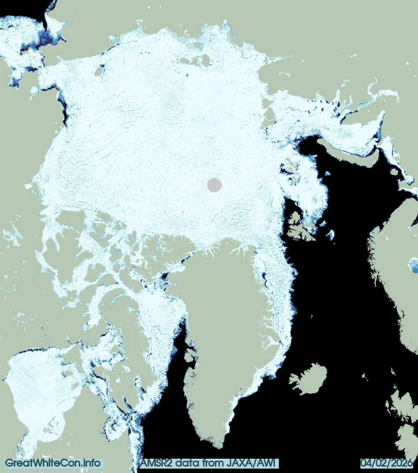
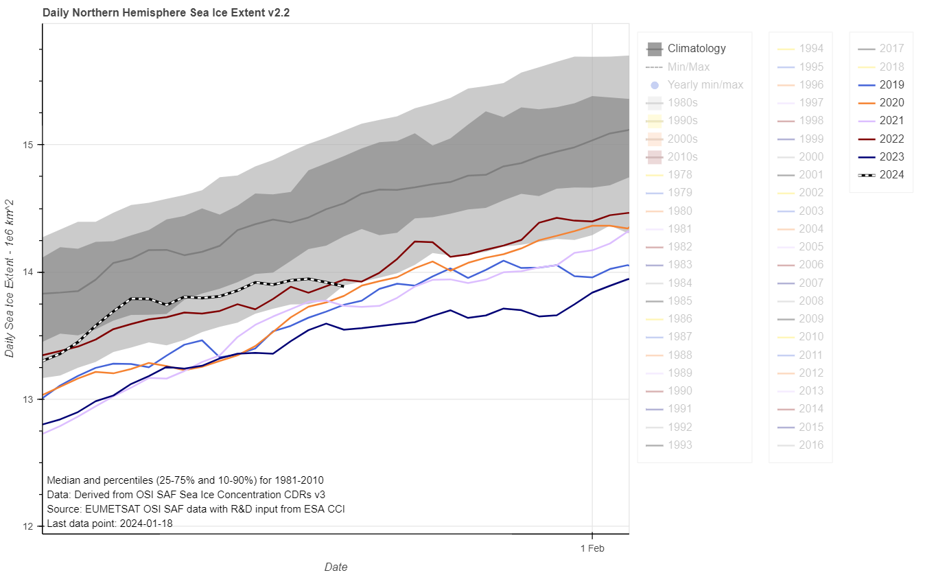
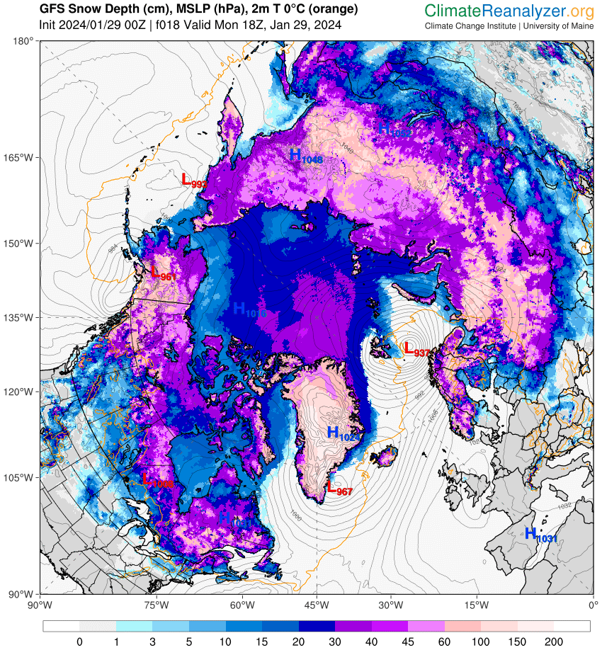
Hudson Bay has fully frozen over during January. However, there is still open water north of Svalbard and in the North Water Polynya. It’s even possible to go swimming in the Nares Strait according to the latest AMSR2 concentration map from the Alfred Wegener Institute:
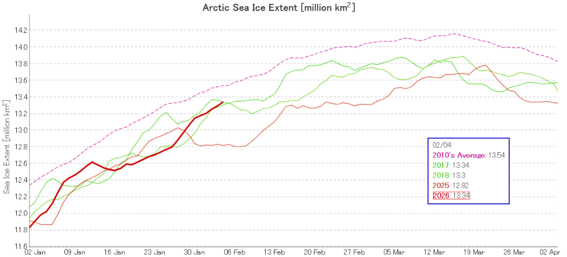
JAXA extent is currently 3rd lowest for the date, in a “statistical tie” with 2017:
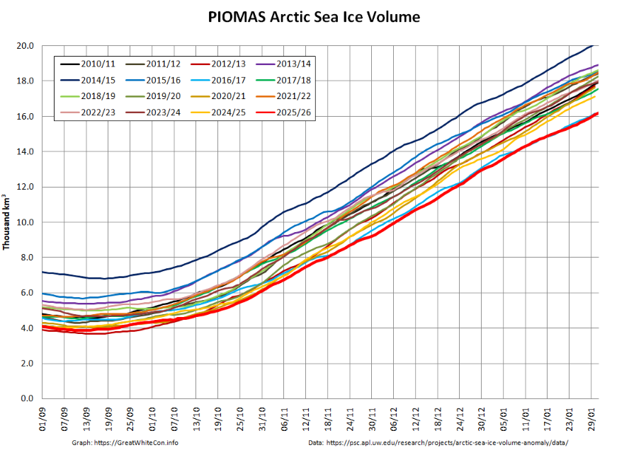
Looking at the third dimension next, PIOMAS volume was second lowest for the date by a whisker at the end of January:
The Fifth US National Climate Assessment was published in November 2023 during the Biden/Harris administration. Here’s the announcement by Zeke Hausfather on X/Twitter:
After three years of work by a team of over 750 scientists, we are releasing the US 5th National Climate Assessment today!
We see greater impacts of climate change on the US since the 2018 NCA4 report, but also some encouraging signs of progress.https://t.co/2WZOLOXoKo
The Global Change Research Act of 1990 mandates that the US Global Change Research Program (USGCRP) deliver a report to Congress and the President not less frequently than every four years that “integrates, evaluates, and interprets the findings of the Program and discusses the scientific uncertainties associated with such findings; analyzes the effects of global change on the natural environment, agriculture, energy production and use, land and water resources, transportation, human health and welfare, human social systems, and biological diversity; and analyzes current trends in global change, both human-induced and natural, and projects major trends for the subsequent 25 to 100 years.”
You may well have noticed that Kamala Harris lost the subsequent election? Hence the Sixth US National Climate Assessment will be prepared during the term of the current Trump/Vance administration.
Regular readers will recognise some or all of those names, and it will not surprise you to learn that there was plenty of pushback from a wide range of climate scientists. In particular, the “Climate Experts’ Review of the DOE Climate Working Group Report“, led by Andrew Dessler and Robert Kopp was published at the end of September 2025. This report begins as follows:
I frequently post a summary of the Arctic section of the United States’ National Snow and Ice Data Center’s monthly review of the current state of the cryosphere. Here is the most recent edition.
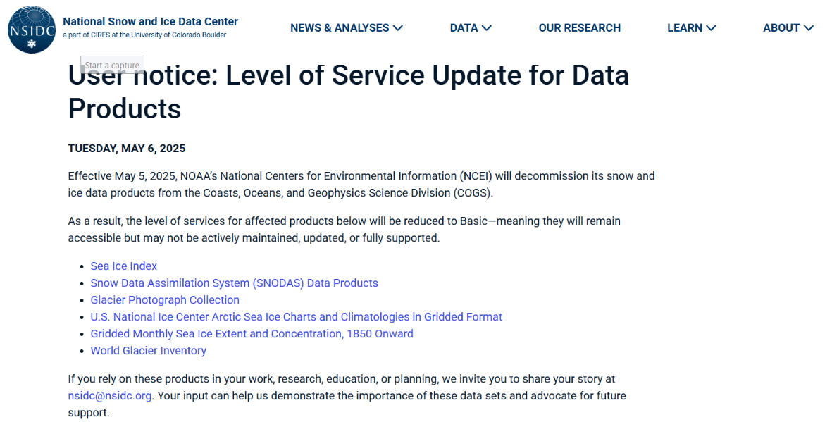
Effective May 5, 2025, NOAA’s National Centers for Environmental Information (NCEI) will decommission its snow and ice data products from the Coasts, Oceans, and Geophysics Science Division (COGS).
As a result, the level of services for affected products below will be reduced to Basic—meaning they will remain accessible but may not be actively maintained, updated, or fully supported.
If you rely on these products in your work, research, education, or planning, we invite you to share your story at [email protected]. Your input can help us demonstrate the importance of these data sets and advocate for future support.
I will certainly share my story with the NSIDC. If you are a resident of the US you may also wish to contact your local friendly neighbourhood politician(s) about the matter?
[Update – May 9th]
Mark Serreze, Director of the National Snow and Ice Data Center, replied to my email and told me that:
We are acutely aware of the importance of the SII and Sea Ice Today. Millions of visits per year. High priority. We’re in the middle of discussions about to make sure that we have continuity.
Thanks for your support. Everything helps.
One of the less well known data products provided by the NSIDC is EASE-Grid Sea Ice Age.
I recently used that particular mine of essential cryospheric information to produce this educational YouTube video:
The video reveals the underlying reason for the “fast transition” of Arctic sea ice cover from thick multi-year ice to a reduced area of much more mobile young ice.
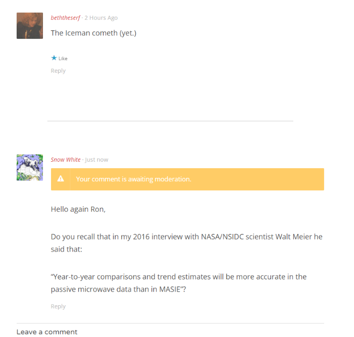
On several previous occasions “Snow White” and I have documented Ron Clutz’s misuse of MASIE Arctic sea ice extent data on his “Science Matters” blog. We agree with Ron that science matters, so on several occasions we have attempted to direct his attention to my interview with NASA/NSIDC scientist Walt Meier. Walt’s words of wisdom included:
Year-to-year comparisons and trend estimates will be more accurate in the passive microwave data than in MASIE.
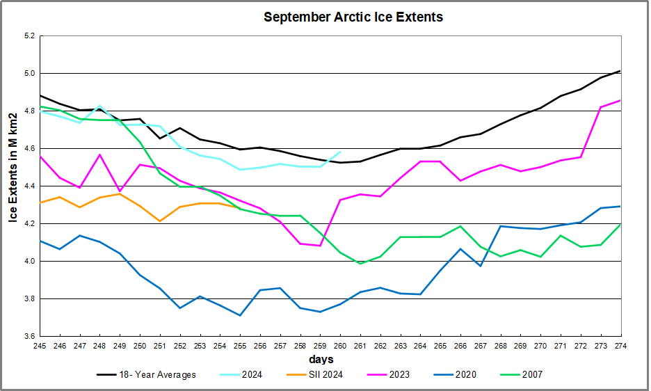
It will probably not surprise you to learn that Ron has not learned anything from our repeated efforts. In his article entitled “2024 Arctic Ice Beats 2007 by Half a Wadham” earlier today Ron proudly displays this graph:
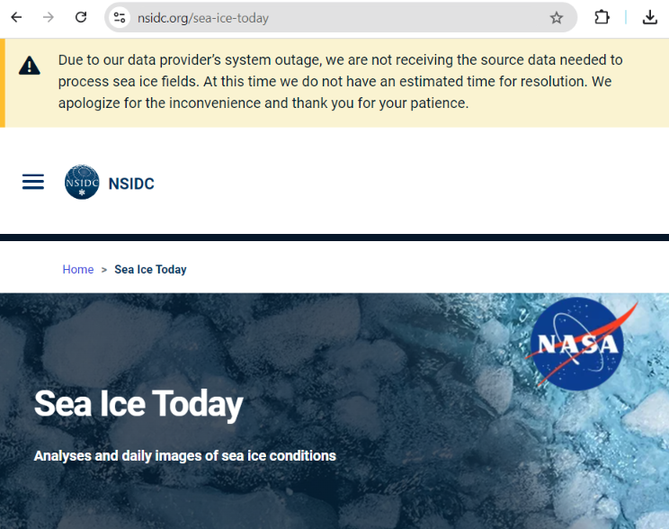
You will note that Ron does not provide details of his data source. However I have recently noted a sudden lack of SSMIS passive microwave data emanating from NOAA. The OSI SAF reported it this way on September 12th:
Dear OSI SAF Sea Ice Concentration User,
Due to missing input data, we have not been able to generate L2 products, corresponding to F-16 / F-17 / F-18 since Sep 11 19:36 UTC.
We apologize for any inconvenience.
The NSIDC’s sea ice home page puts it this way today:
Now day 260 of 2024 is September 16th, so it seems safe to assume that Ron is erroneously using his favourite MASIE metric for year to year comparisons yet again. In his article Ron states that:
SII was reporting deficits as high as 0.5M km2 (half a Wadham) compared to MASIE early in September. For some reason, that dataset has not been updated for the last five days.
It appears as though Ron has also not yet learned how to find NSIDC’s sea ice home page on the world wide interweb!
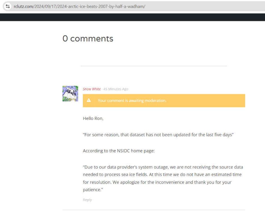
I added this hopefully helpful comment below Ron’s article. For some strange reason it is yet to emerge from his moderation queue:
[Update – September 18th]
Our regular reader(s) will not be surprised to learn that my helpful comment yesterday is no longer in Ron’s moderation queue, but is now languishing underfoot on his cutting room floor.
Ron has written another Arctic article using the graph reproduced above. This one is entitled: “2024 Arctic Ice Abounds at Average Daily Minimum“. In it Ron assures his flock of faithful followers that:
We are close to the annual Arctic ice extent minimum, which typically occurs on or about day 260 (mid September). Some take any year’s slightly lower minimum as proof that Arctic ice is dying, but the image above shows the Arctic heart is beating clear and strong.
Over this decade, the Arctic ice minimum has not declined, but since 2007 looks like fluctuations around a plateau.
Ron has also changed his phraseology regarding the recent SSMIS data outage. This time it reads:
For some reason, apparently data access issues, that dataset has not been updated for the last five days.
“Snow White” felt compelled to leave Ron another helpful comment concerning his new words of Arctic wisdom:
The 2023 Arctic Report Card has been published by the US National Oceanic and Atmospheric Administration (NOAA). All sorts of things are discussed in the report, but sticking to Snow White’s speciality of sea ice here’s an extract:
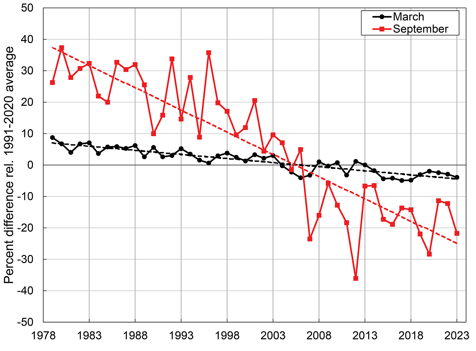
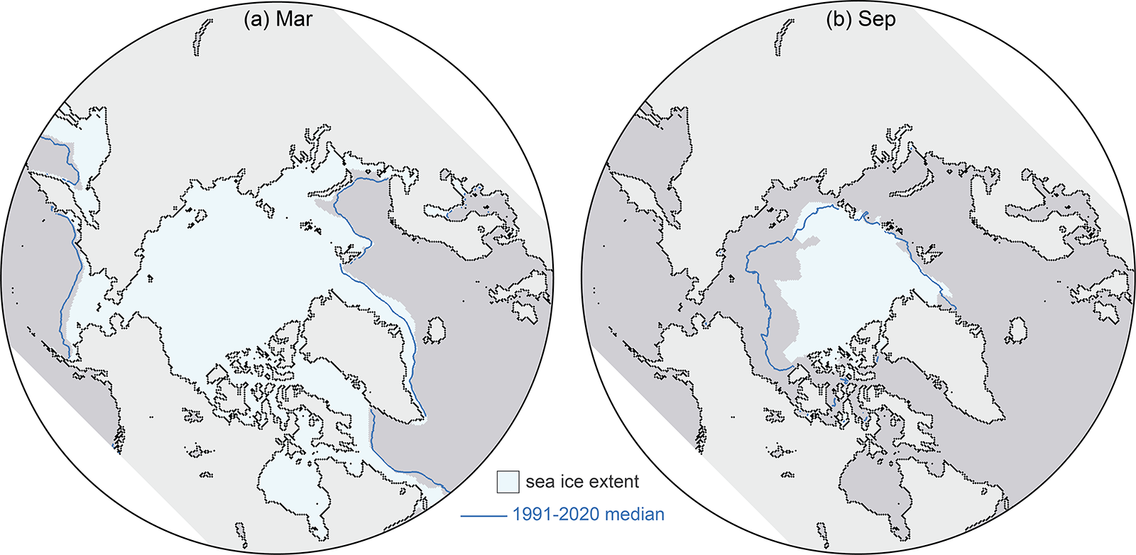
This satellite record tracks long-term trends, variability, and seasonal changes from the annual extent maximum in late February or March and the annual extent minimum in September. Extents in recent years are ~50% lower than values in the 1980s. In 2023, March and September extents were lower than other recent years, and though not a new record low, they continue the long-term downward trends:
March 2023 was marked by low sea ice extent around most of the perimeter of the sea ice edge, with the exception of the East Greenland Sea where extent was near normal. At the beginning of the melt season, ice retreat was initially fairly slow through April. In May and June, retreat increased to a near-average rate, and then accelerated further through July and August. By mid-July, the ice had retreated from much of the Alaskan and eastern Siberian coast and Hudson Bay had nearly melted out completely. In August, sea ice retreat was particularly pronounced on the Pacific side, opening up vast areas of the Beaufort, Chukchi, and East Siberian Seas. Summer extent remained closer to average on the Atlantic side, in the Laptev, Kara, and Barents Seas
The Northern Sea Route, along the northern Russian coast, was relatively slow to open as sea ice extended to the coast in the eastern Kara Sea and the East Siberian Sea, but by late August, open water was found along the coast through the entire route. The Northwest Passage through the Canadian Archipelago became relatively clear of ice, though ice continued to largely block the western end of the northern route through M’Clure Strait through the melt season. Nonetheless, summer 2023 extent in the Passage was among the lowest observed in the satellite record, based on Canadian Ice Service ice charts.
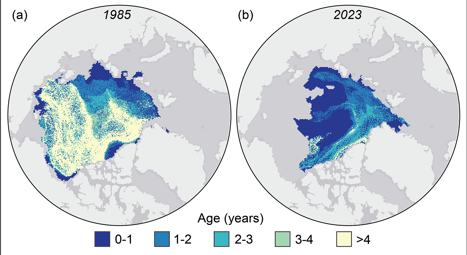
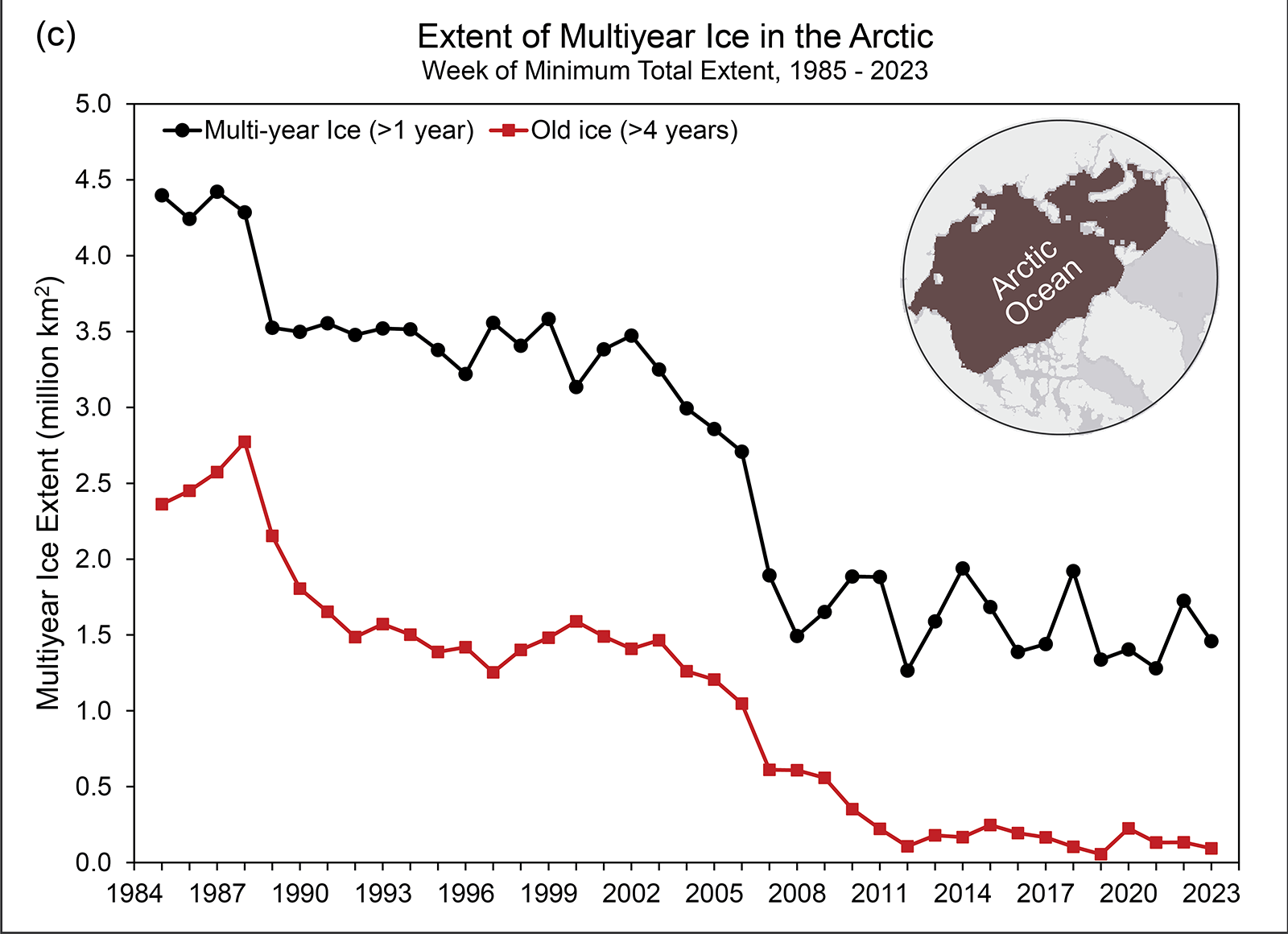
Tracking the motion of ice in passive microwave imagery using feature tracking algorithms can be used to infer sea ice age. Age is a proxy for ice thickness because multiyear ice generally grows thicker through successive winter periods. Multiyear ice extent has shown interannual oscillations but no clear trend since 2007, reflecting variability in the summer sea ice melt and export out of the Arctic. After a year when substantial multiyear ice is lost, a much larger area of first-year ice generally takes its place. Some of this first-year ice can persist through the following summer, contributing to the replenishment of the multiyear ice extent:
However, old ice (here defined as >4 years old) has remained consistently low since 2012. Thus, unlike in earlier decades, multiyear ice does not remain in the Arctic for many years. At the end of the summer 2023 melt season, multiyear ice extent was similar to 2022 values, far below multiyear extents in the 1980s and 1990s:
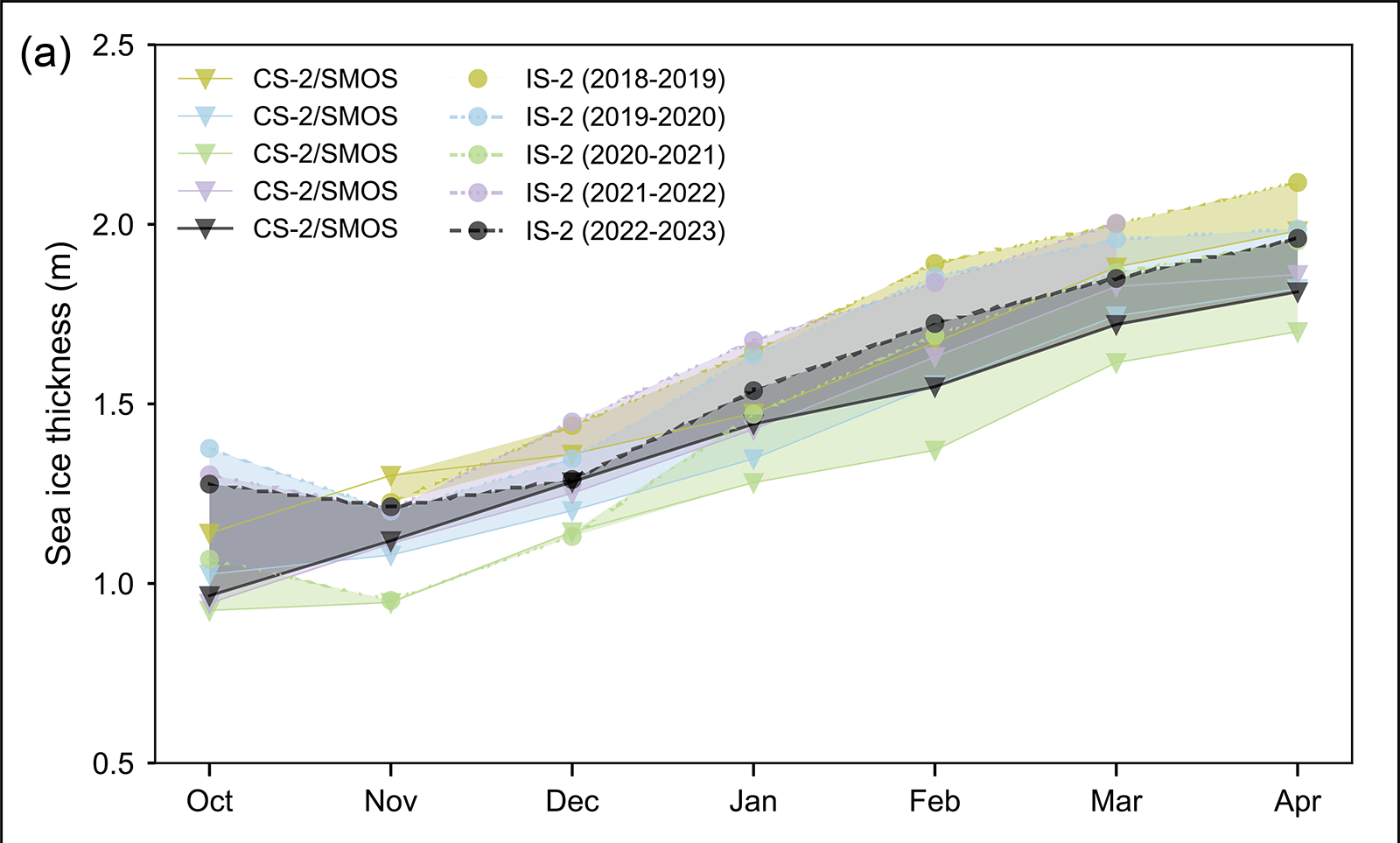
Estimates of sea ice thickness from satellite altimetry can be used to more directly track this important metric of sea ice conditions, although the data record is shorter than for extent and ice age. Data from ICESat-2 and CryoSat-2/SMOS satellite products tracking the seasonal October to April winter ice growth over the past four years (when all missions have been in operation) show a mean thickness generally thinner than the 2021/22 winter but with seasonal growth typical of recent winters:
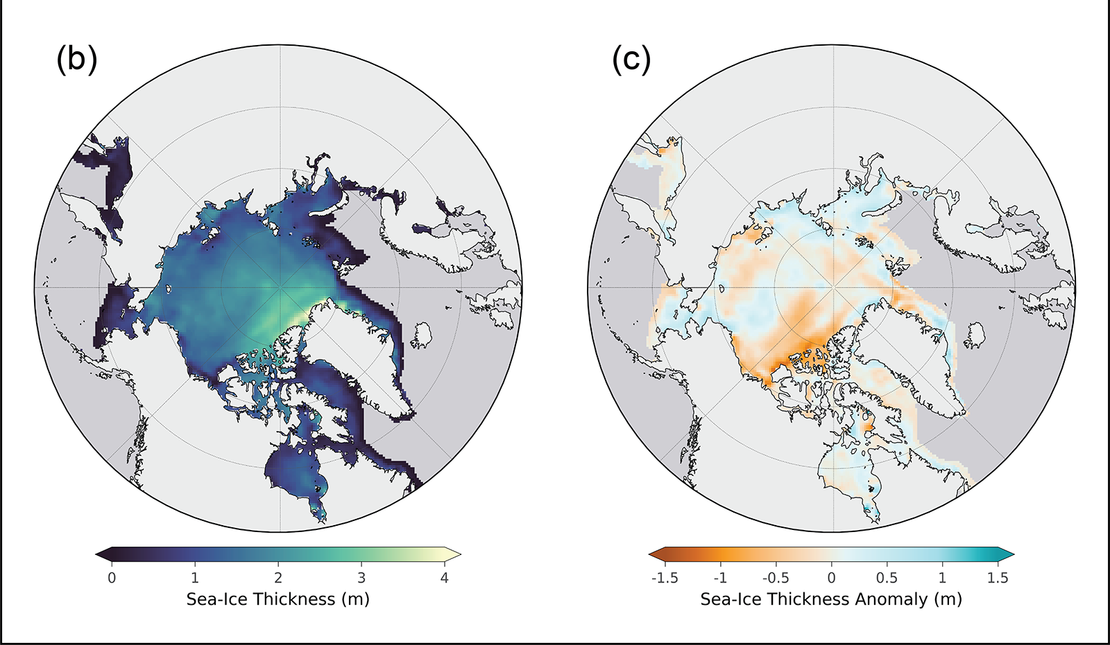
April 2023 thickness from CryoSat-2/SMOS relative to the 2011-22 April mean shows that the eastern Beaufort Sea and the East Siberian Sea had relatively thinner sea ice than the 2011-22 mean, particularly near the Canadian Archipelago. Thickness was higher than average in much of the Laptev and Kara Seas and along the west and northwest coast of Alaska, extending northward toward the pole. The East Greenland Sea had a mixture of thicker and thinner than average ice:
An excellent analysis (IMHO!), but I do have one quibble. I was following events in the Northwest Passage very closely last summer, and according to the Canadian Ice Service on September 1st:
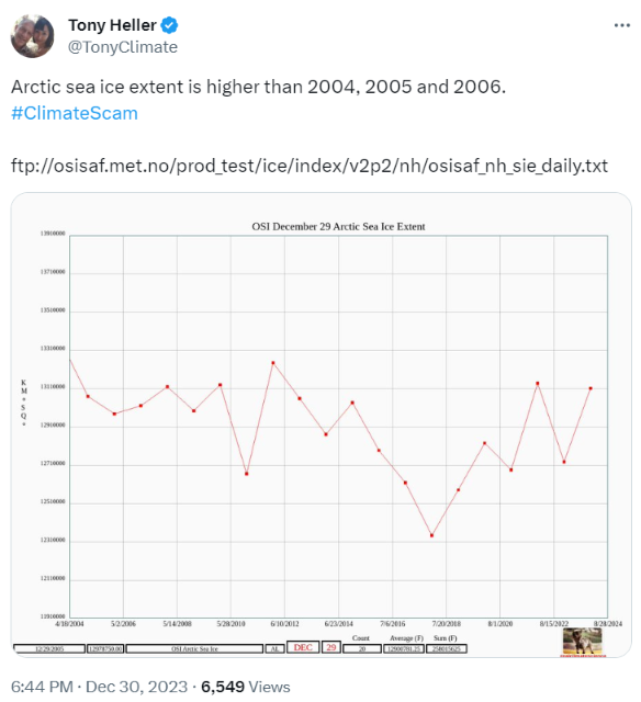
Apart from (presumably accidentally) empirically confirming global warming and Arctic sea ice volume decline, Tony Heller has also been frantically attempting to persuade his flock of faithful followers that the current value of the OSI SAF’s extent metric means that the impending series of “2023 has been the hottest year evah!” stories are all lies.
Here a few examples of his infamous oeuvre, together with “Snow White’s” responses:
Can you rustle up one of those for another date Tony?
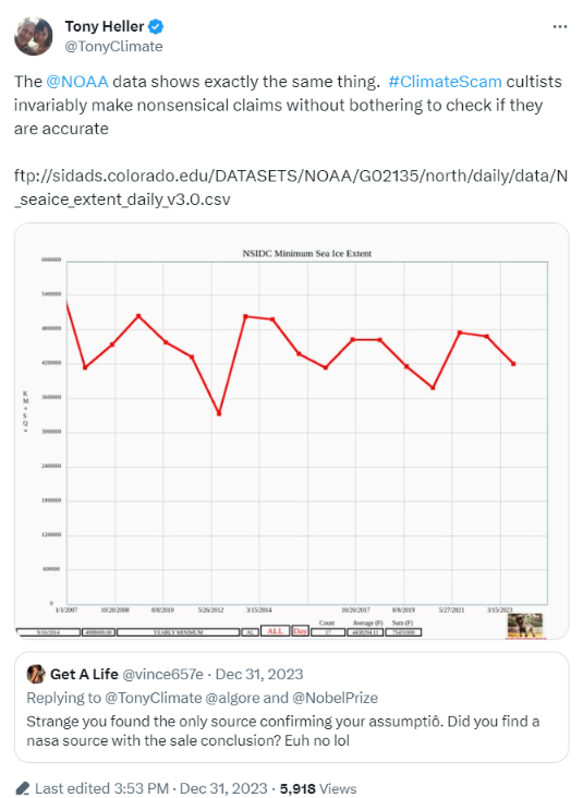
Switching swiftly to a cherry picked graph of the OSI SAF minimum extent, Tony invokes the spirit of a deceased parrot that went to meet its maker several decades ago. He remains blissfully unaware that I watched the Monty Python dead parrot sketch when it was first broadcast:
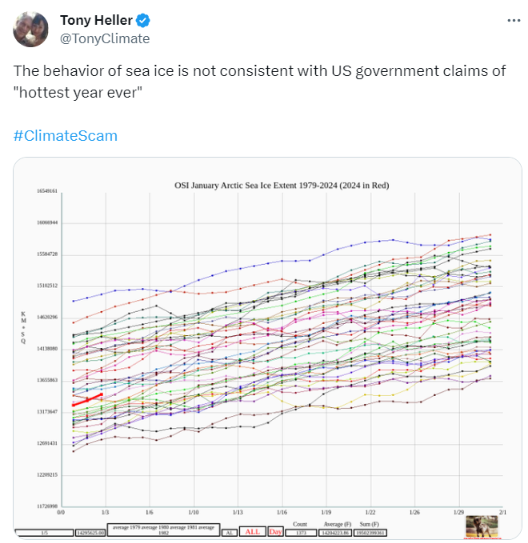
When do you suppose Tony will get around to implementing my suggestion of revealing the OSI SAF extent graph for December 8th to his flock of faithful followers?
Or a multi decade graph of NSIDC extent for that matter?
[Update – January 4th]
My prediction has come true in next to no time:
[Update – January 20th]
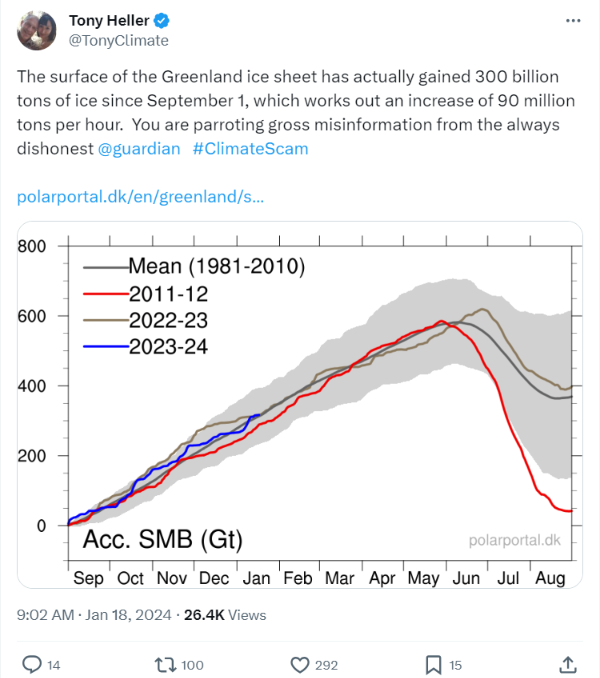
For some strange reason Tony has been silent about Arctic sea ice extent for a while, and has moved on to the Greenland ice sheet instead:
Presumably that’s in response to an article in The Guardian:
The Greenland ice cap is losing an average of 30m tonnes of ice an hour due to the climate crisis, a study has revealed, which is 20% more than was previously thought…
The study, published in the journal Nature, used artificial intelligence techniques to map more than 235,000 glacier end positions over the 38-year period, at a resolution of 120 metres. This showed the Greenland ice sheet had lost an area of about 5,000 sq km of ice at its margins since 1985, equivalent to a trillion tonnes of ice.
“Snow White” felt compelled to respond to Mr. Heller as follows:
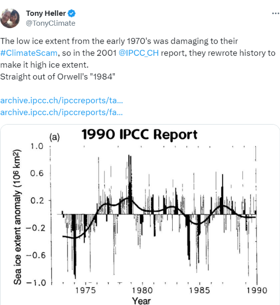
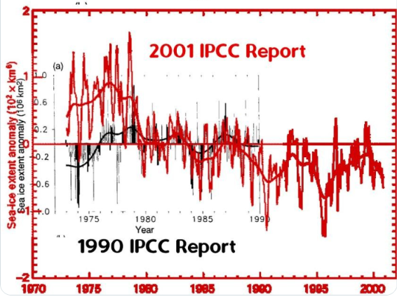
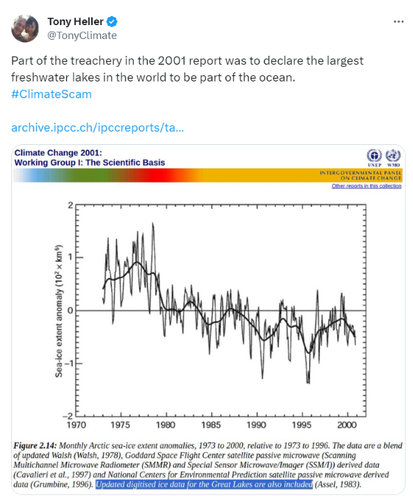
Evidently Tony has still not learned that it’s impossible to compare 1990 apples with 2001 oranges, despite having the difference explained to him on numerous previous occasions.
Stop Press! Tony has suddenly discovered that he’s been comparing apples with oranges all these years!!
Whilst waiting for the all important thickness and volume data to arrive, we’ll start the new year in traditional fashion with a graph of JAXA extent:
The 2023 calendar year finished with this particular extent metric sitting at 15th lowest in the satellite era.
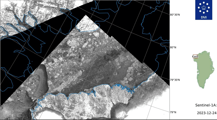
From Niall Dollard on the Arctic Sea Ice Forum comes evidence via the Sentinel 1A satellite that an arch formed in the Nares Strait between Greenland and Ellesmere Island in late December:
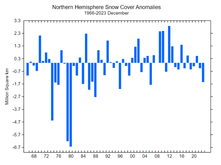
Please note the current record low NH snow extent. Matt predicts all that is about to change:
How sure? And in what way "totally different"?
Have you pointed out to Tony yet that the current daily snow cover data you cite utterly negates his recent assertion that "Autumn/Winter snow cover has been increasing for almost 60 years"?
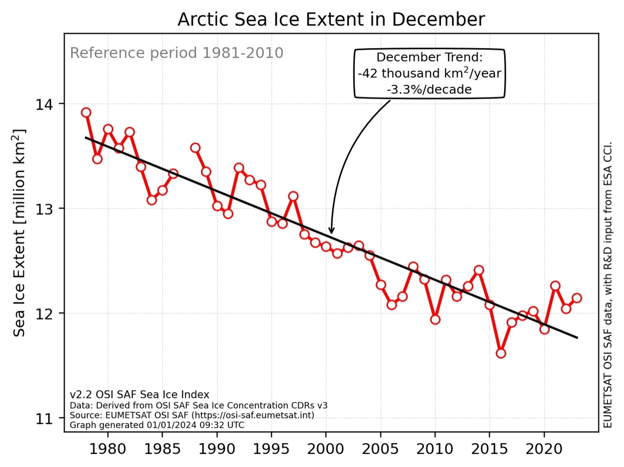
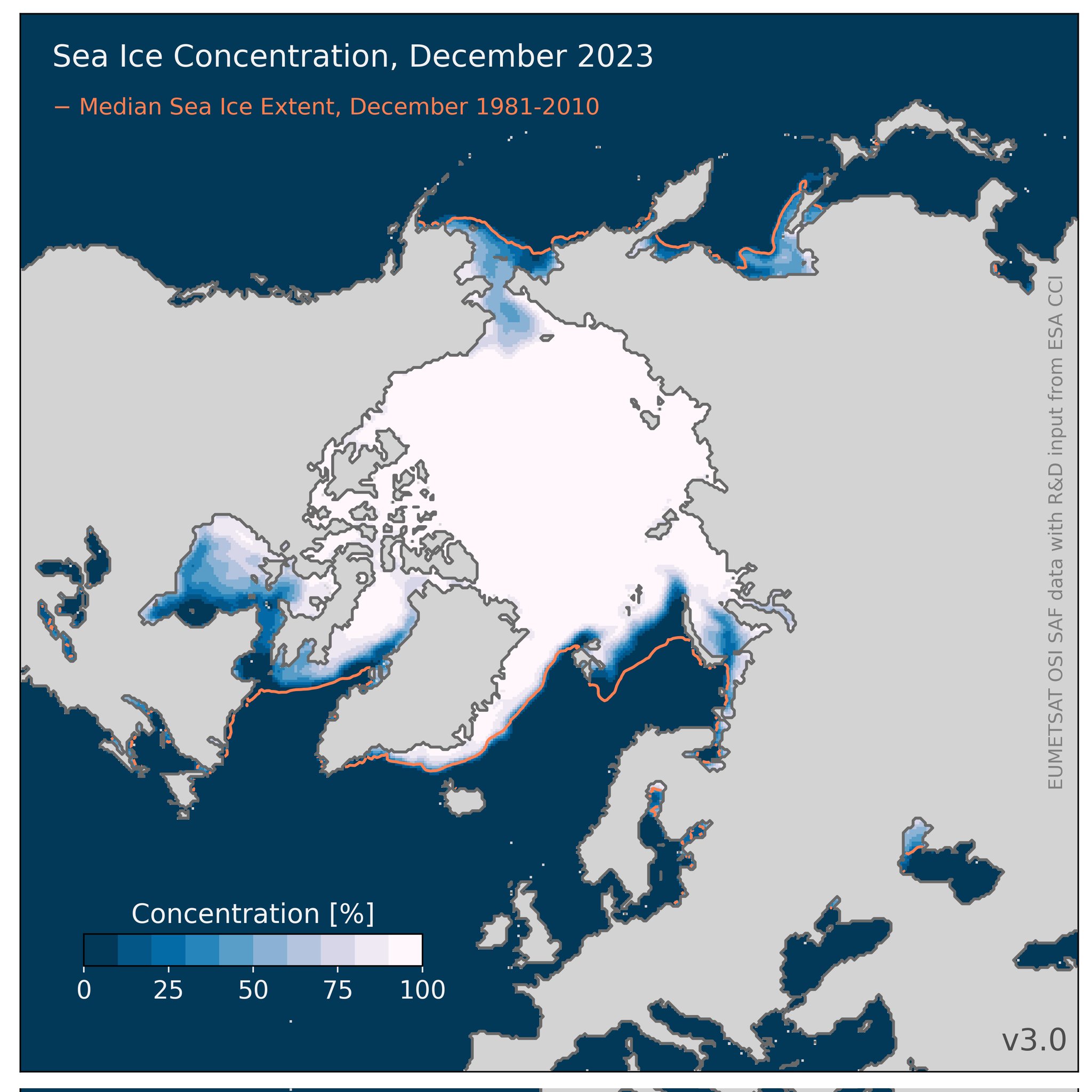
Hot off the Scandinavian virtual printing presses, here is the official December Arctic sea ice extent trend graph from the OSI SAF:
That’s “Steve”/Tony’s current metric du jour. When do you suppose he will bring it to the attention of his horde of regular readers? It’s accompanied by this matching concentration map:
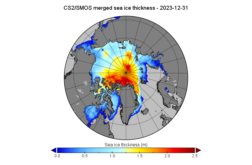
Here too is the CryoSat-2/SMOS thickness map for December 31st, in a different format to the one usually used here:
[Update – January 3rd]
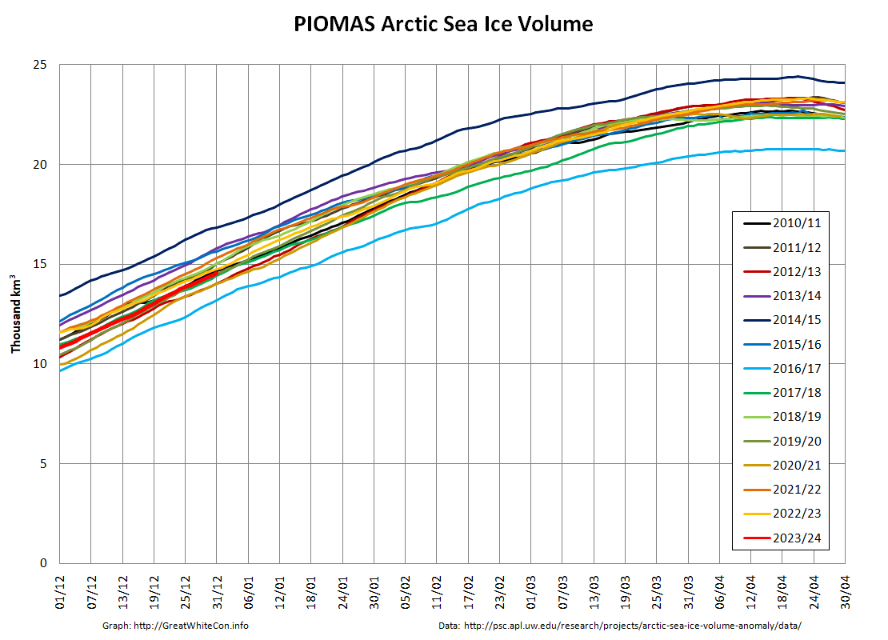
The December PIOMAS modelled gridded thickness data has been released. The calculated volume is 6th lowest in the satellite era:
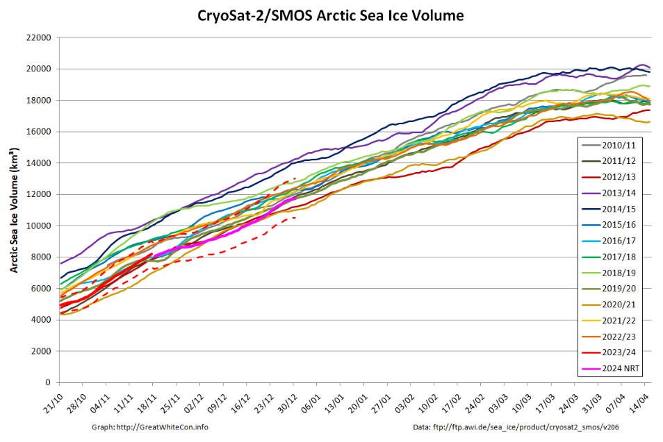
Here is the equivalent CS2/SMOS volume graph
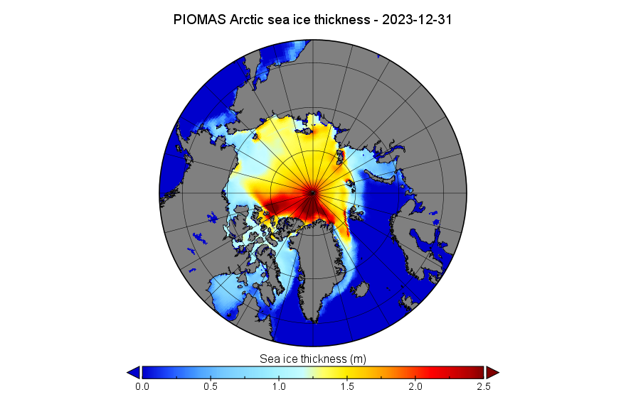
Here too is the PIOMAS thickness map for December 31st:
This uses the same Greenland down orientation and 2.5 meter maximum scale value as the CS2/SMOS map above.
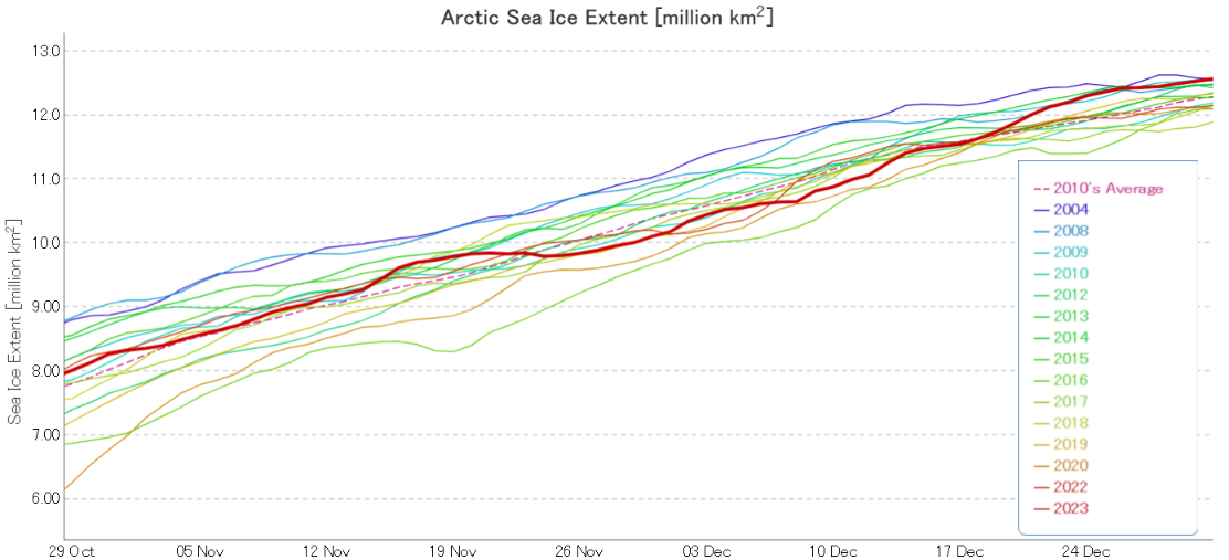
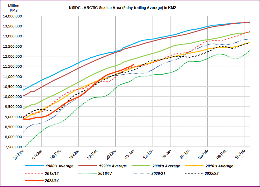
The end of 2023 had above average sea ice growth, bringing the daily extent within the interdecile range, the range spanning 90 percent of past sea ice extents for the date. Rapid expansion of ice in the Chukchi and Bering Seas and across Hudson Bay was responsible.
Average Arctic sea ice extent for December 2023 was 12.00 million square kilometers, ninth lowest in the 45-year satellite record . Sea ice extent increased by an average of 87,400 square kilometers per day, markedly faster than the 1981 to 2010 average of 64,100 square kilometers per day.
After a delayed start to the freeze-up in Hudson Bay, sea ice formed quickly from west to east across the bay, leaving only a small area of open ocean near the Belcher Islands at month’s end. In the northern Atlantic, sea ice extent remained below average extent, as has been typical for the past decade.
For December overall, 2023 had the third highest monthly gain in the 45-year record at 2.71 million square kilometers, behind 2006 at 2.85 million square kilometers and 2016 at 2.78 million square kilometers.
Moving on to the “Conditions in context” section:
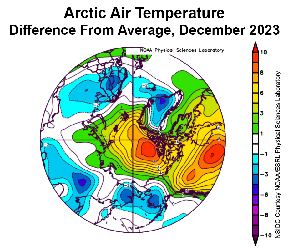
Warm conditions prevailed over the central Arctic Ocean and Beaufort Sea regions, as well as over Hudson Bay and much of northern Canada, with air temperatures at the 925 millibar level (around 2,500 feet above sea level) 8 to 9 degrees Celsius above the 1991 to 2020 average. Elsewhere, relatively cool conditions prevailed, with air temperatures 2 to 4 degrees Celsius below average in southwestern Alaska, easternmost Russia, Scandinavia, and southeast Greenland. Cool conditions in the Bering and southern Chukchi Seas explain the rapid ice growth there. By contrast, the warm conditions over Hudson Bay, continuing since November, explain its delayed start of ice formation there.
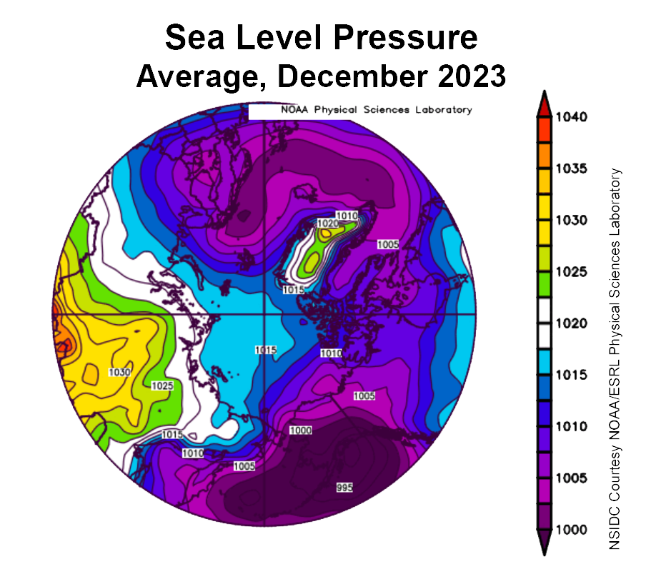
The atmospheric circulation pattern for December was marked by low sea level pressure over the Gulf of Alaska and northern Europe and high sea level pressure over central Russia. This pattern led to cold Arctic air flowing across the Chukchi Sea and into the Bering Sea as well as advection of relatively warm air across Canada into the Beaufort Sea:
Here’s a taste, but there’s much more at the dedicated article linked to above:
[Update – January 12th]
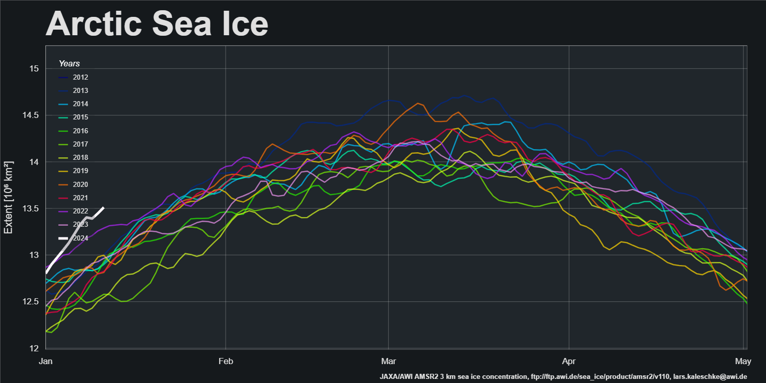
A change is as good as a rest, so here’s the AWI “high resolution” AMSR2 Arctic wide sea ice extent graph
It’s currently highest for the date in the AMSR2 era by a significant margin.
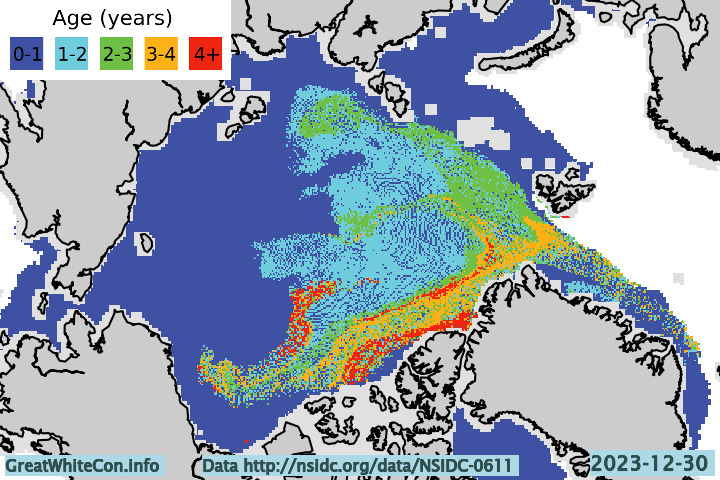
Here too is the ice age map for the end of 2023:
[Update – January 19th]
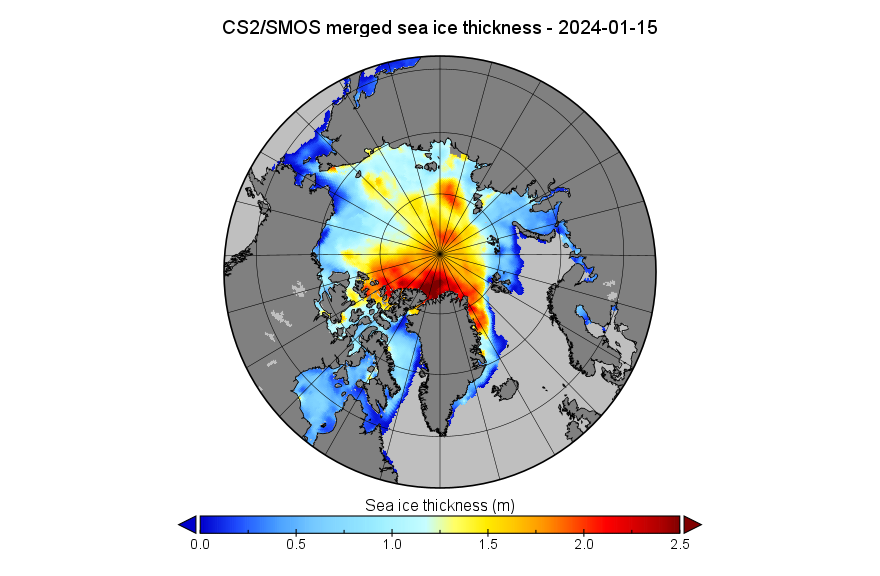
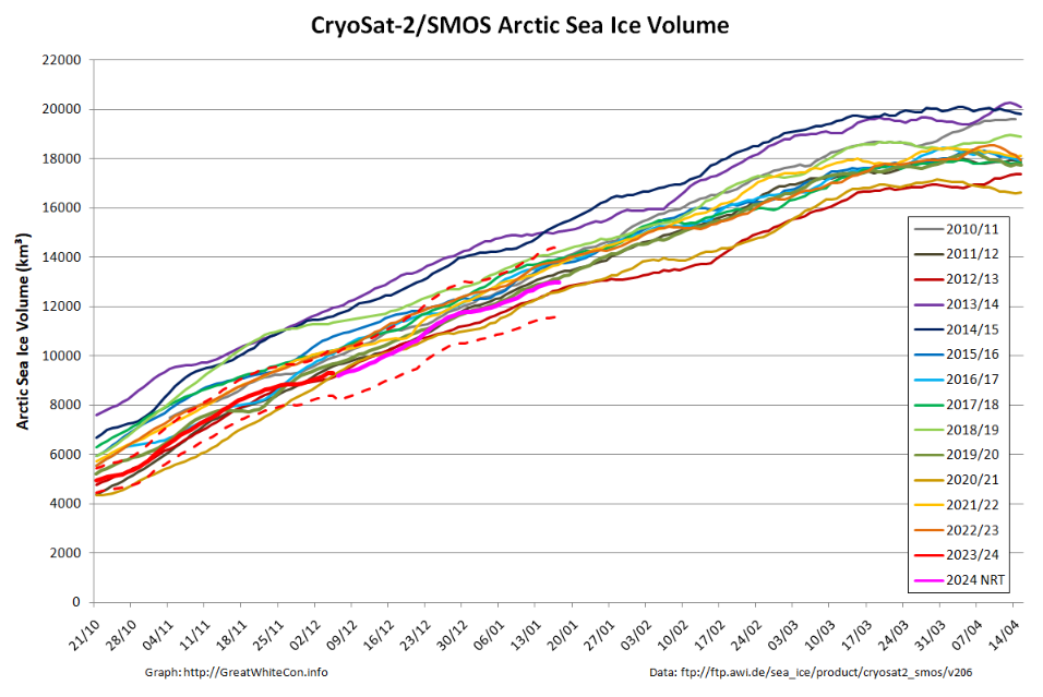
Something seems to have gone wrong with the processing of the mid-month PIOMAS gridded thickness data. For the moment we’ll have to make do with just the CryoSat-2/SMOS thickness map:
and volume graph:
With the perennial caveat of a probable upward revision when the reanalysed data is released, Arctic sea ice volume is still close to the bottom of the range during the CryoSat-2 era.
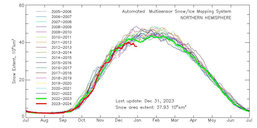
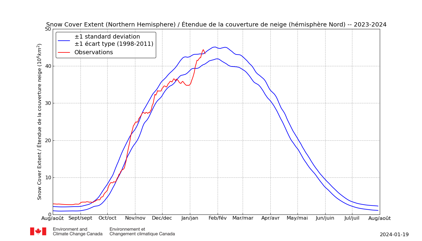
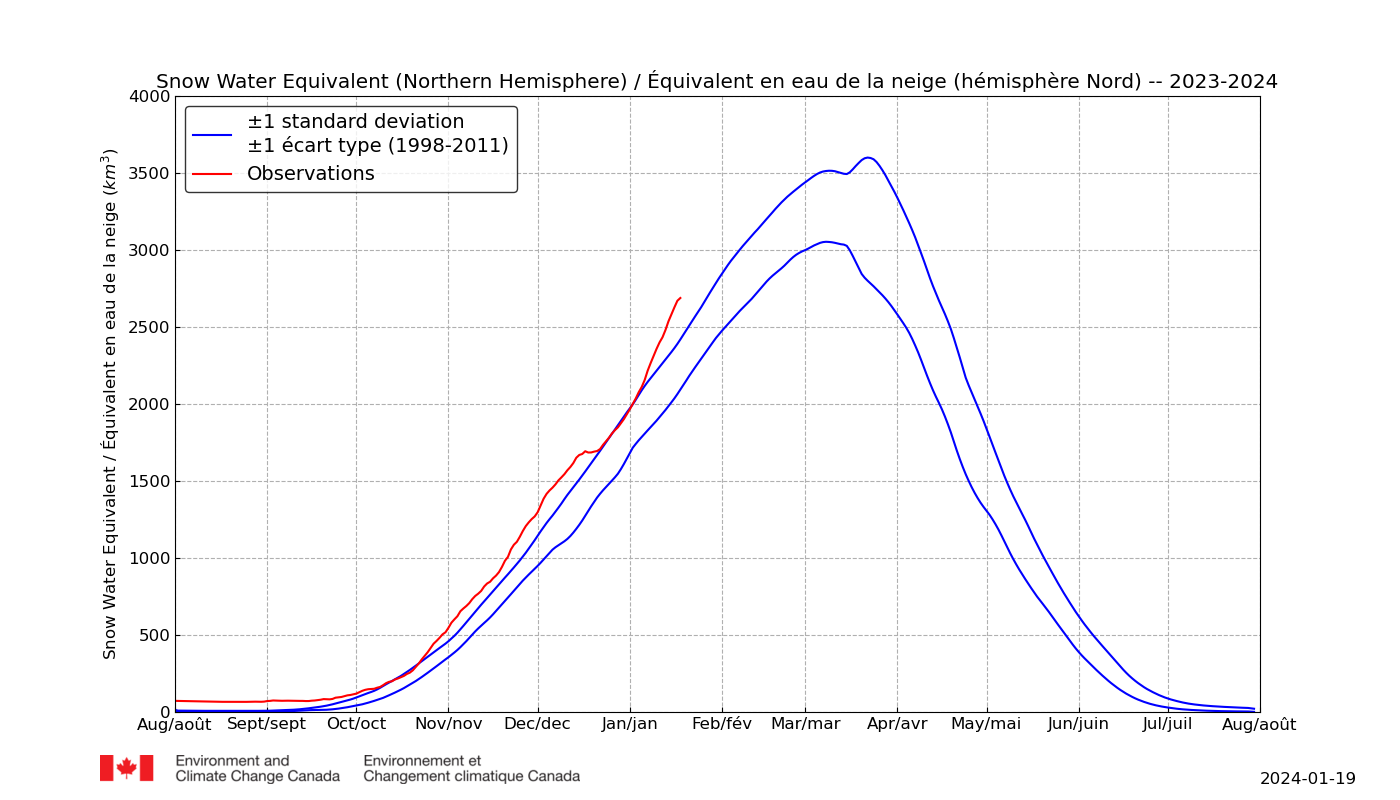
In addition especially for Matt, “Steve”/Tony and numerous others of a “skeptical” persuasion, here are the latest Environment & Climate Change Canada snow extent and snow water equivalent graphs for the northern hemisphere:
Last but certainly not least is the Rutgers Global Snow Lab northern hemisphere snow cover anomaly chart for December:
[Update – January 29th]
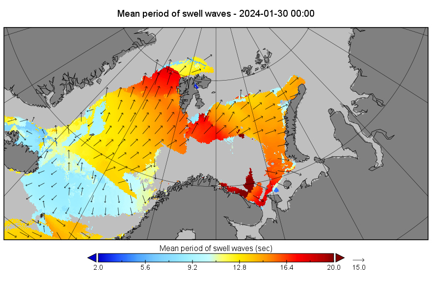
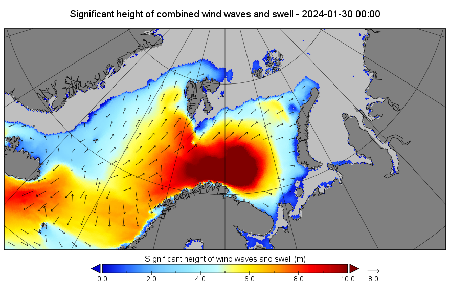
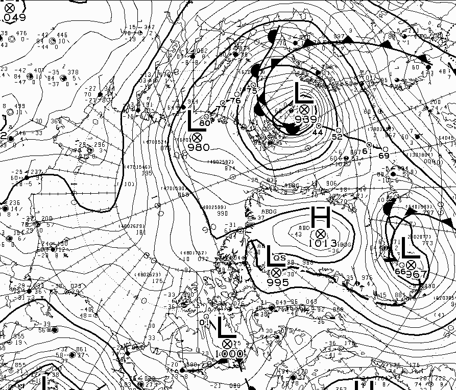
A winter cyclone is stirring up the far North Atlantic. It’s currently forecast to bottom out later today with a minimum MSLP of 937 hPa:
The storm has been creating a long period swell directed at the ice edge in the Barents Sea. By midnight that swell will be battering the ice in the Fram Strait too:
[Update – January 30th]
According to Environment Canada the cyclone bottomed out with an MSLP of 939 hPa at 12 PM UTC yesterday:
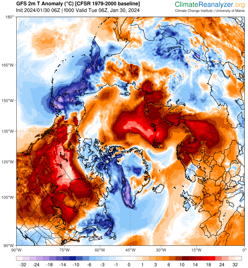
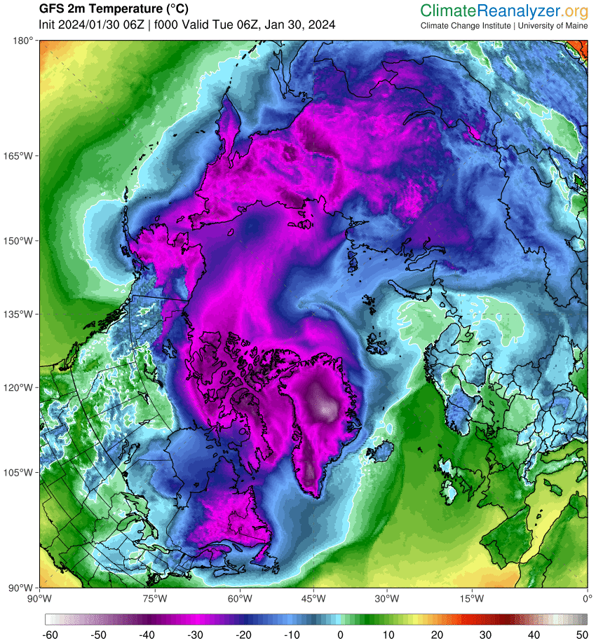
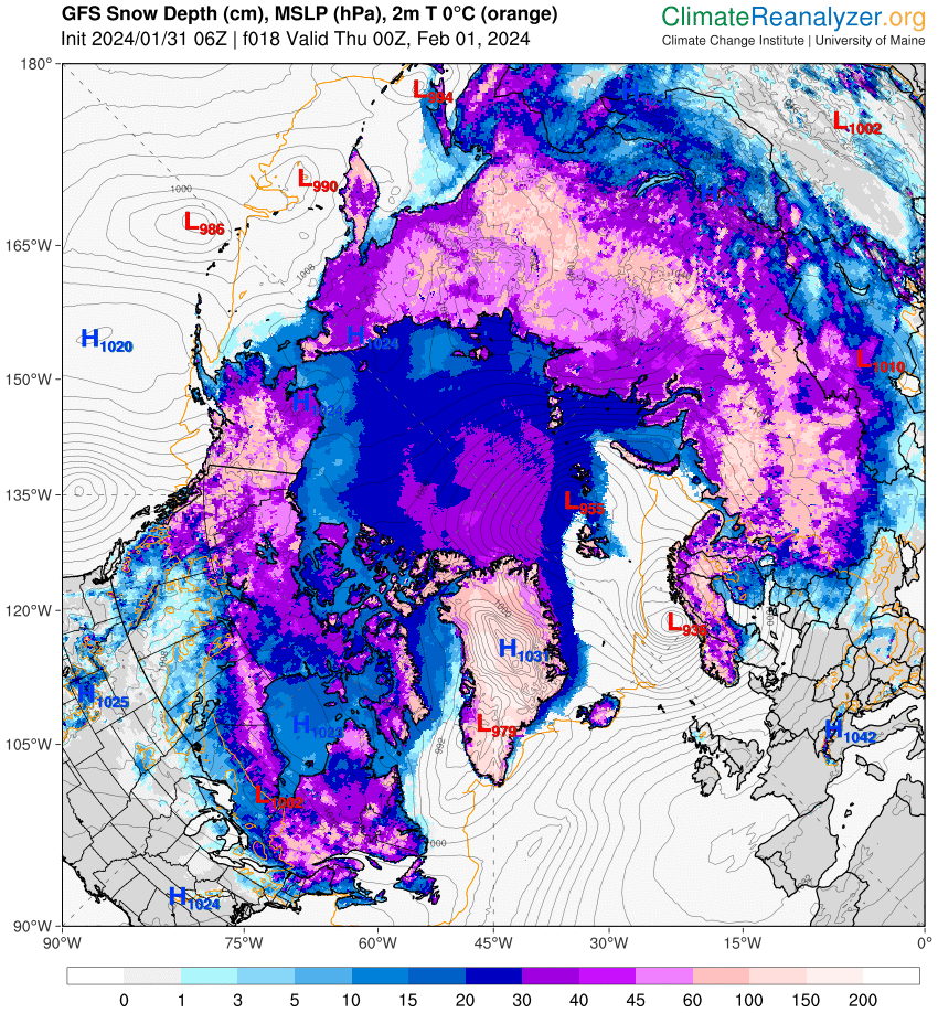
Associated with the storm is a pulse of abnormally warm air reaching to the North Pole and beyond:
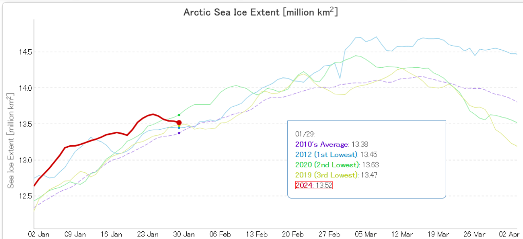
Here’s how JAXA extent looks as the big swell arrives:
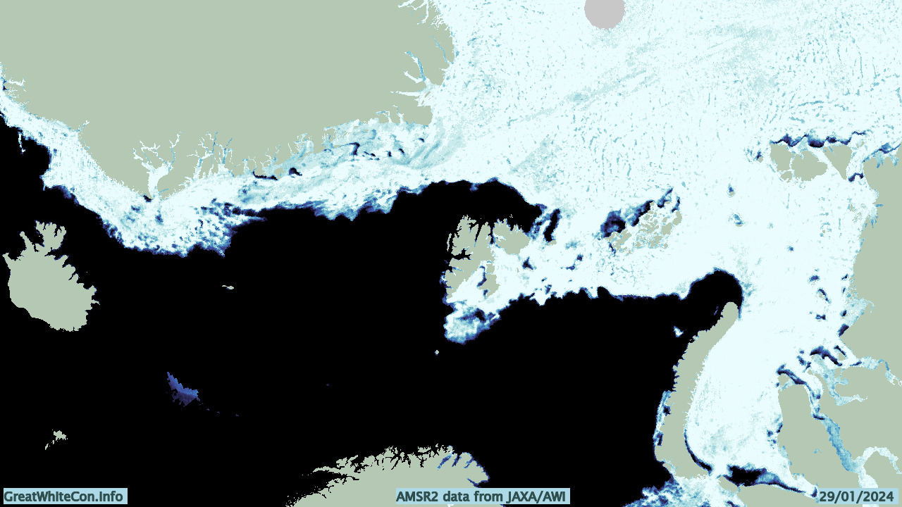
And here’s the lead enhanced AWI AMSR2 concentration map of the Atlantic periphery:
Let’s see how things change over the next few days.
[Update – January 31st]
Here’s a preliminary look at the effect of the recent Arctic cyclone and other “weather” on the sea ice in the Fram Strait and Barents & Kara Seas:
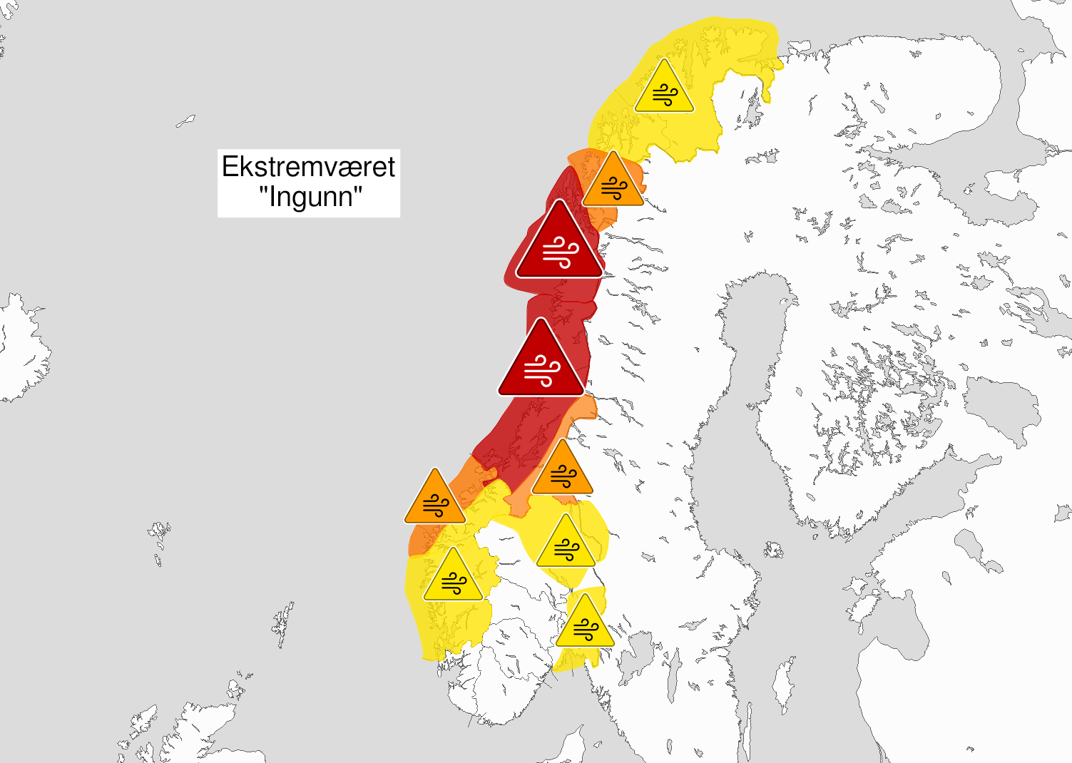
There is also another cyclone heading for the Barents Sea. This one is forecast to bottom out at 936 hPa at around midnight tonight near the Norwegian coast:
P.S. The cyclone mentioned just above has been named Storm Ingunn by the Norwegian Meteorological Institute:
👀 This swirl of cloud is #StormIngunn – an intense area of low pressure that's still rapidly deepening
😮 Wind gusts of over 120 mph have been reported in the Faroe Islands with the storm now moving towards Norway pic.twitter.com/TNuo52L7MW
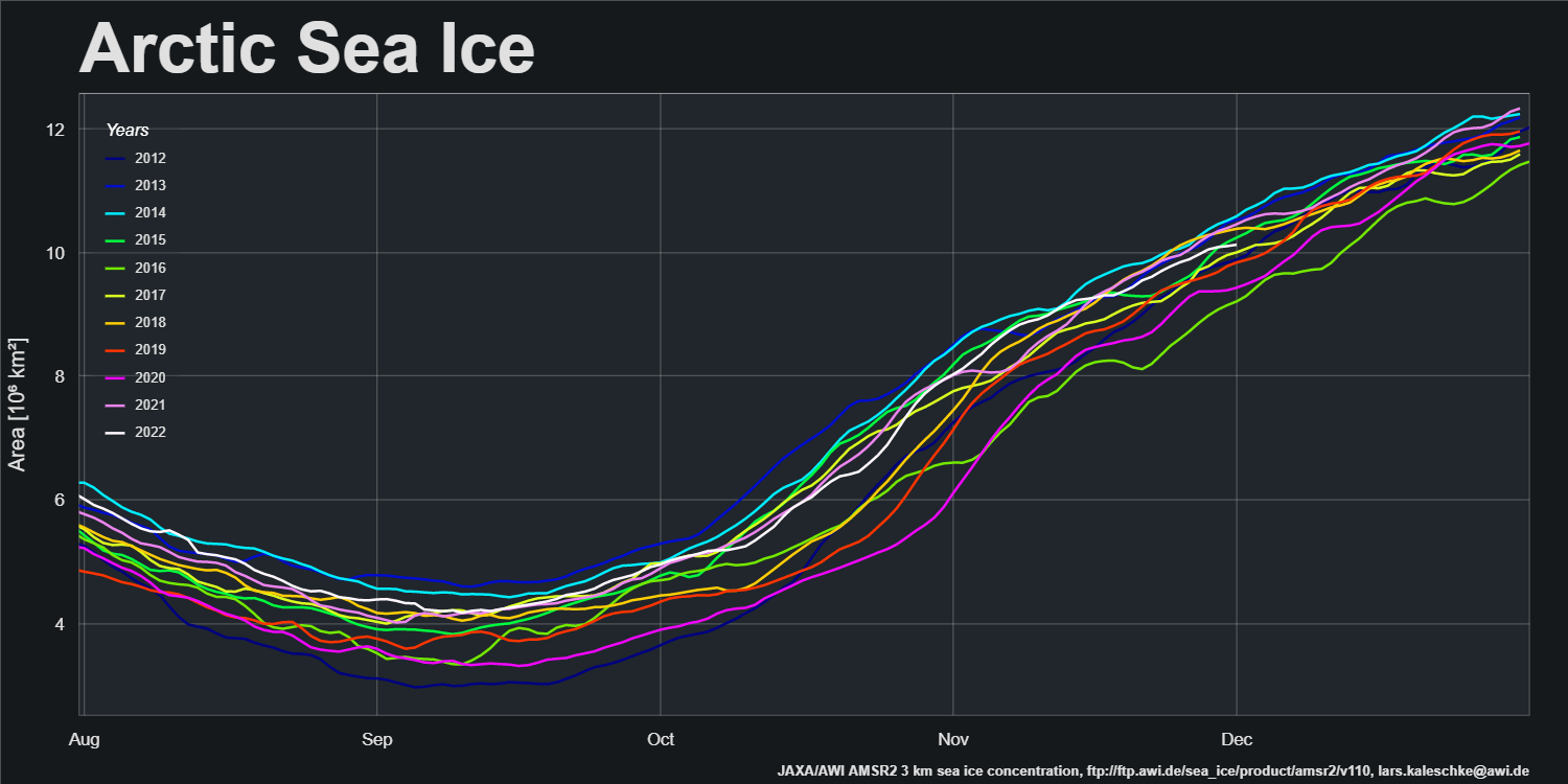
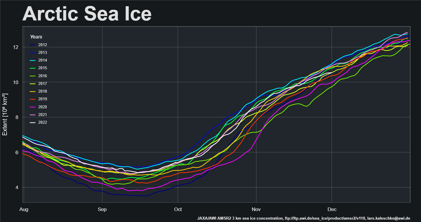
A new month is upon us and Christmas is coming! Here’s another look at Lars Kaleschke’s high resolution AMSR2 area and extent graphs for the Arctic as a whole:
Extent increase stalled for the last few days of November, and as a result extent is now in a “statistical tie” with 2017 for 4th lowest extent for the date in the AMSR2 record.
Regular readers of this blog will no doubt have realised that way up here in the Great White Con Ivory Towers we concluded many moons ago that Arctic sea ice is the “canary in the climate coal mine”.
Unlike some others we have already mentioned we were not the beneficiaries of a review copy of Steven E. Koonin’s new book, catchily entitled “Unsettled: What Climate Science Tells Us, What It Doesn’t, and Why It Matters”. Hence I was compelled to acquire my own review copy, and have just purchased the electronic version. I eagerly searched the virtual weighty tome for the term “Arctic sea ice”, and you may well be wondering what I discovered?
Nothing. Nada. Zilch. ничего такого. Nic.
I broadened my thus far vain search by removing the “Arctic” specifier, which revealed:
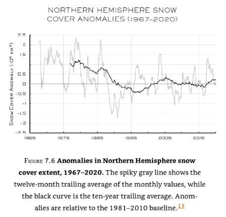
No mention of “sea ice” in the body of the book, merely a reference to the data underlying this graph of northern hemisphere snow cover:
I am forced to an unsettling conclusion. Evidently there are some areas of climate science that Dr. Koonin tells his eager readers nothing whatsoever about. It seems likely that he is also well aware that Arctic sea ice is the canary in the climate coal mine, which is why he has chosen to make no mention of it in his magnum opus.
Here is an informative video which will no doubt not appear in “Unsettled – The Movie”:
[Edit – May 8th]
Having now had time to read some of Steve Koonin’s “Unsettled Climate Science” at greater length I have discovered that it does contain one reference to Arctic sea ice, albeit using non-standard terminology. On page 40 of the Kindle version of the book I read:
Rising temperatures at the surface and in the ocean are not the only indicators of recent warming. The ice on the Arctic Ocean and in mountain glaciers has been in decline, and growing seasons have been lengthening slightly. Satellite observations show that the lower atmosphere is warming as well.
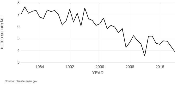
A paragraph I can broadly agree with, but I am compelled to ask why Dr. Koonin does not quantify the “decline of the ice on the Arctic Ocean” anywhere in the book? There are a wide variety of metrics used to quantify the “amount” of sea ice in the Arctic, but here is one readily available for download from the NASA web site. It is hard to believe that a scientist of Dr. Koonin’s experience, particularly one writing about climate change, has never previously come across a similar graph of Arctic sea ice extent:
Arctic sea ice reaches its minimum each September. September Arctic sea ice is now declining at a rate of 13.1 percent per decade, relative to the 1981 to 2010 average. This graph shows the average monthly Arctic sea ice extent each September since 1979, derived from satellite observations.
It seems safe to assume that Dr. Koonin has heard of NASA, since the organisation is mentioned several times in his list of references and once in the body of the book. However it seems that the United States’ National Snow and Ice Data Center (NSIDC for short) is not very visible on his personal radar screen, meriting only a single reference which is to snow rather than ice data.
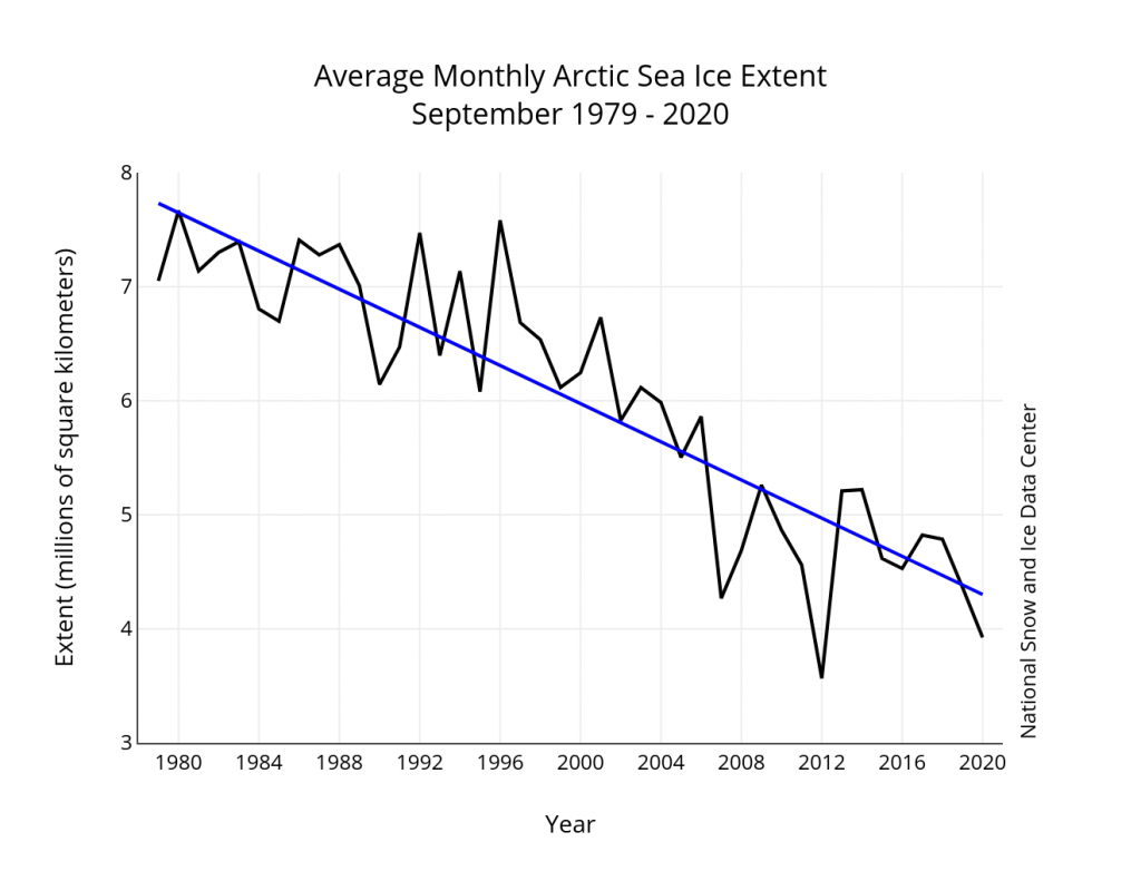
Here is the NSIDC’s version of the NASA graph above, which includes a handy trend line:
Monthly September ice extent for 1979 to 2020 shows a decline of 13.1 percent per decade.
Nearby Steve has penned another paragraph I can broadly agree with. On page 36 he states:
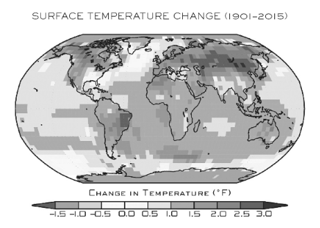
The warming of the past forty years on large scales hasn’t been uniform over the globe. That’s evident in Figure 1.5, reproduced from the US government’s 2017 CSSR (Climate Science Special Report, described earlier). As you can see, the land is warming more rapidly than the ocean surface, and the high latitudes near the poles are warming faster than the lower latitudes near the equator.
Here is the figure 1.5 referred to above:
Surface temperature change (in °F) for the period 1986–2015 relative to 1901–1960. Changes are generally significant over most land and ocean areas. Changes are not significant in parts of the North Atlantic Ocean, the South Pacific Ocean, and the southeastern United States. There is insufficient data in the Arctic Ocean and Antarctica to compute long-term changes there.
Once again I am compelled to ask some questions. Why not include a map that uses more recent data than 2015? And why not quantify how much faster the “high latitudes near the poles are warming than the lower latitudes near the equator”?
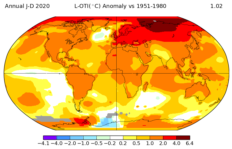
NASA helpfully provide an interface to their data which allows anybody who can click a mouse to produce their own global surface temperature maps. Here is the up to date answer to the first question:
NASA have also produced another informative video, which I suspect will also never make it into “Unsettled – The Movie”:
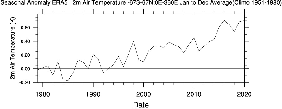
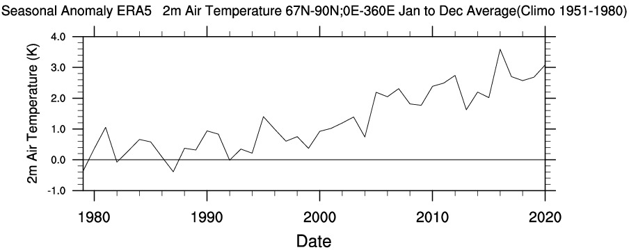
Another US scientific agency that provides publicly accessible climate data is the National Oceanic and Atmospheric Administration (NOAA for short). The abbreviation is referred to several times in Steve Koonin’s book, but for some reason he never expands the acronym in full. Like NASA they also provide a means to produce your own maps and time series. Albeit with a somewhat more complex user interface, the Web-based Reanalysis Intercomparison Tool (WRIT for short) allows the user to differentiate between different regions of Planet Earth, and hence answer the second question above.
Please compare and contrast the “non polar” temperature time series with the “Arctic” one. Note the change of scale of the X axis, and also the units. Degrees Kelvin rather than degrees Fahrenheit which are seemingly preferred by Dr. Koonin:
To summarise, you don’t need to wait for Steve Koonin to write another book or for the US government to produce another CSSR. Vast amounts of data and a plethora of visualisation tools are freely available to allow you to do your own research regarding a wide variety of climate metrics. Steve neglects to impart that information to his readers as well.
[Edit – May 9th]
As has been alluded to above, in the soon to be shipped hardcover edition of his new book Steve Koonin makes much mention of “snow cover” whilst ignoring “sea ice” entirely. There are also a grand total of 48 reference to the perhaps overly esoteric term “albedo“. On page 84 of the Kindle edition of “Unsettled” we are reliably informed that:
Among the most important things that a model has to get right are “feedbacks.”
Despite that the entire electronic volume makes no mention whatsoever of the phrase “ice-albedo feedback” or any synonym thereof. A brief course teaching the topic has recently been developed as part of the outreach activities of the MOSAiC Arctic drift expedition. Perhaps Dr. Koonin would be well advised to read it at his earliest convenience?
The ice-albedo feedback is an example of a positive feedback loop. A feedback loop is a cycle within a system that increases (positive) or decreases (negative) the effects on that system. In the Arctic, melting sea ice exposes more dark ocean (lower albedo), which in turn absorbs more heat and causes more ice to melt…the cycle continues.
Here’s another explanatory video which will also no doubt never make it into “Unsettled – The Movie”:
Watch this space for further revelations about the gigantic Arctic canary in the room!
The show is over, and it went pretty much as Alice F. predicted it would. Lamar Smith has passed his verdict on the morning’s proceedings in strangely untheatrical style:
My own mileage certainly varied from Lamar’s! Here’s a hasty summary of events via the distorting lens of Twitter:
A more detailed analysis of United States’ House Committee on Science, Space and Technology’s “show trial” of climate models will follow in due course, but for now if you so desire you can watch the entire event on YouTube:
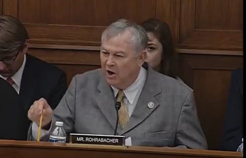
I’ll have to at least watch the bit where my live feed cut out as Dana Rohrabacher slowly went ballistic with Mike Mann:
Nevertheless, given our long running campaign against the climate science misinformation frequently printed in the Mail on Sunday it gives us great pleasure to reprint in full the following extract from his written testimony today:
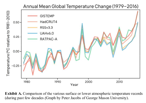
For proper context, we must consider the climate denial myth du jour that global warming has “stopped”. Like most climate denial talking points, the reality is pretty much the opposite of what is being claimed by the contrarians. All surface temperature products, including the controversial UAH satellite temperature record, show a clear long-term warming trend over the past several decades:
We have now broken the all-time global temperature record for three consecutive years and a number of published articles have convincingly demonstrated that global warming has continued unabated despite when one properly accounts for the vagaries of natural short-term climate fluctuations. A prominent such study was published by Tom Karl and colleagues in 2015 in the leading journal Science. The article was widely viewed as the final nail in the “globe has stopped warming” talking point’s coffin.
Last month, opinion writer David Rose of the British tabloid the Daily Mail — known for his serial misrepresentations of climate change and his serial attacks on climate scientists, published a commentary online attacking Tom Karl, accusing him of having “manipulated global warming data” in the 2015 Karl et al article. This fake news story was built entirely on an interview with a single disgruntled former NOAA employee, John Bates, who had been demoted from a supervisory position at NOAA for his inability to work well with others.
Bates’ allegations were also published on the blog of climate science denier Judith Curry (I use the term carefully—reserving it for those who deny the most basic findings of the scientific community, which includes the fact that human activity is substantially or entirely responsible for the large-scale warming we have seen over the past century — something Judith Curry disputes). That blog post and the Daily Mail story have now been thoroughly debunked by the actual scientific community. The Daily Mail claim that data in the Karl et al. Science article had been manipulated was not supported by Bates. When the scientific community pushed back on the untenable “data manipulation” claim, noting that other groups of scientists had independently confirmed Karl et al’s findings, Bates clarified that the real problem was that data had not been properly archived and that the paper was rushed to publication. These claims too quickly fell apart.
Though Bates claimed that the data from the Karl et al study was “not in machine-readable form”, independent scientist Zeke Hausfather, lead author of a study that accessed the data and confirmed its validity, wrote in a commentary “…for the life of me I can’t figure out what that means. My computer can read it fine, and it’s the same format that other groups use to present their data.” As for the claim that the paper was rushed to publication, Editor-in-chief of Science Jeremy Berg says, “With regard to the ‘rush’ to publish, as of 2013, the median time from submission to online publication by Science was 109 days, or less than four months. The article by Karl et al. underwent handling and review for almost six months. Any suggestion that the review of this paper was ‘rushed’ is baseless and without merit. Science stands behind its handling of this paper, which underwent particularly rigorous peer review.”
Shortly after the Daily Mail article went live, a video attacking Karl (and NOAA and even NASA for good measure) was posted by the Wall Street Journal. Within hours, the Daily Mail story spread like a virus through the right-wing blogosphere, appearing on numerous right-wing websites and conservative news sites. It didn’t take long for the entire Murdoch media empire in the U.S, U.K. and elsewhere to join in, with the execrable Fox News for example alleging Tom Karl had “cooked” climate data and, with no sense of irony, for political reasons.
Rep. Lamar Smith (R-TX), chair of this committee has a history25 of launching attacks on climate science and climate scientists. He quickly posted a press release praising the Daily Mail article, placing it on the science committee website, and falsely alleging that government scientists had “falsified data”. Smith, it turns out, had been planning a congressional hearing timed to happen just days after this latest dustup, intended to call into question the basis for the EPA regulating carbon emissions. His accusations against Karl and NOAA of tampering with climate data was used in that hearing to claim that the entire case for concern over climate change was now undermined.
That’s pretty much the way we see things too Mike!
[Edit – March 31st]
In the aftermath of Wednesday’s hearing, the accusations are flying in all directions. By way of example:
No clarification has yet been forthcoming from Dr. Pielke.
The denialosphere is of course now spinning like crazy attempting to pin something, anything, on Michael Mann. Over at Climate Depot Marc Morano assures his loyal readers that:
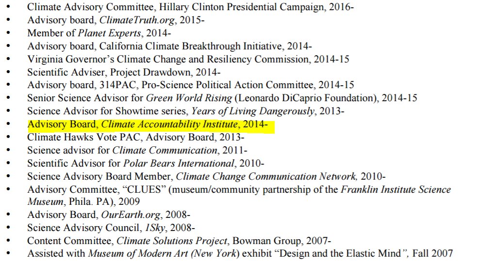
Testifying before Congress, climate scientist Michael Mann denies any affiliation or association to the Climate Accountability Institute despite his apparent membership on the Institute’s Council of Advisors.
Whilst correctly quoting Dr. Mann as saying:
I can provide – I’ve submitted my CV you can see who I’m associated with and who I am not.
Here’s the video Marc uses to support his case:
Meanwhile over on Twitter:
As I said before, Mann said "No." He then added "I've submitted my CV. You can see who I'm associated with". The CV contradicts his lie.
Today is All Fools’ Day, but this is no joke. Last night Judith Curry posted an article on her “Climate Etc.” blog entitled “‘Deniers,’ lies and politics“. Here is an extract from it:
“Turns out Mann appears to be a bit of a denier himself. Under questioning, Mann denied being involved with the Climate Accountability Institute even though he is featured on its website as a board member. CAI is one of the groups pushing a scorched-earth approach to climate deniers, urging lawmakers to employ the RICO statute against fossil-fuel corporations. When asked directly if he was either affiliated or associated with CAI, Mann answered “no.” [JC note: Mann also lists this affiliation on his CV]
Some additional ‘porkies’ are highlighted in an article by James Delingpole.
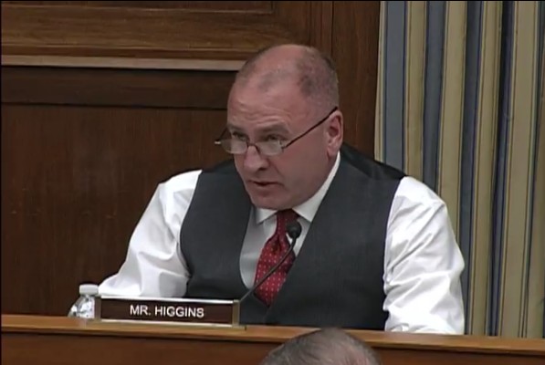
Now the first thing to note is that I’d already explained the context of Mr. Mann’s “interrogation” by Rep. Clay Higgins on Judith’s blog several times:
At the risk of repeating myself Mann said, and I quote:
“I’ve submitted my CV. You can see who I’m ‘associated’ with”
His CV states, quoted by McIntyre:
Why on Earth Judith chose to repeat the “CAI” allegation is beyond me.
Secondly, Prof. Mann is NOT featured on the CAI website as a board member. He is instead listed as a member of their “Council of Advisors”.
Thirdly, quoting James Delingpole as a source of reliable information about anything “climate change” related is also beyond me. Needless to say Mr. Delingpole also repeats the CAI nonsense, whilst simultaneously plagiarising our long standing usage of the term “Porky pie“!
All of which brings me on to my next point. In the video clip above Rep. Higgins can be heard to say:
These two organisations [i.e the Union of Concerned Scientists & the Climate Accountability Institute], are they connected directly with organised efforts to prosecute man influenced climate sceptics via RICO statutes?
to which Dr. Mann replied:
The way you’ve phrased it, I would find it extremely surprising if what you said was true.
Now please skip to the 1 hour 31:33 mark in the video of the full hearing to discover what Marc Morano left out. Rep. Higgins asks Dr. Mann:
Would you be able to at some future date provide to this committee evidence of your lack of association with the organisation Union of Concerned Scientists and lack of your association with the organisation called Climate Accountability Institute? Can you provide that documentation to this committee Sir?
This is, of course, a “when did you stop beating your wife” sort of a question. How on Earth do you prove a “lack of association with an organisation”. Supply a video of your entire life? Dr. Mann responded less pedantically:
You haven’t defined what “association” even means here, but it’s all in my CV which has already been provided to Committee.
So what on Earth are Rep. Higgins and ex. Prof. Curry on about with all this “RICO” business? With thanks to Nick Stokes on Judith’s blog, the document he refers to seems to be the only evidence for the insinuations:
It turns out that what the congressman was probably referring to was a workshop they mounted in 2012 (not attended by Mann), which explored the RICO civil lawsuit mounted against tobacco companies.
It does mention for example “the RICO case against the tobacco companies” but it never mentions anything that might conceivably be (mis)interpreted as “pushing a scorched-earth approach to climate deniers”.
That being the case, why on Earth do you suppose Judith Curry chose to mention that phrase on her blog last night and why did Clay Higgins choose to broach the subject on Wednesday?
[Edit – April 2nd]
Perhaps this really is an April Fools’ joke? Over on Twitter Stephen McIntyre continues to make my case for me. Take a look:
And he’s not the only one! Alice F.’s sixth sense tells her that another Storify slideshow will be required to do this saga justice!
This website uses cookies to improve your experience. We'll assume you're ok with this, but you can opt-out if you wish. Cookie settingsACCEPT
Privacy & Cookies Policy
Privacy Overview
This website uses cookies to improve your experience while you navigate through the website. Out of these, the cookies that are categorized as necessary are stored on your browser as they are essential for the working of basic functionalities of the website. We also use third-party cookies that help us analyze and understand how you use this website. These cookies will be stored in your browser only with your consent. You also have the option to opt-out of these cookies. But opting out of some of these cookies may affect your browsing experience.
Necessary cookies are absolutely essential for the website to function properly. This category only includes cookies that ensures basic functionalities and security features of the website. These cookies do not store any personal information.
Any cookies that may not be particularly necessary for the website to function and is used specifically to collect user personal data via analytics, ads, other embedded contents are termed as non-necessary cookies. It is mandatory to procure user consent prior to running these cookies on your website.