Tag Archives: Judith Curry

Post-Truth Global and Arctic Temperatures

“Post-truth” is the the Oxford Dictionaries word of the year for 2016. The definition reads as follows:

post-truth – an adjective defined as ‘relating to or denoting circumstances in which objective facts are less influential in shaping public opinion than appeals to emotion and personal belief’.

and according to Oxford Dictionaries:

The concept of post-truth has been in existence for the past decade, but Oxford Dictionaries has seen a spike in frequency this year in the context of the EU referendum in the United Kingdom and the presidential election in the United States. It has also become associated with a particular noun, in the phrase post-truth politics.

Post-truth has gone from being a peripheral term to being a mainstay in political commentary, now often being used by major publications without the need for clarification or definition in their headlines.

Our old friend David Rose has been remarkably quiet on the topic of Arctic sea ice recently. Presumably the objective facts from the Arctic are impossible to spin to his satisfaction even for a man of David’s talents? However that didn’t stop him from penning an article for The Mail on Sunday at the end of November on the topic of the recent “record highs in global temperatures“:

Global average temperatures over land have plummeted by more than 1C since the middle of this year – their biggest and steepest fall on record.

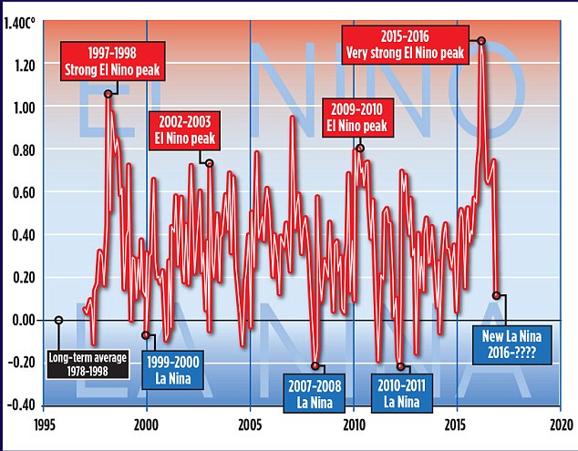
The news comes amid mounting evidence that the recent run of world record high temperatures is about to end. The fall, revealed by Nasa satellite measurements of the lower atmosphere, has been caused by the end of El Niño – the warming of surface waters in a vast area of the Pacific west of Central America.

MoS2 Template Master

The Mail article helpfully included this one year old video from the World Meteorological Organization, explaining the basics of the El Niño phenomenon:

According to the commentary:

This phenomenon affects weather conditions across the equatorial Pacific, with potential knock on effects in other parts of the world.

We’ll get on to the “potential knock on effects” in the Arctic eventually, but let’s start with a snippet of Mr. Rose’s “post-truth politics”:

Some scientists, including Dr Gavin Schmidt, head of Nasa’s climate division, have claimed that the recent highs were mainly the result of long-term global warming.

Last year, Dr Schmidt said 2015 would have been a record hot year even without El Nino. ‘The reason why this is such a warm record year is because of the long-term underlying trend, the cumulative effect of the long-term warming trend of our Earth,’ he said. This was ‘mainly caused’ by the emission of greenhouse gases by humans.

Other experts have also disputed Dr Schmidt’s claims. Professor Judith Curry, of the Georgia Institute of Technology, and president of the Climate Forecast Applications Network, said yesterday: ‘I disagree with Gavin. The record warm years of 2015 and 2016 were primarily caused by the super El Nino.’ The slowdown in warming was, she added, real, and all the evidence suggested that since 1998, the rate of global warming has been much slower than predicted by computer models – about 1C per century.

David Whitehouse, a scientist who works with Lord Lawson’s sceptic Global Warming Policy Foundation, said the massive fall in temperatures following the end of El Nino meant the warming hiatus or slowdown may be coming back. ‘According to the satellites, the late 2016 temperatures are returning to the levels they were at after the 1998 El Nino. The data clearly shows El Nino for what it was – a short-term weather event,’ he said.

In case you’re wondering where the politics is in all of this, you need look no further than here:

The Twitter account of the United States’ House of Representatives Committee on Science, Space, and Technology quotes a Breitbart article by another old friend of ours, James Delingpole, which quotes David Rose’s article in the Mail on Sunday:

The last three years may eventually come to be seen as the final death rattle of the global warming scare. Thanks [sic] what’s now recognised as an unusually strong El Nino, global temperatures were driven to sufficiently high levels to revive the alarmist narrative – after an unhelpful pause period of nearly 20 years – that the world had got hotter than ever before.

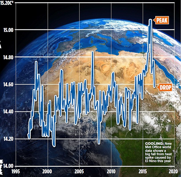
In case you’re also wondering about the objective facts of the matter David Rose quotes with approval “the authoritative Met Office ‘Hadcrut4’ surface record” in his latest article in the Mail on Sunday this very morning:

New official data issued by the Met Office confirms that world average temperatures have plummeted since the middle of the year at a faster and steeper rate than at any time in the recent past.

The huge fall follows a report by this newspaper that temperatures had cooled after a record spike. Our story showed that these record high temperatures were triggered by naturally occurring but freak conditions caused by El Nino – and not, as had been previously suggested, by the cumulative effects of man-made global warming.

The Mail on Sunday’s report was picked up around the world and widely attacked by green propagandists as being ‘cherry-picked’ and based on ‘misinformation’. The report was, in fact, based on Nasa satellite measurements of temperatures in the lower atmosphere over land – which tend to show worldwide changes first, because the sea retains heat for longer.

There were claims – now exploded by the Met Office data shown here – that our report was ‘misleading’ and ‘cherry-picked’.

Yet bizarrely, the fiercest criticism was reserved for claims we never made – that there isn’t a long-term warming trend, mainly caused by human emissions.

This just wasn’t in our report – which presumably, critics hadn’t even read.

We’ve explained all this to David before, yet bizzarely we obviously need to do so again. Here’s the Mail’s version of the latest HADCRUT 4 data from the Met Office:

hadcrut-mail-20161211

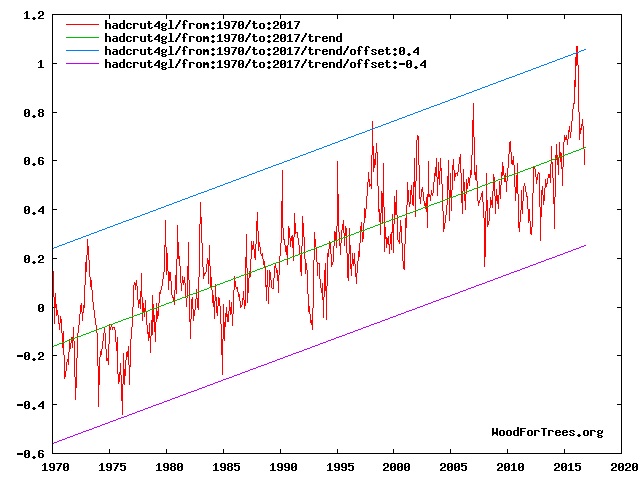
and here’s ours:

hadcrut-wft-20161211

Can you spot any “cumulative effects of man-made global warming”?

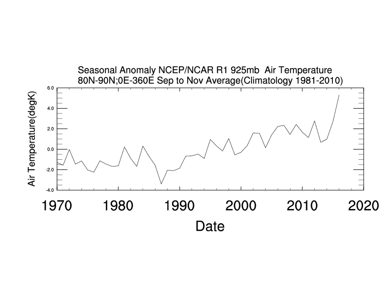
Messrs Smith, Rose, Delingpole, Whitehouse et al. may well be unaware of the fact that the satellite temperature data they’re so fond of cherry picking doesn’t include data from the lower troposphere between 80 degrees North and the North Pole. Just in case they fancy spinning the latest objective facts from the Arctic in the near future, here’s the long term autumnal temperature trend:

80n-son-20161211

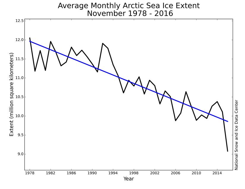
and here’s the long term November Arctic sea ice extent trend:
monthly_ice_11_nh

Global Sea Ice “Comeback” Conspiracy

Our Twitter feed has suddenly been inundated with messages to the effect that:

Global sea ice makes a strong comeback as El Nino fades.

First up was Professor Judith Curry on April 12th, with:

You will note that we were not the only ones to swiftly conclude that Judy’s assertion was lacking both veracity and verisimilitude! Then this morning came our old friends at the Global Warming Policy Forum with:

You will note that the GWPF adorned their “Tweet” with a graph purporting to show “Global sea ice anomalies”. We can only assume that Benny Peiser hadn’t read this April 11th article of ours, which pointed out that:

NSIDC has suspended daily sea ice extent updates until further notice, due to issues with the satellite data used to produce these images. The problem was initially seen in data for April 5 and all data since then are unreliable, so we have chosen to remove all of April from NSIDC’s archive.

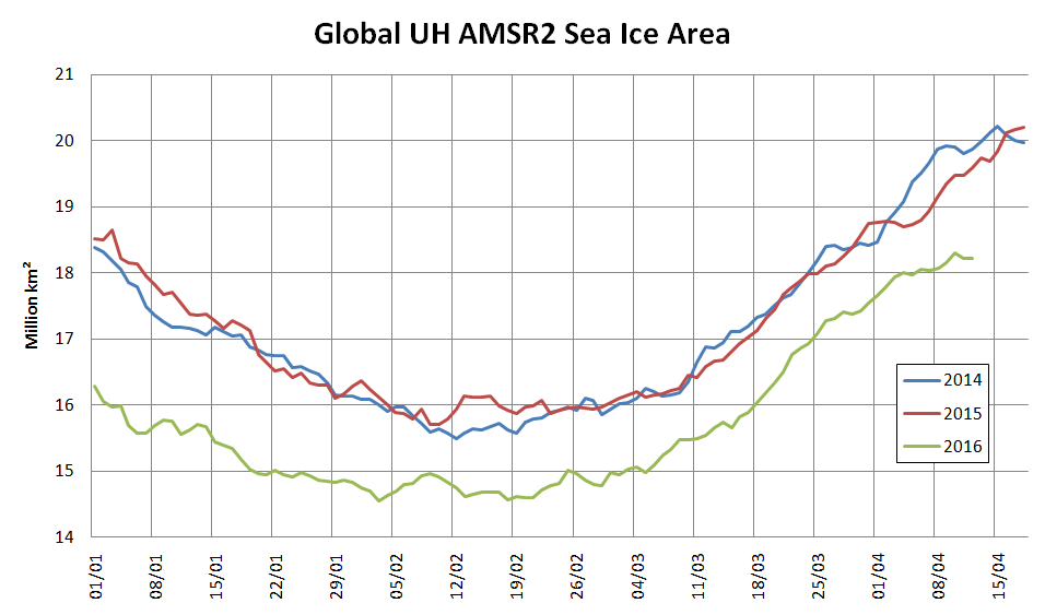
To remedy that (no doubt?) inadvertent oversight on Benny’s part here is a graph we prepared earlier of absolute global sea ice area using reliable data from the AMSR2 instrument on the Japan Aerospace eXploration Agency’s SHIZUKU satellite:

2016-04-12-UH-AMSR2-Area

The GWPF were followed this afternoon by Anthony Watts with:

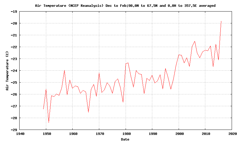
Both Prof. Curry and non Prof. Watts adorned their “Tweets” with a graph allegedly comparing “global temperature” with “tropical temperature”, but provided no graph of “polar temperature”. To remedy that (no doubt?) inadvertent oversight here is one we prepared earlier:

NCEP-Arctic-T2-DJF

All members of this team of synchronised “Tweeters” provided links to an April 11th article by a certain Paul Dorian entitled, believe it or not:

Global Sea Ice Makes A Strong Comeback

Note in particular the part of Paul’s article that states:

In an interesting twist, the recent analysis found that the global ice area remained stable throughout the 1980s and the 1990s, while temperatures climbed suggesting “the global sea ice area is not particularly a function of the global average surface temperature.” [Source: Willis Eschenbach/”Watts Up With That” web site]

We can only assume that Paul Dorian hadn’t read this April 10th article of ours, which pointed out amongst other things that:

One feels compelled to ask why Willis’s global average temperature graph neglects to mention 2015 when he implies that it does?

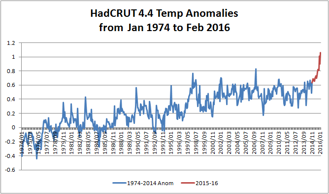
Here’s an up to date version of one of those that Bill The Frog prepared for us earlier:

HadCRUT-201602

We must further assume that Paul hadn’t read this April 11th article by Mr. Watts either. It stated that:

A few years ago in 2009, I was the first to notice and write about a failure of the instrumentation for one of the satellites used by the National Snow and Ice Data Center (NSIDC) to show Arctic Sea Ice extent. Today, we have what appears to be a similar problem with satellite sea ice measurement.

It seems that Paul Dorian has finally read at least one out of all these informative articles, because the latest revision of his own piece of imaginative fiction now starts:

The source of global sea ice information cited in this posting was NOAA’s National Snow and Ice Data Center (NSIDC). They are now reporting issues with the satellite data used to produce these images and this information was not known at the time of the writing of this article.

Do you suppose we can now expect a similarly “fulsome apology” from the other players in this tragi-comic farce, together with all their rebloggers, retweeters, plagiarisers and other assorted acolytes?

DMIGate Skulduggery In a Nutshell

With apologies to O’Reilly Media Inc. here’s a brief history of the “DMIGate” story, viewed through Anthony Watts’ distorting spectacle lenses.

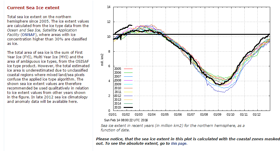
0) Here is the February 14th 2016 edition of the Danish Meteorological Institutes’s long “deprecated” 30% concentration threshold Arctic sea ice extent graph in question:

dmi-30-WUWT-20160214-crop

1) On August 14th 2013 Anthony Watts wrote on his “Watts Up With That” blog:

That’s the old DMI plot, which DMI says we should now use this one on this page:
http://ocean.dmi.dk/arctic/icecover.uk.php

2) On February 22nd 2016 Anthony Watts wrote on WUWT:

There has been so much skulduggery going on in the climate establishment in recent years that it is hard to avoid the conclusion that this graph has been withdrawn simply because it gives the “wrong” results.

3) Anthony Watts refuses to publish any and all comments on his blog pointing out what he himself had confirmed that DMI said in August 2013.

4) Anthony Watts states on Judith Curry’s “Climate Etc.” blog that:

You post off topic or disrupt threads with the sort of unsubstantiated nonsense you post above, and both demand to have these off topic comments heard and then play the “look Watts is censoring me!” game when your comments don’t meet our site comment policy and/or are abusive in nature.

5) Judith Curry deletes the following comment (amongst others) on her “Climate Etc.” blog:

David – Are you suffering from acute snow blindness too, just like poor Paul Homewood? Try reading this if you haven’t already. Try reading it again if you have:

https://greatWhiteCon.info/2016/02/gross-deception-about-dmis-missing-graph/

In view of the incontrovertible evidence why would anyone believe anything Paul Homewood, Anthony Watts and Judith Curry claim about “Climate Etc.” ever again?

The 2016 Arctic Winter Sea Ice Puzzle

Professor Judith Curry recently posed the following rhetorical question on her “Climate Etc.” blog:

Arctic sea ice extent has been anomalously low this winter. The greatest anomalies are in the European sector, specifically in the Barents Sea. To what extent are the anomalies associated with warm temperatures?

Which she answered as follows:

So, what might be causing this particular anomaly? Some possibilities are:

  • Gobal warming (January 2016 was warmest Jan on record, according to the surface temperature analyses

  • Multidecadal oscillations (e.g. stadium wave) predicts ice recovery to be occurring in the same region (European Arctic) where we see the sea ice decline).

  • Seasonal weather circulation patterns – this has been a year with with unusual weather patterns, with both low temperature and high temperature records being set.

As regular readers will already be aware we have been blogging about anomalously warm temperatures in the Arctic all year and so felt well qualified to contribute to the “debate”. What a job that turned out to be! Early on in the proceedings the anticipated pronouncement was made by one of Judith’s “denizens”. A link to a ludicrously inaccurate article on Watts Up With That accompanied by the following words of wisdom:

Other measures are high.

Which of course they aren’t! Instead of stating the bleedin’ obvious Professor Curry replied:

I spotted this, no idea what to make of it.

You would think she and her denizens would therefore have been pleased when I attempted to explain to her what to make of it, but you would have been mistaken. The icing on the ad hominem cake was the aforementioned Anthony Watts driving by to accuse me of all sorts of nefarious activities without providing a single shred of evidence and then running for the hills when invited to actually prove his ludicrous allegations.

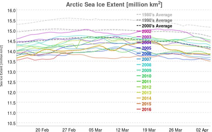
Since the denizens of “Climate Etc.” aren’t particularly interested let’s take stock here instead shall we? After every Arctic area and extent metric under the sun sitting at “lowest *ever” levels for weeks a recent increase in coverage on the Pacific side of the Arctic has changed that. The most up to date example of that is the JAXA/ADS extent, which currently looks like this:

vishop_extent-20160228

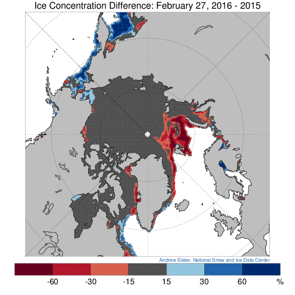
The latest reading is the merest whisker above 2015’s record low maximum. However in other respects things are most certainly not comparable with 2015. See for example this concentration comparison from Andrew Slater of the NSIDC:

ice_con_delt_20160227

Much more ice on the Pacific periphery where it will all have disappeared by September, as opposed to much less ice on the Atlantic side, even well to the north of 80 degrees latitude where the sun still does not shine. Here’s a video revealing how the sea ice North of the Pacific Ocean has been reacting to the sequence of hurricane force storms that have been passing through the area over the past couple of months:

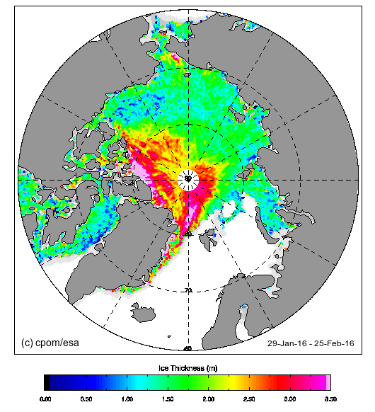
Now let’s take a look at “near real time” Arctic sea ice thickness as measured by the CryoSat 2 satellite:

CryoSat2_20160225

Notice the absence of any thick ice in the Beaufort and Chukchi Seas, an obvious difference from last year? Notice too the large area of thick ice that looks as though it’s heading towards the Fram strait exit from the Central Arctic. Here’s another video, this time of sea ice movement over on the Atlantic side of the Arctic Ocean:

Those dark areas between Svalbard and the North Pole are suddenly starting to look as though they represent reality rather than a mere “artifact”, although perhaps they are merely transient evidence of yet another Arctic “heat wave”?

The “DMIGate” Dodo is Pushing up the Daisies

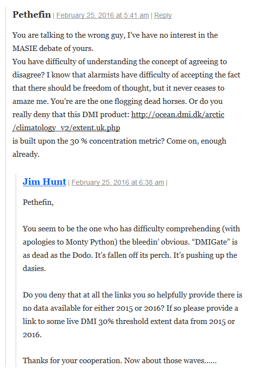
Our title this morning is but a brief extract from a conversation I started on Judith Curry’s “Climate Etc.” blog about (believe it or not!) the effects of large wind driven swells on the “Marginal Ice Zone” of sea ice in the Arctic:

2016-02-25_1159-Judy

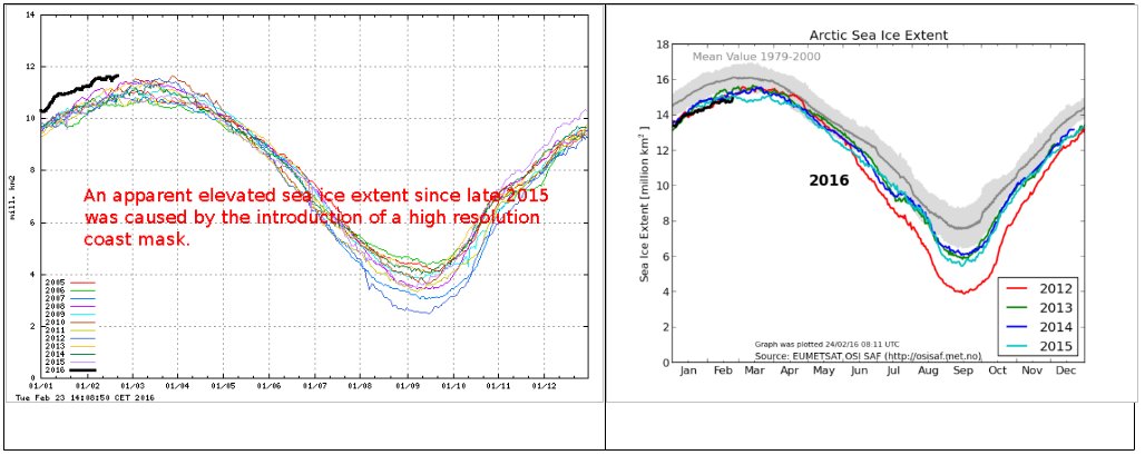
Whilst “skeptics” like Pethewin keep on flogging that particular “dead parrot” the DMI have just published an explanation of the erroneously high readings on their now deceased 30% concentration threshold Arctic sea ice extent metric. Here’s an extract, together with a pretty picture for the benefit of those amongst we Cryospheric commenters who are hard of understanding:

The apparent elevated sea ice extent in the data from the old extent algorithm was an artifact, caused by a new and higher resolution coast mask.

Surely that’s easy enough for even the dumbest of all the armchair Arctic analysts scattered across the internet to comprehend?

Going into more detail, the DMI article explains that:

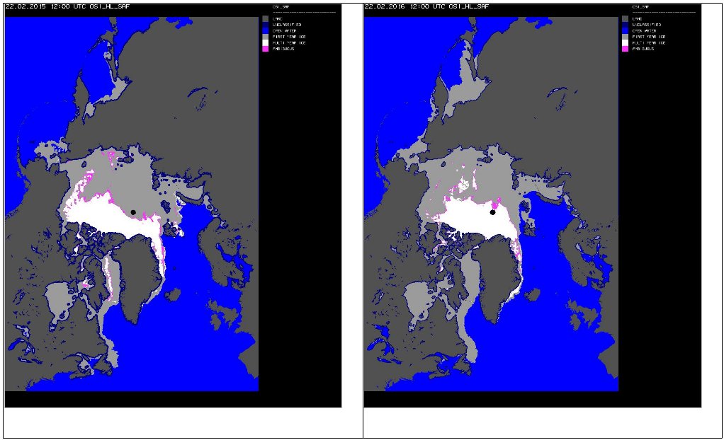
Most of our sea ice extent followers know that the old plot includes a coastal mask, inside which sea ice was is accounted for. In summer 2015 this mask was refined and the masked region was subsequently smaller, thus leaving more area for classified sea ice and open water. The difference in masked area, before and after summer 2015, is approximately 1.4 million km2. This corresponds to difference of the blue coast lines in figure 2, showing the old and new coastal masks in the left and right panels, respectively. The difference may be difficult to detect on the figure, but the area is quite significant. The increasing sea ice extent that is caused by the new coast mask is not great during summer, because sea ice has a relative short line of contact with land during summer. But the new and finer coast mask will result in increasingly more sea ice, compared to previous years during winter, as the coast line with sea ice contact is increasing. This is the reason for an increasing sea ice extent during current freeze-up period, relative to previous winters. A comparison of the 2015/2016 sea ice extent with previous years does therefore not make sense.

Note how the dark blue “coastal mask” in the left hand image from February 22nd 2015 is thicker than the one in the right hand image from the same date this year. DMI conclude with this apology:

Because of the deprecated status of the old plot in the past year, DMI has not been monitoring these irregularities. The old plot should, of cause, have been removed when the mask was replaced. DMI apologizes for the confusion and inconvenience this has caused.

Somehow I doubt that the assorted “skeptics” that have recently been making massive mountains out of this minor molehill will apologise for all “the confusion and inconvenience this has caused”. Causing confusion and inconvenience was probably the general idea.

The Great White Con 2016 “New Einstein” Award

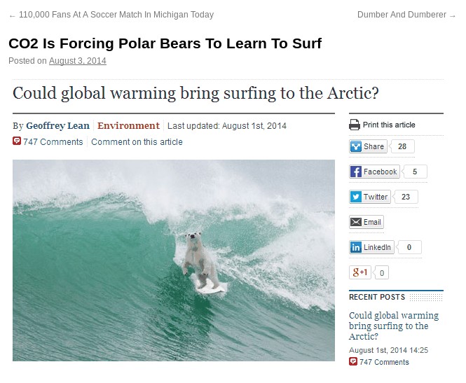
Our regular reader(s) will be already be all too familiar with the 2015 edition of our annual Great White Con 2016 “New Einstein” Award. The jury has now finished its deliberations in a smoke filled igloo just outside the Great White Con Ivory Towers. I am pleased to be able to announce that the first prize of the loan of a polar bear suit kindly donated by the Daily Telegraph plus a battered big board from Cotty’s quiver has been awarded to none other than Gail Combs with her:

Jim, How does it feel to be morally responsible for the deaths of thousands of people a year?

SurfBear

I’m not quite sure how we’ll get the good news to Gail in time for her to take part in the 2016 Great White Con Arctic Basin Big Wave (Fantasy?) Surfing Competition, since she abused us in her capacity as a regular commenter on “Steve Goddard’s” (un)RealScience blog, where imparting such messages is most certainly a non trivial task. Watch this space!

2016-02-13_1230-Goddard

You will no doubt be overjoyed to learn that we already have a couple of several candidates in the running for our 2016 award, the first of which is in similar vein to Gail’s winning 2015 entry. Here they are:

1) Gary P Jackson, who claims in his Twitter profile to be a “Texan, Palinista, Conservative Activist, DragRacer Editor & Publisher”, with:

2) Anthony Watts, who is the proprietor of what he claims is “The world’s most viewed site on global warming and climate change”, has of course already “blocked” the message he doesn’t care to hear:

2016-02-27_0904-WUWTwit

Without offering a single shred of evidence for his baseless assertions Anthony had this to say on the “Climate Etc.” blog of Professor Judith Curry:

You two guys are quite the pieces of work. You both operate under multiple identities. Jim Hunt has three I have been able to identify, Lawrence Martin/Martinez has two.

Both of you post off topic or disrupt threads with the sort of unsubstantiated nonsense you post above, and both demand to have these off topic comments heard and then play the “look Watts is censoring me!” game when your comments don’t meet our site comment policy and/or are abusive in nature.

Case in point- here you are making abusive off-topic comments on Dr. Curry’s site.

Plain and simple, if you comment under different identities, post off topic and/or thread disruptive comments you don’t get to participate. Mr. Hunt was warned months ago, yet he still persists in trying to get comments through under other identities such as V2G.

3) Chris Comber, who claims to be a “Mac User, ebay addict, Re-enactor & Designer” and who has of course already “blocked” the message (s)he doesn’t care to hear:

2016-02-13_1230-Comber

Chris is apparently keen on the #Brexit concept, and (s)he blasted out an extended sequence of (comparatively!) mild ad homs culminating in:

4) CatWeazle666, who is an expert emitter of ad hominem attacks on the blog of “Steve Goddard” and it now becomes apparent also on the blog of Roger Helmer MEP, the United Kingdom Independence Party’s spokesman on Energy & Industry. CatWeazle’s entry is a stream of invective which eventually culminated (for the moment at least) in:

2016-02-16_1125-CatWeazle

As you can see, there was no way I was going to take that lying down, and I in all the circumstances I felt compelled to bring the attention of Mr. Helmer and his merry minions to this link:

http://econnexus.org.uk/how-to-upset-a-global-warming-sceptic/

where many moons ago there appeared a well documented account of how “Steve Goddard” really is “the dumbest man on the internet” when it comes to analysing Arctic sea ice. Either that or he does have some idea of what he’s talking about but is nonetheless more than content to pull the wool over the eyes of his very own band of merry minions.

P.S. In response to my request for considered comment concerning 3 million deaths per annum due to outdoor air pollution CatWeazle666’s reply was:

What a sad little troll you are, Jim.

5) Ben Pile, whose Twitter profile tells us that he is a “Researcher, writer, blogger. Sceptical of environmentalism, environmental policy and the fashion for ‘evidence-based policy’. For science, against scientism”. Inevitably Ben is yet another “blocker” of scientific messages he doesn’t care to hear:

2016-03-12_1417-BenBan

Ben evidently has a high opinion of himself, and thinks he knows more about climate science than IPCC lead author Professor Richard Betts:

He concluded his avalanche of ad homs aimed at yours truly with yet another undeleted expletive:

Unfortunately Ben then departed without offering me a series of swift apologies for his barrage of abuse:

https://twitter.com/jim_hunt/status/708361665734156288

6) Gator69, who is yet another expert emitter of ad homs on the blog of Tony Heller (AKA “Steve Goddard”).

Over at (un)Real Climate Science I humbly suggested under an article alleging “More Arctic Fraud From Mark Serreze And NSIDC” that it is difficult to prove that Amundsen “could have gone through [the Northwest Passage] in a few weeks”. Gator’s response?

Jim “could have” helped save 21,000 innocent humans yesterday, but he didn’t did he?

Jim thinks that snuffing out 21,000 innocent humans every day for his agenda is ethical and laudable.

“Could have” is an interesting phrase. How do you intend to justify this genocide Jim?

Please feel free to provide feedback to our 2016 jury in the space provided below.

IPSO Powerless to Prevent The Great White Con

In a blog post earlier this year entitled “IPSO, the press regulator created in the aftermath of the Leveson Inquiry, is not up to task” Bob Ward, Policy and Communications Director of the Centre for Climate Change Economics and Policy at the Grantham Research Institute, made a prophetic statement:

IPSO is also currently considering a complaint I made against another article by David Rose in The Mail on Sunday in September 2014 which wrongly suggested that Arctic sea ice extent has stopped declining. I am not optimistic that my complaint will be upheld, even though the newspaper again breached Section 1(i) of the Editors’ Code of Practice.

IPSO have now published their ruling on that complaint, and conclude that:

17. The complaint was not upheld.

Remedial Action Required: N/A

Date complaint received: 17/09/2014

Date decision Issued: 16/02/2015

By all means read the ruling in full, but here are our edited highlights:

13. The article presented the author’s view that forecasts regarding the melting of Arctic ice had overestimated the rate of decline. The complainant did not dispute that measures showed that the Arctic ice extent had increased over the last two years. The article had made clear that the long-term trend still showed a decline, and the coverage had included commentary from a number of scientists, expressing a variety of views on the matter, including one who had stated that he was “uncomfortable with the idea of people saying the ice had bounced back”, and warned against reading too much into the ice increases. The article had made clear that scientific opinions regarding the significance of the most recent data varied. In this context, the omission of the information that the measure in 2012 had been the lowest on record, and that 2014 had still been the seventh lowest since records began, was not significantly misleading. The article did not suggest that it had been established as fact that the long-term decline in Arctic sea ice had reversed.

I highlight that paragraph in particular because in our coverage of David Rose’s article here at Great White Con we have disputed that “measures showed that the Arctic ice extent had increased over the last two years”. I wonder what IPSO might make of that information?

The Guardian have recently published an article by Dana Nuccitelli on the IPSO ruling entitled “Ipso proves impotent at curbing the Mail’s climate misinformation“, which now contains this addendum:

We have appended the following response from Rose:

“Like anyone who challenges aspects of the so-called ‘consensus’ over climate change, I’ve grown inured to being called a ‘denier’, as some of the commenters ‘below the line’ claim I am here. It is with some weariness that I must point out, as I did in the article that started this fuss, that I accept that the long-term Arctic ice trend is down, that carbon dioxide of human origin is an important cause of this trend, and that, unchecked, it will lead eventually to ice-free Arctic summers – albeit perhaps not for decades.

“But to be attacked for something I didn’t actually write is unfortunate. The fact remains there are large uncertainties and intense debate among scientists on this and other climate change topics, even if, as has been said, 97 per cent agree that the world is warming and that humans are partly to blame. But that doesn’t take us very far, and there are important differences of opinion. Professor Judith Curry isn’t a ‘contrarian’ but a very distinguished scientist and ice expert with a long record of peer-reviewed publications, though she happens to disagree with Mr Nuccitelli.

We feel compelled to point out to David Rose once again that he actually wrote:

The Arctic ice cap has expanded for the second year in succession.

and that this is both inaccurate and significantly misleading.

Mr. Rose’s comments are also of interest to us because despite recently bringing her attention to the matter once again Professor Judith Curry’s personal blog still contains the inaccurate and/or misleading information first published by the Mail on Sunday on September 8th 2013 in an article by David Rose entitled “And now it’s global COOLING! Record return of Arctic ice cap as it grows by 60% in a year“.

What sort of “very distinguished scientist and ice expert” would continue to proudly proclaim the following inaccurate information after even the Mail on Sunday had retracted it?

2015-04-19_1251_JudyCurry


Mark Serreze and the Arctic Sea Ice Death Spiral

In his article about Arctic sea ice in the Mail on Sunday three days ago David Rose pointed out that:

The most widely used measurements of Arctic ice extent are the daily satellite readings issued by the US National Snow and Ice Data Center, which is co-funded by NASA.

He also stated that:

For years, many have been claiming that the Arctic is in an ‘irrevocable death spiral’, with imminent ice-free summers bound to trigger further disasters. These include gigantic releases of methane into the atmosphere from frozen Arctic deposits, and accelerated global warming caused by the fact that heat from the sun will no longer be reflected back by the ice into space.

Judith Curry, professor of earth and atmospheric sciences at Georgia Institute of Technology in Atlanta, said last night: ‘The Arctic sea ice spiral of death seems to have reversed.’

All of which got me thinking. Why did David Rose speak to a professor of earth and atmospheric sciences when researching his article, rather than an expert on Arctic sea ice? Why, indeed, did he not speak to the man who originally coined the “Death spiral” metaphor? Seeking answers to these troubling questions amongst others, I called the National Snow and Ice Data Center in Boulder, Colorado. I enquired whether I might be able to speak with Mark Serreze,  who is currently director of the NSIDC. Shortly after that Mark called me back and I was able to ask him a number of questions.

My first question was whether David Rose or anyone from the Mail on Sunday had been in touch with the NSIDC recently. The answer was “No”. Next I enquired whether the “Death spiral” story was apocryphal or not. Mark told me he did recall saying something along those lines, but that he couldn’t recall the exact circumstances. Doing my own due diligence (unlike the Mail!) the earliest reference I could find suggested that “the circumstances” involved a telephone interview much like the one I was in the middle of. In an article dated August 27th 2008 the Reuters environment correspondent reported that:

This year’s Arctic ice melt could surpass the extraordinary 2007 record low in the coming weeks. Last year’s minimum ice level was reached on September 16, according to the National Snow and Ice Data Center.

Even if no records are broken this year, the downward trend in summer sea ice in the Arctic continues, the Colorado-based center said. Last year’s record was blamed squarely on human-spurred climate change.

“No matter where we stand at the end of the melt season it’s just reinforcing this notion that Arctic ice is in its death spiral,” said Mark Serreze, a scientist at the center. The Arctic could be free of summer ice by 2030, Serreze said by telephone.

Mark confirmed to me that he still stood by his 2030 estimate for the onset of a seasonally ice free Arctic, although “most models say more like 2050”.

Next I asked him whether he agreed that “The Arctic sea ice spiral of death has reversed.” He said that he agreed with the statement attributed to Dr. Ed Hawkins near the end of the Mail article, that “There is undoubtedly some natural variability on top of the long-term downwards trend caused by the overall warming“. However 2 years worth of data certainly didn’t constitute “a recovery”. It was more like “a one week retracement in the US stock market. The long term trend in extent is definitely downwards”.

In conclusion I asked Mark to offer his best estimate for Arctic sea ice extent at this summer’s minimum. He told me that even at this late stage some of that “natural variability” could affect the outcome, but that the NSIDC extent “will probably end up on a par with 2013”.

I have also had an email conversation with Andrew Shepherd, the British “expert in climate satellite monitoring” whose views about Arctic sea ice were reported in the Mail on Sunday’s article. He told me that:

Arctic sea ice cover is expected to continue to decline, with the possibility of ice-free summers in the next 20-30 years. Climate model predictions tend to be at the upper end of this range, whereas projections of past observations tend to be at the lower end. Once we are able to include direct measurements of thickness from CryoSat-2, I expect the accuracy of predictions will improve.

If nothing else changes, then the recovery in Arctic sea ice thickness will wind the clock backwards a few years, but there is no reason to believe this is anything other than a temporary reprieve due to one cool summer.

Finally, for the moment at least, I also called the Danish Meteorological Institute. Along with the NSIDC their Arctic sea ice extent figures were quoted by David Rose. Along with the NSIDC they told me that they had received no enquiries recently from Mr. Rose or anyone else at the Mail on Sunday.

Has Arctic Sea Ice Already Started to Recover?

In a word, NO!! Here we go again.

Them:

According to David Rose’s headline in yesterday’s Mail on Sunday:

Global warming ‘pause’ may last for 20 more years and Arctic sea ice has already started to recover.

There is of course plenty more where that came from, such as:

The 17-year pause in global warming is likely to last into the 2030s and the Arctic sea ice has already started to recover, according to new research.

A paper in the peer-reviewed journal Climate Dynamics – by Professor Judith Curry of the Georgia Institute of Technology and Dr Marcia Wyatt – amounts to a stunning challenge to climate science orthodoxy.

Not only does it explain the unexpected pause, it suggests that the scientific majority – whose views are represented by the UN Intergovernmental Panel on Climate Change (IPCC) – have underestimated the role of natural cycles and exaggerated that of greenhouse gases.

along with a:

Graph that makes a mockery of warming

Us:

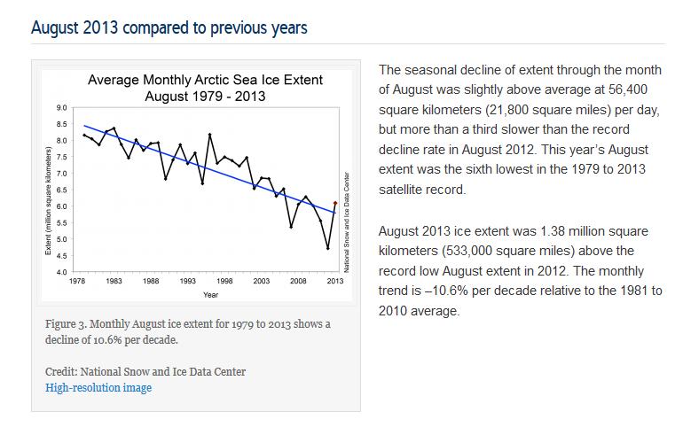
If you take a look at the evidence from the NSIDC the Mail on Sunday recently provided us with in support of their previous inaccurate headlines you will discover it says:

Monthly August ice extent for 1979 to 2013 shows a decline of 10.6% per decade.

QED? Apparently not as far as the Mail on Sunday’s concerned. If further evidence is needed please read our previously published “stunning challenge” to Judith Curry’s Arctic sea ice expertise. In brief:

Judith Curry republishes the same nonsense [as The Mail], but then neglects to publish even a similarly mealy mouthed “correction”, let alone anything remotely resembling the information originally published by the NSIDC upon which this collective fantasy is allegedly based. Therefore Judith should be taken seriously, and as a climate scientist rather than a tabloid journalist or a fantasy fiction writer?

We think not.

Them:

David Rose goes on to say (amongst other things) that:

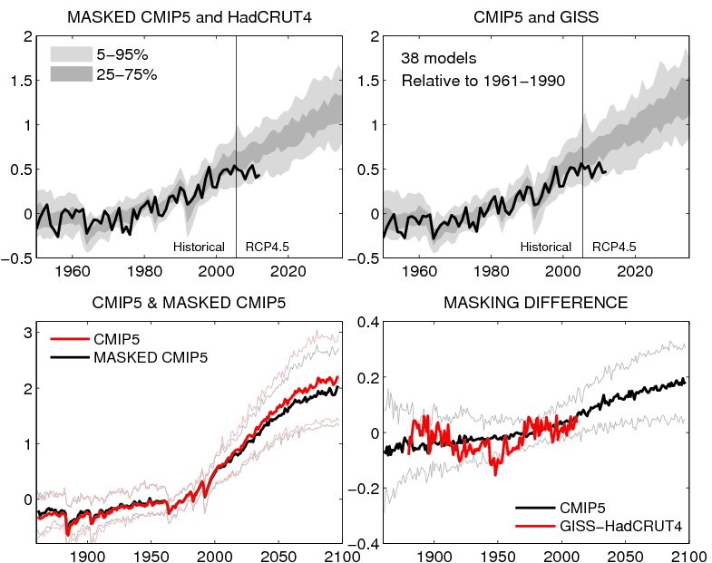
The graph shown above, based on a version published by Dr Ed Hawkins of Reading University on his blog, Climate Lab Book, reveals that actual temperatures are now below the predictions made by almost all the 138 models on which the IPCC relies.

The pause means there has been no statistically significant increase in world average surface temperatures since the beginning of 1997, despite the models’ projection of a steeply rising trend.

Us:

On Dr. Hawkins’ blog, commenting on a previous David Rose article in the Mail on Sunday, he says this:

David Rose has written an article in the Mail on Sunday which, by eye, seems to use the top left panel from the figure below, but without mention of its original source. In the article David Rose suggests that this figure proves that the forecasts are wrong. This is incorrect.

Here’s the figure Dr. Hawkins is referring to:

Ed Hawkins original graphs comparing CMIP5 simulations with observations
Ed Hawkins’ original graphs comparing CMIP5 simulations with observations

Finally, for the moment at least, here’s the text of an email we sent to the Managing Editor of the Mail on Sunday this morning:

Hello John,

Thanks for your additional comments. Unfortunately you still fail to address the primary question I’ve been asking for almost 2 months now, so I will be formally pursuing matters concerning the September 8th article via the PCC from now on.

Moving on I note that you have published another article by David Rose this weekend entitled “Global warming ‘pause’ may last for 20 more years and Arctic sea ice has already started to recover”, which mentions both Judith Curry and Arctic sea ice once again. I already have a few bones to pick with you about this one as well.

1. I posted an online comment on the article yesterday evening. It remains invisible this morning. Your web site says “The comments below have not been moderated.”. My comment included no links, although it did mention the “Great White Con”. Perhaps you could look into that for me, and provide me with an explanation?

2. Do you suppose it would be possible to persuade David to reveal his sources any more swiftly this time around? Where does his misleading graphic entitled “Graph that makes a mockery of warming” and the underlying data come from? At first sight it doesn’t seem to be from Judith Curry’s “Stadium wave” paper for example.

We have yet to receive a reply.

The David and Judy Show

In case today’s headline metaphor doesn’t readily translate into other cultures, it refers to the popular fairground sideshow in which a couple of puppets dance on the end of some strings, accompanied from time to time by a baby, some sausages, a crocodile and a police officer.

Us:

The Great White Con was recently mentioned on the Arctic Sea Ice Blog, where the discussion turned to news of a recently published academic journal article by Marcia Glaze Wyatt and Judith A. Curry entitled “Role for Eurasian Arctic shelf sea ice in a secularly varying hemispheric climate signal during the 20th century”.

In one response it was suggested that:

I always think it’s terribly sad when a study is immediately condemned on the basis of not whether it has been peer reviewed, or methodology, or objectiveness, but on the basis of who wrote it. It’s the classic open goal displayed by supporters of the consensus (which includes myself) to anything which may challenge entrenched beliefs.

Them:

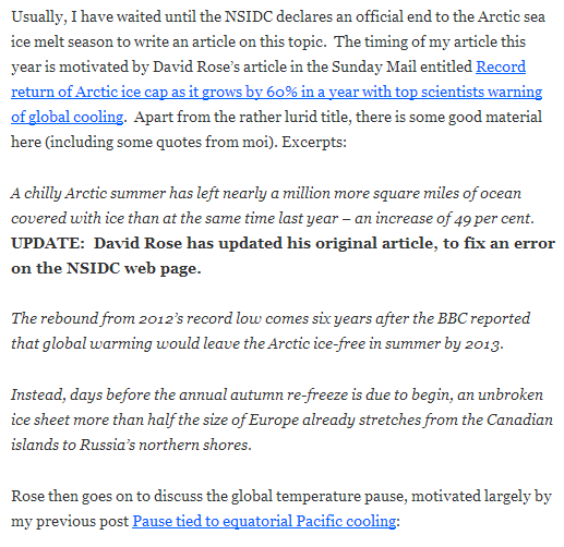
In partial answer to that point, here’s a screenshot from an article entitled “Arctic sea ice minimum?” on Judith Curry’s personal blog this morning:

An extract from Judith Curry's blog article "Arctic sea ice minimum?" on October 13th 2013
An extract from Judith Curry’s blog article “Arctic sea ice minimum?” on October 13th 2013

Us:

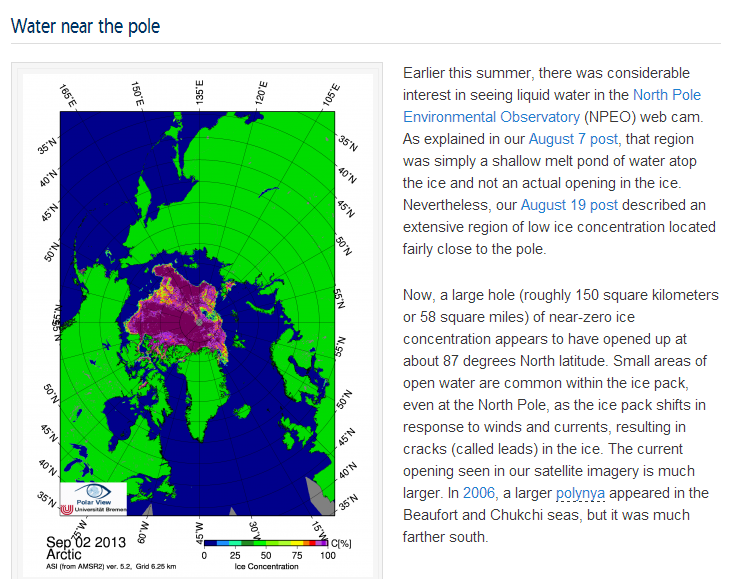
From the other side of the fence here’s a couple of screenshots from the September 4th edition of the NSIDC’s Arctic Sea Ice News entitled “A Real Hole Near the North Pole“:

NSIDC Arctic Sea Ice News report for August 2012

The NSIDC discuss "Water Near the Pole" on September 4th 2013
The NSIDC discuss “Water Near the Pole” on September 4th 2013

Would anyone care to play “Spot the difference” with me? If the differences between the official National Snow and Ice Data Center version of recent events in the Arctic and David and Judy’s version aren’t immediately obvious to you there are plenty of clues sprinkled throughout the rest of this web site to help. Does any of that help to explain my comment on the Arctic Sea Ice Blog to the effect that:

If [Judith Curry] can’t even get the basics right I fail to see why anyone (apart from David Rose of course) should place any credence whatsoever in her “Stadium Waves”, although I must admit I haven’t read the paper yet. I fear it will be a while before it rises to the top of my “to do” list.