Tag Archives: DMI

The Danish Meteorological Institute

The 2016 Arctic Sea Ice Metric Minima

September 2016 is here at last! I posed this question at the start of the recent “Great Arctic Cyclone“:

I wonder what the minimum for 2016 will be, and on what date?

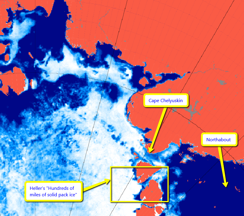
I’m still wondering, and the answer does of course depend on which Arctic sea ice metric you happen to be looking at. Here’s a few examples to be going on with. Firstly there’s Tony Heller’s extent metric du jour, from the University of Bremen:

extent_n_running_mean_amsr2_regular_20160902

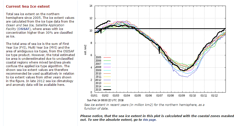
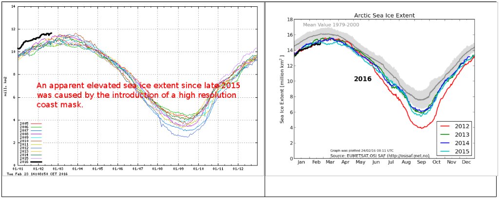
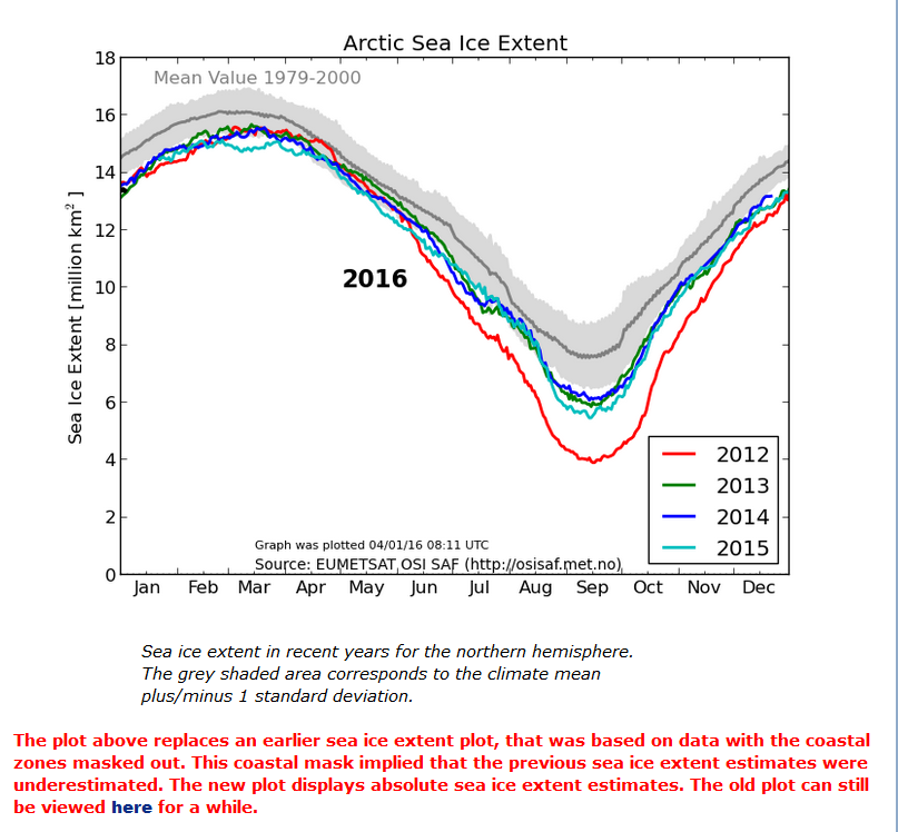
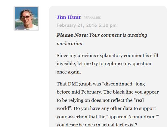
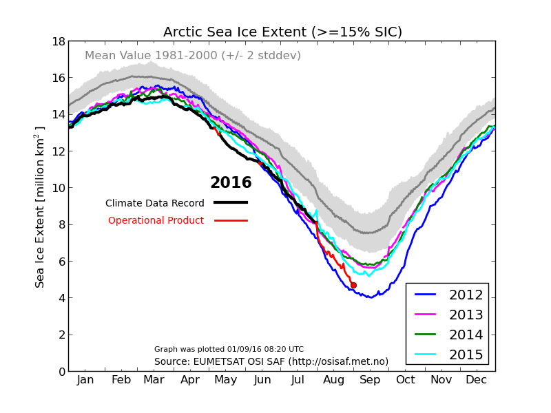
and then there’s (one of) his previous one(s), from the Danish Meteorological Institute:

osisaf_nh_iceextent_daily_5years_20160901

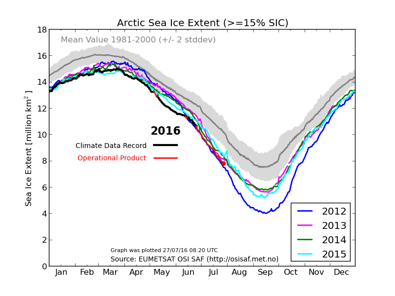
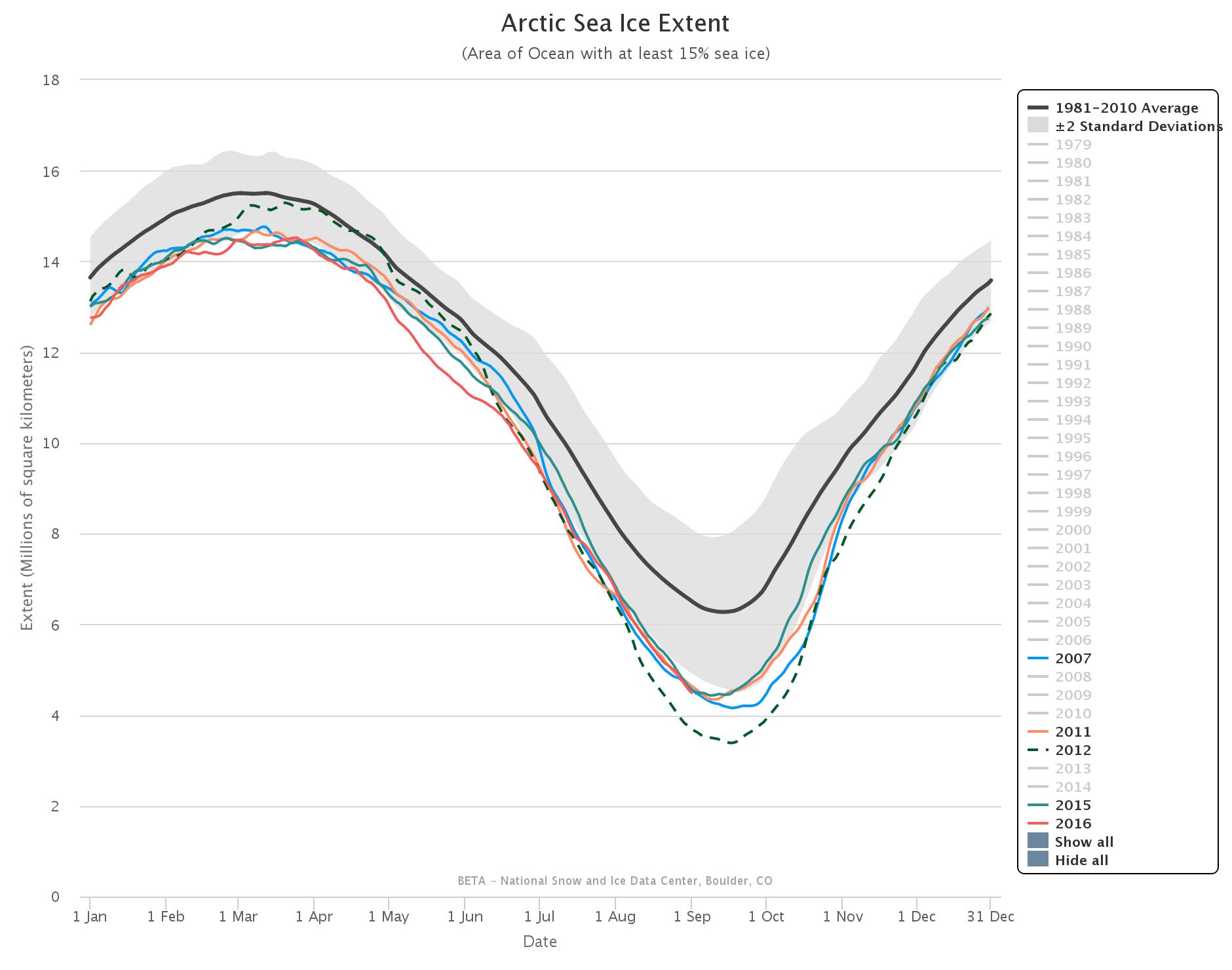
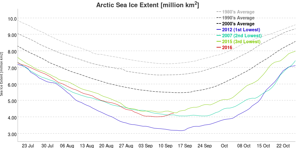
Amongst the “industry standards” Cryosphere Today area is missing in action so here’s the National Snow & Ice Data Center’s 5 day average extent:

charctic-20160901

and JAXA extent:

JAXA_Extent_20160901

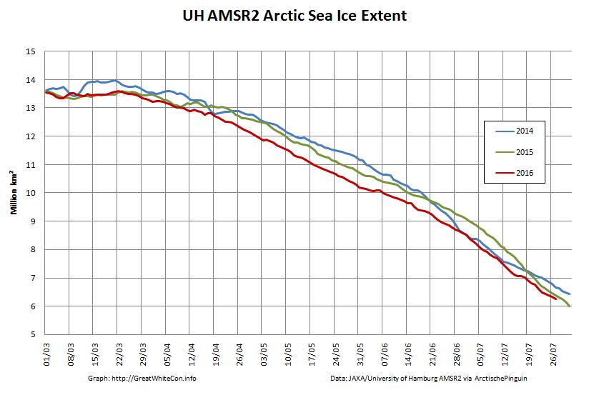
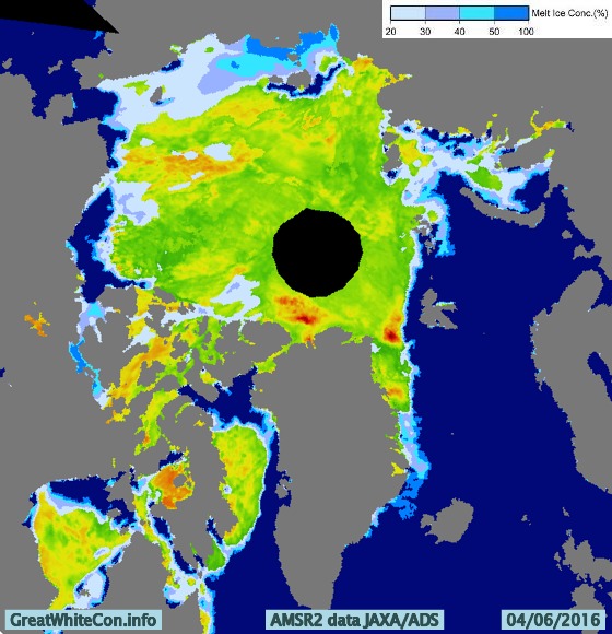
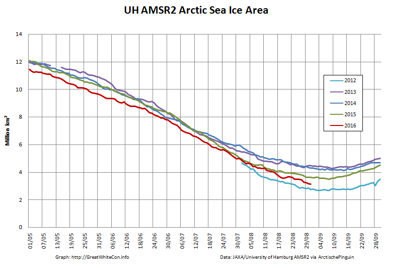
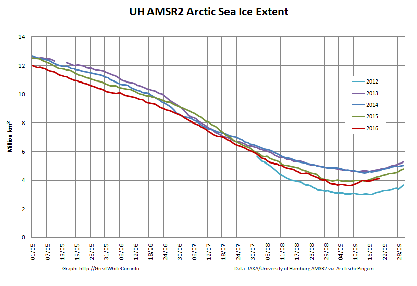
Finally here are “Snow White’s” favourite high resolution AMSR2 metrics derived by “Wipneus” from University of Hamburg AMSR2 concentration data:

UH-Arctic-Area-2016-08-31

UH-Arctic-Extent-2016-08-31

Are there any other suggestions for numbers to keep a close eye on over the next few weeks?


[Edit – September 3rd]

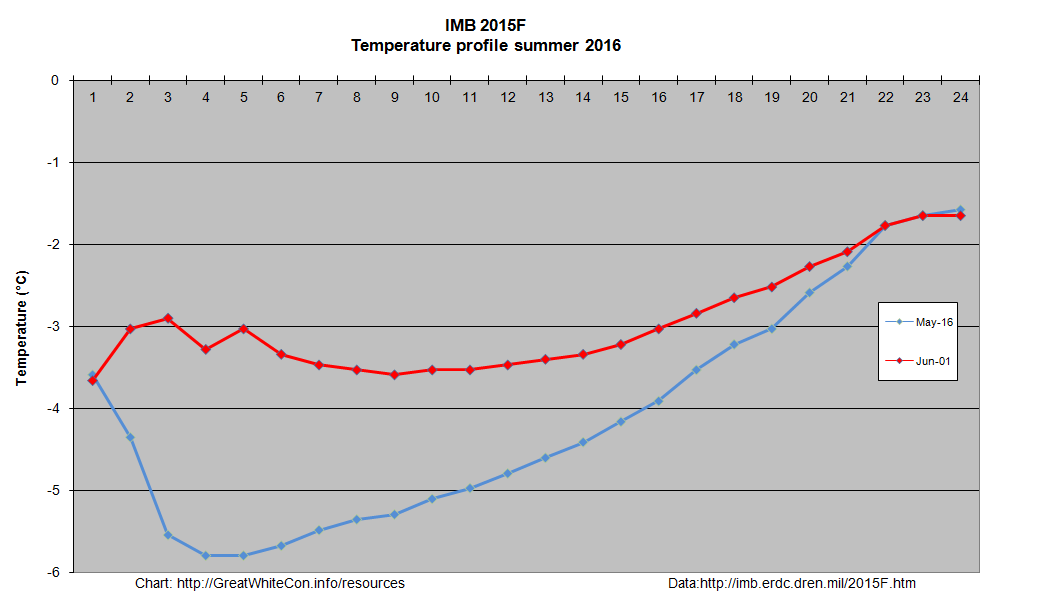
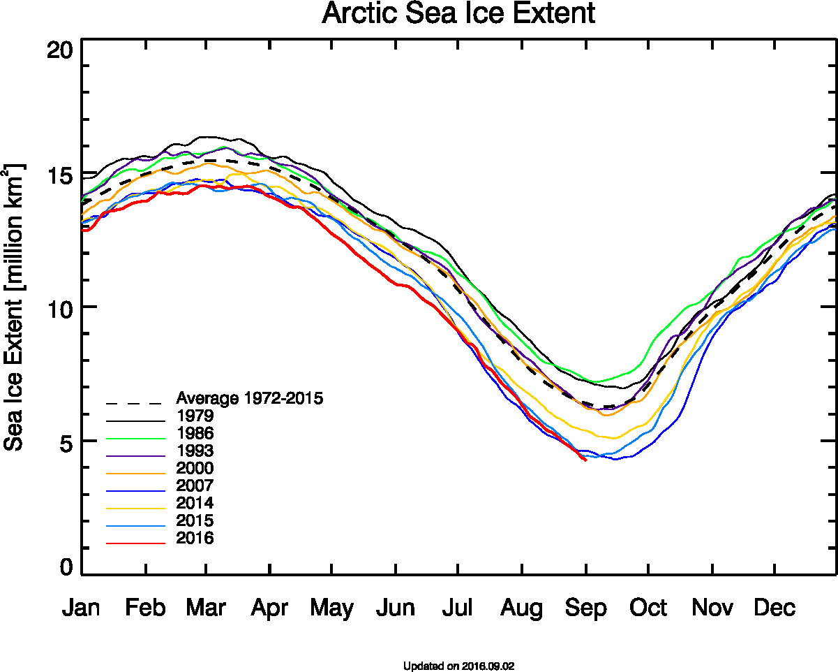
Arctic sea ice volume, as modelled by PIOMAS, has been updated to August 2016:

piomas-201608

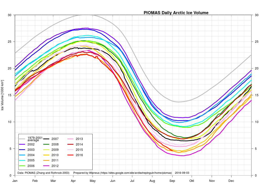
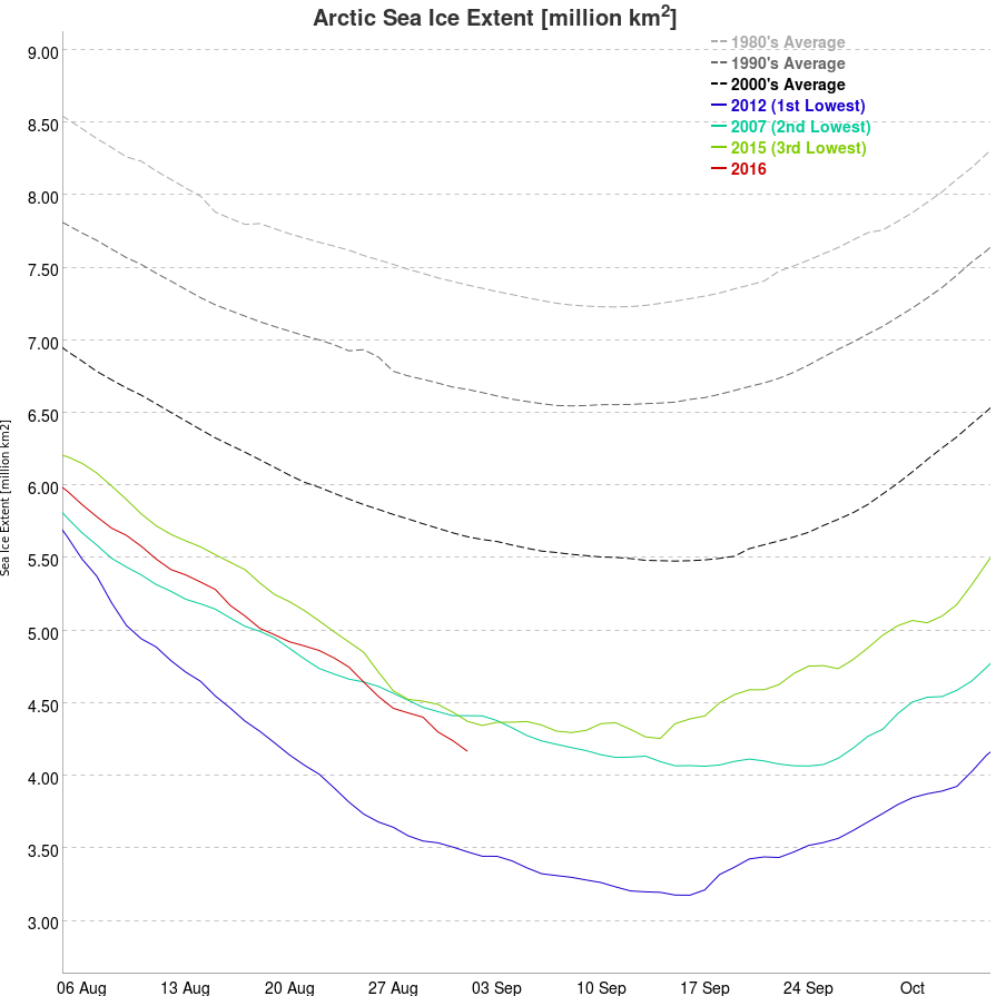
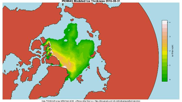
It’s currently 3rd lowest for the month, just a whisker behind 2011. Here’s the PIOMAS gridded data for August 31st 2016:

PIOMAS-20160831

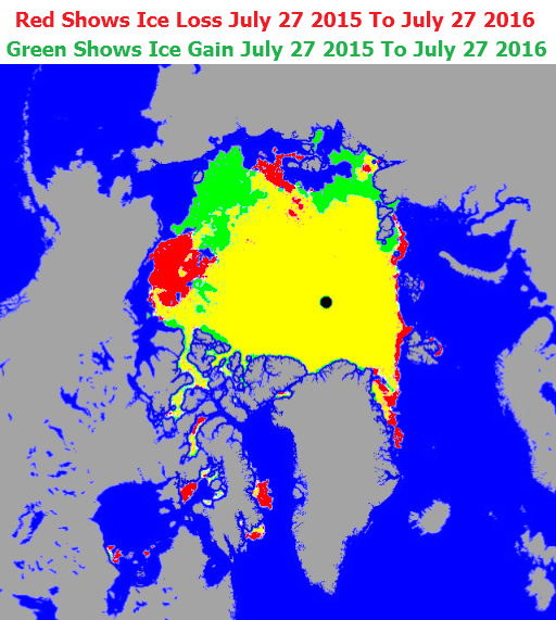
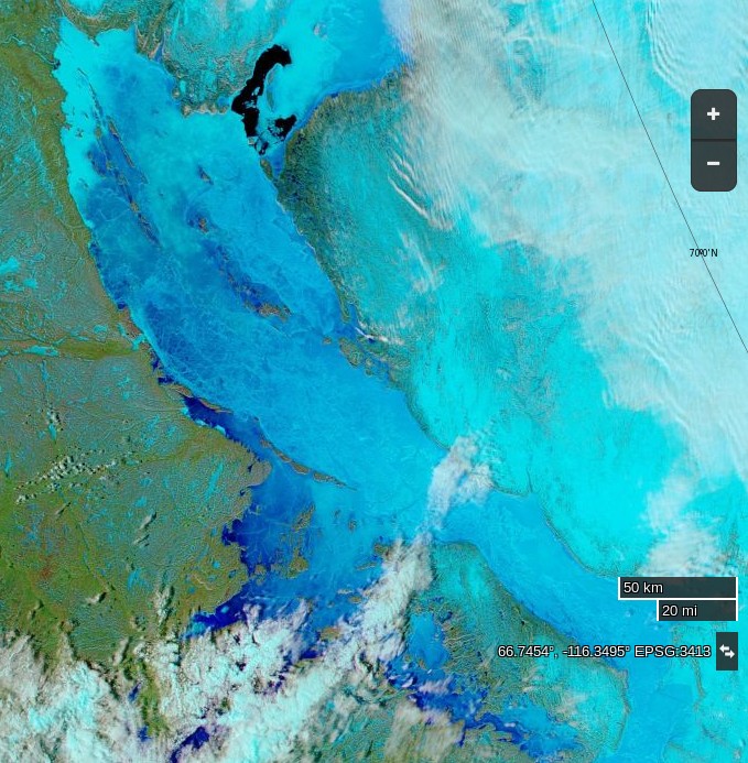
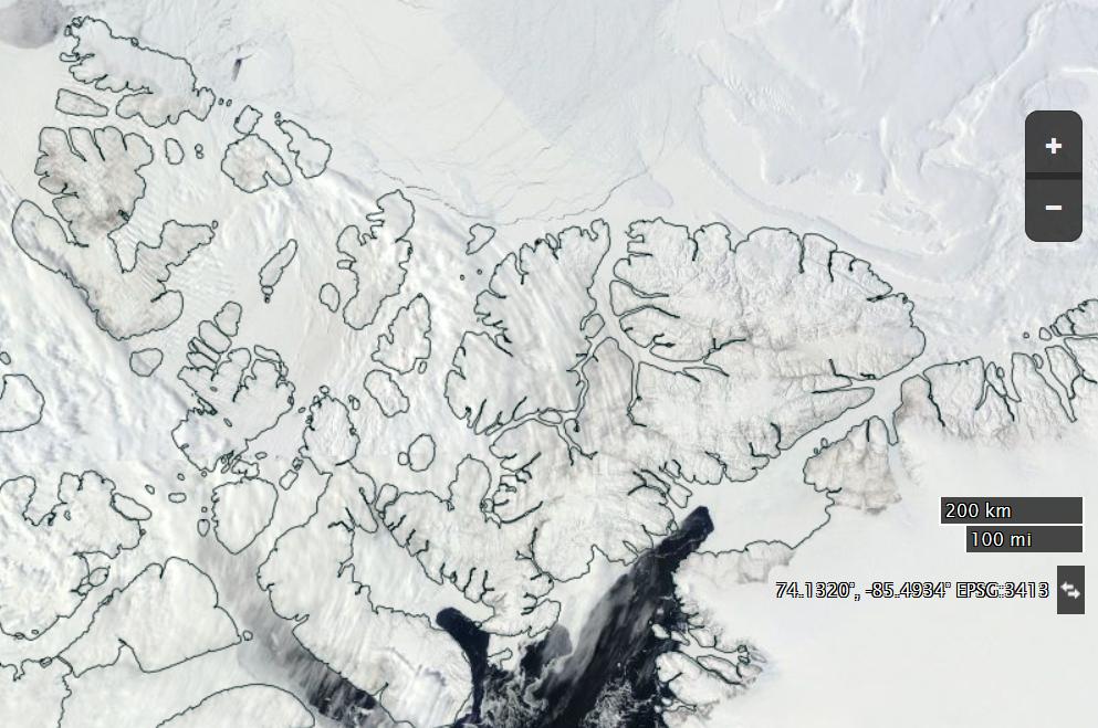
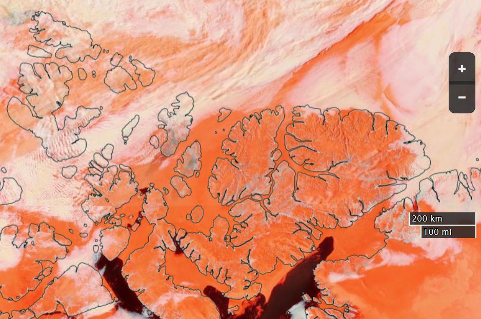
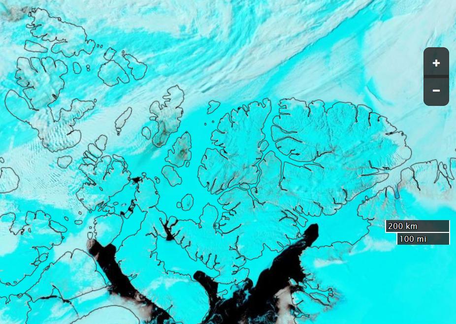
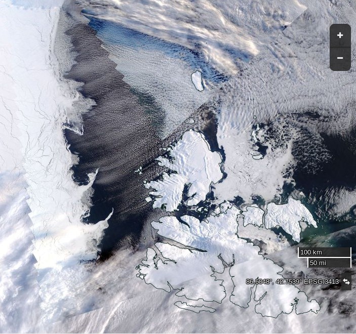
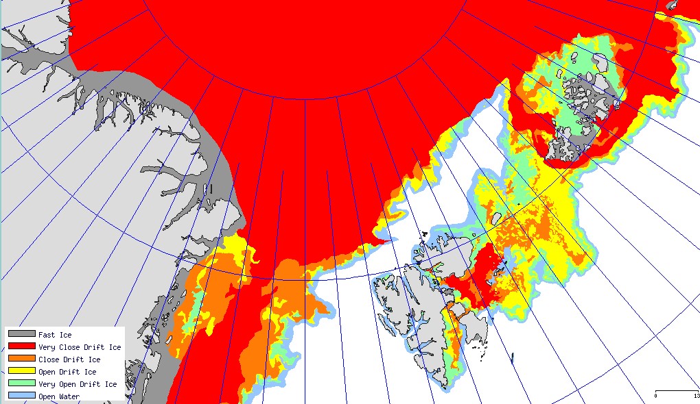
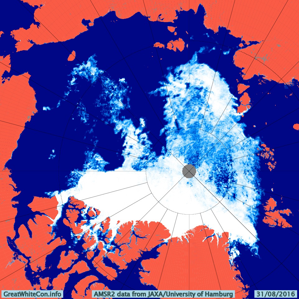
and for comparison purposes here’s the high res AMSR2 concentration map for the same date:

Arc_20160831_res3.125

As suggested by Bill, here too are the Arctic Regional Ocean Observing System numbers. Much like the high res AMSR2 data they allow comparison between area and extent from the same sensor/algo combination, in this case SSMIS/NORSEX on a 25 km grid:

NORSEX-area-20160901

NORSEX-extent-20160901

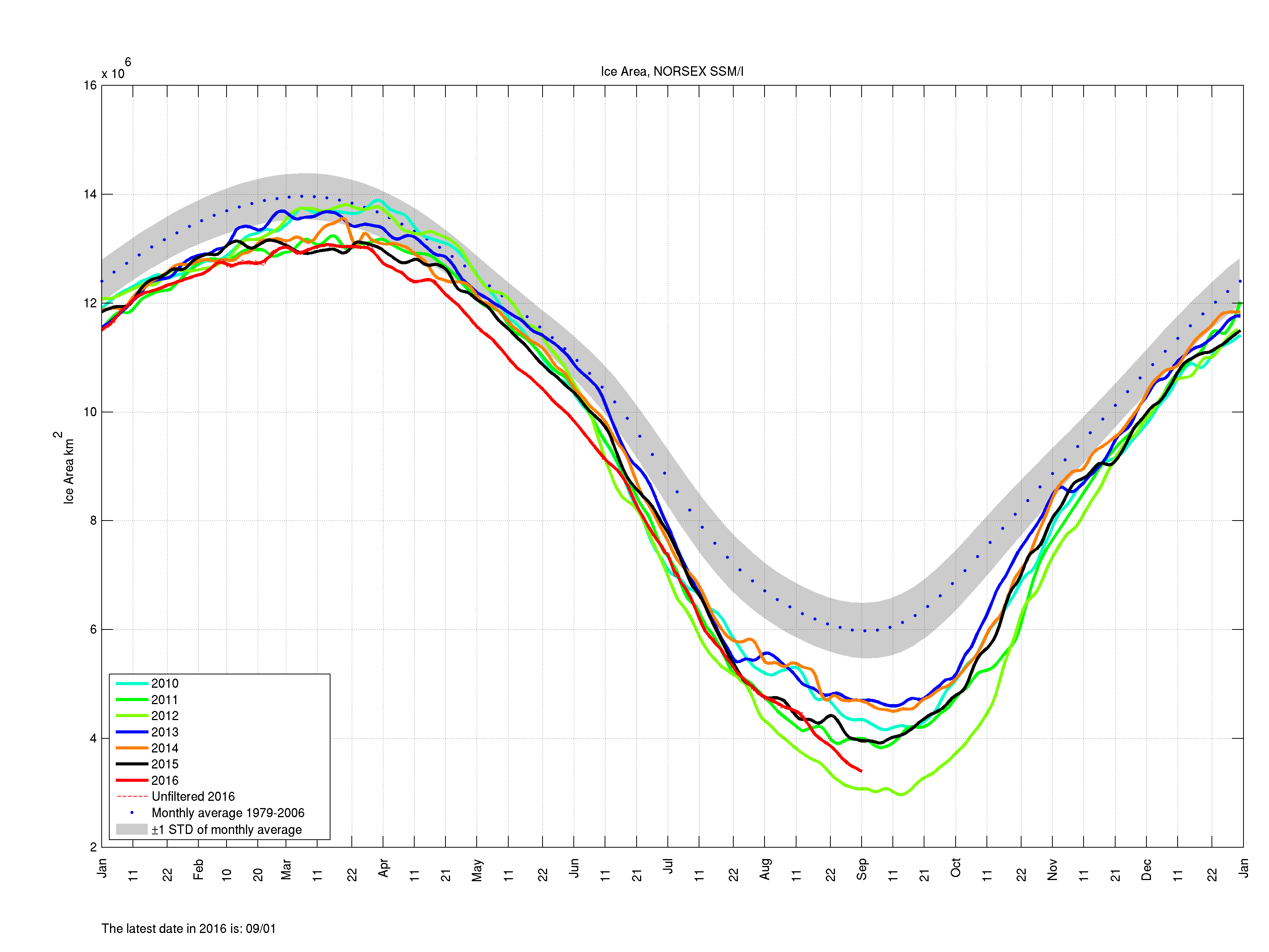
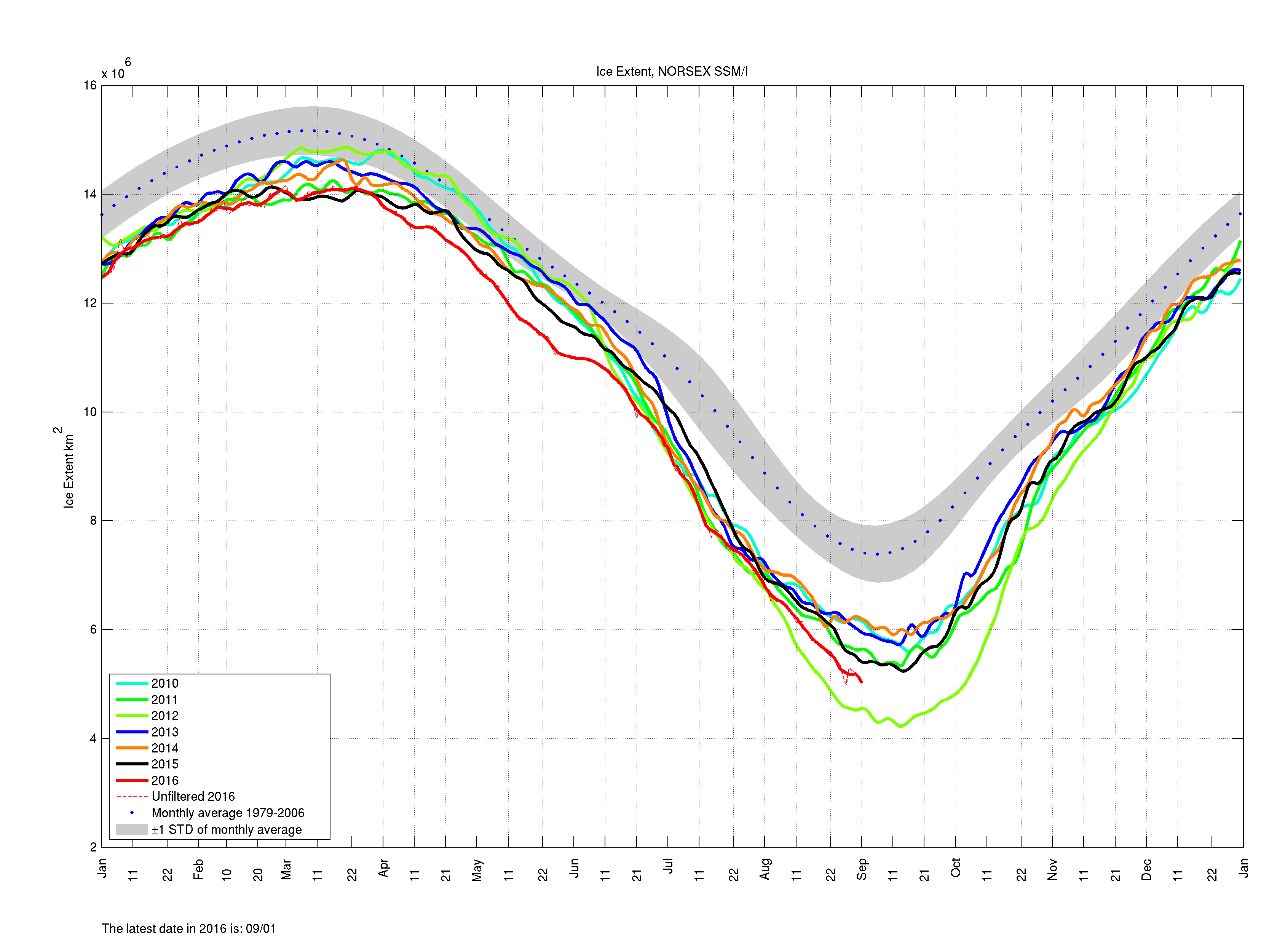
Both sources agree that currently the remaining ice is less compact in 2016 than it was in 2012.


[Edit – September 4th]

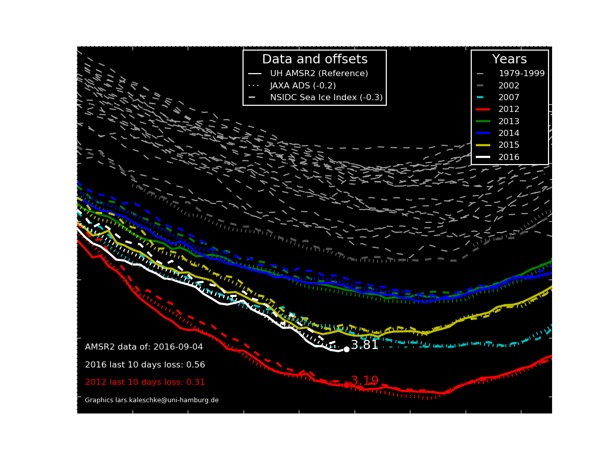
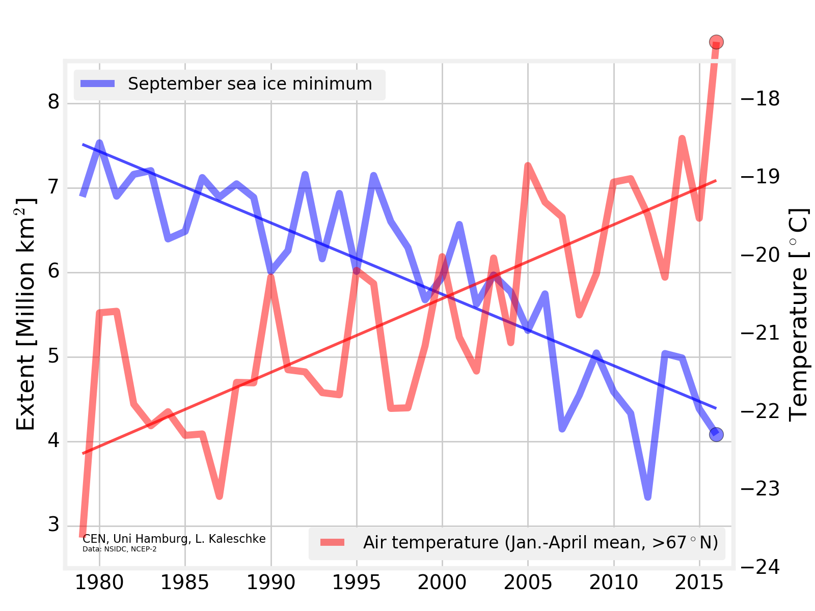
An interesting inter-metric comparison from Lars Kaleschke of the University of Hamburg:


[Edit – September 5th]

Here’s another twist on the University of Hamburg’s AMSR2 extent, courtesy of Lars Kaleschke:

UH-AMSR2-20160904


[Edit – September 11th]

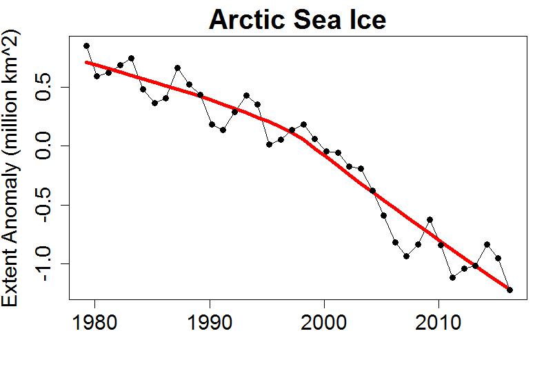
Several of the metrics displayed above have increased over the last day or two. The 2016 minimum may be upon us, but another few days will have to go by before that’s finally confirmed. Whilst we wait here’s another metric to consider, as described on “Tamino’s” Open Mind blog:

A plot of annual average extent also clearly shows the decline, and includes data from throughout the year rather than just the annual minimum. The figure for 2016 is the lowest on record, but the year isn’t done yet. If instead of averaging January-through-December we do September-through-August (to make the final year complete), we find that the most recent year is still the lowest on record:

taminoannualanomaly-aug-2016

Any way you look at it, Arctic sea ice is in decline. If you look at the entire year rather than just the annual minimum, the record year is this one.


[Edit – September 14th]

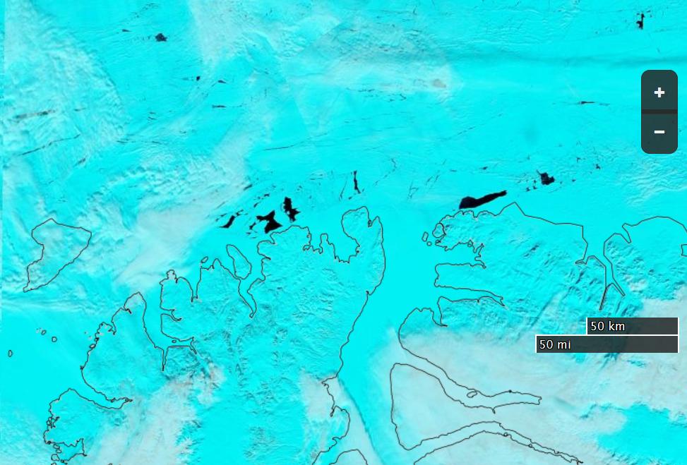
The refreeze has certainly started now. A quick look through the metrics. First of all the Hamburg University high resolution AMSR2 matched set:

uh-arctic-area-2016-09-13

uh-arctic-extent-2016-09-13

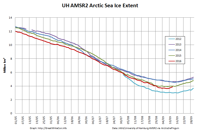
Area just squeezed under 3 million km². Next up is JAXA extent:

jaxa_extent_20160913

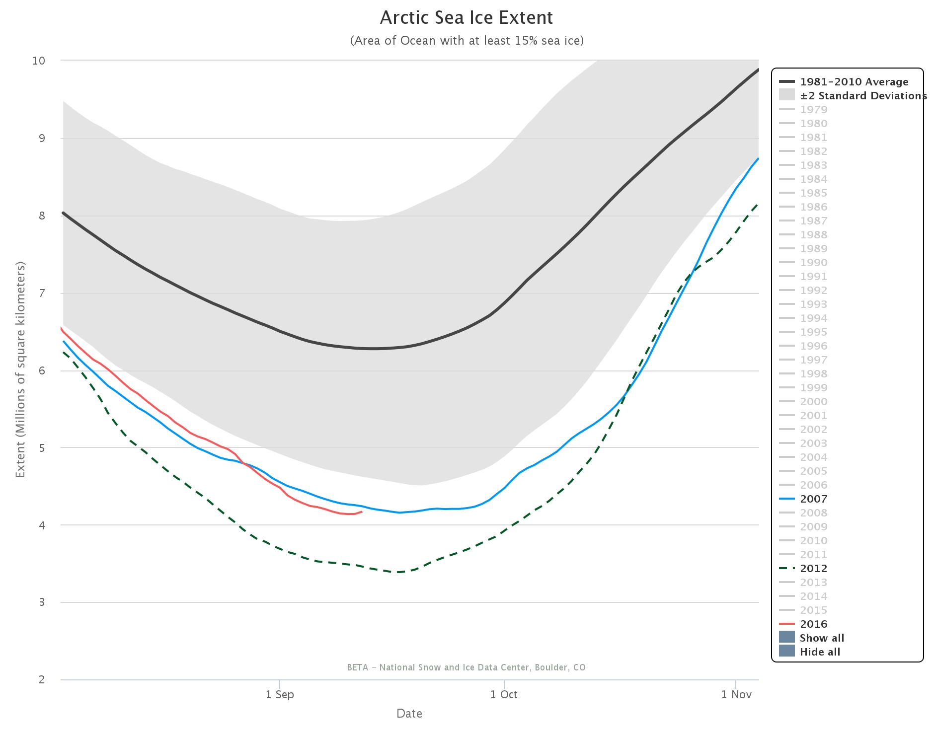
which just failed to fall below 4 million km². Last but not least, just for the moment, is the NSIDC 5 day trailing averaged extent:

charctic-20160912

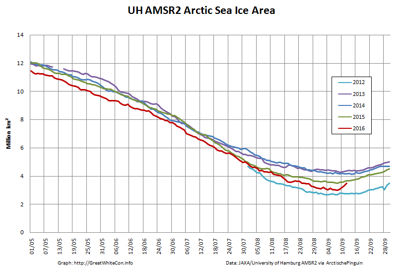
The most striking this year is the unusually large gap between area and extent for this time of year, illustrated by this “compactness” graph from Arctische Pinguin:

amsr2-compact-20160913

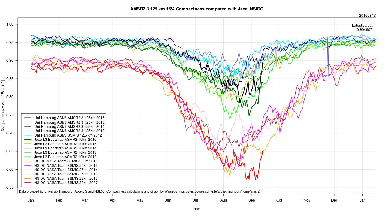
Note too the striking difference between different sensor/algo combinations for this metric!


[Edit – September 15th]

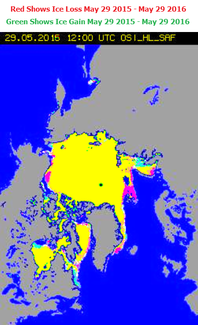
With the minimum now beyond doubt, here’s a new graphic from Lars Kaleschke of the University of Hamburg:

uh-min-temp

Need I say more?


[Edit – September 20th]

The September cyclone has now done its worst:

NASA Worldview “true-color” image of the Beaufort Sea on September 18th 2016, derived from the VIIRS sensor on the Suomi satellite

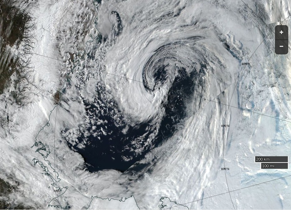
Leaving the area and extent metrics with an intriguing “double dip”:

uh-arctic-area-2016-09-20

uh-arctic-extent-2016-09-20


2016 Minimum Milestones

September 3rd – JAXA extent dropped to 2nd place below the 2007 minimum at 4.05 million km²

September 7th – JAXA extent minimum of 4.02 million km²

September 8th – NSIDC single day extent dropped to 2nd place below the 2007 minimum at 4.083 million km². This proved to the minimum value for the year as a whole.

September 9th – NSIDC 5 day trailing averaged extent dropped to 2nd place below the 2007 minimum at 4.146 million km²

September 10th – NSIDC 5 day trailing averaged extent minimum of 4.137 million km²

More Arctic BS From Tony Heller

Please forgive my mixing of metaphors this morning, but the interminable stream of piss poor propaganda from Tony Heller grows ever more voluminous. Not only has he reprised his “DMIGate” nonsense but he is also posting pictures of the wrong bit of the Arctic yet again. Exhibit A:

DMI shows Arctic sea ice extent well below last year, and near a record low.

unReal-DMI-20170728

In fact, there is more ice than last year, and it likely that 2016 will end considerably higher than last year. This is because the big red spot (below) in the Beaufort Sea disappeared in a storm during the second week of August last year.

unReal-DMI-Delta-20170728

The forecast is for very cold air over the Beaufort Sea the next two weeks, so it is unlikely that a lot of melting is going to occur there. This is shaping up to be a disastrous year for Arctic alarmists, and it will be interesting to see how the graphs progress, and if and when they catch up with reality.

DMI aren’t the only ones that “show Arctic sea ice extent well below last year”:

UH-Arctic-Extent-2016-07-27

and Tony still wouldn’t recognise a higher resolution coastal mask if it bit him in the backside.

Moving on to Exhibit B, Tony still has it in for the valiant Polar Ocean Challenge team in brave little Northabout, who he claims are “Not Going Anywhere“:

The clouds over the Northeast Passage have finally cleared, and you can now see what our intrepid explorers are up against. Hundreds of miles of solid pack ice.

unReal-Vilkitsky-20170728

I pointed out the error of his ways to him yesterday, but for some strange reason Tony is still posting pictures of the wrong place. Here is an overview of the actual facts, as assessed by AMSR2:

Laptev-Kara-AMSR2-2016-07-29

Summer 2016 Surface Melt Takes Off

June has arrived, and according to the Great White Con Arctic sea ice calendar that means the summer surface melting season has started. Once July arrives bottom melt should have started in earnest too, but for now let’s stick to the surface. Here’s the Climate Reanalyzer map of Arctic surface air temperatures at 06:00 UTC this morning:

CCI-T2-2016-06-04-0600

Green areas are above 0 degrees Celsius, and bear in mind that the melting point of sea ice is at around -1.8 degrees Celsius. The red areas near the East Siberian Sea coast are 25-30 degrees Celsius. Given those sort of temperatures you might well think that some snow and/or ice in that area would be melting, and you would be correct! Here is the Japan Aerospace Exploration Agency’s current map of Arctic surface melting:

AM2SI20160603A_SIT_NP

The assorted shades of blue/grey show the areas where surface melting is already underway. Whilst this melting is taking place you may possibly read in some quarters of the cryodenialosphere that “There is almost no melting going on in the Arctic“. The authors of such nonsense evidently don’t know their proverbial Arctic arse from their elbow.

Here’s how today’s surface melting in the East Siberian Sea looks from space:

NASA Worldview “false-color” image of the East Siberian Sea on June 4th 2016, derived from the MODIS sensor on the Terra satellite

Meanwhile over on the other side of the Arctic, here’s yesterday’s surface melting on “Amundsen’s Route” through the Northwest Passage:

NASA Worldview “false-color” image of the Northwest Passage on June 3rd 2016, derived from the MODIS sensor on the Aqua satellite

By way of further illustration of the fact that Arctic sea ice is and has been melting, here is a graph of the current area of sea ice in the all important central area of the Arctic Basin, courtesy of “Wipneus” at Arctische Pinguin:

basin-area-20160603

The areas included are the Central Arctic Basin, plus the Beaufort, Chukchi, East Siberian and Laptev Seas. The above zero temperatures are forecast to spread across the Central Arctic Basin early next week, whereupon it will be very interesting to discover what happens to the snow around the single ice mass balance buoy currently transmitting near real time data. Here is the current temperature profile for the sea ice underneath IMB buoy 2015F:

2016-06-02_2015F

The current conditions there are summarised this morning as:

Pos: 82.00 N, 147.45 W
Air Temp: -3.74 C
Air Pres: 1007.42 mb
Snow depth: 21 cm
Ice thickness: 202 cm

Normally by now there would also be a number of webcams beaming back pictures from across the sea ice in the Arctic Basin. However according to NOAA:

Due to funding constraints, it was not possible to deploy new Web Cams in Spring 2016, but deployments in Spring 2017 are planned.

Three of the camera carrying O-Buoys also seem to have failed over the winter, which leaves us with only O-Buoy 14 to reveal the forthcoming melt to us:

O-Buoy 14 image from June 2nd 2016

O-Buoy 14 is currently colocated with Ice Tethered Profiler 89, the yellow object in the foreground, at 77.49° N, 153.92° W, to the north of the Beaufort Sea. ITP 89 measures the temperature and salinity of the water beneath the sea ice and revealed this the last time it managed to take a measurement, a month or so ago:

itp89-20160604

If you examine the extreme right hand edge of the charts carefully you will no doubt note that the water underneath the ice has recently become both warmer and saltier.

Watch this space!

[Edit – June 5th 2016]

The latest JAXA/ADS map shows that the area of sea ice undergoing surface melting has increased since yesterday, particularly over the Chukchi Sea:

AM2SI20160604A_SIT_NP

The recent clouds over the Beaufort Sea cleared yesterday. Here’s a close up view of the open water between the big floes from the Suomi satellite:

Beaufort-Floes-Suomi-20160604

For a more distant perspective see our Summer 2016 image archive.

It’s not simply the surface that’s melting either. Here’s the latest “high resolution” AMSR2 sea ice area graph for the Pacific side of the Arctic:

2016-06-04-Pacific-AMSR2-Area

Arctic Fraud Continues Unabated

The opening sentence of Tony Heller’s latest Arctic update is astonishingly accurate. Just for once we agree with him when he states:

DMI continues to show rapid melting of Arctic sea ice.

unReal-DMI-20160525

However after that the Arctic fraud continues unabated. Tony assures his loyal readership that:

Their maps show the exact opposite. Arctic sea ice coverage is hardly changing at all.

and:

Equally as troubling is that they show a lot less ice than last year, when in fact there is more ice than last year.

providing this map as justification:

unReal-Comparison-20160525

As unReal Science commenter Peter Ellis put it:

You’re getting caught out by the change in the land mask.

When Caleb quibbled yours truly felt compelled to elucidate:

What have you and Tony been smoking Caleb?

Here’s a satellite image of the Beaufort Sea this year, which is red on Tony’s low resolution 2015/16 comparison map:

NASA Worldview “true-color” image of the Beaufort Sea on May 20th 2016

Here’s a satellite image of the the northern edge of the CAA last year, which is green on Tony’s map:

NASA Worldview “true-color” image of the Canadian Arctic Archipelago on May 20th 2015, derived from the MODIS sensor on the Terra satellite
NASA Worldview “true-color” image of the Canadian Arctic Archipelago on May 20th 2015

Would you care to play “spot the difference” with Peter and I?

[Edit – May 28th 2016]

Tony is doubling down on his Arctic fraud. His Arctic monkey business continues. Despite the lucid explanation of his glaring error provided by Peter Ellis the unReal Science Gish gallop continues. We are now (un)reliably informed that:

The Arctic is very cold, and is not melting.

The amount of ice in the Arctic is almost exactly the same as this date last year.

unReal-2016-05-27-10-40-58

Yours truly has asked all and sundry at unReal Science this question 9 times, phrased in a variety of different ways:

Here’s a satellite image of the the northern edge of the CAA last year. Take a good look at it and then show me the areas of open water corresponding to the green areas on Tony’s final map above.

I have yet to receive an answer.

[Edit – May 29th 2016]

Tony’s doubled down again. His Arctic BS continues for another day:

DMI shows ice rapidly melting and extent far below last year. But their maps show about 1% more ice this year than last.

unReal-2016-05-28-18-41-05

How long will this scam continue?

I tried using a more colourful image of the CAA today. This one’s from May 27th 2015:

CAA-Terra-367-2015-05-27

Once again “No answer!” was the stern reply to my plaintive questions.

[Edit – May 30th 2016]

The “Jousting with Malice in Blunderland” continues, but the oppostion are remarkably quiet today. I’ve had my knuckles rapped about this previously, but cutting and pasting is so quick ‘n easy I simply cannot resist:

Us:

Evidently Tony Heller believes that when it comes to melting sea ice air temperatures are all that matters and that “somewhat warmer ocean water” is irrelevant. see above:

http://realclimatescience.com/2016/05/arctic-bs-continues-for-another-day/#comment-9532

He also evidently believes that in May 2015 large areas of the oldest and thickest sea ice in the Arctic had already melted away to nothing. Perhaps you can point out all the polynyas around the coast of the Canadian Arctic Archipelago this time last year to him, since nobody else has yet managed to do so?

http://go.nasa.gov/1TO7zZk

CAA-Terra-721-2015-05-27

Them:

gees, Jimbo has change to a luminous blue.
Very pretty Jim..
Now how about you show one that shows th near ZERO Arctic sea ice from the first 3/4 of the Holocene..
Or are you still going to DENY/ IGNORE the FACT that there is nothing untoward happening with the Arctic Sea Ice, and all you are arguing about is the INSIGNIFICANT TRIVIA that rules your meaningless life.

Us:

For psychedelic Arctic surface air temperature fans every where:

http://cci-reanalyzer.org/Forecasts/#ARC-LEA

What do you suppose happens to sea ice when you combine “somewhat warmer ocean water” with “somewhat above freezing point air”?

N.B. Such conditions do not currently exist off the north coast of the CAA. They didn’t in May 2015 either.

CCI-2016-05-30_0300

Them:

You on psycho drugs yet again, Jimbo

Which of your Exeter buddies is feeding them too you ?

Us:

Evidently you and Tony are the ones who have been smoking stuff Andy.

In the fantasy wonderland portrayed in several of Tony’s recent “articles” polynyas are depicted in the oldest, thickest sea ice in the Arctic in May 2015. Here is what the real life polynyas in the “oldest, thickest sea ice” in the actual Arctic of May 2016 look like from above (through cyan tinted spectacles):

http://go.nasa.gov/1OXxeYa

CAA-Aqua-721-2016-05-27

[Edit – June 1st 2016]

The Gish gallop continues. In yet another post on the self same topic Tony Heller makes the self same mistake and opines:

DMI still shows a lot less ice than last year, but their maps show about 1% more ice than last year.

2016-05-30-04-03-04-1

I will continue to track this, because I don’t trust any government agency anymore.

Us:

Visual comparison isn’t Tony’s strong suit Sondre, whereas painting hallucinatory green pixels is.

Where are all the holes in the sea ice in the CAA that were there in 2015 but not in 2016 then Andy?

http://www.arctic.io/explorer/8-8/2016-05-29;2015-05-30/6-N79.25236-W95.51613

Them:

weather related changes…

you KNOW that, Jimbo the attention seeking prat.

You have NOTHING, and never have.

Andy:

Shut up about the Holocene, it’s not relevant to modern Arctic sea ice extent trends.
It’t like talking about sun spot trends and then someone comes along and says “Well, this is nothing compared to when the sun becomes a red giant”. Which is true, but not relevant at all.

Us:

Have you noticed that the world’s leading expert on satellite imagery of the Arctic during the first 3/4 of the Holocene epoch has compared MODIS imagery of the Canadian Arctic Archipelago from May 2015 with May 2016 and confirmed that there is no noticeable difference in sea ice extent between the two?

Them:

We’ll keep you posted!

Vanishing Svalbard Sea Ice

At the turn of the year we speculated about the potential effect of high temperatures and the swells caused by strong winds on sea ice in the Fram Strait and Barents and Greenland Seas. With the vernal equinox rapidly approaching let’s take stock of the state of Svalbard sea ice. Here’s one the first “visual” satellite images of the area in 2016 recorded yesterday by the Aqua satellite:

NASA Worldview “true-color” image of the Central Arctic north of Svalbard on March 14th 2016, derived from the MODIS sensor on the Aqua satellite

and here is the equivalent sea ice map from the Norwegian Meteorological Institute:

Svalbard-Map-20160314

Both sources reveal an unseasonable lack of solid sea ice around Svalbard. In fact an intrepid Northwest Passage navigator who didn’t mind the dark might well currently be able to circumnavigate Svalbard!

The Norwegian Meteorological Institute also produce a time series of sea ice area in the Svalbard region based on data from OSI-SAF. It currently looks like this:

osisaf-svalbard_20160314

As sunlight returns to the Central Arctic north of 80 degrees there is an anomalously large area of open water ready to soak up the rays. Here is what the Danish Meteorological Institute timeseries of Central Arctic temperatures looks like at the moment:

DMI-meanT_20160314

and here is the current Svalbard surf forecast from Magic Seaweed:

MSW-20160315

Whilst we speculate on what all this might mean for the Atlantic side of the Arctic over the coming melting season, here’s our new Svalbard Sea Ice page which contains a variety of graphs and maps to help us keep track of events on that part of our planet.

DMIGate Skulduggery In a Nutshell

With apologies to O’Reilly Media Inc. here’s a brief history of the “DMIGate” story, viewed through Anthony Watts’ distorting spectacle lenses.

0) Here is the February 14th 2016 edition of the Danish Meteorological Institutes’s long “deprecated” 30% concentration threshold Arctic sea ice extent graph in question:

dmi-30-WUWT-20160214-crop

1) On August 14th 2013 Anthony Watts wrote on his “Watts Up With That” blog:

That’s the old DMI plot, which DMI says we should now use this one on this page:
http://ocean.dmi.dk/arctic/icecover.uk.php

2) On February 22nd 2016 Anthony Watts wrote on WUWT:

There has been so much skulduggery going on in the climate establishment in recent years that it is hard to avoid the conclusion that this graph has been withdrawn simply because it gives the “wrong” results.

3) Anthony Watts refuses to publish any and all comments on his blog pointing out what he himself had confirmed that DMI said in August 2013.

4) Anthony Watts states on Judith Curry’s “Climate Etc.” blog that:

You post off topic or disrupt threads with the sort of unsubstantiated nonsense you post above, and both demand to have these off topic comments heard and then play the “look Watts is censoring me!” game when your comments don’t meet our site comment policy and/or are abusive in nature.

5) Judith Curry deletes the following comment (amongst others) on her “Climate Etc.” blog:

David – Are you suffering from acute snow blindness too, just like poor Paul Homewood? Try reading this if you haven’t already. Try reading it again if you have:

https://greatWhiteCon.info/2016/02/gross-deception-about-dmis-missing-graph/

In view of the incontrovertible evidence why would anyone believe anything Paul Homewood, Anthony Watts and Judith Curry claim about “Climate Etc.” ever again?

The “DMIGate” Dodo is Pushing up the Daisies

Our title this morning is but a brief extract from a conversation I started on Judith Curry’s “Climate Etc.” blog about (believe it or not!) the effects of large wind driven swells on the “Marginal Ice Zone” of sea ice in the Arctic:

2016-02-25_1159-Judy

Whilst “skeptics” like Pethewin keep on flogging that particular “dead parrot” the DMI have just published an explanation of the erroneously high readings on their now deceased 30% concentration threshold Arctic sea ice extent metric. Here’s an extract, together with a pretty picture for the benefit of those amongst we Cryospheric commenters who are hard of understanding:

The apparent elevated sea ice extent in the data from the old extent algorithm was an artifact, caused by a new and higher resolution coast mask.

Surely that’s easy enough for even the dumbest of all the armchair Arctic analysts scattered across the internet to comprehend?

Going into more detail, the DMI article explains that:

Most of our sea ice extent followers know that the old plot includes a coastal mask, inside which sea ice was is accounted for. In summer 2015 this mask was refined and the masked region was subsequently smaller, thus leaving more area for classified sea ice and open water. The difference in masked area, before and after summer 2015, is approximately 1.4 million km2. This corresponds to difference of the blue coast lines in figure 2, showing the old and new coastal masks in the left and right panels, respectively. The difference may be difficult to detect on the figure, but the area is quite significant. The increasing sea ice extent that is caused by the new coast mask is not great during summer, because sea ice has a relative short line of contact with land during summer. But the new and finer coast mask will result in increasingly more sea ice, compared to previous years during winter, as the coast line with sea ice contact is increasing. This is the reason for an increasing sea ice extent during current freeze-up period, relative to previous winters. A comparison of the 2015/2016 sea ice extent with previous years does therefore not make sense.

Note how the dark blue “coastal mask” in the left hand image from February 22nd 2015 is thicker than the one in the right hand image from the same date this year. DMI conclude with this apology:

Because of the deprecated status of the old plot in the past year, DMI has not been monitoring these irregularities. The old plot should, of cause, have been removed when the mask was replaced. DMI apologizes for the confusion and inconvenience this has caused.

Somehow I doubt that the assorted “skeptics” that have recently been making massive mountains out of this minor molehill will apologise for all “the confusion and inconvenience this has caused”. Causing confusion and inconvenience was probably the general idea.

Watts Up With DMI Arctic Sea Ice Extent?

When I pose that question I’m not referring to the Danish Meteorological Institute’s long “deprecated” 30% concentration threshold Arctic sea ice extent metric so much as the reaction to its demise amongst the more “skeptical” of we cryospheric bloggers. Here once again is the “controversial” graph in question, archived from the start of the year:

DMI-15-2016-01-04

No sooner had Paul Homewood moved on from that topic to finally reproduce on his blog an NSIDC Arctic sea ice graph I first brought to his attention last spring than across the Atlantic in the good ‘ol US of A a certain Mr. Anthony Watts suddenly loudly proclaims that he “tends to agree” with Mr. Homewood’s assertion that:

There has been so much skulduggery going on in the climate establishment in recent years that it is hard to avoid the conclusion that this graph has been withdrawn simply because it gives the “wrong” results.

Given the actual facts of the matter this is peculiar enough, but then things get positively surreal. Regular readers will realise that up here in the penthouse suite at the pinnacle of the tallest of the Great White Con Ivory Towers we pride ourselves on our surreal sensibilities. Today though, we are forced to admit that WUWT has beaten us at our own game. Whilst we were conducting a perfectly sane interview with one of the world’s top sea ice scientists Tony was concocting these perfectly formed surrealist fantasies.

In his update 1 to this already nonsensical story Anthony assures us that:

The typical haters, such as Neven Acropolis, are making claims in comments that I see this as some sort of “conspiracy”. I do not and any such claim is false and political in nature.

Mr. Watts is evidently a big fan of William Burroughs, and has used his celebrated “cut-up” technique to transform “Skulduggery going on in the climate establishment” into “magnets cued she got on the inimitably ginger skull” which is obviously not even slightly conspiratorial.

Let’s move swiftly on to update 2, wherein we are told:

DMI has an entire page dedicated to the use of the 30% concentration value that is still operational!

However if you read the small print on Anthony’s accompanying image it says that:

The maps are additionally overlayed with the corresponding multi-year monthly mean of the periods 1978-2014.

and if you click the accompanying link you will discover that there is no way on Earth to persuade the DMI web site to display “operational” data from 2015, let alone 2016.

Whilst we eagerly await the no doubt imminent arrival of What’s up with that Watts DMIgate update 3 we will leave you with some words of wisdom from Dr. Walt Meier of NASA, the aforementioned top sea ice scientist, who informed us earlier today that:

Regarding DMI, the issue seems quite simple. The 30% plot is an older version that they stopped supporting as they transitioned to the 15% plot.

DMI, MASIE and the Sea Ice Index – An Interview With Walt Meier

For some reason best known to himself Anthony Watts has jumped on the “DMIGate” bandwagon started by Paul Homewood over on this side of the Atlantic a few days ago. In his latest article Mr. Watts quotes with approval the “Not A Lot Of People Know That” article which we have already covered in some depth.

Here yet again is one of my comments that recently ended up on the NALOPKT cutting room floor:

2016-02-21_1811-NALOPKT

You will note that I was suggesting that Ron Clutz’s extremely selectively interpretation of some of Walt Meier’s academic papers left a lot to be desired. Particularly given the additional fuel added to the “skulduggery” fire by the Watts Up With That article it seemed sensible to phone up NASA and ask Walt for his views on the second hottest Arctic sea ice topic on the planet at the moment, according to Messrs. Clutz and Homewood at least. That is the relative merits of Multisensor Analyzed Sea Ice Extent (MASIE for short) versus the National Snow and Ice Data Center’s Sea Ice Index (SII for short) for determining Arctic sea ice trends.

According to the NSIDC:

MASIE sea ice products are developed from National Ice Center (NIC for short) data with support from the U.S. Navy and from NOAA. MASIE is hosted by NOAA@NSIDC.

whereas:

The Sea Ice Index provides a quick look at Arctic- and Antarctic-wide changes in sea ice. It is a source for consistent, up-to-date sea ice extent and concentration images and data values from November 1978 to the present.

As luck would have I managed to get through to Walt on my second attempt, and he graciously agreed to be interviewed at extremely short notice. He told me that whilst he now worked at NASA he used to be at the NSIDC, and still collaborated with them. Here are the edited highlights of his thoughts on “MASIE v SII”:

MASIE repackages data from the NIC, and incorporates an ice edge hand drawn by analysts working with whatever satellite data they have available at the time. It is an “operational” product designed to produce a “best effort” ice edge each day, based on whatever data may be available at the time.

Visual data is obviously not available in winter, and the ice edge is often obscured by clouds in summer. Synthetic Aperture Radar can “see in the dark” and through clouds, but suffers from different limitations. The whole of the Arctic isn’t covered every day for example. In addition, and unlike the SII, data from different satellite sensors is incorporated which means there are inevitably inconsistencies from day to day and from year to year. There is also an element of “human subjectivity” because different analysts are working with different sources of data from one day to the next. Since the quantity and quality of data varies the time series will not be consistent over time.

On the other hand the SII was designed to use a consistent methodology over a long period of time using a single type of sensor. 100% automatically processed passive microwave data is the “gold standard” when it comes to determining sea ice trends. It is subject to some biases and thus is not necessarily as accurate on a given day as MASIE. However, the biases are consistent over time, so the time series will be consistent over time. This means that year-to-year comparisons and trend estimates will be more accurate in the passive microwave data than in MASIE.

So there you have it. If you’re on the bridge of a vessel sailing in Arctic waters then MASIE is the right tool for the job. If on the other hand you’re sat in front of a computer trying to get the best estimate of trends in Arctic sea ice extent then the Sea Ice Index is what you’ll grab from your toolkit.

Having had a chance to examine the “evidence” of DMI “skulduggery” presented by Messrs. Watts and Homewood, Walt sent me a follow up email. Here is what it says:

Regarding DMI, the issue seems quite simple. The 30% plot is an older version that they stopped supporting as they transitioned to the 15% plot. I don’t know specifically why the 30% plot went awry, but there is generally automatic quality control done to make sure the final results are accurate and consistent. If such QC is not done, a lot of incorrect values can occur. I suspect that since the older version was no longer supported, the QC wasn’t being watched and something went wrong that they didn’t bother to fix (or maybe didn’t even notice) because the new 15% version is the official DMI output.

Not a lot of people know that, because Watts, Homewood et al. have developed the nasty habit of “snipping” comments to that effect as and when the mood takes them, which based on my own experience seems to be remarkably often in this day and age.

Gross Deception About DMI’s “Missing Graph”

For reasons that will take too long to explain just at the moment I answered a question asked by Ron Clutz over at Paul Homewood’s “Not A Lot Of People Know That” blog. Having done that I had a quick look round and discovered that unlike most of his “skeptical” friends Paul is writing almost as many posts per day about sea ice as I am! Needless to say he’s raking over the coals of his “Gross Deception” article from last year.

Yesterday he published another article on the topic of Arctic sea ice, entitled “DMI’s Missing Graph“, in which he claims:

For the last few months, there has been a widening divergence between the two Arctic sea ice extent graphs produced by DMI…

Now there may be good reasons for this difference, and it must be pointed out that DMI has never stated that there is any problem with the 30% version, or reason to doubt it…

But the real problem is that DMI has now withdrawn their 30% graph, offering this explanation:

“I have removed the old sea ice extent graphics and the new graphics (http://ocean.dmi.dk/arctic/icecover.php) is now our one and only official sea ice extent.

When I introduced the new graphics I also announced that the old graphics would be removed after some time – and now is the time, sorry.

I spend too much time explaining the differences and it was quite confusing for many – so, I decided to remove the old graphics. However, all the data are available here http://osisaf.met.no/p/ if you would like do the plotting your selves.”

The real problem would instead seem to be that Paul Homewood cannot read, and DMI have in fact been offering a good reason to anyone with eyes to see for many months. We explained all this only the other day, but nonetheless here is an example of the DMI’s 15% threshold extent graph from earlier this year, carefully preserved for posterity in a secure archive deep in the ice shelf underneath the Great White Con Ivory Towers:

DMI-15-2016-01-04

For those poor souls amongst us currently afflicted by acute snow blindness it says in bright red lettering, amongst other things:

The plot above replaces an earlier sea ice extent plot… The old plot can still be viewed here for a while.

For the moment at least the last word on the matter must come from the Danish Meteorological Institute, who report via the @PolarPortal on Twitter that:

[Edit – February 21st 2016 at 21:30 UTC]

The gross deception increases! Not a lot of people know that all my comments on Paul Homewood’s blog are now hidden from view, on the pretext that I’m a troll. Paul really must be blind if he thinks Snow White resembles a troll in any way shape or form. Here’s what some trolls actually look like:

KBT-Climate-Trolls

The thread about DMI’s deprecated graph has degenerated into a free for all about MASIE, when there’s already a thread over there for the discussion of that thorny topic. More on MASIE in due course, but let’s try and stick with DMI extent here. Unlike Paul Homewood and Ron Clutz, who no doubt welcome the distraction!

Them:

Jaime – With regard to the apparent ‘conundrum’ regarding the significant increase in 30% SIE and the lack of increase 15% SIE. It seems to me – and correct me if my logic is faulty – that the ‘at least 30% concentration’ increase tells us that the area of more consolidated ice has increased relative to previous years. The ‘at least 15% concentration’ lack of increase (or decrease) tells us that the less consolidated ice edge area has not increased significantly compared to previous years and may even be declining.


Us:

What “at least 30% concentration increase” would that be then Jaime?

[This is currently visible – mod]


Them:

Pethefin – “at least 30 % concentration” = minimum 30 % concentration = ice coverage with concentration equal to or higher than 30 %. Anyone with the slightest ability to think for themselves would be able to figure it out. Trolls however…


Us:

2016-02-21_1522-NALOPKT
[This is currently invisible – mod]


Them:

Jaime – Jim, that increase shown in comparison with earlier years by the discontinued DMI graph shown above, starting in September and culminating with the large difference notable right up to mid February.


Us:

2016-02-21_1735-NALOPKT
[This is currently invisible too – mod]

I’m sure you get the general idea by now. All of which means that not a lot of people know that if you were to follow the sound advice that DMI gave Paul Homewood and “do the plotting yourself” using the open source software and support made freely available on the Arctic Sea Ice Forum you would discover that (surprise, surprise!) 30% threshold Arctic sea ice extent on February 20th 2016 was significantly less than on the same date in 2015.


[Edit – February 21st 2016 at 22:30 UTC]

And here’s the coup de grace. Before and after the wielding of the NALOPKT red pencil:


Before:

2016-02-21_1811-NALOPKT


After:

[SNIP]

Jim

I have already warned you.

You have already posted eight comments on just one article, none of which had the slightest relevance to the original post, not to mention several more.

All you have done is disrupted the comment thread. I am aware that you have attempted to do exactly the same on other blogs. I am not prepared to allow you to do the same here.

If you want an argument, I suggest you decamp to Disqus, or better still go and argue with yourself on that pathetic little blog of yours, which very few people appear to read.

You are on your final chance. If you have any relevant comments to make, they will be welcome. But any more trolling, and you will be banned.

BTW – If you want to slag me off on your own rarely visited site, as you have before, perhaps you might at least have the decency to tell the truth

Paul

2016-02-21_2226-NALOPKT


[Edit – February 22nd 2016 at 10:00 UTC]

You will note from the comments below that Lawrence Martin has also now fallen foul of the “Not A Lot Of People Know That” censor red pencil. Next in line looks like it will be Neven Acropolis from the Arctic Sea Ice Blog, who is currently still permitted to valiantly fight the good fight:

Neven:

I’m not interested in why the DMI replaced their 30% SIE graph with a 15% SIE graph, because a switch from 30% to 15% isn’t all that exciting. Perhaps it is for someone who doesn’t understand the difference, but it isn’t for me.

And it’s not like they did it all of a sudden. The graph was replaced months ago, with the announcement that the old graph would be discontinued at some point.

I’m also not interested in why the graph was in error. What’s interesting about that? Why would I want DMI people who have lots of different stuff to do, to spend time and money on something that bears no relevance to anything, except to some guy who thinks it’s a all big conspiracy?


Them:

Notice how Neven The Gullible avoids answering or commenting any of these questions.


Us:
2016-02-22_0920-NALOPKT[This is also currently invisible – mod] 


Them:

We’ll keep you posted!