For some relevant background to this weekend’s dose of “Alternative Facts” from David Rose in the Mail on Sunday you may wish to peruse this article in our sister journal “Alternative Facts Wetware™“:
From the conclusions to that article on Donald Trump’s rise to power:
Reflecting on the implications of this analysis for the specifics of this election, we can see that many Trump voters knew full well that their man was a reprobate, that they deplored his crudities and that they saw him as a risky choice. And yet in a world where the system is seen to be against “us” and where things appear to be driven in the wrong direction by “them,” the really irrational thing to do is to vote for the conventional candidate who represents sticking with that system.
Getting back to this morning’s batch of post truth alternative facts from the poison pen of David Rose, the latest porky pie fresh off the Mail’s production line is entitled:
It is of course Mr. Rose who is “twisting the truth” yet again. His opening salvo:
They were duped – and so were we. That was the conclusion of last week’s damning revelation that world leaders signed the Paris Agreement on climate change under the sway of unverified and questionable data.
A landmark scientific paper –the one that caused a sensation by claiming there has been NO slowdown in global warming since 2000 – was critically flawed. And thanks to the bravery of a whistleblower, we now know that for a fact.
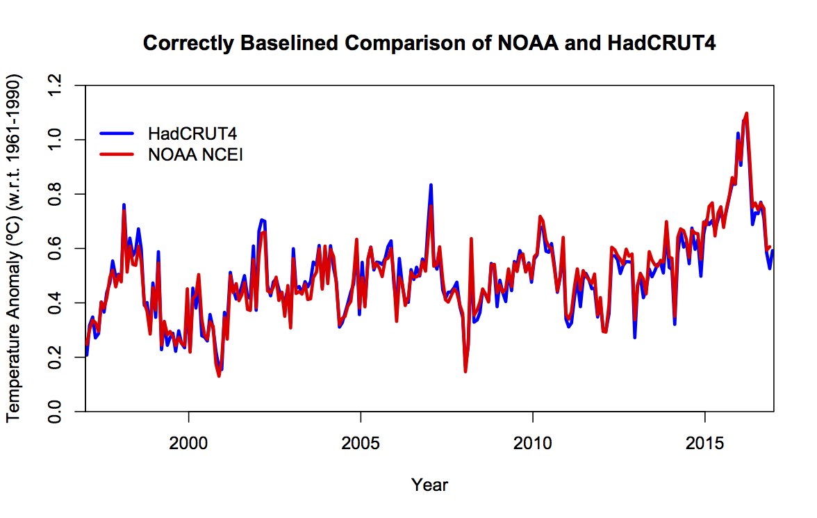
Mr. Rose wouldn’t recognise “a fact” if it hit him in the back of the head at a million miles an hour. The “landmark scientific paper” in question isn’t “critically flawed” anywhere but in the fertile imagination of David Rose and the other “Merchants of Doubt”. Take a look at the facts:
As predicted yesterday, I’m off down to the local paper shop. I wonder if there’s an associated editorial this week too? I’ll be back in a bit with more. As David Rose so eloquently put it this morning:
We cannot allow such a vital issue for our future to be mired in half truths and deceptions.
[Edit – February 12th PM]
My pocket is now £1.70 lighter in exchange for the following information:
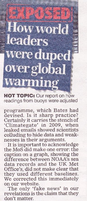
It seems that is what passes for “due prominence, and — where appropriate — an apology” in MailSpeak? Here’s the actual facts once again:
I don’t see an accurate graph in Mr. Rose’s profuse apology. I see no mention of “World leaders not duped, Mail readers conned again”. Do you?
[Edit – February 15th]
This will come as no shock to seasoned Lamar Smith watchers. The U.S. House Science, Space, and Technology Committee have issued another news release:
Lamar Smith (R-Texas) today sent a letter to National Oceanic and Atmospheric Administration (NOAA) Acting Administrator Benjamin Friedman requesting information on the Karl study following reports the study ignored NOAA standards, was rushed to publication, and was not free from political bias.
“Allegations of politicization of government funded scientific research cannot be ignored. The Committee has a constitutional responsibility to conduct oversight in instances of alleged fraud, abuse, and misconduct especially where the government’s scientific integrity is called into question. Dr. Bates’ revelations raise additional questions as to whether the science at NOAA is objective and free from political interference. In light of this new information, the Committee requests the below information to better understand the depth and scope of internal debate at NOAA related to the Karl study,” the letter states.
Today’s letter requests documents and communications related to the release of the Karl study, the datasets used in the Karl study, concerns raised about datasets used in the Karl study, and the scientific integrity of the study. The committee also requested a briefing on the independent experts NOAA is engaging with to review this matter.
The news release continues to describe the alleged “background”, but I think we’re all pretty familiar with that by now? The letter itself is addressed to Benjamin Friedman, NOAA’s acting administrator. It demands to see a big pile of documents “related to the Karl study”. It will come a no surprise whatsoever to our regular readers that it references the leading actors in the David & Judy show!
If that’s the case then it doesn’t actually answer my repeated question, which included the word “amicably”. See below.
I’d be most grateful if you could confirm that my interpretation of your email is correct. In any event I shall give IPSO a call on Monday to see what they suggest.
I think I’ll head to the newsagents first thing tomorrow morning, to make sure I grab a copy of the MoS before it sells out. What “Shock News” might be next I wonder?
“New NOAA Whistleblower says Ice Age Imminent!”
Please feel free to plagiarise that one if you so desire.
As part of our ongoing alternative facts research program we flipped the switch on the first beta test version of Snow White’s Alternative Facts Wetware™ (#AFW™ for short) AF detection subsystem early on Saturday morning (UTC). We were astonished when the needle literally flew past the end stops later that morning. Initially we suspected a bug must have sneaked in via one of Snow’s unprotected ear canals. However when she rather reluctantly ran her exhaustive diagnostic routines they revealed that her mission was in actual fact absolutely nominal.
What happened next therefore came as no surprise whatsoever:
For those of you unfamiliar with some of Planet Earth’s leading alternate facts exponents perhaps we should explain at this juncture that we tweeted Congressman Dana Rohrabacher (amongst numerous other local, national and international politicians) long before ex Prof. Judith Curry “blew the whistle” with the aid of John J Bates and then Congressman Lamar Smith proudly published the House Science Committee’s “#NOAAGate press release”.
Here’s a close up of the graphic graphic we sent the pols, which emerged from our prior “debate” with Nigel, who changed the subject without addressing the issue and then turned strangely silent:
We cannot help but wonder what comment Messrs Smith and Rohrabacher might wish to make at this juncture. What do you make of all this Nigel?
Shock News! The David and Judy Show took to the road once again last night, aided and abetted by all the usual suspects. We’ll skip the Breitbarts, Hellers and Watts of this world and head straight for the now ex Prof. Judith Curry‘s “Climate Etc.” blog. There we will discover “Climate scientists versus climate data“, a guest post by ex NOAA scientist John Bates. According to John:
The most serious example of a climate scientist not archiving or documenting a critical climate dataset was the study of Tom Karl et al. 2015 (hereafter referred to as the Karl study or K15), purporting to show no ‘hiatus’ in global warming in the 2000s (Federal scientists say there never was any global warming “pause”). The study drew criticism from other climate scientists, who disagreed with K15’s conclusion about the ‘hiatus.’ (Making sense of the early-2000s warming slowdown). The paper also drew the attention of the Chairman of the House Science Committee, Representative Lamar Smith, who questioned the timing of the report, which was issued just prior to the Obama Administration’s Clean Power Plan submission to the Paris Climate Conference in 2015.
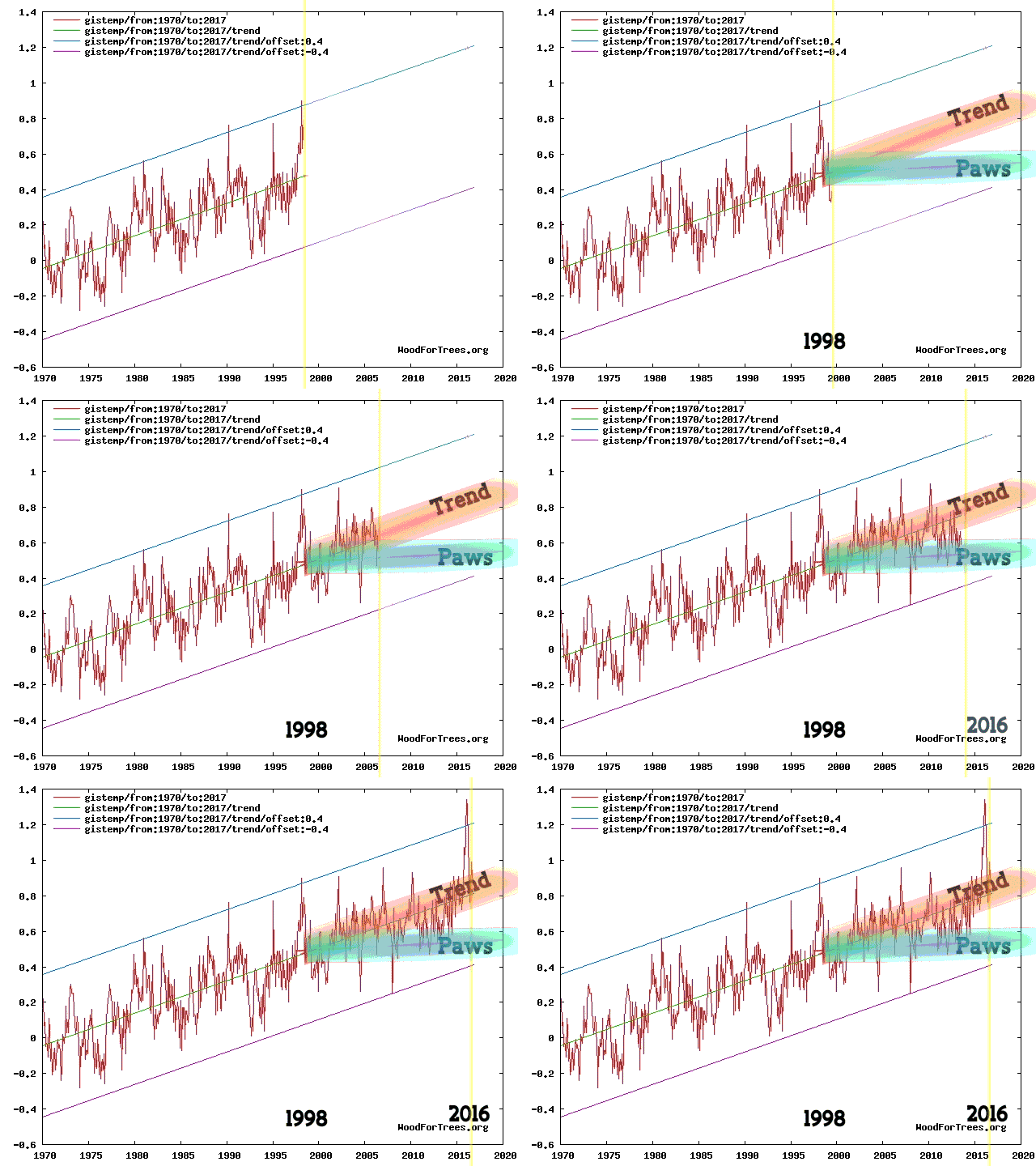
Regular readers of our humble scribblings will be well aware that here in Great White Con Ivory Towers we are firmly of the opinion that there never was a ‘hiatus’. Exhibit 1:
Animation by izen
What’s all the fuss about then? Perhaps our old friend David Rose can explain in layperson’s terms? In his latest article for the Mail on Sunday, catchily entitled “Exposed: How world leaders were duped into investing billions over manipulated global warming data”, he assures us that amongst many other things:
The [K15] report claimed that the ‘pause’ or ‘slowdown’ in global warming in the period since 1998 – revealed by UN scientists in 2013 – never existed, and that world temperatures had been rising faster than scientists expected. Launched by NOAA with a public relations fanfare, it was splashed across the world’s media, and cited repeatedly by politicians and policy makers.
But the whistleblower, Dr John Bates, a top NOAA scientist with an impeccable reputation, has shown The Mail on Sunday irrefutable evidence that the paper was based on misleading, ‘unverified’ data.
It was never subjected to NOAA’s rigorous internal evaluation process – which Dr Bates devised.
Now “never subjected to NOAA’s rigorous internal evaluation process” isn’t quite the same thing as “manipulated global warming data”, but Mr. Rose has more!
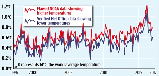
The misleading ‘pausebuster chart’: The red line shows the current NOAA world temperature graph – which relies on the ‘adjusted’ and unreliable sea data cited in the flawed ‘Pausebuster’ paper. The blue line is the UK Met Office’s independently tested and verified ‘HadCRUT4’ record – showing lower monthly readings and a shallower recent warming trend
That graph looks convincing enough, doesn’t it? However there is a teensy weensy little upward adjustment in there that Mr. Rose is apparently unaware of, as NASA’s Gavin Schmidt pointed out late last night:
This morning Carbon Brief has published a much longer takedown of the aforementioned purple prose by Zeke Hausfather, who points out amongst other things that:
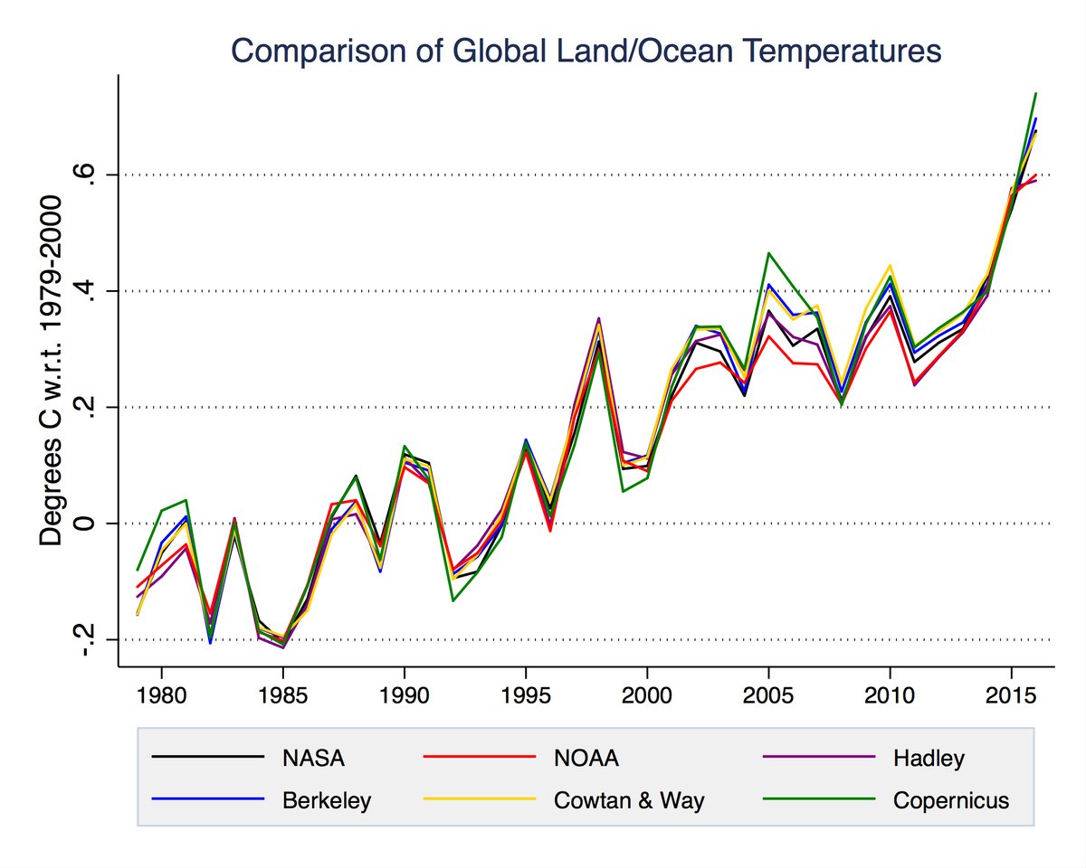
What [David Rose] fails to mention is that the new NOAA results have been validated by independent data from satellites, buoys and Argo floats and that many other independent groups, including Berkeley Earth and the UK’s Met Office Hadley Centre, get effectively the same results.
As per usual Mr. Rose doesn’t stick to science, however dubious. He also dabbles in politics. On that front we are assured:
Karl’s ‘Pausebuster’ paper was hugely influential in dictating the world agreement in Paris and sweeping US emissions cuts. President Trump, above right, has pledged to scrap both policies – triggering furious claims by Democrats he is a climate ‘denier’ and ‘anti-science’.
Thanks to today’s MoS story, NOAA is set to face an inquiry by the Republican-led House science committee.
We’ll have much more to say on this controversy in the context of our “Alternative Facts” investigation in due course, but for the moment at least it looks to us as though the nth iteration of “Climategate 2” barely made it out of the starting gate. However Mr. Rose’s loyal army of “rebloggers, retweeters, plagiarisers and other assorted acolytes” and that “Republican-led House science committee” may of course have other ideas?
[Edit – February 5th PM]
Commentary on Judith Curry’s blog brought to light an article by Peter Thorne. He says, amongst many other things:
I worked for three and a bit years in the NOAA group responsible in the build-up to the Karl et al. paper (although I had left prior to that paper’s preparation and publication). I have been involved in and am a co-author upon all relevant underlying papers to Karl et al., 2015.
The ‘whistle blower’ is John Bates who was not involved in any aspect of the work. NOAA’s process is very stove-piped such that beyond seminars there is little dissemination of information across groups. John Bates never participated in any of the numerous technical meetings on the land or marine data I have participated in at NOAA NCEI either in person or remotely. This shows in his reputed (I am taking the journalist at their word that these are directly attributable quotes) mis-representation of the processes that actually occured. In some cases these mis-representations are publically verifiable.
See if you can spot where Dan & Dan mention the term #Climategate.
[Edit – February 6th]
It’s been a busy day! Several of my carefully crafted comments have ended up on Judy’s cutting room floor, but this one has eluded the red pencil thus far. I bring you this warming and educational nightcap created by an ad hoc team of celebrity international chefs for “warmists” around the planet:
You have to keep clicking through to the very bottom of the virtual mug in order to experience the full benefit of the beverage.
Thank you and good night from May or May Not Land. I’ll see you all in the morning (UTC).
[Edit – February 7th]
Lot’s of pertinent papers just in from Great White Con guest author Kevin Cowtan of York University. Kevin is part of the by now world famous team of Cowtan & Way, who have long championed the cause of accurate Arctic temperature measurements. Kevin tells us:
The paper by Karl and colleagues corrected two known problems with the temperature observations: poor coverage of the Arctic, and a change from ships to buoys. Both had been known about since 2008:
It took NOAA seven years to produce a paper correcting their temperature data, and even now their monthly updates still omit much of the Arctic. The UKMO temperature record is also missing much of the Arctic and only partially corrects the ship problem. Both lead to an underestimation of recent warming.
The agencies face an impossible dilemma – on one hand they have to slowly and carefully evaluate new results, and on the other they have to provide an up-to-date temperature record. Rather than rushing out corrections, they appear to have been extremely conservative.
So there you have it. For more accurate Arctic temperature metrics turn to Cowtan & Way and/or the Berkeley Earth Surface Temperature study! The long delay in improving the quality of the data published by NOAA and the UK Met Office has led to confusion amongst the public, politicans, and even other scientists. All three groups have been trying to understand a supposed “pause” in warming, which in our (humble?) opinion never actually happened. If you disagree with that assessment please feel free to take a good long look at izen’s animation at the top and then explain to us very slowly where you see a “hiatus”.
You may also wish to take a good long look at another guest post on the topic of “the pause”, this time authored by our very good friend Bill the Frog.
[Edit – February 8th]
Watch this video to discover how “The Land of the Free” has morphed into “TrumpLand” in a matter of weeks. The “interrogation” of Rush Holt of the AAAS:
A show trial of the American Association for the Advancement of Science? Congressman Lamar Smith presiding!
[Edit – February 9th]
We like the UK Met Office’s new style. They have taken off the kid gloves, rolled up their sleeves, and they’re extracting the Michael from David Rose on Twitter with great glee:
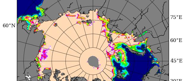
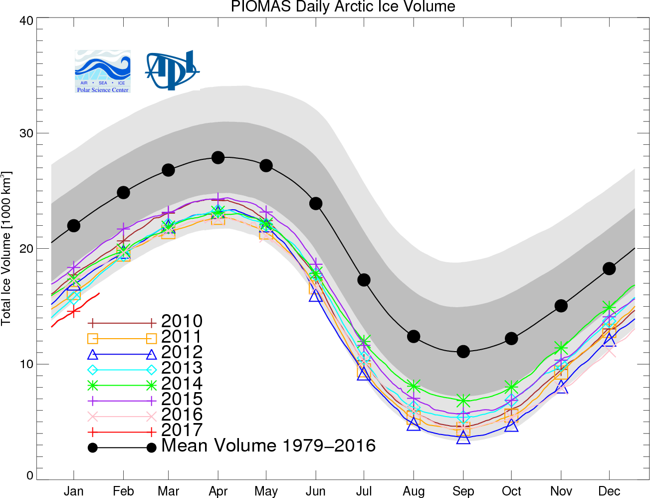
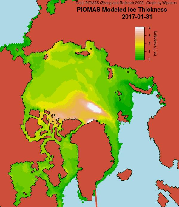
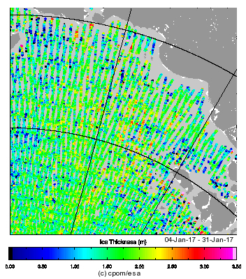
Here’s the PIOMAS gridded thickness for January 31st, courtesy of Wipneus at the Arctic Sea Ice Forum:
Somewhat anomalously it shows the thickest ice some distance away from the coast of Greenland and/or Ellesmere Island. Here too is Andy Lee Robinson‘s updated PIOMAS “Arctic death spiral”:
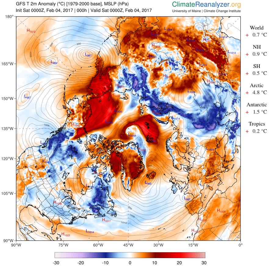
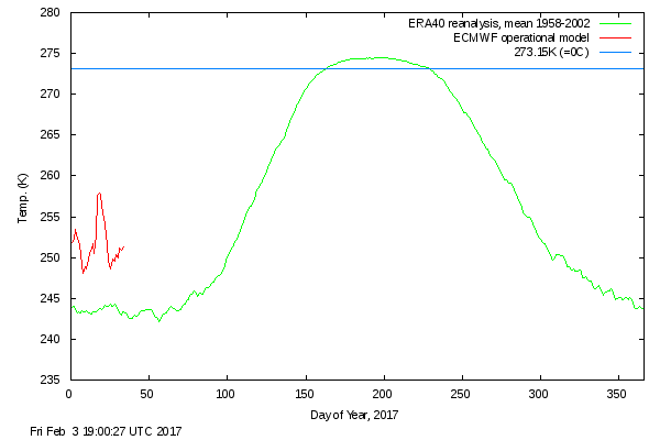
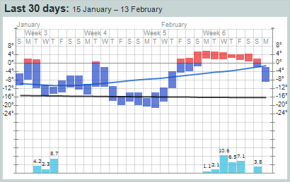
Meanwhile yet more anomalously warm air is entering the Arctic Basin from both the Pacific and Atlantic sides:
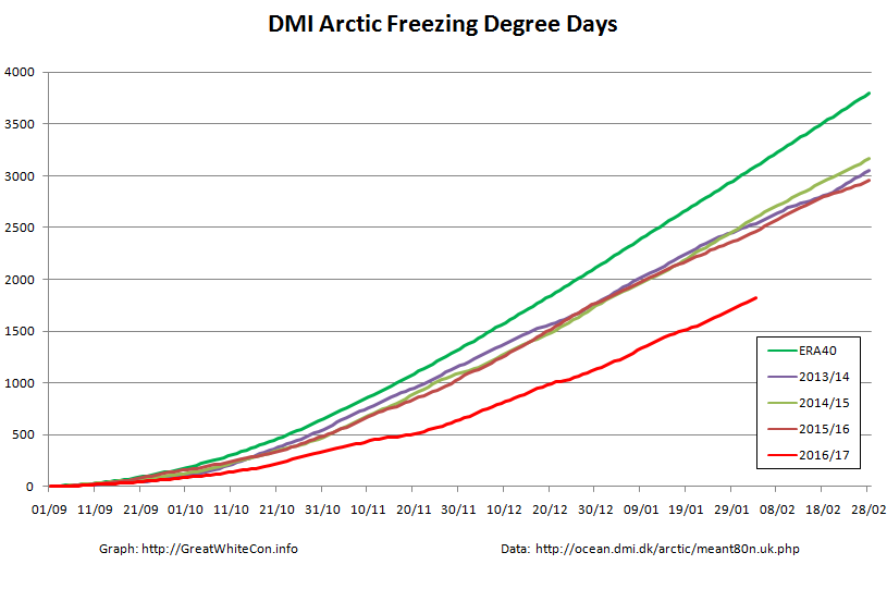
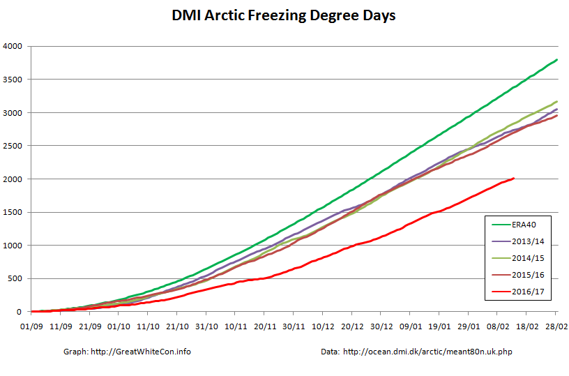
That sort of thing has happened quite a few times over the 2016/17 freezing season, as you can see from this graph of cumulative Freezing Degree Days (FDD for short):
The FDD graph is based on the same data as the probably much more familiar DMI “Daily mean temperatures for the Arctic area north of the 80th northern parallel” graph:
Things are warming up in the Arctic once again.
[Edit – February 5th]
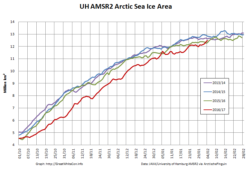
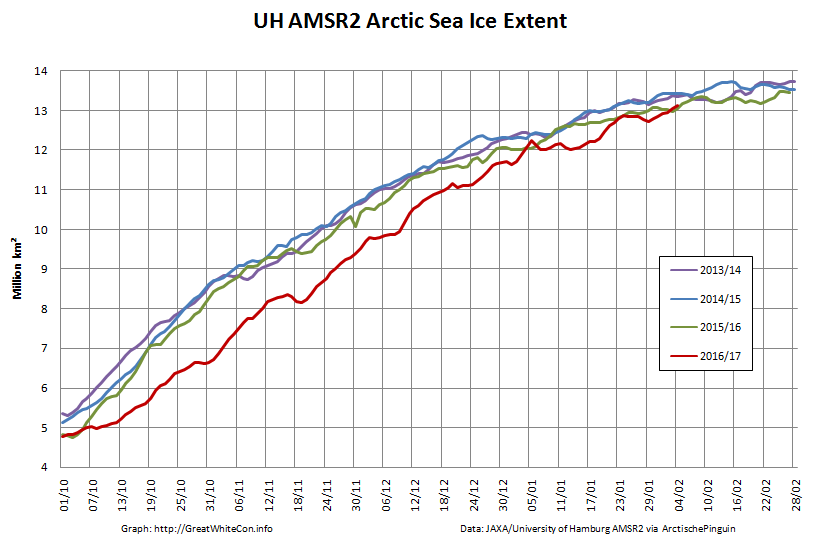
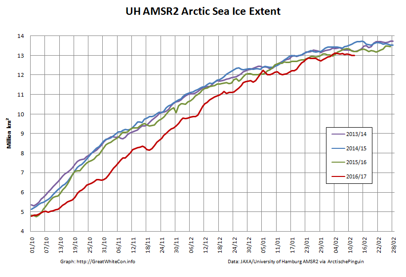
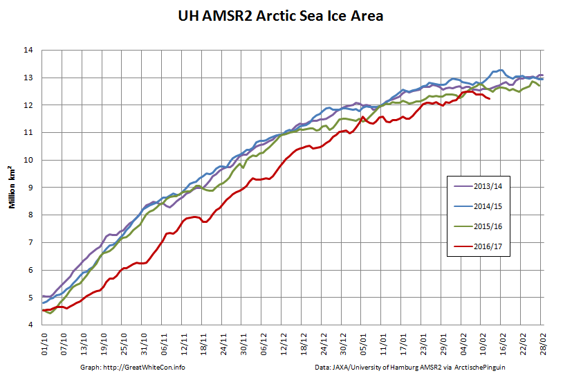
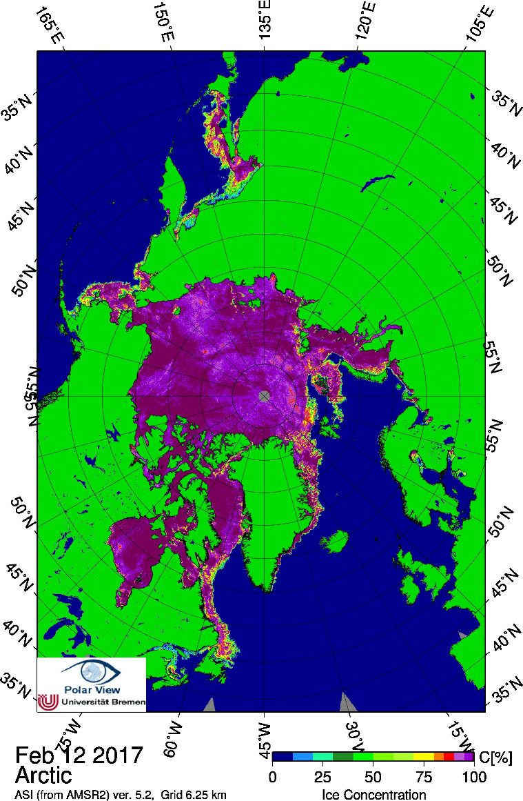
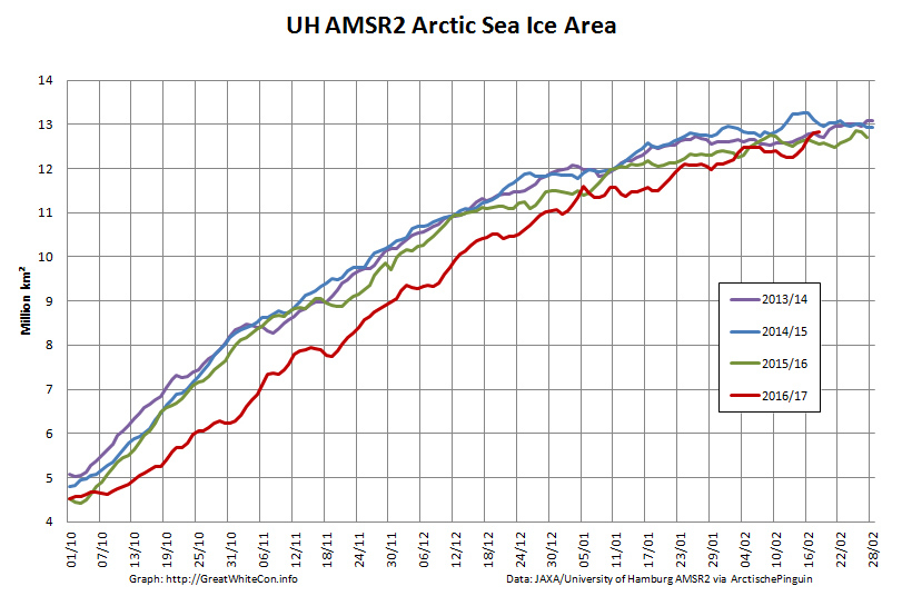
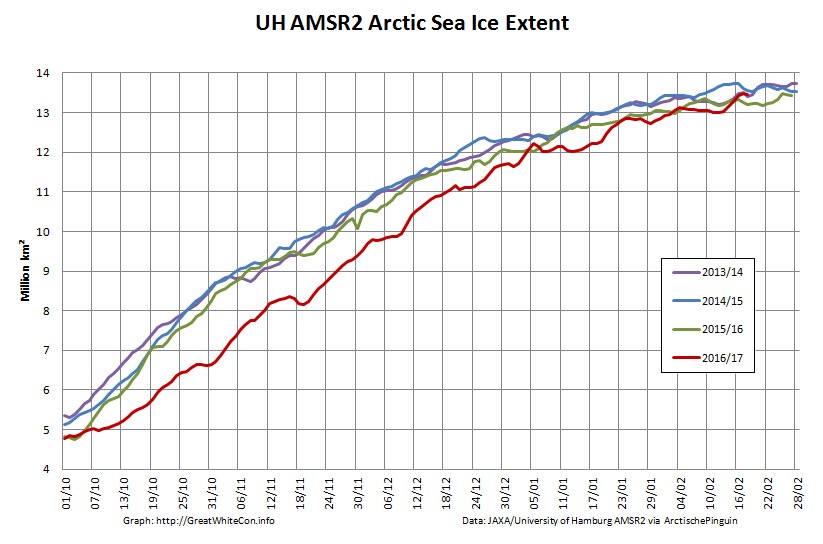
Whilst we await the arrival of the forecast anomalous warmth, how are some other metrics coming along? Here’s the high resolution AMSR2 area and extent:
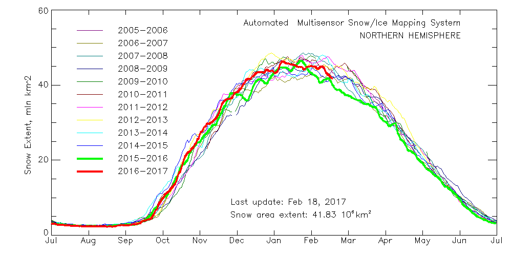
It looks like they’re back in the “normal” range for now, does it not?
[Edit – February 6th]
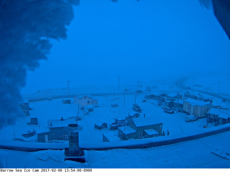
Things currently still look fairly frosty over on the Pacific side of the Arctic, as you can see from the webcam at Utqiagvik (Barrow as was):
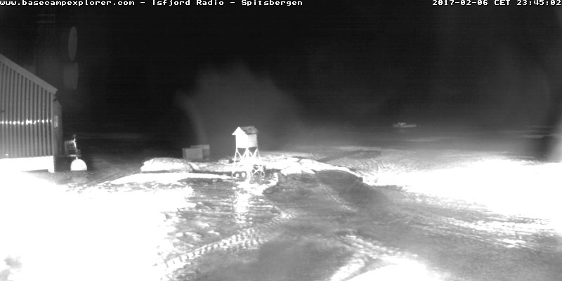
However over on the Atlantic side (and especially for “Richard”!) melting can now be observed on Svalbard:
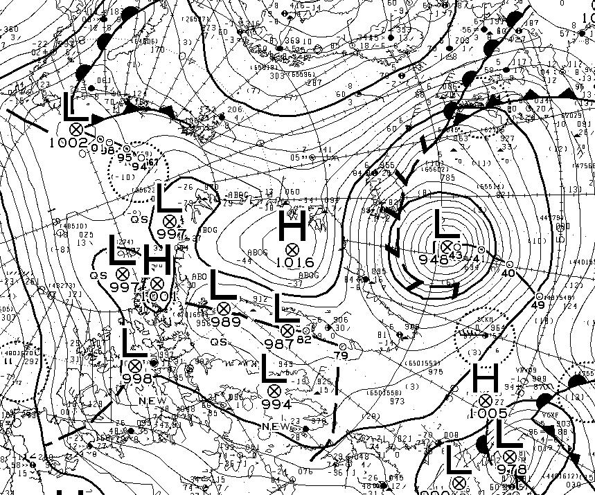
An extremely powerful cyclone off Greenland is pumping heat and moisture northwards:
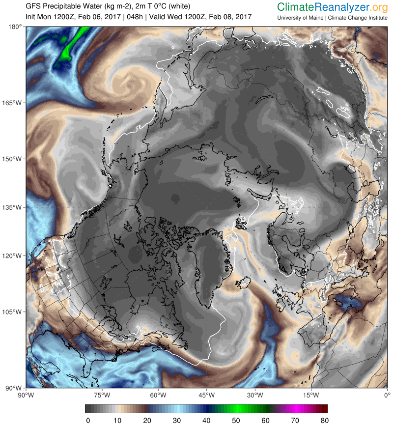
Note that the cyclone’s MSLP fell to 940 hPa earlier today. This is the GFS precipitable water forecast for Wednesday lunchtime:
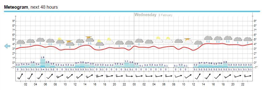
Finally, for the moment at least, here’s the current weather forecast for Longyearbyen in Svalbard:
All in all there’s plenty more heat and moisture on the way.
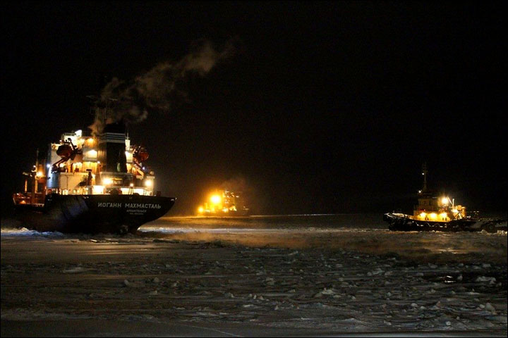
Yesterday I found myself in conversation with Nigel and “Steve” on Twitter about NOAA’s recent report on Arctic temperatures and the seemingly unrelated topic of Russian icebreakers. Apparently Nigel has been perusing “Steve’s” recent railing against NOAA’s “Red Hot Arctic” in 2016 on his “Deplorable Client Science” blog. Here’s how my conversation with Nigel went:
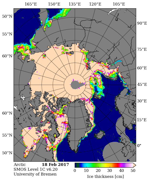
It appears that Nigel believes that an image like this:
is far more relevant than an image like this:
when it comes to determining the thickness of “the ice up in the north of Russia”!
Then of course there was my “conversation” with “Steve” after he butted in on my “debate” with Nigel. It went like this:
Just like Nigel, “Steve” still hasn’t got around to commenting on my map of Arctic sea thickness or explaining the significance of 2 Russian icebreakers NOT stuck in the East Siberian Sea.
The Journal of Alternative Facts article guidelines insist on peer review by politicians, so I’ve invited a few local, national and international politicians to comment on my draft paper:
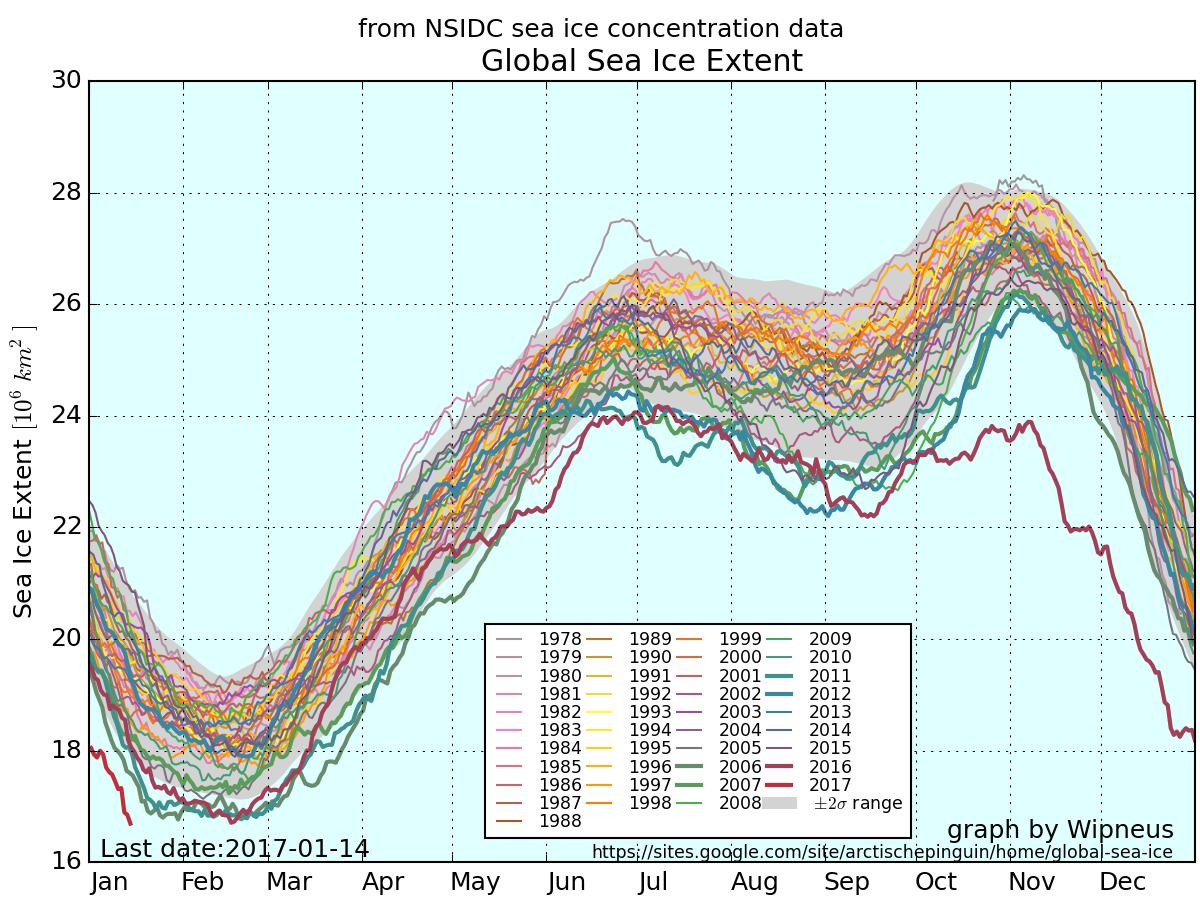
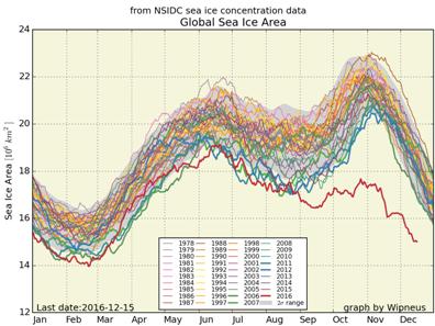
Here once again is the up to date version of Wipneus’ graphic graphic, this time of global sea ice extent:
As you can see, global sea ice extent has just reached the lowest ever level in the National Snow and Ice Data Center’s satellite records going back to 1979. It was over a month later when the previous record was broken in February 2016, so there is plenty of time for the metric to fall further.
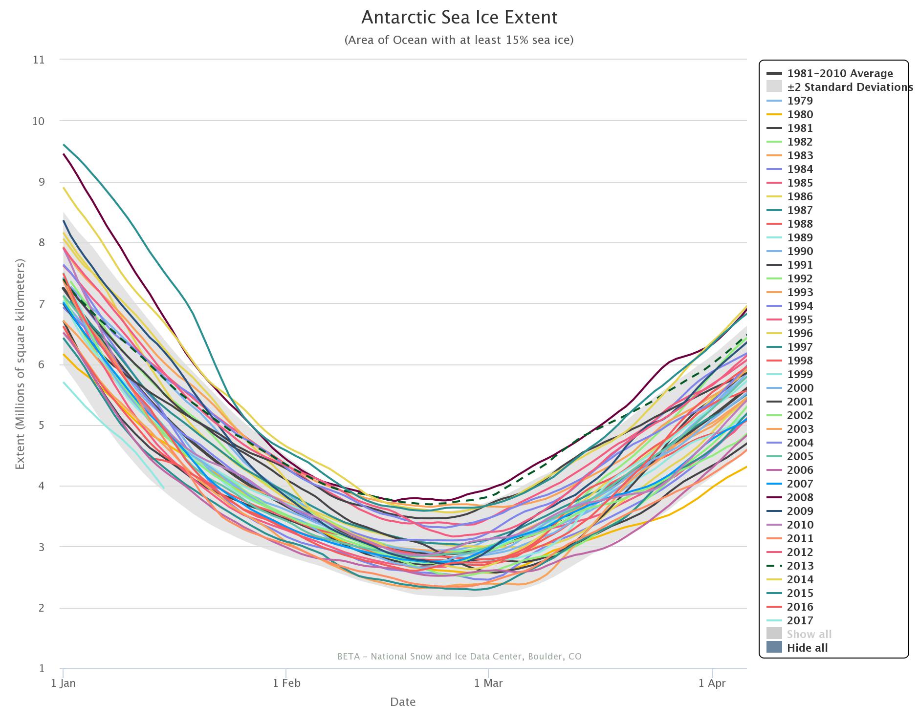
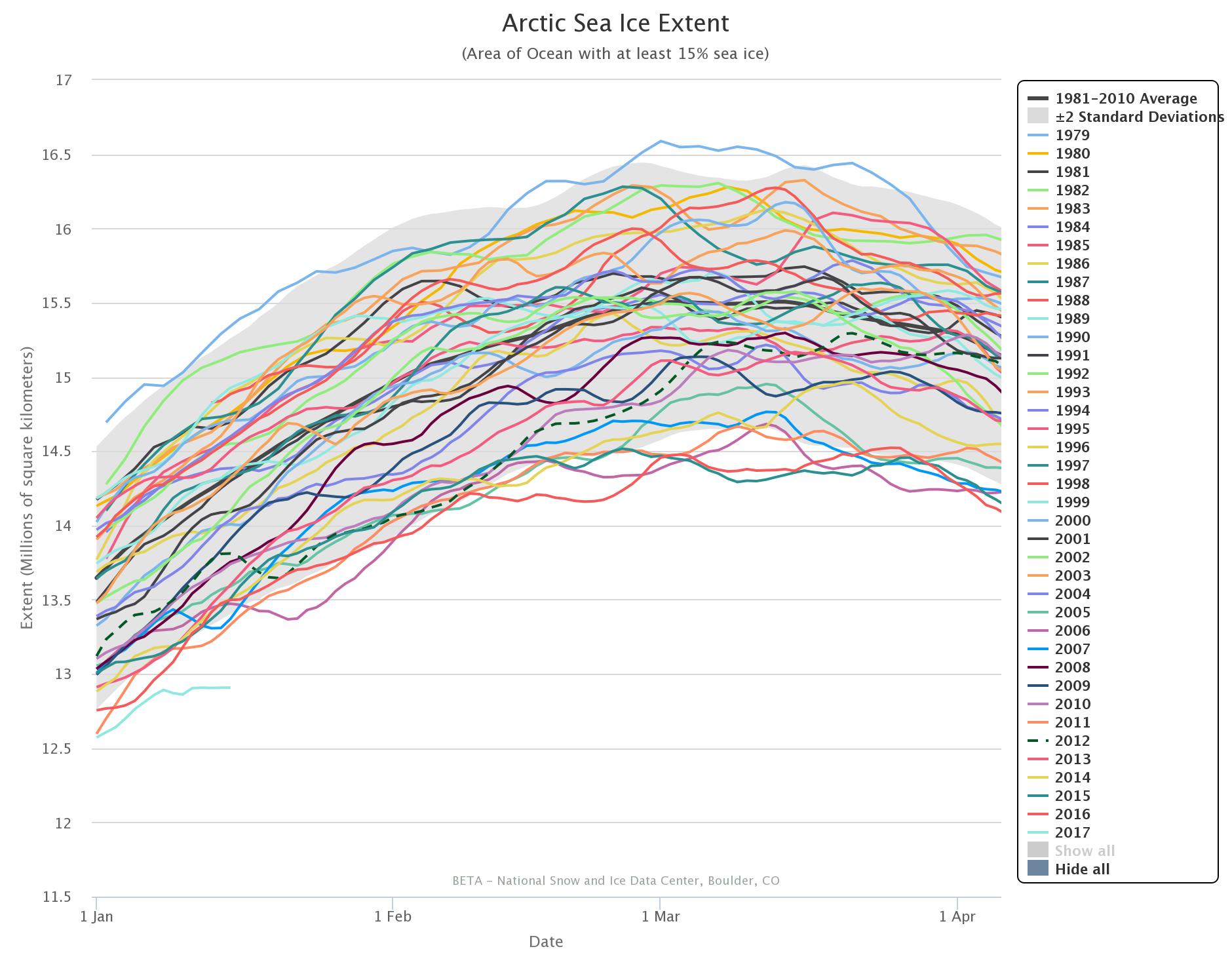
The 2017 curves in the NSIDC’s own extent graphs are coloured in a pale shade of blue. Even so they’re easy to pick out since both Antarctic and Arctic extent are at the lowest level for the date in NSIDC’s records by a considerable margin:
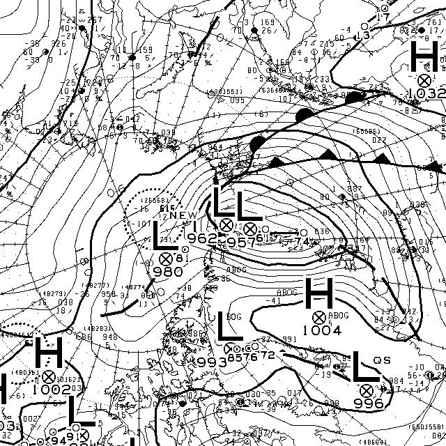
Antarctic sea ice extent is still falling, and the Arctic has been flatlining for several days now and more trouble is heading its way. Another Fram Strait cyclone is brewing, and this time around the storm’s minimum central pressure is already down to 957 hPa according to Environment Canada:
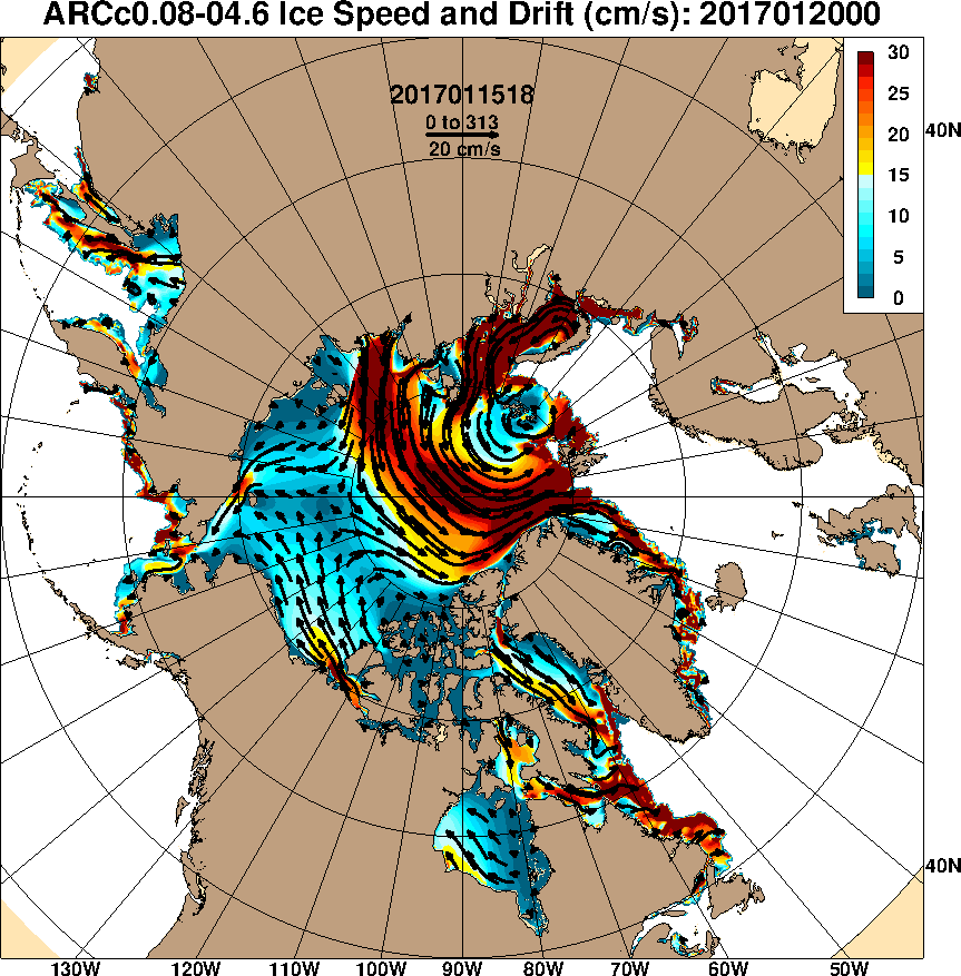
According to the current forecasts it will continue to spin over the central Arctic for several more days, driving export of sea ice via the Fram Strait:
I recently found myself in an extended discussion on Professor Judith Curry’s “Climate Etc.” blog with Tony Brown. Tony asserts that:
In 1932, a Soviet expedition led by Professor Otto Yulievich Schmidt was the first to sail all the way from Arkhangelsk to the Bering Strait in the same summer without wintering en route. After a couple more trial runs, in 1933 and 1934, the Northern Sea Route was officially defined and open and commercial exploitation began in 1935. The next year, part of the Baltic Fleet made the passage to the Pacific where armed conflict with Japan was looming.
and asks:
Are you SERIOUSLY suggesting that the northern sea route was not operable from the 1930’s onwards?
My response?
I’m still awaiting your pick of the year in the 1930s in which the NSR was most “open”. I have a sneaking suspicion it won’t conform to, for example, the current Canadian Ice Service definition.
I won’t bore you with the long list of questions I asked Tony that he has thus far failed to answer. Instead let’s take a closer look at the history of the Northern Sea Route than Tony is willing and/or able to undertake. Perhaps the most obvious place to start is the “History of the Northern Sea Route“? However this does rather gloss over the 1930s. For our initial reference let’s see what Bill Barr has to say in his “The Drift of Lenin’s Convoy in the Laptev Sea, 1937 – 1938″, published in 1980.
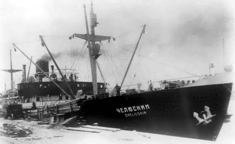
Only a few months after Sibiryukov‘s limited success in her attempt at a one-season passage of the Northern Sea Route, so eloquently embodied in her final emergence from the ice of the Chukchi Sea under improvised sails, on December 17, 1932 Sovnurkom (the Soviet of Peoples’ Commissars) took the momentous step of forming the Chief Administration of the Northern Sea Route (Gluvnoye Upruvleniye Severnogo Morskogo Puli), more commonly known as Gluvsevmorput’. Its primary task was to establish safe, reliable navigation from the White Sea to Bering Strait, but in a series of subsequent decrees over the next few years it also acquired a remarkable array of ancillary functions, and along with them, remarkably wide powers. In effect Gluvsevmorput’ was given almost complete control of the entire vast area of Siberia north of 62″ (the latitude of Yakutsk) not only in terms of transport and economic development, but also education, health services and cultural development. Even with these extensive powers, however, the new organization’s first attempt at demonstrating that it was capable of tackling its primary task was a disastrous failure. In her attempt at making a one-season passage of the Northern Sea Route in the summer of 1933 the steamer Chelyuskin became beset in the ice of the Chukchi Sea, and after drifting helplessly for several months, was ultimately crushed and sank on February 13, 1934. However, the new organization’s reputation was definitely redeemed the following year when the icebreaker Fyodor Litke reached Murmansk on September 20, 1934, having succeeded where Chelyuskin had so utterly failed.
To summarise, one of Tony’s “trial runs in 1933” was “a disastrous failure”!
On 1 October 1932 the icebreaking steamer Sibiryukov emerged from the ice in Bering Strait having completed the first one-season passage of the Northern Sea Route from Arkhangelsk. It was not an unqualified success, however; Sibiryakov had lost her propeller two weeks previously and had managed to reach the edge of the ice only under improvised sails and with a large measure of luck.
Moving on to another 1933 “trial run” Bill informs us that:
In 1933 the newly-formed Gluvsevmorput’ dispatched the first convoy of freighters via the Northern Sea Route to the mouth of the Lena to deliver cargoes bound for the Yakut ASSR. It consisted of three freighters and was escorted by the icebreaker Krasin. Despite heavy ice conditions in the Kara Sea two of the ships reached Tiksi, their destination, and unloaded their cargoes. The third ship, bound for Bukhta Nordvik with an oil exploration expedition, ran aground near its destination and turned back. Severe ice conditions in Proliv Vil’kitskogo forced all three ships to winter at the Ostrova Samuila. A shore station was built and a full scientific programme maintained all winter. Urvantsev, the chief scientist, took the opportunity to make a winter reconnaissance survey of the northern portion of Poluostrov Taymyr using half-tracks. The convoy was freed from the ice by the icebreaker Fyodor Litke in the summer of 1934 and having completed their tasks all three ships ultimately returned safely to Arkhangel’sk.
Not exactly an unqualified success either then, and certainly not a single season transit of the full Northern Sea Route! However despite all her assorted trials and tribulations the icebreaker Fyodor Litke did manage to complete a single season transit from Vladivostok to Murmansk, and according to Wikipedia “became a Soviet propaganda icon”.
Returning to Barr 1980, we discover that:
In the summer of 1935 Fyodor Litke escorted the first two laden freighters, Vantsetti and Iskra, through the Sea Route from west to east; sailing from Leningrad on July 8, they reached Vladivostok on October 8. Meanwhile two other steamers, Anadyr’ and Stalingrad, made the through-passage in the opposite direction, sailing from Vladivostok on July 23 and 25 and reaching Leningrad on October 16.
The following season (1936) saw a spectacular increase in activity along the Northern Sea Route; a total of 160 ships travelled parts of the route (the bulk of them from the west to the mouth of the Yenisey and back), while 16 vessels made the through-passage, 14 from west to east, and 2 from east to west, the latter being Vantsetti and Iskra homeward bound to Leningrad. The ships heading east included the first Soviet warships to utilize the Northern Sea Route, the destroyers Voykov and Stalin, escorted once again by Fyodor Litke
Hence 1935 and 1936 were far more successful years than the previous two, but then we come to 1937. Quoting Barr 1980 once again:
The plans for the 1937 season were equally ambitious, but by then the run of luck had ended. Due to a combination of abnormally severe ice conditions and some very unfortunate decisions as to routing of convoys and deployment of icebreakers towards the end of the season, 25 ships were obliged to winter on an emergency basis at various points in the Soviet Arctic. Perhaps the most critical aspect, however, was that of Gluvsevmorput’s fleet of icebreakers; only one, the veteran Yermak was not forced to winter in the Arctic.
One of the other questions I asked Tony Brown over at Prof. Judy’s was:
It would be helpful if you selected an ice chart from the 1930s to illustrate your point.
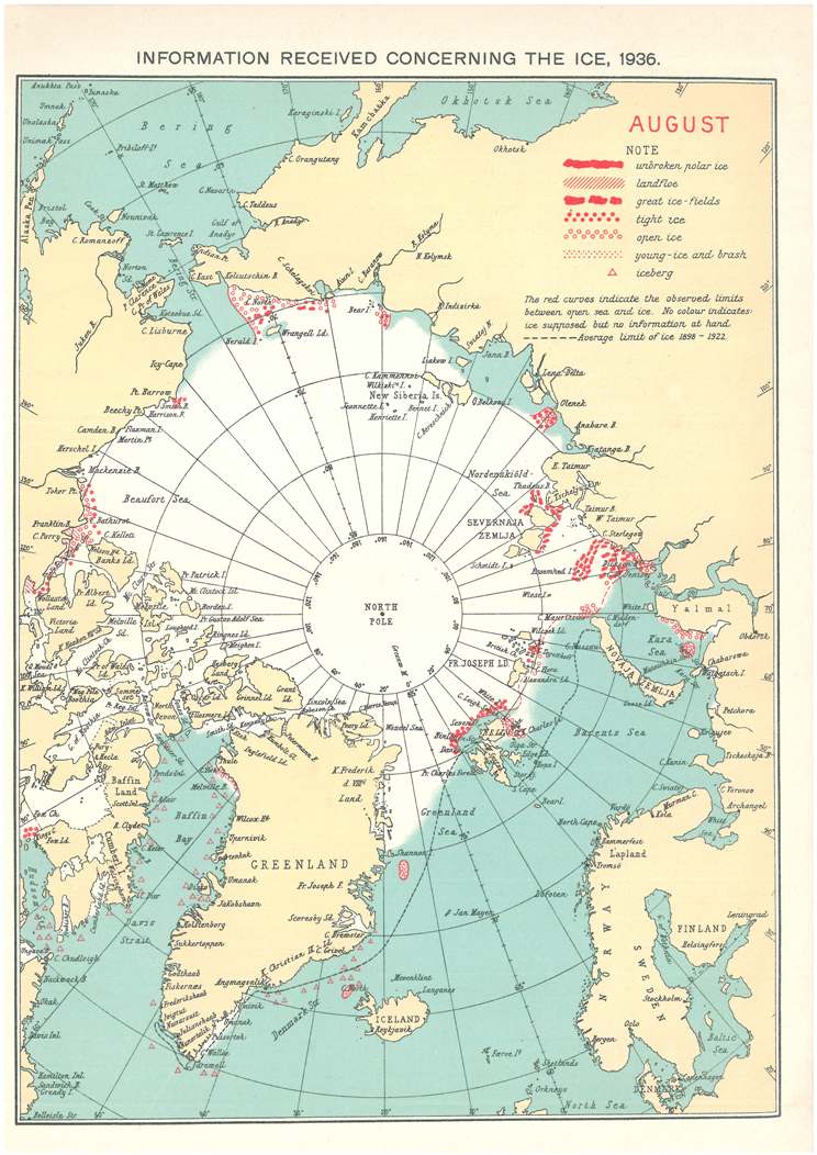
Tony still hasn’t got around to doing that, so why don’t we take a look at the August 1936 chart from the archives of the Danish Meteorological Institute:
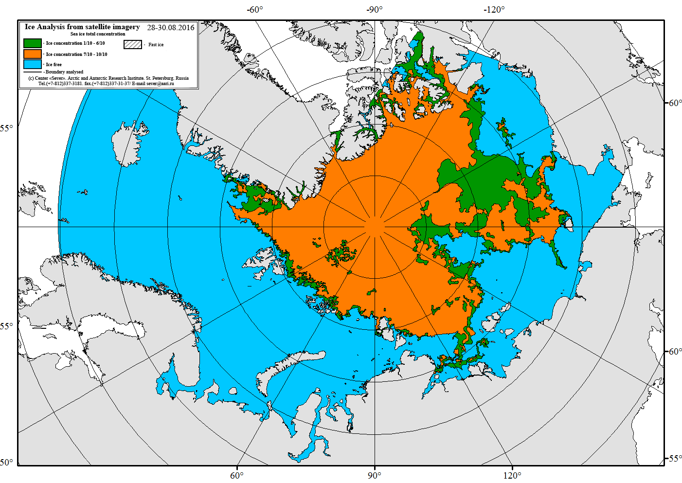
It certainly doesn’t look to me as though the entire Northern Sea Route was covered by no more than 3/10 concentration sea ice in August 1936. For comparison purposes here’s the Russian Arctic and Antarctic Research Institute ice chart for the end of August 2016:
For an eyewitness account of conditions along the Northern Sea Route in 2016 see our series of articles on the voyage of the yacht Northabout
The story got some legs. Zack got pushback from some “skeptics” and then the AGU blogged about the story.:
My attention was called to this issue last week thanks to the Twitter feed of Zack Labe, a PhD student in Earth Systems Science at the University of California – Irvine. He makes great graphics showing the latest data on polar climate.
It’s now December 18th, and as far as I’m aware that remains the case in the mainstream media (MSM for short). The Arctic Sea Ice Forum grew out the earlier Arctic Sea Ice Blog (ASIB for short). The proprietor of both the ASIB and ASIF has been revealed by CBC to be one Neven Curlin. They recently interviewed Neven, and even gave him top billing above Sir David Attenborough in the resulting podcast:
However the title of the CBC article is inaccurate, as CBC would surely have noticed if they’d read Neven’s article on the ASIB on the topic of his “sabbatical”.
Now comes news that the “astonishingly low level” of global sea ice area that we brought to the waiting world’s attention on November 7th has today been chosen by The Guardian as one of their:
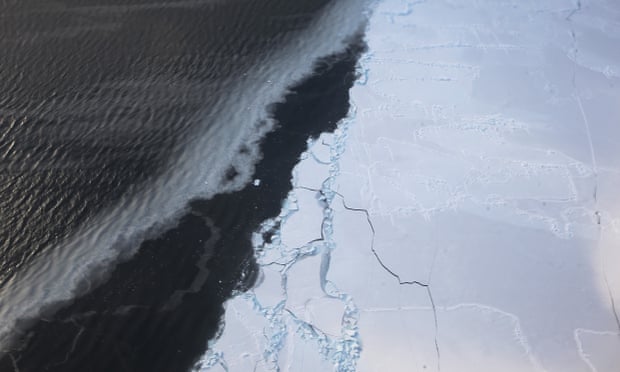
The story outlined above and the associated graphic graphic are conspicuous only by their absence, but the Grauniad have thoughtfully provided this pretty stock photo of some sea ice:
Scroll down the Guardian’s article to number 11, pausing to read Tamsin Edwards’ section on atmospheric carbon dioxide levels at number 9 on the way down (unlike CO₂ concentrations). There you will discover Professor Andrea Sella’s opinion that:
In October, unprecedented weather patterns drove icy winds across Siberia, pushing Arctic temperatures up to 20C above normal and parts of the Arctic Ocean failed to refreeze; in the Antarctic, sea ice thawed faster than usual. For me the bombshell came from a Dutch blogger in late November: a plot of the Arctic plus Antarctic showed sea ice this autumn to be tracking 4m km2 (the size of western Europe) below the normal average. This is a 7-sigma event – with a chance of about one in a hundred billion of being random. The ice doesn’t lie. If we don’t take this seriously now, our children will ask us why.
The “plot of the Arctic plus Antarctic” Andrea refers to was created by “Wipneus”, who I suppose could reasonably be described as a “Dutch programmer”. Neven could reasonably be described as a blogger, although he is much more than that. Although he was born in The Netherlands he no longer lives there.
Regular readers will be aware that in a recent article in the Mail on Sunday David Rose quoted Professor Judith Curry as stating that:
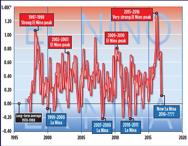
The record warm years of 2015 and 2016 were primarily caused by the super El Nino
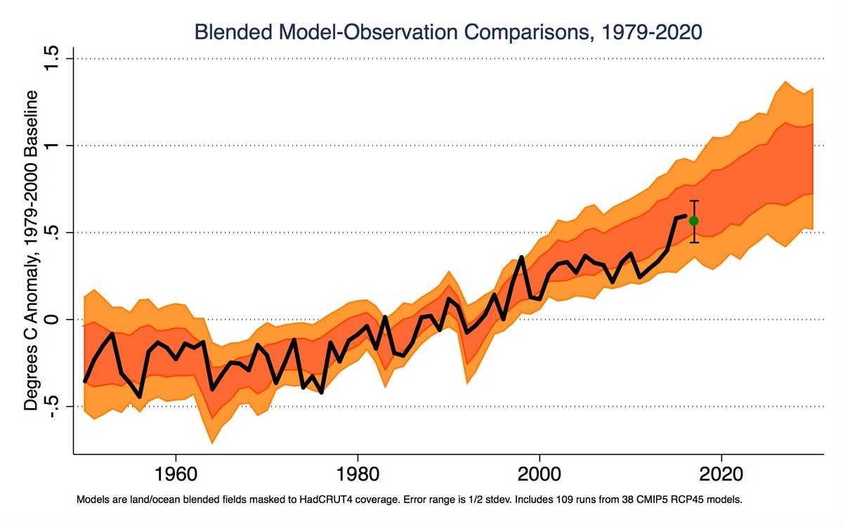
The article in question also included this graph:
It looks as though David’s left hand doesn’t know what his right hand is doing. Was the 2015 El Niño “Super” or “Very strong”? And how about the 1997/98 El Niño. Was that one really merely “Strong”?
We sought the professional opinion of an eminent expert in such matters, according to David Rose at least – Professor Judith Curry. Here’s how we got on, firstly at Prof. Curry’s “Climate Etc.” blog:
Us:
Since you mention the subject, I was wondering if Dr. Curry could take a look at the “the authoritative Met Office ‘HADCRUT4’ surface record” mentioned in David Rose’s latest Mail article and explain how it justifies her “The record warm years of 2015 and 2016 were primarily caused by the super El Nino” remark quoted in his previous one:
Bill the Frog has asked me to check the objective criteria Prof. Curry uses for differentiating between “weak”, “strong”, “very strong” and “super” El Niños. Likewise for La Niñas.
Can you assist by any chance Ristvan? Can Judith?
Them:
JH, Sure could. But first prove you are just not more loser snark.
Enso is variously but in eqch case precisely defined. I defer to Bob Tisdale comcerning details. And you?
Us:
I defer to the BoM in the first instance. How about Judith?
A different Them:
Jim Hunt
I expect the answers you are looking for are in this article by Judith back in 2014
This website uses cookies to improve your experience. We'll assume you're ok with this, but you can opt-out if you wish. Cookie settingsACCEPT
Privacy & Cookies Policy
Privacy Overview
This website uses cookies to improve your experience while you navigate through the website. Out of these, the cookies that are categorized as necessary are stored on your browser as they are essential for the working of basic functionalities of the website. We also use third-party cookies that help us analyze and understand how you use this website. These cookies will be stored in your browser only with your consent. You also have the option to opt-out of these cookies. But opting out of some of these cookies may affect your browsing experience.
Necessary cookies are absolutely essential for the website to function properly. This category only includes cookies that ensures basic functionalities and security features of the website. These cookies do not store any personal information.
Any cookies that may not be particularly necessary for the website to function and is used specifically to collect user personal data via analytics, ads, other embedded contents are termed as non-necessary cookies. It is mandatory to procure user consent prior to running these cookies on your website.