Tag Archives: Temperature

Post-Truth Global and Arctic Temperatures

“Post-truth” is the the Oxford Dictionaries word of the year for 2016. The definition reads as follows:

post-truth – an adjective defined as ‘relating to or denoting circumstances in which objective facts are less influential in shaping public opinion than appeals to emotion and personal belief’.

and according to Oxford Dictionaries:

The concept of post-truth has been in existence for the past decade, but Oxford Dictionaries has seen a spike in frequency this year in the context of the EU referendum in the United Kingdom and the presidential election in the United States. It has also become associated with a particular noun, in the phrase post-truth politics.

Post-truth has gone from being a peripheral term to being a mainstay in political commentary, now often being used by major publications without the need for clarification or definition in their headlines.

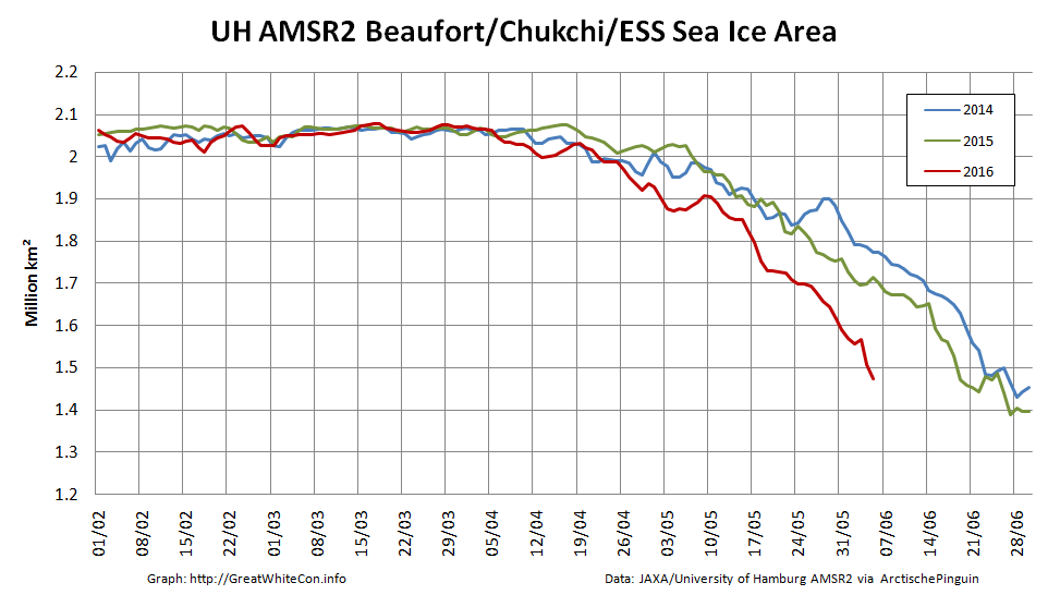
Our old friend David Rose has been remarkably quiet on the topic of Arctic sea ice recently. Presumably the objective facts from the Arctic are impossible to spin to his satisfaction even for a man of David’s talents? However that didn’t stop him from penning an article for The Mail on Sunday at the end of November on the topic of the recent “record highs in global temperatures“:

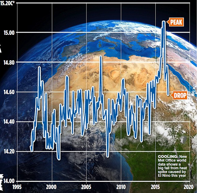
Global average temperatures over land have plummeted by more than 1C since the middle of this year – their biggest and steepest fall on record.

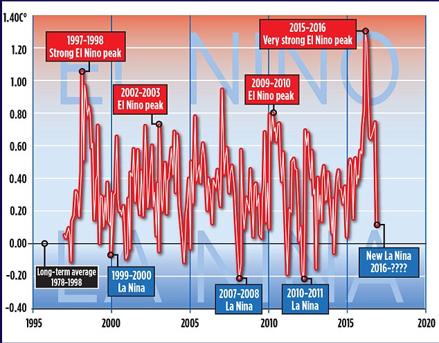
The news comes amid mounting evidence that the recent run of world record high temperatures is about to end. The fall, revealed by Nasa satellite measurements of the lower atmosphere, has been caused by the end of El Niño – the warming of surface waters in a vast area of the Pacific west of Central America.

MoS2 Template Master

The Mail article helpfully included this one year old video from the World Meteorological Organization, explaining the basics of the El Niño phenomenon:

According to the commentary:

This phenomenon affects weather conditions across the equatorial Pacific, with potential knock on effects in other parts of the world.

We’ll get on to the “potential knock on effects” in the Arctic eventually, but let’s start with a snippet of Mr. Rose’s “post-truth politics”:

Some scientists, including Dr Gavin Schmidt, head of Nasa’s climate division, have claimed that the recent highs were mainly the result of long-term global warming.

Last year, Dr Schmidt said 2015 would have been a record hot year even without El Nino. ‘The reason why this is such a warm record year is because of the long-term underlying trend, the cumulative effect of the long-term warming trend of our Earth,’ he said. This was ‘mainly caused’ by the emission of greenhouse gases by humans.

Other experts have also disputed Dr Schmidt’s claims. Professor Judith Curry, of the Georgia Institute of Technology, and president of the Climate Forecast Applications Network, said yesterday: ‘I disagree with Gavin. The record warm years of 2015 and 2016 were primarily caused by the super El Nino.’ The slowdown in warming was, she added, real, and all the evidence suggested that since 1998, the rate of global warming has been much slower than predicted by computer models – about 1C per century.

David Whitehouse, a scientist who works with Lord Lawson’s sceptic Global Warming Policy Foundation, said the massive fall in temperatures following the end of El Nino meant the warming hiatus or slowdown may be coming back. ‘According to the satellites, the late 2016 temperatures are returning to the levels they were at after the 1998 El Nino. The data clearly shows El Nino for what it was – a short-term weather event,’ he said.

In case you’re wondering where the politics is in all of this, you need look no further than here:

The Twitter account of the United States’ House of Representatives Committee on Science, Space, and Technology quotes a Breitbart article by another old friend of ours, James Delingpole, which quotes David Rose’s article in the Mail on Sunday:

The last three years may eventually come to be seen as the final death rattle of the global warming scare. Thanks [sic] what’s now recognised as an unusually strong El Nino, global temperatures were driven to sufficiently high levels to revive the alarmist narrative – after an unhelpful pause period of nearly 20 years – that the world had got hotter than ever before.

In case you’re also wondering about the objective facts of the matter David Rose quotes with approval “the authoritative Met Office ‘Hadcrut4’ surface record” in his latest article in the Mail on Sunday this very morning:

New official data issued by the Met Office confirms that world average temperatures have plummeted since the middle of the year at a faster and steeper rate than at any time in the recent past.

The huge fall follows a report by this newspaper that temperatures had cooled after a record spike. Our story showed that these record high temperatures were triggered by naturally occurring but freak conditions caused by El Nino – and not, as had been previously suggested, by the cumulative effects of man-made global warming.

The Mail on Sunday’s report was picked up around the world and widely attacked by green propagandists as being ‘cherry-picked’ and based on ‘misinformation’. The report was, in fact, based on Nasa satellite measurements of temperatures in the lower atmosphere over land – which tend to show worldwide changes first, because the sea retains heat for longer.

There were claims – now exploded by the Met Office data shown here – that our report was ‘misleading’ and ‘cherry-picked’.

Yet bizarrely, the fiercest criticism was reserved for claims we never made – that there isn’t a long-term warming trend, mainly caused by human emissions.

This just wasn’t in our report – which presumably, critics hadn’t even read.

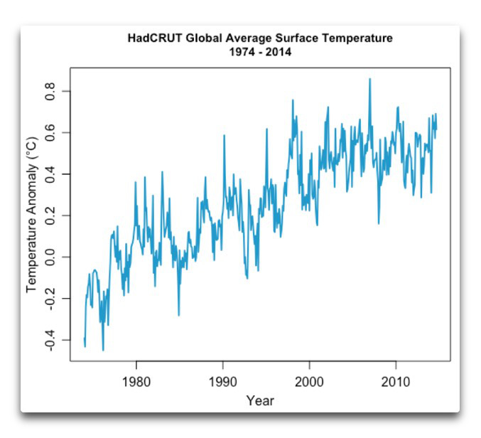
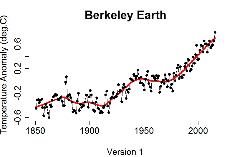
We’ve explained all this to David before, yet bizzarely we obviously need to do so again. Here’s the Mail’s version of the latest HADCRUT 4 data from the Met Office:

hadcrut-mail-20161211

and here’s ours:

hadcrut-wft-20161211

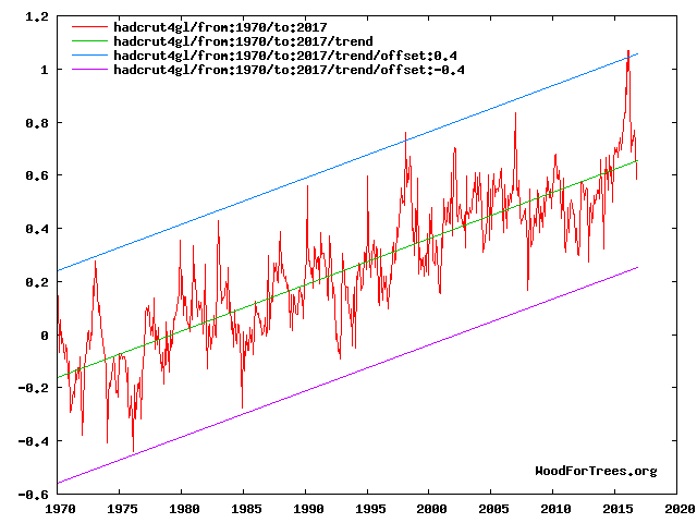
Can you spot any “cumulative effects of man-made global warming”?

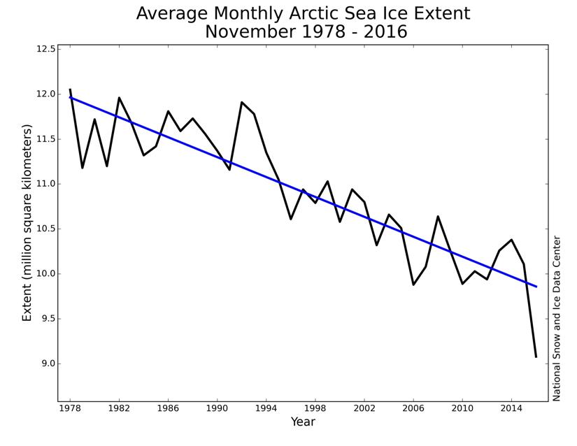
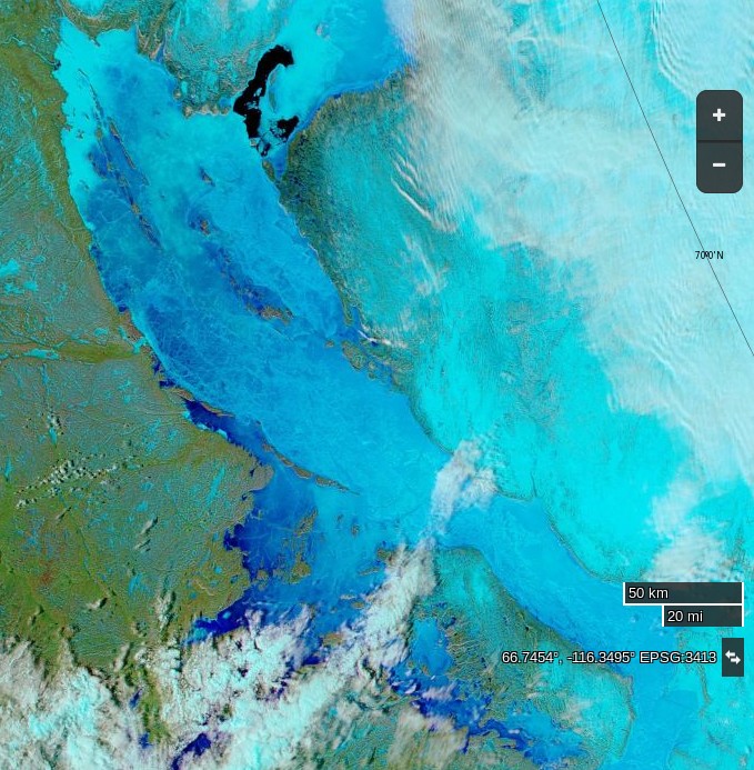
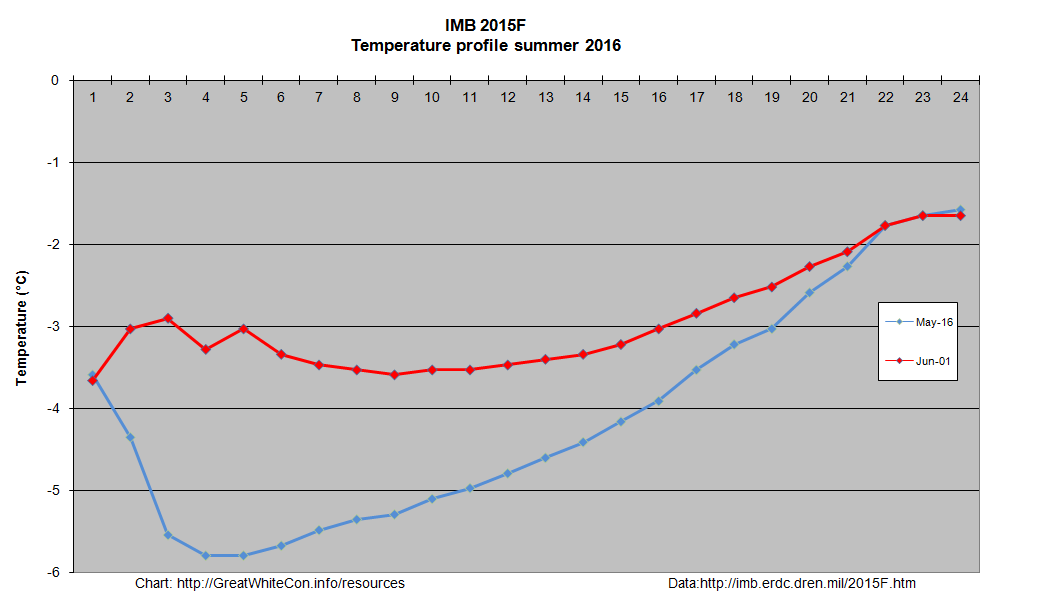
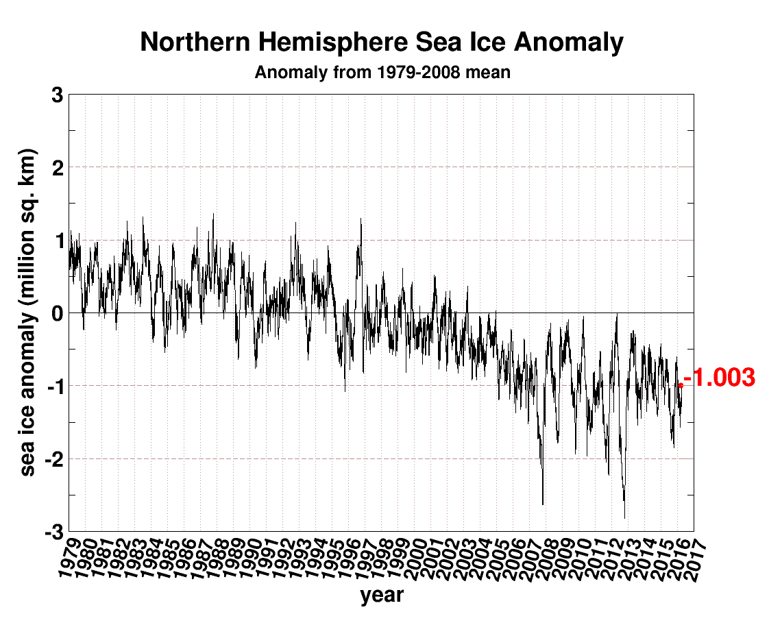
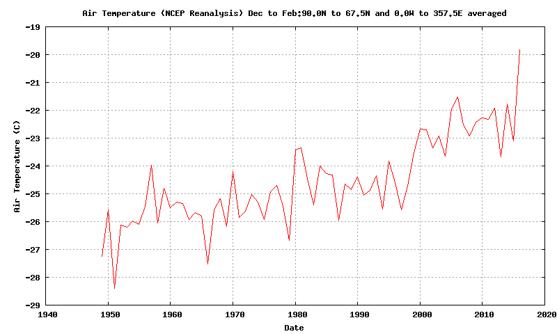
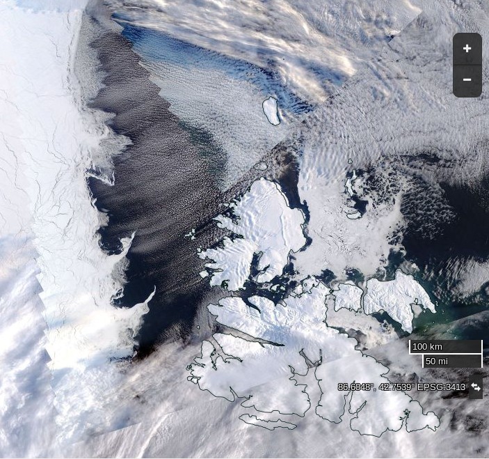
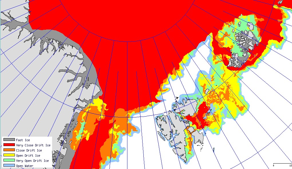
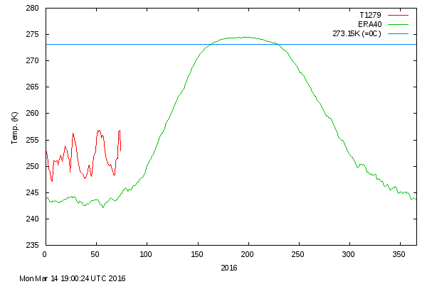
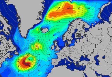
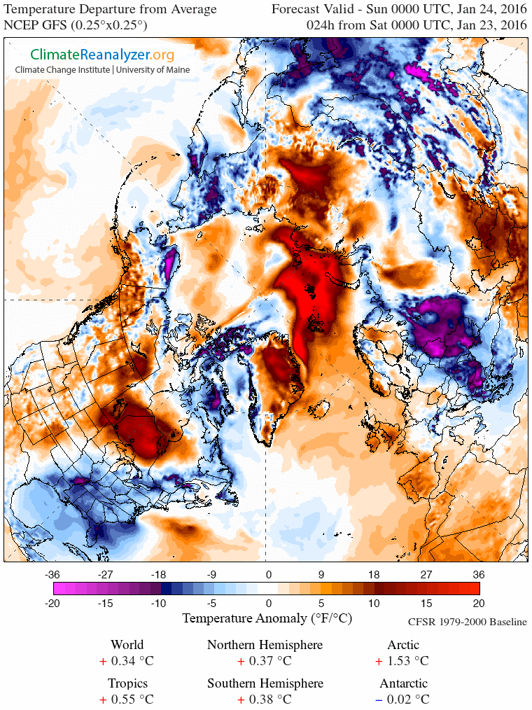
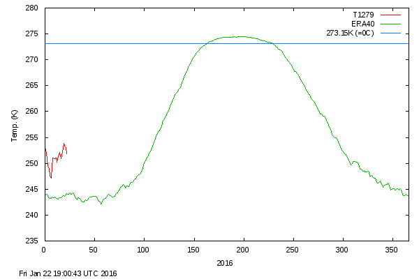
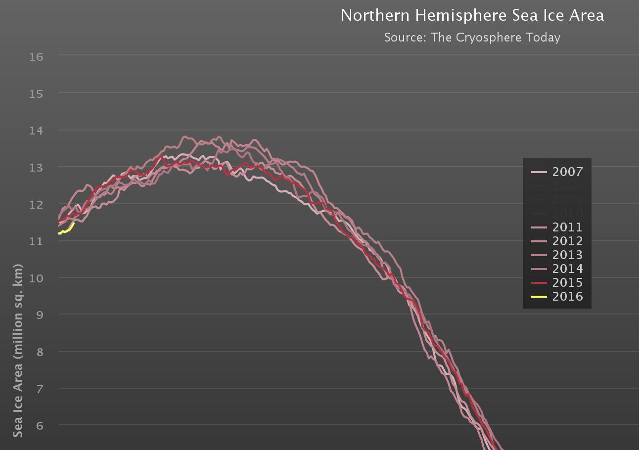
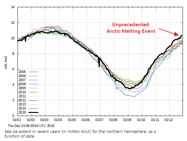
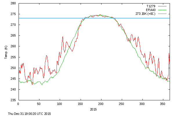
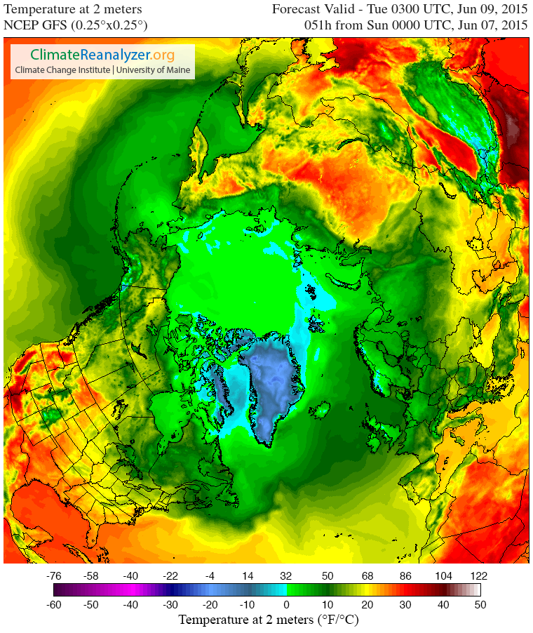
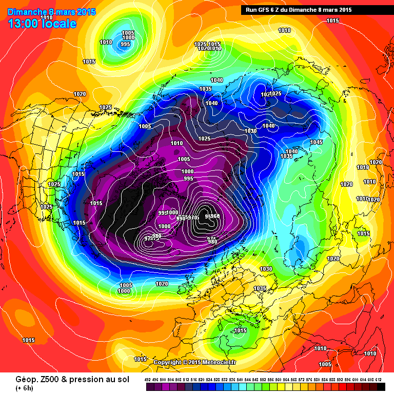
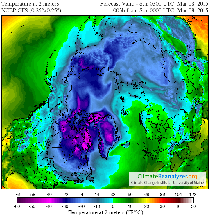
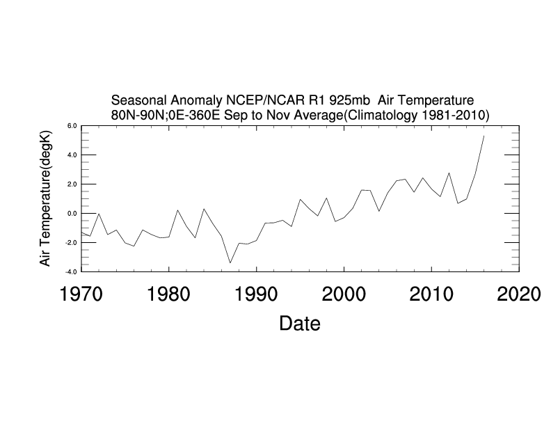
Messrs Smith, Rose, Delingpole, Whitehouse et al. may well be unaware of the fact that the satellite temperature data they’re so fond of cherry picking doesn’t include data from the lower troposphere between 80 degrees North and the North Pole. Just in case they fancy spinning the latest objective facts from the Arctic in the near future, here’s the long term autumnal temperature trend:

80n-son-20161211

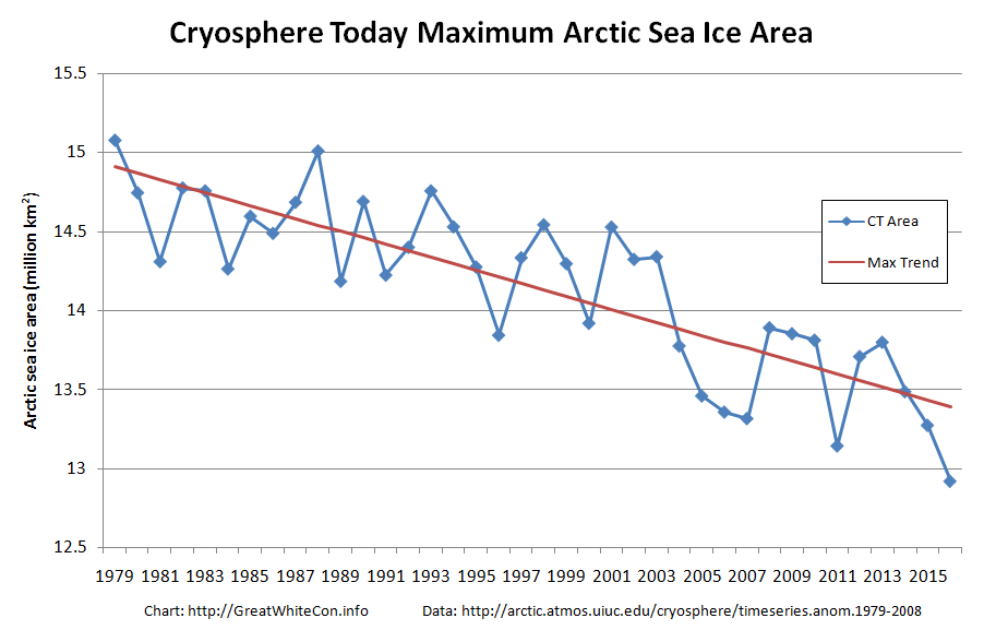
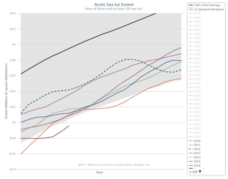
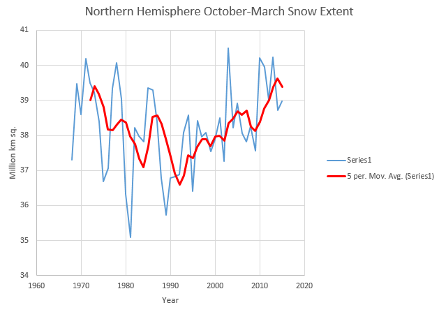
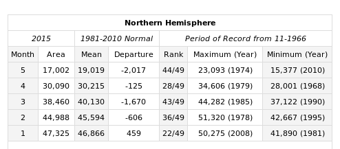
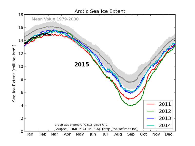
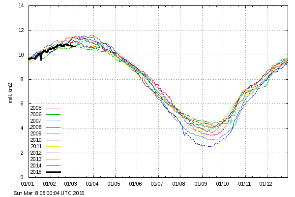
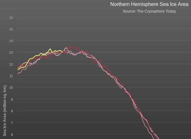
and here’s the long term November Arctic sea ice extent trend:

monthly_ice_11_nh

Summer 2016 Surface Melt Takes Off

June has arrived, and according to the Great White Con Arctic sea ice calendar that means the summer surface melting season has started. Once July arrives bottom melt should have started in earnest too, but for now let’s stick to the surface. Here’s the Climate Reanalyzer map of Arctic surface air temperatures at 06:00 UTC this morning:

CCI-T2-2016-06-04-0600

Green areas are above 0 degrees Celsius, and bear in mind that the melting point of sea ice is at around -1.8 degrees Celsius. The red areas near the East Siberian Sea coast are 25-30 degrees Celsius. Given those sort of temperatures you might well think that some snow and/or ice in that area would be melting, and you would be correct! Here is the Japan Aerospace Exploration Agency’s current map of Arctic surface melting:

AM2SI20160603A_SIT_NP

The assorted shades of blue/grey show the areas where surface melting is already underway. Whilst this melting is taking place you may possibly read in some quarters of the cryodenialosphere that “There is almost no melting going on in the Arctic“. The authors of such nonsense evidently don’t know their proverbial Arctic arse from their elbow.

Here’s how today’s surface melting in the East Siberian Sea looks from space:

NASA Worldview “false-color” image of the East Siberian Sea on June 4th 2016, derived from the MODIS sensor on the Terra satellite

Meanwhile over on the other side of the Arctic, here’s yesterday’s surface melting on “Amundsen’s Route” through the Northwest Passage:

NASA Worldview “false-color” image of the Northwest Passage on June 3rd 2016, derived from the MODIS sensor on the Aqua satellite

By way of further illustration of the fact that Arctic sea ice is and has been melting, here is a graph of the current area of sea ice in the all important central area of the Arctic Basin, courtesy of “Wipneus” at Arctische Pinguin:

basin-area-20160603

The areas included are the Central Arctic Basin, plus the Beaufort, Chukchi, East Siberian and Laptev Seas. The above zero temperatures are forecast to spread across the Central Arctic Basin early next week, whereupon it will be very interesting to discover what happens to the snow around the single ice mass balance buoy currently transmitting near real time data. Here is the current temperature profile for the sea ice underneath IMB buoy 2015F:

2016-06-02_2015F

The current conditions there are summarised this morning as:

Pos: 82.00 N, 147.45 W
Air Temp: -3.74 C
Air Pres: 1007.42 mb
Snow depth: 21 cm
Ice thickness: 202 cm

Normally by now there would also be a number of webcams beaming back pictures from across the sea ice in the Arctic Basin. However according to NOAA:

Due to funding constraints, it was not possible to deploy new Web Cams in Spring 2016, but deployments in Spring 2017 are planned.

Three of the camera carrying O-Buoys also seem to have failed over the winter, which leaves us with only O-Buoy 14 to reveal the forthcoming melt to us:

O-Buoy 14 image from June 2nd 2016

O-Buoy 14 is currently colocated with Ice Tethered Profiler 89, the yellow object in the foreground, at 77.49° N, 153.92° W, to the north of the Beaufort Sea. ITP 89 measures the temperature and salinity of the water beneath the sea ice and revealed this the last time it managed to take a measurement, a month or so ago:

itp89-20160604

If you examine the extreme right hand edge of the charts carefully you will no doubt note that the water underneath the ice has recently become both warmer and saltier.

Watch this space!

[Edit – June 5th 2016]

The latest JAXA/ADS map shows that the area of sea ice undergoing surface melting has increased since yesterday, particularly over the Chukchi Sea:

AM2SI20160604A_SIT_NP

The recent clouds over the Beaufort Sea cleared yesterday. Here’s a close up view of the open water between the big floes from the Suomi satellite:

Beaufort-Floes-Suomi-20160604

For a more distant perspective see our Summer 2016 image archive.

It’s not simply the surface that’s melting either. Here’s the latest “high resolution” AMSR2 sea ice area graph for the Pacific side of the Arctic:

2016-06-04-Pacific-AMSR2-Area

The Awful Terrible Horrible Arctic Sea Ice Crisis

As our regular reader(s) will be aware, Anthony Watts has been plagiarising our content and republishing it on his “Watts Up With That” blog. In a perplexing perversity he has also been refusing to publish content that we have happily contributed to the self same blog. Hence we have taken the liberty of basing our title for today on a recent WUWT guest post by Willis Eschenbach entitled:

The Awful Terrible Horrible Global Sea Ice Crisis

Here’s what Willis had to say at the end of his article:

My Usual Request: Misunderstandings are the curse of the internet. If you disagree with me or anyone, please quote the exact words you disagree with, so we can all understand the exact nature of your objections. I can defend my own words. I cannot defend someone else’s interpretation of some unidentified words of mine.

My Other Request: If you believe that e.g. I’m using a method wrong or using the wrong dataset, please educate me and others by demonstrating the proper use of the method or the right dataset. Simply claiming I’m wrong about methods doesn’t advance the discussion unless you can point us to the right way to do it.

Data: The Hadley HadISST ice (and sea surface temperature) data is available here. I used the NetCDF file HadISST_ice.nc.gz (~15Mb) at the bottom of the page.

and here’s a copy of our still invisible comment:

2016-04-07_0600-WUWT

Epitomising the indomitable spirit of scientific skepticism we set out to duplicate the results obtained by Mr. Eschenbach and answer our own question as well as his. Here is what we’ve discovered. Firstly global sea ice area since 1974:

HadISST-Global

and then Arctic sea ice area since 1974:

HadISST-Arctic

Now as our very own learned guest poster Bill The Frog all too briefly pointed out to Willis Eschenbach on April 7th:

2016-04-07-1757-WUWT-BtF

Ignoring Bill’s helpful hint Willis concluded that:

We’re pretty sure that the global average surface temperature increased from the mid-1970s to about 1998. However, we see no sign of this in the global sea ice area data. Instead, ice area remained stable throughout the 1980s and the 1990s, while temperatures climbed:

hadcrut-global-average-surface-temp-WUWT-20160406

Next, we’re also pretty sure that there was no significant change in the global average temperature from about 1998 to 2015, the end of the ice data. Despite that, starting in 2000 the ice area first dipped to a low in about 2007, and since then has been climbing rapidly.

This supports a curious conclusion, which is that in modern times at least, the global sea ice area is not particularly a function of the global average surface temperature. Go figure…

Now that we’re in possession of all this newly revealed data about historical sea ice area and censorship in the cryospheric blogosphere what should we “go figure”? Firstly one feels compelled to ask why Willis’s global average temperature graph neglects to mention 2015 when he implies that it does?

Should you figure anything else please free to answer our query on a virtual postcard, in the space provided for that purpose below. You may additionally like to vent your feelings concerning this controversial cover-up of our changing climate over on Twitter using the #SnipGate hashtag.

Claim – Arctic Sea Ice Holds Firm?

Today’s Arctic sea ice claim comes from the Bishop Hill blog of Andrew Montford, which recently stated that:

This morning’s story appears to be the hoary old “Arctic sea ice in freefall” one.

“The Arctic is in crisis. Year by year, it’s slipping into a new state, and it’s hard to see how that won’t have an effect on weather throughout the Northern Hemisphere,” said Ted Scambos, lead scientist at the Colorado-based NSIDC.”

As usual on these occasions, I take a quick look at the Cryosphere Today anomaly page, where I find the sea ice apparently still stuck firmly in “pause” mode.

seaice.anomaly.-20160328

Having inadvertently wended my way onto The Bishop’s Hill via the northerly extension to Eli’s Rabett Warren I felt compelled, as usual, to quibble with Andrew’s “apparently firmly in ‘pause’ mode” claim. Since graphs in comments are not available over on The Hill, or The Rabett Run for that matter, let’s take a look at some graphic representations of the available data over here instead. Commenter “Golf Charlie” asks at The Bishop’s:

With CO₂ levels continuing to rise, why hasn’t temperature risen, and the ice disappeared as predicted?

Let’s see shall we? CO₂ levels are indeed continuing to rise:

Keeling-20160330

Temperature has risen, as predicted:

2015-berk1

Arctic amplification is occuring, as predicted:

Time series of Arctic surface temperature in winter (Dec/Jan/Feb)

Arctic sea ice is disappearing, as predicted:

CT-20160330

CT-Max-2016-Final

Q.E.D?

Vanishing Svalbard Sea Ice

At the turn of the year we speculated about the potential effect of high temperatures and the swells caused by strong winds on sea ice in the Fram Strait and Barents and Greenland Seas. With the vernal equinox rapidly approaching let’s take stock of the state of Svalbard sea ice. Here’s one the first “visual” satellite images of the area in 2016 recorded yesterday by the Aqua satellite:

NASA Worldview “true-color” image of the Central Arctic north of Svalbard on March 14th 2016, derived from the MODIS sensor on the Aqua satellite

and here is the equivalent sea ice map from the Norwegian Meteorological Institute:

Svalbard-Map-20160314

Both sources reveal an unseasonable lack of solid sea ice around Svalbard. In fact an intrepid Northwest Passage navigator who didn’t mind the dark might well currently be able to circumnavigate Svalbard!

The Norwegian Meteorological Institute also produce a time series of sea ice area in the Svalbard region based on data from OSI-SAF. It currently looks like this:

osisaf-svalbard_20160314

As sunlight returns to the Central Arctic north of 80 degrees there is an anomalously large area of open water ready to soak up the rays. Here is what the Danish Meteorological Institute timeseries of Central Arctic temperatures looks like at the moment:

DMI-meanT_20160314

and here is the current Svalbard surf forecast from Magic Seaweed:

MSW-20160315

Whilst we speculate on what all this might mean for the Atlantic side of the Arctic over the coming melting season, here’s our new Svalbard Sea Ice page which contains a variety of graphs and maps to help us keep track of events on that part of our planet.

More Heat Heading for the North Pole

We speculated a few days ago about whether the “Son of Storm Frank” might have battered Britain by now, and be sending a 10 meter swell past Svalbard towards the Arctic sea ice edge. That’s not quite how things have worked out in practice however! We haven’t had another named storm affecting the United Kingdom directly, but we have received a series of long distance swells from a sequence of hurricane force storms further out in the North Atlantic. I even managed to test my Arctic surfing equipment by personally partaking in the swell generated by Hurricane Alex!

Moving from the water into the air, here’s the Danish Meteorological Institute’s forecast for Greenland tomorrow:

Greenland-20160123+24h

If you’re at all familiar with isobars you’ll note yet another storm off Southern Greenland and that comparatively warm, moist air will be heading up the east coast of Greenland towards the Fram Strait, albeit not at the speeds generated by Storm Frank! As a consequence here is Climate Reanalyzer’s surface temperature anomaly map for first thing tomorrow:

CCI-AnomT-20160123+24h

and here is how it looks by Wednesday lunchtime:

CCI-AnomT-20160123+108h

As you can see, the ultimate effect of the recent hurricane force storms in both the Atlantic and the Pacific is to attack the Arctic with warm, moist air from both sides. Whilst we wait to see exactly how this much shorter term forecast pans out, particularly at the North Pole itself, the DMI’s graph of temperatures in the central Arctic has burst back into life after a “brief hiatus” in the New Year. Here’s how it looks at the moment:

DMI-T80N-20160123

New Year 2016 Arctic Meltdown Update

On January 1st 2016 the 15% concentration threshold daily Arctic sea ice extent metric reported by the United States National Snow and Ice Data Centre reached the lowest ever level for the first day of any year since their satellite derived records began in 1979. A couple of days later the more familiar 5 day trailing averaged extent also reached the lowest ever level for the date:

Charctic-20160107

Cryosphere Today have been somewhat sluggish about updating their records of Arctic sea ice area, but have at long last revealed that their metric is now also at the lowest ever level for the date:

CT-NH-20160107

Meanwhile Great White Con commenter “Just A Thought” states that:

I find it hard, with what I do have access to, to see why everyone is so worried that the Arctic is melting.

He or she has evidently only had access to the propaganda perpetrated by Tony Heller (AKA “Steve Goddard”) on his so called “Real Climate Science” blog. Mr. Heller’s latest Arctic pronouncement on December 31st 2015 is entitled “Arctic Meltdown Update” and claims that:

Experts say that a terrifying storm melted the North Pole yesterday. This unprecedented melting event has caused Arctic ice to reach its highest December extent in over a decade.

justifying that comment with the following graph of his beloved (albeit deprecated) 30% concentration threshold DMI extent metric:

DMI-30-2015-12-31-

Here’s a video revealing the effect of the recent “terrifying storm” on the sea ice on the North Atlantic side of the Arctic:

As you can see the ice at the North Pole didn’t melt away. However the ice edge did retreat in the immediate aftermath of what is referred to here in the United Kingdom as “Storm Frank“. Frank led to lots of flooding in the North of the nation, and also to some strong winds inside the Arctic Circle:

WW3Wind-20151230-1400

Those winds, travelling over a long stretch of open ocean, produced some pretty significant waves, speeding in the direction of the sea ice edge:

WWIII-20151231-0000

Meanwhile temperatures near the North Pole did briefly rise above the freezing point of sea ice in the middle of the Arctic winter. Here’s the Danish Meteorological Institute’s view of the air temperatures in the central Arctic:

meanT_20151231

and here is NOAA’s temperature anomaly reanalysis for December 30th 2015:
NOAA-anomT_20151230

Personally I reckon the 25 m/s winds and resulting 10 meter waves had more effect on the sea ice metrics than the 25 °C above normal air temperatures, but your mileage may of course vary, especially if your pseudonym is “Steve Goddard”!

Alaska May Snow Cover At Record Low Levels

“Steven Goddard” is evidently magically turning into “Snow White’s” muse. His latest fairy tale addresses her second favourite subject after Arctic sea ice, which is of course northern hemisphere snow cover. The article is entitled “October-March Snow Cover At Record High Levels“, and proudly proclaims that:

Fifteen years ago, climate experts said that snow is a thing of the past. Since then, Northern Hemisphere snow cover has soared to record levels.

unRealSnow-20150607

Rutgers University Climate Lab :: Global Snow Lab

What this tells us is that cold air is intruding further south during the snow season. It also tells us that Tom Karl at NOAA is lying about global temperatures.

Snow White and I innocently followed Steve’s link, then clicked on the “Rankings” link on the left hand side, where we discovered this:

Selection_474

not to mention this:

Selection_473

Feeling confident that all the Real Scientists would be interested in the latest data hot off the presses from the Snow Lab we showed them this picture:

maysnowmap2015

and enquired?

What does that tell us?

The initial response from “gator69”?

The fact that you refer to “normal” in climate or weather tells us that you have zero understanding of either.

When will you work to help the starving millions by confronting alarmists, and assist in diverting money to where it is desperately needed right now?

Since “Real Scientists” are apparently aghast at anomaly maps, here are the current absolute values from Rutgers:

RutgersSnow-20150607

Just in case you are wondering what all this has to do with Snow White’s favourite subject of all, here’s the current Topaz 4 map of Arctic sea ice snow cover:

Topaz4Snow-20150607

and here is the current northern hemisphere temperature forecast for Tuesday morning from the “Climate Reanalyzer

CCIT2-20150607+51

Snow White and I cannot help but wonder what effect temperatures above zero across virtually the entire Arctic Ocean will have on the snow cover that currently remains. We also cannot help but wonder whether 2015 Arctic sea ice extent will suddenly start tracking 1995 or 2006 as a consequence.

We also wondered what Tom Karl et al. of NOAA have been saying about the Arctic, and discovered this:

Since the IPCC report, new analyses have revealed that incomplete coverage over the Arctic has led to an underestimate of recent (since 1997) warming in the Hadley Centre/Climate Research Unit data used in the IPCC report. These analyses have surmised that incomplete Arctic coverage also affects the trends from our analysis as reported by IPCC.

Finally, for the moment at least, here’s the Topaz 4 snow depth forecast for June 16th 2015:

Topaz4Snow-20150616

Thanks to “Nightvid Cole” and “Vergent” at the Arctic Sea Ice Forum for bringing that view of things to our attention.

Arctic Sea Ice Area Lowest Ever (For the Date!)

As we reported on February 18th, some of the Arctic sea ice extent metrics reached the lowest levels for the date in their respective histories quite some time ago. Today though, we’re looking at a full house. The daily NSIDC and IJIS extent numbers have both been at all time lows for the date for quite some time now. Here’s how the NSIDC 5 day average extent looks at the moment:

2015-03-06_NSIDC

and here’s the IJIS/JAXA daily extent:

vishop_sic_extent-20150307

Meanwhile a series of storms in the North Atlantic have been bringing large surf to the shores of the Western United Kingdom, and battering the edge of the sea ice in the Greenland and Barents Seas. Here’s how GFS looks currently, as visualised by MeteoCiel:

gfsnh-20150308-6

In addition this has  resulted in warm air from further south being funnelled into the high Arctic, so much so that the surface temperature anomalies currently look like this:

CCI-AnomT-20150308+003

whilst the temperatures 2 metres above the surface of the Arctic look like this:

CCI-Temp2m-20150308+003

If you look closely you’ll see that air temperatures 2 metres above the North Pole are currently similar to those around the shores of the Great Lakes of North America.  As a result of all this atmospheric activity today we bring you news that both the Danish Meteorological Institute “new” 15% extent:

DMI-15-icecover_20150307

and “old” 30% metrics:

DMI-30-icecover_20150308

have now joined the club.

The Cryosphere Today area metric has been holding out against the trend in sea ice extent for weeks, but we can confidently predict that when their next update is released it too will also reveal the lowest ever Arctic sea ice area for the 65th day of the year, in records going back to 1979. Here’s how their graph looks currently:

CTArea-2015-Day64


The House of Lords Responds to a Changing Arctic

The United Kingdom’s House of Lords are an unlikely bunch to be bundled under the banner of “alarmist” or even “warmist”. Nevertheless their Select Committee on the Arctic has just published a report entitled “Responding to a Changing Arctic“, and in this video the chairman of that committee, Lord Teverson, briefly outlines their findings:


Note that he starts by saying that:

Absolutely the obvious thing first of all is that with the temperatures going up [in the Arctic] at twice the rate of the rest of the world the thing that everybody is seeing is reduction in sea ice which has reduced quite substantially over recent years, and of course a lot of the Arctic is land and we have the melting ice on Greenland particularly, which is causing sea level rises in the rest of the world.

In order to get that message across the committee has also produced the following infographic:

LordsInfographic
 
which shows how the temperature over land has been increasing whilst the sea ice extent in the Arctic has been declining.  The committee have also made all the learned evidence they received whilst producing their report publicly available. Professor Andy Shepherd from the University of Leeds told the committee that:

The majority of sea ice changes witnessed in “the past 50 or 60 years” could be attributed to greenhouse gas emissions and their effect on temperatures in the Arctic region.

and:

Suggested that the length of the solar melt season had increased by around five days per decade, causing additional melting and retreat of the ice.

How strange then, that David Rose made no mention of any of this when reporting Prof. Shepherd’s views in his “Myth of Arctic meltdown” article of August 31st 2014?

How strange also, that Christopher Booker maintained in his “The fiddling with temperature data is the biggest science scandal ever” article of February 8th 2015 that:

The ice-melt is not caused by rising global temperatures at all.