Tag Archives: NSIDC

The United States’ National Snow and Ice Data Center

Watts Up With the Maximum Trend?

The self proclaimed “world’s most viewed site on global warming and climate change”, otherwise known as the “Watts Up With That?” blog, recently published an article entitled “Arctic Sea Ice Appears to Have Reached Maximum And Other Ice Observations”. Since I’ve been speculating about the date of the 2014 maximum Arctic sea ice extent myself I avidly read the article but found myself ultimately somewhat perplexed. There were lots of graphs and charts displayed, but there was no sight or mention of what seems to me the most relevant one of all. The long term trend. Here is an expurgated version of my attempts to bring this oversight to the attention of the Watts Up With Thatters:

Us:

A "dull" comment about Arctic sea ice trends
A “dull” comment about Arctic sea ice trends

Them:

Re: Michael Jennings says:
March 26, 2014 at 7:07 am

[snip . . this is dull. Put some content into your contributions or you are just trolling . . mod]

Us:

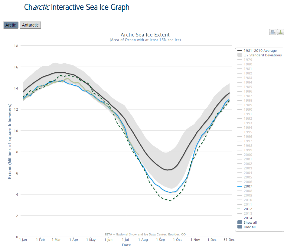
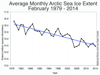
At the risk of repeating myself, here’s the latest dull content out of NSIDC:

Do you see the blue line heading for the bottom right?

[snip.. lots of dull references to Antarctic sea ice and “Real Science” removed.. mod]

Them:

Snow White needs to get up to speed on the Scientific Method: skeptics have nothing to prove.

Rather, the onus is on the alarmist crowd to provide scientific evidence showing that their CO2/cAGW conjecture is true. They have failed miserably.

But there is no scientific evidence supporting their belief in manmade global warming. None at all. Every last climate model has failed. They were all wrong.

The alarmist crowd is fixated on Arctic ice, instead of on global ice cover. Why? Because that is their last forlorn hope; every other climate scare has been debunked. Well, it’s time to debunk the ‘disappearing Arctic ice’ scare, too:

Global sea ice is at it’s 30-year average [the red graph – click in chart to embiggen]. We already know about the polar see-saw, in which the NH and SH poles balance each other out. That effect can be clearly seen in the global ice chart above.

There is nothing either unusual or unprecedented happening. What we observe now has happened before, repeatedly, and to a much greater degree. Rational folks understand that. It is called the climate Null Hypothesis, and it has never been falsified. The Null Hypothesis is a corollary of the Scientific Method. So is the fact that the onus is on those who produce the catastrophic CO2/AGW conjecture, to suport their belief with scientific evidence.

But there is no evidence proving that Arctic ice is in unprecedented decline. None at all. There is no evidence to prove that the current Arctic ice fluctuation is anything other than natural climate variability. Occam’s Razor says that natural variability is by far the most likely explanation.

The Arctic ice scare is just the same as all the other climate scares. It is promoted by religious True Believers, who expect everyone to share in their Chicken Little panic.

But that only works on those who are ruled by emotion, and fright is an emotion. Scientific skeptics, OTOH, are logical, and therefore they are unaffected by the silly ‘Arctic ice’ scare.

Us:

So to summarise, you cannot muster a single chart to refute my assertion about Arctic sea ice decline, let alone “hundreds”.

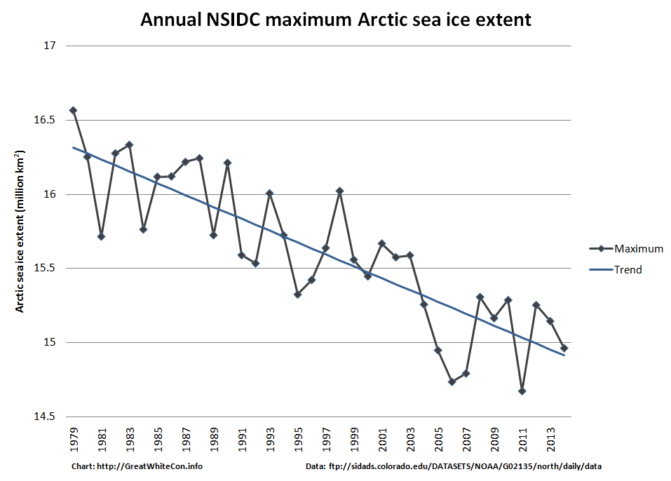
For your edification, and for that of the writer of the original article who for some strange reason neglected to include a graph showing the long term trend in Arctic sea ice maximum extent, here is one I prepared earlier:

Provisional NSIDC annual maximum extent graph for 1979 – 2014
Provisional NSIDC annual maximum Arctic sea ice extent graph for 1979 – 2014

Them:

From a comment on a different thread on WUWT, on April 10, 2014 at 3:33 am (WUWT time)

I’m sorry Snow White (or Mr Hunt, if you prefer), but I think that a little courtesy would be in order. I’ve read every word on the link you’ve provided, and the central theme of your original post was that “there was no sight or mention of what seems to me the most relevant one of all. The long term trend [of Arctic sea ice]“. You described more than one attempt to bring this deficit to the attention of WUWT.

Given that Michael D posted on your page at April 9, 2014 at 4:01 pm, politely pointing out that the WUWT sea ice page has just such data presented, it would seem a basic courtesy to either acknowledge his assistance (in this blog or yours) and either thank him, or explain why graph does not answer your criticisms.

I acknowledge that your arguments seem to have moved on to volume now, but they have been addressed by others, and better than I could have done. As an aside, I suppose I could run a blog with limited data about Antarctic sea ice coverage and volumes. I’m sure that I would be criticised, with comments explaining that I was looking at the mural through a microscope, and that the Antarctic buildup cannot be considered in isolation. I think that such criticism would be valid – your thoughts?

Us:

As you can see from the historical record, I asked on more than one occasion for someone to supply a link to “A long term (let’s say 30 years or more) graph for any measure of Arctic sea ice “quantity” showing anything other than a trend in the direction of the bottom right hand corner.” Nobody did. Nobody suggested looking at the WUWT sea ice page either, presumably because no graphs fitting my description can be found on there.

Q.E.D. ?

Them:

 We’ll keep you posted!

A Conversation With David Rose

Perhaps “conversation” is somewhat too strong a word? We have somehow managed to engage the Mail on Sunday’s top investigative journalist (AKA David Rose) in a debate about sea ice on Twitter. For some strange reason he tried to change the topic from the Arctic to the Antarctic!

Us:

Them:


Us:

Meanwhile we gatecrashed another debate that David Rose was gatecrashing, about a topic we have some experience with.

Them:

Us:


We’ll keep you posted!
Some Sceptical Questions

With the able assistance of some of the regular readers of Steve Goddard’s so called “Real Science” blog I have drawn up a checklist of questions to answer should you (or any “sceptics” you may be aware of) be suffering from the delusion that the sea ice in the Arctic is “recovering” or “rebounding”:

Us:

1. Is the NSIDC daily Arctic sea ice extent number for March 8th 2014 the lowest on record for that day of the year? Yes or No?

2. Is the Cryosphere Today Arctic sea ice area number for March 8th 2014 the lowest on record for that day of the year? Yes or No?

3. Is the IJIS Arctic sea ice extent number for March 9th 2014 the lowest on record for that day of the year? Yes or No?

4. What credible evidence can you provide to show that “The Arctic is getting colder”?

5. In what way has the NSIDC’s data been “contaminated by Mann”?

6. Where might one find “empirical data that hasn’t been contaminated” if not from the likes of NOAA/NASA/JAXA et. al.

7. How do you define “The Arctic”? [2014-3-12 16:53]

8. How much sea ice do you suppose will be left in the Gulf of St. Lawrence by September? [2014-3-12 20:26]

9. Which version of “the [thickness/volume] truth” do you choose to believe? [2014-3-14 09:30]

10. When was it that the DMI “changed the way they read/interrupt coastal features [which] they incorporated into their extent/area numbers”? [2014-3-15 15:08]

11. Why have we been accused of “a lie” and “put on ignore”? [2014-3-16 15:12]

12. Please be so good as to provide us with a link that describes “the modeling used by NSIDC to ‘create’ these numbers” [2014-3-20 13:00]

ftp://sidads.colorado.edu/DATASETS/NOAA/G02135/north/daily/data/NH_seaice_extent_nrt.csv

No reply to any seven eight nine ten eleven of those questions as yet.

Them:

In answer to question 7 Steve Goddard “says”

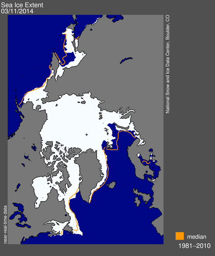
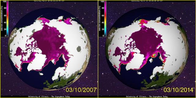
NSIDC visualisation of Arctic sea ice daily extent for March 10th 2014

Then a “Real Scientist” asks a sensible question:

Do NSIDC and DMI define the Arctic differently? If so, by how much?

Us:

We say:

1. Yes Dave.

2. Here’s a clue:

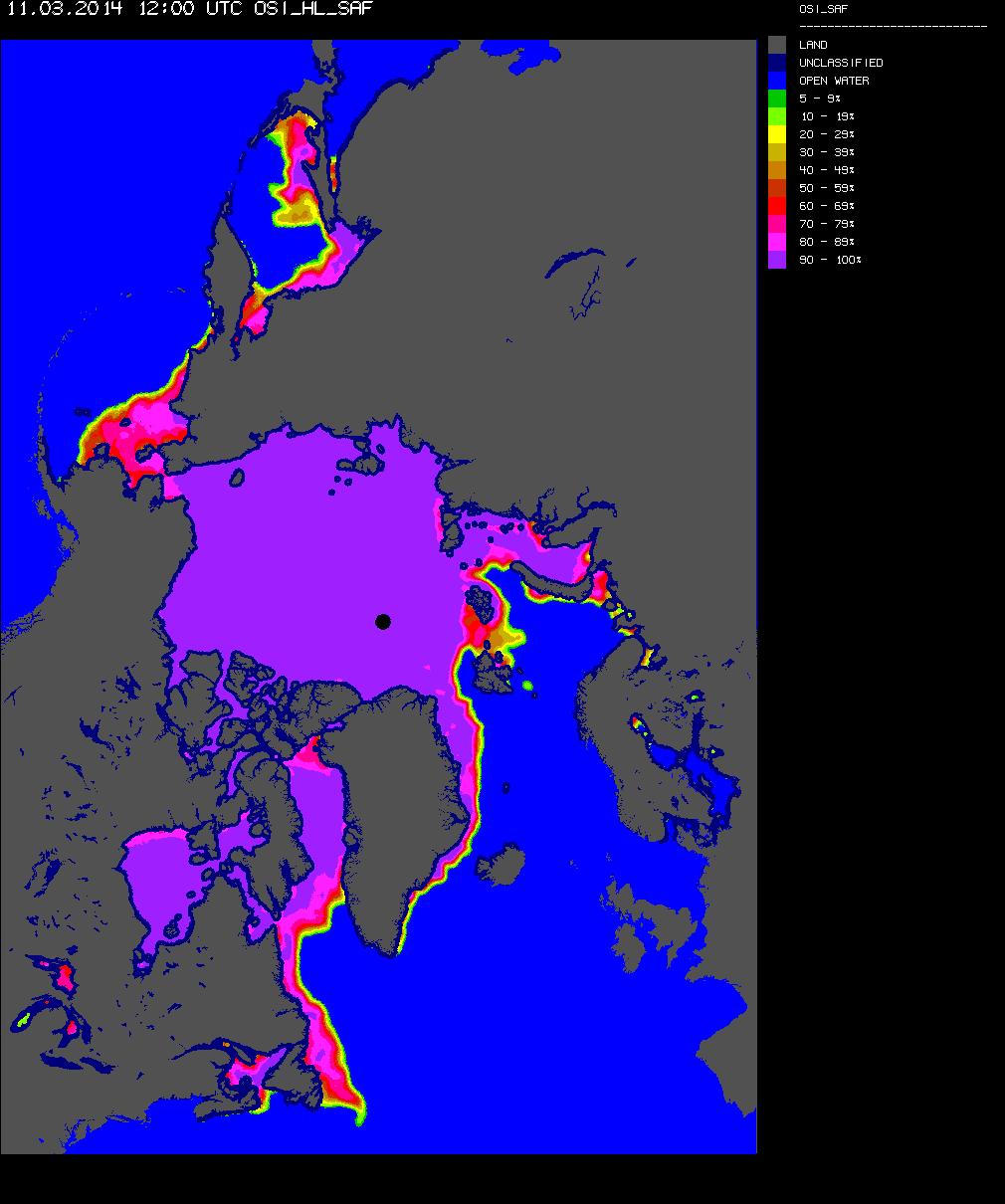
OSI Arctic sea ice concentration for March 11th 2014
OSI-SAF Arctic sea ice concentration for March 11th 2014

We’ll keep you posted!
New Mail for The Mail

Now seems like an entirely appropriate time to bring the latest “Shock News!” from the Arctic to the attention of the “mass media” here in once Great Britain. Here’s a copy of an email I sent to John Wellington over at The Mail earlier today:

Us:

Re: PCC – Global cooling in an ideal world

Hello again John,

Further to our previous correspondence on this controversial topic here is the latest “shock news” from the Arctic, hot off the presses down here at Ivory Towers:

https://greatWhiteCon.info/2014/03/the-arctic-sea-ice-recovery-vanishes/

In view of the recent inclement weather in this neck of the woods, perhaps you could forward it on to one of your finest investigative reporters for me?

Best wishes,

Jim Hunt

Them:

It’s now March 15th 2014, and this morning I received a “Dear Jim” note from John:

Dear Jim,

Nice to hear from you and I trust you were not hit by the West Country floods, climate-influenced or not.

I have discussed your message with a colleague who is interested in these things and we conclude that March is a little early in the year to be drawing significant conclusions. I have been shown some different graphs that appear to show 2014 is not dissimilar to the last few years. I am attaching these for your information.

Best regards

John

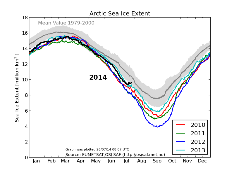
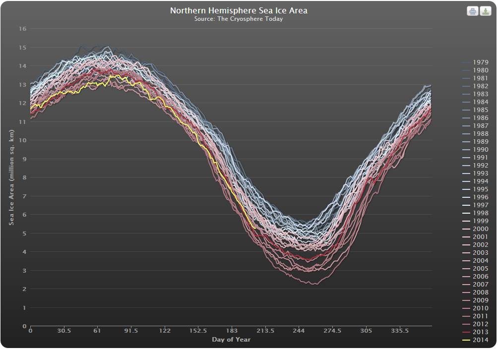
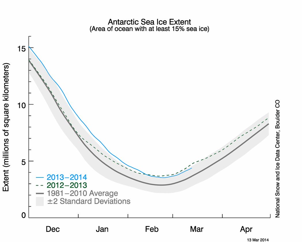
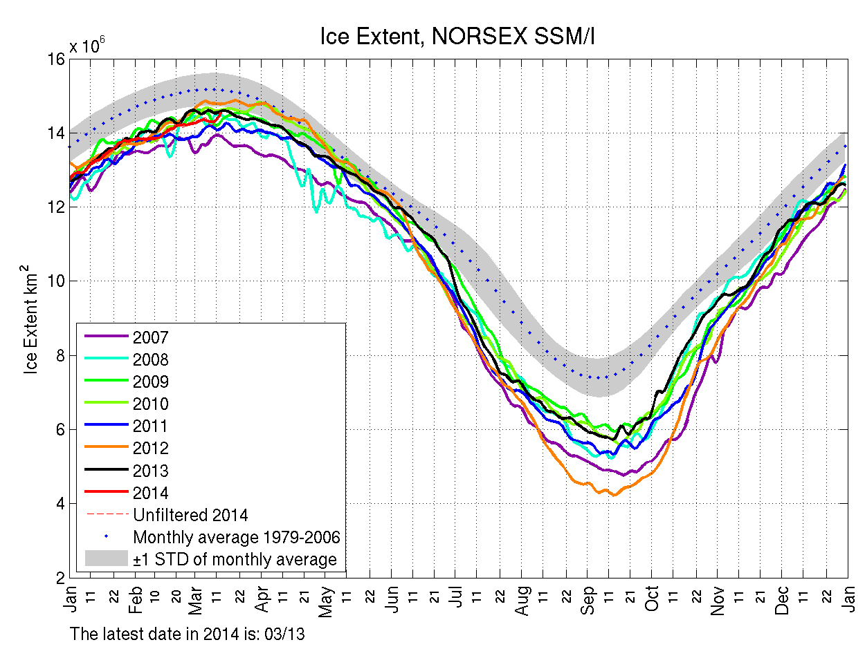
S_stddev_timeseries N_bm_extent cryo_compare_small ssmi1_ice_ext_small

Us:

Dear John,

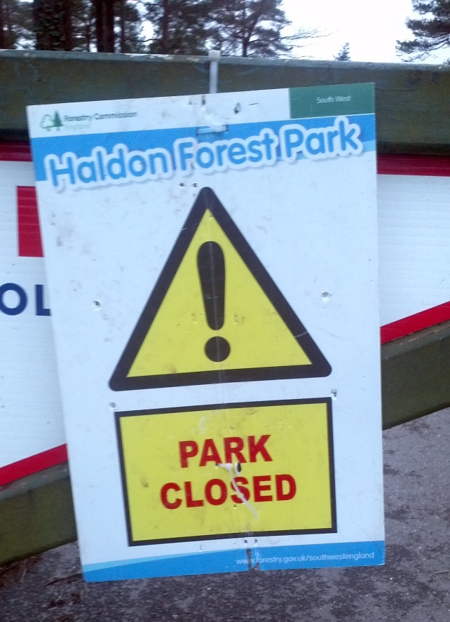
Thank you for your kind words. We’re situated halfway up Haldon, so we avoided the worst of the inclement weather. The top of the hill took a bit of a battering however.

The entrance to Haldon Forest Park on February 24th 2014
Haldon Forest Park on March 8th 2014

Our garden suffered a bit too, but thankfully the house was OK.

A new spring gushes from the side of Haldon Hill on Valentine's day 2014
A new spring gushes from the side of Haldon Hill on Valentine’s Day 2014

Others weren’t quite so fortunate:

http://econnexus.org/the-weather-report-from-soggy-south-west-england/

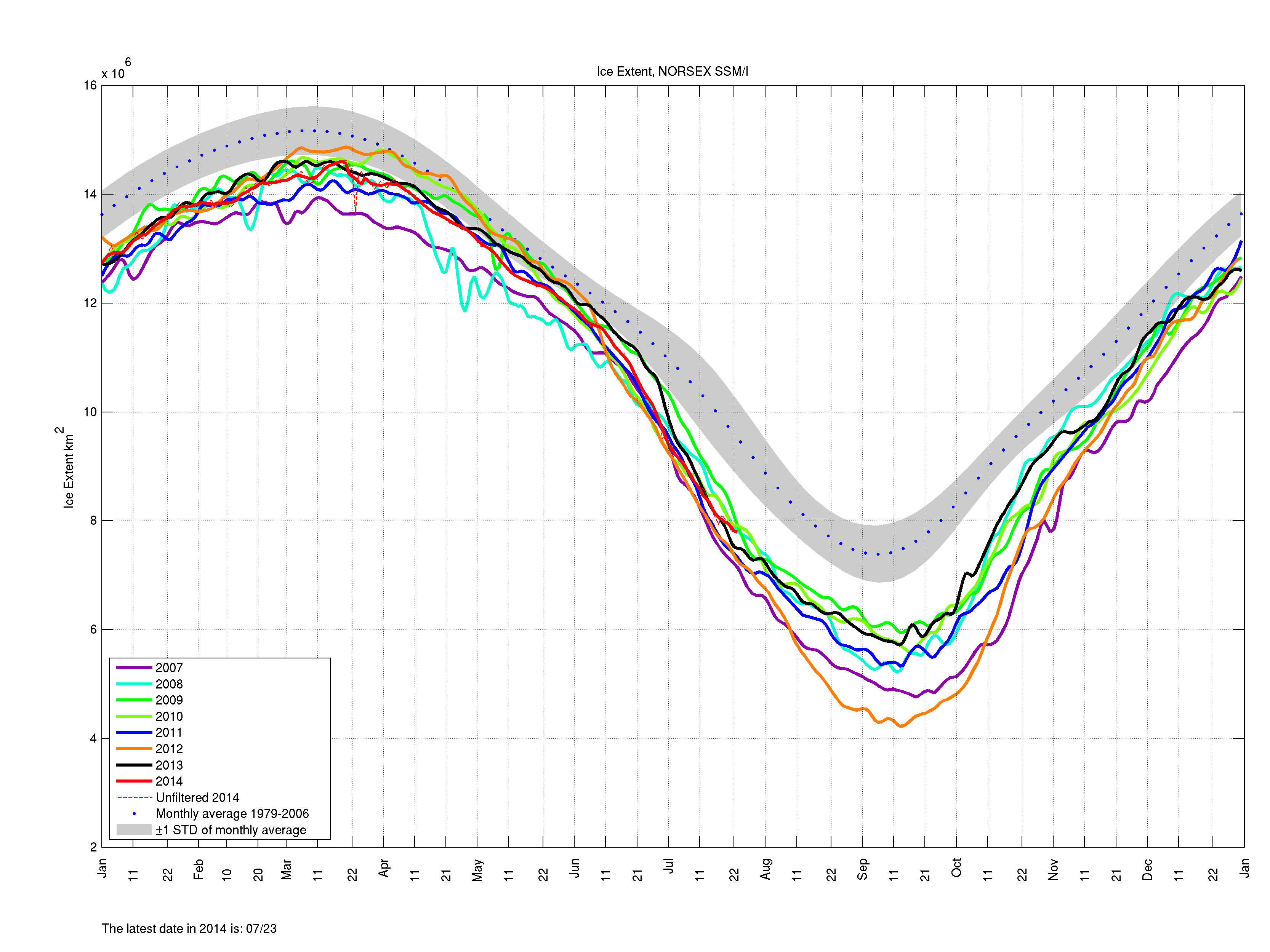
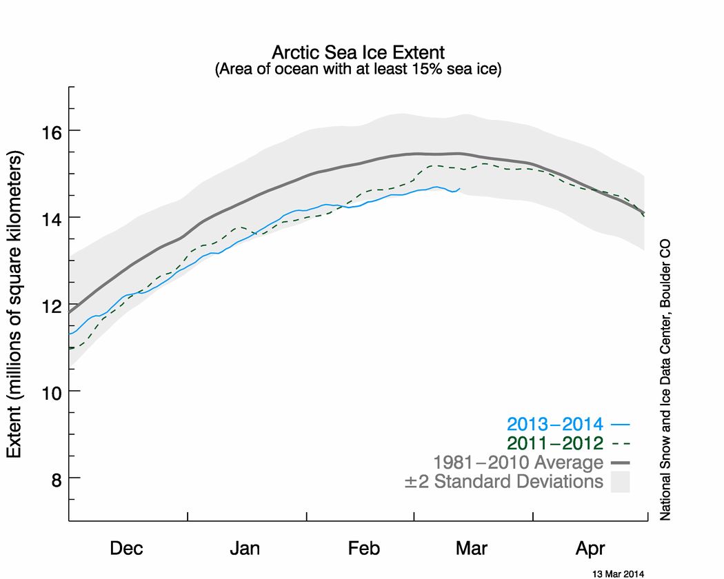
Regarding your own attachments, perhaps in the first instance you might ask your colleague to explain why he or she chooses to send you a NORSEX Arctic sea ice extent graph rather than one from the NSIDC, which I believe we established last summer is The Mail’s oracle on such matters? Please take a good look at the latest NSIDC equivalent to the Antarctic extent graph you sent me, which I attach for your convenience.

NSIDC Arctic sea ice extent graph for March 13th 2014

Whilst you’re at it perhaps you could also ask your colleague to answer at least the first three of these simple questions:

https://greatWhiteCon.info/2014/03/some-sceptical-questions/

You may also wish to pass on to your colleague the shock news that earlier this week the daily atmospheric carbon dioxide readings from Mauna Loa rose above 400 ppm almost 2 months earlier than last year?

https://greatWhiteCon.info/2014/03/our-guardians-sleeping-on-the-job/

Best wishes,

Jim

We’ll keep you posted!
Has Arctic Sea Ice Already Started to Recover?

In a word, NO!! Here we go again.

Them:

According to David Rose’s headline in yesterday’s Mail on Sunday:

Global warming ‘pause’ may last for 20 more years and Arctic sea ice has already started to recover.

There is of course plenty more where that came from, such as:

The 17-year pause in global warming is likely to last into the 2030s and the Arctic sea ice has already started to recover, according to new research.

A paper in the peer-reviewed journal Climate Dynamics – by Professor Judith Curry of the Georgia Institute of Technology and Dr Marcia Wyatt – amounts to a stunning challenge to climate science orthodoxy.

Not only does it explain the unexpected pause, it suggests that the scientific majority – whose views are represented by the UN Intergovernmental Panel on Climate Change (IPCC) – have underestimated the role of natural cycles and exaggerated that of greenhouse gases.

along with a:

Graph that makes a mockery of warming

Us:

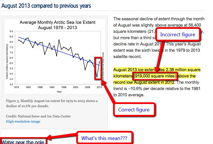
If you take a look at the evidence from the NSIDC the Mail on Sunday recently provided us with in support of their previous inaccurate headlines you will discover it says:

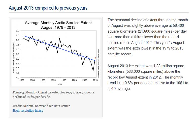
Monthly August ice extent for 1979 to 2013 shows a decline of 10.6% per decade.

QED? Apparently not as far as the Mail on Sunday’s concerned. If further evidence is needed please read our previously published “stunning challenge” to Judith Curry’s Arctic sea ice expertise. In brief:

Judith Curry republishes the same nonsense [as The Mail], but then neglects to publish even a similarly mealy mouthed “correction”, let alone anything remotely resembling the information originally published by the NSIDC upon which this collective fantasy is allegedly based. Therefore Judith should be taken seriously, and as a climate scientist rather than a tabloid journalist or a fantasy fiction writer?

We think not.

Them:

David Rose goes on to say (amongst other things) that:

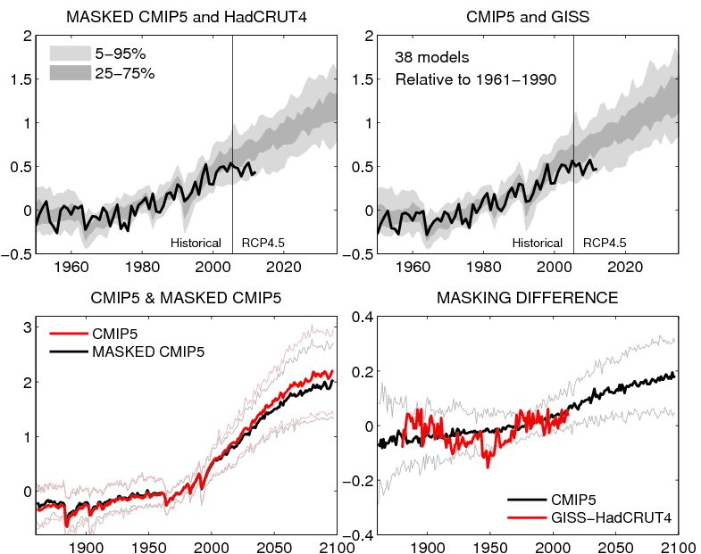
The graph shown above, based on a version published by Dr Ed Hawkins of Reading University on his blog, Climate Lab Book, reveals that actual temperatures are now below the predictions made by almost all the 138 models on which the IPCC relies.

The pause means there has been no statistically significant increase in world average surface temperatures since the beginning of 1997, despite the models’ projection of a steeply rising trend.

Us:

On Dr. Hawkins’ blog, commenting on a previous David Rose article in the Mail on Sunday, he says this:

David Rose has written an article in the Mail on Sunday which, by eye, seems to use the top left panel from the figure below, but without mention of its original source. In the article David Rose suggests that this figure proves that the forecasts are wrong. This is incorrect.

Here’s the figure Dr. Hawkins is referring to:

Ed Hawkins original graphs comparing CMIP5 simulations with observations
Ed Hawkins’ original graphs comparing CMIP5 simulations with observations

Finally, for the moment at least, here’s the text of an email we sent to the Managing Editor of the Mail on Sunday this morning:

Hello John,

Thanks for your additional comments. Unfortunately you still fail to address the primary question I’ve been asking for almost 2 months now, so I will be formally pursuing matters concerning the September 8th article via the PCC from now on.

Moving on I note that you have published another article by David Rose this weekend entitled “Global warming ‘pause’ may last for 20 more years and Arctic sea ice has already started to recover”, which mentions both Judith Curry and Arctic sea ice once again. I already have a few bones to pick with you about this one as well.

1. I posted an online comment on the article yesterday evening. It remains invisible this morning. Your web site says “The comments below have not been moderated.”. My comment included no links, although it did mention the “Great White Con”. Perhaps you could look into that for me, and provide me with an explanation?

2. Do you suppose it would be possible to persuade David to reveal his sources any more swiftly this time around? Where does his misleading graphic entitled “Graph that makes a mockery of warming” and the underlying data come from? At first sight it doesn’t seem to be from Judith Curry’s “Stadium wave” paper for example.

We have yet to receive a reply.

The Mail’s Concentration on Sea Ice Extent

Further to our previous communications about what we refer to here as “The Great White Con” I have now received another email from John Wellington, Managing Editor of the Mail on Sunday.

Them:

Amongst other things it says that:

The incorrect figure published by the NSIDC was taken in good faith. Our writer [AKA David Rose] did not expect an institution of its stature to make such an error, so it is not reasonable to expect him to contact NSIDC to check it, specially as the general idea of an increase in the icepack was consistent with more anecdotal information such as the shipping information. You say we did not produce evidence of the NSIDC mistake. I am attaching a screen grab of their web site before they corrected it.

Mail on Sunday screen grab of NSIDC article entitled "A real hole near the pole"
Mail on Sunday screen grab of NSIDC article entitled “A real hole near the pole”

John’s latest email also included the following statement:

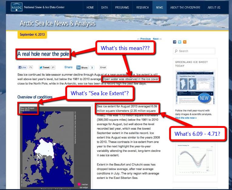
The August NSIDC report begins with a diagram (see  attachment). This shows the Arctic ice sheet stretching from Siberia to the Canadian islands:

Another Mail on Sunday screen grab of NSIDC "Arctic Sea Ice News" article of September 4th 2013
Another Mail on Sunday screen grab of NSIDC “Arctic Sea Ice News” article of September 4th 2013

Us:

You will note I have taken the liberty of annotating The Mail’s screen grabs with what seem to me to be reasonable questions for any vaguely competent investigative journalist to ask themselves when reading the NSIDC’s early September update. At this juncture I can only repeat this question from my most recent missive to The Mail:

This raises any number of questions about the Mail on Sunday misleading its readers, such as “Why didn’t The Mail ask the NSIDC about the apparently conflicting information, much like Bob Ward did, before publishing an article relying on that information?” not to mention “Why can’t David Rose perform accurate arithmetic?”

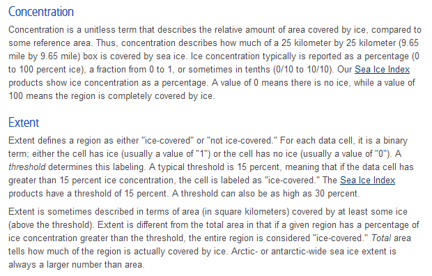
and provide my own screenshot from the “terminology” page of the NSIDC web site in a no doubt vain attempt to provide John and David with an answer to just one of those questions:

NSIDC explanation of the terms "concentration" and "extent"
NSIDC explanation of the terms “concentration” and “extent”

In brief:

Extent defines a region as either “ice-covered” or “not ice-covered.” For each data cell, it is a binary term; either the cell has ice (usually a value of “1”) or the cell has no ice (usually a value of “0”).

 Do you suppose that given their apparent difficulties in performing elementary arithmetic John and David are able to appreciate the difference between “1 or 0” and “low-concentration sea ice (20 to 80% cover) within our extent outline” or even “near-zero ice concentration“?

How about the readers of The Mail on Sunday, or the Press Complaints Commission for that matter?

The Balding Arctic Exposed

I’ve recently received a letter signed by John Wellington who is the Managing Editor of The Mail on Sunday.

Them:

Referring to David Rose’s Mail on Sunday article of September 8th 2013 John says amongst many other things that:

We deny that the article was significantly inaccurate apart from the original headline figure which we have already corrected.

and:

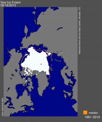
In August, ice did stretch from part of the Siberian shore to the Canadian islands. The image published in the newspaper and online supports this statement as does the enclosed image from the NSIDC site which shows the ice extent on August 18.

Here’s that image, which comes from the August 19th 2013 edition of the National Snow and Ice Data Center’s “Arctic Sea Ice News” entitled “The balding Arctic“:

National Snow and Ice Data Center graphic showing Arctic sea ice extent on August 18th 2013
NSIDC graphic showing Arctic sea ice extent on August 18th 2013

Us:

I’m currently writing a reply to John’s letter. Amongst many other things it directs his attention to this very article and says:

Images showing sea ice “extent” reveal remarkably little about whether an “ice sheet” is “unbroken” or not. If that is what you want to illustrate then an image showing “concentration” is much more helpful. In their report of September 4th upon which David Rose’s article is supposedly based, at least in part, the NSIDC helpfully provided such an image. The Mail on Sunday didn’t publish that image, or a similar image from 2012. In order to correct this inaccuracy they should do so.

Since they’ve evidently read the NSIDC’s news that the Arctic was “Balding” towards the end of August and there was “A real hole near the pole” by early September John and David should be aware of this already, but it seems a refresher course is necessary. On August 19th the NSIDC pointed out that:

Satellite data from the AMSR-2 instrument and MODIS show an unusually large expanse of low-concentration sea ice (20 to 80% cover) within our extent outline (15% or greater, using the SSM/I sensor) spanning much of the Russian side of the Arctic and extending to within a few degrees of the North Pole.

While some of the low concentrations recorded by AMSR-2 may be due to surface melt on sea ice, the MODIS image confirms that a large region is covered by isolated floes.

On September 4th the NSIDC also helpfully pointed out that:

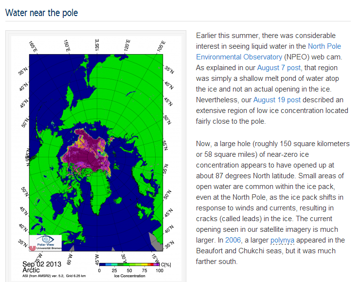
A large hole (roughly 150 square kilometers or 58 square miles) of near-zero ice concentration appears to have opened up at about 87 degrees North latitude.

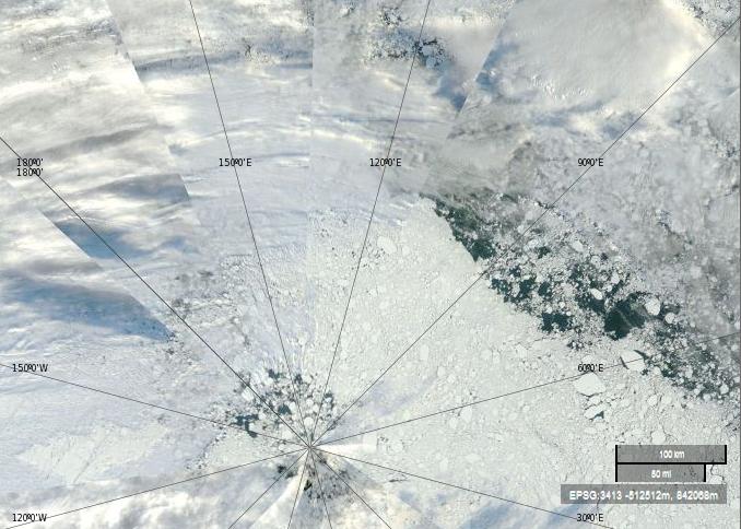
Here is a “true-color” image from September 4th 2013 using MODIS bands 1, 4 and 3, helpfully made available by NASA to anyone who might be interested via the EOSDIS Worldview web site:

NASA Worldview “true-color” image of the North Pole area on September 4th 2013 derived from bands 1,4 and 3 of the MODIS sensor on the Terra satellite
NASA Worldview “true-color” image of the North Pole area on September 4th 2013 derived from bands 1, 4 and 3 of the MODIS sensor on the Terra satellite

The lines in this image converge on the North Pole, the same location as the little cross in the NSIDC extent image near the top of this article. Let’s play “Spot the Difference” yet again shall we. Would you say that the sea ice underneath the clouds looks “broken” in this Worldview “true-color” image? How about in the the University of Bremen concentration images often shown by the NSIDC, or in the NSIDC “extent” image above, or in the NASA “extent” videos so beloved by David Rose and the Mail on Sunday?

The David and Judy Show

In case today’s headline metaphor doesn’t readily translate into other cultures, it refers to the popular fairground sideshow in which a couple of puppets dance on the end of some strings, accompanied from time to time by a baby, some sausages, a crocodile and a police officer.

Us:

The Great White Con was recently mentioned on the Arctic Sea Ice Blog, where the discussion turned to news of a recently published academic journal article by Marcia Glaze Wyatt and Judith A. Curry entitled “Role for Eurasian Arctic shelf sea ice in a secularly varying hemispheric climate signal during the 20th century”.

In one response it was suggested that:

I always think it’s terribly sad when a study is immediately condemned on the basis of not whether it has been peer reviewed, or methodology, or objectiveness, but on the basis of who wrote it. It’s the classic open goal displayed by supporters of the consensus (which includes myself) to anything which may challenge entrenched beliefs.

Them:

In partial answer to that point, here’s a screenshot from an article entitled “Arctic sea ice minimum?” on Judith Curry’s personal blog this morning:

An extract from Judith Curry's blog article "Arctic sea ice minimum?" on October 13th 2013
An extract from Judith Curry’s blog article “Arctic sea ice minimum?” on October 13th 2013

Us:

From the other side of the fence here’s a couple of screenshots from the September 4th edition of the NSIDC’s Arctic Sea Ice News entitled “A Real Hole Near the North Pole“:

NSIDC Arctic Sea Ice News report for August 2012

The NSIDC discuss "Water Near the Pole" on September 4th 2013
The NSIDC discuss “Water Near the Pole” on September 4th 2013

Would anyone care to play “Spot the difference” with me? If the differences between the official National Snow and Ice Data Center version of recent events in the Arctic and David and Judy’s version aren’t immediately obvious to you there are plenty of clues sprinkled throughout the rest of this web site to help. Does any of that help to explain my comment on the Arctic Sea Ice Blog to the effect that:

If [Judith Curry] can’t even get the basics right I fail to see why anyone (apart from David Rose of course) should place any credence whatsoever in her “Stadium Waves”, although I must admit I haven’t read the paper yet. I fear it will be a while before it rises to the top of my “to do” list.

Russia’s Northern Shores

Regular readers will have realised by now that we’ve been pestering the Mail and The Telegraph with telephone calls and emails for weeks now. That’s because, as The Economist put it last weekend:

There are climate facts—and facts are stubborn things.

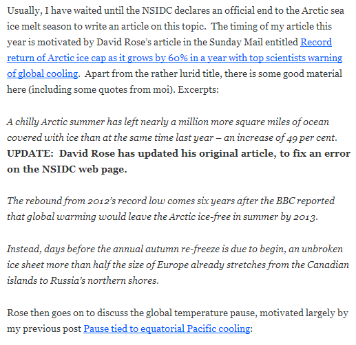
Both The Mail and The Telegraph have now corrected a couple of the gross inaccuracies they printed (virtually and/or physically) on September 8th, but many more remain. One of those is the identical phrase in both articles saying:

An unbroken ice sheet more than half the size of Europe already stretches from the Canadian islands to Russia’s northern shores.

The fact of the matter is that this statement is untrue. I’ve recently received a couple of letters about this from “The Daily Telegraph” signed by “Robert Winnett, Head of News”. Here’s an extract from the first one:

Them:

Reputable evidence exists to show an unbroken ice sheet more than half the size of Europe already stretches from the Canadian islands to Russia’s northern shore.  This can be seen on the National Snow and Ice Data Center’s website [in the article] “A Real Hole Near the North Pole“.  The site states that the average ice extent for August 2013 was 6.09 million square kilometres, which is more than half the size of Europe.

Us:

Have I got news for you Robert!  If you’d read any of the articles on here, or watched any of the videos I linked to in my emails, that wasn’t the “fact” I was quibbling about. The fact is that the Arctic “ice sheet” was not “unbroken” and did not “stretch… to Russia’s northern shore” on September 8th 2013 and for considerable periods of time both before and after that date. Here’s an extract from The Telegraph’s second letter:

Them:

In reply to your enquiry, the Telegraph’s policy is to correct clear inaccuracies once we are alerted to them – and in appropriate cases update articles on our website.

Us:

I thought I’d already made this perfectly plain, but evidently not, so here’s yet another alert about clear inaccuracies in the “reporting” of climate science in The Telegraph:

Will The Telegraph Print the Truth in the Cold Light of Day?

I just received an emailed letter from the Telegraph’s Head of News, part of which reads as follows:

The Telegraph has looked into the matters you raise. As far as the points concerning ice extent are concerned, the incorrect information was derived from data published by the National Snow and Ice Data Center (NSIDC). The mistaken information was due to a typographical error, which the NSIDC only corrected after the article that incorporated it was published. We have since updated the online versions of the article and explained why this was necessary.

There is no mention in the letter of any “updates” or “corrections” being put into print. The Telegraph are thus telling much the same story as the Mail, which is of course wholly unsatisfactory when it comes to correcting the long list of “inaccuracies and misrepresentations” they have recently published regarding the sorry state of sea ice in the Arctic. This is how they’ve done it:

Them:

Hayley Dixon’s article entitled “Global warming? No, actually we’re cooling, claim scientists” from September 8th now starts as follows:

There has been a 29 per cent increase in the amount of ocean covered with ice compared to this time last year, the equivalent of 533,000 square miles.

In a rebound from 2012’s record low, an unbroken ice sheet more than half the size of Europe already stretches from the Canadian islands to Russia’s northern shores, days before the annual re-freeze is even set to begin.

The Northwest Passage from the Atlantic to the Pacific had remained blocked by pack-ice all year, forcing some ships to change their routes.

One ship has now managed to pass through, completing its journey on September 27.

with the following additional “explanation” at the end:

Update: As at the date the article was first posted it relied on information about ice extent from the Nasa-funded National Snow and Ice Data Centre (NSIDC). This information contained a typographical error which the NSIDC subsequently corrected. The article has been amended in line with the correct information.

In addition, we have amended our reference to the Northwest Passage following the successful traverse, completed on September 27 after our article was published, of the Danish bulk carrier Nordic Orion.

Us:

Should The Telegraph’s Head of News be interested in some slightly stale Northwest Passage news, here’s a picture published on econnexus.org on September 4th in an article linked to below, which takes a close look at the “pack ice” supposedly “blocking the North West Passage” on that date:

Sea ice concentration in the Northwest Passage on September 4th 2013, according to AMSR2

Them:

Geoffrey Lean’s article entitled “Global warming: Will the truth brave the cold light of day?” from September 13th now carries the following “explanation” at the bottom:

Update: After this article was published, a bulk carrier – the MV Nordic Orion – was able to pass through the Northwest Passage on its way from Vancouver to Finland.

Christopher Booker’s article entitled “The ice is not melting, yet still the scaremongers blunder on” from September 21st appears to be completely unmodified.

Us:

Here’s some extracts from my own (repeated) email to The Telegraph, to which they have also failed to respond satisfactorily (in my humble opinion!):

a) “An unbroken ice sheet more than half the size of Europe already stretches from the Canadian islands to Russia’s northern shores,”

Inaccurate – See: https://greatWhiteCon.info/2013/09/an-unbroken-ice-sheet/ for plenty of visual evidence of that.

b) “The Northwest Passage from the Atlantic to the Pacific has remained blocked by pack-ice all year, forcing some ships to change their routes.”

Inaccurate – See: http://econnexus.org/the-northwest-passage-in-2013/

c) “That has been enough to make a mockery of a much-publicised prediction, six years ago, by Prof Wieslaw Maslowski, of the Naval Postgraduate School in Monterey, California, that the Arctic would be entirely ice-free by 2013”

Inaccurate – See (and hear) https://greatWhiteCon.info/2013/09/shock-news-why-isnt-the-arctic-ice-free/ for visual and aural evidence of that.

d) “The ice is not melting, yet still the scaremongers blunder on”

Inaccurate – The ice is melting. See Geoffrey Lean’s article!

I can see that this particular story is going to run and run!