By way of a change we start this month’s look at all things Arctic with some sea ice statistical analysis. Anthony Watts’ Arctic porky pie production line has been speeding up recently, and I am not the only one who has noticed. As part of his takedown of the latest “skeptical” allegations against the United Kingdom Met Office Tamino has been looking at trends in Arctic sea ice extent over at his “Open Mind” blog:
First and foremost, the yearly minimum is only one day out of the year. We have sea ice extent data throughout the year, and what happens during the rest of the year counts. Instead of using the annual minimum, let’s use the annual average. To avoid losing the most recent data, I’ll compute the yearly average for October through the following September rather than the usual (but arbitrary) January through December. I’ll also omit October 1978 through September 1979 because that year is incomplete. I get this:
The annual averages show much less fluctuation than the annual minima, so we can estimate things like rates of change with greater precision. I find that there is statistical evidence that the rate changed over time. One model of such changes uses three straight-line segments with their changes chosen to best-fit the data, like this:
The celebrated web site of our old friend Anthony Watts published an article yesterday entitled “The polar ice melt myth“. As a self styled expert on that particular topic I popped over there expectantly, only to discover that it is an actual fact a cut ‘n’ paste of an April 30th article by Dr. Jay Lehr at CFACT. Part of that article reads as follows:
Al Gore predicted in 2007 that by 2013 the Arctic Ocean would be completely ice free. In the summer of 2012 ice levels did reach all time lows in the Arctic. Emboldened by this report Australian Professor Chris Turney launched an expedition in December of 2013 to prove that the Antarctic Sea Ice was also undergoing catastrophic melting only to have his ship trapped in sea ice such that it could not even be rescued by modern ice-breakers.
The Professor should have known that a more accurate estimate of sea ice can be had from satellite images taken every day at the Poles since 1981. These images show that between summer and winter, regardless of the degree of summer melting, the sea ice completely recovers to its original size the winter before for almost every year since the pictures were taken. The sea ice has been stubbornly resistant to Al Gore’s predictions. In fact the average annual coverage of sea ice has been essentially the same since satellite observations began in 1981. However that has not stopped global warming advocates and even government agencies from cherry picking the data to mislead the public.
I also like to think that I’m something of an expert on the way “skeptical” folks cherry pick the data to mislead the public. For example I once wrote a post about David Rose‘s Mail on Sunday article concerning Al Gore’s interpretation of Prof. Wieslaw Maslowski’s research into Arctic sea ice decline. Hence I felt compelled to comment on this most recent of misleadling WUWT articles about polar ice!
As luck would have it Guy McPherson recently interviewed Wieslaw about events back in 2007 and his more recent research on Arctic sea ice melt. Here is a video recording of their conversation:
I endeavoured to bring this most relevant piece of information to the attention of Anthony’s loyal readership last night (UTC) as follows:
This morning my pertinent comment is still “awaiting moderation”.
Our headline today is inspired by Tony Heller, probably still better known by his nom de guerre “Steven Goddard”, who excitedly tells the world:
NSIDC Busted!
Reader Chris71 has discovered the smoking gun on the NSIDC web site. Read on.
A few weeks ago, NSIDC put out this press release, claiming that 5+ year old ice is at its smallest level on record.
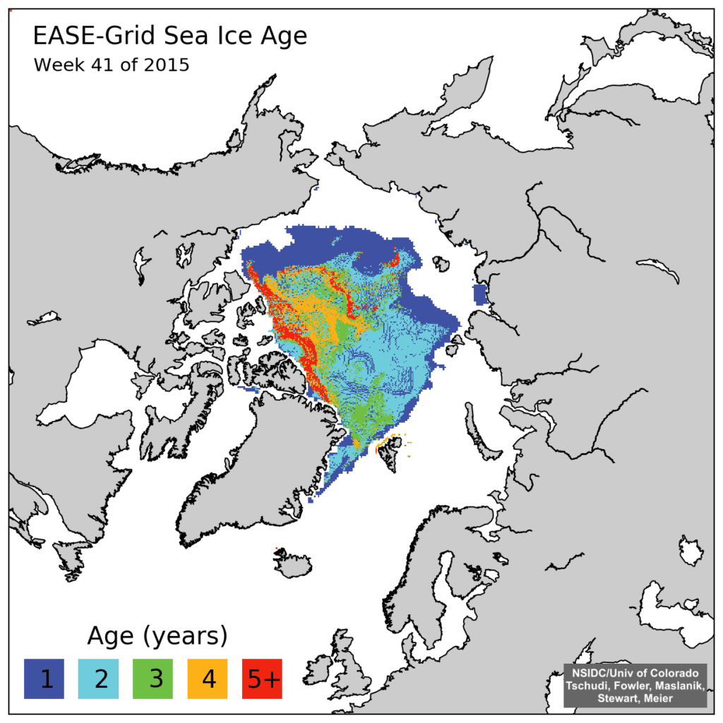
The press release included the map below. This is a new style map which they just started in week 39 2015. The map below is for week 41 2015. All of their previous 1984-2015 maps have been deleted from their archive.
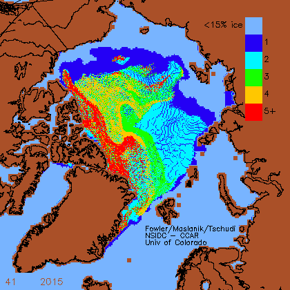
The good news is that Chris found one of their old style maps which had not been scrubbed from their website. NSIDC has deleted the original graphs, but seem to have forgotten to get rid of the copy.
For some strange reason “Steve” neglects to mention this text that accompanied the “old style map” he so proudly displays:
Here are some graphs from the Arctic – automatically saved here, and some of them archived Enjoy! Fred aka DungeonMaster on http://forum.arctic-sea-ice.net/.
Have I got news for Chris and “Steve”? Indeed I have! If one were to bother to go to the relevant section of the NSIDC web site instead of inventing bizzare fairy tales one would be able to read this:
EASE-Grid Sea Ice Age, Version 3
This data set provides weekly estimates of sea ice age for the Arctic Ocean from remotely sensed sea ice motion and sea ice extent.
The input ice motion data used for this data set is now derived from NSIDC-0116 Version 3 data.
Checking out the detailed information provided about the NSIDC-0116 Polar Pathfinder Daily 25 km EASE-Grid Sea Ice Motion Vectors, Version 3 would also reveal:
Version 3 – February 2016.
Eliminated unrealistic AVHRR and IABP buoy velocities
Extended buoy ice motion estimates to the present
Improved browse images
Reprocessed SSMI fields using GDAL map transformations on the DMSP SSM/I-SSMIS
Daily Polar Gridded Brightness Temperatures Data Set, NSIDC-0001.
Used Ice concentration estimates greater than 15 percent from the Sea Ice Concentrations from Nimbus-7 SMMR and DMSP SSM/I-SSMIS Passive Microwave Data Set, NSIDC-0051, to indicate where ice extent is present.
Checking out the detailed information provided about the NSIDC-0611 EASE-Grid Sea Ice Age, Version 3 would further reveal:
The sea ice age data in these files are derived using data from satellite passive microwave instruments, drifting buoys, and a weather model. With these data sources, the formation, movement, and disappearance of sea ice can be observed; and these observations can, in turn, be used to estimate ice age (Maslanik et al. 2007). The ice age data are derived from a number of passive microwave imagers: the Scanning Multichannel Microwave Radiometer (SMMR), the Special Sensor Microwave/Imager (SSM/I), and the Special Sensor Microwave Imager Sounder (SSMIS). Visible and infrared data from the Advanced Very High Resolution Radiometer (AVHRR) were also utilized through 2004. In addition, International Arctic Buoy Program (IABP) drifting-buoy vectors and the National Centers for Environmental Prediction (NCEP)/National Center for Atmospheric Research (NCAR) Reanalysis Project (CDAS) are used to augment the satellite data (Tschudi 2010).
Version 3 – April 2016.
So there you have it “Steve”. Thanks to the sterling (albeit uncredited!) efforts of the all volunteer members of the Arctic Sea Ice Forum and the (presumably still paid?) scientists at the National Snow and Ice Data Center you can now explain the truth, the whole truth, and nothing but the truth of the matter to your own loyal readers.
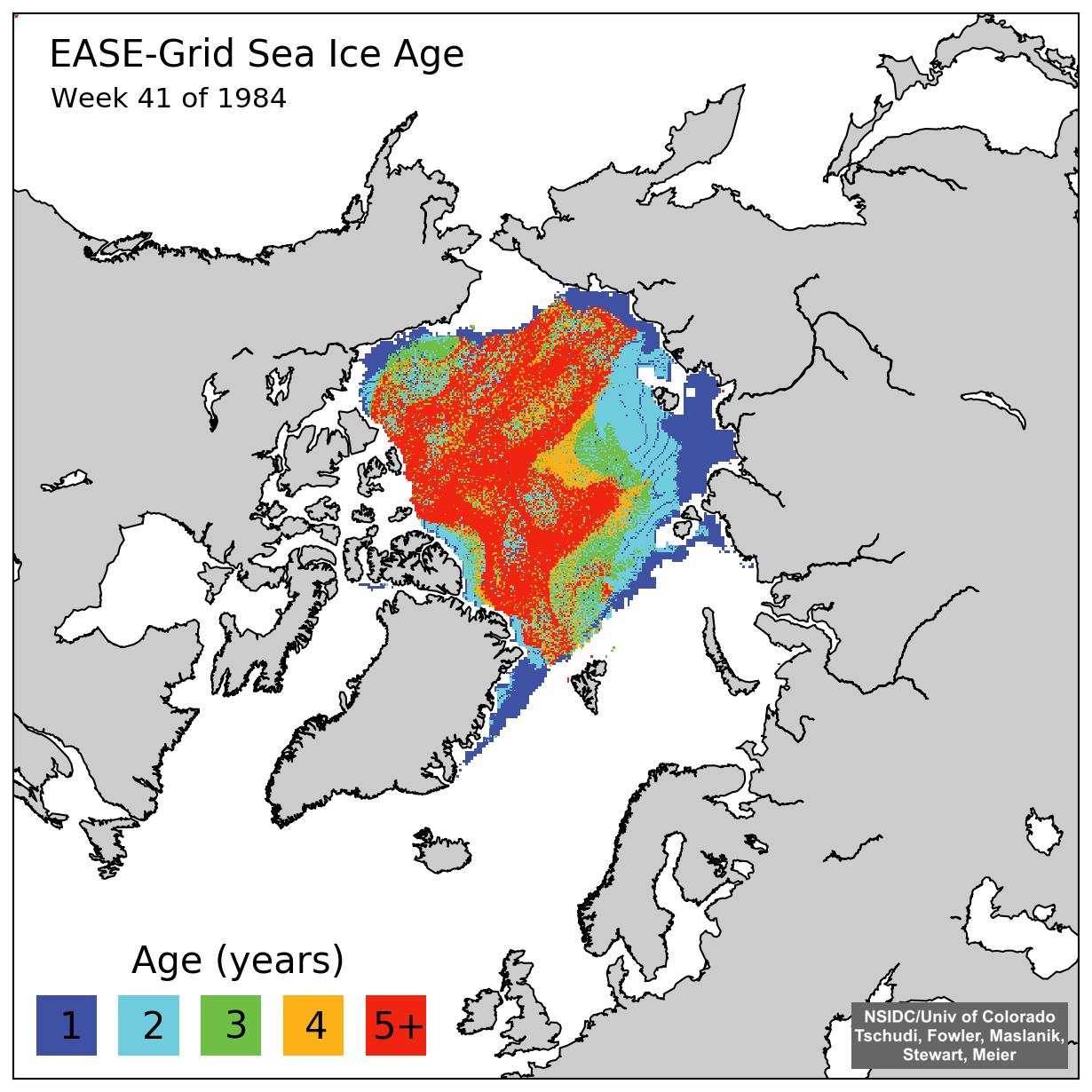
A few weeks ago the NSIDC upgraded their sea ice age product from version 2 to version 3. Here’s what the latest version of 1984 week 41 looks like:
Can you spot the difference Tony?
[Edit – May 1st 2016]
In partial answer to a question posed below, here’s an animation of Arctic sea ice age from September 2010 to May 2015. Can you see what has happened to the old ice Tony?
Original Arctic sea ice age images from: Tschudi, M., C. Fowler, J. Maslanik, J. S. Stewart, and W. Meier. 2016. EASE-Grid Sea Ice Age, Boulder, Colorado USA: NASA National Snow and Ice Data Center Distributed Active Archive Center. http://dx.doi.org/10.5067/PFSVFZA9Y85G.
[Edit – May 30th 2016]
Here’s a “Storified” summary of my Twitter “debate” with Tony Heller and Patrick Moore:
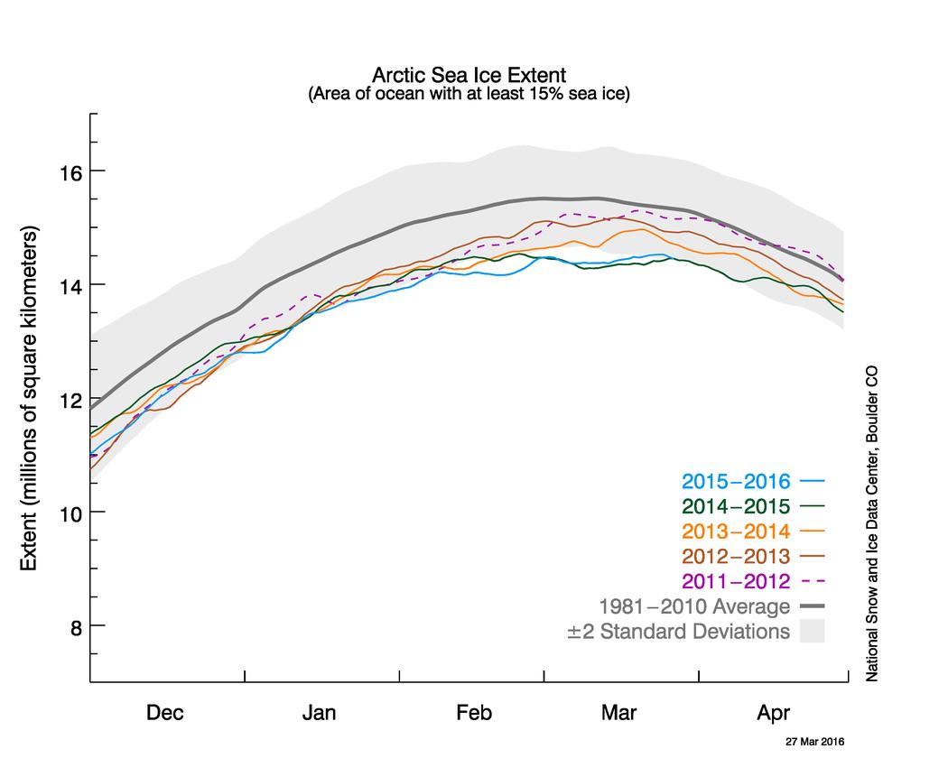
In the latest edition of their “Arctic Sea Ice News” the United States’ National Snow and Ice Data Center have announced that:
Arctic sea ice appears to have reached its annual maximum extent on March 24, and is now the lowest maximum in the satellite record, replacing last year’s record low. This year’s maximum extent occurred later than average. A late season surge in ice growth is still possible. NSIDC will post a detailed analysis of the 2015 to 2016 winter sea ice conditions in early April.
On March 24, 2016, Arctic sea ice likely reached its maximum extent for the year, at 14.52 million square kilometers (5.607 million square miles). This year’s maximum ice extent was the lowest in the satellite record, with below-average ice conditions everywhere except in the Labrador Sea, Baffin Bay, and Hudson Bay. The maximum extent is 1.12 million square kilometers (431,000 square miles) below the 1981 to 2010 average of 15.64 million square kilometers (6.04 million square miles) and 13,000 square kilometers (5,000 square miles) below the previous lowest maximum that occurred last year. This year’s maximum occurred twelve days later than the 1981 to 2010 average date of March 12. The date of the maximum has varied considerably over the years, occurring as early as February 24 in 1996 and as late as April 2 in 2010.
NASA’s Goddard Space Flight Center has also made a similar announcement, which includes this video:
The new record low follows record high temperatures in December, January and February around the globe and in the Arctic. The atmospheric warmth probably contributed to this lowest maximum extent, with air temperatures up to 10 degrees Fahrenheit above average at the edges of the ice pack where sea ice is thin, said Walt Meier, a sea ice scientist at NASA’s Goddard Space Flight Center in Greenbelt, Maryland.
The wind patterns in the Arctic during January and February were also unfavorable to ice growth because they brought warm air from the south and prevented expansion of the ice cover. But ultimately, what will likely play a bigger role in the future trend of Arctic maximum extents is warming ocean waters, Meier said.
“It is likely that we’re going to keep seeing smaller wintertime maximums in the future because in addition to a warmer atmosphere, the ocean has also warmed up. That warmer ocean will not let the ice edge expand as far south as it used to,” Meier said. “Although the maximum reach of the sea ice can vary a lot each year depending on winter weather conditions, we’re seeing a significant downward trend, and that’s ultimately related to the warming atmosphere and oceans.” Since 1979, that trend has led to a loss of 620,000 square miles of winter sea ice cover, an area more than twice the size of Texas.
This year’s record low sea ice maximum extent will not necessarily result in a subsequent record low summertime minimum extent, Meier said. Summer weather conditions have a larger impact than the extent of the winter maximum in the outcome of each year’s melt season; warm temperatures and summer storms make the ice melt fast, while if a summer is cool, the melt slows down.
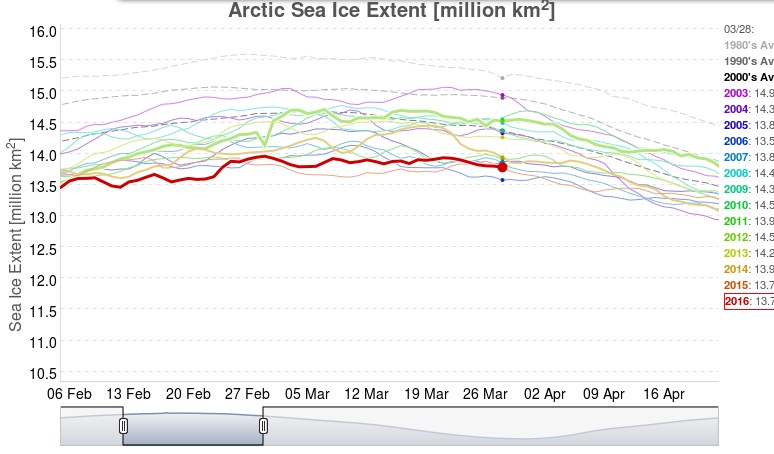
Neither NASA or the NSIDC comment on one of the striking things about this winter’s NSIDC extent chart, which has effectively “plateaued” during March 2016 following an initial peak of 14.48 million square kilometers on March 2nd, which was only recently exceeded. This is also illustrated by the JAXA Arctic sea ice extent metric, for which the 2016 maximum was 13.96 million square kilometers on February 29th:
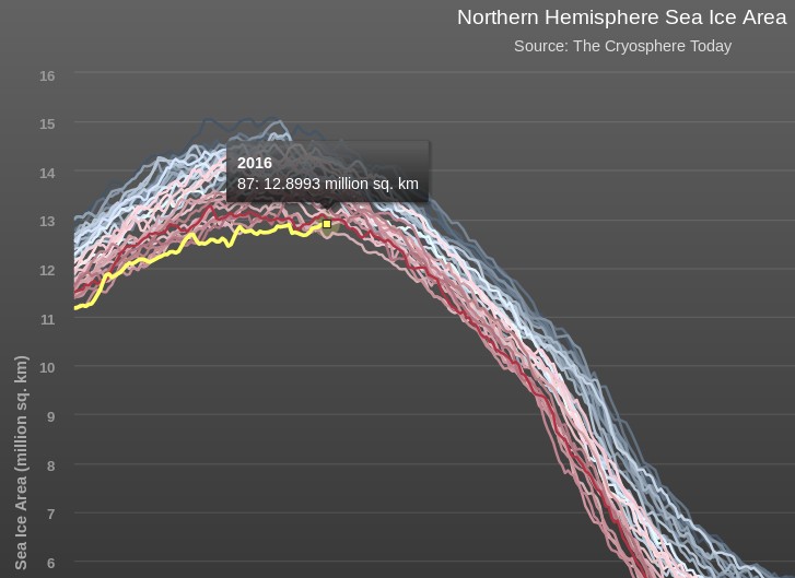
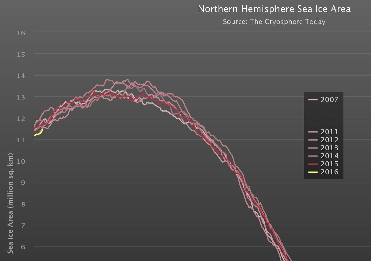
Now that the start of 2016 Arctic sea ice melting season has been called, albeit slightly hesitantly, by the experts at the NSIDC let’s also take a look at Cryosphere Today Arctic sea ice area:
The preliminary peak which we announced on March 16th has also recently been exceeded, but we now feel supremely confident in predicting that the 2016 CT area maximum will be less than 13 million square kilometers for the first time ever in the satellite record.
Thus begins what promises to be a very interesting 2016 Arctic sea ice melting season! As the NSIDC puts it:
There is little correlation between the maximum winter extent and the minimum summer extent—this low maximum does not ensure that this summer will see record low ice conditions. A key factor is the timing of widespread surface melting in the high Arctic. An earlier melt onset is important to the amount of energy absorbed by the ice cover during the summer. If surface melting starts earlier than average, the snow darkens and exposes the ice below earlier, which in turn increases the solar heat input, allowing more ice to melt. With the likelihood that much of the Arctic cover is somewhat thinner due to the warm winter, early surface melting would favor reduced summer ice cover.
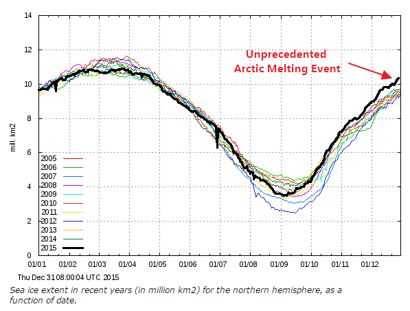
On January 1st 2016 the 15% concentration threshold daily Arctic sea ice extent metric reported by the United States National Snow and Ice Data Centre reached the lowest ever level for the first day of any year since their satellite derived records began in 1979. A couple of days later the more familiar 5 day trailing averaged extent also reached the lowest ever level for the date:
Cryosphere Today have been somewhat sluggish about updating their records of Arctic sea ice area, but have at long last revealed that their metric is now also at the lowest ever level for the date:
Meanwhile Great White Con commenter “Just A Thought” states that:
I find it hard, with what I do have access to, to see why everyone is so worried that the Arctic is melting.
He or she has evidently only had access to the propaganda perpetrated by Tony Heller (AKA “Steve Goddard”) on his so called “Real Climate Science” blog. Mr. Heller’s latest Arctic pronouncement on December 31st 2015 is entitled “Arctic Meltdown Update” and claims that:
Experts say that a terrifying storm melted the North Pole yesterday. This unprecedented melting event has caused Arctic ice to reach its highest December extent in over a decade.
justifying that comment with the following graph of his beloved (albeit deprecated) 30% concentration threshold DMI extent metric:
Here’s a video revealing the effect of the recent “terrifying storm” on the sea ice on the North Atlantic side of the Arctic:
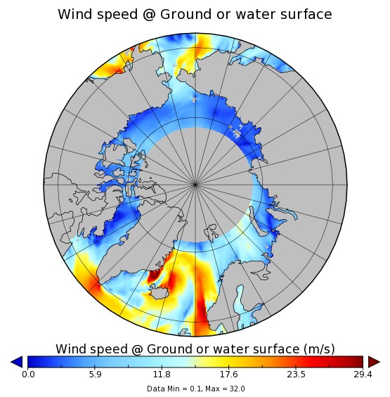
As you can see the ice at the North Pole didn’t melt away. However the ice edge did retreat in the immediate aftermath of what is referred to here in the United Kingdom as “Storm Frank“. Frank led to lots of flooding in the North of the nation, and also to some strong winds inside the Arctic Circle:
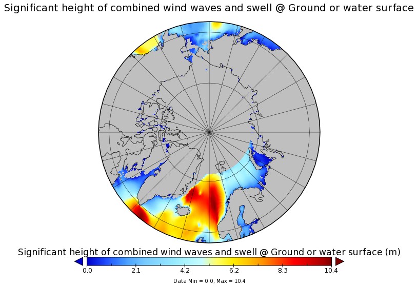
Those winds, travelling over a long stretch of open ocean, produced some pretty significant waves, speeding in the direction of the sea ice edge:
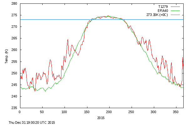
Meanwhile temperatures near the North Pole did briefly rise above the freezing point of sea ice in the middle of the Arctic winter. Here’s the Danish Meteorological Institute’s view of the air temperatures in the central Arctic:
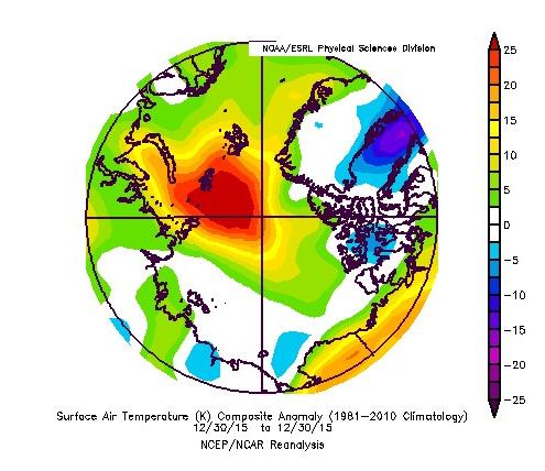
and here is NOAA’s temperature anomaly reanalysis for December 30th 2015:
Personally I reckon the 25 m/s winds and resulting 10 meter waves had more effect on the sea ice metrics than the 25 °C above normal air temperatures, but your mileage may of course vary, especially if your pseudonym is “Steve Goddard”!
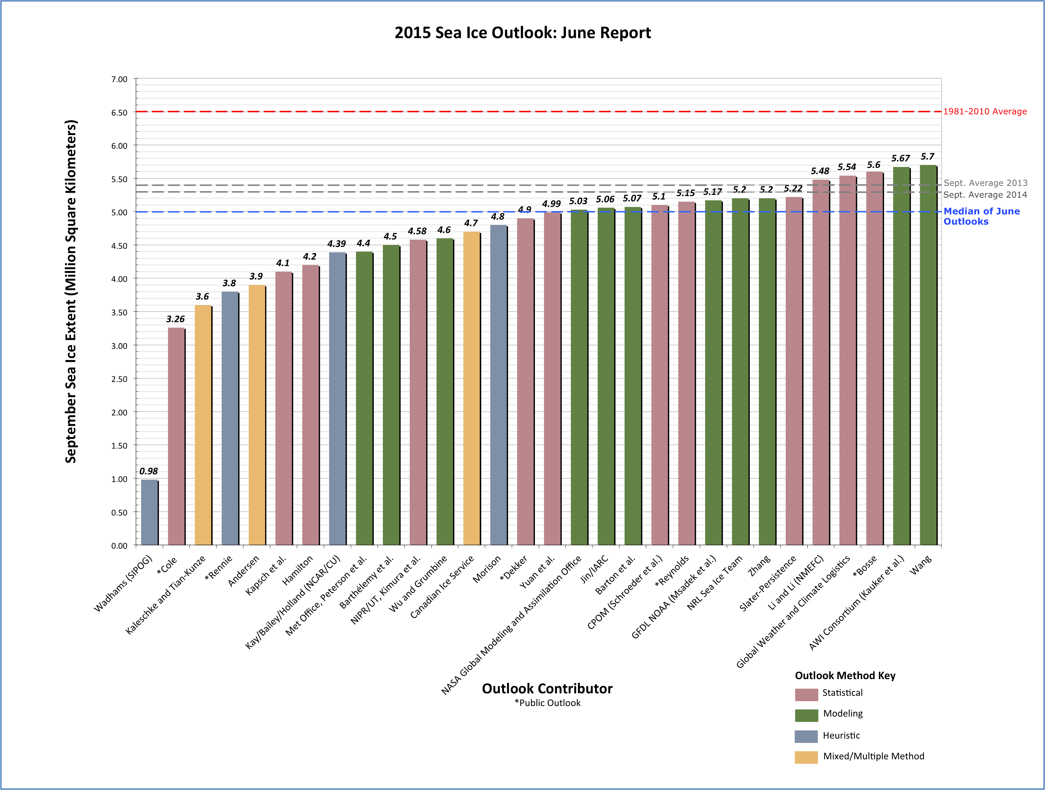
One eminent sea ice researcher certainly seems to think that time is indeed running out for the sea ice in the Arctic. First let’s take a look at the results of the first call for contributions of the 2015 melting season from the Sea Ice Prediction Network:
Note that in the bottom left hand corner of that graph there is a prediction of 0.98 million square kilometers labelled “Wadhams (SIPOG)”. The acronym refers to the Sea Ice and Polar Oceanography Group in the Department of Applied Mathematics and Theoretical Physics at the University of Cambridge, of which Prof. Peter Wadhams is the head. Before we get on to his explanation for what the SIPN refers to as “an extreme outlier” amongst all the other predictions, here’s a TEDx presentation given by Dr. David Barber, who is currently Associate Dean (Research) in the CHR Faculty of Environment, Earth and Resources at the University of Manitoba in Canada:
Here are what Dr. Barber refers to as the “seven surprising impacts” of declining Arctic sea ice:
Increasing coverage of young ice significantly changes atmospheric chemistry
More snow both preserves and destroys ice
Polar bear habitat can actually improve in some areas while deteriorating in others
Match-mismatch timing in the marine ecosystem increases vulnerability
Uncertainty as to whether the Arctic ocean will increase or decrease in overall productivity is a key unknown
Evidence that ice hazards are actually increasing while the world marshals to increase development of Arctic resources
Evidence that our recent cold winters are actually linked to our warming Arctic.
However those bullet points from David’s closing summary don’t actually mention the part of his presentation that most interested me. Listen carefully at 7:40 when he says that:
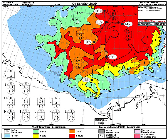
In 2009 we had our icebreaker down here and we went up this line that you see right here in this figure.
Here’s the relevant passage from the paper rather than the TEDx video:
We departed from station L1 heading north towards station L1.5, expecting to enter MY sea ice cover at about 71°20′N, 139°00′W based on remotely sensed information (Orange polygon in the figure). The Canadian Ice Service (CIS) ice chart (which relies extensively on Radarsat-1 data) for 4 September 2009 indicated the ship track would range from 7 to 9 tenths coverage and this ice would consist of partial concentrations of 5 tenths to 7 tenths old ice and from 2 to 3 tenths thick first year ice.
In situ observations of the sea ice conditions however showed that the ice we were traversing was not MY or thick FY, nor was it 7 to 9 tenths concentration, but rather it was a mixture of a few small MY ice floes (1 tenth coverage) interspersed in a cover dominated by small (10–100 m) rounded floes of heavily decayed first year sea ice (4 tenths). These floes were overlain by a thin layer of new ice (7 tenth) where freeboard was negative and thin ice growing between remnant pieces when the ice had a positive freeboard. Likewise, some new ice covered open water areas between floes.
This is the “rotten sea ice” David refers to in the video, about which he says:
It was so rotten in fact that the ship that we had does 13.5 knots in open water, and we were able to traverse that ice at 13 knots, yet the satellites all thought that this was very thick multi-year sea ice, because that’s what it had always traditionally been.
This information is obviously very interesting of course, but even more interesting (to me at least) is a subsequent paper by Dr. Barber about the same voyage of the Canadian Research Icebreaker Amundsen, published in 2012 and entitled “Fracture of summer perennial sea ice by ocean swell as a result of Arctic storms“. Here’s a pertinent extract:
We progressed through the heavily decayed ice region into a transitional region containing a mix of decayed old and FY sea ice floes, and finally into thick late summer MY pack ice. Using the onboard helicopter to survey the area, we identified a vast MY floe (10 km diameter), to which we intended to moor the ship, and conduct our typical science operations. The ice in this area was much thicker than the heavily decayed FY ice we that we had encountered the previous day to the west. Our helicopter EMI system recorded overall thicknesses of sea ice around station MYI (e.g., mean = 2.0 m, max = 10 m).
As ice teams initially prepared to deploy to the ice, we noticed the appearance of a swell from the ships helicopter deck. Laser data collected during the helicopter EMI survey at station MYI indicated a swell period of 13.5 s, and a wavelength ranging from 200–300 m. Laser data were collected while the helicopter hovered over a large MY ice floe. These data were augmented with three-dimensional dynamic ship positioning data, which revealed approximate ship heave amplitude of 0.4 m, also with a period of 13.5 s. The swell caused the vast MY ice floe nearest the Amundsen to ride up one side of the swell and fracture as it crested the wave peak, creating smaller ice floes of width approximately one half of the wavelength of the swell. In a matter of minutes from the initial onset of swell propagation, all large MY ice floes in the region were fractured in this manner, yielding a new distribution of smaller MY ice floes ranging from 100–150 m in diameter. A helicopter-borne video system recorded this event in still photographs along its flight track which were later combined to create a series of photo mosaics.
On 09 September 2009, we conducted a longitudinal helicopter EMI survey at 72.5 N, and determined the limit of the swell penetration into the pack ice at 72.526 N 134.51 W, a penetration of 350 km. Furthermore, the rotted FY ice margin was heavily fractured, with small floe sizes ranging from 20–50 m in diameter.
Moving on from Manitoba to Cambridge, Peter Wadhams has recently recorded an interview for The University of Earth, which describes itself as “an entertaining educational reality television series”. Here it is:
So what is “the reality” of the situation in the Arctic? Prof. Wadhams doesn’t explain his “extreme outlier” 2015 prediction in detail in the interview, but he does identify three potentially significant problems:
The “minor thing, in a way” of several feet of global sea level rise this century due to melting of the Greenland ice sheet
A sudden increase in the rate of “global warming” due to Arctic albedo feedback, which leads to
The exposure of the methane hydrate bearing continental shelves off Siberia to increasing water temperatures as the sea ice above them melts. “It’s a massive risk, if you do a risk analysis”
Peter also highlights the same concerns as Barber et al. 2012, often referred to in the literature as “waves-in-ice“. I highly recommend watching both videos from cover to cover. However if you’re in a rush then at least skip to 28:30 minutes where he points out that on his cruise around the Arctic this coming September:
We’re looking at one particular thing, which may not be the most important thing, but the retreat of the sea ice in summer is going much faster than computer models predict, and we think that one factor there is the fact that as the sea ice retreats it opens up this huge area of open water in the Arctic Ocean which then becomes like an ocean, with lots of waves and storms and swell, and the waves themselves break the remaining ice up and cause it to retreat faster so that there’s a kind of collaborative effect there that the remaining ice is vanishing faster because of so much open water producing wave action.
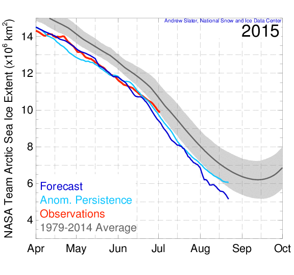
Getting back to the current situation in the 2015 melting season, here’s what the University of Hamburg’s AMSR2 sea ice concentration map currently reveals:
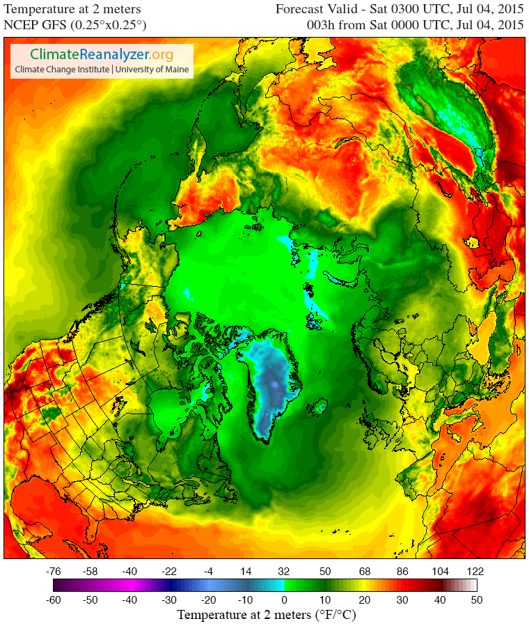
Both suggest to me that although the rate of decline in the area of Arctic sea ice is not currently abnormal for post 2007 years, it may well become so in another month or so, when the extent curve “normally” starts to flatten out. Possibly even sooner than that, because here is the current GFS 2 metre temperature map for the Arctic:
and temperatures, particularly on the Pacific side of the Arctic, are forecast to get warmer still over the next few days.
Watch this space and we’ll keep you posted, but in the meantime here’s a final thought from Peter Wadhams:
Our children have a future only if we take action now.
[Edit – July 6th 2015]
In a personal communication Prof. Wadhams informs me that:
This year I’m going out in September in the “Sikuliaq” (University of Alaska) to do some more specific wave-ice interaction experiments [in the Beaufort Sea Marginal Ice Zone], assuming there is any ice to experiment on.
Today we’re going to delve into the application of surf science in the Arctic. If you’re not already familiar with the basics of how the best surf is created then perhaps you might first wish to take a detour to the StormSurf “Wave Basics” article:
Wind waves, though rideable, are not the optimal type of wave one likes to ride. Swells are much better. Wind waves are only the raw material that swells are made from. But, the more energy wind waves accumulate while being driven by wind, the greater the likelihood they will transform into a swell. Enough energy and the swell can travel the entire circumference of the globe with only a slow decay in size!
During a typical open ocean winter storm, one could expect to see winds of 45-55 kts blowing over 600-1000 nautical miles for 36 hours. In such a storm, the average highest wind waves (or ‘seas’) commonly reach 30-35 ft towards the center of the fetch area and produce a swell with a period of 17-20 secs.
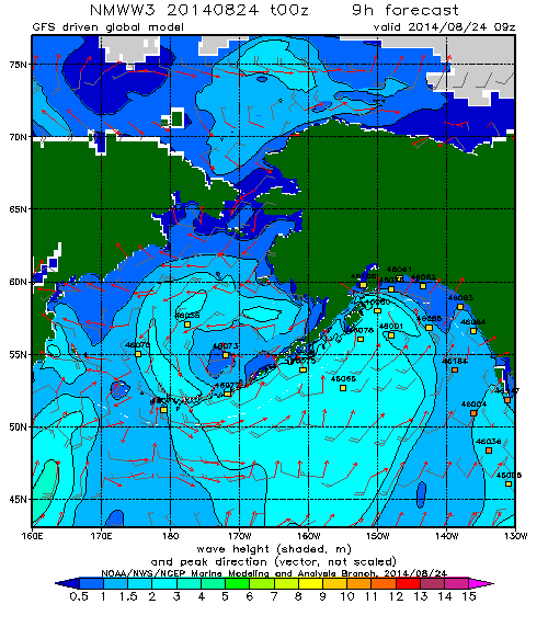
Regular readers may recall that on August 24th 2014 we revealed this WaveWatch III “surf forecast” for the Beaufort Sea, which lies off the north coast of Alaska and the Canadian Northwest Territories (i.e. top center of the map): and noted that the 2 meter waves depicted:
Have blasted past Point Barrow and are currently heading straight for the Beaufort Sea Marginal Ice Zone.
Here’s a video from the University of Washington’s Applied Physics Laboratory which explains that the Marginal Ice Zone is:
The area between declining unbroken sea ice and the expanding area of open water.
The theoretical significance of such swells has been discussed in a number of academic papers recently. Take for example these extracts from “Swell and sea in the emerging Arctic Ocean” by Jim Thomson from the University of Washington and W. Erick Rogers from the US Naval Research Laboratory. Note first of all that the authors distinguish between “wind seas” and “swells” as follows:
Pure wind seas have a wave age less than one, indicating that the wind is driving the waves, and these points cluster largely below the Pierson–Moskowitz limit. Swells have a wave age greater than one, indicating that the waves are outrunning the wind.
They then go on to use some more terms very familiar to the average surfer:
Ocean surface waves (sea and swell) are generated by winds blowing over a distance (fetch) for a duration of time. In the Arctic Ocean, fetch varies seasonally from essentially zero in winter to hundreds of kilometers in recent summers. Using in situ observations of waves in the central Beaufort Sea, combined with a numerical wave model and satellite sea ice observations, we show that wave energy scales with fetch throughout the seasonal ice cycle. Furthermore, we show that the increased open water of 2012 allowed waves to develop beyond pure wind seas and evolve into swells. The swells remain tied to the available fetch, however, because fetch is a proxy for the basin size in which the wave evolution occurs. Thus, both sea and swell depend on the open water fetch in the Arctic, because the swell is regionally driven. This suggests that further reductions in seasonal ice cover in the future will result in larger waves, which in turn provide a mechanism to break up sea ice and accelerate ice retreat.
It is possible that the increased wave activity will be the feedback mechanism which drives the Arctic system toward an ice-free summer. This would be a remarkable departure from historical conditions in the Arctic, with potentially wide-ranging implications for the air-water-ice system and the humans attempting to operate there.
In practice there were several more swells that impacted the Beaufort Sea marginal ice zone over the course of the next couple of weeks. Here’s what the charts looked like, as visualised by MagicSeaweed.com rather than NOAA:
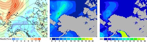
Beaufort Sea on August 27th 2014 – Winds / Wave Height / Wave Period
Beaufort Sea on September 1st 2014 – Winds / Wave Height / Wave Period
Beaufort Sea on September 7th 2014 – Winds / Wave Height / Wave Period
Note that on the right of each set of three is a depiction of the period of the waves in question. As StormSurf points out:
Chop tends to have a period ranging from 3-8 seconds. That is, there is anywhere from 3-8 seconds between each wave crest. Wind waves range from 9-12 seconds. Ground swells range from 13-15 seconds, and strong ground swells have a period anywhere from 16-25 or more seconds.
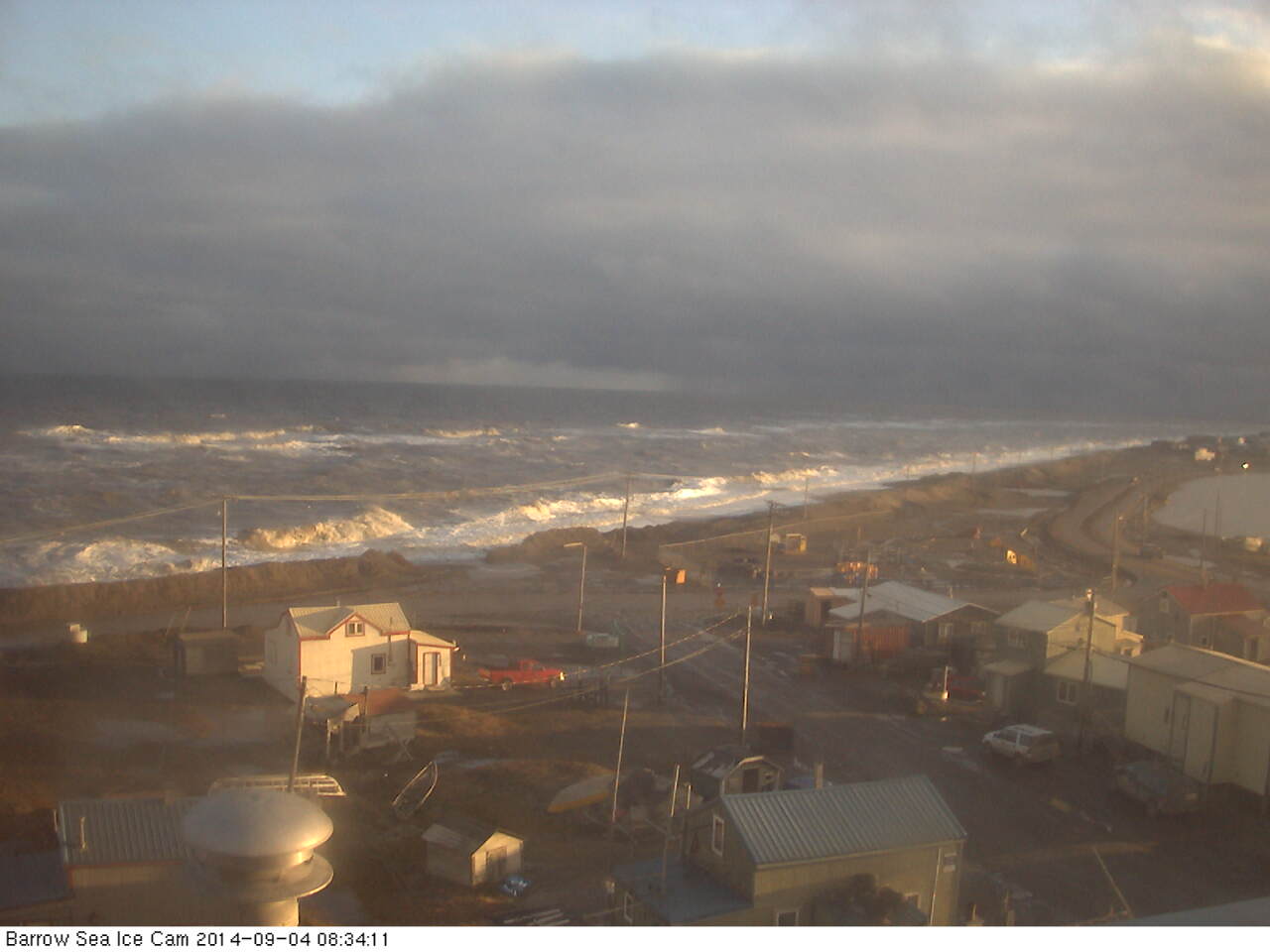
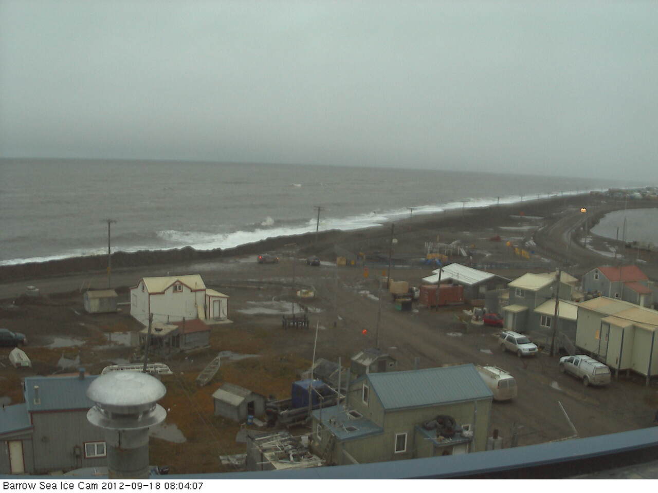
Thus the final swell on September 7th was actually the best of the bunch, with a small area of waves over 10 feet in height and with a period of over 9 seconds. According to StormSurf those are merely “wind waves” and not yet a full blown “swell”. To give you a feel for such waves here’s what some “wind waves” hitting the beach at Barrow looked like on September 4th 2014:
Next here’s another video that reveals what effect those series of waves had on the sea ice in the Beaufort Sea:
For future reference here also is the same swell described by Thomson and Rogers, but illustrated in an identical “surfer friendly” format to the 2014 swells we’ve been looking at:
Beaufort Sea on September 18th 2012 – Winds / Wave Height / Wave Period
whilst here is the swell produced by the “Great Arctic Cyclone” of early August 2012, also mentioned in passing by Thomson and Rogers:
Beaufort Sea on August 5th 2012 – Winds / Wave Height / Wave Period
As you can see, if you’re a surfer used to tracking swells across the world’s oceans at least, whilst the September 2012 swell was indeed rather more substantial than those we have looked at in 2014, with a height in excess of 20 feet, the period was too short to qualify as a full blown swell and it was in fact directed away from the ice edge rather than towards it. Here’s what that 2012 swell looked like once it reached Barrow:
All of which does rather make one wonder what might happen if a slightly longer period swell directed at the ice edge in the Beaufort Sea were to occur at some point in the not too distant future? Whilst we all wait with bated breath to discover what that future holds for the sea ice in the Arctic, not to mention the beach at Barrow, here’s another video about the 2014 Marginal Ice Zone Program, which summarises the year’s campaign as a whole:
Note that Craig Lee says that:
We had very little wave activity. It was surprisingly calm when we were out there in the Araon, both when we were in the ice and in the open water. There just wasn’t much wind, and so there weren’t very many surface waves.
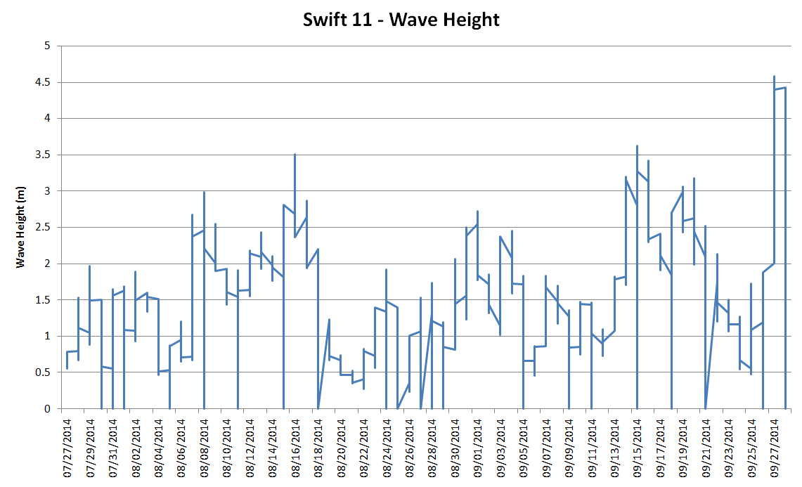
However at least one of the “robots” he refers to did discover some significant wave activity. Here’s a visualisation of SWIFT 11‘s record of significant wave height as it floated across the Beaufort Sea in the summer of 2014:
I don’t know about you, but I don’t think I would describe 4.5 meter waves as “surprisingly calm”, especially in the Arctic!
I don’t usually get involved in debates about “the global warming pause”, but as you will eventually see there is an Arctic connection, so please bear with me. Personally I reckon “global heat” is more relevant than “global surface temperature”, but nevertheless NASA and NOAA issued a “news release” a couple of days ago stating that:
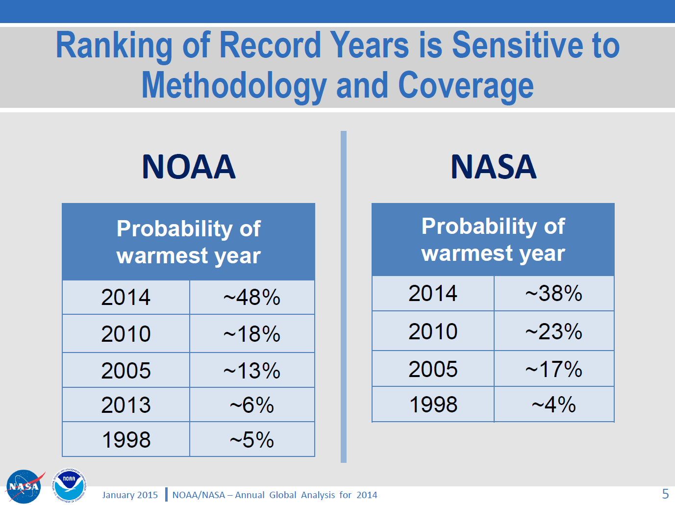
The year 2014 ranks as Earth’s warmest since 1880, according to two separate analyses by NASA and National Oceanic and Atmospheric Administration (NOAA) scientists.
The 10 warmest years in the instrumental record, with the exception of 1998, have now occurred since 2000. This trend continues a long-term warming of the planet, according to an analysis of surface temperature measurements by scientists at NASA’s Goddard Institute of Space Studies (GISS) in New York.
In an independent analysis of the raw data, also released Friday, NOAA scientists also found 2014 to be the warmest on record.
The announcement was accompanied by this video:
I figured our old friend David Rose would have something to say about all that in the Mail on Sunday, and I was not disappointed. Yesterday David reported, in bold headlines:
Nasa climate scientists: We said 2014 was the warmest year on record… but we’re only 38% sure we were right
Nasa’s Goddard Institute for Space Studies claimed its analysis of world temperatures showed ‘2014 was the warmest year on record’
But it emerged that GISS’s analysis is subject to a margin of error
Nasa admits this means it is far from certain that 2014 set a record at all
David Rose includes this NASA video in the online version of his article:
which finishes up showing the Arctic blanketed in red for the period 2010-14. In the body of the article David suggests that:
GISS’s director Gavin Schmidt has now admitted Nasa thinks the likelihood that 2014 was the warmest year since 1880 is just 38 per cent.
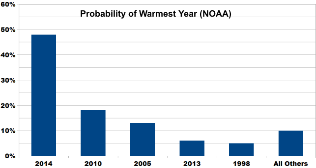
but for some strange reason David neglects to mention this NASA/NOAA “press briefing“, which includes the following figure:
As you can see and hear, Gavin Schmidt’s “admission” was pretty public, and available for anyone doing their due diligence on this thorny topic to see well before the Mail on Sunday published David Rose’s article. For still more from Gavin see also the second half of yet another video from NASA, which we’ve hastily made embeddable from YouTube since NASA’s Goddard Space Flight Center don’t seem to have done so themselves as yet:
[Edit – 23/01/2015]
By way of further elucidation of the NASA/NOAA table of probabilities above, here’s a new graphic courtesy of Skeptical Science:
The probability of 2014 being the warmest year (due to margin of uncertainty and the small differences between years) is almost ten times that of 1998. And the contrarians were very certain that year was warm!
Does that help make things clearer, for those who evidently have difficulty understanding statistics?
[/Edit]
I also figured that the likes of “Steve Goddard” and Anthony Watts would be jumping on the same bandwagon, so you can imagine my disappointment when I discovered that they have both, unlike Gavin, blocked me from their Twitter feeds! Venturing over to the so called “Real Science” blog instead I discovered that Steve/Tony does at least read Gavin’s Twitter feed, although apparently not NASA/NOAA press briefings:
Them:
Implausible Deniability
Gavin is playing his usual game, trying to cover his ass with “uncertainty” that wasn’t mentioned in the NASA press release.
They get the propaganda out there for the White House and major news outlets, then try to generate implausible deniability through back channels like twitter. None of this was mentioned in the NASA press release.
Us:
I take it you weren’t on the call either Tony? Have you by any chance seen this press briefing?
THE DATA ON WEATHER AND CLIMATE (NASA AND NOAA) CAN BE COMPARED TO THE STOCK MARKET ON WALL STREET, MUCH CORRUPTION AND ALTERING. WE ARE NOT GUARANTEED A CERTAIN TEMPERATURE EVERYDAY; ALTHOUGH, THAT IS WHAT THEY WOULD HAVE US THINK, JUST BECAUSE OF SEASONS IN GENERAL.
Further to previous correspondence on similar matters, on January 27th 2015 I received the following email from the Personal Assistant to John Wellington, David Rose’s managing editor at the Mail on Sunday:
Dear Jim,
Thank you for your email.
I am afraid the best person to deal with your question is John Wellington who will reply on his return at the beginning of March.
Thank you for your patience.
Kind regards
Poppy Hall
Us:
CC: IPSO.co.uk
Dear Poppy,
Thanks for that information, but I am afraid my almost infinite patience in this matter is exhausted.
In John’s absence perhaps I might reiterate a question posed by Bob Ward of The Grantham Institute on Twitter yesterday:
Predictable that Mail on Sunday censored all letters pointing out errors in last week's article by @DavidRoseUK about @NASAGISS
Please would you ask whoever owns the desk on which the buck currently stops for the article entitled “Nasa climate scientists: We said 2014 was the warmest year on record… but we’re only 38% sure we were right” by David Rose to communicate with me as soon as possible. FYI – Here it is:
As I’m sure you must realise by now, unfortunately it includes some inaccurate and/or misleading statements which as far as I can ascertain have still not been publicly corrected.
Best wishes,
Jim Hunt
Post Script:
Bob Ward lodged a formal complaint with the Independent Press Standards Organisation about the Mail on Sunday article. Their conclusion?
The complaint was not upheld.
Remedial Action Required – N/A
Date complaint received: 13/02/2015
Date decision issued: 22/06/2015
Their “reasoning”?
The Committee noted that information about the margin of error had been made available by GISS, but that it was not in dispute that these details had been omitted from the press release. The article had made clear that this specifically was the basis for its criticism of Nasa, and the newspaper was entitled to present its view that this omission represented a failure on the part of the organisation. While the information had been released by Nasa, it had been released to a limited selection of people, in comparison to those who would have had access to the press release, and had not been publicised to the same level as the information in the release. The press briefing images referred to by the complainant were available on Nasa’s website, but were not signposted by the press release. In this context, it was not misleading to report that the information relating to the margin of error had emerged in circumstances where the position was not made clear in the press release. While these details of the margin of error may have been noted in a press briefing two days previously, rather than “yesterday”, as reported, this discrepancy did not represent a significant inaccuracy requiring correction under the terms of the Code.
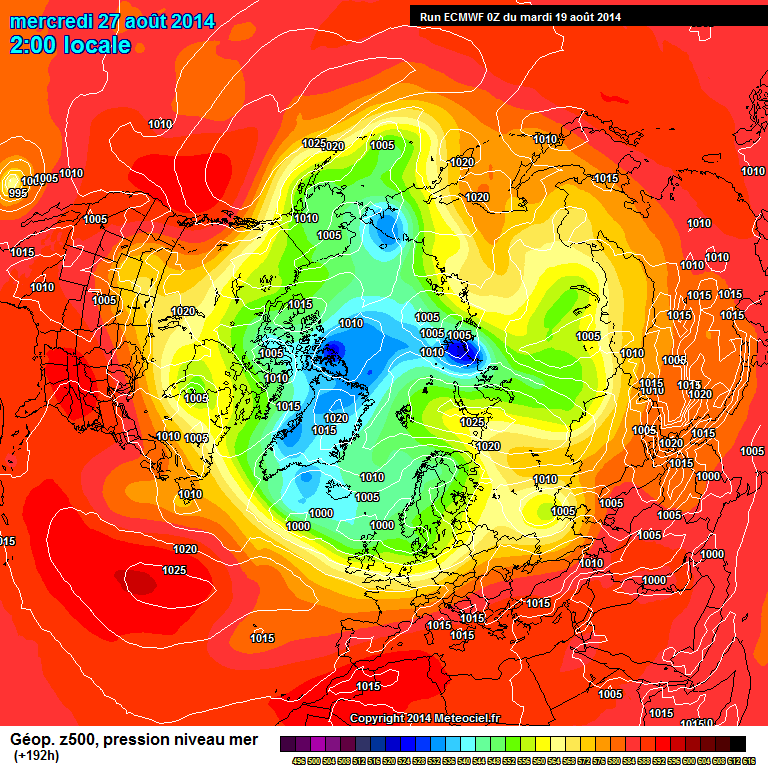
Regular readers adept at reading between lines may already have concluded that here in the Great White Con Ivory Towers we have been surreptitiously organising the world’s first ever Arctic Basin Big Wave Fantasy Surfing Contest (or GWCABBWFSC for short). Today we are proud to announce that the long waiting period may now be almost over!
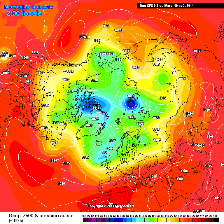
Here is the long range Arctic weather forecast from GFS 192 hours from now (courtesy of MeteoCiel):
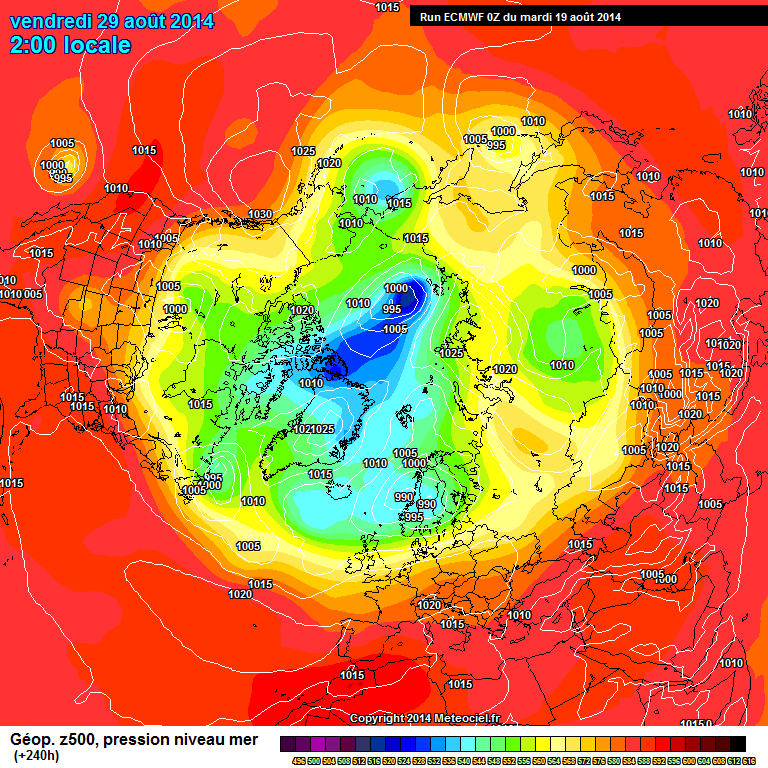
There looks to be a certain amount of agreement there, so now let’s take a look at ECMWF for T+240h:
If the forecast pans out (a very big IF this far out!) there’s an Arctic storm brewing with the isobars packed tight over all the open water in the Laptev Sea, pushing the potential swell through the East Siberian Sea and on into the Beaufort Sea before it crashes against the northernmost shores of North America.
We fondly imagine a Great White Con team containing the likes of Andrew Cotton:
taking on the biggest waves ever recorded on camera off Alaska’s North Slope, each clad in their respective sponsors’ thickest, finest neoprene.
The opposing “Great Green Con” team will be composed of volunteers from amongst the serried ranks of fiddlers with the facts on Fleet Street such as Andrew Neil, David Rose and Christopher Booker, all clad in matching Polar Bear suits to keep the cold Arctic waters at bay:
To coin a phrase oft used in this particular portion of the blogosphere:
Shock News! In an astonishing revelation over on “Steven Goddard’s” (un)Real Science blog a commenter has revealed exactly how David Rose pulled the wool over the eyes of millions of Mail on Sunday readers last September.
I was eagerly engaged in a “debate” about “The Arctic Catastrophe” with Steve/Tony and his band of merry (mostly) men when the conversation took an unexpectedly enlightening turn:
Them:
If you have eleven minutes to spare, there is a movie made of all last summer’s pictures taken by O-Buoy 7. It gives you something to compare this summer with. It is a little annoying because the ice got slushy and the camera gradually tilted. You may get a crick in your neck, if your head tilts as you watch. Finally you spend around four minutes basically looking at your feet, but the redeeming thing is that the ice cracks up and you are looking at the edge of the water. Then you fall in. You are blown south and bob about in ice-free waters briefly, before the refreeze swallows you up in advancing ice, and you get to see winter set in:
Caleb – Here’s an O-Buoy 7 movie I hurriedly put together in October last year, that also shows winter setting in. Since you’re evidently an “Arctic sea ice nutter” too I’d be very interested to hear your comments:
In that particular case you apparently did catch a reporter making a mistake. He likely took a quick glance at an extent map, and didn’t dig deeper. Some of those maps show all “extent”, even down to 15% ice and 85% water, as solid white. (For example, this map: )
NSIDC high resolution Arctic sea ice extent visualisation on August 16th 2014
Because the map shows pure white, the reporter likely jumped to the wrong conclusion that the ice was “Unbroken.” Then it is likely a week passed between when he researched and the piece was printed, and further ice melted during that week.
It is not hard to catch the MSM making such mistakes about sea-ice. Either they are in too much of a hurry, or are lazy, or perhaps have an agenda. The best thing to do is to gently and politely educate them to what the actual facts are. In some cases they really do not know that what is solid white on the map can be as much as 85% open water in reality. Some actually appreciate you doing the research they don’t have the time (or are too lazy) to do.
But make sure you educate them with actual facts. If you feed them bull, and they catch you at it, they never forget it and very rarely forgive it, even if you confess and apologize.
Us:
I have made it my mission in life to educate all and sundry with actual facts!
If David Rose appreciates me doing all this research on his behalf he has been remarkably backward in coming forward to convey his eternal gratitude 😥
Them:
We’ll keep you posted!
This website uses cookies to improve your experience. We'll assume you're ok with this, but you can opt-out if you wish. Cookie settingsACCEPT
Privacy & Cookies Policy
Privacy Overview
This website uses cookies to improve your experience while you navigate through the website. Out of these, the cookies that are categorized as necessary are stored on your browser as they are essential for the working of basic functionalities of the website. We also use third-party cookies that help us analyze and understand how you use this website. These cookies will be stored in your browser only with your consent. You also have the option to opt-out of these cookies. But opting out of some of these cookies may affect your browsing experience.
Necessary cookies are absolutely essential for the website to function properly. This category only includes cookies that ensures basic functionalities and security features of the website. These cookies do not store any personal information.
Any cookies that may not be particularly necessary for the website to function and is used specifically to collect user personal data via analytics, ads, other embedded contents are termed as non-necessary cookies. It is mandatory to procure user consent prior to running these cookies on your website.