Tag Archives: Shock News

Allegedly “Unsettled Science” by Steven Koonin et al.

In our recent article about the forthcoming G7 Summit in Cornwall we suggested that:

Climate change is top of the G7 agenda along with Covid-19, and you can rest assured that vested interests will not miss any opportunity to promote those interests over the next two months and beyond.

That has indeed proved to be the case! Let us count the ways.

Steven Koonin’s new book “Unsettled: What Climate Science Tells Us, What It Doesn’t, and Why It Matters” is being promoted (left?), right and centre by a veritable cornucopia of the usual suspects. In an endeavour to explain (to the mythical (wo)man in the street?) the ways in which “A lie will fly around the whole world while the truth is getting its boots on” I’ve performed a Google search for the phrase “climate science has drifted so far out of touch with the actual science as to be absurdly demonstrably false” by way of a demonstration:

65 “demonstrably false” clones of the WSJ article, and counting……

[Edit – April 24th]

This morning’s update on my “demonstration” Google search.

There are now 241 “demonstrably false” Kooninism clones, and counting……

Continue reading Allegedly “Unsettled Science” by Steven Koonin et al.

Shock News! Alice F. Convicted in WUWT Show Trial!!

Regular readers will be aware that Snow White and I have long been banished from the hallowed halls of Watts Up With That. What is one to do, then, when Anthony Watts publishes these scurrilous allegations about one’s character by the pseudonymous “Sunsettommy” under an article by David Middleton on a topic under much discussion here?

Your ice obsession is destroying you and Jim Hunt,who was exposed as a dishonest person over his absurd cherry picking of a small area while Tony was covering the ENTIRE Arctic region. Tony just today exposed Hunts dishonesty, by showing that his small Canadian region is actually thicker than last year.

The two of you are gaining a stellar reputation as wild eyed warmist morons,who will lie or distort the topic presented, Tony has effectively destroyed your low Arctic ice baloney, to the point that you now get derision there, since your replies are free of any science information,meaning you have no effective counterpoint to offer,just brainless opinions, nothing more.

With the usual channels of communication solidly blocked our very good friend Alice F. helpfully leapt into the breach:

SST – It seems as though you’ve been unable to confirm Aphan’s conjecture with evidence of an accurate prediction [from Tony Heller]? Meanwhile your aforementioned “Mr. Hunt” posted this “data based presentation” earlier:

SMOSvOSI-20170315

“You don’t even need to be familiar with the satellite products to understand that the sea ice edge to the north of the Barents Sea doesn’t currently consist of multi-year ice.”

Any comment?

Much witty banter about Arctic sea ice maps and metrics ensued! Here is one of the more inventive comments, from the pseudonymous “2hotel9”:

Every time leftarded c*nts like you get caught being leftarded c*nts all you do is cry. Wahwahwahwahwahwahwah. Too f*cking funny.

That sort of thing apparently does not violate any of the carefully crafted house rules at WUWT, whereas this comment of Alice’s does:

WUWT-AliceUnmasked

Unabashed by her love letter being so swiftly trampled underfoot on the WUWT cutting room floor Alice valiantly pursued the matter with Anthony on Twitter, where in his habitual fashion he gleefully unfrocked her in public view of the whole of cyberspace:


[Edit – March 29th]

Anthony Watts has finally [snip]ped the four letter words uttered by “2hotel9”.

However there’s still no sign of him allowing yours truly a right of reply to SST’s libellous attacks upon my unblemished (outside the cryodenialosphere) character:

Watch this space!

Shock News! Mail on Sunday Silently “Corrects” Another David Rose “Porky Pie”

In our latest astonishing disclosure concerning David Rose’s optimistically named “Climategate 2” campaign in the Mail on Sunday in February we can now reveal the Mail’s botched attempt to cover up another “inadvertent” error in Mr. Rose’s February 19th article entitled “US Congress launches a probe into climate data that duped world leaders over global warming“.

In actual fact it’s the US Congress that’s being duped. Perhaps Lamar Smith, Chairman of the House Committee on Science, Space and Technology, would like to play “spot the difference” with us? Here’s an extract from the original article:

MoS-20170219-Original

and here’s the same section of the allegedly “corrected” article.

MoS-20170219-20170321

One of Mr. Rose’s “porky pies” concerning a statement supposedly made last month by Peter Stott from the UK Met Office has gone missing. There’s no apology or explanation in either the online or print version of the apology for a “correction” issued by the Mail on Sunday at the weekend.

Not only that, but an entire paragraph concerning the alleged “pause” has evaporated into thin air.

Not only that, but the alleged “correction” included below the offending article is different to the “official” version published in print at the weekend. Take another look:

MoS-20170319-Mono

Something is rotten in the state of MayBeLand. And in the state of TrumpLand too.

Shock News! Finally, the GWPF Corrects a Mistake!!

David Whitehouse has just published an article on the Global Warming Policy Forum web site entitled “How The Recent El Nino Saved Climate Models“.

The article itself is of course straight off the GWPF’s porky pie production line, but in the small print at the bottom there is this “Shock News!”:

Finally, we must correct a mistake. In February a scientist involved in the production of the HadCRUT4 global surface temperature data set told us what January’s figure was before its official publication. It turns out they were wrong, and we have corrected the graphs accordingly. Here is HadCRUT4, with its pause and recent El Nino peak.

GWPF-latestHadcrut4-20170313

When the HadCRUT4 data for 2016 was complete the MET Office estimated that 0.2°C was due to the El Nino. So here is that difference.

GWPF-HadcrutMinusElNino-20170313

A scientist involved in the production of the HadCRUT4 global surface temperature data set told us that once again David Whitehouse is mistaken:

Can we now expect David Rose to issue an even more abject apology in next weekend’s Mail on Sunday?

Shock News! The Telegraph is Propagating Fake News About the Arctic!!

David Rose is mercifully quiet this weekend, but there’s no rest for the wicked! Christopher Booker in the Sunday Telegraph leads a bunch of the usual Alt-facts suspects in a barrage of fake news about our dearly beloved Arctic sea ice. According to Mr. Booker in the “Arctic Myths” section of his column today:

As the fake science of global warming continues to crumble, one scare story the zealots are determined to hold on to at all costs is their claim that ice in the Arctic is dangerously vanishing. Yet again lately we have been treated to a barrage of such headlines as “Hottest Arctic on record triggers massive ice melt”.

The nearest we got to such a headline here at the Great White Con was “Arctic Sea Ice News from AGU” in which article we showed images which said things like:

arctictemp_map_graph_2015-16_620

That’s because last year was the *hottest year on record in the Arctic! Undeterred by mere facts Mr. Booker continues:

Booker-NSIDC-20170226

But that ever-diligent blogger Paul Homewood has drawn on official sources such as the US National Snow and Ice Data Center to uncover what is actually happening. Under “Arctic Fake News”, on NotALotOfPeopleKnowThat, he posted a graph showing that last week the extent of sea ice was much the same as it has been at this date ever since 2001. Indeed, according to the Danish Meteorological Institute, there is even more of it today than in February 2006, and it is also significantly thicker. Back in 2008 much of the ice was only a metre thick. Today that has risen to two metres, and in some places four.

Mr. Booker appears to be more than somewhat confused, since this is what the DMI Arctic sea ice extent graph he links to reveals:

DMI_nh_iceextent_daily_5years_20170225

In addition the DMI thickness maps he refers to aren’t available at any of the places he mentions! Not a lot of people know that he was probably thinking of another recent article by Paul Homewood entitled “Arctic Ice Fake News“, which includes these two DMI thickness maps:

cice_combine_thick_sm_en_20080218

cice_combine_thick_sm_en_20170218

Even without considering other sources of Arctic thickness and/or volume data it is quite clear from the two volume graphs that according to the Danish Meteorological Institue Arctic sea ice volume is significantly lower this year than it was in 2008. If Arctic sea ice extent is greater this year and the volume is lower then the laws of physics (which not even the combined talents of Messrs Homewood and Booker can change) dictate that its average thickness must be LESS this year than in 2008!

Mr Booker blunders on:

The DMI data also show that the Greenland ice sheet, which we are told is melting at horrendous speed, is actually growing this year at a record rate, to a size way above its average for the past 26 years. And the most authoritative record of Northern Hemisphere snow cover shows this year’s ranking as one of the six highest since 1967.

He seems blissfully unaware that the “DMI data” to which he refers is the output of a DMI climate model that attempts to determine the “surface mass balance” of the Greenland ice sheet. He seems to think it’s a measurement of the mass of the Greenland ice sheet, which it isn’t. However this is, courtesy of NASA:

GreenlandGrace-20170213

In his bubble of astounding Arctic ignorance Mr. Booker continues:

The Deplorable Climate Science blog, run by US expert Tony Heller, gleefully reproduces a 2007 headline: “Scientists: ‘Arctic is screaming’, global warming may have passed tipping point”. As Heller comments: “The Arctic is indeed screaming at climate scientists – to shut up.”

Now as luck would have it I have been (vainly!) attempting to persuade Mr. Heller “to shut up” on the very article Mr. Booker references! Let’s take a quick look at a couple of highlights shall we?

February 22, 2017 at 12:01 am

At the risk of repeating myself, need I say more?

PIOMAS-Jan-19Years

It seems safe to assume that Mr. Booker wasn’t reading Mr Heller’s blog on or after February 22nd does it not? Otherwise he would surely have had second thoughts about writing such a ludicrous phrase as “there is even more of it today than in February 2006”?

Then of course there’s the burning question of the “Hottest Arctic on record”

February 22, 2017 at 5:59 pm

At the risk of (repeating myself)² AZ, here’s some “higher atmospheric air temperatures” for you:

DMI-FDD-20170218

If Mr. Booker had browsed Mr. Heller’s blog slightly more diligently he might even have seen this from the much maligned NOAA:

February 20, 2017 at 11:06 am

You seem to have forgotten about spring Gail? Here’s April:

NOAA-NH-Snow-April

Here’s the May graph from “the most authoritative record of Northern Hemisphere snow cover” for good measure:

Rutgers-NH-Snow-May

To summarise, Messrs Booker and Homewood could have confined their due diligence on their assorted Arctic articles to reading my comments on Mr. Heller’s blog. Having done so it would quickly have become apparent to them that every single point they made was in actual fact a “fake fact”.

The inevitable conclusion is that they have no interest whatsoever in establishing the actual facts about the Arctic. All they are interested in is propagating “fake news” about the Arctic as far and as wide as possible in pursuit of a common “agenda”. As is David Rose.

* Since satellite records began.

Shock News! 19 years without warming?

In the wake of the 2015/16 El Niño, recent weeks have seen the denialoblogosphere inundated with assorted attempts to proclaim yet again that there have been “19 years without warming”. In another of his intermittent articles Great White Con guest author Bill the Frog once again proves beyond any shadow of a doubt that all the would be emperors are in actual fact wearing no clothes. Without further preamble:

Ho-hum! So here we go again. The claim has just been made that the UAH data now shows no warming for about 19 years. A couple of recently Tweeted comments on Snow White’s Great White Con blog read as follows…

For the nth time, nearly 19 years with no significant warming. Not at all what was predicted!!

and

Just calculated UAH using jan: R^2 = 0.019 It’s PROVABLE NO DISCERNIBLE TREND. You’re talking complete bollocks!!!

Before one can properly examine this “no warming in 19 years” claim, not only is it necessary to establish the actual dataset upon which the claim is based, but one must also establish the actual period in question. A reasonable starting point within the various UAH datasets would be the Lower Troposphere product (TLT), as most of us do live in the lower troposphere – particularly at the very bottom of the lower troposphere.

However, one also has to consider which version of the TLT product is being considered. The formally released variant is Version 5.6, but Version 6 Beta 5 is the one that self-styled “climate change sceptics” have instantly and uncritically taken to their hearts.

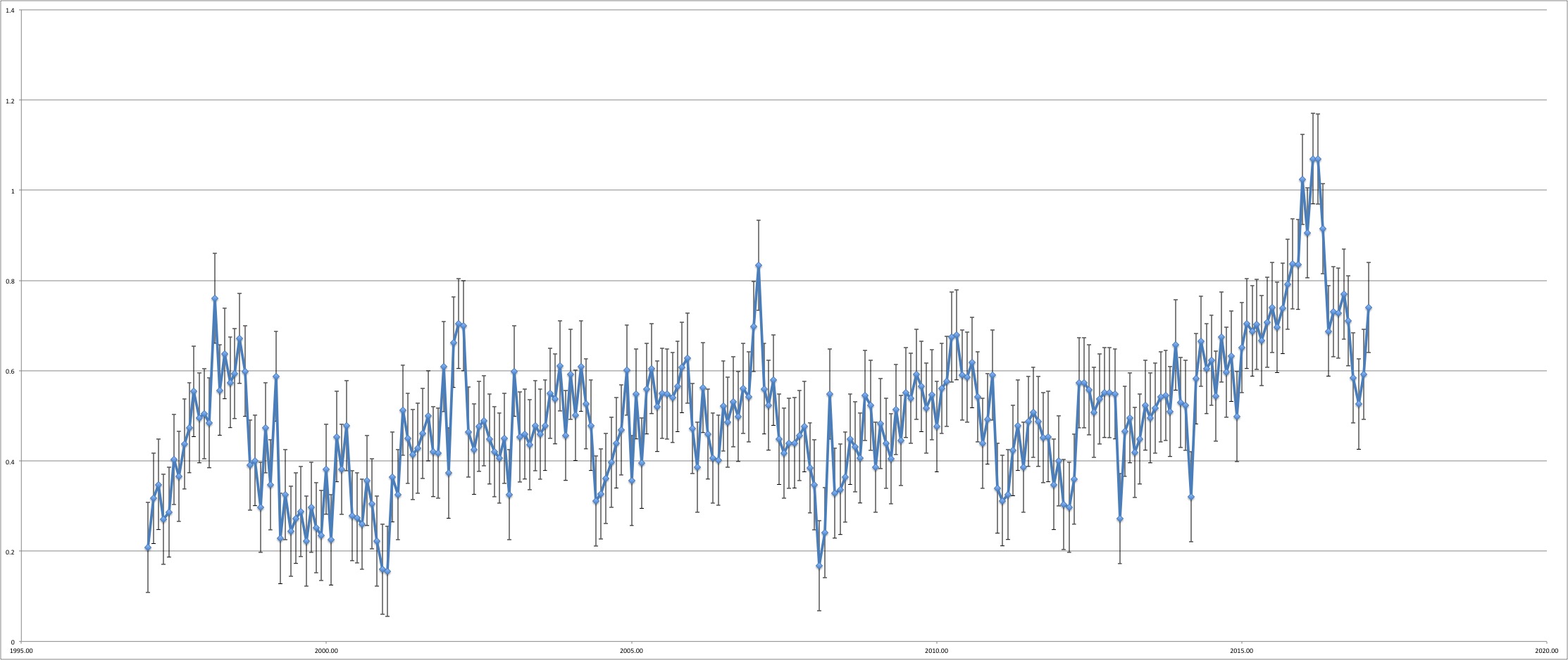
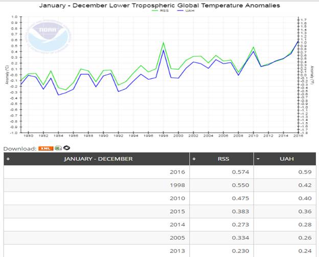
The formally released variant (Ver 5.6) is the one currently used by NOAA’s National Centers for Environmental Information (NCEI) on their Microwave Sounding Unit climate monitoring page. As can be seen from the chart and the partial table (sorted on UAH values), the warmest seven years in the data include each of the four most recent years…

image002


The above chart clearly doesn’t fit the bill for the “no warming in 19 years claim”, so, instead we must look to the Version 6 Beta 5 data. Before doing so, a comparison of the two versions can be quite revealing…

image003


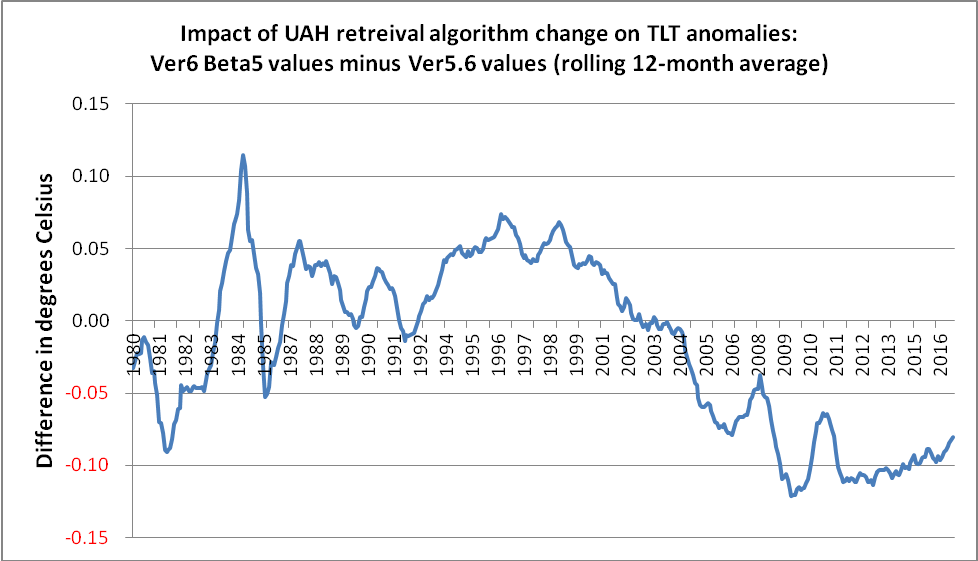
In terms of its impact on trend over the last 19 years or so, an obvious feature of the version change is that it boosts global temperatures in 1998 by just over 0.06° C, whilst lowering current temperatures by just over 0.08° C. Therefore, the net effect is to raise 1998 temperatures by about 0.15° C relative to today’s values. That is why some people refer to a mere 0.02° C difference between 1998 and 2016, whereas, NOAA NCEI shows this as 0.17° C.

(It is not difficult to imagine the hue and cry that would have gone up if one of the other datasets, such as NASA Gistemp, NOAA’s own Global Land & Ocean anomalies or the UK’s HadCRUT, had had a similar adjustment, but in the opposite direction.)

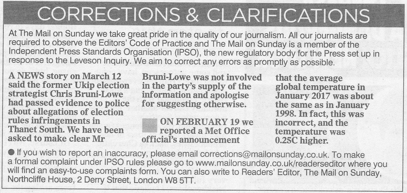
Anyway, it seemed pretty obvious which variant would have been used, so the task was merely to establish the exact start point. It transpires that if one ignores all the data before January 1998, and then superimposes a linear trend line, one does indeed get an R² value of ~ 0.019, as mentioned in one of the Tweets above. (The meaning of an R² value, as well as its use and misuse, will be discussed later in this piece.) In the interim, here is the chart…

image005


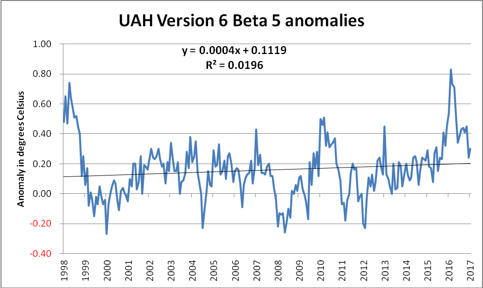
Those with some skill in dealing with such charts will recognise the gradient in the equation of the linear trend line,

Y = 0.0004X + 0.1119

As the data series is in terms of monthly anomalies, this value needs to be multiplied by 120 in order to convert it to the more familiar decadal trend form of +0.048° C/decade. Whilst this is certainly less than the trend using the full set of data, namely +0.123° C/decade, it is most assuredly non-zero.

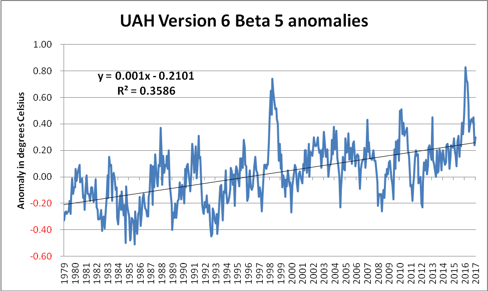
The full dataset (shown below) gives a far more complete picture, as well as demonstrating just how egregious the selection of the start point had been. Additionally, this also highlights just how much of an outlier the 1998 spike represents. Compare the size of the upward 1998 spike with the less impressive downward excursion shown around 1991/92. This downward excursion was caused by the spectacular Mt Pinatubo eruption(s) in June 1991. The Pinatubo eruption(s) did indeed have a temporary effect upon the planet’s energy imbalance, owing, in no small measure, to the increase in planetary albedo caused by the ~ 20 million tons of sulphur dioxide blasted into the stratosphere. On the other hand, the 1997/98 El Nino was more of an energy-redistribution between the ocean and the atmosphere. (The distinction between these types of event is sadly lost on some.)

image007


The approach whereby inconvenient chunks of a dataset are conveniently ignored is a cherry-picking technique known as “end point selection”. It can also be used to actually identify those areas of the data which are most in line with the “climate change is a hoax” narrative. Once again, it is extremely easy to identify such regions of the data. A simple technique is to calculate the trend from every single starting date up until the present, and to then only focus on those which match the narrative. Doing this for the above dataset gives the following chart…

image009


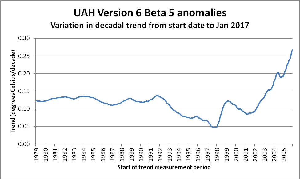
It can clearly be seen that the trend value becomes increasingly stable (at ~ +0.12° C/decade) as one utilises more and more of the available data. The trend also clearly reaches a low point – albeit briefly – at 1998. This is entirely due to the impact that the massive 1997/98 El Nino had on global temperatures – in particular on satellite derived temperatures.

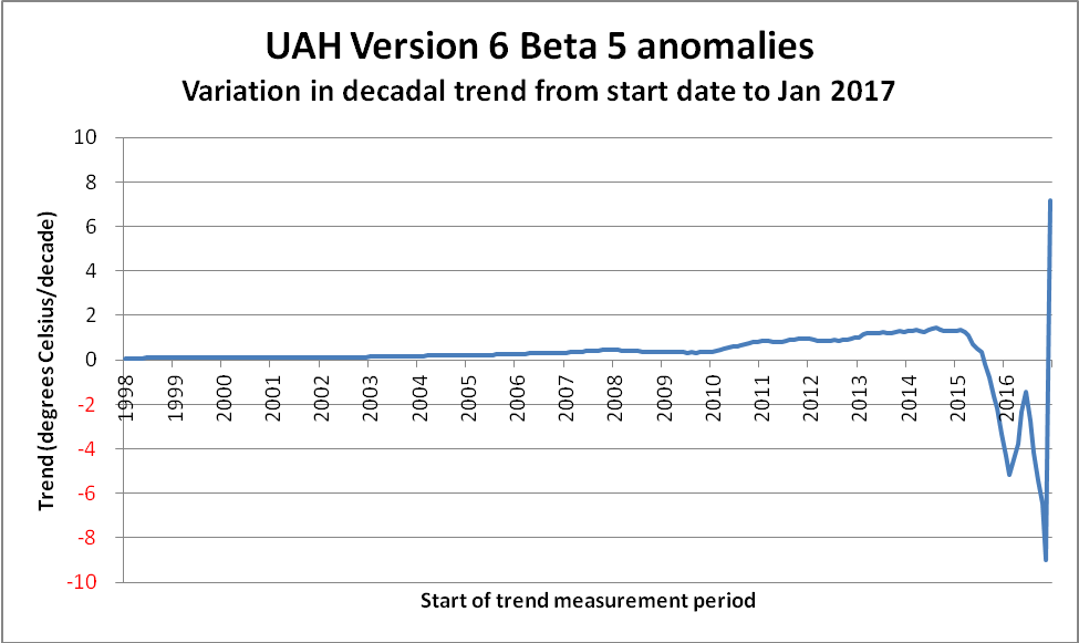
The observant reader will have undoubtedly noticed that the above chart ends at ~ 2006. The reason is simply because trend measurements become increasingly unstable as the length of the measurement period shortens. Not only do “short” trend values become extreme and meaningless, they also serve to compress the scale in areas of genuine interest. To demonstrate, here is the remainder of the data. Note the difference in the scale of the Y-axis…

image011


Now, what about this thing referred to as the R² value? It is also known as the Coefficient of Determination, and can be a trap for the unwary. First of all, what does it actually mean? One description reads as follows…

It is a statistic used in the context of statistical models whose main purpose is either the prediction of future outcomes or the testing of hypotheses, on the basis of other related information. It provides a measure of how well observed outcomes are replicated by the model, based on the proportion of total variation of outcomes explained by the model.

In their online statistics course, Penn State feel obliged to offer the following warning…

Unfortunately, the coefficient of determination r² and the correlation coefficient r have to be the most often misused and misunderstood measures in the field of statistics.

The coefficient of determination r² and the correlation coefficient r quantify the strength of a linear relationship. It is possible that r² = 0% and r = 0, suggesting there is no linear relation between x and y, and yet a perfect curved (or “curvilinear” relationship) exists.

Here is an example of what that means. Consider a data series in which the dependent variable is comprised of two distinct signals. The first of these is a pure Sine-wave and the second is a slowly rising perfectly linear function.

The formula I used to create such a beast was simply… Y = SinX + 0.00005X (where x is simply angular degrees)

The chart, with its accompanying R² value, is shown below, and, coincidentally, does indeed bear quite a striking resemblance to the Keeling Curve

image013


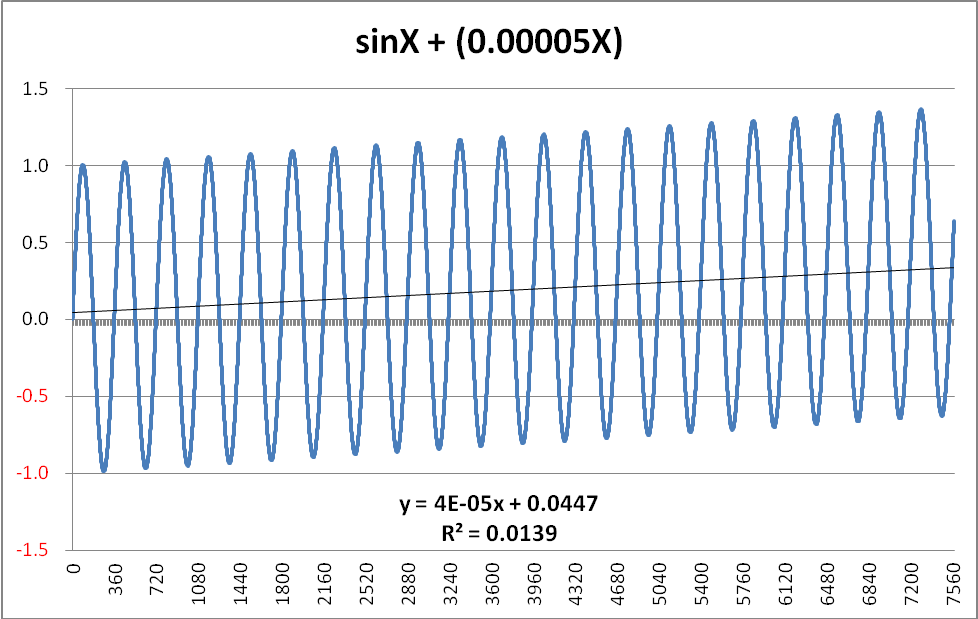
The function displayed is 100% predictable in its nature, and therefore it would be easy to project this further along the X-axis with 100% certainty of the prediction. If one were to select ANY point on the curve, moving one complete cycle to the right would result in the Y-value incrementing by EXACTLY +0.018 (360 degrees x 0.00005 = 0.018 per cycle). A similar single-cycle displacement to the left would result in a -0.018 change in the Y-value. In other words, the pattern is entirely deterministic. Despite this, the R² value is only 0.0139 – considerably less than the value of 0.0196 derived from the UAH data.

(NB There is a subtlety in the gradient which might require explanation. Although the generating formula clearly adds 0.00005 for each degree, the graph shows this as 0.00004 – or, more accurately as 0.000038. The reason is because the Sine function itself introduces a slight negative bias. Even after 21 full cycles, this bias is still -0.000012. Intuitively, one can visualise this as being due to the fact that the Sine function is positive over the 0 – 180 degree range, but then goes negative for the second half of each cycle. As the number of complete cycles rises, this bias tends towards zero. However, when one is working with such functions in earnest, this “seasonal” bias would have to be removed.)

Summing this up, trying to fit a linear trend to the simple (sine + ramp) function is certain to produce an extremely low R² value, as, except for the two crossover points each cycle, the difference between the actual value and the trend leaves large unaccounted-for residuals. To be in any way surprised by such an outcome is roughly akin to being surprised that London has more daylight hours in June than it does in December.

So what is the paradox with the low R² value for the UAH data? There isn’t one. Just as it would be daft to expect a linear trend line to map onto the future outcomes on the simple (sine + ramp) graph above, it would be equally daft to expect a linear trend line to be in any way an accurate predictor for the UAH monthly anomalies over the months and years to come.

Nevertheless, even although a linear trend produces such a low R² value when applied to the (sine + ramp), how does it fare as regards calculating the actual trend? Once the “seasonal” bias introduced by the presence of the sine function is removed, the calculated trend is EXACTLY equal to the actual trend embedded in the generating function.

Anyway, even if the period from January 1998 until January 2017 did indeed comprise the entirety of the available data, why would anyone try to use a linear trend line? If someone genuinely believed that the mere fact of a relatively higher R² value provided a better predictor, then surely that person might play around with some of the other types of trend line instantly available to anyone with Excel? (Indeed, any application possessing even rudimentary charting features would be suitable.) For example, a far better fit to the data is obtained by using a 5th order polynomial trend line, as shown below…

image015


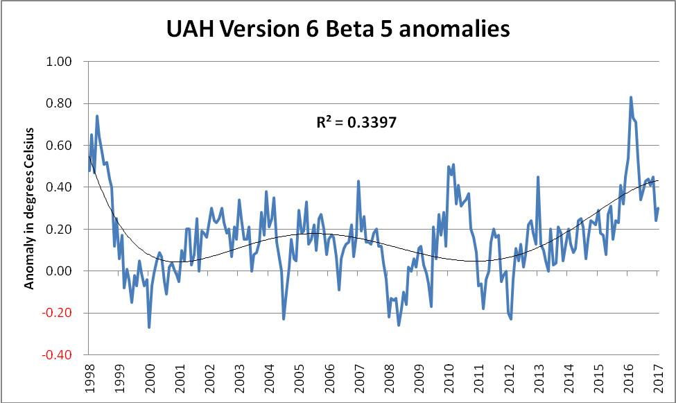
Although this is something of a “curve fitting” exercise, it seems difficult to argue with the case that this polynomial trend line looks a far better “fit” to the data than the simplistic linear trend. So, when someone strenuously claims that a linear trend line applied to a noisy dataset producing an R² value of 0.0196 means there had been no warming, then there are some questions which need to be asked and adequately answered:

Does that person genuinely not know what they’re talking about, or is their intention to deliberately mislead? (NB It should be obvious that these two options are not mutually exclusive, and therefore both could apply.)

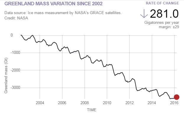
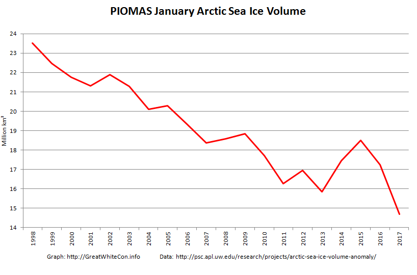
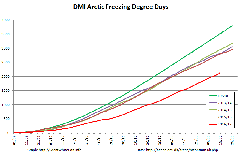
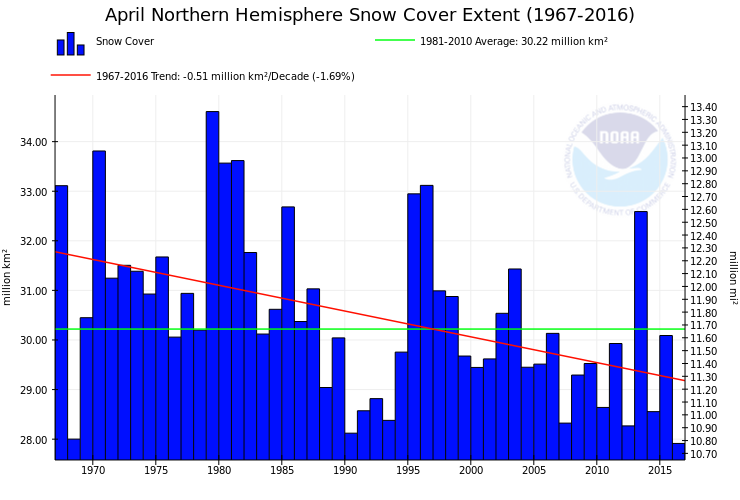
Given that measurements of surface temperature, oceanic heat content, sea level rise, glacial mass balance, ice-sheet mass balance, sea ice coverage and multiple studies from the field of phenology all confirm global warming, why, one wonders, would somebody concentrate on an egregiously selected subset of a single carefully selected variant of a single carefully selected dataset?

Climategate 2 Falls at the First Hurdle?

Shock News! The David and Judy Show took to the road once again last night, aided and abetted by all the usual suspects. We’ll skip the Breitbarts, Hellers and Watts of this world and head straight for the now ex Prof. Judith Curry‘s “Climate Etc.” blog. There we will discover “Climate scientists versus climate data“, a guest post by ex NOAA scientist John Bates. According to John:

The most serious example of a climate scientist not archiving or documenting a critical climate dataset was the study of Tom Karl et al. 2015 (hereafter referred to as the Karl study or K15), purporting to show no ‘hiatus’ in global warming in the 2000s (Federal scientists say there never was any global warming “pause”). The study drew criticism from other climate scientists, who disagreed with K15’s conclusion about the ‘hiatus.’ (Making sense of the early-2000s warming slowdown). The paper also drew the attention of the Chairman of the House Science Committee, Representative Lamar Smith, who questioned the timing of the report, which was issued just prior to the Obama Administration’s Clean Power Plan submission to the Paris Climate Conference in 2015.

Regular readers of our humble scribblings will be well aware that here in Great White Con Ivory Towers we are firmly of the opinion that there never was a ‘hiatus’. Exhibit 1:

Animation by izen
Animation by izen

What’s all the fuss about then? Perhaps our old friend David Rose can explain in layperson’s terms? In his latest article for the Mail on Sunday, catchily entitled “Exposed: How world leaders were duped into investing billions over manipulated global warming data”, he assures us that amongst many other things:

The [K15] report claimed that the ‘pause’ or ‘slowdown’ in global warming in the period since 1998 – revealed by UN scientists in 2013 – never existed, and that world temperatures had been rising faster than scientists expected. Launched by NOAA with a public relations fanfare, it was splashed across the world’s media, and cited repeatedly by politicians and policy makers.

But the whistleblower, Dr John Bates, a top NOAA scientist with an impeccable reputation, has shown The Mail on Sunday irrefutable evidence that the paper was based on misleading, ‘unverified’ data.

It was never subjected to NOAA’s rigorous internal evaluation process – which Dr Bates devised.

Now “never subjected to NOAA’s rigorous internal evaluation process” isn’t quite the same thing as “manipulated global warming data”, but Mr. Rose has more!

MoS2 Template Master

The misleading ‘pausebuster chart’: The red line shows the current NOAA world temperature graph – which relies on the ‘adjusted’ and unreliable sea data cited in the flawed ‘Pausebuster’ paper. The blue line is the UK Met Office’s independently tested and verified ‘HadCRUT4’ record – showing lower monthly readings and a shallower recent warming trend

That graph looks convincing enough, doesn’t it? However there is a teensy weensy little upward adjustment in there that Mr. Rose is apparently unaware of, as NASA’s Gavin Schmidt pointed out late last night:

https://twitter.com/ClimateOfGavin/status/828082851585388544

This morning Carbon Brief has published a much longer takedown of the aforementioned purple prose by Zeke Hausfather, who points out amongst other things that:

What [David Rose] fails to mention is that the new NOAA results have been validated by independent data from satellites, buoys and Argo floats and that many other independent groups, including Berkeley Earth and the UK’s Met Office Hadley Centre, get effectively the same results.

As per usual Mr. Rose doesn’t stick to science, however dubious. He also dabbles in politics. On that front we are assured:

Karl’s ‘Pausebuster’ paper was hugely influential in dictating the world agreement in Paris and sweeping US emissions cuts. President Trump, above right, has pledged to scrap both policies – triggering furious claims by Democrats he is a climate ‘denier’ and ‘anti-science’.

Thanks to today’s MoS story, NOAA is set to face an inquiry by the Republican-led House science committee.

We’ll have much more to say on this controversy in the context of our “Alternative Facts” investigation in due course, but for the moment at least it looks to us as though the nth iteration of “Climategate 2” barely made it out of the starting gate. However Mr. Rose’s loyal army of “rebloggers, retweeters, plagiarisers and other assorted acolytes” and that “Republican-led House science committee” may of course have other ideas?

[Edit – February 5th PM]

Commentary on Judith Curry’s blog brought to light an article by Peter Thorne. He says, amongst many other things:

I worked for three and a bit years in the NOAA group responsible in the build-up to the Karl et al. paper (although I had left prior to that paper’s preparation and publication). I have been involved in and am a co-author upon all relevant underlying papers to Karl et al., 2015.

The ‘whistle blower’ is John Bates who was not involved in any aspect of the work. NOAA’s process is very stove-piped such that beyond seminars there is little dissemination of information across groups. John Bates never participated in any of the numerous technical meetings on the land or marine data I have participated in at NOAA NCEI either in person or remotely. This shows in his reputed (I am taking the journalist at their word that these are directly attributable quotes) mis-representation of the processes that actually occured. In some cases these mis-representations are publically verifiable.

A “rave from the grave” suggests itself at this juncture:

See if you can spot where Dan & Dan mention the term #Climategate.


[Edit – February 6th]

It’s been a busy day! Several of my carefully crafted comments have ended up on Judy’s cutting room floor, but this one has eluded the red pencil thus far. I bring you this warming and educational nightcap created by an ad hoc team of celebrity international chefs for “warmists” around the planet:

You have to keep clicking through to the very bottom of the virtual mug in order to experience the full benefit of the beverage.

Thank you and good night from May or May Not Land. I’ll see you all in the morning (UTC).


[Edit – February 7th]

Lot’s of pertinent papers just in from Great White Con guest author Kevin Cowtan of York University. Kevin is part of the by now world famous team of Cowtan & Way, who have long championed the cause of accurate Arctic temperature measurements. Kevin tells us:

The paper by Karl and colleagues corrected two known problems with the temperature observations: poor coverage of the Arctic, and a change from ships to buoys. Both had been known about since 2008:

http://www.realclimate.org/index.php/archives/2008/11/mind-the-gap/

https://www.ncdc.noaa.gov/sites/default/files/attachments/Improvements-NOAAs-Historical-Merged-land-Ocean-Temp-Analysis-1880-2006_0.pdf

and were further reported in subsequent papers:

http://onlinelibrary.wiley.com/doi/10.1029/2009JD012442/abstract

http://www.metoffice.gov.uk/hadobs/hadsst3/part_2_figinline.pdf

http://onlinelibrary.wiley.com/doi/10.1002/qj.2297/abstract

http://advances.sciencemag.org/content/3/1/e1601207

It took NOAA seven years to produce a paper correcting their temperature data, and even now their monthly updates still omit much of the Arctic. The UKMO temperature record is also missing much of the Arctic and only partially corrects the ship problem. Both lead to an underestimation of recent warming.

The agencies face an impossible dilemma – on one hand they have to slowly and carefully evaluate new results, and on the other they have to provide an up-to-date temperature record. Rather than rushing out corrections, they appear to have been extremely conservative.

So there you have it. For more accurate Arctic temperature metrics turn to Cowtan & Way and/or the Berkeley Earth Surface Temperature study! The long delay in improving the quality of the data published by NOAA and the UK Met Office has led to confusion amongst the public, politicans, and even other scientists. All three groups have been trying to understand a supposed “pause” in warming, which in our (humble?) opinion never actually happened. If you disagree with that assessment please feel free to take a good long look at izen’s animation at the top and then explain to us very slowly where you see a “hiatus”.

You may also wish to take a good long look at another guest post on the topic of “the pause”, this time authored by our very good friend Bill the Frog.


[Edit – February 8th]

Watch this video to discover how “The Land of the Free” has morphed into “TrumpLand” in a matter of weeks. The “interrogation” of Rush Holt of the AAAS:

A show trial of the American Association for the Advancement of Science? Congressman Lamar Smith presiding!


[Edit – February 9th]

We like the UK Met Office’s new style. They have taken off the kid gloves, rolled up their sleeves, and they’re extracting the Michael from David Rose on Twitter with great glee:

It looks like we’ve now got a serious contender for our surrealist crown. We’ll have to try and up our game!


[Edit – February 10th]

I was beginning to think he’d retired, but no such luck for David Rose! Peter Hadfield (AKA Potholer54) is back with avengeance. Essential viewing:

If you have the time take a good long look at Peter’s takedowns of the Good “Lord” Christopher Monckton.

Alternative Facts About the Arctic in 2017

Yesterday I found myself in conversation with Nigel and “Steve” on Twitter about NOAA’s recent report on Arctic temperatures and the seemingly unrelated topic of Russian icebreakers. Apparently Nigel has been perusing “Steve’s” recent railing against NOAA’s “Red Hot Arctic” in 2016 on his “Deplorable Client Science” blog. Here’s how my conversation with Nigel went:


It appears that Nigel believes that an image like this:

JohannMahmastal

is far more relevant than an image like this:

SMOS-20170201

when it comes to determining the thickness of “the ice up in the north of Russia”!

Then of course there was my “conversation” with “Steve” after he butted in on my “debate” with Nigel. It went like this:

https://twitter.com/jim_hunt/status/826924807124025345

https://twitter.com/jim_hunt/status/826926389152583682

https://twitter.com/jim_hunt/status/826930170439274501

https://twitter.com/jim_hunt/status/826937934171480064

https://twitter.com/jim_hunt/status/826940688734494721

https://twitter.com/jim_hunt/status/826944199840903169

Followed the next morning by:

https://twitter.com/jim_hunt/status/827120539764457472

Just like Nigel, “Steve” still hasn’t got around to commenting on my map of Arctic sea thickness or explaining the significance of 2 Russian icebreakers NOT stuck in the East Siberian Sea.

[Edit – February 3rd 2017]

Some more pertinent facts, courtesy of CryoSat-2:

Cryosat_ESS_20170131

I’ve just submitted this article to a brand new learned journal. The Journal of Alternative Facts:

https://twitter.com/jim_hunt/status/827458574515318784

According to their article guidelines self references are highly desirable, so I figured I should add some.


[Edit – February 4th 2017]

Nigel still refuses to provide any more “evidence” about the Russian icebreakers allegedly “stuck in ice”, whilst “Steve” continues to ignore me:

https://twitter.com/jim_hunt/status/827807996331843584

The Journal of Alternative Facts article guidelines insist on peer review by politicians, so I’ve invited a few local, national and international politicians to comment on my draft paper:

https://twitter.com/jim_hunt/status/827823720609746944


[Edit – References]

White, S. (2016a) – The 11th Key Science Moment of 2016

White, S. (2016b) – Post-Truth Global and Arctic Temperatures

White, S. (2015) – Why It’s So Hard to Convince Pseudo-Skeptics

Please feel free to add your peer reviews in the space provided for that purpose below.

Shock News! The Worms Have Turned!!

Today we bring a positive plethora of “Shock News!”. Starting with sea ice, yesterday Anthony Watts published an article on WUWT about the 2016 Arctic minimum extent. That’s not too surprising perhaps, but what’s shocking is that included one of Wipneus’ graphs of Arctic sea ice AREA that has been gracing our very own Arctic Sea Ice Graphs page since Anthony mocked us for not having such a thing. His take on this momentous event?

All of the data I’ve looked at agrees, Arctic sea ice is now on the upswing, and in a big way.

This graph from Wipneus shows the abruptness of the change.

Here it is, in all its glory:

amsr2-area-all-20160913

What’s not in the least surprising is that Anthony failed to provide a link to the source of the graph, and that our polite request for that to be corrected remains invisible took a long time to be approved over at Watts Up With That. Here it is, in all its ignominy:

selection_918

As if that isn’t enough to cope with for one day, there was even bigger shock yesterday. Tony Heller stated:

Effective Skeptics Don’t Reject Basic Physics

which is accompanied by a screenshot from an Independent article which reads as follows:

One of Britain’s leading climate change sceptics – former Chancellor Nigel Lawson – has admitted that humans are causing global warming.

Speaking to the House of Lords’ Economic Affairs Committee, Lord Lawson said he did not “question for a moment” that carbon dioxide was a greenhouse gas.

And he accepted there was “huge agreement” among scientists that it was having “some effect” on the atmosphere.

But the former Conservative Cabinet minister argued it would be “crazy” for the UK to try to stop burning the fossil fuels that produce carbon dioxide, claiming countries like China were simply carrying on doing so.

Lord Lawson founded the Global Warming Policy Foundation in 2009 to oppose attempts to reduce the rise in temperatures and has emerged as one of Britain’s leading sceptics.

Here’s a recording of Nigel Lawson versus Adair Turner yesterday, testifying before the Economic Affairs Committee:

It seems as if the “97% consensus” on “anthropogenic global warming” is now at least 97.1%. I cannot help but wonder when Anthony Watts will reveal the news to his faithful followers? Meanwhile most of Tony’s many merry minions are unhappy bunnies this morning. 2015 “New Einstein” award winner Gail Combs complains:

The biggest problem is with that statement he just betrayed every skeptic and agreed that we are all tinfoil hat Den1ers.

It does not matter what else he added. That ‘sound bite’ is a HUGE WIN for the other side. Add the Ship of Fools ‘win’ and they will bash us into the ground.

I am sorry Tony, but it is a complete PR disaster especially right before the US elections.

As you well know this has never been about science. Our side plays by the Marquess of Queensberry Rules, their side are dirty street fighters using Alinsky’s Rules for Radicals and lie and cheat and browbeat at every turn. So their side wins EVERY D@MN TIME!

Mr. Heller comments:

I completely agree with [Nigel Lawson]. Do you consider me to be a “real skeptic” ?

Answers on a virtual postcard please, in the space provided below.

Could Northabout Sail to the North Pole?

No is the obvious answer just at the moment, since the plucky little yacht is currently parked at a pontoon in Tuktoyaktuk. However actual facts aren’t sufficient to stop Tony Heller suggesting that Andrew Freedman suggested on Mashable that Mark Serreze of the NSIDC said that such a feat is feasible:

Mark “Arctic Is Screaming” Serreze says the Ship of Fools could sail to the North Pole.

Tony (AKA (m)Alice) attempts to justify his scurrilous allegation by referencing Andrew’s recent article entitled “After unusual Arctic storms, sea ice coverage in region is plummeting“. According to Andrew:

In an interview with Mashable, Serreze said sea ice coverage across the different regions of the Arctic has fallen dramatically in association with a series of unusually powerful summertime Arctic storms during August.

That much is certainly true, as we here at Great White Con have documented in detail. Mr. Heller however highlights this section of Mr. Freedman’s article:

In fact, if they want to, the Hempleman-Adams and the rest of the ship’s crew could actually sail nearly all the way to the North Pole, since sea ice cover is largely absent to about 86 degrees north, according to Mark Serreze, director of the National Snow and Ice Data Center (NSIDC) in Boulder, Colorado.

It’s not out of the question that the North Pole will become a geographical marker in open water, rather than ice cover, sometime in the next few weeks.

Serreze called this situation “pretty darned unusual.”

Let’s examine the facts about this “pretty darned unusual” situation shall we? Here is the latest high resolution AMSR2 visualisation of Arctic sea ice concentration:

Arc_20160902_res3.125

Can you see the stretch of open water leading all the way from the East Siberian Sea, where Northabout was a couple of weeks ago, to 86 degrees north? Apparently Tony Heller and his faithful followers cannot! Not only that, but also supposedly:

A NASA image [shows that] the North Pole is indeed encased in Thick ice right now.

Here’s a (somewhat foggy) NASA image of the North Pole right now:

NASA Worldview “false-color” image of the North Pole on September 3rd 2016, derived from the MODIS sensor on the Terra satellite

and for good measure here’s a (somewhat foggy) NASA image from 86 degrees north in the Central Arctic Basin right now:

NASA Worldview “false-color” image of the Central Arctic on September 3rd 2016, derived from the VIIRS sensor on the Suomi satellite

Need I say more?


[Edit – September 4th]

Today Terra offers a glimpse of the Greenland side of the North Pole:

NASA Worldview “false-color” image of the North Pole on September 4th 2016, derived from the MODIS sensor on the Terra satellite


[Edit – September 5th]

Today Aqua offers us a view of what’s left of the sea ice on the Siberian side of the North Pole:

NASA Worldview “true-color” image of the North Pole on September 5th 2016, derived from the MODIS sensor on the Aqua satellite


[Edit – September 9th]

SHOCK NEWS!!!

Tony Heller has just posted an accurate image of the state of the sea ice near the North Pole! Here it is:

unreal-pole-20160908

The accompanying text is nonsense of course:

The Ship Of Fools is facing a -10C weather forecast in five days, which would be impassable. They better put their fossil fuel powered pedal to the metal and get out of there fast, so that they can go back to Bristol and lie about the ice.

Meanwhile, professional fraudster Mark Serreze said last week they could sail to the North Pole

Needless to say Tony doesn’t provide a link to his source. Try this one and then have a good look around on NASA Worldview.


[Edit – September 10th]

Lord Soth on the Arctic Sea Ice Blog mentions this image of the 2016 version of Santa’s secret summer swimming pool: