Regular readers will be aware that Snow White and I have long been banished from the hallowed halls of Watts Up With That. What is one to do, then, when Anthony Watts publishes these scurrilous allegations about one’s character by the pseudonymous “Sunsettommy” under an article by David Middleton on a topic under much discussion here?
Your ice obsession is destroying you and Jim Hunt,who was exposed as a dishonest person over his absurd cherry picking of a small area while Tony was covering the ENTIRE Arctic region. Tony just today exposed Hunts dishonesty, by showing that his small Canadian region is actually thicker than last year.
The two of you are gaining a stellar reputation as wild eyed warmist morons,who will lie or distort the topic presented, Tony has effectively destroyed your low Arctic ice baloney, to the point that you now get derision there, since your replies are free of any science information,meaning you have no effective counterpoint to offer,just brainless opinions, nothing more.
With the usual channels of communication solidly blocked our very good friend Alice F. helpfully leapt into the breach:
SST – It seems as though you’ve been unable to confirm Aphan’s conjecture with evidence of an accurate prediction [from Tony Heller]? Meanwhile your aforementioned “Mr. Hunt” posted this “data based presentation” earlier:
“You don’t even need to be familiar with the satellite products to understand that the sea ice edge to the north of the Barents Sea doesn’t currently consist of multi-year ice.”
Any comment?
Much witty banter about Arctic sea ice maps and metrics ensued! Here is one of the more inventive comments, from the pseudonymous “2hotel9”:
Every time leftarded c*nts like you get caught being leftarded c*nts all you do is cry. Wahwahwahwahwahwahwah. Too f*cking funny.
That sort of thing apparently does not violate any of the carefully crafted house rules at WUWT, whereas this comment of Alice’s does:
Unabashed by her love letter being so swiftly trampled underfoot on the WUWT cutting room floor Alice valiantly pursued the matter with Anthony on Twitter, where in his habitual fashion he gleefully unfrocked her in public view of the whole of cyberspace:
Anthony Watts has finally [snip]ped the four letter words uttered by “2hotel9”.
However there’s still no sign of him allowing yours truly a right of reply to SST’s libellous attacks upon my unblemished (outside the cryodenialosphere) character:
Our title for today is borrowed then modified from the title of a Global Warming Policy Foundation report entitled “The State of the Climate in 2016”. The associated GWPF press release assures us that:
A report on the State of the Climate in 2016 which is based exclusively on observations rather than climate models is published today.
Compiled by Dr Ole Humlum, Professor of Physical Geography at the University Centre in Svalbard (Norway), the new climate survey is in sharp contrast to the habitual alarmism of other reports that are mainly based on computer modelling and climate predictions.
Prof Humlum said: “There is little doubt that we are living in a warm period. However, there is also little doubt that current climate change is not abnormal and not outside the range of natural variations that might be expected.
However it seems as though the sharp contrast to other reports is that the GWPF’s effort is evidently hot off their porky pie production line. By way of example, Prof. Humlum’s “white paper” is not “based exclusively on observations rather than climate models” nor is it “The World’s first” such “State of the Climate Survey”. As Dr. Roy Spencer of the University of Alabama in Huntsville pointed out on Watts Up With That of all places:
Ummm… I believe the Bulletin of the AMS (BAMS) annual State of the Climate report is also observation-based…been around many years.
Meanwhile on Twitter Victor Venema of the University of Bonn pointed out that:
Sorry Benny Peiser, if you use satellite temperature estimates, you are using a (radiative transfer) model.
All in all there are several “alternative facts” in just the headline and opening paragraph of the GWPF’s press release, which doesn’t augur well for the contents of the report itself!
Date: Wednesday, March 29, 2017 – 10:00am
Location: 2318 Rayburn House Office Building
Dr. Judith Curry
President, Climate Forecast Applications Network; Professor Emeritus, Georgia Institute of Technology
Dr. John Christy
Professor and Director, Earth System Science Center, NSSTC, University of Alabama at Huntsville; State Climatologist, Alabama
Dr. Michael Mann
Professor, Department of Meteorology and Atmospheric Science, Pennsylvania State University
Dr. Roger Pielke Jr.
Professor, Environmental Studies Department, University of Colorado
John Christy doesn’t seem to have a Twitter account, but the other three “expert witnesses” announced there involvement, as revealed in this slideshow of learned (and not so learned!) comments on Twitter:
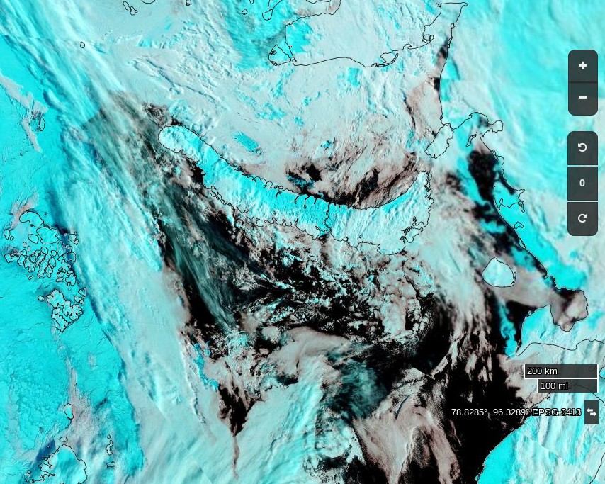
You may have noticed that in response to the GWPF’s propaganda I pointed them at a “State of the Arctic in 2017” report of my own devising which is in actual fact “based exclusively on observations rather than climate models” and looks like this:
NASA Worldview “false-color” image of the Bering Sea on March 22nd 2017, derived from the MODIS sensor on the Terra satelliteNASA Worldview “false-color” image of the Kara Sea on March 22nd 2017, derived from the MODIS sensor on the Terra satelliteSynthetic aperture radar image of the Wandel Sea on March 21st 2017, from the ESA Sentinel 1B satellite
We feel sure that Lamar Smith and the House Committee on Science, Space and Technology won’t comprehend the significance of those observations, but will nonetheless be pleased to see the GWPF’s report become public knowledge shortly before their planned hearing next week.
We also feel sure they were pleased to view the contents of another recent “white paper” published under the GWPF banner. The author was ex Professor Judith Curry, and the title was “Climate Models for the Layman“. Lamar Smith et al. certainly seem to qualify as laymen, and Judith’s conclusion that:
There is growing evidence that climate models are running too hot and that climate sensitivity to carbon dioxide is at the lower end of the range provided by the IPCC.
will no doubt be grist to their climate science bashing mill next Wednesday. Unfortunately that conclusion is yet another “alternative fact” according to the non laymen.
This report, however, does little to help public understanding; well, unless the goal is to confuse public understanding of climate models so as to undermine our ability to make informed decisions. If this is the goal, this report might be quite effective.
That certainly seems to be the goal of the assorted parties involved, and consequently we cannot help but wonder if the David and Judy Show will put on another performance this coming Sunday morning? Paraphrasing William Shakespeare:
Friends, Romans, countrymen, lend me your ears;
Lamar Smith comes to bury Michael Mann, not to praise him
In our latest astonishing disclosure concerning David Rose’s optimistically named “Climategate 2” campaign in the Mail on Sunday in February we can now reveal the Mail’s botched attempt to cover up another “inadvertent” error in Mr. Rose’s February 19th article entitled “US Congress launches a probe into climate data that duped world leaders over global warming“.
In actual fact it’s the US Congress that’s being duped. Perhaps Lamar Smith, Chairman of the House Committee on Science, Space and Technology, would like to play “spot the difference” with us? Here’s an extract from the original article:
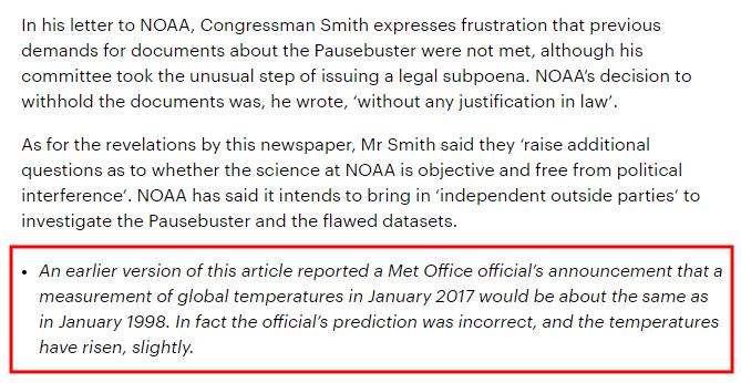
and here’s the same section of the allegedly “corrected” article.
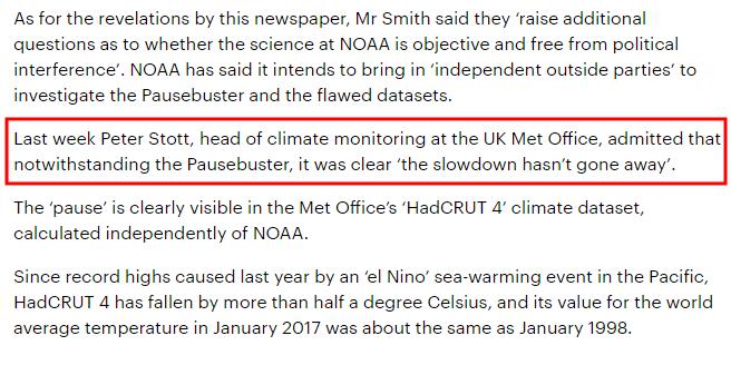
One of Mr. Rose’s “porky pies” concerning a statement supposedly made last month by Peter Stott from the UK Met Office has gone missing. There’s no apology or explanation in either the online or print version of the apology for a “correction” issued by the Mail on Sunday at the weekend.
Not only that, but an entire paragraph concerning the alleged “pause” has evaporated into thin air.
Not only that, but the alleged “correction” included below the offending article is different to the “official” version published in print at the weekend. Take another look:
Something is rotten in the state of MayBeLand. And in the state of TrumpLand too.
Regular readers will be aware that the alleged “Global Warming Policy Forum” recently published what they describe with tongue in cheek as a “correction” to one of the many egregious inaccuracies published on their web site recently.
Last night the Mail Online web site followed suit by publishing an excuse for a “correction” to the self same egregious inaccuracy published on February 19th 2017 as part of David Rose’s self christened “Climategate 2” campaign in the Mail on Sunday. Here’s how I announced that momentous event to the waiting World:
and here’s how that version looked in virtual print last night:
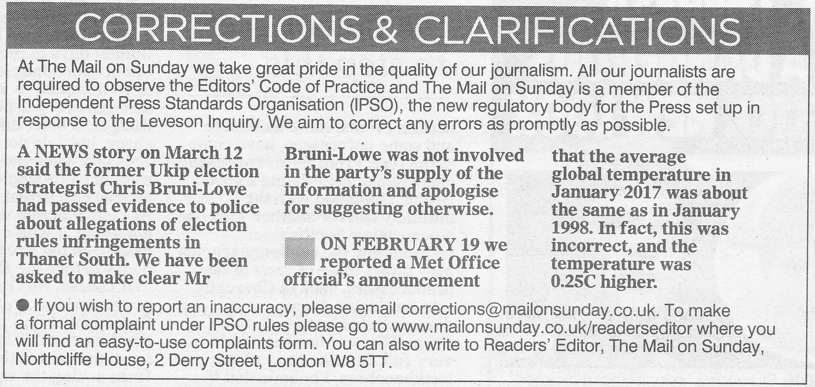
Now in actual fact I reported this particular inaccuracy to David Rose’s managing editor at the Mail on Sunday weeks ago. This morning I rushed down to the local paper shop to discover how the Mail’s apology for a “correction” looked in actual print. I searched in vain for a “climate change” story or even a “science” story with which it might have been associated, but I failed miserably.
They are an elite fighting force with proud history and a fearsome reputation for being among the toughest soldiers in the British Army.
But now, in an extraordinary military first, a battalion of the crack Parachute Regiment are to receive key aspects of their training from Barclays Bank.
The astonishing scheme has echoes of the classic sitcom Dad’s Army, in which hapless bank manager Captain Mainwaring attempted to whip his platoon into shape.
What a picture of Arthur Lowe has to do with that story, or “Climategate 2” for that matter, escapes me but nonetheless beneath that load of “investigative” churnalism the printed version of the Mail’s alleged “correction” looks like this:
One of the numerous problems with the Mail and the GWPF’s version of these recent events is that none of the UK Met Office insiders I have contacted have any idea what the Mail might be blathering on about:
Our old friend Tony Heller has been publishing a glorious Gish gallop of articles showing OSI-SAF Arctic sea ice type maps and claiming amongst other things:
A decade after declaring the end of Arctic multi-year sea ice, it has increased 116% and now covers nearly half of the Arctic.
That is of course not true. In actual fact it’s an “alternative fact” par excellence!
I have been endeavouring to point out to Tony the error of his ways for weeks now, but my words have wisdom have fallen on deaf ears. My graphic graphics have been viewed only by “snow blind” eyes. My incontrovertible arguments have been misapprehended by purpose built dumb and dumberer wetware illogic. By way of example, here’s a refreshingly ad hom free riposte from a typical commenter:
Jimmy Boy actually thinks his honesty and integrity are equally to that of Anthony Watts???
No doubt we’ll get around to discussing Anthony Watts “honesty and integrity” again soon, but for now let’s see if we can finally set this particular badly warped record straight shall we?
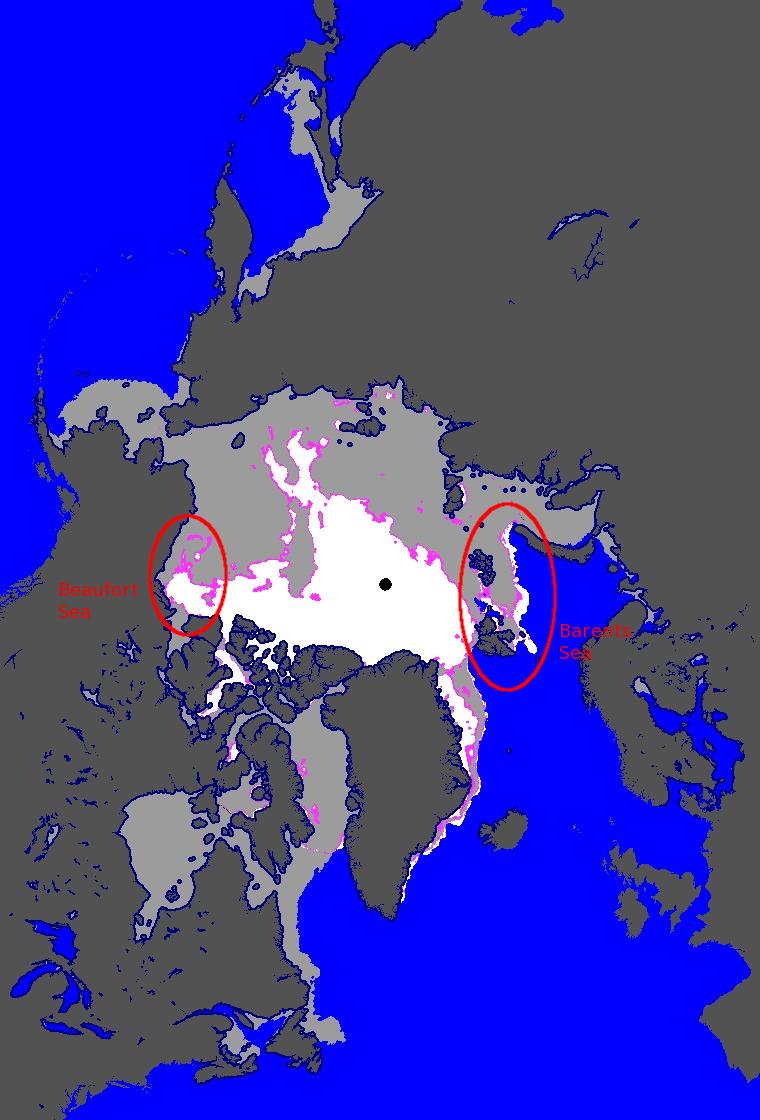
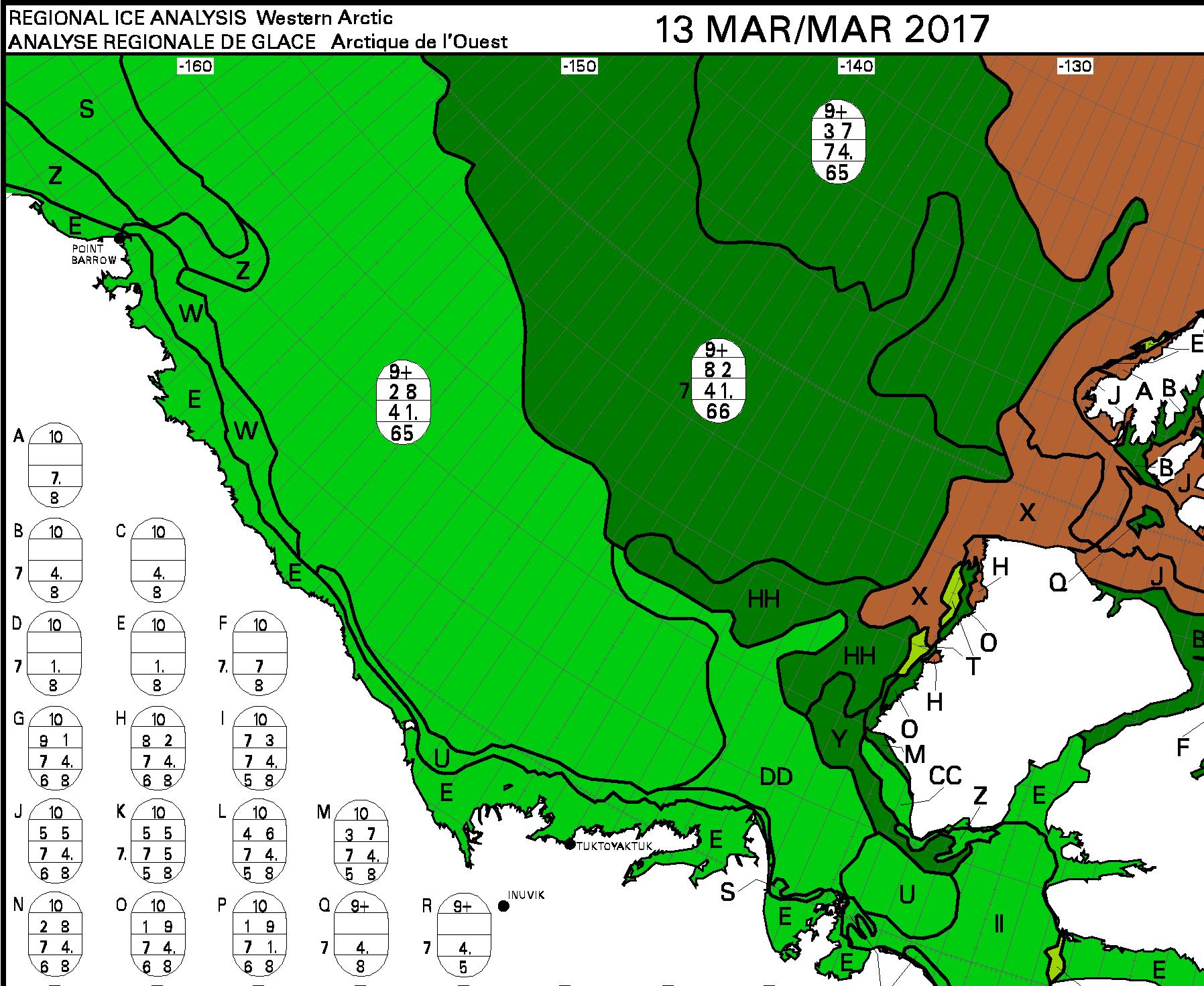
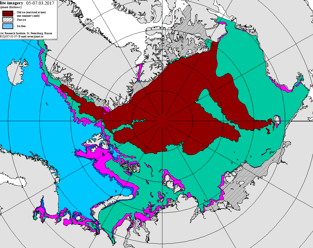
Here is the latest OSI-SAF ice type map, for March 16th 2017:
The highlighted area on the left is the Beaufort Sea to the north of Canada. If you’re not “snow blind” you can no doubt readily perceive a large area of allegedly “multi-year sea ice” coloured white. Let’s now take a look at the most recent Canadian Ice Service map of the same area, for March 13th 2017:
Canadian Ice Service sea ice stage of development on March 13th 2017
Can you see a large area of brown “old ice” covering most of the surface of the Beaufort Sea?
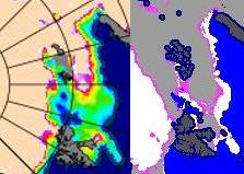
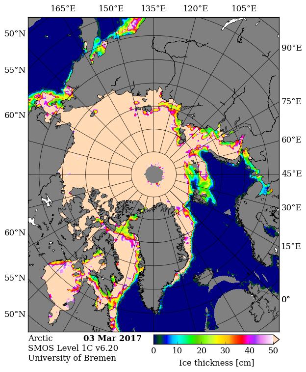
Now let’s take a look on the other side of the Arctic at the area north of the Barents Sea. Can you see a large area of allegedly “multi-year sea ice” coloured white inside the red ellipse on the OSI-SAF map? Next let’s take a look at the most recent University of Bremen SMOS map of the Arctic, for March 15th 2017:
On this map the brightly coloured areas show sea ice that’s less than 50 cm thick. Even when two people explain this point slowly to them the “deplorable denizens” at Mr. Heller’s blog do not manage to get the message! So now let’s look at a closeup comparison between the OSI-SAF ice type map and the University of Bremen SMOS sea ice thickness map:
As I popped the question to the deplorable denizens over on Tony Heller’s Deplorable Climate Science blog:
For anybody else here who isn’t deaf, dumb and blind, please note all the young, thin sea ice around Svalbard identified by SMOS that OSI-SAF currently classifies as “multi-year” ice.
At the risk of (repeating myself)^n, n → ∞:
Why do Tony, Tommy and Andy persist with this nonsense?
Although positive feedbacks between sea ice and the Arctic circulation exist, we find that these are small during summer. Instead, circulation variations over the Arctic have been a significant factor in driving sea-ice variability since 1979, and have had a non-trivial contribution to the total surface temperature trend over Greenland and northeastern Canada39 . The potentially large contribution of internal variability to sea-ice loss over the next 40 years reinforces the importance of natural contributions to sea-ice trends over the past several decades. The similarity of high-latitude circulation variability associated with sea-ice loss to the teleconnections with the tropical Pacific suggests a contribution of sea-ice losses from SST trends across the tropical Pacific Ocean. Decadal trends in the hemispheric circulation are an important driver of Arctic climate change, and therefore a significant source of uncertainty in projections of sea ice. Better understanding of these teleconnections and their representation in global models under increasing greenhouse gases may help increase predictability on seasonal to decadal timescales.
As you may already be able to imagine, this paper (PDF as submitted) is already the source of considerable controversy! Firstly let’s take a look at an overview of the paper from the University of Washington, entitled “Rapid decline of Arctic sea ice a combination of climate change and natural variability”:
“The idea that natural or internal variability has contributed substantially to the Arctic sea ice loss is not entirely new,” said second author Axel Schweiger, a University of Washington polar scientist who tracks Arctic sea ice. “This study provides the mechanism, and uses a new approach to illuminate the processes that are responsible for these changes.”
[First author Qinghua] Ding designed a new sea ice model experiment that combines forcing due to climate change with observed weather in recent decades. The model shows that a shift in wind patterns is responsible for about 60 percent of sea ice loss in the Arctic Ocean since 1979. Some of this shift is related to climate change, but the study finds that 30-50 percent of the observed sea ice loss since 1979 is due to natural variations in this large-scale atmospheric pattern.
Now let’s take a look at another overview of the paper, this time from Roz Pidcock at Carbon Brief and entitled “Humans causing up to two-thirds of Arctic summer sea ice loss, study confirms”:
Rising greenhouse gas emissions are responsible for at least half, possibly up to two-thirds, of the drop in summer sea ice in the Arctic since the late 1970s, according to new research. The remaining contribution is the result of natural fluctuations, say the authors.
The paper, published today in Nature Climate Change, confirms previous studies which show how random variations in the climate have acted to enhance ice loss caused by rising CO2.
Importantly, the authors state clearly in the paper that their work does not absolve human activity as a driver of Arctic sea ice loss. A News and Views article that accompanies the paper, by Dr Neil Swart from Environment and Climate Change Canada, adds:
“The results of Ding et al. do not call into question whether human-induced warming has led to Arctic sea-ice decline — a wide range of evidence shows that it has.”
There has already been much debate about the paper on Twitter! Here’s the “scientific” edition:
FILE PHOTO: An undated NASA illustration shows Arctic sea ice at a record low wintertime maximum extent for the second straight year, according to scientists at the NASA-supported National Snow and Ice Data Center (NSIDC) and NASA. NASA/Goddard’s Scientific Visualization Studio/C. Starr/Handout via Reuters/File Photo
Natural swings in the Arctic climate have caused up to half the precipitous losses of sea ice around the North Pole in recent decades, with the rest driven by man-made global warming, scientists said on Monday.
The study indicates that an ice-free Arctic Ocean, often feared to be just years away, in one of the starkest signs of man-made global warming, could be delayed if nature swings back to a cooler mode.
Natural variations in the Arctic climate “may be responsible for about 30–50 percent of the overall decline in September sea ice since 1979,” the U.S.-based team of scientists wrote in the journal Nature Climate Change.
David embellished his article with some “humorous” asides such as:
“This is the worst of the worst catastrophes in the world! Oh, it’s crashing … Oh, the humanity! Honest, I can hardly breathe. I’m going to step inside where I cannot see it.”
Please say it ain’t so!!!
“The melt of the Arctic is disrupting the livelihoods of indigenous peoples and damaging wildlife such as polar bears and seals while opening the region to more oil and gas and shipping.”
Eskimos, seals and polar bears!!! Oh My!!! And more oil and gas shipping!!! Aiiieeee!!!!
which some of us took exception to:
David – An Arctic indigenous person of my acquaintance asks me to tell you to “go f(r)@ck yourself”!
What should I reply on your behalf?
No answer has yet been received to that (im)pertinent question!
All this excitement in the Twittosphere and elsewhere leads one to wonder whether Ding, Schweiger et al. saw (or should have seen?) all this coming, and if so what might have been done differently? In any event this story is set to run and run and run and……
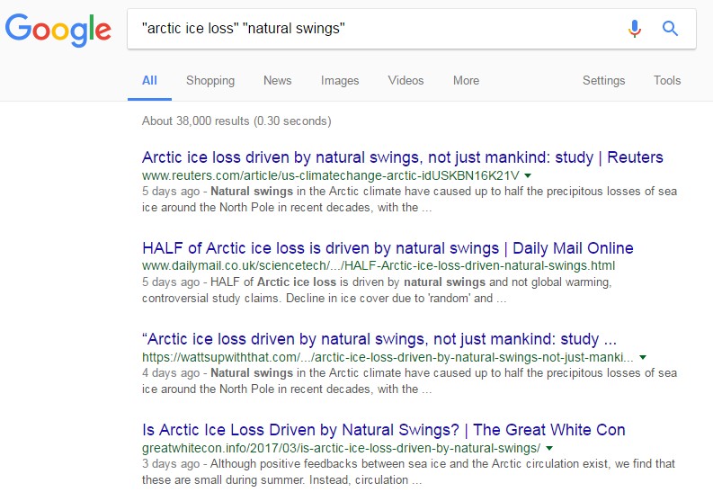
38,000 results. We’re number 4. If you repeat the exercise please feel free to experiment with the search phrase(s) you employ. Make sure to only click on the link that leads you back here!
Without being able to pick any obvious holes I feel somewhat uncomfortable with that; the idea that September ice depends just on JJA circulation doesn’t feel at all right. Having decided that, though, they then run a variety of model experiments, for example “nudging” the circulation back to re-analysis, with and without an ocean-ice model underneath. And the result seems to be that it is mostly the circulation forcing the sea ice, rather than the sea ice changes forcing the atmosphere. This kinda-fits the “information flow” meme from way back so I should be prepared to accept that mostly. Having done that they then convince themselves that most of the circulation changes that matter to the ice are not GW forced, and so must be natural variability; and hence the conclusion. If you took all of this at face value then they’d have solved one of the puzzles, that on the whole models show much less ice decline that reality. But of course if the decline is substantially a freak of variation, not forced, that would fit.
The flaw in this overall, without looking at the details, is that it’s hard to see a near-40-year trend and being so much natural variability. That seems to be asking for an awful lot of one-way variation.
Prof. Andrew Shepherd, Director of the Centre for Polar Observation and Modelling at the University of Leeds, said:
“According to this new research, the dramatic decline in Arctic sea ice that we have witnessed over recent decades is primarily due to anthropogenic (man-made) climate warming.
“Although this finding may not come as a surprise, being able to separate this from the effects of natural climate variability is an important step forwards, and paves the way for an improved understanding of what we should expect in future decades.”
Dr Ed Hawkins, Climate research scientist at the University of Reading, said:
“Recent summer Arctic sea ice extents have all been amongst the lowest on record but this is not necessarily all due to warming global temperatures – part of the sea ice decline is also because of changes in the atmospheric circulation.
“It is challenging to determine how much of the change in the circulation is itself due to warming temperatures, but this study suggests that a substantial fraction is due to natural fluctuations.
“Looking ahead, it is still a matter of when, rather than if, the Arctic will become ice-free in summer, but we expect to see periods where the ice melts rapidly and other times where it retreats less fast.”
The Arctic icecap is shrinking – but it’s not all our fault, a major study of the polar region has found. At least half of the disappearance is down to natural processes, and not the fault of man made warming.
Part of the decline in ice cover is due to ‘random’ and ‘chaotic’ natural changes in air currents, researchers said.
The rest has been driven by man-made global warming, scientists said.
The research means that although it is widely feared that the Arctic could soon be free of ice, this could be delayed if nature swings back to a cooler cycle.
Colin Fernandez’ Daily Mail article reproduced at Mark Morano’s “Climate Depot”
Study in journal Nature: HALF of Arctic ice loss driven by natural swings — not ‘global warming’
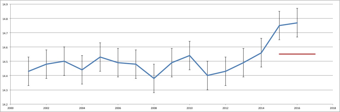
The five earliest years of data plot near +2 standard deviations. The five most recent full years of data plot near or just outside of -2 standard deviations. Ding et al., 2017 conclude that up to half of the difference is due to the NAO and other natural climate fluctuations.
Astonishingly though, the study makes no mention of the Atlantic Multidecadal Oscillation, which also has a significant effect on Arctic sea ice extent.
Since the late 1970s, the AMO has moved from the coldest point of its cycle to its highest, coinciding with a decline in Arctic sea ice coverage.
Considering that the climate models are already performing poorly as it is, the new finding means that they are actually faring even worse than has been generally realized. And accounting for this strengthens the case for a lukewarming future from greenhouse gas emissions.
Ring up another strike against the climate models, and another reason why basing government policy on their output is a bad idea.
The article itself is of course straight off the GWPF’s porky pie production line, but in the small print at the bottom there is this “Shock News!”:
Finally, we must correct a mistake. In February a scientist involved in the production of the HadCRUT4 global surface temperature data set told us what January’s figure was before its official publication. It turns out they were wrong, and we have corrected the graphs accordingly. Here is HadCRUT4, with its pause and recent El Nino peak.
When the HadCRUT4 data for 2016 was complete the MET Office estimated that 0.2°C was due to the El Nino. So here is that difference.
A scientist involved in the production of the HadCRUT4 global surface temperature data set told us that once again David Whitehouse is mistaken:
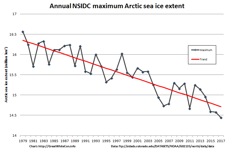
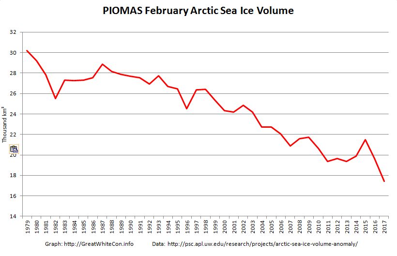
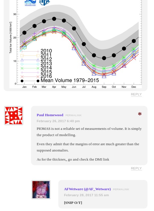
The February 2017 PIOMAS Arctic sea ice volume numbers are out. It’s no longer surprising to report that they are the lowest ever for the month of February in records going back to 1979:
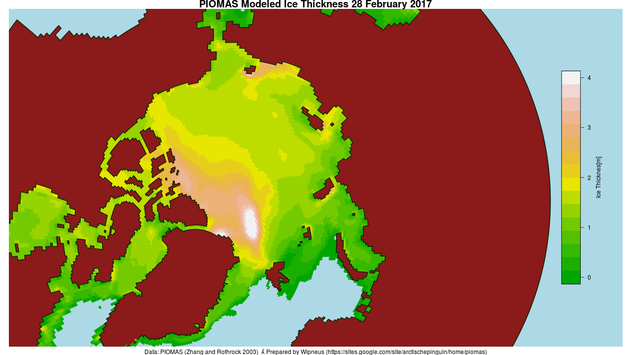
Here’s the PIOMAS gridded thickness map for February 28th:
There does seem to be a small patch of slightly thicker ice in the East Siberian Sea off Chaunskaya Bay, but there’s still a much larger area of sub 0.5 meter thick ice in the Laptev and Kara Seas.
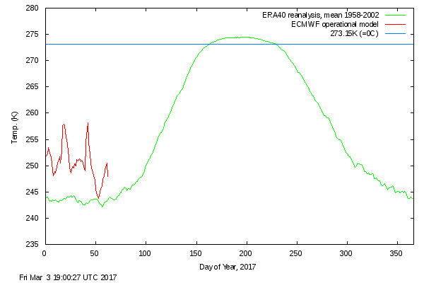
The Danish Meteorological Institute’s temperatures for the “Arctic area north of the 80th northern parallel” graph shows somewhat more “normal” readings in February 2017, but still without falling below the ERA40 climatology this year or in 2016:
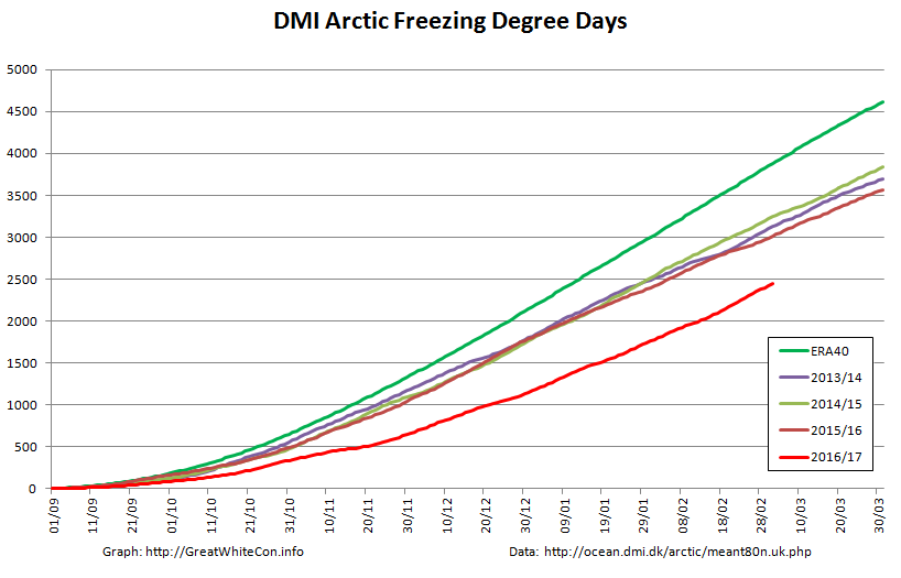
The graph of cumulative Freezing Degree Days (FDD for short) is still far below all previous years in DMI’s records going back to 1958:
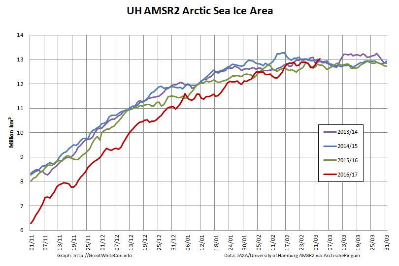
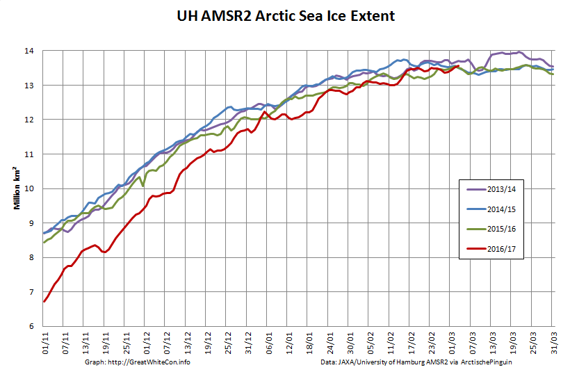
Finally, for the moment at least, here’s the high resolution AMSR2 Arctic sea ice area and extent:
I’m going to have to eat some humble pie, or crow pie as I gather it’s usually referred to across the Atlantic, following my tentative “2017 maximum prediction” a couple of weeks ago. Both area and extent posted new highs for the year yesterday, with area creeping above 13 million square kilometers for the first time this year.
[Edit – March 7th]
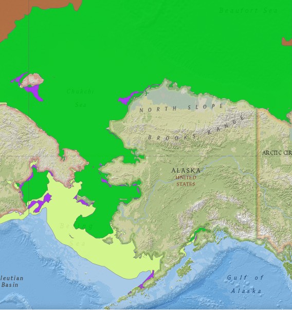
Commenter Michael Olsen suggests that “thicker ice being pushed into the Alaskan and Russian parts of the Arctic Ocean”. Here’s some evidence:
The United States’ National Weather Service current sea ice stage of development map for Alaskan waters:
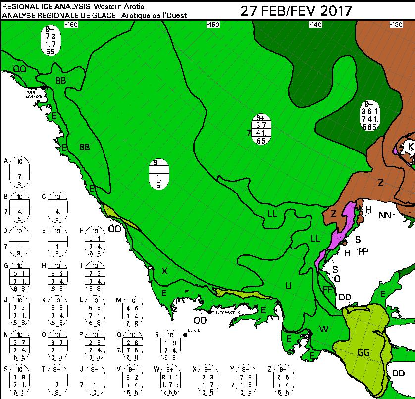
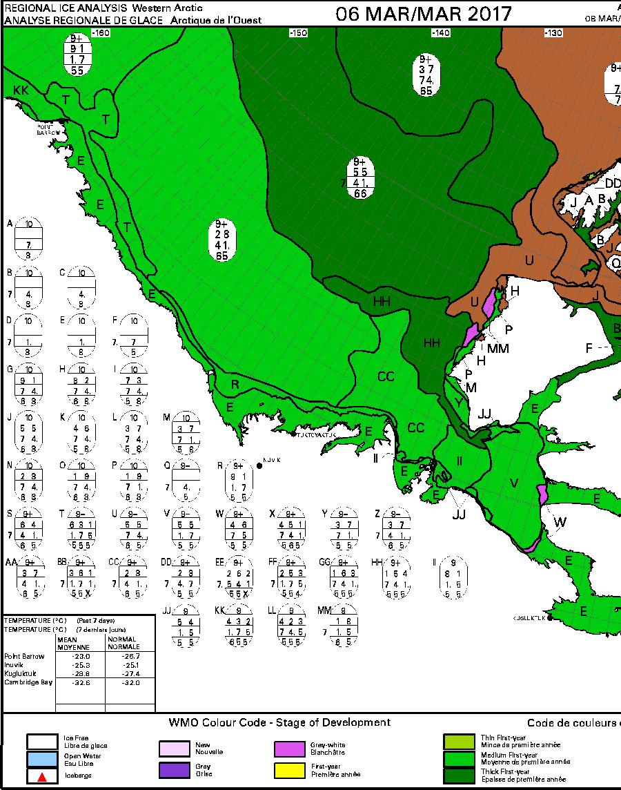
This week’s Canadian Ice Service sea ice stage of development map is expected later today, so for now here’s last week’s:
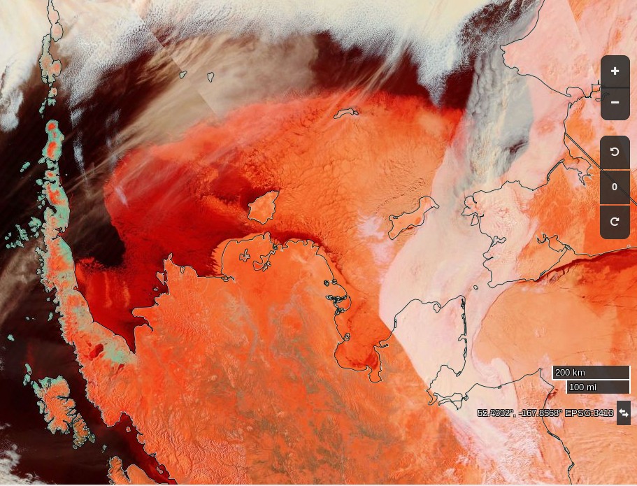
Especially for Michael, a visual image of all the “thicker ice [that’s been] pushed into the Russian parts of the Arctic Ocean” courtesy of the nice folks at NASA:
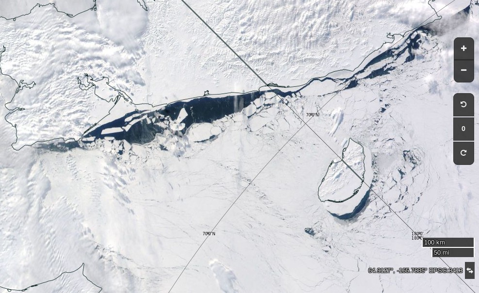
NASA Worldview “true-color” image of the Chukchi Sea on March 10th 2017, derived from the MODIS sensor on the Aqua satellite
[Edit – March 12th]
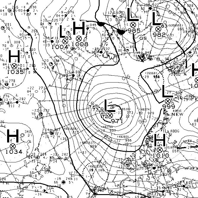
Yet another strong Arctic cyclone has been battering the sea ice in the Arctic Basin. According to Environment Canada this one bottomed out at 971 hPa at 06:00 UTC today.
Has drawn on official sources.. to uncover what is actually happening [in the Arctic]
Have we got news for you Christopher? That’s not how it works in the cryodenialosphere! Mr. Homewood’s article about Mr. Booker’s article about Mr. Homewood’s previous article(s) is littered with factual errors. This is what happens should you be foolish enough to attempt to correct such errors.
Here is what we typed into the comment section of Mr. Homewood’s blog:
Of course if Mr. Booker were to have considered Arctic sea ice volume he might have thought twice about his “there is even more of it today than in February 2006, and it is also significantly thicker.” remark?
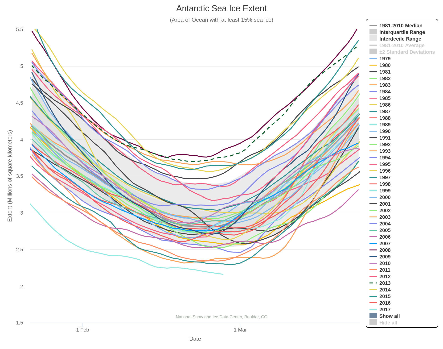
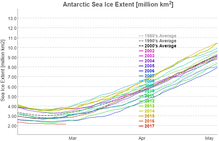
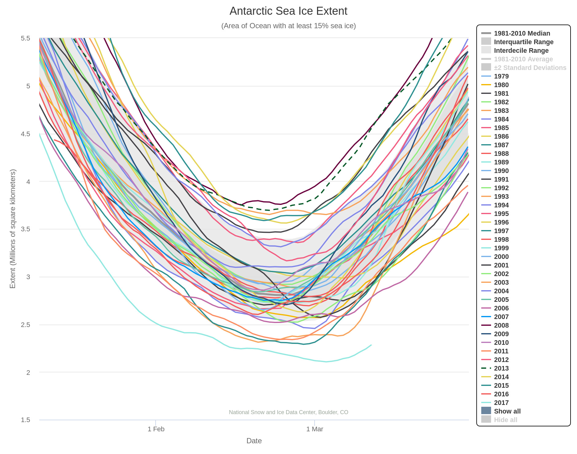
In 2017 Antarctic sea ice extent is beating all the records. All flavours of the metric are already below the minimum of all previous years in the satellite record, and it looks like there’s still some more melting left to go. Here’s the NSIDC’s 5 day averaged extent:
It seems highly likely that the 2017 Antarctic sea ice minimum extent has now been reached. Here’s the NSIDC 5 day averaged extent graph:
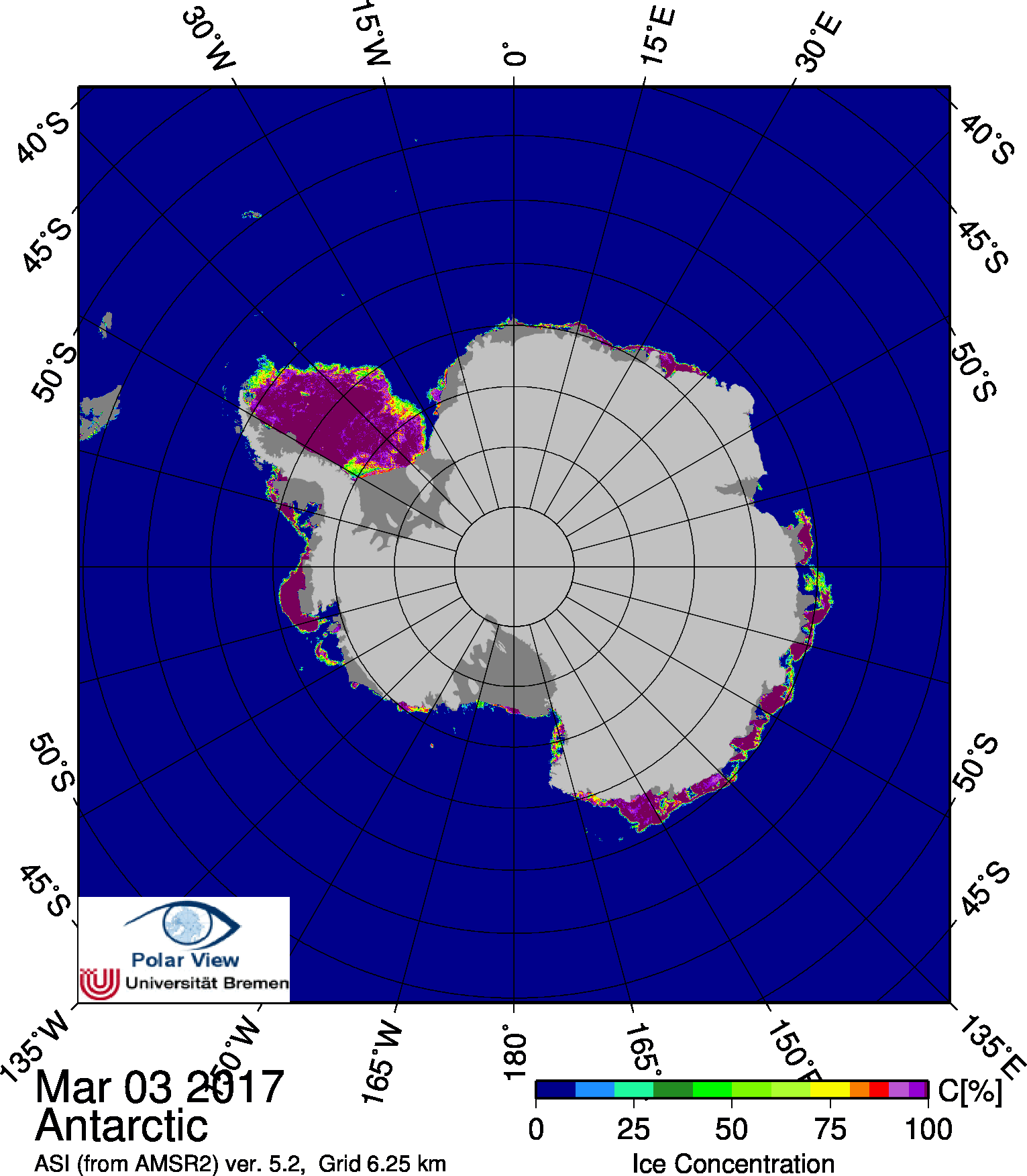
The minimum extent of 2.106 million square kilometers was reached on March 3rd. Here’s the University of Bremen’s Antarctic sea ice concentration map for March 3rd:
This website uses cookies to improve your experience. We'll assume you're ok with this, but you can opt-out if you wish. Cookie settingsACCEPT
Privacy & Cookies Policy
Privacy Overview
This website uses cookies to improve your experience while you navigate through the website. Out of these, the cookies that are categorized as necessary are stored on your browser as they are essential for the working of basic functionalities of the website. We also use third-party cookies that help us analyze and understand how you use this website. These cookies will be stored in your browser only with your consent. You also have the option to opt-out of these cookies. But opting out of some of these cookies may affect your browsing experience.
Necessary cookies are absolutely essential for the website to function properly. This category only includes cookies that ensures basic functionalities and security features of the website. These cookies do not store any personal information.
Any cookies that may not be particularly necessary for the website to function and is used specifically to collect user personal data via analytics, ads, other embedded contents are termed as non-necessary cookies. It is mandatory to procure user consent prior to running these cookies on your website.