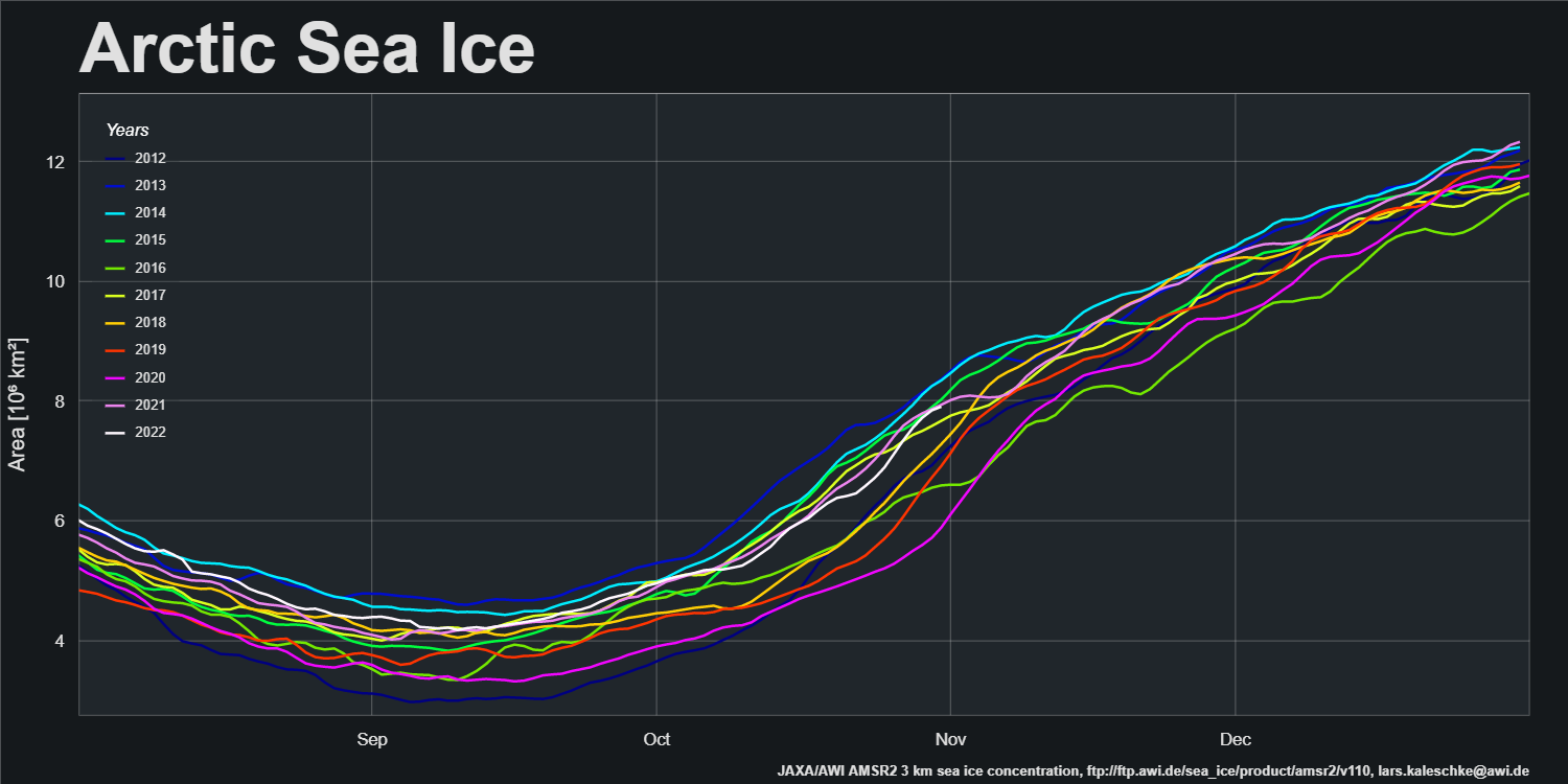
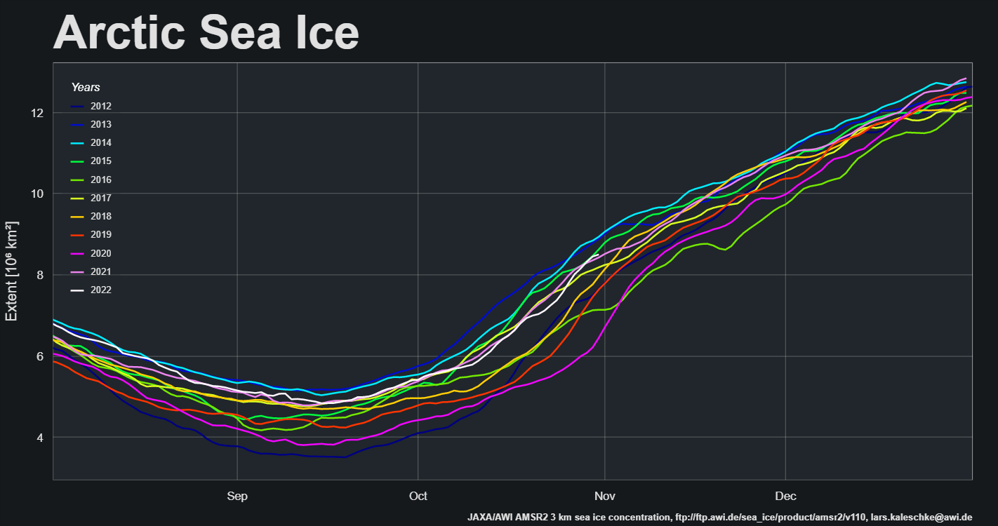
A change is allegedly as good as a rest, so here’s an alternative view of high resolution AMSR2 area and extent created using the experimental tools provided by the AWI’s Lars Kaleschke at: https://sites.google.com/view/sea-ice/
After a brief pause mid-month the refreeze has accelerated again. Both metrics are in the upper half of the decadal range, with extent this year just above 2021 and area just below last year.
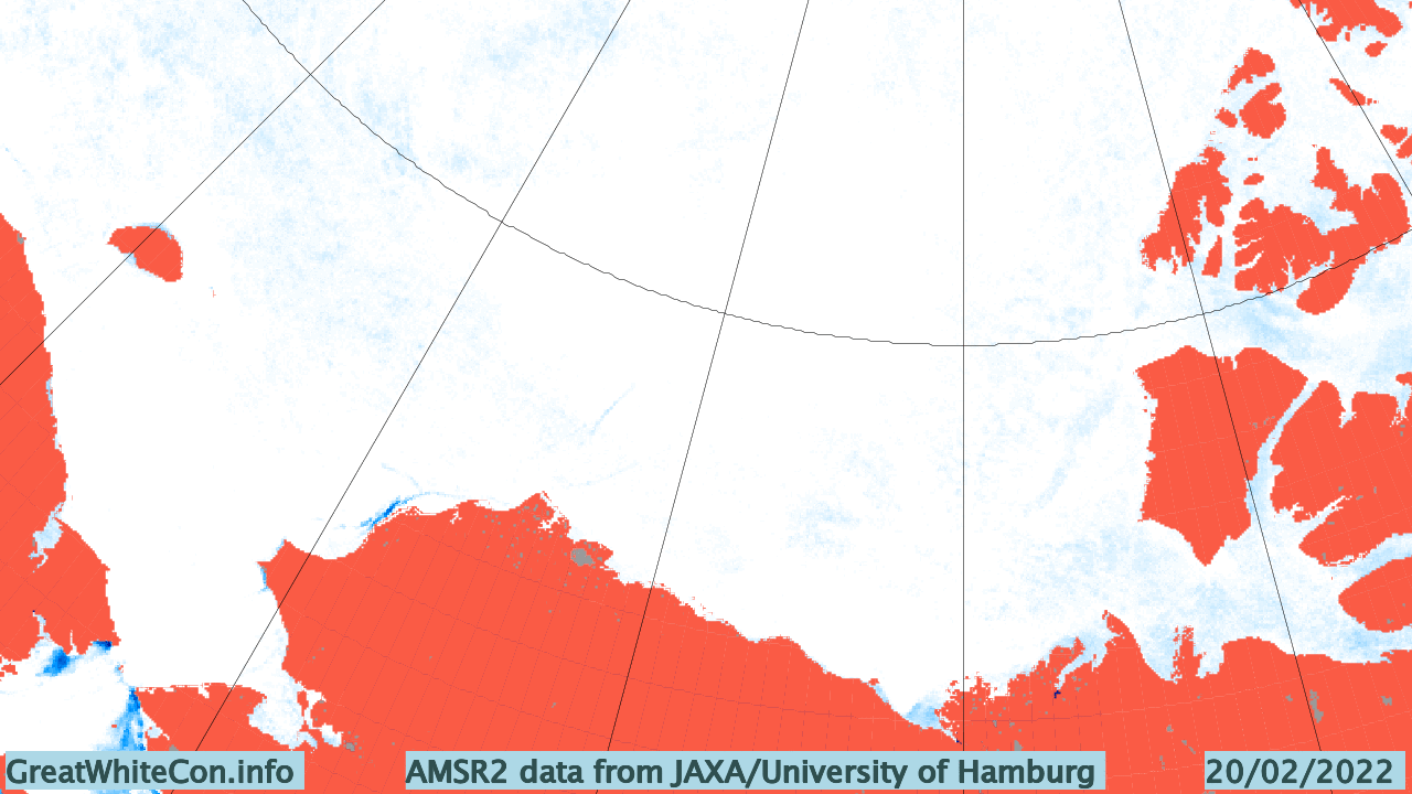
Next let’s take a look at sea ice concentration at the end of October:
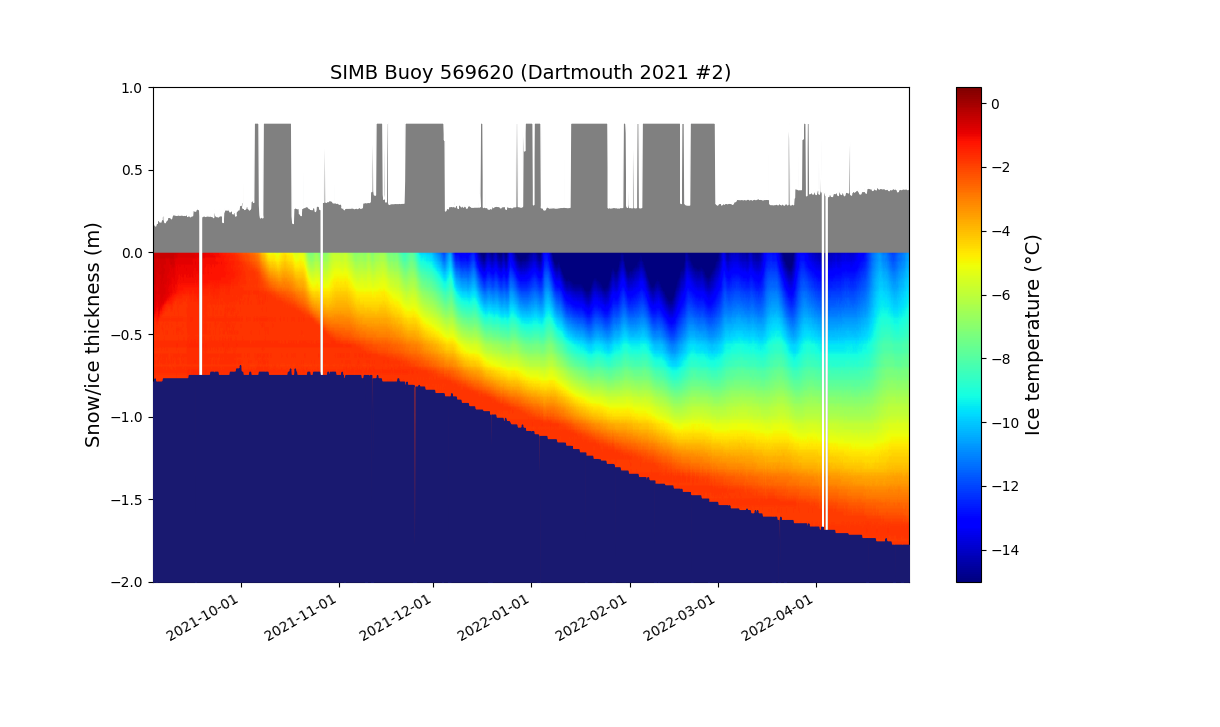
By way of a change we’ll start the month of May with a closer look at one of the ice mass balance buoys deployed in the Beaufort Sea last Autumn. IMB buoy 569620 was deployed at 78.5 N, 147.0 W on September 3rd 2021, and since then it has drifted to 81.0 N, 147.7 W. Here is the buoy’s record of atmospheric conditions above the ice floe it’s embedded in since then:
Here too is the buoy’s record of the temperature of the ice floe itself, as well as the thickness of the ice and the snow layer covering it:
There’s a few things to note at first glance. The ice floe continued to decrease in thickness into November. It’s thickness then started to increase, but is currently still less than 2 meters. Also the snow depth has gradually been increasing, and (apart from some data glitches!) is now ~38 cm. Finally, for the moment at least, the ice surface temperature has been slowly warming since mid February and is now ~-11 °C.
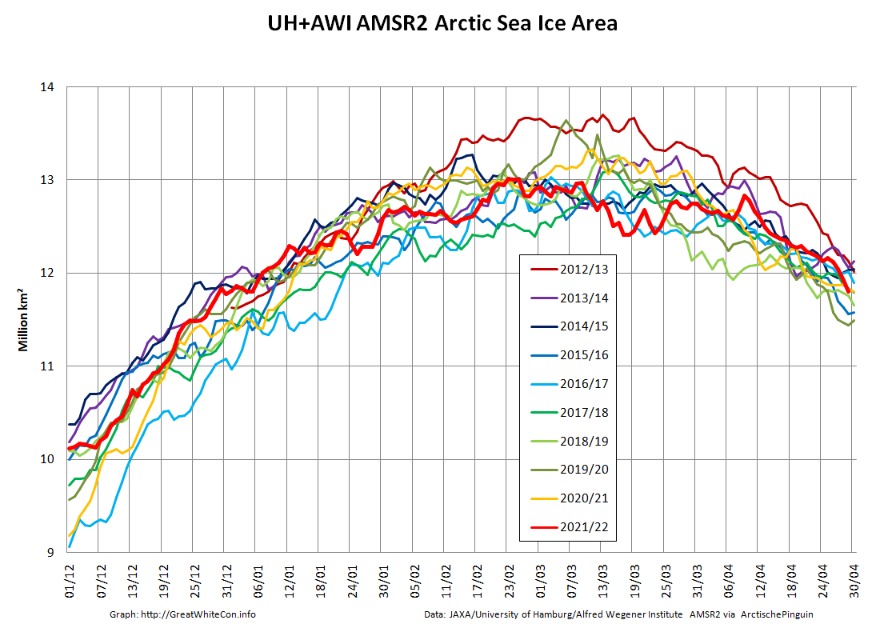
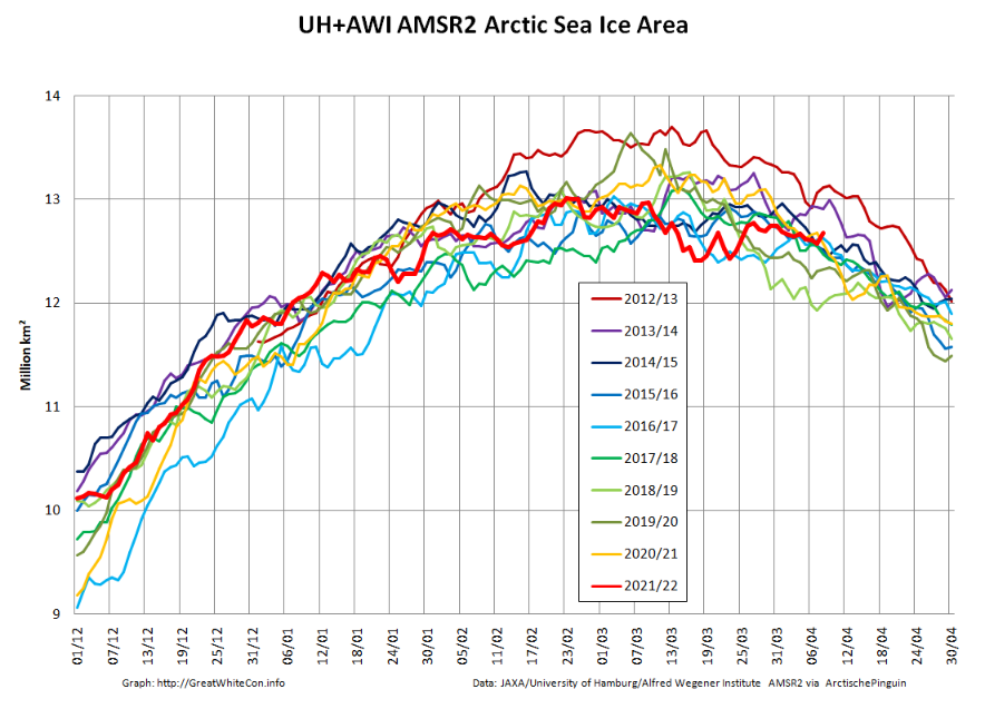
Returning to more familiar territory, high resolution AMSR2 Arctic sea ice area has taken a bit of a tumble recently:
followed less steeply by extent:
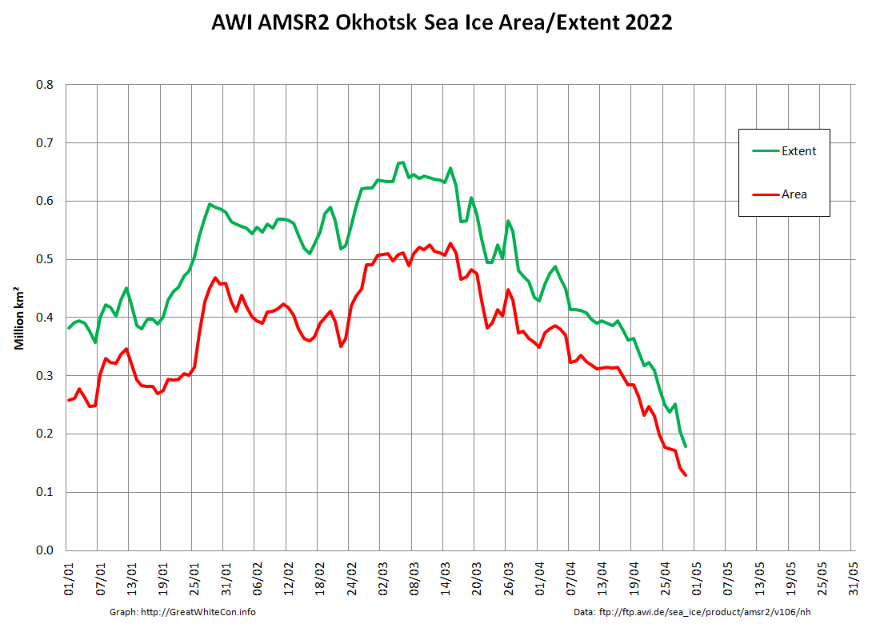
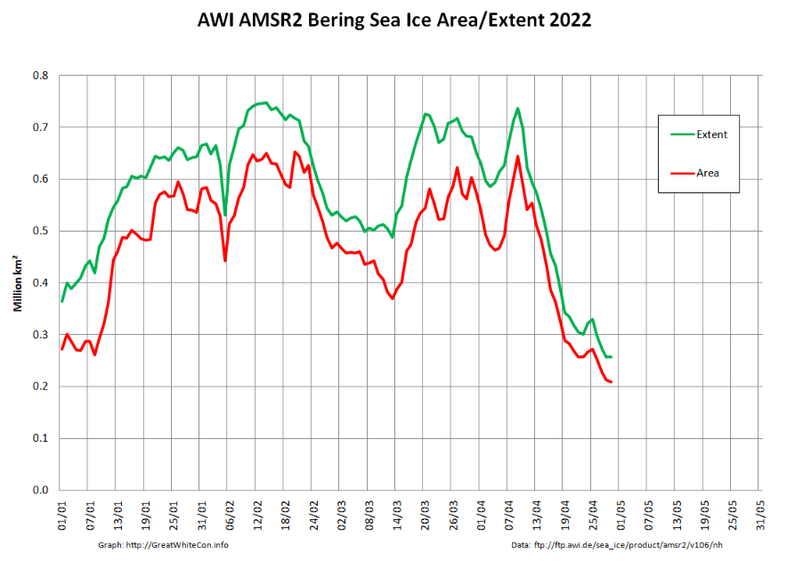
Not unexpectedly, the Pacific periphery is currently leading the decline:
[Edit – May 4th]
The Rutgers Snow Lab has updated its northern hemisphere snow cover bar chart for April 2022:
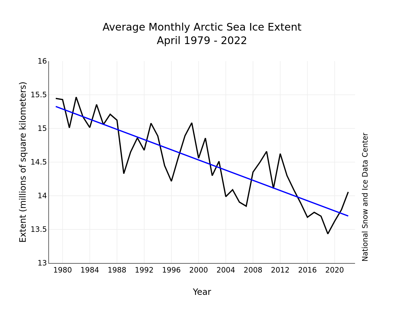
The May edition of the NSIDC’s Arctic Sea Ice News has also just been published. It summarises April 2022 as follows:
Average Arctic sea ice extent for April 2022 was 14.06 million square kilometers (5.43 million square miles). This was 630,000 square kilometers (243,000 square miles) below the 1981 to 2010 average and ranked eleventh lowest in the 44-year satellite record.
Extent declined slowly through the beginning of the month, with only 87,000 square kilometers (33,600 square miles) of ice loss between April 1 and April 10. The decline then proceeded at an average pace for this time of year through the reminder of the month.
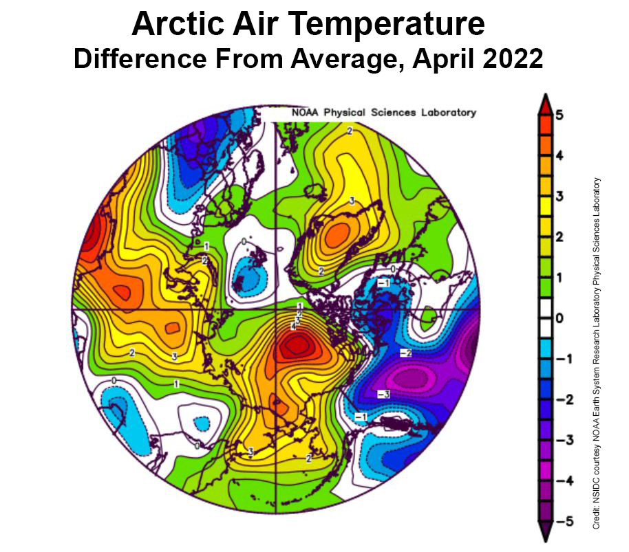
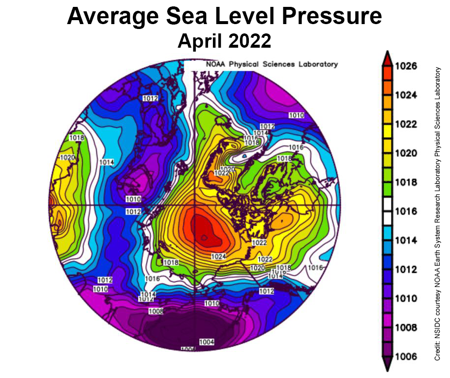
During April, temperatures at the 925 mb level (about 2,500 feet above the surface) over the Arctic Ocean were above average. Most areas were 2 to 3 degrees Celsius (4 to 5 degrees Fahrenheit) above average, but in the Beaufort Sea, April temperatures were up to 5 to 6 degrees Celsius (9 to 11 degrees Fahrenheit) above average:
This was accompanied by a strong Beaufort High pressure cell through the month:
The NSIDC’s update also refers to the Chukchi Sea polynya we’ve been keeping an eye on here:
Strong offshore winds over the northwest coast of Alaska led to openings in the ice cover, called polynyas. The first pulse of winds began on March 21. At that time, surface air temperatures were still well below freezing, and the water in the coastal polynya quickly refroze. By April 9, the offshore push of the ice ceased and the polynya iced over completely.
However, starting on April 12, a second round of offshore wind pushed the ice away from the coast, initiating another polynya. Refreezing began anew in the open water areas, but the ice growth was noticeably slower, reflecting the higher surface air temperatures by the end of the month
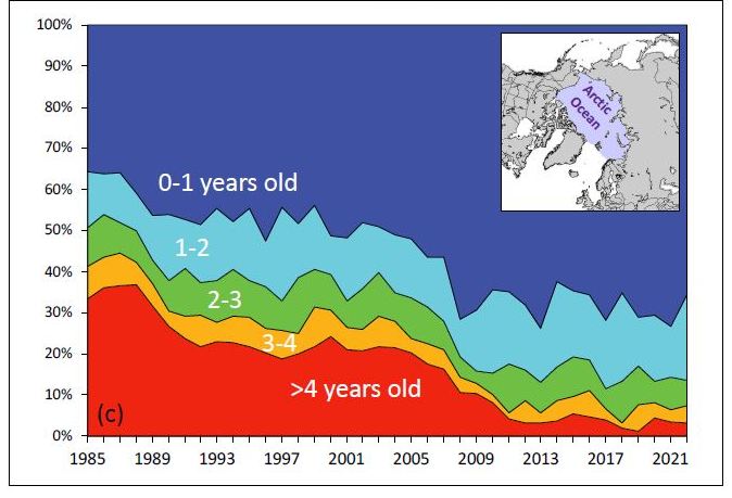
The NSIDC also updated their graph of sea ice age, on this occasion for the week of March 12th to 18th over the years:
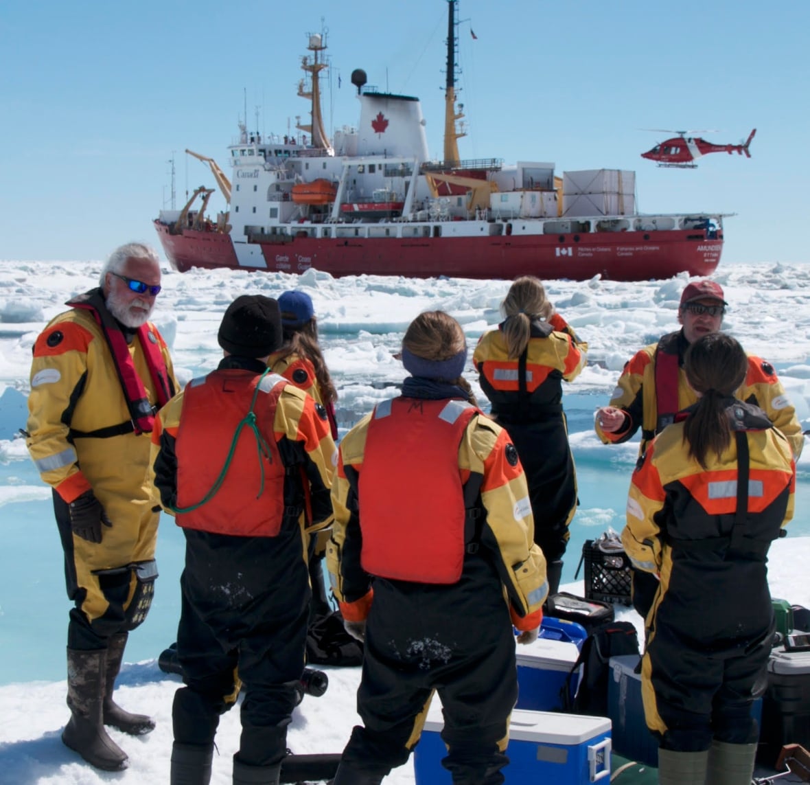
Arctic sea ice news concludes with brief news of the recent death of Canadian Arctic scientist David Barber. CBC News’s obituary for David provides more details:
Family and friends are mourning the loss of the visionary Arctic researcher and University of Manitoba professor David Barber.
Barber, who was a distinguished professor, the founding director of the Centre for Earth Observation Science and associate dean of research in the faculty of environment, earth and resource, passed away on Friday after suffering complications from cardiac arrest.
Barber, 61, is survived by his wife Lucette, three children and two grandchildren.
David Barber (left) pictured with his team on an Arctic expedition. Photo: Julien Barber[Edit – May 9th]
The waters of the Mackenzie River are starting to spread over the fast ice off the delta:
“False colour” image of the Beaufort Sea on May 7th from the MODIS instrument on the Terra satellite[Edit – May 11th]
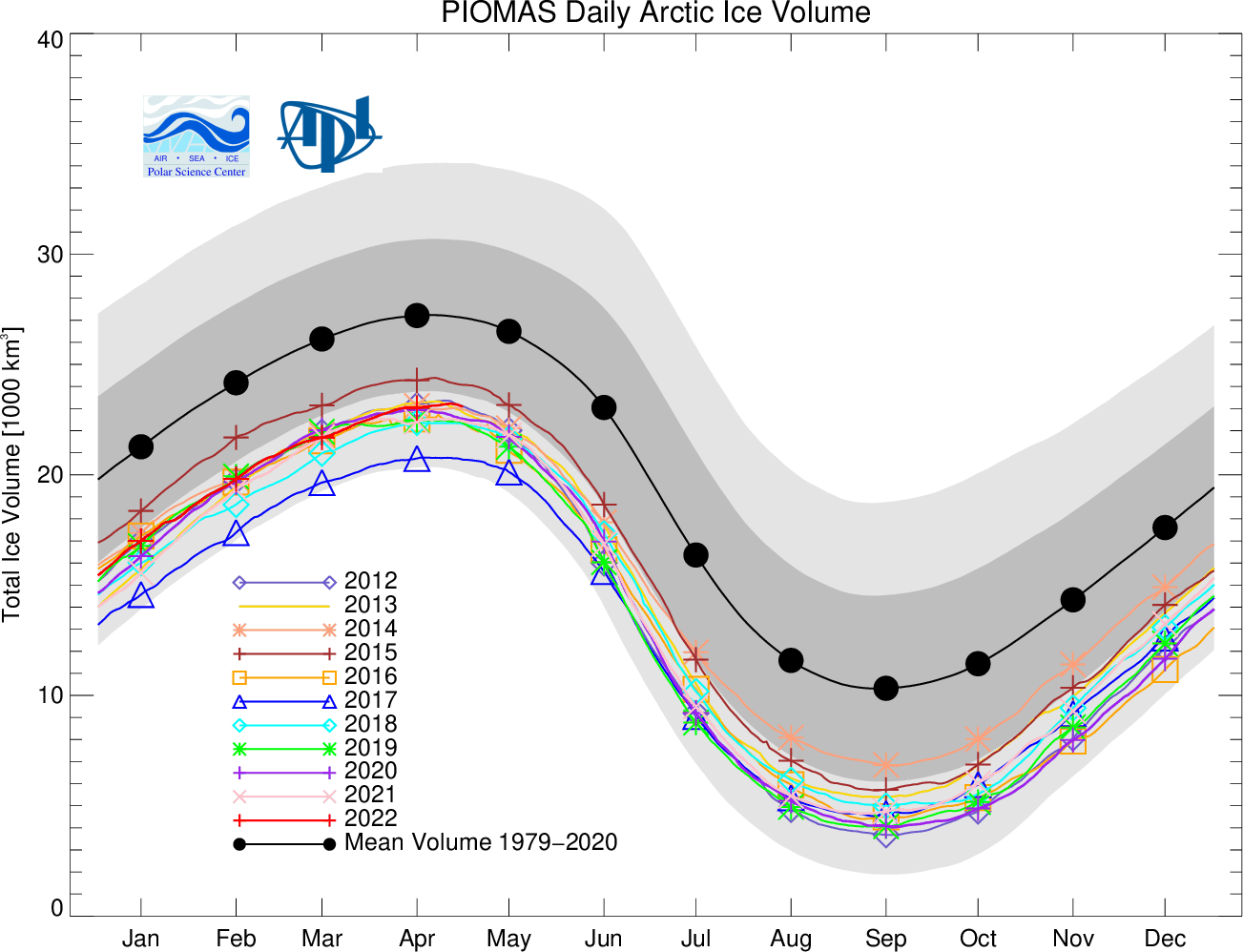
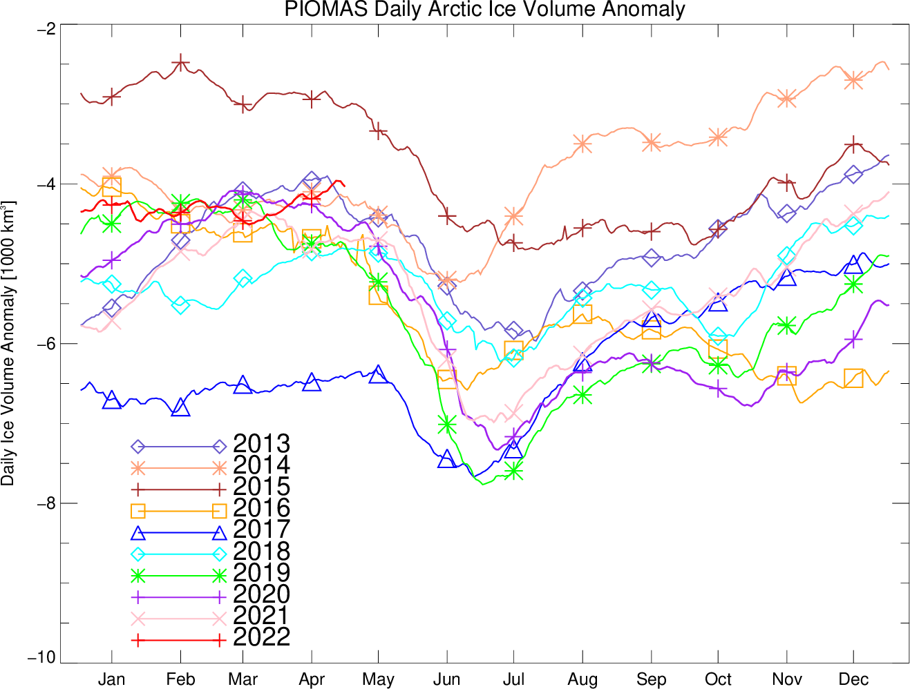
The Polar Science Center at the University of Washington has released the PIOMAS volume data for April 2022:
Average Arctic sea ice volume in April 2022 was 23,000 km3. This value is the 9th lowest on record for April, about 2,300 km3 above the record set in 2017. Monthly ice volume was 30% below the maximum in 1979 and 15% below the mean value for 1979-2021. Average April 2022 ice volume was 1.45 standard deviations above the 1979-2021 trend line.
The daily volume numbers reveal the PIOMAS maximum volume for 2022 to be 23,225 km3 on April 26th.
The PSC report continues:
Ice growth anomalies for April 2022 continued to be at the upper end of the most recent decade with a mean ice thickness (above 15 cm thickness) at the middle of recent values.
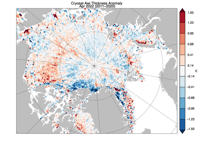
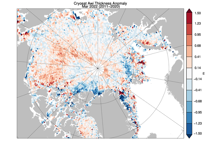
The ice thickness anomaly map for April 2022 relative to 2011-2020 divides the Arctic in two halves with positive anomalies in the “Western Arctic” but negative anomalies in “Eastern Arctic”. A narrow band of negative anomalies remains along the coast of North Greenland but a positive anomaly exists north of Baffin Island.
Note that the “positive anomaly north of Baffin Island” referred to is not apparent in the CryoSat 2 ice thickness anomaly map, although there is agreement about the thicker ice in the eastern Beaufort Sea:
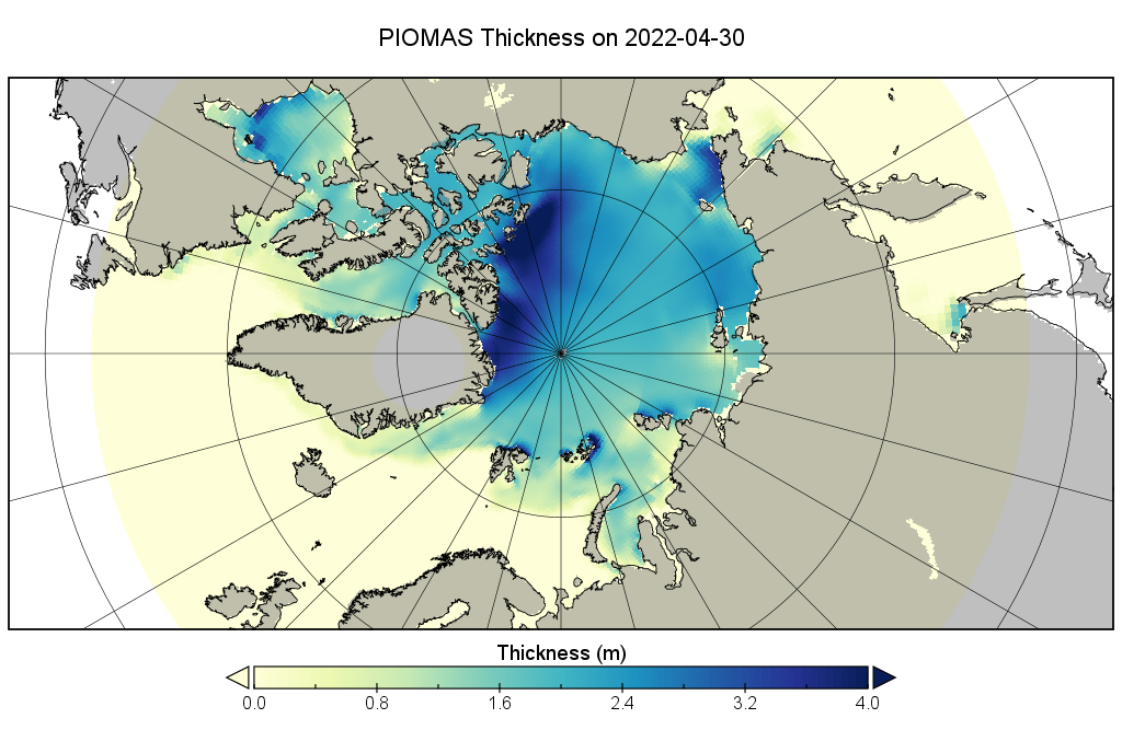
[Edit – May 23rd]
CryoSat-2 thickness maps stopped for the Summer in mid April. I’ve been hoping for mid May data from the PIOMAS team, but in vain so far. In its continuing absence here is a “work in progress” PIOMAS thickness map for the end of April:
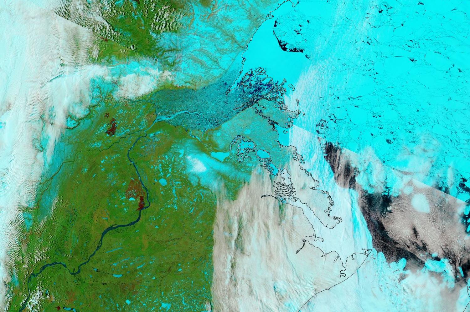
The sea ice in Chaunskaya Bay and along the adjacent coast of the East Siberian Sea is starting to look distinctly damp:
“False colour” image of the East Siberian Sea on May 23rd from the MODIS instrument on the Terra satellite
That’s not too surprising when you also look at recent temperatures in Pevek, which have been approaching all time highs for the date:
P.S. The Mackenzie River has reappeared from under the clouds and is now largely liquid:
“False colour” image of the Mackenzie River and Beaufort Sea on May 23rd from the MODIS instrument on the Terra satellite[Edit – May 27th]
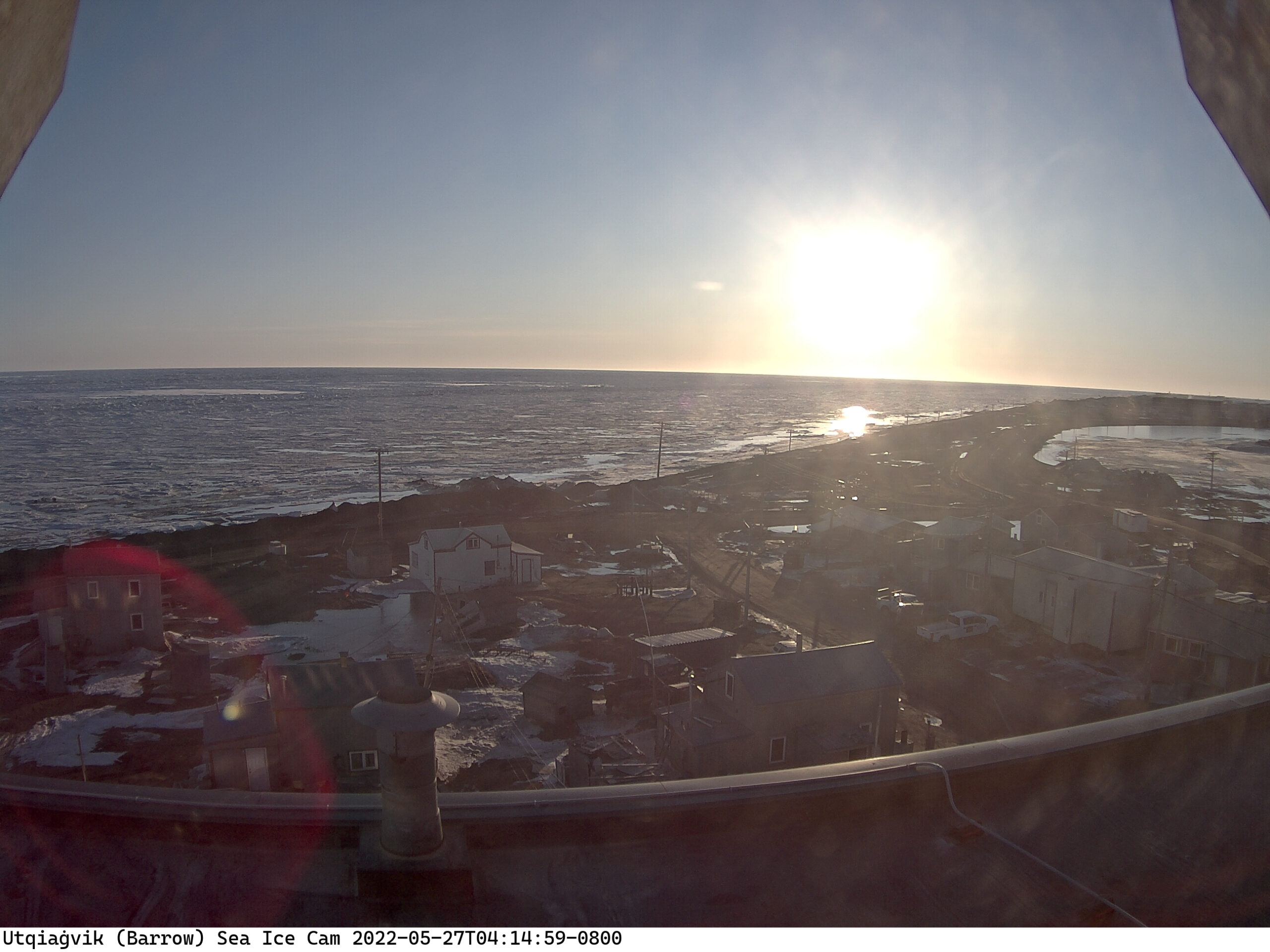
Some surface melt is now visible on the fast ice at Utqiaġvik:
No doubt the recent above zero temperatures are responsible, but the forecast is for colder conditions to return:
Discussion continues on the new open thread for June 2022.
The April edition of the NSIDC’s Arctic Sea Ice News summarises March 2022 as follows:
Average Arctic sea ice extent for March 2022 was 14.59 million square kilometers (5.63 million square miles), ranking ninth lowest in the satellite record…
The total decline, after a series of small ups and downs, was only 250,000 square kilometers (96,500 square miles):
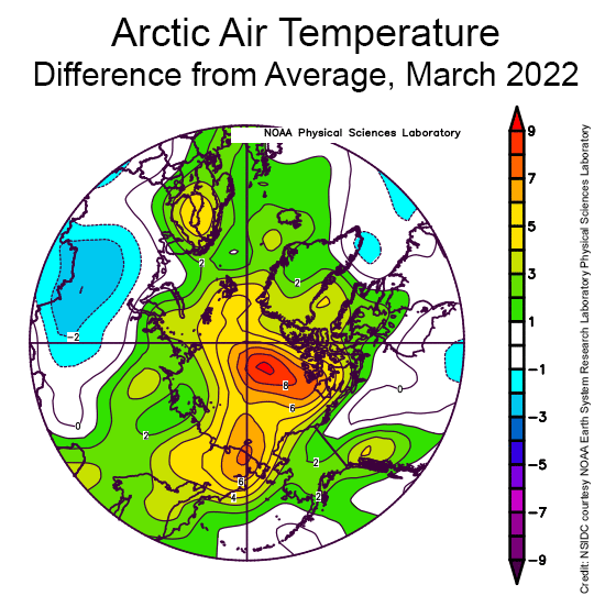
Counter to what might be expected given the very slow rate of sea ice loss over the month as a whole, air temperatures at the 925 millibar level (about 2,500 feet above the surface) were above average over all of the Arctic Ocean:
March temperatures were up to 9 degrees Celsius (16 degrees Fahrenheit) higher than average north of the Canadian Arctic Archipelago, up to 6 degrees Celsius (11 degrees Fahrenheit) above average in the East Siberian Sea, but up to 5 degrees Celsius (9 degrees Fahrenheit) above average over a wide area.
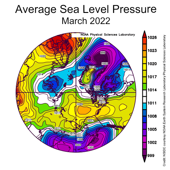
The key features of the sea level pressure pattern were high pressure (an anticyclone) over the central Arctic Ocean, a trough of low pressure extending into the Barents Sea, and an unusually high pressure over Northern Europe:
While having an anticyclone over the central Arctic Ocean is quite typical for this time of year, the combination of the high pressure over northern Europe and the pressure trough to the west led to a strong pressure gradient, leading to strong winds from south through the Norwegian and Barents Seas…
This can be tied to the extreme warm event over the Arctic Ocean seen in the middle of the month, associated with strong water vapor transport and the passage of several strong cyclones.
The Polar Science Center at the University of Washington has also released the PIOMAS volume data for March 2022:
Average Arctic sea ice volume in March 2022 was 21,700 km3. This value is the 6th lowest on record for March, about 2,200 km3 above the record set in 2017. Monthly ice volume was 38% below the maximum in 1979 and 25% below the mean value for 1979-2021:
Ice growth anomalies for March 2022 continued to be at the upper end of the most recent decade with a mean ice thickness (above 15 cm thickness) at the middle of recent values:
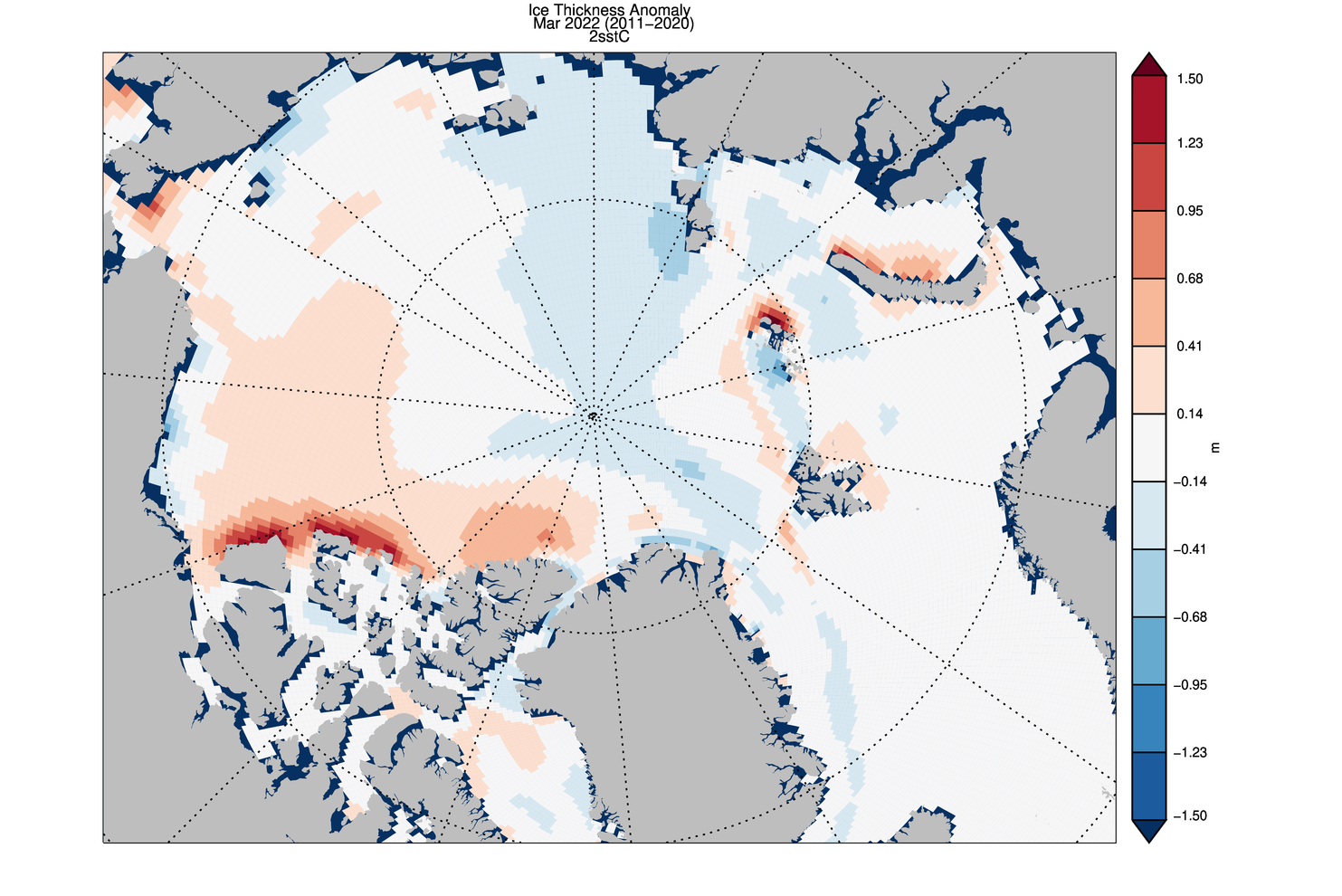
The ice thickness anomaly map for March 2022 relative to 2011-2020 divides the Arctic in two halves with positive anomalies in the “Western Arctic” but negative anomalies in “Eastern Arctic”. A narrow band of negative anomalies remains along the coast of North of Greenland but positive anomaly exists north of Baffin Island.
CryoSat 2 ice thickness shows an similar pattern of sea ice thickness anomalies though the areas North of Greenland and Baffin Bay show substantial differences:
[Edit – April 10th]
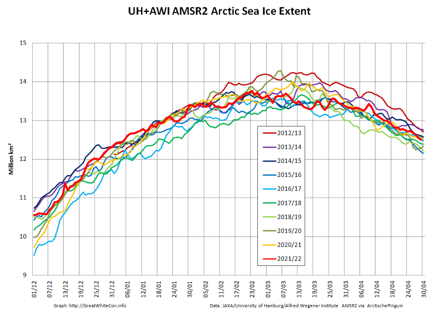
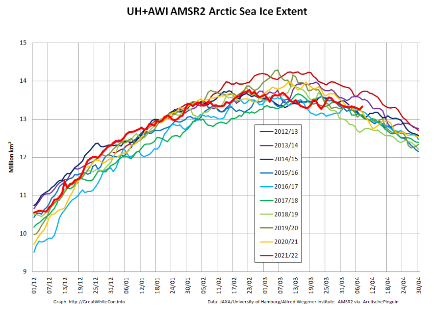
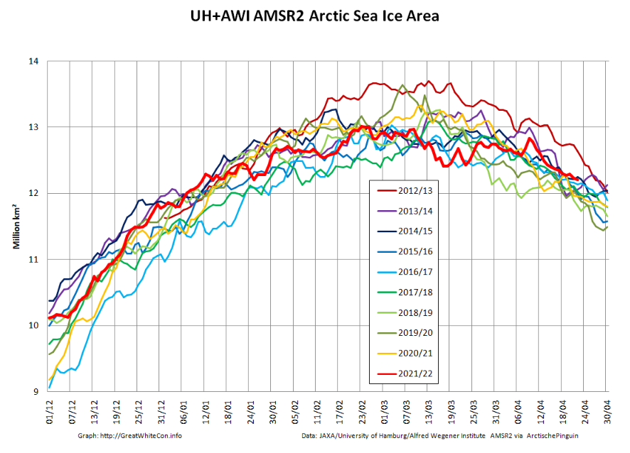
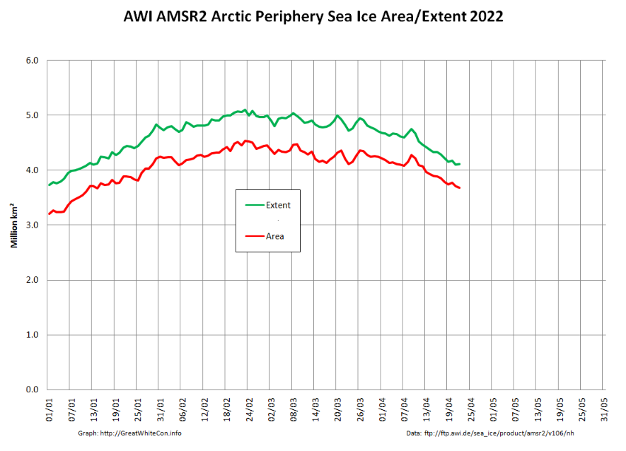
Here are the latest graphs of our favourite “high resolution” AMSR2 metrics, which combine recent data from the Alfred Wegener Institute with historical data from the University of Hamburg:
As you can see, there have indeed been a few ups and downs! Click the image below to see a 10 Mb animation of ice motion over the last few weeks:
The obvious point to note at the moment is that there are currently long flaw leads on both the Siberian and Canadian sides of the Arctic Ocean. The animation also reveals episodes of open water in the Beaufort and Chukchi Seas, as well as north of Franz Josef Land and Svalbard.
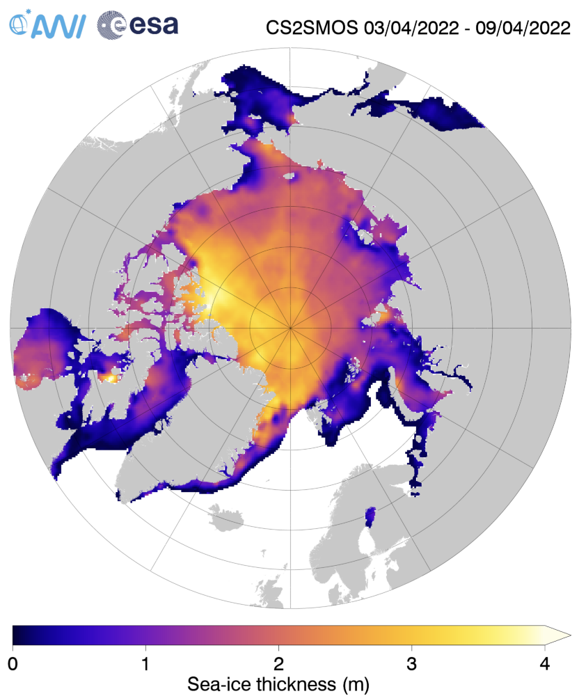
The ice in those areas is still very thin on the latest AWI CryoSat-2/SMOS sea ice thickness map:
[Edit – April 11th]
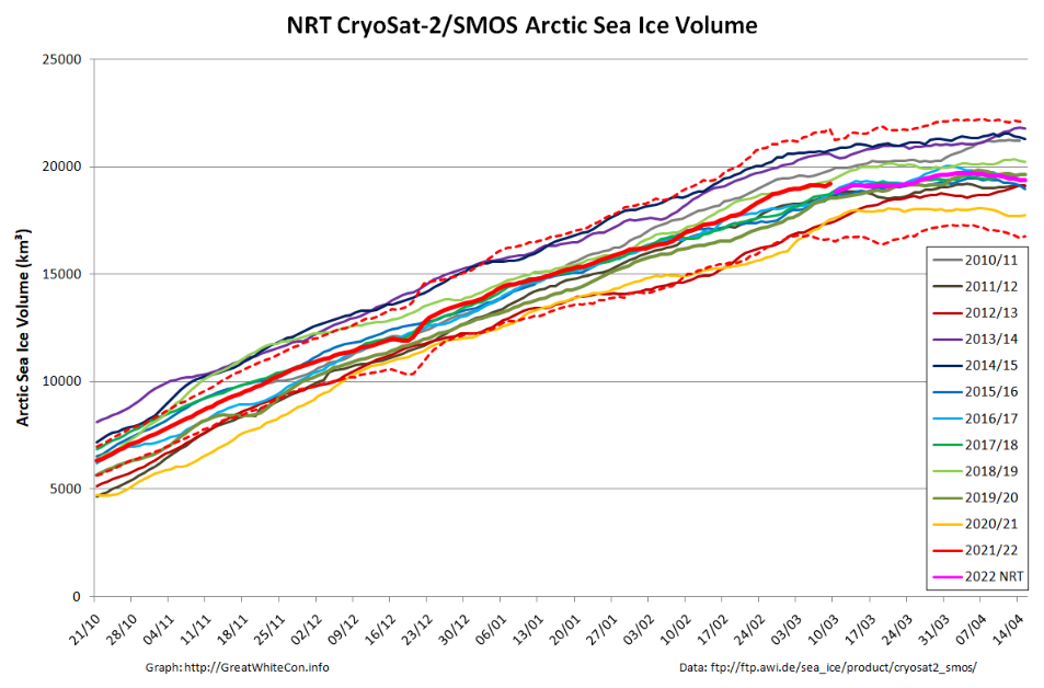
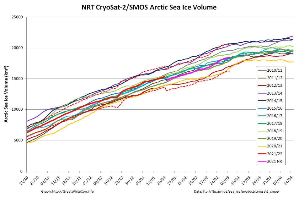
Here too is the latest AWI CryoSat-2/SMOS volume graph:
The reanalysed data is now showing something of a surge towards the end of February.
[Edit – April 23rd]
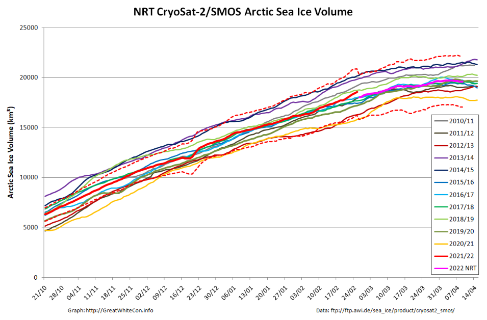
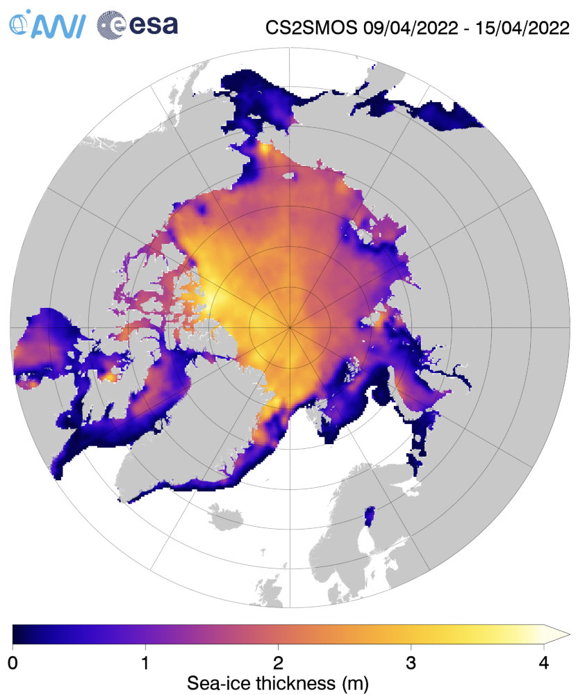
Here’s the last “near real time” AWI CryoSat-2/SMOS Arctic sea ice thickness map for Spring 2022:
The significantly thinner areas in the Beaufort and Chukchi Seas are even more pronounced than previously. Here also is the associated CS2/SMOS volume graph:
The 2022 maximum volume based on NRT data is 19719 km³ on April 5th. Expect that to be revised upwards when the reanalysed data is ultimately published.
Going back to 2 dimensions, the assorted “ups and downs” now seem to have resolved into the melting season proper:
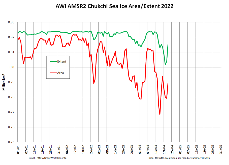
The peripheral sea have been responsible for most of the recent decline:
However as mentioned above, the Chukchi Sea has been experiencing some ups and downs of its own. Perhaps the sun is now high enough in the sky for the most recent “down” to stick around for the summer?
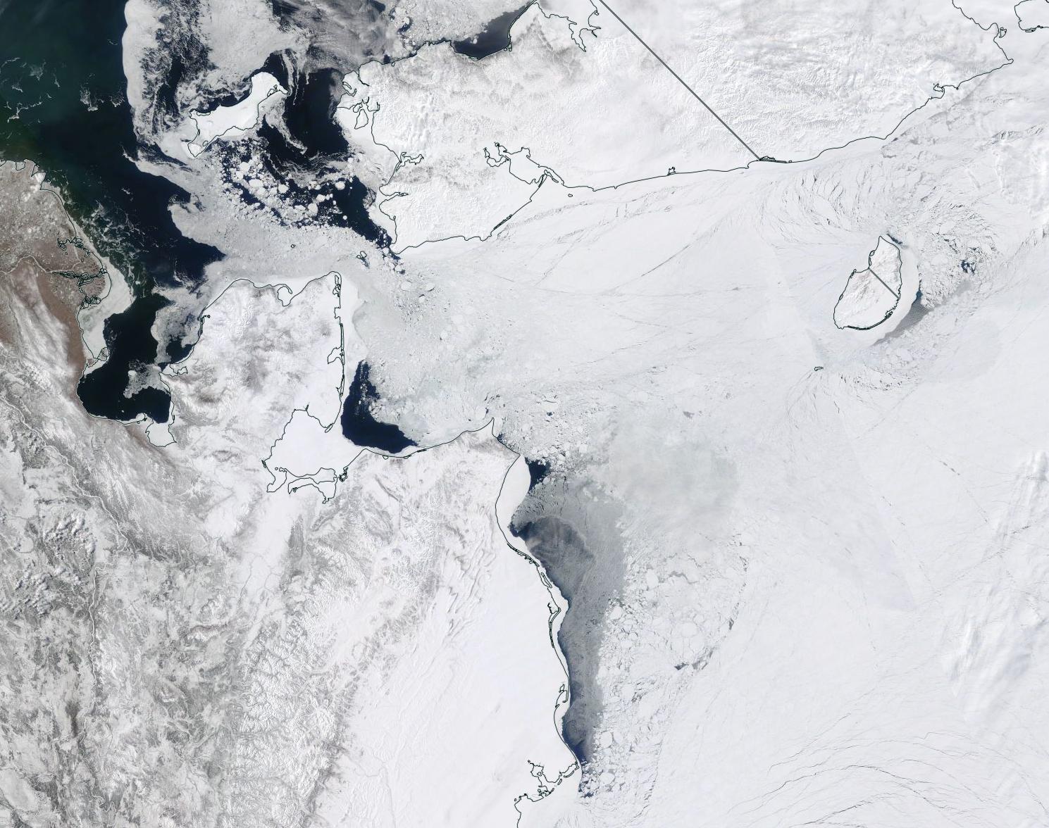
“True colour” image of the Chukchi Sea on April 21st from the MODIS instrument on the Terra satellite[Edit – April 24th]
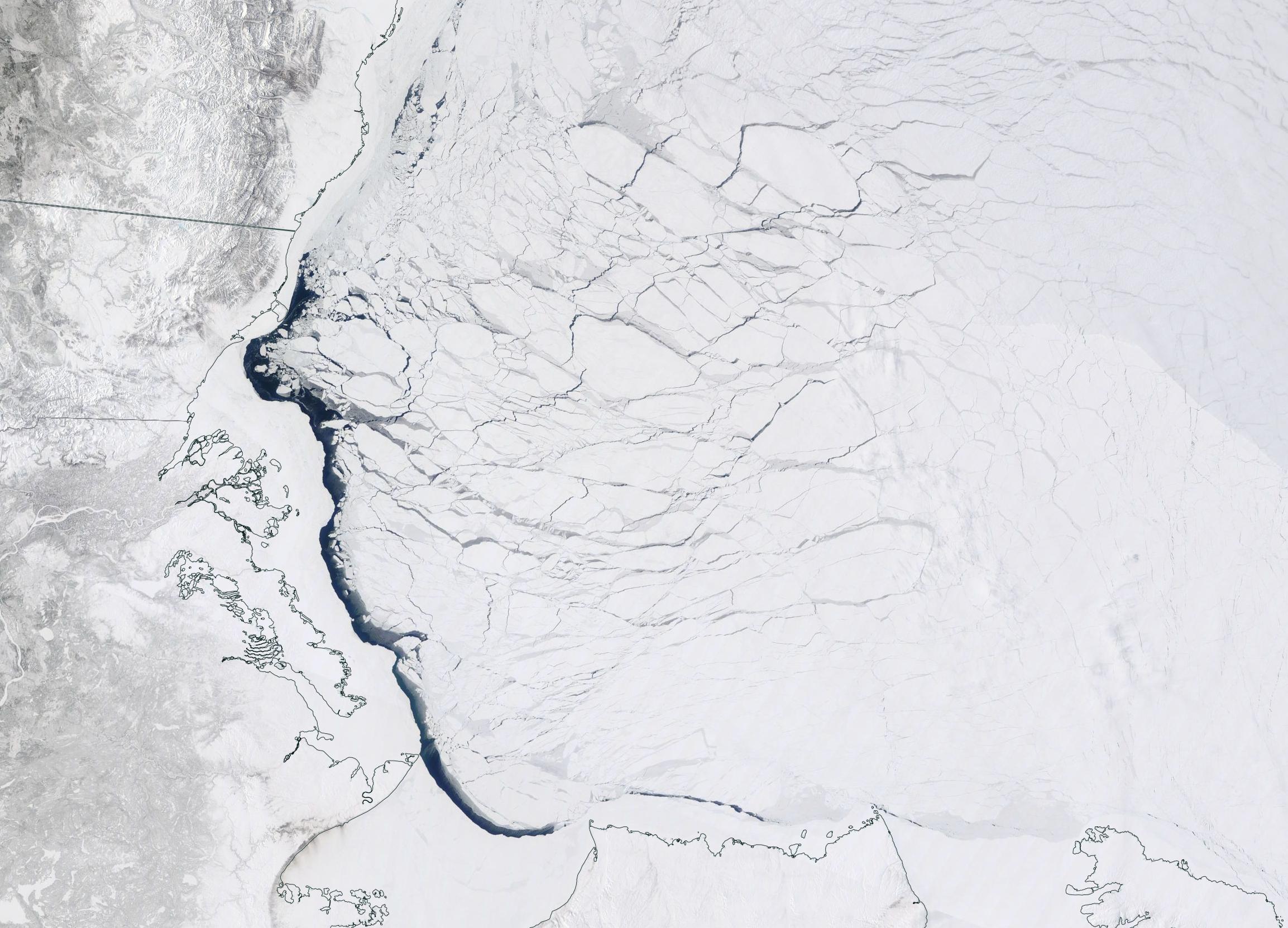
Over the last couple of days some open water has appeared in the Beaufort Sea off the Mackenzie Delta:
“True colour” image of the Beaufort Sea on April 23rd from the MODIS instrument on the Terra satellite [Edit – April 25th]
Especially for Taylor, here’s the GFS Arctic snow depth forecast for 10 days into the future:
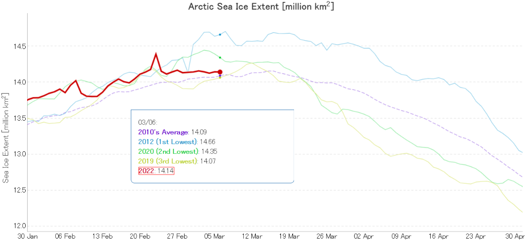
For detailed analysis of Arctic sea ice extent over the next few weeks please see the 2022 maximum extent thread. However to get the new open thread going here is the current JAXA/ViSHOP extent graph:
It’s looking more and more as though the real maximum for 2022 occurred close the false peak on February 23rd.
Arctic sea ice volume will keep increasing for a while longer. Here is the current AWI CryoSat-2/SMOS volume graph:
The recent “flat line” in extent is in part due to recent events on the Pacific periphery of the Arctic. Take a look at this animation of AMSR2 sea ice concentration:
The gap varies depending on how the wind blows, but there is still evidence of open water (or very thin ice) along the shore of the Beaufort and Chukchi Seas. Here’s the Mackenzie Delta and the adjacent Beaufort Sea on March 5th:
Regular readers will no doubt have noticed by now that here at the Great White Con we are publishing a series of reviews of Steven E. Koonin‘s new book “Unsettled”? Today we move on to the topic of Land-Surface Air Temperature (LSAT for short). Here is an extract from the very first page of the book:
Yes, it’s true that the globe is warming, and that humans are exerting a warming influence upon it. But beyond that—to paraphrase the classic movie The Princess Bride: “I do not think ‘The Science’ says what you think it says.”
For example, both the research literature and government reports that summarize and assess the state of climate science say clearly that heat waves in the US are now no more common than they were in 1900, and that the warmest temperatures in the US have not risen in the past fifty years. When I tell people this, most are incredulous. Some gasp. And some get downright hostile.
Here once again is an extract from page 23 of the Kindle edition of Steve’s book:
The [IPCC] assessment reports literally define The Science for non-experts. Given the intensive authoring and review processes, any reader would naturally expect that their assessments and summaries of the research literature are complete, objective, and transparent—the “gold standard.” In my experience, the reports largely do meet that expectation, and so much of the detail in the first part of this book, the science story, is drawn from them.
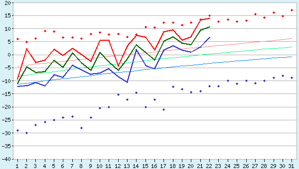
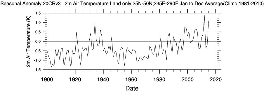
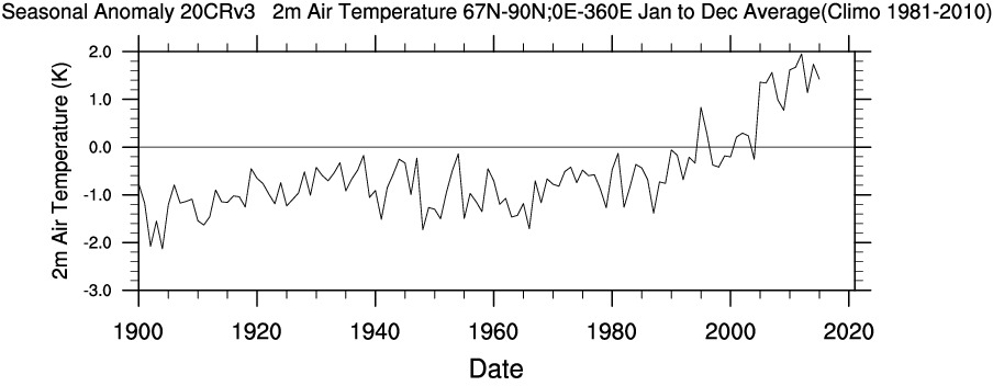
First of all let me remind Steve that the United States does not constitute the entirety of our planet. In particular the Arctic is warming a lot faster than mid latitudes in general and the US in particular. Using WRIT once again to produce our own time series, we can compare and contrast longer term temperature records between the Continental United States and the Arctic (including both land and ocean above the Arctic circle):
Also note that for some reason Steve makes no mention of US “coolest temperatures” and/or “cold waves” since 1900. I don’t know about you, but the top graph certainly suggest to me that “the warmest temperatures in the US have risen in the past fifty years”.
Let’s see how Steve explains himself. For that we have to wait until Chapter 5, catchily entitled “Hyping the Heat”. Therein no mention is made of recent temperature increases across the Arctic, but we are able to read in the introductory paragraphs that:
We can all agree the globe has gotten warmer over the past several decades. Here’s another summary statement from the IPCC’s AR5:
[S]ince about 1950 it is very likely that the numbers of cold days and nights have decreased and the numbers of warm days and nights have increased . . . there is medium confidence that globally the length and frequency of warm spells, including heat waves, has increased since the middle of the 20th century. (IPCC. AR5 WGI Section 2.6.1.)
Then there is a long discussion about what Steve apparently perceives to be shortcomings in the “The US government’s most recent assessment report, the 2017 Climate Science Special Report (CSSR)”. Steve is apparently well qualified in physics, so presumably he is able to comprehend these equations?
US ≠ Global
CSSR ≠ AR5
For those of you less familiar with the arcane language of mathematics and physics that translates to “the climate of the continental United States is not identical to Arctic climate or typical of the climate of Planet Earth as a whole” and hence “US Governmental climate reports are not necessarily typical of ‘Intergovernmental’ climate assessments”.
Next let’s check what Steve’s “gold standard for The Science” has to say on this topic. According to section 2.6.1 of the Intergovernmental Panel on Climate Change’s fifth Assessment Report, as cited by Steve:
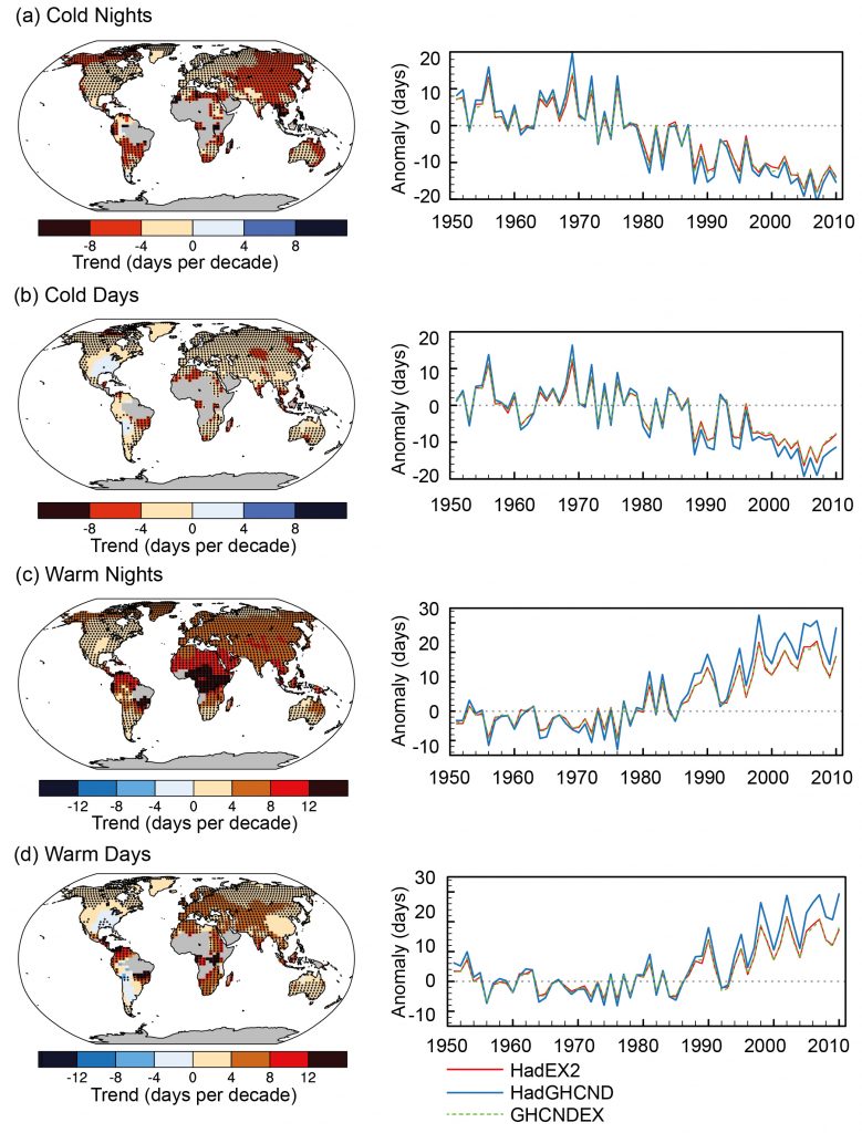
A large amount of evidence continues to support the conclusion that most global land areas analysed have experienced significant warming of both maximum and minimum temperature extremes since about 1950 (Donat et al., 2013c). Changes in the occurrence of cold and warm days (based on daily maximum temperatures) are generally less marked (Figure 2.32):
Figure 2.32 | Trends in annual frequency of extreme temperatures over the period 1951–2010, for (a) cold nights (TN10p), (b) cold days (TX10p), (c) warm nights (TN90p) and (d) warm days (TX90p) (Box 2.4, Table 1). Trends were calculated only for grid boxes that had at least 40 years of data during this period and where data ended no earlier than 2003. Grey areas indicate incomplete or missing data. Black plus signs (+) indicate grid boxes where trends are significant (i.e., a trend of zero lies outside the 90% confidence interval). The data source for trend maps is HadEX2 (Donat et al., 2013c) updated to include the latest version of the European Climate Assessment data set (Klok and Tank, 2009). Beside each map are the near-global time series of annual anomalies of these indices with respect to 1961–1990 for three global indices data sets: HadEX2 (red); HadGHCND (Caesar et al., 2006; blue) and updated to 2010 and GHCNDEX (Donat et al., 2013a; green). Global averages are only calculated using grid boxes where all three data sets have at least 90% of data over the time period. Trends are significant (i.e., a trend of zero lies outside the 90% confidence interval) for all the global indices shown.
To paraphrase The Princess Bride once again: “I do not think ‘The Science’ says what Steven E. Koonin says it says in ‘Unsettled’”.
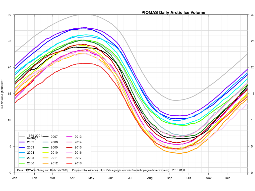
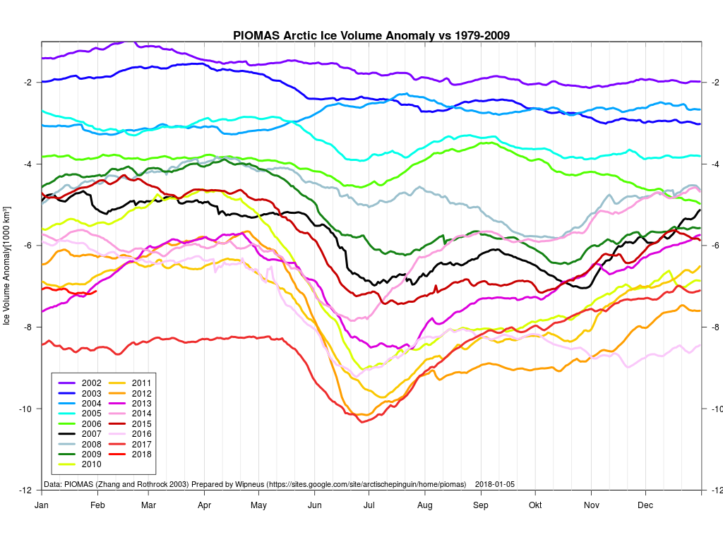
Whilst the official PIOMAS volume figures for January have yet to be released Wipneus has worked his usual magic on the gridded thickness numbers to reveal:
not to mention the calculated volume:
and the volume anomaly:
As Wipneus puts it:
Estimated from the thickness data, the latest value is from 31st of January: 17.57 [1000 km3], which is the second lowest value for that day, 2017 is lowest by a rather large margin at 16.16 [1000 km3].
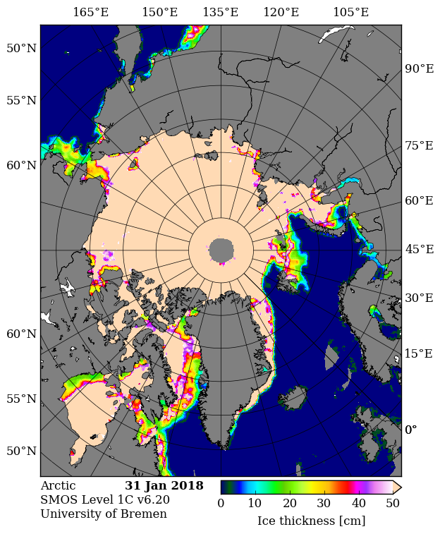
Here are the “measured” thickness maps from SMOS:
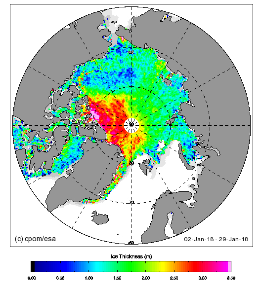
and CryoSat-2:
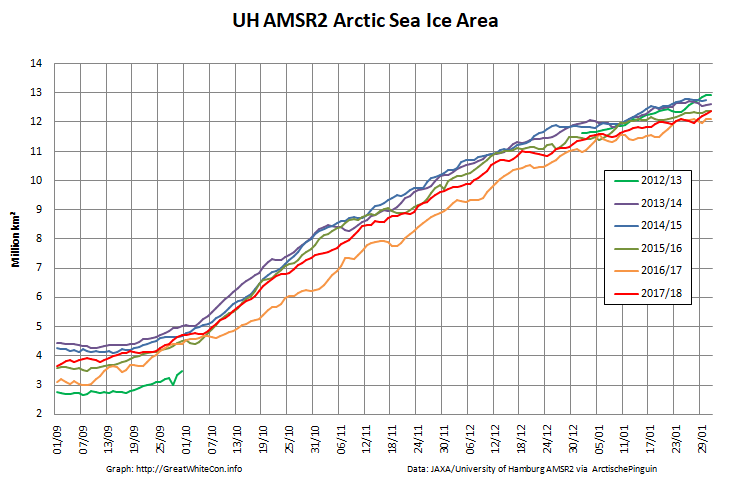
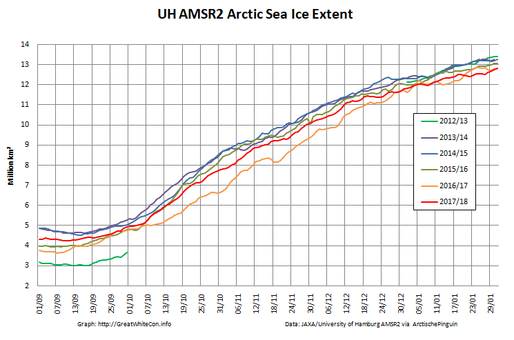
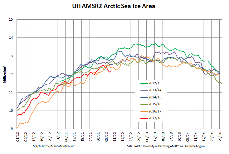
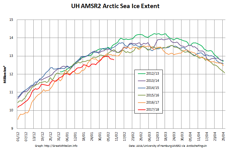
Here are the end of January Arctic wide high resolution AMSR2 graphs based on University of Hamburg data:
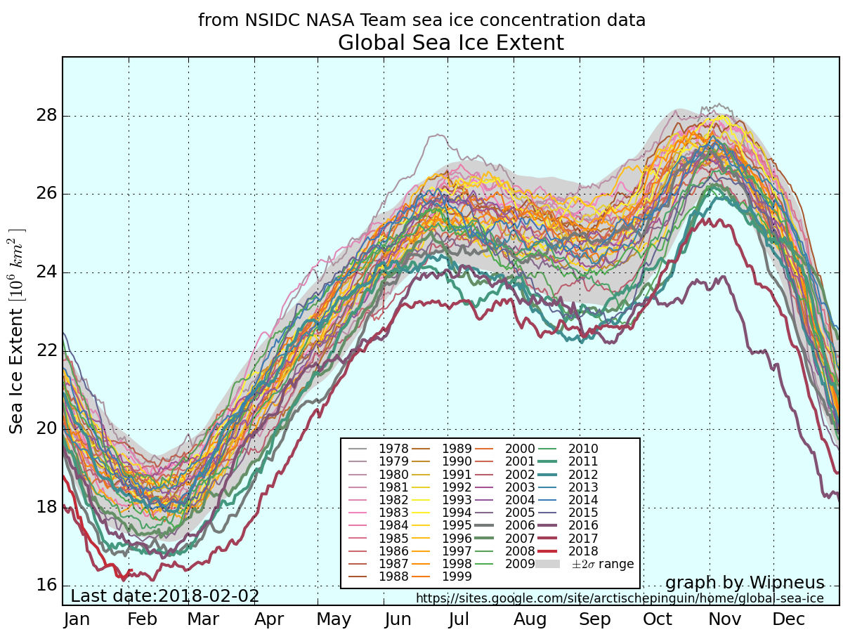
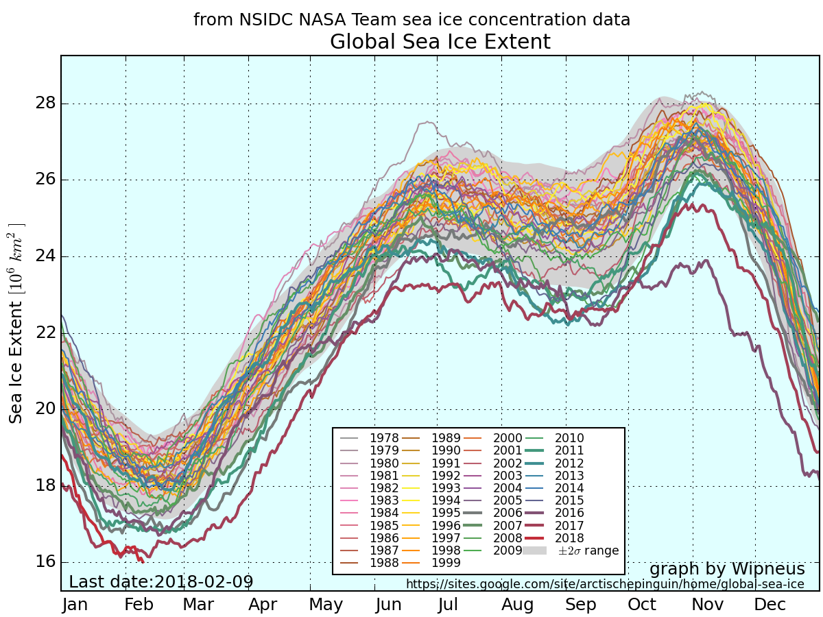
In addition, since it’s that time of year, here too is Wipneus’ NSIDC global sea ice extent:
The minimum thus far is very slightly above last year’s value, but perhaps like last year there will be a “double dip”?
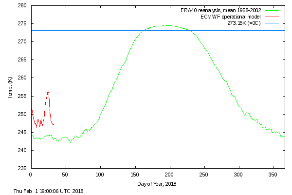
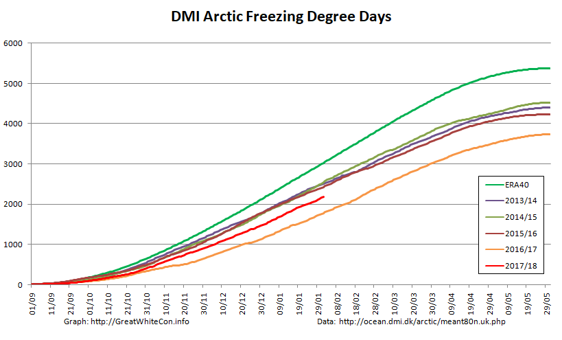
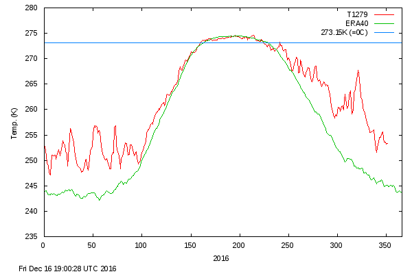
Getting back to the Arctic, here is the DMI >80N temperature plot for January:
together with the associated freezing degree days graph:
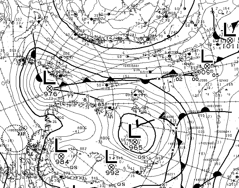
Here’s a video showing the effect of the mid January cyclones on the sea ice in the Fram Strait and north of Svalbard:
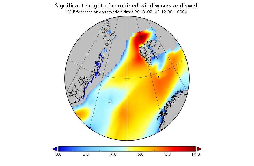
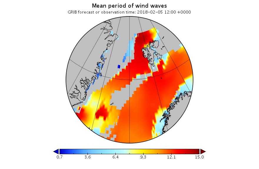
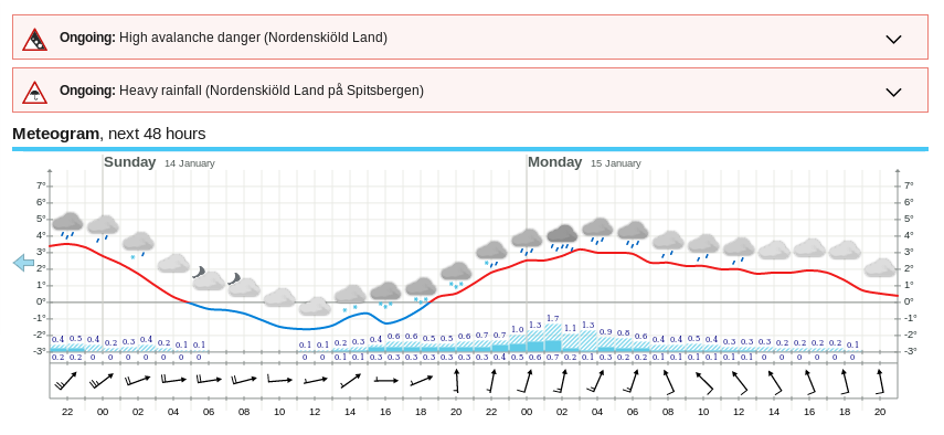
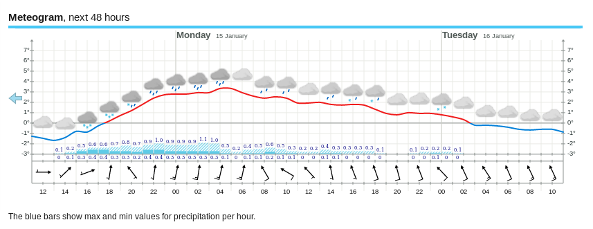
Finally, for the moment at least, here is the current Fram Strait surf forecast for 12:00 UTC on February 5th:
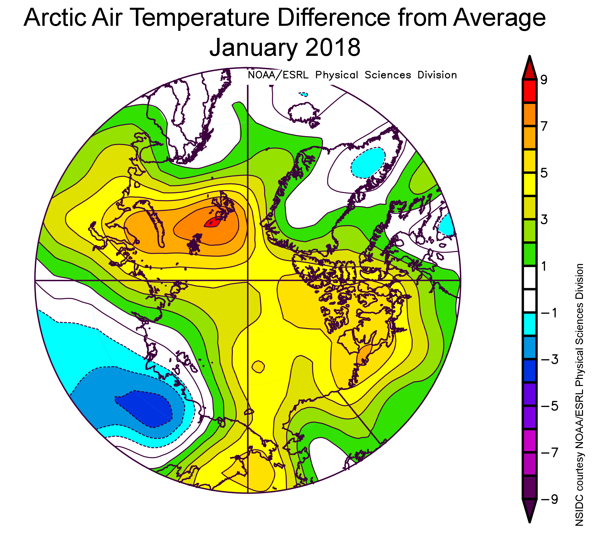
The latest edition of Arctic Sea Ice News has been published. As the NSIDC put it:
January of 2018 began and ended with satellite-era record lows in Arctic sea ice extent, resulting in a new record low for the month. Combined with low ice extent in the Antarctic, global sea ice extent is also at a record low.
Air temperatures at the 925 hPa level (about 2,500 feet above sea level) remained unusually high over the Arctic Ocean. Nearly all of the region was at least 3 degrees Celsius (5 degrees Fahrenheit) or more above average. The largest departures from average of more than 9 degrees Celsius (16 degrees Fahrenheit) were over the Kara and Barents Seas, centered near Svalbard. On the Pacific side, air temperatures were about 5 degrees Celsius (9 degrees Fahrenheit) above average. By contrast, 925 hPa temperatures over Siberia were up to 4 degrees Celsius (7 degrees Fahrenheit) below average. The warmth over the Arctic Ocean appears to result partly from a pattern of atmospheric circulation bringing in southerly air, and partly from the release of heat into the atmosphere from open water areas.
[Edit – February 10th]
The University of Hamburg’s high resolution AMSR2 derived area is bouncing back after the recent cyclone, but extent is currently still declining:
The recent drop in Arctic sea ice extent has pushed the NSIDC global extent to a new all time (satellite era!) low:
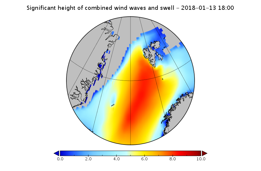
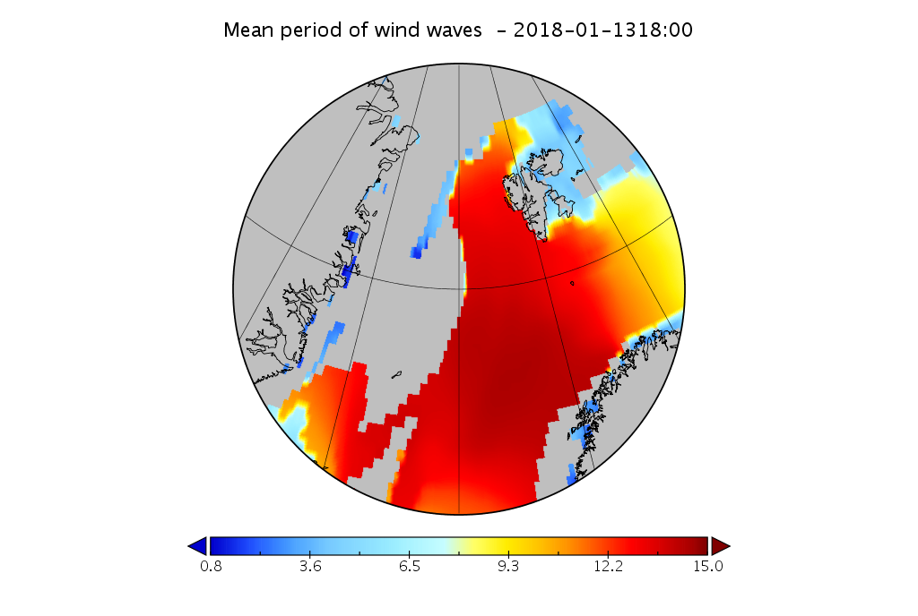
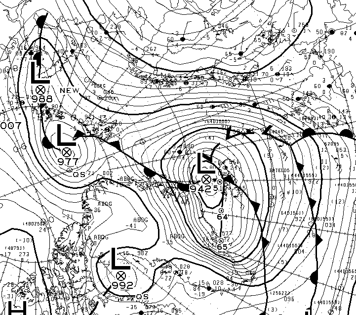
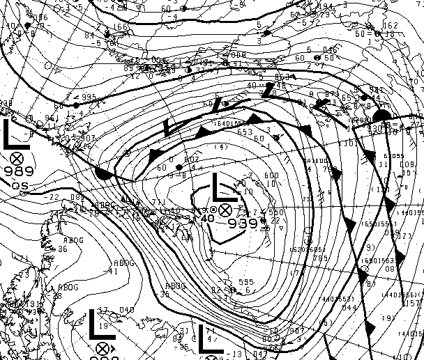
Here’s the 6 hour wave forecast for the Fram Strait from 12:00 UTC this afternoon:
Look at the scales carefully then compare the wave height and period with previous similar events. Here’s the cause of those giant waves, two powerful cyclones off Greenland pumping heat and moisture northwards from a long way south:
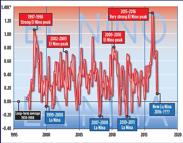
Regular readers will be aware that in a recent article in the Mail on Sunday David Rose quoted Professor Judith Curry as stating that:
The record warm years of 2015 and 2016 were primarily caused by the super El Nino
The article in question also included this graph:
It looks as though David’s left hand doesn’t know what his right hand is doing. Was the 2015 El Niño “Super” or “Very strong”? And how about the 1997/98 El Niño. Was that one really merely “Strong”?
We sought the professional opinion of an eminent expert in such matters, according to David Rose at least – Professor Judith Curry. Here’s how we got on, firstly at Prof. Curry’s “Climate Etc.” blog:
Us:
Since you mention the subject, I was wondering if Dr. Curry could take a look at the “the authoritative Met Office ‘HADCRUT4’ surface record” mentioned in David Rose’s latest Mail article and explain how it justifies her “The record warm years of 2015 and 2016 were primarily caused by the super El Nino” remark quoted in his previous one:
Bill the Frog has asked me to check the objective criteria Prof. Curry uses for differentiating between “weak”, “strong”, “very strong” and “super” El Niños. Likewise for La Niñas.
Can you assist by any chance Ristvan? Can Judith?
Them:
JH, Sure could. But first prove you are just not more loser snark.
Enso is variously but in eqch case precisely defined. I defer to Bob Tisdale comcerning details. And you?
Us:
I defer to the BoM in the first instance. How about Judith?
A different Them:
Jim Hunt
I expect the answers you are looking for are in this article by Judith back in 2014
This is the Great White Con version as opposed to the NOAA version published during the Fall AGU conference earlier this week, although there is some overlap.
Hot off the presses, here’s how Arctic sea ice age has progressed over the last year and a bit:
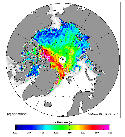
The 4 and 5 year old ice looks to be edging away from the area north of the Canadian Arctic Archipelago towards the Fram Strait. Here’s the current CryoSat-2 Arctic sea ice thickness map:
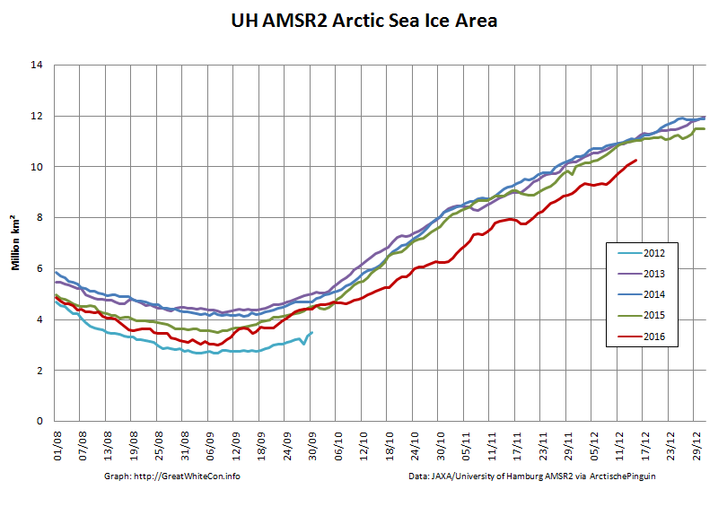
Almost no ice over 2 meters thick to be found in the Beaufort sector or anywhere on the Siberian side of the Arctic. Here’s the current AMSR2 Arctic sea ice area graph:
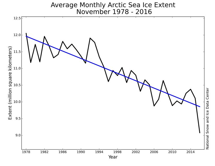
Lowest for the date in the satellite record. Here’s the NSIDC’s long term trend in November sea ice extent:
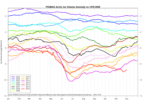
Act 1 of a 3 act play according to Don Perovich at AGU. Here’s the current PIOMAS Arctic sea ice volume anomaly graph:
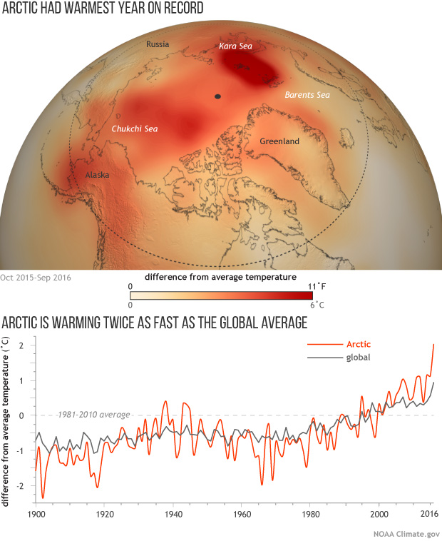
Lowest for the date in the satellite record. Here’s NOAA’s Arctic and global surface temperature graph:
Warmest in a record going back to 1900. Here’s the current DMI >80N surface temperature graph:
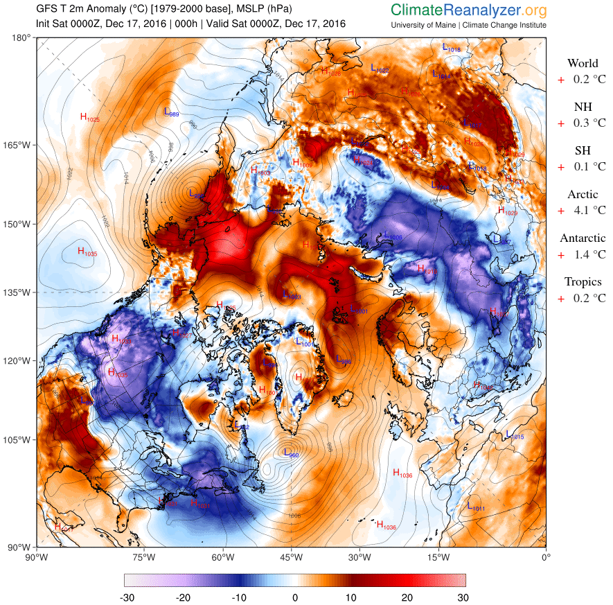
and here’s the current Arctic surface temperature anomaly map:
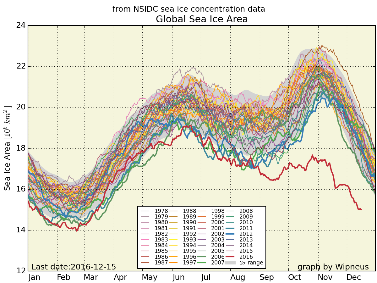
Finally, for the moment at least, here’s global sea ice area just for good measure:
Need I say more? How about this:
Ice has no agenda. It just melts.
Out of the labs and into the streets?
I just watched the live stream of the fall 2016 AGU press conference about the findings of the “First results from the Norwegian Young Sea ICE Expedition”.
Here’s the associated video of the expedition:
Here are the bullet points:
Initial results suggest that the thinner and younger ice is altogether different from older multiyear ice. It moves faster, breaks up easier, melts faster, and is more vulnerable to storms. This has important consequences for the Arctic as a whole, as our current knowledge is largely based on information from the “old Arctic.”
The Atmosphere
• For the first time, N-ICE2015 researchers directly observed large winter storms over sea ice and saw that they have significant effects on the young, thinner ice. The high winds create a lot of stress on the sea ice by pushing it around and breaking it up.
• One winter storm raised the air temperature from -40 F to +32 F in less than 48 hours, while the moisture in the air increased 10 times. All of these factors significantly warm the surface of the snow, even in mid-winter, and slow the growth of ice.
The Sea Ice and Snow Cover
• Researchers on the drifting ice camps found more snow on top of the ice than expected. This insulated the ice from the atmosphere, slowing its growth in winter and surface melt in summer.
• The sea ice was sometimes flooded by seawater as the large snow load pushed the thinner ice below sea level.
• The thinner sea ice was more dynamic than researchers have seen before. This could mean more ridging but also more cracks and leads between ice floes.
The Ocean
• Winter storms caused the sea ice to drift so fast that it increased mixing of the water beneath the ice. Deeper, warmer water was mixed up closer to the sea ice, causing it to melt from below despite winter air temperatures that were below freezing.
• Researchers saw summer storms stir up deep warm waters and melt as much as 25 cm of ice in a single day.
The Ecosystem
• For the first time, N-ICE2015 researchers observed an algae bloom under snow-covered pack ice. Thinner and more dynamic Arctic sea ice allows more light transmission to the ocean, especially through cracks and leads. This triggers earlier phytoplankton blooms under the snow-covered ice.
• The phytoplankton species that dominated the under-ice bloom does not sink to the deep ocean. Such shifts in phytoplankton species composition, associated with early under-ice phytoplankton blooms, could thus have important implications for the strength of the biological carbon pump in the Arctic.
There was also mention of the “waves in ice” event that the R/V Lance experienced back in June 2015:
P.S. A recording of the N-ICE2015 press conference is now available:
No doubt because of the recent controversy concerning the effects of the 2015/16 El Niño the first graphic that caught my eye was this one:
In the question and answer session the obvious question was asked. The answer was that while attribution is difficult the 2015/16 El Niño did have some effect on Arctic sea ice. However currently we’ve only seen “the first act of a 3 act play”. Act 2 will be the maximum extent in March.
In answer to another question, a focus of research over the next 10 years should be the interactions between mid latitudes and the Arctic.
P.S. A recording of the Arctic Report Card press conference is now available:
A variety of cryospheric posters are available via:
This website uses cookies to improve your experience. We'll assume you're ok with this, but you can opt-out if you wish. Cookie settingsACCEPT
Privacy & Cookies Policy
Privacy Overview
This website uses cookies to improve your experience while you navigate through the website. Out of these, the cookies that are categorized as necessary are stored on your browser as they are essential for the working of basic functionalities of the website. We also use third-party cookies that help us analyze and understand how you use this website. These cookies will be stored in your browser only with your consent. You also have the option to opt-out of these cookies. But opting out of some of these cookies may affect your browsing experience.
Necessary cookies are absolutely essential for the website to function properly. This category only includes cookies that ensures basic functionalities and security features of the website. These cookies do not store any personal information.
Any cookies that may not be particularly necessary for the website to function and is used specifically to collect user personal data via analytics, ads, other embedded contents are termed as non-necessary cookies. It is mandatory to procure user consent prior to running these cookies on your website.