We first mentioned the cruise ship Crystal Serenity in our initial musings about prospects for the Northwest Passage in 2016. Since then the sea ice has melted on a variety of the “southern” routes through the Northwest Passage, and the Crystal Serenity has now set sail for the Arctic. Amongst the over 1000 passengers there is even a blogger:
We’re thrilled to have travel journalist Katie Jackson “joining the crew” for this voyage. Katie, an acclaimed writer and avid traveler, will be providing dispatches from the ship…or tundra, or zodiac, to help all of you indulge your wanderlust.
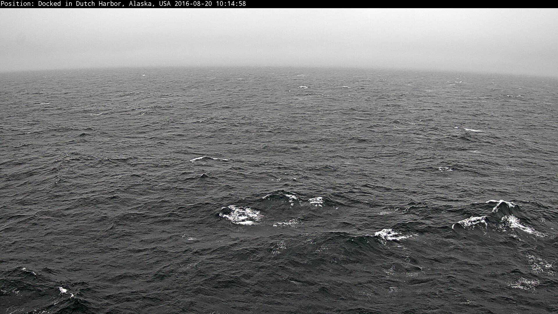
The Crystal Serenity is equipped with a number of webcams. Here’s the current view from one as the Crystal Serenity is en route to Nome Alaska:
It looks a bit breezy up there at the moment, but nothing to trouble the 68,000 ton Crystal Serenity. However Crystal Cruises do seem to be anticipating some potential problems. Accompanying the Crystal Serenity will be the British Antarctic Survey icebreaker Ernest Shackleton, which is already making its way through the Northwest Passage from the direction of the Atlantic Ocean:
The RRS Ernest Shackleton, operated by British Antarctic Survey, is an ICE 05 classed icebreaker (exceeding the more common 1A Super class) that will provide operational support to Crystal Serenity, including ice breaking assistance should the need arise and carry additional safety and adventure equipment.
The RRS Ernest Shackleton will carry two helicopters for real-time ice reconnaissance, emergency support and flightseeing activities. In addition to its robust ice navigation and communications equipment, the RRS Ernest Shackleton will have on board supplemental damage control equipment, oil pollution containment equipment, and survival rations for emergency use.
Hopefully none of that emergency equipment will need deploying over the next two weeks or so, but that is far from certain. Listen to what Admiral Charles Michel, Vice Commandant of the United States Coast Guard, had to say in testimony before the House Subcommittee on Coast Guard and Maritime Transportation in answer to questions from Congresswoman Janice Hahn:
I don’t want to underestimate the challenges of that area. There is almost no logistics up there. For example if we needed to get another helicopter up there they’re only bringing a very small helicopter with them. If we needed to get a big helicopter up there it’s estimated it would take between 15 and 20 hours, if the weather’s good, in order to get that up there. Fixed wing aviation may be available, but even there you’ve got very limited landing areas, very environmentally sensitive areas, things change up there dramatically even during the summer. The weather is an incredible challenge, so this is not an easy category for a voyage.
If you’re interested in US Arctic policy in general you may wish to watch the whole 2+ hours of the hearing instead. In which case, here it is!
[Edit – August 23rd]
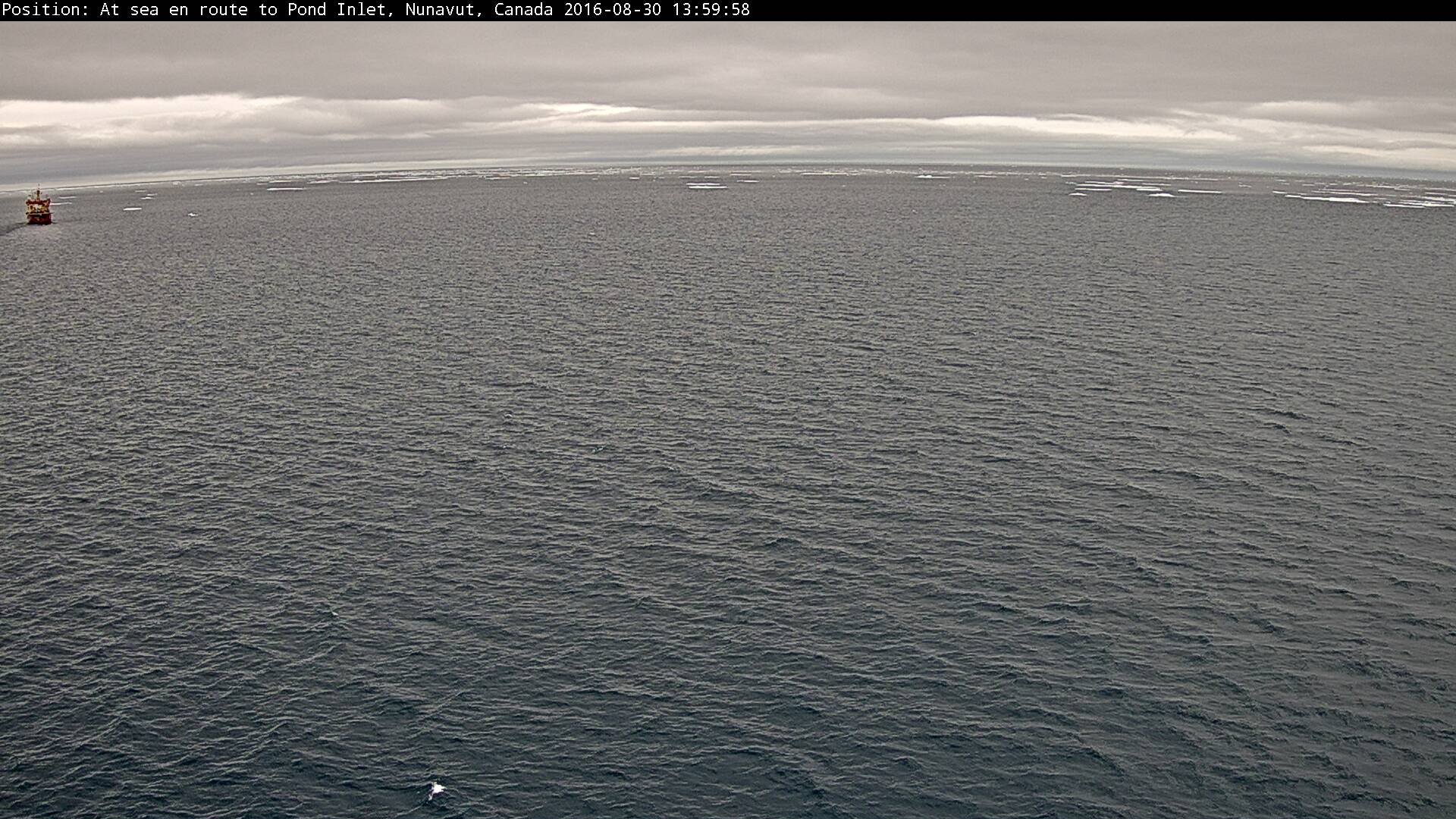
Crystal Serenity is now inside the Arctic Circle, and rapidly approaching her first potential problem:
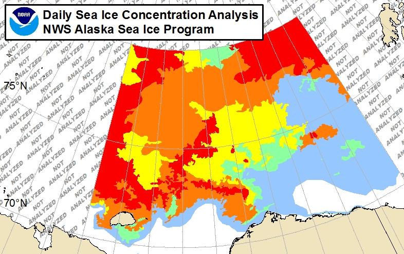
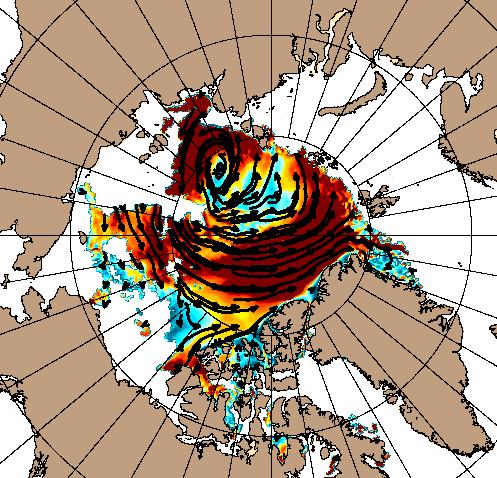
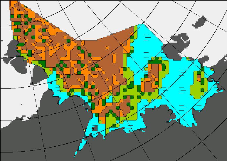
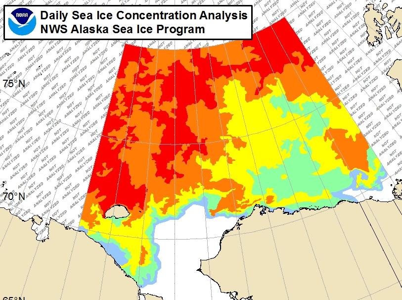
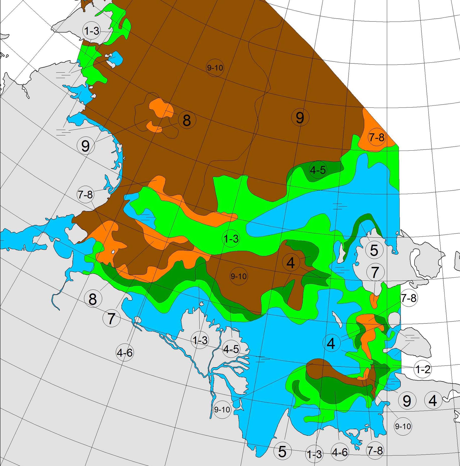
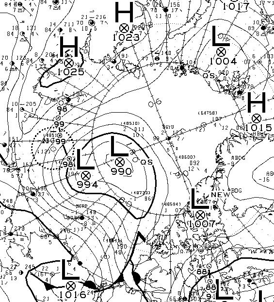
Here is the latest National Weather Service ice chart for Alaskan waters:
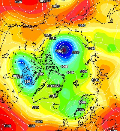
It shows 1-3 tenths coverage all the way to shore at Point Barrow. What’s more with the Great Arctic Cyclone still raging the current US Navy forecast is for continuing onshore ice drift:
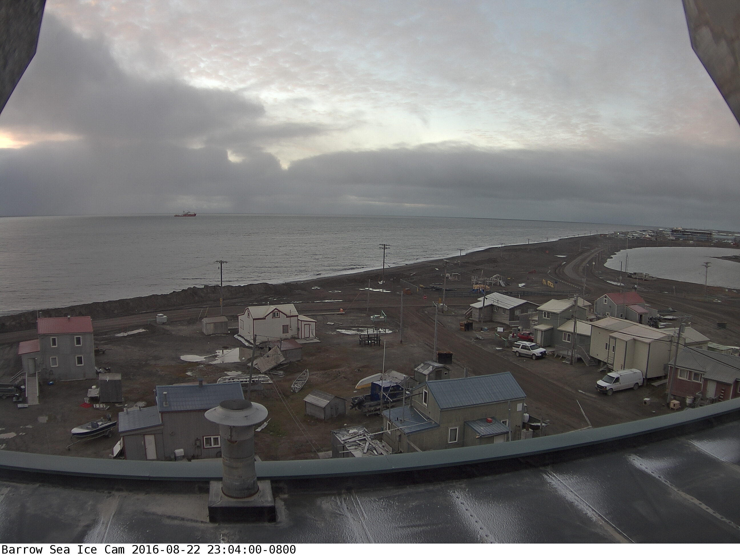
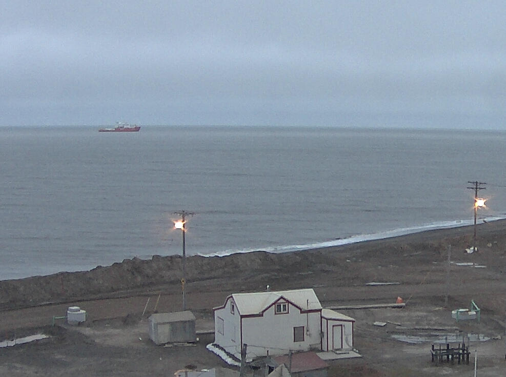
Maybe that’s why there seems to be an icebreaker patiently waiting offshore at Barrow as we speak?
As luck would have it USCGC Healy is in the vicinity too, albeit slightly south of Barrow. The weather in the Chukchi Sea doesn’t look too good at the moment:
[Edit – August 24rd]
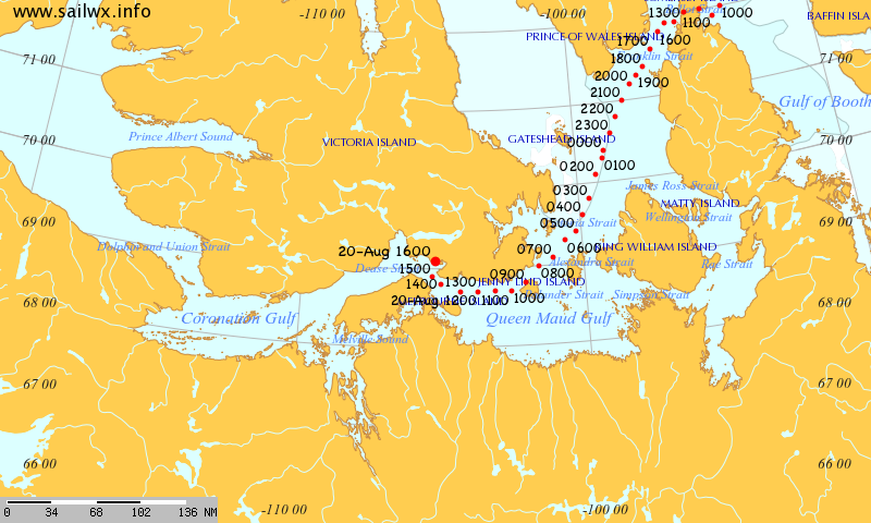
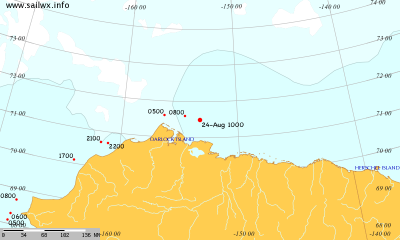
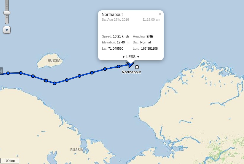
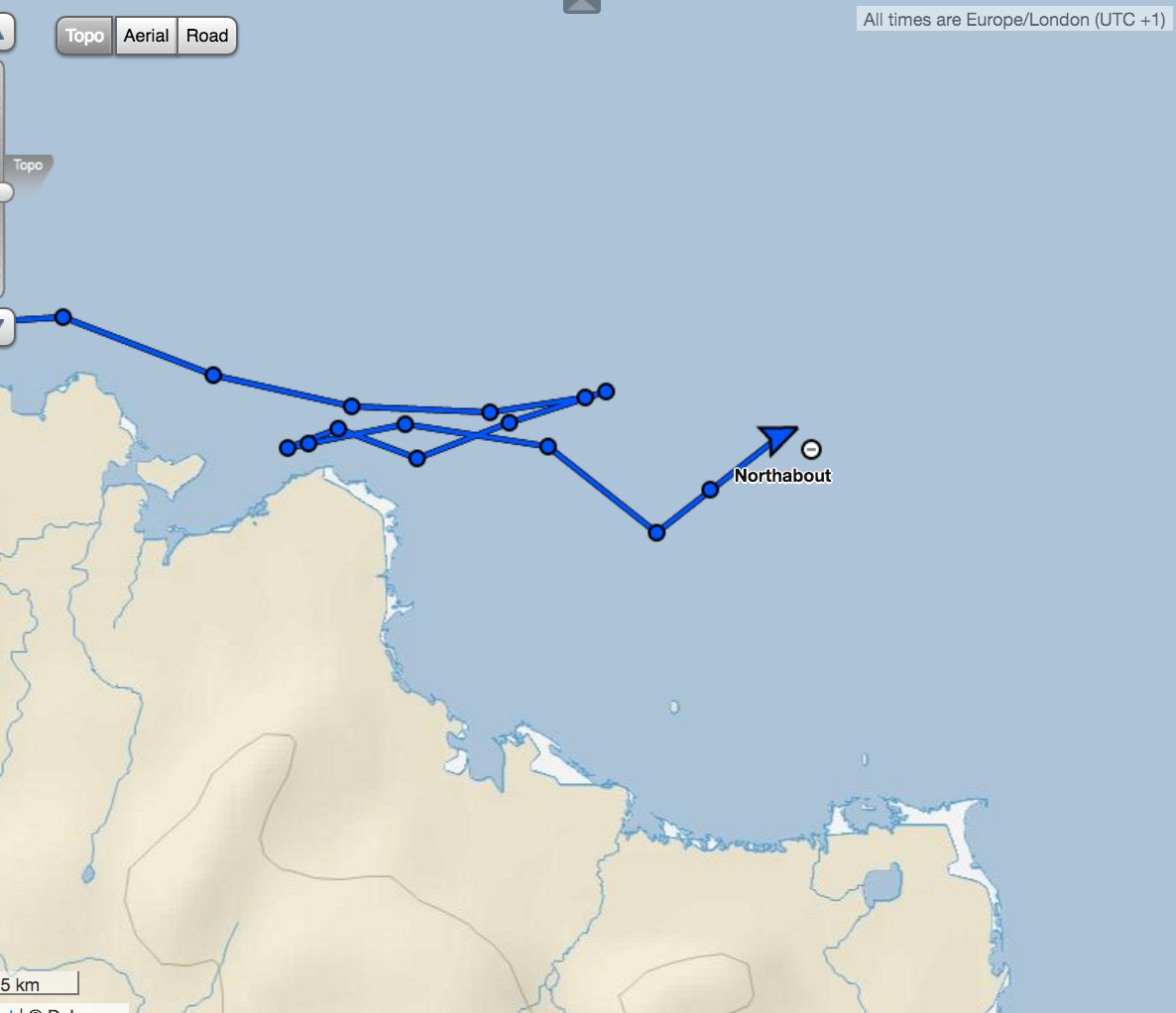
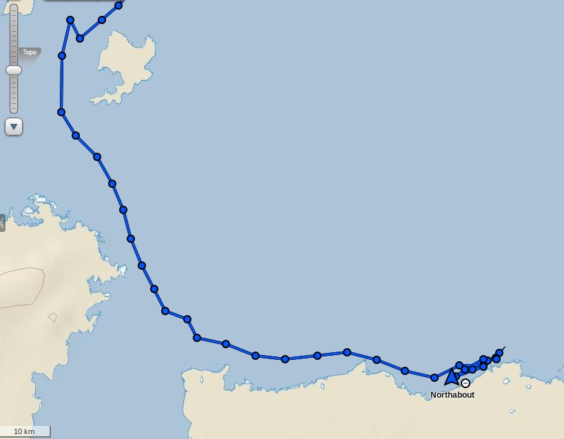
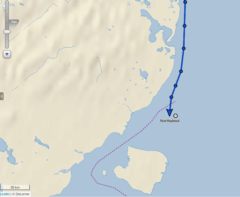
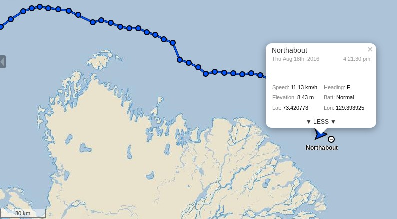
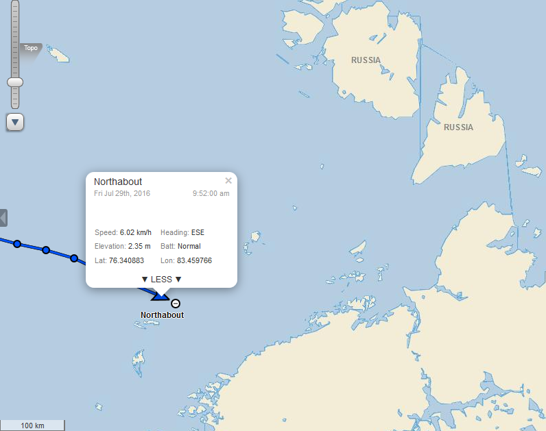
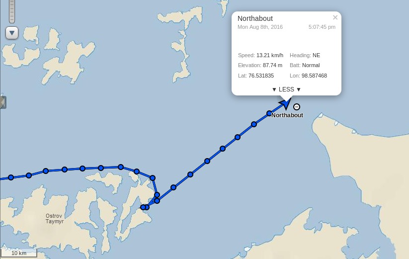
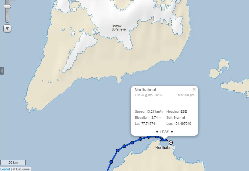
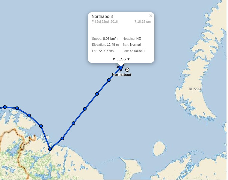
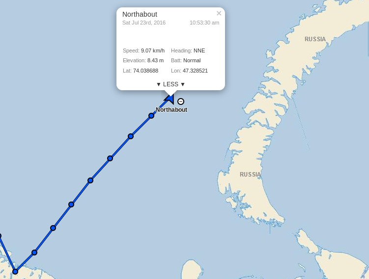
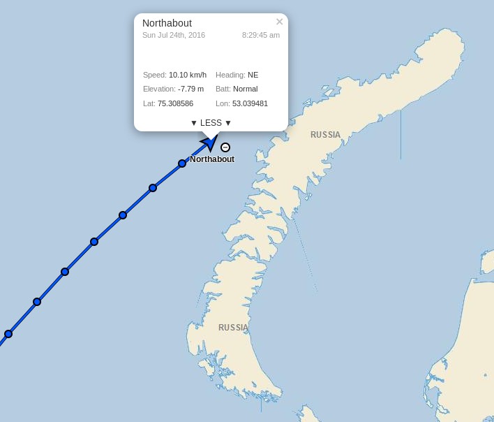
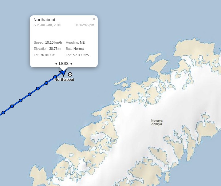
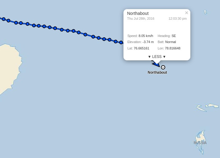
Crystal Serenity has rounded Point Barrow, apparently without incident. Here’s her tracking map from SailWX:
Apparently icebreaker assistance was not required since the ship anchored off Barrow, which looks a lot like the Korean icebreaker Araon, seems not to have moved:
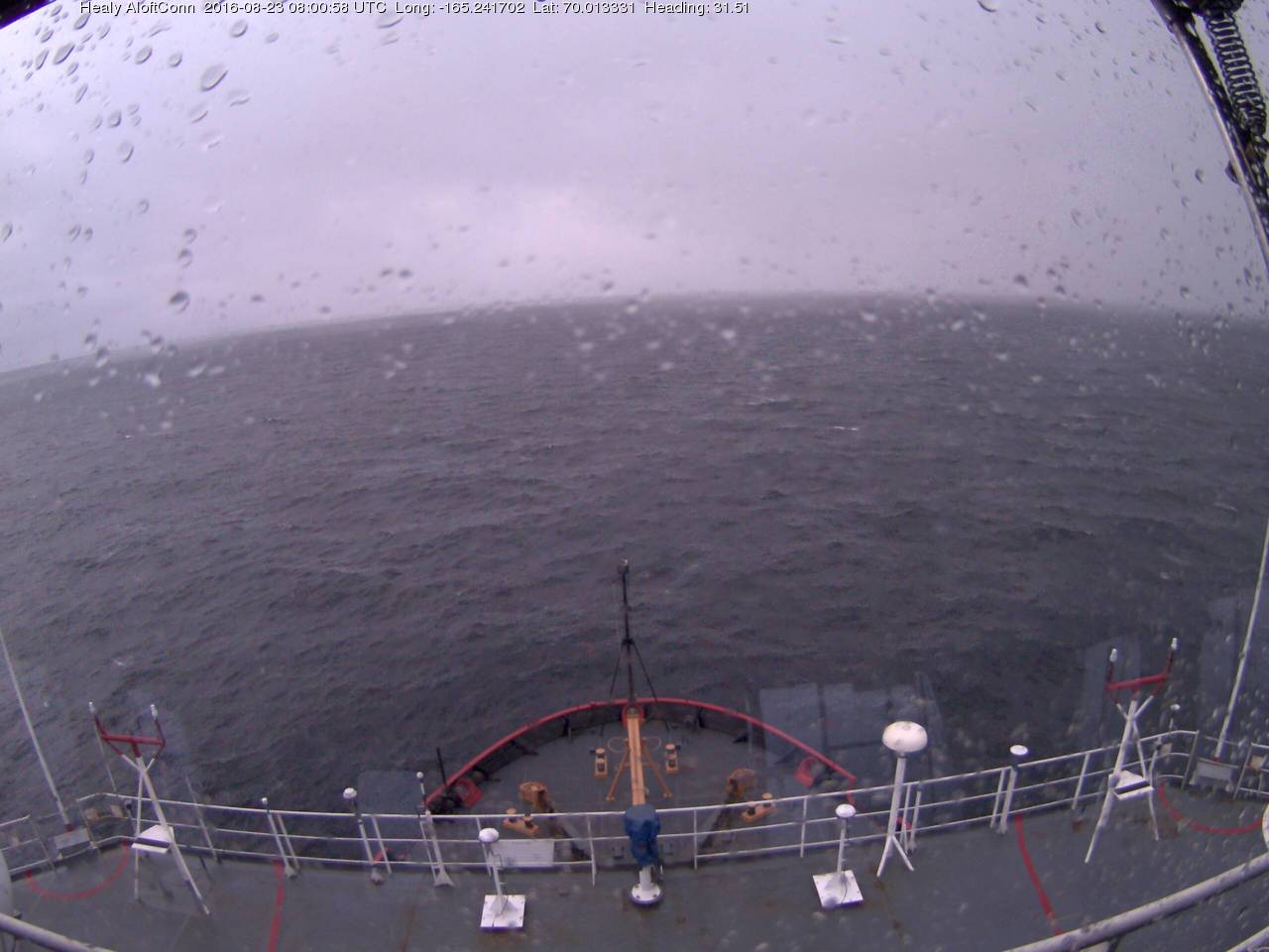
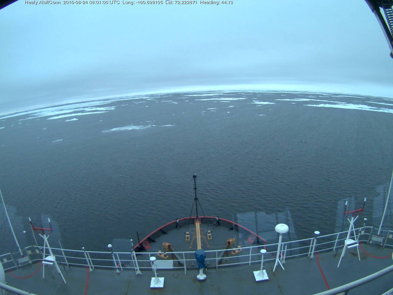
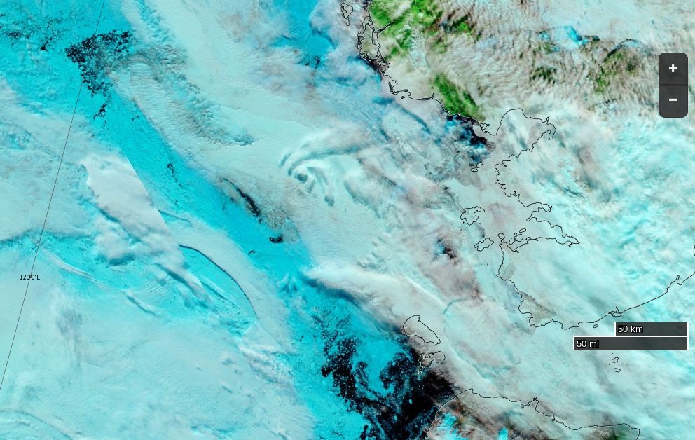
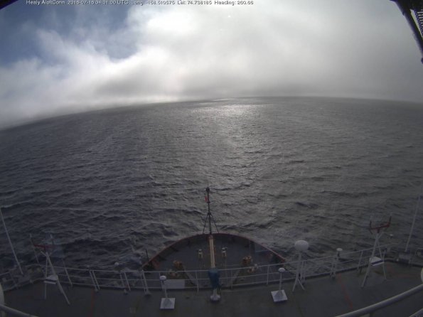
Rather disappointingly the Crystal Serenity’s webcams seem to update infrequently and have yet to reveal any sea ice. The Healy aloftcon camera, however, recorded this image from 72 degrees north:
[Edit – August 27th]
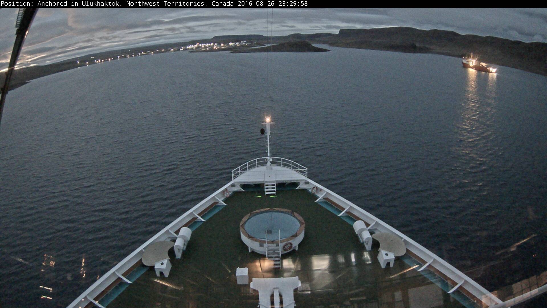
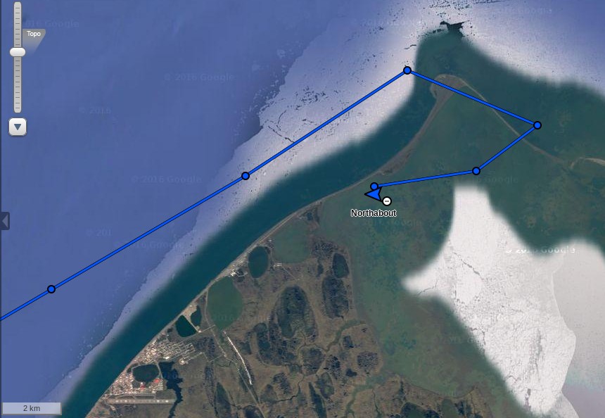
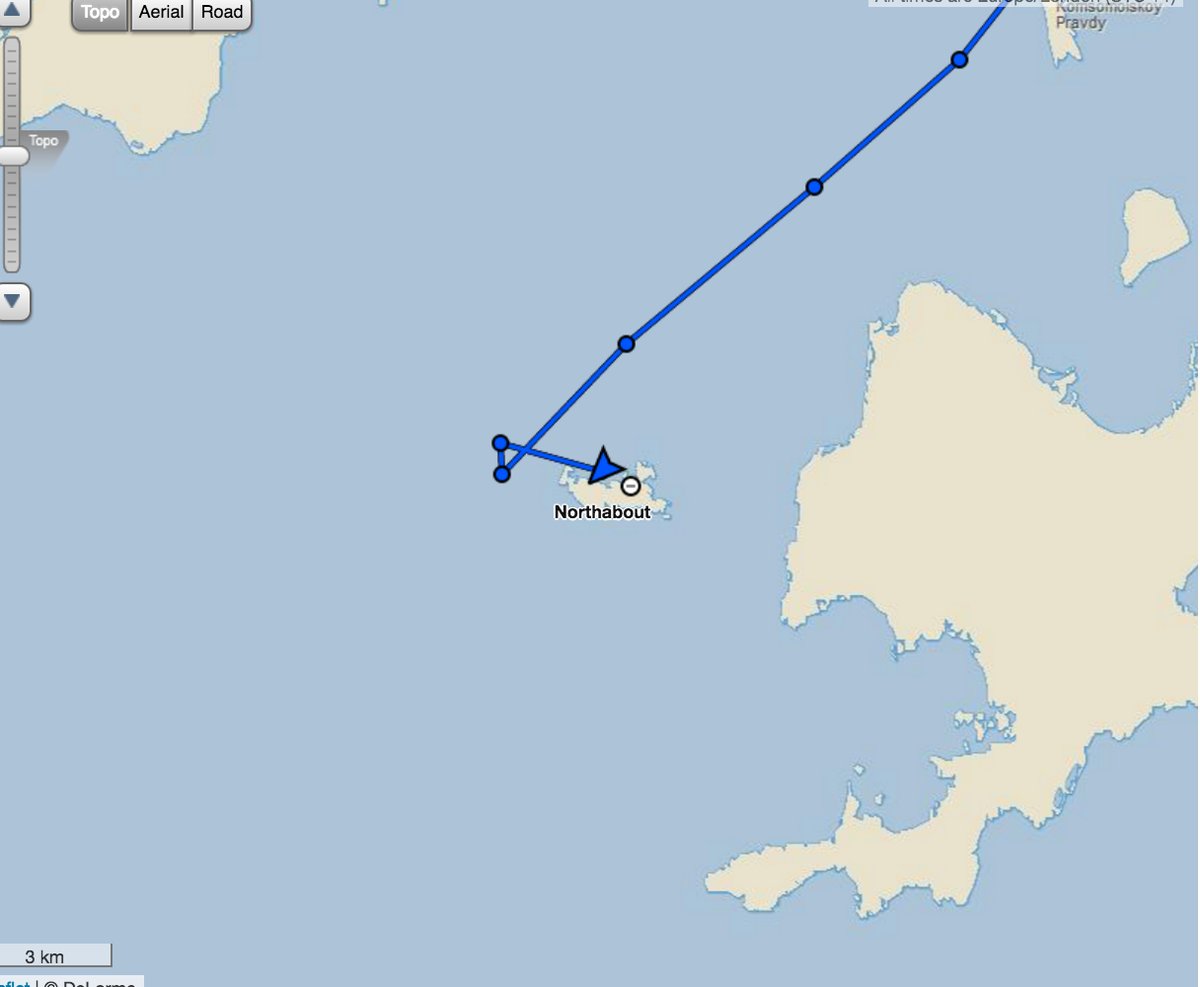
Crystal Serenity has reached Ulukhaktok on the west coast Victoria Island, and met up with the Ernest Shackleton:
It doesn’t look as though any ice breaking will be required in the near future!
[Edit – August 29th]
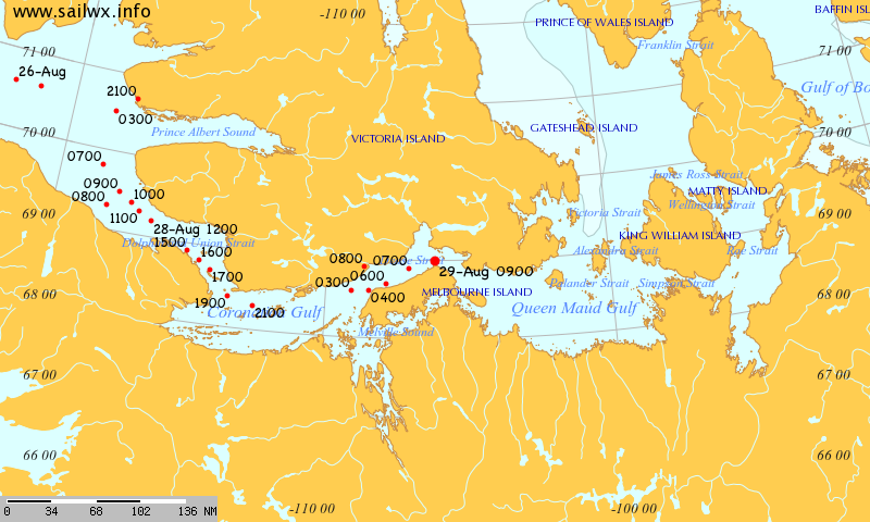
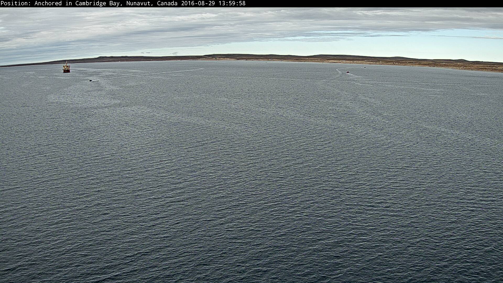
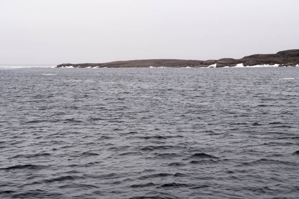
Crystal Serenity and Ernest Shackleton are both now in Cambridge Bay:
There is no ice to be seen!
The next stage of Crystal Serenity’s itinerary involves “Cruising Peel Sound or The Bellot Strait”. I wonder which option she’ll take?
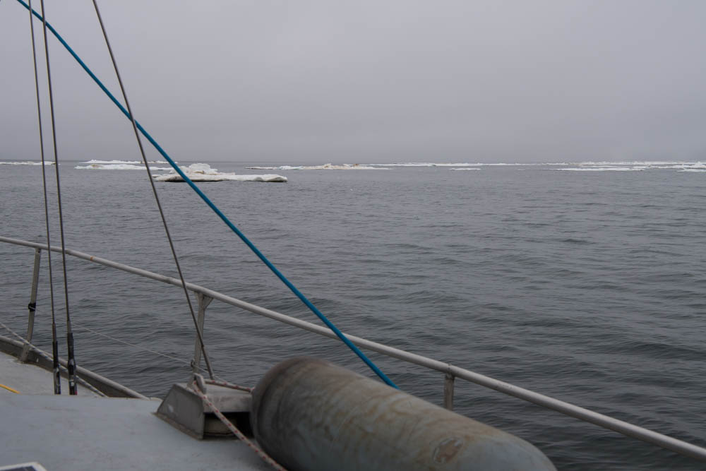
The early morning paid off quickly with our first Polar bear sighting! And what an experience it was. This apex predator patrolled calmly on an ice floe, and put on quite a show stretching, scanning and keeping watch for any potential prey.
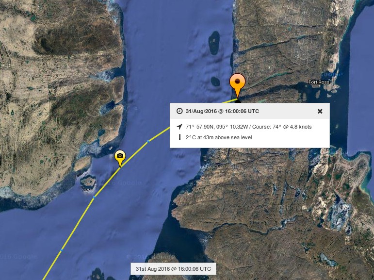
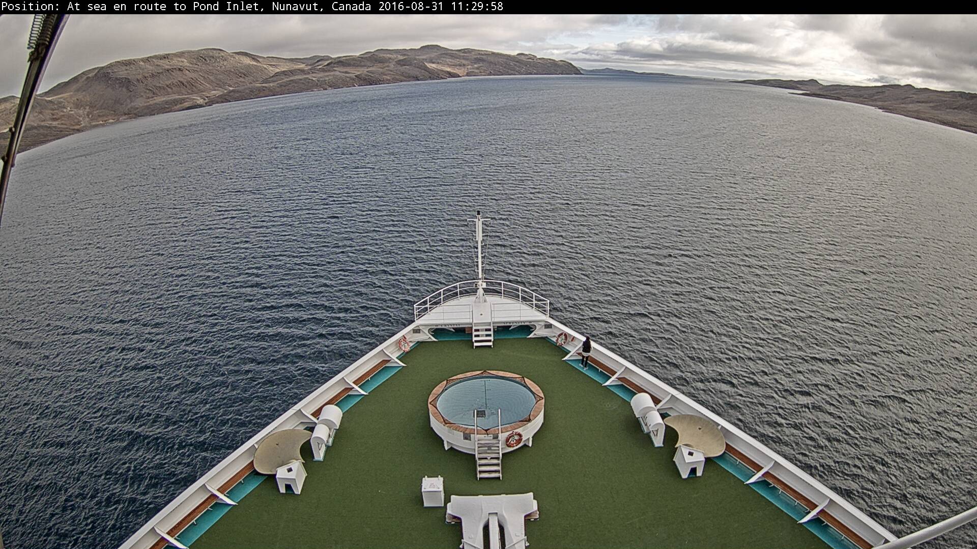
[Edit – August 31st]
Crystal Serenity has evidently decided to cut through Bellot Strait:
Here’s the view from the bridge:
No sea ice to be seen!
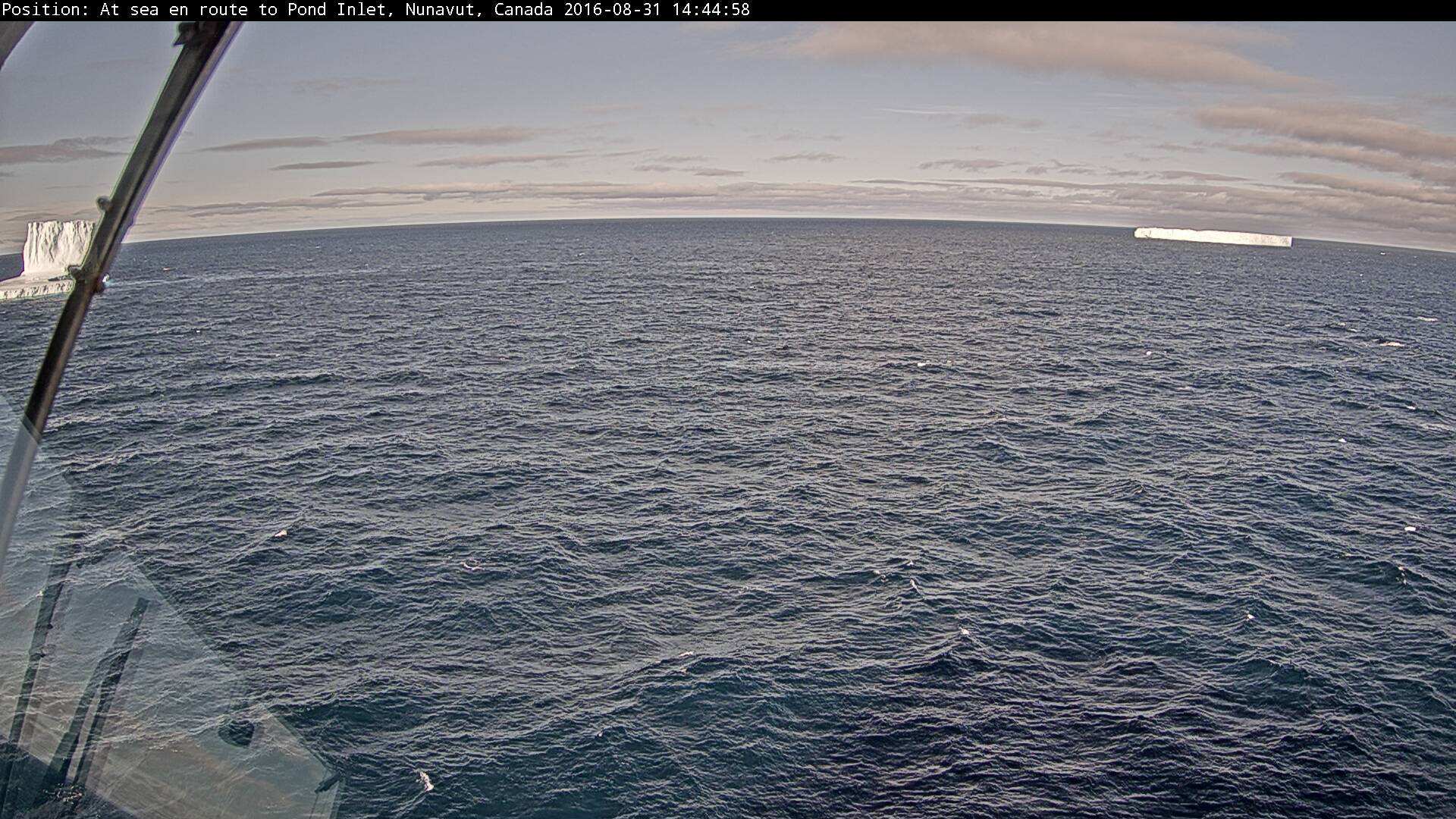
P.S. Having emerged from the eastern end of Bellot Strait some bergy bits could be seen in the Gulf of Boothia:
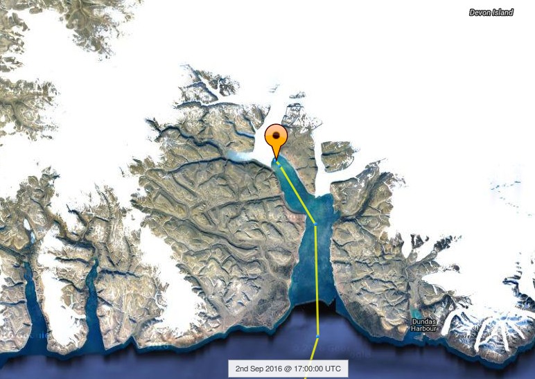
[Edit – September 2nd]
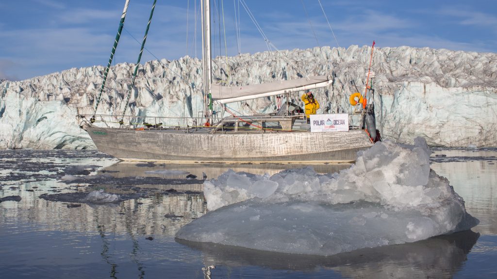
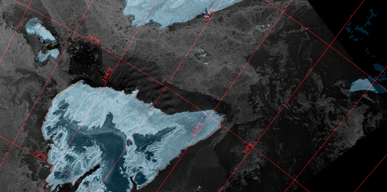
Crystal Serenity has been taking a good long look at a glacier today:
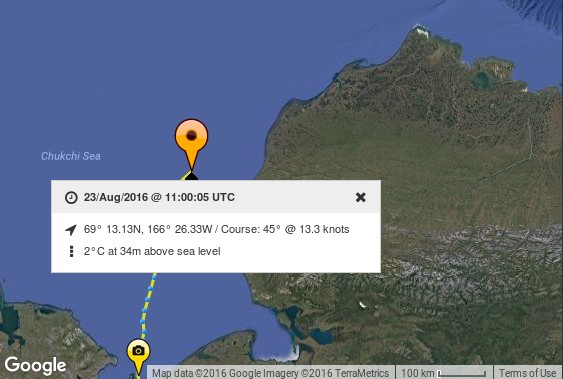
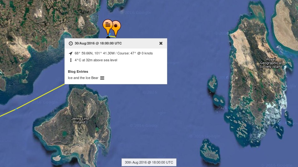
Judging by her tracking map it’s the North Croker Bay Glacier on Devon Island:
I wonder if that’s where those bergy bits came from?
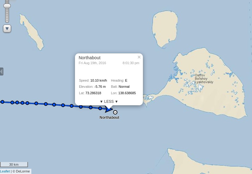
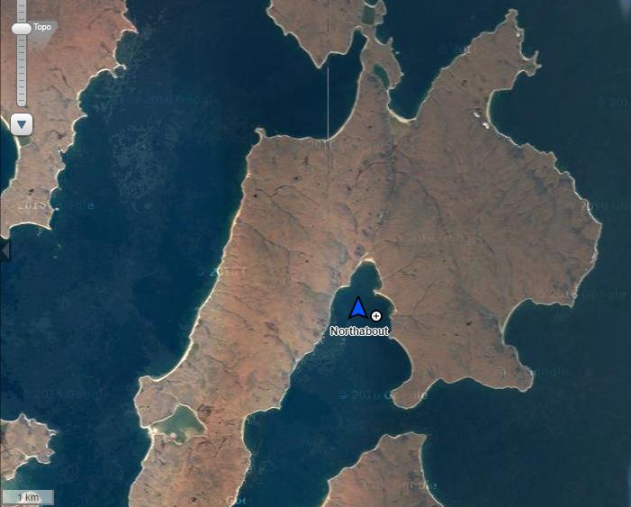
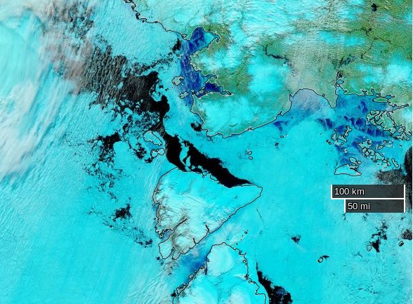
It’s time to open another chapter in the continuing adventures of Northabout. The Polar Ocean Challenge team have been plagued by sea ice along their route across the Laptev Sea, but currently they are hurrying towards the exit into the East Siberian Sea via the Dmitry Laptev Strait:
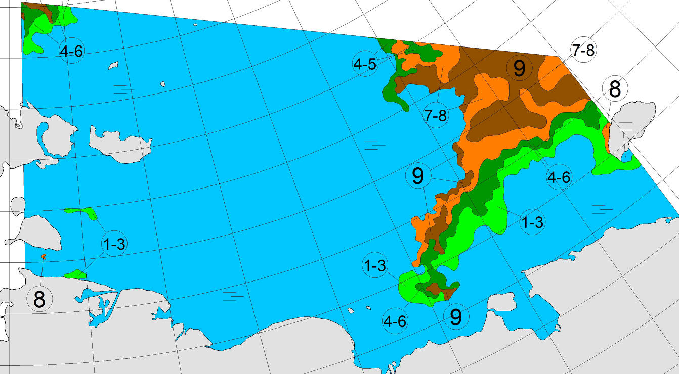
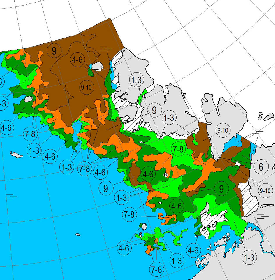
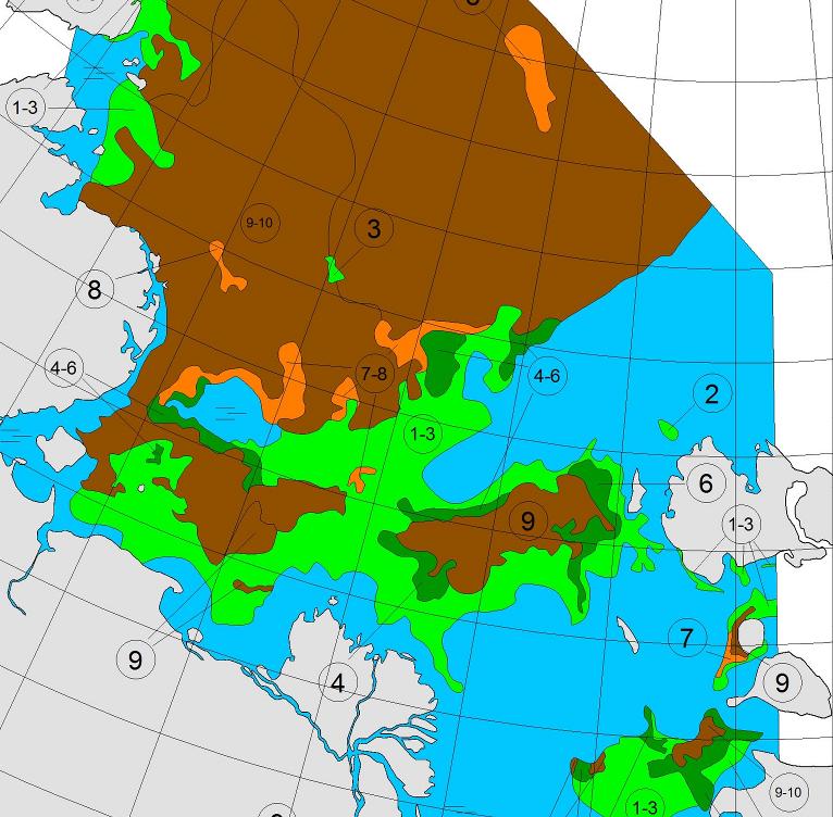
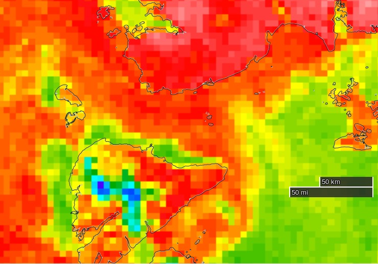
The latest chart of sea ice in the East Siberian Sea from the Arctic and Antarctic Research Institute suggest they should now have plenty of (comparatively!) plain sailing ahead of them:
Certain quarters of the cryodenialosphere have been questioning the plucky little yacht’s ability to make it through the Northwest Passage before it freezes up once again in the Autumn. As a crude reality check on that assertion let’s see how previous successful single season polar circumnavigations fared in that regard. The international date line runs through the Bering Strait, and effectively defines a boundary between the Northern Sea Route and the Northwest Passage. In 2010 Børge Ousland and Thorleif Thorleifsson in the catamaran Northern Passage crossed the date line on September 3rd:
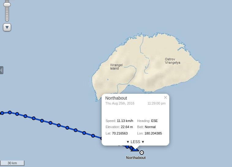
Let’s wait and see when Northabout manages to pass that milestone, before heading to their next scheduled port of call at Barrow in Alaska.
[Edit – August 21st]
Northabout has spotted some more sea ice, this time in the Dmitry Laptev Strait. Presumably the small area shown in the AARI chart above? According to the latest “Ship’s Log”:
Well slowly making progress, and now into a new sea, East Siberian, Looks the same to be honest. Saw a ship,on the AIS , but couldn’t see it with the fog. Went between the Islands. We had a large patch of 8/10ths ice in the middle, but managed to keep north of it. Along the coast you could again see the remnants of an old Polar station. What a vast coast to look after.
Just as things were getting into a rhythm, the engine is over revving. We are so close but so far out here. My stomach is sometimes in my mouth, Comrades trying to work it out. If not, is a slow sail from here to Alaska.
The reported engine trouble doesn’t seem to have slowed Northabout down. She crossed 150 east earlier this morning and is now passing the delta of the Indigigirka River:
[Edit – August 22nd]
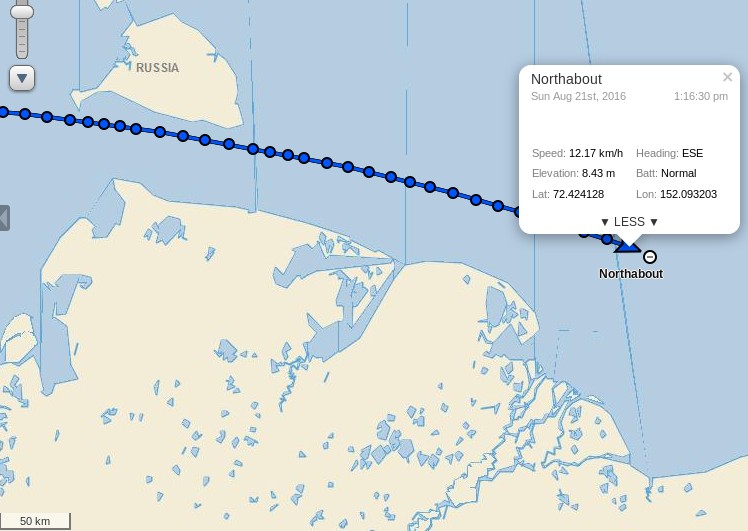
Her engine has been serviced, and Northabout continues to make good progress. She’s crossed 160 east, and is now passing the delta of the Kolyma River:
We’ve got enough wind to put the staysail out and the skies are clear. I think quite a lot of how I was feeling may have been that I hadn’t got any sunshine for over two weeks, the last couple of days however have been warm(ish) and bright. I at least am coming dangerously close to feeling actually happy, I don’t know about anyone else… Provided we continue like this we should be in Point Barrow in under a week.
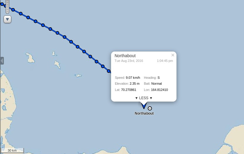
[Edit – August 23rd]
Northabout looks to be turning south:
Presumably that is to skirt the patch of high concentration sea ice in their path, rather than try to break through the lower concentration area to the north (which is towards the bottom of this image!):
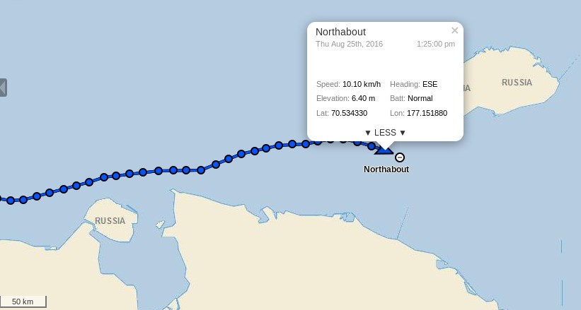
[Edit – August 25th]
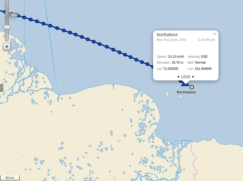
Northabout is currently closing in on “the edge of the world” at 180 degrees east and/or west:
Her crew aren’t entirely happy with the speed at which that is happening at present though:
A long slog of a day. Very choppy seas which makes living onboard difficult, especially sleeping, when you can be fast asleep and suddenly wake up in mid air.
The wind we had was a head wind, so slow going. Getting to the edge of the World is proving tiresome.
Our track to get the best wind is towards the ice, and north east, hoping this will change during the night, and bring us back south to our waypoint.
A long slog in the Chukchi Sea. Its renown for its wild weather and seas. With rising winds now in the 25/30 knots, we have had a bumpy ride, but fast and in the right direction.
Well, well, we passed the date line and the W 168 58 .620 at 16.57 boat time, that is the point we can inform the Russian Authorities that we have finished their Northern Sea Route, and we no longer have to report to them daily. I will celebrate this milestone when we get to Point Barrow. It’s only just sinking in what we have all done.
Next stop Barrow, and after that Northabout takes on one of the Southern routes through the NorthWest Passage. It looks like she’ll have much more difficulty spotting some sea ice than on the first half of her polar circumnavigation!
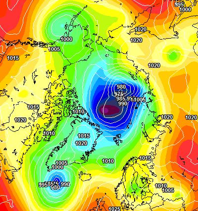
A storm is brewing in the Arctic. A big one! The crew of the yacht Northabout are currently sailing along the western shore of the Laptev Sea and reported earlier today that:
The sea is calm. Tomorrow a gale 8. But this moment is perfect.
That perfect moment will not last long. Here is the current ECMWF forecast for midnight tomorrow:
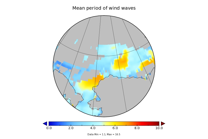
and here is the current Arctic surf forecast for 06:00 UTC on Monday:
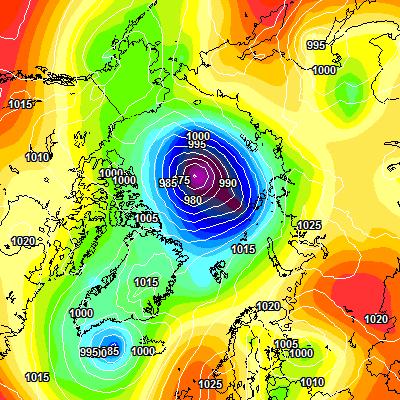
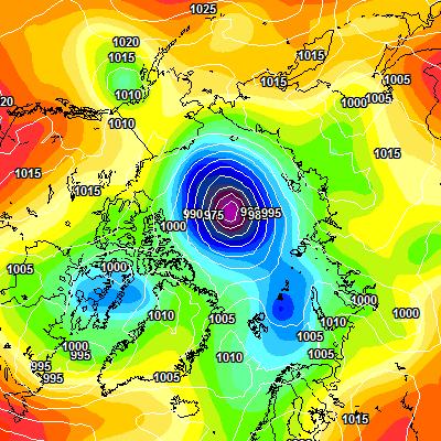
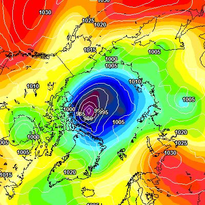
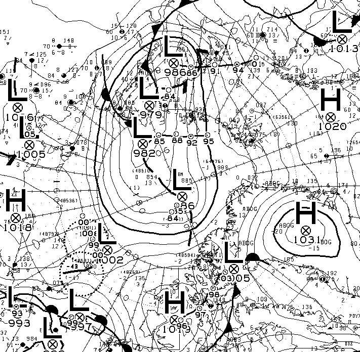
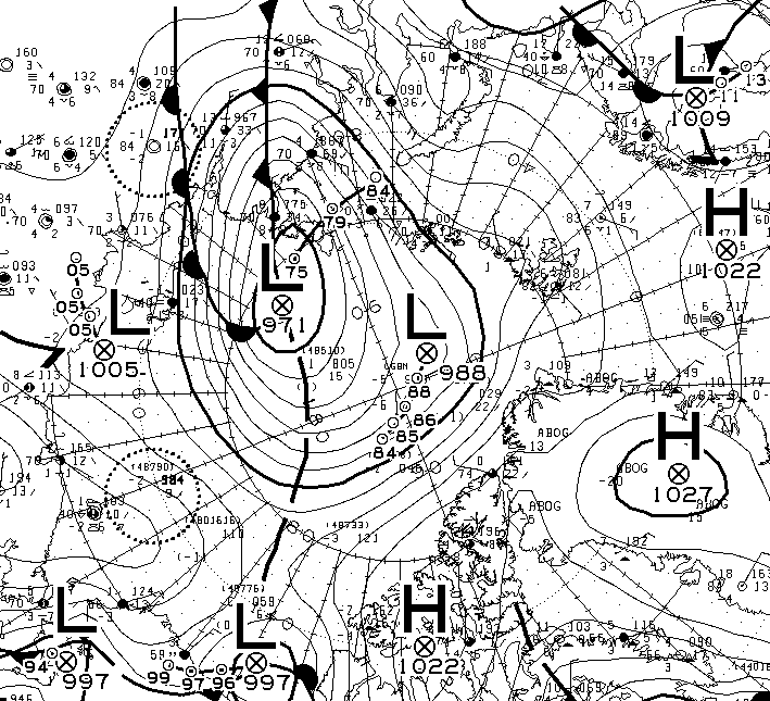
A 975 hPa low pressure system will be creating 3 meter waves with a period of around 8 seconds heading across the East Siberian Sea in the direction of the ice edge. By midnight on Monday the cyclone is forecast to have deepened to a central pressure below 970 hPa:
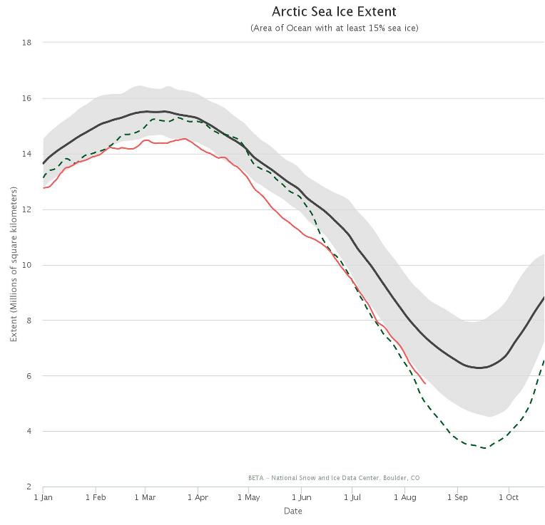
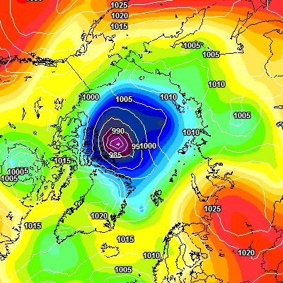
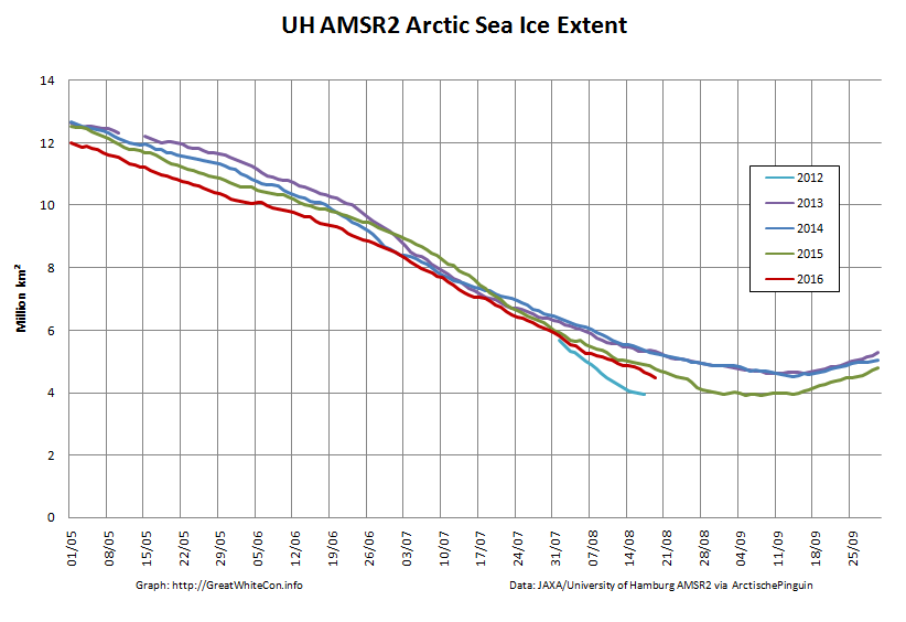
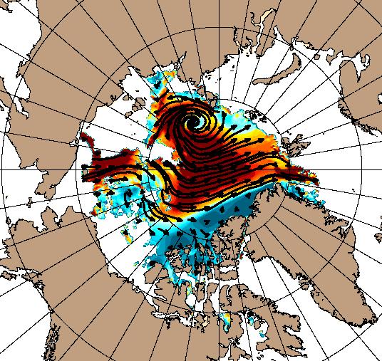
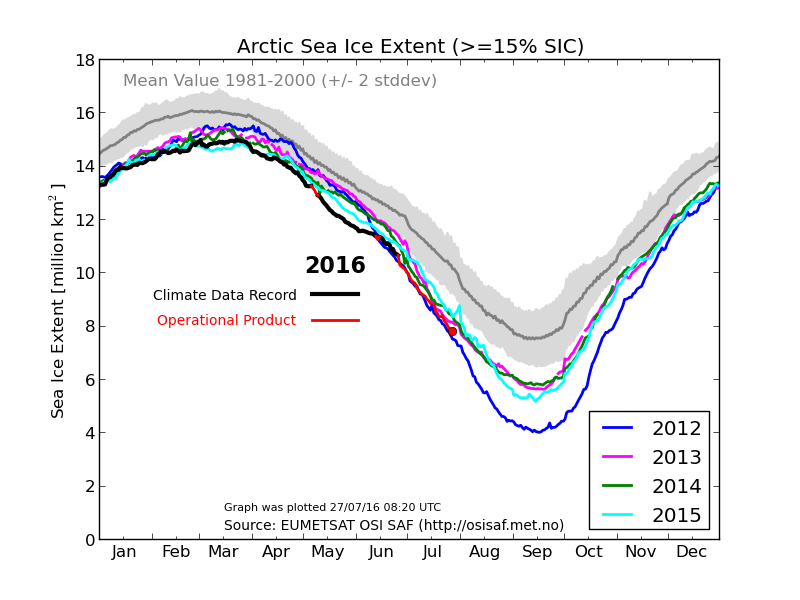
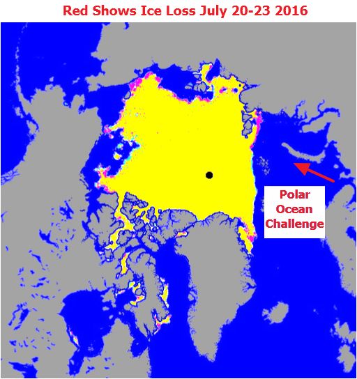
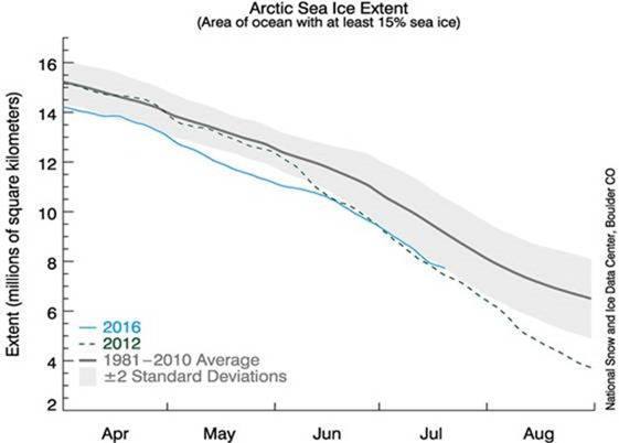
All of this is rather reminiscent of the “Great Arctic Cyclone” in the summer of 2012, which looked like this on August 7th:
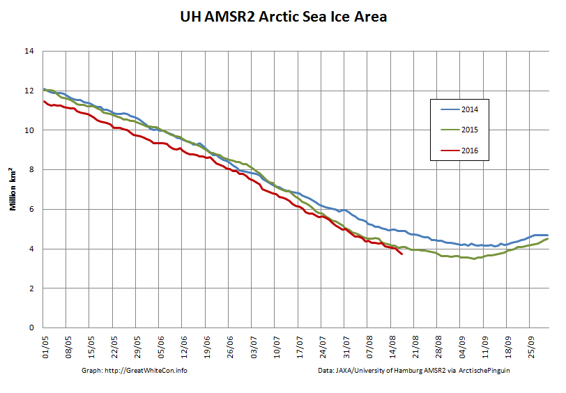
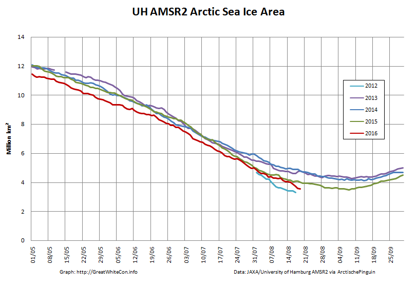
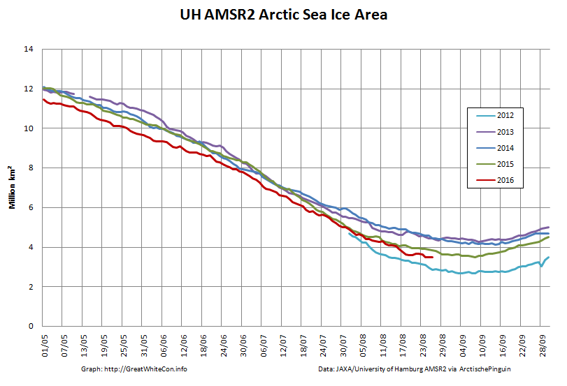
and which ultimately led to the lowest Arctic sea ice extent in the satellite record. Using the National Snow and Ice Data Center’s numbers that was 3.41 million square kilometers on September 16th 2012. Here’s the NSIDC’s current graph comparing 2012 with this year:
I wonder what the minimum for 2016 will be, and on what date?
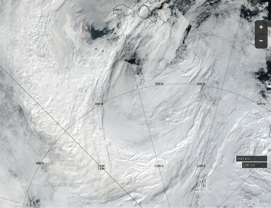
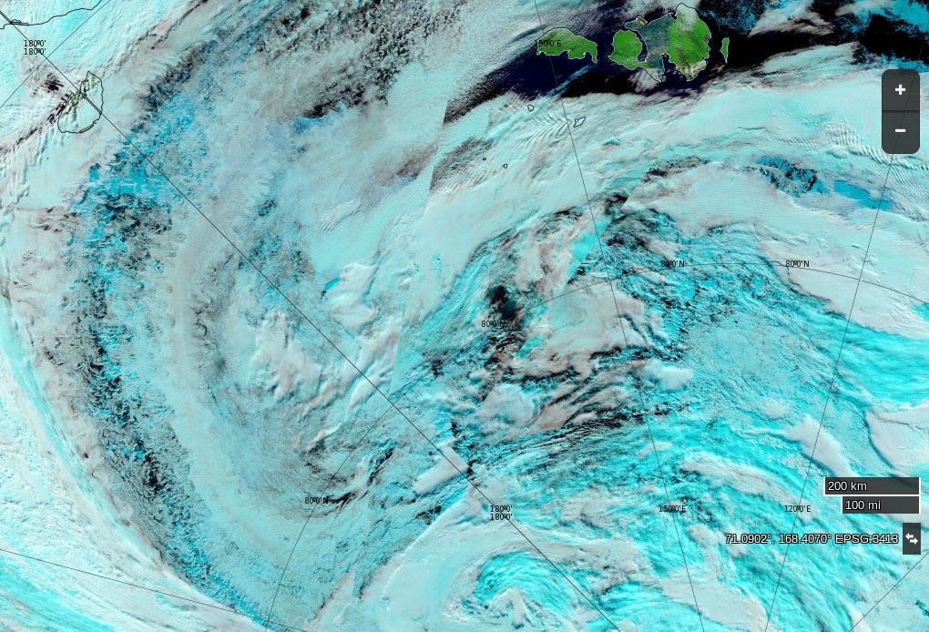
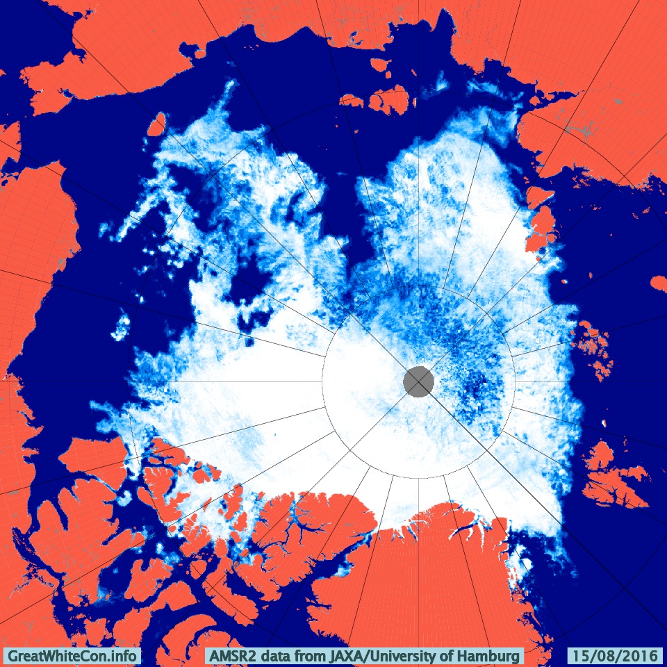
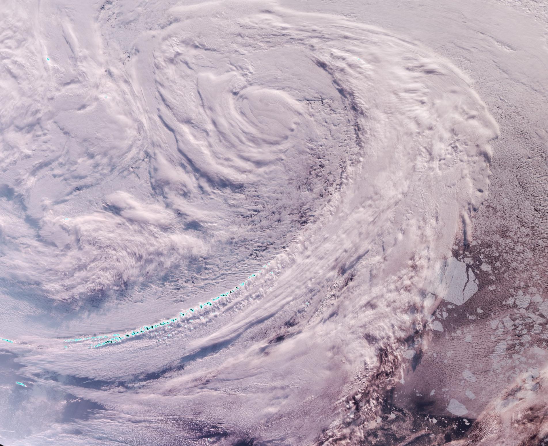
Here’s how the Great Arctic Cyclone of 2016 looks from on high this morning:
NASA Worldview “true-color” image of the ‘Great Arctic Cyclone’ on August 15th 2016, derived from the VIIRS sensor on the Suomi satellite
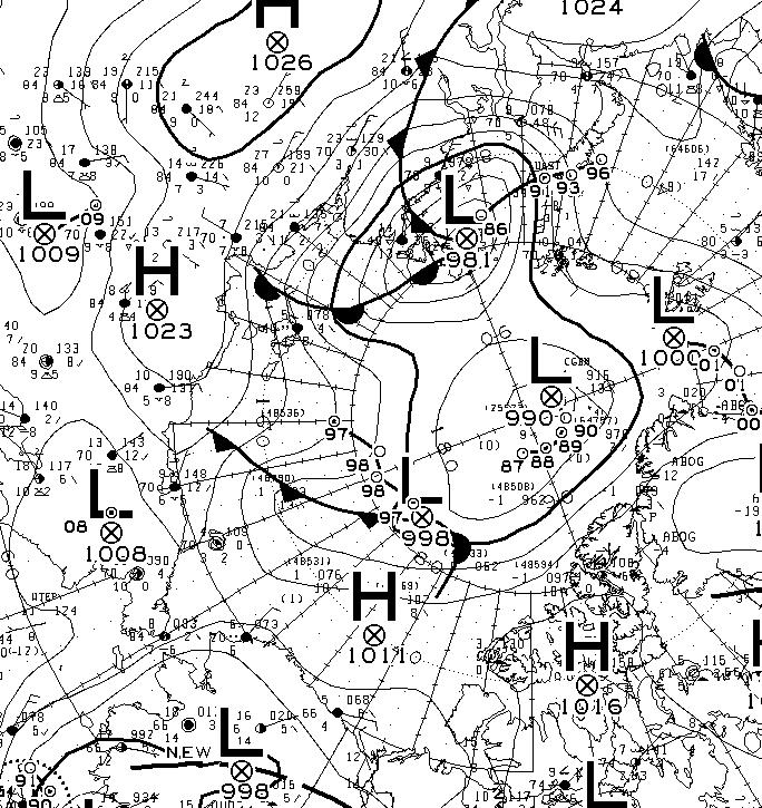
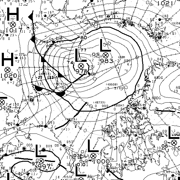
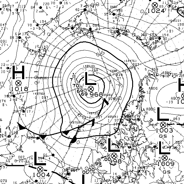
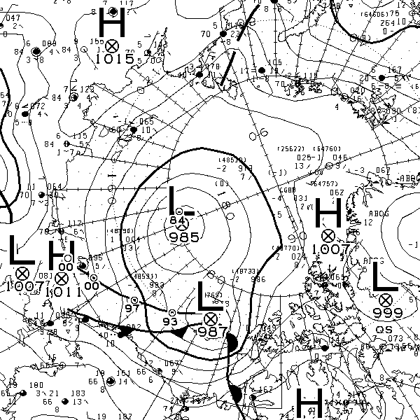
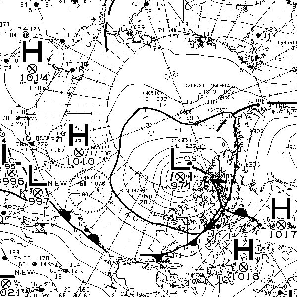
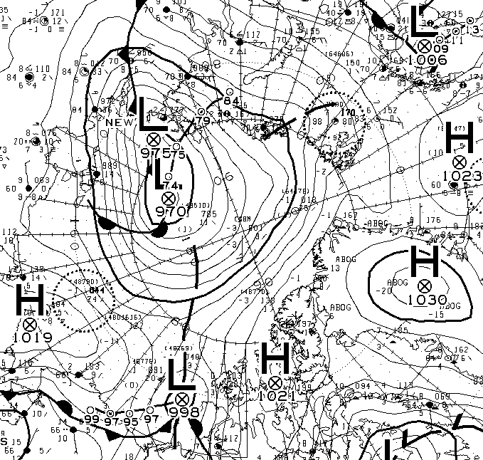
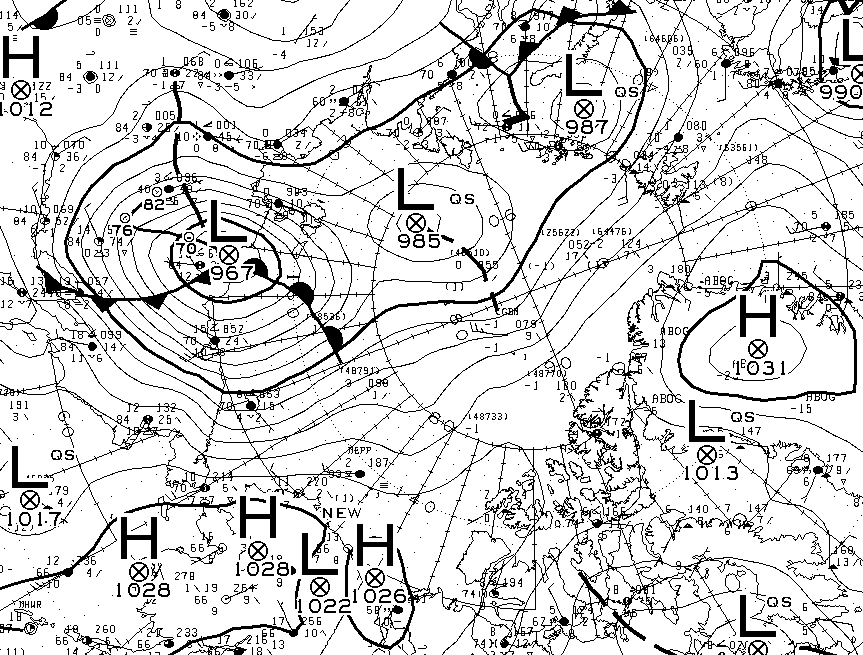
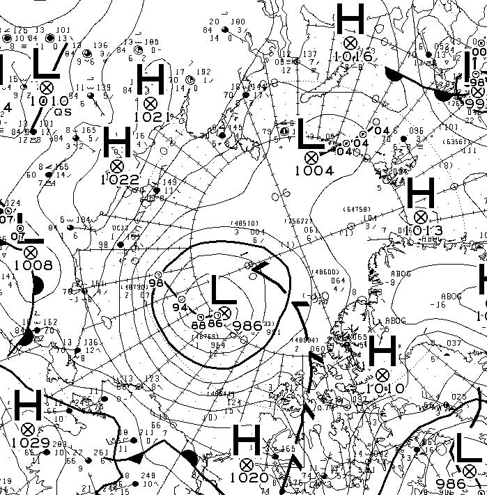
The latest synopsis from Environment Canada shows that the central pressure of the cyclone is now down to 974 hPa:
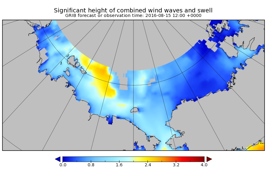
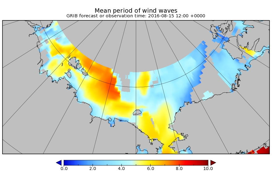
The WaveWatch III forecast for noon today UTC confirms the forecast of two days ago:
P.S. The Canadian 0600Z synopsis has the cyclone’s SLP down to 971 hPa:
[Edit – August 16th]
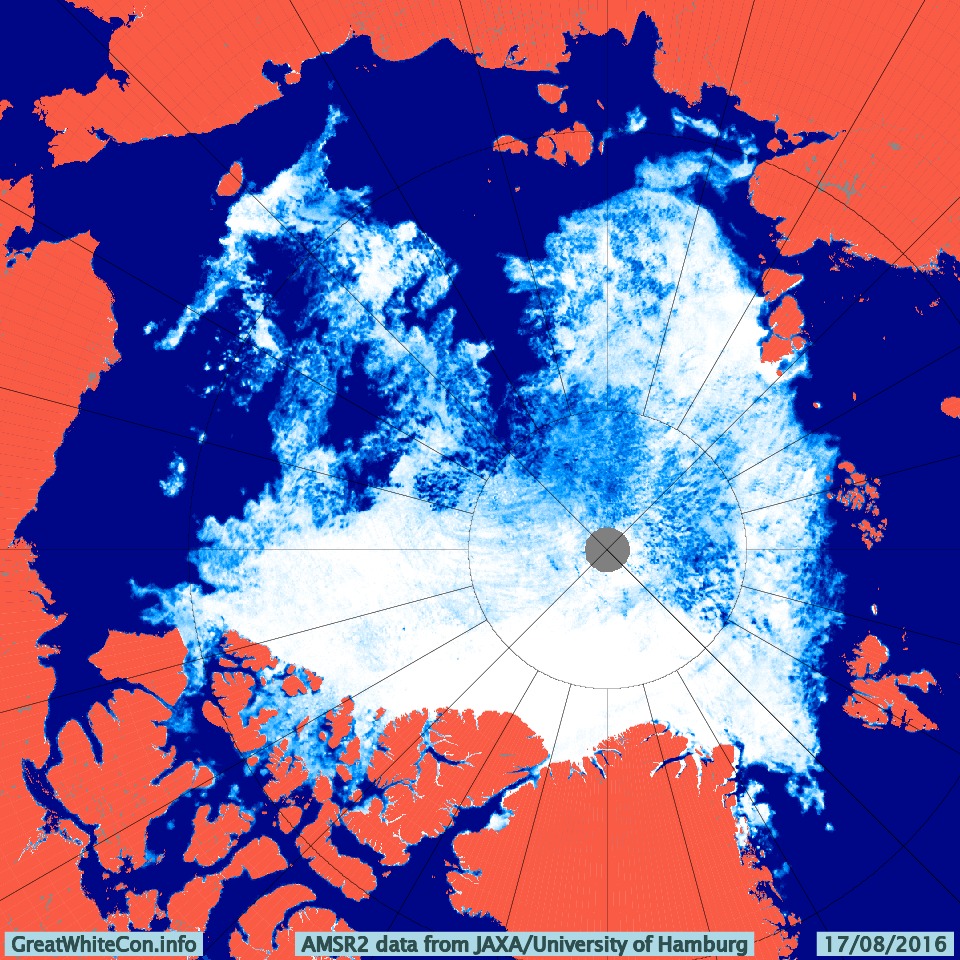
This morning the cyclone’s SLP is down to 969 hPa:
and the clouds over the Central Arctic are parting:
NASA Worldview “false-color” image of the Arctic Basin on August 16th 2016, derived from the MODIS sensor on the Terra satellite
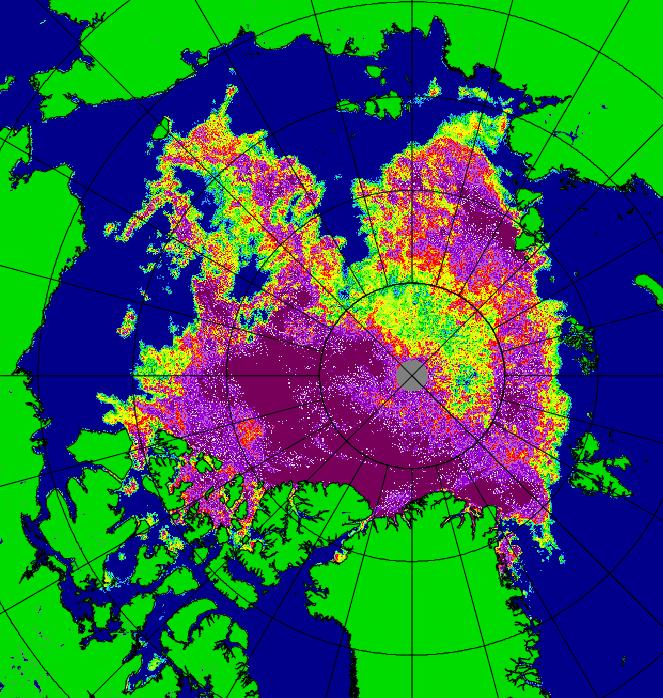
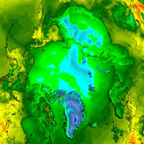
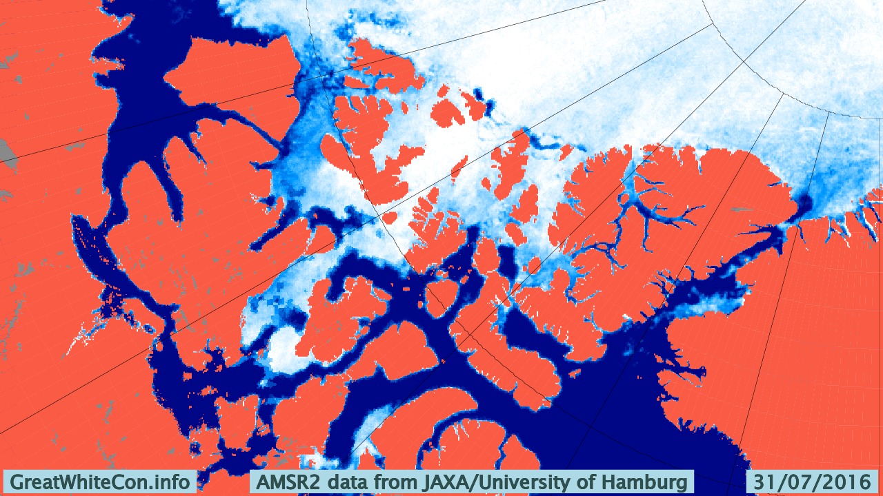
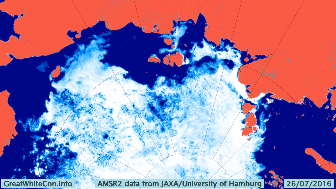
Our favourite method of seeing through the clouds using the AMSR2 maps from the University of Hamburg doesn’t seem to working at the moment, so here’s one from the University of Bremen instead:
The cyclone central pressure is now up to 983 hPa, and some indications of the effect it has had on the sea ice in the Arctic are being revealed:
[Edit – August 19th]
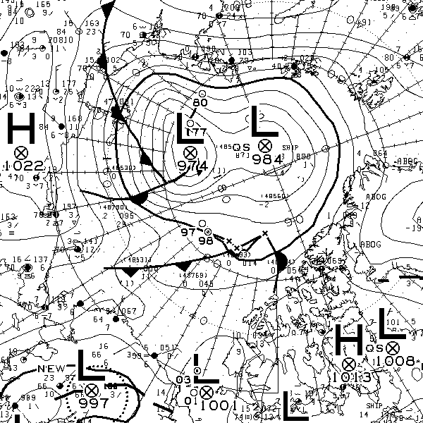
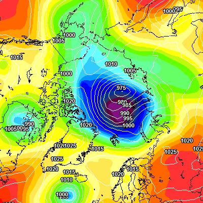
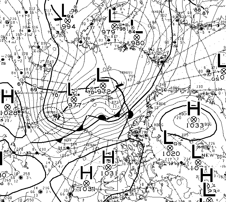
According to Environment Canada the cyclone’s central pressure rose to 985 hPa earlier today:
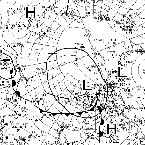
However the 987 hPa low near the Canadian Arctic Archipelago is currently forecast to deepen below 980 hPa over the next 24 hours. Here’s the ECMWF forecast for first thing tomorrow morning:
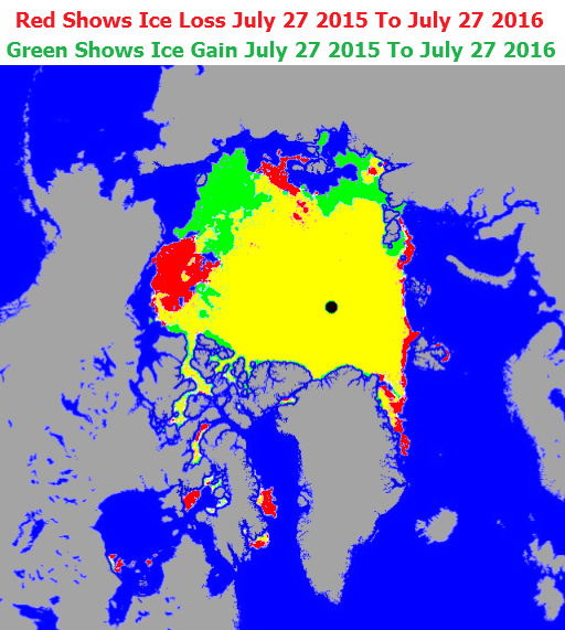
The high resolution AMSR2 Arctic sea ice area has reduced by another 133.5 thousand square kilometers since yesterday. A similar drop tomorrow will take us below the 2015 minimum.
[Edit – August 19th PM]
The MSLP of the rejuvenated cyclone had dropped to 976 hPa by 12:00 UTC today:
The ECMWF forecast for lunchtime tomorrow is for something similar:
[Edit – August 20th]
The current incarnation of the cyclone bottomed out at 971 hPa near the Canadian Arctic Archipelago:
The 72 hour forecast from ECMWF for the next phase of GAC 2016 is beginning to enter the realms of plausibility. Here’s what it reveals:
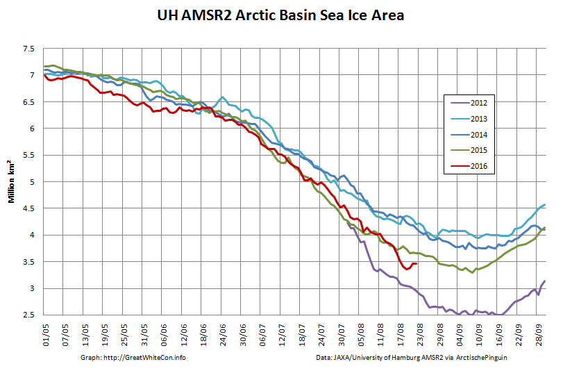
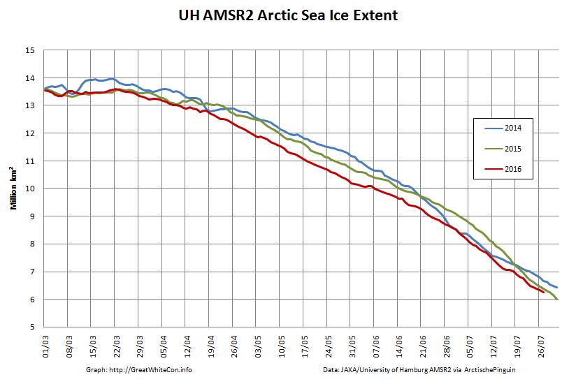
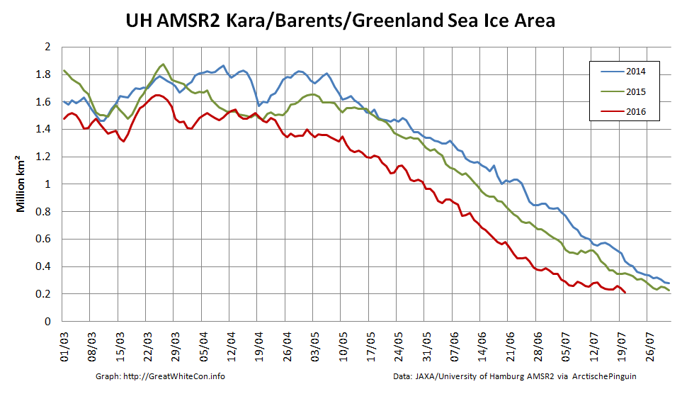
The University of Hamburg have been processing more AMSR2 data from 2012. You can argue until the cows come home about which is the best metric to peruse at this time of year, but try this one for size:
That’s the high resolution AMSR2 sea ice area for the Arctic Basin, comprising the CAB plus Beaufort, Chukchi, East Siberian and Laptev Seas.
[Edit – August 25th]
There’s a bit of a gap in the clouds over the Central Arctic today:
NASA Worldview “true-color” image of the Central Arctic Basin on August 25th 2016, derived from the MODIS sensor on the Terra satellite
This is merely the calm before the next storm. Here is the current ECMWF forecast for Saturday lunchtime (UTC):
Low pressure on the Siberian side of the Arctic and high pressure on the Canadian side producing an impressive dipole with lots of sea ice “drift” towards the Atlantic:
[Edit – August 27th]
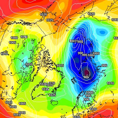
Saturday morning has arrived, and so has the predicted storm. As the centre of the cyclone crossed the coast of the East Siberian Sea its central pressure had fallen to 967 hPa, whilst the high pressure over Alaska had risen to 1028 hPa:
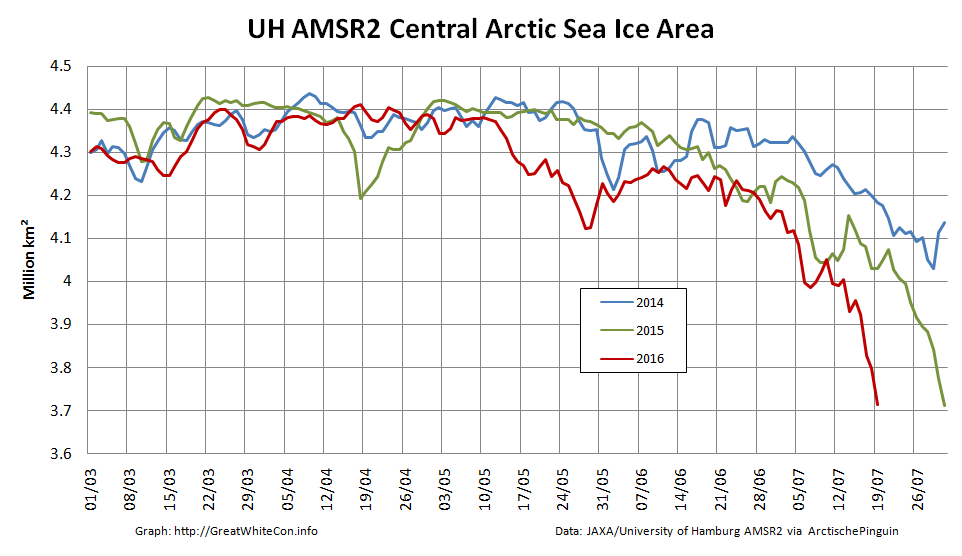
The effect of the earlier bursts of high wind is apparent in the high resolution AMSR2 sea ice area graph:
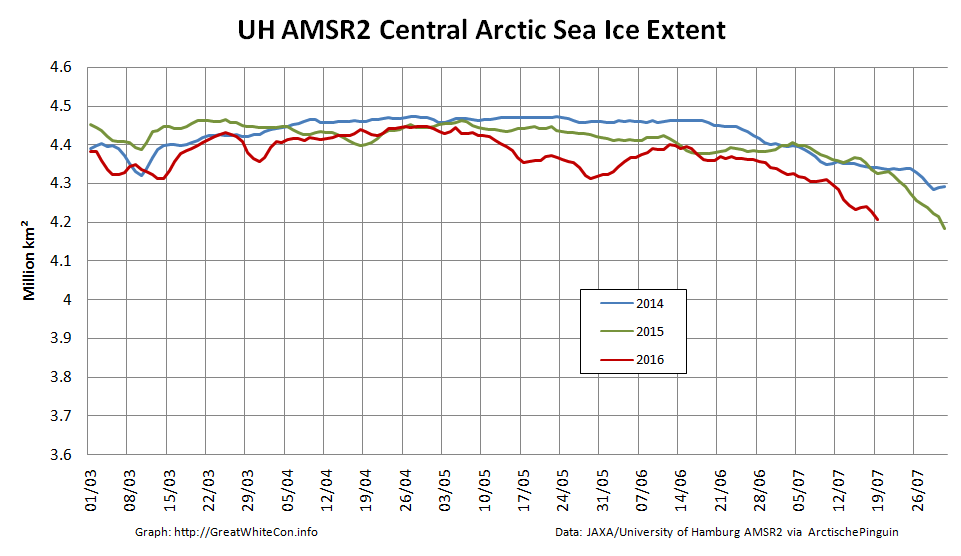
However they are not as apparent in the corresponding extent graph:
[Edit – August 28th]
As the centre of the cyclone heads for the North Pole the isobars are tightening across the last refuge of multi-year sea ice north of the Canadian Arctic Archipelago and Greenland:
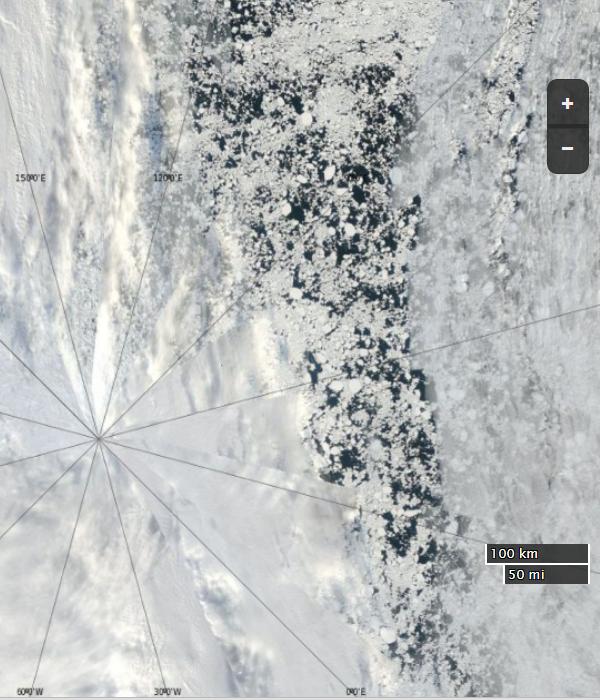
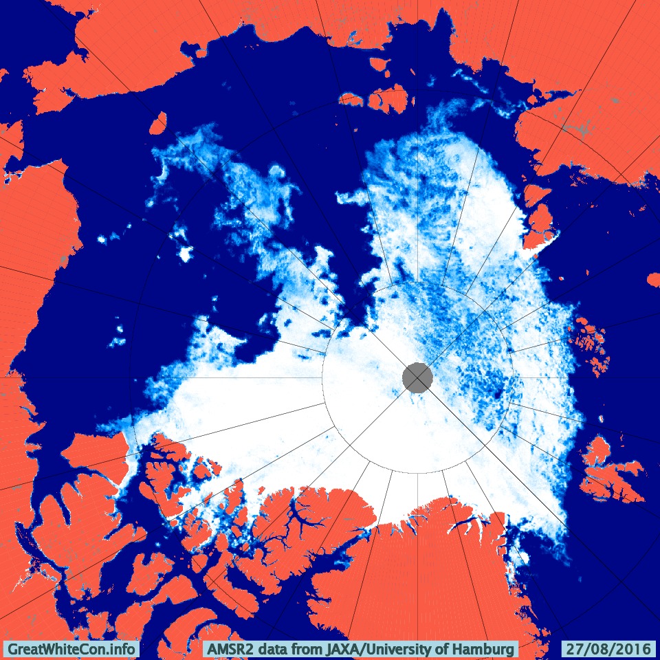
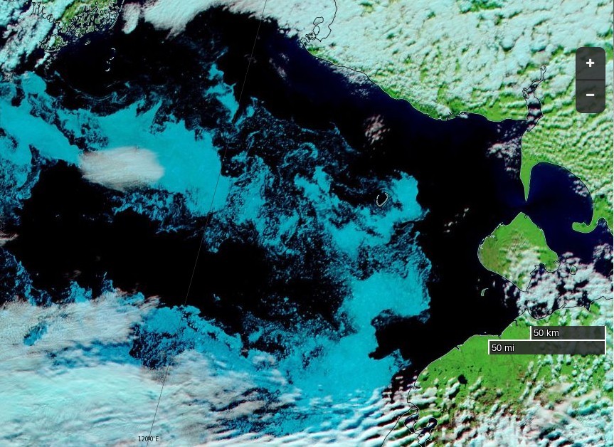
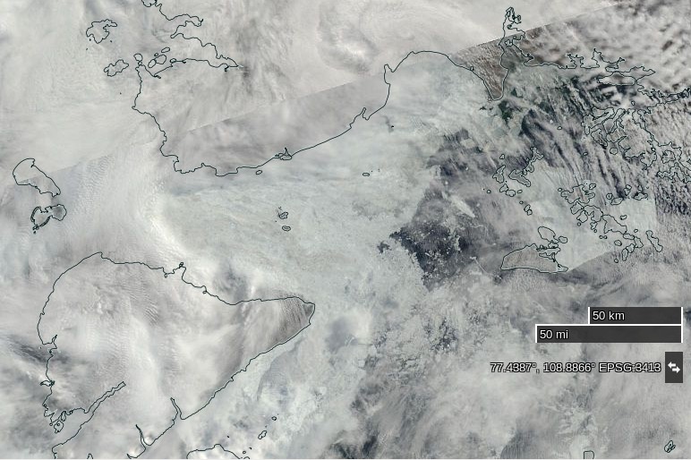
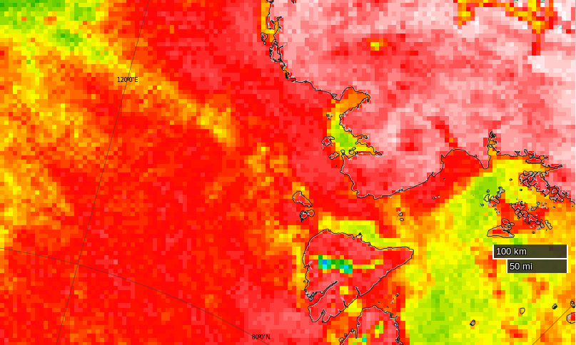
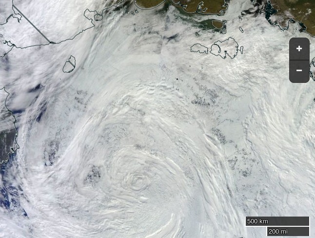
The area north of the East Siberian Sea that was predicted to bear the brunt of the wind and waves overnight is still covered in cloud. However the latest AMSR2 update from the University of Hamburg suggests that open water now stretches as far as 86 degrees north:
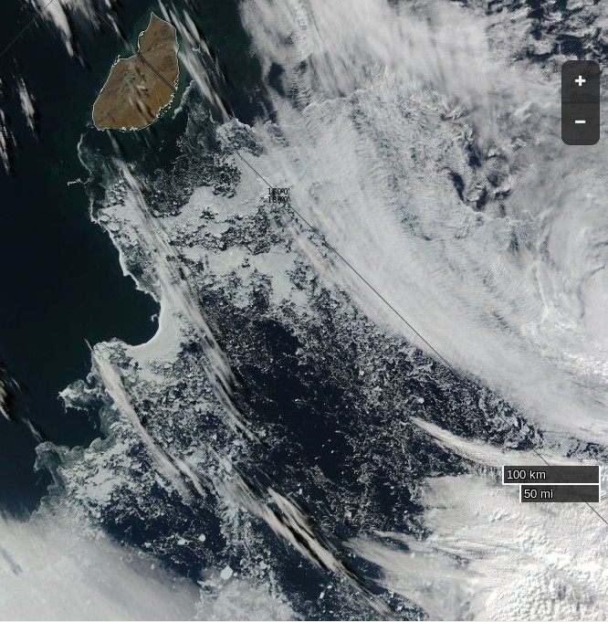
The skies over the northern Chukchi Sea have cleared to reveal this:
NASA Worldview “true-color” image of the northern Chukchi Sea on August 28th 2016, derived from the MODIS sensor on the Aqua satellite
[Edit – August 29th]
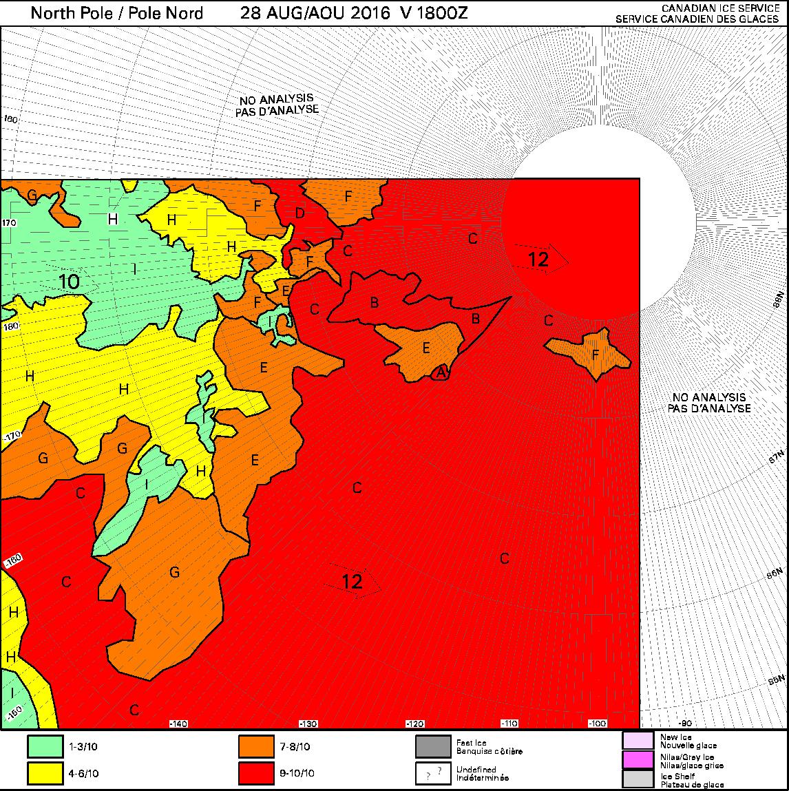
Some of the effects of the recent high winds can be judged by this Canadian Ice Service chart of ice concentration near the North Pole:
[Edit – September 1st]
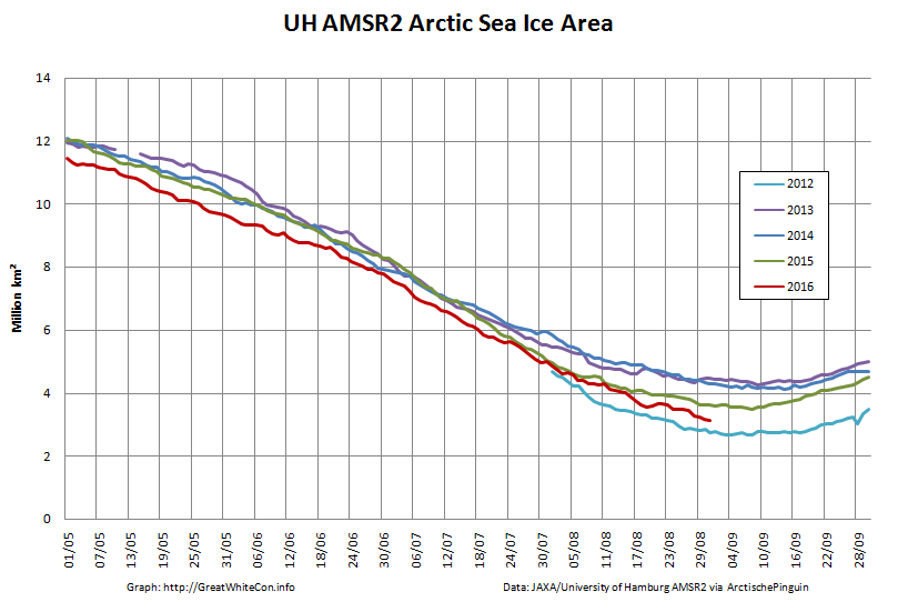
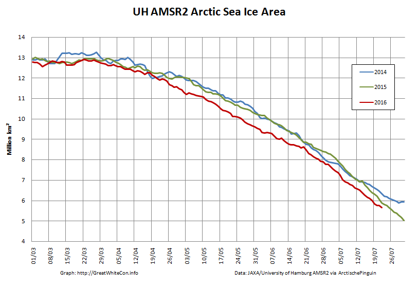
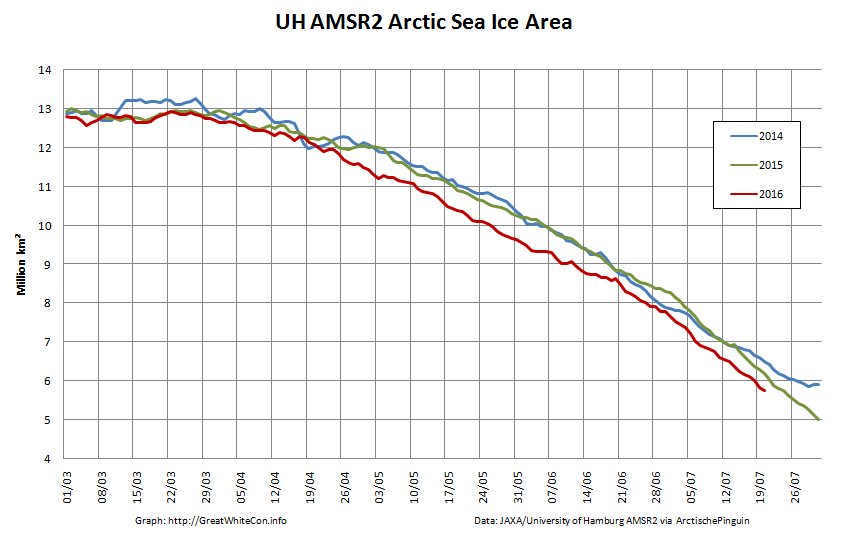
Arctic sea ice area continues to fall quickly for the time of year:
The recent dipole has finally caused some compaction of the scattered sea ice. Hence the high resolution AMSR2 extent is following suit and is now below last year’s minimum:
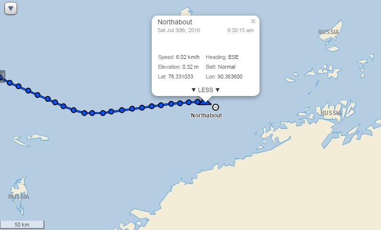
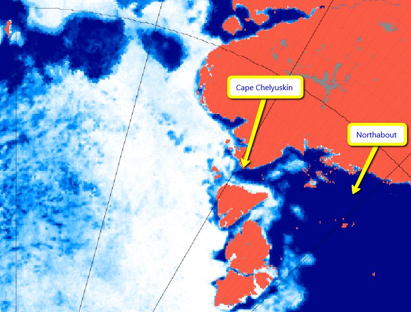
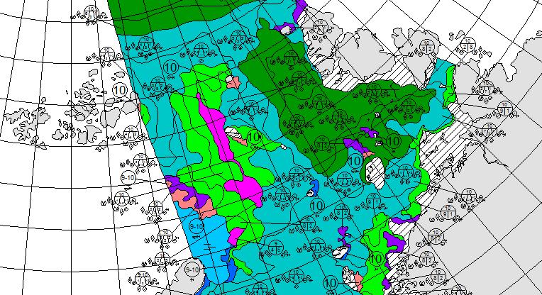
Having rounded Cape Chelyuskin yesterday Northabout has now come across some serious sea ice in the Laptev Sea. The crew are posting regular updates on conditions. Here’s a recent example:
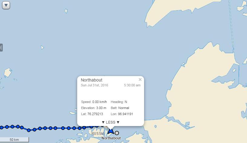
Having anchored against some land-fast ice overnight Northabout is on the move once again:
Not before indulging in some strenuous early morning exercise though!
[Edit – August 11th]
Northabout made further progress yesterday and anchored last night in the shelter of Ostrov Volodarskiy:
There seems to have been less sea ice in attendance than the night before!
Northabout is now approaching the area in which the most recent AARI forecast suggests there will be sea ice all the way to the coast:
Will the hoped for winds have done their work by tomorrow?
[Edit – August 13th]
Northabout spent yesterday trying to find a way south. Ultimately they failed, reporting that:
The wind and sea state were really picking up. Our options were few. Wind and tide against us, really shallow water of 5m , small bergy bits in the water to miss. NO shelter whatsoever. Do we make our way back the 40 miles where we knew a good anchor spot ? At this rate it would take us 11 hours, using up precious diesel. In the end a nice large floe came into sight, so we gingerly approached, and my comrades made the boat secure. It would protect us from the sea state like a pontoon, and protect us from the mass of ice coming our way. My watch finishes at 12 and I got into my pit at 3.30am.
To our surprise, the floe was moving at 1.3 knots, so up again to move. The strong winds were driving huge belts of pack ice our way, we didn’t want to be caught up against the shore. So, off towards our anchorage, and then a nice large ‘Stamukha’ appeared. Russian for ice that has grounded on the bottom, so not moving. Another mooring. This time it felt safe, so a good couple of hours sleep,
This morning it looks like they are still anchored to that Stamukha:
Here’s a picture of their anchorage the previous night:
and moving pictures of Northabout mooring to the “stamukha”.
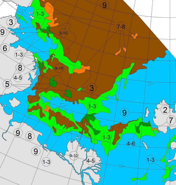
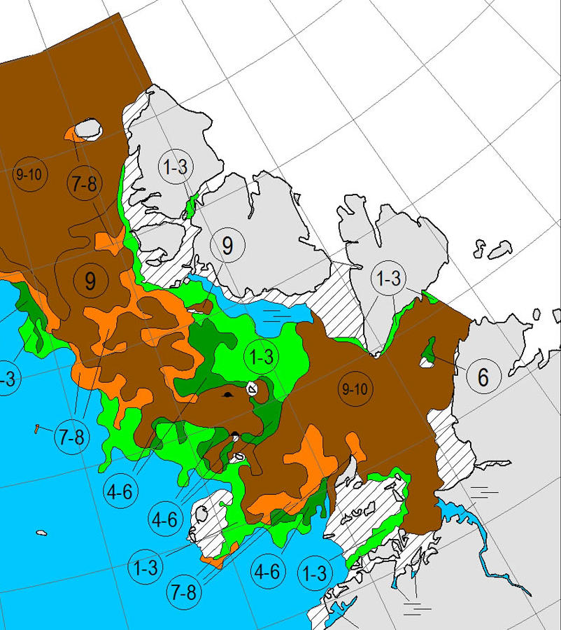
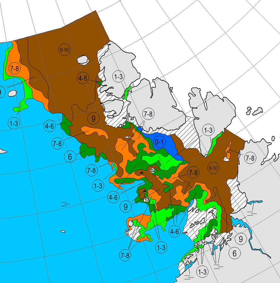
Here’s the latest AARI sea ice chart:
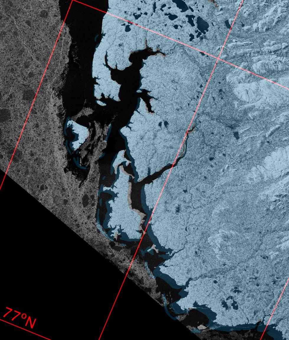
which still shows a considerable length of the coast of the Taymyr Peninsula beset by 9/10 concentration sea ice. However Sentinel 1A imaged that coast just before midnight last night. Here’s what it revealed:
So near and yet still so far for Northabout?
[Edit – August 13th PM]
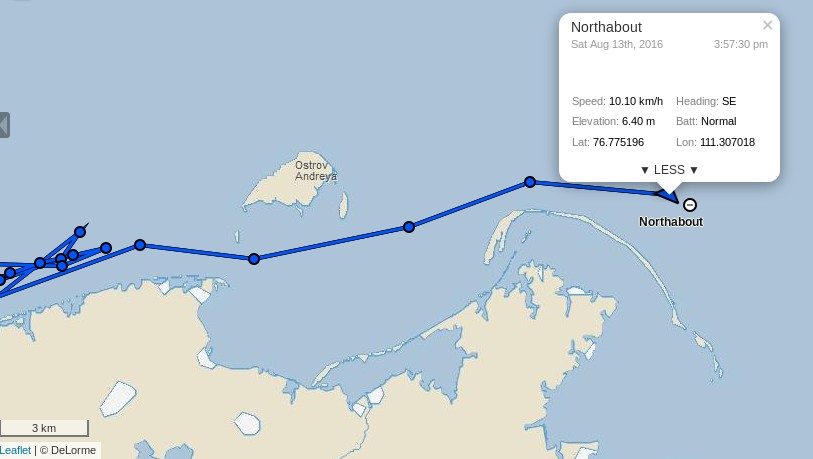
Stop Press! Northabout has now passed Ostrov Andreya and turned south:
If last night’s Sentinel 1A images are to be believed the worst is now behind the Polar Ocean Challenge team, until the winds of the forthcoming “Great Arctic Cyclone” of 2016 arrive at least? Here’s the current ECMWF forecast for early Monday morning, courtesy of MeteoCiel:
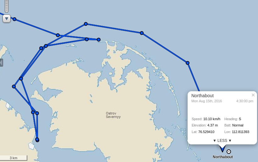
[Edit – August 14th]
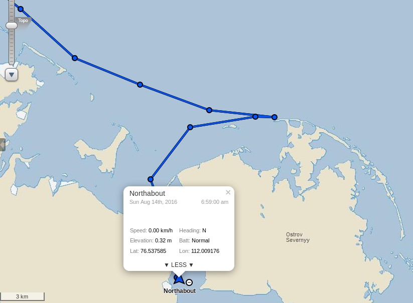
After inspecting a possible route to the east of Ostrov Severnyy, the crew of Northabout have decided that:
We have had to go and find shelter tonight. A huge storm on the way, and high wind, in shallow waters with masses of ice driving your way, is no place to hang around to see what might happen.
So, now at anchor, all tired, excited after today, and looking forward to the next hurdle – I think! As I write, the wind is gusting 30 knots, so clever to run for shelter.
[Edit – August 15th]
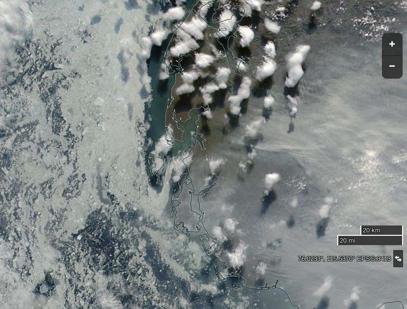
The Sentinel image from last night isn’t very clear, and today’s MODIS images are rather cloudy so here’s one from yesterday:
NASA Worldview “true-color” image of the western Laptev Sea on August 14th 2016, derived from the MODIS sensor on the Aqua satellite
It shows that the winds had already opened up a fairly ice free channel past Ostrov Severnyy, and also the smoke that Northabout’s crew reported smelling yesterday:
Staying at Anchor for another night behind Ostrov Severnyy – Air 9C water 5C 76 53N 112 E 30 knot winds from SW 15.40 UTC 22.40 local time
Well, as predicted from the Grib files, winds slowly increased throughout last night to 35 and gusting much higher. Also, as predicted, the temp rose to an amazing 17 degrees today! In the morning, I also got the distinct smell of wood smoke. Maybe a forest fire 500 miles south and the smell drifted with the wind. At one point, we slipped the anchor, so good we had an anchor watch and wise to find shelter, no ice, 7m of depth, surrounded by land but still bouncing about like a cork.
In the wake of the cyclone they are sailing south again today, apparently unhindered by sea ice:
[Edit – August 16th]
Northabout has made good progress overnight:
The skies are clear this morning over the south-west Laptev Sea:
NASA Worldview “false-color” image of the south-western Laptev Sea on August 16th 2016, derived from the MODIS sensor on the Terra satellite
The next question is which side of Ostrov Bol’shoy Begichev will Northabout pass? All the indications are that the answer will be to the east.
Whilst we wait for that to be confirmed, here is some video footage of Northabout passing Ostrov Andreya on August 13th:
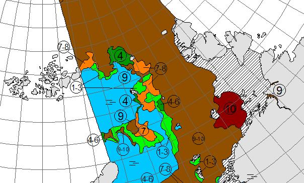
P.S. Here’s the latest AARI ice chart for the Laptev Sea:
[Edit – August 18th]
Northabout has encountered yet more sea ice. According to the “Crew Blog” of Ben Edwards:
Over night we’d sailed into ice. I know, I said we shouldn’t be troubled by ice for a bit, I was wrong. The ice on its own wasn’t too bad, the thing was we had fog as well. The fog was terrible, we could barely see five meters in front of the prow and the ice just kept on coming. After a bit the fog went, thankfully, the ice didn’t. Eight hours later when I’m back on watch we still had ice and even better, we had to divert to avoid a sandbank. Then the fog came back, typical. Luckily after another two and a half hours the ice began to clear a bit, for now.
Despite the ice, fog and sandbank Northabout is still making good progress across the Laptev Sea, and is currently sailing past the delta of the Lena River:
We asked this question last year, albeit a couple of weeks later. It looks like it is if you only peruse passive microwave visualisations such as this one:
However if you were the captain of a yacht attempting to sail through the Northwest Passage this year you might well have some reservations. For example, the Barrow webcam (currently stuck on July 31st) reveals this:
Discretion being the better part of valour, in all the circumstances waiting a day or two longer before casting off might prove prudent:
[Edit – August 3rd]
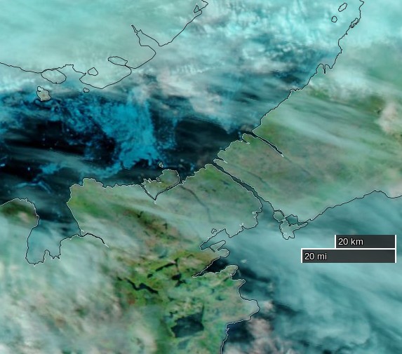
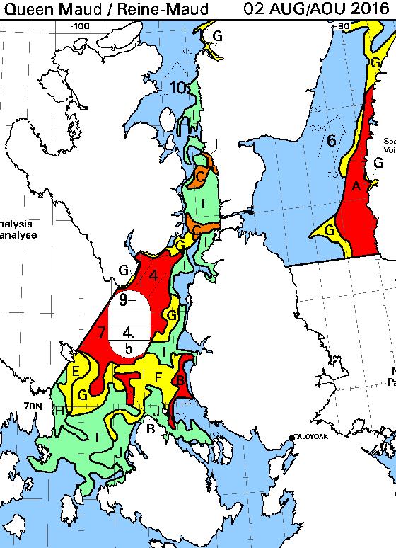
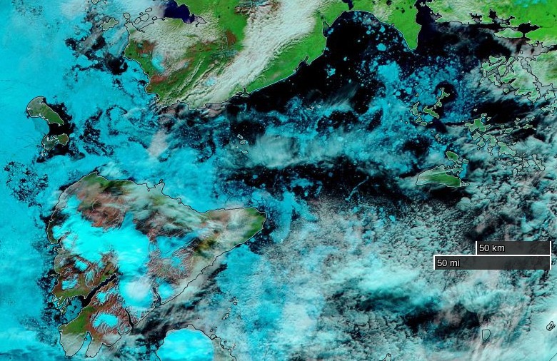
Clearer skies over the Northwest Passage yesterday reveal the remaining ice:
NASA Worldview “true-color” image of Larsen Sound on August 2nd 2016, derived from the MODIS sensor on the Aqua satellite
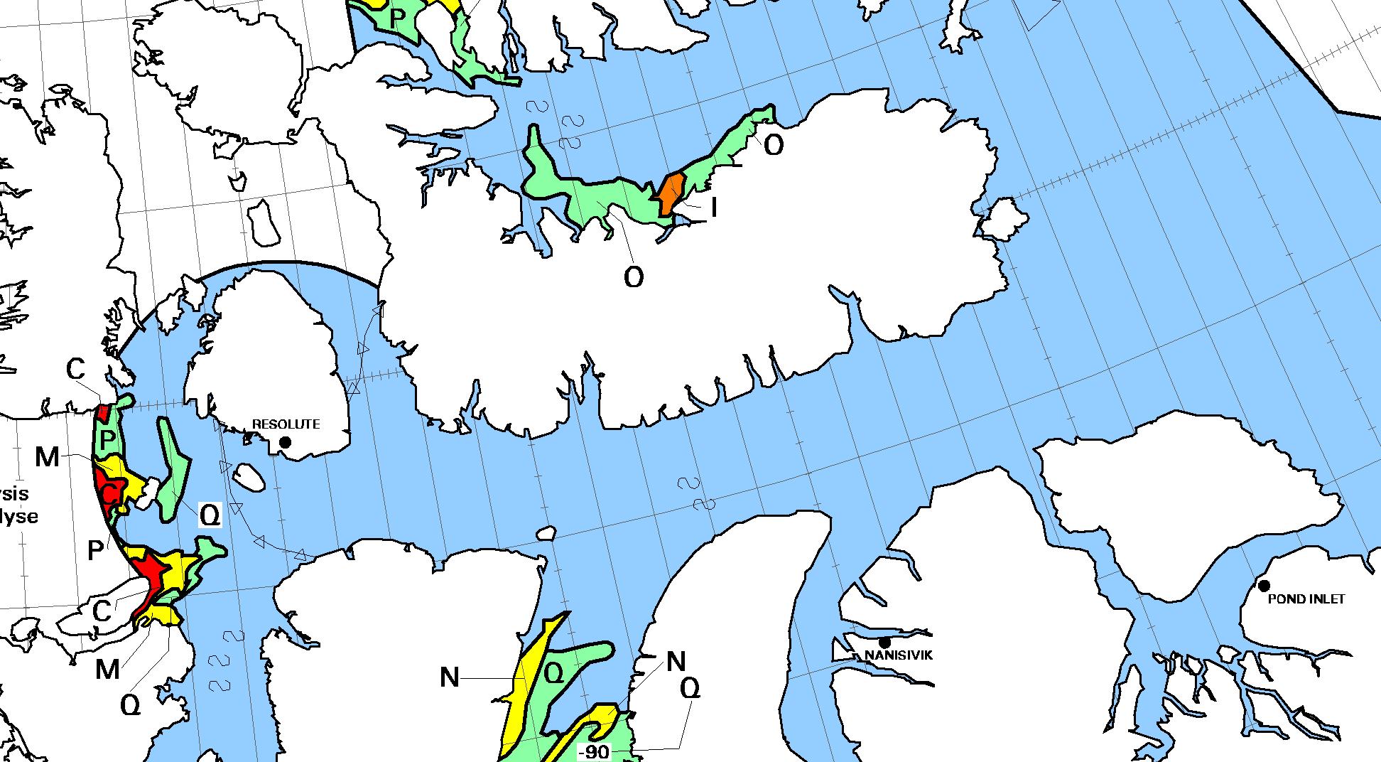
Here’s the CIS chart of the area from yesterday evening:
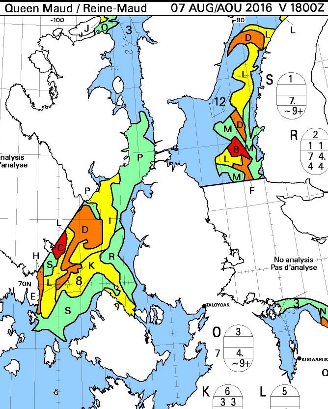
[Edit – August 7th]
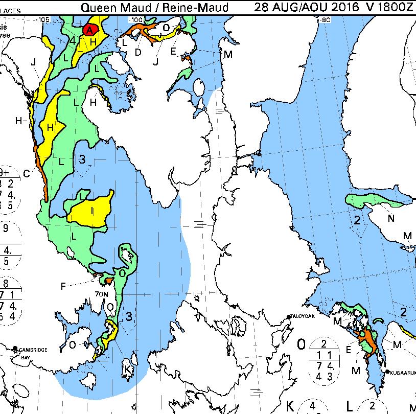
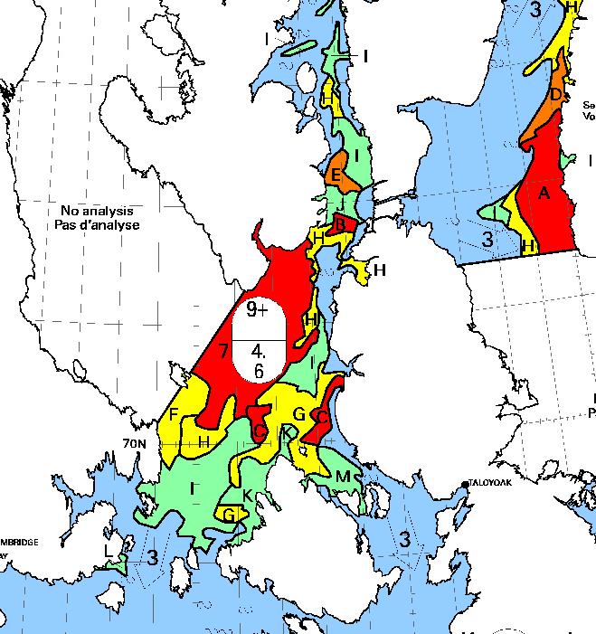
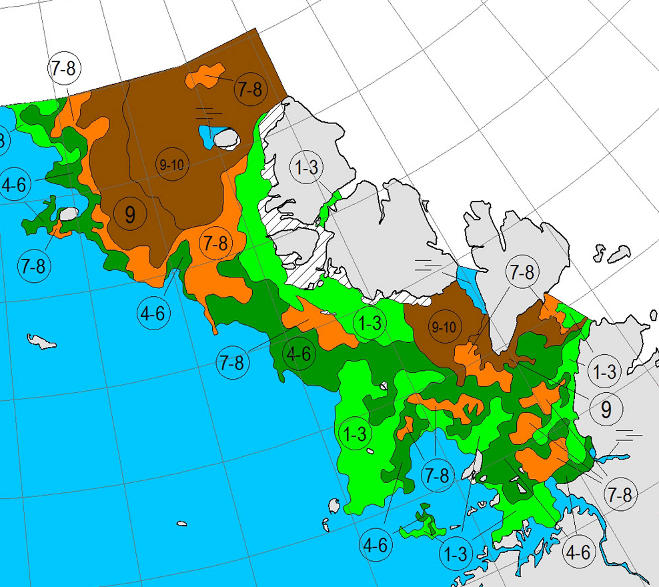
Here’s the August 7th CIS chart for the Queen Maud Gulf and points north:
Today there looks to be a route past Gjoa Havn and through Bellot Strait that doesn’t involve negotiating more than 3/10 concentration sea ice. The ice has been pushed back from Point Barrow too, so by my reckoning we can now declare one route through the Northwest Passage “open”, for the moment at least.
[Edit – August 10th]
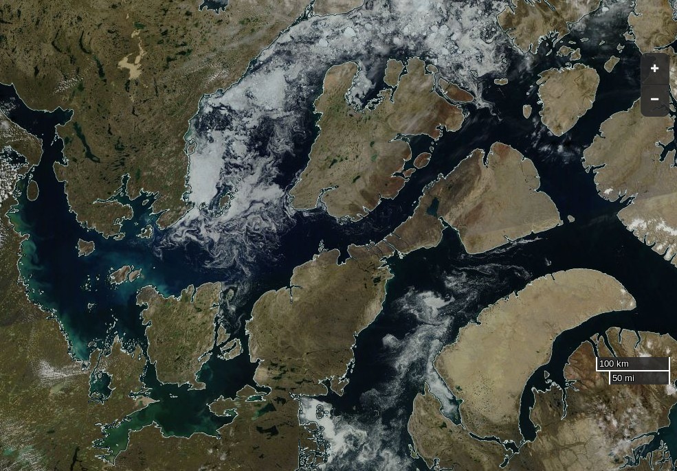
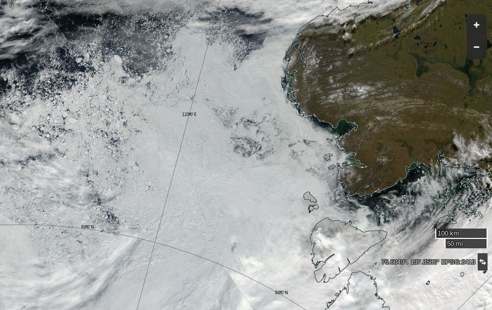
A nice clear MODIS image of the Northwest Passage yesterday:
NASA Worldview “true-color” image of the Northwest Passage on August 9th 2016, derived from the MODIS sensor on the Terra satellite
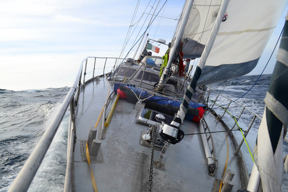
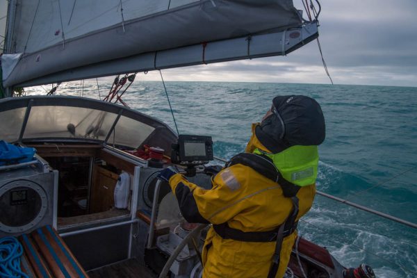
I had an interesting watch this morning. Just crawled out of bed, rocking and rolling getting ready. I even put my second thermals on, checked the log to see what was happening. clipped on before leaving the saloon, and clipped on behind the wheel.
Just sitting down, put my leg up for stability and a wave came across the boat. Didn’t see it or hear it. For a fraction of a second, my whole body was under water, and it was only my leg stopping me going out of the side, and hopefully my tether would have stopped me going over completely.
I actually had a mouth full of sea water which was novel. Nikolai thought it was hilarious. I’m just very pleased it was me and not one of the lighter ladies.
Here’s brief video showing some slightly smaller waves:
Their live tracking map reveals that they have passed Ostrov Troynoy and are now heading east in the general direction of the Nordenskiöld Archipelago:
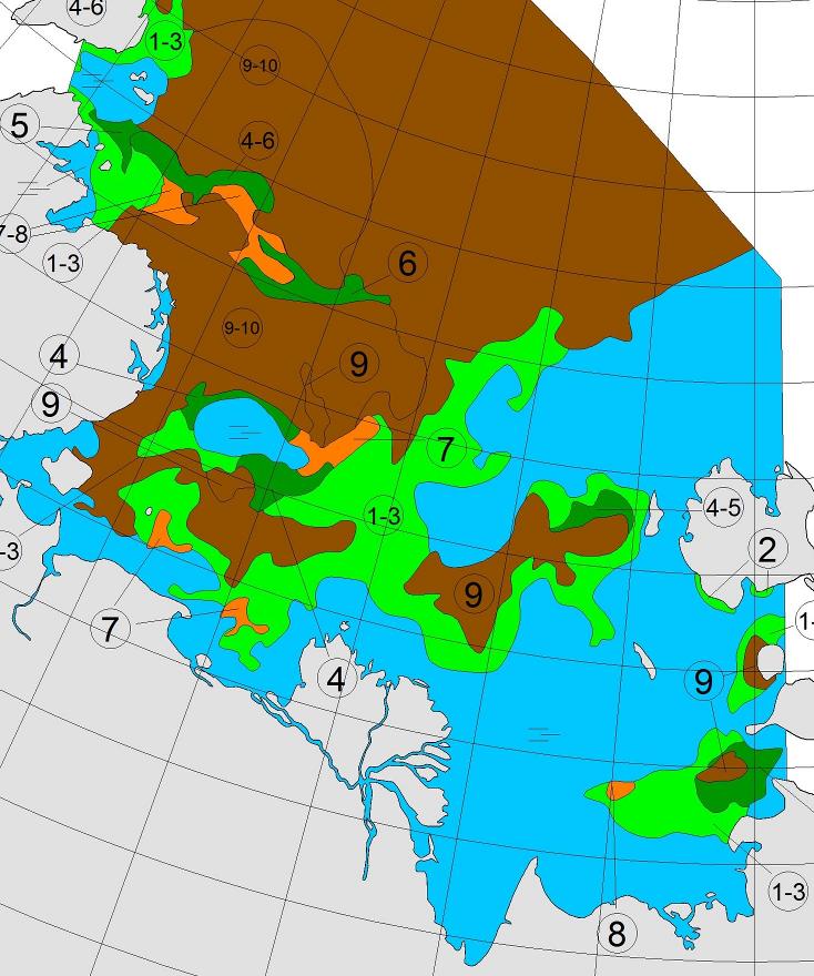
The latest sea ice map of the north eastern Kara Sea reveals some open water in the Vilkitsky Strait, but as yet no way through for a small yacht like Northabout:
A bit further afield the University of Hamburg’s AMSR2 imagery reveals the current ice conditions along the rest of the Northern Sea Route:
All in all it doesn’t look as though Northabout’s crew will beaming videos back to us from the Laptev Sea over the next few days, but never say “never” in the Arctic!
N76 20 E083 28 Pressure 998 water temp 4 outside temp 5 cloud 6/8 sea state 3 winds 15 knots.
Making steady progress east. I always love it when we click over degree of longitude. Of course, they are pretty close together up here. ( I have been dreaming of the 180 long), for weeks.
The winds will slowly take us north east today and tomorrow. Hopefully find our island with the Palm trees and wait for the Ice to break up. Looking forward to seeing an Ice update today and see if this storm has changed anything. Fingers crossed.
The Vilkitsky Strait is covered in thick clouds this morning, so here once again is the view from on high using passive microwaves:
Today’s sea ice update is that concentration in the Nordenskiöld Archipelago and Vilkitsky Strait seems to be falling fast. Visual confirmation of that is eagerly awaited.
Making steady progress East. We had the latest ice charts for the Vilkitskogo straight. Still blocked and the Laptev still blocked, but big changes from the last set of charts, and encouraging.
Nikolai and Dennis are having bets. Nikolai thinks it will be free on his birthday, the 9th Aug, and Dennis on his, 6th Aug . Either way, would mean a few days rest. We are heading for a small sheltered Island. Different to the first choice, as the ice from the North has come down and blocked it, so trying for another Island closer to shore and closer to the straight. So if anything dramatic changed quickly, we would be close to react. Ie, A strong southerly taking the ice from the shore.
Saw our first ICE today on my watch, just an hour ago. What is slightly worrying, it didn’t show up on the Radar. It’s probably good for the big icebergs, but not low ice in the water. I think we will see a lot more of that before the trip is out. You can’t beat that old eyeball.
[Edit – July 31st]
In a brief update this morning the crew of Northabout report they are:
Anchored! for rest repairs and to wait for favourable ice conditions in the NE passage and for the new ice charts. Proper shipslog update coming later with some photos (which take ages to upload) But for now we’re getting a bit of a rest & having a cuppa.
They have found some shelter in the convoluted coastline of Ostrov Pilota Makhotkina, just off the shores of Siberia and within striking distance of their exit from the Kara Sea:
As Reggie points out below, the sea ice in the Vilkitsky Strait broke up remarkably early this year. Here’s his view from June 23rd:
NASA Worldview “false-color” image of the Vilkitsky Strait on June 23rd 2016, derived from the VIIRS sensor on the Suomi satellite
and if you watch our latest Northern Sea Route animation carefully you’ll note that the ice was already mobile at the beginning of June:
In actual fact the Vilkitsky Strait never became blocked with land-fast ice last winter. Compare this ice chart from the Russian Arctic and Antarctic Research Institute for May 4th 2016:
Three years ago the island where Northabout is now sheltering was still encased in land fast ice at the beginning of July, as was the Vilkitsky Strait itself. By August 25th when the yacht Tara passed around Cape Chelyuskin into the Laptev Sea on her own Polar circumnavigation the Strait looked like this:
[Edit – August 1st]
The latest video from the crew of Northabout reveals them anchoring off Ostrov Pilota Makhotkina:
The skies have cleared over the Vilkitsky Strait this morning! Here’s a “false colour” image from the MODIS instrument aboard the Aqua satellite:
NASA Worldview “false-color” image of the Vilkitsky Strait on August 1st 2016, derived from the MODIS sensor on the Aqua satellite
On “true colour” images sea ice looks white, and so do clouds. Using a different set of wavelengths reveals the ice in pale blue, with the clouds still white. Northabout remains anchored, and it’s easy to see why!
[Edit – August 2nd]
The latest AARI ice charts are out, but don’t reveal a way through to the Laptev Sea for Northabout just yet:
Here’s a fairly cloud free satellite image of what lies ahead:
NASA Worldview “true-color” image of the Laptev Sea on August 2nd 2016, derived from the MODIS sensor on the Aqua satellite
The crew of Northabout report that some of that ice has made its way into their anchorage:
Whilst at anchor we have a respite from our normal watch routine and it is replaced with Anchor Watch, which is an hour and half slot, mine is from 12.30am to 2am. The other crew and Northabout are in a deep slumber, perfect quiet interspersed with gentle snoring from contented crew! Last night was an exception, as the wind picked up and changed direction, resulting in some bits of drifting ice coming into the bay, ‘crashing’ into the boat at about 4am, giving all the crew an alarming wake up call. There was no danger, it was simply the deafening noise of ice and aluminium in the still of the night! Dennis was soon on the job with the ice poles, keeping all at bay!
[Edit – August 8th]
As Bill points out below, Northabout is now heading in the direction of Vilkitsky Strait:
Perhaps they’ve had an early look at the latest AARI ice charts of the Laptev Sea? The Northern Sea Route Administration web site is still displaying the ones from August 5th, which showed the route blocked by 9/10 ice coverage in places:
Satellite imagery at visual frequencies is rather cloudy again today:
NASA Worldview “false-color” image of the Laptev Sea on August 8th 2016, derived from the VIIRS sensor on the Suomi satellite
but there’s still no obvious way through to the East Siberian Sea that I can see.
[Edit – August 9th]
Northabout has just rounded Cape Chelyuskin and is now heading into the Laptev Sea!
Here’s the new ice chart for the Laptev Sea:
A navigable strip does seem to be opening up around the coast, but there’s still a stubborn patch of 9/10 concentration sea ice blocking Northabout’s way.
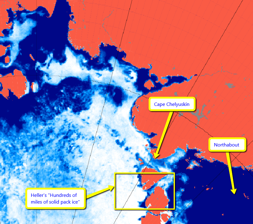
Please forgive my mixing of metaphors this morning, but the interminable stream of piss poor propaganda from Tony Heller grows ever more voluminous. Not only has he reprised his “DMIGate” nonsense but he is also posting pictures of the wrong bit of the Arctic yet again. Exhibit A:
DMI shows Arctic sea ice extent well below last year, and near a record low.
In fact, there is more ice than last year, and it likely that 2016 will end considerably higher than last year. This is because the big red spot (below) in the Beaufort Sea disappeared in a storm during the second week of August last year.
The forecast is for very cold air over the Beaufort Sea the next two weeks, so it is unlikely that a lot of melting is going to occur there. This is shaping up to be a disastrous year for Arctic alarmists, and it will be interesting to see how the graphs progress, and if and when they catch up with reality.
DMI aren’t the only ones that “show Arctic sea ice extent well below last year”:
The clouds over the Northeast Passage have finally cleared, and you can now see what our intrepid explorers are up against. Hundreds of miles of solid pack ice.
I pointed out the error of his ways to him yesterday, but for some strange reason Tony is still posting pictures of the wrong place. Here is an overview of the actual facts, as assessed by AMSR2:
It is if you believe Tony Heller, which I humbly suggest is not a particularly wise course of action at the best of times. In his umpteenth article on Northabout’s Great Adventure over the last four days he dares to take your humble scribe’s name in vain as he loudly proclaims:
I cannot help but think that sorting the wheat from the unReal Scientific chaff will be required as the “debate” proceeds, and so:
Them
Jim Hunt (and Blowtorch Reggie) are egging the ship of fools on to disaster, telling them that the ice is receding. And the intrepid fools are listening to them.
It has been persistently cloudy in the Northeast Passage, and the ice is not melting.
[Cloudy image redacted]
The ice edge has pushed back slightly due to winds.
The animation below shows how the wind has shifted the ice over the last couple of days, and how the route is blocked with hundreds of miles of 1-2 meter thick ice.
Reggie also egged the 2013 Arctic rowers on to near disaster, before they had to abandon their boat.
Now please explain to me precisely how “Snow White” is “egging on” anybody by posting the satellite visualisation that you have kindly reproduced above?
It does after all reveal that the ice edge at the Kara Sea end of the Vilkitsky Strait has recently receded, as predicted.
Them
They aren’t going anywhere without an icebreaker. Why are you giving them false hope?
Us
I’m not “giving them false hope”. I’m reporting on some interesting (IMHO) Arctic facts, as per usual. In this instance it seems a few other people find them interesting also.
It seems we’re all agreed that “The ice edge has pushed back slightly due to winds” since your map above shows that too, albeit with reduced resolution?
FYI “Snow White” is sobbing uncontrollably into her snow white hanky as we speak. She’s still blocked by “Steve Goddard”
Whilst we’re on the subject, I thought you were of the view that those who block polite enquirers on Twitter are “probably attempting to pull off a Michael Mann sized fraud on the public.”?
According to the old saying “A change is as good as a rest”, so rather than plagiarise today’s title from a “skeptical” web site we’ve invented this one all by ourselves. Northabout is a small yacht with big ideas. (S)he wants to circumnavigate the North Pole in one summer season. However certain cryoblogospheric commenters are somewhat skeptical that this can be achieved this year. Take Tony Heller for example:
There has been very little melt going on in the Arctic Ocean the last few days, due to cold cloudy weather.
A group of climate clowns were planning on sailing around the entire Arctic Ocean through the Northeast and Northwest Passages (to prove there isn’t any ice in the Arctic) but are stuck in Murmansk because the Northeast Passage is completely blocked with ice.
The “group of climate clowns” aboard Northabout that Mr. Heller refers to are led by David Hempleman-Adams. According to the Polar Ocean Challenge web site:
David is one of the most experienced and successful adventurers in the world.
In his forty years as an adventurer, David was the first person to reach the highest peaks on all seven continents and journey fully to the North and South Geographical and Magnetic Poles. He has broken forty-seven Federation Aeronautique Internationale ballooning records
My name is Tony Heller. I am a whistle blower. I am an independent thinker who is considered a heretic by the orthodoxy on both sides of the climate debate.
I have degrees in Geology and Electrical Engineering, and worked on the design team of many of the world’s most complex designs, including some which likely power your PC or Mac. I have worked as a contract software developer on climate and weather models for the US government.
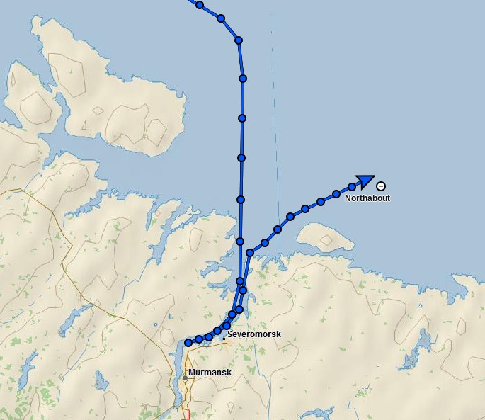
However despite Tony’s long list of qualifications he is evidently currently quite confused, since according to the Polar Ocean Challenge live tracking map David and Northabout are not in actual fact “stuck in Murmansk” at all:
This shouldn’t come as surprise to anyone with an internet connection and a desire to check the facts, since as we speak there is currently remarkably little sea ice cover on the Atlantic side of the Arctic Ocean:
Hence Northabout should find the next leg of his/her voyage across the Barents and Kara Seas pretty plain sailing. However Vilkitsky Strait, the passage from the Kara into the Laptev Sea, is currently looking a trifle tricky:
NASA Worldview “true-color” image of the Vilkitsky Strait on July 20th 2016, derived from the MODIS sensor on the Terra satellite
Do you suppose Tony Heller suffers from precognitive dreams?
[Edit – July 22nd 2016]
According to Environment Canada this morning there’s a 988 hPa central pressure cyclone causing a bit of a blow in the Vilkitsky Strait at the moment:
Sea and air temperature getting colder as we venture further north. Saw quite a lot of Dolphins for the first time around the Yacht. Still sea gulls flying behind and skimming the waves.
Had some promising Canadian ice charts yesterday, but that’s a long way off. Today we should get an update with the Russian side. fingers crossed it is still not solid around the cape and Laptev sea. That could slow us down considerably. The wind has been blowing the pack ice against the land, so very difficult to get around the shore, but let’s see what Santa brings.
P.S. Maintaining his usual modus operandi, Tony Heller has penned a new article today, containing a satellite image remarkably similar to the one just above. Under the headline “The 2016 Franklin Expedition” he tells his loyal readership:
The Polar Ocean Challenge is headed off into the ice.
They will run into this in three days – hundreds of miles of solid ice. Without an icebreaker, they are going nowhere. I asked them on Twitter if they have an icebreaker. I haven’t received a response, and will be monitoring them by satellite to see if they are cheating.
By some strange coincidence we’re “monitoring them by satellite” too:
As for ice melt, yet another totalitarian propaganda expedition intended to “raise awareness” of climate “catastrophe” by trying to sail around the Arctic in the summer has just come a cropper owing to – er – too much ice. Neither the North-East Passage nor the North-West Passage is open, so the expedition is holed up in – of all ghastly places – Murmansk. That’ll teach Them.
However my corrective comment has yet to see the light of day at WUWT:
Meanwhile Northabout resolutely presses on regardless, and has just passed 74 degrees North:
whilst the sea ice edge in the north-eastern Kara Sea has retreated somewhat over the last three days:
NASA Worldview “true-color” image of the Vilkitsky Strait on July 23rd 2016, derived from the MODIS sensor on the Terra satellite
Here’s the July 20-22nd AARI map of the Vilkitsky Strait area:
On the topic of Arctic sea ice melt in general Viscount Monckton opines over on WUWT that:
According to the National Snow and Ice Data Center’s graph, also available at WUWT’s sea-ice page, it’s possible, though not all that likely, that there will be no Arctic icecap for a week or two this summer:
Even if the ice disappears for a week or two so what? The same was quite possibly true in the 1920s and 1930s, which were warmer than today in the northern hemisphere, but there were no satellites to tell us about it.
The Good Lord seems to have a very tenuous grasp on reality, since the NSIDC’s graph shows nothing of the sort. Perhaps he is merely indulging in irony?
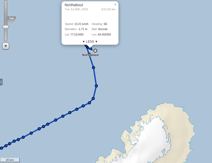
[Edit – July 24th 2016]
Northabout passed the 75 degrees North milestone overnight:
Clouds obscure the Vilkitsky Strait in visible light this morning but passive microwaves make it through the murk, albeit with reduced resolution. They reveal the sea ice edge in the Kara Sea receding and a narrow passage opening up along the Northern side of the Strait (North is down in the image):
NASA Worldview passive microwave image of the Vilkitsky Strait on July 24th 2016, derived from the AMSR2 instrument on the Shizuku satellite
According to Ben Edwards’ latest blog post from the Barents Sea:
I just wore a T-shirt on my first watch out of Murmansk. Today I wore my trawler suit and a primaloft under it with gloves and a hat….
As the cryodenialosphere continue to retweet and reblog their regurgitated rubbish here’s a picture from last year of Northabout amidst some ice, especially for those apparently unable to distinguish a small yacht from a large icebreaker:
Meanwhile Arctic sea ice continues its inexorable decline:
[Edit – July 24th 2016 PM]
Shock News! Tony Heller has just published yet another article about Northabout’s Great Adventure, and yours truly gets a mention. In the headline no less!! Read all about it at:
Meanwhile the commenters over at unReal Science keep blathering on about icebreakers even though one of the more inquisitive denizens posted thisextract from the “Ship’s Log” over there yesterday:
Partly checked the new ice charts on www.nsra.ru, we still have no chance of getting through yet, not past the cape or through the Laptev sea. Nikolai, Our Russian Captain who is very familiar with this route, impresses on me that this is a very unusual year and normally clear, Not what I want to hear. We are under sail, so saving fuel, and will find a small island to shelter until we get improvements. We are still 5 days from the ice, so lets hope for some southerly winds to push the ice from shore.
Northabout is heading for the Kara Sea past the northern tip of Novaya Zemlya, and has now passed 76 degrees North:
[Edit – July 25th 2016]
The skies are still cloudy over the Vilkitsky Strait and Cape Chelyuskin, so here’s another AMSR2 passive microwave visualisation of the state of play. Note the change of scale:
NASA Worldview passive microwave image of the Vilkitsky Strait on July 25th 2016, derived from the AMSR2 instrument on the Shizuku satellite
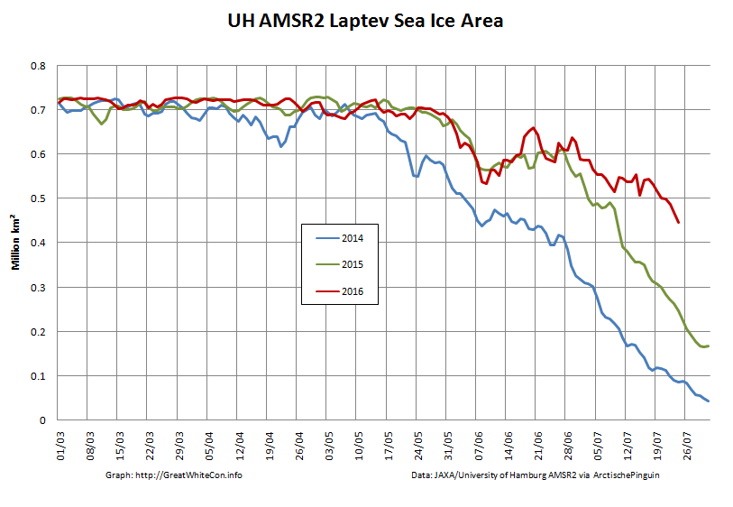
The sea ice area in the Laptev Sea has finally started decreasing at a more “normal” rate for late July, but still has a lot of catching up to do compared to recent years:
Meanwhile over at “Watts Up With That” at least one reader of Christopher Monckton’s purple prose is clearly confused. Needless to say my clarifying comment is still invisible to him:
Finally, for the moment at least, here’s some moving pictures of dolphins having fun in the Barents Sea:
[Edit – July 26th 2016]
I was expecting Northabout to have entered the Kara Sea by now, but instead (s)he has headed north, and is now well above the 77th parallel:
It’s still pretty cloudy up there so here once again is the latest AMSR2 passive microwave visualisation of the Vilkitsky Strait area, with a few place names added for a bit of variety:
NASA Worldview passive microwave image of the Vilkitsky Strait on July 26th 2016, derived from the AMSR2 instrument on the Shizuku satellite
P.S. The Polar Ocean Challenge team explain via Twitter:
@GreatWhiteCon Ha ha! Thanks for interest! Waiting game, manoeuvring, strategy. Difficult to update in choppy conditions! New SHIPSLOG now
— PolarOceanChallenge (@PolarOceanChall) July 26, 2016
Choppy sea, taking four hour tacks. These sea conditions make it hard to sleep, cook or relax.
We are considering many elements all the time. We are due new Russian Ice charts today.
We know the North west is pretty clear, but this year is a very unusual year in the north east passage. Normally the Laptev Sea would be pretty open now as in previous years. It is not. This is also partly due to the wind blowing the pack ice down south and consolidating next to the land.
So, we need to get through the straight and through the Laptev Sea. So where do we wait until we can do this? We have deliberately taken our time to get to this point, and used the wind as much as we can to conserve fuel.
Now the weather has changed, the wind direction has also changed. From the calm turquoise seas, to choppy short seas, wet, windy and cold.
So we took a long tack north, and then tacked east again. There is No hurry. We will slowly make our way east, and if we can find an island with no fast ice around, will look for a sheltered spot, until we get better ice conditions.
The other options are to Heave to and wait, but this is a sailing Yacht, she needs to sail. And if we get a Southerly blow, it could change our chances very quickly to get around, so we need to be close to react.
So, another day at the office.
There was a report on the BBC Radio 4 Today programme this morning from the crew of Northabout, and an interview with Dr. Ed Blockley from the UK Met Office about the current state of sea ice in the Arctic:
Note in particular the part at 2:59:00 where Justin Webb says to Ed:
I thought that I’d read somewhere that [Northabout] had got stuck.
I cannot help but wonder what on Earth gave him that idea?
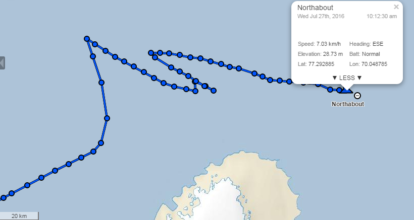
[Edit – July 27th 2016]
After “going round in circles” north of Novaya Zemlya yesterday Northabout is now heading East across the Kara Sea:
Synthetic aperture radar images from the European Space Agency’s Sentinel 1A satellite have started flowing through Polarview once again, so here’s one of where Northabout is heading:
Sentinel 1A synthetic aperture radar image of the Vilkitsky Strait on July 26th 2016
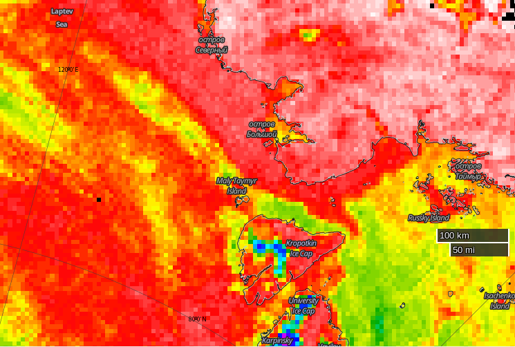
Here’s the current Arctic and Antarctic Research Institute map of the same area:
There’s still no way through by which Northabout might avoid an encounter with 9-10 tenths sea ice coverage. Then of course there’s the Laptev Sea to contend with too. Here’s the latest AMSR2 visualisation from the University of Hamburg:
It’s not exactly plain sailing there either just yet!
[Edit – July 28th 2016]
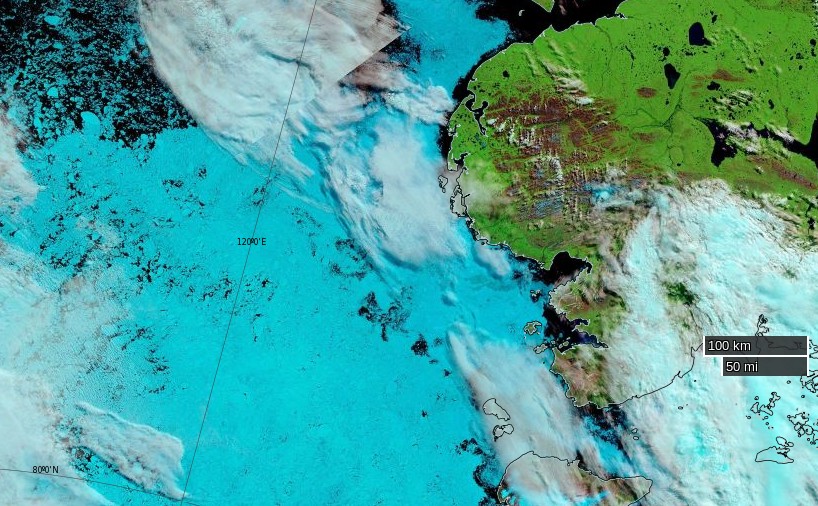
This morning Northabout has almost reached 79 degrees East, and appears to be heading in the direction of Ostrov Troynoy:
The clouds over the Laptev Sea have cleared somewhat as the recent cyclone heads for the Beaufort Sea, to reveal that the “brick wall” of ice referred to in certain quarters now looks more like Swiss cheese:
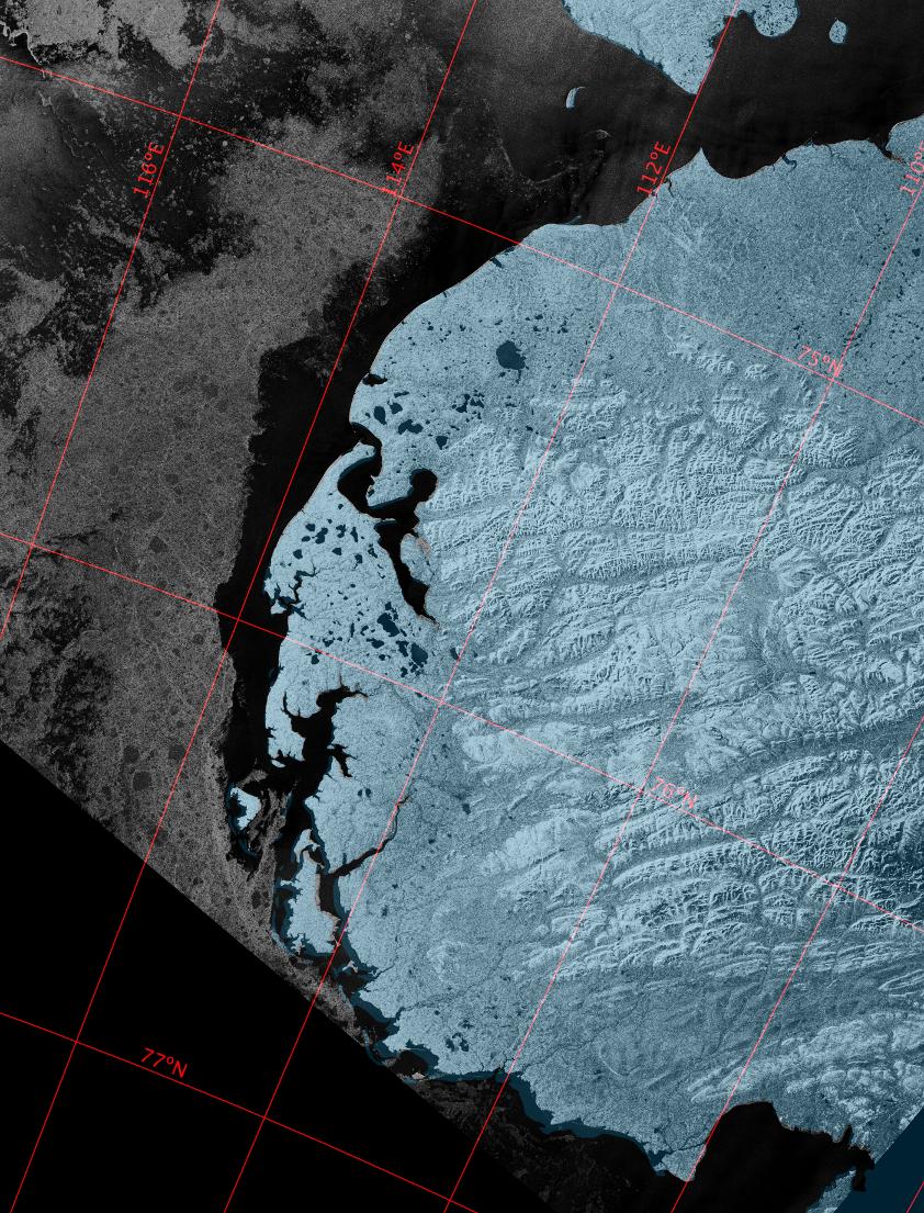
NASA Worldview “false-color” image of the Laptev on July 28th 2016, derived from the MODIS sensor on the Terra satellite
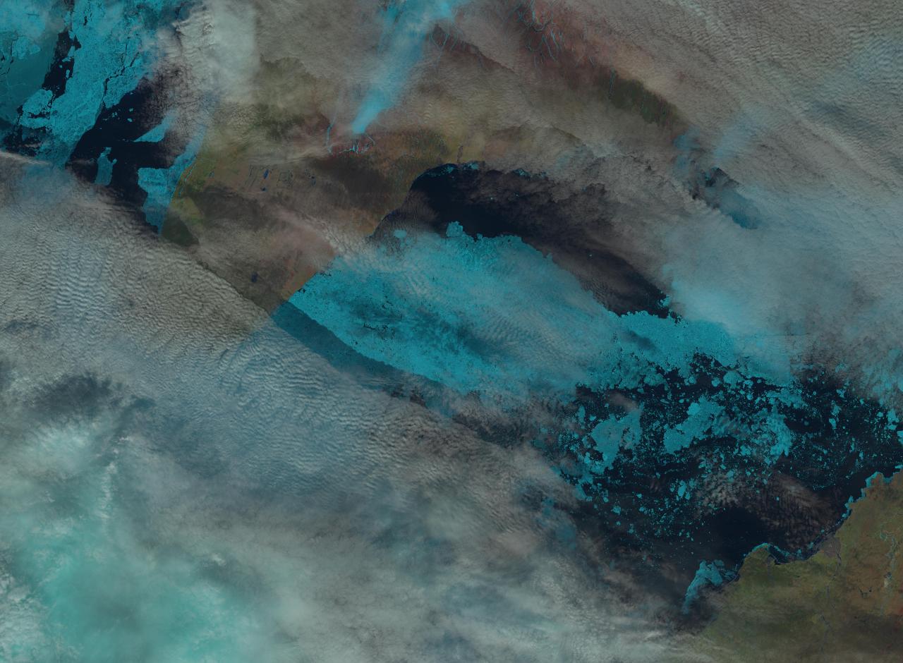
Here’s a close up look at the Vilkitsky Strait from the Landsat 8 satellite this morning. Note that unlike the MODIS image above, north is at the top of this one:
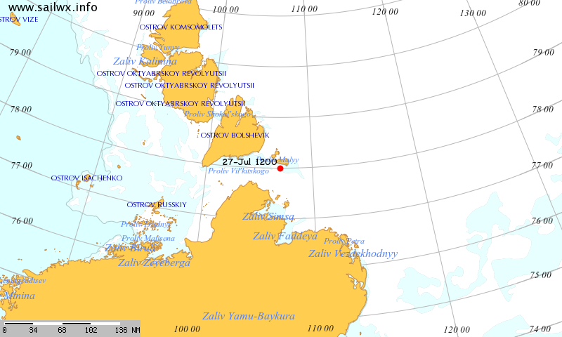
Meanwhile according to SailWX the Russian icebreaker Yamal is traversing the Vilkitsky Strait from east to west:
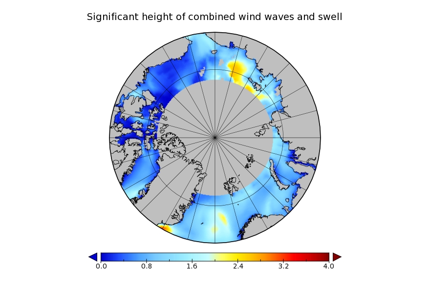
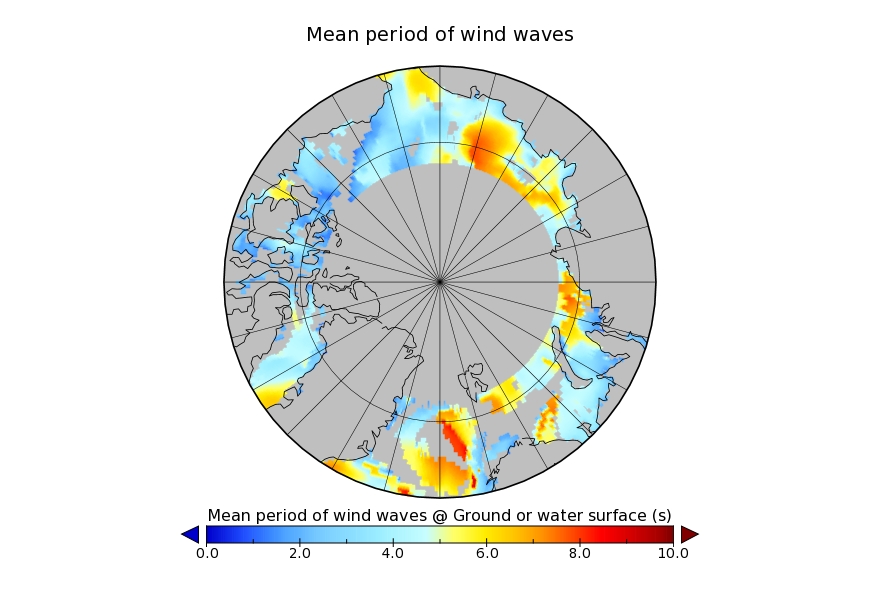
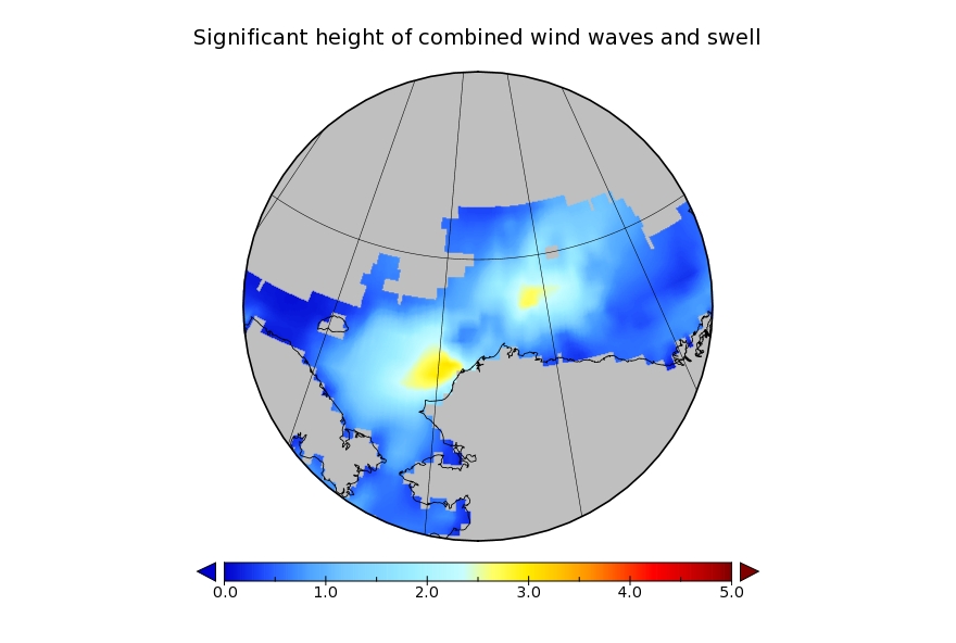
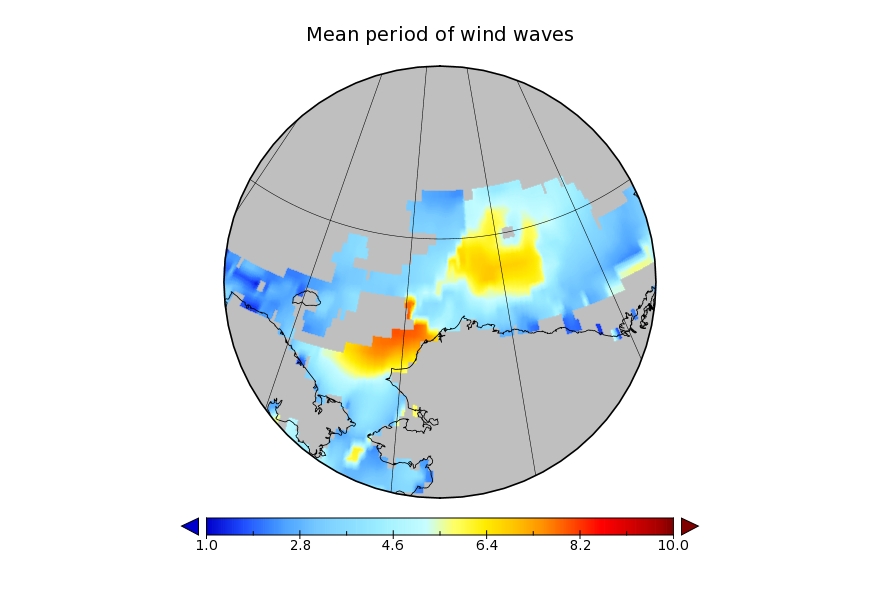
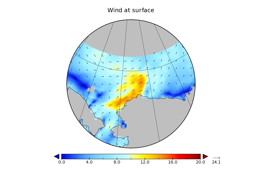
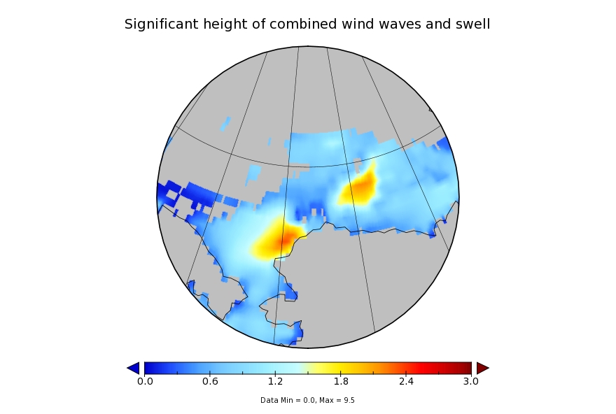
It looks like a storm is brewing in the Arctic. The long range weather forecasts for the Arctic have been remarkably unreliable recently, but this one is for a mere three days from now. WaveWatch III suggests there will be some significant waves in the Chukchi and Beaufort Seas this coming weekend, travelling in the direction of the ice edge:
WaveWatch III wave height forecast for July 17thWaveWatch III wave period forecast for July 17thWaveWatch III wind forecast for July 17th
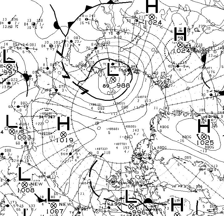
Another day has dawned, and the Environment Canada synoptic chart shows that the low pressure system currently over the Arctic has reached a central pressure of 990 hPa:
The latest ECMWF SLP forecast for tomorrow is firming up:
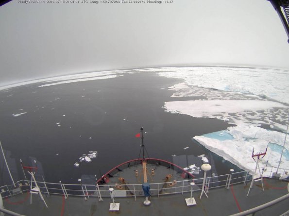
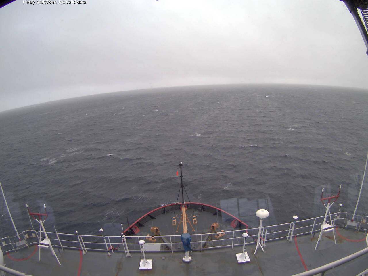
A modest swell is now visible from USCGC Healy’s “AloftCon” webcam:
whilst the WaveWatch III forecast for tomorrow has dropped off to a significant wave height of around 2 metres with an average period of 7 seconds:
Meanwhile an image from the VIIRS instrument on the Suomi NPP satellite reveals the current storm in all its glory, together with confirmation that the “Big Block” multi-year ice floe north of Barrow has split asunder overnight:
[Edit July 17th 2016]
Sunday morning has now arrived. The storm in the Arctic looks to have bottomed out at 986 hPa central pressure. Here’s the Environment Canada synoptic chart for 00:00 this morning:
This is how the resultant swell looked from USCGC Healy at 06:00:
[Edit July 18th 2016]
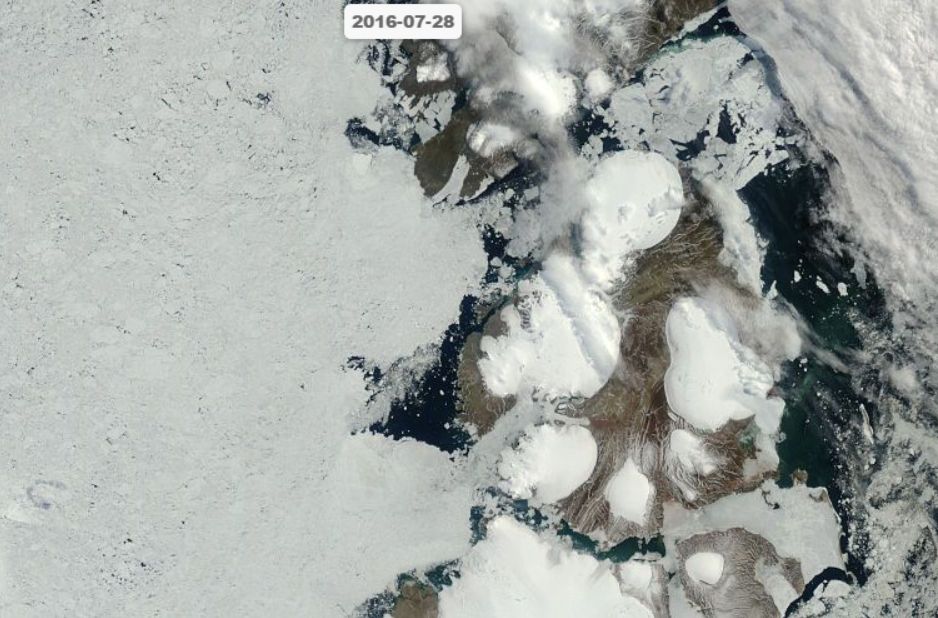
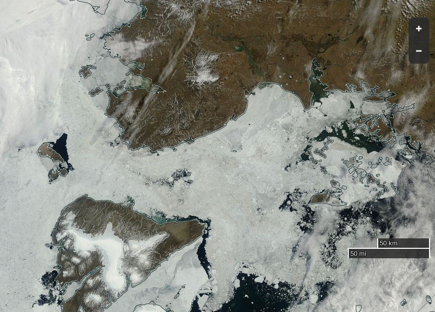
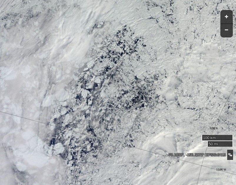
Here’s what the Beaufort and Chukchi Sea north of Barrow look like this morning through the clouds:
NASA Worldview “true-color” image of the Beaufort Sea on July 18th 2016, derived from the MODIS sensor on the Terra satellite
The remains of the now not so “Big Block” can just be made out in the bottom left. For a cloud free image here’s the latest AMSR2 passive microwave imagery of the area from the University of Hamburg:
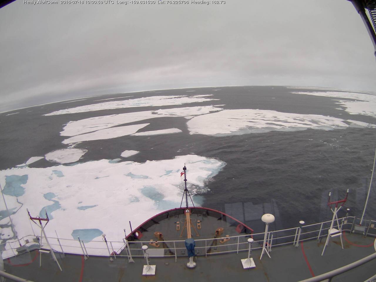
The USCGC Healy and the remnants of the swell are in amongst the ice:
[Edit July 20th 2016]
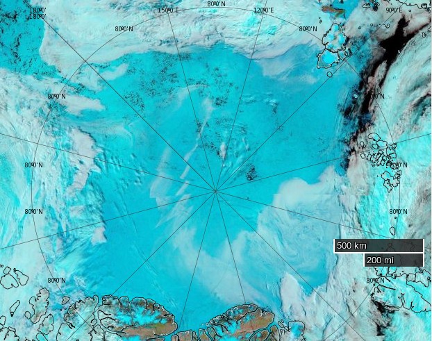
As the remnants of the storm head off across the Canadian Arctic Archipelago here is what it has left in its wake in the Central Arctic Basin:
NASA Worldview “false-color” image of the Central Arctic Basin on July 19th 2016, derived from the MODIS sensor on the Aqua satelliteUniversity of Hamburg AMSR2 concentration visualisation of the Central Arctic on July 19th 2016
[Edit July 21st 2016]
The storm has dispersed the remaining ice in the Beaufort Sea over the last few days:
However across the Arctic as a whole sea ice area continues its downward trend:
This website uses cookies to improve your experience. We'll assume you're ok with this, but you can opt-out if you wish. Cookie settingsACCEPT
Privacy & Cookies Policy
Privacy Overview
This website uses cookies to improve your experience while you navigate through the website. Out of these, the cookies that are categorized as necessary are stored on your browser as they are essential for the working of basic functionalities of the website. We also use third-party cookies that help us analyze and understand how you use this website. These cookies will be stored in your browser only with your consent. You also have the option to opt-out of these cookies. But opting out of some of these cookies may affect your browsing experience.
Necessary cookies are absolutely essential for the website to function properly. This category only includes cookies that ensures basic functionalities and security features of the website. These cookies do not store any personal information.
Any cookies that may not be particularly necessary for the website to function and is used specifically to collect user personal data via analytics, ads, other embedded contents are termed as non-necessary cookies. It is mandatory to procure user consent prior to running these cookies on your website.