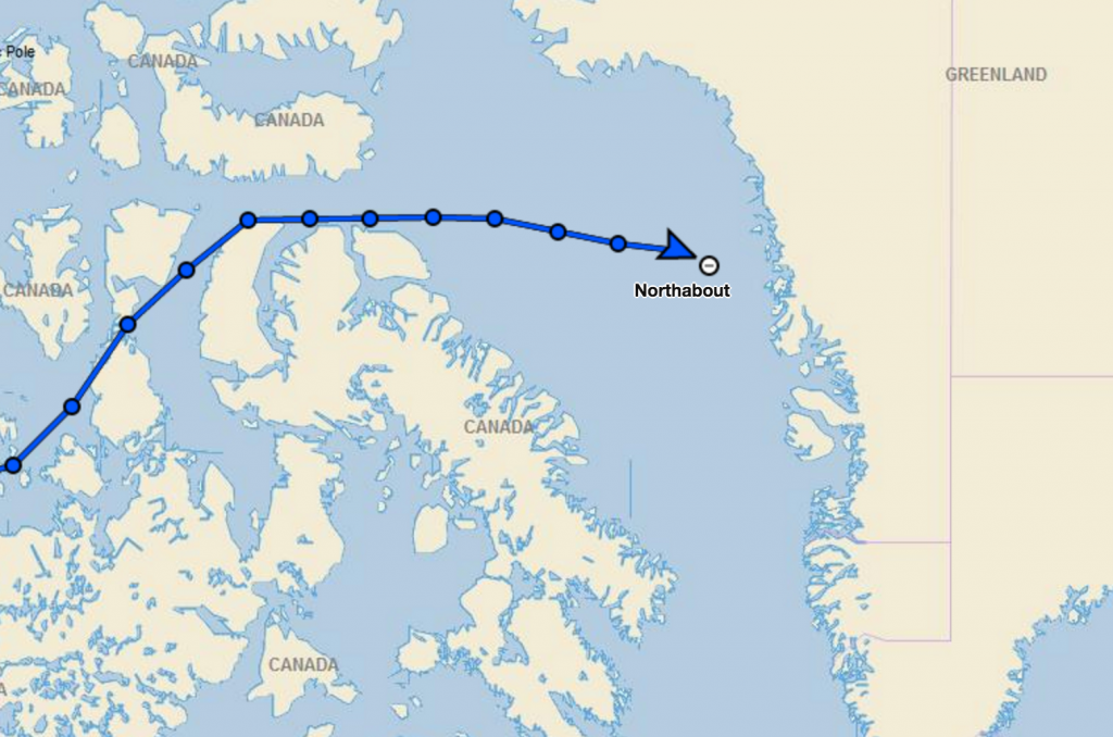
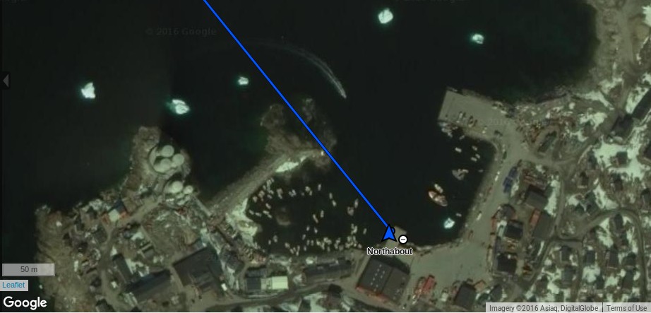
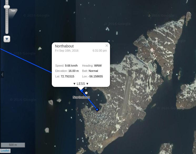
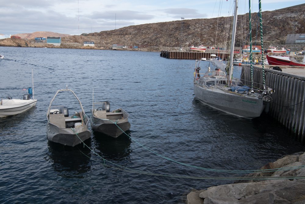
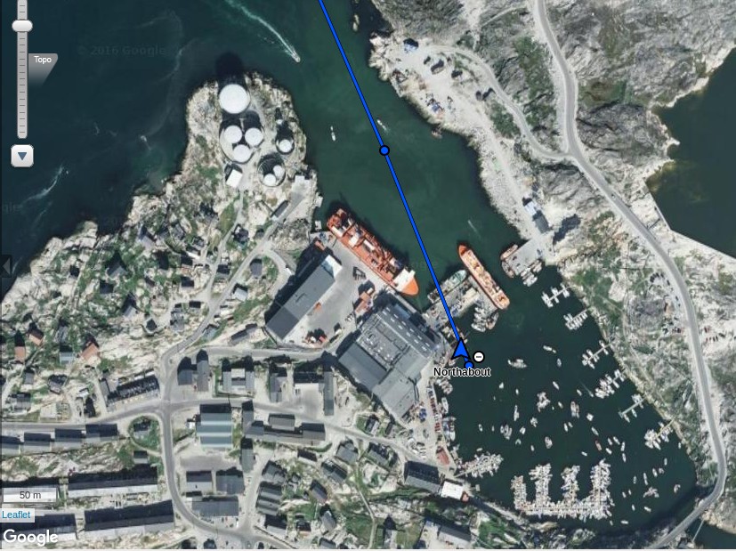
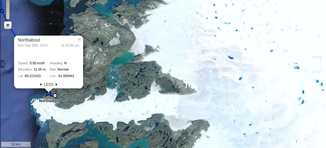
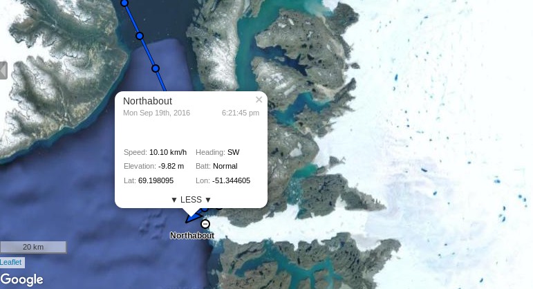
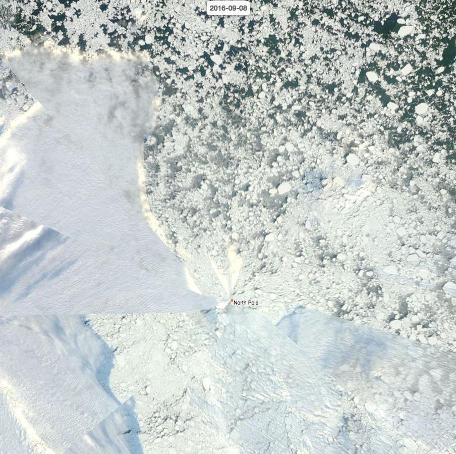
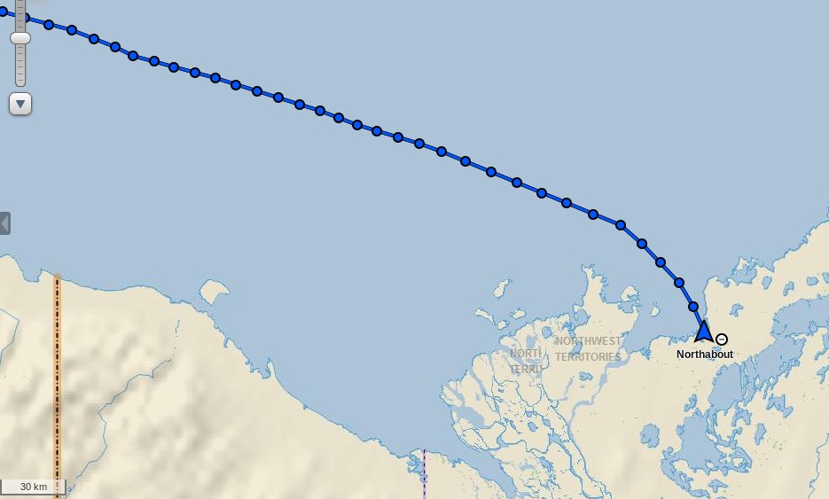
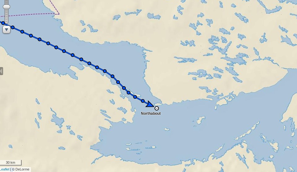
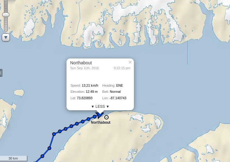
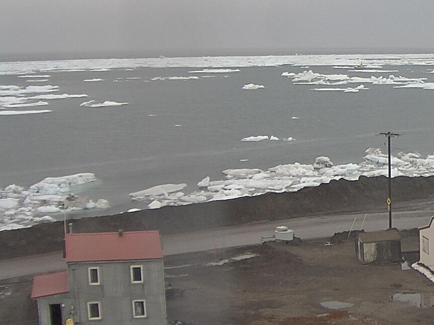
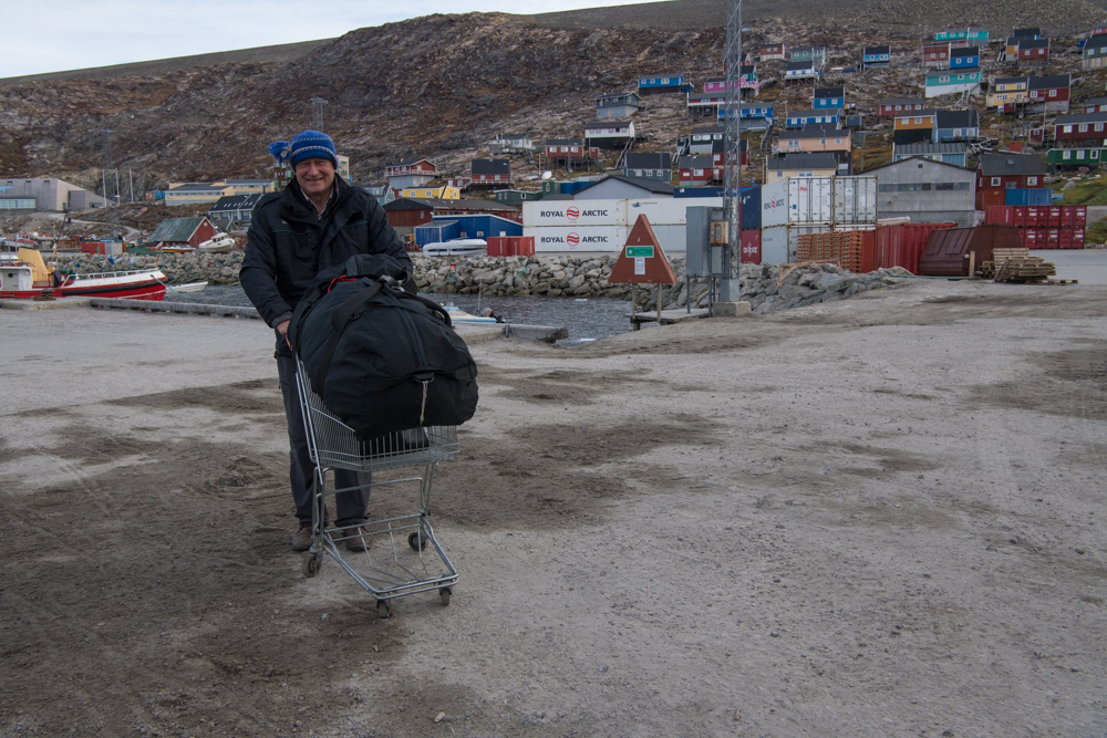
The BBC Radio 4 Today programme broadcast another one of their regular updates on the progress of the Polar Ocean Challenge expedition. On this occasion they were able to interview David Hempleman-Adams, the leader of the expedition. That’s because David disembarked from the yacht Northabout at Upernavik in Greenland:
By now David is back in Blighty, in Swindon to be precise. Here’s a brief extract from his interview with Sarah Montague this morning.
David pointed out that:
We’re not scientists. We weren’t collecting scientific data, and it’s wrong to suggest that our trip, this adventure, will show that there’s less ice. What we’re trying to do is make people more aware of the hundreds of scientists who are doing good work and who actually do show that.
At this juncture you might have supposed that one or more of those “hundreds of scientists” might have been mentioned, but you would have been wrong. Shortly thereafter Sarah asked David:
You will know though that the well known science writer Matt Ridley has written about your expedition and said look there are times in the past where routinely ice has disappeared during the summer, and his argument is that really it doesn’t matter, it doesn’t actually tell us anything.
I fondly imagine that at this juncture David raised his eyes to the heavens over Swindon. After all he’d already explained to Sarah that, rather like Matt Ridley, he isn’t a scientist. What he actually then said was:
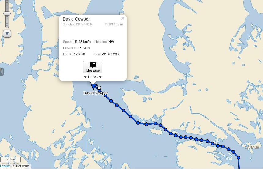
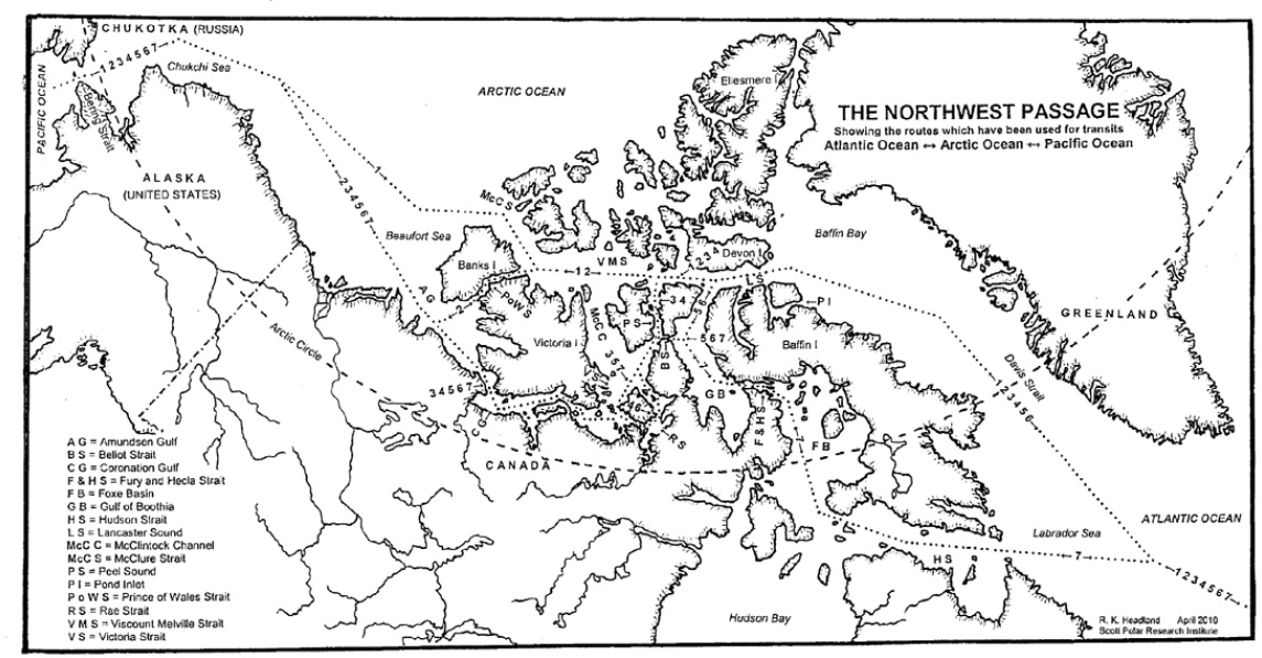
Sure. You know I do know that he’s written that, and other people. But if you look on balance, and you know I’m just one of the general public, if you look on balance, if you look at 99% of the scientists they’re all saying that we’ve got a problem and if you look at the trends, and of course there are trends over the years but what we’re seeing now is really rapid change. If you look at the, as I said, the Northwest Passage it is quite frightening. We didn’t actually see any ice for the entire route up until the Lancaster Sound, which is worrying whatever scientists say or the naysayers say. It is a worrying trend.
And if you look at the cultures, I’ve been going up there for 30 years now, it’s not just sea ice. If you look at these small, little Inuit villages and seen the impact of the climate on some of these places, you know there’s been dramatic change over the last 30 years.
At which juncture Sarah thanked David Hempleman-Adams and Nick Robinson said:
The time is now 26 minutes past eight, and Rob’s got the sports news.
It’s nice to know where the BBC’s priorities lie, and that they prefer to publicise the views of a “coal baron” rather than one or more of “the hundreds of scientists who are doing good work” on the subject of sea ice.
Should you be wondering at this juncture how the opinions of Matt Ridley are at variance with the actual facts take a look at the August 29th article of his in The Times of London that Sarah Montague was referring to:
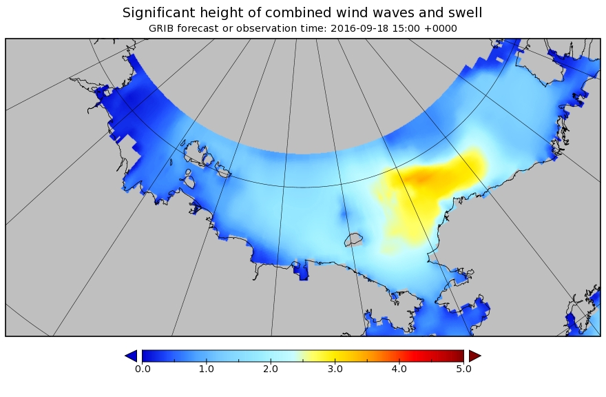
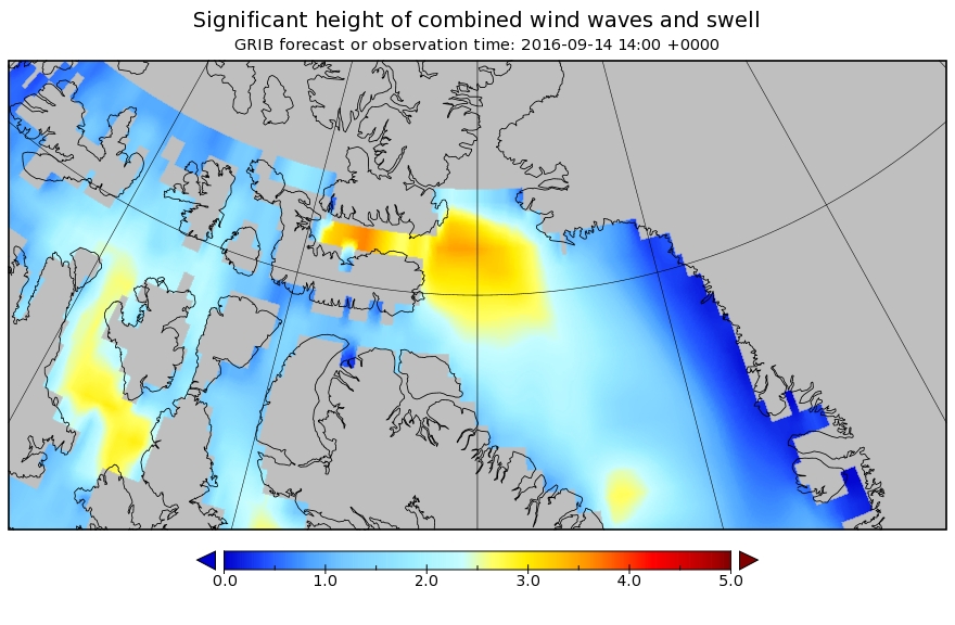
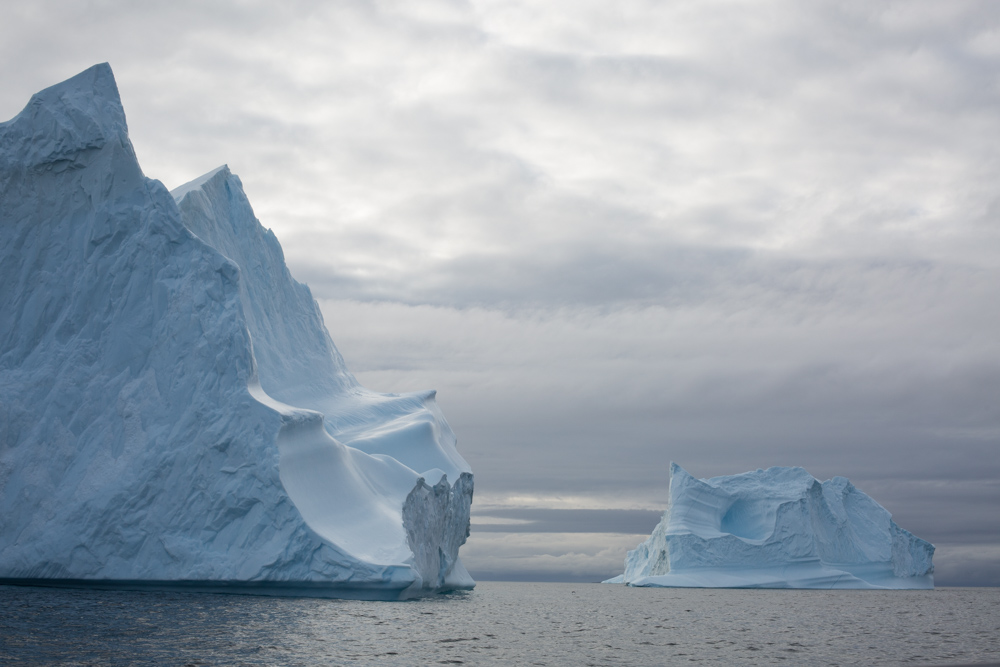
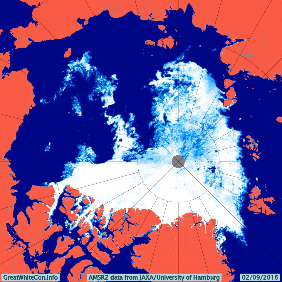
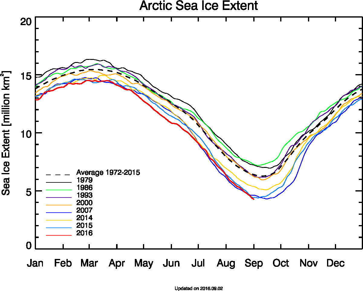
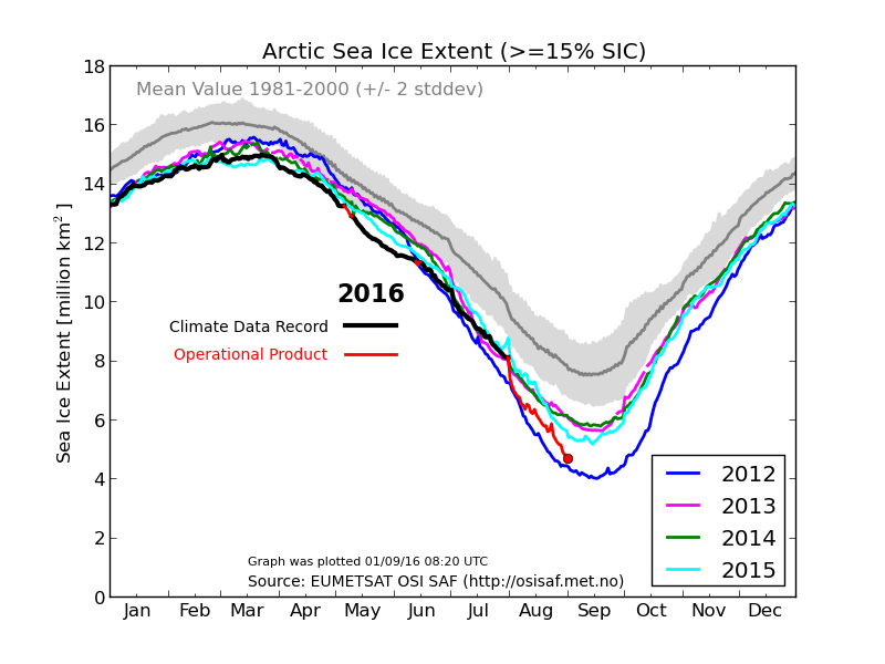
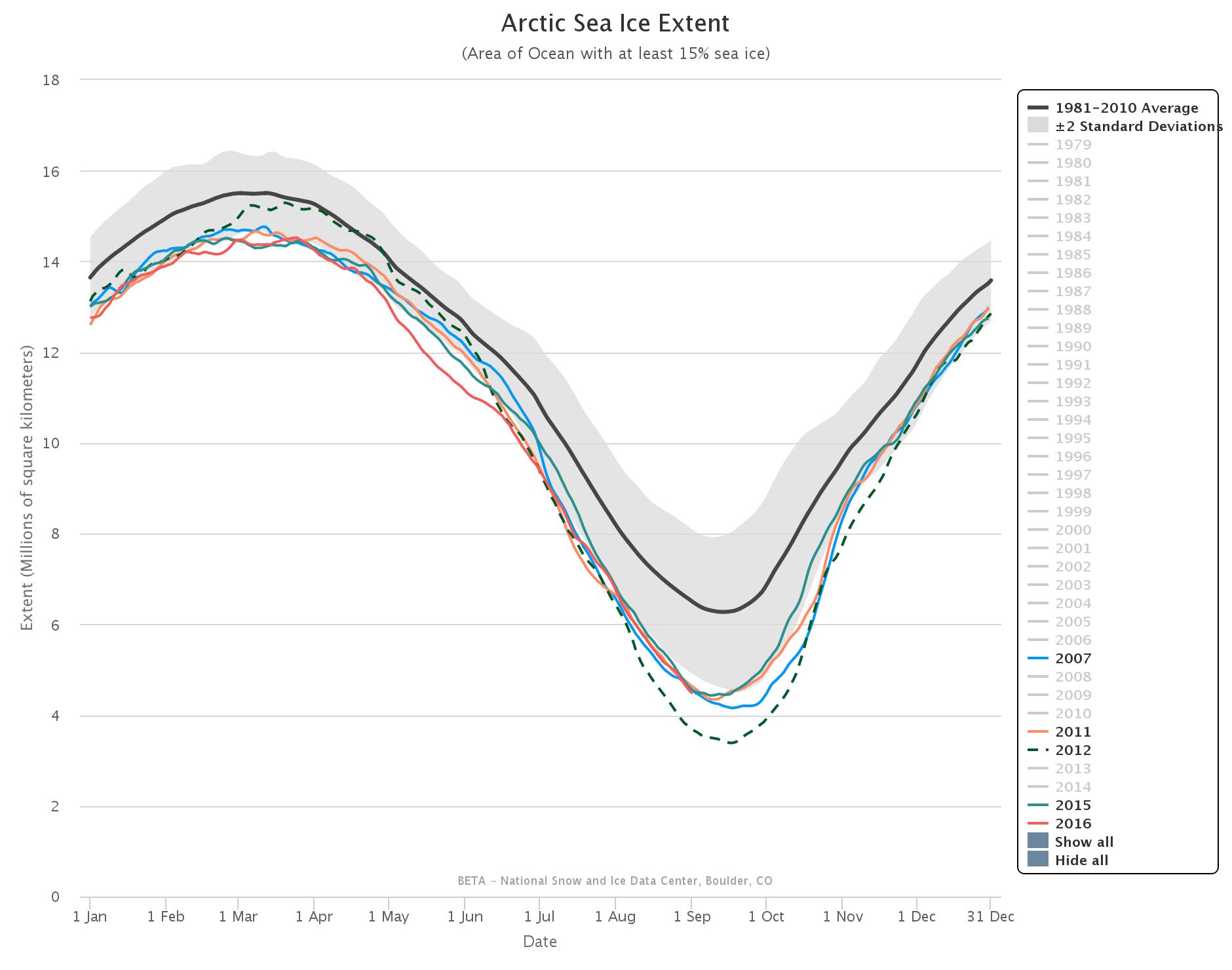
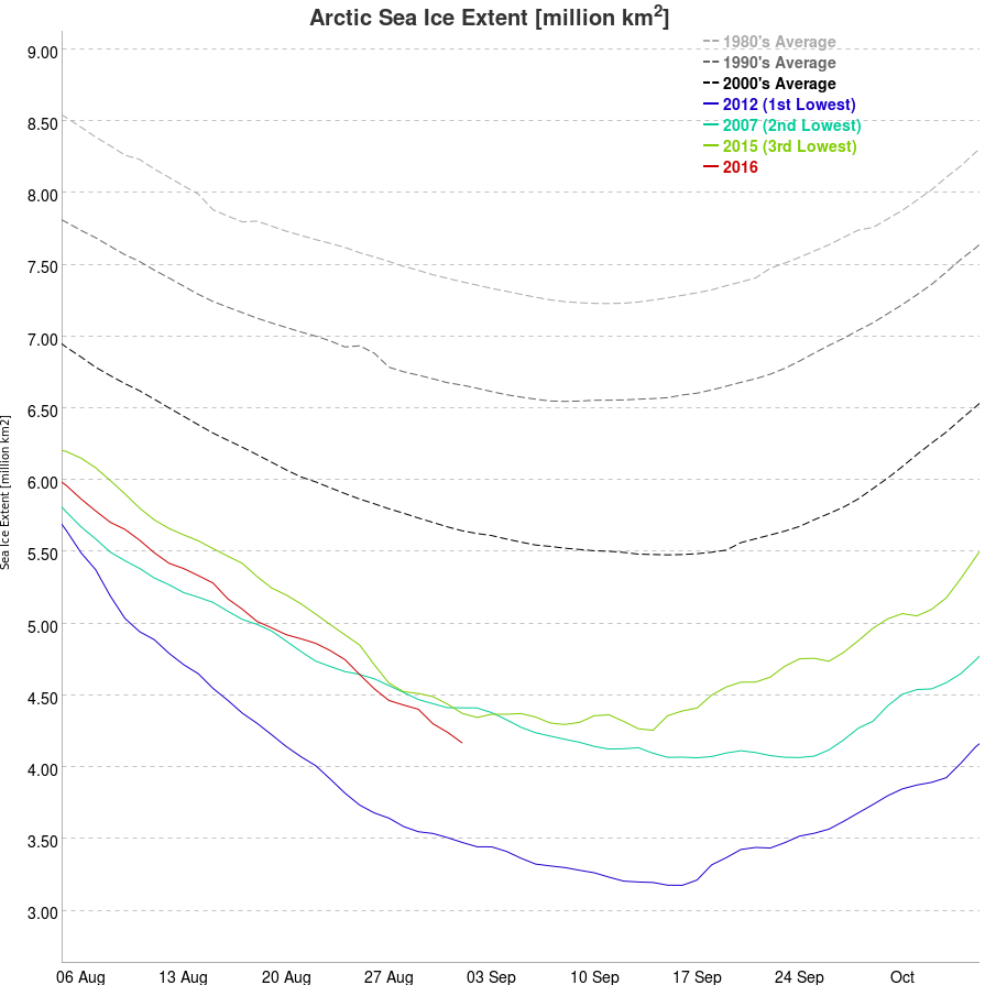
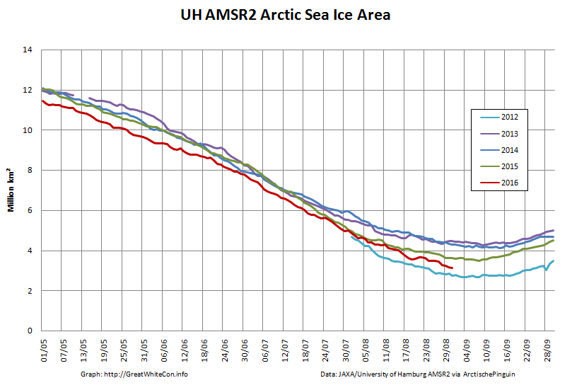
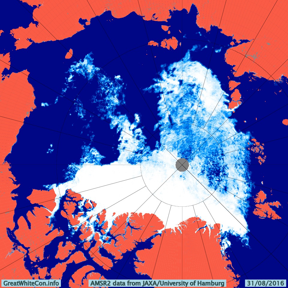
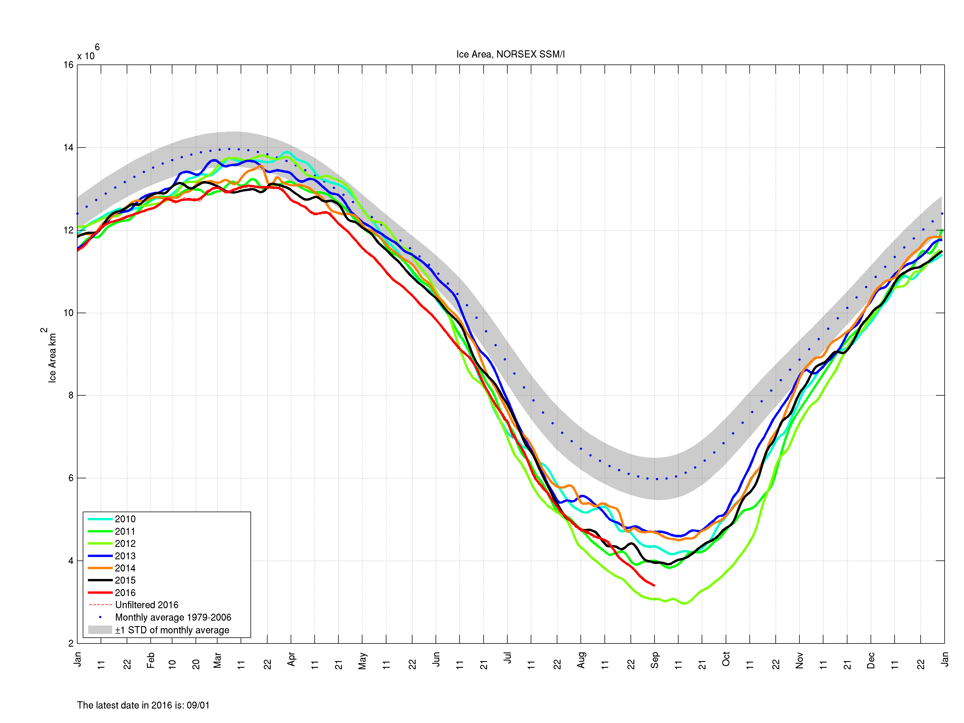
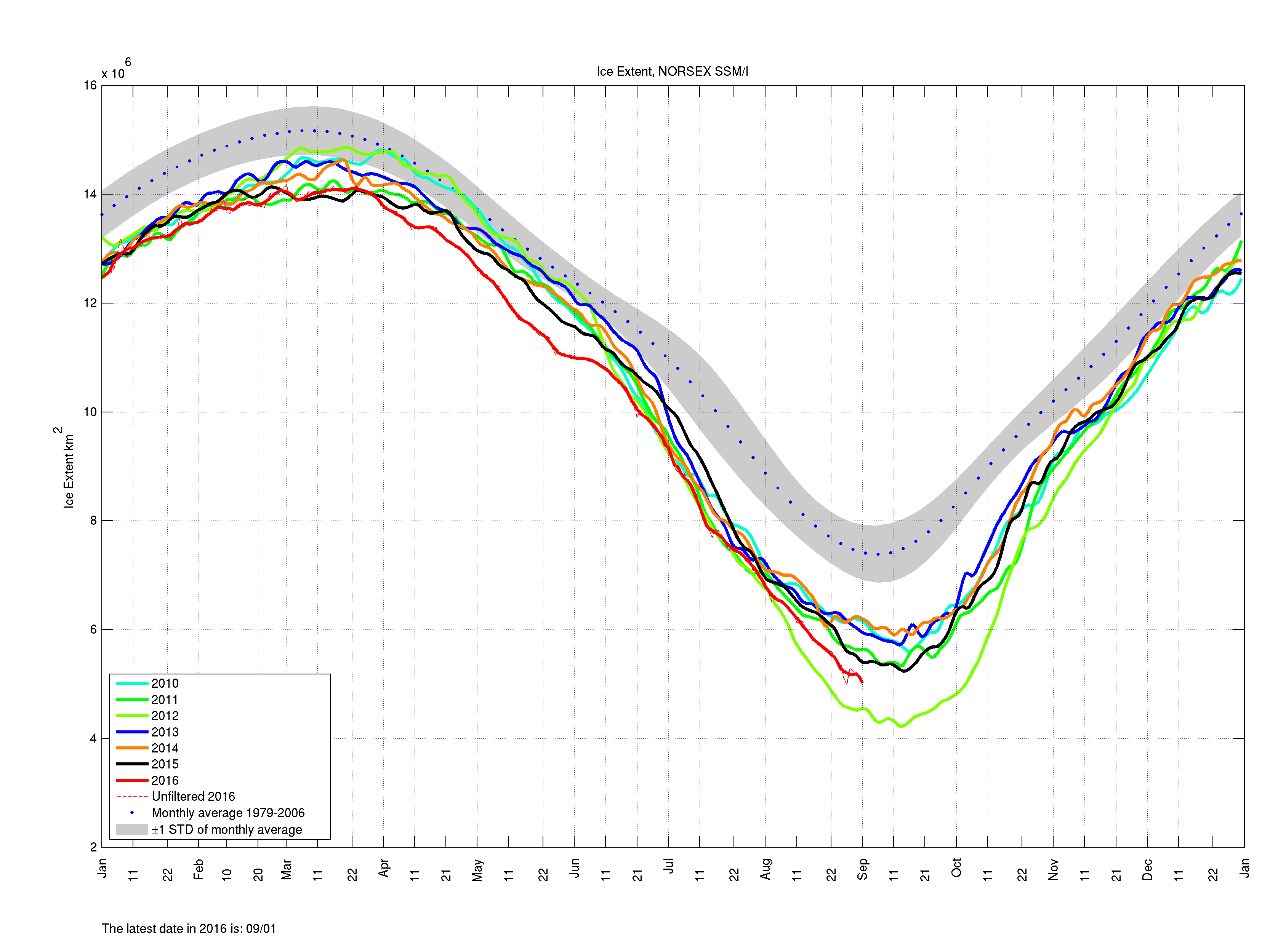
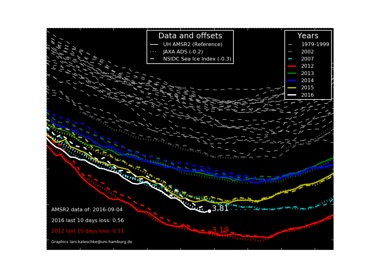
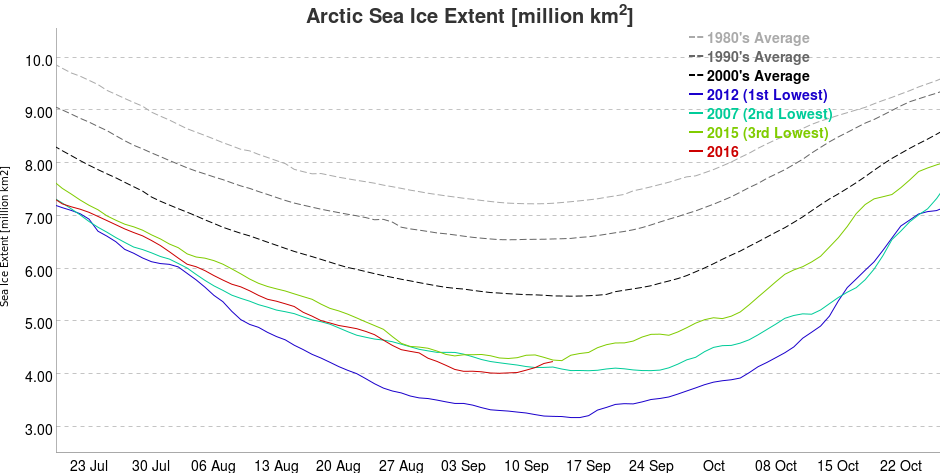
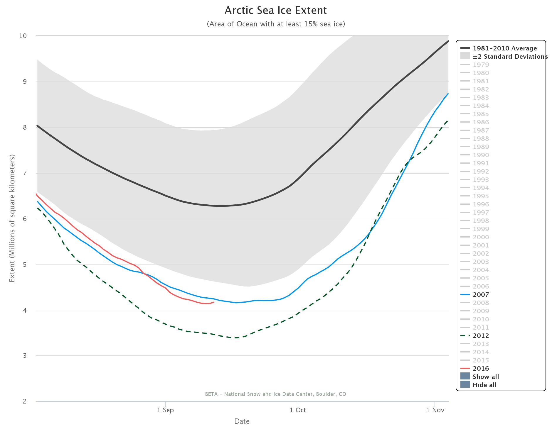
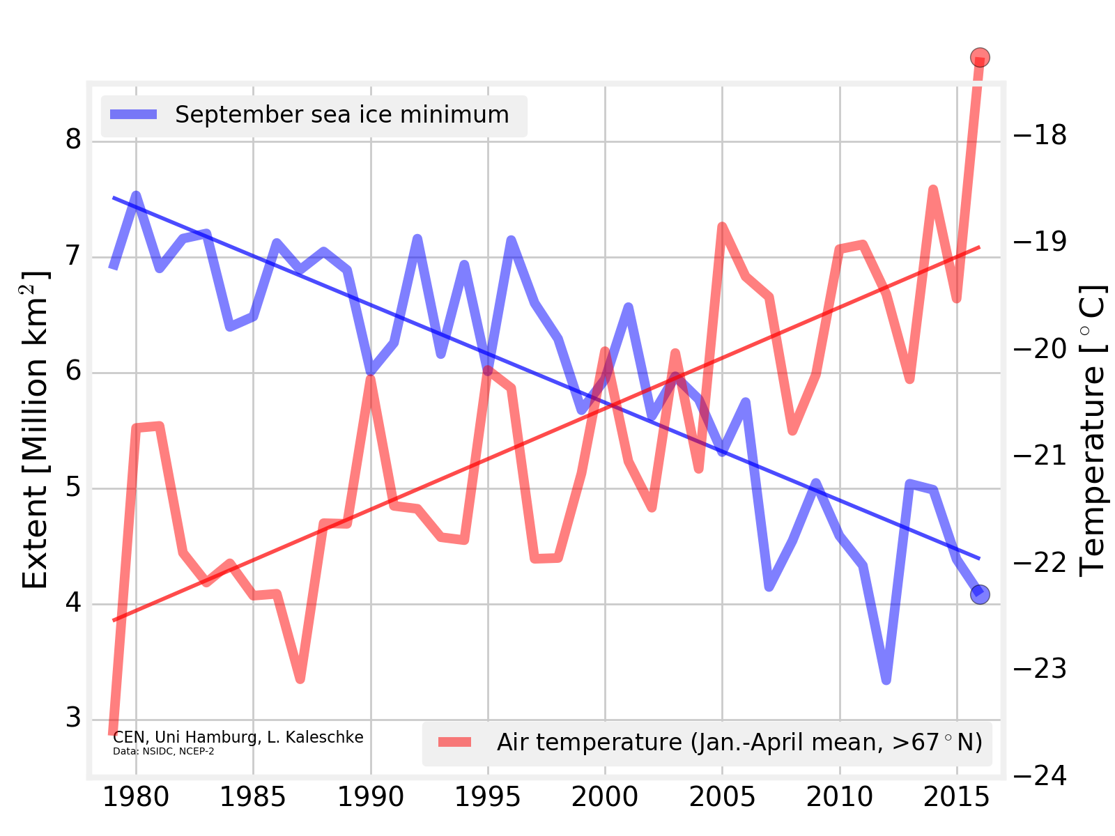
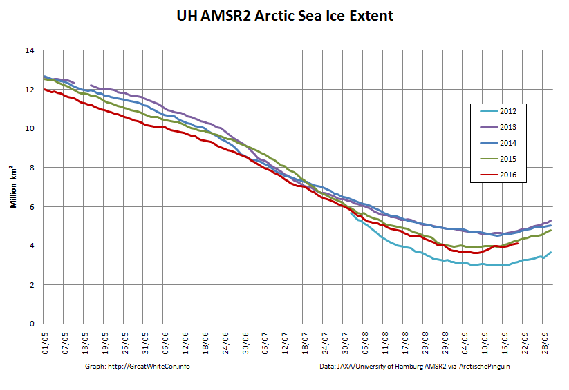
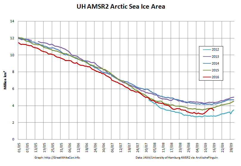
The sea ice in the Arctic Ocean is approaching its annual nadir. By early September each year about two thirds of the ice cap has melted, then the sea begins to freeze again. This year looks unlikely to set a record for melting, with more than four million square kilometres of ice remaining, less than the average in the 1980s and 1990s, but more than in the record low years of 2007 and 2012.
That’s not true Matt.
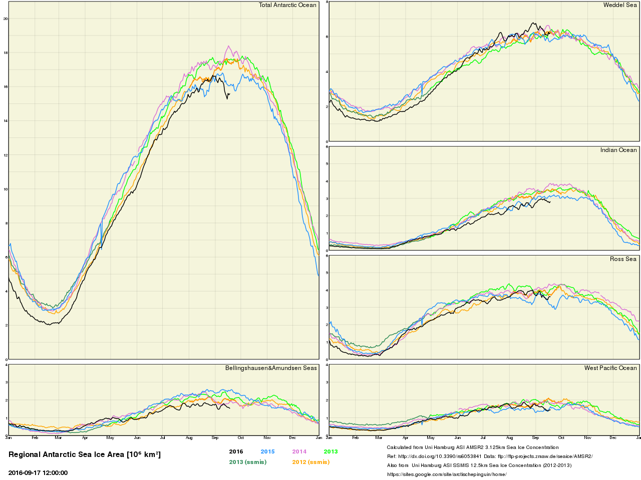
The amount of sea ice around Antarctica has been increasing in recent years, contrary to predictions.
That’s not true Matt.
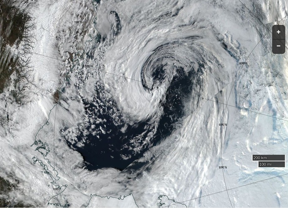
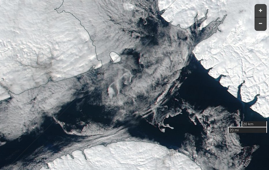
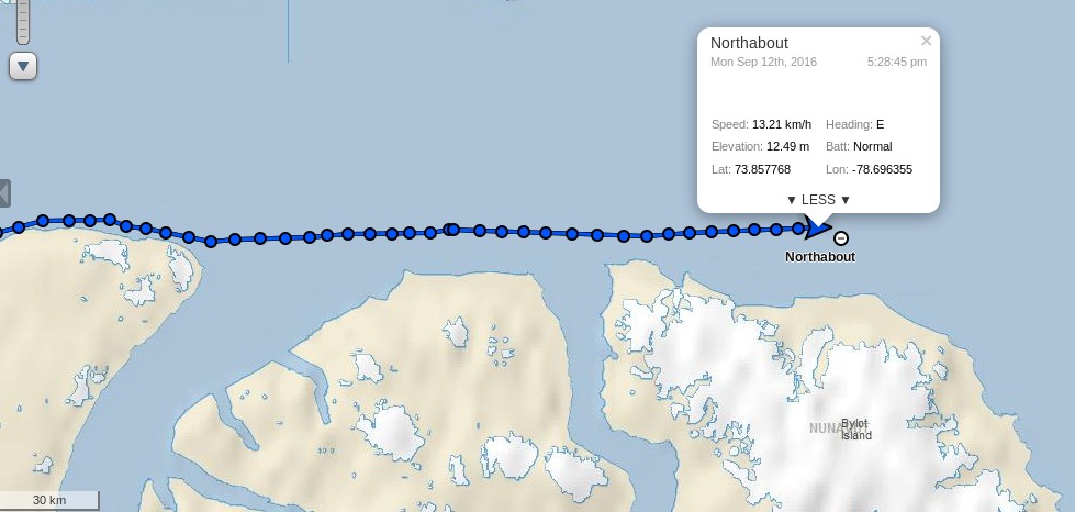
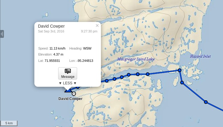
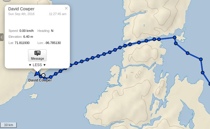
This will disappoint some. An expedition led by David Hempleman-Adams to circumnavigate the North Pole through the Northeast and Northwest passages, intending to demonstrate “that the Arctic sea ice coverage shrinks back so far now in the summer months that sea that was permanently locked up now can allow passage through”, was recently held up for weeks north of Siberia by, um, ice. They have only just reached halfway.
I suppose that’s not too far from the literal truth:
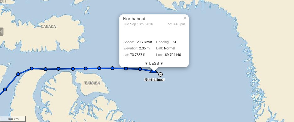
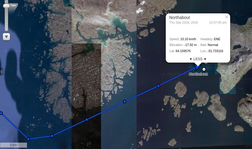
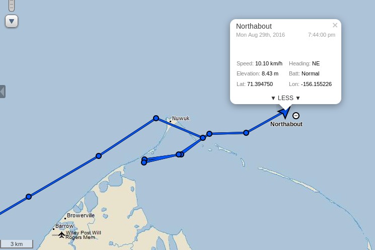
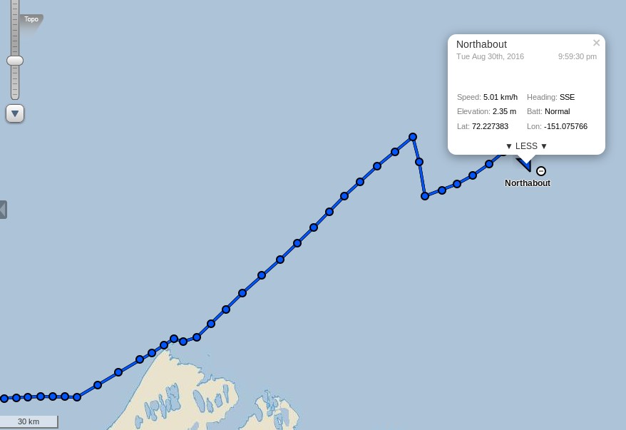
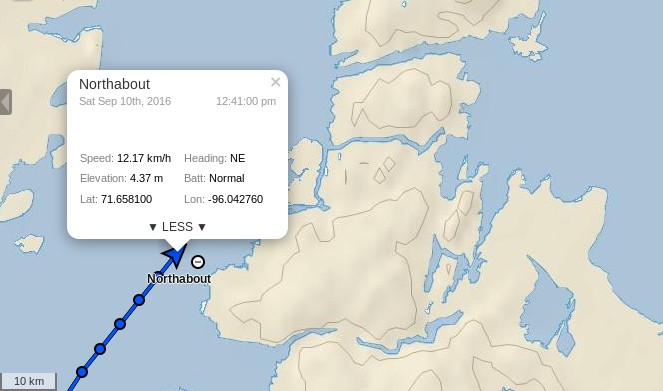
However it’s also extremely misleading. The yacht Northabout reached the International Date Line spot on the original Polar Ocean Challenge schedule, and earlier than previous successful polar circumnavigations managed to achieve.
Must I go on? I suppose so! Skipping several more untruths, a bit later Matt opines:
Would it matter if it did all melt one year? Here’s the point everybody seems to be missing: the Arctic Ocean’s ice has indeed disappeared during summer in the past, routinely. The evidence comes from various sources, such as beach ridges in northern Greenland, never unfrozen today, which show evidence of wave action in the past. One Danish team concluded in 2012 that 8,500 years ago the ice extent was “less than half of the record low 2007 level”. A Swedish team, in a paper published in 2014, went further: between 10,000 years ago and 6,000 years ago, the Arctic experienced a “regime dominated by seasonal ice, ie, ice-free summers”.
Here’s a thought for you to consider Matt. What was the population of London between 10,000 years ago and 6,000 years ago? How about Miami or the Big Apple, or Dhaka for that matter? Has it ever crossed your mind to enquire what the human population of the whole of Planet Earth was “during parts of the early and middle Holocene”, and what sea level around the World might have been at that time?
Answers on a postcard please, in the space provided for that purpose below. We’ll forward them on to the BBC. I don’t suppose Matt will be interested though.
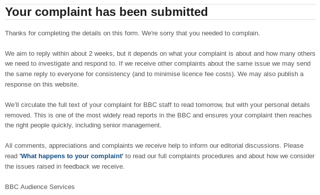
Based on considerable past experience this will not achieve anything, but I have filed a formal complaint via the BBC web site. Here it is:
An extended version of this complaint can be seen at:
https://greatWhiteCon.info/2016/09/radio-four-in-arctic-sea-ice-bias-shock-today/
Note also the comments. In brief:
Sarah Montague was interviewing David Hempleman-Adams about the Polar Ocean Challenge expedition to circumnavigate the Arctic. David pointed out that “We’re not scientists” and “What we’re trying to do is make people more aware of the hundreds of scientists who are doing good work”. If 3rd party comment was deemed necessary at this juncture then it should have included at least one of those “hundreds of scientists”. Not just Matt Ridley, whose recent article in The Times that Sarah was alluding to was riddled with factual errors, amongst its other failings. See above.
One can only assume that the BBC was attempting to achieve some sort of “balance”? They failed miserably. I’m a long ex academic, but for another perspective on that failure here’s one from a practicing astrophysicist:
https://andthentheresphysics.wordpress.com/2016/09/19/the-bbc-and-its-balance-again/
Note also the comments. David Hempleman-Adams wasn’t even given adequate time to fully respond to the nonsense printed in The Times and regurgitated by BBC Radio 4 before it was “Rob’s got the sports news.”
As David put it “I’m just one of the general public”. If the BBC wanted to present a balanced report a specialist in the subject should have been invited to comment. There’s loads of them gathered in London as we speak:
Arctic sea ice is in the news, but what's really going on? Join us tmrw to dig into the details with the scientists: https://t.co/E3lc2PEG3u
— Helen Czerski (@helenczerski) September 19, 2016
Why not ask one of them for their views on declining sea ice? Helen Czerski works as a science presenter for the BBC doesn’t she? She may not be a sea ice specialist, but ask her for her opinion on this charade.
To summarise, either Matt Ridley has no idea what he’s talking about or he has an agenda. In either case reporting his views without adequate “balancing” comment badly lets down BBC Radio 4 listeners. How do you intend to remedy this?
Here is the BBC’s response so far:
I have now received an emailed response from the BBC. Here it is:
Thank you for contacting us regarding Radio 4’s ‘Today’ which was broadcast on 19 September.
I understand you felt that the interview with David Hempleman-Adams was of a poor quality, that you considered it inappropriate for Sarah Montague to quote from an article written by Matt Ridley and that a “specialist in the subject should have been invited to comment”.
We are naturally very sorry when we hear that members of our audience have been left disappointed with an interview. We try very hard to produce a wide range of high quality shows and services which we hope will appeal to listeners.
It is not always possible or practical to reflect all the various aspects of a subject within one individual item. Editors are charged to ensure that over a reasonable period they reflect the range of significant views, opinions and trends in their subject area.
We do not seek to denigrate any view or to promote any view. Our aim is always to provide enough information on the stories we cover and to let our listeners make up their own minds. Nevertheless, I would like to assure you that we value your feedback on this matter.
All complaints are sent to senior management and programme makers every morning and we included your points in this overnight report. These reports are among the most widely read sources of feedback in the BBC and ensures that your complaint has been seen by the right people quickly. This helps inform their decisions about current and future output.
Thank you once again for getting in touch.
BBC Complaints Team
NB This is sent from an outgoing account only which is not monitored. You cannot reply to this email address but if necessary please contact us via our webform quoting any case number we provided.
As you can probably imagine, I am far from satisfied with the Beeb’s response thus far!
Shock News! I’ve received another communication from the BBC!! In fact I received it twice!!! Here is what it says:
Dear Mr. Hunt
I’m Sam Smith, Head of BBC Audience Services – thank you for getting in touch with the BBC recently.
I wonder if you’d be interested in taking part in a short survey?
It’s to learn more about how you got on, and how we can improve.
All feedback – good or bad – gets passed back to the person that handled your contact.
The survey is carried out by an independent agency called ICM. It takes around 10 minutes to complete, and you just need to click the link below or paste it into your browser:
[Link redacted]
(ICM is a member of the Market Research Society and abides by its strict code of conduct at all times. You will not receive any emails, sales calls or literature as a result of taking part in this survey, and your personal data will only be used for the purpose of helping us to understand our audiences better. If you have any difficulties with the survey, please e-mail [email protected])
Thanks again – we’d love to hear from you.
Sam Smith
Head of BBC Audience ServicesPs. It’s not possible to reply to this address, but please use one of our webforms – quoting your case number – if you need anything else.
Am I “interested in taking part in a short survey”?
As luck would have it I decided that I was interested:
Them:
Please tell us in detail why you decided to contact the BBC.
Please think about what made you decide to get in touch, why this was important to you, and what you hoped would happen as a result.
Us:
Quoting from my original complaint, I have already published my thoughts on the matter:
https://greatWhiteCon.info/2016/09/radio-four-in-arctic-sea-ice-bias-shock-today/
“At this juncture you might have supposed that one or more of those “hundreds of scientists” [mentioned by David Hempleman-Adams] might have been mentioned, but you would have been wrong.”
“Should you be wondering at this juncture how the opinions of Matt Ridley are at variance with the actual facts take a look at the August 29th article of his in The Times of London that Sarah Montague was referring to.”
“To summarise, either Matt Ridley has no idea what he’s talking about or he has an agenda. In either case reporting his views without adequate “balancing” comment badly lets down BBC Radio 4 listeners. How do you intend to remedy this?”
I “hoped for” a substantive answer to that final question. I have yet to receive one!
Them:
When you decided to contact the BBC, what did you think would happen next?
Please think about who you expected to respond, what information you expected the response to provide and what you expected would happen as a result.
Us:
Based on my past experience I expected another “canned” reply and no substantive response:
https://greatWhiteCon.info/tag/bbc/
Thus far my exceedingly limited expectations have been fulfilled exactly!
Them:
Please tell us a bit more about what you thought about the response you received.
You may like to think about the language used, the tone of the response, what information it gave you, and what you thought was good about it.
Us:
See my previous responses.
There was nothing good about it.
Them:
What, if anything, could have been better about the response you received?
Please think about any aspect which could be improved – for example the tone of the response, the level of detail it gave, and anything you thought was missing.
Us:
The novelty of these questions is wearing off.
See my previous responses.
A substantive answer to my final question would have improved the BBC’s response.
Them:
How would you rate the response you received on the following attributes? Please rate each attribute out of 10 where 1 is ‘strongly disagree’ and 10 means ‘strongly agree’.
Please remember we are asking you to rate the specific response you received and not any other aspect of the BBC, such as its programming.
Us:
Them:
Finally, are there any other comments you would like to make about your contact experience with the BBC that we haven’t covered, or any comments you would like to make about this survey?
Us:
Yes. I’d like to ask two questions:
1) What is the point of all the “intrusive” questions I’ve just been asked?
2) Why hasn’t the BBC provided a substantive answer to the final question in my original complaint?
Them:
Thank you for taking the time to complete this questionnaire.
To exit the questionnaire you can either navigate to another website or close this window.
Us:
We’ll keep you posted!