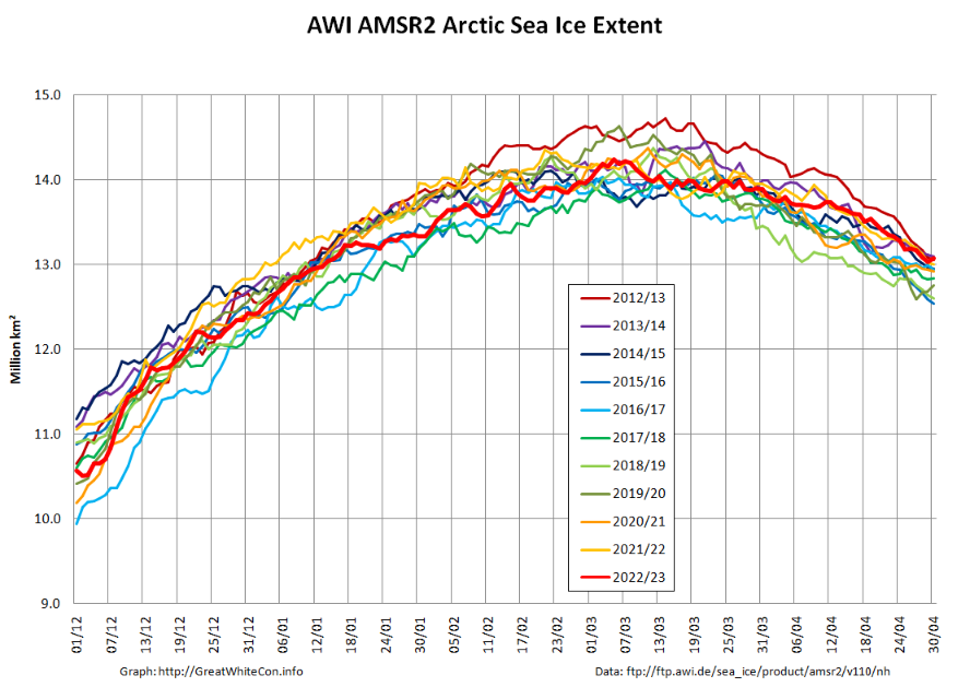
At the beginning of May AWI’s high resolution AMSR2 extent metric is at the top of the historical range:
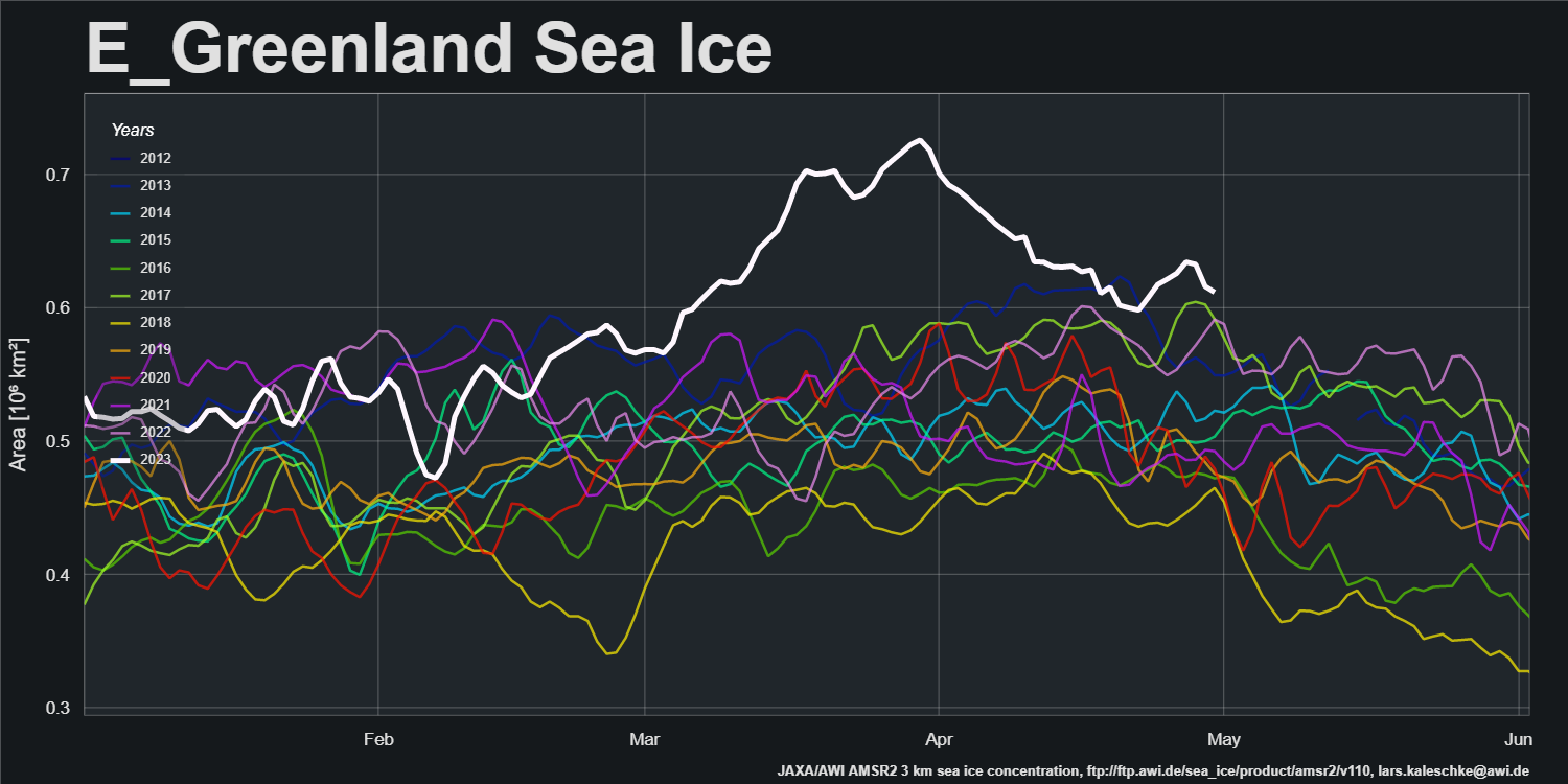
After a period of melt in the East Greenland Sea, export of sea ice from the Central Arctic via the Fram Strait has increased recently:
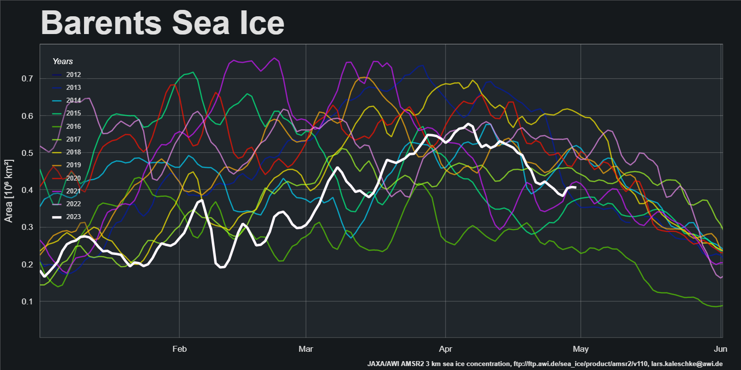
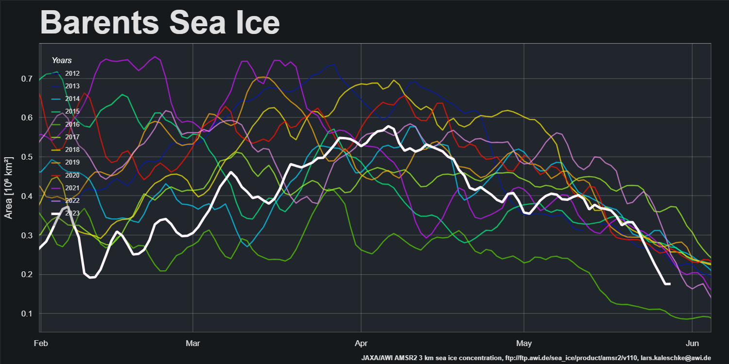
Sea ice area in the Barents Sea peaked in the first week of April and has declined steadily since then:
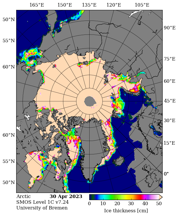
SMOS data is flowing again, and the gaps have been filled. Here’s the final pre melt ponding map of the spring:
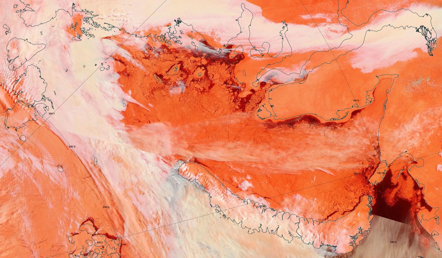
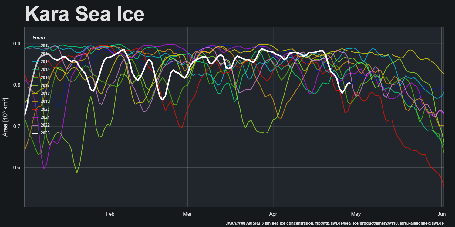
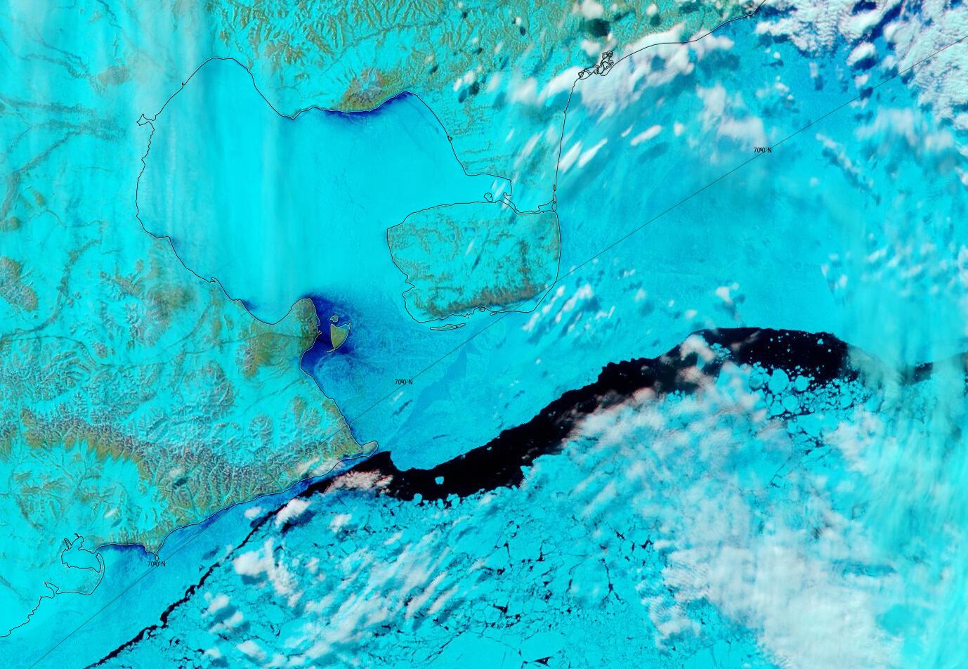
It reveals large areas of thin ice that have recently developed in the Kara Sea. Here’s a pseudo colour glimpse of the region through the clouds:
and the regional sea ice area graph:
An area of thin ice has also developed off the Chukchi Sea coast of Alaska.
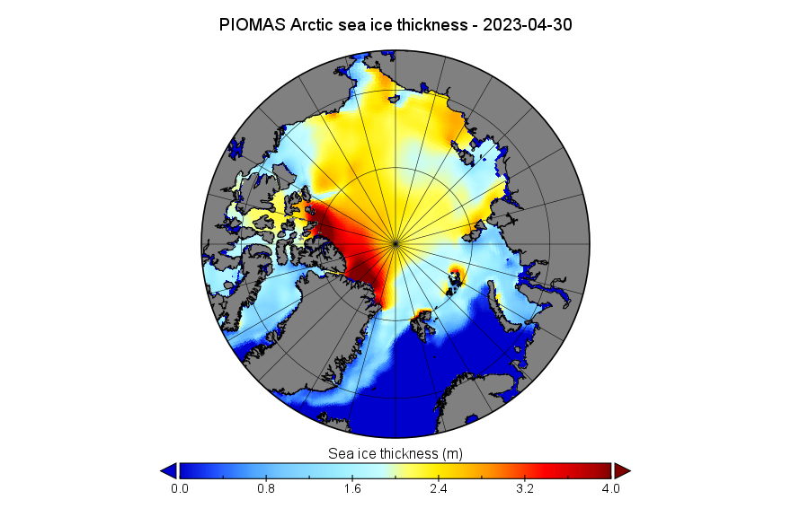
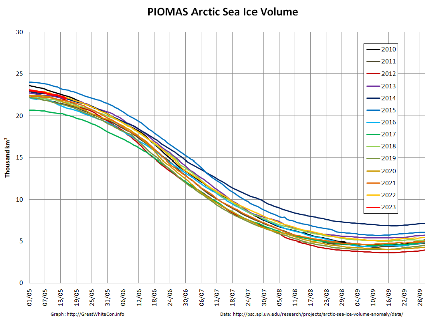
[Edit – May 4th]The PIOMAS gridded thickness data for April show that the 2023 maximum volume of 23,320 km3 was reached on April 23rd:

Here too is the thickness map for April 30th:
In Arctic weather news there is currently a cyclone spinning over the Laptev Sea which is forecast by GFS to reach a minimum MSLP of 971 hPa later today:
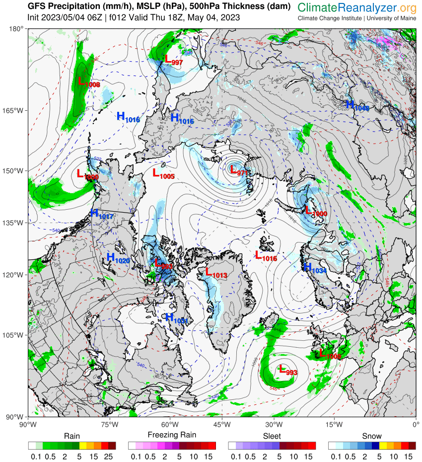
It remains to be seen what effect the inclement weather has on the ice in the region.
[Edit – May 5th]As Neil points out below, the May edition of the NSIDC’s Arctic Sea Ice News has been published:
Air temperatures at the 925 hPa level in April were near average to below average over most of the Arctic Ocean. This helps to explain the slow rate of sea ice loss during April. While temperatures were modestly above average over the Barents Sea, these areas are already largely free of sea ice:
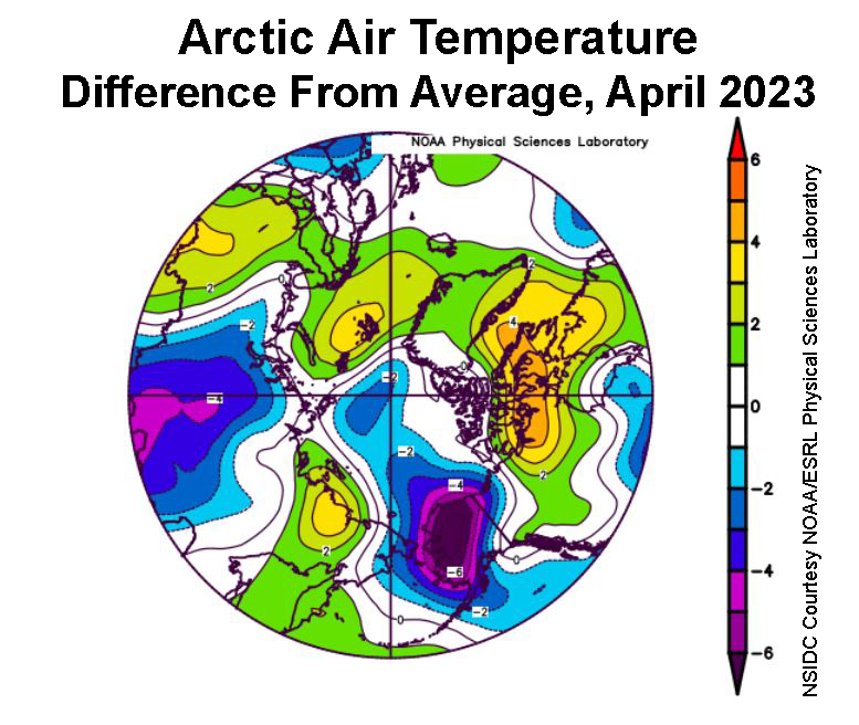
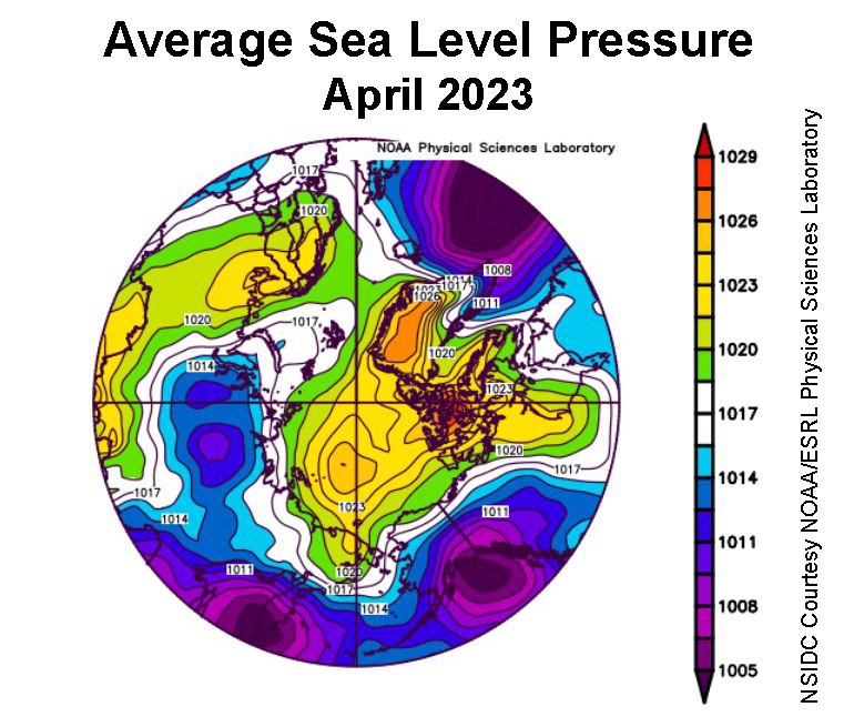
The sea level pressure pattern was characterized by fairly high pressure over most of the Arctic Ocean. The clockwise winds around a separate high-pressure center over Scandinavia brought warm winds from the south over the Barents Sea, consistent with the above air average temperatures in that area. Similarly, below-average temperatures over Alaska were driven by the combination of a strong low pressure area in the Gulf of Alaska and high pressure in the Beaufort Sea, driving air generally southward from the ice-covered Arctic Ocean.
The NSIDC article also mentions a new open access paper by Sledd et al. entitled “Clouds Increasingly Influence Arctic Sea Surface Temperatures as CO2 Rises“. Here’s an extract from the abstract:
[Edit – May 7th]Under pre-industrial CO2 concentrations, summer clouds have little direct effect on maximum annual sea surface temperatures (SST). When CO2 concentrations increase, sea ice retreats earlier, allowing more solar radiation to warm the ocean. Clouds can counteract this summer warming by reflecting solar radiation back to space. Consequently, clouds explain up to 13% more variability in maximum annual SST under modern-day CO2 concentrations. Maximum annual SST are three times more sensitive to summer clouds when CO2 concentrations are four times pre-industrial levels.
Since Neil is wondering about the recent “slow melt”, here’s an animation of Arctic sea ice drift over the last month. Click the image if your bandwidth supports viewing a 13 Mb video:
Melt ponds (and a patch of open water) are now clearly visible along the coast of the Coronation Gulf in the Canadian Arctic Archipelago:

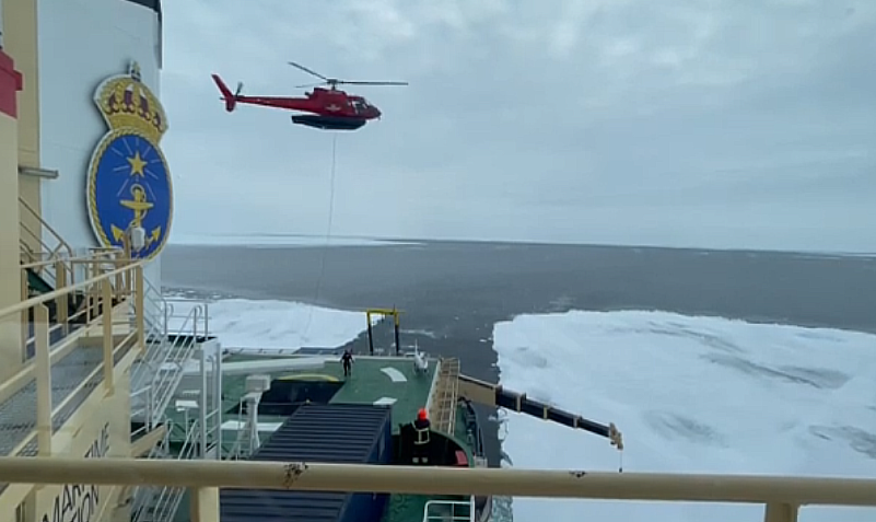
The Swedish icebreaker Oden is now in the marginal ice zone west of Svalbard. It won’t come as a surprise to regular readers that the Art of Melt 2023 expedition blog reports that:
We encountered the first ice on the first day, which quickly became quite challenging to break, even for Oden, as there were many ridges and bumps on the ice.
Above zero temperatures are forecast for the Beaufort Sea by the end of the weekend:
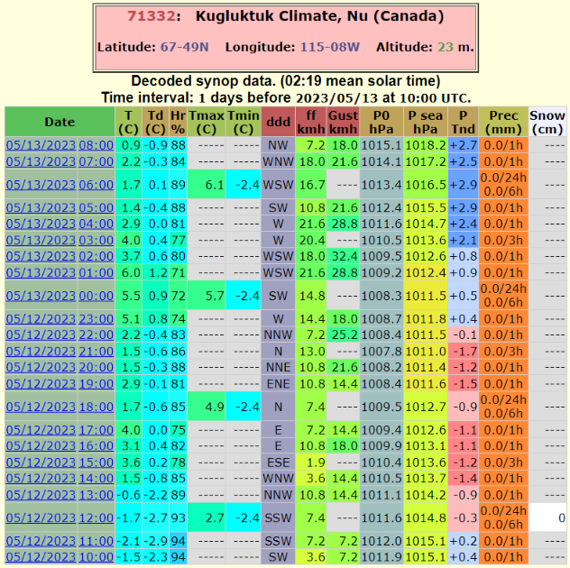
The weather is already warm in the Canadian Arctic Archipelago. Here’s the report from Kugluktuk for the last 24 hours:
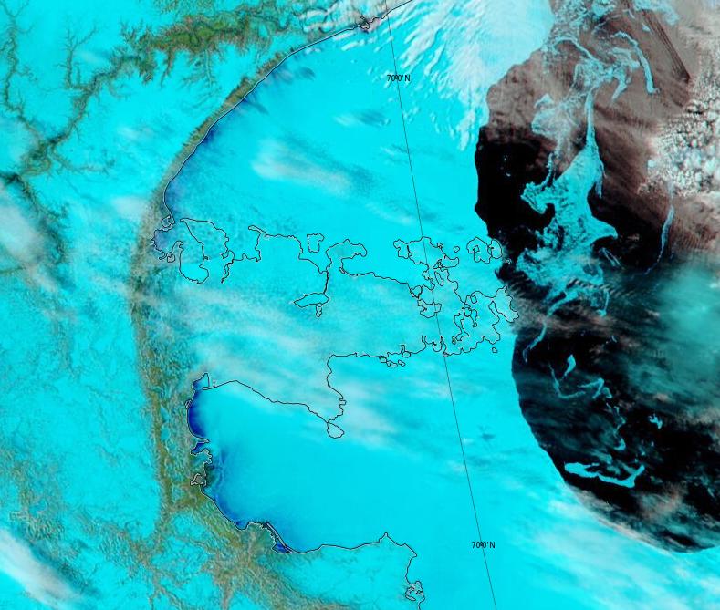
Melt ponds are now visible in Franklin and Darnley Bays:
Melt ponds are now visible in the Beaufort Sea off the Mackenzie Delta:
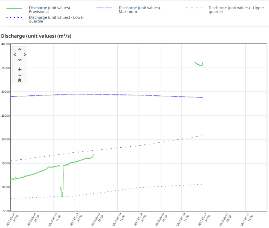
The flow of the Mackenzie River at Tsiigehtchic (Arctic Red River) has suddenly gone off the charts:
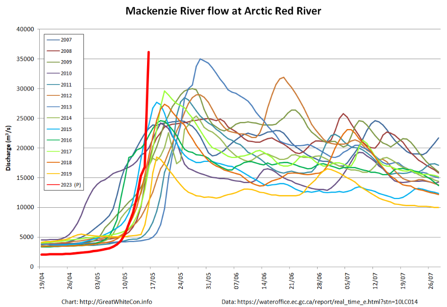
The raw data does have a big gap in it, so there are doubts about the veracity of the recent numbers:
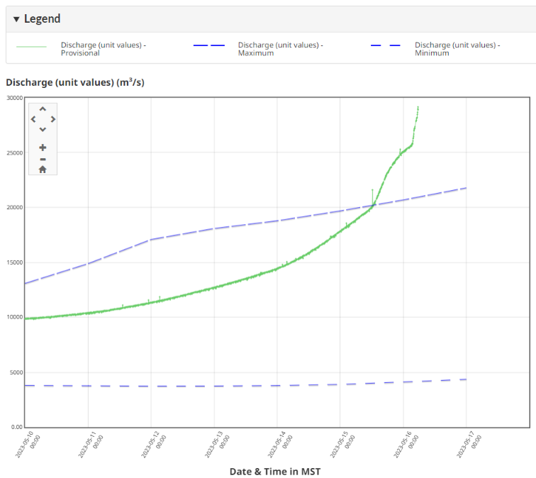
However continuous data from the middle channel in the Mackenzie Delta shows a similar pattern:
There are also reports of flooding at Fort McPherson on the nearby Peel River:
The Hamlet of Fort McPherson, N.W.T., declared a state of emergency over flooding on Tuesday evening.
Elders, infants and people who are sick are being evacuated out of Fort McPherson, N.W.T., as early as Thursday morning, even though flooding in the community has started to drop, according to the community’s chief.
“They won’t be back until the state of emergency is lifted,” said Tetlit Gwich’in First Nation Chief Elizabeth Wright.
The hamlet of about 700 people on the banks of the Peel River declared a state of emergency on Tuesday evening, after water flooded cabins at a popular fishing site south of the community and threatened its fresh water supply.
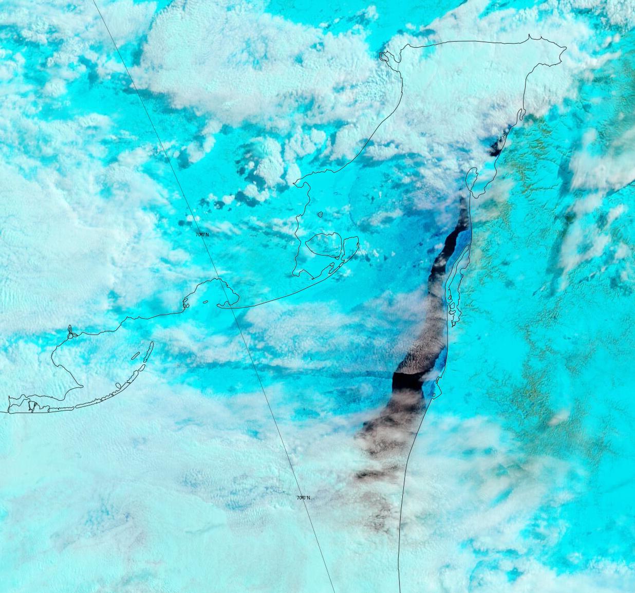
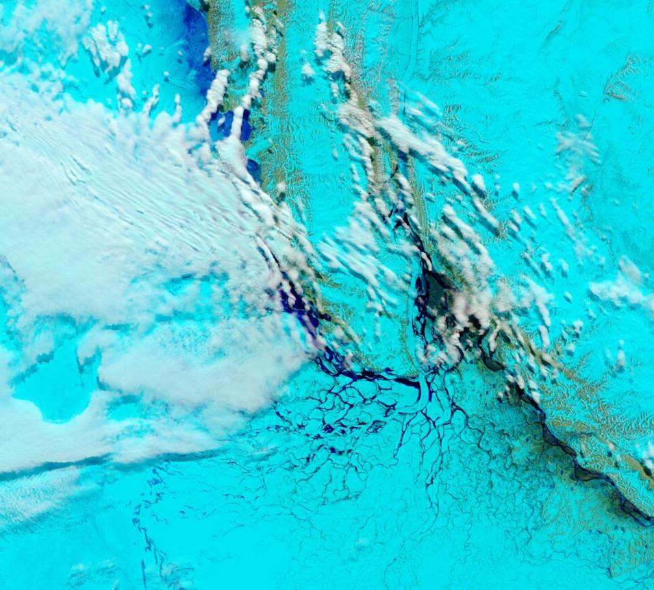
Melt ponds are now visible on the southern shore of the Kara Sea:
Bottom melt is now apparent in the western Beaufort Sea at 74.56 N, 155.4 W, the location of ice mass balance buoy 651330:
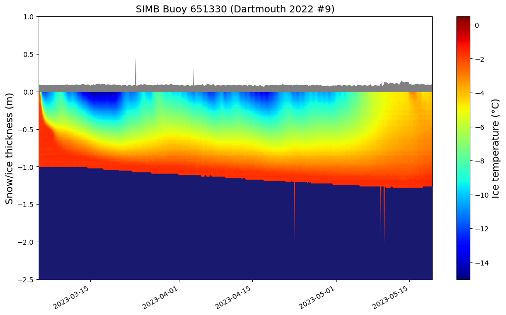
Assuming that no further thickening occurs the ice reached a maximum thickness of 1.35 m.
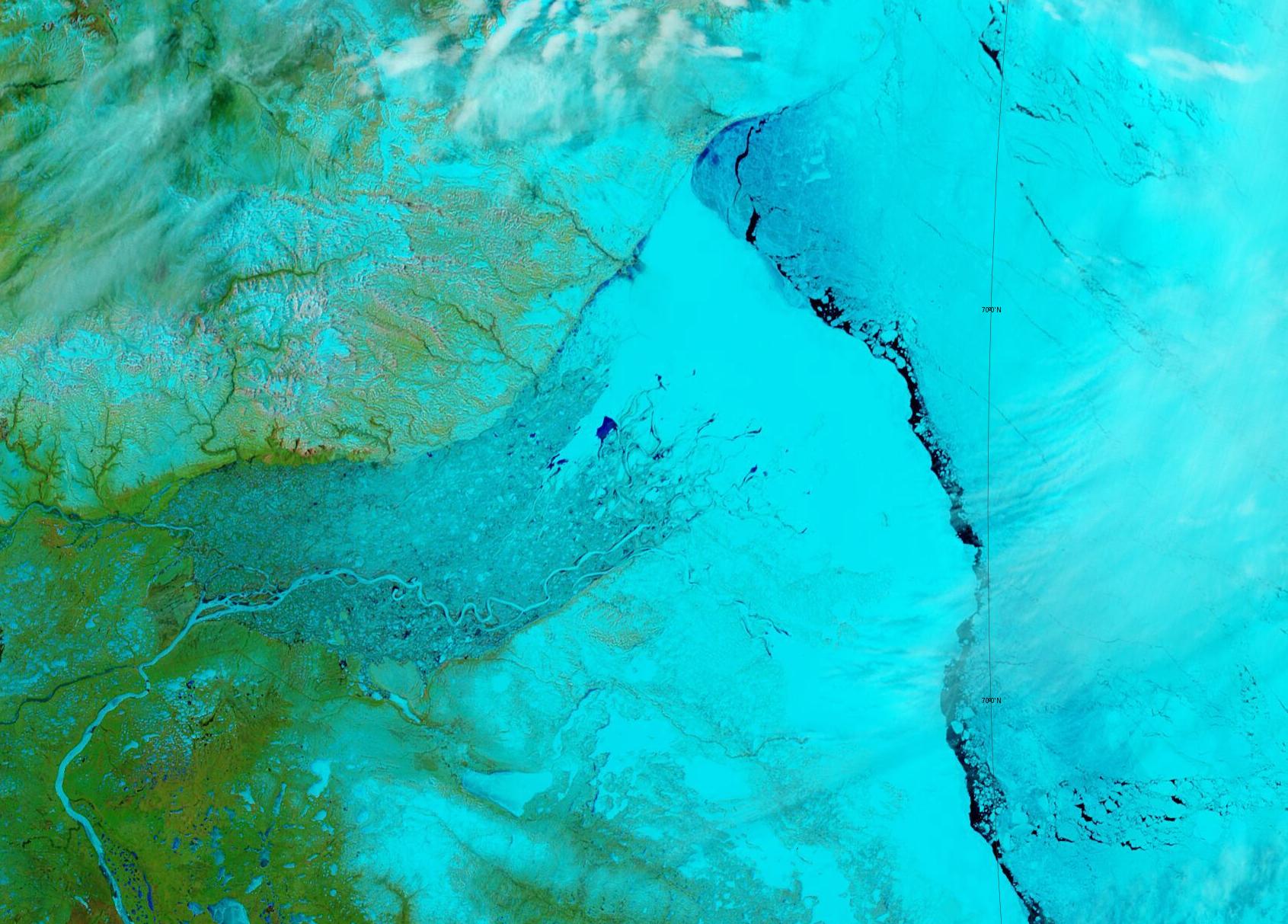
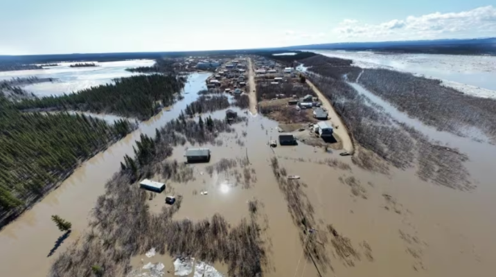
[Edit – May 20th]The clouds have cleared over the Mackenzie Delta, revealing the river’s dark waters flooding the fast ice:
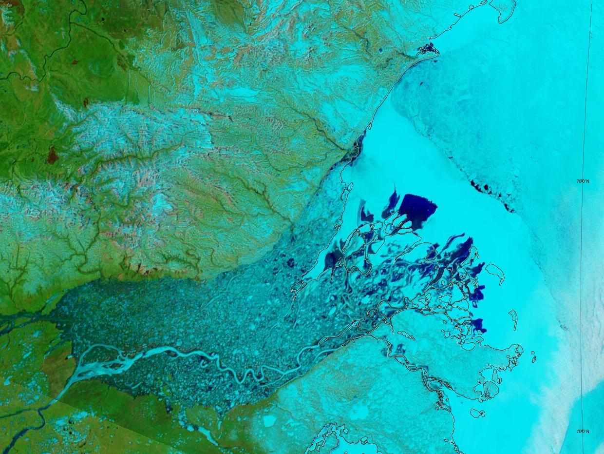
The confluence of the Arctic Red River with the Mackenzie is visible in the bottom left of the image, with the Peel River and Fort Macpherson above that.
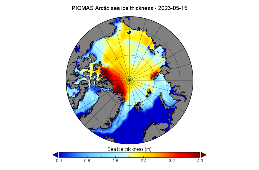
[Edit – May 22nd]The mid month PIOMAS gridded thickness data has been released. Here’s the Arctic sea ice thickness map for May 15th:
and here’s the calculated volume graph:
The clouds cleared over Chaunskaya Bay yesterday. Evidently surface melt has begun on the East Siberian land fast sea ice:
Here’s the recent weather record from Pevek:

There was a fine view of Chaunskaya Bay from on high this morning:

The melt ponds on the fast ice are now clearly visible.
[Edit – May 29th]Water is now starting to flow through the Lena Delta, and surface melt has begun on the fast ice in the Laptev Sea further south:
Barents Sea ice area has experienced a steep decline over the last few days:
Further west on the Atlantic side of the Arctic Ocean, the Greenland Sea ice area is finally back within its previous historical range:

The conversation has now moved to the June open thread.
NSIDC May 3rd.
The rate of sea ice loss for April 2023 was slow, owing to cool conditions across the ice-covered Arctic Ocean and below-average to near-average temperatures near the ice edge.
Jim, you left out part of the NSIDC comment on the Sledd paper:
“Looking to the future, their findings suggest that when the Arctic becomes seasonally ice free, the maximum sea surface temperature becomes three times more sensitive to clouds than in the pre-industrial era.”
Their modeling analysis was conducted assuming four times pre-industrial CO2 levels. That’s an RCP8.5 scenario (at least) with over 1,000 ppm, and has essentially zero probability. Sorry, more junk science to scare the kiddies.
Whereas you seem to have missed the part where the abstract says:
Noted, but irrelevant to my point about speculation on what happens ‘when the Arctic is seasonally ice-free’.
November month end sea ice extent fell BELOW 2010’s average for the first time since March 2022.
It remained BELOW 2010’s average until April 2023
Jan.31.—-16th.lowest. +333,064 sq.km. above 2010’s average.
Feb.28.—-11th.lowest +116,764 sq.km. above 2010’s average
Mar.31.—-10th.lowest -127,470 sq.km. BELOW 2010’s average
Apr. 30.—-14th.lowest +16,886 sq.km. above 2010’s average
May. 31.—15th lowest +395,097 sq.km. above 2010’s average
Jun. 30.—–10th.lowest +35,744 sq.km above 2010’s average
Jul. 31.—–12th lowest +228,905 sq.km. above 2010’s average
Aug.31.—-11th.lowest +203,902 sq.km. above 2010’s average
Sep.30.—-–7th lowest +115,918 sq.km. above 2010’s average
Oct.31.– 11th lowest, +269,119 sq.km. above 2010’s average
Nov30.——5th lowest, -183,803 sq.km. BELOW 2010’s average
Dec.31—–4th.lowest,-138,700 sq.km. BELOW 2010’s average
Jan.31—-2nd.lowest, -302,000 sq.km. BELOW 2010’s average
Feb.28——9th.lowest, -36,000 sq.km. BELOW 2010’s average
Mar.31—–7th.lowest, -274,000 sq.km. BELOW 2010’s average
Apr.30—–11th.lowest, +50,500 sq.km. above 2010’s average
May 6—-17th.lowest, +298,000 sq.km. above 2010’s average
Month end April sea ice has just risen ABOVE 2010’s average.
Can anyone explain the apparent rise in sea ice extent for May.
As you may know I think it is related to the AMO.
Does anyone know why the AMO data has not been updated since jan.2023
Just looked at the University of Bremen map, for this date in 2019, this year has more ice in the Bering sea between Svalbard and FJ land, wind driven export we saw last year. The Greenland sea has a lot more ice, again ice leaving the central Arctic for warmer waters.
Also at this time in 2019 there was no ice beyond the Bering strait, was the north Pacific warmer the preceding winter?
I presume you mean “the Barents Sea between Svalbard and Franz Josef Land”?
Compare and contrast 2019:
with 2023:
Re the AMO see:
Re the recent “slow melt” see the resurgent Fram Strait export, visible in the animation above:
Here’s a “false colour” satellite image of north-west Canada revealing the smoke from numerous wildfires on the left and ice free stretches of the Mackenzie River at the top right:
According to CBC:
Noted with some interest that PIOMAS has reported on April. They again had the opportunity to cut and paste their observation about ‘no trend in 12 years’. It’s notable because April is the peak volume month, and April volume is now nearly 2 SD above the long-term trend. Per DMI, temps above 80 degrees have been at or below the long- term average for most of the Spring. Surely something is changing up there.
The PIOMAS team have also cut’n’pasted this observation once again:
Jim, thanks, and yes, I am a faithful reader of all their commentary. I do appreciate scientists who point out how critical solar energy is to climate variability. Some climate scientists struggle with that concept.
Additionally, and tellingly, since volume has been stable for the last twelve years, does that imply (using their own numbers) that there has not been an additional 8.6 x 10^19 joules of energy/year input to the Arctic climate system that previously caused the ice loss scenario? Did someone turn off all those tiny bulbs? Or are we in a period of lower solar output? Any papers on that question?
At the highest latitudes, the sun tends to be low in the sky, except for a brief few weeks either side of June 20.
Some over on ASIF have speculated wether that brief Arctic summer is long enough to produce a so called blue ocean event, but it might also tell us why it’s more difficult for extent to fall below a certain level, hence the drop in extent stalling around 4 million km2 or so.
Of course the deciding factor could be the gradual rise in ocean temperatures.
Here’s a graph of solar insolation:
A very small change in albedo will change the absorption of the available ~500 Wm⁻² peak insolation by more than 0.4 Wm⁻².
By way of example, at the start of July 2021 extent was at a record low:
https://GreatWhiteCon.info/2021/07/facts-about-the-arctic-in-july-2021/
Then the weather turned cloudy!
Thanks, Jim, but your graph of solar insolation at latitude is a geometric model that assumes constant solar output. I was referring to the variations in solar output from cycle to cycle, which would make those crisp lines a bit ‘smudgier’ ( if that’s a word) in any given year/solar cycle. I’m sure you’ve read Longhurst’s book (second edition now out). Chapter 8 cites some interesting data wrt the Arctic.
Your certainty is misplaced Taylor!
I hadn’t read “Doubt and Certainty in Climate Science” before, but I’ve now skimmed Chapter 8 of the first edition. Thanks for the tip. Which part(s) do you think are relevant to the current discussion?
For example Lean (2000), shows data that would indicate that solar insolation has varied nearly 2 Wm^2 cyclically from 1600 to the present.
Have you checked the scale on my TOA flux delta map above?
Solar insolation that’s reflected instead of absorbed at the surface varies by a lot more than that from one summer to the next.
The forecast heat has reached the shores of the eastern Beaufort Sea.
Here’s a summary of the recent weather in Tuktoyaktuk:
The water level of the Peel River above Fort McPherson now appears to be slowly reducing:
It probably won’t come as a surprise to discover that the Dempster Highway through Fort McPherson is currently closed:
Hi Jim.
It seems to me, the arctic is getting colder…
regards, Matthew.
Hello again Matt,
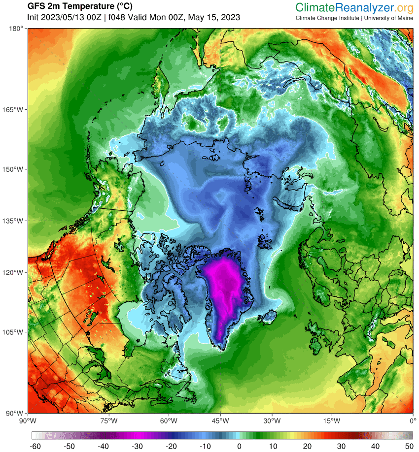
You appear to be badly misinformed? Here’s the very latest Arctic temperature anomaly map:
At 0Z this morning temperatures were above freezing across large areas of the Beaufort and Chukchi Seas:
Interesting anomaly map using a 1978-2000 baseline, one of the coldest periods in the last 70 years. Matt’s graph, using the 1958-2002 period (from DMI) shows temp for 80+ North below normal all spring. I don’t suppose the climate community could agree on a single baseline so we could compare anomalies, do you?
A consistent baseline would indeed be helpful Taylor.
Temps for 80+ North [being] “below normal” is largely irrelevant all spring. They start to become relevant by mid June.
Note instead all the melt ponds forming at 70N or thereabouts. Here’s the current GFS Arctic temperature anomaly map:
As I just pointed out to Matt, the current low pressure system has sucked some warm air into the Pacific side of the Arctic Basin.
GFS seems to have settled on a minimum MSLP of 978 hPa:
Plus a sprinkling of rain in the vague vicinity of IMB buoy 651330.
Just from eyeballing the climate reanalyser temperature anomaly
map, I’d guess the Arctic has been slightly warmer of late, except Greenland, which seems colder.
Hi Jim,
Sorry to trouble you again about the image displayed on my posts.
I noticed you recently changed yours.
I am getting a little older these days
Thought my image should reflect this.
How do I make a change?
Whereas I got much colder!
I think this is what did the trick:
https://GreatWhiteCon.info/2021/10/whats-up-with-that-arctic-sea-ice-disinformation/#comment-489489
Thanks very much Jim.
Found the site. Put in into my favourites.
Now looking for a more up to date photo showing my advancing age.
I will still be holding a glass of wine
Indeed you are. Very dapper!
Raise a glass for me, Neil! I’ll be walking the Cotswolds again this summer!
Melt ponds and fractures are visible across the East Siberian Sea fast ice this morning:
The skies were also clear over the Eastern Beaufort Sea yesterday:
Click the images for a closer look.
thanks – Peter Wadhams mentioned on youtube a few weeks ago that parts of the arctic are warming 7 times faster than the rest of the planet. “even times as fast yeah if you look at the the Seas North of Europe that is the balance sea uh currency um the season around spitsburg and that
that’s seven times which is just incredible because that that’s an amount of warming which will get rid of all the sea ice very quickly and will make other changes as well and then in fact the temperature changes have been incredible as well when you look at those um the biggest warming has been in the Seas North East of Europe uh so North Eastern America that is Canada at the very the very Waters that we thought about uh being the place we should go to
to preserve sea ice um but instead in fact um is warming the
fastest of all there and there have been measurements of a warming of about 13 degrees uh in the Seas North of Newfoundland and Labrador and 13 degrees uh is is simply not something that ever happens before you know ”
Wadhams said scientists have been basically silent about this since they have no real explanation for “why” – but would not this be due to Atlantification and also the stratification of the ocean temperature? The circulation being messed up? could you share your take on this?
thanks,
drew hempel
Hi Drew,
I don’t suppose you can provide a link to the video you mention?
Peter is a very nice man, but he also has a record of “crying wolf” a little too often for comfort:
https://GreatWhiteCon.info/2015/07/is-time-running-out-for-arctic-sea-ice/
Indeed. I think we still have a long wait before Arctic ice reaches 1 ‘Wadham’, despite his previous confident predictions.
Hello Jim,
I greatly value your article, and I have a special interest in the GIF/video you shared on May 7th in response to Neil’s question. I’m curious about where I can access historical photos similar to those, depicting each day of May 2023. These photos would be instrumental in enhancing my comprehension of the adverse anomalies observed in Arctic sea ice during May 2023.
thanks!
Hi David,
You’ll need an FTP client (such as FileZilla) in order to download all the .TIFF files at:
ftp://ftp.awi.de//sea_ice/product/amsr2/v110/nh/2023/05