Both of the last two years, temperatures stayed below normal for the entire melt season.
The below normal summer temperatures are keeping the ice from melting, and have led to a large expansion in the amount of thick multi-year ice.
However the Arctic is unfortunately failing to cooperate with that narrative. Today we are unhappy to report that Tony Heller‘s favourite Arctic sea ice metric, the Danish Meteorological Institute 30% threshold extent, is at the lowest level ever for the date since their records began:
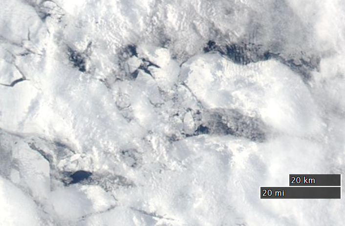
As if that wasn’t enough to be going on with, some big holes have already appeared in the middle of the supposedly multi-meter thick, multi-year sea ice in the Beaufort Sea, well away from the open water already warming up off the Mackenzie Delta:
NASA Worldview “true-color” image of The Beaufort Sea on May 11th, derived from bands 1, 4 and 3 of the MODIS sensor on the Aqua satellite
Officially, we only started monitoring Arctic sea ice extents by satellite from 1979. We know however that this is not the whole story. For instance, HH Lamb tells us:
Kukla & Kukla (1974) report that the area of snow and ice, integrated over the year across the Northern Hemisphere, was 12% more in 1973 than in 1967, when the first satellite surveys were made.
I’ve added that link, since Paul neglected to include it. He concludes:
To draw any conclusions about Arctic ice or temperatures, using data that begins at the coldest point of the cycle is utterly worthless and grossly misleading. But this is climate “science” we are talking about.
Since this is Paul Homewood we are talking about I felt compelled to quibble about his grossly misleading assertion:
Us:
Here’s the NSIDC’s chart of Arctic sea ice extent anomalies since 1953:
You will no doubt note that it reveals an overall peak in the late 60s, not the late 70s
Them:
I note they don’t show the 1940’s
Us:
Whereas I note that 1969 is a much juicier looking cherry than 1979. Is 1949 better still?
Them:
They did not have satellite monitoring in 1969.
Even though I had already pointed out the error of his ways to him Paul Homewood decided at this juncture to publish another article, this time entitled “Satellite Monitoring Of Arctic Sea Ice Pre 1979“. It began:
I was pointing out yesterday why it was so inappropriate to deduce trends in Arctic sea ice, using 1979 as the start point. NSIDC, of course, do this supposedly because that is when satellite monitoring began.
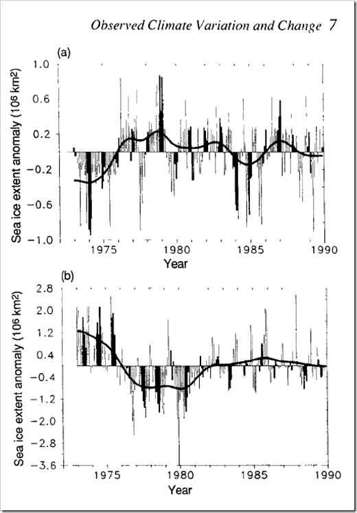
Mr Biscuits, however, reminds me that the 1990 IPCC report showed the above graph, with Arctic sea ice extent back to 1972.
Us:
At the risk of repeating myself, what about this remarkable recent narrative?
What the NSIDC actually say regarding their dataset that starts in 1978 is:
“This product is designed to provide a consistent time series of sea ice concentrations (the fraction, or percentage, of ocean area covered by sea ice) spanning the coverage of several passive microwave instruments.”
http://nsidc.org/data/nsidc-0051
Note that there is no mention of “when satellite monitoring began”. See also their Nimbus Data Rescue project, which has data going back to 1964:
IPSO is also currently considering a complaint I made against another article by David Rose in The Mail on Sunday in September 2014 which wrongly suggested that Arctic sea ice extent has stopped declining. I am not optimistic that my complaint will be upheld, even though the newspaper again breached Section 1(i) of the Editors’ Code of Practice.
IPSO have now published their ruling on that complaint, and conclude that:
17. The complaint was not upheld.
Remedial Action Required: N/A
Date complaint received: 17/09/2014
Date decision Issued: 16/02/2015
By all means read the ruling in full, but here are our edited highlights:
13. The article presented the author’s view that forecasts regarding the melting of Arctic ice had overestimated the rate of decline. The complainant did not dispute that measures showed that the Arctic ice extent had increased over the last two years. The article had made clear that the long-term trend still showed a decline, and the coverage had included commentary from a number of scientists, expressing a variety of views on the matter, including one who had stated that he was “uncomfortable with the idea of people saying the ice had bounced back”, and warned against reading too much into the ice increases. The article had made clear that scientific opinions regarding the significance of the most recent data varied. In this context, the omission of the information that the measure in 2012 had been the lowest on record, and that 2014 had still been the seventh lowest since records began, was not significantly misleading. The article did not suggest that it had been established as fact that the long-term decline in Arctic sea ice had reversed.
I highlight that paragraph in particular because in our coverage of David Rose’s article here at Great White Con we have disputed that “measures showed that the Arctic ice extent had increased over the last two years”. I wonder what IPSO might make of that information?
We have appended the following response from Rose:
“Like anyone who challenges aspects of the so-called ‘consensus’ over climate change, I’ve grown inured to being called a ‘denier’, as some of the commenters ‘below the line’ claim I am here. It is with some weariness that I must point out, as I did in the article that started this fuss, that I accept that the long-term Arctic ice trend is down, that carbon dioxide of human origin is an important cause of this trend, and that, unchecked, it will lead eventually to ice-free Arctic summers – albeit perhaps not for decades.
“But to be attacked for something I didn’t actually write is unfortunate. The fact remains there are large uncertainties and intense debate among scientists on this and other climate change topics, even if, as has been said, 97 per cent agree that the world is warming and that humans are partly to blame. But that doesn’t take us very far, and there are important differences of opinion. Professor Judith Curry isn’t a ‘contrarian’ but a very distinguished scientist and ice expert with a long record of peer-reviewed publications, though she happens to disagree with Mr Nuccitelli.
We feel compelled to point out to David Rose once again that he actually wrote:
The Arctic ice cap has expanded for the second year in succession.
and that this is both inaccurate and significantly misleading.
What sort of “very distinguished scientist and ice expert” would continue to proudly proclaim the following inaccurate information after even the Mail on Sunday had retracted it?
Today we’re going to delve into the application of surf science in the Arctic. If you’re not already familiar with the basics of how the best surf is created then perhaps you might first wish to take a detour to the StormSurf “Wave Basics” article:
Wind waves, though rideable, are not the optimal type of wave one likes to ride. Swells are much better. Wind waves are only the raw material that swells are made from. But, the more energy wind waves accumulate while being driven by wind, the greater the likelihood they will transform into a swell. Enough energy and the swell can travel the entire circumference of the globe with only a slow decay in size!
During a typical open ocean winter storm, one could expect to see winds of 45-55 kts blowing over 600-1000 nautical miles for 36 hours. In such a storm, the average highest wind waves (or ‘seas’) commonly reach 30-35 ft towards the center of the fetch area and produce a swell with a period of 17-20 secs.
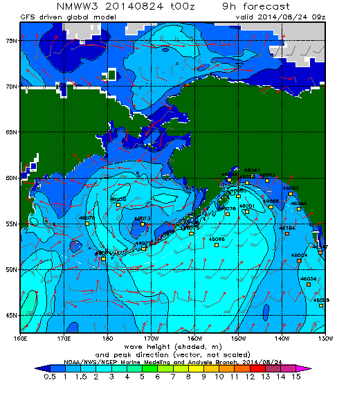
Regular readers may recall that on August 24th 2014 we revealed this WaveWatch III “surf forecast” for the Beaufort Sea, which lies off the north coast of Alaska and the Canadian Northwest Territories (i.e. top center of the map): and noted that the 2 meter waves depicted:
Have blasted past Point Barrow and are currently heading straight for the Beaufort Sea Marginal Ice Zone.
Here’s a video from the University of Washington’s Applied Physics Laboratory which explains that the Marginal Ice Zone is:
The area between declining unbroken sea ice and the expanding area of open water.
The theoretical significance of such swells has been discussed in a number of academic papers recently. Take for example these extracts from “Swell and sea in the emerging Arctic Ocean” by Jim Thomson from the University of Washington and W. Erick Rogers from the US Naval Research Laboratory. Note first of all that the authors distinguish between “wind seas” and “swells” as follows:
Pure wind seas have a wave age less than one, indicating that the wind is driving the waves, and these points cluster largely below the Pierson–Moskowitz limit. Swells have a wave age greater than one, indicating that the waves are outrunning the wind.
They then go on to use some more terms very familiar to the average surfer:
Ocean surface waves (sea and swell) are generated by winds blowing over a distance (fetch) for a duration of time. In the Arctic Ocean, fetch varies seasonally from essentially zero in winter to hundreds of kilometers in recent summers. Using in situ observations of waves in the central Beaufort Sea, combined with a numerical wave model and satellite sea ice observations, we show that wave energy scales with fetch throughout the seasonal ice cycle. Furthermore, we show that the increased open water of 2012 allowed waves to develop beyond pure wind seas and evolve into swells. The swells remain tied to the available fetch, however, because fetch is a proxy for the basin size in which the wave evolution occurs. Thus, both sea and swell depend on the open water fetch in the Arctic, because the swell is regionally driven. This suggests that further reductions in seasonal ice cover in the future will result in larger waves, which in turn provide a mechanism to break up sea ice and accelerate ice retreat.
It is possible that the increased wave activity will be the feedback mechanism which drives the Arctic system toward an ice-free summer. This would be a remarkable departure from historical conditions in the Arctic, with potentially wide-ranging implications for the air-water-ice system and the humans attempting to operate there.
In practice there were several more swells that impacted the Beaufort Sea marginal ice zone over the course of the next couple of weeks. Here’s what the charts looked like, as visualised by MagicSeaweed.com rather than NOAA:
Beaufort Sea on August 27th 2014 – Winds / Wave Height / Wave PeriodBeaufort Sea on September 1st 2014 – Winds / Wave Height / Wave PeriodBeaufort Sea on September 7th 2014 – Winds / Wave Height / Wave Period
Note that on the right of each set of three is a depiction of the period of the waves in question. As StormSurf points out:
Chop tends to have a period ranging from 3-8 seconds. That is, there is anywhere from 3-8 seconds between each wave crest. Wind waves range from 9-12 seconds. Ground swells range from 13-15 seconds, and strong ground swells have a period anywhere from 16-25 or more seconds.
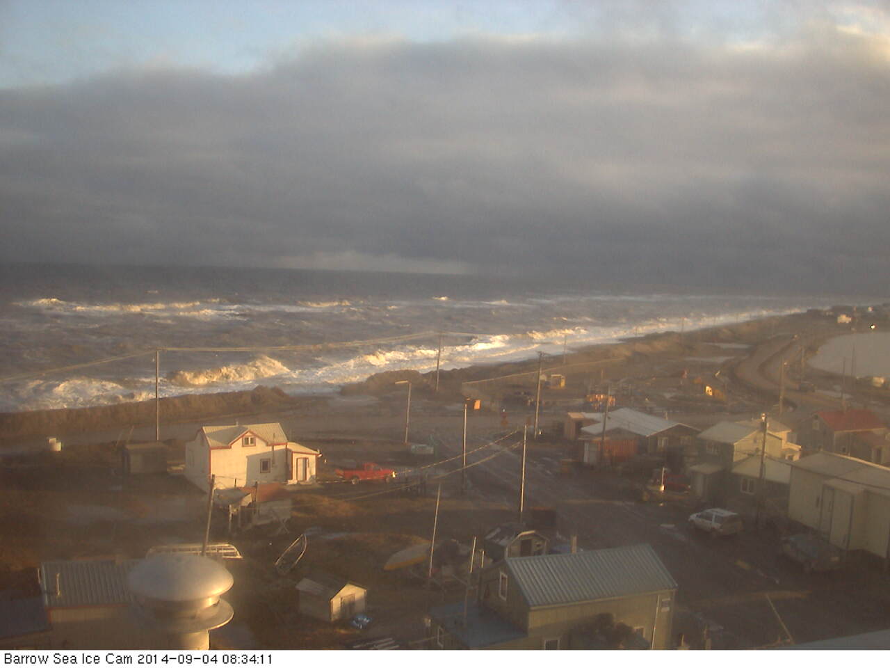
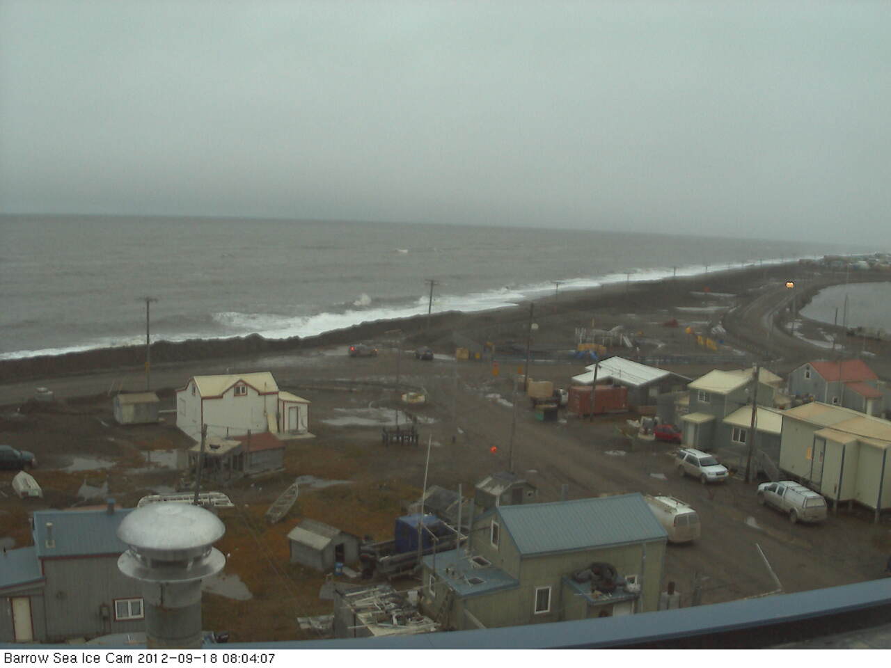
Thus the final swell on September 7th was actually the best of the bunch, with a small area of waves over 10 feet in height and with a period of over 9 seconds. According to StormSurf those are merely “wind waves” and not yet a full blown “swell”. To give you a feel for such waves here’s what some “wind waves” hitting the beach at Barrow looked like on September 4th 2014:
Next here’s another video that reveals what effect those series of waves had on the sea ice in the Beaufort Sea:
For future reference here also is the same swell described by Thomson and Rogers, but illustrated in an identical “surfer friendly” format to the 2014 swells we’ve been looking at:
Beaufort Sea on September 18th 2012 – Winds / Wave Height / Wave Period
whilst here is the swell produced by the “Great Arctic Cyclone” of early August 2012, also mentioned in passing by Thomson and Rogers:
Beaufort Sea on August 5th 2012 – Winds / Wave Height / Wave Period
As you can see, if you’re a surfer used to tracking swells across the world’s oceans at least, whilst the September 2012 swell was indeed rather more substantial than those we have looked at in 2014, with a height in excess of 20 feet, the period was too short to qualify as a full blown swell and it was in fact directed away from the ice edge rather than towards it. Here’s what that 2012 swell looked like once it reached Barrow:
All of which does rather make one wonder what might happen if a slightly longer period swell directed at the ice edge in the Beaufort Sea were to occur at some point in the not too distant future? Whilst we all wait with bated breath to discover what that future holds for the sea ice in the Arctic, not to mention the beach at Barrow, here’s another video about the 2014 Marginal Ice Zone Program, which summarises the year’s campaign as a whole:
Note that Craig Lee says that:
We had very little wave activity. It was surprisingly calm when we were out there in the Araon, both when we were in the ice and in the open water. There just wasn’t much wind, and so there weren’t very many surface waves.
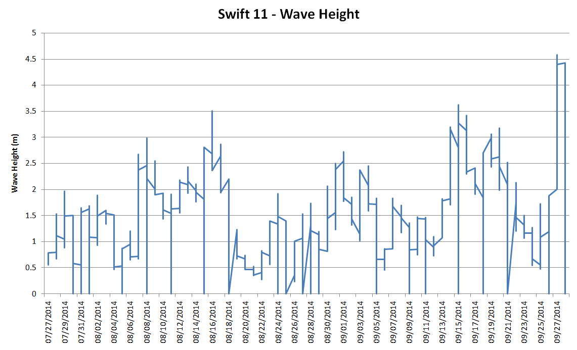
However at least one of the “robots” he refers to did discover some significant wave activity. Here’s a visualisation of SWIFT 11‘s record of significant wave height as it floated across the Beaufort Sea in the summer of 2014:
I don’t know about you, but I don’t think I would describe 4.5 meter waves as “surprisingly calm”, especially in the Arctic!
A week after our first equipment evaluation expedition for our 2015 Arctic Basin Big Wave Surfing Contest the signs were looking good once again, albeit with a southwesterly wind once again. Here’s how our compact format surf forecast looked for noon on March 7th, courtesy of some copying and pasting from Magic Seaweed’s global surf outlook:
The North Atlantic surf forecast for March 7th 2015. Winds / Wave Height / Wave Period
You’ll no doubt note that the swell height out in mid Atlantic was off the top of the truncated scale. That’s because it’s designed for use in the Arctic Basin, where 40 foot waves are very hard to come by! Take a look at the last link below to see what I mean.
Given the wind the shelter of Putsborough was the order of the day when it came to spot selection. Water temperatures hadn’t changed significantly in a week, but the sun was shining on this occasion, which is undoubtedly preferable to the rain we experienced last time:
Donning the same gear as last time even my fingers didn’t feel cold this time around, although my partner for the day (encased in a standard winter wet suit plus separate hood) described conditions as “f…. cold!” even after warming up thoroughly, as you can see here:
Eat your heart out Anastasia Ashley! After the session considerably more energy was expended by the two of us extracting yours truly from his Tiki Prodigy 6/5/4 suit. After that I started chatting to Simon, who happened to be parked next to us in the car park at Putsborough Sands, as dusk started to descend. Here’s what happened next:
Towards the end of our conversation I explained the rationale behind our Arctic Basin big wave surfing contest, and briefly touched on some of the associated Arctic surf science. For the scientifically inclined amongst you, there’s a much longer explanation available in this companion article!
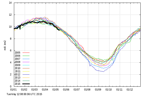
Here are some relevant Arctic sea ice metrics. We will continue to update them as the latest figures arrive throughout the rest of today:
IJIS/JAXA daily extent: 13,648,280 km² – Lowest ever level for the date in records going back to 2003
DMI “30%” daily extent: 10,676,900 km² – Lowest ever level for the date in records going back to 2005
NSIDC daily extent: 14,330,000 km² – Lowest ever level for the date
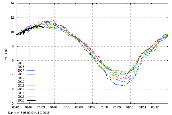
NSIDC 5 day average extent: 14,280,000 km² – Lowest ever level for the date in records going back to 1979
Cryosphere Today daily area: 12,984,410 km² – Lowest ever level for the date in records going back to 1979
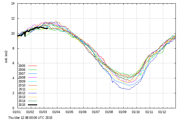
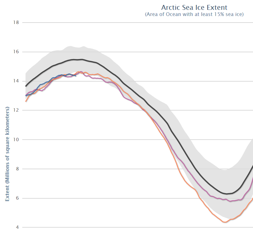
As we reported on February 18th, some of the Arctic sea ice extent metrics reached the lowest levels for the date in their respective histories quite some time ago. Today though, we’re looking at a full house. The daily NSIDC and IJIS extent numbers have both been at all time lows for the date for quite some time now. Here’s how the NSIDC 5 day average extent looks at the moment:
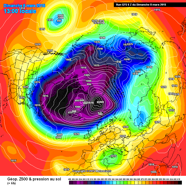
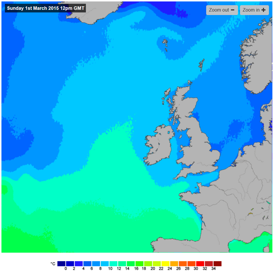
Meanwhile a series of storms in the North Atlantic have been bringing large surf to the shores of the Western United Kingdom, and battering the edge of the sea ice in the Greenland and Barents Seas. Here’s how GFS looks currently, as visualised by MeteoCiel:
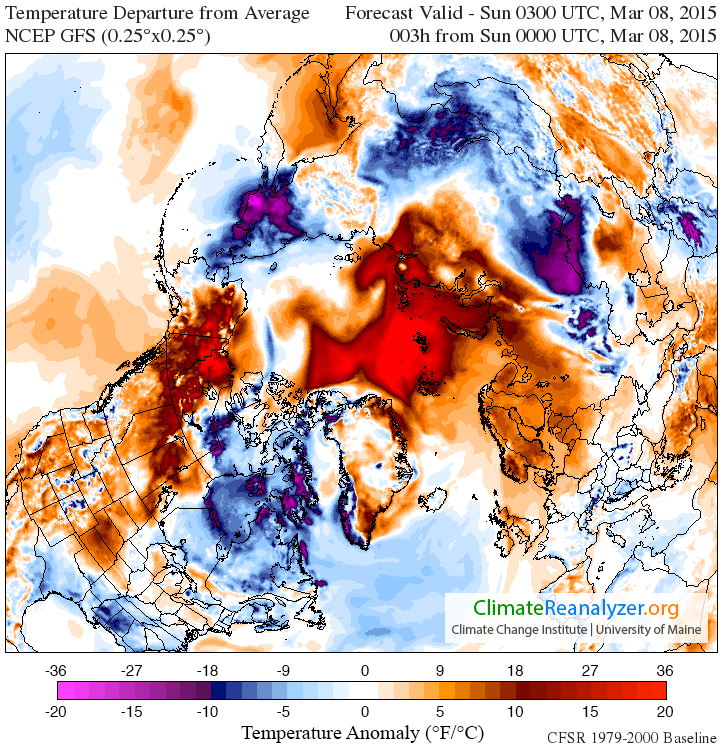
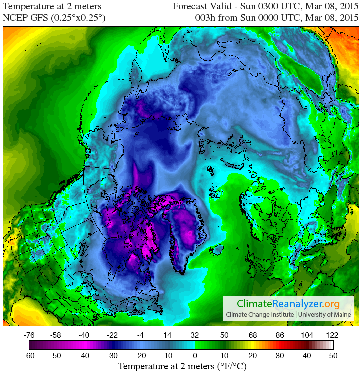
In addition this has resulted in warm air from further south being funnelled into the high Arctic, so much so that the surface temperature anomalies currently look like this:
whilst the temperatures 2 metres above the surface of the Arctic look like this:
If you look closely you’ll see that air temperatures 2 metres above the North Pole are currently similar to those around the shores of the Great Lakes of North America. As a result of all this atmospheric activity today we bring you news that both the Danish Meteorological Institute “new” 15% extent:
and “old” 30% metrics:
have now joined the club.
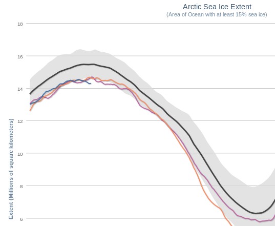
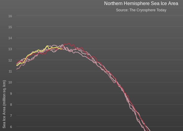
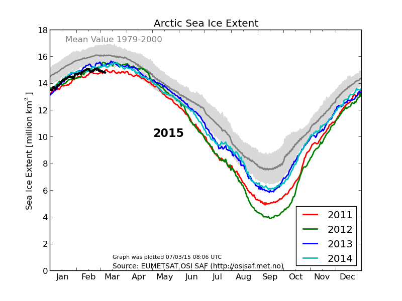
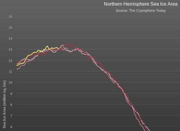
The Cryosphere Today area metric has been holding out against the trend in sea ice extent for weeks, but we can confidently predict that when their next update is released it too will also reveal the lowest ever Arctic sea ice area for the 65th day of the year, in records going back to 1979. Here’s how their graph looks currently:
Great White Con fantasy big wave team rider Andrew Cotton was interviewed on BBC Radio Devon last week by none other than Simon Bates! Cotty was on a trip to Hawaii at the time and pointed out to Simon that:
The thing with surf… is it’s the tides, the waves, the wind. The surf tells you when to surf. It’s not around chores or work, you have to have surf that looks good.
As luck would have it all that came together for North Devon surfers at Putsborough Sands on Saturday. Things looked promising to us a couple of days beforehand, and plans were hatched on Twitter for our first equipment evaluation expedition of 2015:
We took the heaven sent opportunity to test out our thickest winter wetsuit in the following conditions:
According to Magic Seaweed sea surface temperatures are currently around 8 °C off the coast of North Devon, and it doesn’t get much colder than that in this neck of the woods, which may have had something to do with at least one “no show” on Saturday. Simon had “volunteered” Richard Green for a “cold and dangerous” surf trip:
but Richard had a good excuse for being unable to make it since he was broadcasting on Radio Devon, and chatting to Pete Waterman amongst other things, that afternoon. We did invite Simon Bates along too, but it seems he had a previous engagement in London:
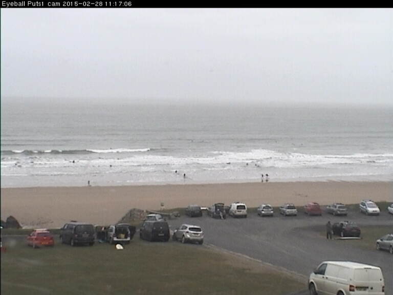
Prior to setting off for the north coast I got in touch with Trev Lumley, who is the proprietor of the Eyeball Surfcheck web site where we had discovered this enticing looking image on the Putsborough surfcam earlier that morning:
Trev told me he would be elsewhere by the time we arrived at “Spot P”, so I quickly tested out my little quiz for the day on him. He claimed never to have heard of Richard Green, whilst Simon Bates did ring a bell and the name Andrew Cotton was very familiar. When I explained the reason for my call Trev told me that he had actually heard Andrew being interviewed by Simon on BBC Radio Devon a few days previously. When pressed to decide who amongst the three names I had mentioned was most famous Trev told me that as far as he was concerned Cotty was the man, since he had known him since he was a boy. However Trev thought that Simon’s name would probably be more familiar to the average Devonian.
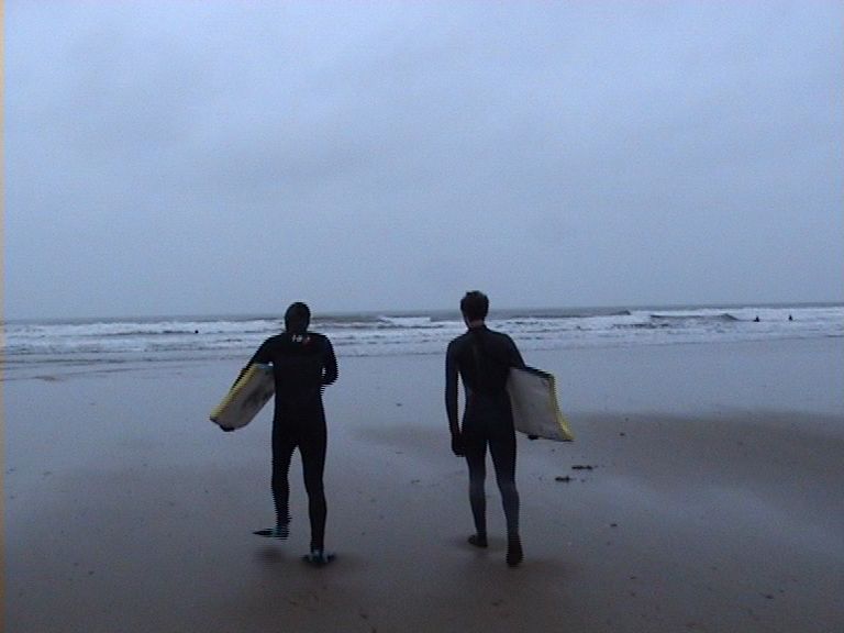
When we eventually arrived at the car park above the beach some heavy showers had already set in. However before plunging into the chilly North Atlantic, I took advantage of a break between the downpours and wandered around the car park at Putsborough with a cameraman in tow to discover the reaction of some of the locals to my TikiProdigy 6/5/4 suit, whilst also killing two birds with one stone by doing some research into the nature of fame and celebrity in the 21st century. Here’s my first interview, with a local lifeguard:
As you can see, our first interviewee thought the Tiki Prodigy “Looks warm”, which was comforting in all the circumstances. In addition out of our list of six celebrities Andrew Cotton was overwhelmingly the most famous. DJs Simon Bates and Richard Green, and journalists Andrew Neil, Christopher Booker and David Rose failed to achieve even the merest flicker of recognition.
More videos are on the way, but are currently still stuck in the editing suite here in the basement of the Great White Con Ivory Towers. In the meantime here are my own findings after a couple of hours at sea on my yellow sponge performing our first Arctic equipment evaluation test:
Apart from my Prodigy I was also wearing Tiki 5mm socks and 2mm bodyboarding gloves. I suffered none of the “brain freeze” reported by my even more intrepid companion, who entered the water hoodless beside me:
Because I didn’t want to lose my contact lenses I did very little duck diving. On only one occasion did I experience the thrill of cold water flushing down my back. My fingers started to feel a bit chilly as I was bobbing about out the back after my initial paddle out, but once I got into the swing of things even they were toasty for the duration. Whilst I do wonder if Tiki could be persuaded to produce some thicker gloves with webs between the fingers, my biggest problem proved to be extracting myself from my soggy suit in the pouring rain that had set in by the time I arrived back in the car park as the light was fading. To give you an idea of the problem I faced here is Andrew Cotton explaining the virtues of the chest zip version of the Zepha, which has replaced the Prodigy in Tiki’s range of cold water winter wetsuits:
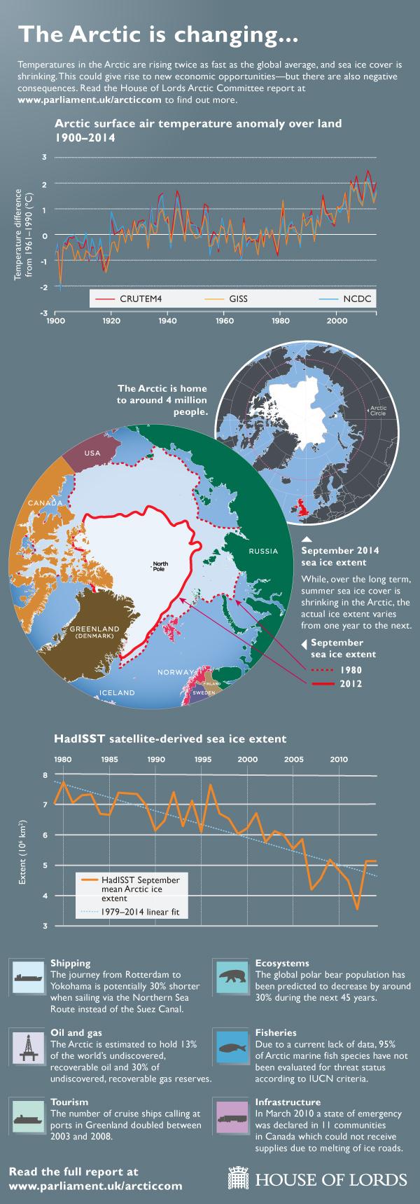
The United Kingdom’s House of Lords are an unlikely bunch to be bundled under the banner of “alarmist” or even “warmist”. Nevertheless their Select Committee on the Arctic has just published a report entitled “Responding to a Changing Arctic“, and in this video the chairman of that committee, Lord Teverson, briefly outlines their findings:
Note that he starts by saying that:
Absolutely the obvious thing first of all is that with the temperatures going up [in the Arctic] at twice the rate of the rest of the world the thing that everybody is seeing is reduction in sea ice which has reduced quite substantially over recent years, and of course a lot of the Arctic is land and we have the melting ice on Greenland particularly, which is causing sea level rises in the rest of the world.
In order to get that message across the committee has also produced the following infographic:
which shows how the temperature over land has been increasing whilst the sea ice extent in the Arctic has been declining. The committee have also made all the learned evidence they received whilst producing their report publicly available. Professor Andy Shepherd from the University of Leeds told the committee that:
The majority of sea ice changes witnessed in “the past 50 or 60 years” could be attributed to greenhouse gas emissions and their effect on temperatures in the Arctic region.
and:
Suggested that the length of the solar melt season had increased by around five days per decade, causing additional melting and retreat of the ice.
How strange then, that David Rose made no mention of any of this when reporting Prof. Shepherd’s views in his “Myth of Arctic meltdown” article of August 31st 2014?
How strange also, that Christopher Booker maintained in his “The fiddling with temperature data is the biggest science scandal ever” article of February 8th 2015 that:
The ice-melt is not caused by rising global temperatures at all.
Regular readers will recall that we recently sent The Telegraph a lesson or two about global surface temperature “adjustments”, both of which included “a video by a scientist who has studied such matters”. It seems nobody at The Telegraph, and particularly Christopher Booker, bothered to watch it or do the homework assignments. The stated view of Jess McAree, Head of Editorial Compliance at the Telegraph Media Group, is that:
Only the most egregious inaccuracy could be significantly misleading.
We therefore take great pleasure in welcoming Dr. Kevin Cowtan from the University of York, the “scientist” mentioned above, who has kindly allowed us to reprint an article of his originally published at Skeptical Science. Please read on below the fold, and don’t forget to do your homework!
There has been a vigorous discussion of weather station calibration adjustments in the media over the past few weeks. While these adjustments don’t have a big effect on the global temperature record, they are needed to obtain consistent local records from equipment which has changed over time. Despite this, the Telegraph has produced two highly misleading stories about the station adjustments, the second including the demonstrably false claim that they are responsible for the recent rapid warming of the Arctic.
In the following video I show why this claim is wrong. But more importantly, I demonstrate three tools to allow you to test claims like this for yourself.
The central error in the Telegraph story is the attribution of Arctic warming (and somehow sea ice loss) to weather station adjustments. This conclusion is based on a survey of two dozen weather stations. But you can of course demonstrate anything you want by cherry picking your data, in this case in the selection of stations. The solution to cherry picking is to look at all of the relevant data – in this case all of the station records in the Arctic and surrounding region. I downloaded both the raw and adjusted temperature records from NOAA, and took the difference to determine the adjustments which had been applied. Then I calculated the trend in the adjustment averaged over the stations in each grid cell on the globe, to determine whether the adjustments were increasing or decreasing the temperature trend. The results are shown for the last 50 and 100 years in the following two figures:
Trend in weather station adjustments over the period 1965-2014, averaged by grid cell. Warm colours show upwards adjustments over time, cold colour downwards. For cells with less than 50 years of data, the trend is over the available period.
Trend in weather station adjustments over the period 1915-2014, averaged by grid cell. Warm colours show upwards adjustments over time, cold colour downwards. For cells with less than 100 years of data, the trend is over the available period.
In the video I demonstrate three tools which are useful in understanding and evaluating temperature adjustments:
A GHCN (global historical climatology network) station report browser. GHCN provide graphical reports on the adjustments made to each station record, but you need to know the station ID to find them. I have created an interactive map to make this easier.
The majority of cells show no significant adjustment. The largest adjustments are in the high Arctic, but are downwards, i.e. they reduce the warming trend. This is the opposite of what is claimed in the Telegraph story. You can check these stations using the GHCN station browser.
The upward adjustments to the Iceland stations, referred to in the Telegraph, predate the late 20th century warming. They occur mostly in the 1960’s, so they only appear in the centennial map. Berkeley Earth show a rather different pattern of adjustments for these stations.
Iceland is a particularly difficult case, with a small network of stations on an island isolated from the larger continental networks. The location of Iceland with respect to the North Atlantic Drift, which carries warm water from the tropics towards the poles, may also contribute to the temperature series being mismatched with records from Greenland or Scotland. However given that the Iceland contribution is weighted according to land area in the global records, the impact of this uncertainty is minimal. Global warming is evaluated on the basis of the land-ocean temperature record; the impact of adjustments on recent warming is minimal, and on the whole record it is small compared to the total amount of warming. As Zeke Hausfather has noted, the land temperature adjustments in the early record are smaller than and in the opposite direction to the sea surface temperature adjustments.
Impact of the weather stations adjustments on the global land-ocean temperature record, calculated using the Skeptical Science temperature record calculator in ‘CRU’ mode.
Manual recalibration of the Iceland records may make an interesting citizen science project. Most of the stations show good agreement since 1970, however they diverge in the earlier record. The challenge is to work out the minimum number of adjustments required to bring them into agreement over the whole period. But the answer may not be unique, and noise and geographical differences may also cause problems. To facilitate this challenge, I’ve made annualized data available for the eight stations as a spreadsheet file.
In the video I demonstrate three tools which are useful in understanding and evaluating temperature adjustments:
A GHCN (global historical climatology network) station report browser. GHCN provide graphical reports on the adjustments made to each station record, but you need to know the station ID to find them. I have created an interactive map to make this easier.
The Berkeley Earth station browser. The Berkeley Earth station reports provide additional information to help you understand why particular adjustments have been made.
The Skeptical Science temperature record calculator. This allows you to construct your own version of the temperature record, using either adjusted or unadjusted data for both the land and sea surface temperatures.
Data for the temperature calculator may be obtained from the following sources:
The GHCN station data. For daily average temperature data, look for the ‘tavg’ files. The ‘qca’ files are adjusted temperatures, and the ‘qcu’ files are unadjusted temperatures. The files are stored in ‘.tar.gz’ archives, and may be extracted using most freely available unzip software.
Finally, here are some interesting papers discussing why adjustments are required.
Menne et al (2009) The U.S. historical climatology network monthly temperature data, version 2.
Bohm et al (2010) The early instrumental warm-bias: a solution for long central European temperature series 1760–2007.
Brunet et al (2010) The minimization of the screen bias from ancient Western Mediterranean air temperature records: an exploratory statistical analysis.
Ellis (1890) On the difference produced in the mean temperature derived from daily maximum and minimum readings, as depending on the time at which the thermometers are read
Finally, for the moment at least, and lapsing back into our by now familiar (and adversarial?) style:
This website uses cookies to improve your experience. We'll assume you're ok with this, but you can opt-out if you wish. Cookie settingsACCEPT
Privacy & Cookies Policy
Privacy Overview
This website uses cookies to improve your experience while you navigate through the website. Out of these, the cookies that are categorized as necessary are stored on your browser as they are essential for the working of basic functionalities of the website. We also use third-party cookies that help us analyze and understand how you use this website. These cookies will be stored in your browser only with your consent. You also have the option to opt-out of these cookies. But opting out of some of these cookies may affect your browsing experience.
Necessary cookies are absolutely essential for the website to function properly. This category only includes cookies that ensures basic functionalities and security features of the website. These cookies do not store any personal information.
Any cookies that may not be particularly necessary for the website to function and is used specifically to collect user personal data via analytics, ads, other embedded contents are termed as non-necessary cookies. It is mandatory to procure user consent prior to running these cookies on your website.