Is Time Running Out for Arctic Sea Ice?

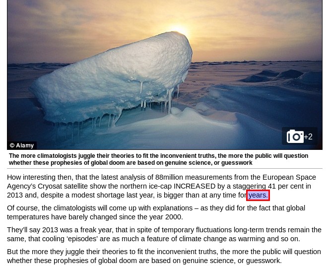
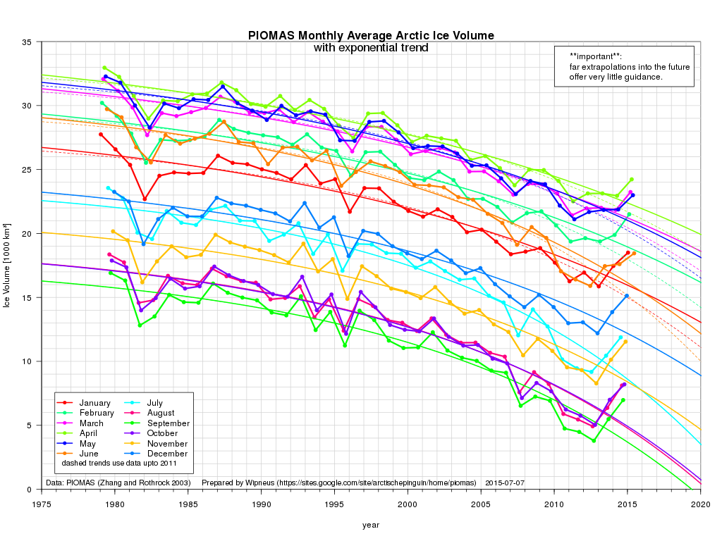
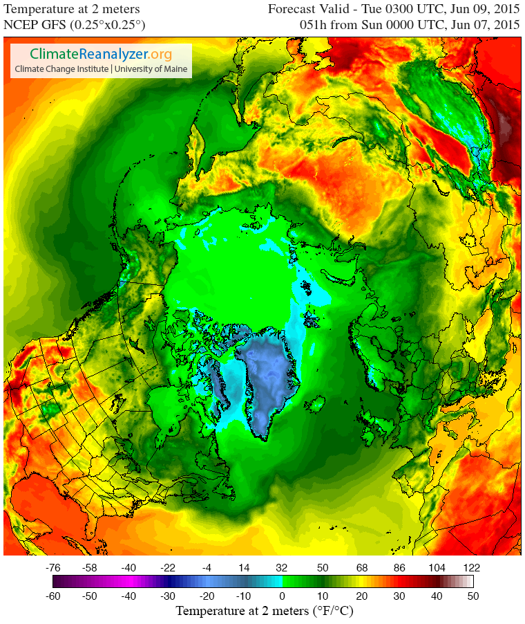
One eminent sea ice researcher certainly seems to think that time is indeed running out for the sea ice in the Arctic. First let’s take a look at the results of the first call for contributions of the 2015 melting season from the Sea Ice Prediction Network:

The Sea Ice Prediction Network  June 2015 Sea Ice Outlook results

Note that in the bottom left hand corner of that graph there is a prediction of 0.98 million square kilometers labelled “Wadhams (SIPOG)”. The acronym refers to the Sea Ice and Polar Oceanography Group in the Department of Applied Mathematics and Theoretical Physics at the University of Cambridge, of which Prof. Peter Wadhams is the head. Before we get on to his explanation for what the SIPN refers to as “an extreme outlier” amongst all the other predictions, here’s a TEDx presentation given by Dr. David Barber, who is currently Associate Dean (Research) in the CHR Faculty of Environment, Earth and Resources at the University of Manitoba in Canada:

Here are what Dr. Barber refers to as the “seven surprising impacts” of declining Arctic sea ice:

  1. Increasing coverage of young ice significantly changes atmospheric chemistry

  2. More snow both preserves and destroys ice

  3. Polar bear habitat can actually improve in some areas while deteriorating in others

  4. Match-mismatch timing in the marine ecosystem increases vulnerability

  5. Uncertainty as to whether the Arctic ocean will increase or decrease in overall productivity is a key unknown

  6. Evidence that ice hazards are actually increasing while the world marshals to increase development of Arctic resources

  7. Evidence that our recent cold winters are actually linked to our warming Arctic.

However those bullet points from David’s closing summary don’t actually mention the part of his presentation that most interested me. Listen carefully at 7:40 when he says that:

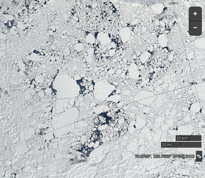
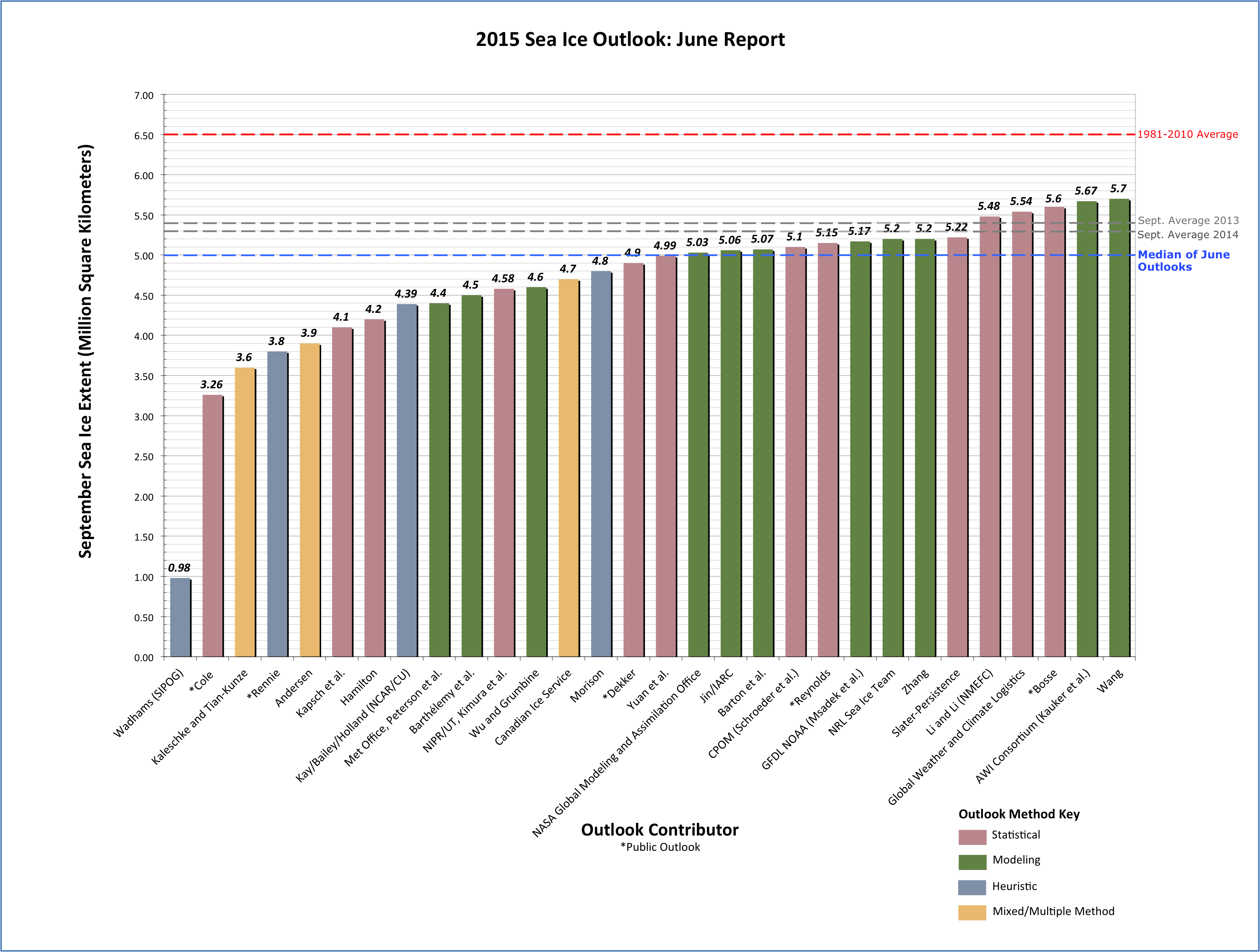
In 2009 we had our icebreaker down here and we went up this line that you see right here in this figure.

Here’s a version of the map Dr. Barber is referring that comes from a 2009 paper of his entitled “Perennial pack ice in the southern Beaufort Sea was not as it appeared in the summer of 2009“:

Barber-2009-Map

Here’s the relevant passage from the paper rather than the TEDx video:

We departed from station L1 heading north towards station L1.5, expecting to enter MY sea ice cover at about 71°20′N, 139°00′W based on remotely sensed information (Orange polygon in the figure). The Canadian Ice Service (CIS) ice chart (which relies extensively on Radarsat-1 data) for 4 September 2009 indicated the ship track would range from 7 to 9 tenths coverage and this ice would consist of partial concentrations of 5 tenths to 7 tenths old ice and from 2 to 3 tenths thick first year ice.

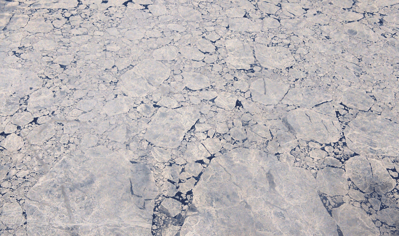
In situ observations of the sea ice conditions however showed that the ice we were traversing was not MY or thick FY, nor was it 7 to 9 tenths concentration, but rather it was a mixture of a few small MY ice floes (1 tenth coverage) interspersed in a cover dominated by small (10–100 m) rounded floes of heavily decayed first year sea ice (4 tenths). These floes were overlain by a thin layer of new ice (7 tenth) where freeboard was negative and thin ice growing between remnant pieces when the ice had a positive freeboard. Likewise, some new ice covered open water areas between floes.

This is the “rotten sea ice” David refers to in the video, about which he says:

It was so rotten in fact that the ship that we had does 13.5 knots in open water, and we were able to traverse that ice at 13 knots, yet the satellites all thought that this was very thick multi-year sea ice, because that’s what it had always traditionally been.

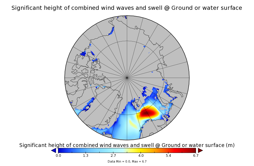
This information is obviously very interesting of course, but even more interesting (to me at least) is a subsequent paper by Dr. Barber about the same voyage of the Canadian Research Icebreaker Amundsen, published in 2012 and entitled “Fracture of summer perennial sea ice by ocean swell as a result of Arctic storms“. Here’s a pertinent extract:

We progressed through the heavily decayed ice region into a transitional region containing a mix of decayed old and FY sea ice floes, and finally into thick late summer MY pack ice. Using the onboard helicopter to survey the area, we identified a vast MY floe (10 km diameter), to which we intended to moor the ship, and conduct our typical science operations. The ice in this area was much thicker than the heavily decayed FY ice we that we had encountered the previous day to the west. Our helicopter EMI system recorded overall thicknesses of sea ice around station MYI (e.g., mean = 2.0 m, max = 10 m).

As ice teams initially prepared to deploy to the ice, we noticed the appearance of a swell from the ships helicopter deck. Laser data collected during the helicopter EMI survey at station MYI indicated a swell period of 13.5 s, and a wavelength ranging from 200–300 m. Laser data were collected while the helicopter hovered over a large MY ice floe. These data were augmented with three-dimensional dynamic ship positioning data, which revealed approximate ship heave amplitude of 0.4 m, also with a period of 13.5 s. The swell caused the vast MY ice floe nearest the Amundsen to ride up one side of the swell and fracture as it crested the wave peak, creating smaller ice floes of width approximately one half of the wavelength of the swell. In a matter of minutes from the initial onset of swell propagation, all large MY ice floes in the region were fractured in this manner, yielding a new distribution of smaller MY ice floes ranging from 100–150 m in diameter. A helicopter-borne video system recorded this event in still photographs along its flight track which were later combined to create a series of photo mosaics.

On 09 September 2009, we conducted a longitudinal helicopter EMI survey at 72.5 N, and determined the limit of the swell penetration into the pack ice at 72.526 N 134.51 W, a penetration of 350 km. Furthermore, the rotted FY ice margin was heavily fractured, with small floe sizes ranging from 20–50 m in diameter.

Moving on from Manitoba to Cambridge, Peter Wadhams has recently recorded an interview for The University of Earth, which describes itself as “an entertaining educational reality television series”. Here it is:

So what is “the reality” of the situation in the Arctic? Prof. Wadhams doesn’t explain his “extreme outlier” 2015 prediction in detail in the interview, but he does identify three potentially significant problems:

  1. The “minor thing, in a way” of several feet of global sea level rise this century due to melting of the Greenland ice sheet
  2. A sudden increase in the rate of “global warming” due to Arctic albedo feedback, which leads to
  3. The exposure of the methane hydrate bearing continental shelves off Siberia to increasing water temperatures as the sea ice above them melts. “It’s a massive risk, if you do a risk analysis”

Peter also highlights the same concerns as Barber et al. 2012, often referred to in the literature as “waves-in-ice“. I highly recommend watching both videos from cover to cover. However if you’re in a rush then at least skip to 28:30 minutes where he points out that on his cruise around the Arctic this coming September:

We’re looking at one particular thing, which may not be the most important thing, but the retreat of the sea ice in summer is going much faster than computer models predict, and we think that one factor there is the fact that as the sea ice retreats it opens up this huge area of open water in the Arctic Ocean which then becomes like an ocean, with lots of waves and storms and swell, and the waves themselves break the remaining ice up and cause it to retreat faster so that there’s a kind of collaborative effect there that the remaining ice is vanishing faster because of so much open water producing wave action.

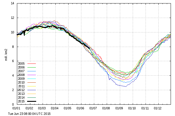
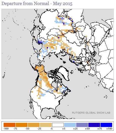
Getting back to the current situation in the 2015 melting season, here’s what the University of Hamburg’s AMSR2 sea ice concentration map currently reveals:

Arc_20150703_res3.125

and here’s what the Slater Probabilistic Ice Extent methodology is predicting will happen over the next 50 days:

Slater_fcst_20150703

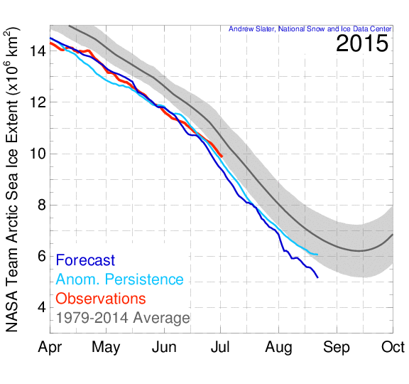
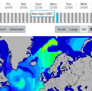
Both suggest to me that although the rate of decline in the area of Arctic sea ice is not currently abnormal for post 2007 years, it may well become so in another month or so, when the extent curve “normally” starts to flatten out. Possibly even sooner than that, because here is the current GFS 2 metre temperature map for the Arctic:

CCI-T2-20150703+3

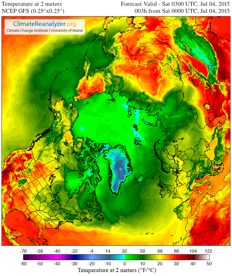
and temperatures, particularly on the Pacific side of the Arctic, are forecast to get warmer still over the next few days.

Watch this space and we’ll keep you posted, but in the meantime here’s a final thought from Peter Wadhams:

Our children have a future only if we take action now.

[Edit – July 6th 2015]

In a personal communication Prof. Wadhams informs me that:

This year I’m going out in September in the “Sikuliaq” (University of Alaska) to do some more specific wave-ice interaction experiments [in the Beaufort Sea Marginal Ice Zone], assuming there is any ice to experiment on.

[/Edit]

Does a Lie Told Often Enough Become the Truth?

This morning “Steven Goddard” quotes Lenin and Hitler with apparent approval. In an article entitled “Today’s Featured Climate Criminals – The Guardian” he closes with the following quotations:

“A lie told often enough becomes the truth”
– Vladimir Lenin

“The most brilliant propagandist technique will yield no success unless one fundamental principle is borne in mind constantly and with unflagging attention. It must confine itself to a few points and repeat them over and over. Here, as so often in this world, persistence is the first and most important requirement for success”
– Adolf Hitler

The few points about the Arctic that Tony Heller repeats over and over look like this today:

The Guardian reports that Arctic ice is melting “faster and earlier”

Arctic ice melting faster and earlier as scientists demand action | Environment | The Guardian

Arctic sea ice is melting very slowly, and is nearing a mid-summer high for the past decade.

unRealScience-DMI-20150623

Ocean and Ice Services | Danmarks Meteorologiske Institut

Arctic sea ice looked like this on June 20 – nothing like the fake picture in their May 5 article.

unRealScience-Ice-20150623

The Greenland melt season started more than a month late, and has seen below normal melt every day this year.

unRealScience-Grelyenland-20150623

Greenland Ice Sheet Surface Mass Budget: DMI

The Guardian report cited by Steve/Tony does in actual fact date from May 5th 2015. For an up to date alternative viewpoint see for example:

DMI Arctic sea ice volume on June 22nd 2015

NASA Worldview “true-color” image of broken ice north of the East Siberian Sea on June 22nd 2015, derived from bands 1, 4 and 3 of the MODIS sensor on the Aqua satellite
NSIDC Greenland melt area graph on June 21st 2015

Alaska May Snow Cover At Record Low Levels

“Steven Goddard” is evidently magically turning into “Snow White’s” muse. His latest fairy tale addresses her second favourite subject after Arctic sea ice, which is of course northern hemisphere snow cover. The article is entitled “October-March Snow Cover At Record High Levels“, and proudly proclaims that:

Fifteen years ago, climate experts said that snow is a thing of the past. Since then, Northern Hemisphere snow cover has soared to record levels.

unRealSnow-20150607

Rutgers University Climate Lab :: Global Snow Lab

What this tells us is that cold air is intruding further south during the snow season. It also tells us that Tom Karl at NOAA is lying about global temperatures.

Snow White and I innocently followed Steve’s link, then clicked on the “Rankings” link on the left hand side, where we discovered this:

Selection_474

not to mention this:

Selection_473

Feeling confident that all the Real Scientists would be interested in the latest data hot off the presses from the Snow Lab we showed them this picture:

maysnowmap2015

and enquired?

What does that tell us?

The initial response from “gator69”?

The fact that you refer to “normal” in climate or weather tells us that you have zero understanding of either.

When will you work to help the starving millions by confronting alarmists, and assist in diverting money to where it is desperately needed right now?

Since “Real Scientists” are apparently aghast at anomaly maps, here are the current absolute values from Rutgers:

RutgersSnow-20150607

Just in case you are wondering what all this has to do with Snow White’s favourite subject of all, here’s the current Topaz 4 map of Arctic sea ice snow cover:

Topaz4Snow-20150607

and here is the current northern hemisphere temperature forecast for Tuesday morning from the “Climate Reanalyzer

CCIT2-20150607+51

Snow White and I cannot help but wonder what effect temperatures above zero across virtually the entire Arctic Ocean will have on the snow cover that currently remains. We also cannot help but wonder whether 2015 Arctic sea ice extent will suddenly start tracking 1995 or 2006 as a consequence.

We also wondered what Tom Karl et al. of NOAA have been saying about the Arctic, and discovered this:

Since the IPCC report, new analyses have revealed that incomplete coverage over the Arctic has led to an underestimate of recent (since 1997) warming in the Hadley Centre/Climate Research Unit data used in the IPCC report. These analyses have surmised that incomplete Arctic coverage also affects the trends from our analysis as reported by IPCC.

Finally, for the moment at least, here’s the Topaz 4 snow depth forecast for June 16th 2015:

Topaz4Snow-20150616

Thanks to “Nightvid Cole” and “Vergent” at the Arctic Sea Ice Forum for bringing that view of things to our attention.

What Planet is Tony Heller On?

There’s no rest for the wicked! Tony Heller, still better known as the pseudonymous “Steven Goddard”, is promulgating his erroneous Arctic sea ice narrative once again this morning. In an article entitled “Rommulans Never Learn” he has this to say:

From five years ago, the Arctic was doomed and I was a denier. And five years later, the ice is still almost exactly the same as twenty years ago.

and he then presents this Cryosphere Today image comparing Arctic sea ice concentration on June 1st 2015 with the same date in 1995:

unRealScience-CTcombo-20150605

and comments:

Someone with an IQ over 30 might be able to figure it out, but not climate alarmists.

Obviously Steve/Tony hasn’t received our message yet, so we repeated it yet again:

At the risk of repeating myself repeating myself, the ice is NOT still almost exactly the same as twenty years ago:

https://stevengoddard.wordpress.com/2015/05/29/trouble-looming-for-arctic-alarmists/#comment-524677

“Can you see the dark blue areas in the 2015 image where there aren’t any in the 1995 image? Try looking at the Beaufort Sea, the Chukchi Sea, the Kara Sea and the North Water Polynya”

The shiny white area in the 2015 image is also of course a long way from the current reality.

For those with an IQ of 30 or less who would like to play “spot the difference” with us, here is a hastily prepared animation of a somewhat pixellated Chukchi Sea:

1995-2015-0601-Chukchi


[Edit 15:15 BST July 5th 2015]

Steve/Tony has published another article about the Arctic today. This one is entitled “Scientific American Calls For An Ice-Free Arctic In 12 Weeks” and claims yet again that:

Arctic sea ice is closely tracking 2006, the summer with the highest minimum of the past decade.

Have we got news for you Tony? Using your preferred metric du jour:

2015-06-05_1600_unRealScience

[Edit 10:15 BST July 6th 2015]

“Caleb” is giving me still more stick over at “Real Science”:

It is my duty to report what actually is happening, even if it isn’t what I expect.

I sure do wish Mr. Hunt would learn to do the same. Why on earth he would want to tell us ice was melting when it seemed obvious it was refreezing is beyond me. Does he have some deep need to humiliate himself, like a medieval person undergoing self-flagellation?

Of course I couldn’t take that lying down, so:

For your information, and that of anyone else who might be interested, the core temperature of the ice floe underneath 2015A got up to -1.34 °C yesterday:

2015-06-05-2015A

Finally, for the moment at least, here’s an animated GIF of the North Water Polynya which I fear won’t impress Treesong very much:

1995-2015-0601-NWPolynya

[Edit 16:00 BST July 7th 2015]

If you repeat something often enough does it eventually turn into the truth? Today’s Arctic article from Steve/Tony is strangely familiar. It is entitled “Arctic Sea Ice Continues To Track 2006“. However according to the NSIDC today:

Charctic-2006-20150606-1

[Edit 11:00 BST July 11th 2015]

Steve/Tony keeps maintaining every day or two that “Arctic Sea Ice Continues To Track 2006”. There’s been a cyclone over the central Arctic with a minimum central pressure of 970 hPa (or mb if you prefer), which has caused some divergence of the sea ice:

Synopsis-20150607-crop

Here’s a closeup of the recent history of a variety of “compactness” metrics which illustrates that point:

amsr2-compact-20150610-crop

Across the board the sea ice in the Arctic is less compact than a few days ago as a result of the cyclone, but still more compact than on the same date in other recent years. Getting back to the extent metrics, here’s what the DMI 30% threshold version has been up to:

2015-06-10-DMI30

and here’s the NSIDC 5 day average of their 15% threshold flavoured variety:

2015-06-10-Charctic-2006

[/Edit]

Trouble Looming for the Arctic?

Once again our title for today is inspired by the indefatigable “Steven Goddard”. His latest Arctic themed article on his so called “Real Science” blog is entitled “Trouble Looming For Arctic Alarmists“, and he’s following his usual formula of showing an image or two interspersed with unrelated text. Here’s Tony’s textual take on things, interspersed with our graphic retorts:

Arctic sea ice coverage is nearly identical to 20 years ago:

Not according to the NSIDC it isn't!
Not according to the NSIDC it isn’t!

Arctic sea ice is following almost the exact trajectory of 2006, which had the highest summer minimum of the last decade.

Not according to the NSIDC it isn't!
Not according to the NSIDC it isn’t!

Not according to GFS they're not, and look at the North Pole!
Not according to GFS they’re not, and look at the North Pole!

The Beaufort Sea is full of very thick ice.

Not according to the US Navy it isn't!
Not according to the US Navy it isn’t!

Arctic sea ice is the thickest it has been in a decade.

According to PIOMAS it's thin in the Beaufort, and most other areas too!
According to PIOMAS it’s thin in the Beaufort, and most other areas too!

As we summarised matters for “Steve”/Tony’s loyal readership:

The Gish Gallop continues! Just for the record:

  1. Arctic sea ice coverage is currently NOT nearly identical to 20 years ago
  2. Arctic sea ice is currently NOT following almost the exact trajectory of 2006
  3. Arctic sea ice is currently NOT the thickest it has been in a decade in Ron’s beloved Beaufort/Chukchi/East Siberian Seas (BCE for short)
  4. Renowned Arctic sea ice expert “Steve Goddard” predicted last year that.”The minimum this summer will likely be close to the 2006 minimum, which was the highest minimum of the past decade”. That’s not how things eventually turned out!

The Greatest Arctic Sea Ice Prophet on the Planet?

The unedited version of "Steve's" extent graph
The unedited version of “Steve’s” DMI extent graph earlier today

Why It’s So Hard to Convince Pseudo-Skeptics

Yesterday Anthony Watts published a guest post on his “Watts Up With That” blog authored by Matt Manos. It is entitled “Why It’s So Hard to Convince Warmists“.

Being a somewhat lazy realist I reproduce it here in full, although be warned that I have used the search/replace function of my text editor a teensy-weensy bit:

Many of the posters and readers at GWC have expressed frustration at convincing pseudo-skeptics. Using facts and logic seem to fall on deaf ears. There are some interesting social sciences theories on why pseudo-skeptics are unresponsive. I know the social sciences aren’t a favoured science with this group but if you’ll bear with me, you’ll hopefully see how social science can be useful in describing why pseudo-skeptics are unreachable. And possibly, what to do about it.

In their latest speeches on global warming, Obama and the Pope weren’t trying to convince pseudo-skeptics that CAGW is real. Instead, they were sending signals to their supporters on what “all right thinking people” should be saying. This is classic in-group/out-group communication. Obama and the Pope were setting up the talking points for their in-group members to use to determine who can be considered part of the tribe and who should be rejected for being outside of it. This is a process called Othering. Othering turns political foes into non-beings. Others have no value. Others can be discounted and ignored. Others can be mocked.

Booker and Rose are examples of bellwethers; the sheep with the bell that the other sheep follow. Bellwether is not a derogatory term, it’s a descriptive term. The job of a political bellwether is to indicate the position that their followers should take in their everyday conversations. Booker and Rose’s latest articles function as position papers for the delegates of all right thinking people. You meet these people at work, church, school, at the coffee house, etc. The delegates will mirror the words that Booker or Rose used to identify other in-group members, normalize beliefs and mock out-group members. One of the main themes of both speeches was shame. Shame on those who aren’t right thinking people. Shame that they aren’t as intelligent and capable as “us.”

That type of smugness is almost impossible to penetrate. When a realist questions a pseudo-skeptic’s view on global warming/climate change, the pseudo-skeptic hears something vastly different than what the realist is saying. A realist might say, “There’s no evidence for an Arctic Ice Recovery.” What the pseudo-skeptic hears is how stupid warmists are because that’s what Anthony Watts told him he should think. If the pseudo-skeptic doesn’t prove that he thinks realists are stupid then he might be confused for a warmist! And no one wants to be identified with being a warmist because they’re mocked and don’t get invited to the right parties. No amount of science can penetrate the ROI the pseudo-skeptic has internalized in not believing in CAGW.

Many of the pseudo-skeptics are running on pure rational ignorance. Rational ignorance is a belief that the cost/benefit to researching every issue is so low as to be a net negative in time utilization. Thus the ignorance is rational and everyone utilizes this mental process on certain topics. People who are rationally ignorant about global warming look to bellwethers that support their gut stance. Rationally ignorant pseudo-skeptics would look to Australian leaders, mockutainers and denialist scientists for guidance on how to communicate their position on global warming.

Penetrating rational ignorance is tough because the position pseudo-skeptics have taken isn’t based on logic. Their position is actually based on an appeal to authority. To question the rationally ignorant denier is to question the field of science as a whole (to be a science realist) or to question the leadership of their favorite bellwether personalities. This will cause the rationally ignorant denier to become defensive and try to stand up for their favorite bellwether. The rationally ignorant will also point to their favorite bellwethers and say, “Who am I to doubt all these intelligent people?” It’s intellectually offshoring. It’s lazy. It’s human nature.

The scientific method rejects outright in-group/out groups, Othering, bellwethers and rational ignorance. A scientist is supposed to follow the results on an experiment even if the results don’t support his hypothesis. The scientist is clearly not supposed to rig the data to ensure he gets invited to a party with the right people or continued funding. But science has a poor track record on controversial topics. It often takes decades to accept new theories that are clear winners (e.g., continental drift).

Scientists are still social animals. Social animals follow hierarchy and incentives. If you really want to win the debate on global warming, change the opinions of the bellwethers. Change the economic incentives for the global warming scientific paper mill. Otherwise you’re stuck debating only the people who are unable to change their minds because it would cost them personally to do so. Rare is the person intellectually honest enough to bite the hand that feeds or is willing to violate social norms to speak the truth.

Please feel free to comment below should you spot any inadvertent errors that necessitate a bit more searching/replacing on my part. In the meantime you may be interested in watching this recording I made of a presentation by Dr. Darren Schreiber of Exeter University at a “Pint of Science” presentation last week, entitled “Your Brain is Built for Politics“:

Note in particular the part at 8 minutes 15 seconds where Darren says:

In a new study that just came out a couple of months ago they showed a single disgusting image, and one single disgusting image and measuring the brain activity and how the person responded to that was sufficient to allow you to identify if somebody was conservative or liberal. With a single brain image. With 95% accuracy!

Arctic Sea Ice Fails To Track 2005/2006

The pseudonymous “Steve Goddard” proudly proclaims this morning that “Arctic Sea Ice Continues To Track 2005/2006“. Tony Heller states:

Experts say that the Arctic is in a “death spiral” – but for the past two years it has been tracking 2005/2006 – the years with the two highest summer extents of the past decade.
unReal_DMI-may-21-04-26

For the past four years, summer melt season temperatures in the Arctic have been well below normal.
unReal-DMI-T2_20150520

No matter how many times experts lie about it, the Arctic is not melting down.

The Arctic, of course, has other ideas and continues to fail to conform to the narrative over at (un)Real Science. Today the NSIDC 5 day average extent Arctic sea ice extent is in actual fact at the lowest level for the time of year since their records began:
2015-05-20_Charctic
In view of “Steve”/Tony’s headline you may find it surprising that so is his much beloved DMI 30% threshold extent extent metric (displayed in full):
DMI-30-20150521
and so is the JAXA 15% extent extent:
JAXA-20150520
Holding out by the merest whisker (for the moment) is the Cryosphere Today area metric, which is nonetheless lower than on the same day in both 2005 and 2006:
2015-139-CTArea
Quod Erat Demonstrandum?


[Edit – May 23rd 2015]

After being used by a polar bear to inspect its feet, the webcam trained on ice mass balance buoy 2015A is now pointing in the right direction again. It reveals that the Arctic is in fact “melting down” even as “Steve”/Tony maintains that it isn’t:

2015A-cam-20150523-2

As if further proof were needed, the DMI 15% threshold extent graph extent is also now clearly lower than previous years at this time:

DMI-15-20150523

Jakobshavn Isbræ Calves Yet Again

As we reported back in February, the Jakobshavn Isbræ glacier in Western Greenland has already calved around about 7 km² of  ice earlier this year. Now the eagle eyed Espen Olsen reports another large calving via the Arctic Sea Ice Forum:

Jakobshavn Isbræ the calving-machine is up in gear again

Here’s his evidence, an animation created using images from the Landsat 8 Operational Land Imager:

Jak-20150512

After a bit more graphical processing Espen subsequently posted another animation:

Jak-20140928

This one reveals the amount of ice that still needs to be lost before the calving face retreats as far as it ultimately did last summer. Espen also comments:

The calving front at Jakobshavn is very different to September 28 2014 (record retreat), not only did the glacier expand since then but the front is much narrower?


Here once again is Jason Box’s Jakobshavn calving summary from February:

Jaki_2015

which certainly seems to confirm Espen’s point.

The New Normal In The Arctic

The latest headline on the so called “Real Science” blog reads as follows:

The New Normal In The Arctic – Cold Summers

According to “Steven Goddard”:

For the third year in a row, near-polar temperatures have dropped below normal in May.

meant_20150511

Both of the last two years, temperatures stayed below normal for the entire melt season.

The below normal summer temperatures are keeping the ice from melting, and have led to a large expansion in the amount of thick multi-year ice.

However the Arctic is unfortunately failing to cooperate with that narrative. Today we are unhappy to report that Tony Heller‘s favourite Arctic sea ice metric, the Danish Meteorological Institute 30% threshold extent, is at the lowest level ever for the date since their records began:

DMI-30_20150512

What is more, so is the JAXA 15% extent metric:

2015-05-12_JAXA

As if that wasn’t enough to be going on with, some big holes have already appeared in the middle of the supposedly multi-meter thick, multi-year sea ice in the Beaufort Sea, well away from the open water already warming up off the Mackenzie Delta:

NASA Worldview “true-color” image of The Beaufort Sea on May 11th, derived from bands 1, 4 and 3 of the MODIS sensor on the Aqua satellite

Gross Deception Measuring Arctic Sea Ice Trends

Our title today is inspired by Paul Homewood, who published an article earlier this week entitled “Why Measuring Arctic Ice Trends From 1979 Is Gross Deception” and which begins as follows:

Officially, we only started monitoring Arctic sea ice extents by satellite from 1979. We know however that this is not the whole story. For instance, HH Lamb tells us:

Kukla & Kukla (1974) report that the area of snow and ice, integrated over the year across the Northern Hemisphere, was 12% more in 1973 than in 1967, when the first satellite surveys were made.

I’ve added that link, since Paul neglected to include it. He concludes:

To draw any conclusions about Arctic ice or temperatures, using data that begins at the coldest point of the cycle is utterly worthless and grossly misleading. But this is climate “science” we are talking about.

Since this is Paul Homewood we are talking about I felt compelled to quibble about his grossly misleading assertion:
 

Us:

Here’s the NSIDC’s chart of Arctic sea ice extent anomalies since 1953:

You will no doubt note that it reveals an overall peak in the late 60s, not the late 70s


Them:

I note they don’t show the 1940’s


Us:

Whereas I note that 1969 is a much juicier looking cherry than 1979. Is 1949 better still?


Them:

They did not have satellite monitoring in 1969.


Even though I had already pointed out the error of his ways to him Paul Homewood decided at this juncture to publish another article, this time entitled “Satellite Monitoring Of Arctic Sea Ice Pre 1979“. It began:

IPCC90-SeaIce IPCC90-Captionhttp://www.ipcc.ch/ipccreports/far/wg_I/ipcc_far_wg_I_full_report.pdf

I was pointing out yesterday why it was so inappropriate to deduce trends in Arctic sea ice, using 1979 as the start point. NSIDC, of course, do this supposedly because that is when satellite monitoring began.

Mr Biscuits, however, reminds me that the 1990 IPCC report showed the above graph, with Arctic sea ice extent back to 1972.


Us:

At the risk of repeating myself, what about this remarkable recent narrative?

https://archive.today/ADq4O#selection-1535.0-1547.25


Them:

They did not have satellites in 1953.


Us:

What the NSIDC actually say regarding their dataset that starts in 1978 is:

“This product is designed to provide a consistent time series of sea ice concentrations (the fraction, or percentage, of ocean area covered by sea ice) spanning the coverage of several passive microwave instruments.”

http://nsidc.org/data/nsidc-0051

Note that there is no mention of “when satellite monitoring began”. See also their Nimbus Data Rescue project, which has data going back to 1964:

http://nsidc.org/data/nimbus/data-sets.html

“Consistent time series” are the operative words


Them:

We’ll keep you posted!