Please forgive my mixing of metaphors this morning, but the interminable stream of piss poor propaganda from Tony Heller grows ever more voluminous. Not only has he reprised his “DMIGate” nonsense but he is also posting pictures of the wrong bit of the Arctic yet again. Exhibit A:
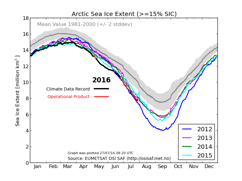
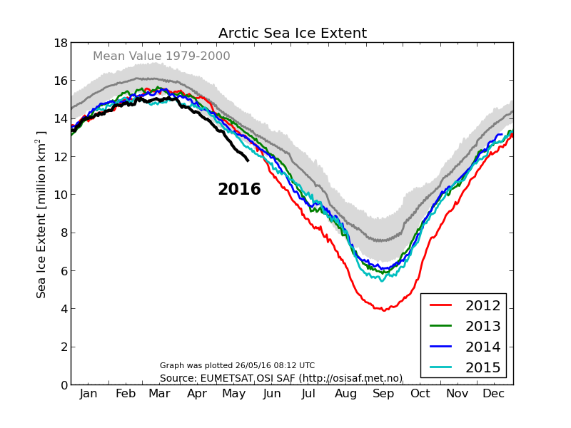
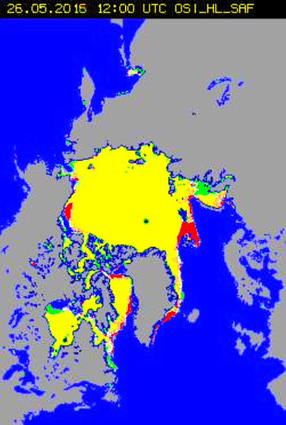
DMI shows Arctic sea ice extent well below last year, and near a record low.
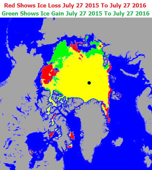
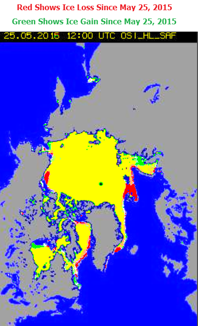
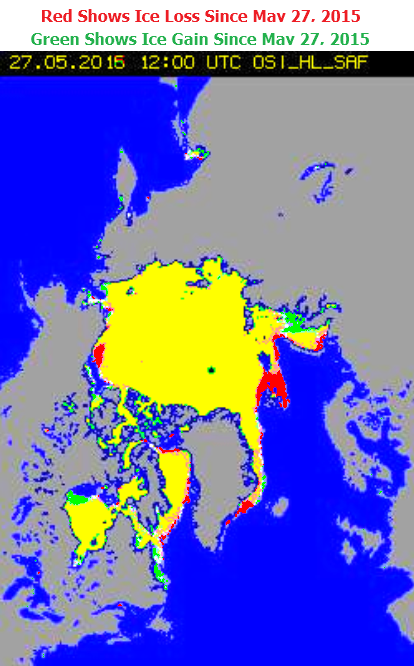
In fact, there is more ice than last year, and it likely that 2016 will end considerably higher than last year. This is because the big red spot (below) in the Beaufort Sea disappeared in a storm during the second week of August last year.
The forecast is for very cold air over the Beaufort Sea the next two weeks, so it is unlikely that a lot of melting is going to occur there. This is shaping up to be a disastrous year for Arctic alarmists, and it will be interesting to see how the graphs progress, and if and when they catch up with reality.
DMI aren’t the only ones that “show Arctic sea ice extent well below last year”:
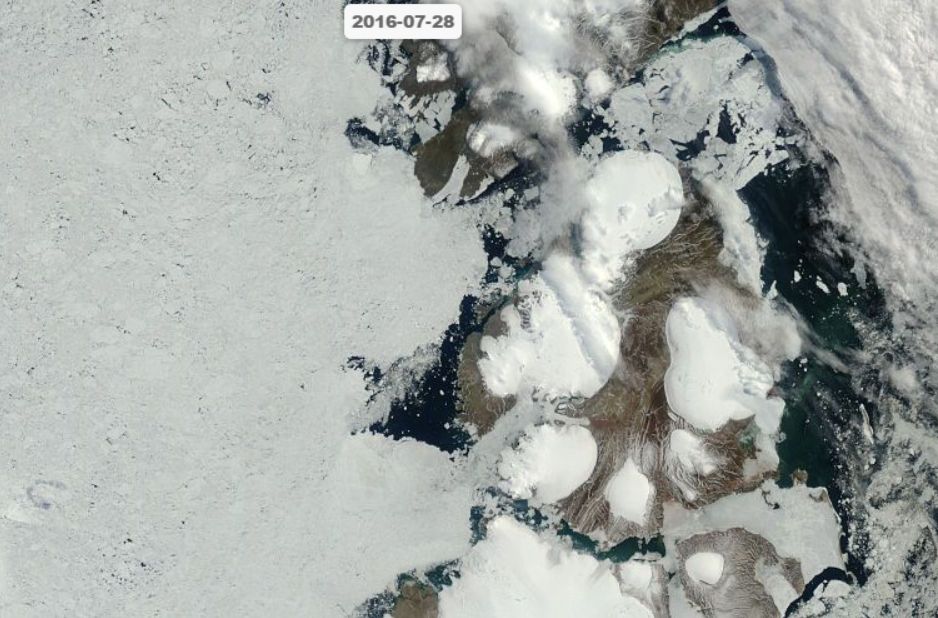
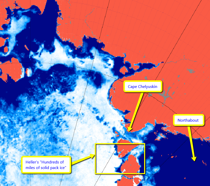
The clouds over the Northeast Passage have finally cleared, and you can now see what our intrepid explorers are up against. Hundreds of miles of solid pack ice.
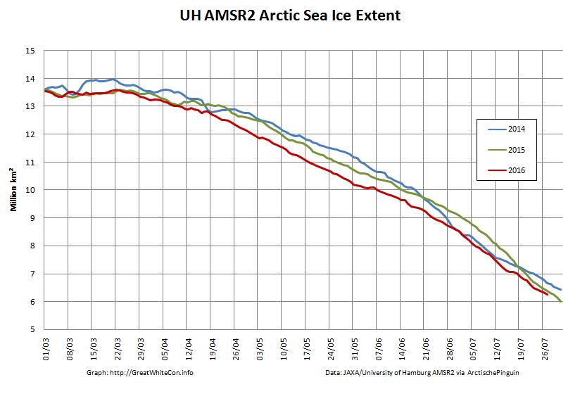
I pointed out the error of his ways to him yesterday, but for some strange reason Tony is still posting pictures of the wrong place. Here is an overview of the actual facts, as assessed by AMSR2:
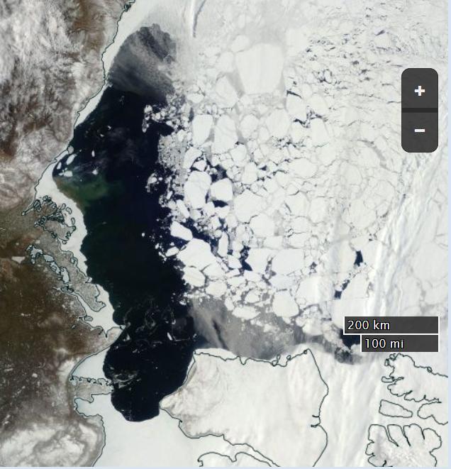
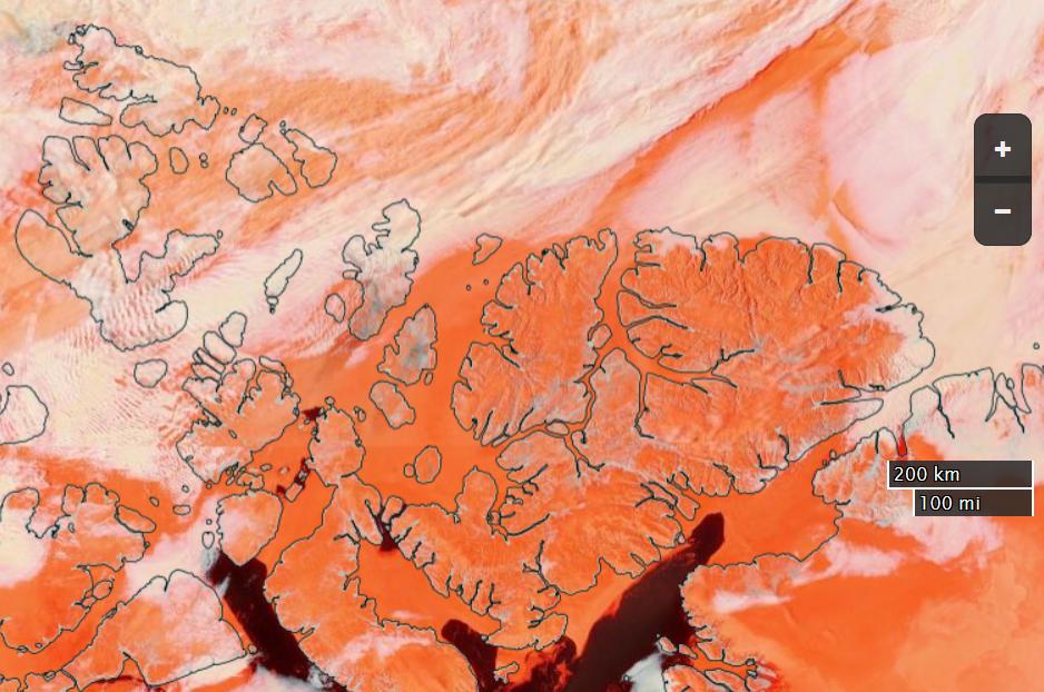
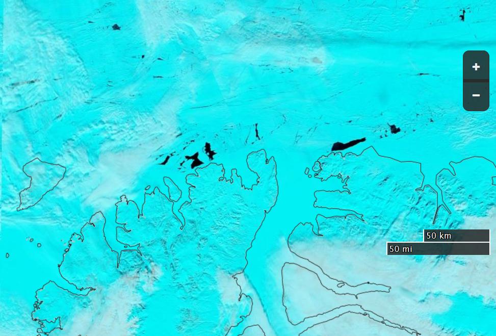
Here’s a satellite image of the Beaufort Sea this year, which is red on Tony’s low resolution 2015/16 comparison map:
NASA Worldview “true-color” image of the Beaufort Sea on May 20th 2016
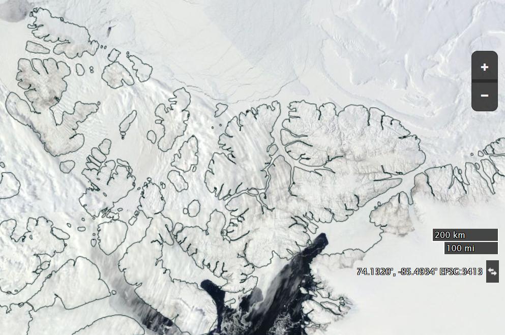
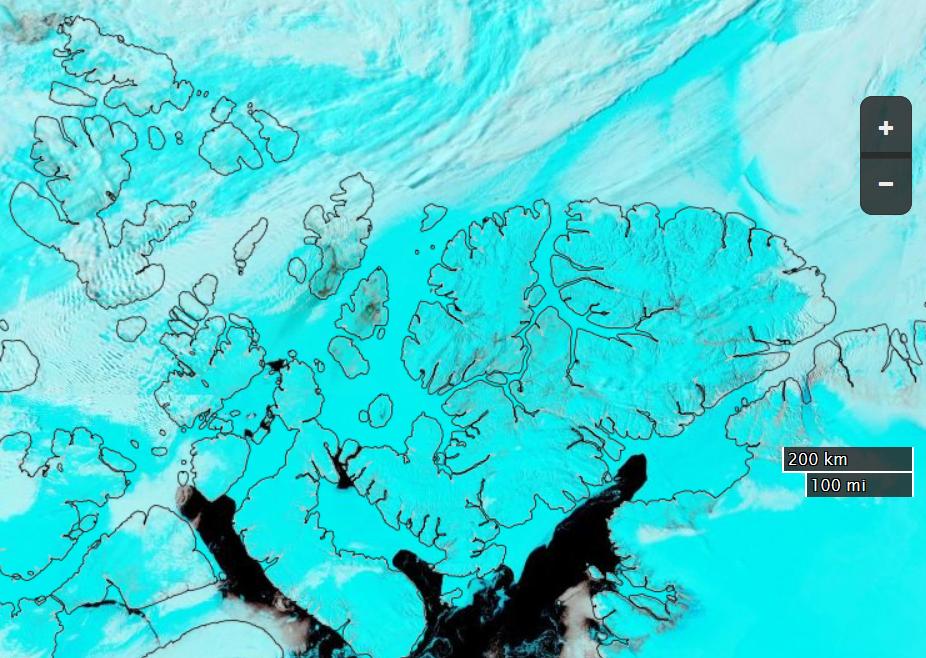
Here’s a satellite image of the the northern edge of the CAA last year, which is green on Tony’s map:
NASA Worldview “true-color” image of the Canadian Arctic Archipelago on May 20th 2015
Would you care to play “spot the difference” with Peter and I?
[Edit – May 28th 2016]
Tony is doubling down on his Arctic fraud. His Arctic monkey business continues. Despite the lucid explanation of his glaring error provided by Peter Ellis the unReal Science Gish gallop continues. We are now (un)reliably informed that:
The Arctic is very cold, and is not melting.
The amount of ice in the Arctic is almost exactly the same as this date last year.
Yours truly has asked all and sundry at unReal Science this question 9 times, phrased in a variety of different ways:
Here’s a satellite image of the the northern edge of the CAA last year. Take a good look at it and then show me the areas of open water corresponding to the green areas on Tony’s final map above.
Once again “No answer!” was the stern reply to my plaintive questions.
[Edit – May 30th 2016]
The “Jousting with Malice in Blunderland” continues, but the oppostion are remarkably quiet today. I’ve had my knuckles rapped about this previously, but cutting and pasting is so quick ‘n easy I simply cannot resist:
Us:
Evidently Tony Heller believes that when it comes to melting sea ice air temperatures are all that matters and that “somewhat warmer ocean water” is irrelevant. see above:
He also evidently believes that in May 2015 large areas of the oldest and thickest sea ice in the Arctic had already melted away to nothing. Perhaps you can point out all the polynyas around the coast of the Canadian Arctic Archipelago this time last year to him, since nobody else has yet managed to do so?
gees, Jimbo has change to a luminous blue.
Very pretty Jim..
Now how about you show one that shows th near ZERO Arctic sea ice from the first 3/4 of the Holocene..
Or are you still going to DENY/ IGNORE the FACT that there is nothing untoward happening with the Arctic Sea Ice, and all you are arguing about is the INSIGNIFICANT TRIVIA that rules your meaningless life.
Us:
For psychedelic Arctic surface air temperature fans every where:
What do you suppose happens to sea ice when you combine “somewhat warmer ocean water” with “somewhat above freezing point air”?
N.B. Such conditions do not currently exist off the north coast of the CAA. They didn’t in May 2015 either.
Them:
You on psycho drugs yet again, Jimbo
Which of your Exeter buddies is feeding them too you ?
Us:
Evidently you and Tony are the ones who have been smoking stuff Andy.
In the fantasy wonderland portrayed in several of Tony’s recent “articles” polynyas are depicted in the oldest, thickest sea ice in the Arctic in May 2015. Here is what the real life polynyas in the “oldest, thickest sea ice” in the actual Arctic of May 2016 look like from above (through cyan tinted spectacles):
Shut up about the Holocene, it’s not relevant to modern Arctic sea ice extent trends.
It’t like talking about sun spot trends and then someone comes along and says “Well, this is nothing compared to when the sun becomes a red giant”. Which is true, but not relevant at all.
Us:
Have you noticed that the world’s leading expert on satellite imagery of the Arctic during the first 3/4 of the Holocene epoch has compared MODIS imagery of the Canadian Arctic Archipelago from May 2015 with May 2016 and confirmed that there is no noticeable difference in sea ice extent between the two?
With apologies to O’Reilly Media Inc. here’s a brief history of the “DMIGate” story, viewed through Anthony Watts’ distorting spectacle lenses.
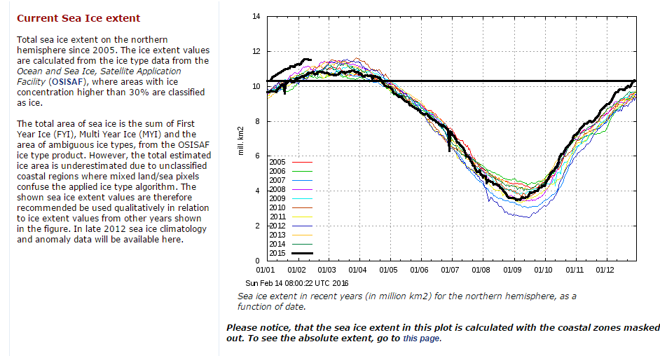
0) Here is the February 14th 2016 edition of the Danish Meteorological Institutes’s long “deprecated” 30% concentration threshold Arctic sea ice extent graph in question:
1) On August 14th 2013 Anthony Watts wrote on his “Watts Up With That” blog:
There has been so much skulduggery going on in the climate establishment in recent years that it is hard to avoid the conclusion that this graph has been withdrawn simply because it gives the “wrong” results.
3) Anthony Watts refuses to publish any and all comments on his blog pointing out what he himself had confirmed that DMI said in August 2013.
You post off topic or disrupt threads with the sort of unsubstantiated nonsense you post above, and both demand to have these off topic comments heard and then play the “look Watts is censoring me!” game when your comments don’t meet our site comment policy and/or are abusive in nature.
David – Are you suffering from acute snow blindness too, just like poor Paul Homewood? Try reading this if you haven’t already. Try reading it again if you have:
In view of the incontrovertible evidence why would anyone believe anything Paul Homewood, Anthony Watts and Judith Curry claim about “Climate Etc.” ever again?
Our title this morning is but a brief extract from a conversation I started on Judith Curry’s “Climate Etc.” blog about (believe it or not!) the effects of large wind driven swells on the “Marginal Ice Zone” of sea ice in the Arctic:
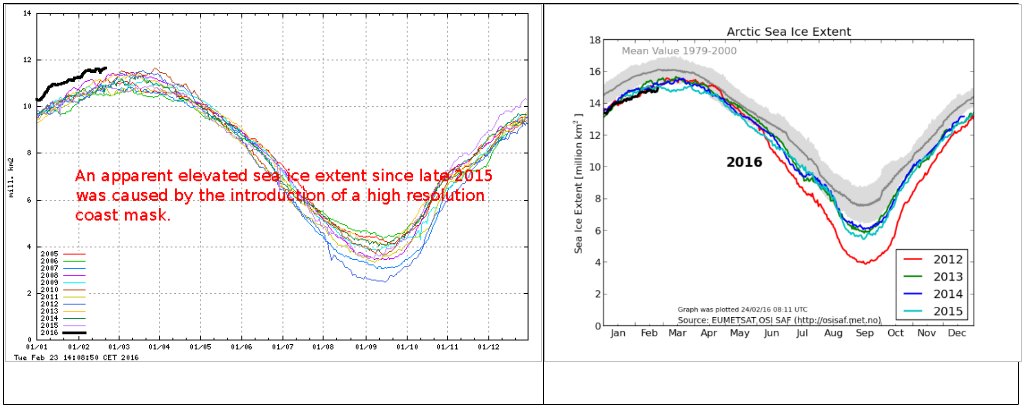
Whilst “skeptics” like Pethewin keep on flogging that particular “dead parrot” the DMI have just published an explanation of the erroneously high readings on their now deceased 30% concentration threshold Arctic sea ice extent metric. Here’s an extract, together with a pretty picture for the benefit of those amongst we Cryospheric commenters who are hard of understanding:
The apparent elevated sea ice extent in the data from the old extent algorithm was an artifact, caused by a new and higher resolution coast mask.
Surely that’s easy enough for even the dumbest of all the armchair Arctic analysts scattered across the internet to comprehend?
Going into more detail, the DMI article explains that:
Most of our sea ice extent followers know that the old plot includes a coastal mask, inside which sea ice was is accounted for. In summer 2015 this mask was refined and the masked region was subsequently smaller, thus leaving more area for classified sea ice and open water. The difference in masked area, before and after summer 2015, is approximately 1.4 million km2. This corresponds to difference of the blue coast lines in figure 2, showing the old and new coastal masks in the left and right panels, respectively. The difference may be difficult to detect on the figure, but the area is quite significant. The increasing sea ice extent that is caused by the new coast mask is not great during summer, because sea ice has a relative short line of contact with land during summer. But the new and finer coast mask will result in increasingly more sea ice, compared to previous years during winter, as the coast line with sea ice contact is increasing. This is the reason for an increasing sea ice extent during current freeze-up period, relative to previous winters. A comparison of the 2015/2016 sea ice extent with previous years does therefore not make sense.
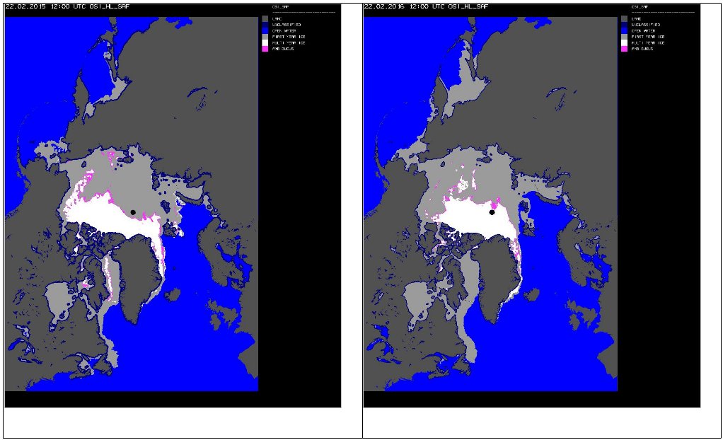
Note how the dark blue “coastal mask” in the left hand image from February 22nd 2015 is thicker than the one in the right hand image from the same date this year. DMI conclude with this apology:
Because of the deprecated status of the old plot in the past year, DMI has not been monitoring these irregularities. The old plot should, of cause, have been removed when the mask was replaced. DMI apologizes for the confusion and inconvenience this has caused.
Somehow I doubt that the assorted “skeptics” that have recently been making massive mountains out of this minor molehill will apologise for all “the confusion and inconvenience this has caused”. Causing confusion and inconvenience was probably the general idea.
This website uses cookies to improve your experience. We'll assume you're ok with this, but you can opt-out if you wish. Cookie settingsACCEPT
Privacy & Cookies Policy
Privacy Overview
This website uses cookies to improve your experience while you navigate through the website. Out of these, the cookies that are categorized as necessary are stored on your browser as they are essential for the working of basic functionalities of the website. We also use third-party cookies that help us analyze and understand how you use this website. These cookies will be stored in your browser only with your consent. You also have the option to opt-out of these cookies. But opting out of some of these cookies may affect your browsing experience.
Necessary cookies are absolutely essential for the website to function properly. This category only includes cookies that ensures basic functionalities and security features of the website. These cookies do not store any personal information.
Any cookies that may not be particularly necessary for the website to function and is used specifically to collect user personal data via analytics, ads, other embedded contents are termed as non-necessary cookies. It is mandatory to procure user consent prior to running these cookies on your website.