Category Archives: Extent

Gross Deception About MASIE and the Sea Ice Index

Our title for today is a reference back to a 2015 article by Paul Homewood on his “Not A Lot Of People Know That” blog, in which he told a load of old porky pies about the National Snow and Ice Data Center’s graphs of Arctic sea ice extent. Only last week Mr. Homewood cooked up another pile of porky pies concerning the Danish Meteorolical Institute’s Arctic sea ice extent metric. Now he has turned his pie baking skills to the Multisensor Analyzed Sea Ice Extent (MASIE for short), which is “a prototype collaborative product of the National Ice Center and NSIDC”.

Mr. Homewood obviously hadn’t done a whole lot of homework on MASIE before firing up his porky pie production line, since he used the self same recipe posted on the so called “Science Matters” blog of Ron Clutz shortly before. In fact he just reprinted the first part of Ron’s article and added a handy link to Ron’s even bigger pile of porky pies beneath it. Hence both Paul and Ron’s web sites currently proudly proclaim that:

Something strange is happening in the reporting of sea ice extents in the Arctic. I am not suggesting that “Something is rotten in the state of Denmark.” That issue about a Danish graph seems to be subsiding, though there are unresolved questions. What if the 30% DMI graph is overestimating and the 15% DMI graph is underestimating?

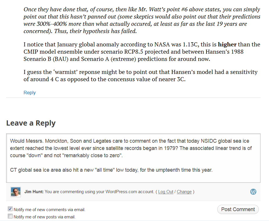
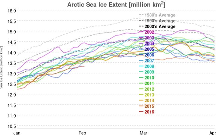
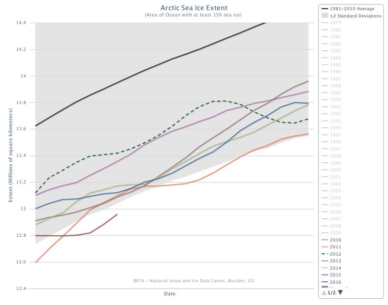
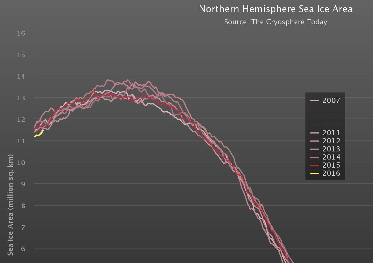
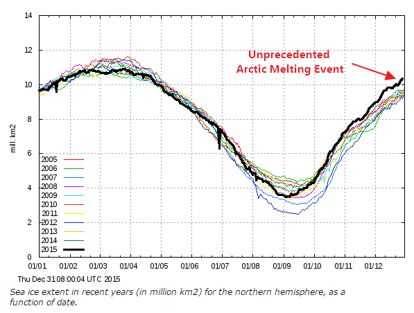
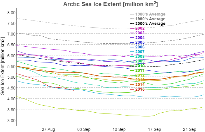
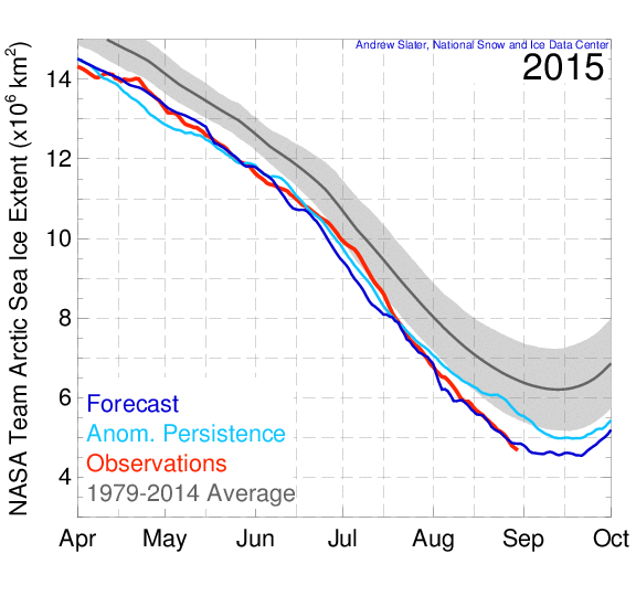
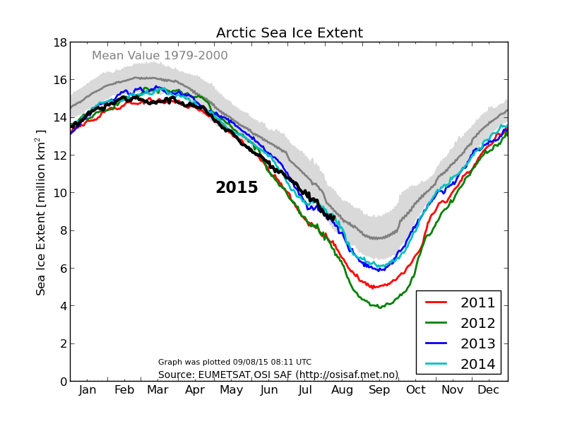
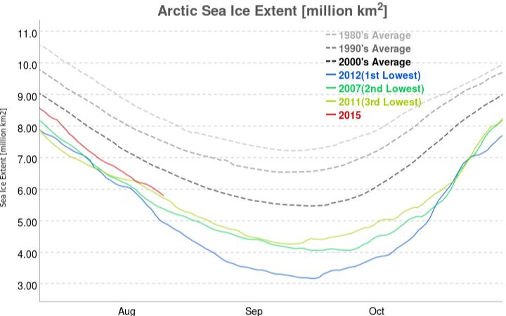
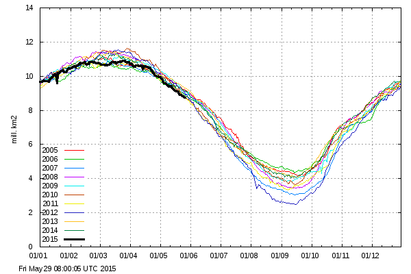
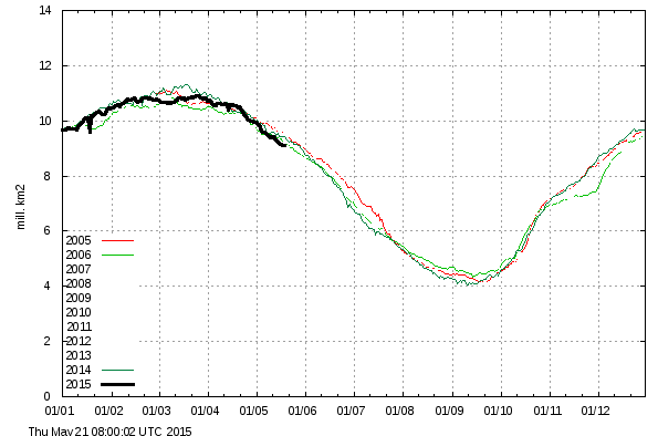
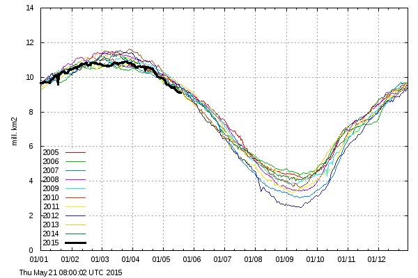
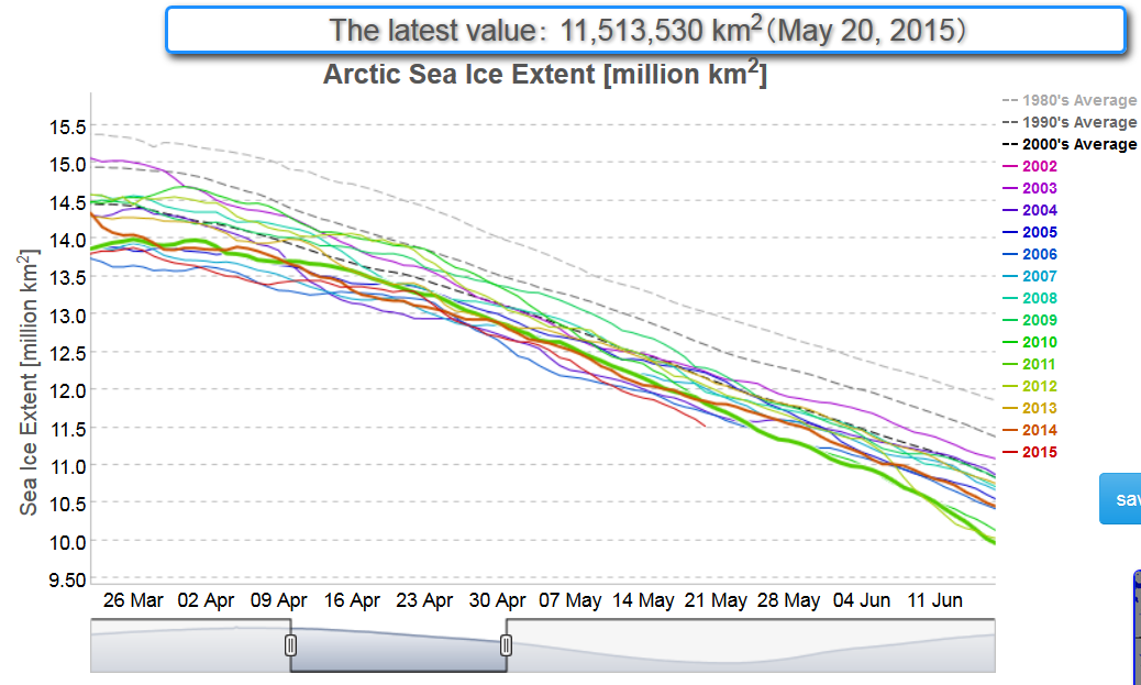
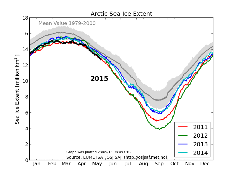
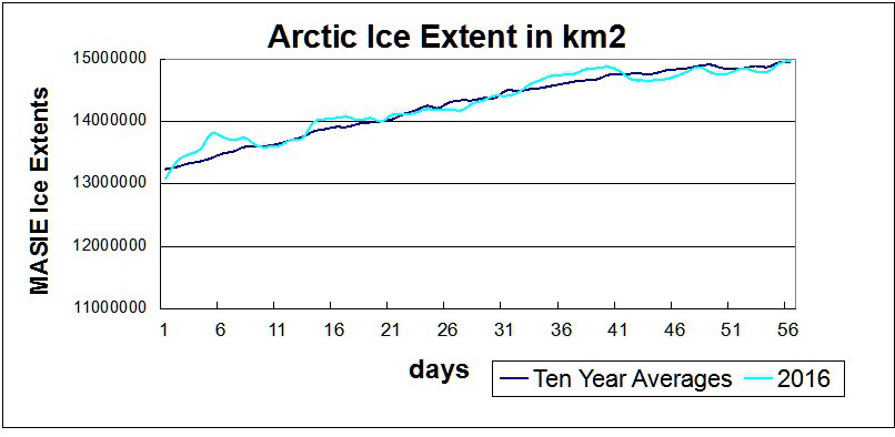
The MASIE record from NIC shows an average year in progress, with new highs occurring well above the 2015 maximum:

Clutz-masie-2016-to-day-56r

While I am compelled to agree with Ron and Paul that “something strange is happening in the reporting of sea ice extents in the Arctic” we disagree about everything else! One reason for that is because only a few days ago I interviewed NASA scientist Walt Meier following a suggestion by Ron Clutz that I do precisely that. Please read the edited highlights of that interview, and note in addition that Walt assured me that he had not previously been contacted by either of Messrs. Clutz and Homewood. Having never previously contacted Mr. Meier, here’s what Ron Clutz would have his loyal readership believe this weekend:

NOAA Is Losing Arctic Ice

Why the Discrepancy between SII and MASIE?

The issue also concerns Walter Meier who is in charge of SII, and as a true scientist, he is looking to get the best measurements possible. He and several colleagues compared SII and MASIE and published their findings last October. The purpose of the analysis was stated thus:

Our comparison is not meant to be an extensive validation of either product, but to illustrate as guidance for future use how the two products behave in different regimes.

Here is what Dr. Meier’s peer reviewed paper from October last year concluded on the matter:

Operational modelers require timely data that are as accurate as possible to initialize forecast models. In particular, an accurate ice edge is important because of the influence of the interaction of sea ice and water with the overlying atmosphere on the model fluxes. Consistency of data is also desirable for operational models, but is a secondary concern because the models are regularly reinitialized for their synoptic forecasts. Operational observations like MASIE make the most sense for these applications. However, the quality and amount of information used to produce the operational analyses vary.

Climate modelers desire consistent long-term data to minimize model biases and better understand and potentially improve model physics. The passive microwave record is useful, but has limitations. Regions of thin ice are underestimated and if the ice cover is diffuse with low concentration, ice-covered regions may be detected as open water. Even thin ice modifies heat and moisture transfer and thus may affect atmospheric and oceanic coupling. Surface melt results in an underestimation of concentration. This should be considered when evaluating model concentrations with passive microwave data.

and here once again is what he told me a few short days ago:

Since the quantity and quality of [MASIE] data varies the time series will not be consistent over time.

For some strange reasom Mr. Clutz’s article mentions none of this. Needless to say I have attempted to bring this unfortunate oversight to the attention of Ron & Paul:

2016-02-28_1007-RonClutz

Even more unfortunately it seems that their joint acute snow blindness has got even worse over the last few days, since they still haven’t noticed my link to Walt Meier’s words waiting patiently in their WordPress.com “moderation queues”.

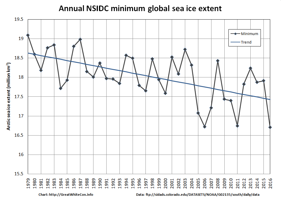
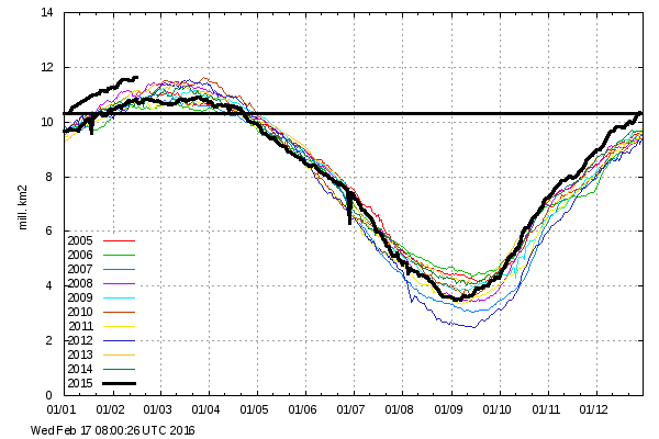
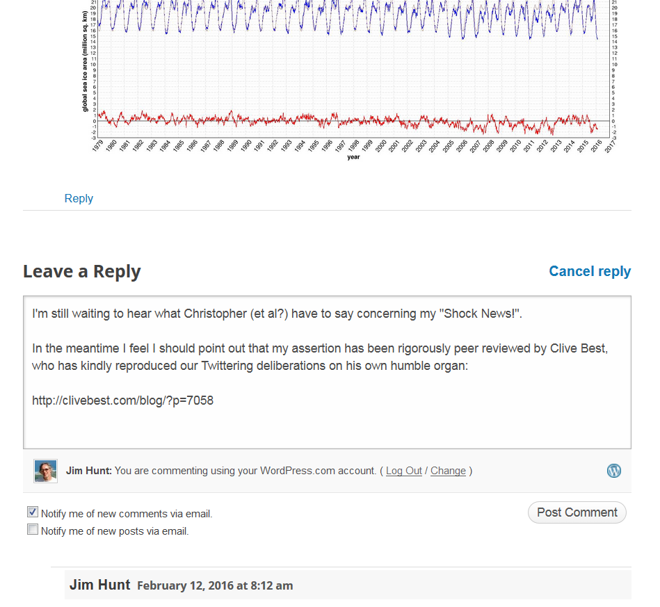
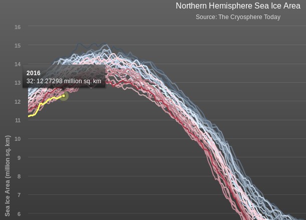
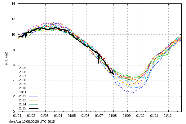
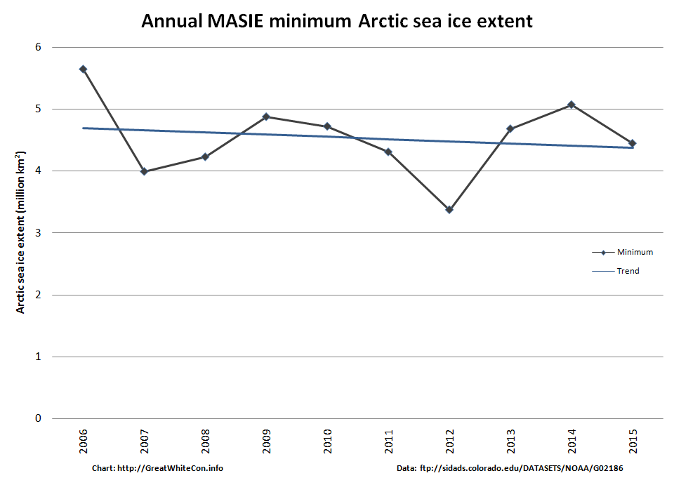
Whilst we wish them on their recovery from their painful ailment, here’s an alternative interpretation of the MASIE data:

MASIE-Min

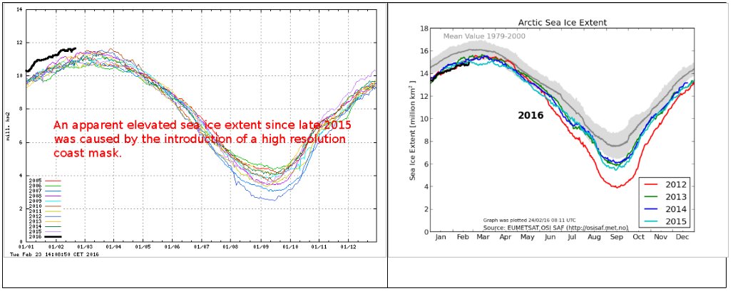
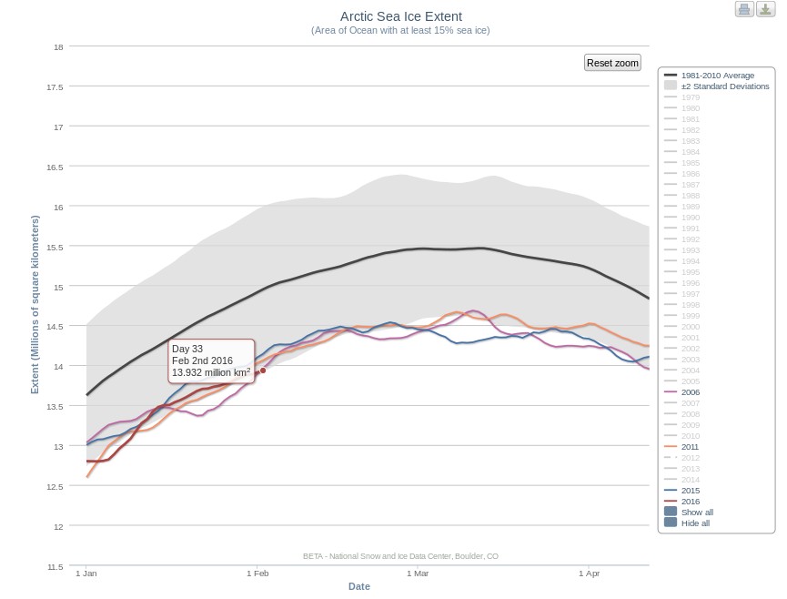
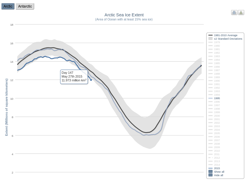
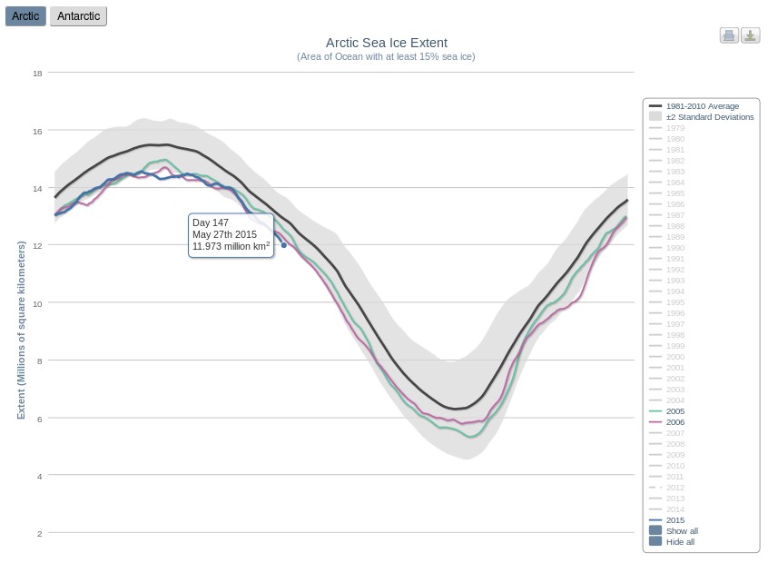
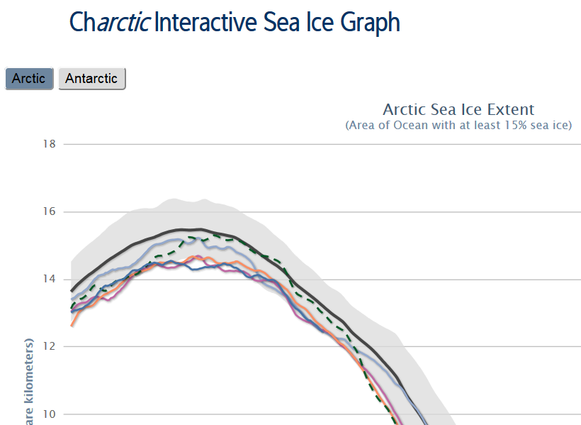
Operational modellers for the use of! Here’s what the NSIDC’s Sea Ice Index currently reveals to climate scientists:

Charctic-20160226

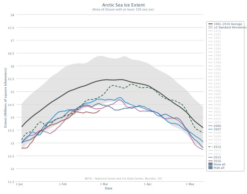
NSIDC Arctic sea ice extent is evidently still currently lowest *ever for the date.

The “DMIGate” Dodo is Pushing up the Daisies

Our title this morning is but a brief extract from a conversation I started on Judith Curry’s “Climate Etc.” blog about (believe it or not!) the effects of large wind driven swells on the “Marginal Ice Zone” of sea ice in the Arctic:

2016-02-25_1159-Judy

Whilst “skeptics” like Pethewin keep on flogging that particular “dead parrot” the DMI have just published an explanation of the erroneously high readings on their now deceased 30% concentration threshold Arctic sea ice extent metric. Here’s an extract, together with a pretty picture for the benefit of those amongst we Cryospheric commenters who are hard of understanding:

The apparent elevated sea ice extent in the data from the old extent algorithm was an artifact, caused by a new and higher resolution coast mask.

Surely that’s easy enough for even the dumbest of all the armchair Arctic analysts scattered across the internet to comprehend?

Going into more detail, the DMI article explains that:

Most of our sea ice extent followers know that the old plot includes a coastal mask, inside which sea ice was is accounted for. In summer 2015 this mask was refined and the masked region was subsequently smaller, thus leaving more area for classified sea ice and open water. The difference in masked area, before and after summer 2015, is approximately 1.4 million km2. This corresponds to difference of the blue coast lines in figure 2, showing the old and new coastal masks in the left and right panels, respectively. The difference may be difficult to detect on the figure, but the area is quite significant. The increasing sea ice extent that is caused by the new coast mask is not great during summer, because sea ice has a relative short line of contact with land during summer. But the new and finer coast mask will result in increasingly more sea ice, compared to previous years during winter, as the coast line with sea ice contact is increasing. This is the reason for an increasing sea ice extent during current freeze-up period, relative to previous winters. A comparison of the 2015/2016 sea ice extent with previous years does therefore not make sense.

Note how the dark blue “coastal mask” in the left hand image from February 22nd 2015 is thicker than the one in the right hand image from the same date this year. DMI conclude with this apology:

Because of the deprecated status of the old plot in the past year, DMI has not been monitoring these irregularities. The old plot should, of cause, have been removed when the mask was replaced. DMI apologizes for the confusion and inconvenience this has caused.

Somehow I doubt that the assorted “skeptics” that have recently been making massive mountains out of this minor molehill will apologise for all “the confusion and inconvenience this has caused”. Causing confusion and inconvenience was probably the general idea.

DMI, MASIE and the Sea Ice Index – An Interview With Walt Meier

For some reason best known to himself Anthony Watts has jumped on the “DMIGate” bandwagon started by Paul Homewood over on this side of the Atlantic a few days ago. In his latest article Mr. Watts quotes with approval the “Not A Lot Of People Know That” article which we have already covered in some depth.

Here yet again is one of my comments that recently ended up on the NALOPKT cutting room floor:

2016-02-21_1811-NALOPKT

You will note that I was suggesting that Ron Clutz’s extremely selectively interpretation of some of Walt Meier’s academic papers left a lot to be desired. Particularly given the additional fuel added to the “skulduggery” fire by the Watts Up With That article it seemed sensible to phone up NASA and ask Walt for his views on the second hottest Arctic sea ice topic on the planet at the moment, according to Messrs. Clutz and Homewood at least. That is the relative merits of Multisensor Analyzed Sea Ice Extent (MASIE for short) versus the National Snow and Ice Data Center’s Sea Ice Index (SII for short) for determining Arctic sea ice trends.

According to the NSIDC:

MASIE sea ice products are developed from National Ice Center (NIC for short) data with support from the U.S. Navy and from NOAA. MASIE is hosted by NOAA@NSIDC.

whereas:

The Sea Ice Index provides a quick look at Arctic- and Antarctic-wide changes in sea ice. It is a source for consistent, up-to-date sea ice extent and concentration images and data values from November 1978 to the present.

As luck would have I managed to get through to Walt on my second attempt, and he graciously agreed to be interviewed at extremely short notice. He told me that whilst he now worked at NASA he used to be at the NSIDC, and still collaborated with them. Here are the edited highlights of his thoughts on “MASIE v SII”:

MASIE repackages data from the NIC, and incorporates an ice edge hand drawn by analysts working with whatever satellite data they have available at the time. It is an “operational” product designed to produce a “best effort” ice edge each day, based on whatever data may be available at the time.

Visual data is obviously not available in winter, and the ice edge is often obscured by clouds in summer. Synthetic Aperture Radar can “see in the dark” and through clouds, but suffers from different limitations. The whole of the Arctic isn’t covered every day for example. In addition, and unlike the SII, data from different satellite sensors is incorporated which means there are inevitably inconsistencies from day to day and from year to year. There is also an element of “human subjectivity” because different analysts are working with different sources of data from one day to the next. Since the quantity and quality of data varies the time series will not be consistent over time.

On the other hand the SII was designed to use a consistent methodology over a long period of time using a single type of sensor. 100% automatically processed passive microwave data is the “gold standard” when it comes to determining sea ice trends. It is subject to some biases and thus is not necessarily as accurate on a given day as MASIE. However, the biases are consistent over time, so the time series will be consistent over time. This means that year-to-year comparisons and trend estimates will be more accurate in the passive microwave data than in MASIE.

So there you have it. If you’re on the bridge of a vessel sailing in Arctic waters then MASIE is the right tool for the job. If on the other hand you’re sat in front of a computer trying to get the best estimate of trends in Arctic sea ice extent then the Sea Ice Index is what you’ll grab from your toolkit.

Having had a chance to examine the “evidence” of DMI “skulduggery” presented by Messrs. Watts and Homewood, Walt sent me a follow up email. Here is what it says:

Regarding DMI, the issue seems quite simple. The 30% plot is an older version that they stopped supporting as they transitioned to the 15% plot. I don’t know specifically why the 30% plot went awry, but there is generally automatic quality control done to make sure the final results are accurate and consistent. If such QC is not done, a lot of incorrect values can occur. I suspect that since the older version was no longer supported, the QC wasn’t being watched and something went wrong that they didn’t bother to fix (or maybe didn’t even notice) because the new 15% version is the official DMI output.

Not a lot of people know that, because Watts, Homewood et al. have developed the nasty habit of “snipping” comments to that effect as and when the mood takes them, which based on my own experience seems to be remarkably often in this day and age.

Global Sea Ice Extent at Lowest *Ever Level

A few days ago we reported that the Cryosphere Today global sea ice area metric had fallen to the “lowest *ever” level since their records began in 1979. CT area just fell to yet another all time low once again. Today we are able to bring you the news that NSIDC global sea ice extent also achieved “lowest *ever” status today, at 16.707 million square kilometers. Here’s the graph to prove it:

Global-Extent-2016-02-18

As we discussed when global sea ice area reached its all time low level:

This measure doesn’t tell us all that much about the health of either Arctic or Antarctic regions, if only because the seasons move in opposite directions (nevertheless, the global sea ice trend is down). It’s just an interesting statistical factoid.

Rest assured that nonetheless we will attempt to bring this “statistical factoid” to the attention of those who have been merrily claiming for the past few years that “the trend on the daily observations of global sea-ice extent by the satellites since 1979 is remarkably close to zero.”

To begin with, let’s see when (if?) this comment sees the cold light of day shall we?

2016-02-18_1911-WUWT

[Edit – 08:30 UTC February 19th 2016]

The comment shown above has now seen the light of day, whereas a number of others have not. Here’s the rest of the assorted conversations, so far:

Them:

I prefer this chart:

DMI_extent-30_20160217

That’s at 30%, which eliminates most of the wind-blown bergs. It measures the thicker ice cover, so it’s a more accurate representation.

You can see 2016 starting to move up after a strong 2015 finish.


Us:

This one is currently still invisible over there:

That’s the one which the Danish Meteorological Institute no longer even mention on their website because it’s been deprecated and unsupported for so long:

http://ocean.dmi.dk/arctic/icecover.uk.php

Here’s the graph (of Arctic sea ice extent only) which they currently recommend, which shows broadly the same thing as the NSIDC’s version:

DMI_icecover_20160219

Can we get back to GLOBAL sea ice area/extent now?

I didn’t want to use up my limited allocation of links over at WUWT, but here is what the Arctic sea ice chart that WUWT mods (and “Steve Goddard“) prefer currently looks like:

DMI_extent-30_20160218

Maybe that’s why the WUWT moderator in question felt compelled to display Wednesday’s chart instead of Thursday’s?


Them:

[I don’t think any of [Monckton, Soon or Legates] with bother with your off-topic question. as said earlier, your entire m.o. is to launch a taunt, and it doesn’t merit a response since this isn’t any particularly noteworthy event. -mod]


Us:

This one is currently still invisible too:

Have you got something against Clive Best? Both my comments that link to our conversation about global area/extent are still invisible.

The “lowest EVAH!!” value of Christopher Monkton’s favourite sea ice metric doesn’t merit a response from him? On an article subtitled “killer questions that expose how wrong and ideologically driven they are”? Surely you jest?

Quoting from the ice cool Snow White:

On January 19th 2016 the Watts Up With That blog published an article by one “Christopher Monckton of Brenchley” entitled “20 false representations in one 10-minute video“. The 15th “false representation” read as follows:

That Arctic sea ice is declining, though Antarctic sea ice has been on a rising trend and reached a satellite-era record in early 2015, and though the decline in Arctic sea ice is chiefly only in a few late-summer weeks and is a small fraction of the seasonal variation in sea-ice extent, so that neither the extent nor the trend of global sea ice (from the University of Illinois) shows much change throughout the satellite era.

Where is the Good Lord when you need him? Where is Willie Soon for that matter?


Here are my other comments that have yet to catch the eagle eyes of the Watts Up With That band of merry moderators:

2016-02-18_1951-WUWT

2016-02-15_1800-WUWT

2016-02-12_2353-WUWT


* Since satellite records began

Arctic Sea Ice Area and Extent Lowest *Ever for the Date

We’ve recently been speculating about the effect on the sea ice in the Arctic of varying amounts of weather borne heat, wind and waves. The cumulative effect of all the assorted storms is that today a variety of sea ice metrics are all at their lowest ever level for the date, since their respective records began.

The JAXA/ADS extent was the first to fall below all previous years, and here’s how it looks today:

vishop_extent-20160202

Note that it shows extent currently decreasing. Next came the Cryosphere Today area, which has also just decreased from the day before:

CT-2016-032

The latest metric to join the club is the 5 day averaged version of the NSIDC Arctic sea ice extent, which currently reveals:

NSIDC-20160202

Would any brave reader care to hazard a guess where and when the assorted Arctic sea ice metrics will eventually reach their maximum values for 2016?

P.S. The NSIDC average Arctic sea ice extent for January 2016 is also in the “lowest ever” club:

nsidc-2016-01

* Since satellite records began

New Year 2016 Arctic Meltdown Update

On January 1st 2016 the 15% concentration threshold daily Arctic sea ice extent metric reported by the United States National Snow and Ice Data Centre reached the lowest ever level for the first day of any year since their satellite derived records began in 1979. A couple of days later the more familiar 5 day trailing averaged extent also reached the lowest ever level for the date:

Charctic-20160107

Cryosphere Today have been somewhat sluggish about updating their records of Arctic sea ice area, but have at long last revealed that their metric is now also at the lowest ever level for the date:

CT-NH-20160107

Meanwhile Great White Con commenter “Just A Thought” states that:

I find it hard, with what I do have access to, to see why everyone is so worried that the Arctic is melting.

He or she has evidently only had access to the propaganda perpetrated by Tony Heller (AKA “Steve Goddard”) on his so called “Real Climate Science” blog. Mr. Heller’s latest Arctic pronouncement on December 31st 2015 is entitled “Arctic Meltdown Update” and claims that:

Experts say that a terrifying storm melted the North Pole yesterday. This unprecedented melting event has caused Arctic ice to reach its highest December extent in over a decade.

justifying that comment with the following graph of his beloved (albeit deprecated) 30% concentration threshold DMI extent metric:

DMI-30-2015-12-31-

Here’s a video revealing the effect of the recent “terrifying storm” on the sea ice on the North Atlantic side of the Arctic:

As you can see the ice at the North Pole didn’t melt away. However the ice edge did retreat in the immediate aftermath of what is referred to here in the United Kingdom as “Storm Frank“. Frank led to lots of flooding in the North of the nation, and also to some strong winds inside the Arctic Circle:

WW3Wind-20151230-1400

Those winds, travelling over a long stretch of open ocean, produced some pretty significant waves, speeding in the direction of the sea ice edge:

WWIII-20151231-0000

Meanwhile temperatures near the North Pole did briefly rise above the freezing point of sea ice in the middle of the Arctic winter. Here’s the Danish Meteorological Institute’s view of the air temperatures in the central Arctic:

meanT_20151231

and here is NOAA’s temperature anomaly reanalysis for December 30th 2015:
NOAA-anomT_20151230

Personally I reckon the 25 m/s winds and resulting 10 meter waves had more effect on the sea ice metrics than the 25 °C above normal air temperatures, but your mileage may of course vary, especially if your pseudonym is “Steve Goddard”!

The 2015 Arctic Sea Ice Minimum Extent

We’ve now entered the month of September, the month in which Arctic sea ice extent and area reach their annual minimum levels, historically at least. To set the scene, here’s the extent graph from the Japan Aerospace Exploration Agency (JAXA) for September 1st, based on data from the AMSR2 sensor on board their SHIZUKU satellite.:

IJIS-sep01

As you can see, the 2015 curve has just dropped below 2007 and is now at the second lowest level for the date in JAXA’s records. As the month progresses we’ll be taking a look at a variety of other metrics as they start to report their numbers for September.

To set the scene, here’s the University of Hamburg’s map of Arctic sea ice concentration for September 1st, again based on AMSR2 data:

Arc_20150901_res3.125

Here’s a video showing how that map has changed over the last two months:


Notice in particular the effect of the recent Arctic cyclone on the sea ice in the lower left quadrant. Note also our comment that:

[There is] a large potential fetch across the East Siberian, Chukchi and Beaufort Seas should any further cyclones occur in the area over the next few weeks. The conditions now exist for an even more damaging swell to be generated before the 2015 minimum Arctic sea ice extent is reached.

By now you may be wondering if we have a prediction to make? Well, we predict it still all depends on the weather! However here’s how the “probabilistic” 50 day ahead prediction from Andrew Slater of the NSIDC looks at the moment: SlaterExtent-20150831

If I were a betting man I’d say that the red line will ultimately put in a lower low than the dark blue one.

Finally, for the moment at least, take a look at the GFS surface level pressure forecast for later today, courtesy of MeteoCiel:

Can you see the 1000 hPa central pressure low spinning over the Laptev Sea? It’s currently not very deep, and it’s not over the East Siberian Sea either, but watch that space along with us as we wait to discover where and when the assorted Arctic sea ice metrics reach their minima for 2015.

[Edit – September 3rd 2015]

The latest edition of the US National Snow and Ice Data Center’s Arctic Sea Ice News has just been published. In the section on the imminent minimum they show this graph:

and say that:

Starting with the ice extent observed on August 31 and then applying 2006 loss rates, the slowest rate in recent years, results in the highest extrapolated minimum for 2015 of 4.50 million square kilometers (1.74 million square miles), and a September monthly average extent of 4.59 million square kilometers (1.77 million square miles). The lowest daily minimum comes from using the 2010 pace, yielding an estimated 4.12 million square kilometers (1.67 million square miles) for the daily minimum, and a September monthly average extent of 4.33 million square kilometers (1.67 million square miles).

Using an average rate of ice loss from the most recent ten years gives a one-day minimum extent of 4.38 ± 0.11 million square kilometers (1.79 million square miles), and a September monthly average of 4.49 ± 0.09. As of August 31, the 5-day running daily average extent is 4.72 million square kilometers. If no further retreat occurred, 2015 would already be the sixth lowest daily ice extent in the satellite record.

The forecast places the upcoming daily sea ice minimum between third and fourth lowest, with fourth more likely. There is still a possibility that 2015 extent will be lower than 4.3 million square kilometers, the third lowest sea ice extent, surpassing the 2011 sea ice extent minimum, and a small chance of surpassing 2007, resulting in the second-lowest daily minimum. This assumes that we continue to have sea ice loss rates at least as fast as those of 2010. This was indeed the case for the final ten days of August 2015.

Somewhere between 2nd and 6th then! We felt compelled to enquire on Twitter:

Arctic Sea Ice Approaching Normal?

According to “Steve Goddard” it is! Hot off the presses over at “Real Science” we are told that:

DMI hasn’t updated their 30% concentration map for 10 days, but their 15% concentration map is just about at the 1979-2000 mean.

DMI-15-icecover_20150809

Ocean and Ice Services | Danmarks Meteorologiske Institut

The melt season has essentially stopped, with very cold air across the Beaufort Sea

[Image redacted – It shows Canada and one corner of the Beaufort Sea]

The usual criminals in the press (Guardian, New York Times, etc.) and government agencies will of course not mention this, because reality and science wrecks their agenda.

unRealScience-Gore-20150810

Gore: Polar ice cap may disappear by summer 2014

I have to admit Steve’s confusing language confused me briefly. The Arctic sea ice concentration and ice type maps from the OSISAF on which the Danish Meteorological Institute base their extent graphs have been updating normally, but I eventually discovered what “Steve”/Tony was on about. On close inspection although the date at the bottom has been updating the 2015 curve on DMI’s 30% threshold Arctic sea ice extent graph currently seems to be stuck on August 2nd:

DMI-30-icecover_20150810

I’ve informed DMI of the problem, but when it might be fixed remains to be seen, since as the DMI web site puts it:

The old plot can still be viewed here for a while.

and as I was just informed they don’t have any resources allocated to keep the “deprecated” 30% service running.

Meanwhile back in real world in the Arctic, DMI temperatures north of 80 degrees are above “normal”:

DMI-meanT_20150810

GFS temperature anomalies look like this:

CCI-T2-Anomaly-20150811

and JAXA 15% threshold Arctic sea ice extent has been dropping at nearly 100,000 km² per day for the last few days:

vishop_extent_20150810

Trouble Looming for the Arctic?

Once again our title for today is inspired by the indefatigable “Steven Goddard”. His latest Arctic themed article on his so called “Real Science” blog is entitled “Trouble Looming For Arctic Alarmists“, and he’s following his usual formula of showing an image or two interspersed with unrelated text. Here’s Tony’s textual take on things, interspersed with our graphic retorts:

Arctic sea ice coverage is nearly identical to 20 years ago:

Not according to the NSIDC it isn't!
Not according to the NSIDC it isn’t!

Arctic sea ice is following almost the exact trajectory of 2006, which had the highest summer minimum of the last decade.

Not according to the NSIDC it isn't!
Not according to the NSIDC it isn’t!

Not according to GFS they're not, and look at the North Pole!
Not according to GFS they’re not, and look at the North Pole!

The Beaufort Sea is full of very thick ice.

Not according to the US Navy it isn't!
Not according to the US Navy it isn’t!

Arctic sea ice is the thickest it has been in a decade.

According to PIOMAS it's thin in the Beaufort, and most other areas too!
According to PIOMAS it’s thin in the Beaufort, and most other areas too!

As we summarised matters for “Steve”/Tony’s loyal readership:

The Gish Gallop continues! Just for the record:

  1. Arctic sea ice coverage is currently NOT nearly identical to 20 years ago
  2. Arctic sea ice is currently NOT following almost the exact trajectory of 2006
  3. Arctic sea ice is currently NOT the thickest it has been in a decade in Ron’s beloved Beaufort/Chukchi/East Siberian Seas (BCE for short)
  4. Renowned Arctic sea ice expert “Steve Goddard” predicted last year that.”The minimum this summer will likely be close to the 2006 minimum, which was the highest minimum of the past decade”. That’s not how things eventually turned out!

The Greatest Arctic Sea Ice Prophet on the Planet?

The unedited version of "Steve's" extent graph
The unedited version of “Steve’s” DMI extent graph earlier today

Arctic Sea Ice Fails To Track 2005/2006

The pseudonymous “Steve Goddard” proudly proclaims this morning that “Arctic Sea Ice Continues To Track 2005/2006“. Tony Heller states:

Experts say that the Arctic is in a “death spiral” – but for the past two years it has been tracking 2005/2006 – the years with the two highest summer extents of the past decade.
unReal_DMI-may-21-04-26

For the past four years, summer melt season temperatures in the Arctic have been well below normal.
unReal-DMI-T2_20150520

No matter how many times experts lie about it, the Arctic is not melting down.

The Arctic, of course, has other ideas and continues to fail to conform to the narrative over at (un)Real Science. Today the NSIDC 5 day average extent Arctic sea ice extent is in actual fact at the lowest level for the time of year since their records began:
2015-05-20_Charctic
In view of “Steve”/Tony’s headline you may find it surprising that so is his much beloved DMI 30% threshold extent extent metric (displayed in full):
DMI-30-20150521
and so is the JAXA 15% extent extent:
JAXA-20150520
Holding out by the merest whisker (for the moment) is the Cryosphere Today area metric, which is nonetheless lower than on the same day in both 2005 and 2006:
2015-139-CTArea
Quod Erat Demonstrandum?


[Edit – May 23rd 2015]

After being used by a polar bear to inspect its feet, the webcam trained on ice mass balance buoy 2015A is now pointing in the right direction again. It reveals that the Arctic is in fact “melting down” even as “Steve”/Tony maintains that it isn’t:

2015A-cam-20150523-2

As if further proof were needed, the DMI 15% threshold extent graph extent is also now clearly lower than previous years at this time:

DMI-15-20150523