Category Archives: Temperature

Unsettling Koonin Critiques Continue

We have previously mentioned assorted reviews of Steven Koonin‘s new book “Unsettled”, but today we bring news of a novel variation on that theme. In an article on the Union of Concerned Scientists web site Ben Santer writes:

Lawrence Livermore National Laboratory (LLNL) has invited Professor Steven Koonin to give a seminar on May 27, 2021. Professor Koonin’s seminar will cover material contained in a book he published on May 4. His book is entitled “Unsettled”. Its basic thesis is that climate science is not trustworthy.

Professor Koonin is not a climate scientist. I am. I have worked at LLNL since 1992. My primary job is to evaluate computer models of the climate system. I also seek to improve understanding of human and natural influences on climate.

Please read Ben’s article in full, but I expect you can already see what’s coming?

Continue reading Unsettling Koonin Critiques Continue

Steve Koonin’s Unsettled History of US Temperature

Regular readers will no doubt have noticed by now that here at the Great White Con we are publishing a series of reviews of Steven E. Koonin‘s new book “Unsettled”? Today we move on to the topic of Land-Surface Air Temperature (LSAT for short). Here is an extract from the very first page of the book:

Yes, it’s true that the globe is warming, and that humans are exerting a warming influence upon it. But beyond that—to paraphrase the classic movie The Princess Bride: “I do not think ‘The Science’ says what you think it says.”

For example, both the research literature and government reports that summarize and assess the state of climate science say clearly that heat waves in the US are now no more common than they were in 1900, and that the warmest temperatures in the US have not risen in the past fifty years. When I tell people this, most are incredulous. Some gasp. And some get downright hostile.

Here once again is an extract from page 23 of the Kindle edition of Steve’s book:

The [IPCC] assessment reports literally define The Science for non-experts. Given the intensive authoring and review processes, any reader would naturally expect that their assessments and summaries of the research literature are complete, objective, and transparent—the “gold standard.” In my experience, the reports largely do meet that expectation, and so much of the detail in the first part of this book, the science story, is drawn from them.

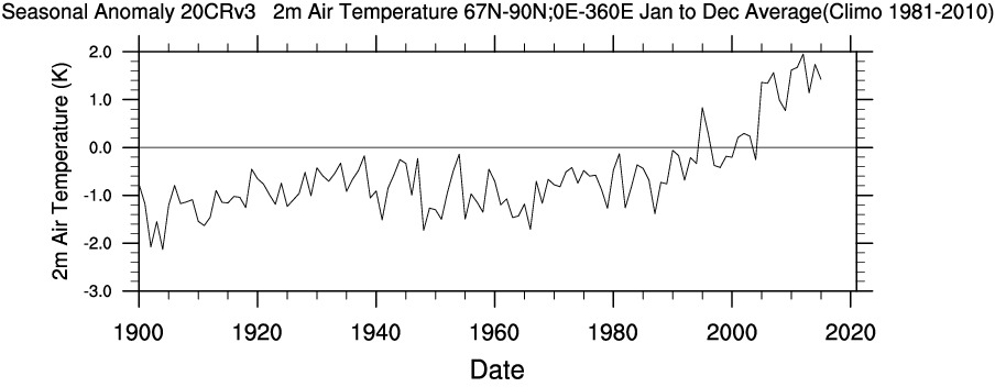
First of all let me remind Steve that the United States does not constitute the entirety of our planet. In particular the Arctic is warming a lot faster than mid latitudes in general and the US in particular. Using WRIT once again to produce our own time series, we can compare and contrast longer term temperature records between the Continental United States and the Arctic (including both land and ocean above the Arctic circle):

Also note that for some reason Steve makes no mention of US “coolest temperatures” and/or “cold waves” since 1900. I don’t know about you, but the top graph certainly suggest to me that “the warmest temperatures in the US have risen in the past fifty years”.

Let’s see how Steve explains himself. For that we have to wait until Chapter 5, catchily entitled “Hyping the Heat”. Therein no mention is made of recent temperature increases across the Arctic, but we are able to read in the introductory paragraphs that:

We can all agree the globe has gotten warmer over the past several decades. Here’s another summary statement from the IPCC’s AR5:

[S]ince about 1950 it is very likely that the numbers of cold days and nights have decreased and the numbers of warm days and nights have increased . . . there is medium confidence that globally the length and frequency of warm spells, including heat waves, has increased since the middle of the 20th century. (IPCC. AR5 WGI Section 2.6.1.)

Then there is a long discussion about what Steve apparently perceives to be shortcomings in the “The US government’s most recent assessment report, the 2017 Climate Science Special Report (CSSR)”. Steve is apparently well qualified in physics, so presumably he is able to comprehend these equations?

  • US ≠ Global
  • CSSR AR5

For those of you less familiar with the arcane language of mathematics and physics that translates to “the climate of the continental United States is not identical to Arctic climate or typical of the climate of Planet Earth as a whole” and hence “US Governmental climate reports are not necessarily typical of ‘Intergovernmental’ climate assessments”.

Next let’s check what Steve’s “gold standard for The Science” has to say on this topic. According to section 2.6.1 of the Intergovernmental Panel on Climate Change’s fifth Assessment Report, as cited by Steve:

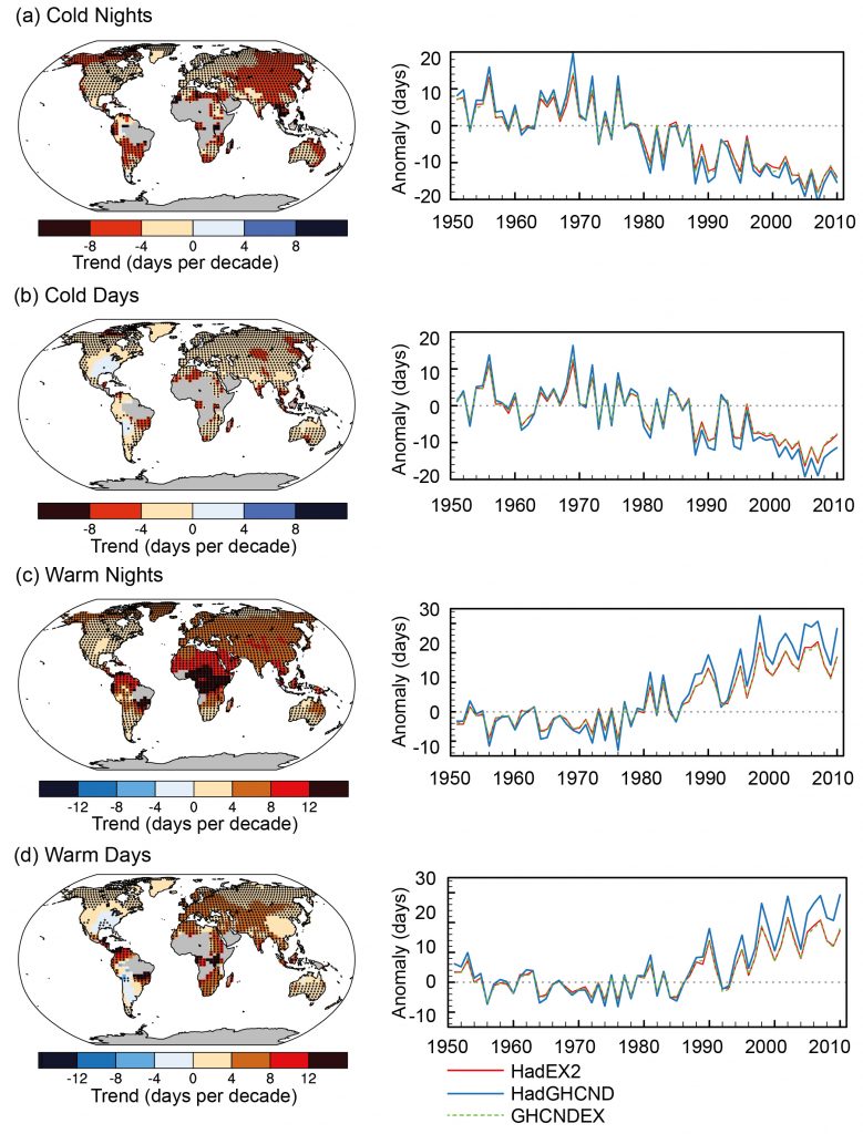
A large amount of evidence continues to support the conclusion that most global land areas analysed have experienced significant warming of both maximum and minimum temperature extremes since about 1950 (Donat et al., 2013c). Changes in the occurrence of cold and warm days (based on daily maximum temperatures) are generally less marked (Figure 2.32):

Figure 2.32 | Trends in annual frequency of extreme temperatures over the period 1951–2010, for (a) cold nights (TN10p), (b) cold days (TX10p), (c) warm nights (TN90p) and (d)
warm days (TX90p) (Box 2.4, Table 1). Trends were calculated only for grid boxes that had at least 40 years of data during this period and where data ended no earlier than 2003.
Grey areas indicate incomplete or missing data. Black plus signs (+) indicate grid boxes where trends are significant (i.e., a trend of zero lies outside the 90% confidence interval).
The data source for trend maps is HadEX2 (Donat et al., 2013c) updated to include the latest version of the European Climate Assessment data set (Klok and Tank, 2009). Beside
each map are the near-global time series of annual anomalies of these indices with respect to 1961–1990 for three global indices data sets: HadEX2 (red); HadGHCND (Caesar et al., 2006; blue) and updated to 2010 and GHCNDEX (Donat et al., 2013a; green). Global averages are only calculated using grid boxes where all three data sets have at least 90%
of data over the time period. Trends are significant (i.e., a trend of zero lies outside the 90% confidence interval) for all the global indices shown.

To paraphrase The Princess Bride once again: “I do not think ‘The Science’ says what Steven E. Koonin says it says in ‘Unsettled’”.

Unsettling, is it not?

IPSO OKs Matt Ridley’s Toxic Pausebuster “Opinion”

Way back in February Bob Ward of the Grantham Institute complained to the Great British Independent Press Standards Organisation about a Matt Ridley article in the no longer Great or British Times newspaper. According to Mr. Ward:

In a characteristically error-filled article (‘Politics and science are a toxic combination’, 6 February 2017), Viscount Ridley made a number of inaccurate and misleading statements.

He claimed that a blog by Dr John Bates “alleges that scientists themselves have been indulging in alternative facts, fake news and policy-based evidence”. This is hyperbolic nonsense. In fact, the blog does not contain such allegations. Instead, it primarily accuses a former colleague, Dr Thomas Karl, at the United States National Oceanic and Atmospheric Administration (NOAA) of failing to archive his data for a research paper (PDF) in accordance with strict new rules governing ‘operational data’.

IPSO have now published the findings of their investigation into the matter:

Findings of the Committee

22. The newspaper was entitled to report on the views of Dr Bates, a leading former climate scientist at the NOAA, about the ‘Pausebuster’ paper and the circumstances surrounding its publication. While acknowledging the newspaper’s position that Dr Bates had reviewed the article before publication, the primary question for the Committee was whether Dr Bates’ concerns had been presented in a significantly inaccurate or misleading way.

23. The columnist’s characterisation of the substance of Dr Bates’ claims was very strong: he had asserted that Dr Bates has alleged that scientists were indulging in “alternative facts, fake news and policy-based evidence”. The Committee noted that this appeared on its face to conflict with Dr Bates’ subsequent public statement that there had been “no data tampering, no data changing, nothing malicious”. However, Dr Bates had claimed in the blog that a “thumb on the scale” pushed for decisions that would create a desired outcome, and described the process as a “flagrant manipulation of scientific integrity guidelines”. “Fake news” and “alternative facts” are currently ill-defined terms, and the Committee concluded on balance that the nature of these allegations was such that the columnist was entitled to characterise them in this way. There was no breach of the Code on that point.

24. Dr Bates had made clear in his blog that he considered that the paper had been rushed, and deliberately timed to influence the Paris Climate Conference; he had said that the NOAA had breached its own rules on scientific integrity; he had said that the data had been faulty, because he believed that both datasets had been flawed. These concerns were clearly distinguished as Dr Bates’ claims based on his professional experience, which was explained, and had been accurately reported in the column, as claims. The columnist also acknowledged, albeit critically, that defenders of the paper had responded that other data sets had come to similar conclusions. While the Committee noted the grounds for the complainant’s disagreement with the columnist (and with Dr Bates) in relation to these matters, the columnist had not failed to take care over the accuracy of these claims, and it did not establish any significant inaccuracies in the column’s discussion of these issues.

25. The columnist had been further entitled to express his opinion on the significance of these claims; to draw comparisons between previous “scandals” within the scientific community; and to comment on the wider implications of Dr Bates’ concerns in that community, as well as on policy decisions on climate change. These were statements of the columnist’s opinion. His views, however controversial, did not raise a breach of Clause 1. There was no breach of the Code in relation to his discussion of these issues.

Conclusion

37. The complaint was not upheld.

According to Bob Ward’s analysis of IPSO’s verdict:

It decided not to uphold my complaint on the grounds that its Complaints Committee considered Viscount Ridley’s column to be wholly opinion.

This is consistent with IPSO’s previous rulings about the systematic misreporting of climate change issues by some newspapers, in which it confines itself to assessing whether opinions are accurately represented, rather than whether the opinions are based on facts or falsehoods.

We now eagerly await IPSO’s Complaints Committee’s verdict on a similar complaint by Bob Ward about a similar article by David Rose in the Mail on Sunday

Reanalysis of Arctic Climate

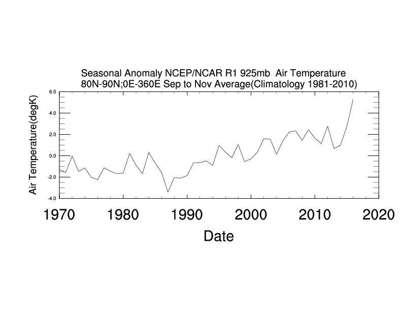
For years now I’ve been using the convenient tools provided at the NCEP/NCAR reanalysis web site to generate custom maps and time series illustrating the climate of the Arctic. By way of example see last December’s “Post-Truth Global and Arctic Temperatures“:

Prompted in part by the obvious difficulty the different models are currently having in generating accurate short term forecasts for the “New Arctic”, I’ve been recently been comparing assorted reanalysis products. For example the UCAR Climate Data Guide points out that:

NCEP Reanalysis (R2) is better than NCEP-NCAR (R1) but still a first generation reanalysis. It is best to use 3rd generation reanalyses, specifically, ERA-Interim and MERRA.

I recently discovered that Richard James has performed a similar analysis for the Arctic, which can be viewed at:

Arctic Winter Warmth

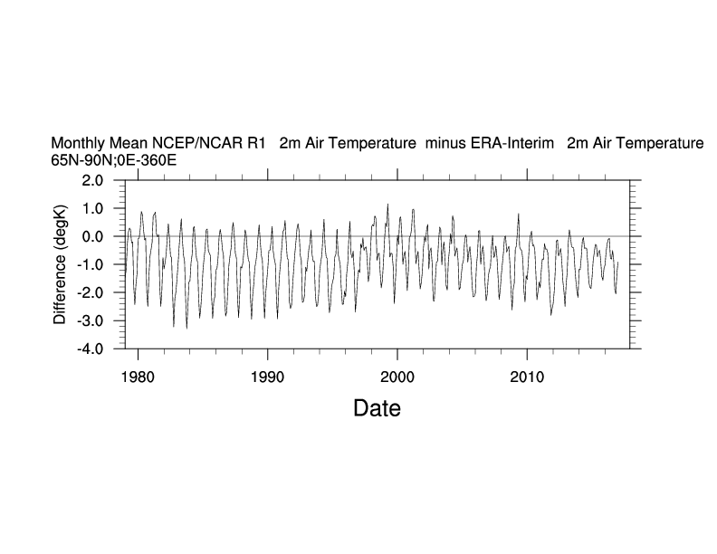
wherein I mentioned the NOAA ESRL Web-based Reanalysis Intercomparison Tool, which allows you to produce plots and timeseries for arbitrary areas of Planet Earth using NCEP/NCAR, ERA Interim, MERRA-2 and numerous other reanalysis products. Here’s one little example:

NCEPr1-ERA-T2m

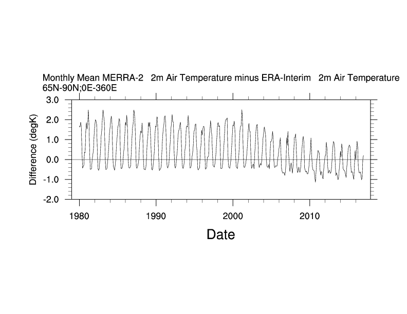
which makes it evident that NCEP-NCAR (R1) and ERA Interim have different ideas about surface temperatures in the Arctic. So does MERRA-2!

MERRA2-ERA-T2m

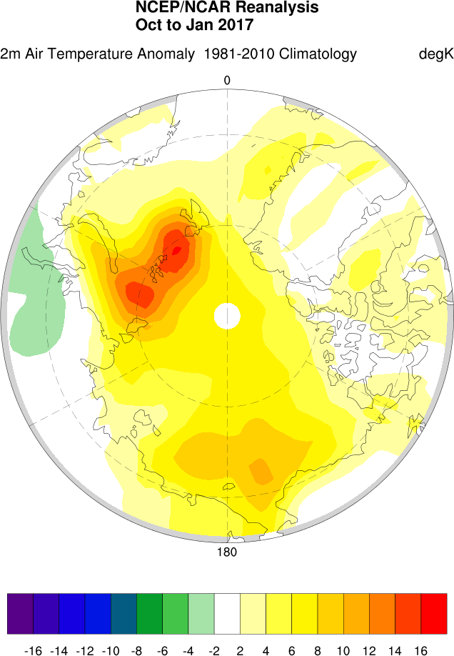
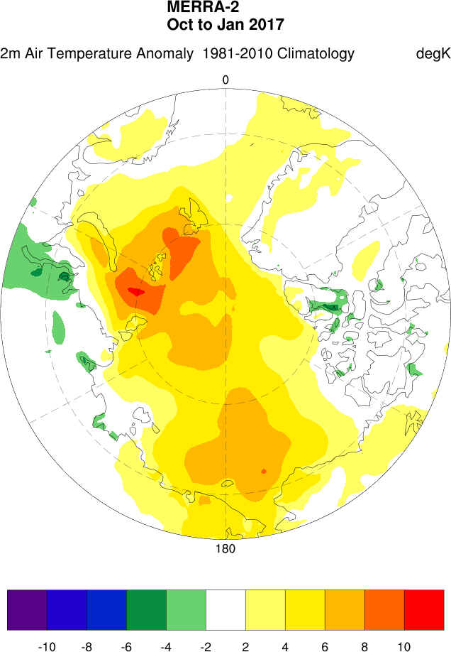
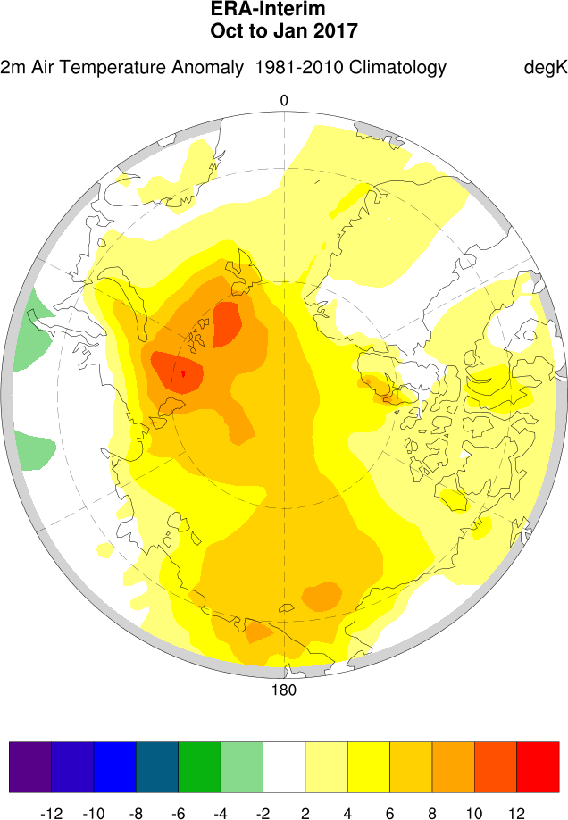
For a graphic example of the differences between the three products here is my version of Richard’s Arctic winter temperature comparison (note that currently ERA data is only available up to January 2017):

NCEPr1-T2-Oct-Jan-2017

MERRA-T2-Oct-Jan-2017

Era-T2-Oct-Jan-2017

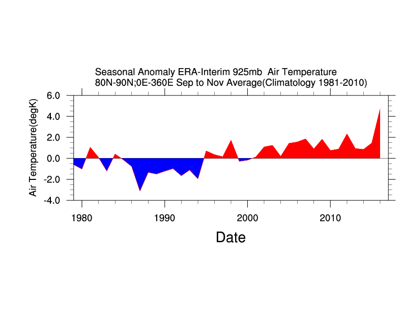
Can you spot the difference? In conclusion, here’s the Era Interim version of the High Arctic autumnal 925 hPa temperature trend graph at the top:

ERA-SON-80N-T925

Shock News! Mail on Sunday Silently “Corrects” Another David Rose “Porky Pie”

In our latest astonishing disclosure concerning David Rose’s optimistically named “Climategate 2” campaign in the Mail on Sunday in February we can now reveal the Mail’s botched attempt to cover up another “inadvertent” error in Mr. Rose’s February 19th article entitled “US Congress launches a probe into climate data that duped world leaders over global warming“.

In actual fact it’s the US Congress that’s being duped. Perhaps Lamar Smith, Chairman of the House Committee on Science, Space and Technology, would like to play “spot the difference” with us? Here’s an extract from the original article:

MoS-20170219-Original

and here’s the same section of the allegedly “corrected” article.

MoS-20170219-20170321

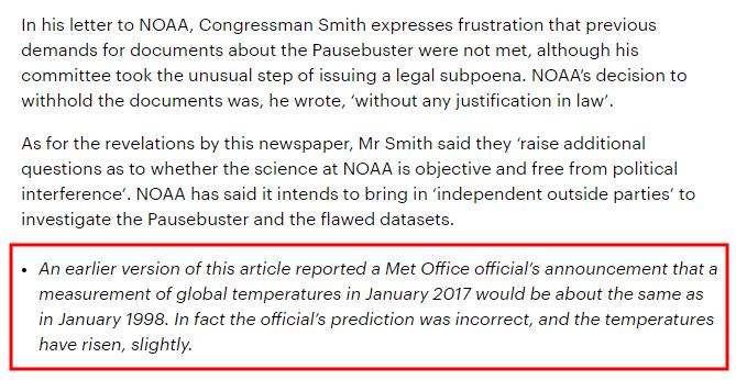
One of Mr. Rose’s “porky pies” concerning a statement supposedly made last month by Peter Stott from the UK Met Office has gone missing. There’s no apology or explanation in either the online or print version of the apology for a “correction” issued by the Mail on Sunday at the weekend.

Not only that, but an entire paragraph concerning the alleged “pause” has evaporated into thin air.

Not only that, but the alleged “correction” included below the offending article is different to the “official” version published in print at the weekend. Take another look:

MoS-20170319-Mono

Something is rotten in the state of MayBeLand. And in the state of TrumpLand too.

Shock News! 19 years without warming?

In the wake of the 2015/16 El Niño, recent weeks have seen the denialoblogosphere inundated with assorted attempts to proclaim yet again that there have been “19 years without warming”. In another of his intermittent articles Great White Con guest author Bill the Frog once again proves beyond any shadow of a doubt that all the would be emperors are in actual fact wearing no clothes. Without further preamble:

Ho-hum! So here we go again. The claim has just been made that the UAH data now shows no warming for about 19 years. A couple of recently Tweeted comments on Snow White’s Great White Con blog read as follows…

For the nth time, nearly 19 years with no significant warming. Not at all what was predicted!!

and

Just calculated UAH using jan: R^2 = 0.019 It’s PROVABLE NO DISCERNIBLE TREND. You’re talking complete bollocks!!!

Before one can properly examine this “no warming in 19 years” claim, not only is it necessary to establish the actual dataset upon which the claim is based, but one must also establish the actual period in question. A reasonable starting point within the various UAH datasets would be the Lower Troposphere product (TLT), as most of us do live in the lower troposphere – particularly at the very bottom of the lower troposphere.

However, one also has to consider which version of the TLT product is being considered. The formally released variant is Version 5.6, but Version 6 Beta 5 is the one that self-styled “climate change sceptics” have instantly and uncritically taken to their hearts.

The formally released variant (Ver 5.6) is the one currently used by NOAA’s National Centers for Environmental Information (NCEI) on their Microwave Sounding Unit climate monitoring page. As can be seen from the chart and the partial table (sorted on UAH values), the warmest seven years in the data include each of the four most recent years…
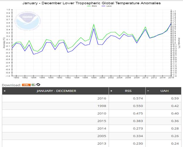
image002


The above chart clearly doesn’t fit the bill for the “no warming in 19 years claim”, so, instead we must look to the Version 6 Beta 5 data. Before doing so, a comparison of the two versions can be quite revealing…
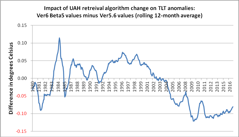
image003


In terms of its impact on trend over the last 19 years or so, an obvious feature of the version change is that it boosts global temperatures in 1998 by just over 0.06° C, whilst lowering current temperatures by just over 0.08° C. Therefore, the net effect is to raise 1998 temperatures by about 0.15° C relative to today’s values. That is why some people refer to a mere 0.02° C difference between 1998 and 2016, whereas, NOAA NCEI shows this as 0.17° C.

(It is not difficult to imagine the hue and cry that would have gone up if one of the other datasets, such as NASA Gistemp, NOAA’s own Global Land & Ocean anomalies or the UK’s HadCRUT, had had a similar adjustment, but in the opposite direction.)

Anyway, it seemed pretty obvious which variant would have been used, so the task was merely to establish the exact start point. It transpires that if one ignores all the data before January 1998, and then superimposes a linear trend line, one does indeed get an R² value of ~ 0.019, as mentioned in one of the Tweets above. (The meaning of an R² value, as well as its use and misuse, will be discussed later in this piece.) In the interim, here is the chart…
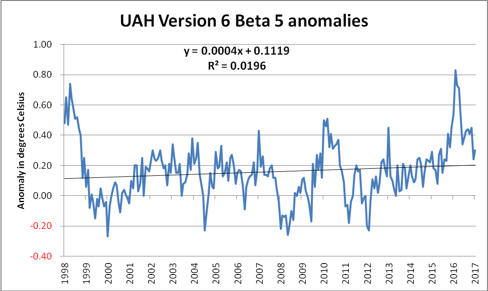
image005


Those with some skill in dealing with such charts will recognise the gradient in the equation of the linear trend line,

Y = 0.0004X + 0.1119

As the data series is in terms of monthly anomalies, this value needs to be multiplied by 120 in order to convert it to the more familiar decadal trend form of +0.048° C/decade. Whilst this is certainly less than the trend using the full set of data, namely +0.123° C/decade, it is most assuredly non-zero.

The full dataset (shown below) gives a far more complete picture, as well as demonstrating just how egregious the selection of the start point had been. Additionally, this also highlights just how much of an outlier the 1998 spike represents. Compare the size of the upward 1998 spike with the less impressive downward excursion shown around 1991/92. This downward excursion was caused by the spectacular Mt Pinatubo eruption(s) in June 1991. The Pinatubo eruption(s) did indeed have a temporary effect upon the planet’s energy imbalance, owing, in no small measure, to the increase in planetary albedo caused by the ~ 20 million tons of sulphur dioxide blasted into the stratosphere. On the other hand, the 1997/98 El Nino was more of an energy-redistribution between the ocean and the atmosphere. (The distinction between these types of event is sadly lost on some.)
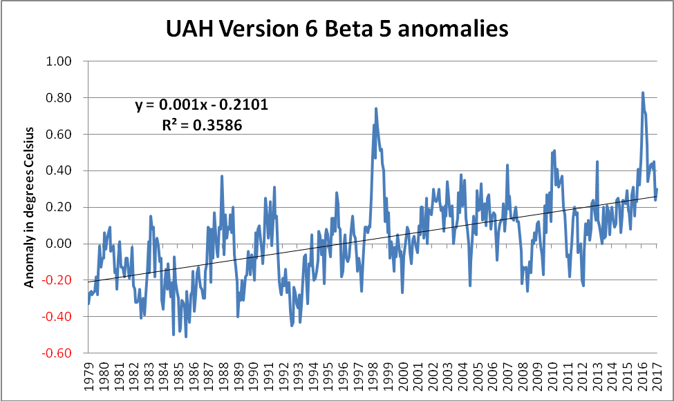
image007


The approach whereby inconvenient chunks of a dataset are conveniently ignored is a cherry-picking technique known as “end point selection”. It can also be used to actually identify those areas of the data which are most in line with the “climate change is a hoax” narrative. Once again, it is extremely easy to identify such regions of the data. A simple technique is to calculate the trend from every single starting date up until the present, and to then only focus on those which match the narrative. Doing this for the above dataset gives the following chart…
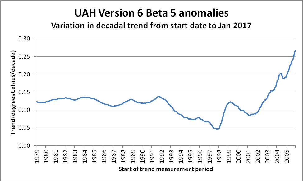
image009


It can clearly be seen that the trend value becomes increasingly stable (at ~ +0.12° C/decade) as one utilises more and more of the available data. The trend also clearly reaches a low point – albeit briefly – at 1998. This is entirely due to the impact that the massive 1997/98 El Nino had on global temperatures – in particular on satellite derived temperatures.

The observant reader will have undoubtedly noticed that the above chart ends at ~ 2006. The reason is simply because trend measurements become increasingly unstable as the length of the measurement period shortens. Not only do “short” trend values become extreme and meaningless, they also serve to compress the scale in areas of genuine interest. To demonstrate, here is the remainder of the data. Note the difference in the scale of the Y-axis…
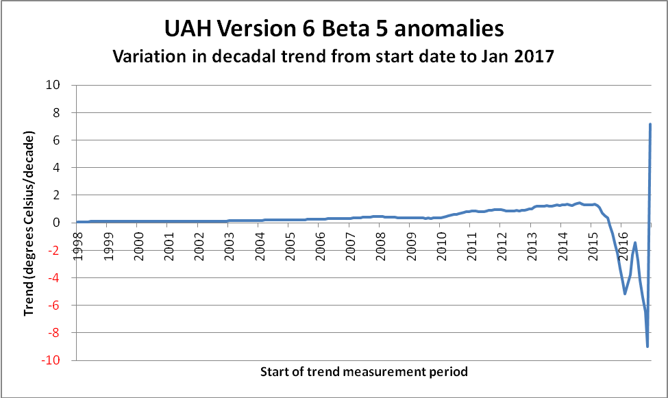
image011


Now, what about this thing referred to as the R² value? It is also known as the Coefficient of Determination, and can be a trap for the unwary. First of all, what does it actually mean? One description reads as follows…

It is a statistic used in the context of statistical models whose main purpose is either the prediction of future outcomes or the testing of hypotheses, on the basis of other related information. It provides a measure of how well observed outcomes are replicated by the model, based on the proportion of total variation of outcomes explained by the model.

In their online statistics course, Penn State feel obliged to offer the following warning…

Unfortunately, the coefficient of determination r² and the correlation coefficient r have to be the most often misused and misunderstood measures in the field of statistics.

The coefficient of determination r² and the correlation coefficient r quantify the strength of a linear relationship. It is possible that r² = 0% and r = 0, suggesting there is no linear relation between x and y, and yet a perfect curved (or “curvilinear” relationship) exists.

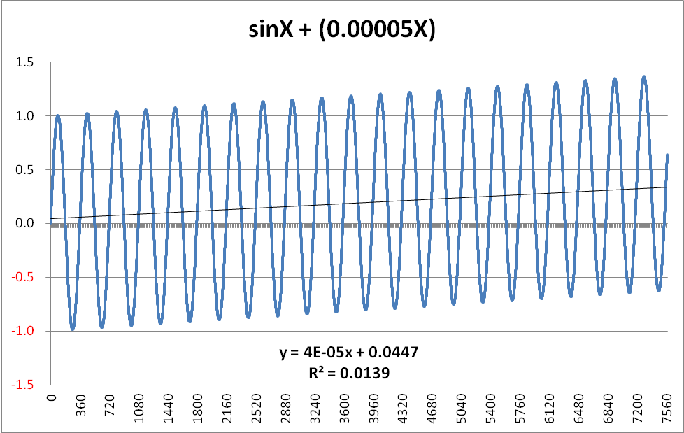
Here is an example of what that means. Consider a data series in which the dependent variable is comprised of two distinct signals. The first of these is a pure Sine-wave and the second is a slowly rising perfectly linear function.

The formula I used to create such a beast was simply… Y = SinX + 0.00005X (where x is simply angular degrees)

The chart, with its accompanying R² value, is shown below, and, coincidentally, does indeed bear quite a striking resemblance to the Keeling Curve

image013


The function displayed is 100% predictable in its nature, and therefore it would be easy to project this further along the X-axis with 100% certainty of the prediction. If one were to select ANY point on the curve, moving one complete cycle to the right would result in the Y-value incrementing by EXACTLY +0.018 (360 degrees x 0.00005 = 0.018 per cycle). A similar single-cycle displacement to the left would result in a -0.018 change in the Y-value. In other words, the pattern is entirely deterministic. Despite this, the R² value is only 0.0139 – considerably less than the value of 0.0196 derived from the UAH data.

(NB There is a subtlety in the gradient which might require explanation. Although the generating formula clearly adds 0.00005 for each degree, the graph shows this as 0.00004 – or, more accurately as 0.000038. The reason is because the Sine function itself introduces a slight negative bias. Even after 21 full cycles, this bias is still -0.000012. Intuitively, one can visualise this as being due to the fact that the Sine function is positive over the 0 – 180 degree range, but then goes negative for the second half of each cycle. As the number of complete cycles rises, this bias tends towards zero. However, when one is working with such functions in earnest, this “seasonal” bias would have to be removed.)

Summing this up, trying to fit a linear trend to the simple (sine + ramp) function is certain to produce an extremely low R² value, as, except for the two crossover points each cycle, the difference between the actual value and the trend leaves large unaccounted-for residuals. To be in any way surprised by such an outcome is roughly akin to being surprised that London has more daylight hours in June than it does in December.

So what is the paradox with the low R² value for the UAH data? There isn’t one. Just as it would be daft to expect a linear trend line to map onto the future outcomes on the simple (sine + ramp) graph above, it would be equally daft to expect a linear trend line to be in any way an accurate predictor for the UAH monthly anomalies over the months and years to come.

Nevertheless, even although a linear trend produces such a low R² value when applied to the (sine + ramp), how does it fare as regards calculating the actual trend? Once the “seasonal” bias introduced by the presence of the sine function is removed, the calculated trend is EXACTLY equal to the actual trend embedded in the generating function.

Anyway, even if the period from January 1998 until January 2017 did indeed comprise the entirety of the available data, why would anyone try to use a linear trend line? If someone genuinely believed that the mere fact of a relatively higher R² value provided a better predictor, then surely that person might play around with some of the other types of trend line instantly available to anyone with Excel? (Indeed, any application possessing even rudimentary charting features would be suitable.) For example, a far better fit to the data is obtained by using a 5th order polynomial trend line, as shown below…
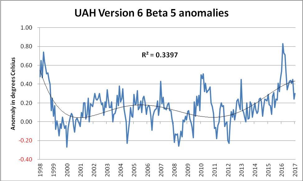
image015


Although this is something of a “curve fitting” exercise, it seems difficult to argue with the case that this polynomial trend line looks a far better “fit” to the data than the simplistic linear trend. So, when someone strenuously claims that a linear trend line applied to a noisy dataset producing an R² value of 0.0196 means there had been no warming, then there are some questions which need to be asked and adequately answered:

Does that person genuinely not know what they’re talking about, or is their intention to deliberately mislead? (NB It should be obvious that these two options are not mutually exclusive, and therefore both could apply.)

Given that measurements of surface temperature, oceanic heat content, sea level rise, glacial mass balance, ice-sheet mass balance, sea ice coverage and multiple studies from the field of phenology all confirm global warming, why, one wonders, would somebody concentrate on an egregiously selected subset of a single carefully selected variant of a single carefully selected dataset?
Climategate 2 – Episode 3 of David Rose’s Epic Saga

This morning’s instalment of the Mail on Sunday’s serialisation of David Rose’s latest piece of fantasy fiction is headlined as follows:

US Congress launches a probe into climate data that duped world leaders over global warming

David is a bit slow on the uptake, since we reported on the “US Congress probe” several days ago. He also seems not to have taken on board any of the copious quantities of evidence that his “climate data that duped world leaders over global warming” allegations are the purest fantasy. This time around Mr. Rose claims, amongst other things:

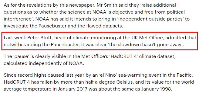
Last week Peter Stott, head of climate monitoring at the UK Met Office, admitted that notwithstanding the Pausebuster, it was clear ‘the slowdown hasn’t gone away’.

The ‘pause’ is clearly visible in the Met Office’s ‘HadCRUT 4’ climate dataset, calculated independently of NOAA.

Let’s see if we can discover if Peter Stott has any recollection of being interviewed last week by the Mail on Sunday and/or The Mail’s leading fantasy fiction writer shall we?

https://twitter.com/jim_hunt/status/833257983018672128

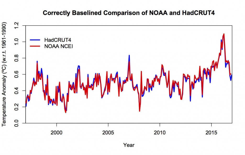
Here’s the HadCRUT 4 data we’ve been showing assorted “skeptical” fellows on Twitter this week:

https://twitter.com/jim_hunt/status/831835739222638592

Perhaps David Rose can assist them by pointing out where exactly the alleged “pause” is located?


[Edit – February 19th PM]

Peter Stott has confirmed my suspicions. David Rose’s “last week” was egregiously inaccurate:

https://twitter.com/jim_hunt/status/833389662953668610

In addition John Kennedy, also from the UK Met Office, pointed out to Mr. Rose that:

Do you suppose that David & Judy have another “whistleblower” embedded deep within the Hadley Centre?


[Edit – March 4th]

The UK Met Office have at long last published the HadCRUT4 January 2017 update:

A theory is proposed that doesn’t involve time travel:

https://twitter.com/GarethSJones1/status/838136044251975682


[Edit – March 18th]

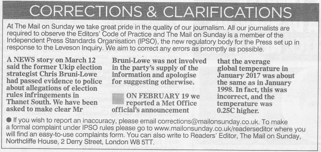
The online version of the Mail on Sunday have just published a “correction” to the most egregious of their long list of recent errors and inaccuracies. It reads as follows:

On February 19 we reported a Met Office official’s announcement that the average global temperature in January 2017 was about the same as in January 1998. In fact, this was incorrect, and the temperature was 0.25C higher.

So there you have it. This buck doesn’t stop on David Rose’s desk, or Benny Peiser’s desk, or John Wellington’s desk, or Geordie Greig’s desk. We’re expected to believe it stops on an unidentified desk of an unknown official somewhere inside the UK Met Office.

We won’t get fooled again. Will we?


[Edit – March 19th]

The expert opinion of Peter Thorne (op. cit.) on the Mail on Sunday’s excuse for a “correction”:

David Rose’s Climatic Alternative Facts and Deceptions

For some relevant background to this weekend’s dose of “Alternative Facts” from David Rose in the Mail on Sunday you may wish to peruse this article in our sister journal “Alternative Facts Wetware™“:

How Trump Won

From the conclusions to that article on Donald Trump’s rise to power:

Reflecting on the implications of this analysis for the specifics of this election, we can see that many Trump voters knew full well that their man was a reprobate, that they deplored his crudities and that they saw him as a risky choice. And yet in a world where the system is seen to be against “us” and where things appear to be driven in the wrong direction by “them,” the really irrational thing to do is to vote for the conventional candidate who represents sticking with that system.

Getting back to this morning’s batch of post truth alternative facts from the poison pen of David Rose, the latest porky pie fresh off the Mail’s production line is entitled:

How can we trust global warming scientists if they keep twisting the truth

It is of course Mr. Rose who is “twisting the truth” yet again. His opening salvo:

They were duped – and so were we. That was the conclusion of last week’s damning revelation that world leaders signed the Paris Agreement on climate change under the sway of unverified and questionable data.

A landmark scientific paper –the one that caused a sensation by claiming there has been NO slowdown in global warming since 2000 – was critically flawed. And thanks to the bravery of a whistleblower, we now know that for a fact.

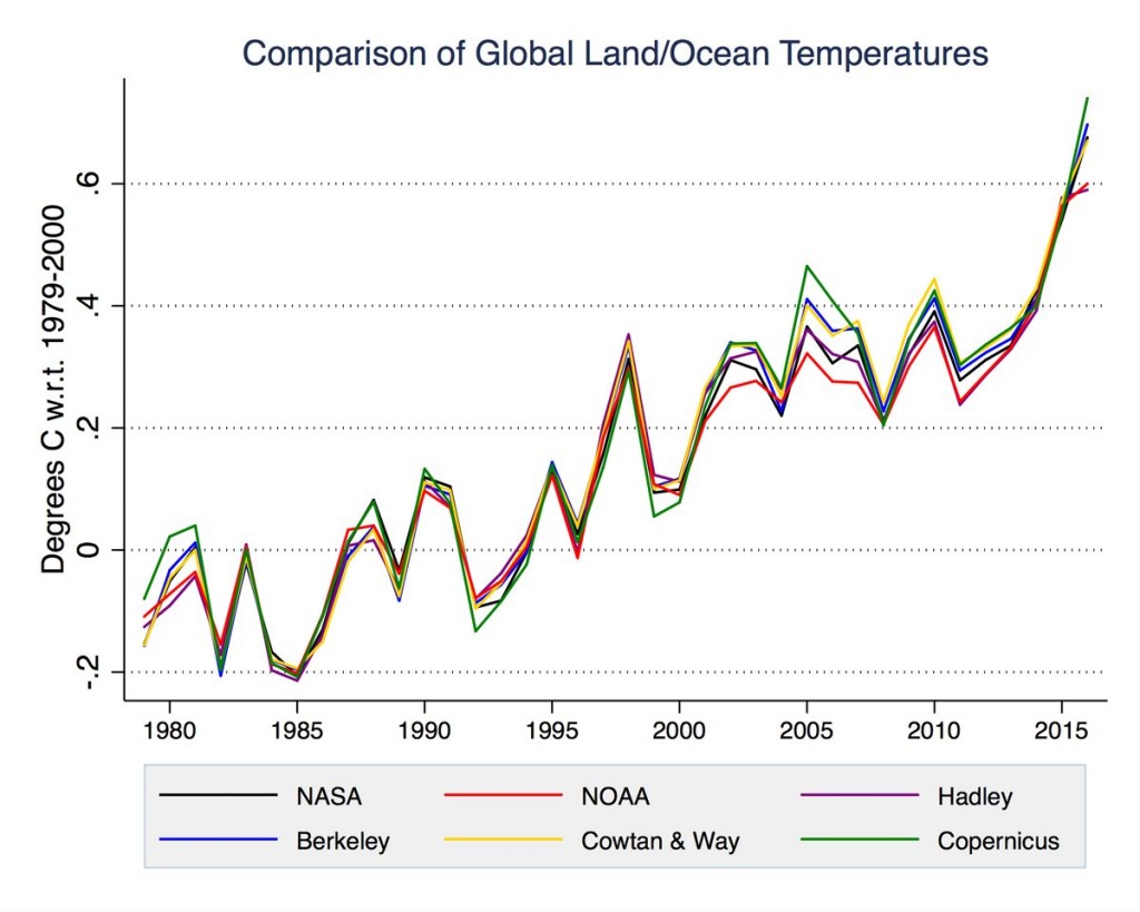
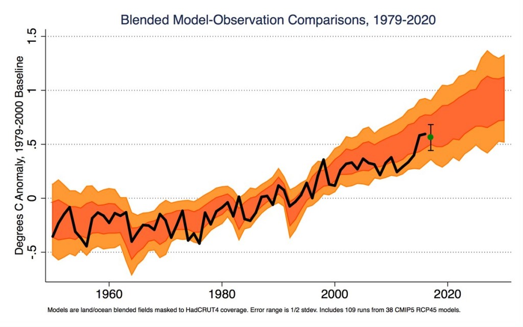
Mr. Rose wouldn’t recognise “a fact” if it hit him in the back of the head at a million miles an hour. The “landmark scientific paper” in question isn’t “critically flawed” anywhere but in the fertile imagination of David Rose and the other “Merchants of Doubt”. Take a look at the facts:

Zeke-Temp-Comp

Zeke-MetOffice2017

As predicted yesterday, I’m off down to the local paper shop. I wonder if there’s an associated editorial this week too? I’ll be back in a bit with more. As David Rose so eloquently put it this morning:

We cannot allow such a vital issue for our future to be mired in half truths and deceptions.


[Edit – February 12th PM]

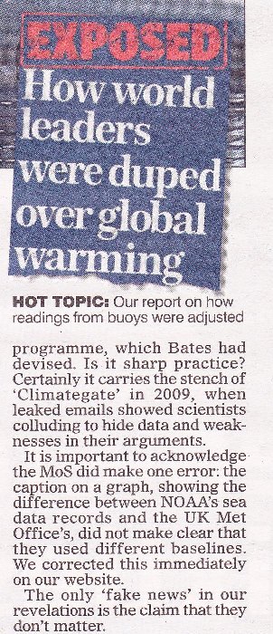
My pocket is now £1.70 lighter in exchange for the following information:

MoS-Error-1

It seems that is what passes for “due prominence, and — where appropriate — an apology” in MailSpeak? Here’s the actual facts once again:

Gavin-Rose-Correct

I don’t see an accurate graph in Mr. Rose’s profuse apology. I see no mention of “World leaders not duped, Mail readers conned again”. Do you?


[Edit – February 15th]

This will come as no shock to seasoned Lamar Smith watchers. The U.S. House Science, Space, and Technology Committee have issued another news release:

Committee Probes Allegations of Politicization of NOAA Study

By now you can probably guess what it says:

Lamar Smith (R-Texas) today sent a letter to National Oceanic and Atmospheric Administration (NOAA) Acting Administrator Benjamin Friedman requesting information on the Karl study following reports the study ignored NOAA standards, was rushed to publication, and was not free from political bias.

“Allegations of politicization of government funded scientific research cannot be ignored. The Committee has a constitutional responsibility to conduct oversight in instances of alleged fraud, abuse, and misconduct especially where the government’s scientific integrity is called into question. Dr. Bates’ revelations raise additional questions as to whether the science at NOAA is objective and free from political interference. In light of this new information, the Committee requests the below information to better understand the depth and scope of internal debate at NOAA related to the Karl study,” the letter states.

Today’s letter requests documents and communications related to the release of the Karl study, the datasets used in the Karl study, concerns raised about datasets used in the Karl study, and the scientific integrity of the study. The committee also requested a briefing on the independent experts NOAA is engaging with to review this matter.

The letter can be found here.

The news release continues to describe the alleged “background”, but I think we’re all pretty familiar with that by now? The letter itself is addressed to Benjamin Friedman, NOAA’s acting administrator. It demands to see a big pile of documents “related to the Karl study”. It will come a no surprise whatsoever to our regular readers that it references the leading actors in the David & Judy show!

Climategate 2 Falls at the First Hurdle?

Shock News! The David and Judy Show took to the road once again last night, aided and abetted by all the usual suspects. We’ll skip the Breitbarts, Hellers and Watts of this world and head straight for the now ex Prof. Judith Curry‘s “Climate Etc.” blog. There we will discover “Climate scientists versus climate data“, a guest post by ex NOAA scientist John Bates. According to John:

The most serious example of a climate scientist not archiving or documenting a critical climate dataset was the study of Tom Karl et al. 2015 (hereafter referred to as the Karl study or K15), purporting to show no ‘hiatus’ in global warming in the 2000s (Federal scientists say there never was any global warming “pause”). The study drew criticism from other climate scientists, who disagreed with K15’s conclusion about the ‘hiatus.’ (Making sense of the early-2000s warming slowdown). The paper also drew the attention of the Chairman of the House Science Committee, Representative Lamar Smith, who questioned the timing of the report, which was issued just prior to the Obama Administration’s Clean Power Plan submission to the Paris Climate Conference in 2015.

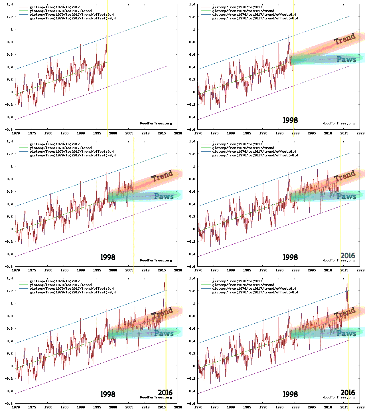
Regular readers of our humble scribblings will be well aware that here in Great White Con Ivory Towers we are firmly of the opinion that there never was a ‘hiatus’. Exhibit 1:

Animation by izen
Animation by izen

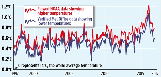
What’s all the fuss about then? Perhaps our old friend David Rose can explain in layperson’s terms? In his latest article for the Mail on Sunday, catchily entitled “Exposed: How world leaders were duped into investing billions over manipulated global warming data”, he assures us that amongst many other things:

The [K15] report claimed that the ‘pause’ or ‘slowdown’ in global warming in the period since 1998 – revealed by UN scientists in 2013 – never existed, and that world temperatures had been rising faster than scientists expected. Launched by NOAA with a public relations fanfare, it was splashed across the world’s media, and cited repeatedly by politicians and policy makers.

But the whistleblower, Dr John Bates, a top NOAA scientist with an impeccable reputation, has shown The Mail on Sunday irrefutable evidence that the paper was based on misleading, ‘unverified’ data.

It was never subjected to NOAA’s rigorous internal evaluation process – which Dr Bates devised.

Now “never subjected to NOAA’s rigorous internal evaluation process” isn’t quite the same thing as “manipulated global warming data”, but Mr. Rose has more!

MoS2 Template Master

The misleading ‘pausebuster chart’: The red line shows the current NOAA world temperature graph – which relies on the ‘adjusted’ and unreliable sea data cited in the flawed ‘Pausebuster’ paper. The blue line is the UK Met Office’s independently tested and verified ‘HadCRUT4’ record – showing lower monthly readings and a shallower recent warming trend

That graph looks convincing enough, doesn’t it? However there is a teensy weensy little upward adjustment in there that Mr. Rose is apparently unaware of, as NASA’s Gavin Schmidt pointed out late last night:

https://twitter.com/ClimateOfGavin/status/828082851585388544

This morning Carbon Brief has published a much longer takedown of the aforementioned purple prose by Zeke Hausfather, who points out amongst other things that:

What [David Rose] fails to mention is that the new NOAA results have been validated by independent data from satellites, buoys and Argo floats and that many other independent groups, including Berkeley Earth and the UK’s Met Office Hadley Centre, get effectively the same results.

As per usual Mr. Rose doesn’t stick to science, however dubious. He also dabbles in politics. On that front we are assured:

Karl’s ‘Pausebuster’ paper was hugely influential in dictating the world agreement in Paris and sweeping US emissions cuts. President Trump, above right, has pledged to scrap both policies – triggering furious claims by Democrats he is a climate ‘denier’ and ‘anti-science’.

Thanks to today’s MoS story, NOAA is set to face an inquiry by the Republican-led House science committee.

We’ll have much more to say on this controversy in the context of our “Alternative Facts” investigation in due course, but for the moment at least it looks to us as though the nth iteration of “Climategate 2” barely made it out of the starting gate. However Mr. Rose’s loyal army of “rebloggers, retweeters, plagiarisers and other assorted acolytes” and that “Republican-led House science committee” may of course have other ideas?

[Edit – February 5th PM]

Commentary on Judith Curry’s blog brought to light an article by Peter Thorne. He says, amongst many other things:

I worked for three and a bit years in the NOAA group responsible in the build-up to the Karl et al. paper (although I had left prior to that paper’s preparation and publication). I have been involved in and am a co-author upon all relevant underlying papers to Karl et al., 2015.

The ‘whistle blower’ is John Bates who was not involved in any aspect of the work. NOAA’s process is very stove-piped such that beyond seminars there is little dissemination of information across groups. John Bates never participated in any of the numerous technical meetings on the land or marine data I have participated in at NOAA NCEI either in person or remotely. This shows in his reputed (I am taking the journalist at their word that these are directly attributable quotes) mis-representation of the processes that actually occured. In some cases these mis-representations are publically verifiable.

A “rave from the grave” suggests itself at this juncture:

See if you can spot where Dan & Dan mention the term #Climategate.


[Edit – February 6th]

It’s been a busy day! Several of my carefully crafted comments have ended up on Judy’s cutting room floor, but this one has eluded the red pencil thus far. I bring you this warming and educational nightcap created by an ad hoc team of celebrity international chefs for “warmists” around the planet:

You have to keep clicking through to the very bottom of the virtual mug in order to experience the full benefit of the beverage.

Thank you and good night from May or May Not Land. I’ll see you all in the morning (UTC).


[Edit – February 7th]

Lot’s of pertinent papers just in from Great White Con guest author Kevin Cowtan of York University. Kevin is part of the by now world famous team of Cowtan & Way, who have long championed the cause of accurate Arctic temperature measurements. Kevin tells us:

The paper by Karl and colleagues corrected two known problems with the temperature observations: poor coverage of the Arctic, and a change from ships to buoys. Both had been known about since 2008:

http://www.realclimate.org/index.php/archives/2008/11/mind-the-gap/

https://www.ncdc.noaa.gov/sites/default/files/attachments/Improvements-NOAAs-Historical-Merged-land-Ocean-Temp-Analysis-1880-2006_0.pdf

and were further reported in subsequent papers:

http://onlinelibrary.wiley.com/doi/10.1029/2009JD012442/abstract

http://www.metoffice.gov.uk/hadobs/hadsst3/part_2_figinline.pdf

http://onlinelibrary.wiley.com/doi/10.1002/qj.2297/abstract

http://advances.sciencemag.org/content/3/1/e1601207

It took NOAA seven years to produce a paper correcting their temperature data, and even now their monthly updates still omit much of the Arctic. The UKMO temperature record is also missing much of the Arctic and only partially corrects the ship problem. Both lead to an underestimation of recent warming.

The agencies face an impossible dilemma – on one hand they have to slowly and carefully evaluate new results, and on the other they have to provide an up-to-date temperature record. Rather than rushing out corrections, they appear to have been extremely conservative.

So there you have it. For more accurate Arctic temperature metrics turn to Cowtan & Way and/or the Berkeley Earth Surface Temperature study! The long delay in improving the quality of the data published by NOAA and the UK Met Office has led to confusion amongst the public, politicans, and even other scientists. All three groups have been trying to understand a supposed “pause” in warming, which in our (humble?) opinion never actually happened. If you disagree with that assessment please feel free to take a good long look at izen’s animation at the top and then explain to us very slowly where you see a “hiatus”.

You may also wish to take a good long look at another guest post on the topic of “the pause”, this time authored by our very good friend Bill the Frog.


[Edit – February 8th]

Watch this video to discover how “The Land of the Free” has morphed into “TrumpLand” in a matter of weeks. The “interrogation” of Rush Holt of the AAAS:

A show trial of the American Association for the Advancement of Science? Congressman Lamar Smith presiding!


[Edit – February 9th]

We like the UK Met Office’s new style. They have taken off the kid gloves, rolled up their sleeves, and they’re extracting the Michael from David Rose on Twitter with great glee:

It looks like we’ve now got a serious contender for our surrealist crown. We’ll have to try and up our game!


[Edit – February 10th]

I was beginning to think he’d retired, but no such luck for David Rose! Peter Hadfield (AKA Potholer54) is back with avengeance. Essential viewing:

If you have the time take a good long look at Peter’s takedowns of the Good “Lord” Christopher Monckton.

Expensive ENSO Expertise

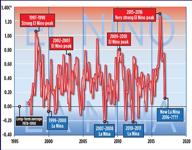
Regular readers will be aware that in a recent article in the Mail on Sunday David Rose quoted Professor Judith Curry as stating that:

The record warm years of 2015 and 2016 were primarily caused by the super El Nino

The article in question also included this graph:

MoS2 Template Master

It looks as though David’s left hand doesn’t know what his right hand is doing. Was the 2015 El Niño “Super” or “Very strong”? And how about the 1997/98 El Niño. Was that one really merely “Strong”?

We sought the professional opinion of an eminent expert in such matters, according to David Rose at least – Professor Judith Curry. Here’s how we got on, firstly at Prof. Curry’s “Climate Etc.” blog:

Us:

Since you mention the subject, I was wondering if Dr. Curry could take a look at the “the authoritative Met Office ‘HADCRUT4’ surface record” mentioned in David Rose’s latest Mail article and explain how it justifies her “The record warm years of 2015 and 2016 were primarily caused by the super El Nino” remark quoted in his previous one:

Post-Truth Global and Arctic Temperatures


Them:

“No answer!” was the stern reply! We tried again on a different thread at Prof. Judy’s place.


Us:

Bill the Frog has asked me to check the objective criteria Prof. Curry uses for differentiating between “weak”, “strong”, “very strong” and “super” El Niños. Likewise for La Niñas.

Can you assist by any chance Ristvan? Can Judith?


Them:

JH, Sure could. But first prove you are just not more loser snark.
Enso is variously but in eqch case precisely defined. I defer to Bob Tisdale comcerning details. And you?


Us:

I defer to the BoM in the first instance. How about Judith?


A different Them:

Jim Hunt

I expect the answers you are looking for are in this article by Judith back in 2014

https://judithcurry.com/2014/05/07/el-ninos-and-la-ninas-and-global-warming/


Us:

Thanks Tony, but that’s not Judith’s expert opinion on “objective criteria” either.

She did respond to my similar request on Twitter, but I’m still none the wiser I’m afraid:

https://twitter.com/jim_hunt/status/809766243486105600
https://twitter.com/jim_hunt/status/809769266081923072


Them:

“No answer!” was the stern reply!