Anthony Watts has been telling porky pies again. He claims his blog is “The world’s most viewed site on global warming and climate change”, which may or may not be true. However Anthony published an article earlier today entitled “NSIDC Mark Serreze’s sea ice ‘death spiral’ no longer ‘screaming’ on the way down, now termed to be ‘erratic & bumpy’“, which most certainly contains an inaccuracy or two.
Here’s how Anthony introduces his “argument”:
From the University of Colorado at Boulder, where they are apparently attempting to explain away why Arctic sea ice isn’t living up to previous wild claims such as those made by Dr. Mark Serreze of the National Snow and Ice Data Center, who famously said that the Arctic is in a ‘Death Spiral’ in response to my writing on WUWT:
Hence we are proud to be able to bring you this exclusive report on the “breathtaking ignorance” of the WattsUpWithThat blog! I’ve recently been publicly castigated on Twitter for our tongue in cheek “Us and Them” exposes:
I remain unrepentant, but just for once I’ll maintain a more conventional narrative. Anthony Watts continues his argument as follows:
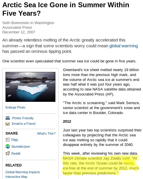
Serreze also famously said two years earlier that “The Arctic is screaming,” and that summer sea ice may be gone in five years, in an interview with the unquestioning and compliant Seth Borenstein at the Associated Press:

He helpfully highlights in yellow what Seth Borenstein said Mark Serreze said way back when in 2007. Note that no “predictions” or even “projections” are mentioned. So where do you suppose Tony’s “summer sea ice may be gone in five years” came from?
Here we provide our own screenshot of the National Geographic article in question, grabbing a slightly larger area of the screen, and highlighting a section slightly further down the page:
For those who have difficulty reading small print, such as Anthony Watts and his merry band of unquestioning and compliant followers over at WUWT, here is the unexpurgated transcript of our highlight in large letters:
NASA climate scientist Jay Zwally said: “At this rate, the Arctic Ocean could be nearly ice-free at the end of summer by 2012, much faster than previous predictions.”
Note firstly that this is a projection rather than a prediction, and secondly that it was reportedly uttered by Jay Zwally of NASA, not Mark Serreze of NSIDC!
Quod erat demonstrandum, and if so one cannot help but wonder how many similar blunders Mr. Watts has made over the course of his illustrious publishing career?
As luck would have it I interviewed Mark Serreze, who is currently director of the NSIDC, not so very long ago. I enquired whether the “Death spiral” story was apocryphal or not. Mark told me he did recall saying something along those lines to a journalist, but that he couldn’t recall the exact circumstances. I also asked if he was willing to make any “predictions” about the decline of sea ice in the Arctic. Mark told me that he still stood by his 2030 estimate for the onset of a seasonally ice free Arctic, although:
Most models say more like 2050
Doing my own due diligence (unlike the readers of Watts Up With That!) the earliest reference I could find to such a “prediction” involved a telephone interview much like the one I had just conducted. In an article dated August 27th 2008 the Reuters environment correspondent reported that:
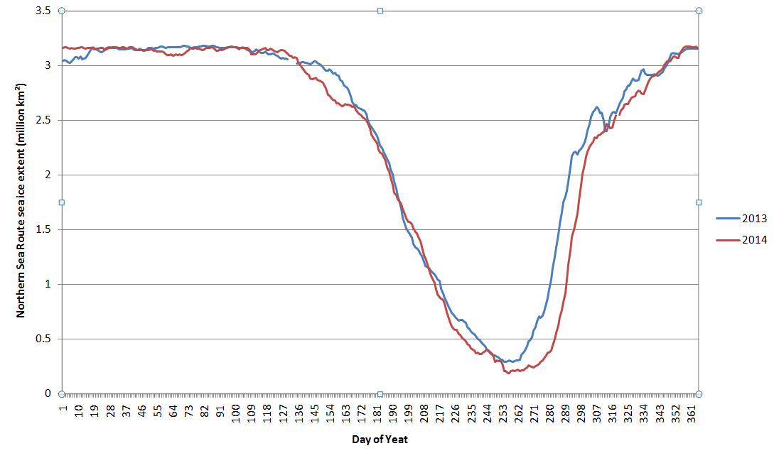
This year’s Arctic ice melt could surpass the extraordinary 2007 record low in the coming weeks. Last year’s minimum ice level was reached on September 16, according to the National Snow and Ice Data Center.
Even if no records are broken this year, the downward trend in summer sea ice in the Arctic continues, the Colorado-based center said. Last year’s record was blamed squarely on human-spurred climate change.
“No matter where we stand at the end of the melt season it’s just reinforcing this notion that Arctic ice is in its death spiral,” said Mark Serreze, a scientist at the center. The Arctic could be free of summer ice by 2030, Serreze said by telephone.
So there you have it. Unless someone can come up with some evidence to the contrary (unlike Watts and the Watties), it looks to me like Mark Serreze has been consistently saying for many years:
The Arctic could be free of summer ice by 2030
or words to that effect. Expect more from me on my interview with Mark Serreze in due course.
[Edit – February 1st]
Without a word of thanks to yours truly Anthony Watts has now published an “Update” to his original article. The salient bits read as follows:
The original article implied that NISDC’s Mark Serreze made the statement about sea ice being gone in 5 years, ending in 2012, when it was actually NASA’s Jay Zwally that made the claim in the National Geographic article. The language has been clarified in the paragraph to reflect this.
The offending paragraph now reads:
Serreze also famously said two years earlier that “The Arctic is screaming,” and a Arctic research associate, Jay Zwally of NASA, said in the same article that summer sea ice may be gone in five years, in an interview with the unquestioning and compliant Seth Borenstein at the Associated Press.
Anthony obviously hasn’t taken on board my helpful remarks about the difference between a prediction and a projection, and hence he waxes lyrical about how the sea ice in the Arctic didn’t vanish in the summer of 2012. He signs off by saying:
To my knowledge, Dr. Serreze has never publicly corrected the National Geographic article claim of 2012 being the ice-free year that wasn’t, suggesting he endorsed the idea at the time.
Have I got news for you Anthony. It doesn’t suggest anything of the kind! In addition to suggesting strange things to the suggestible Mr. Watts has so far neglected to answer this question posed by a commenter on the article in question:
I look forward to seeing any substantive replies to Jim Hunt’s clarifying post.
and so far he has also neglected to publish my response to that question. It included this video of my namesake, James Hunt, conversing with a couple of clueless mechanics:
Anthony Watts has also thus far neglected to explain how he inexplicably (in all the circumstances) successfully attributed the supposed 2012 “prediction” to Jay Zwally in this 2012 article, that also included a highlighted screenshot much like mine above:
In four months, just 132 days from now at the end of summer on the Autumnal Equinox September 22nd 2012, the Arctic will be “nearly ice free” according to a prominent NASA scientist in a National Geographic article on December 12, 2007.
Quod Erat Demonstrandum?
“There’s no answer to that”!
[/Edit]