In the spirit of providing some spurious “balance” to the contentious Arctic sea ice “debate” our quote for today comes fairly fresh from the Arctic Sea Ice Forum:
idk how people are confusing the gaping fissures that span from Siberia to Canada with melt ponds but it seems like half the people here have blinders on to what is ongoing.
I know HYCOM gets a lot of flak but instead of projecting out, let’s look at the last five days.
[Superfluous image redacted]
The ice has clearly broken completely in two now, and the recent ~970mb low did a major whomping to the ice in the “cleavage” between what’s stuck against Siberia and the main CAB.

Intriguingly this was in response to an informed comment on June 23rd to the effect that:
As we have seen recently, these large area drops in the middle of the pack do not mean the ice is gone, just that its top is wet/ponded. In a couple of days some of these drops might be reversed. Of course the ice has suffered in the meantime, but still it’s risky to simply extrapolate these numbers.
Even more intriguingly our headline for today is remarkably like the inverse of a phrase in a Mail on Sunday article that led us to create this site in the first place!
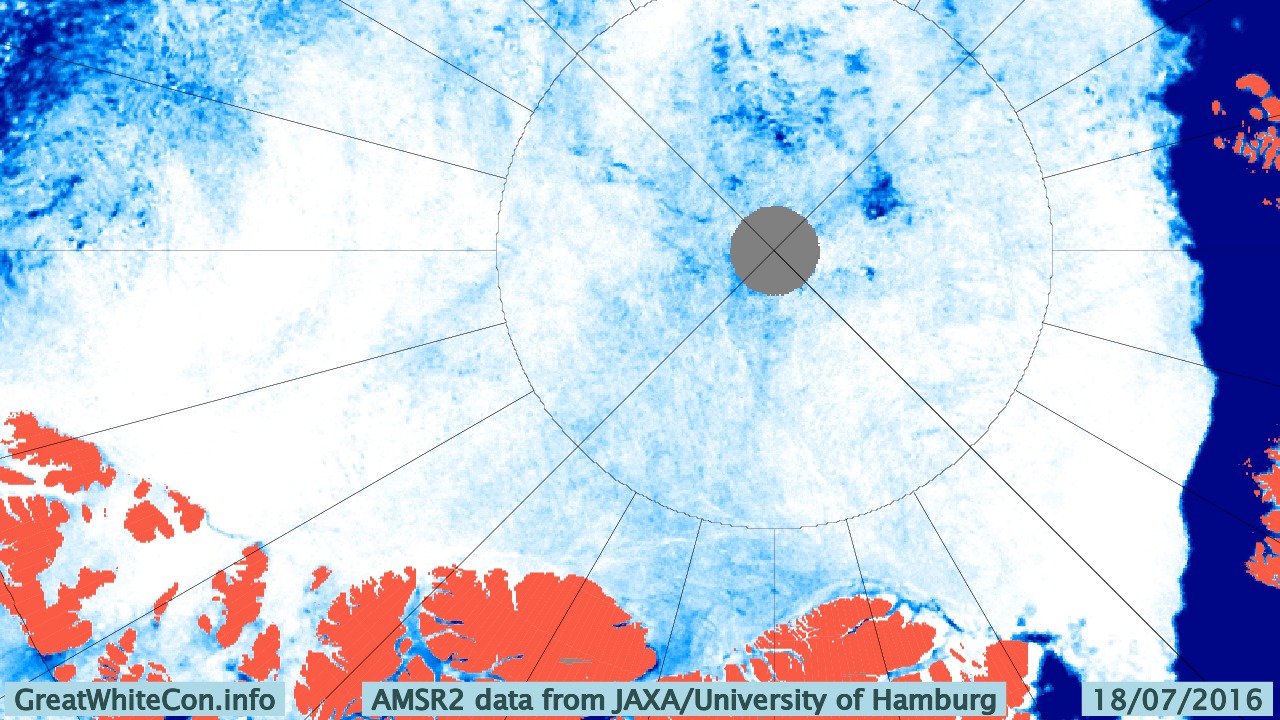
Nearly three weeks have passed since those “gaping fissures that span from Siberia to Canada” were announced, and you may well (like me) be wondering how they have been coming along? In partial answer to that question here is our very latest video based on the University of Hamburg’s AMSR2 concentration visualisations:
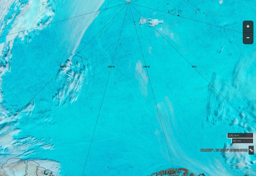
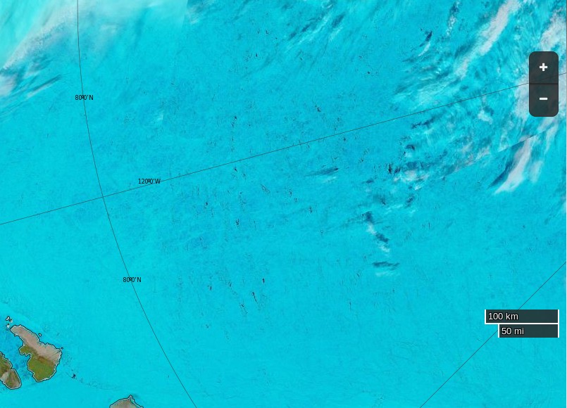
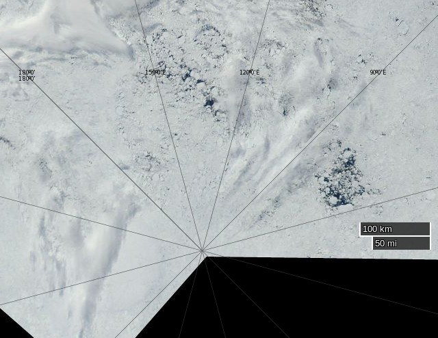
In my own humble opinion this doesn’t really count as a “gaping fissure” but MODIS imagery does now show a fair bit of open water between Siberia and the North Pole:

A “gaping fissure” between the Pole and Canada (and/or Greenland) is however conspicuous only by its absence:
I do think that I can spot some melt ponds in the area at the moment though. How about you?
The one CRREL/ERDC ice mass balance buoy still reporting reveals that both surface and bottom melting have started at around 83 degrees north:
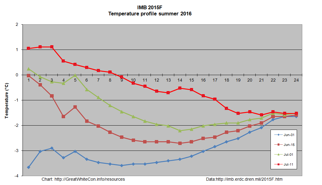
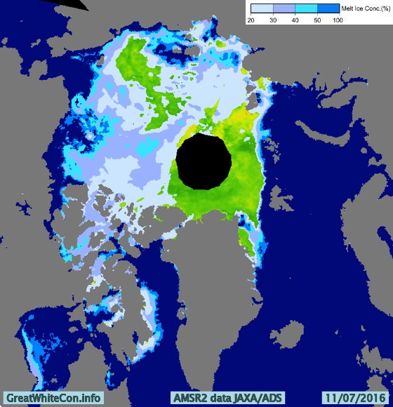
The 2016 multi-year ice melting season has evidently now begun, and the floe upon which buoy 2015F is sitting still has ~1.9 metres of melting to go. It’s not beyond the bounds of possibilty that a “gaping fissure” from the Atlantic to the Pacific will ultimately emerge this year. However based on the evidence thus far I’ll be extremely surprised if there is one “from Siberia to Canada”, unless of course you count the Chukchi & Beaufort Seas. That route is already open to intrepid Arctic seafarers, as can be seen at the bottom of the animation above and on the current JAXA/ADS Arctic sea ice surface melt map:
It seems I was mistaken. According to my flack jacketed informant over at the ASIF:
I have taken lots of flack I will stand by my prediction that we are heading for sub-1M KM2 come September (or early October).
Structurally [the ice] has actually now broken into three pieces, one is attached to the islands N of Siberia/NE of Svalbard, one is near Wrangel/ESS, and the “bulk” is pushed against the CAA/Greenland.
The lower concentrations in CAB are clearly open water and not melt ponds.
I felt compelled to explain to (presumably) him that:
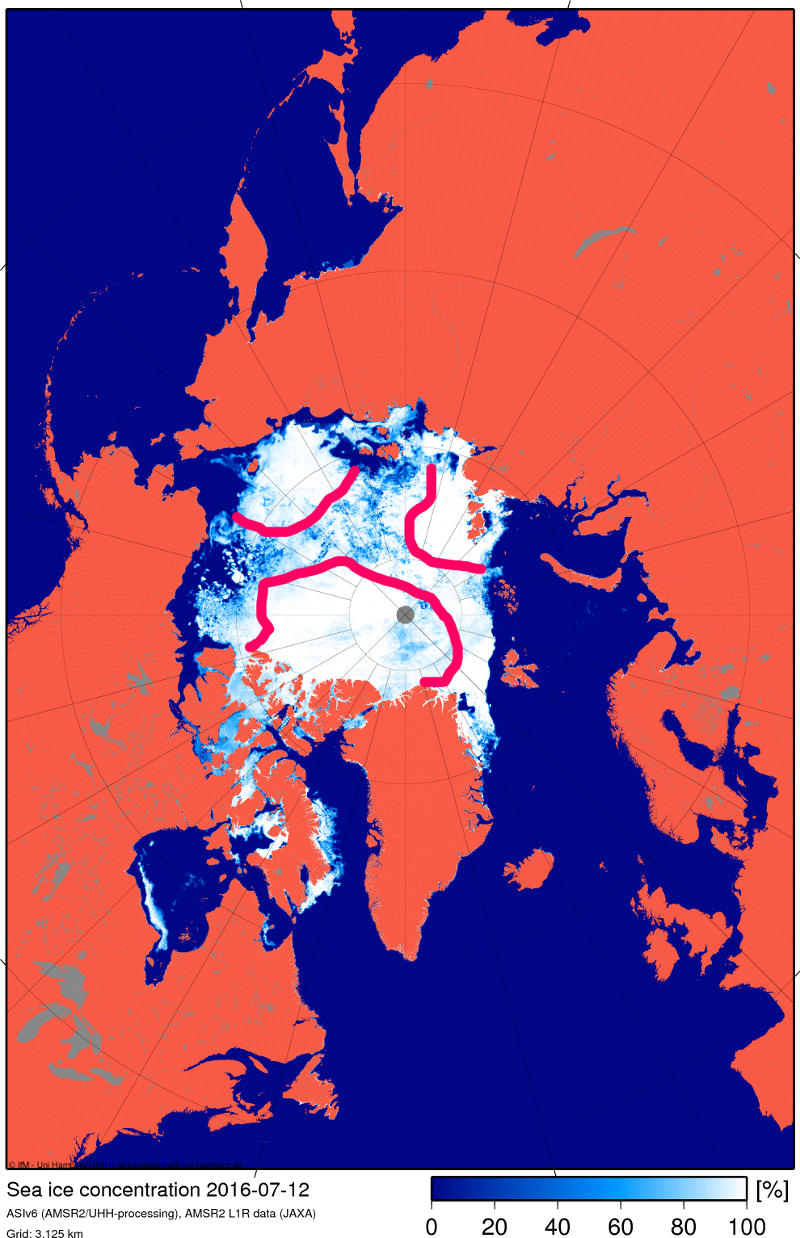
Here’s the NSIDC’s view of those “gaping fissures” of yours:

“Flak jacket” assures me that:
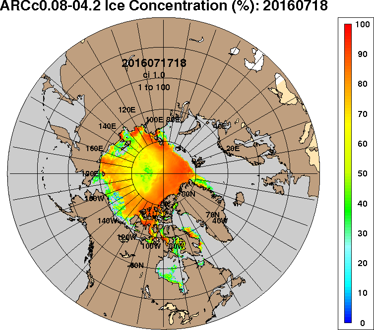
Despite some faults I think both ARC and GLB are onto the truth. Satellite grabs over the past few days show failure on all three fronts (ATL, PAC, and the Russian side especially), but the Russian side doesn’t present as a solid front (nor does the Beaufort melt), and the leads keep getting absorbed into the slush of the main pack (which is why the ‘slush’ keeps expanding, and why most of the CAB has now evolved into this state). The only solid regions of ice are those bordering the steaming ATL waters as well as some remnants north of the CAA (no coincidence the latter was chosen as ‘evidence’).
“ARC” refers to the US Navy’s Arctic Cap Nowcast/Forecast System. Here’s the ACNFS sea ice thickness “nowcast” from July 13th:

Here’s the July 13th model run sea ice thickness forecast for July 14th:

and here’s an annotated version of the Navy’s sea ice concentration forecast:
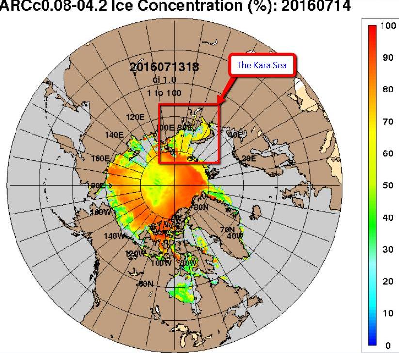
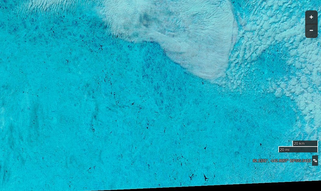
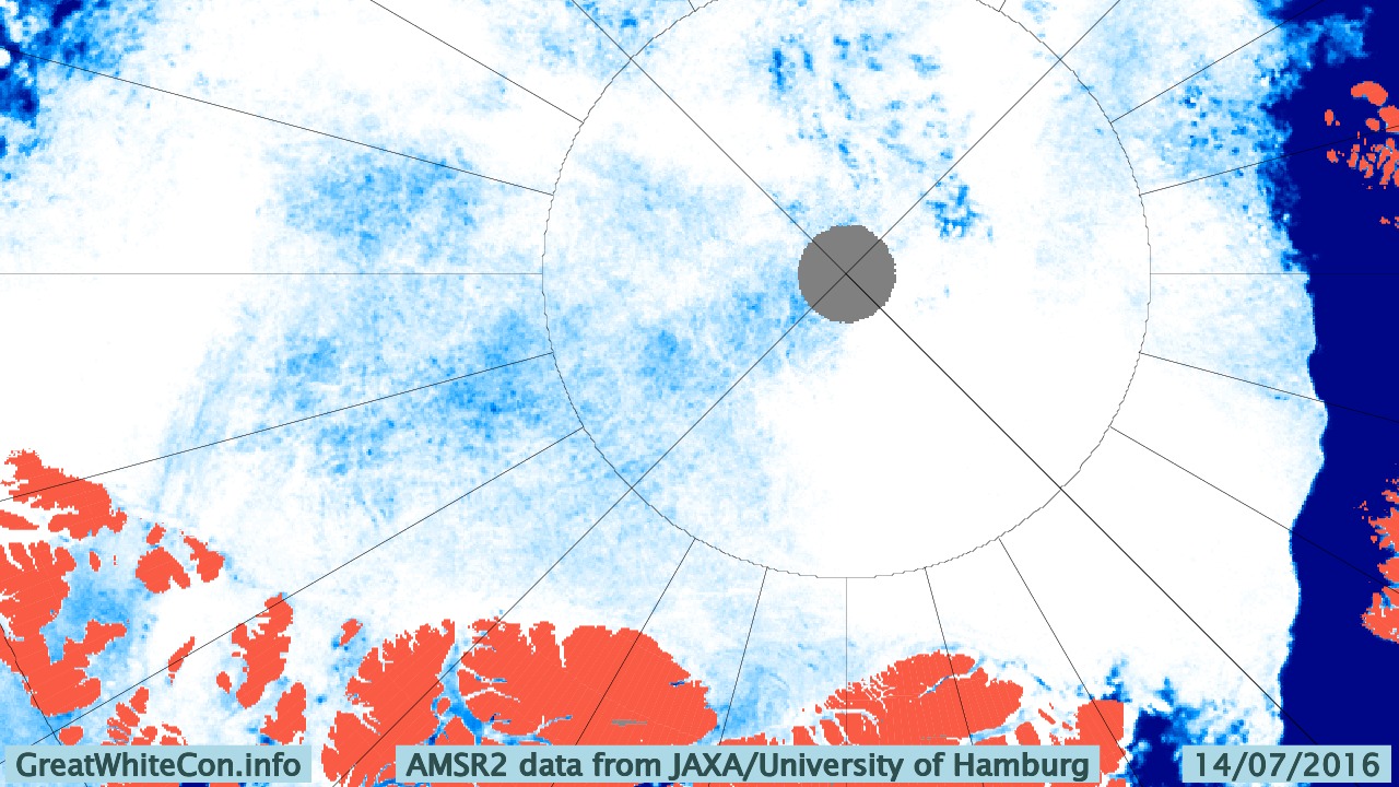
Yesterday the Kara Sea didn’t suddenly become covered in sea ice, and today the area of the Central Arctic Basin around 82 N, 135 W looks like this to the MODIS instrument on board the Terra Satellite:
and like this to the University of Hamburg’s ARTIST sea ice concentration algorithm:
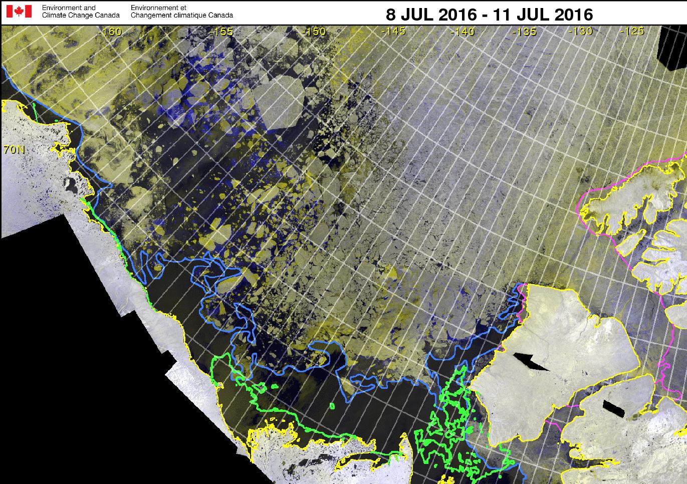
whilst here’s the latest Canadian Ice Service RadarSat mosaic for the Western Arctic:
Ice mass balance buoy 2015F reports this morning:
Current Buoy Data (07/15/2016):
Pos: 82.89 N, 137.34 W
Air Temp: -0.76 C
Air Pres: 1011.16 mb
Ice thickness : 185 cm
The Arctic Sea Ice Forum management have banished “Flack Jacket” to the sin bin for a month.
I’m fed up with the personal insults because a model that has a history of errors is showing something spectacular that no other data source does. Come back in a month if you still feel like it.
Meanwhile in answer to my enquiry on the HYCOM support forum Alan Wallcraft tells me:
We now use the National Ice Center’s IMS sea ice extent product in our assimiltion, see http://www.natice.noaa.gov/ims/. This is manually produced every day, and generally avoids the artifacts and deficiencies of satellite sea ice concentrations. However yesterdays IMS fields were not good, and that is where the spurious sea ice came from. Today’s IMS field is good, and we may rerun the 2016/07/13-18Z nowcast/forecast to clear this up.
After a brief “pause” ACNFS is back in action, and here is its latest Arctic sea ice concentration “nowcast”:

Yesterday the skies were clear once again over the corner of the Arctic where buoy 2015F is located:
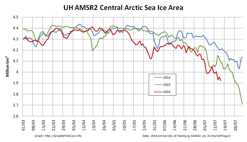
Here’s how the sea ice area in the Central Arctic Basin has been faring recently:
Here’s an early image of the North Pole from the Aqua satellite this morning, recorded for posterity in case it changes later:
and as the recent Arctic storm heads towards the Canadian Arctic Archipelago here’s the latest Hamburg AMSR2 concentration map:
I now also have an answer to my “supplementary question” on the HYCOM support forum:
I attach the ACNFS plot you referenced and the corresponding plot from our next global real-time system (GOFS 3.1), which will likely replace our current global analysis (and ACNFS) once NAVGEM 1.4 is operational (it is running here with NAVGEM 1.3, like ACNFS). They assimilate the same observations, but ACNFS only does so near the ice edge while GOFS 3.1 assimilates sea ice concentration everywhere (but with higher error bounds in the ice interior). The reason for ACNFS only assimilating near the edge is in part due to that being the most important area for navigation but also because SSMI satelite ice concentrations tend to “over saturate” in the summer. We switched GOFS 3.1 to “believe” the observations because they are generally better in recent years.
The two are quite different in the interior of the sea ice and GOFS 3.1 is certainly better there. We did not see the low concentrations near the North Pole in ACNFS this time last year, so something has happened to make the free running model produce low concentrations this summer. We are looking into it.
071800_927_arcticicen.001″ width=”754″ height=”666″ class=”aligncenter size-full wp-image-4361″ />
June has arrived, and according to the Great White Con Arctic sea ice calendar that means the summer surface melting season has started. Once July arrives bottom melt should have started in earnest too, but for now let’s stick to the surface. Here’s the Climate Reanalyzer map of Arctic surface air temperatures at 06:00 UTC this morning: Green areas are above 0 degrees Celsius, and bear in mind that the melting point of sea ice is at around -1.8 degrees Celsius. The red areas near the East Siberian Sea coast are 25-30 degrees Celsius. Given those sort of temperatures you might well think that some snow and/or ice in that area would be melting, and you would be correct! Here is the Japan Aerospace Exploration Agency’s current map of Arctic surface melting: The assorted shades of blue/grey show the areas where surface melting is already underway. Whilst this melting is taking place you may possibly read in some quarters of the cryodenialosphere that “There is almost no melting going on in the Arctic“. The authors of such nonsense evidently don’t know their proverbial Arctic arse from their elbow. Here’s how today’s surface melting in the East Siberian Sea looks from space: Meanwhile over on the other side of the Arctic, here’s yesterday’s surface melting on “Amundsen’s Route” through the Northwest Passage: By way of further illustration of the fact that Arctic sea ice is and has been melting, here is a graph of the current area of sea ice in the all important central area of the Arctic Basin, courtesy of “Wipneus” at Arctische Pinguin: The areas included are the Central Arctic Basin, plus the Beaufort, Chukchi, East Siberian and Laptev Seas. The above zero temperatures are forecast to spread across the Central Arctic Basin early next week, whereupon it will be very interesting to discover what happens to the snow around the single ice mass balance buoy currently transmitting near real time data. Here is the current temperature profile for the sea ice underneath IMB buoy 2015F: The current conditions there are summarised this morning as: Pos: 82.00 N, 147.45 W Normally by now there would also be a number of webcams beaming back pictures from across the sea ice in the Arctic Basin. However according to NOAA: Due to funding constraints, it was not possible to deploy new Web Cams in Spring 2016, but deployments in Spring 2017 are planned. Three of the camera carrying O-Buoys also seem to have failed over the winter, which leaves us with only O-Buoy 14 to reveal the forthcoming melt to us: O-Buoy 14 is currently colocated with Ice Tethered Profiler 89, the yellow object in the foreground, at 77.49° N, 153.92° W, to the north of the Beaufort Sea. ITP 89 measures the temperature and salinity of the water beneath the sea ice and revealed this the last time it managed to take a measurement, a month or so ago: If you examine the extreme right hand edge of the charts carefully you will no doubt note that the water underneath the ice has recently become both warmer and saltier. Watch this space! The latest JAXA/ADS map shows that the area of sea ice undergoing surface melting has increased since yesterday, particularly over the Chukchi Sea: The recent clouds over the Beaufort Sea cleared yesterday. Here’s a close up view of the open water between the big floes from the Suomi satellite: For a more distant perspective see our Summer 2016 image archive. It’s not simply the surface that’s melting either. Here’s the latest “high resolution” AMSR2 sea ice area graph for the Pacific side of the Arctic: The opening sentence of Tony Heller’s latest Arctic update is astonishingly accurate. Just for once we agree with him when he states: DMI continues to show rapid melting of Arctic sea ice. However after that the Arctic fraud continues unabated. Tony assures his loyal readership that: Their maps show the exact opposite. Arctic sea ice coverage is hardly changing at all. and: Equally as troubling is that they show a lot less ice than last year, when in fact there is more ice than last year. providing this map as justification: As unReal Science commenter Peter Ellis put it: You’re getting caught out by the change in the land mask. When Caleb quibbled yours truly felt compelled to elucidate: What have you and Tony been smoking Caleb? Here’s a satellite image of the Beaufort Sea this year, which is red on Tony’s low resolution 2015/16 comparison map: Here’s a satellite image of the the northern edge of the CAA last year, which is green on Tony’s map: Would you care to play “spot the difference” with Peter and I? Tony is doubling down on his Arctic fraud. His Arctic monkey business continues. Despite the lucid explanation of his glaring error provided by Peter Ellis the unReal Science Gish gallop continues. We are now (un)reliably informed that: The Arctic is very cold, and is not melting. The amount of ice in the Arctic is almost exactly the same as this date last year. Yours truly has asked all and sundry at unReal Science this question 9 times, phrased in a variety of different ways: Here’s a satellite image of the the northern edge of the CAA last year. Take a good look at it and then show me the areas of open water corresponding to the green areas on Tony’s final map above. I have yet to receive an answer. Tony’s doubled down again. His Arctic BS continues for another day: DMI shows ice rapidly melting and extent far below last year. But their maps show about 1% more ice this year than last. How long will this scam continue? I tried using a more colourful image of the CAA today. This one’s from May 27th 2015: Once again “No answer!” was the stern reply to my plaintive questions. The “Jousting with Malice in Blunderland” continues, but the oppostion are remarkably quiet today. I’ve had my knuckles rapped about this previously, but cutting and pasting is so quick ‘n easy I simply cannot resist: Us: Evidently Tony Heller believes that when it comes to melting sea ice air temperatures are all that matters and that “somewhat warmer ocean water” is irrelevant. see above: http://realclimatescience.com/2016/05/arctic-bs-continues-for-another-day/#comment-9532 He also evidently believes that in May 2015 large areas of the oldest and thickest sea ice in the Arctic had already melted away to nothing. Perhaps you can point out all the polynyas around the coast of the Canadian Arctic Archipelago this time last year to him, since nobody else has yet managed to do so? Them: gees, Jimbo has change to a luminous blue. Us: For psychedelic Arctic surface air temperature fans every where: http://cci-reanalyzer.org/Forecasts/#ARC-LEA What do you suppose happens to sea ice when you combine “somewhat warmer ocean water” with “somewhat above freezing point air”? N.B. Such conditions do not currently exist off the north coast of the CAA. They didn’t in May 2015 either. Them: You on psycho drugs yet again, Jimbo Which of your Exeter buddies is feeding them too you ? Us: Evidently you and Tony are the ones who have been smoking stuff Andy. In the fantasy wonderland portrayed in several of Tony’s recent “articles” polynyas are depicted in the oldest, thickest sea ice in the Arctic in May 2015. Here is what the real life polynyas in the “oldest, thickest sea ice” in the actual Arctic of May 2016 look like from above (through cyan tinted spectacles): The Gish gallop continues. In yet another post on the self same topic Tony Heller makes the self same mistake and opines: DMI still shows a lot less ice than last year, but their maps show about 1% more ice than last year. I will continue to track this, because I don’t trust any government agency anymore. Us: Visual comparison isn’t Tony’s strong suit Sondre, whereas painting hallucinatory green pixels is. Where are all the holes in the sea ice in the CAA that were there in 2015 but not in 2016 then Andy? http://www.arctic.io/explorer/8-8/2016-05-29;2015-05-30/6-N79.25236-W95.51613 Them: weather related changes… you KNOW that, Jimbo the attention seeking prat. You have NOTHING, and never have. Andy: Shut up about the Holocene, it’s not relevant to modern Arctic sea ice extent trends. Us: Have you noticed that the world’s leading expert on satellite imagery of the Arctic during the first 3/4 of the Holocene epoch has compared MODIS imagery of the Canadian Arctic Archipelago from May 2015 with May 2016 and confirmed that there is no noticeable difference in sea ice extent between the two? Them: We’ll keep you posted! As regular readers will be aware we have been following the progress of the Great Arctic Anticyclone of 2016 for the last 3 weeks or so and the generation of increasingly large waves in the Beaufort Sea in August and September for the last 3 years or so. Today we combine the two to bring you news of anomalously large waves in the Beaufort Sea earlier this week. In actual fact any sort of waves in the Beaufort Sea at this time of year would be anomalous, since normally the Beaufort is still covered in sea ice in April! Firstly a bit of background information. In the continuing absence of the DMSP F-17 satellite data used by the NSIDC for their Arctic sea ice metrics, here’s a close up look at Arctische Pinguin’s current Beaufort Sea ice area data: Now here’s NOAA’s WaveWatch III “hindcast” of the winds over the Beaufort Sea on April 26th 2016: Notice the continuing easterly winds from the persistent high pressure system centred to the north of the Beaufort Sea. Next here’s the resultant wind wave height: and the associated wind wave period: Wind waves with a height of around 1.5 meters and a period of 6 seconds wouldn’t tempt me to go out on a surfing expedition, but they would certainly be enough to interfere with the sea ice formation process, as you can see from this “pseudo-color” image of the Beaufort Sea on April 26th from the MODIS instrument on the Terra satellite: Unfortunately the Jason 2 and recently launched Jason 3 satellites don’t measure wave heights in bodies of water as far north as the Beaufort Sea, so we’ll have to content ourselves with the modelled data from WaveWatch III. However here’s a brief video explaining how Jason 3 measurements are now used to assist WaveWatch forecasts further south: Whilst Jason 3 won’t be watching waves in the Arctic Ocean it looks as though the European Space Agency’s Sentinel 3A satellite will be providing wave height data for the Beaufort Sea in the not too distant future: It also looks as though CryoSat-2 is already potentially providing such data, but as far as I can ascertain it’s not available in handy gridded format in the same way that the CS2 near real time ice thickness data is. Our headline today is inspired by Tony Heller, probably still better known by his nom de guerre “Steven Goddard”, who excitedly tells the world: NSIDC Busted! Reader Chris71 has discovered the smoking gun on the NSIDC web site. Read on. A few weeks ago, NSIDC put out this press release, claiming that 5+ year old ice is at its smallest level on record. The press release included the map below. This is a new style map which they just started in week 39 2015. The map below is for week 41 2015. All of their previous 1984-2015 maps have been deleted from their archive. The good news is that Chris found one of their old style maps which had not been scrubbed from their website. NSIDC has deleted the original graphs, but seem to have forgotten to get rid of the copy. For some strange reason “Steve” neglects to mention this text that accompanied the “old style map” he so proudly displays: Here are some graphs from the Arctic – automatically saved here, and some of them archived Enjoy! Fred aka DungeonMaster on http://forum.arctic-sea-ice.net/. Have I got news for Chris and “Steve”? Indeed I have! If one were to bother to go to the relevant section of the NSIDC web site instead of inventing bizzare fairy tales one would be able to read this: EASE-Grid Sea Ice Age, Version 3 This data set provides weekly estimates of sea ice age for the Arctic Ocean from remotely sensed sea ice motion and sea ice extent. The input ice motion data used for this data set is now derived from NSIDC-0116 Version 3 data. Checking out the detailed information provided about the NSIDC-0116 Polar Pathfinder Daily 25 km EASE-Grid Sea Ice Motion Vectors, Version 3 would also reveal: Version 3 – February 2016. Eliminated unrealistic AVHRR and IABP buoy velocities Extended buoy ice motion estimates to the present Improved browse images Reprocessed SSMI fields using GDAL map transformations on the DMSP SSM/I-SSMIS Daily Polar Gridded Brightness Temperatures Data Set, NSIDC-0001. Used Ice concentration estimates greater than 15 percent from the Sea Ice Concentrations from Nimbus-7 SMMR and DMSP SSM/I-SSMIS Passive Microwave Data Set, NSIDC-0051, to indicate where ice extent is present. Checking out the detailed information provided about the NSIDC-0611 EASE-Grid Sea Ice Age, Version 3 would further reveal: The sea ice age data in these files are derived using data from satellite passive microwave instruments, drifting buoys, and a weather model. With these data sources, the formation, movement, and disappearance of sea ice can be observed; and these observations can, in turn, be used to estimate ice age (Maslanik et al. 2007). The ice age data are derived from a number of passive microwave imagers: the Scanning Multichannel Microwave Radiometer (SMMR), the Special Sensor Microwave/Imager (SSM/I), and the Special Sensor Microwave Imager Sounder (SSMIS). Visible and infrared data from the Advanced Very High Resolution Radiometer (AVHRR) were also utilized through 2004. In addition, International Arctic Buoy Program (IABP) drifting-buoy vectors and the National Centers for Environmental Prediction (NCEP)/National Center for Atmospheric Research (NCAR) Reanalysis Project (CDAS) are used to augment the satellite data (Tschudi 2010). Version 3 – April 2016. So there you have it “Steve”. Thanks to the sterling (albeit uncredited!) efforts of the all volunteer members of the Arctic Sea Ice Forum and the (presumably still paid?) scientists at the National Snow and Ice Data Center you can now explain the truth, the whole truth, and nothing but the truth of the matter to your own loyal readers. A few weeks ago the NSIDC upgraded their sea ice age product from version 2 to version 3. Here’s what the latest version of 1984 week 41 looks like: Can you spot the difference Tony? In partial answer to a question posed below, here’s an animation of Arctic sea ice age from September 2010 to May 2015. Can you see what has happened to the old ice Tony? Here’s a “Storified” summary of my Twitter “debate” with Tony Heller and Patrick Moore: According to the US National Snow and Ice Data Center, the Beaufort Gyre is: A clockwise circulation (looking from above the North Pole) in the Beaufort Sea, north of Alaska. This circulation results from an average high-pressure system that spawns winds over the region.
Such a high pressure system has been in place over the Arctic Ocean for a few days now, and the effect of the clockwise circulation on the sea ice in the Beaufort Sea is already evident in these recent satellite images: as well as in this animation of sea ice movement since February: The high pressure is forecast to continue for several more days. Here’s the GFS forecast for April 20th, courtesy of MeteoCiel: which shows a large system with a central pressure of 1040 hPa still sitting over the Northern Beaufort Sea. Next here’s an animation from the US Navy which forecasts ice thickness until April 19th: Note in particular the large area of open water forecast to be produced in the Chukchi sea off Barrow, Alaska by the end of the period. The continuing clockwise winds have already started reducing the area of sea ice in the Beaufort Sea at an unusually early date: Amongst other things we’ll be keeping a close eye on the ice area in the Chukchi Sea over the next few days. The sun is already starting to bathe that area of our planet with its rays, and open ocean soaks up that heat much more readily than bright white ice. Here’s an animation of the effect on sea ice of the Beaufort Gyre in overdrive from Neven at the Arctic Sea Ice Blog: Notice how towards the end of the animation another huge part of the ice pack, north of the Canadian Arctic Archipelago is pulled into the Gyre. This is mostly multi-year ice. Here also is a MODIS image of the Beaufort Sea processed by A-Team at the Arctic Sea Ice Forum to highlight the areas of new ice: Our Twitter feed has suddenly been inundated with messages to the effect that: Global sea ice makes a strong comeback as El Nino fades. First up was Professor Judith Curry on April 12th, with: @curryja I'd be somewhat dubious about a strong ENSO-sea ice link. Not much of a response during 97/98: https://t.co/D1oyDvyCxg — Zeke Hausfather (@hausfath) April 12, 2016 You will note that we were not the only ones to swiftly conclude that Judy’s assertion was lacking both veracity and verisimilitude! Then this morning came our old friends at the Global Warming Policy Forum with: As El Nino Collapses Global Sea Ice Makes A Strong Comeback – See more at: https://t.co/SdWaC7Ve2d pic.twitter.com/4H7K0Ju6n3 — GWPF (@thegwpfcom) April 13, 2016 You will note that the GWPF adorned their “Tweet” with a graph purporting to show “Global sea ice anomalies”. We can only assume that Benny Peiser hadn’t read this April 11th article of ours, which pointed out that: NSIDC has suspended daily sea ice extent updates until further notice, due to issues with the satellite data used to produce these images. The problem was initially seen in data for April 5 and all data since then are unreliable, so we have chosen to remove all of April from NSIDC’s archive. To remedy that (no doubt?) inadvertent oversight on Benny’s part here is a graph we prepared earlier of absolute global sea ice area using reliable data from the AMSR2 instrument on the Japan Aerospace eXploration Agency’s SHIZUKU satellite: The GWPF were followed this afternoon by Anthony Watts with: Global Sea Ice Makes A Strong Comeback https://t.co/XeKm0j4Cbp pic.twitter.com/JNXWjdiIOH — Watts Up With That (@wattsupwiththat) April 13, 2016 Both Prof. Curry and non Prof. Watts adorned their “Tweets” with a graph allegedly comparing “global temperature” with “tropical temperature”, but provided no graph of “polar temperature”. To remedy that (no doubt?) inadvertent oversight here is one we prepared earlier: All members of this team of synchronised “Tweeters” provided links to an April 11th article by a certain Paul Dorian entitled, believe it or not: “Global Sea Ice Makes A Strong Comeback” Note in particular the part of Paul’s article that states: In an interesting twist, the recent analysis found that the global ice area remained stable throughout the 1980s and the 1990s, while temperatures climbed suggesting “the global sea ice area is not particularly a function of the global average surface temperature.” [Source: Willis Eschenbach/”Watts Up With That” web site] We can only assume that Paul Dorian hadn’t read this April 10th article of ours, which pointed out amongst other things that: One feels compelled to ask why Willis’s global average temperature graph neglects to mention 2015 when he implies that it does? Here’s an up to date version of one of those that Bill The Frog prepared for us earlier: We must further assume that Paul hadn’t read this April 11th article by Mr. Watts either. It stated that: A few years ago in 2009, I was the first to notice and write about a failure of the instrumentation for one of the satellites used by the National Snow and Ice Data Center (NSIDC) to show Arctic Sea Ice extent. Today, we have what appears to be a similar problem with satellite sea ice measurement. It seems that Paul Dorian has finally read at least one out of all these informative articles, because the latest revision of his own piece of imaginative fiction now starts: The source of global sea ice information cited in this posting was NOAA’s National Snow and Ice Data Center (NSIDC). They are now reporting issues with the satellite data used to produce these images and this information was not known at the time of the writing of this article. Do you suppose we can now expect a similarly “fulsome apology” from the other players in this tragi-comic farce, together with all their rebloggers, retweeters, plagiarisers and other assorted acolytes? According to the Danish Arctic research institutions’ Polar Portal this year there’s been an “Unusually Early Greenland Melt“. The article by Ruth Mottram points out that: An early melt event over the Greenland ice sheet occurred this week, smashing by a month the previous records of more than 10% of the ice sheet melting. Based on observation-initialized weather model runs by DMI, almost 12% of the Greenland ice sheet had more than 1mm of melt on Monday 11th April, following an early start to melting the previous day. Scientists at DMI were at first incredulous due to the early date. “We had to check that our models were still working properly” said Peter Langen, a climate scientist at DMI. “Fortunately we could see from the PROMICE.dk stations on the ice sheet that it had been well above melting, even above 10 °C. This helped to explain the results”. The former top 3 earliest dates for a melt area larger than 10% were previously all in May (5th May 2010, 8th May 1990, 8th May 2006). Just in case you think the DMI’s models really aren’t working properly, take a look at this satellite image of South West Greenland today: Then head over to NASA Worldview and flip back to last year using the controls at the bottom left: Can you spot the difference? According to the Polar Portal once again: Around the coast of Greenland where DMI has climate records dating back to 1873, Greenland came close to setting a record temperature for the whole of Greenland in April. Kangerlussuaq measured a daily maximum of 17.8°C, the previous record is 18.0°C and the DMI observation station at the Summit of Greenland set a new “warm” April record of -6.6°C. “Everything is melting” observed Nuuk resident Aqqaluk Petersen. The melt was driven by warm air advected from the SW bringing rain along the coast, similar to an extreme melt event in 2012 when 95% of the surface of the ice sheet had melt, a situation that has been reported in detail by GEUS and DMI scientists (Fausto et al., 2016). It has been brought to my attention that the cloud cover in the first image above makes it difficult to see the melting ice sheet. By way of explanation, at this time of year you can use images derived from the MODIS instrument on the Aqua and Terra satellites and the VIIRS instrument on the Suomi satellite to watch the snow cover retreat across Alaska, Canada, Siberia and indeed Greenland. There is less snow on the ground in SW Greenland than “normal” this year, and hence lower albedo. This implies there will also be less snow on the ice sheet itself, which is hence more vulnerable to “early melt”. In order to get visual confirmation of melt ponds on the ice clear blue skies are needed. You can see hints of “blue ice” through the gaps in the cloud on my first image above. To bring out the “blue ice” try following the link above to NASA Worldview and then experiment with the controls on the left. If you select “Corrected Reflectance (Bands 7-2-1) you should be able to produce an image that looks like this: For a closer look between the clouds here’s a “natural colour” image from Landsat 8: Skeptical sorts across the cryoblogosphere are in meltdown mode at the moment. They seem to be unaware that satellites don’t last forever in the harsh environment of space, and the individual scientific instruments carried by a satellite don’t either. Some failures are more spectacular than others however. By way of illustration here’s one recent report from Space.com: The February [2015] explosion of an American military satellite may cause some problems for orbiting spacecraft after all, a new study reports. The U.S. Air Force’s 20-year-old Defense Meteorological Satellite Program Flight 13 (DMSP-F13) craft blew apart on Feb. 3 after experiencing a power-system faillure. Analyses by the European Space Agency and other organizations found that the cloud of space junk generated by the explosion shouldn’t pose much of a threat to their missions, but the new research suggests that not all spacecraft are in the clear. Another DMSP satellite started pushing up the metaphorical daisies earlier this year. Last month Space Flight Now reported that: The U.S. Air Force has been unable to send commands to the service’s newest weather satellite for nearly a month, and engineers are trying to determine if the spacecraft can be salvaged, officials said last week. The polar-orbiting Defense Meteorological Satellite Program Flight 19, or DMSP F19, spacecraft stopped responding to orders from the ground Feb. 11, the Air Force said in a March 3 press release. “At this time, it is not known what caused the anomaly or if the satellite will be recovered, and the anomaly is under investigation,” the Air Force said. “There are no other known issues with the satellite.” Designed for a five-year service life, DMSP F19 launched April 3, 2014, from California atop a United Launch Alliance Atlas 5 rocket. It is the newest in the Air Force’s series of DMSP weather observatories designed to help forecasters predict storms, clouds, fog and dust storms that could inhibit global military operations. The data provided by the Special Sensor Microwave Imager/Sounder (SSMIS) instrument carried aboard several of the DMSP series of satellites is used by the National Snow and Ice Data Center to calculate their Sea Ice Index metric of Arctic sea ice extent. However suddenly Boulder has a problem. As we reported earlier this week the SSMIS sensor carried by DMSP F17 appears to be malfunctioning. This can be seen in this visualisation of the data from the European Ocean and Sea Ice Satellite Application Facility(OSI-SAF): Look closely at the top centre of the image to see a large patch of spurious “sea ice”. Here’s the resulting SII extent graph from the NSIDC: Anthony Watts reported this news in typically fanciful fashion: There is this small notice on the NSIDC page: “The daily sea ice extent images are currently displaying erroneous data. NSIDC is investigating.” It looks to be a problem with the DMSP F17 satellite. Makes you wonder how long this has been going on and if the anomalously low readings we’ve seen for awhile are due to a slow sensor degradation. Time will tell. For a more realistic interpretation of the facts we suggest that instead of reading the propaganda perpetrated at WUWT you instead examine this graph derived using data from the AMSR2 sensor on board the Japanese SHIZUKU satellite: Mr. Watts evidently takes a very US centric view of these matters, since he neglected to report this timely news bulletin from the OSI-SAF: Due to the previously reported problems with one of the channels on SSMIS onboard DMSP F17, OSI SAF is now working on replacing DMSP F17 with DMSP F18 in our sea ice products. Currently, the switch to F18 has been implemented for the ice concentration product (OSI-401). The product dated 20160410 has been reprocessed and is available on our FTP server, ftp://osisaf.met.no/prod/ice/conc/ and ftp://osisaf.met.no/archive/ice/conc/2016/04 The ice edge and type products (OSI-402 and OSI-403) will be updated to use F18 tomorrow, 2016-04-12. It seems Willis Eschenbach, the current Watts Up With That resident sea ice expert, is already beavering away endeavouring to prove Anthony’s case for him: We have no way to know if this has been a gradual decrease followed by a failure, so yes, it’s certainly possible that the previous data is bad. Doesn’t mean it is, but we’d be fools not to check. We suggested a simple check: Why not compare the NSIDC’s SSMIS data from F-17 with JAXA’s AMSR2 data from Shizuku? Wouldn’t that do the trick? Willis replied: I meant that just from the bad reading alone, we don’t know if the previous data is bad. Yes, we can check it in the way you suggest and other ways … which is why I said we’d be fools not to check. We think that if he does his due diligence he will find that he is in actual fact engaged on a fool’s errand, but time will indeed tell. Let’s wait and see what Willis n Willard can come up with, shall we? Meanwhile we also cannot help but wonder what the dynamic duo might make of our own due diligence replicating the results of another collaboration of theirs: As our regular reader(s) will be aware, Anthony Watts has been plagiarising our content and republishing it on his “Watts Up With That” blog. In a perplexing perversity he has also been refusing to publish content that we have happily contributed to the self same blog. Hence we have taken the liberty of basing our title for today on a recent WUWT guest post by Willis Eschenbach entitled: Here’s what Willis had to say at the end of his article: My Usual Request: Misunderstandings are the curse of the internet. If you disagree with me or anyone, please quote the exact words you disagree with, so we can all understand the exact nature of your objections. I can defend my own words. I cannot defend someone else’s interpretation of some unidentified words of mine. My Other Request: If you believe that e.g. I’m using a method wrong or using the wrong dataset, please educate me and others by demonstrating the proper use of the method or the right dataset. Simply claiming I’m wrong about methods doesn’t advance the discussion unless you can point us to the right way to do it. Data: The Hadley HadISST ice (and sea surface temperature) data is available here. I used the NetCDF file HadISST_ice.nc.gz (~15Mb) at the bottom of the page. and here’s a copy of our still invisible comment: Epitomising the indomitable spirit of scientific skepticism we set out to duplicate the results obtained by Mr. Eschenbach and answer our own question as well as his. Here is what we’ve discovered. Firstly global sea ice area since 1974: and then Arctic sea ice area since 1974: Now as our very own learned guest poster Bill The Frog all too briefly pointed out to Willis Eschenbach on April 7th: Ignoring Bill’s helpful hint Willis concluded that: We’re pretty sure that the global average surface temperature increased from the mid-1970s to about 1998. However, we see no sign of this in the global sea ice area data. Instead, ice area remained stable throughout the 1980s and the 1990s, while temperatures climbed: Next, we’re also pretty sure that there was no significant change in the global average temperature from about 1998 to 2015, the end of the ice data. Despite that, starting in 2000 the ice area first dipped to a low in about 2007, and since then has been climbing rapidly. This supports a curious conclusion, which is that in modern times at least, the global sea ice area is not particularly a function of the global average surface temperature. Go figure… Now that we’re in possession of all this newly revealed data about historical sea ice area and censorship in the cryospheric blogosphere what should we “go figure”? Firstly one feels compelled to ask why Willis’s global average temperature graph neglects to mention 2015 when he implies that it does? Should you figure anything else please free to answer our query on a virtual postcard, in the space provided for that purpose below. You may additionally like to vent your feelings concerning this controversial cover-up of our changing climate over on Twitter using the #SnipGate hashtag. 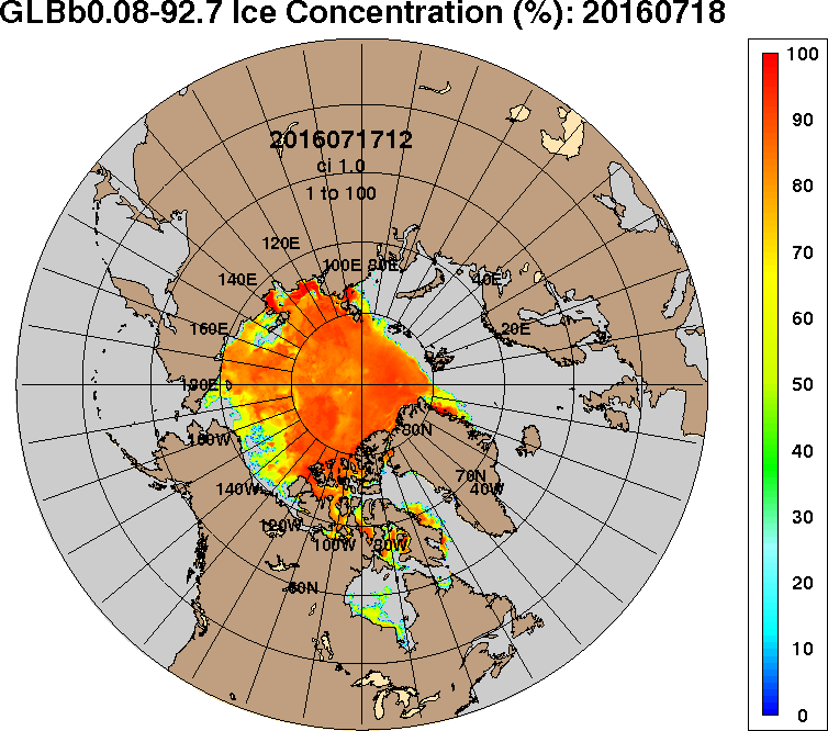
Summer 2016 Surface Melt Takes Off
Air Temp: -3.74 C
Air Pres: 1007.42 mb
Snow depth: 21 cm
Ice thickness: 202 cm
Arctic Fraud Continues Unabated
Very pretty Jim..
Now how about you show one that shows th near ZERO Arctic sea ice from the first 3/4 of the Holocene..
Or are you still going to DENY/ IGNORE the FACT that there is nothing untoward happening with the Arctic Sea Ice, and all you are arguing about is the INSIGNIFICANT TRIVIA that rules your meaningless life.
It’t like talking about sun spot trends and then someone comes along and says “Well, this is nothing compared to when the sun becomes a red giant”. Which is true, but not relevant at all.
Wind Waves in the Beaufort Sea in April 2016
“Steve Goddard” Busted
Original Arctic sea ice age images from: Tschudi, M., C. Fowler, J. Maslanik, J. S. Stewart, and W. Meier. 2016. EASE-Grid Sea Ice Age, Boulder, Colorado USA: NASA National Snow and Ice Data Center Distributed Active Archive Center. http://dx.doi.org/10.5067/PFSVFZA9Y85G.
The Beaufort Gyre Goes Into Overdrive
Global Sea Ice “Comeback” Conspiracy
Greenland 2016 Melt Starts A Month Early
Satellite Problems With Arctic Sea Ice Measurement
The Awful Terrible Horrible Arctic Sea Ice Crisis