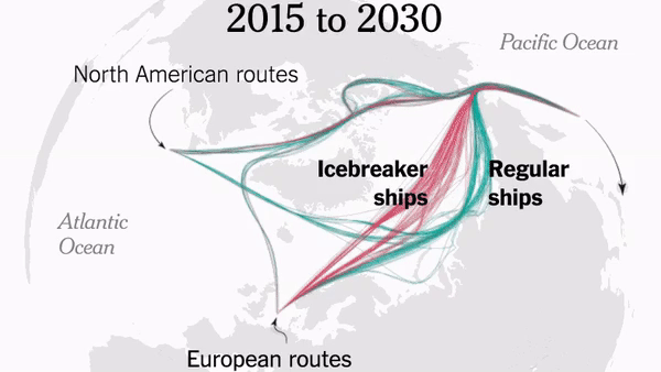
The United Kingdom Government has just published details of its Foresight “Future of the sea” project’s investigation into the implications of declining Arctic sea ice. According to the overview:
The Arctic is losing sea ice at a dramatic rate and this decline is expected to continue. This is creating opportunities for shorter global trade links between East Asia and the UK, via the Arctic.
Arctic routes are seasonally open most years, although normally icebreaker ships are required and available routes are close to the coast. Currently the Arctic shipping season is short and highly variable with optimum conditions in September and/or October.
Due to climate change, the Arctic shipping season could become three times longer and more reliable, so that by mid-century it will likely be possible to directly cross the North Pole during late summer. During this time, voyages from East Asia to the UK could save 10 to 12 days by using Arctic routes.
However, the extra costs associated with operating in the harsh Arctic environment may detract from their appeal.
The full report goes into much greater detail. According to the executive summary:
There are mixed views on whether trans-Arctic routes will become economically viable. The Russian government wishes to develop the Northern Sea Route as a commercial enterprise and offers substantial fee-based services such as ice-breaking support and pilotage, which are certainly necessary for future investment and development of the route. However Arctic transport is also likely to grow due to increased destination shipping to serve natural resource extraction projects and cruise tourism.
The UK is well positioned, geographically, geopolitically, and commercially, to benefit from a symbiotic relationship with increasing Arctic shipping. The UK has a prominent role in Arctic science and a world-leading maritime services industry based in London, including the International Maritime Organization (IMO), one of the world’s leading financial centres, and Europe’s largest insurance sector. Arctic economic growth is focused in four key sectors – mineral resources, fisheries, logistics, and tourism – all of which require shipping, and could generate investment reaching $100bn (US Dollars and hereafter) or more in the Arctic region over the next decade. The UK had a fundamental role in preparing the UN IMO Polar Code which came into operation in January 2017. The Polar Code is an historic milestone in addressing the specific risks faced by Arctic shipping and acts to supplement the existing Safety of Life at Sea (SOLAS) and Marine Pollution (MARPOL) conventions for protecting the environment while ensuring safe shipping in international waters.
Much of the investment into Arctic shipping projects is from China but northern European countries are also playing an increasing role. Potential opportunities for the UK include the development of UK-based Arctic cruise tourism, and a UK-based trans-shipment port – transferring goods from ice-classed vessels to conventional carriers. The UK’s active diplomatic role in many international organisations means it is well placed to ensure that increased activity in the Arctic is accomplished in line with established UN maritime conventions, many of which were written with significant UK contributions. The UK’s leading role in Arctic science has wide reaching positive implications for international collaboration. To enhance predictions of the future Arctic, further developments in climate modelling and science are required.
From the concluding remarks:
If anthropogenic greenhouse gas concentrations can be reduced sharply in line with the UN Paris climate change agreements, Arctic ice melt and shipping opportunities will still continue to increase for the majority of the 21st century. However, even with continually increasing greenhouse gas concentrations, climate models suggest there will always be some Arctic sea ice during winters through the 21st century. Although the Arctic shipping season length and reliability is likely to increase dramatically, for the vast majority of the current global shipping fleet sailing trans-Arctic will remain a seasonal endeavour. Based on the current activity and physical climate changes this suggests that trans-Arctic shipping is likely to increase, focused on the Northern Sea Route; however, it is likely to remain a niche market for specialist operators.
Finally, for the moment at least, here’s the latest IMO video on search and rescue in the polar environment:
https://youtu.be/N_gs9wgaHQo
The emphasis in the video is on Antarctica, but one cannot help but wonder when the next search and rescue operation will take place in the Arctic. Later this summer perhaps? Note that under the new Polar Code avoiding the use of heavy fuel oil is mandatory in the Antarctic, but merely “encouraged” in the Arctic:
Way back in February Bob Ward of the Grantham Institute complained to the Great British Independent Press Standards Organisation about a Matt Ridley article in the no longer Great or British Times newspaper. According to Mr. Ward:
In a characteristically error-filled article (‘Politics and science are a toxic combination’, 6 February 2017), Viscount Ridley made a number of inaccurate and misleading statements.
He claimed that a blog by Dr John Bates “alleges that scientists themselves have been indulging in alternative facts, fake news and policy-based evidence”. This is hyperbolic nonsense. In fact, the blog does not contain such allegations. Instead, it primarily accuses a former colleague, Dr Thomas Karl, at the United States National Oceanic and Atmospheric Administration (NOAA) of failing to archive his data for a research paper (PDF) in accordance with strict new rules governing ‘operational data’.
IPSO have now published the findings of their investigation into the matter:
Findings of the Committee
22. The newspaper was entitled to report on the views of Dr Bates, a leading former climate scientist at the NOAA, about the ‘Pausebuster’ paper and the circumstances surrounding its publication. While acknowledging the newspaper’s position that Dr Bates had reviewed the article before publication, the primary question for the Committee was whether Dr Bates’ concerns had been presented in a significantly inaccurate or misleading way.
23. The columnist’s characterisation of the substance of Dr Bates’ claims was very strong: he had asserted that Dr Bates has alleged that scientists were indulging in “alternative facts, fake news and policy-based evidence”. The Committee noted that this appeared on its face to conflict with Dr Bates’ subsequent public statement that there had been “no data tampering, no data changing, nothing malicious”. However, Dr Bates had claimed in the blog that a “thumb on the scale” pushed for decisions that would create a desired outcome, and described the process as a “flagrant manipulation of scientific integrity guidelines”. “Fake news” and “alternative facts” are currently ill-defined terms, and the Committee concluded on balance that the nature of these allegations was such that the columnist was entitled to characterise them in this way. There was no breach of the Code on that point.
24. Dr Bates had made clear in his blog that he considered that the paper had been rushed, and deliberately timed to influence the Paris Climate Conference; he had said that the NOAA had breached its own rules on scientific integrity; he had said that the data had been faulty, because he believed that both datasets had been flawed. These concerns were clearly distinguished as Dr Bates’ claims based on his professional experience, which was explained, and had been accurately reported in the column, as claims. The columnist also acknowledged, albeit critically, that defenders of the paper had responded that other data sets had come to similar conclusions. While the Committee noted the grounds for the complainant’s disagreement with the columnist (and with Dr Bates) in relation to these matters, the columnist had not failed to take care over the accuracy of these claims, and it did not establish any significant inaccuracies in the column’s discussion of these issues.
25. The columnist had been further entitled to express his opinion on the significance of these claims; to draw comparisons between previous “scandals” within the scientific community; and to comment on the wider implications of Dr Bates’ concerns in that community, as well as on policy decisions on climate change. These were statements of the columnist’s opinion. His views, however controversial, did not raise a breach of Clause 1. There was no breach of the Code in relation to his discussion of these issues.
It decided not to uphold my complaint on the grounds that its Complaints Committee considered Viscount Ridley’s column to be wholly opinion.
This is consistent with IPSO’s previous rulings about the systematic misreporting of climate change issues by some newspapers, in which it confines itself to assessing whether opinions are accurately represented, rather than whether the opinions are based on facts or falsehoods.
We now eagerly await IPSO’s Complaints Committee’s verdict on a similar complaint by Bob Ward about a similar article by David Rose in the Mail on Sunday
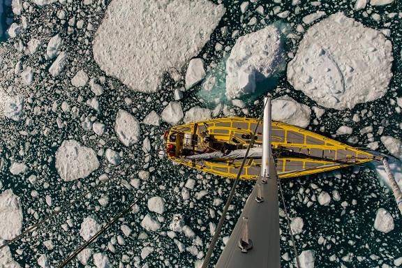
Arctic explorer Pen Hadow trekked, and swam, from Ward Hunt Island to the North Pole in 2003. Solo and unsupported. He plans to return to the North Pole this summer, but on this occasion he’ll be sailing with a few companions. According to yesterday’s Sunday Times:
Pen Hadow launches bittersweet mission to sail to North Pole
For his new record attempt, Hadow and his nine-strong team will take two yachts on a 3,500-mile round trip from Nome in Alaska to the pole, using satellites to find a route through the ice and avoid getting stuck. He will fly to Alaska to join his team members on Saturday.
If all goes to plan, he will arrive at the pole between August 15 and early September, about 510 miles further north than anyone has sailed before.
Although the Sunday Times failed to mention it the expedition has a web site of its own. According to the Arctic Mission “About” page:
Arctic Mission sets off from Nome in Alaska (USA) in the first week of August. The expedition team will not see land again for six weeks. We will cover about 3,500 miles by the time they return to harbour at Nome in mid-September.
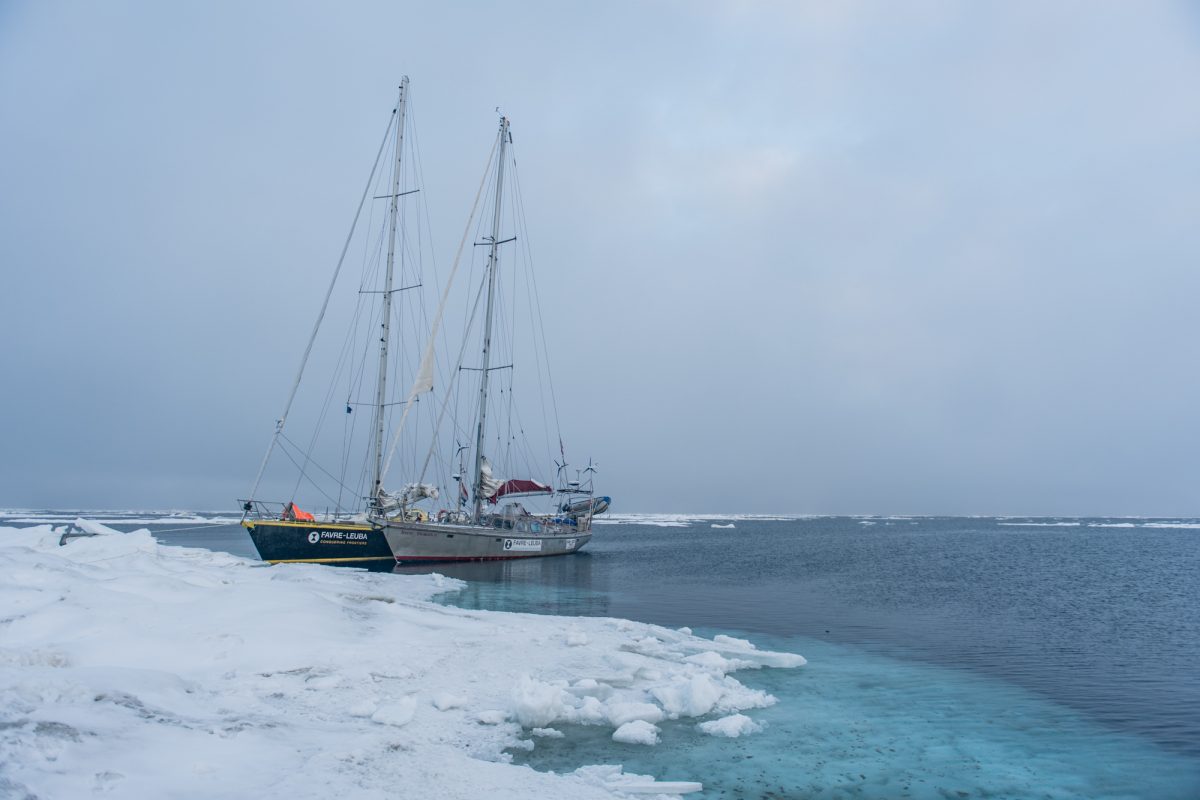
Our two 50 foot yachts, Bagheera and Snow Dragon II, are specially built to sail in waters with sea ice, and the four skippers, two on each boat, are exceptionally experienced in polar seas, and with navigation and safety procedures in sea ice.
The Arctic Mission team intend to do lots of science during their attempt to reach the Pole:
Our expedition is going to explore, discover and share the stories of the spectacular marine wildlife – plants, animals and even bacteria – that lives around the North Pole. Be prepared to be surprised!
We’ll also be doing essential scientific studies and sharing this information, so that our international policy-makers can decide how best to #protect90North.
The more we explore this unexplored ocean, the better we will understand how it works, which means we can make the best decisions to protect it for the benefit of everyone for ever.
We’ve met the two yachts in question before. In 2015 Bagheera and Snow Dragon II both successfully negotiated the Northwest Passage. However this voyage will be far more difficult. During their attempt to sail to the North Pole in the summer of 2013 Sébastian Roubinet and Vincent Berthet had to be rescued by the Russian icebreaker Admiral Makarov when the Central Arctic refreeze set in earlier than originally anticipated. Unlike the ice skating catamaran Babouchka, Bagheera and Snow Dragon II both have engines which will certainly help avoiding a similar fate. In addition perhaps the sea ice in the Arctic is less of an obstacle than it was in 2013? In an interview with the BBC World Service on Sunday Pen pointed out that:
Now 40% of the international waters around the North Pole, what we call the Central Arctic Ocean, are open water in the summer time.
When asked:
Do you think you’ll actually achieve this goal then?
Pen replied:
I think it’s quite possible, with the assistance of a US agency that have satellites that are going to be helping us each day pick the best route through these ever narrowing cracks, and it’s quite possible that we’ll reach the North Geographic Pole.
I also trust that the Arctic Mission team will be keeping a close eye on the Arctic weather forecast over the next month or so. Last August the crew of the yacht Northabout feared for their lives when caught in an Arctic cyclone in a sheltered anchorage on the Northern Sea Route. There is no such safe haven anywhere near the North Pole.
Pen concluded his BBC interview as follows:
If we can produce a visual image of a sail boat at 90 degrees north I think that could become an iconic image of the challenge that the twenty-first century faces. Are we serious about running this planet, which is actually what we need to start doing, and it’s biophysical resources on a sustainable basis, or are we just here for a laugh?
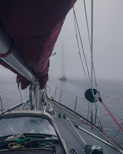
We wish him and the Arctic Mission team well. Watch this space for further updates, and possibly that iconic visual image! Meanwhile here’s a picture of Bagheera in the Northwest Passage in 2015:
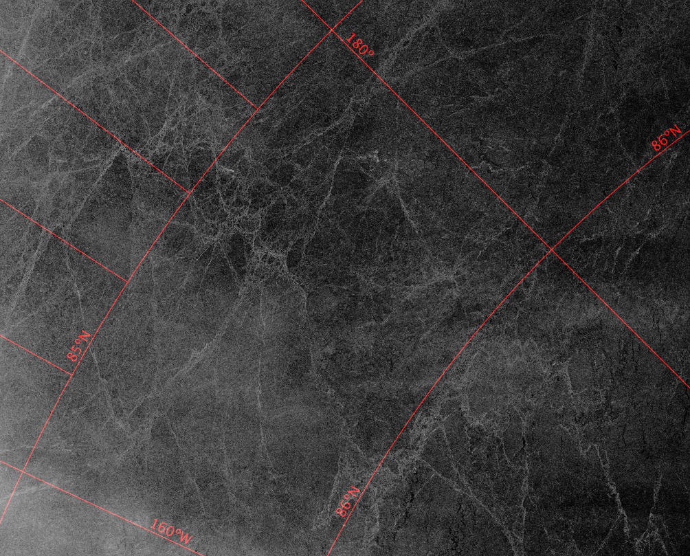
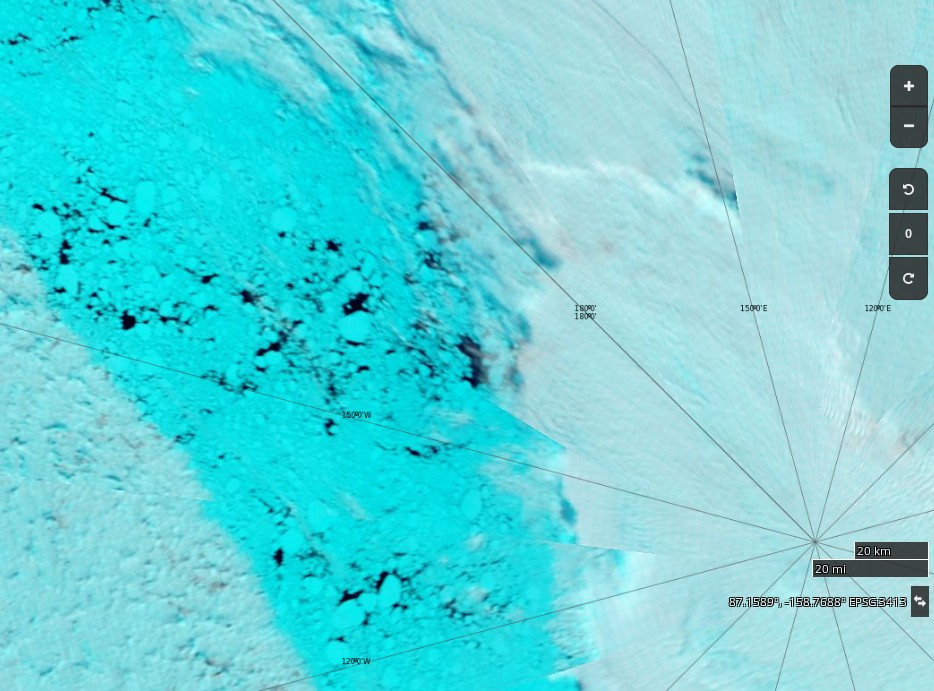
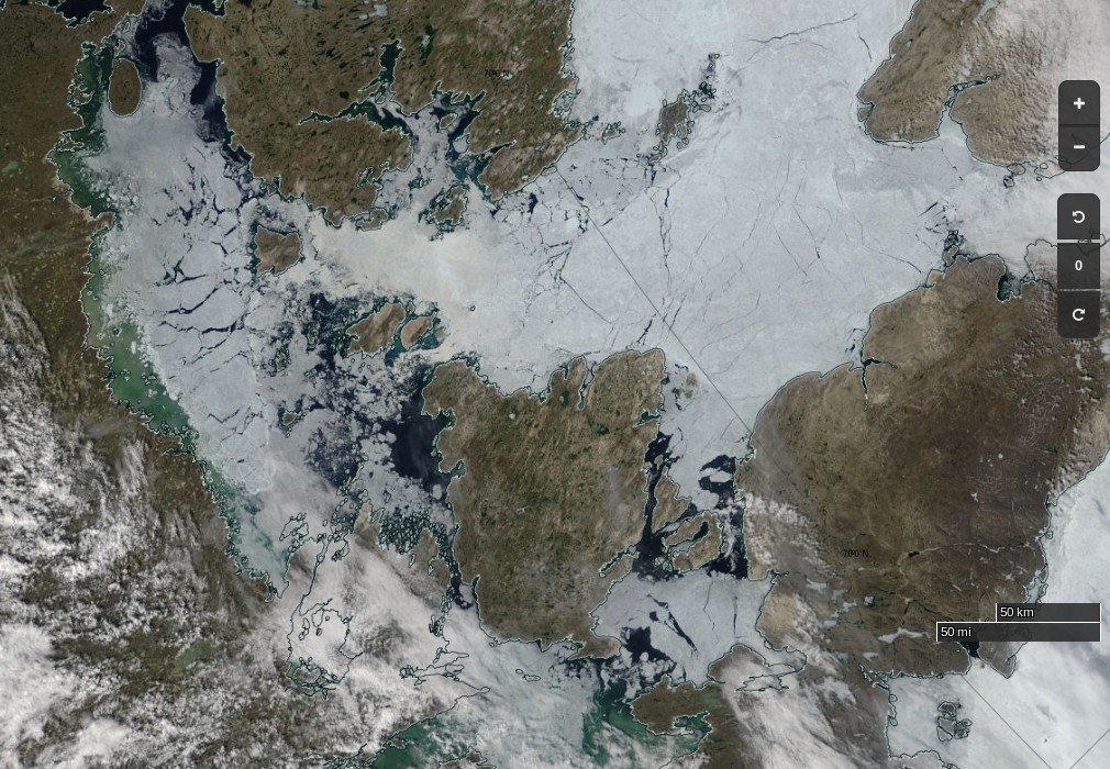
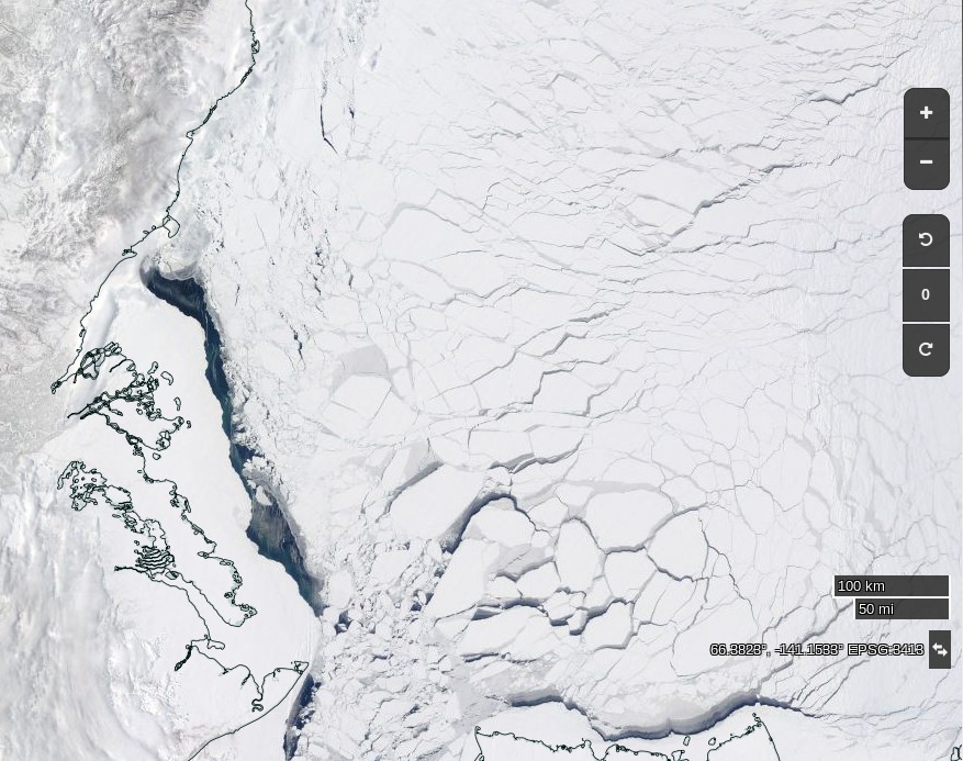
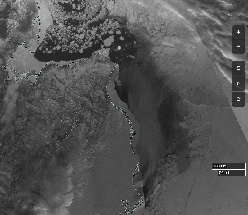
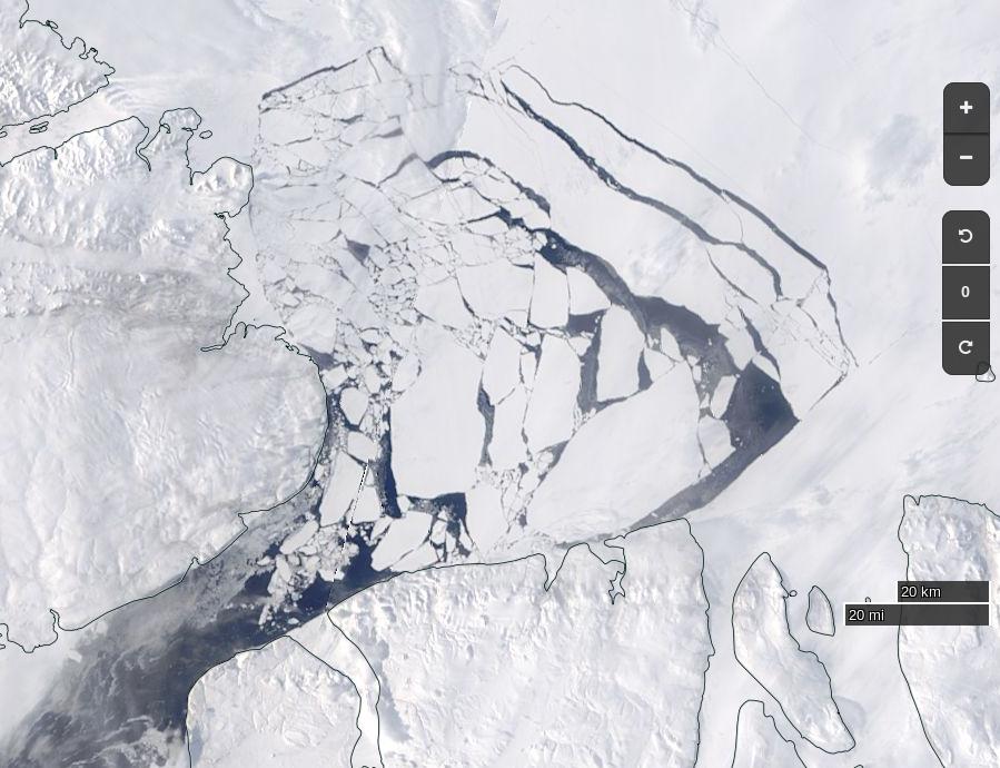
plus an image from the Sentinel 1B satellite of the current state of the Arctic sea ice on the direct route from Nome to the North Pole:
Sentinel 1B image of Arctic sea ice at 86N, 180W on July 24th 2017
There don’t seem to be many “narrow cracks” just yet.
[This] brings us to the summer of 2016, and an idea I was mulling over. A rather Big Idea. Had the deterioration of the Arctic sea ice got to a point where switching from Spring-time sledge-hauling to Summer-time sailing was appropriate? In my solo journey from northern Canada to the North Geographic Pole in 2003, I had spent over 30 hours swimming open water stretches, out of the total 850 hours spent hauling my sledge while walking on skis across the sea ice. It had dawned on me then that global warming was the likely cause of so much open water. Since then, it has become highly unlikely that the ski route from northern Russia to the Pole will be done again, due to the absence of sea ice for most of the year off the Severnaya Zemlya island group. And the other classic route from northern Canada no longer has an aircraft operation to provide the necessary support for sea ice expeditions, due to the worsening quality of the sea ice. Both routes have now been lost to the Arctic Ocean’s fast-changing environment. And with this change, the Arctic Ocean with its hitherto frozen summer surface is now rapidly becoming open-access to surface vessels for the first time in human history.
Would it be possible to sail a small yacht to the Pole? Could that create a useful platform to share the unfolding situation with a global audience? Might this be the best way I could focus world attention on the merit of creating a new marine reserve in the international waters surrounding the North Pole?
It looks like we’re just about to find out the answer to those questions. The team have also announced another livestream from Nome, Alaska. This one is scheduled for 8 PM BST tomorrow, Thursday August 10th. They say:
Ahead of our Friday departure (weather permitting – there’s a nasty storm brewing over the Bering Strait that may prove problematic) we’d love to introduce you to the Arctic Mission team.
This is probably what they are referring to:
A bumpy ride for Pen Hadow et al. is in store on Saturday, and some big waves for Utqiaġvik (Barrow as was) as well.
[Edit – August 13th]
An overly brief and (hence?) rather misleading article in the Sunday Times today. According to Jonathan Leake:
Sailing to North Pole will have to wait
Pen Hadow, the British explorer, is today due to start a sailing expedition across the Arctic Ocean to highlight the effects of climate change, including an attempt to reach the North Pole.
Scientists warned, though, that despite the rapid melting of the ice there was unlikely to be access to the North Pole via open water for some years.
Professor Mark Serreze, director of America’s National Snow and Ice Data Centre, said the North Pole was still surrounded by nearly 800 miles of solid pack ice as of last week.
Jonathan appears not to have a particularly good grasp of sea ice (thermo)dynamics during the latter stages of the summer melting season!
NASA Worldview “false-color” image of the North Pole on August 13th 2017, derived from the MODIS sensor on the Terra satellite
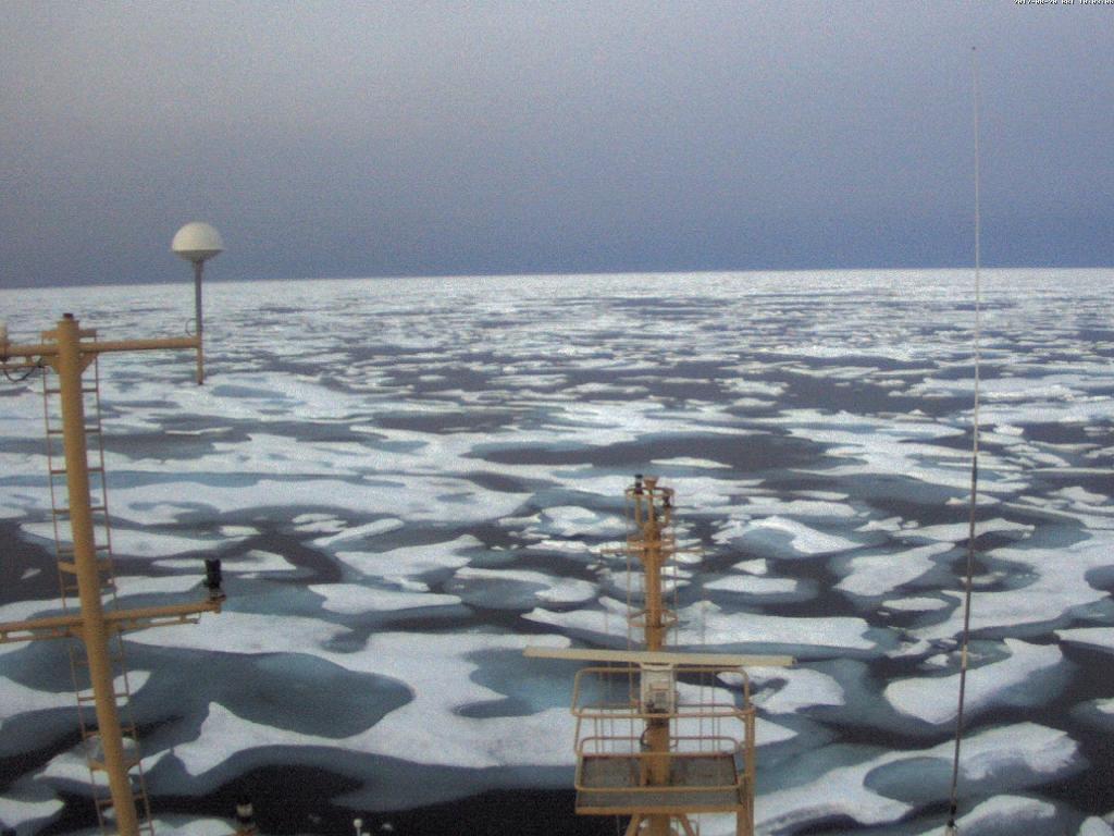
Whilst waiting for the waves in the Bering Strait to die down Conor McDonnell, Arctic Mission’s photographer, has recorded a video from the top of Bagheera’s mast, amongst other places:
[Edit – August 14th]
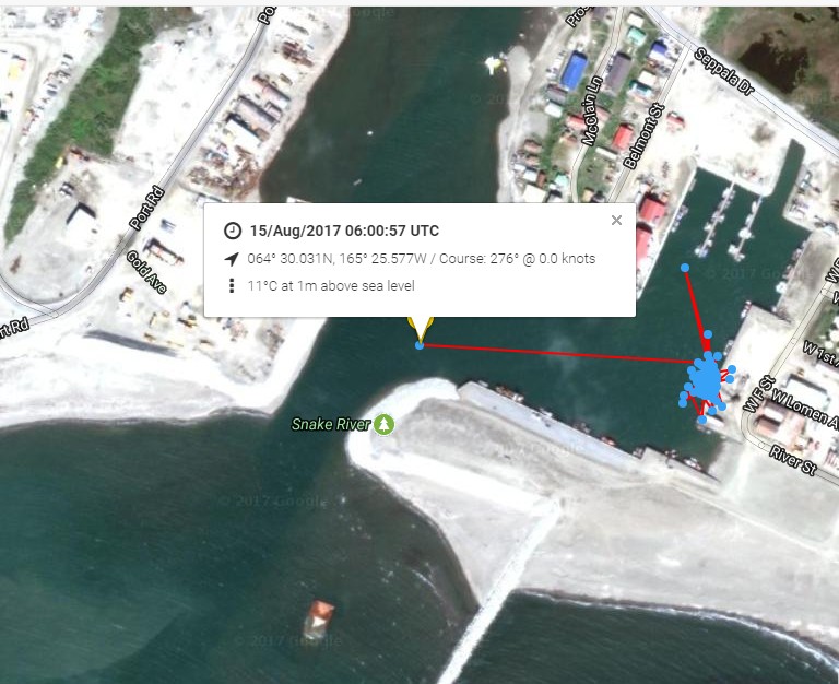
According to Pen Hadow Bagheera and Snow Dragon II will set sail in the small hours of tomorrow morning (UTC):
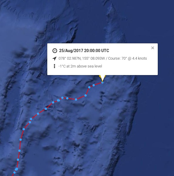
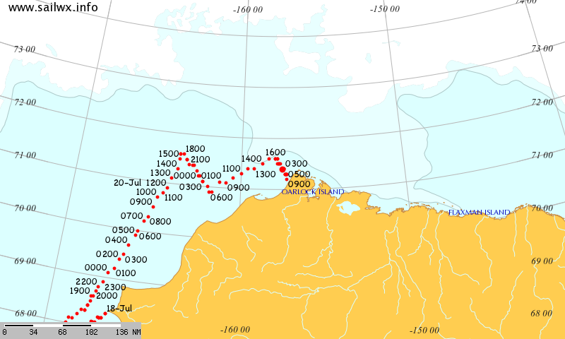
The Arctic Mission live tracking map is operational at last. Here is what it reveals so far:
It looks as though Bagheera and Snow Dragon II left Nome on their voyage of discovery at 06:00 UTC this morning.
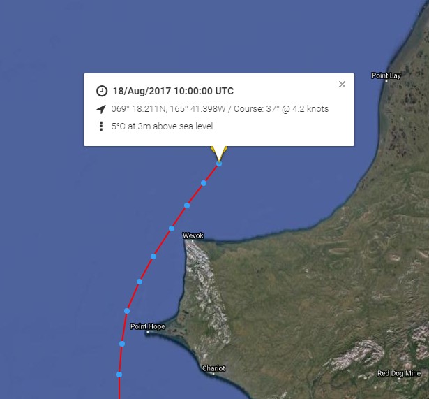
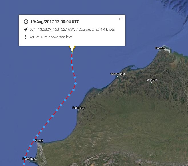
[Edit – August 18th]
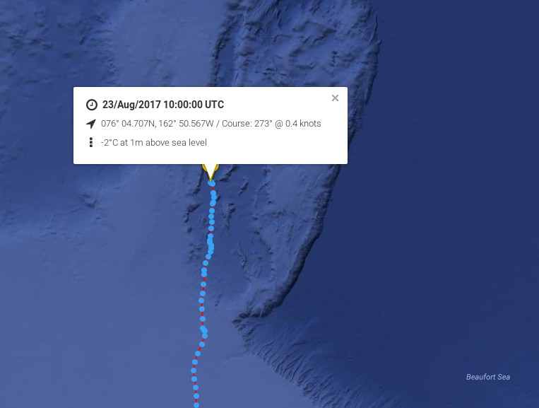
Point Hope is now behind the Arctic Mission team:
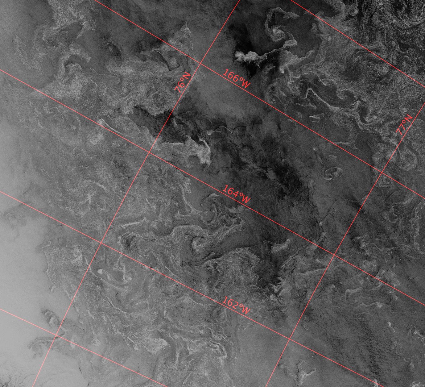
Next is Point Lay. Much further north, there are significant gaps appearing in the sea ice up to around 83N:
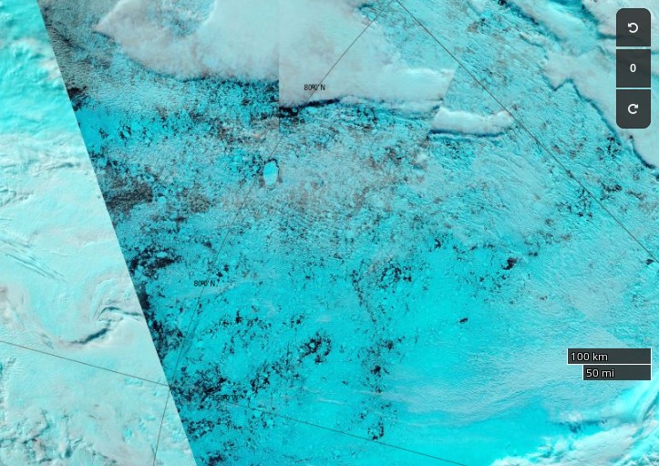
NASA Worldview “false-color” image of the Central Arctic north of the Beaufort Sea on August 18th 2017, derived from the MODIS sensor on the Terra satellite
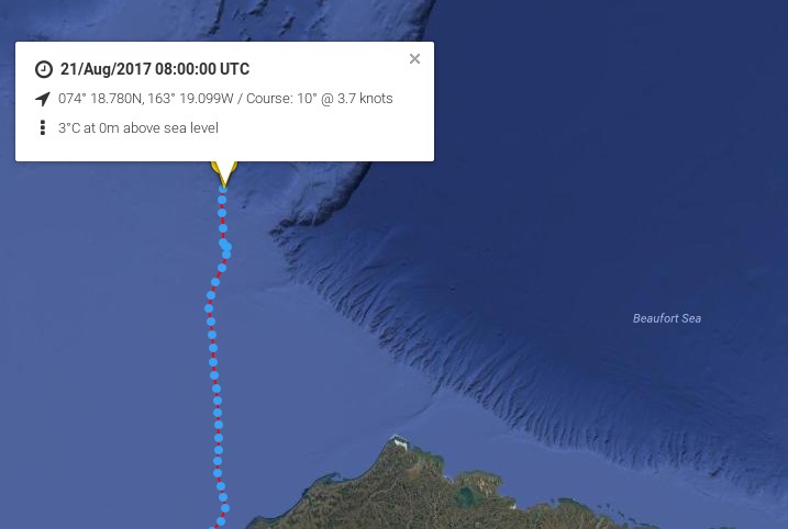
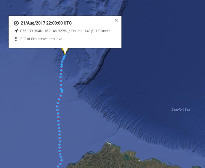
[Edit – August 19th]
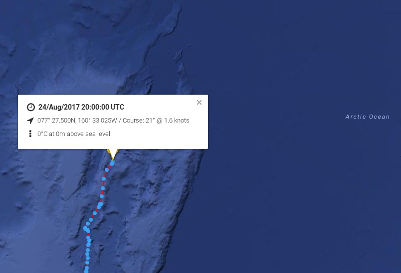
Bagheera and Snow Dragon II are obviously not heading for the Northwest Passage in 2017!
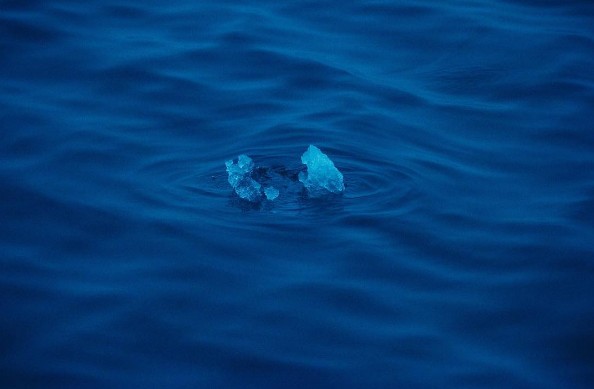
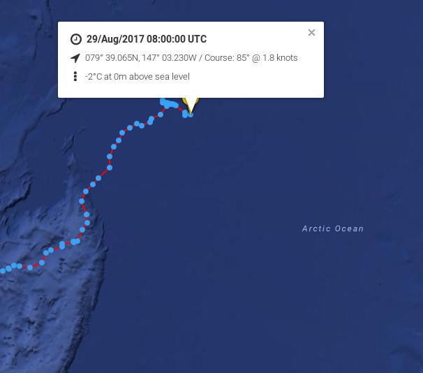
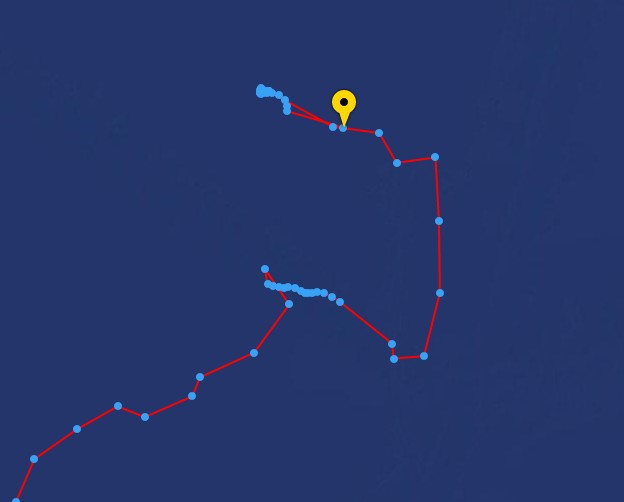
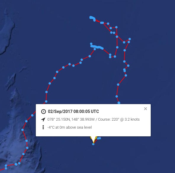
Arctic Mission’s furthest North was 80 degrees 10 minutes North, 148 degrees 51 minutes West, reached at 22:04:12 (Alaskan Time, GMT-9hours) on 29 August 2017 by yachts, Bagheera and Snow Dragon II.
Arctic Mission moored its yachts to an ice floe on 29 August to conduct one of its 24-hour marine science surveys, while drifting with the sea ice. The strategy for any future northward progress had been to monitor the sea surface currents, sea ice, and weather conditions (both observed from the yachts and through satellites imagery downloaded onto our computers), and decide how to proceed as we approached the end of the 24-hour survey.
A meeting of the four skippers was held led by Erik de Jong, with Pen Hadow present, and it was agreed further northward progress would increase considerably the risks to the expedition, with very limited scientific reward. The decision to head south, back to an area of less concentrated sea ice in the vicinity of 79 degrees 30 minutes North, was made at 18.30 (Alaskan time).
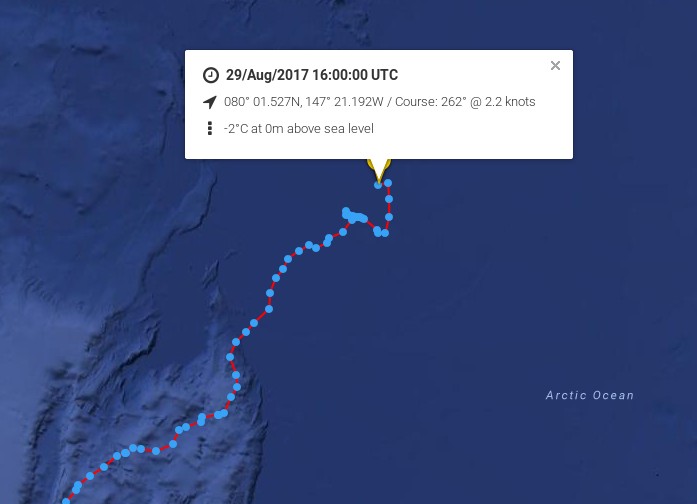
Here’s the live tracking map from 06:00 UTC this morning:
A prudent and not unexpected decision. Cue the cackling from all the usual suspects?
[Edit – August 31st]
The cackling from all the usual suspects has indeed begun. It has even inspired a somewhat surreal modern art installation! Meanwhile according to their Twitter feed:
We are slowly making our way back to Nome now after reaching the northernmost point of our… https://t.co/GhrYYza6gk
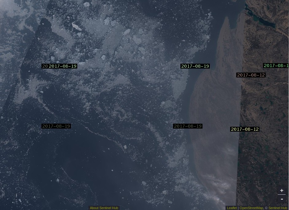
The time has come to start speculating about if, and when, the Northwest Passage will become navigable for the host of small vessels eager to traverse it this summer. The west and east entrances are clearing early this year. Lancaster Sound and Prince Regent inlet already reveal only a few area of white amongst the deep blue open water:
NASA Worldview “true-color” image of Lancaster Sound and Prince Regent Inlet on July 8th 2017, derived from the MODIS sensor on the Aqua satellite
To the west the route is already opening up all the way from the Chukchi Sea to Cambridge Bay:
NASA Worldview “true-color” image of the Beaufort Sea on July 12th 2017, derived from the MODIS sensor on the Terra satellite
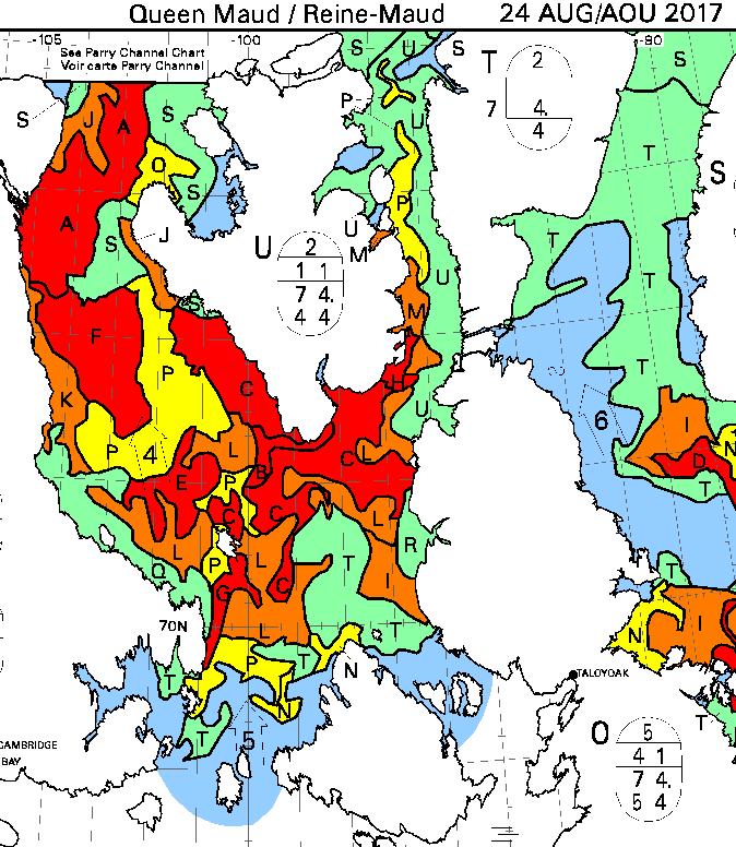
The problems on the southern route seem likely to arise in the central section this year, where far more old ice is present this year than in 2016:
The remaining sea ice in Queen Maud Gulf doesn’t look like it will last long, but the ice in Victoria Strait and Larsen Sound is made of much sterner stuff:
NASA Worldview “true-color” image of Victoria Strait and Larsen Sound on July 10th 2017, derived from the MODIS sensor on the Terra satellite
The cruise liner Crystal Serenity is anticipating navigating those waters once again this year, on August 29th. However much smaller craft are already heading for the Northwest Passage. Celebrate and Alkahest are already sailing north along the west coast of Greenland. Meanwhile Yvan Bourgnon is due to depart Nome, Alaska tomorrow, sailing his catamaran single handed in the opposite direction.
The crew of the Coast Guard Cutter Maple, a 225-foot seagoing buoy tender home ported in Sitka, Alaska, departed [July 12th] on a historic voyage through the Northwest Passage.
This summer marks the 60th anniversary of the three Coast Guard cutters and one Canadian ship that convoyed through the Northwest Passage. The crews of the U.S. Coast Guard Cutters Storis, SPAR and Bramble, along with the crew of the Canadian ice breaker HMCS Labrador, charted, recorded water depths and installed aids to navigation for future shipping lanes from May to September of 1957. All four crews became the first deep-draft ships to sail through the Northwest Passage, which are several passageways through the complex archipelago of the Canadian Arctic.
The crew of the cutter Maple will make a brief logistics stop in Nome, Alaska, to embark an ice navigator on its way to support marine science and scientific research near the Arctic Circle. The cutter will serve as a ship of opportunity to conduct scientific research in support of the Scripps Institution of Oceanography.
The Maple crew will deploy three sonographic buoys that are used to record acoustic sounds of marine mammals. A principal investigator with the University of San Diego embarked aboard the cutter will analyze the data retrieved from the buoys.
The Canadian Coast Guard Ship Sir Wilfrid Laurier will rendezvous with the Maple later this month to provide icebreaking services as the Maple makes it way toward Victoria Strait, Canada. The Maple has a reinforced hull that provides it with limited ice breaking capabilities similar to Coast Guard 225-foot cutters operating on the Great Lakes.
There doesn’t seem to be any up to date tracking information for the Maple, but CCGS Sir Wilfrid Laurier has recently arrived off Utqiaġvik (Barrow as was):
[Edit – August 18th]
Another article by Chris Mooney in the Washington Post includes this image of the eastern entrance to Bellot Strait on August 11th:
According to Chris:
After we’d passed through safely, Claude Lafrance, the ship’s commanding officer, took some time to explain how the strait worked with the help of a navigational chart. In the process, he lent credence to some of the observations made by Larsen over 70 years ago, while also explaining how modern knowledge has made navigating it safe with a proper tidal understanding.
The essence is that depending on when you are in Bellot Strait, the waters can be flowing either westward or eastward at and around high or low tide, respectively. So timing your crossing makes a great deal of difference.
The danger is that if you’re coming from the west (as we were) with the current to your back, you can be moving too fast, and have difficulty steering your vessel as you approach rocks at the end of the strait.
“We always want to go through where it’s more difficult, with the current against you, because it’s a lot easier to control the movement of your ship,” Lafrance said.
Therefore, the two-hour wait was quite intentional: The CCGS Amundsen stayed put until the tide began to shift and the waters to flow back westward, in effect neutralizing the current. Then the ship steamed out easily. “We just passed at the ideal time to go through,” Lafrance said.
Here’s Sentinel 2A’s view of what he should expect to see in Larsen Sound after emerging at the other end:
[Edit – August 21st]
From the RRS Ernest Shackleton in Franklin Strait or thereabouts:
[Edit – August 22nd]
From the C3 expedition, also in the Franklin Strait area by the look of things:
Yesterday, we broke through ice that was two metres thick. Thank you to the Canadian Ice Service for ensuring our safe passage! #CanadaC3pic.twitter.com/2nCgalwPOo
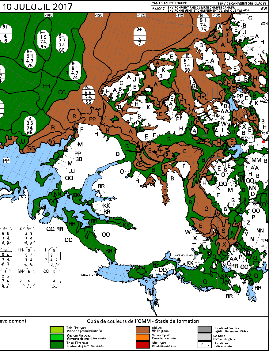
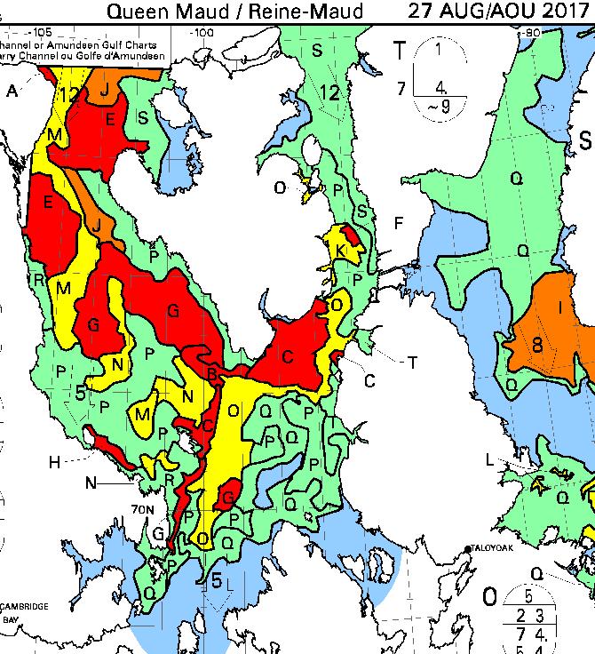
The latest CIS ice chart reveals a circuitous route via McClintock Channel that is ALMOST <= 6/10 concentration. Meanwhile Larsen Sound is still refusing to open up for the imminent arrival of the Crystal Serenity:
[Edit – August 27th]
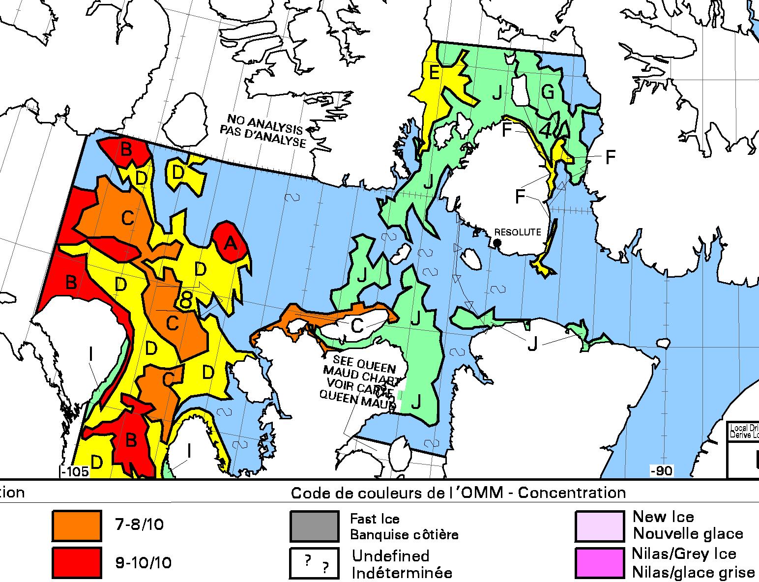
At long last the CIS concentration map reveals a <= 6/10 concentration path along the entire southern route via Bellot Strait:
[Edit – August 29th]
It is now possible to squeeze through Roald Amundsen’s route through the Northwest Passage without encountering over 6/10 concentration sea ice:
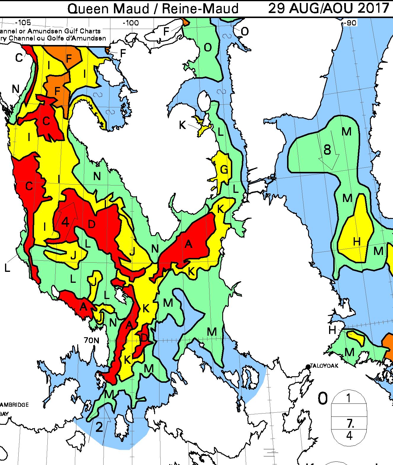
David Scott Cowper sought shelter for Polar Bound in the welcoming arms of Booth Island for a couple of days. Now they’re off again and have taken another close look at Cape Bathurst, but which route will they take now?
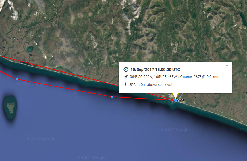
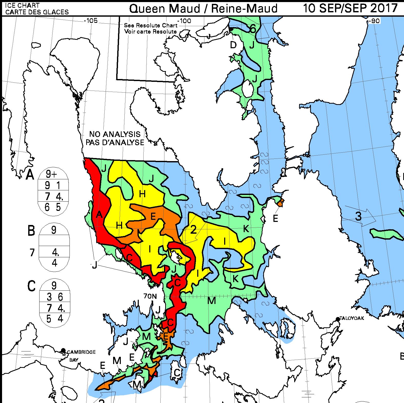
[Edit – September 10th]
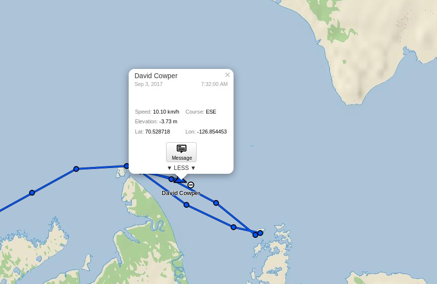
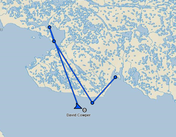
David Scott Cowper has left Cambridge Bay in Polar Bound and is heading east:
For years now I’ve been using the convenient tools provided at the NCEP/NCAR reanalysis web site to generate custom maps and time series illustrating the climate of the Arctic. By way of example see last December’s “Post-Truth Global and Arctic Temperatures“:
Prompted in part by the obvious difficulty the different models are currently having in generating accurate short term forecasts for the “New Arctic”, I’ve been recently been comparing assorted reanalysis products. For example the UCAR Climate Data Guide points out that:
NCEP Reanalysis (R2) is better than NCEP-NCAR (R1) but still a first generation reanalysis. It is best to use 3rd generation reanalyses, specifically, ERA-Interim and MERRA.
I recently discovered that Richard James has performed a similar analysis for the Arctic, which can be viewed at:
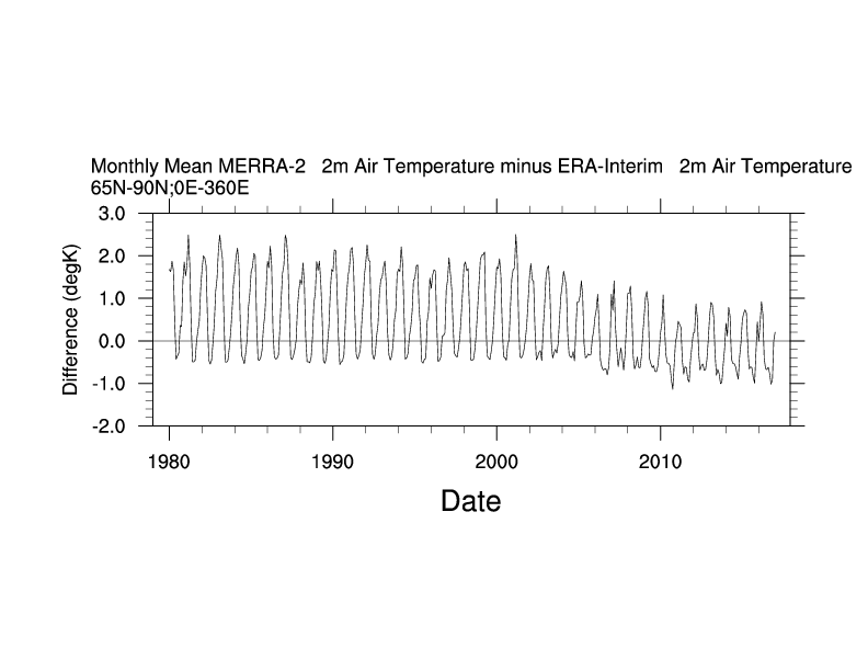
wherein I mentioned the NOAA ESRL Web-based Reanalysis Intercomparison Tool, which allows you to produce plots and timeseries for arbitrary areas of Planet Earth using NCEP/NCAR, ERA Interim, MERRA-2 and numerous other reanalysis products. Here’s one little example:
which makes it evident that NCEP-NCAR (R1) and ERA Interim have different ideas about surface temperatures in the Arctic. So does MERRA-2!
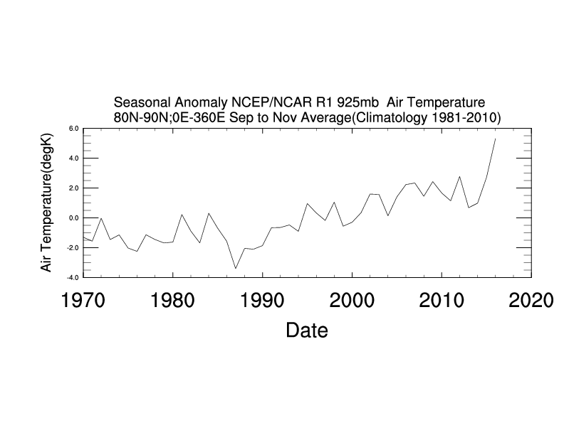
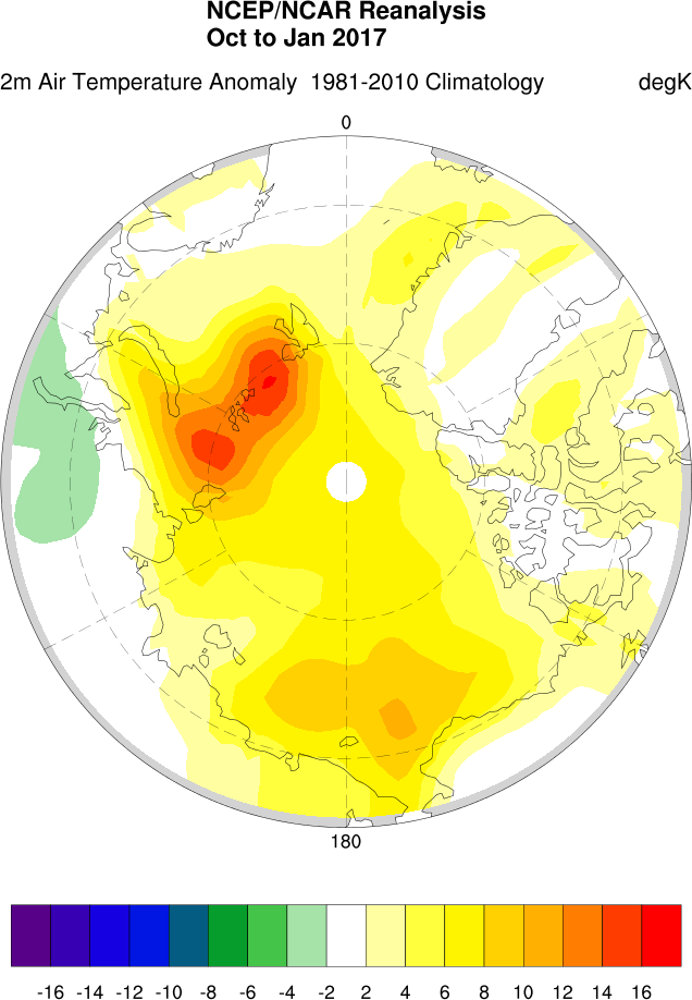
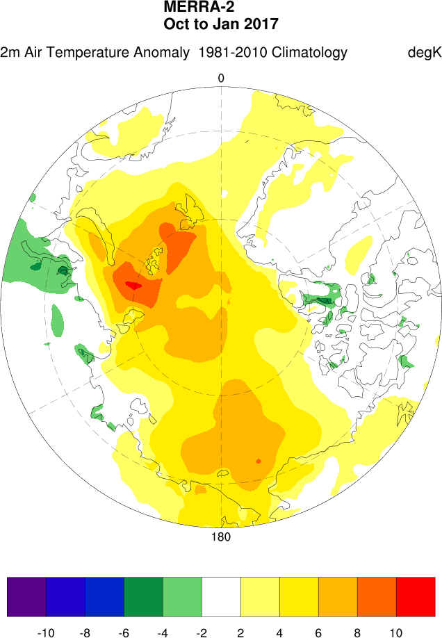
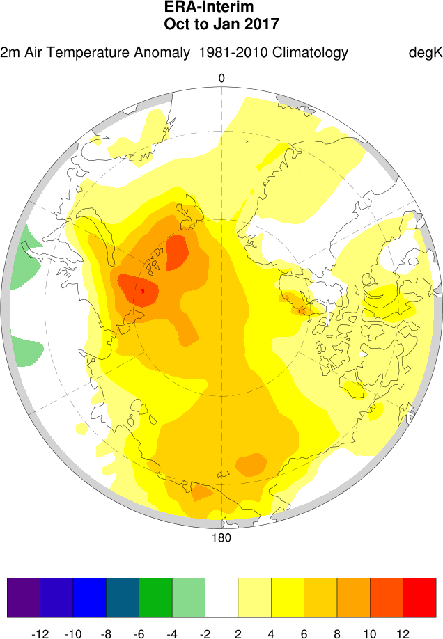
For a graphic example of the differences between the three products here is my version of Richard’s Arctic winter temperature comparison (note that currently ERA data is only available up to January 2017):
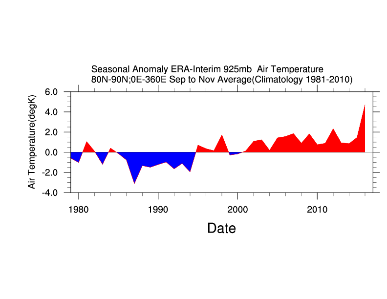
Can you spot the difference? In conclusion, here’s the Era Interim version of the High Arctic autumnal 925 hPa temperature trend graph at the top:
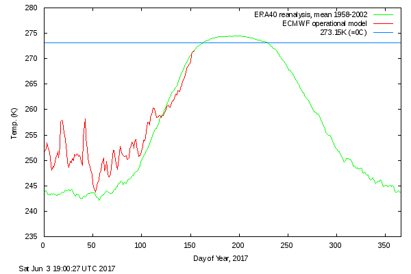
After a comparatively cool May, surface air temperatures in the high Arctic are back up to “normal”:
The condition of the sea ice north of 80 degrees is far from normal however. Here’s what’s been happening to the (normally) land fast ice north west of Greenland:
NASA Worldview “true-color” image of the sea ice north west of Greenland breaking up on June 2nd 2017
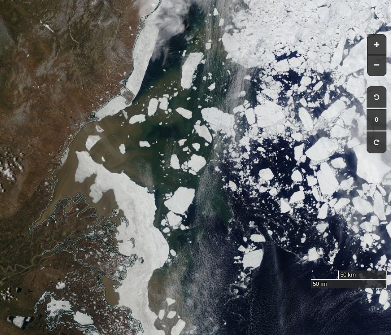
Further south surface melt has set in across the southern route through the Northwest Passage:
NASA Worldview “false-color” image of the Coronation Gulf on June 1st 2017, derived from the MODIS sensor on the Terra satellite
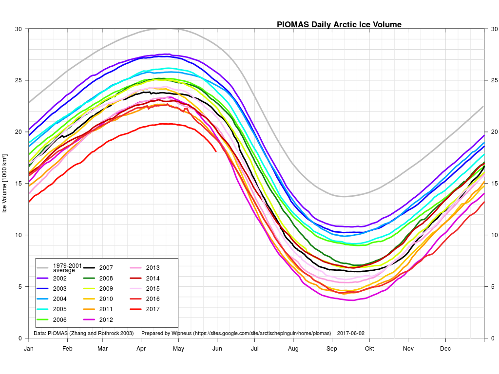
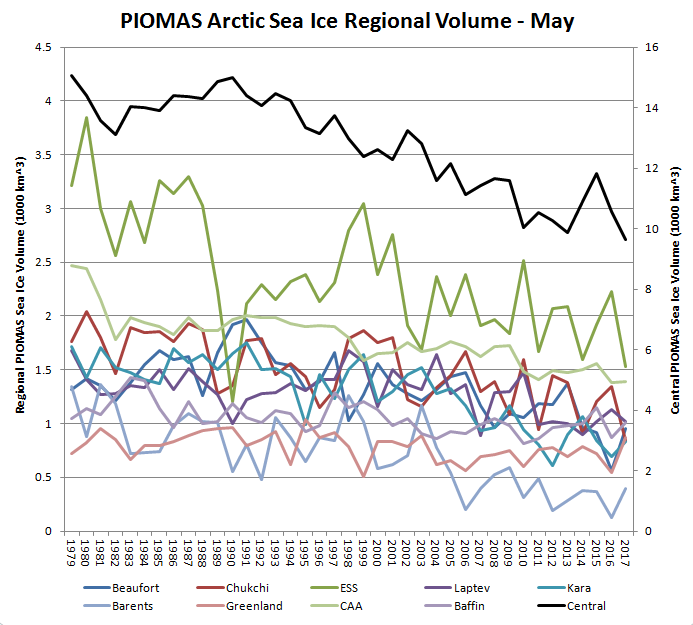
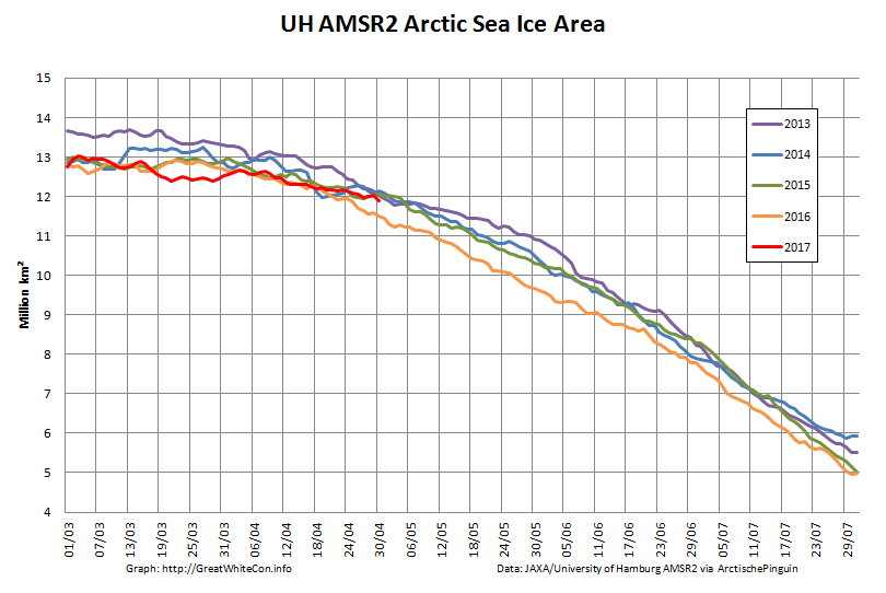
Whilst the gap with previous years has narrowed during May, PIOMAS Arctic sea ice volume is still well below all previous years in their records:
The PIOMAS gridded thickness graph suggests that a large area of thick ice is currently sailing through the Fram Strait to ultimate oblivion:
and just in case melt ponds are now affecting those numbers here is extent as well:
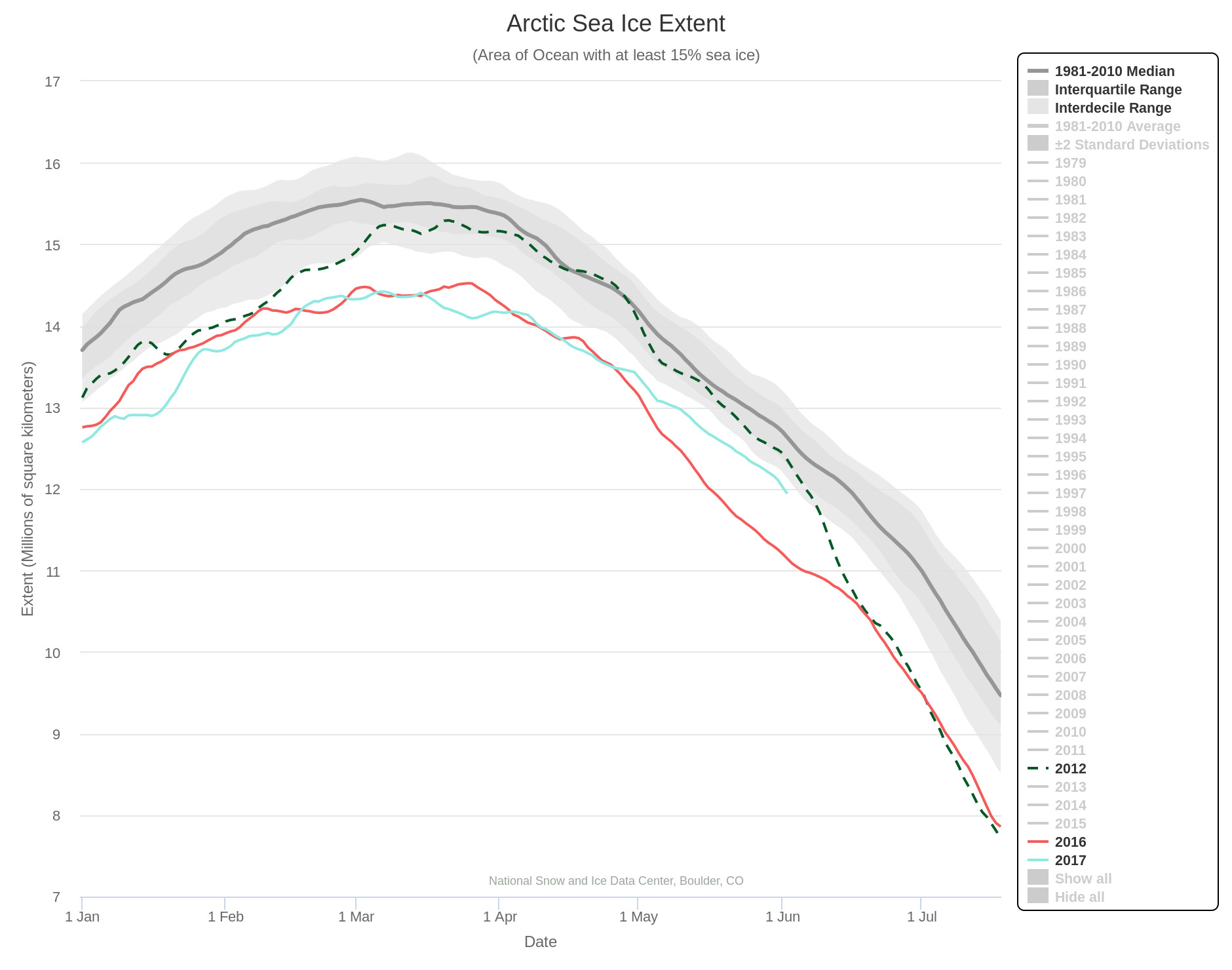
The rate of decrease is inexorably increasing! 2012 extent is currently still well above that of 2017, but those positions may well be reversed by the end of June? Here’s NSIDC’s view on the matter:
[Edit – June 8th]
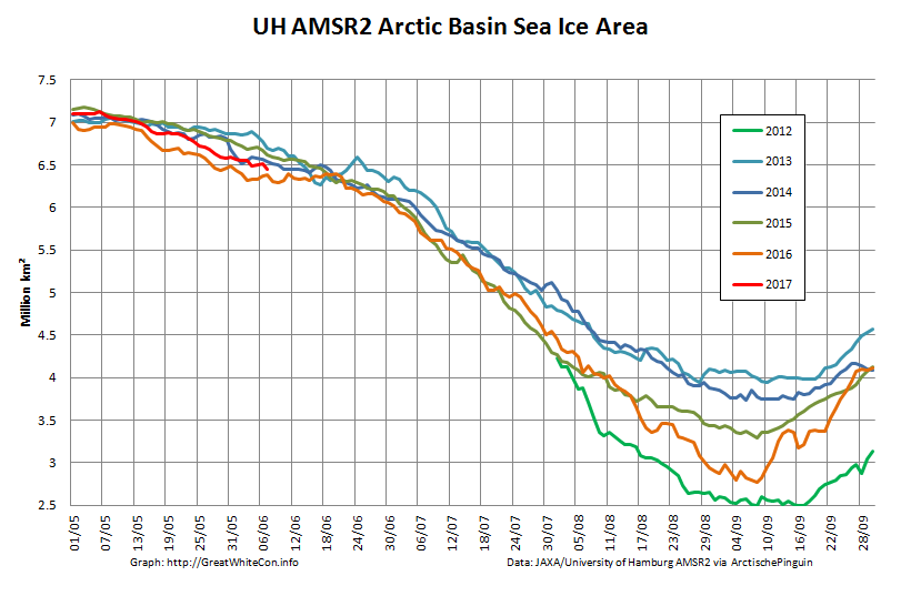
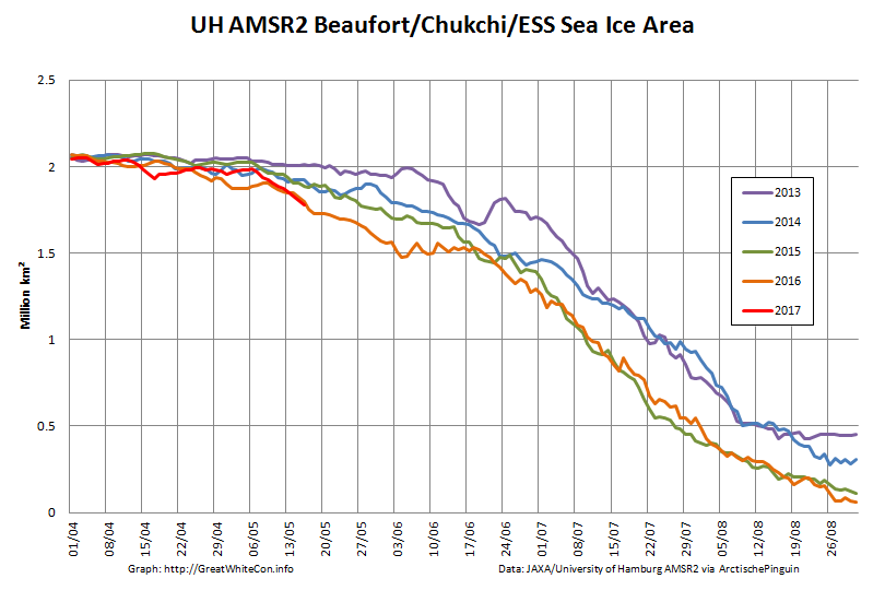
As requested by Tommy, here’s the current Arctic Basin sea ice area:
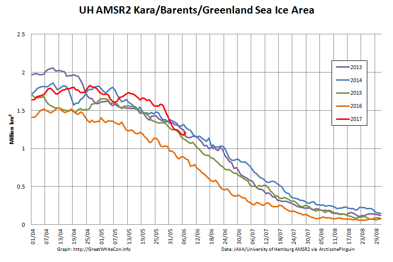
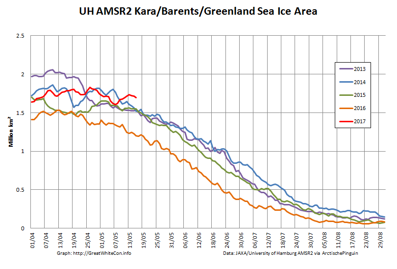
This includes the Beaufort, Chukchi, East Siberian and Laptev Seas along with the Central Arctic. It excludes the Atlantic periphery, which currently looks like this:
[Edit – June 10th]
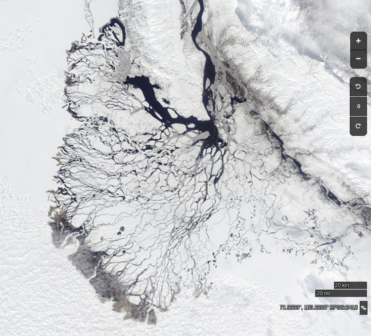
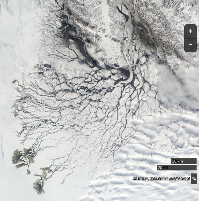
At long last a clear(ish) image of water from the Lena Delta spreading out across the fast ice in the Laptev Sea:
NASA Worldview “true-color” image of the Lena Delta on June 10th 2017, derived from the MODIS sensor on the Terra satellite
NASA Worldview “true-color” image of the Lena Delta on June 10th 2012, derived from the MODIS sensor on the Terra satellite
[Edit – June 11th]
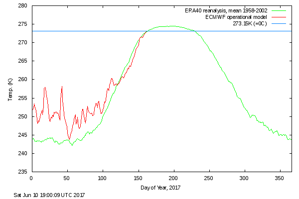
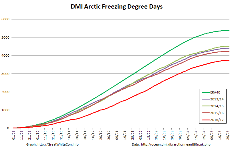
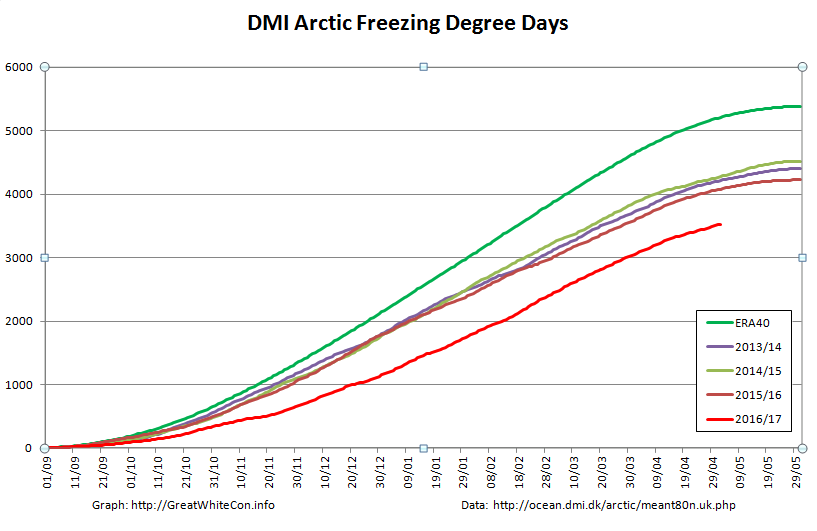
DMI’s daily mean temperature for the Arctic area north of the 80th northern parallel has reached zero degrees Celsius almost exactly on the climatological schedule:
We calculate our freezing degree days on the basis of the freezing point of Arctic sea water at -1.8 degrees Celsius. On that basis this winter’s grand total of 3740 was reached on June 1st:
Despite the “coolish” recent weather total FDDs are way below the climatology and other recent years. Consequently there’s a lot less sea ice in the Arctic left to melt at the start of this Central Arctic melting season than in any previous year in the satellite record. However whilst there are some melt ponds visible in the Arctic Basin on MODIS, in that respect 2017 is lagging behind both last year and 2012.
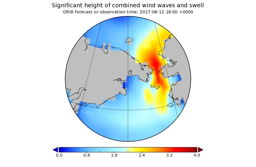
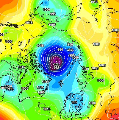
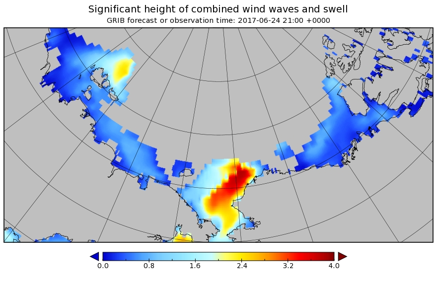
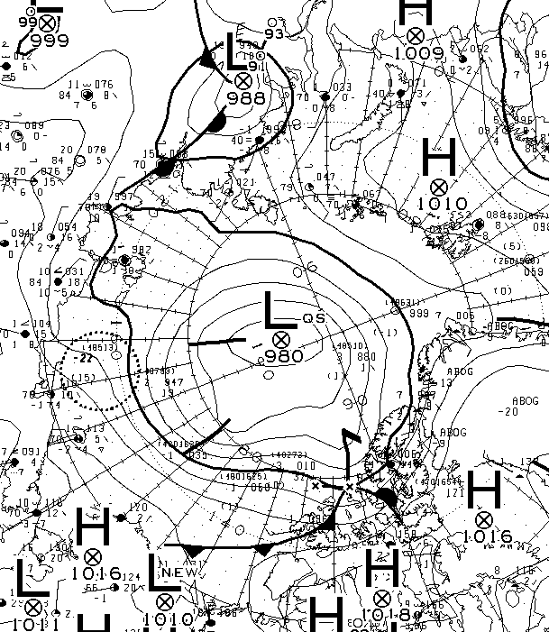
A sub 970 hPa cyclone is starting to enter the realms of realistic possibility, and also forecast are some significant waves in the Chukchi Sea and the expanding 2017 “Laptev Bite”:
[Edit – June 27th]
The forecast cyclone was nowhere near as deep as predicted. According to the analysis by Environment Canada it bottomed out at 980 hPa yesterday:
[Edit – June 29th]
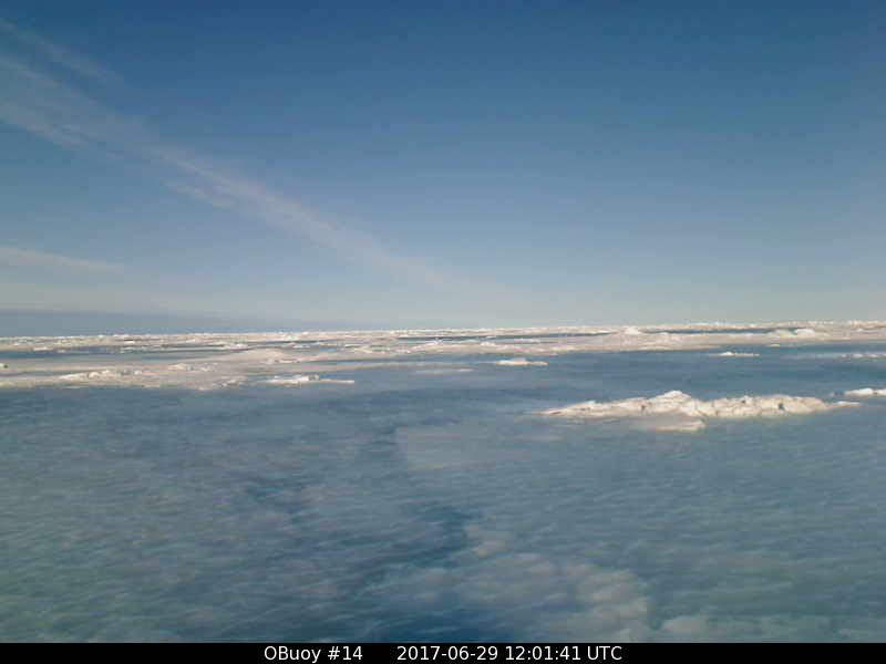
O-Buoy 14 is currently firmly embedded in the fast ice of Viscount Melville Sound, deep in the heart of the Northwest Passage. Here’s the view from the buoy’s camera:
Before we got on to the more usual Arctic metrics let’s bear in mind that the beginning of May is the time when the ice on the mighty Mackenzie River begins to break up, ultimately sending a surge of (comparatively!) warm water rushing into the Beaufort Sea. The patches of open water visible in the Beaufort Sea off the Mackenzie Delta in early April refroze, but have recently opened up once again:
NASA Worldview “true-color” image of the Beaufort Sea on May 2nd 2017, derived from the MODIS sensor on the Terra satellite
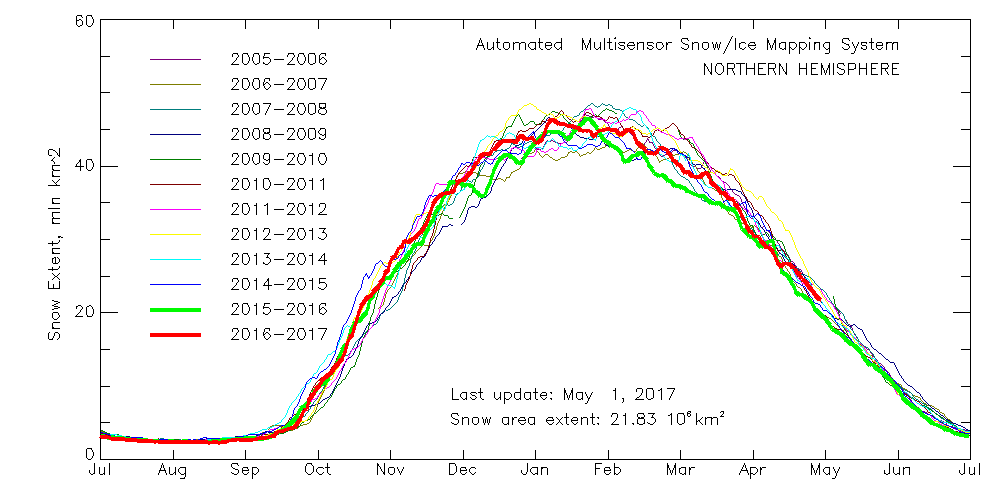
Meanwhile Northern Hemisphere snow cover is falling fast, albeit still above last year’s levels:
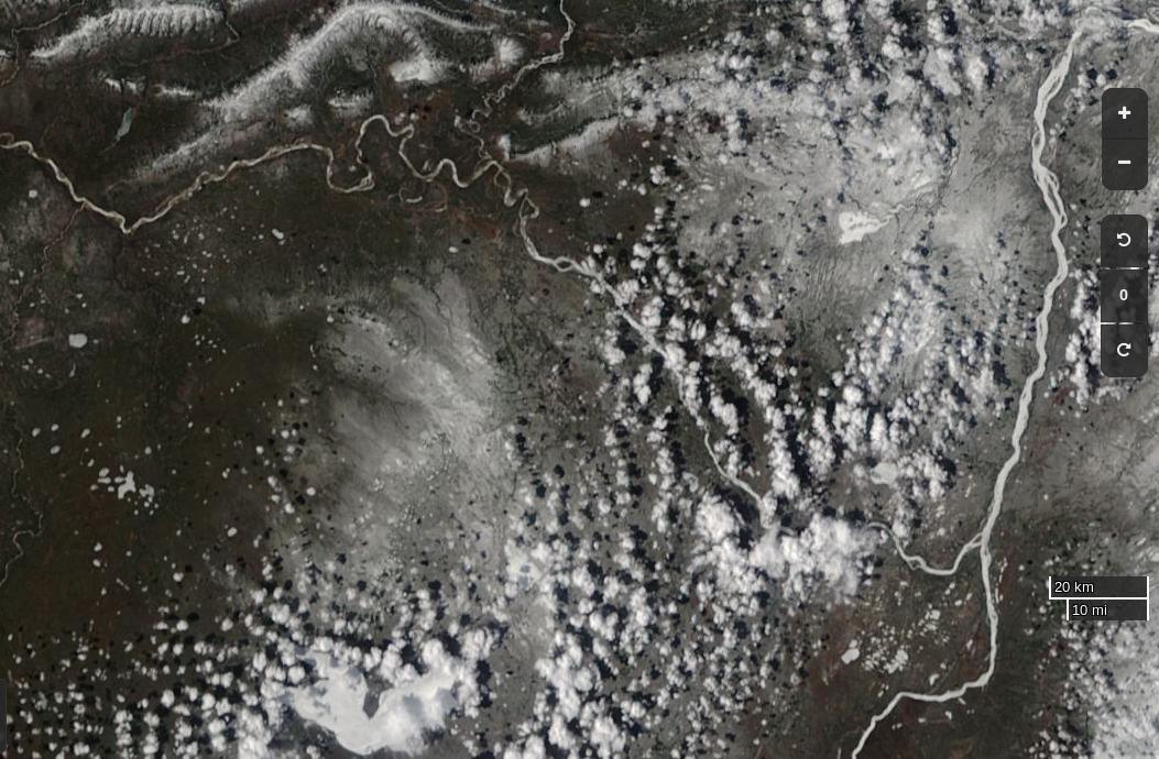
Here’s the current view of the Liard River in northern Canada, with the Mackenzie River running bottom to top on the right hand side:
NASA Worldview “true-color” image of the Liard and Mackenzie Rivers on May 2nd 2017, derived from the MODIS sensor on the Terra satellite
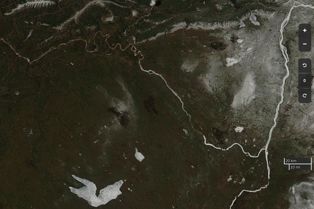
The break-up of the Liard leads the Mackenzie, and taking a look at last year’s view of the same area it’s apparent that this year there’s somewhat more snow on the ground, and that this years Mackenzie break-up will therefore be a few days later than last year:
NASA Worldview “true-color” image of the Liard and Mackenzie Rivers on May 2nd 2016, derived from the MODIS sensor on the Aqua satellite
Whilst early melt in the Beaufort Sea is currently behind last year, the reverse is most certainly the case next door in the Chukchi Sea. The skies are rather cloudy there at the moment, but using the Suomi NPP day/night band to peer through the gloom reveals this:
NASA Worldview “day/night band” image of the Chukchi Sea on May 2nd 2017, derived from the VIIRS sensor on the Suomi satellite
Whilst sea coverage on the Pacific periphery has continued to fall, extent on the Atlantic side has not been following suit. Hence overall Arctic sea ice area is no longer lowest in the satellite record:
Finally, until the new PIOMAS numbers are released at least, here’s how DMI freezing degree days look at the moment:
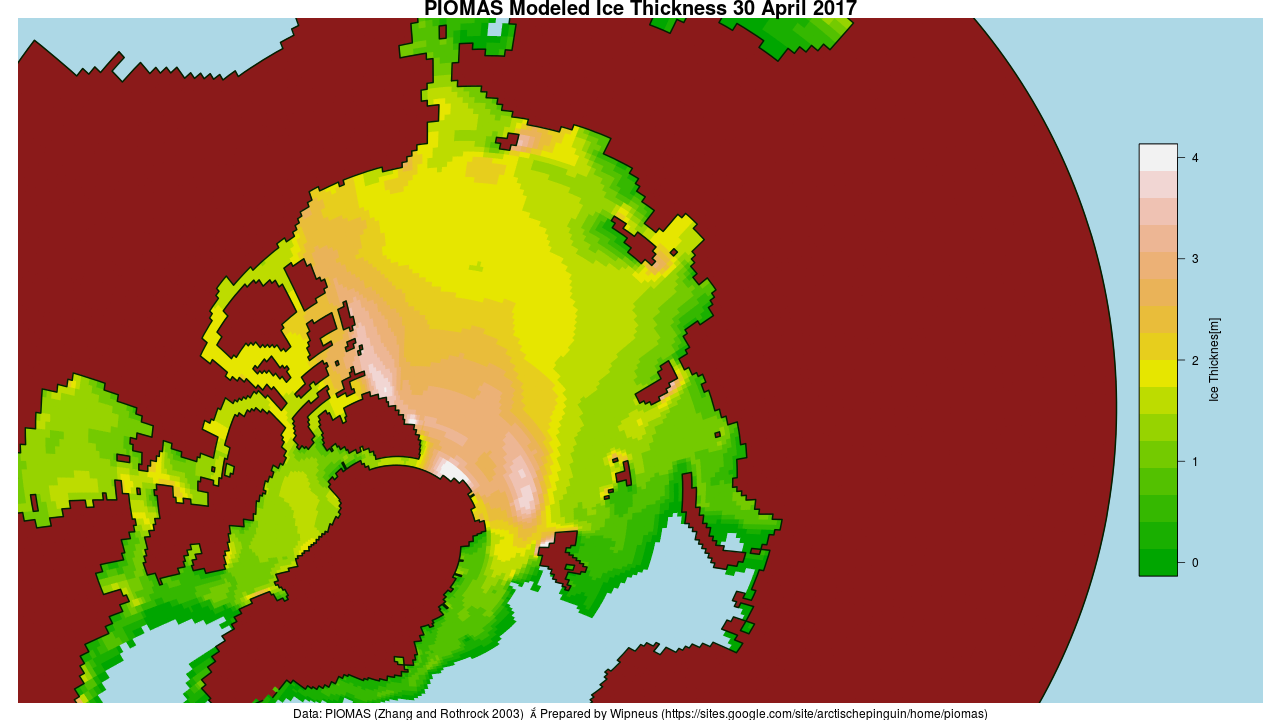
[Edit – May 4th]
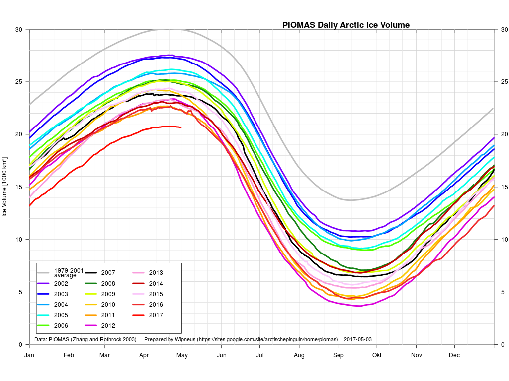
The April PIOMAS numbers have been published: Arctic sea ice volume is yet again by far the lowest on record:
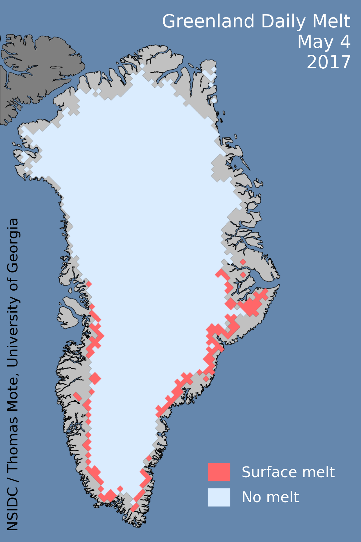
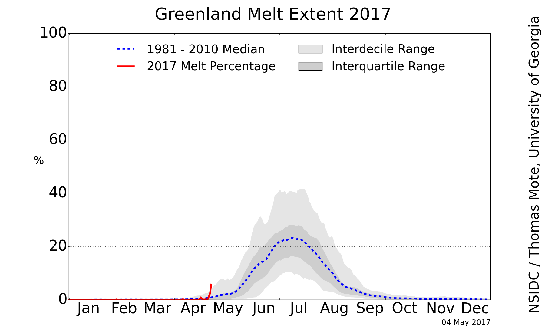
[Edit – May 5th]
Greenland ice sheet surface melt has started early this year:
[Edit – May 12th]
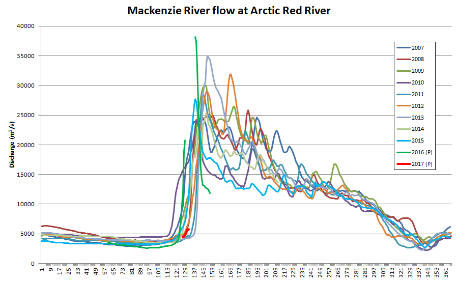
The ice break-up of the Mackenzie River is now visible as increased flow at the junction with Arctic Red River just south of the delta:
Mackenzie River flow at Arctic Red River up to May 12th 2017
Meanwhile the sea ice in the Lincoln Sea north the Nares Strait is coming apart at the seams:
NASA Worldview “true-color” image of the Lincoln Sea on May 12th 2017, derived from the MODIS sensor on the Terra satellite
[Edit – May 17th]
May seems to be shaping up as month of two halves, both spatially and temporally. Here’s an overview of the current state of play:
On the Pacific side of the Arctic sea ice area has been declining rapidly courtesy of the expanding areas of open water visible in the Beaufort, Chukchi and East Siberian Seas. It’s currently tracking below other recent years:
However over on the Atlantic side area has been flatlining, and is currently above other recent years:
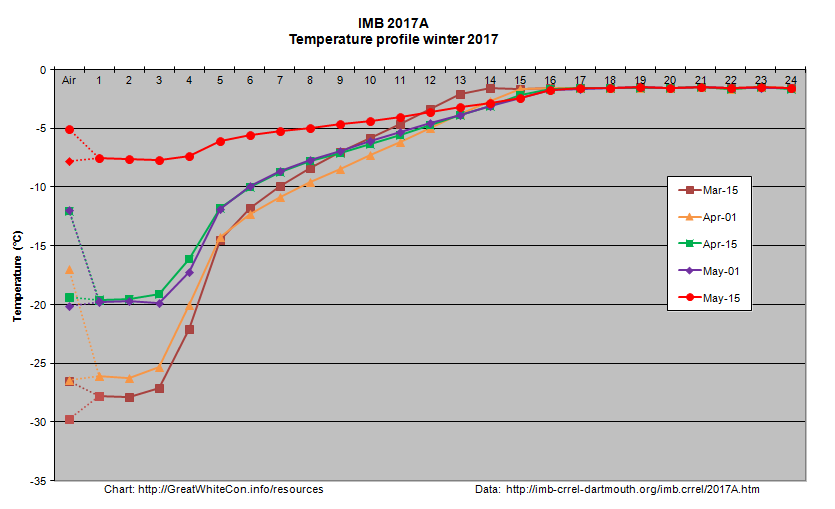
Ice mass balance buoy 2017A is now located near the boundary between the Beaufort and Chukchi Seas and as the melting season in that vicinity rapidly approaches it reveals that thermodynamic thickening has thus far achieved a mere 119 cm:
Arctic wide sea ice area has recently started to decline at an increasing rate:
During the second half of the month it will be interesting to see whether the forecast high temperatures produce significant melt ponding. If so it’s conceivable that 2017 area could drop below 2016 again by the beginning of June. There already signs of surface melt at places as far apart as Franklin Bay, Chaunskaya Bay and even the Great Bear Lake!
Watch this space!
References
Muhammad, P., Duguay, C., and Kang, K.-K.: Monitoring ice break-up on the Mackenzie River using MODIS data, The Cryosphere, 10, 569-584, doi:10.5194/tc-10-569-2016, 2016.
Rood S. B., Kaluthota S., Philipsen L. J., Rood N. J., and Zanewich K. P. (2017) Increasing discharge from the Mackenzie River system to the Arctic Ocean, Hydrol. Process., 31, 150–160. doi: 10.1002/hyp.10986.
Kwok, R., L. Toudal Pedersen, P. Gudmandsen, and S. S. Pang (2010), Large sea ice outflow into the Nares Strait in 2007, Geophys. Res. Lett., 37, L03502, doi:10.1029/2009GL041872.
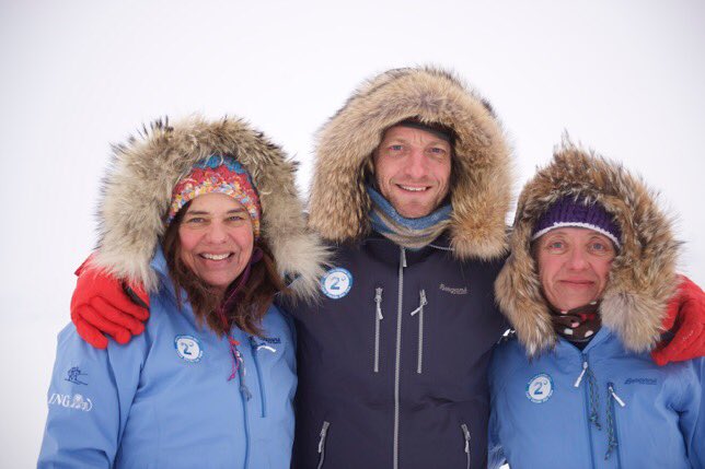
An experienced team of polar explorers set off on April 4th intending to ski from a latitude of 88° North to 90° North, better known as the North Pole!
According to the expedition’s web site those 2 degrees of latitude are symbolic of the United Nations Framework Convention on Climate Change agreement in Paris to “hold the increase in the global average temperature to well below 2 °C above pre-industrial levels”, and are thus part of the expedition’s name.
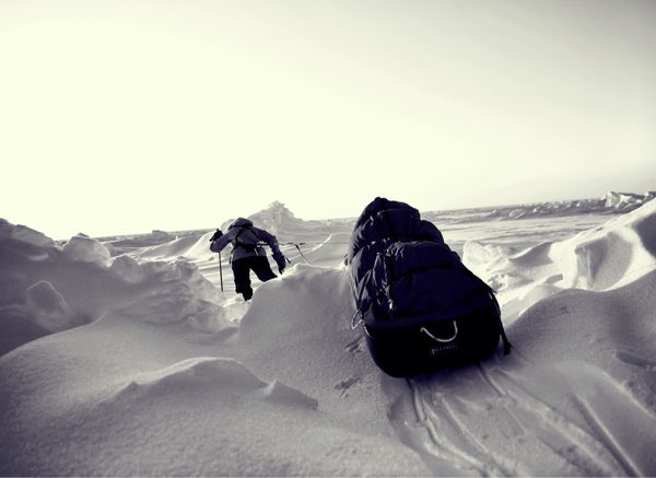
Here’s the team of Bernice Notenboom, Martin Hartley and Ann Daniels pictured shortly before departing on their arduous journey via the Russian Barneo ice camp near the North Pole:
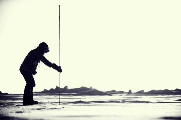
Apart from hauling their sleds across some very challenging terrain they will also be doing lots of “citizen science” en route, including stopping regularly to measure the depth of snow covering the sea ice:
Photo: Martin Hartley
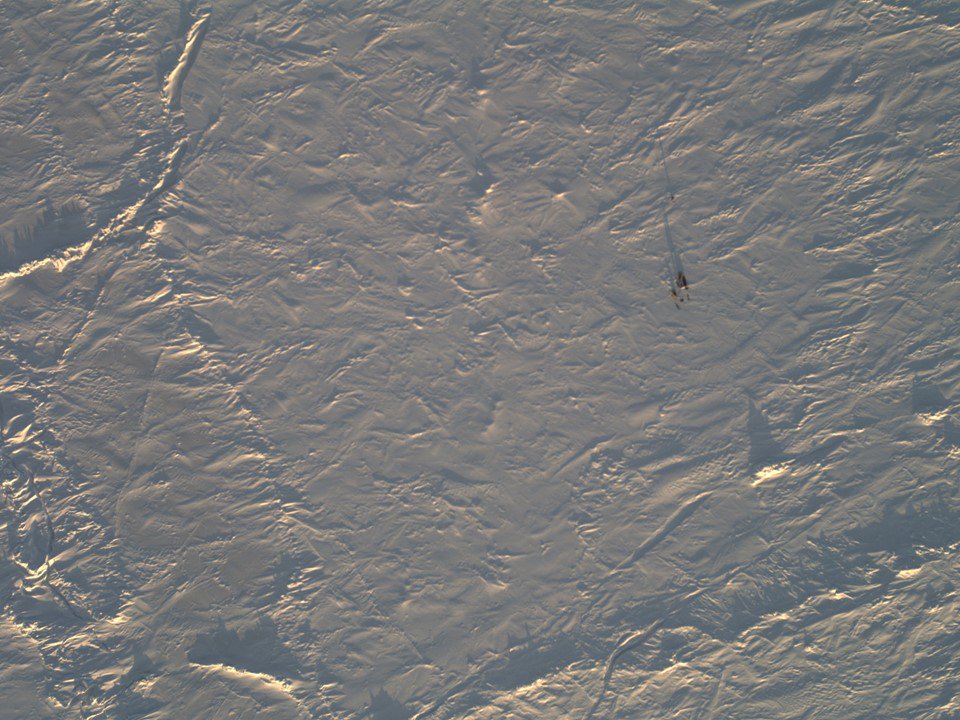
As part of that scientific mission the NASA Operation IceBridge Orion P3 aircraft overflew the team, and amongst other things took this picture:
Photo: NASA
Bernice announced on the 2 Degrees expedition’s blog this morning that:
A milestone today – skied 1/2 degree of latitude.
Victor Serov who I call into every night with our position is really happy with our progress: ” You are doing very well Bernice and you are doing science” is his encouraging response every time I call in.
I imagine he is sitting in a tent in Barneo with a giant map, North Pole in the middle, and plotting all routes towards the pole. Each team on the ice has to call in coordinates at night so if something happens, they are standby with 2 MI8 helicopters to assist. Like yesterday somebody had to get evacuated because of frostbite.
To get a compliment from a Russian scientist who has spend a year in Vostok in Antarctica [coldest place on earth] as well as being an accomplished polar explorer, we should be proud of ourselves to have skied 1/4 of the way on day 5. But it hasn’t come easy. The half degree has been really hard work temperatures dipped to -41C too cold to film, do science, all we can do is keep moving until we need to eat and drink.
The sleds weigh over 80 kilo’s and new pains and aches show unexpectedly in places you don’t want them, like my back. On the odd break, I would get the notebook out, jot down the GPS position while Ann pokes into the snow and yells the various snow depths to me. The rest of the day we are doing cold management: toes we don’t feel anymore and need nurturing or placing your thumb between the fingers to warm them up inside your mitt, and worse letting your arm hang so the blood can race back to the extremities.
If you are cold all blood flows to your heart and core to protect it, so to call it back is playing a trick with your mind. Despite this careful nursing, I still end up with frost nip on all fingers. I now need to be extra careful with exposure to cold.
Meanwhile Ann Daniels published this image of the sort of terrain they’ve been crossing on her Twitter feed:
Photo: Martin Hartley
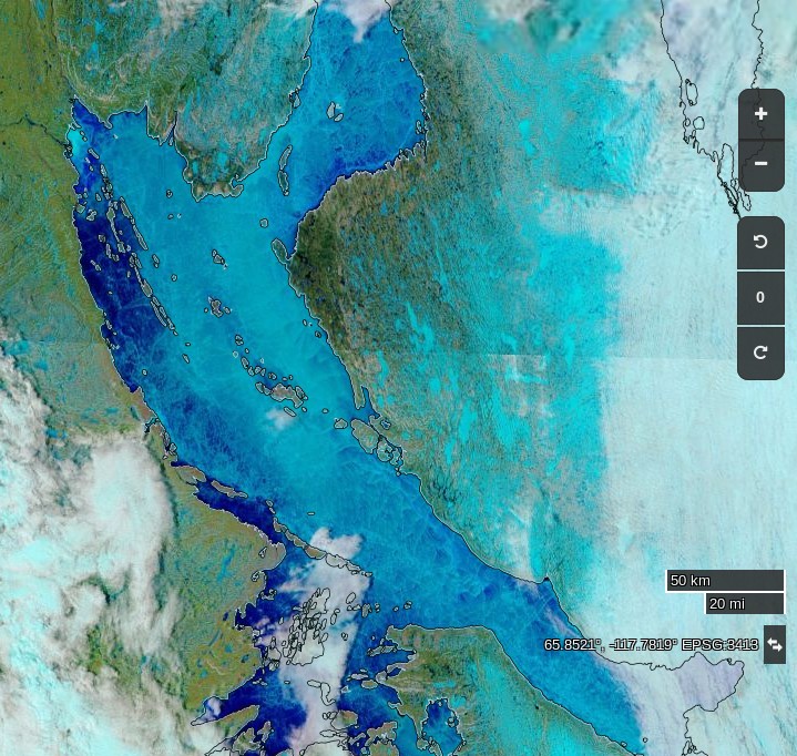
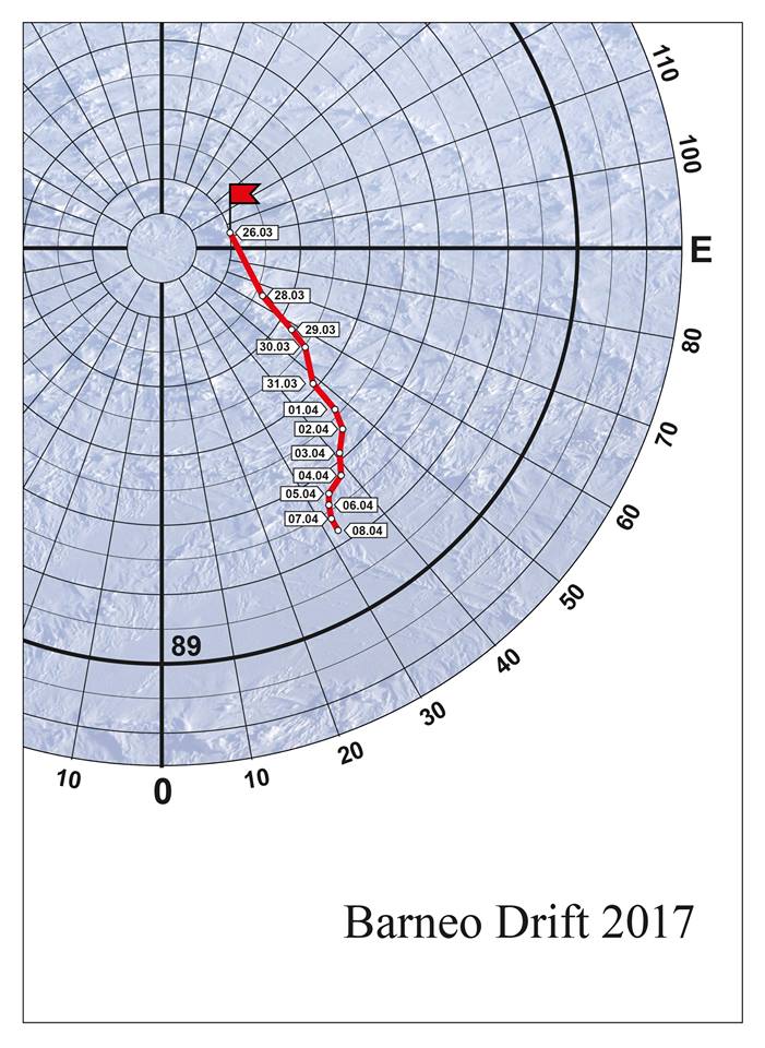
The expedition’s current position is reported as as 88.52 N, 147.75 E. Only another 1 1/2 degrees to go! As this map of the drift of the Barneo ice camp shows, the winds are currently somewhat in the team’s favour:
Particularly in view of all the balderdash concerning “climate science” being spouted in Washington DC on Wednesday lets first of all run through some Arctic sea ice facts from April 1st 2017 or thereabouts:
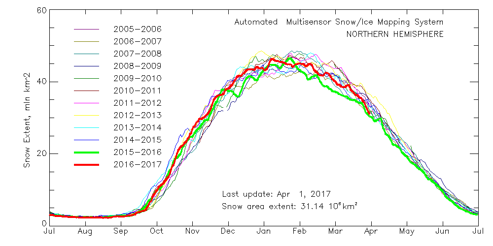
Northern Hemisphere Snow Extent:
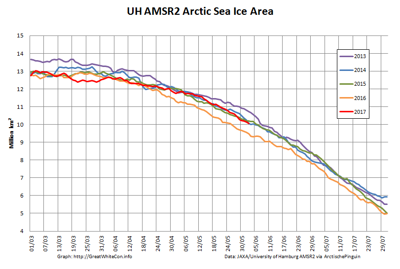
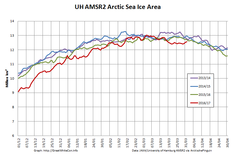
Arctic Sea Ice Area:
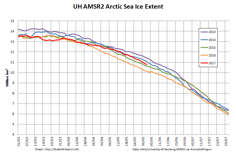
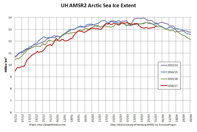
Arctic Sea Ice Extent:
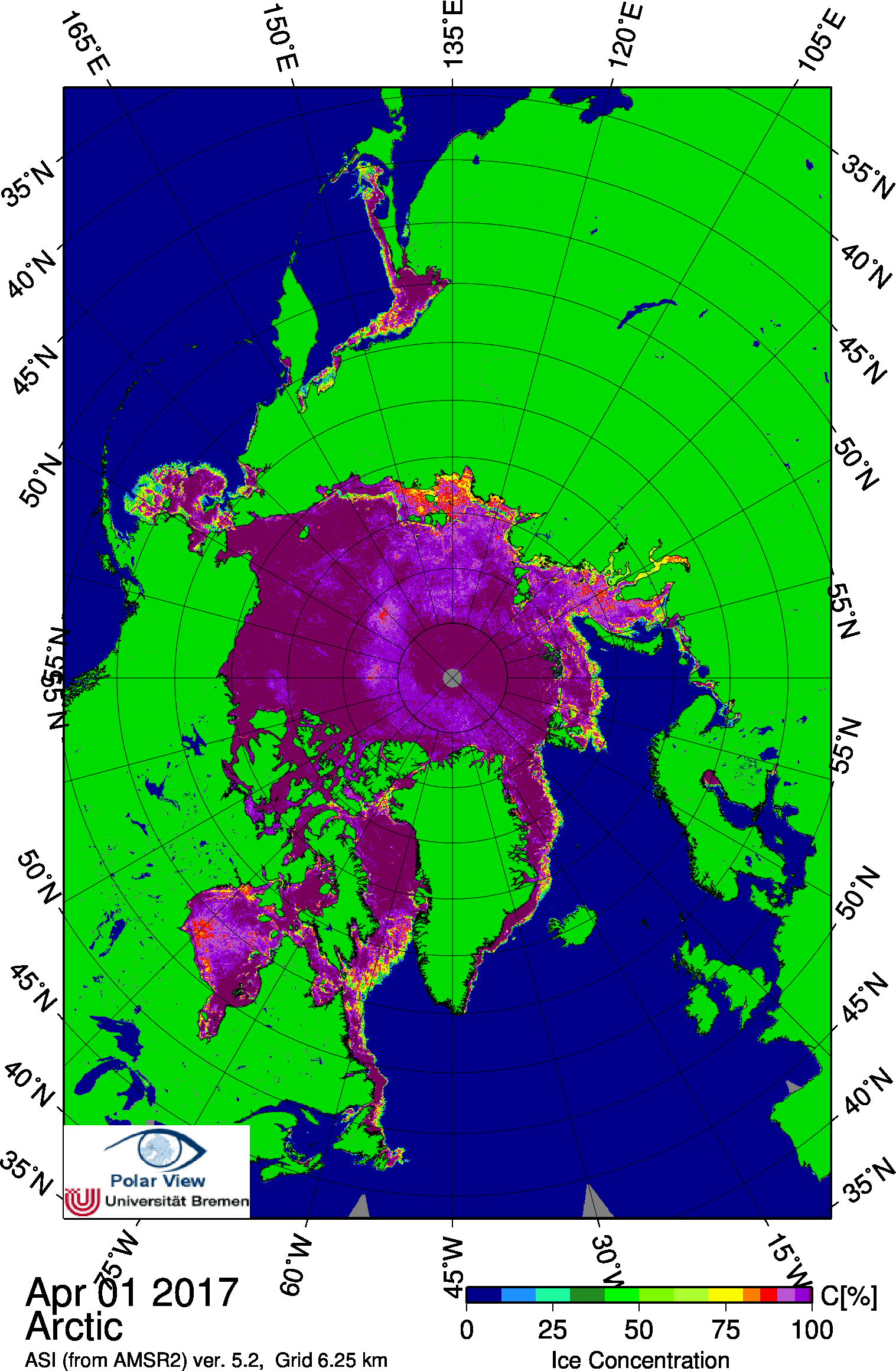
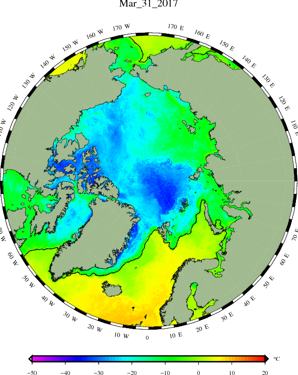
Arctic Sea Ice Concentration:
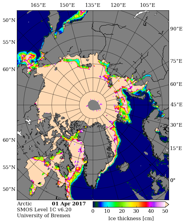
Thin ice map from the University of Bremen SMOS:
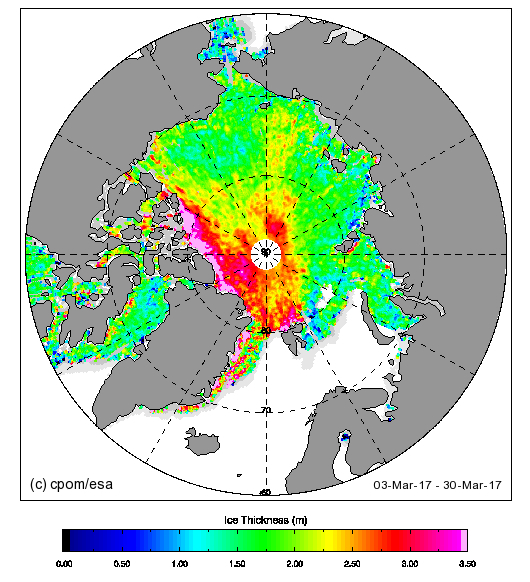
Thick ice map from CPOM CryoSat-2
Beaufort Sea ice thickness growth graph:
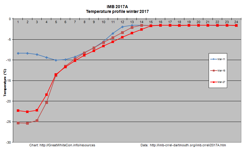
DMI sea ice temperature map:
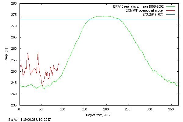
DMI atmospheric temperature graph:
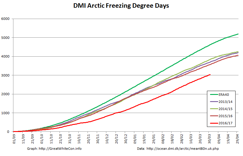
DMI Arctic Freezing Degree Days:
PIOMAS volume for March will follow in a few days, but it’s extremely unlikely to be anything other than “lowest for the date”.
What preliminary conclusions can we draw from this plethora of pretty pictures? First of all the Arctic hasn’t suddenly gone into “deep freeze” mode. Temperatures above 80 degrees north are rising again and are well above the climatology. Freezing degree days are still the lowest on record by a wide margin. Northern hemisphere snow cover is falling fast and is currently just above last year.
In contrast to last year, and thanks to lots of cyclones and very little in the way of anticyclones, there’s plenty of sub half meter sea ice in the Laptev and East Siberian Seas and hardly any in the Beaufort Sea. There’s also plenty of thin ice to be seen on both the Atlantic and Pacific peripheries.
The usual southerly arch hasn’t formed in the Nares Strait between Greenland and Ellesmere Island, and as SMOS shows the sea ice in the strait is consequently very thin. That leads one to wonder when the northern arch in the Lincoln Sea might give way.
It’s not immediately apparent from the still images above, but there’s been relatively large amounts of “old ice” exported from the Central Arctic on the Atlantic side, hence the recent increase in overall extent which is now second lowest for the date (since satellite records began). Area has been creeping up as well over recent days, but is still lowest for the date, as it has been for most of the last year. Sea ice “compactness” has decreased somewhat and given all the thin ice around the edges extent will soon start dropping once again.
All in all, the Arctic sea ice prognosis is not good. Are you watching Lamar Smith? (Pun intended!)
[Edit – April 4th]
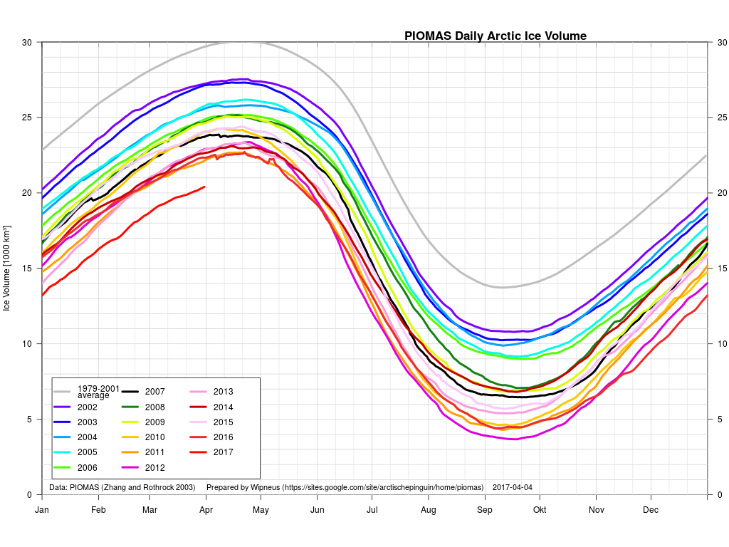
The March PIOMAS update is out! As suspected, Arctic sea ice volume is still by far the lowest on record:
Volume on March 31st 2017 was 20.398 thousand cubic kilometers. The previous lowest volume for the date was 22.129 thousand km³ in 2011.
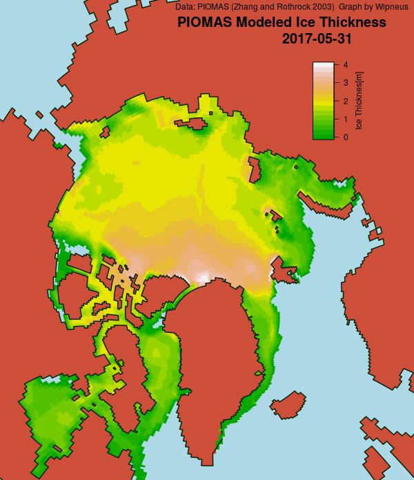
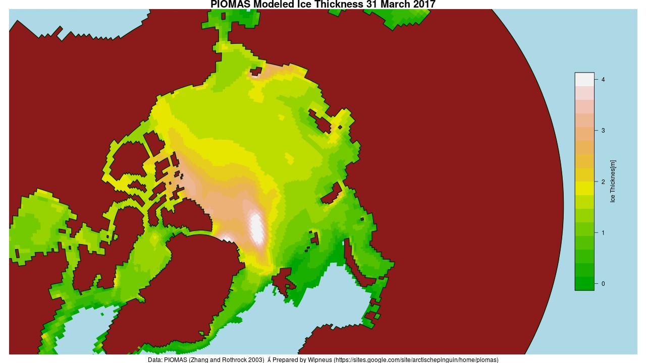
Here too is the PIOMAS modelled Arctic sea ice thickness map:
PIOMAS daily gridded thickness for March 31st 2017
[Edit – April 12th]
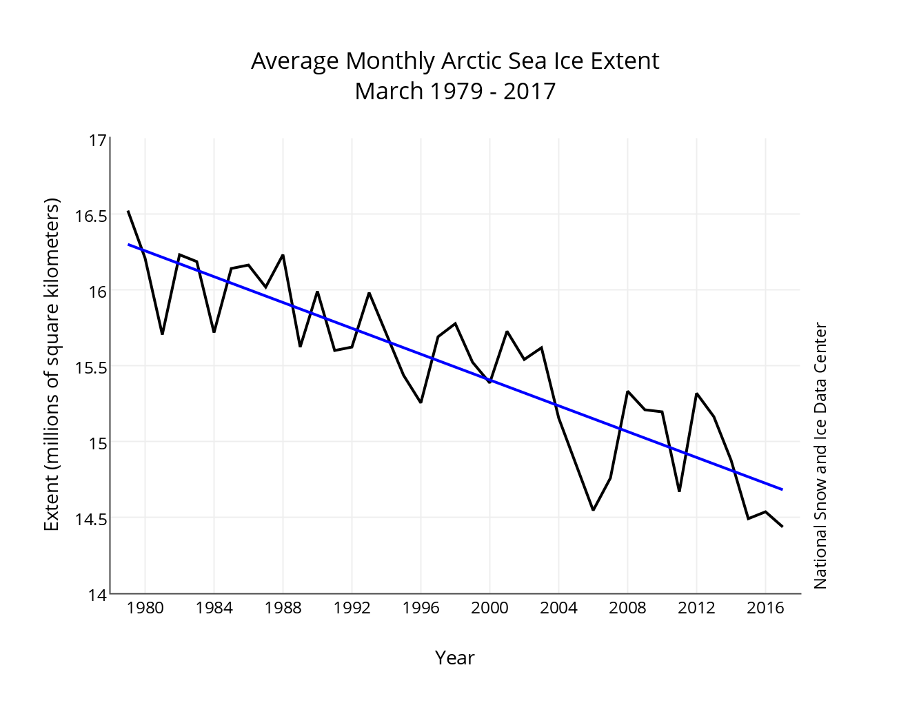
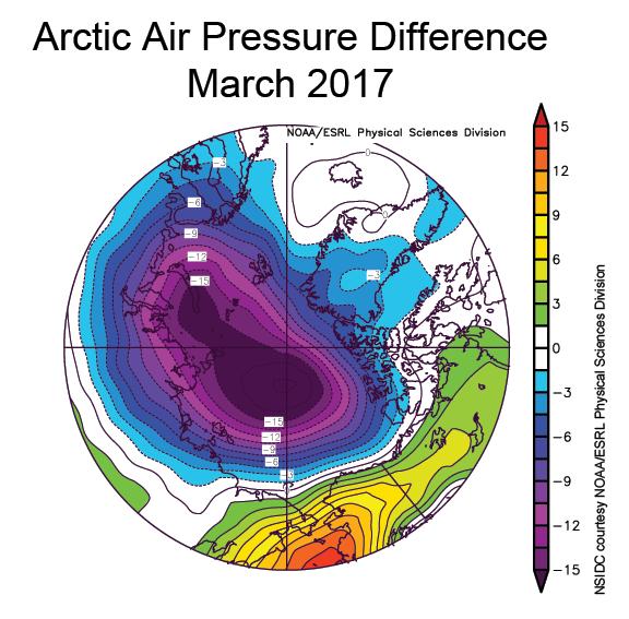
The latest edition of the NSIDC’s Arctic Sea Ice News confirms that their monthly extent metric for March 2017 was the lowest in the satellite record for the month:
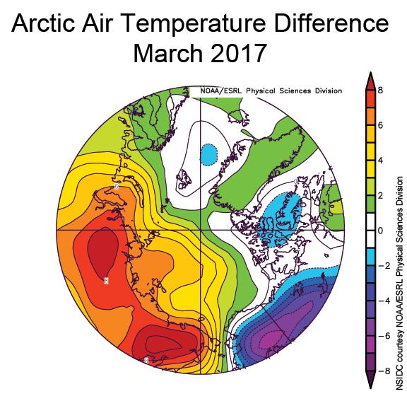
As well as highlighting the anomalously warm temperatures across much of the Arctic:
the NSIDC article includes this telling pressure anomaly map:
New work by an international team led by Igor Polyakov of the University of Alaska Fairbanks provides strong evidence that Atlantic layer heat is now playing a prominent role in reducing winter ice formation in the Eurasian Basin, which is manifested as more summer ice loss. According to their analysis, the ice loss due to the influence of Atlantic layer heat is comparable in magnitude to the top down forcing by the atmosphere.
Answers on a postcard please, to the usual address:
Snow Y. White,
Great White Con Ivory Towers,
Nr. Santa’s Secret Summer Swimming Pool,
Central Arctic Basin
This website uses cookies to improve your experience. We'll assume you're ok with this, but you can opt-out if you wish. Cookie settingsACCEPT
Privacy & Cookies Policy
Privacy Overview
This website uses cookies to improve your experience while you navigate through the website. Out of these, the cookies that are categorized as necessary are stored on your browser as they are essential for the working of basic functionalities of the website. We also use third-party cookies that help us analyze and understand how you use this website. These cookies will be stored in your browser only with your consent. You also have the option to opt-out of these cookies. But opting out of some of these cookies may affect your browsing experience.
Necessary cookies are absolutely essential for the website to function properly. This category only includes cookies that ensures basic functionalities and security features of the website. These cookies do not store any personal information.
Any cookies that may not be particularly necessary for the website to function and is used specifically to collect user personal data via analytics, ads, other embedded contents are termed as non-necessary cookies. It is mandatory to procure user consent prior to running these cookies on your website.