Tag Archives: Willis Eschenbach

Sea Ice Data Tampering At DMI?

Not a lot of people know that our headline for today (apart from the terminating question mark) has been shamelessly plagiarised from Paul Homewood’s latest Arctic article. This will give you a flavour of Paul’s purple prose:

Electroverse have uncovered some blatant data tampering by DMI:

“It would appear that the Danish Meteorological Institute (DMI) may have taken a leaf out of NASA’s ‘data-fudging 101‘.

Sometime between late-Nov and early-Dec this year, the DMI’s Arctic Sea Ice Volume chart experienced a mysterious ‘vanishing’ of ice — this is revealed by a direct comparison of the Nov 18th and the Dec 8th charts below.”

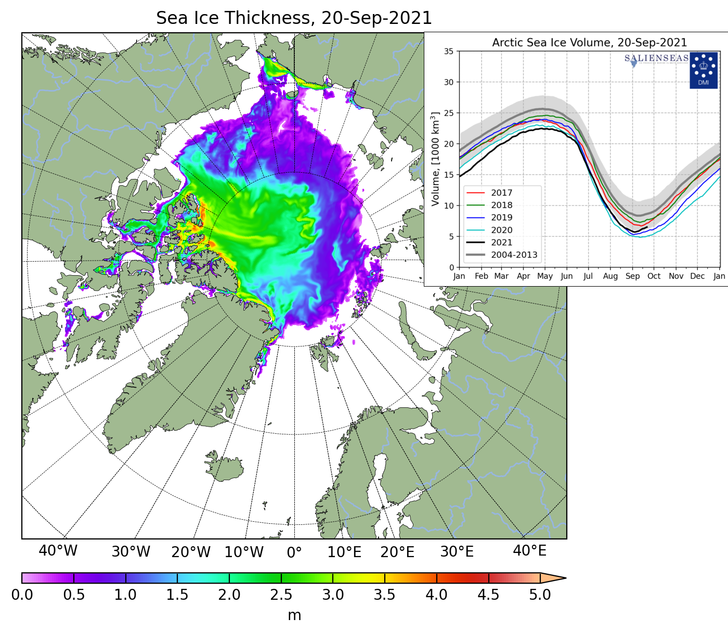
I am able to corroborate their findings. In September I took this screenshot of DMI sea ice thickness. Note that the black line for this year was close to the 2018 line, and above 2017 for Sep 20th:

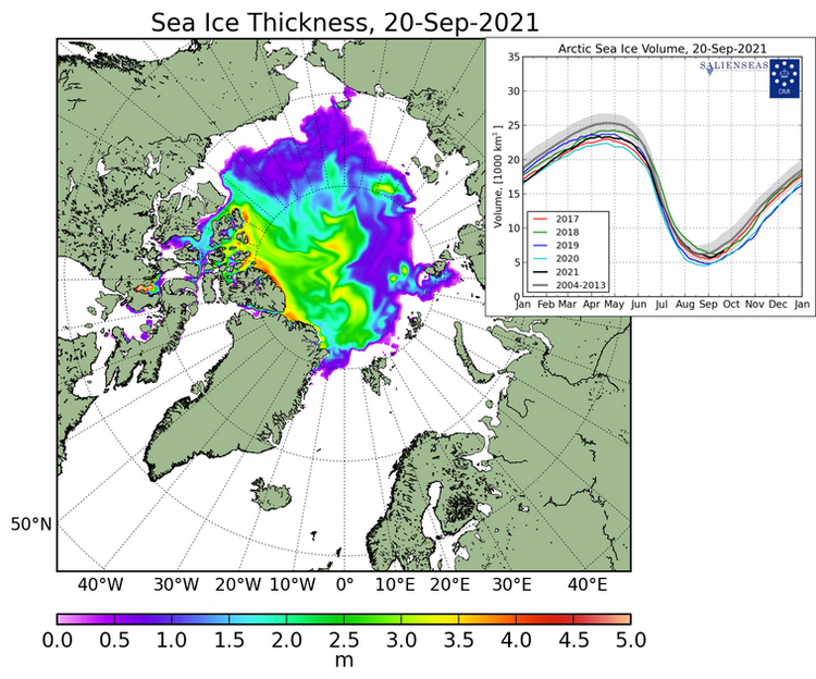
But the new version shows this year well below those two years:

There is no other way to describe this than blatant fraud. The changes do not appear to have been even documented, and the old data is not archived, being simply “replaced”. These should surely be very basic scientific requirements.

Neither does there appear to have been any public announcement by DMI about the fact or the justifications for what amounts to a significant change.

What this episode means is that DMI can no longer be trusted to produce honest, reliable data. It also raises the question of whether similar tampering has been carried out in previous years, without anybody being aware. After all, it is only by pure accident that it has been spotted this time.

Even fewer people know that my helpful explanatory comment is currently invisible to Paul’s band of merry (mostly) men:

Should anyone contrive to click on the invisible link this what they would see just below the DMI’s recent Tweet:

Quite predictably Tony Heller has also jumped on the self same bandwagon, claiming in an article entitled “Rapidly Disappearing Arctic Ice” that:

On December 4, DMI showed Arctic sea ice volume above the 2004-2013 average:

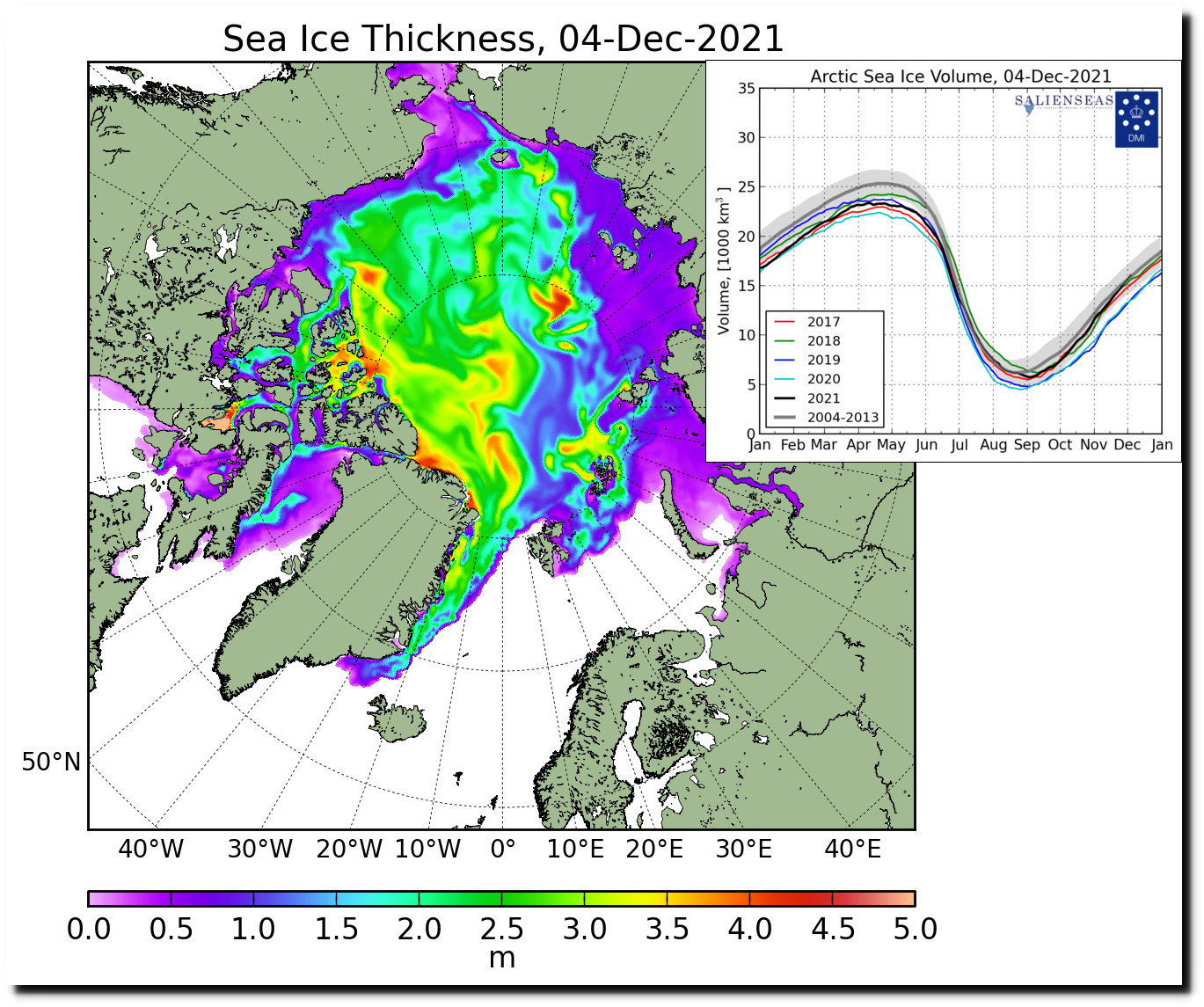
Quite predictably, the data disappeared for three days, and now that it has returned, DMI has massively reduced the amount of sea ice in the Arctic. Much of the thick ice off the coast of Siberia has disappeared:

Presumably their data tampering has freed the Russian ships trapped in the ice.

In normal circumstances I would of course point out the error of his ways to Tony via Twitter. However:

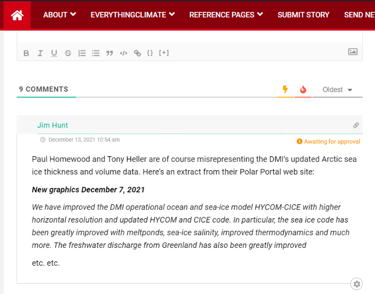
Here is the DMI’s explanation for the recent change in their Arctic sea ice thickness/volume visualisations, as shown on their “Polar Portal” web site:

New graphics December 7, 2021

We have improved the DMI operational ocean and sea-ice model HYCOM-CICE with higher horizontal resolution and updated HYCOM and CICE code. In particular, the sea ice code has been greatly improved with meltponds, sea-ice salinity, improved thermodynamics and much more. The freshwater discharge from Greenland has also been greatly improved using freshwater product from GEUS, which especially improves the coastal ocean currents and thus the ice transport nearshore Greenland. The model has been running continuously since September 1990. Therefore, we have by December 07, 2021 updated the graphics of sea-ice thickness and volume using the new and improved data on Polarportal and ocean.dmi.dk.

The improved model setup has led to higher variability as well as less abrupt melting during the melt season, which gives a shift of approximately half a month for the time of minimum ice volume. The trend between the years is almost unchanged. Thereby, a year with a large sea-ice volume in the old setup also has a large volume in the new setup, and similar for years with low sea-ice volume.

I always thought that “skeptical” folk didn’t much care for the output of “climate models” but I guess I must have been mistaken?

[Edit – December 13th]

Needless to say my comment at NALOPKT is still invisible this evening. However credit where credit is due. Tony Heller has at least not censored my comments on his blog. Earlier today Watts Up With That referred to both the Heller and Homewood DMIGate2 articles. Do you suppose the following helpful comment of mine will ever see the light of day at WUWT?

Watch this space for more #DMIGate2 news as and when we receive it!

CERES Arctic TOA Energy Fluxes

Earth’s energy imbalance is of course a critical factor driving “global warming”. According to NASA back in June:

Researchers have found that Earth’s energy imbalance approximately doubled during the 14-year period from 2005 to 2019.

Earth’s climate is determined by a delicate balance between how much of the Sun’s radiative energy is absorbed in the atmosphere and at the surface and how much thermal infrared radiation Earth emits to space. A positive energy imbalance means the Earth system is gaining energy, causing the planet to heat up.

The doubling of the energy imbalance is the topic of a recent study, the results of which were published June 15 in Geophysical Research Letters.

Scientists at NASA and NOAA compared data from two independent measurements. NASA’s Clouds and the Earth’s Radiant Energy System (CERES) suite of satellite sensors measure how much energy enters and leaves Earth’s system. In addition, data from a global array of ocean floats, called Argo, enable an accurate estimate of the rate at which the world’s oceans are heating up. Since approximately 90 percent of the excess energy from an energy imbalance ends up in the ocean, the overall trends of incoming and outgoing radiation should broadly agree with changes in ocean heat content.

“The two very independent ways of looking at changes in Earth’s energy imbalance are in really, really good agreement, and they’re both showing this very large trend, which gives us a lot of confidence that what we’re seeing is a real phenomenon and not just an instrumental artifact, ” said Norman Loeb, lead author for the study and principal investigator for CERES at NASA’s Langley Research Center in Hampton, Virginia. “The trends we found were quite alarming in a sense.”

As our regular reader(s) will no doubt already be aware, Willis Eschenbach has been singularly unhelpful when it comes to assisting 3rd parties to reproduce the results contained in his 2014 letter to the editor of PNAS on the topic of “Arctic albedo”:

Whilst we wait (in vain?) for Willis to explain himself, here is a preliminary look at some example CERES net top of the atmosphere energy flux maps for the Arctic:

June 2021 is the latest month currently available in NASA’s CERES data, and please feel to play the game of “spot the difference” in the space provided for that purpose below. Meanwhile we await the data for July and August 2021 with barely bated breath.

[Edit – November 3rd]

The CERES data for July 2021 has now been released, so first of all let’s take a look at the July net TOA flux for some selected years:

Next let’s compare this year’s peak insolation months with last year’s:

Does anything stand out yet?

[Edit – January 1st]

Here are maps of the CERES net TOA flux for August 2021 and our usual selection of other years:

It is obvious that by August the entire Arctic is radiating energy back into space. Now let’s compare August 2021 with 2020:

Whilst we’re at it let’s also take a look at how September compares to last year:

It is also obvious that the central Arctic has been radiating less energy back into space during September this year than it was in 2020.

Watch this space!

What’s Up With That Arctic Sea Ice Disinformation

A few days ago we posted an article about the recent surge in the amount of disinformation being published about Arctic sea ice. Eventually one of our long list of usual suspects, Anthony Watts, published a copy of an erroneous Arctic article by Paul Homewood.

Now the Watts Up With That Arctic porky pie production line is going into overdrive, so here’s an already long list of its output in the run up to the COP26 conference in Glasgow in a month or so. First up is the aforementioned clone from NALOPKT. Allegedly:

It is very easy to show that Arctic sea ice has stabilised. As their graph itself shows, there have only been three years since 2007 with lower ice extent than that year, and eleven have had higher extents. Also the average of the last ten years is higher than 2007’s extent.

In itself, this is too short a period to make any meaningful judgements. But that is no excuse for the Met Office to publish such a manifest falsehood.

This comment of mine on that article remains invisible at WUWT:

This morning (UTC) I added another comment to Anthony’s moderation queue:

Continue reading What’s Up With That Arctic Sea Ice Disinformation

Mud Wrestling with Climategate Pigs

This article started out as an addendum to my recent tale of woe in which I got banned from Anthony Watts eponymous website just as Willis Eschenbach had published an article about Arctic sea ice inspired by yours truly!

I’ll get back to that in a moment, but earlier today this happened over on Twitter:

In case you haven’t heard the shock news already, earlier today Climategate was featured on BBC News once again:

Needless to say this news caused much excitement amongst both climate scientists and the cryodenialosphere! However getting back to where I was when I went to bed yesterday, I recently had the good fortune to bump into Willis once again, only this time it was on Judith Curry’s “Climate Etc.” blog rather than WUWT. I eagerly sought to reopen our Arctic discussion, and this is how the conversation went:

Continue reading Mud Wrestling with Climategate Pigs

Watts Up With Polariced Mysteries?

It’s not very often that we discuss an article from Watts Up With That with even the vaguest hint of approval in the smoke filled editorial offices at the Great White Con, but here’s the exception that proves the rule! No doubt the fact that allegedly I inspired the article in question is also relevant? Here’s the start of a guest post at WUWT entitled “Polariced Mysteries“, written by our old friend Willis Eschenbach:

I got into a discussion about polar sea ice in the comments to my post Where Is The Climate Emergency?. In the process I noticed some mysteries.

To start with, here’s the Arctic sea ice area record.

The mystery for me in this record is the decade from about 1998 to 2008. There’s very little month-to-month variation in the record over that period, and the ice area is dropping steadily … followed by ~ thirteen years of very large month-to-month variations with little overall change in ice area. Is this real? Is it an artifact? Unknown.

Then we have the Antarctic ice area record …

Here, the obvious mystery is, just what the heck happened around 2015-2017 to cause the Antarctic ice area to drop so precipitously?

And finally, putting both poles together, we get the following:

etc. etc…

At the North Pole, there is an ocean covered with sea ice. At the South Pole, there’s a high rocky plateau covered with land ice and surrounded by sea ice. Yet despite these totally different situations, the area of sea ice is almost exactly the same at both poles … say what?

I will say that I am overjoyed that the world of climate contains far more mysteries than answers …

“When nothing is for sure, we remain alert, perennially on our toes. It is more exciting not to know which bush the rabbit is hiding behind than to behave as though we knew everything.”
—Carlos Castaneda, in The Teachings of Don Juan

My best to all adventurers in this most marvelous universe,

Thanks for your good wishes Willis, but there is a big black fly in the marvellous universal ointment. No sooner had a potentially enlightening discussion begun than darkness descended from on high:

At the risk of repeating myself:

What do you suppose the effect of ice-albedo feedback will prove to be over the next 10 years or so? Or if you prefer over the last 10 years or so?

And why “remove the seasonality”. As you correctly pointed out over there, “When the ice is mostly there the sun mostly isn’t”.

Global Sea Ice “Comeback” Conspiracy

Our Twitter feed has suddenly been inundated with messages to the effect that:

Global sea ice makes a strong comeback as El Nino fades.

First up was Professor Judith Curry on April 12th, with:

You will note that we were not the only ones to swiftly conclude that Judy’s assertion was lacking both veracity and verisimilitude! Then this morning came our old friends at the Global Warming Policy Forum with:

You will note that the GWPF adorned their “Tweet” with a graph purporting to show “Global sea ice anomalies”. We can only assume that Benny Peiser hadn’t read this April 11th article of ours, which pointed out that:

NSIDC has suspended daily sea ice extent updates until further notice, due to issues with the satellite data used to produce these images. The problem was initially seen in data for April 5 and all data since then are unreliable, so we have chosen to remove all of April from NSIDC’s archive.

To remedy that (no doubt?) inadvertent oversight on Benny’s part here is a graph we prepared earlier of absolute global sea ice area using reliable data from the AMSR2 instrument on the Japan Aerospace eXploration Agency’s SHIZUKU satellite:

2016-04-12-UH-AMSR2-Area

The GWPF were followed this afternoon by Anthony Watts with:

Both Prof. Curry and non Prof. Watts adorned their “Tweets” with a graph allegedly comparing “global temperature” with “tropical temperature”, but provided no graph of “polar temperature”. To remedy that (no doubt?) inadvertent oversight here is one we prepared earlier:

NCEP-Arctic-T2-DJF

All members of this team of synchronised “Tweeters” provided links to an April 11th article by a certain Paul Dorian entitled, believe it or not:

Global Sea Ice Makes A Strong Comeback

Note in particular the part of Paul’s article that states:

In an interesting twist, the recent analysis found that the global ice area remained stable throughout the 1980s and the 1990s, while temperatures climbed suggesting “the global sea ice area is not particularly a function of the global average surface temperature.” [Source: Willis Eschenbach/”Watts Up With That” web site]

We can only assume that Paul Dorian hadn’t read this April 10th article of ours, which pointed out amongst other things that:

One feels compelled to ask why Willis’s global average temperature graph neglects to mention 2015 when he implies that it does?

Here’s an up to date version of one of those that Bill The Frog prepared for us earlier:

HadCRUT-201602

We must further assume that Paul hadn’t read this April 11th article by Mr. Watts either. It stated that:

A few years ago in 2009, I was the first to notice and write about a failure of the instrumentation for one of the satellites used by the National Snow and Ice Data Center (NSIDC) to show Arctic Sea Ice extent. Today, we have what appears to be a similar problem with satellite sea ice measurement.

It seems that Paul Dorian has finally read at least one out of all these informative articles, because the latest revision of his own piece of imaginative fiction now starts:

The source of global sea ice information cited in this posting was NOAA’s National Snow and Ice Data Center (NSIDC). They are now reporting issues with the satellite data used to produce these images and this information was not known at the time of the writing of this article.

Do you suppose we can now expect a similarly “fulsome apology” from the other players in this tragi-comic farce, together with all their rebloggers, retweeters, plagiarisers and other assorted acolytes?

Satellite Problems With Arctic Sea Ice Measurement

Skeptical sorts across the cryoblogosphere are in meltdown mode at the moment. They seem to be unaware that satellites don’t last forever in the harsh environment of space, and the individual scientific instruments carried by a satellite don’t either. Some failures are more spectacular than others however. By way of illustration here’s one recent report from Space.com:

The February [2015] explosion of an American military satellite may cause some problems for orbiting spacecraft after all, a new study reports.

The U.S. Air Force’s 20-year-old Defense Meteorological Satellite Program Flight 13 (DMSP-F13) craft blew apart on Feb. 3 after experiencing a power-system faillure. Analyses by the European Space Agency and other organizations found that the cloud of space junk generated by the explosion shouldn’t pose much of a threat to their missions, but the new research suggests that not all spacecraft are in the clear.

Another DMSP satellite started pushing up the metaphorical daisies earlier this year. Last month Space Flight Now reported that:

The U.S. Air Force has been unable to send commands to the service’s newest weather satellite for nearly a month, and engineers are trying to determine if the spacecraft can be salvaged, officials said last week.

The polar-orbiting Defense Meteorological Satellite Program Flight 19, or DMSP F19, spacecraft stopped responding to orders from the ground Feb. 11, the Air Force said in a March 3 press release.

“At this time, it is not known what caused the anomaly or if the satellite will be recovered, and the anomaly is under investigation,” the Air Force said. “There are no other known issues with the satellite.”

Designed for a five-year service life, DMSP F19 launched April 3, 2014, from California atop a United Launch Alliance Atlas 5 rocket. It is the newest in the Air Force’s series of DMSP weather observatories designed to help forecasters predict storms, clouds, fog and dust storms that could inhibit global military operations.

The data provided by the Special Sensor Microwave Imager/Sounder (SSMIS) instrument carried aboard several of the DMSP series of satellites is used by the National Snow and Ice Data Center to calculate their Sea Ice Index metric of Arctic sea ice extent. However suddenly Boulder has a problem. As we reported earlier this week the SSMIS sensor carried by DMSP F17 appears to be malfunctioning. This can be seen in this visualisation of the data from the European Ocean and Sea Ice Satellite Application Facility(OSI-SAF):

nt_20160409_f17_nrt_n

Look closely at the top centre of the image to see a large patch of spurious “sea ice”. Here’s the resulting SII extent graph from the NSIDC:

NSIDC_NH_20160410

Anthony Watts reported this news in typically fanciful fashion:

There is this small notice on the NSIDC page:

“The daily sea ice extent images are currently displaying erroneous data. NSIDC is investigating.”

It looks to be a problem with the DMSP F17 satellite.

Makes you wonder how long this has been going on and if the anomalously low readings we’ve seen for awhile are due to a slow sensor degradation.

Time will tell.

For a more realistic interpretation of the facts we suggest that instead of reading the propaganda perpetrated at WUWT you instead examine this graph derived using data from the AMSR2 sensor on board the Japanese SHIZUKU satellite:

JAXA-20160410

Mr. Watts evidently takes a very US centric view of these matters, since he neglected to report this timely news bulletin from the OSI-SAF:

Due to the previously reported problems with one of the channels on SSMIS onboard DMSP F17, OSI SAF is now working on replacing DMSP F17 with DMSP F18 in our sea ice products.

Currently, the switch to F18 has been implemented for the ice concentration product (OSI-401). The product dated 20160410 has been reprocessed and is available on our FTP server, ftp://osisaf.met.no/prod/ice/conc/ and ftp://osisaf.met.no/archive/ice/conc/2016/04

The ice edge and type products (OSI-402 and OSI-403) will be updated to use F18 tomorrow, 2016-04-12.

It seems Willis Eschenbach, the current Watts Up With That resident sea ice expert, is already beavering away endeavouring to prove Anthony’s case for him:

We have no way to know if this has been a gradual decrease followed by a failure, so yes, it’s certainly possible that the previous data is bad. Doesn’t mean it is, but we’d be fools not to check.

We suggested a simple check:

Why not compare the NSIDC’s SSMIS data from F-17 with JAXA’s AMSR2 data from Shizuku? Wouldn’t that do the trick?

Willis replied:

I meant that just from the bad reading alone, we don’t know if the previous data is bad. Yes, we can check it in the way you suggest and other ways … which is why I said we’d be fools not to check.

We think that if he does his due diligence he will find that he is in actual fact engaged on a fool’s errand, but time will indeed tell. Let’s wait and see what Willis n Willard can come up with, shall we? Meanwhile we also cannot help but wonder what the dynamic duo might make of our own due diligence replicating the results of another collaboration of theirs:

“The Awful Terrible Horrible Arctic Sea Ice Crisis”

The Awful Terrible Horrible Arctic Sea Ice Crisis

As our regular reader(s) will be aware, Anthony Watts has been plagiarising our content and republishing it on his “Watts Up With That” blog. In a perplexing perversity he has also been refusing to publish content that we have happily contributed to the self same blog. Hence we have taken the liberty of basing our title for today on a recent WUWT guest post by Willis Eschenbach entitled:

The Awful Terrible Horrible Global Sea Ice Crisis

Here’s what Willis had to say at the end of his article:

My Usual Request: Misunderstandings are the curse of the internet. If you disagree with me or anyone, please quote the exact words you disagree with, so we can all understand the exact nature of your objections. I can defend my own words. I cannot defend someone else’s interpretation of some unidentified words of mine.

My Other Request: If you believe that e.g. I’m using a method wrong or using the wrong dataset, please educate me and others by demonstrating the proper use of the method or the right dataset. Simply claiming I’m wrong about methods doesn’t advance the discussion unless you can point us to the right way to do it.

Data: The Hadley HadISST ice (and sea surface temperature) data is available here. I used the NetCDF file HadISST_ice.nc.gz (~15Mb) at the bottom of the page.

and here’s a copy of our still invisible comment:

2016-04-07_0600-WUWT

Epitomising the indomitable spirit of scientific skepticism we set out to duplicate the results obtained by Mr. Eschenbach and answer our own question as well as his. Here is what we’ve discovered. Firstly global sea ice area since 1974:

HadISST-Global

and then Arctic sea ice area since 1974:

HadISST-Arctic

Now as our very own learned guest poster Bill The Frog all too briefly pointed out to Willis Eschenbach on April 7th:

2016-04-07-1757-WUWT-BtF

Ignoring Bill’s helpful hint Willis concluded that:

We’re pretty sure that the global average surface temperature increased from the mid-1970s to about 1998. However, we see no sign of this in the global sea ice area data. Instead, ice area remained stable throughout the 1980s and the 1990s, while temperatures climbed:

hadcrut-global-average-surface-temp-WUWT-20160406

Next, we’re also pretty sure that there was no significant change in the global average temperature from about 1998 to 2015, the end of the ice data. Despite that, starting in 2000 the ice area first dipped to a low in about 2007, and since then has been climbing rapidly.

This supports a curious conclusion, which is that in modern times at least, the global sea ice area is not particularly a function of the global average surface temperature. Go figure…

Now that we’re in possession of all this newly revealed data about historical sea ice area and censorship in the cryospheric blogosphere what should we “go figure”? Firstly one feels compelled to ask why Willis’s global average temperature graph neglects to mention 2015 when he implies that it does?

Should you figure anything else please free to answer our query on a virtual postcard, in the space provided for that purpose below. You may additionally like to vent your feelings concerning this controversial cover-up of our changing climate over on Twitter using the #SnipGate hashtag.

HadISST Historical Arctic Sea Ice Concentration Data

Commenter Henry P over on “Steve Goddard’s” (un)Real Science blog poses the following question:

Unfortunately, we do not have any record of ice around 1929. But there was an eyewitness report of the melting of ice around 1923. Noting that Antarctic ice is currently increasing, my question to you Jim is simply this: why do you think that Arctic melt now is more than 87 years ago?

By way of a partial answer to that question, the United Kingdom’s Meteorological Office (Met Office or UKMO for short) maintains the Hadley Centre Sea Ice and Sea Surface Temperature data set (HadISST for short). Unfortunately Henry P is obviously sadly misinformed, since according to the Met Office:

HadISST is a unique combination of monthly globally-complete fields of SST and sea ice concentration on a 1 degree latitude-longitude grid from 1870 to date.

Here is what the HadISST data set reveals for September 1929:

HadISST-19290916

compared to September 2015:

HadISST-20150916

Surely a working pair of Mark 1 eyeballs should be sufficient to allow even a dyed in the wool denizen of (un)Real Science to spot the difference?