Earth’s energy imbalance is of course a critical factor driving “global warming”. According to NASA back in June:
Researchers have found that Earth’s energy imbalance approximately doubled during the 14-year period from 2005 to 2019.
Earth’s climate is determined by a delicate balance between how much of the Sun’s radiative energy is absorbed in the atmosphere and at the surface and how much thermal infrared radiation Earth emits to space. A positive energy imbalance means the Earth system is gaining energy, causing the planet to heat up.
Scientists at NASA and NOAA compared data from two independent measurements. NASA’s Clouds and the Earth’s Radiant Energy System (CERES) suite of satellite sensors measure how much energy enters and leaves Earth’s system. In addition, data from a global array of ocean floats, called Argo, enable an accurate estimate of the rate at which the world’s oceans are heating up. Since approximately 90 percent of the excess energy from an energy imbalance ends up in the ocean, the overall trends of incoming and outgoing radiation should broadly agree with changes in ocean heat content.
“The two very independent ways of looking at changes in Earth’s energy imbalance are in really, really good agreement, and they’re both showing this very large trend, which gives us a lot of confidence that what we’re seeing is a real phenomenon and not just an instrumental artifact, ” said Norman Loeb, lead author for the study and principal investigator for CERES at NASA’s Langley Research Center in Hampton, Virginia. “The trends we found were quite alarming in a sense.”
As our regular reader(s) will no doubt already be aware, Willis Eschenbach has been singularly unhelpful when it comes to assisting 3rd parties to reproduce the results contained in his 2014 letter to the editor of PNAS on the topic of “Arctic albedo”:
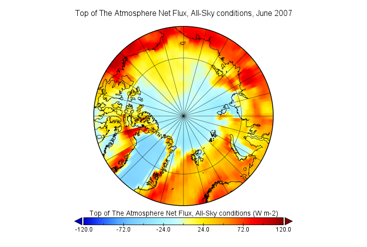
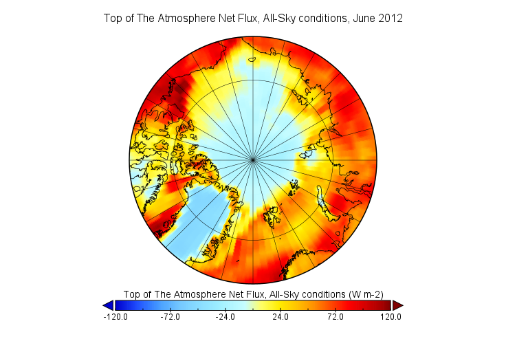
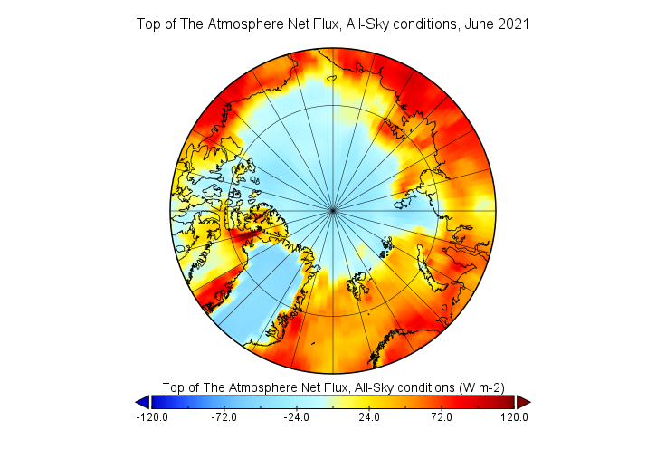
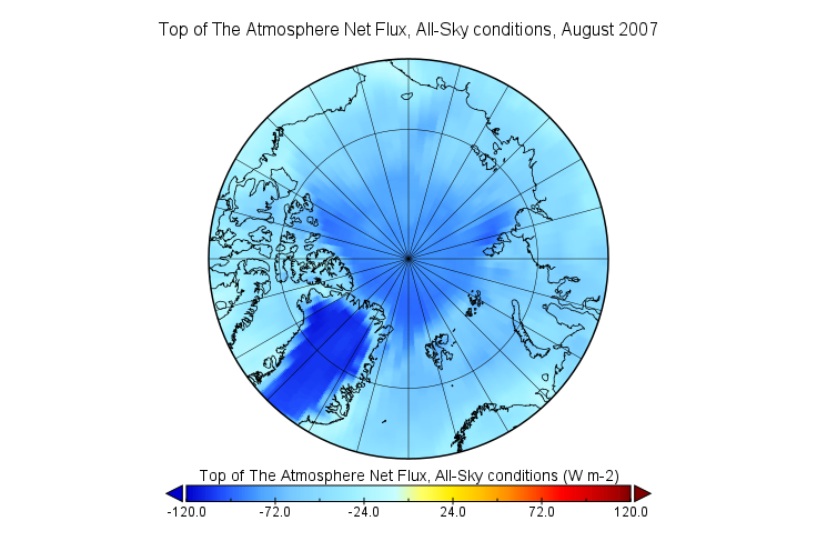
Whilst we wait (in vain?) for Willis to explain himself, here is a preliminary look at some example CERES net top of the atmosphere energy flux maps for the Arctic:
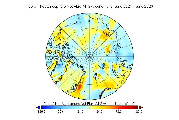
June 2021 is the latest month currently available in NASA’s CERES data, and please feel to play the game of “spot the difference” in the space provided for that purpose below. Meanwhile we await the data for July and August 2021 with barely bated breath.
[Edit – November 3rd]
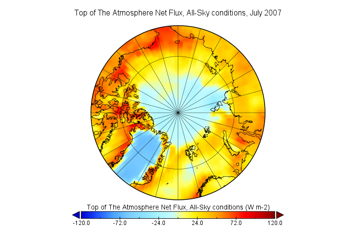
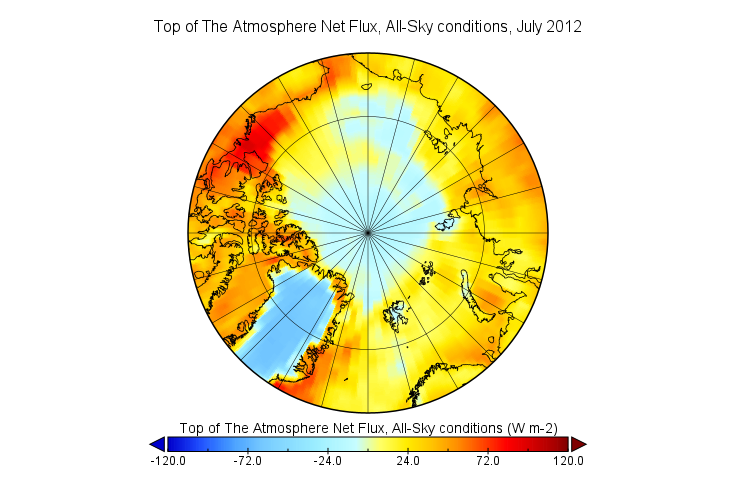
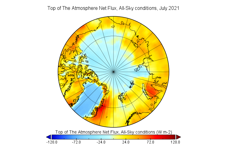
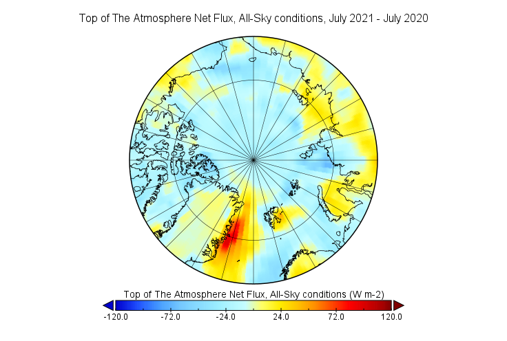
The CERES data for July 2021 has now been released, so first of all let’s take a look at the July net TOA flux for some selected years:
Next let’s compare this year’s peak insolation months with last year’s:
Does anything stand out yet?
[Edit – January 1st]
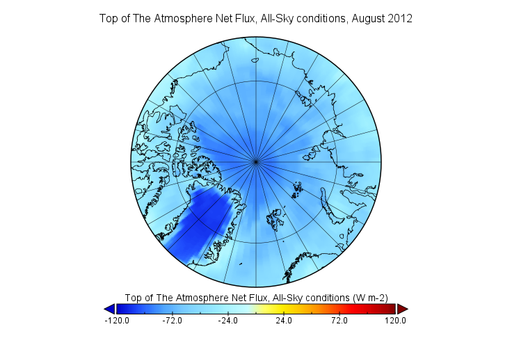
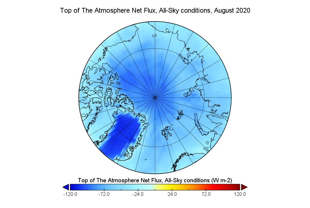
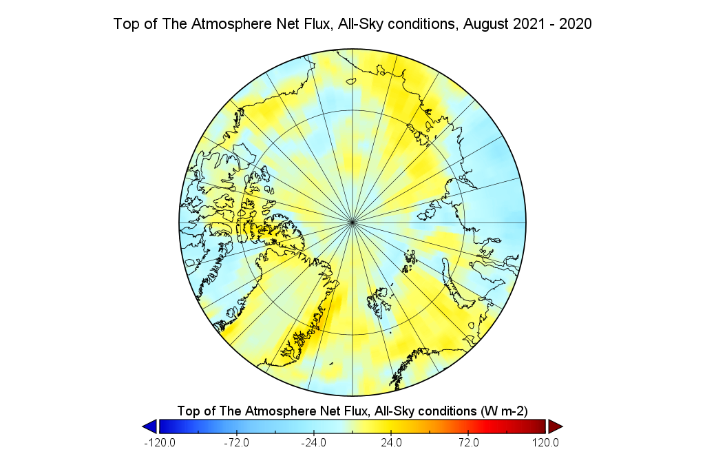
Here are maps of the CERES net TOA flux for August 2021 and our usual selection of other years:
It is obvious that by August the entire Arctic is radiating energy back into space. Now let’s compare August 2021 with 2020:
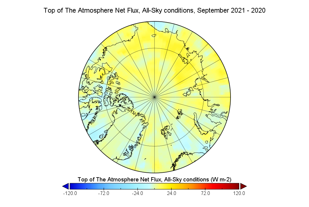
Whilst we’re at it let’s also take a look at how September compares to last year:
It is also obvious that the central Arctic has been radiating less energy back into space during September this year than it was in 2020.
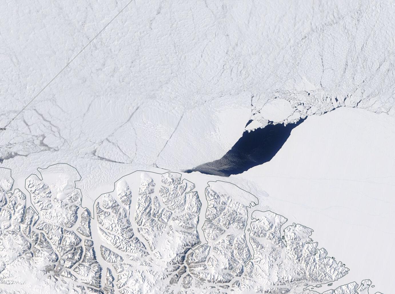
A recent paper by Kent Moore et al. has caused something of a stir in the mainstream media recently, as well as in cryospheric circles and amongst the cryodenialista:
The area to the north of Ellesmere Island and Greenland contains the Arctic’s thickest ice and it is predicted to be the last to lose its perennial ice, thus providing an important refuge for ice-dependent species. There is however evidence that this Last Ice Area is, like the entire Arctic, undergoing rapid changes that may reduce its suitability as a refuge. During May 2020, a polynya developed to the north of Ellesmere Island in a region where there are no reports of a previous development. We use a variety of remotely sensed data as well as an atmospheric reanalysis to document the evolution and the dynamics responsible for the polynya. In particular, we argue that anomalously strong divergent winds associated with an intense and long-lived Arctic anti-cyclone contributed to the development of the polynya as well as similar previously unreported events in May 1988 and 2004.
Curiously the paper neglects to mention a polynya in the same region that we reported on, albeit in passing, in August 2018. Here’s an updated video of that event, with the addition at the start of a yellow arrow to highlight the part of the Arctic’s “Last Ice Area” investigated by Moore et al. and a pale blue arrow to highlight Kap Morris Jesup, the most northerly point in Greenland:
Next here’s another animation, covering the time period discussed in the paper and continuing throughout the summer of 2020:
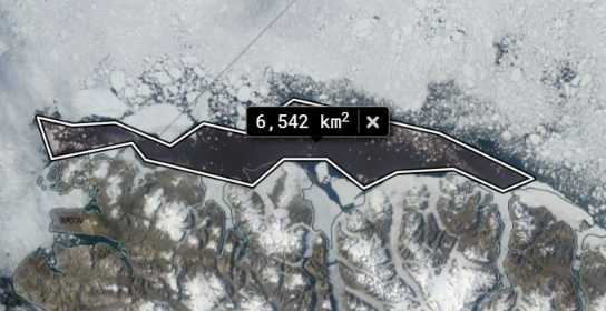
Comparing the two animations it is obvious that the August 2018 polynya is much larger than the one in May 2020, confirmed by a quick area computation using NASA WorldView:
The introduction to the paper states that:
Flaw leads, elongated regions of open water that develop along the interface between land fast and pack ice (Barber & Massom, 2007) are common in the region. Indeed Peary’s 1909 sledding expedition to the North Pole was delayed as a result of a large flaw lead that developed north of Ellesmere Island (Peary, 1910). However, the development of a polynya in this region has not been reported previously.
To my eye the image above reveals something far too wide to be described as a “flaw lead”, but let’s delve deeper into the paper:
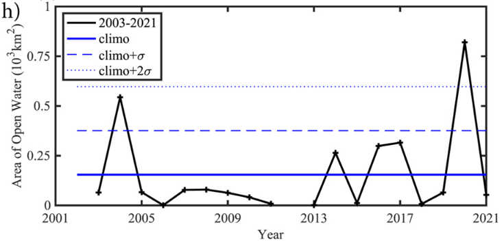
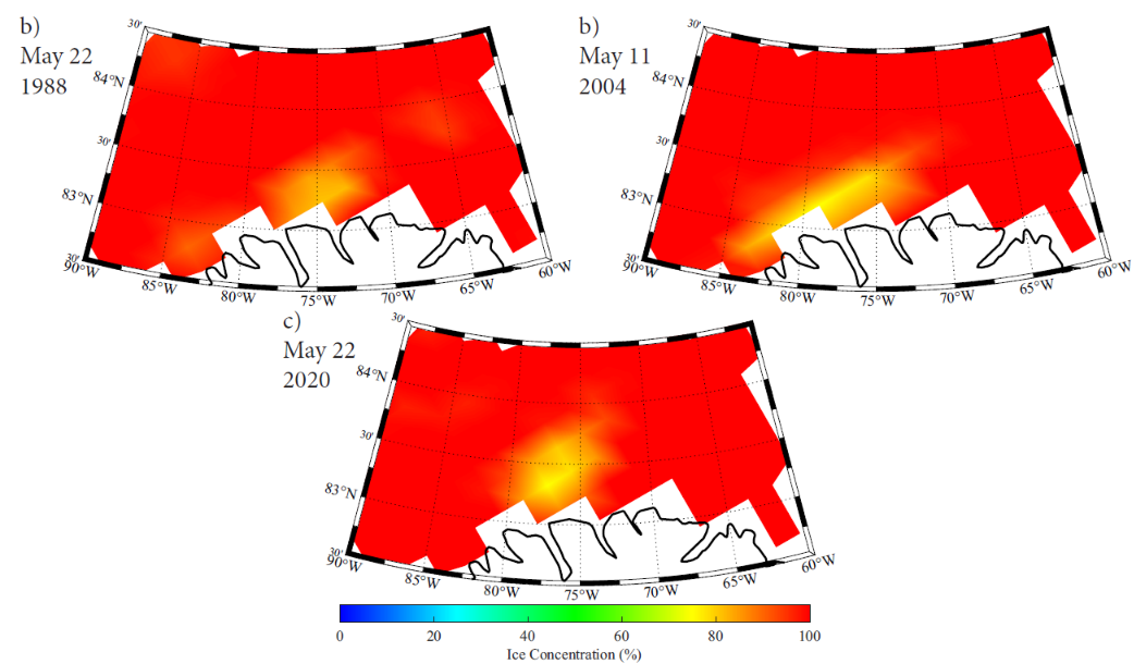
A perspective on the unique nature of the May 2020 event is provided by the monthly mean area of open water in the area of interest during May for the entire period of the ASI data set, 2003–2021 (Figure 2h). Typically the area of open water during May in the region is less than 160 km2. May 2020 is the only year in which the area of open water exceeds 2 standard deviations above the mean.
Perhaps the polynya in question is indeed “unique in the month of May”, in which case it would no doubt have been helpful if the abstract and/or the introduction to the paper had mentioned this subtlety. Then the plethora of erroneous statements in the media like the one recently referenced by Mark Lynas on Twitter might have been avoided?
The polynya is the first one that has been identified in this part of the Last Ice Area, according to a new study detailing the findings in the AGU journal Geophysical Research Letters.
Since Mark, amongst others, seem to be suffering from the misapprehension that “The Arctic’s ‘Last Ice Area’ is cracking, just in time for COP26” here is what’s been happening in the “Last Ice Area” this year, in the run up to next month’s conference in Glasgow:
Finally, for the moment at least, are MODIS images of the May 20th 2020 polynya:
and the one on May 12th 2004:
Neither Aqua or Terra had been launched in 1988 of course, and Landsat 5 didn’t cover the north of Ellesmere Island. This is the SSM/I & SSMIS visualisation of all three May polynyas from the supplement to Moore’s paper:
We’ve been following the voyage of the Canadian icebreaker CCGS Amundsen as he circumnavigated Banks Island. Now Amundsen is about to set off on the final leg of his 2021 Arctic campaign to conduct the “DarkEdge” study in northern Baffin Bay. According to the Amundsen Science web site:
7 October to 3 November – Cambridge Bay to Quebec City
During the final Leg of the 2021 Expedition, an integrated study (DarkEdge) will take place at the ice edge to study the key processes taking place during the fall-winter transition in northern Baffin Bay. The Sentinel North program will deploy an Autonomous Underwater Vehicle (AUV) and contribute to the Dark Edge campaign. The CCGS Amundsen will sail to Quebec City for the end of the annual expedition on November 3rd.
and according to Christian Katlein from the Alfred Wegener Institute:
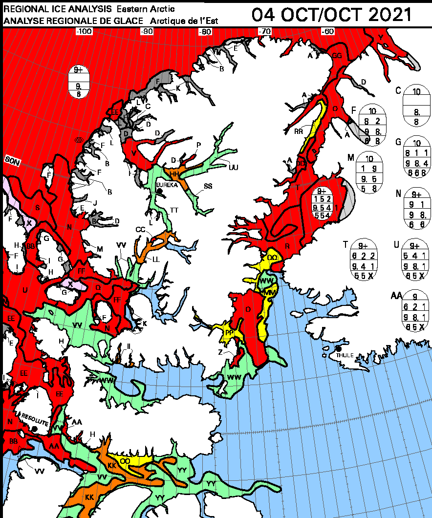
The Canadian Ice Service daily charts don’t currently cover the north of Baffin Bay, so here’s the most recent weekly which provides some idea of what Amundsen will be facing over the next few weeks:
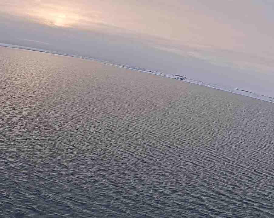
As Amundsen prepares to begin his voyage to the DarkEdge, here’s a watery sun setting over Cambridge Bay last night:
[Edit – October 11th]
Here’s the eighth video in Christian’s Sea Ice Stories series and the first from Amundsen itself, whilst moored in Cambridge Bay:
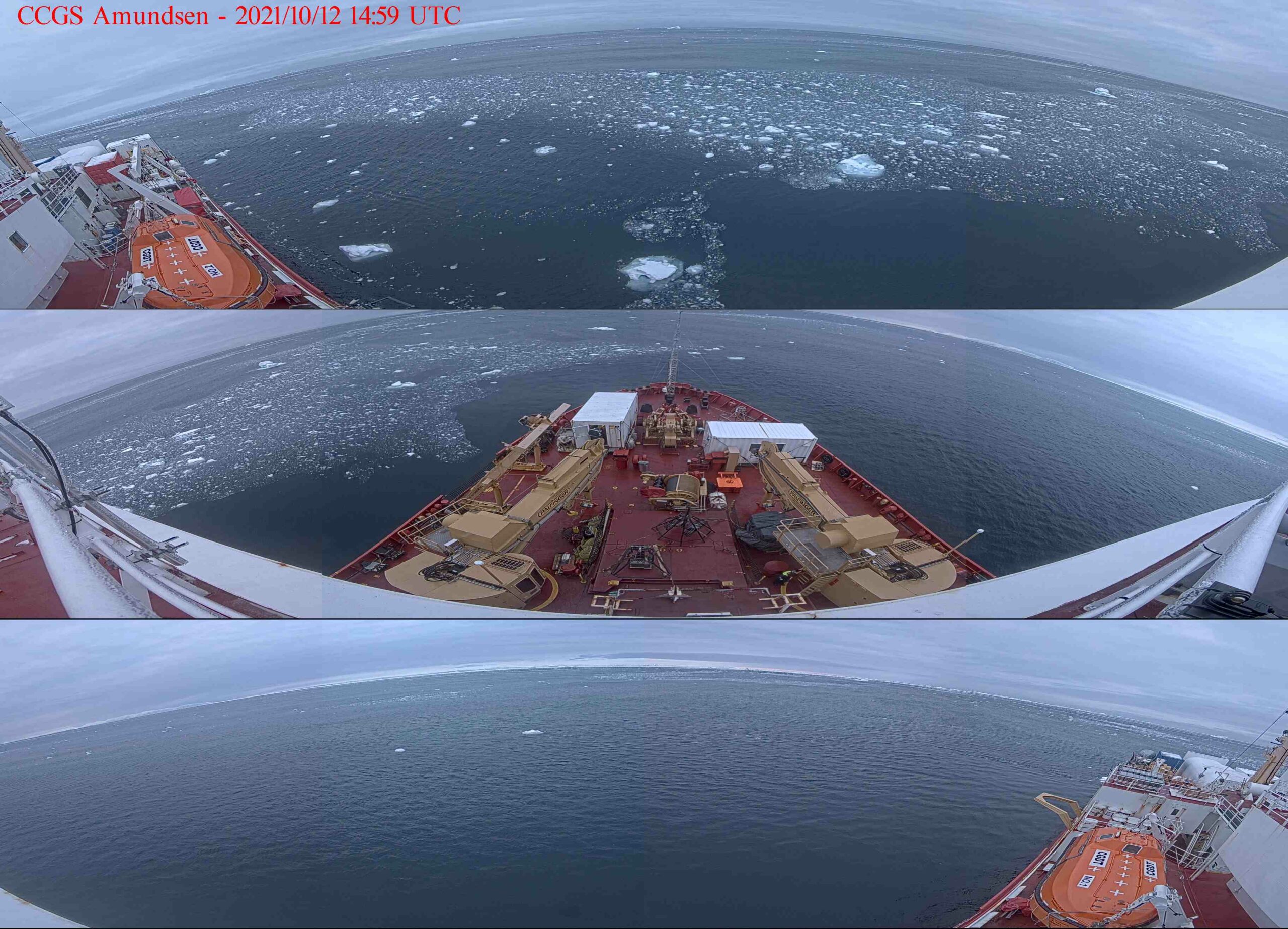
[Edit – October 12th]
Amundsen has finally located a smidgen of sea ice in Baffin Bay, at approximately 76.10 N, 77.10 W. Click to enlarge:
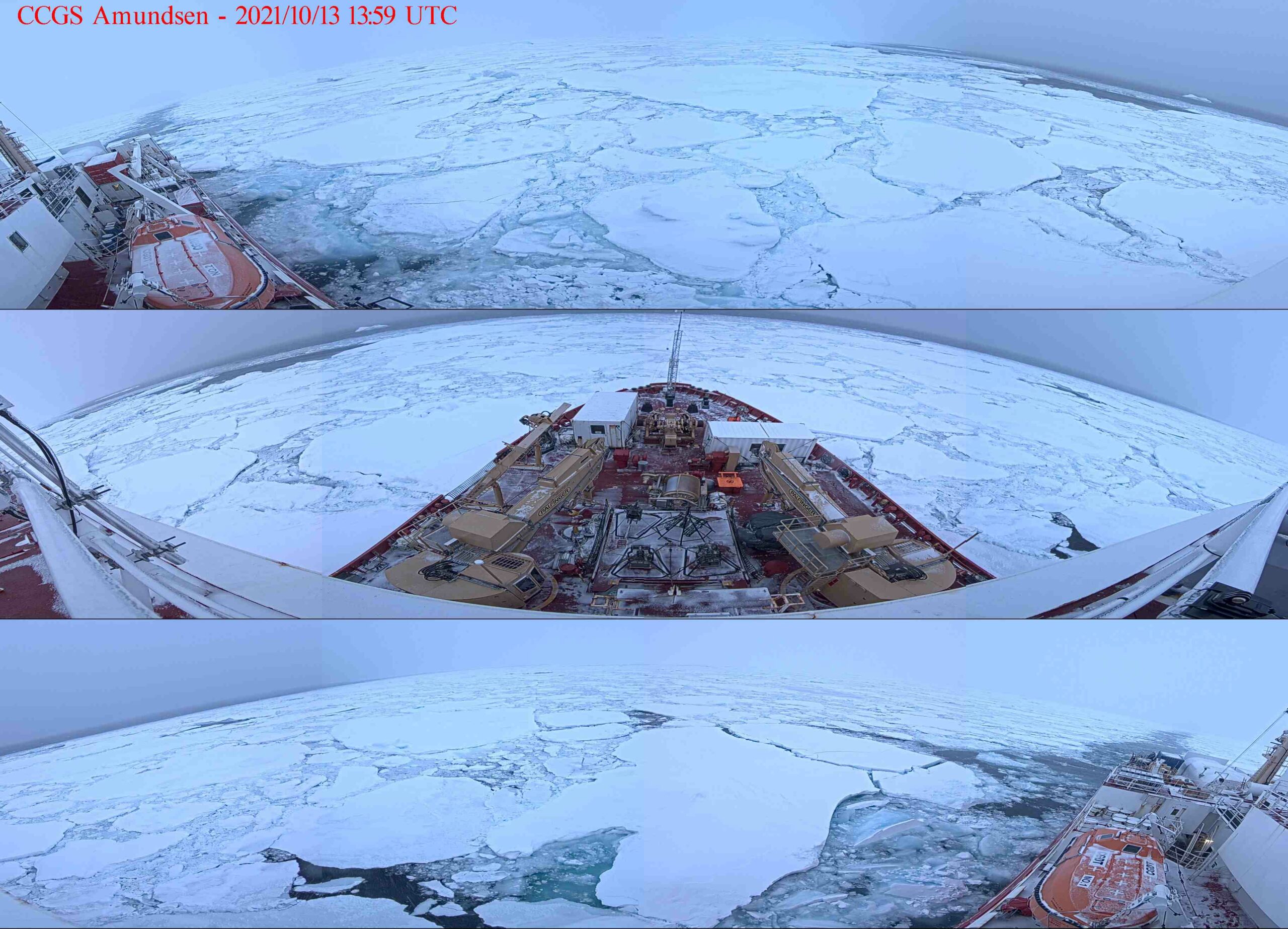
[Edit – October 13th]
Amundsen has managed to find some more significant sea ice, this time located at around 76.30 N, 78.70 W:
Earlier today Scientific American published an article entitled “That ‘Obama Scientist’ Climate Skeptic You’ve Been Hearing About“. The climate skeptic in question being of course Steven E. Koonin. If you click that last link it will be immediately obvious that I’ve recently been critical of Professor Koonin’s new book “Unsettled” in several more ways than one! The article in Scientific American is authored by several more people than one. Twelve to be precise, including the famous names of Naomi Oreskes, Michael E. Mann and Andrew Dessler. That team takes a largely different approach to my own criticism, making no mention of the cryosphere for example, although sea level rise does get a mention. Rather than going into the science in detail, Oreskes et al. take a different approach. Here’s the introduction to the article:
If you’d heard only that a scientist who served in the Trump administration and now regularly appears on Fox News and other conservative media thinks climate change is a hoax, you’d roll your eyes and move on. But if you heard that someone associated with former President Barack Obama’s Democratic administration was calling the climate science consensus a conspiracy, the novelty of the messenger might make you take it a little more seriously.
The latter is what Steve Koonin is using to sell his new book, which is being billed as the revelation of an “Obama scientist” who wants you to think that climate change isn’t a big deal. But unfortunately, climate change is real, is caused primarily by burning fossil fuels, and is already hurting people all over the world, including here in the United States.
For example, a study published recently found that because climate change has caused sea levels to rise, Superstorm Sandy flooded an additional 36,000 homes, impacting 71,000 people who would’ve been safe otherwise, and caused $8 billion in additional damage.
A little later the article suggests that:
Steve Koonin is hoping you’ll see Obama’s name and trust him when he tells you that he’s better equipped to summarize major climate reports than the authors of the U.N.’s IPCC report and the U.S. government’sNational Climate Assessment, who wrote at length about the already sizable and growing costs of climate change. He’s hoping you won’t recall that each president appoints thousands of people, and Koonin, it turns out, was hired at the Energy Department specifically for his contrarianism. His boss at the time, Stephen Chu, said he “didn’t want to have a department where everybody believed exactly as everybody else” and added that Koonin “loves to be the curmudgeon type.”
Curmudgeon or not, Steve’s science certainly leaves a lot to be desired, as has been proved here! Oreskes et al. put it this way:
When it comes to the science, Koonin cherry-picks and misrepresents outdated material to downplay the seriousness of the climate crisis…
He wants you to believe that, as an Obama hire, he knows better about what you should take away from these reports than the scientists who wrote them.
That sums things up quite nicely, although the article doesn’t actually contain a whole lot of evidence for the first assertion, what Steve refers to as “The Science”. Instead it prefers to link to the Climate Feedback article mentioned here at the Great White Con back at the beginning of May and two articles by Marianne Lavelle in Inside Climate News.
However towards the end of the article, in true “Merchants of Doubt” style, following the money trail behind the promotion of “Unsettled” is mentioned:
The misrepresentations cited as appearing in Koonin’s book are being amplified in right-wing media and beyond. A recent Washington Post column by conservative contributor Marc Thiessen repeats several points Koonin makes…
Thiessen is a fellow at the American Enterprise Institute. For those unfamiliar with the tangled world of organized climate denial, a recent study paints a pretty clear picture: of all the conservative, climate-denying think tanks that get Koch and other industry funding, AEI has gotten the most. It received some $380 million to peddle industry-friendly denial like Koonin’s, much of it through dark money pass-throughs to conceal that it’s coming from conservative and dirty-energy donors.
Be all that as it may, in conclusion let’s get back to the cryospheric science. Here’s how I first found out about the Scientific American article, and Steve Koonin and/or Judith Curry still haven’t answered my pertinent questions about the unsettling lack of Arctic scientific expertise evident in “Unsettled”:
I rather doubt that Judith! Although @michaelemann and @NaomiOreskes are a bit behind the curve in their critique of the "recent Washington Post column by conservative contributor @marcthiessen" which I covered on May 16th.
Regular readers of this blog will no doubt have realised that way up here in the Great White Con Ivory Towers we concluded many moons ago that Arctic sea ice is the “canary in the climate coal mine”.
Unlike some others we have already mentioned we were not the beneficiaries of a review copy of Steven E. Koonin’s new book, catchily entitled “Unsettled: What Climate Science Tells Us, What It Doesn’t, and Why It Matters”. Hence I was compelled to acquire my own review copy, and have just purchased the electronic version. I eagerly searched the virtual weighty tome for the term “Arctic sea ice”, and you may well be wondering what I discovered?
Nothing. Nada. Zilch. ничего такого. Nic.
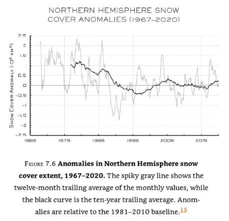
I broadened my thus far vain search by removing the “Arctic” specifier, which revealed:
No mention of “sea ice” in the body of the book, merely a reference to the data underlying this graph of northern hemisphere snow cover:
I am forced to an unsettling conclusion. Evidently there are some areas of climate science that Dr. Koonin tells his eager readers nothing whatsoever about. It seems likely that he is also well aware that Arctic sea ice is the canary in the climate coal mine, which is why he has chosen to make no mention of it in his magnum opus.
Here is an informative video which will no doubt not appear in “Unsettled – The Movie”:
[Edit – May 8th]
Having now had time to read some of Steve Koonin’s “Unsettled Climate Science” at greater length I have discovered that it does contain one reference to Arctic sea ice, albeit using non-standard terminology. On page 40 of the Kindle version of the book I read:
Rising temperatures at the surface and in the ocean are not the only indicators of recent warming. The ice on the Arctic Ocean and in mountain glaciers has been in decline, and growing seasons have been lengthening slightly. Satellite observations show that the lower atmosphere is warming as well.
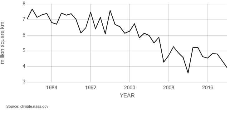
A paragraph I can broadly agree with, but I am compelled to ask why Dr. Koonin does not quantify the “decline of the ice on the Arctic Ocean” anywhere in the book? There are a wide variety of metrics used to quantify the “amount” of sea ice in the Arctic, but here is one readily available for download from the NASA web site. It is hard to believe that a scientist of Dr. Koonin’s experience, particularly one writing about climate change, has never previously come across a similar graph of Arctic sea ice extent:
Arctic sea ice reaches its minimum each September. September Arctic sea ice is now declining at a rate of 13.1 percent per decade, relative to the 1981 to 2010 average. This graph shows the average monthly Arctic sea ice extent each September since 1979, derived from satellite observations.
It seems safe to assume that Dr. Koonin has heard of NASA, since the organisation is mentioned several times in his list of references and once in the body of the book. However it seems that the United States’ National Snow and Ice Data Center (NSIDC for short) is not very visible on his personal radar screen, meriting only a single reference which is to snow rather than ice data.
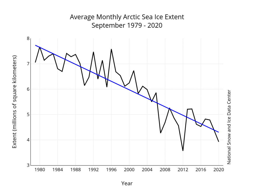
Here is the NSIDC’s version of the NASA graph above, which includes a handy trend line:
Monthly September ice extent for 1979 to 2020 shows a decline of 13.1 percent per decade.
Nearby Steve has penned another paragraph I can broadly agree with. On page 36 he states:
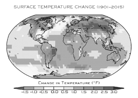
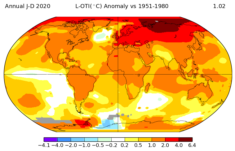
The warming of the past forty years on large scales hasn’t been uniform over the globe. That’s evident in Figure 1.5, reproduced from the US government’s 2017 CSSR (Climate Science Special Report, described earlier). As you can see, the land is warming more rapidly than the ocean surface, and the high latitudes near the poles are warming faster than the lower latitudes near the equator.
Here is the figure 1.5 referred to above:
Surface temperature change (in °F) for the period 1986–2015 relative to 1901–1960. Changes are generally significant over most land and ocean areas. Changes are not significant in parts of the North Atlantic Ocean, the South Pacific Ocean, and the southeastern United States. There is insufficient data in the Arctic Ocean and Antarctica to compute long-term changes there.
Once again I am compelled to ask some questions. Why not include a map that uses more recent data than 2015? And why not quantify how much faster the “high latitudes near the poles are warming than the lower latitudes near the equator”?
NASA helpfully provide an interface to their data which allows anybody who can click a mouse to produce their own global surface temperature maps. Here is the up to date answer to the first question:
NASA have also produced another informative video, which I suspect will also never make it into “Unsettled – The Movie”:
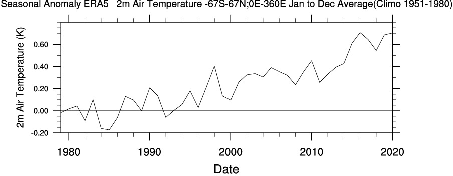
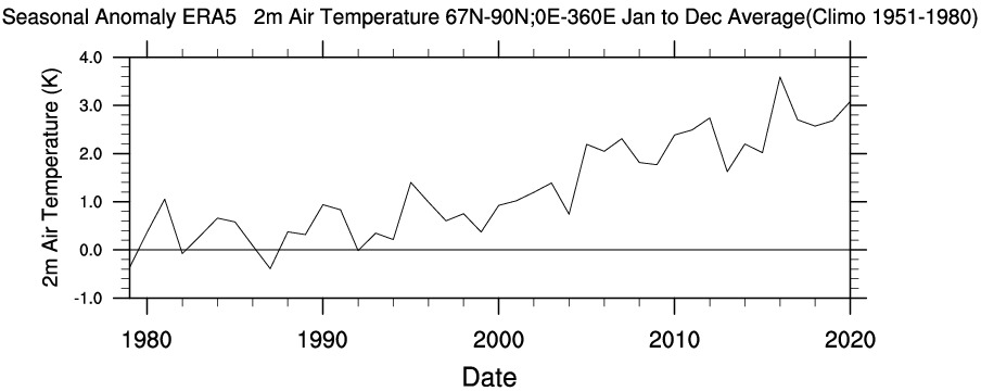
Another US scientific agency that provides publicly accessible climate data is the National Oceanic and Atmospheric Administration (NOAA for short). The abbreviation is referred to several times in Steve Koonin’s book, but for some reason he never expands the acronym in full. Like NASA they also provide a means to produce your own maps and time series. Albeit with a somewhat more complex user interface, the Web-based Reanalysis Intercomparison Tool (WRIT for short) allows the user to differentiate between different regions of Planet Earth, and hence answer the second question above.
Please compare and contrast the “non polar” temperature time series with the “Arctic” one. Note the change of scale of the X axis, and also the units. Degrees Kelvin rather than degrees Fahrenheit which are seemingly preferred by Dr. Koonin:
To summarise, you don’t need to wait for Steve Koonin to write another book or for the US government to produce another CSSR. Vast amounts of data and a plethora of visualisation tools are freely available to allow you to do your own research regarding a wide variety of climate metrics. Steve neglects to impart that information to his readers as well.
[Edit – May 9th]
As has been alluded to above, in the soon to be shipped hardcover edition of his new book Steve Koonin makes much mention of “snow cover” whilst ignoring “sea ice” entirely. There are also a grand total of 48 reference to the perhaps overly esoteric term “albedo“. On page 84 of the Kindle edition of “Unsettled” we are reliably informed that:
Among the most important things that a model has to get right are “feedbacks.”
Despite that the entire electronic volume makes no mention whatsoever of the phrase “ice-albedo feedback” or any synonym thereof. A brief course teaching the topic has recently been developed as part of the outreach activities of the MOSAiC Arctic drift expedition. Perhaps Dr. Koonin would be well advised to read it at his earliest convenience?
The ice-albedo feedback is an example of a positive feedback loop. A feedback loop is a cycle within a system that increases (positive) or decreases (negative) the effects on that system. In the Arctic, melting sea ice exposes more dark ocean (lower albedo), which in turn absorbs more heat and causes more ice to melt…the cycle continues.
Here’s another explanatory video which will also no doubt never make it into “Unsettled – The Movie”:
Watch this space for further revelations about the gigantic Arctic canary in the room!
Inspired by my recent visits to Judith Curry’s blog this post will bring you links to the latest learned journal articles about Arctic sea ice. Together with occasional excursions into older and wider Arctic papers.
Judith’s “Week in Review” articles seem to last for a month, so this one will probably last for at least a year!
First up is an article apparently written by a regular reader of this humble web site! A University of Alaska article at phys.org begins:
In August 2016 a massive storm on par with a Category 2 hurricane churned in the Arctic Ocean. The cyclone led to the third-lowest sea ice extent ever recorded. But what made the Great Arctic Cyclone of 2016 particularly appealing to scientists was the proximity of the Korean icebreaker Araon.
For the first time ever, scientists were able to see exactly what happens to the ocean and sea ice when a cyclone hits. University of Alaska Fairbanks researchers and their international colleagues recently published a new study showing that sea ice declined 5.7 times faster than normal during the storm. They were also able to prove that the rapid decline was driven by cyclone-triggered processes within the ocean.
Note that it didn’t take us 5 years to write about the cyclone in question. Our article catchily entitled “The Great Arctic Cyclone of 2016” was published on August 13th 2016:
A storm is brewing in the Arctic. A big one! The crew of the yacht Northabout are currently sailing along the western shore of the Laptev Sea and reported earlier today that “The sea is calm. Tomorrow a gale 8. But this moment is perfect”.
That perfect moment will not last long.
I interviewed polar explorer David Hempleman-Adams about the succeeding moments once Northabout had returned to the UK. It seems riding out the cyclone was the most frightening experience he had ever had.
The University of Alaska article references the following peer reviewed paper:
This website uses cookies to improve your experience. We'll assume you're ok with this, but you can opt-out if you wish. Cookie settingsACCEPT
Privacy & Cookies Policy
Privacy Overview
This website uses cookies to improve your experience while you navigate through the website. Out of these, the cookies that are categorized as necessary are stored on your browser as they are essential for the working of basic functionalities of the website. We also use third-party cookies that help us analyze and understand how you use this website. These cookies will be stored in your browser only with your consent. You also have the option to opt-out of these cookies. But opting out of some of these cookies may affect your browsing experience.
Necessary cookies are absolutely essential for the website to function properly. This category only includes cookies that ensures basic functionalities and security features of the website. These cookies do not store any personal information.
Any cookies that may not be particularly necessary for the website to function and is used specifically to collect user personal data via analytics, ads, other embedded contents are termed as non-necessary cookies. It is mandatory to procure user consent prior to running these cookies on your website.