Does Tony Heller Need To Be Prosecuted?

In some recent shock news over at the “Real Science” blog “Steven Goddard” asked “Who is Steven Goddard” and then answered himself as follows:

My name is Tony Heller. I am a whistle blower. I am an independent thinker who is considered a heretic by the orthodoxy on both sides of the climate debate.

I’m highly unorthodox, so I’ll consider him as a schizoidal cherry picking pseudo-skeptic instead. Steve/Tony finishes his “coming out” article as follows:

I am more than happy to debate anyone who feels up to the challenge, including the President of The United States. Science works through research and debate – not censorship, propaganda, faith, or intimidation.

Steve/Tony has been blogging about Arctic sea ice again recently. His most recent post is entitled “Does The Arctic Need To Be Prosecuted?“, but it seems he’s unwilling to engage in debate about that topic with me.

Them:

Some climate experts want to make skepticism of junk science a felony, and every day it becomes more clear that the Arctic has no respect for climate models or eminent government scientists. This is shocking, and it is time for the Arctic to be prosecuted. The Arctic is aiding and abetting climate deniers, as well as making obscene gestures towards the world’s leading academics.

DMI "new" Arctic sea ice extent graph on July 26th 2014

DMI “new” Arctic sea ice extent graph on July 26th 2014


Us:

Needless to say Steve/Tony has yet to approve my comment on his ruminations, which reads as follows:

2014-07-26_1314_RealScienceThis is what the Cryosphere Today graph of Arctic sea ice area I linked to looks like at the moment:

Cryosphere Today interactive Arctic sea ice area graph on July 26th 2014

This is what the NORSEX extent chart that Eliza linked to looks like this morning:

NORSEX SSM/I Arctic sea ice extent graph on July 26th 2014

Here’s another one for good measure, this time showing NSIDC Arctic sea ice extent:

NSIDC interactive Arctic sea ice extent graph on July 26th 2014

As far as I am aware there is no law against being a schizoidal cherry picking pseudo-skeptic in the United States of America, or anywhere else for that matter. Please feel free to comment below if you know otherwise and/or think that there should be!


Them:

After a protracted exchange on Twitter a copy of my comment eventually saw the light of day:


Us:

We’ll keep you posted!


Shock News! Murdoch Plagiarises David Rose Errors

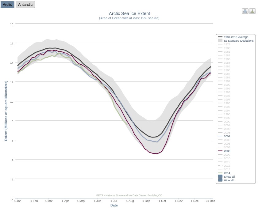
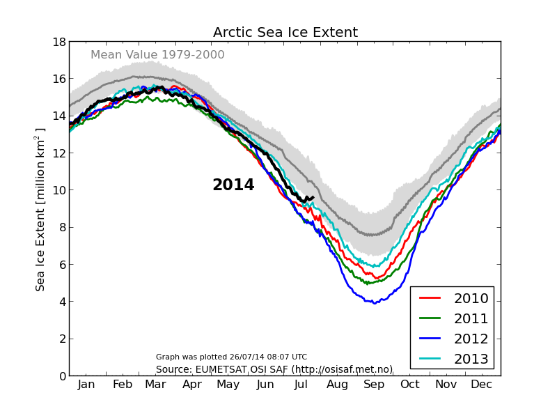
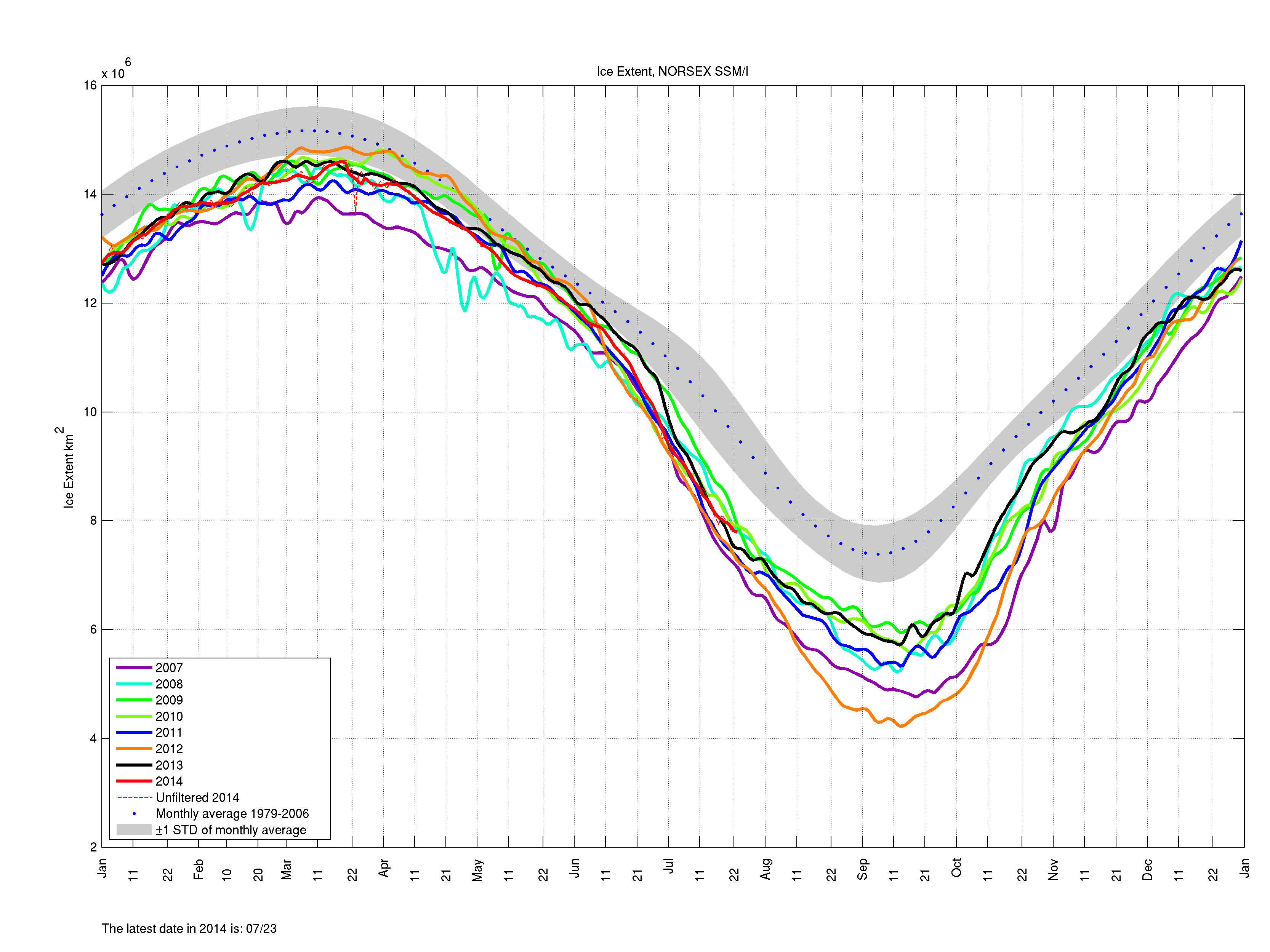
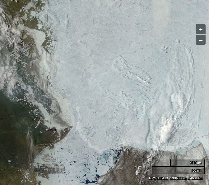
Regular readers may recall that on September 8th 2013 the Mail on Sunday published an article by David Rose claiming that the Arctic “Ice Sheet Grew 920,000 Square Miles in a Year“. That was not true, and after we complained to the UK Press Complaints Commission The Mail eventually published a “correction” of sorts.

On September 15th 2013 the Mail on Sunday published another article by David Rose entitled “Global warming is just HALF what we thought: World’s top climate scientists admit computers got the effects of greenhouse gases wrong”, which proudly displayed their erroneous headline from the previous week. The article contained many more errors,  some of which the United Kingdom’s Met Office highlighted on their official blog later the same day:

The article states that the Met Office’s ‘flagship’ model (referring to our Earth System Model known as HadGEM2-ES) is too sensitive to greenhouse gases and therefore overestimates the possible temperature changes we may see by 2100.

There is no scientific evidence to support this claim.

The Mail eventually “corrected” the article in their usual half hearted fashion, whilst simultaneously updating the title to read “Global warming is just QUARTER what we thought“, which doesn’t strike me as being an accurate use of the English language let alone scientifically accurate.

Meanwhile on September 16th 2013 on the other side of the planet Rupert Murdoch’s The Australian published an article written by Graham Lloyd entitled “We got it wrong on warming, says IPCC“, saying things like:

The Intergovernmental Panel on Climate Change’s latest assessment reportedly admits its computer drastically overestimated rising temperatures, and over the past 60 years the world has in fact been warming at half the rate claimed in the previous IPCC report in 2007. More importantly, according to reports in British and US media, the draft report appears to suggest global temperatures were less sensitive to rising levels of atmospheric carbon dioxide than was previously thought. The 2007 assessment report said the planet was warming at a rate of 0.2C every decade, but according to Britain’s The Daily Mail the draft update report says the true figure since 1951 has been 0.12C.

After a long drawn out enquiry the Australian Press Council has finally announced that in its view The Australian cannot justify publishing inaccurate scientific information by blaming David Rose and The Mail on Sunday. They state that:

The Press Council has considered a complaint about a number of items published in The Australian in September 2013, a week before the release of the Fifth Assessment Report of the Intergovernmental Panel on Climate Change (IPCC).

The Council has considered the complaint by reference to the following parts of its General Principles: “Publications should take reasonable steps to ensure reports are accurate, fair and balanced”; “relevant facts should not be misrepresented or suppressed”; and “Where it is established that a serious inaccuracy has been published, a publication should promptly correct the error, giving the correction due prominence.”

The Council has concluded that the erroneous claim about the revised warming rate was very serious, given the importance of the issue and of the need for accuracy (both of which were emphasised in the editorial that repeated the claim without qualification). Although based on another publication’s report, the claim was unequivocally asserted in The Australian headline, “We got it wrong on warming, says IPCC”, which also implied the IPCC had acknowledged the alleged error. The impression that the claim was correct was reinforced by The Australian saying the IPCC had been “forced to deny” that it was in crisis talks.

The Council considers rigorous steps should have been taken before giving such forceful and prominent credence to The Mail on Sunday’s claim. Accordingly, the complaint on that ground is upheld.

The Council welcomes the acknowledgements of error and expressions of regret which the publication eventually made to it. But they should have been made very much earlier, and made directly to the publication’s readers in a frank and specific manner. It is a matter of considerable concern that this approach was not adopted.

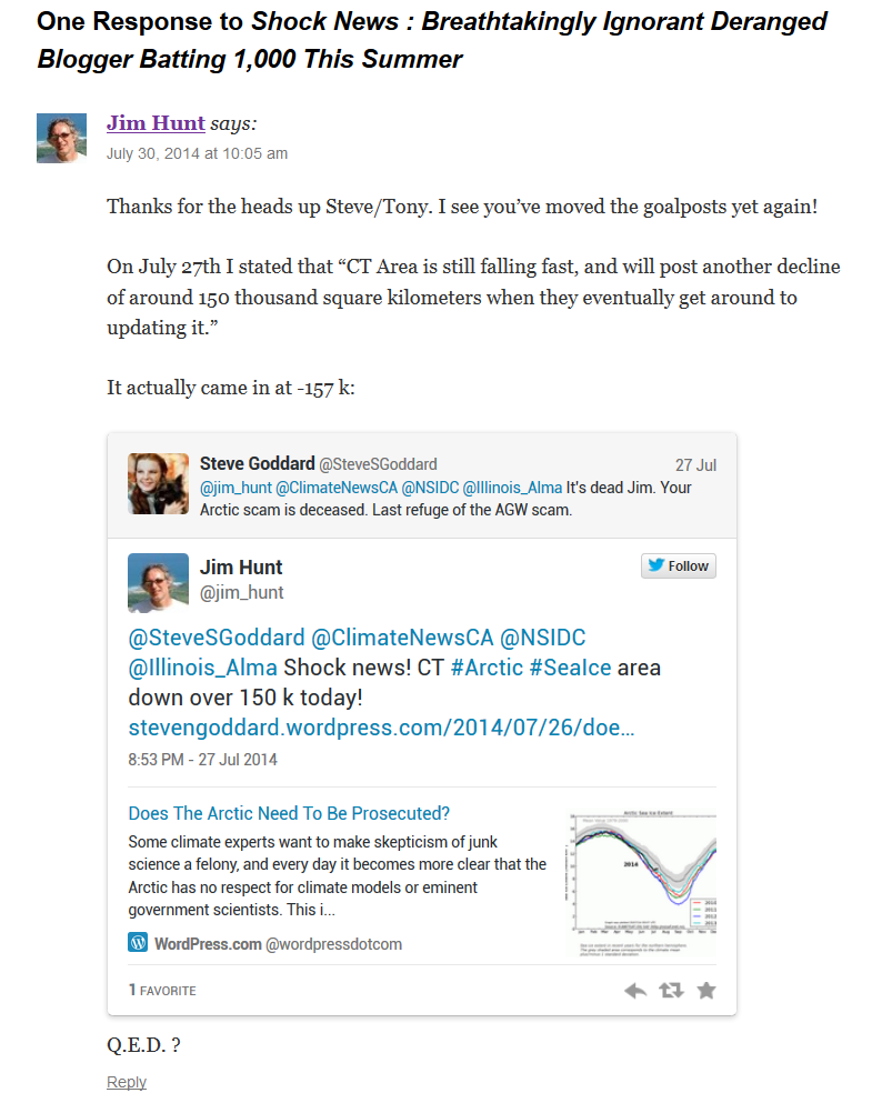
To summarise, don’t believe everything you read in The Daily Mail or The Australian, particularly if the words in question are written by or plagiarised from David Rose:


The Pseudo-Skeptics’ Worst Nightmare?

On June 17th 2014 the Danish Meteorological Institute (DMI for short) published a news article which said amongst other things (and translated from the original Danish) that:

On Tuesday, June 17, 2014 daily mean temperature of the Arctic area north of the 80th northern parallel rose above the melting point. Thus, the summer melting season in the central part of the Arctic Ocean has begun.

Here’s the DMI’s graph that is being referred to:

DMI daily mean temperature and climate north of the 80th northern parallel, on June 22nd 2014
DMI daily mean temperature and climatology north of the 80th northern parallel, on June 22nd 2014

The DMI’s news article continues:

This year’s onset of melting is 7 days later than usual and 2 weeks later than in 2012, when later in the season – in September – the sea ice shrank to the smallest area ever measured.

According to Rasmus Tonboe, one of the DMI’s sea ice experts from their Centre for Ocean and Ice:

There is a clear correlation between the start date of the melt season in June and the area of ​​the same year’s minimum ice coverage in September. When the season starts later than the year before, then extent in September is more than the year before – and vice versa. This applies in 4 out of 5 cases since 1972.

As you might expect the usual suspects have greeted this news item with unconcealed glee. According to Steven Goddard on his so called “Real Science” blog the news is the “Alarmists’ Worst Nightmare – They Have Already Lost 15% Of The Arctic Melt Season”:

Them:

The Sun has begun its descent towards winter, and the high Arctic melt season hasn’t started yet.

Us:

As is usual these days, Steve has neglected to publish my comment on his article, which reads as follows:

20140622-RealScience

By way of an explanation for my cryptic comment, Steve seems happy to ignore that fact that the graph shown above reveals that the metric under consideration was way above “average” for the entire 2013/14 Arctic sea ice freezing season, as we ourselves pointed out not so very long ago. 2014’s numbers have only been lagging behind “normal” since around day 130. Perhaps this will prove to be enough of a difference from Rasmus’s historical records such that the 2014 melting season will be one of the exceptions that proves his “4 out of 5 rule”?

As some sort of support for this theory we suggest you take a good long look at our regional Arctic sea ice extent breakdown and our ice mass balance buoy overview. The sea ice extent in the Central Arctic Basin is currently much the same as last year, with barely any visible reduction in extent as yet. However in important areas for the overall Arctic sea ice extent in September, such as the Laptev and Beaufort Seas, the melt in 2014 is way ahead of 2013. In the former case the melt is even ahead of 2012 at the same time of year.

Do you suppose that Steve will be able to spot the difference between these two satellite images, taken one year apart?

NASA Worldview “true-color” image of the Beaufort Sea on June 21st 2014, derived from bands 1, 4 and 3 of the MODIS sensor on the Aqua satellite
NASA Worldview “true-color” image of the Beaufort Sea on June 21st 2013, derived from bands 1, 4 and 3 of the MODIS sensor on the Terra satellite


We’ll keep you posted!

Forecasting Sea Ice Extent in the Dark

My title today refers to the fact that the summer Arctic sea ice forecasting season is with us once again. The ARCUS Sea Ice Outlook (SIO for short) started in 2008, with the aim of gathering together and publishing “community predictions of the September sea ice extent”.  The SIO is now part of the recently created Sea Ice Prediction Network, and the deadline for submission for the first set of forecasts of 2014 was June 10th.

I have a professional interest in UK and international energy policy, and as a consequence I have been commenting on the recent attempts of  Professor Richard Tol to debunk the so called “97% climate change consensus” elsewhere in the blogosphere. As luck would have it I allowed myself to become engaged in what was supposedly a conversation about that very topic on the What’s Up With That blog.  Feel free to read all about it if you’d like to see a pseudo-skeptical gish gallop in full swing:


Whilst over there I couldn’t help but notice that Anthony Watts had left things until the eleventh hour before asking his faithful followers to contribute to the Sea Ice Outlook June survey. I also couldn’t help but notice that despite assurances to the contrary a few short weeks ago (and even after my recent “extra heads up“!)  the  WUWT “Sea Ice Reference Page” is still sadly lacking in a wide range of  information about Arctic sea ice thickness and volume. Consequently I figured I would be performing a valuable public service by bringing this to the attention of Anthony and his readers. Here’s what happened after that:

Us:

2014-06-10_1654_WUWT

Them:

June 10, 2014 at 8:55 am

[snip no, we are not going to have you thread-jack again by pushing your own website and own views – Anthony]

Us:

June 10, 2014 at 9:32 am

Re: @Anthony says: June 10, 2014 at 8:55 am
It’s not my “own views” Anthony. In fact it’s a long list of useful facts and figures for anybody attempting to forecast the future of Arctic sea ice. A long list of useful information still noticeable only by its absence from the WUWT sea ice reference page.
 

Them:

REPLY: We aren’t forecasting volume, we are forecasting extent, so again, your views that we should pay attention to volume graphs on your website (your favorite hobby horse) in this extent forecasting exercise are irrelevant. Don’t clutter up this thread further – Anthony.

Them & Us:


Them:

In the absence of a wide range of scientific information concerning the current thickness distribution of sea ice in the Arctic, and after due deliberation about the likely value of the NSIDC Arctic sea ice extent metric in September 2014, Anthony concluded:

A value of 6.12 million sq km will be sent to ARCUS.

Us:

We’ll keep you posted!


Debating skeptics is like mud wrestling with pigs

In an article entitled “Exeter University Prof: ‘Debating skeptics is like mud wrestling with pigs’” a guest poster on the “Watts Up With That” blog quotes my fellow Exonian Dr. Stephan Harrison of Exeter University, whilst simultaneously managing to misspell his name:

Them:

Dr Harrison [was] asked about climate skeptics and he goes on to say that they are not worth debating their viewpoint as it’s “like mud wrestling with pigs. Firstly you get covered in mud and secondly, the pig loves it” he then goes on to say he won’t debate skeptics because geographers don’t debate with people who think the world is flat and biologists don’t debate with people who think evolution isn’t happening or that the world is only 6000 years old.

Us:

Fresh from indulging in some “mud wrestling” with Anthony Watts myself, I felt compelled to contribute my own two new pence worth to the ongoing “debate”:

I don’t know if this counts as “mud wrestling with pigs” but here at WUWT seems to be no place to “engage in a fair public debate”. By way of example see:

http://wattsupwiththat.com/2014/04/09/study-wuwt-near-the-center-of-the-climate-blogosphere/#comment-1611483

et seq.

Them:

Your comment is so cryptic it is worthy of Mosher. Whatever your comment/link means, I don’t understand it.


Us:

A recent screenshot of some mud being flung at WUWT:

2014-04-29_1557_WUWT


Them:

Jim,

After reading your comment on WUWT, it looks like you thought the moderator who snipped your comment was me. It wasn’t.

In fact, I made the moderator’s comment under the comment you made on April 12, 2014 at 10:25 am on the ‘Study: WUWT near the center of the climate blogosphere‘ thread.

I don’t like it when an anonymous moderator snips a comment without a good reason. In your case it was done improperly. I am sorry about that.

Sincerely,


Us:

Thanks for your note. I previously hadn’t the faintest inkling that you are one of the moderators at WUWT, let alone a senior one. It did however seem to me that your comment on the “Mud wrestling” thread deserved to be balanced by recounting my own recent experience on the “Study” thread.

That said, my riposte to GreggB’s long list of wholly unjustified accusations remains “snipped”, and my request for Anthony to reveal his sources remains unanswered, so I remain an unhappy bunny!

Best wishes,

Jim


Them:

We’ll keep you posted!

“Real Science” Censorship – Episode 2

After having a brush with the “Real Science” censor last month I’ve really gone and done it now. Steven Goddard’s blog has been badmouthing Al Gore recently. I’m afraid I couldn’t let that slight on Al’s predictive abilities go unchallenged. Steve evidently didn’t care for my suggestion that he “is fond of poetic license”, so my alter ego is “now spam” there too:

I’ve cut out much of the gratuitous abuse in the ensuing conversation, but you can peruse an archived version if you so desire. Note amongst other things that Al Gore never mentioned “16 foot thick ice in the Beaufort Sea”. Here are the expurgated highlights:

Them:

Nobel Peace Prize Laureate Al Gore says that the 16 foot thick ice in the Beaufort Sea will all melt in the next few weeks.

http://www.examiner.com/article/gore-arctic-ocean-ice-free-as-early-as-2014

Us:

“Some of the models suggest that there is a 75 percent chance that the entire north polar ice cap during some of the summer months will be completely ice-free within the next five to seven years,” Gore said in 2009.

There’s still plenty of time left for some of the models to be proved 75% correct!


Them:

“Some models suggest.” I love that – so very scientific. Some do, others don’t.


Us:

I realise Steve is fond of poetic license, but my point is that in the article Steve references Al Gore did not “predict an ice free Arctic in 2014″. He didn’t even “predict an ice free Arctic by 2016 at the latest”


Them:

I have warned you numerous times about lying about me. This is your last warning
http://www.examiner.com/article/gore-arctic-ocean-ice-free-as-early-as-2014


Us:

Steve – My Gore quote from April 15, 2014 at 10:41 am is cut/pasted from the article you just linked to. Here’s another quote from the same article, presumably a journalist’s interpretation of Gore’s words:
“Today at the U.N. climate conference in Copenhagen, Al Gore said there is new computer modeling that suggests the Arctic Ocean may be nearly ice-free in the summertime as early as 2014.”


Them:

“Some of the models suggest that there is a 75 percent chance that the entire north polar ice cap during some of the summer months will be completely ice-free within the next five to seven years,” Gore said.
Attack Gore for being an idiot. Not me for reporting on it.


Us:

Unpublished comment on Steven Goddard's "Real Science" blog from Wednesday April 16th at 12:55 UTC
Unpublished comment on the “Real Science” blog from Wednesday April 16th at 12:55 UTC


Them:

They have so far neglected to publish the above comment.


Us:

We’ll keep you posted!

North Pole Webcam Begins Transmissions

Construction of Ice Camp Barneo 2014 began close to the North Pole at the beginning of April, and now the first scientific data has started flowing  from the sea ice near the Pole. The first of three webcams has been successfully  installed on the ice, and the slightly noisy initial images are available from the North Pole Environmental Observatory 2014 web site:

NPEO webcam 1 image from April 14th 2014

Data is now also arriving from ice mass balance buoy 2014E, which as you can see if you click on the pushpins on the map below, has been drifting at the rate of 16 km / day during its brief lifetime on the Arctic sea ice so far:

Here’s the initial temperature profile for 2014E:

Temperature profiles for ice mass balance buoy 2014E from April to May 2014At present the ice on the floe is 1.7 m thick, covered with 19 cm of snow. As you can see, temperatures were a touch chilly when the buoy was installed on April 12th, at around -32 degrees Celsius. A variety of expeditions have already set off from Barneo in various directions. Expedition Hope are heading in the direction of Cape Discovery on Ellesmere Island, and here Bernice Nootenboom illustrates the effects of such low temperatures on the human body:

Bernice Nootenboom near the North Pole. Photo: Martin Hartley

You can also view data from IMB 2014E and the other active ice mass balance buoys on our IMB overview page.


New Arctic Sea Ice Resources

Stung by some unusually constructive criticism from Anthony Watts we have (somewhat hurriedly) added several new pages to the Great White Con “Resources” section of this web site. They contain the sort of information that is rather tricky to update automatically on a daily basis, and concentrate on resources that help the interested searcher after truth get a handle on the thickness and hence volume of the sea ice in the Arctic, on a regional as well as pan Arctic scale.

The first section is entitled “Arctic Sea Ice Graphs“, and here’s an example of one graph which reveals the ice volume in various regions of the Arctic, based on the output of the PIOMAS model:

PIOMAS regional volume breakdown for March 2014

[Graph by Chris Reynolds on the Dosbat blog]

The second section is entitled “Ice Mass Balance Buoys“. As the name hopefully suggests, this section displays data reported by the Cold Regions Research and Engineering Laboratory’s currently active ice mass balance buoys in a variety of novel formats. These buoys are deployed on a regular basis at selected locations across the Arctic, and report on a number of different parameters including snow depth, ice thickness and temperature. By way of example here’s a couple of reports from IMB 2013F, which was originally deployed last August on what was then classified as “first year” ice in the Beaufort Sea. First of all here’s the Google Maps/Earth view that reveals how the buoy has moved around the Arctic since then, and shows how clicking on one of the “pushpins” reveals the values of a variety of interesting metrics on a daily basis:

Google map of the movement of IMB 2013F

As you can see, last August the thickness of the ice floe that the buoy is located upon was 1.4 metres thick. If you click through to the live map and experiment you will discover, amongst a variety of other things, that the ice under the buoy is now 1.68 meters thick, with an additional 49 cm of snow on top of that.

A second set of images shows graphs revealing the temperature above, below and within the ice, currently on a monthly basis:

2013F-Temp-20140401

Click on the graph to view a larger version. This one requires a certain amount of interpretation, but the first thing to note is that the numbers across the top represent the position of thermistors spaced 10 cm apart on a pole that is mounted vertically through the ice floe. Number 1 is in the air above the floe, the rightmost side of the graph (number 26 in this case) is in the water below the ice floe, and somewhere in between those extremes the temperature sensors can also be in the midst of either ice or snow.

At the end of March the interface between ice and snow in this case was somewhere between sensors 8 and 9, and hence at a temperature of around – 7 degrees Celsius, by which time the buoy had moved from the Canadian waters where it started into the area of the Beaufort Sea north of Alaska.

For further discussion about the interpretation of our new resources please use the comment section on the “About Our Arctic Sea Ice Resources” page. For technical observations and suggestions for improvements feel free to comment below!


Snow White is Actually a “Cowardly Cross Dresser”!

In order to avoid the malicious “spammer” label attached to me by Steven Goddard of “Real Science” fame many moons ago I have been using the nom de guerre “Snow White” in skeptical circles for a while. Unfortunately my pseudonimity didn’t stand a chance against the laser sharp investigative skills of Anthony Watts. My embarrassment is now archived in the public record, plain for all to see:

An extract from the "WUWT near the center of the climate blogosphere"
An extract from the “WUWT near the center of the climate blogosphere” thread on the “Watts Up With That” blog on April 9, 2014 at 2:01 pm

A commenter at “Watts Up With That” then piled on the scorn:

"Snow White"  is revealed as a "Cowardly Cross dresser", for all the world to see.
“Snow White” is revealed as a “Cowardly cross dresser”, for all the world to see.

The thing is though, that in the process of so skilfully “outing” Snow White Anthony kindly pointed his loyal readers in the direction of our humble “Resources” section and our videos, so I suppose we’ll have to tart them all up a bit now!


The Arctic Sea Ice “Recovery” Vanishes Even More

Whilst a variety of climate change “skeptics” have been pointing out recently that the April 2014 edition of the National Snow and Ice Data Center’s Arctic Sea Ice News mentioned that:

A large area of the multiyear ice has drifted to the southern Beaufort Sea and East Siberian Sea

which led said skeptics to claim things like:

There is a lot of thick ice in the western Arctic, which will be difficult to melt this summer.

they glossed over the bit where the NSIDC added:

Where warm conditions are likely to exist later in the year.

In fact conditions have been very warm (relatively speaking!) in the Arctic for all of 2014 so far. The DMI daily mean temperature of the Arctic area north of the 80th northern parallel has never dropped below the long term average all winter:

DMI mean temperature north of the 80th northern parallel, on April 8th 2014

and the surface air temperature anomaly chart for the Arctic for the first three months of 2014 looks like this:

Surface air temperature anomaly plot for January to March 2014
Arctic surface air temperature anomaly plot for January to March 2014

Those anomalously warm temperatures may well have something to do with the fact that the latest PIOMAS Arctic sea ice volume estimates which have just been released reveal this:

PIOMAS arctic sea ice volume on March 31st from 1979-2014

As you can see, according to the PIOMAS model at least, Arctic sea ice volume has now reached the second lowest level for the date since the satellite record began.

Whilst the skeptics have been complaining about the amount of ice on the Great Lakes of North America they seem to have somehow failed to notice the anomalously low coverage of snow over Siberia. Here’s the surface air temperature anomaly forecast for the northern hemisphere tomorrow:

GFS 2m temperature anomaly forecast for 09:00 UTC on April 9th 2014

Do you see the bright red patch over the coast of the Laptev Sea, indicating temperatures 20 degrees Celsius above normal? Now take a look at a similar chart, but of the surface air temperatures themselves:

GFS 2m temperature forecast for 09:00 UTC on April 9th 2014

That reveals that the temperatures over the edge of the Laptev Sea are forecast to be above the freezing point of fresh water tomorrow. Just in case you’re wondering what the shores of the Laptev Sea look like at the moment, here’s a picture we recorded earlier today, courtesy of NASA Worldview and the MODIS sensor on the Aqua satellite:

The Laptev Sea as seen by the Aqua satellite on April 8th 2014

What do you suppose the same area will look like in a day or two’s time, or in a month or two’s time for that matter?