Tag Archives: Paul Homewood

“Steve Goddard” Busted

Our headline today is inspired by Tony Heller, probably still better known by his nom de guerre “Steven Goddard”, who excitedly tells the world:

NSIDC Busted!

Reader Chris71 has discovered the smoking gun on the NSIDC web site. Read on.

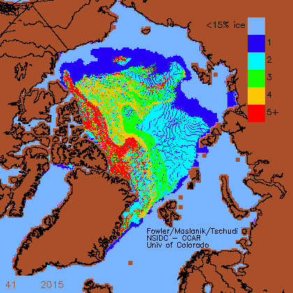
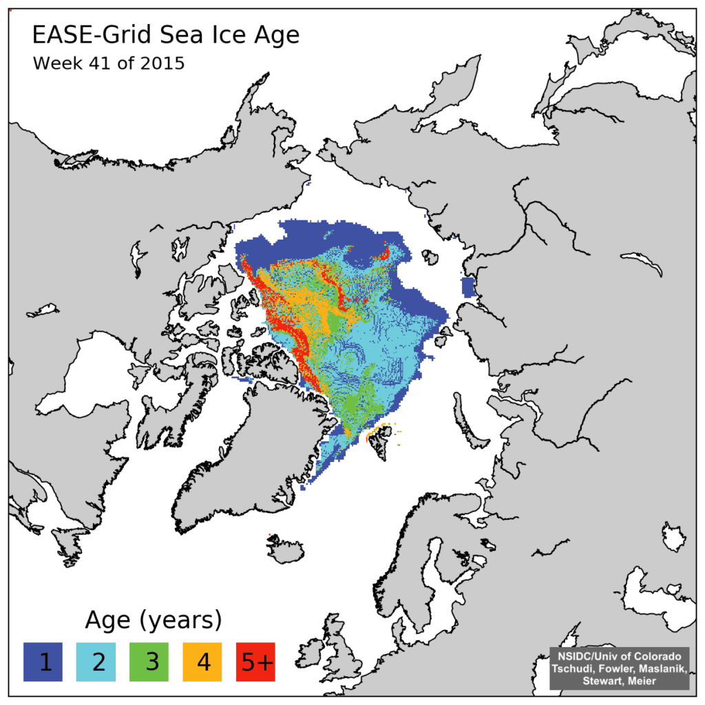
A few weeks ago, NSIDC put out this press release, claiming that 5+ year old ice is at its smallest level on record.

The press release included the map below. This is a new style map which they just started in week 39 2015. The map below is for week 41 2015. All of their previous 1984-2015 maps have been deleted from their archive.

iceage_browse_week_n_2015_41-1024x1024

The good news is that Chris found one of their old style maps which had not been scrubbed from their website. NSIDC has deleted the original graphs, but seem to have forgotten to get rid of the copy.

iceage-2015-41

For some strange reason “Steve” neglects to mention this text that accompanied the “old style map” he so proudly displays:

Here are some graphs from the Arctic – automatically saved here, and some of them archived Enjoy! Fred aka DungeonMaster on http://forum.arctic-sea-ice.net/.

Have I got news for Chris and “Steve”? Indeed I have! If one were to bother to go to the relevant section of the NSIDC web site instead of inventing bizzare fairy tales one would be able to read this:

EASE-Grid Sea Ice Age, Version 3

This data set provides weekly estimates of sea ice age for the Arctic Ocean from remotely sensed sea ice motion and sea ice extent.

The input ice motion data used for this data set is now derived from NSIDC-0116 Version 3 data.

Checking out the detailed information provided about the NSIDC-0116 Polar Pathfinder Daily 25 km EASE-Grid Sea Ice Motion Vectors, Version 3 would also reveal:

Version 3 – February 2016.

  • Eliminated unrealistic AVHRR and IABP buoy velocities

  • Extended buoy ice motion estimates to the present

  • Improved browse images

  • Reprocessed SSMI fields using GDAL map transformations on the DMSP SSM/I-SSMIS

  • Daily Polar Gridded Brightness Temperatures Data Set, NSIDC-0001.

  • Used Ice concentration estimates greater than 15 percent from the Sea Ice Concentrations from Nimbus-7 SMMR and DMSP SSM/I-SSMIS Passive Microwave Data Set, NSIDC-0051, to indicate where ice extent is present.

Checking out the detailed information provided about the NSIDC-0611 EASE-Grid Sea Ice Age, Version 3 would further reveal:

The sea ice age data in these files are derived using data from satellite passive microwave instruments, drifting buoys, and a weather model. With these data sources, the formation, movement, and disappearance of sea ice can be observed; and these observations can, in turn, be used to estimate ice age (Maslanik et al. 2007). The ice age data are derived from a number of passive microwave imagers: the Scanning Multichannel Microwave Radiometer (SMMR), the Special Sensor Microwave/Imager (SSM/I), and the Special Sensor Microwave Imager Sounder (SSMIS). Visible and infrared data from the Advanced Very High Resolution Radiometer (AVHRR) were also utilized through 2004. In addition, International Arctic Buoy Program (IABP) drifting-buoy vectors and the National Centers for Environmental Prediction (NCEP)/National Center for Atmospheric Research (NCAR) Reanalysis Project (CDAS) are used to augment the satellite data (Tschudi 2010).

Version 3 – April 2016.

So there you have it “Steve”. Thanks to the sterling (albeit uncredited!) efforts of the all volunteer members of the Arctic Sea Ice Forum and the (presumably still paid?) scientists at the National Snow and Ice Data Center you can now explain the truth, the whole truth, and nothing but the truth of the matter to your own loyal readers.

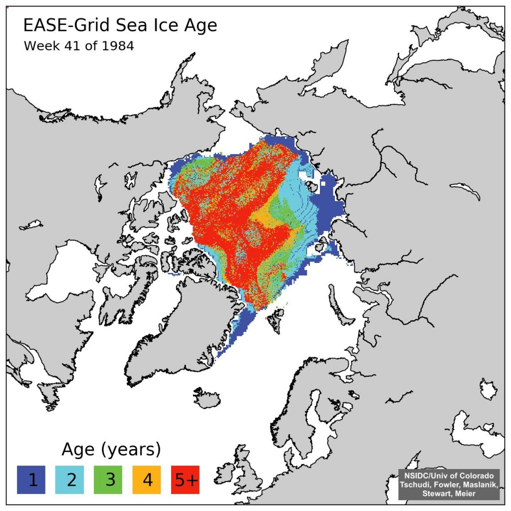
A few weeks ago the NSIDC upgraded their sea ice age product from version 2 to version 3. Here’s what the latest version of 1984 week 41 looks like:

iceage.week.1984.41.n.v3

Can you spot the difference Tony?

[Edit – May 1st 2016]

In partial answer to a question posed below, here’s an animation of Arctic sea ice age from September 2010 to May 2015. Can you see what has happened to the old ice Tony?


Original Arctic sea ice age images from: Tschudi, M., C. Fowler, J. Maslanik, J. S. Stewart, and W. Meier. 2016. EASE-Grid Sea Ice Age, Boulder, Colorado USA: NASA National Snow and Ice Data Center Distributed Active Archive Center. http://dx.doi.org/10.5067/PFSVFZA9Y85G.

[Edit – May 30th 2016]

Here’s a “Storified” summary of my Twitter “debate” with Tony Heller and Patrick Moore:

More Of The Usual Hype About Arctic Sea Ice

No sooner has one of the usual suspects claimed that “Arctic Sea Ice Holds Firm” than a few more jump on the same bandwagon. The Global Warming Policy Forum have republished almost the whole of an article penned by our old friend Paul Homewood entitled “More Of The Usual Hype About Arctic Ice“. According to Paul (and Benny):

Far from collapsing, Arctic sea ice area has been remarkably stable in the last decade

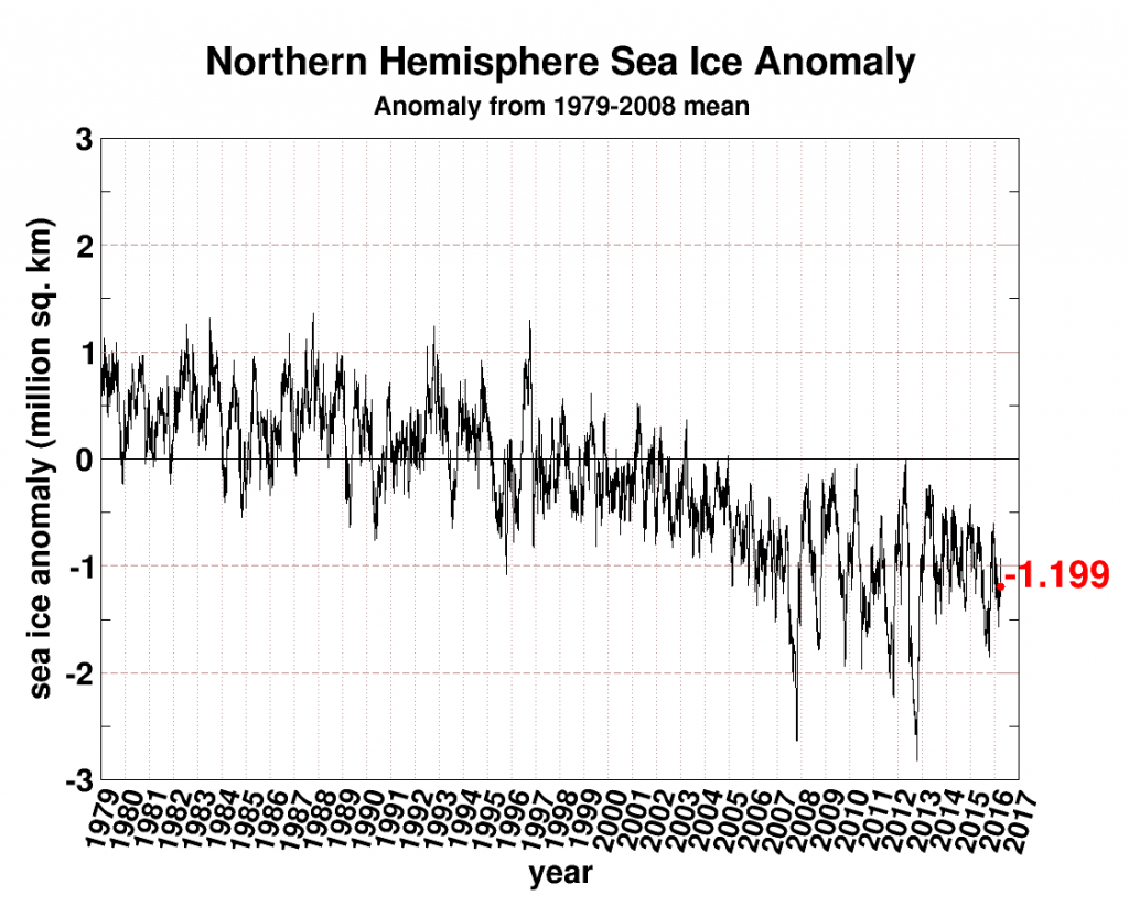
He illustrates his point using a slightly different version of the Cryosphere Today Arctic sea ice area anomaly graph employed by Andrew Montford on March 29th. Here’s the latest version:

seaice-anomaly-20160403

For some strange reason Paul (and Benny) neglect to mention that the current anomaly of -1.199 million square kilometers is the most negative it has ever been for the day of the year in the entirety of the Cryosphere Today record going back to 1979. They also neglect to mention that the CT anomaly is typically much larger in summer than in winter, and that despite that fact the CT anomaly never fell as low as -1.199 at any time of year until 2006.

Make sure to follow the first link above for much more on anomalously misleading area graphs. However Paul (and Benny) are not content with just one misleading interpretation of an anomaly graph. The article continues:

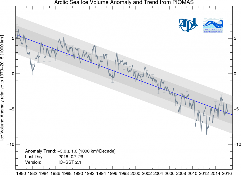
With multi year ice continuing to recover from 2008 lows, ice volume has also been growing in the last few years.

BPIOMASIceVolumeAnomaly-201602

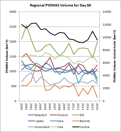
Whilst we all eagerly await the release of the PIOMAS Arctic sea ice volume numbers for March 2016, here is an alternative visualisation of the data from Chris Reynolds:

Reg-Vol-Feb16

Volume is the second lowest on record [for February] since 1978 at 20.660 thousand km cubed

In the Central Arctic, where it matters most, sea ice volume at the end of February was only a whisker above where it was in 2012, according to PIOMAS at least. For those with short memories the CT Arctic sea ice area metric reached an *all time low of 2.23401 million square kilometers on September 13th 2012, and an *all time low anomaly of -2.81817 million square kilometers on October 14th 2012.

*Since the Cryosphere Today records began

DMIGate Skulduggery In a Nutshell

With apologies to O’Reilly Media Inc. here’s a brief history of the “DMIGate” story, viewed through Anthony Watts’ distorting spectacle lenses.

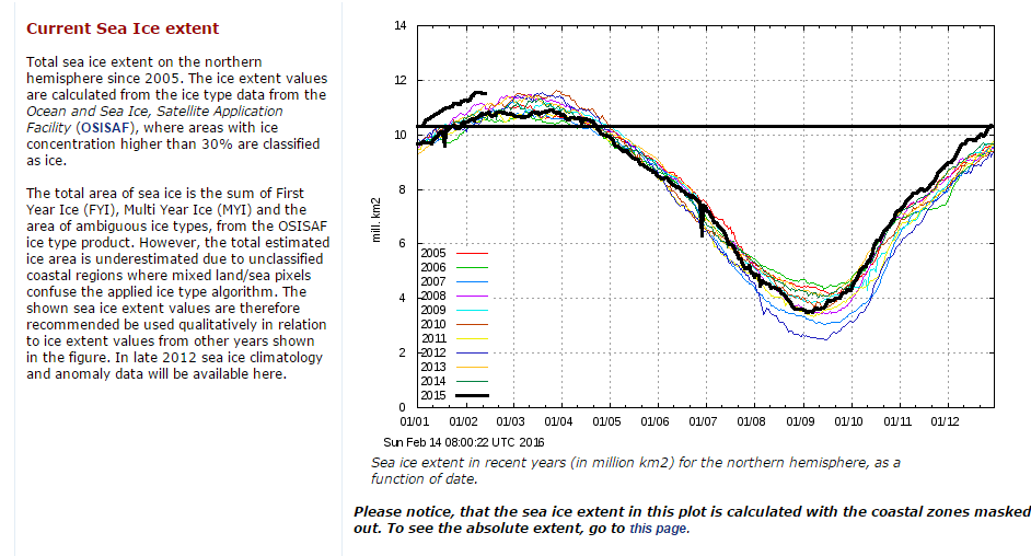
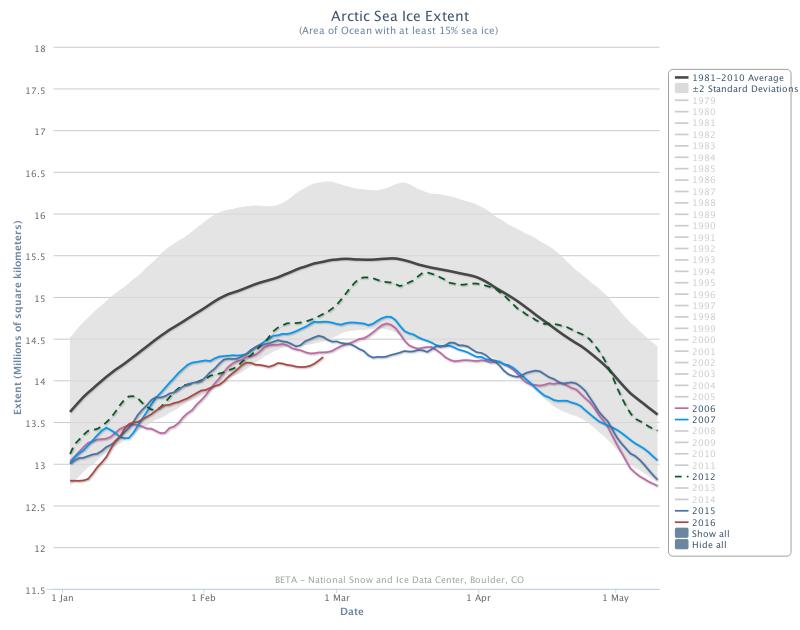
0) Here is the February 14th 2016 edition of the Danish Meteorological Institutes’s long “deprecated” 30% concentration threshold Arctic sea ice extent graph in question:

dmi-30-WUWT-20160214-crop

1) On August 14th 2013 Anthony Watts wrote on his “Watts Up With That” blog:

That’s the old DMI plot, which DMI says we should now use this one on this page:
http://ocean.dmi.dk/arctic/icecover.uk.php

2) On February 22nd 2016 Anthony Watts wrote on WUWT:

There has been so much skulduggery going on in the climate establishment in recent years that it is hard to avoid the conclusion that this graph has been withdrawn simply because it gives the “wrong” results.

3) Anthony Watts refuses to publish any and all comments on his blog pointing out what he himself had confirmed that DMI said in August 2013.

4) Anthony Watts states on Judith Curry’s “Climate Etc.” blog that:

You post off topic or disrupt threads with the sort of unsubstantiated nonsense you post above, and both demand to have these off topic comments heard and then play the “look Watts is censoring me!” game when your comments don’t meet our site comment policy and/or are abusive in nature.

5) Judith Curry deletes the following comment (amongst others) on her “Climate Etc.” blog:

David – Are you suffering from acute snow blindness too, just like poor Paul Homewood? Try reading this if you haven’t already. Try reading it again if you have:

https://greatWhiteCon.info/2016/02/gross-deception-about-dmis-missing-graph/

In view of the incontrovertible evidence why would anyone believe anything Paul Homewood, Anthony Watts and Judith Curry claim about “Climate Etc.” ever again?

Gross Deception About MASIE and the Sea Ice Index

Our title for today is a reference back to a 2015 article by Paul Homewood on his “Not A Lot Of People Know That” blog, in which he told a load of old porky pies about the National Snow and Ice Data Center’s graphs of Arctic sea ice extent. Only last week Mr. Homewood cooked up another pile of porky pies concerning the Danish Meteorolical Institute’s Arctic sea ice extent metric. Now he has turned his pie baking skills to the Multisensor Analyzed Sea Ice Extent (MASIE for short), which is “a prototype collaborative product of the National Ice Center and NSIDC”.

Mr. Homewood obviously hadn’t done a whole lot of homework on MASIE before firing up his porky pie production line, since he used the self same recipe posted on the so called “Science Matters” blog of Ron Clutz shortly before. In fact he just reprinted the first part of Ron’s article and added a handy link to Ron’s even bigger pile of porky pies beneath it. Hence both Paul and Ron’s web sites currently proudly proclaim that:

Something strange is happening in the reporting of sea ice extents in the Arctic. I am not suggesting that “Something is rotten in the state of Denmark.” That issue about a Danish graph seems to be subsiding, though there are unresolved questions. What if the 30% DMI graph is overestimating and the 15% DMI graph is underestimating?

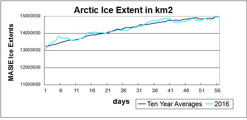
The MASIE record from NIC shows an average year in progress, with new highs occurring well above the 2015 maximum:

Clutz-masie-2016-to-day-56r

While I am compelled to agree with Ron and Paul that “something strange is happening in the reporting of sea ice extents in the Arctic” we disagree about everything else! One reason for that is because only a few days ago I interviewed NASA scientist Walt Meier following a suggestion by Ron Clutz that I do precisely that. Please read the edited highlights of that interview, and note in addition that Walt assured me that he had not previously been contacted by either of Messrs. Clutz and Homewood. Having never previously contacted Mr. Meier, here’s what Ron Clutz would have his loyal readership believe this weekend:

NOAA Is Losing Arctic Ice

Why the Discrepancy between SII and MASIE?

The issue also concerns Walter Meier who is in charge of SII, and as a true scientist, he is looking to get the best measurements possible. He and several colleagues compared SII and MASIE and published their findings last October. The purpose of the analysis was stated thus:

Our comparison is not meant to be an extensive validation of either product, but to illustrate as guidance for future use how the two products behave in different regimes.

Here is what Dr. Meier’s peer reviewed paper from October last year concluded on the matter:

Operational modelers require timely data that are as accurate as possible to initialize forecast models. In particular, an accurate ice edge is important because of the influence of the interaction of sea ice and water with the overlying atmosphere on the model fluxes. Consistency of data is also desirable for operational models, but is a secondary concern because the models are regularly reinitialized for their synoptic forecasts. Operational observations like MASIE make the most sense for these applications. However, the quality and amount of information used to produce the operational analyses vary.

Climate modelers desire consistent long-term data to minimize model biases and better understand and potentially improve model physics. The passive microwave record is useful, but has limitations. Regions of thin ice are underestimated and if the ice cover is diffuse with low concentration, ice-covered regions may be detected as open water. Even thin ice modifies heat and moisture transfer and thus may affect atmospheric and oceanic coupling. Surface melt results in an underestimation of concentration. This should be considered when evaluating model concentrations with passive microwave data.

and here once again is what he told me a few short days ago:

Since the quantity and quality of [MASIE] data varies the time series will not be consistent over time.

For some strange reasom Mr. Clutz’s article mentions none of this. Needless to say I have attempted to bring this unfortunate oversight to the attention of Ron & Paul:

2016-02-28_1007-RonClutz

Even more unfortunately it seems that their joint acute snow blindness has got even worse over the last few days, since they still haven’t noticed my link to Walt Meier’s words waiting patiently in their WordPress.com “moderation queues”.

Whilst we wish them on their recovery from their painful ailment, here’s an alternative interpretation of the MASIE data:

MASIE-Min

Operational modellers for the use of! Here’s what the NSIDC’s Sea Ice Index currently reveals to climate scientists:

Charctic-20160226

NSIDC Arctic sea ice extent is evidently still currently lowest *ever for the date.

Watts Up With DMI Arctic Sea Ice Extent?

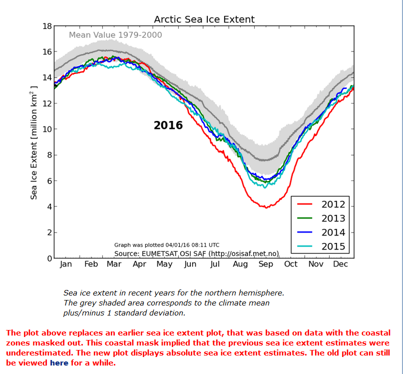
When I pose that question I’m not referring to the Danish Meteorological Institute’s long “deprecated” 30% concentration threshold Arctic sea ice extent metric so much as the reaction to its demise amongst the more “skeptical” of we cryospheric bloggers. Here once again is the “controversial” graph in question, archived from the start of the year:

DMI-15-2016-01-04

No sooner had Paul Homewood moved on from that topic to finally reproduce on his blog an NSIDC Arctic sea ice graph I first brought to his attention last spring than across the Atlantic in the good ‘ol US of A a certain Mr. Anthony Watts suddenly loudly proclaims that he “tends to agree” with Mr. Homewood’s assertion that:

There has been so much skulduggery going on in the climate establishment in recent years that it is hard to avoid the conclusion that this graph has been withdrawn simply because it gives the “wrong” results.

Given the actual facts of the matter this is peculiar enough, but then things get positively surreal. Regular readers will realise that up here in the penthouse suite at the pinnacle of the tallest of the Great White Con Ivory Towers we pride ourselves on our surreal sensibilities. Today though, we are forced to admit that WUWT has beaten us at our own game. Whilst we were conducting a perfectly sane interview with one of the world’s top sea ice scientists Tony was concocting these perfectly formed surrealist fantasies.

In his update 1 to this already nonsensical story Anthony assures us that:

The typical haters, such as Neven Acropolis, are making claims in comments that I see this as some sort of “conspiracy”. I do not and any such claim is false and political in nature.

Mr. Watts is evidently a big fan of William Burroughs, and has used his celebrated “cut-up” technique to transform “Skulduggery going on in the climate establishment” into “magnets cued she got on the inimitably ginger skull” which is obviously not even slightly conspiratorial.

Let’s move swiftly on to update 2, wherein we are told:

DMI has an entire page dedicated to the use of the 30% concentration value that is still operational!

However if you read the small print on Anthony’s accompanying image it says that:

The maps are additionally overlayed with the corresponding multi-year monthly mean of the periods 1978-2014.

and if you click the accompanying link you will discover that there is no way on Earth to persuade the DMI web site to display “operational” data from 2015, let alone 2016.

Whilst we eagerly await the no doubt imminent arrival of What’s up with that Watts DMIgate update 3 we will leave you with some words of wisdom from Dr. Walt Meier of NASA, the aforementioned top sea ice scientist, who informed us earlier today that:

Regarding DMI, the issue seems quite simple. The 30% plot is an older version that they stopped supporting as they transitioned to the 15% plot.

DMI, MASIE and the Sea Ice Index – An Interview With Walt Meier

For some reason best known to himself Anthony Watts has jumped on the “DMIGate” bandwagon started by Paul Homewood over on this side of the Atlantic a few days ago. In his latest article Mr. Watts quotes with approval the “Not A Lot Of People Know That” article which we have already covered in some depth.

Here yet again is one of my comments that recently ended up on the NALOPKT cutting room floor:

2016-02-21_1811-NALOPKT

You will note that I was suggesting that Ron Clutz’s extremely selectively interpretation of some of Walt Meier’s academic papers left a lot to be desired. Particularly given the additional fuel added to the “skulduggery” fire by the Watts Up With That article it seemed sensible to phone up NASA and ask Walt for his views on the second hottest Arctic sea ice topic on the planet at the moment, according to Messrs. Clutz and Homewood at least. That is the relative merits of Multisensor Analyzed Sea Ice Extent (MASIE for short) versus the National Snow and Ice Data Center’s Sea Ice Index (SII for short) for determining Arctic sea ice trends.

According to the NSIDC:

MASIE sea ice products are developed from National Ice Center (NIC for short) data with support from the U.S. Navy and from NOAA. MASIE is hosted by NOAA@NSIDC.

whereas:

The Sea Ice Index provides a quick look at Arctic- and Antarctic-wide changes in sea ice. It is a source for consistent, up-to-date sea ice extent and concentration images and data values from November 1978 to the present.

As luck would have I managed to get through to Walt on my second attempt, and he graciously agreed to be interviewed at extremely short notice. He told me that whilst he now worked at NASA he used to be at the NSIDC, and still collaborated with them. Here are the edited highlights of his thoughts on “MASIE v SII”:

MASIE repackages data from the NIC, and incorporates an ice edge hand drawn by analysts working with whatever satellite data they have available at the time. It is an “operational” product designed to produce a “best effort” ice edge each day, based on whatever data may be available at the time.

Visual data is obviously not available in winter, and the ice edge is often obscured by clouds in summer. Synthetic Aperture Radar can “see in the dark” and through clouds, but suffers from different limitations. The whole of the Arctic isn’t covered every day for example. In addition, and unlike the SII, data from different satellite sensors is incorporated which means there are inevitably inconsistencies from day to day and from year to year. There is also an element of “human subjectivity” because different analysts are working with different sources of data from one day to the next. Since the quantity and quality of data varies the time series will not be consistent over time.

On the other hand the SII was designed to use a consistent methodology over a long period of time using a single type of sensor. 100% automatically processed passive microwave data is the “gold standard” when it comes to determining sea ice trends. It is subject to some biases and thus is not necessarily as accurate on a given day as MASIE. However, the biases are consistent over time, so the time series will be consistent over time. This means that year-to-year comparisons and trend estimates will be more accurate in the passive microwave data than in MASIE.

So there you have it. If you’re on the bridge of a vessel sailing in Arctic waters then MASIE is the right tool for the job. If on the other hand you’re sat in front of a computer trying to get the best estimate of trends in Arctic sea ice extent then the Sea Ice Index is what you’ll grab from your toolkit.

Having had a chance to examine the “evidence” of DMI “skulduggery” presented by Messrs. Watts and Homewood, Walt sent me a follow up email. Here is what it says:

Regarding DMI, the issue seems quite simple. The 30% plot is an older version that they stopped supporting as they transitioned to the 15% plot. I don’t know specifically why the 30% plot went awry, but there is generally automatic quality control done to make sure the final results are accurate and consistent. If such QC is not done, a lot of incorrect values can occur. I suspect that since the older version was no longer supported, the QC wasn’t being watched and something went wrong that they didn’t bother to fix (or maybe didn’t even notice) because the new 15% version is the official DMI output.

Not a lot of people know that, because Watts, Homewood et al. have developed the nasty habit of “snipping” comments to that effect as and when the mood takes them, which based on my own experience seems to be remarkably often in this day and age.

Gross Deception About DMI’s “Missing Graph”

For reasons that will take too long to explain just at the moment I answered a question asked by Ron Clutz over at Paul Homewood’s “Not A Lot Of People Know That” blog. Having done that I had a quick look round and discovered that unlike most of his “skeptical” friends Paul is writing almost as many posts per day about sea ice as I am! Needless to say he’s raking over the coals of his “Gross Deception” article from last year.

Yesterday he published another article on the topic of Arctic sea ice, entitled “DMI’s Missing Graph“, in which he claims:

For the last few months, there has been a widening divergence between the two Arctic sea ice extent graphs produced by DMI…

Now there may be good reasons for this difference, and it must be pointed out that DMI has never stated that there is any problem with the 30% version, or reason to doubt it…

But the real problem is that DMI has now withdrawn their 30% graph, offering this explanation:

“I have removed the old sea ice extent graphics and the new graphics (http://ocean.dmi.dk/arctic/icecover.php) is now our one and only official sea ice extent.

When I introduced the new graphics I also announced that the old graphics would be removed after some time – and now is the time, sorry.

I spend too much time explaining the differences and it was quite confusing for many – so, I decided to remove the old graphics. However, all the data are available here http://osisaf.met.no/p/ if you would like do the plotting your selves.”

The real problem would instead seem to be that Paul Homewood cannot read, and DMI have in fact been offering a good reason to anyone with eyes to see for many months. We explained all this only the other day, but nonetheless here is an example of the DMI’s 15% threshold extent graph from earlier this year, carefully preserved for posterity in a secure archive deep in the ice shelf underneath the Great White Con Ivory Towers:

DMI-15-2016-01-04

For those poor souls amongst us currently afflicted by acute snow blindness it says in bright red lettering, amongst other things:

The plot above replaces an earlier sea ice extent plot… The old plot can still be viewed here for a while.

For the moment at least the last word on the matter must come from the Danish Meteorological Institute, who report via the @PolarPortal on Twitter that:

[Edit – February 21st 2016 at 21:30 UTC]

The gross deception increases! Not a lot of people know that all my comments on Paul Homewood’s blog are now hidden from view, on the pretext that I’m a troll. Paul really must be blind if he thinks Snow White resembles a troll in any way shape or form. Here’s what some trolls actually look like:

KBT-Climate-Trolls

The thread about DMI’s deprecated graph has degenerated into a free for all about MASIE, when there’s already a thread over there for the discussion of that thorny topic. More on MASIE in due course, but let’s try and stick with DMI extent here. Unlike Paul Homewood and Ron Clutz, who no doubt welcome the distraction!

Them:

Jaime – With regard to the apparent ‘conundrum’ regarding the significant increase in 30% SIE and the lack of increase 15% SIE. It seems to me – and correct me if my logic is faulty – that the ‘at least 30% concentration’ increase tells us that the area of more consolidated ice has increased relative to previous years. The ‘at least 15% concentration’ lack of increase (or decrease) tells us that the less consolidated ice edge area has not increased significantly compared to previous years and may even be declining.


Us:

What “at least 30% concentration increase” would that be then Jaime?

[This is currently visible – mod]


Them:

Pethefin – “at least 30 % concentration” = minimum 30 % concentration = ice coverage with concentration equal to or higher than 30 %. Anyone with the slightest ability to think for themselves would be able to figure it out. Trolls however…


Us:

2016-02-21_1522-NALOPKT
[This is currently invisible – mod]


Them:

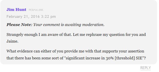
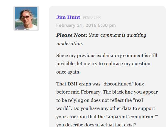
Jaime – Jim, that increase shown in comparison with earlier years by the discontinued DMI graph shown above, starting in September and culminating with the large difference notable right up to mid February.


Us:

2016-02-21_1735-NALOPKT
[This is currently invisible too – mod]

I’m sure you get the general idea by now. All of which means that not a lot of people know that if you were to follow the sound advice that DMI gave Paul Homewood and “do the plotting yourself” using the open source software and support made freely available on the Arctic Sea Ice Forum you would discover that (surprise, surprise!) 30% threshold Arctic sea ice extent on February 20th 2016 was significantly less than on the same date in 2015.


[Edit – February 21st 2016 at 22:30 UTC]

And here’s the coup de grace. Before and after the wielding of the NALOPKT red pencil:


Before:

2016-02-21_1811-NALOPKT


After:

[SNIP]

Jim

I have already warned you.

You have already posted eight comments on just one article, none of which had the slightest relevance to the original post, not to mention several more.

All you have done is disrupted the comment thread. I am aware that you have attempted to do exactly the same on other blogs. I am not prepared to allow you to do the same here.

If you want an argument, I suggest you decamp to Disqus, or better still go and argue with yourself on that pathetic little blog of yours, which very few people appear to read.

You are on your final chance. If you have any relevant comments to make, they will be welcome. But any more trolling, and you will be banned.

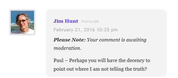
BTW – If you want to slag me off on your own rarely visited site, as you have before, perhaps you might at least have the decency to tell the truth

Paul

2016-02-21_2226-NALOPKT


[Edit – February 22nd 2016 at 10:00 UTC]

You will note from the comments below that Lawrence Martin has also now fallen foul of the “Not A Lot Of People Know That” censor red pencil. Next in line looks like it will be Neven Acropolis from the Arctic Sea Ice Blog, who is currently still permitted to valiantly fight the good fight:

Neven:

I’m not interested in why the DMI replaced their 30% SIE graph with a 15% SIE graph, because a switch from 30% to 15% isn’t all that exciting. Perhaps it is for someone who doesn’t understand the difference, but it isn’t for me.

And it’s not like they did it all of a sudden. The graph was replaced months ago, with the announcement that the old graph would be discontinued at some point.

I’m also not interested in why the graph was in error. What’s interesting about that? Why would I want DMI people who have lots of different stuff to do, to spend time and money on something that bears no relevance to anything, except to some guy who thinks it’s a all big conspiracy?


Them:

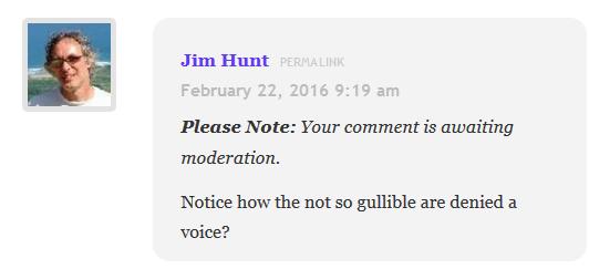
Notice how Neven The Gullible avoids answering or commenting any of these questions.


Us:
2016-02-22_0920-NALOPKT[This is also currently invisible – mod] 


Them:

We’ll keep you posted!

The Great Global Warming Policy Forum Con

You may possibly be aware that here in the United Kingdom the charitable status of the so called “Global Warming Policy Foundation” was challenged in 2014. As the BBC reported in 2014:

Lawson’s climate-sceptic group hit by charity status row

The climate-sceptic Global Warming Policy Foundation is to relaunch in September, after a complaint about its charitable status.

The Charity Commission has forced it to divide into a charitable educational arm and a separately funded political arm.

The change follows a charge that the main purpose of the foundation is political, not charitable.

The foundation said its new structure would make it even more effective.

It aimed to continue to promote debate about the costs of tackling climate change, it added.

But the complainant had argued that its information was often misleading.

The Charity Commission will issue a formal statement on the changes in the coming weeks, but a spokesman told BBC News: “Some of the the Global Warming Policy Foundation’s activities breached what is expected of an educational charity, namely that the material lacked balance and promoted a particular line of opinion. An organisation will not be charitable if its purposes are political.”

The Charity Commission investigated the Global Warming Policy Foundation following a complaint by Bob Ward, a science communicator who works with Lord Stern’s climate change team at the LSE.

He also complained that the foundation breaches charity rules by “continually disseminating inaccurate and misleading information”.

As a consequence of all that brouhaha yet another organisation with an identical acronym was set up. The Global Warming Policy Forum (or GWPF for short). Would it surprise you to learn that the new “political” GWPF is “disseminating inaccurate and misleading information” about the Arctic? If so then please read on.

In an extract from an article by Ron Clutz dated 28th September 2015 and headlined “Arctic Ice Recovering – MASIE Proves Yearly Arctic Ice Recovering” the GWPF prove nothing of the sort. Mr. Clutz claims that:

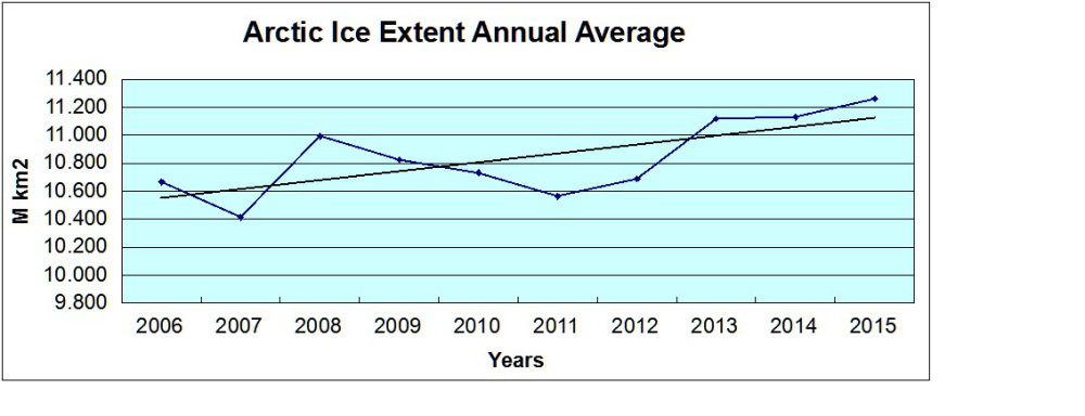
You will be hearing a lot about 2015 having the fourth lowest minimum Arctic ice extent ever recorded. Here is what they are not telling you:
GWPF-masie-annual

MASIE has very helpfully provided their records for the last ten years. Since stormy weather can affect both maximum and minimum ice extents, emphasis on March and September averages can be misleading. From a climate change perspective, a better metric is the average ice extent over the entire year. By that measure we gain a realistic perspective on the last ten years of Arctic ice fluctuation.

Actually we don’t Ron, for a number of reasons. For example Chris Reynolds summarises your “better metric” as follows:

Claims that there is no ongoing deterioration in Arctic sea ice are totally unfounded, and it is safe to ignore those making such claims as being unreliable due to their lack of grasp of the subject.

whilst “Tamino” points out that:

The data used, from MASIE, doesn’t start until 2006. Which makes it downright bizarre to use this for studying climate, for two reasons. First, we have data (passive microwave from satellites) covering quite a bit more time — starting in late 1978. Second, the MASIE people themselves tell you that their product isn’t the best for climate studies, instead you should use that passive microwave data from satellites.

If you download the data that “MASIE has very helpfully provided” and plot the self same graph so proudly displayed by the GWPF you will see something that looks a lot like this:
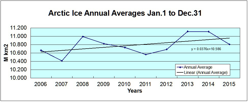
GWPF-masie-day-2015365

Amazingly enough this graph is taken from a more recent article by Ron Clutz, also reproduced in part on the Global Warming Policy Forum’s web site. This one is dated 2nd January 2016 and entitled “Happy Arctic Ice Year!“. Ron claims that:

Arctic ice declined in the decade prior to 2007, but has not declined since. What we have seen in the last decade is a plateau in Arctic ice extent, analogous to the plateau in surface temperatures. This year end report shows there is no reason to worry about Arctic ice melting.

For some strange reason the GWPF have thus far not corrected the extract from Ron’s earlier article on their web site, and neither has Mr. Clutz. For some other strange reason he hasn’t gotten around to publishing my comment to his article pointing him and his loyal readers to this graph which is also derived from the MASIE data, and neither have the GWPF:
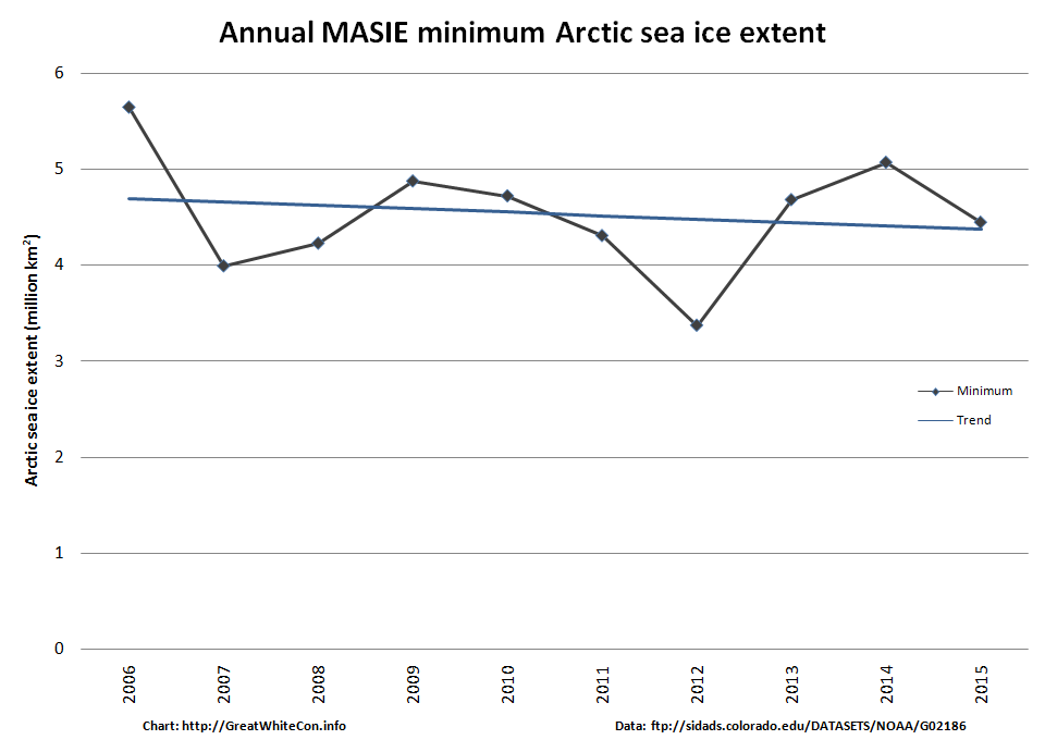
MASIE-Min

It’s not as though I haven’t tried! See for example:
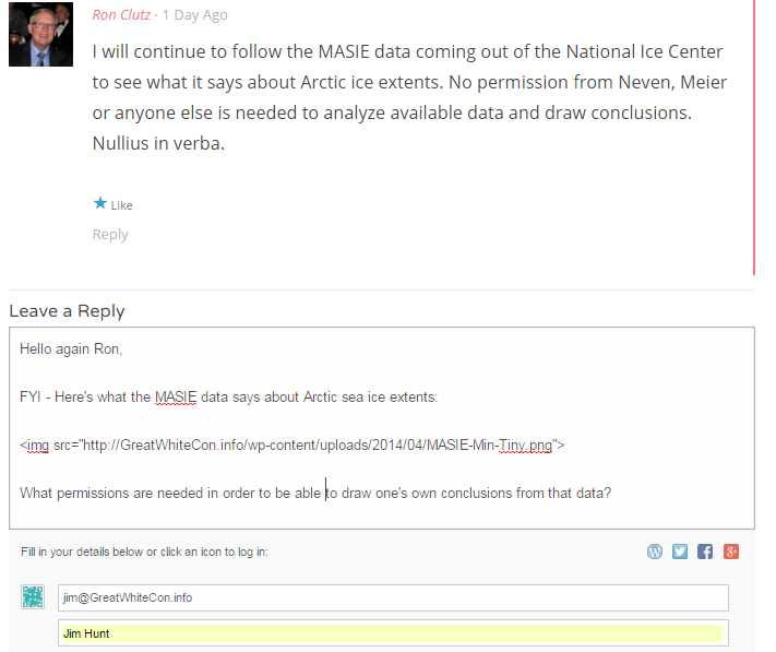
Selection_608

I’m not the only one to have my constructive criticism censored by Ron Clutz recently. Neven, proprietor of the Arctic Sea Ice Blog, reports over there that:

He’s deleting my comments again (and his own comments to wipe out traces of the fact, which is a cowardly act), so I’m just posting the comments here for reference.

I’ll conclude for the moment with some more words from Chris Reynolds. Someone who, unlike Ron Clutz and the other GWPF Arctic article authors (GWPFAAA for short), has a grasp of physics:

Ice state in the Peripheral Seas region is a critical metric in determining whether the Arctic Ocean’s ice pack is indeed stabilising or recovering.

Here is a plot of compactness for late summer in the Peripheral Seas from 1979 to 2015, where late summer is the seven day average centred on 31 August.

Here’s the accompanying graph:

Nullius in verba, as the GWPF don’t put it.


[Edit – February 18th 2016]

I have recently exchanged a few emails about this issue with Dr. Benny Peiser, who is Director of the Global Warming Policy Forum. However Benny has suddenly gone strangely silent, so here is a transcript of the “debate” thus far:

Us:

Hello Benny,

Thanks for your time in our telephone conversation just now.

In brief, here are my alter ego’s initial quibbles about the GWPForum’s recent Arctic coverage:

and

Please do not hesitate to ask if you require any additional information!


Them:

Dear Mr Hunt

I wonder whether you have any comments regarding the latest PIOMAS data which appear to show a pause in the Arctic sea ice melt in recent years?

With best regards


Us:

Hello Benny,

All in the fullness of time. First of all though, I am waiting to hear your comment(s) on the points I raised in my original email. Here’s where those “Tweets” finish up:

https://greatWhiteCon.info/2016/02/the-great-global-warming-policy-forum-con/

To reiterate, as numerous people pointed out to Mr. Clutz following his first article, MASIE is not fit for the purpose to which he (and hence the GWPF) put it.

To add insult to injury the first MASIE based graph he (and hence the GWPF) published is wildly inaccurate and misleading, and has still not been corrected.

I still eagerly await your comment(s) on this matter,


Them:

Dear Mr Hunt

If I understand you correctly you claim that

1. MASIE is not fit for the purpose to assess Artic sea ice extent, and

2. Arctic sea ice has actually decreased since 2007 — contrary to claims that Arctic ice has not declined in the last 8 years.

I have looked into your first claim and cannot find any information that undermines the reliability of MASIE data for Arctic sea ice analysis.

Regarding your second criticism, the latest PIOMAS data appear to confirm Mr Clutz’s main point, i.e. Arctic ice has remained fairly stable since 2007.

Yours sincerely


Us:

Hello again Benny,

Thank you for your swift response to my most recent email. I fear that you totally misunderstand me. Regarding your numbered points:

1) Did your due diligence include reading this section of the NSIDC web site concerning MASIE?

https://nsidc.org/data/docs/noaa/g02186_masie/index.html

Can you see the parts where it says?

MASIE may look like several other sea ice products distributed at NSIDC and elsewhere, but its source data and intended uses are different.

Operational ice charts meet the needs of those going into the ice and provide general situational awareness, such as the extent of fast ice or of ice of any concentration greater than zero percent.

If one is interested in long-term trends in sea ice or how it responds to changing climate forcing, generally, it is best not to use an operational product, but rather one that is consistently produced and retroactively quality controlled.

Do you understand what that means? If not please do not hesitate to ask!

2) Where on Earth did you get that idea from? Here’s what I said once again:

The first MASIE based graph [Ron Clutz] (and hence the GWPF) published is wildly inaccurate and misleading, and has still not been corrected.

To see what I mean all you have to do is compare it to the second MASIE based graph [Ron Clutz] (and hence the GWPF) published.


Them:

Dear Mr Hunt

I’m afraid you have not addressed my points.

There is nothing wrong with the MASIE data, in particular not when it comes to short-term data sets (although I agree that it should not be used for any trend analysis).

You did not answer the key question: where is the evidence (as suggested in your graph) that Artic sea ice has declined since 2007?

Yours sincerely


Us:

Hello Benny,

I’m afraid that in actual fact it is you who have not addressed my points. Let me take you through them slowly once again. Once you’ve understood the first two rest assured there are more.

1 a) According to the NSIDC, MASIE is not a “short-term data set”, it is an “operational ice chart”.

1 b) In addition, please feel free to search the NSIDC web site for any graph based on the Arctic Ice Annual Average of any metric whatsoever, and let me know what you discover

2) Let’s play “Spot the difference” shall we? Please let me know what differences (if any) you can find between this graph:

GWPF-masie-annual

and this one:

GWPF-masie-day-2015365

Thanks in anticipation,


[Edit – February 19th 2016]

Us again:

Not having heard from Benny for a while we thought it polite to enquire after his health this morning:

Dear Benny,

I’ve received nothing back from you since your email of 15:22 on the 16th. Are you OK? If there’s anything we can do to help please do get in touch.

We have some interesting news about which we’d love to know your opinion, as soon as you feel up to it of course. First of all, the NSIDC’s global sea ice extent metric fell to the lowest level *ever yesterday:
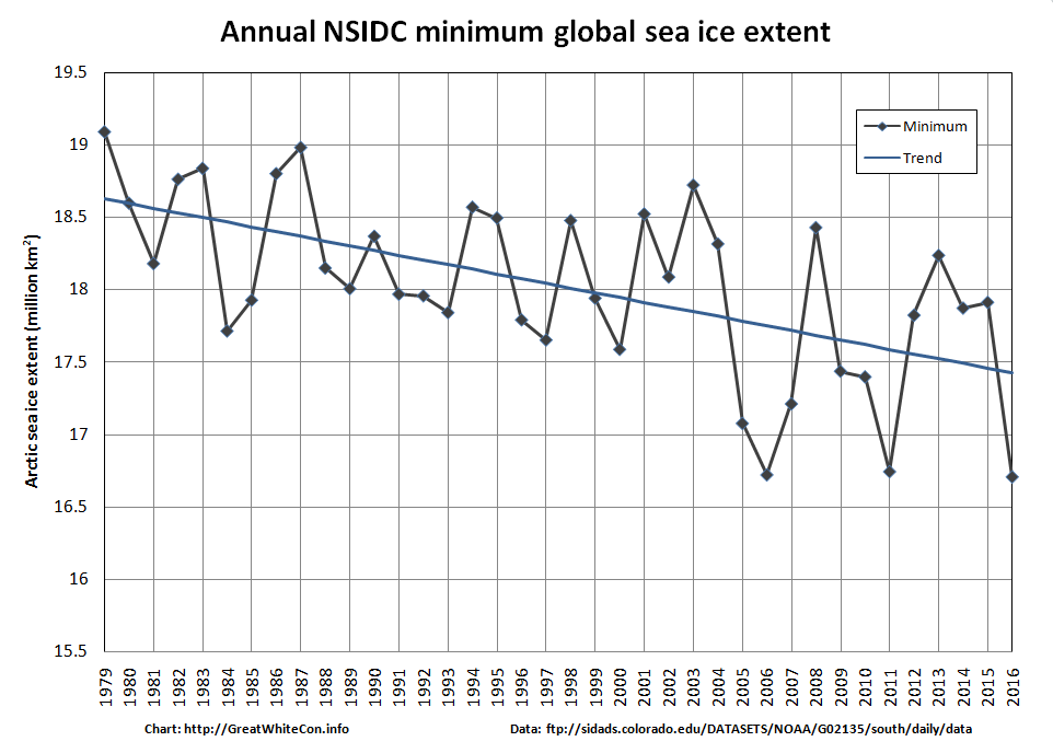
Global-Extent-2016-02-18

Secondly, are you aware that the February 13th article on the GWPF web site by Pierre Gosselin entitled “Arctic Sea Ice Trend May Have Turned The Corner As Ice Volume Picks Up Over Past 5 Years” currently looks like this?
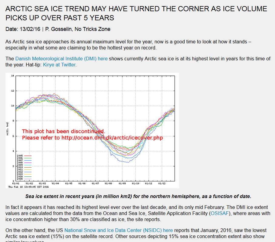
2016-02-19_1140-GWPF-DMI

Get well soon,


Them:

Dear Mr Hunt

Thank you for your latest concern about global sea ice extent

I suggest to monitor global sea ice extent in the next 12 months to see whether the usual recovery fails to materialise (see graph below).


Us:

Dear Dr. Peiser,

I’m delighted to discover that you are evidently in fine fetttle!

I am however afraid that your image is invisible at this end, although it appears to emanate from somewhere on the WUWT sea ice page.

First of all can you possibly resend it?

Secondly I highly recommend that you peruse the GWC sea ice resources instead of Mr. Watts’ in future.

Thirdly will you please fix the wide variety of gross inaccuracies concerning Arctic sea ice that still exist on the Global Warming Policy Forum web site, even after they have been brought to your attention on numerous occasions. For your further information please see also:

https://greatWhiteCon.info/2016/02/global-sea-ice-extent-at-lowest-ever-level/#comment-213484

Best wishes,


[Edit – February 23rd 2016]

Us:

Good day Benny,

I trust that you had a pleasant weekend?

I note that the GWPF webmaster has still not corrected even the most egregious of Ron Clutz’s errors republished on the GWPF web site in the following article:

http://www.thegwpf.com/arctic-ice-recovering/

I further note that you have also now republished this article authored by Paul Homewood:

http://www.thegwpf.com/maisie-confirms-arctic-sea-ice-remaining-stable-in-february/

which amongst other errors contains the following insinuation:

“MAISIE, of course, only goes back to 2006, whereas the sea ice index dates to 1979. It is, however, easy to see why NSIDC are keen to use the latter as a starting point!”

This is of course inaccurate, as I have personally pointed out to Paul on several occasions in the past. The NSIDC themselves have this to say on the matter:

“The Sea Ice Index provides a quick look at Arctic- and Antarctic-wide changes in sea ice. It is a source for consistent, up-to-date sea ice extent and concentration images, in PNG format, and data values, in ASCII text files, from November 1978 to the present.

The images and data are produced in a consistent way that makes the Index time-series appropriate for use when looking at long-term trends in sea ice cover.”

When do you suppose the GWPF webmaster will be able to get around to correcting the latest piece of Arctic misinformation to be published on your web site?

Best wishes,


Us again:

Good morning Benny,

I note that the GWPF webmaster has still not taken on board any of the helpful advice I have proffered over the last few weeks, and has now posted some inaccurate information about “global warming”. Will he or she never learn?

Sticking with our own speciality, please feel free to “print” Snow White’s prediction that CT global sea ice area will post yet another new record of around 14.22 million square kilometers over the next 2 to 3 days.

I followed Ron Clutz’s recent suggestion on Paul Homewood’s blog to “Take it up with Walt Meier”. I interviewed Dr. Meier yesterday and this is what he told me:

https://greatWhiteCon.info/2016/02/dmi-masie-and-the-sea-ice-index-an-interview-with-walt-meier/

Perhaps it is now time to hand your current webmaster their cards and hire a new one?

Best wishes,


[Edit – March 4th 2016]

Us once again:

Hello again Benny,

It seems that your new webmaster has yet to republish the latest product of the Clutz/Homewood porky pie production line! Please pass on our congratulations on their perspicacity. However the latest article on The GWPF web site by David Whitehouse has this to say:

“Is the global warming pause over for good — or will it continue once the current El Nino dies down?”

Does Dr. Whitehouse not realise that there was no “pause”?
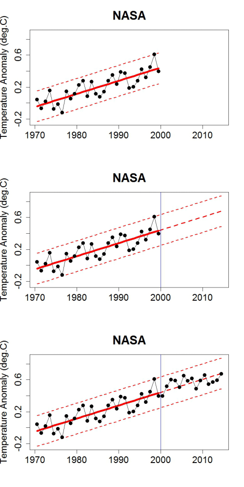
There is no "pause"!

For your, and Dr. Whitehouse’s, information here is the latest report from the NSIDC on Arctic sea ice extent:
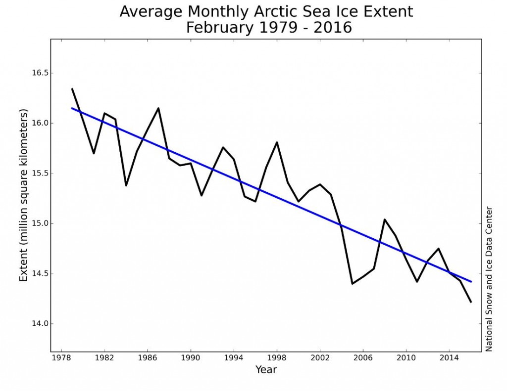
NSIDC February 2016 monthly Arctic sea ice extent

With a new webmaster in charge at The GWPF can we now anticipate an accurate Arctic article appearing on your web site? Please do not hesitate to ask if you would like to republish one of mine.

Best wishes,


[Edit – April 4th 2016]

Us once again:

Hello again Benny,

I hope this finds you well? I have been doing as you suggested! Consequently I could not help but notice that you have not been doing what I suggested, and have instead recently republished a large extract from yet another article by Paul Homewood on the topic of Arctic sea ice:

http://www.thegwpf.com/more-of-the-usual-hype-about-arctic-ice/

Needless to say this one is also downright misleading. For your information, here are the actual facts:

Claim – Arctic Sea Ice Holds Firm?

and

More Of The Usual Hype About Arctic Sea Ice

It looks like you’ll have to let another webmaster go, does it not? Don’t forget to tell the new one that my offer of an authoritative Arctic article still stands.

Best wishes,


Them:

We’ll keep you posted!
 

Gross Deception Measuring Arctic Sea Ice Trends

Our title today is inspired by Paul Homewood, who published an article earlier this week entitled “Why Measuring Arctic Ice Trends From 1979 Is Gross Deception” and which begins as follows:

Officially, we only started monitoring Arctic sea ice extents by satellite from 1979. We know however that this is not the whole story. For instance, HH Lamb tells us:

Kukla & Kukla (1974) report that the area of snow and ice, integrated over the year across the Northern Hemisphere, was 12% more in 1973 than in 1967, when the first satellite surveys were made.

I’ve added that link, since Paul neglected to include it. He concludes:

To draw any conclusions about Arctic ice or temperatures, using data that begins at the coldest point of the cycle is utterly worthless and grossly misleading. But this is climate “science” we are talking about.

Since this is Paul Homewood we are talking about I felt compelled to quibble about his grossly misleading assertion:
 

Us:

Here’s the NSIDC’s chart of Arctic sea ice extent anomalies since 1953:

You will no doubt note that it reveals an overall peak in the late 60s, not the late 70s


Them:

I note they don’t show the 1940’s


Us:

Whereas I note that 1969 is a much juicier looking cherry than 1979. Is 1949 better still?


Them:

They did not have satellite monitoring in 1969.


Even though I had already pointed out the error of his ways to him Paul Homewood decided at this juncture to publish another article, this time entitled “Satellite Monitoring Of Arctic Sea Ice Pre 1979“. It began:

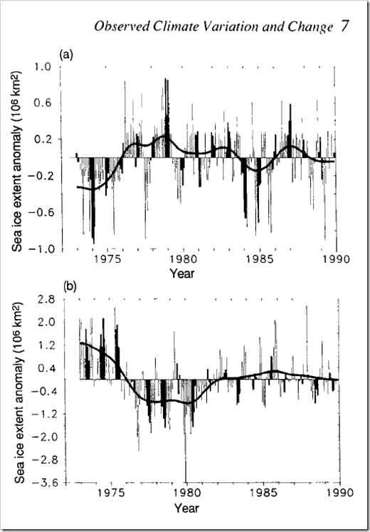
IPCC90-SeaIce IPCC90-Captionhttp://www.ipcc.ch/ipccreports/far/wg_I/ipcc_far_wg_I_full_report.pdf

I was pointing out yesterday why it was so inappropriate to deduce trends in Arctic sea ice, using 1979 as the start point. NSIDC, of course, do this supposedly because that is when satellite monitoring began.

Mr Biscuits, however, reminds me that the 1990 IPCC report showed the above graph, with Arctic sea ice extent back to 1972.


Us:

At the risk of repeating myself, what about this remarkable recent narrative?

https://archive.today/ADq4O#selection-1535.0-1547.25


Them:

They did not have satellites in 1953.


Us:

What the NSIDC actually say regarding their dataset that starts in 1978 is:

“This product is designed to provide a consistent time series of sea ice concentrations (the fraction, or percentage, of ocean area covered by sea ice) spanning the coverage of several passive microwave instruments.”

http://nsidc.org/data/nsidc-0051

Note that there is no mention of “when satellite monitoring began”. See also their Nimbus Data Rescue project, which has data going back to 1964:

http://nsidc.org/data/nimbus/data-sets.html

“Consistent time series” are the operative words


Them:

We’ll keep you posted!
The Greatest Scandal in the History of Science!

Christopher Booker has raised the stakes in the “ClimateGate 2.0” edition of ClimateBall™ in his article in this morning’s edition of the Sunday Telegraph:

It was only the adjusted surface records which showed 2014 to have been “the hottest year on record”. The other two official records, based on satellite measurements, which only go back to 1979, show nothing of the kind.

The international fallout from my two articles has been huge. The second, headed “The fiddling of temperature data has been the biggest science scandal ever”, scored a record 30,000 comments on The Telegraph website. But what is particularly telling has been the silence of GHCN and the compilers of the other surface records in response to requests from Homewood and others for a proper explanation of how and why they had needed to make so many adjustments to the original data.

What is now needed is a meticulous analysis of all the data, to establish just how far these adjustments have distorted the picture the world has been given. Although I cannot yet reveal any details, I gather that a responsible foundation is gathering an expert team to do just that. If the results confirm what has already been unearthed by Homewood and other analysts, from the US to New Zealand, this may indeed turn out to have been the greatest scandal in the history of science.

He is apparently being aided and abetted in his latest outlandish bid by BBC Radio 4 News, who reported on his article as follows in their 07:07:25 review of the Sunday newspapers this morning:

Christopher Booker in the Sunday Telegraph demands a meticulous analysis of the data used to justify the claim that last year was the warmest on record, something he suggests could turn out to be one of the greatest scandals in science. He says a growing number of experts around the world have found that the raw data originally gathered by weather stations was comprehensively adjusted to justify the claim.

This is of course all spectacularly shoddy science (SSS for short) by Homewood, Booker et. al. , as we informed Ian Marsden at the Telegraph Group after Booker’s previous climate bluff was trumped by a long list of climate scientists, who have in fact been anything but “particularly silent” this time around. By way of example, since Ian Marsden evidently hasn’t watched this video yet, here once again is a video by a scientist who has studied such matters, which explains the truth:


Once more unto the breach, dear friends!

Us:

not to mention:

https://www.facebook.com/GreatWhiteCon/posts/676792169109481


Next I called the Beeb’s complaints number (03700 100 222 – 24 hours, charged as 01/02 geographic numbers) and told Rachel that I wished to register a complaint. I manfully resisted the temptation to emit any expletives, and informed her that the BBC’s apparent belief that Mr. Booker’s article provides some sort of “scientific balance” to Ed Milibands remarks about the need for UK plc to up its “climate change” game is so utterly ludicrous that words had totally failed me.

Rachel wondered if I was talking about this morning’s edition of “Broadcasting House“. I assured her I was not, but it sounds as though I now ought to go away and listen to that from cover to cover!

It’s now the morning of Monday February 23rd 2013. I haven’t received the email confirmation from the BBC that Rachel promised me yet, so…..

BBC Radio 4 Swallows Booker’s Bait

I’ve also just spoken to Ian Marsden of the Telegraph Group once again. He assures me that my complaint about a previous article by Christopher Booker is being dealt with, and suggests that I file another one to ensure that I have “a proper audit trail” in this instance as well.

An IPSO complaints officer suggests following up our previous complaint via said complaints form, so….

Them:

We’ll keep you posted!