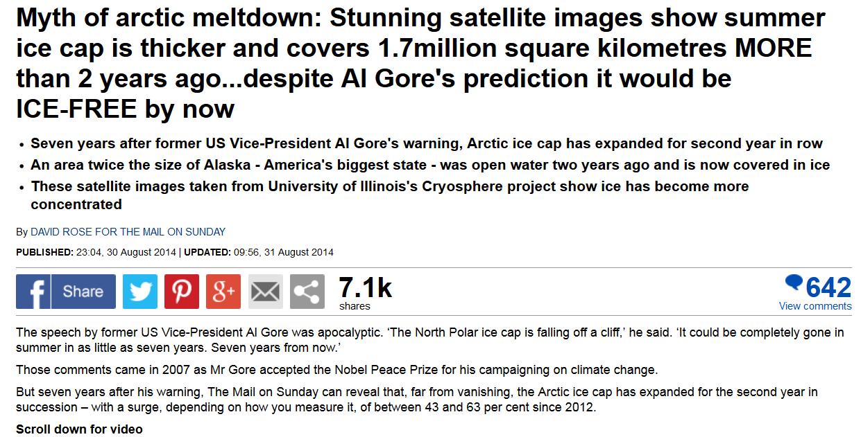
According to David Rose’s latest article in the Mail on Sunday it has. This came as shock news to me, because only a couple of days ago I was discussing with “Steve Goddard” how Arctic sea ice extent (using “Steve’s” patent pending personal “DMI 30% clone” metric) had actually decreased since the same time last year!
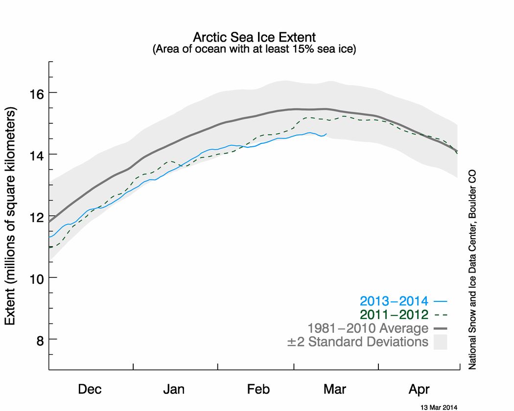
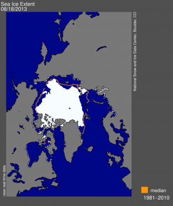
Before we delve deep into the data, and before the Mail on Sunday makes any “corrections” to David’s misleadingly purple prose, here’s how things look over there at the moment:
Them:

As you can see, the Mail’s main claims are:
- Seven years after former US Vice-President Al Gore’s warning, Arctic ice cap has expanded for second year in row
- An area twice the size of Alaska – America’s biggest state – was open water two years ago and is now covered in ice
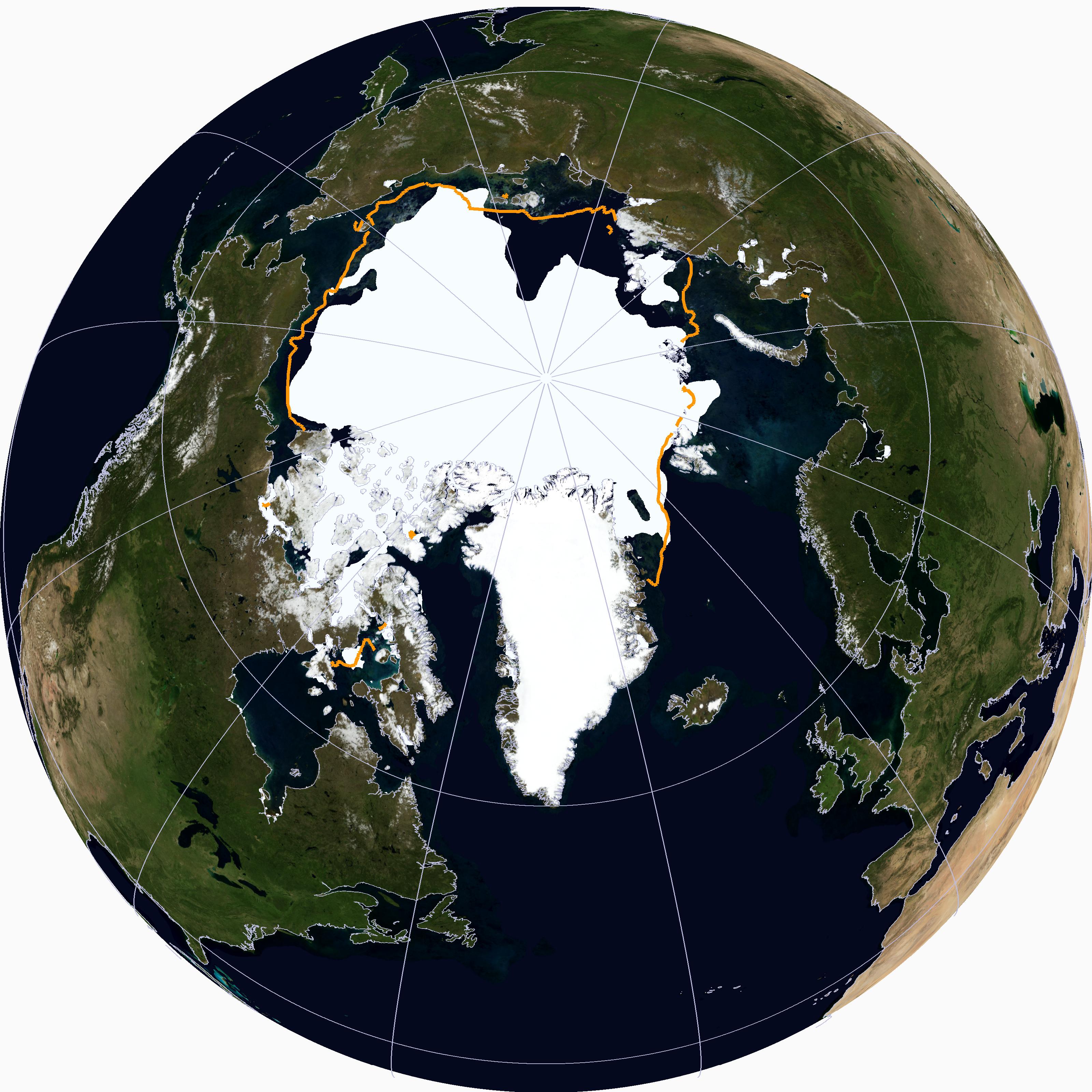
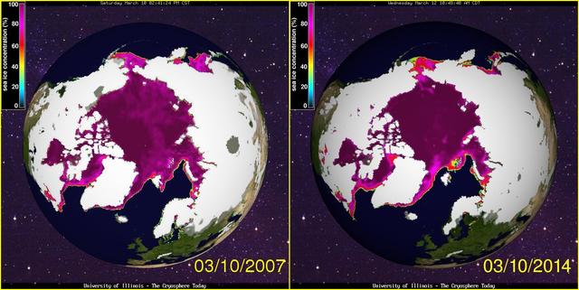
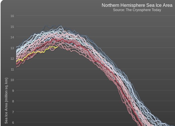
- These satellite images taken from University of Illinois’s Cryosphere project show ice has become more concentrated
not to mention that:
The Mail on Sunday can reveal that, far from vanishing, the Arctic ice cap has expanded for the second year in succession – with a surge, depending on how you measure it, of between 43 and 63 per cent since 2012.
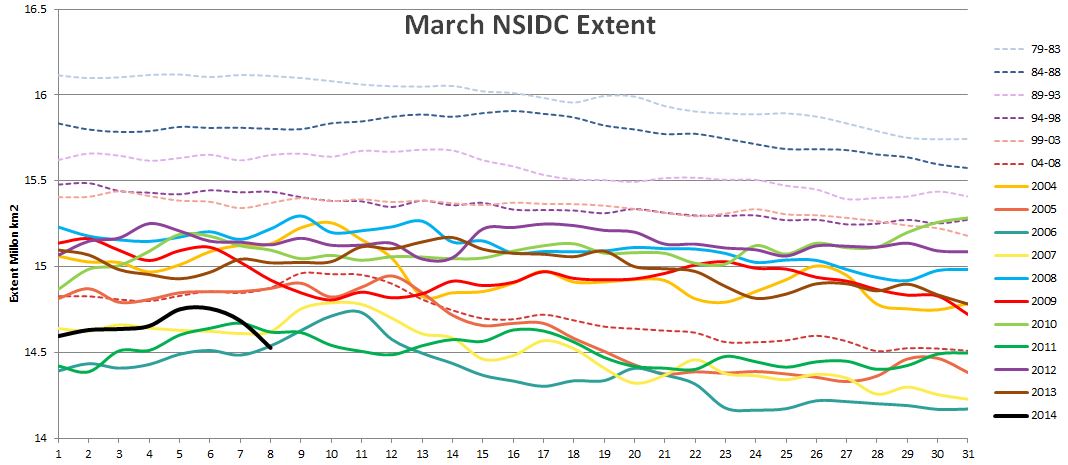
For some strange reason David neglects to include any numbers for 2013, so….
Us:
A quick telephone call revealed that John Wellington doesn’t work at the Mail on Sunday’s, so I sent him an email instead:
Hello again John,
David Rose is at it again, hence so am I. According to his latest words of wisdom:
“The Mail on Sunday can reveal that, far from vanishing, the Arctic ice cap has expanded for the second year in succession”
I don’t suppose David and/or the Mail on Sunday can provide any data to back up that assertion can they?
Best wishes,
Jim Hunt
Them:
Hello Jim,
I did wonder if we would be corresponding, again.
I will be in touch after the weekend.Best regards
John
Us:
Hi Tessa,
I’m working on the assumption that you are still responsible for this subject. If not perhaps you can pass this email on to the relevant person?
David Rose is talking about the Arctic on the Mail Online again, so I’m attempting to comment again. Yet again I can’t see my comments (under the nom de guerre “SoulSurfer”) anywhere underneath the article in question. Can you look into it please, and let me know what the problem is?
To make things easier for you I’ve just commented for the third time this morning, as per the enclosed attachment.
Thanks,
Jim Hunt

In an email dated September 6th 2014:
Dear Jim,
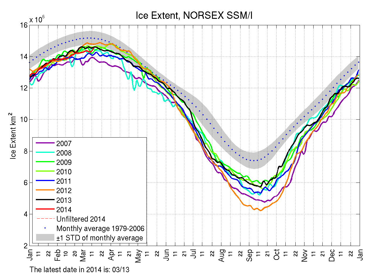
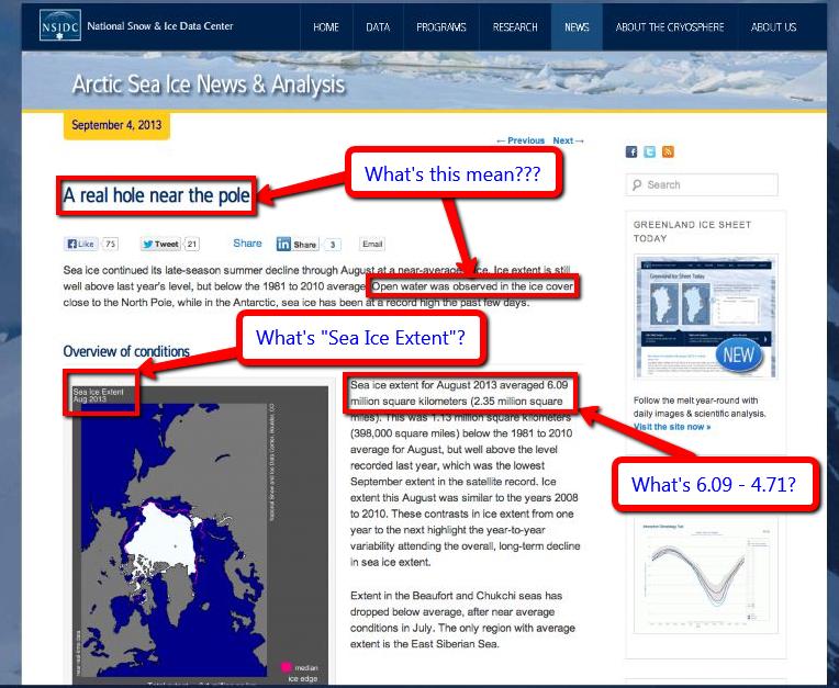
Sorry not to reply sooner. The article relied on data from the US National Snow and Ice Data Centre comparing ice cover on the same date, August 25. In 2012 the figure was 3.91m sq miles, in 2013 it was 5.59m and in 2014, 5.62m. You may wish to note that the article did point out that the long-term trend is still downward.
Best regards
John
In an email dated January 24th 2015:
Dear John,
Sorry not to reply sooner. The PCC decided to laboriously mutate into something called IPSO right around the time of the 2014 Arctic sea ice minimum extent. Hence the brief hiatus. However David Rose is at it again, and he’s now even discussing tricky things like “probabilities”! IPSO do now seem to be getting their act together as well. Did you see their “open letter to publishers” last month?
No doubt I will have more than a few bones to pick with David’s article last weekend, not to mention the subsequent one by Victoria Woollaston. Is that one your responsibility too? For the moment though, perhaps we can pick up where we left off last summer?
Thanks for your information about the long term Arctic sea ice trend and the NSIDC extent numbers. However the article in question also states:
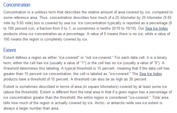
“Figures from the Danish Meteorological Institute suggest that the growth has been even more dramatic. Using a different measure, the area with at least 30 per cent ice cover, these reveal a 63 per cent rise – from 2.7 million to 4.4 million square kilometres”.
Where did David get those DMI numbers from? I asked the DMI, and even they didn’t seem to know!
Best wishes,
Jim Hunt
Them:
In the absence of any response from John I called the Mail offices on January 26th 2015. It seems John is out of the office for the next two weeks. His PA is now looking into matters for me.
I sent a further email to John and Poppy on February 2nd 2015:
Them:
Dear Jim,
If you have a complaint about last Sunday’s article, you should set out exactly what it is. If you disagree with any opinions expressed you are welcome to write a letter that we will consider for publication.
You mention that you have sent us a number of inquiries recently. The only other, to my knowledge is that you wanted to know the source of some data that David Rose mentioned in an article some months ago. David Rose told me it came from the official website. Perhaps my colleague Poppy Hall can find it for you since David is probably unwilling to help after your insult.
Best regards,
John
Us:
Dear Poppy (and John)
Please would you ask David to let me know where exactly, and on which “official website”, he obtained the DMI extent numbers he quoted in his article last Summer?
FYI John, at Poppy’s suggestion I have also emailed the editorial team @MailOnline. They have yet to even acknowledge receipt of my email of January 26th.
Best wishes,
Jim Hunt
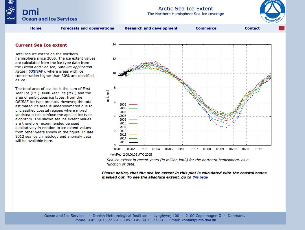
Dear Jim,
David is unable to find the table with the numerical data. But he says that the graph here from the DMI website makes it clear that if you look at 30% concentration, the figures he gave were correct.
I hope this answers your query.
Kind regards,
Poppy
Dear Poppy,
Just to clarify, the facts of the matter are that David Rose did NOT obtain the DMI numbers he quoted last summer from a “table with the numerical data” on an “official website”?
Best wishes,
Jim Hunt
Them:
We’ll keep you posted!