Tag Archives: Christopher Monckton

Northabout’s Great Adventure

According to the old saying “A change is as good as a rest”, so rather than plagiarise today’s title from a “skeptical” web site we’ve invented this one all by ourselves. Northabout is a small yacht with big ideas. (S)he wants to circumnavigate the North Pole in one summer season. However certain cryoblogospheric commenters are somewhat skeptical that this can be achieved this year. Take Tony Heller for example:

There has been very little melt going on in the Arctic Ocean the last few days, due to cold cloudy weather.

A group of climate clowns were planning on sailing around the entire Arctic Ocean through the Northeast and Northwest Passages (to prove there isn’t any ice in the Arctic) but are stuck in Murmansk because the Northeast Passage is completely blocked with ice.

The “group of climate clowns” aboard Northabout that Mr. Heller refers to are led by David Hempleman-Adams. According to the Polar Ocean Challenge web site:

David is one of the most experienced and successful adventurers in the world.

In his forty years as an adventurer, David was the first person to reach the highest peaks on all seven continents and journey fully to the North and South Geographical and Magnetic Poles. He has broken forty-seven Federation Aeronautique Internationale ballooning records

According to Tony’s previous blog:

My name is Tony Heller. I am a whistle blower. I am an independent thinker who is considered a heretic by the orthodoxy on both sides of the climate debate.

I have degrees in Geology and Electrical Engineering, and worked on the design team of many of the world’s most complex designs, including some which likely power your PC or Mac. I have worked as a contract software developer on climate and weather models for the US government.

However despite Tony’s long list of qualifications he is evidently currently quite confused, since according to the Polar Ocean Challenge live tracking map David and Northabout are not in actual fact “stuck in Murmansk” at all:

Northabout-20160720

This shouldn’t come as surprise to anyone with an internet connection and a desire to check the facts, since as we speak there is currently remarkably little sea ice cover on the Atlantic side of the Arctic Ocean:

UH-Atlantic-Area-2016-07-20

Hence Northabout should find the next leg of his/her voyage across the Barents and Kara Seas pretty plain sailing. However Vilkitsky Strait, the passage from the Kara into the Laptev Sea, is currently looking a trifle tricky:

NASA Worldview “true-color” image of the Vilkitsky Strait on July 20th 2016, derived from the MODIS sensor on the Terra satellite

Do you suppose Tony Heller suffers from precognitive dreams?


[Edit – July 22nd 2016]

According to Environment Canada this morning there’s a 988 hPa central pressure cyclone causing a bit of a blow in the Vilkitsky Strait at the moment:

Synopsis-20160722-00Z

Meanwhile the crew of Northabout report from the Barents Sea that:

Sea and air temperature getting colder as we venture further north. Saw quite a lot of Dolphins for the first time around the Yacht. Still sea gulls flying behind and skimming the waves.

Had some promising Canadian ice charts yesterday, but that’s a long way off. Today we should get an update with the Russian side. fingers crossed it is still not solid around the cape and Laptev sea. That could slow us down considerably. The wind has been blowing the pack ice against the land, so very difficult to get around the shore, but let’s see what Santa brings.

Northabout-Barents-20160722-1

According to the Russian Arctic and Antarctic Research Institute, Santa had brought this by July 19th:

AARI_ICEANL_20160719_KARA-Crop

P.S. Maintaining his usual modus operandi, Tony Heller has penned a new article today, containing a satellite image remarkably similar to the one just above. Under the headline “The 2016 Franklin Expedition” he tells his loyal readership:

The Polar Ocean Challenge is headed off into the ice.

They will run into this in three days – hundreds of miles of solid ice. Without an icebreaker, they are going nowhere. I asked them on Twitter if they have an icebreaker. I haven’t received a response, and will be monitoring them by satellite to see if they are cheating.

By some strange coincidence we’re “monitoring them by satellite” too:

Northabout-20160722-1930


[Edit – July 23rd 2016]

In some “Shock News!!!” from another corner of the cryodenialosphere Viscount Monckton of Brenchley claims on the “Watts Up With That” blog that:

As for ice melt, yet another totalitarian propaganda expedition intended to “raise awareness” of climate “catastrophe” by trying to sail around the Arctic in the summer has just come a cropper owing to – er – too much ice. Neither the North-East Passage nor the North-West Passage is open, so the expedition is holed up in – of all ghastly places – Murmansk. That’ll teach Them.

However my corrective comment has yet to see the light of day at WUWT:

Selection_789

Meanwhile Northabout resolutely presses on regardless, and has just passed 74 degrees North:

Northabout-20160723-1100

whilst the sea ice edge in the north-eastern Kara Sea has retreated somewhat over the last three days:

NASA Worldview “true-color” image of the Vilkitsky Strait on July 23rd 2016, derived from the MODIS sensor on the Terra satellite

Here’s the July 20-22nd AARI map of the Vilkitsky Strait area:

AARI_ICEANL_20160722_KARA-Crop

On the topic of Arctic sea ice melt in general Viscount Monckton opines over on WUWT that:

According to the National Snow and Ice Data Center’s graph, also available at WUWT’s sea-ice page, it’s possible, though not all that likely, that there will be no Arctic icecap for a week or two this summer:

NSIDC-WUWT-20170722

Even if the ice disappears for a week or two so what? The same was quite possibly true in the 1920s and 1930s, which were warmer than today in the northern hemisphere, but there were no satellites to tell us about it.

The Good Lord seems to have a very tenuous grasp on reality, since the NSIDC’s graph shows nothing of the sort. Perhaps he is merely indulging in irony?


[Edit – July 24th 2016]

Northabout passed the 75 degrees North milestone overnight:

Northabout-20160724-0830

Clouds obscure the Vilkitsky Strait in visible light this morning but passive microwaves make it through the murk, albeit with reduced resolution. They reveal the sea ice edge in the Kara Sea receding and a narrow passage opening up along the Northern side of the Strait (North is down in the image):

NASA Worldview passive microwave image of the Vilkitsky Strait on July 24th 2016, derived from the AMSR2 instrument on the Shizuku satellite

According to Ben Edwards’ latest blog post from the Barents Sea:

I just wore a T-shirt on my first watch out of Murmansk. Today I wore my trawler suit and a primaloft under it with gloves and a hat….

Ben-Barents-20170624

As the cryodenialosphere continue to retweet and reblog their regurgitated rubbish here’s a picture from last year of Northabout amidst some ice, especially for those apparently unable to distinguish a small yacht from a large icebreaker:

Northabout-svalbard-18th

Meanwhile Arctic sea ice continues its inexorable decline:

UH-Arctic-Area-2016-07-23


[Edit – July 24th 2016 PM]

Shock News! Tony Heller has just published yet another article about Northabout’s Great Adventure, and yours truly gets a mention. In the headline no less!! Read all about it at:

Is the Polar Ocean Challenge About to End in Disaster?

Meanwhile the commenters over at unReal Science keep blathering on about icebreakers even though one of the more inquisitive denizens posted this extract from the “Ship’s Log” over there yesterday:

Partly checked the new ice charts on www.nsra.ru, we still have no chance of getting through yet, not past the cape or through the Laptev sea. Nikolai, Our Russian Captain who is very familiar with this route, impresses on me that this is a very unusual year and normally clear, Not what I want to hear. We are under sail, so saving fuel, and will find a small island to shelter until we get improvements. We are still 5 days from the ice, so lets hope for some southerly winds to push the ice from shore.

Northabout is heading for the Kara Sea past the northern tip of Novaya Zemlya, and has now passed 76 degrees North:

Northabout-20160724-2200


[Edit – July 25th 2016]

The skies are still cloudy over the Vilkitsky Strait and Cape Chelyuskin, so here’s another AMSR2 passive microwave visualisation of the state of play. Note the change of scale:

NASA Worldview passive microwave image of the Vilkitsky Strait on July 25th 2016, derived from the AMSR2 instrument on the Shizuku satellite

The sea ice area in the Laptev Sea has finally started decreasing at a more “normal” rate for late July, but still has a lot of catching up to do compared to recent years:

UH-Laptev-Area-2016-07-24

Meanwhile over at “Watts Up With That” at least one reader of Christopher Monckton’s purple prose is clearly confused. Needless to say my clarifying comment is still invisible to him:

2016-07-25_0038_WUWT

Finally, for the moment at least, here’s some moving pictures of dolphins having fun in the Barents Sea:


[Edit – July 26th 2016]

I was expecting Northabout to have entered the Kara Sea by now, but instead (s)he has headed north, and is now well above the 77th parallel:

Northabout-20160726-0900

It’s still pretty cloudy up there so here once again is the latest AMSR2 passive microwave visualisation of the Vilkitsky Strait area, with a few place names added for a bit of variety:

NASA Worldview passive microwave image of the Vilkitsky Strait on July 26th 2016, derived from the AMSR2 instrument on the Shizuku satellite

P.S. The Polar Ocean Challenge team explain via Twitter:

and their latest log entry:

Choppy sea, taking four hour tacks. These sea conditions make it hard to sleep, cook or relax.

We are considering many elements all the time. We are due new Russian Ice charts today.

We know the North west is pretty clear, but this year is a very unusual year in the north east passage. Normally the Laptev Sea would be pretty open now as in previous years. It is not. This is also partly due to the wind blowing the pack ice down south and consolidating next to the land.

So, we need to get through the straight and through the Laptev Sea. So where do we wait until we can do this? We have deliberately taken our time to get to this point, and used the wind as much as we can to conserve fuel.

Now the weather has changed, the wind direction has also changed. From the calm turquoise seas, to choppy short seas, wet, windy and cold.

So we took a long tack north, and then tacked east again. There is No hurry. We will slowly make our way east, and if we can find an island with no fast ice around, will look for a sheltered spot, until we get better ice conditions.

The other options are to Heave to and wait, but this is a sailing Yacht, she needs to sail. And if we get a Southerly blow, it could change our chances very quickly to get around, so we need to be close to react.

So, another day at the office.

There was a report on the BBC Radio 4 Today programme this morning from the crew of Northabout, and an interview with Dr. Ed Blockley from the UK Met Office about the current state of sea ice in the Arctic:

http://www.bbc.co.uk/programmes/b07lfsrl

Note in particular the part at 2:59:00 where Justin Webb says to Ed:

I thought that I’d read somewhere that [Northabout] had got stuck.

I cannot help but wonder what on Earth gave him that idea?


[Edit – July 27th 2016]

After “going round in circles” north of Novaya Zemlya yesterday Northabout is now heading East across the Kara Sea:

Northabout-2016-07-27_1015

Synthetic aperture radar images from the European Space Agency’s Sentinel 1A satellite have started flowing through Polarview once again, so here’s one of where Northabout is heading:

Sentinel 1A synthetic aperture radar image of the Vilkitsky Strait on July 26th 2016

Here’s the current Arctic and Antarctic Research Institute map of the same area:

AARI_ICEANL_20160726_KARA-Crop

There’s still no way through by which Northabout might avoid an encounter with 9-10 tenths sea ice coverage. Then of course there’s the Laptev Sea to contend with too. Here’s the latest AMSR2 visualisation from the University of Hamburg:

Arc_20160726_res3.125_LARGE

It’s not exactly plain sailing there either just yet!


[Edit – July 28th 2016]

This morning Northabout has almost reached 79 degrees East, and appears to be heading in the direction of Ostrov Troynoy:

Northabout-20160728-1200

Here is the Weather Underground forecast for the area:

Troynoy-Fcst-20160728

The clouds over the Laptev Sea have cleared somewhat as the recent cyclone heads for the Beaufort Sea, to reveal that the “brick wall” of ice referred to in certain quarters now looks more like Swiss cheese:

NASA Worldview “false-color” image of the Laptev on July 28th 2016, derived from the MODIS sensor on the Terra satellite

Here’s a close up look at the Vilkitsky Strait from the Landsat 8 satellite this morning. Note that unlike the MODIS image above, north is at the top of this one:

LC8-Vilkitsky-20160728

Meanwhile according to SailWX the Russian icebreaker Yamal is traversing the Vilkitsky Strait from east to west:

Yamal-Posn-20160727

How to Make a Complete RSS of Yourself (With Sausages)

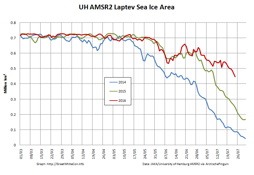
In the wake of the recent announcement from NASA’s Goddard Institute for Space Studies that global surface temperatures in February 2016 were an extraordinary 1.35 °C above the 1951-1980 baseline we bring you the third in our series of occasional guest posts.

Today’s article is a pre-publication draft prepared by Bill the Frog, who has also authorised me to reveal to the world the sordid truth that he is in actual fact the spawn of a “consumated experiment” conducted between Kermit the Frog and Miss Piggy many moons ago. Please ensure that you have a Microsoft Excel compatible spreadsheet close at hand, and then read on below the fold.


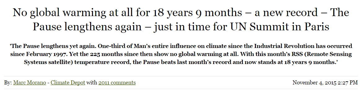
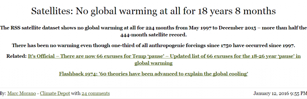
­­­­In a cleverly orchestrated move immaculately timed to coincide with the build up to the CoP21 talks in Paris, Christopher Monckton, the 3rd Viscount Monckton of Brenchley, announced the following startling news on the climate change denial site, Climate Depot

Morano1

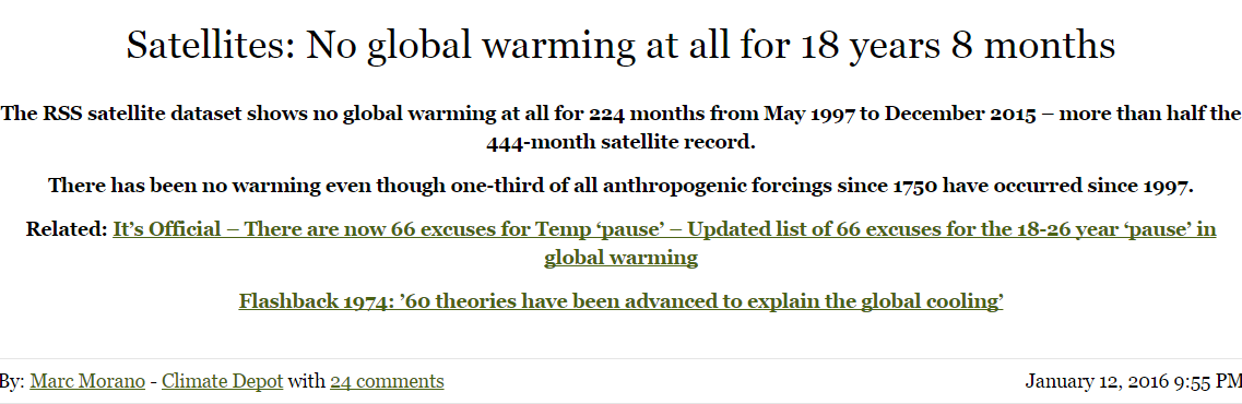
Upon viewing Mr Monckton’s article, any attentive reader could be forgiven for having an overwhelming feeling of déjà vu. The sensation would be entirely understandable, as this was merely the latest missive in a long-standing series of such “revelations”, stretching back to at least December 2013. In fact, there has even been a recent happy addition to the family, as we learned in January 2016 that …

Morano2

The primary eye-candy in Mr Monckton’s November article was undoubtedly the following diagram …

https://lh3.googleusercontent.com/-xAdiohdkcU4/VjpSKNYP9SI/AAAAAAACa8Q/639el4qIzpM/s720-Ic42/monckton1.png

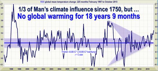
Fig 1: Copied from Nov 2015 article in Climate Depot

It is clear that Mr Monckton has the ability to keep churning out virtually identical articles, and this is a skill very reminiscent of the way a butcher can keep churning out virtually identical sausages. Whilst on the subject of sausages, the famous 19th Century Prussian statesman, Otto von Bismarck, once described legislative procedures in a memorably pithy fashion, namely that … “Laws are like sausages, it is better not to see them being made”.

One must suspect that those who are eager and willing to accept Mr Monckton’s arguments at face value are somehow suffused with a similar kind of “don’t need to know, don’t want to know” mentality. However, some of us are both able and willing to scratch a little way beneath the skin of the sausage. On examining one of Mr Monckton’s prize sausages, it takes all of about 2 seconds to work out what has been done, and about two minutes to reproduce it on a spreadsheet. That simple action is all that is needed to see how the appropriate start date for his “pause” automatically pops out of the data.

However, enough of the hors d’oeuvres, it’s time to see how those sausages get made. Let’s immediately get to the meat of the matter (pun intended) by demonstrating precisely how Mr Monckton arrives at his “no global warming since …” date. The technique is incredibly straightforward, and can be done by anyone with even rudimentary spreadsheet skills.

One basically uses the spreadsheet’s built-in features, such as the SLOPE function in Excel, to calculate the rate of change of monthly temperature over a selected time period. The appropriate command would initially be inserted on the same row as the first month of data, and it would set to range to the latest date available. This would be repeated (using a feature such as Auto Fill) on each subsequent row, down as far as the penultimate month. On each row, the start date therefore advances by one month, but the end date remains fixed. (As the SLOPE function is measuring rate of change, there must be at least two items in the range, that’s why the penultimate month would also be the latest possible start date.)

That might sound slightly complex, but if one then displays the results graphically, it becomes obvious what is happening, as shown below…

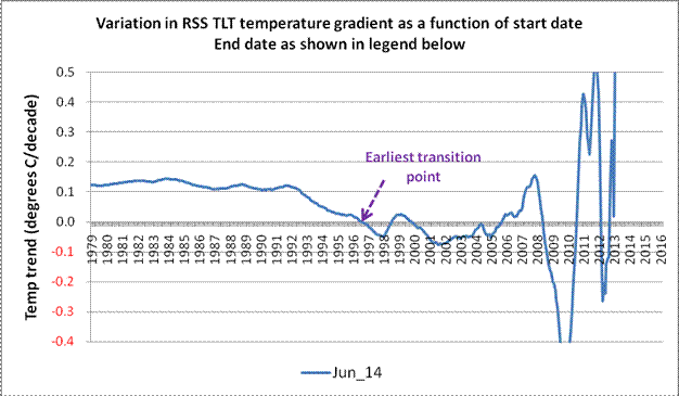
Fig 2: Variation in temperature gradient. End date June 2014

On the above chart (Fig 2), it can clearly be seen that, after about 13 or 14 years of stability, the rate of change of temperature starts to oscillate wildly as one looks further to the right. Mr Monckton’s approach has been simply to note the earliest transition point, and then declare that there has been no warming since that date. One could, if being generous, describe this as a somewhat naïve interpretation, although others may feel that a stronger adjective would be more appropriate. However, given his classical education, it is difficult to say why he does not seem to comprehend the difference between veracity and verisimilitude. (The latter being the situation when something merely has the appearance of being true – as opposed to actually being the real thing.)

Fig 2 is made up from 425 discrete gradient values, each generated (in this case) using Excel’s SLOPE function. Of these, 122 are indeed below the horizontal axis, and can therefore be viewed as demonstrating a negative (i.e. cooling) trend. However, that also means that 70% show a trend that is positive. Indeed, if one performs a simple arithmetic average across all 425 data points, the integration thus obtained is 0.148 degrees Celsius per decade.

(In the spirit of honesty and openness, it must of course be pointed out that the aggregated warming trend of 0.148 degrees Celsius/decade thus obtained has just about the same level of irrelevance as Mr Monckton’s “no warming since mm/yy” claim. Nether has any real physical meaning, as, once one gets closer to the end date(s), the values can swing wildly from one month to the next. In Fig 2, the sign of the temperature trend changes 8 times from 1996 onwards. A similar chart created at the time of his December 2013 article would have had no fewer than 13 sign changes over a similar period. This is because the period in question is too short for the warming signal to unequivocally emerge from the noise.)

As one adds more and more data, a family of curves gradually builds up, as shown in Fig 3a below.

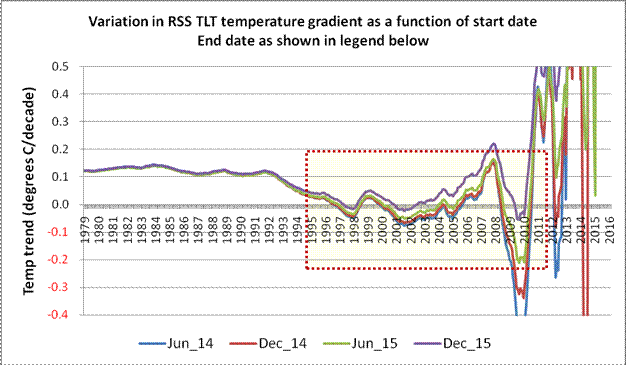
Fig 3a: Family of curves showing how end-date also affects temperature gradient

It should be clear from Fig 3a that each temperature gradient curve migrates upwards (i.e. more warming) as each additional 6-month block of data comes in. This is only to be expected, as the impact of isolated events – such as the temperature spike created by the 1997/98 El Niño – gradually wane as they get diluted by the addition of further data. The shaded area in Fig 3a is expanded below as Fig 3b in order to make this effect more obvious.

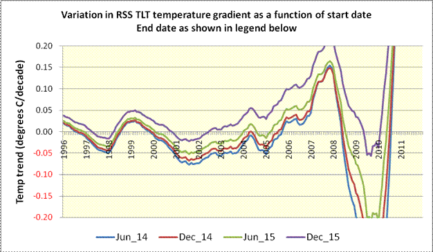
Fig 3b: Expanded view of curve family

By the time we are looking at an end date of December 2015, the relevant curve now consists of 443 discrete values, of which just 39, or 9%, are in negative territory. Even if one only considers values to the right of the initial transition point, a full 82% of these are positive. The quality of Mr Monckton’s prize-winning sausages is therefore revealed as being dubious in the extreme. (The curve has not been displayed, but the addition of a single extra month – January 2016 – further reduces the number of data points below the zero baseline to just 26, or 6%.) To anyone tracking this, there was only ever going to be one outcome, eventually, the curve was going to end up above the zero baseline. The ongoing El Niño conditions have merely served to hasten the inevitable.

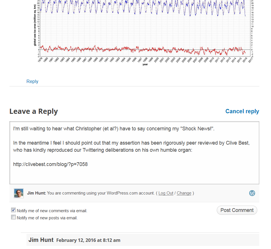
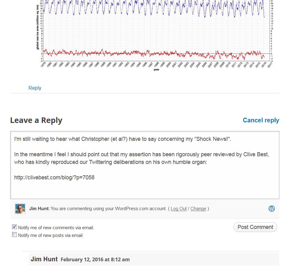
With the release of the February 2016 data from RSS, this is precisely what happened. We can now add a fifth curve using the most up-to-date figures available at the time of writing. This is shown below as Fig 4.

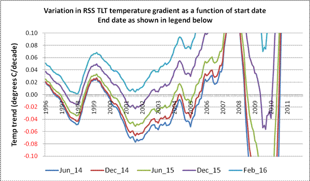
Fig 4: Further expansion of curve families incorporating latest available data (Feb 2016)

As soon as the latest (Feb 2016) data is added, the fifth member of the curve family (in Fig 4) no longer intersects the horizontal axis – anywhere. When this happens, all of Mr Monckton’s various sausages reach their collective expiry date, and his entire fantasy of “no global warming since mm/yy” simply evaporates into thin air.

Interestingly, although Mr Monckton chooses to restrict his “analysis” to only the Lower Troposphere Temperatures produced by Remote Sensing Systems (RSS), another TLT dataset is available from the University of Alabama in Huntsville (UAH). Now, this omission seems perplexing, as Mr Monckton took time to emphasise the reliability of the satellite record in his article dated May 2014.

In his Technical Note to this article, Mr Monckton tells us…

The satellite datasets are based on measurements made by the most accurate thermometers available – platinum resistance thermometers, which not only measure temperature at various altitudes above the Earth’s surface via microwave sounding units but also constantly calibrate themselves by measuring via spaceward mirrors the known temperature of the cosmic background radiation, which is 1% of the freezing point of water, or just 2.73 degrees above absolute zero. It was by measuring minuscule variations in the cosmic background radiation that the NASA anisotropy probe determined the age of the Universe: 13.82 billion years.

Now, that certainly makes it all sound very easy. It’s roughly the metaphorical equivalent of the entire planet being told to drop its trousers and bend over, as the largest nurse imaginable approaches, all the while gleefully clutching at a shiny platinum rectal thermometer. Perhaps a more balanced perspective can be gleaned by reading what RSS themselves have to say about the difficulties involved in Brightness Temperature measurement.

When one looks at Mr Monckton’s opening sentence referring to “the most accurate thermometers available”, one would certainly be forgiven for thinking that there must perforce be excellent agreement between the RSS and UAH datasets. This meme, that the trends displayed by the RSS and UAH datasets are in excellent agreement, is one that appears to be very pervasive amongst those who regard themselves as climate change sceptics. Sadly, few of these self-styled sceptics seem to understand the meaning behind the motto “Nullius in verba”.

Tellingly, this “RSS and UAH are in close agreement” meme is in stark contrast to the views of the people who actually do that work for a living.

Carl Mears (of RSS) wrote an article back in September 2014 discussing the reality – or otherwise – of the so-called “Pause”. In the section of this article dealing with measurement errors, he wrote that …

 A similar, but stronger case can be made using surface temperature datasets, which I consider to be more reliable than satellite datasets (they certainly agree with each other better than the various satellite datasets do!) [my emphasis]

The views of Roy Spencer from UAH concerning the agreement (or, more accurately, the disagreement) between the two satellite datasets must also be considered. Way back in July 2011, Dr Spencer wrote

… my UAH cohort and boss John Christy, who does the detailed matching between satellites, is pretty convinced that the RSS data is undergoing spurious cooling because RSS is still using the old NOAA-15 satellite which has a decaying orbit, to which they are then applying a diurnal cycle drift correction based upon a climate model, which does not quite match reality.

So there we are, Carl Mears and Roy Spencer, who both work independently on satellite data, have views that are somewhat at odds with those of Mr Monckton when it comes to agreement between the satellite datasets. Who do we think is likely to know best?

The closing sentence in that paragraph from the Technical Note did give rise to a wry smile. I’m not sure what relevance Mr Monckton thinks there is between global warming and a refined value for the Hubble Constant, but, for whatever reason, he sees fit to mention that the Universe was born nearly 14 billion years ago. The irony of Mr Monckton mentioning this in an article which treats his target audience as though they were born yesterday appears to have passed him by entirely.

Moving further into Mr Monckton’s Technical Note, the next two paragraphs basically sound like a used car salesman describing the virtues of the rust bucket on the forecourt. Instead of trying to make himself sound clever, Mr Monckton could simply have said something along the lines of … “If you want to verify this for yourself, it can easily be done by simply using the SLOPE function in Excel”. Of course, Mr Monckton might prefer his readers not to think for themselves.

The final paragraph in the Technical Note reads as follows…

Dr Stephen Farish, Professor of Epidemiological Statistics at the University of Melbourne, kindly verified the reliability of the algorithm that determines the trend on the graph and the correlation coefficient, which is very low because the data are highly variable and the trend is flat.

Well, this is an example of the logical fallacy known as “Argument from Authority” combined with a blatant attempt at misdirection. The accuracy of the “… algorithm that determines the trend …” has absolutely nothing to do with Mr Monckton’s subsequent interpretation of the results, although that is precisely what the reader is meant to think. The good professor may well be seriously gifted at statistics, but that doesn’t mean he speaks with any authority about atmospheric science or about satellite datasets.

Also, for the sake of the students at Melbourne University, I would hope that Mr Monckton was extemporizing at the end of that paragraph. It is simply nonsense to suggest that the “flatness” of the trend displayed in his Fig 1 is in any way responsible for the trend equation also having an R2 value of (virtually) zero. The value of the coefficient of determination (R2) ranges from 0 to 1, and wildly variable data can most certainly result in having a value of zero, or thereabouts, but the value of the trend itself has little or no bearing upon this.

The phraseology used in the Technical Note would appear to imply that, as both the trend and the coefficient of determination are effectively zero, this should be interpreted as two distinct and independent factors which serve to corroborate each other. Actually, nothing could be further from the truth.

The very fact that the coefficient of determination is effectively zero should be regarded as a great big blazing neon sign which says “the equation to which this R2 value relates should be treated with ENORMOUS caution, as the underlying data is too variable to infer any firm conclusions”.

To demonstrate that a (virtually) flat trend can have an R2 value of 1, anyone can try inputting the following numbers into a spreadsheet …

10.0 10.00001 10.00002 10.00003 etc.

Use the Auto Fill capability to do this automatically for about 20 values. The slope of this set of numbers is a mere one part in a million, and is therefore, to all intents and purposes, almost perfectly is flat. However, if one adds a trend line and asks for the R2 value, it will return a value of 1 (or very, very close to 1). (NB When I tried this first with a single recurring integer – i.e. absolutely flat – Excel returned an error value. That’s why I suggest using a tiny increment, such as the 1 in a million slope mentioned above.)

Enough of the Technical Note nonsense, let’s looks at the UAH dataset as well. Fig 5 (below) is a rework of the earlier Fig 2, but this time with the UAH dataset added, as well as an equally weighted (RSS+UAH) composite.

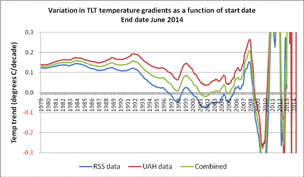
Fig 5: Comparison between RSS and UAH (June 2014)

The difference between the RSS and UAH results makes it clear why Mr Monckton chose to focus solely on the RSS data. At the time of writing this present article, the RSS and UAH datasets each extended to February 2016, and Fig 6 (below) shows graphically how the datasets compare when that end date is employed.

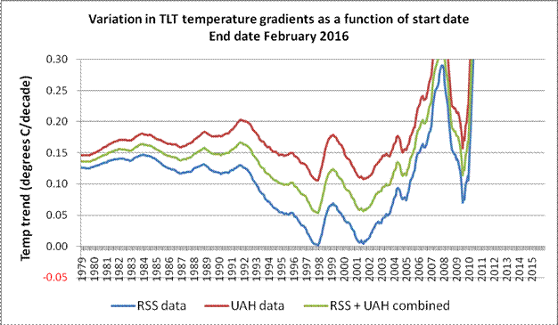
Fig 6: Comparison between RSS and UAH (Feb 2016)

In his sausage with the November 2015 sell-by-date, Mr Monckton assured his readers that “…The UAH dataset shows a Pause almost as long as the RSS dataset.

Even just a moment or two spent considering the UAH curves on Fig 5 (June 2014) and then on Fig 6 (February 2016) would suggest precisely how far that claim is removed from reality. However, for those unwilling to put in this minimal effort, Fig 7 is just for you.

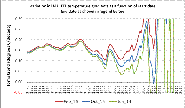
Fig 7: UAH TLT temperatures gradients over three different end dates.

From the above diagram, it is rather difficult to see any remote justification for Mr Monckton’s bizarre assertion that “…The UAH dataset shows a Pause almost as long as the RSS dataset.

Moving on, it is clear that, irrespective of the exact timeframe, both the datasets exhibit a reasonably consistent “triple dip”. To understand the cause(s) of this “triple dip” in the above diagrams (at about 1997, 2001 and 2009), one needs to look at the data in the usual anomaly format, rather than in gradient format used in Figs 2 – 7.

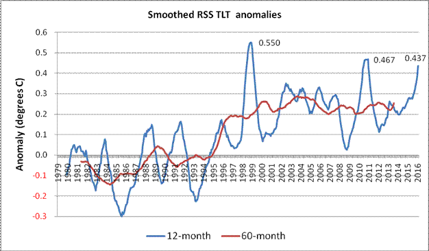
Fig 8: RSS TLT anomalies smoothed over 12-month and 60-month periods

The monthly data looks very messy on a chart, but the application of 12-month and 60-month smoothing used in Fig 8 perhaps makes some details easier to see. The peaks resulting from the big 1997/98 El Niño and the less extreme 2009/10 event are very obvious on the 12-month data, but the impact of the prolonged series of 4 mini-peaks centred around 2003/04 shows up more on the 60-month plot. At present, the highest 60-month rolling average is centred near this part of the time series. (However, that may not be the case for much longer. If the next few months follow a similar pattern to the 1997/98 event, both the 12- and 60-month records are likely to be surpassed. Given that the March and April RSS TLT values recorded in 2015 were the two coolest months of that year, it is highly likely that a new rolling 12-month record will be set in April 2016.)

Whilst this helps explain the general shape of the curve families, it does not explain the divergence between the RSS and the UAH data. To show this effect, two approaches can be adopted: one can plot the two datasets together on the same chart, or one can derive the differences between RSS and UAH for every monthly value and plot that result.

In the first instance, the equivalent UAH rolling 12- and 60-month values have effectively been added to the above chart (Fig 8), as shown below in Fig 9.

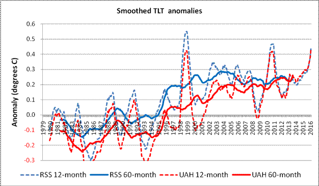
Fig 9: RSS and UAH TLT anomalies using 12- and 60-month smoothing

On this chart (Fig 9) it can be seen that the smoothed anomalies start a little way apart, diverge near the middle of the time series, and then gradually converge as one looks toward the more recent values. Interestingly, although the 60-month peak at about 2003/04 in the RSS data is also present in the UAH data, it has long since been overtaken.

The second approach would involve subtracting the UAH monthly TLT anomalies figures from the RSS equivalents. The resulting difference values are plotted on Fig 10 below, and are most revealing. The latest values on Figs 9 and 10 are for February 2016.

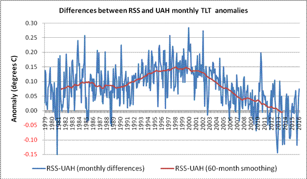
Fig 10: Differences between RSS and UAH monthly TLT values up to Feb 2016

Even without the centred 60-month smoothed average, the general shape emerges clearly. The smoothed RSS values start off about 0.075 Celsius above the UAH values, but by about 1999 or 2000, this delta has risen to +0.15 Celsius. It then begins a virtually monotonic drop such that the 6 most recent rolling 60-month values have gone negative.

NB It is only to be expected that the dataset comparison begins with an offset of this magnitude. The UAH dataset anomalies are based upon a 30-year meteorology stretching from 1981 – 2010. However, RSS uses instead a 20-year baseline running from 1979 – 1998. The mid points of the two baselines are therefore 7 years apart. Given that the overall trend is currently in the order of 0.12 Celsius per decade, one would reasonably expect the starting offset to be pretty close to 0.084 Celsius. The actual starting point (0.075 Celsius) was therefore within about one hundredth of a degree Celsius from this figure.

Should anyone doubt the veracity of the above diagram, hereis a copy of something similar taken from Roy Spencer’s web pages. Apart from the end date, the only real difference is that whereas Fig 9 has the UAH monthly values subtracted from the RSS equivalent, Dr Spencer has subtracted the RSS data from the UAH equivalent, and has applied a 3-month smoothing filter. This is reproduced below as Fig 11.

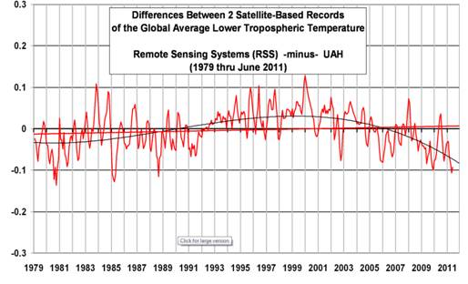
Fig 11: Differences between UAH and RSS (copied from Dr Spencer’s blog)

This actually demonstrates one of the benefits of genuine scepticism. Until I created the plot on Fig 10, I was sure that the 97/98 El Niño was almost entirely responsible for the apparent “pause” in the RSS data. However, it would appear that the varying divergence from the equivalent UAH figures also has a very significant role to play. Hopefully, the teams from RSS and UAH will, in the near future, be able to offer some mutually agreed explanation for this divergent behaviour. (Although both teams are about to implement new analysis routines – RSS going From Ver 3.3 to Ver 4, and UAH going from Ver 5.6 to Ver 4.0 – mutual agreement appears to be still in the future.)

Irrespective of this divergence between the satellite datasets, the October 2015 TLT value given by RSS was the second largest in that dataset for that month. That was swiftly followed by monthly records for November, December and January. The February value went that little bit further and was the highest in the entire dataset. In the UAH TLT dataset, September 2015 was the third highest for that month, with each of the 5 months since then breaking the relevant monthly record. As with its RSS equivalent, the February 2016 UAH TLT figure was the highest in the entire dataset. In fact, the latest rolling 12-month UAH TLT figure is already the highest in the entire dataset. This would certainly appear to be strange behaviour during a so-called pause.

As sure as the sun rises in the east, these record breaking temperatures (and their effect on temperature trends) will be written off by some as merely being a consequence of the current El Niño. It does seem hypocritical that these people didn’t feel that a similar argument could be made about the 1997/98 event. An analogy could be made concerning the measurement of Sea Level Rise. Imagine that someone – who rejects the idea that sea level is rising – starts their measurements using a high tide value, and then cries foul because a subsequent (higher) reading was also taken at high tide.

This desperate clutching of straws will doubtless continue unabated, and a new “last, best hope” has already appeared in guise of Solar Cycle 25. Way back in 2006, an article by David Archibald appeared in Energy & Environment telling us how Solar Cycles 24 & 25 were going to cause temperatures to plummet. In the Conclusion to this paper, Mr Archibald wrote that …

A number of solar cycle prediction models are forecasting weak solar cycles 24 and 25 equating to a Dalton Minimum, and possibly the beginning of a prolonged period of weak activity equating to a Maunder Minimum. In the former case, a temperature decline of the order of 1.5°C can be expected based on the temperature response to solar cycles 5 and 6.

Well, according to NASA, the peak for Solar Cycle 24 passed almost 2 years ago, so it’s not looking too good at the moment for that prediction. However, Solar Cycle 25 probably won’t peak until about 2025, so that will keep the merchants of doubt going for a while.

Meanwhile, back in the real world, it is very tempting to make the following observations …

  • The February TLT value from RSS seems to have produced the conditions under which certain allotropes of the fabled element known as Moncktonite will spontaneously evaporate, and …
  • If Mr Monckton’s sausages leave an awfully bad taste in the mouth, it could be due to the fact that they are full of tripe.

Inevitably however, in the world of science at least, those who seek to employ misdirection and disinformation as a means to further their own ideological ends are doomed to eventual failure. In the closing paragraph to his “Personal
observations on the reliability of the Shuttle
”, the late, great Richard Feynman used a phrase that should be seared into the consciousness of anyone writing about climate science, especially those who are economical with the truth…

For a successful technology, reality must take precedence over public relations, for nature cannot be fooled.

Remember that final phrase – “nature cannot be fooled”, even if vast numbers of voters can be!

Global Sea Ice Extent at Lowest *Ever Level

A few days ago we reported that the Cryosphere Today global sea ice area metric had fallen to the “lowest *ever” level since their records began in 1979. CT area just fell to yet another all time low once again. Today we are able to bring you the news that NSIDC global sea ice extent also achieved “lowest *ever” status today, at 16.707 million square kilometers. Here’s the graph to prove it:

Global-Extent-2016-02-18

As we discussed when global sea ice area reached its all time low level:

This measure doesn’t tell us all that much about the health of either Arctic or Antarctic regions, if only because the seasons move in opposite directions (nevertheless, the global sea ice trend is down). It’s just an interesting statistical factoid.

Rest assured that nonetheless we will attempt to bring this “statistical factoid” to the attention of those who have been merrily claiming for the past few years that “the trend on the daily observations of global sea-ice extent by the satellites since 1979 is remarkably close to zero.”

To begin with, let’s see when (if?) this comment sees the cold light of day shall we?

2016-02-18_1911-WUWT

[Edit – 08:30 UTC February 19th 2016]

The comment shown above has now seen the light of day, whereas a number of others have not. Here’s the rest of the assorted conversations, so far:

Them:

I prefer this chart:

DMI_extent-30_20160217

That’s at 30%, which eliminates most of the wind-blown bergs. It measures the thicker ice cover, so it’s a more accurate representation.

You can see 2016 starting to move up after a strong 2015 finish.


Us:

This one is currently still invisible over there:

That’s the one which the Danish Meteorological Institute no longer even mention on their website because it’s been deprecated and unsupported for so long:

http://ocean.dmi.dk/arctic/icecover.uk.php

Here’s the graph (of Arctic sea ice extent only) which they currently recommend, which shows broadly the same thing as the NSIDC’s version:

DMI_icecover_20160219

Can we get back to GLOBAL sea ice area/extent now?

I didn’t want to use up my limited allocation of links over at WUWT, but here is what the Arctic sea ice chart that WUWT mods (and “Steve Goddard“) prefer currently looks like:

DMI_extent-30_20160218

Maybe that’s why the WUWT moderator in question felt compelled to display Wednesday’s chart instead of Thursday’s?


Them:

[I don’t think any of [Monckton, Soon or Legates] with bother with your off-topic question. as said earlier, your entire m.o. is to launch a taunt, and it doesn’t merit a response since this isn’t any particularly noteworthy event. -mod]


Us:

This one is currently still invisible too:

Have you got something against Clive Best? Both my comments that link to our conversation about global area/extent are still invisible.

The “lowest EVAH!!” value of Christopher Monkton’s favourite sea ice metric doesn’t merit a response from him? On an article subtitled “killer questions that expose how wrong and ideologically driven they are”? Surely you jest?

Quoting from the ice cool Snow White:

On January 19th 2016 the Watts Up With That blog published an article by one “Christopher Monckton of Brenchley” entitled “20 false representations in one 10-minute video“. The 15th “false representation” read as follows:

That Arctic sea ice is declining, though Antarctic sea ice has been on a rising trend and reached a satellite-era record in early 2015, and though the decline in Arctic sea ice is chiefly only in a few late-summer weeks and is a small fraction of the seasonal variation in sea-ice extent, so that neither the extent nor the trend of global sea ice (from the University of Illinois) shows much change throughout the satellite era.

Where is the Good Lord when you need him? Where is Willie Soon for that matter?


Here are my other comments that have yet to catch the eagle eyes of the Watts Up With That band of merry moderators:

2016-02-18_1951-WUWT

2016-02-15_1800-WUWT

2016-02-12_2353-WUWT


* Since satellite records began

For Life on Earth, Ice is not Generally a Good Thing!?

Or so Viscount Christopher Monckton of Brenchley claims in answer to the question I recently put to him and his fellow authors in a comment below an article on the Watts Up With That blog entitled “The Profiteers of Climate Doom” and bylined “Christopher Monckton of Brenchley, Willie Soon and David R. Legates”. As I put it in my initial comment:

A “killer question” for you Christopher.

Were you previously aware that global sea ice area has recently reached its lowest ever level (since the Cryosphere Today satellite records began)?

The thing is, although Chris’s riposte to my gentle probing has just been published, my third explanatory comment has not. Here it is:

2016-02-12_2353-WUWT

and here is the good Viscount’s answer, quoted in full:

Mr Hunt, in his desperation to promote the purely political but now collapsing cause of shutting down fossil-fuel corporations that were once the major donors to his hated Republican opponents, displays a shameful disregard for, or ignorance of, elementary statistical method. He founds his case on a single data point, and one that is little different from similar data points in 2006 and 2011.

However, as he will learn when he attends his first Statistics 101 course, to place undue weight on a single data point is to err. Grown-ups determine trends on multiple data points. As Mr Hunt will learn from the graph helpfully posted by Mr Stealey, to whom he is as churlishly ungrateful as most of his sort are, the trend on the daily observations of global sea-ice extent by the satellites since 1979 is remarkably close to zero.

There has, of course, been some global warming since 1979, though only one-third of what the IPCC predicted in 1990. Naturally, one consequence of the little warming that has occurred might be a very small loss of global sea ice.

For life on Earth, of course, ice is not generally a good thing. The less of it the better.

Messrs Soon and Legates are currently keeping any thoughts they may have on the matter close to their respective chests.

[Edit – 23:30 UTC on Saturday February 13th 2016]

Intriguingly my 4th comment @WUWT is now plain for all to see, whereas despite my plaintive calls on Twitter the third shown above is not! Time for a brief flashback. On January 13th 2016 Yale Climate Connections published this video:

You will note that at around 6 minutes 30 seconds Carl Mears of Remote Sensing systems says that:

Senator Cruz focusses on one data set, mine, from one type of instrument, satellites, and he ignores all the other evidence. For example the surface temperature record, things like the Arctic sea ice declining….

On January 19th 2016 the Watts Up With That blog published an article by one “Christopher Monckton of Brenchley” entitled “20 false representations in one 10-minute video“. The 15th “false representation” read as follows:

That Arctic sea ice is declining, though Antarctic sea ice has been on a rising trend and reached a satellite-era record in early 2015, and though the decline in Arctic sea ice is chiefly only in a few late-summer weeks and is a small fraction of the seasonal variation in sea-ice extent, so that neither the extent nor the trend of global sea ice (from the University of Illinois) shows much change throughout the satellite era:

Moncktom-Global-Area

Does that graph look at all familiar?

[Edit – 16:45 UTC on Tuesday February 16th 2016]

I have posted two comments on the Watts Up With That blog today, but at present neither of them is visible. In the most recent one I endeavoured to inform Monckton et al. about the news that today the Cryosphere Today global sea ice area metric posted a new “*all time low” value. Here’s my comment:

2016-02-16_1639-WUWT

We’ll keep you posted about if and when it appears over there as well.

Willie Soon Gate at the Mail Online

I’ve just had a long phone conversation with John Wellington of the Mail on Sunday. He assures me he is fit and well and back in his hot seat there, but that the long standing bone that I’ve been eager to pick with the Mail Online about Victoria Woollaston’s January 21st article entitled “Is climate change really that dangerous? Predictions are ‘very greatly exaggerated’, claims study” is the responsibility of Tal Gottesman. Here’s a brief extract of the article, to give you a little taste:

The paper, ‘Why models run hot: results from an irreducibly simple climate model’, was written by Lord Christopher Monckton of Brenchley, astrophysicist and geoscientist Willie Soon, Professor of Geography at the University of Delaware David Legates, and statistician Dr Matt Briggs.

It has been peer reviewed and is published in the journal Science Bulletin.

Mathematical equations used for large climate model typically require supercomputers that perform calculations quickly – some make more than 80 million calculations an hour.

and here’s the accompanying “infographic”:

I’ve been trying to get in touch with Vicky and/or her editor for several weeks now, so this is a big step forward! After a series of phone calls and emails that elicited no response “Willie SoonGate” broke earlier this week, so….

Us:


which also elicited no response, so following John’s phone call:

Hello Tal,

John was kind enough to telephone me and pass on your email address.

Further to the correspondence copied below you will note that I have had a singular lack of success directing my enquiries on the above topic to the generic MailOnline editorial address.

At the risk of repeating myself repeating myself

How do you suggest we go about starting a conversation?

Best wishes,

Jim Hunt

followed by:
 

Them:

Thank you for your email which has been passed to the Managing Editor’s office.

We understand that you would like to submit a complaint on the story below:

http://www.dailymail.co.uk/sciencetech/article-2920311/Is-climate-change-really-dangerous-Predictions-greatly-exaggerated-claims-study.html

If you could please outline what the issue is, we will ensure your complaint is investigated immediately.

Yours sincerely

MailOnline


Us:

Dear Madam,

Your understanding is (at long last) correct!

My first complaint is that I have received no previous response, not even an acknowledgement, to my emails of January 26th, February 2nd and February 23rd 2015. Can I safely assume that conversation using this email address will be more timely from now on? Do you by any chance possess a telephone number?

Moving on to the article in question, I will prepare a more substantive reply as soon as I have finished addressing similar issues with the Sunday Telegraph and the BBC. In brief the paper by Monckton, Soon, Legates & Briggs described in the article in question is scientific nonsense. As a famous scientist called Albert Einstein allegedly once put it:

“Everything should be as simple as possible, but not simpler”

As such the article is scientifically inaccurate and/or misleading, and as I am sure you must be aware allegations have recently been made elsewhere about possible reasons for that. I have been denied any discussion about a reply or “correction” to the article for 5 weeks thus far, and counting. Did you hear back from the IPCC by the way? If so, what did they say and where did you “print” it?

Best wishes,

Jim Hunt


Them:

We’ll keep you posted!


Snow White is Actually a “Cowardly Cross Dresser”!

In order to avoid the malicious “spammer” label attached to me by Steven Goddard of “Real Science” fame many moons ago I have been using the nom de guerre “Snow White” in skeptical circles for a while. Unfortunately my pseudonimity didn’t stand a chance against the laser sharp investigative skills of Anthony Watts. My embarrassment is now archived in the public record, plain for all to see:

An extract from the "WUWT near the center of the climate blogosphere"
An extract from the “WUWT near the center of the climate blogosphere” thread on the “Watts Up With That” blog on April 9, 2014 at 2:01 pm

A commenter at “Watts Up With That” then piled on the scorn:

"Snow White"  is revealed as a "Cowardly Cross dresser", for all the world to see.
“Snow White” is revealed as a “Cowardly cross dresser”, for all the world to see.

The thing is though, that in the process of so skilfully “outing” Snow White Anthony kindly pointed his loyal readers in the direction of our humble “Resources” section and our videos, so I suppose we’ll have to tart them all up a bit now!