Category Archives: Area

Facts About the Arctic in May 2017

Before we got on to the more usual Arctic metrics let’s bear in mind that the beginning of May is the time when the ice on the mighty Mackenzie River begins to break up, ultimately sending a surge of (comparatively!) warm water rushing into the Beaufort Sea. The patches of open water visible in the Beaufort Sea off the Mackenzie Delta in early April refroze, but have recently opened up once again:

NASA Worldview “true-color” image of the Beaufort Sea on May 2nd 2017, derived from the MODIS sensor on the Terra satellite

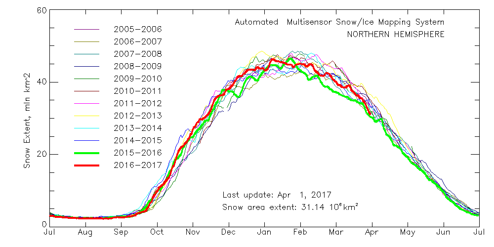
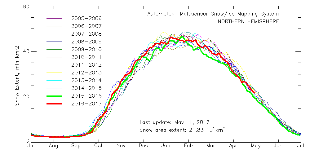
Meanwhile Northern Hemisphere snow cover is falling fast, albeit still above last year’s levels:

multisensor_4km_nh_snow_extent_20170502

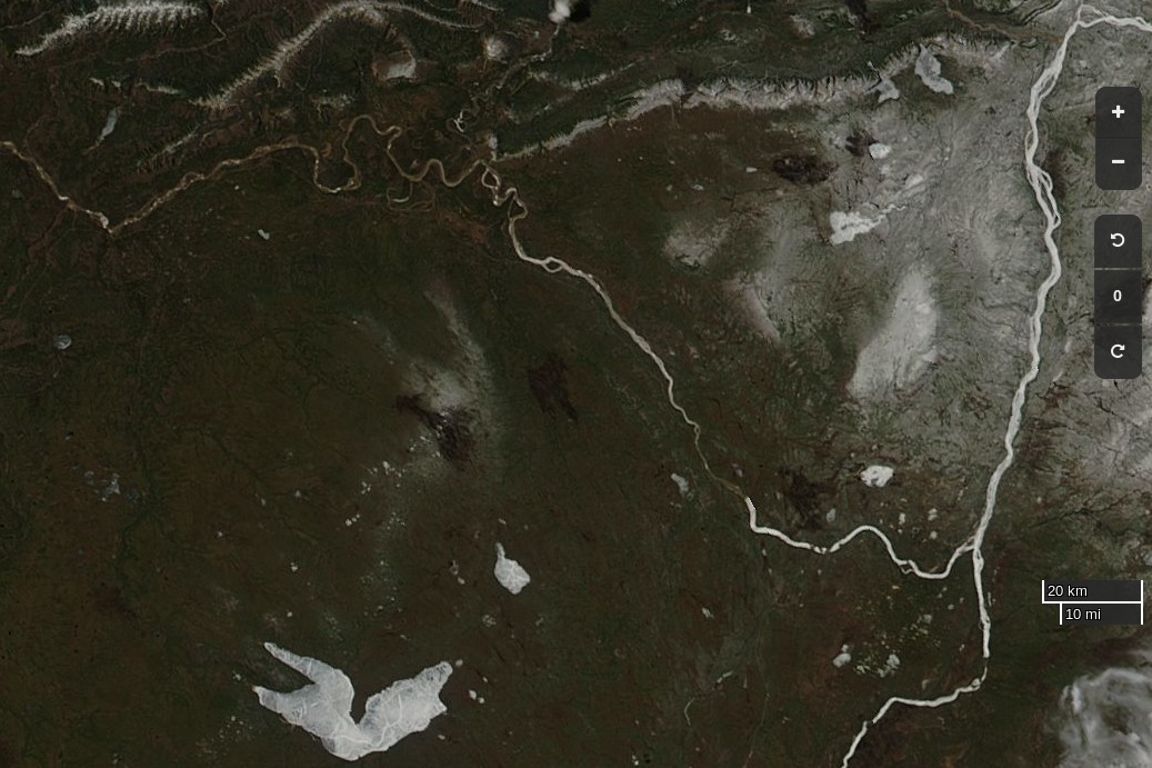
Here’s the current view of the Liard River in northern Canada, with the Mackenzie River running bottom to top on the right hand side:

NASA Worldview “true-color” image of the Liard and Mackenzie Rivers on May 2nd 2017, derived from the MODIS sensor on the Terra satellite

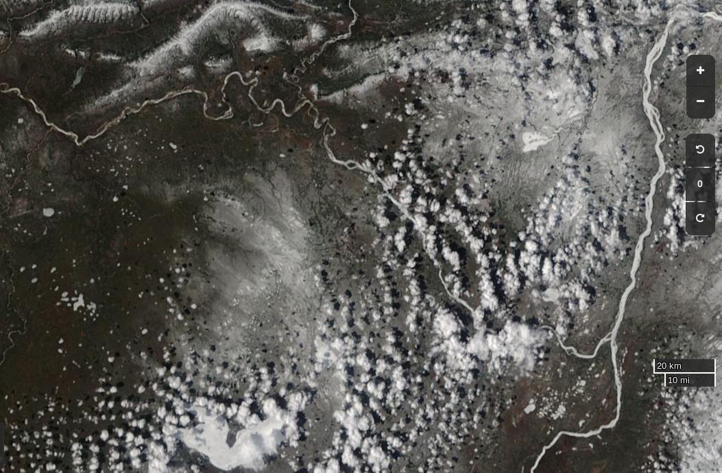
The break-up of the Liard leads the Mackenzie, and taking a look at last year’s view of the same area it’s apparent that this year there’s somewhat more snow on the ground, and that this years Mackenzie break-up will therefore be a few days later than last year:

NASA Worldview “true-color” image of the Liard and Mackenzie Rivers on May 2nd 2016, derived from the MODIS sensor on the Aqua satellite

Whilst early melt in the Beaufort Sea is currently behind last year, the reverse is most certainly the case next door in the Chukchi Sea. The skies are rather cloudy there at the moment, but using the Suomi NPP day/night band to peer through the gloom reveals this:

NASA Worldview “day/night band” image of the Chukchi Sea on May 2nd 2017, derived from the VIIRS sensor on the Suomi satellite

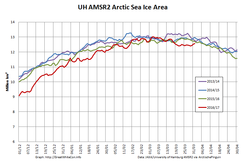
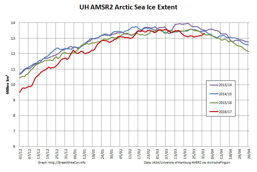
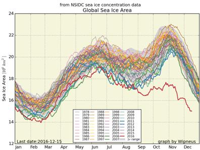
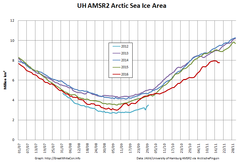
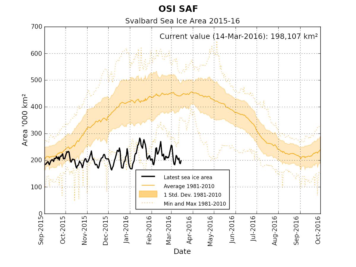
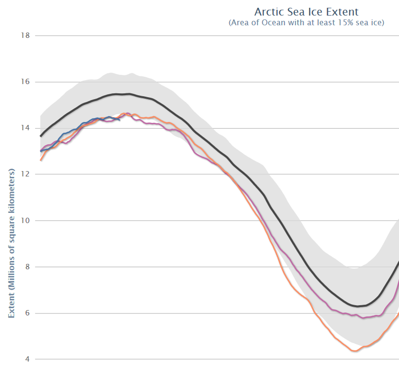
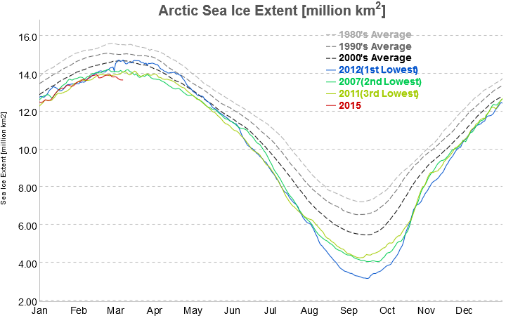
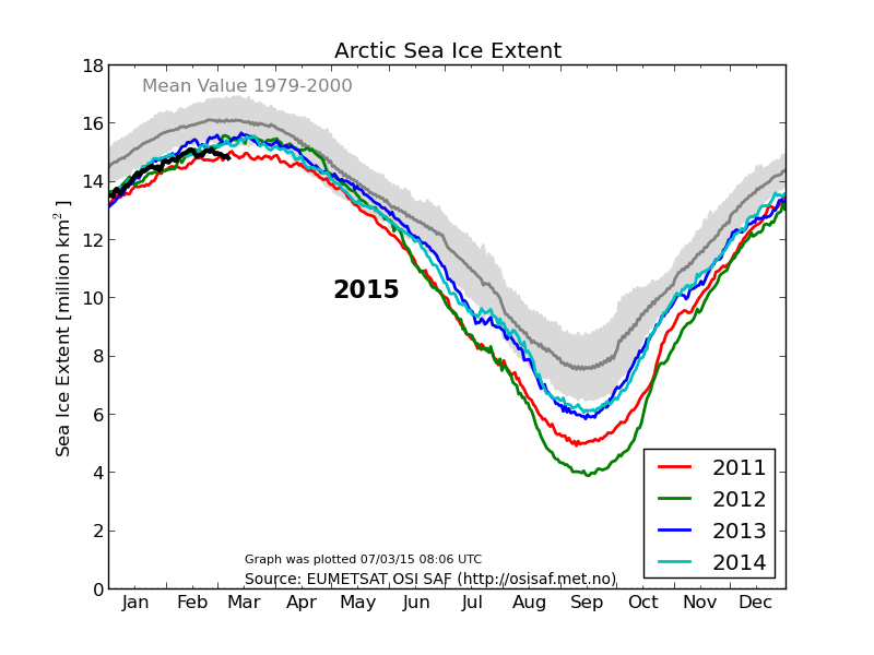
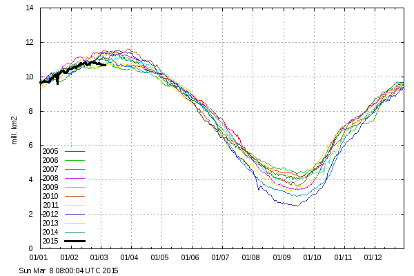
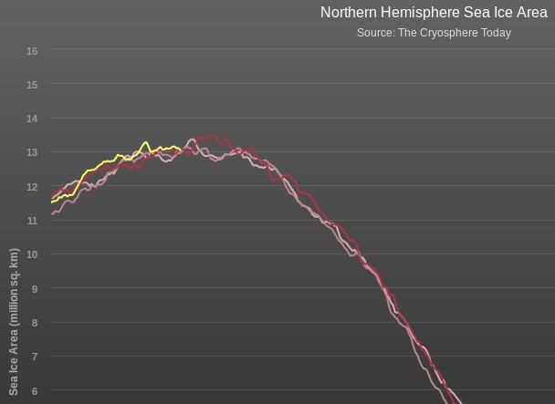
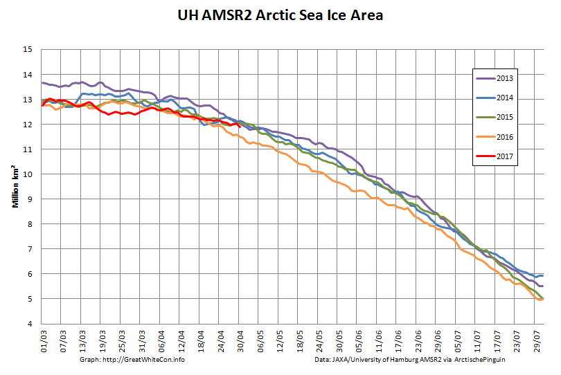
Whilst sea coverage on the Pacific periphery has continued to fall, extent on the Atlantic side has not been following suit. Hence overall Arctic sea ice area is no longer lowest in the satellite record:

UH-Arctic-Area-2017-04-30

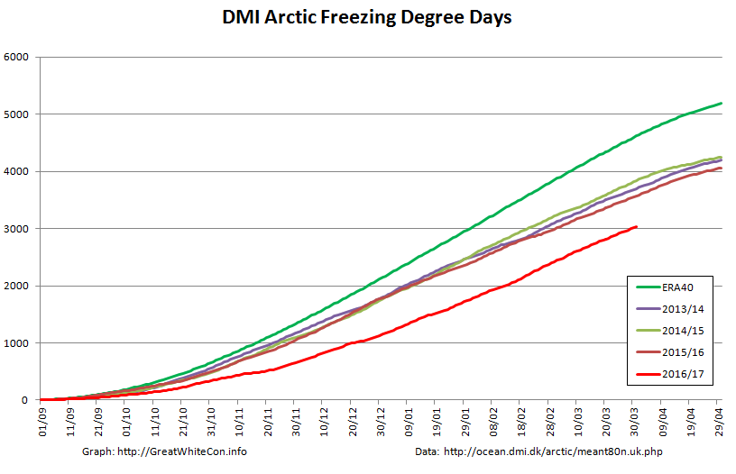
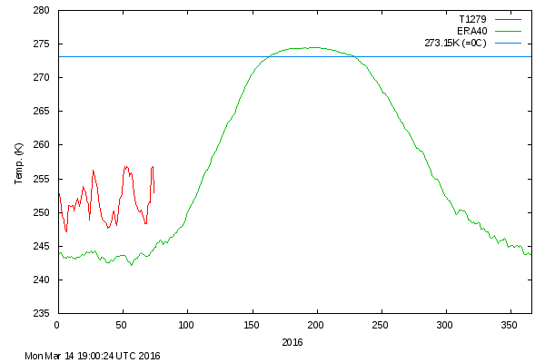
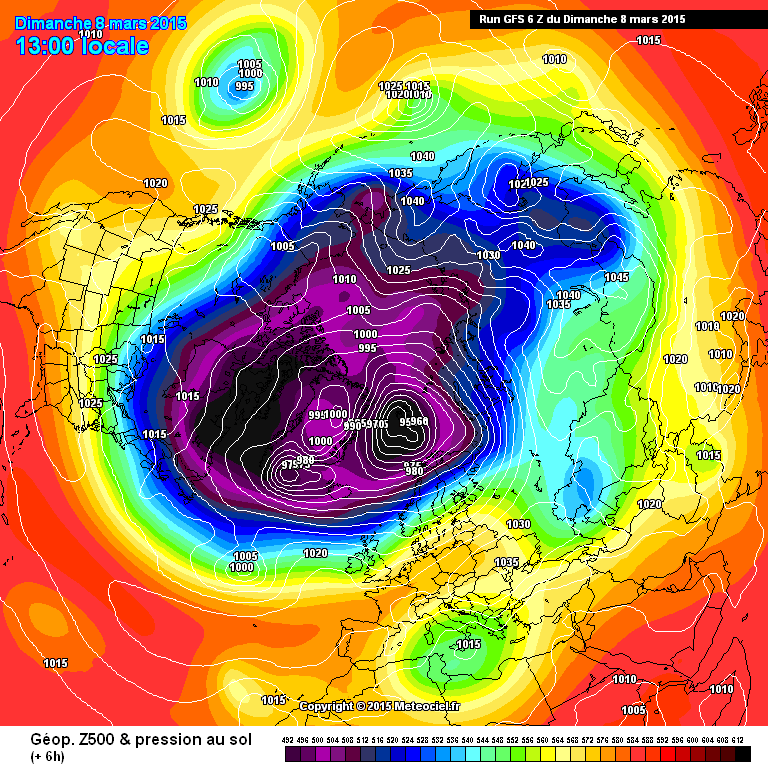
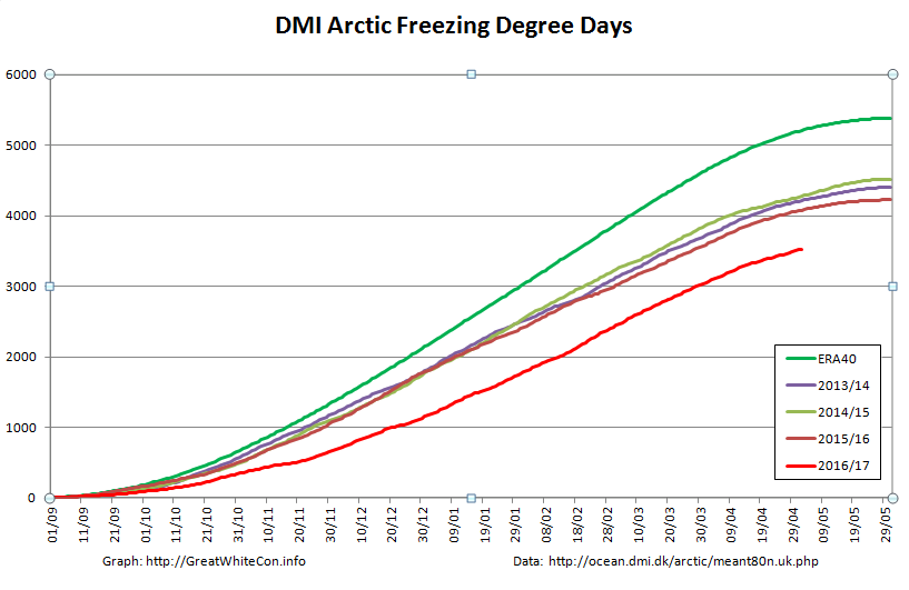
Finally, until the new PIOMAS numbers are released at least, here’s how DMI freezing degree days look at the moment:

DMI-FDD-20170502


[Edit – May 4th]

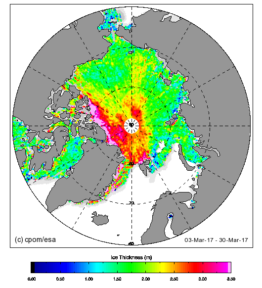
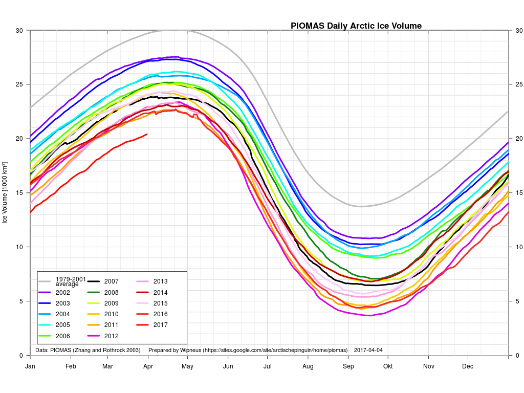
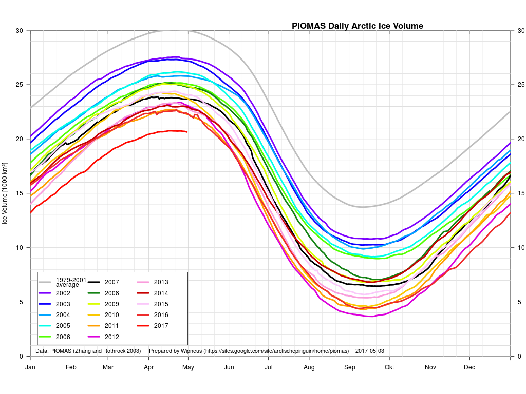
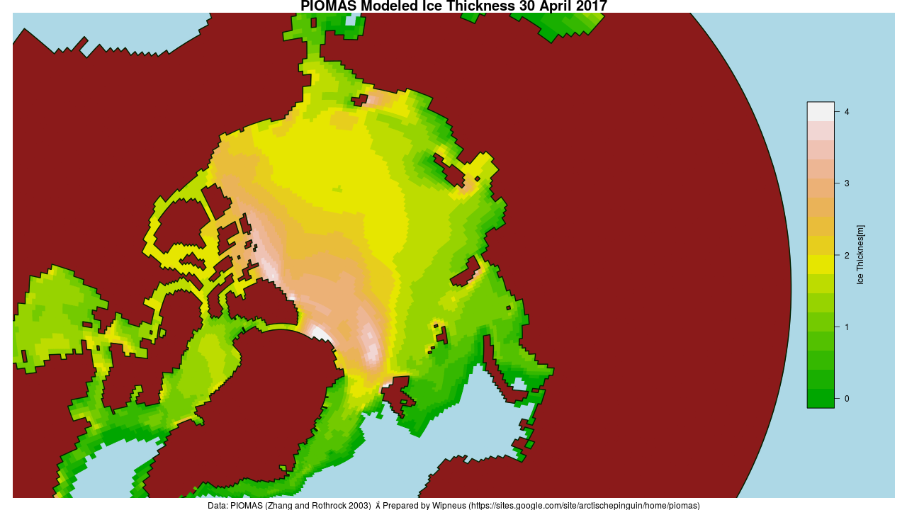
The April PIOMAS numbers have been published: Arctic sea ice volume is yet again by far the lowest on record:

PIOMAS-Volume-20170430

PIOMAS-thk-20170430


[Edit – May 5th]

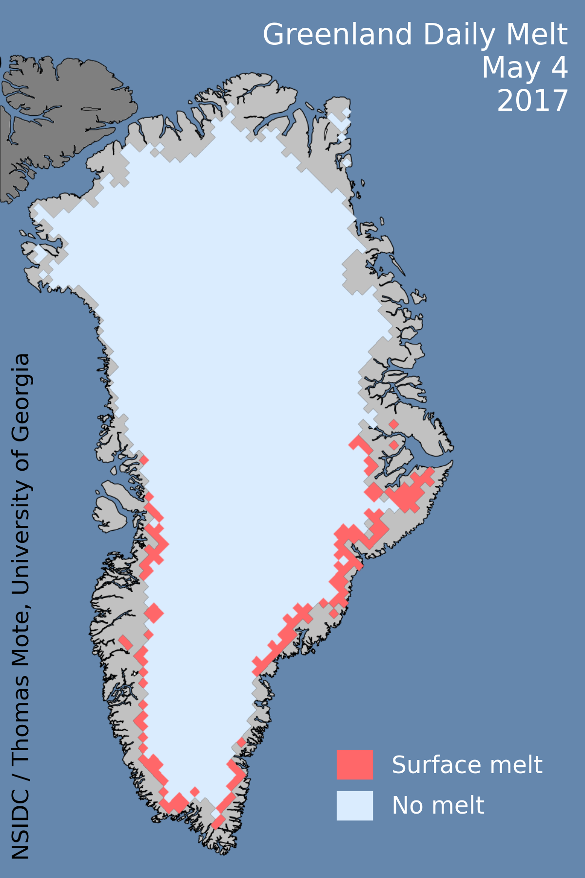
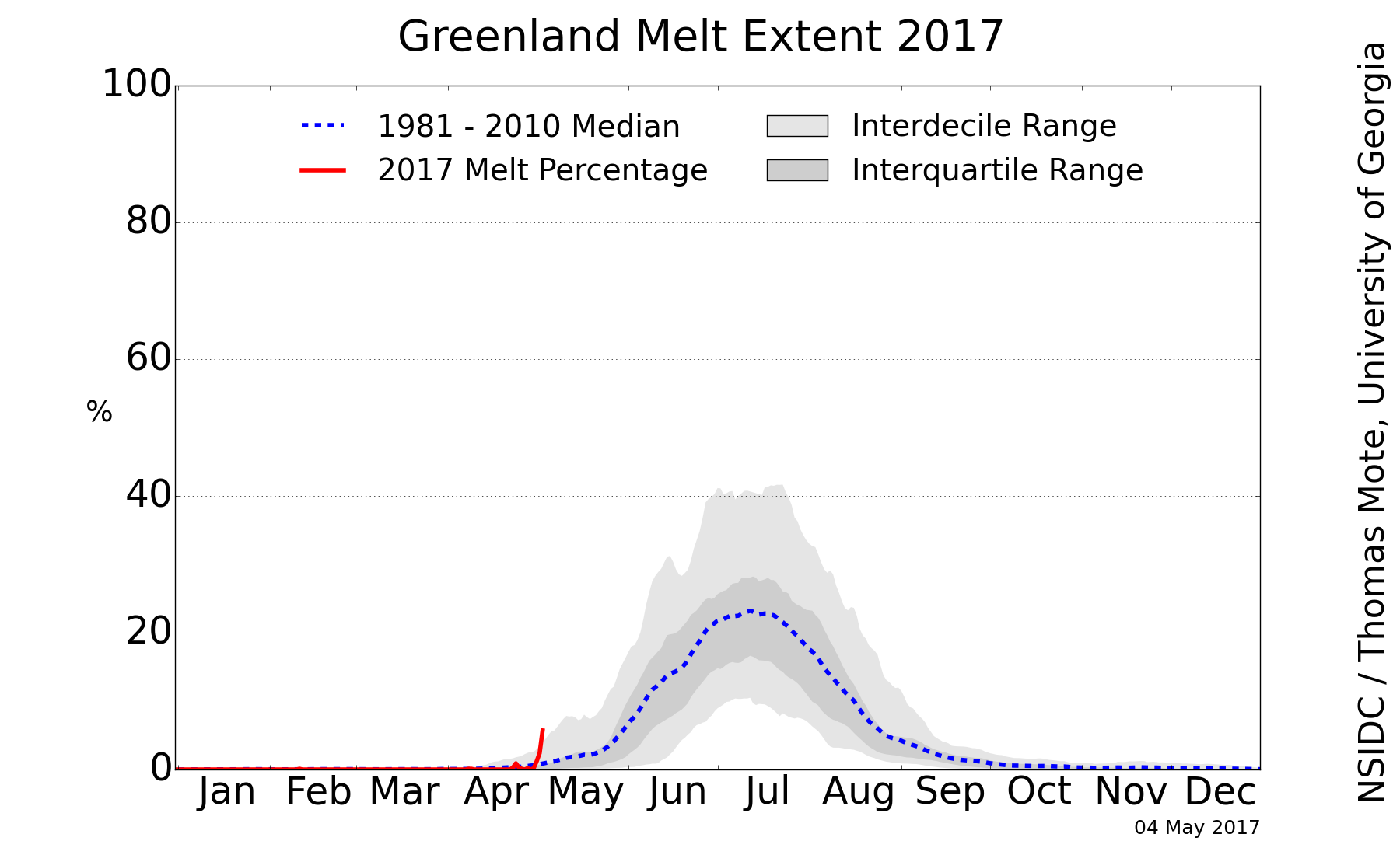
Greenland ice sheet surface melt has started early this year:

greenland_melt_map_20170504

greenland_melt_plot_20170504


[Edit – May 12th]

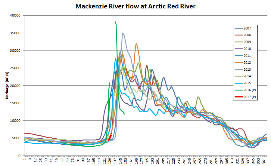
The ice break-up of the Mackenzie River is now visible as increased flow at the junction with Arctic Red River just south of the delta:

Mackenzie River flow at Arctic Red River up to May 12th 2017

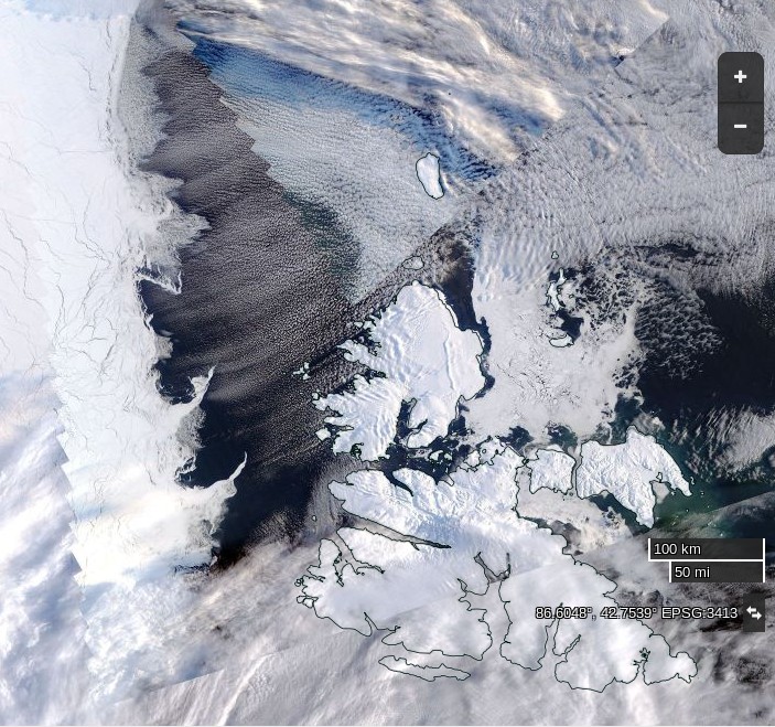
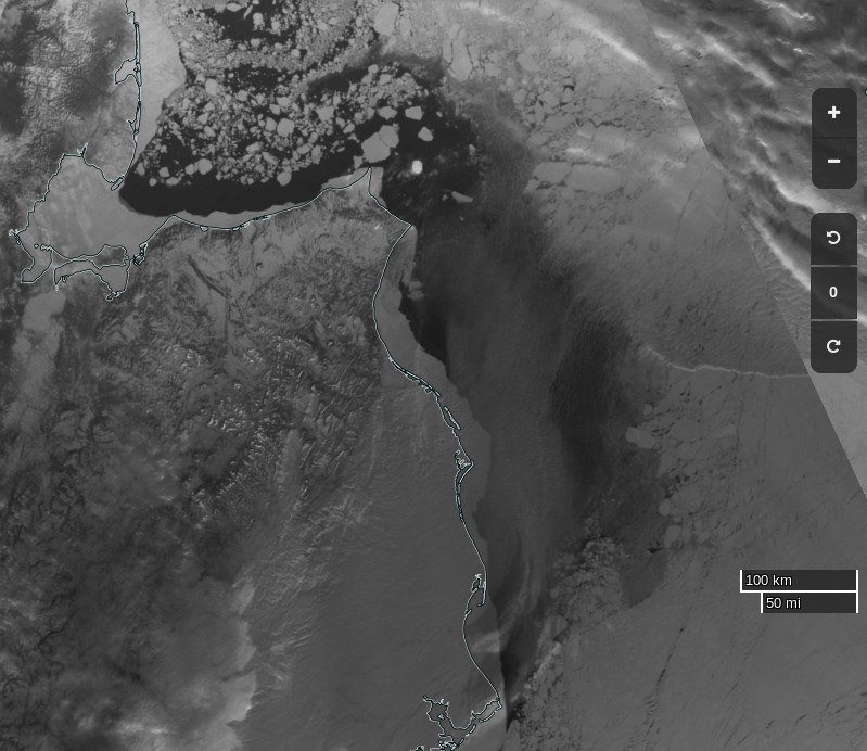
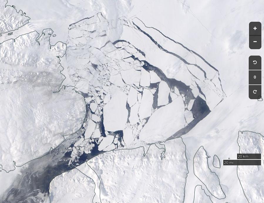
Meanwhile the sea ice in the Lincoln Sea north the Nares Strait is coming apart at the seams:

NASA Worldview “true-color” image of the Lincoln Sea on May 12th 2017, derived from the MODIS sensor on the Terra satellite


[Edit – May 17th]

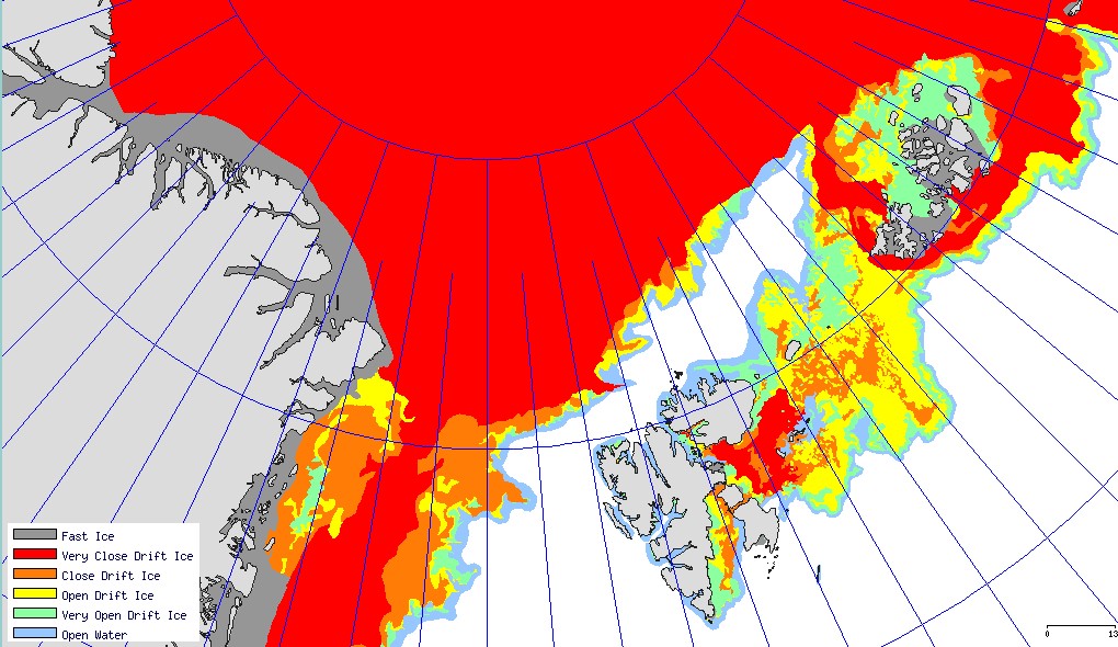
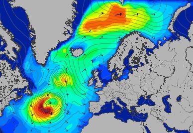
May seems to be shaping up as month of two halves, both spatially and temporally. Here’s an overview of the current state of play:

Arc_20170516_res3.125

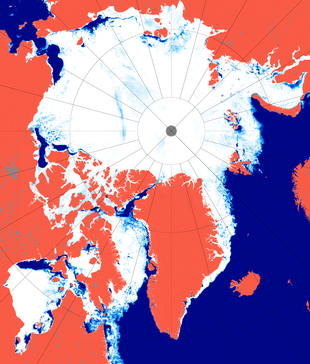
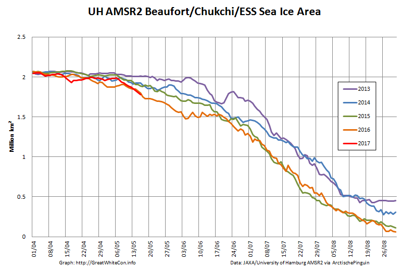
On the Pacific side of the Arctic sea ice area has been declining rapidly courtesy of the expanding areas of open water visible in the Beaufort, Chukchi and East Siberian Seas. It’s currently tracking below other recent years:

UH-Pacific-Extent-2017-05-16

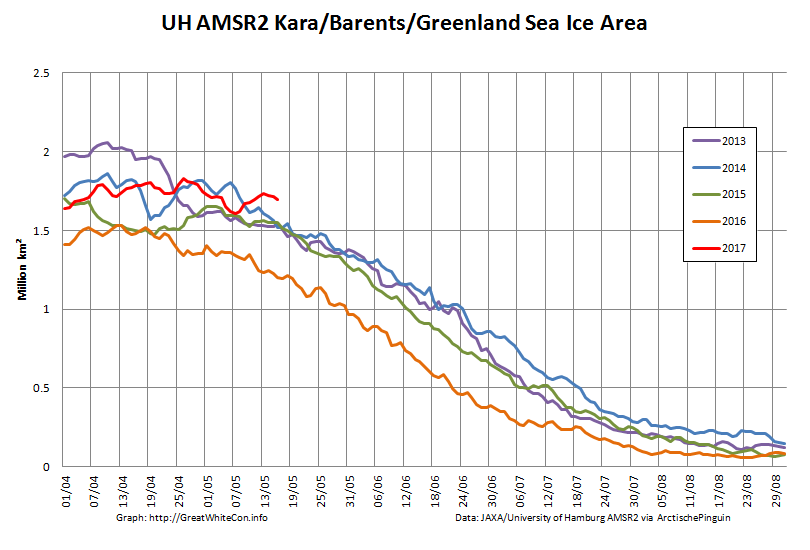
However over on the Atlantic side area has been flatlining, and is currently above other recent years:

UH-Atlantic-Extent-2017-05-16

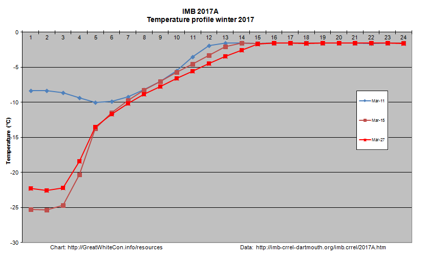
Ice mass balance buoy 2017A is now located near the boundary between the Beaufort and Chukchi Seas and as the melting season in that vicinity rapidly approaches it reveals that thermodynamic thickening has thus far achieved a mere 119 cm:2017A-2017-05-15

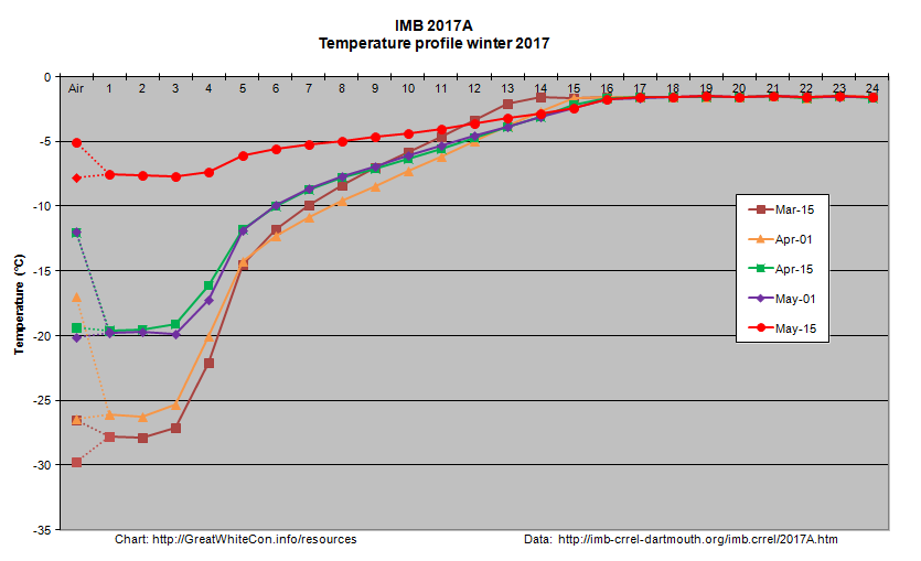
Arctic wide sea ice area has recently started to decline at an increasing rate:

UH-Arctic-Area-2017-05-16

During the second half of the month it will be interesting to see whether the forecast high temperatures produce significant melt ponding. If so it’s conceivable that 2017 area could drop below 2016 again by the beginning of June. There already signs of surface melt at places as far apart as Franklin Bay, Chaunskaya Bay and even the Great Bear Lake!

Watch this space!

References

Muhammad, P., Duguay, C., and Kang, K.-K.: Monitoring ice break-up on the Mackenzie River using MODIS data, The Cryosphere, 10, 569-584, doi:10.5194/tc-10-569-2016, 2016.

Rood S. B., Kaluthota S., Philipsen L. J., Rood N. J., and Zanewich K. P. (2017) Increasing discharge from the Mackenzie River system to the Arctic Ocean, Hydrol. Process., 31, 150–160. doi: 10.1002/hyp.10986.

Kwok, R., L. Toudal Pedersen, P. Gudmandsen, and S. S. Pang (2010), Large sea ice outflow into the Nares Strait in 2007, Geophys. Res. Lett., 37, L03502, doi:10.1029/2009GL041872.

Facts About the Arctic in April 2017

Particularly in view of all the balderdash concerning “climate science” being spouted in Washington DC on Wednesday lets first of all run through some Arctic sea ice facts from April 1st 2017 or thereabouts:

Northern Hemisphere Snow Extent:

multisensor_4km_nh_snow_extent_20170401

Arctic Sea Ice Area:

UH-Arctic-Area-2017-04-01

Arctic Sea Ice Extent:

UH-Arctic-Extent-2017-04-01

Arctic Sea Ice Concentration:

Bremen_AMSR2_20170401

Thin ice map from the University of Bremen SMOS:

SMOS-20170401

Thick ice map from CPOM CryoSat-2

Cryosat_28_20170330

Beaufort Sea ice thickness growth graph:

2017A-2017-03-27

DMI sea ice temperature map:

DMI-icetemp-20170330

DMI atmospheric temperature graph:

DMI-meanT_20170401

DMI Arctic Freezing Degree Days:

DMI-FDD-20170401

PIOMAS volume for March will follow in a few days, but it’s extremely unlikely to be anything other than “lowest for the date”.

What preliminary conclusions can we draw from this plethora of pretty pictures? First of all the Arctic hasn’t suddenly gone into “deep freeze” mode. Temperatures above 80 degrees north are rising again and are well above the climatology. Freezing degree days are still the lowest on record by a wide margin. Northern hemisphere snow cover is falling fast and is currently just above last year.

In contrast to last year, and thanks to lots of cyclones and very little in the way of anticyclones, there’s plenty of sub half meter sea ice in the Laptev and East Siberian Seas and hardly any in the Beaufort Sea. There’s also plenty of thin ice to be seen on both the Atlantic and Pacific peripheries.

The usual southerly arch hasn’t formed in the Nares Strait between Greenland and Ellesmere Island, and as SMOS shows the sea ice in the strait is consequently very thin. That leads one to wonder when the northern arch in the Lincoln Sea might give way.

It’s not immediately apparent from the still images above, but there’s been relatively large amounts of “old ice” exported from the Central Arctic on the Atlantic side, hence the recent increase in overall extent which is now second lowest for the date (since satellite records began). Area has been creeping up as well over recent days, but is still lowest for the date, as it has been for most of the last year. Sea ice “compactness” has decreased somewhat and given all the thin ice around the edges extent will soon start dropping once again.

All in all, the Arctic sea ice prognosis is not good. Are you watching Lamar Smith? (Pun intended!)


[Edit – April 4th]

The March PIOMAS update is out! As suspected, Arctic sea ice volume is still by far the lowest on record:

PIOMAS-Volume-20170331

Volume on March 31st 2017 was 20.398 thousand cubic kilometers. The previous lowest volume for the date was 22.129 thousand km³ in 2011.

Here too is the PIOMAS modelled Arctic sea ice thickness map:

PIOMAS daily gridded thickness for March 31st 2017


[Edit – April 12th]

The latest edition of the NSIDC’s Arctic Sea Ice News confirms that their monthly extent metric for March 2017 was the lowest in the satellite record for the month:

monthly_ice_03_NH_v2.1

As well as highlighting the anomalously warm temperatures across much of the Arctic:

Mar_925t_anom

the NSIDC article includes this telling pressure anomaly map:

Mar_925_slp_anom

There’s also mention of a new paper:

New work by an international team led by Igor Polyakov of the University of Alaska Fairbanks provides strong evidence that Atlantic layer heat is now playing a prominent role in reducing winter ice formation in the Eurasian Basin, which is manifested as more summer ice loss. According to their analysis, the ice loss due to the influence of Atlantic layer heat is comparable in magnitude to the top down forcing by the atmosphere.

The 11th Key Science Moment of 2016

A brief history of scientific “churnalism” in the age of social media. The “post-truth” of The Guardian’s 11th Key Science Moment of 2016.

On November 7th 2016 we broke this astonishing news on Twitter:

Nobody noticed! Then on November 16th 2016 Zack Labe did likewise:

The story got some legs. Zack got pushback from some “skeptics” and then the AGU blogged about the story.:

My attention was called to this issue last week thanks to the Twitter feed of Zack Labe, a PhD student in Earth Systems Science at the University of California – Irvine. He makes great graphics showing the latest data on polar climate.

Then he got interviewed by the AGU. The AGU linked back to the graphic graphic in question in the clouds at Google, but there was no mention of our November 6th article or the real source of the story. The Arctic Sea Ice Forum (ASIF for short).

It’s now December 18th, and as far as I’m aware that remains the case in the mainstream media (MSM for short). The Arctic Sea Ice Forum grew out the earlier Arctic Sea Ice Blog (ASIB for short). The proprietor of both the ASIB and ASIF has been revealed by CBC to be one Neven Curlin. They recently interviewed Neven, and even gave him top billing above Sir David Attenborough in the resulting podcast:

‘Like watching a train wreck’: Blogger quits writing about climate change

However the title of the CBC article is inaccurate, as CBC would surely have noticed if they’d read Neven’s article on the ASIB on the topic of his “sabbatical”.

Sabbatical (I hope)

Now comes news that the “astonishingly low level” of global sea ice area that we brought to the waiting world’s attention on November 7th has today been chosen by The Guardian as one of their:

12 key science moments of 2016

The story outlined above and the associated graphic graphic are conspicuous only by their absence, but the Grauniad have thoughtfully provided this pretty stock photo of some sea ice:

Scroll down the Guardian’s article to number 11, pausing to read Tamsin Edwards’ section on atmospheric carbon dioxide levels at number 9 on the way down (unlike CO₂ concentrations). There you will discover Professor Andrea Sella’s opinion that:

In October, unprecedented weather patterns drove icy winds across Siberia, pushing Arctic temperatures up to 20C above normal and parts of the Arctic Ocean failed to refreeze; in the Antarctic, sea ice thawed faster than usual. For me the bombshell came from a Dutch blogger in late November: a plot of the Arctic plus Antarctic showed sea ice this autumn to be tracking 4m km2 (the size of western Europe) below the normal average. This is a 7-sigma event – with a chance of about one in a hundred billion of being random. The ice doesn’t lie. If we don’t take this seriously now, our children will ask us why.

The “plot of the Arctic plus Antarctic” Andrea refers to was created by “Wipneus”, who I suppose could reasonably be described as a “Dutch programmer”. Neven could reasonably be described as a blogger, although he is much more than that. Although he was born in The Netherlands he no longer lives there.

Here’s the current state of play:

nsidc_global_area_20161215-400

Are your children asking “Why?” yet?

Should anybody wish to pose that question on Twitter please see:

NASA Researches Storm Frank in the Arctic

Regular readers may recall that as 2016 began we pondered how “Storm Frank” might have affected the Arctic. Now NASA have published some research into that very topic, entitled ” The Impact of the Extreme Winter 2015/16 Arctic Cyclone on the Barents–Kara Seas”. The paper itself is paywalled, but according to an associated article on the NASA web site:

A large cyclone that crossed the Arctic in December 2015 brought so much heat and humidity to this otherwise frigid and dry environment that it thinned and shrunk the sea ice cover during a time of the year when the ice should have been growing thicker and stronger.

The cyclone formed on Dec. 28, 2015, in the middle of the North Atlantic, and traveled to the United Kingdom and Iceland before entering the Arctic on Dec. 30, lingering in the area for several days. During the height of the storm, the mean air temperatures in the Kara and Barents seas region, north of Russia and Norway, were 18 degrees Fahrenheit (10 degrees Celsius) warmer than what the average had been for this time of the year since 2003.

The extremely warm and humid air mass associated with the cyclone caused an amount of energy equivalent to the power used in one year by half a million American homes to be transferred from the atmosphere to the surface of the sea ice in the Kara-Barents region. As a result, the area’s sea ice thinned by almost 4 inches (10 centimeters) on average.

At the same time, the storm winds pushed the edges of the sea ice north, compacting the ice pack.

Here’s a video with commentary by Linette Boisvert, lead author of the paper:

From the commentary:

As a result of this cyclone, the concentration of the sea ice in the Barents and Kara Seas decreased by ten percent, and the sea ice edge moved northward. The loss in sea ice area during this time was equivalent to the size of Florida. Sea ice extent stayed low throughout the month of January with large parts of the Barents and Kara Seas remaining unseasonably ice-free, which probably helped contribute to a record low Arctic sea ice maximum.

Somewhat earlier than last year another strong cyclone has been having a similar effect on the Arctic over the last week. A cyclone entered the Central Arctic via the Fram Strait, reaching a minimum central pressure of 954 hPa on November 14th:

fram-2016-11-14-1800

Here is the Wavewatch III wave height forecast for November 15th 2016:

significant_height_of_combined_w-in-multi_2-glo_30m-20161113_00049

and here is NOAA’s temperature anomaly reanalysis for November 16th 2016:

noaatempanomaly-20161116

As a consequence of the strong winds, huge waves and 20 degrees Celsius temperature anomaly across much of the Arctic, sea ice area has been falling during a period when it is usually increasing rapidly:

uh-arctic-area-2016-11-19

The Awful Terrible Horrible Arctic Sea Ice Crisis

As our regular reader(s) will be aware, Anthony Watts has been plagiarising our content and republishing it on his “Watts Up With That” blog. In a perplexing perversity he has also been refusing to publish content that we have happily contributed to the self same blog. Hence we have taken the liberty of basing our title for today on a recent WUWT guest post by Willis Eschenbach entitled:

The Awful Terrible Horrible Global Sea Ice Crisis

Here’s what Willis had to say at the end of his article:

My Usual Request: Misunderstandings are the curse of the internet. If you disagree with me or anyone, please quote the exact words you disagree with, so we can all understand the exact nature of your objections. I can defend my own words. I cannot defend someone else’s interpretation of some unidentified words of mine.

My Other Request: If you believe that e.g. I’m using a method wrong or using the wrong dataset, please educate me and others by demonstrating the proper use of the method or the right dataset. Simply claiming I’m wrong about methods doesn’t advance the discussion unless you can point us to the right way to do it.

Data: The Hadley HadISST ice (and sea surface temperature) data is available here. I used the NetCDF file HadISST_ice.nc.gz (~15Mb) at the bottom of the page.

and here’s a copy of our still invisible comment:

2016-04-07_0600-WUWT

Epitomising the indomitable spirit of scientific skepticism we set out to duplicate the results obtained by Mr. Eschenbach and answer our own question as well as his. Here is what we’ve discovered. Firstly global sea ice area since 1974:

HadISST-Global

and then Arctic sea ice area since 1974:

HadISST-Arctic

Now as our very own learned guest poster Bill The Frog all too briefly pointed out to Willis Eschenbach on April 7th:

2016-04-07-1757-WUWT-BtF

Ignoring Bill’s helpful hint Willis concluded that:

We’re pretty sure that the global average surface temperature increased from the mid-1970s to about 1998. However, we see no sign of this in the global sea ice area data. Instead, ice area remained stable throughout the 1980s and the 1990s, while temperatures climbed:

hadcrut-global-average-surface-temp-WUWT-20160406

Next, we’re also pretty sure that there was no significant change in the global average temperature from about 1998 to 2015, the end of the ice data. Despite that, starting in 2000 the ice area first dipped to a low in about 2007, and since then has been climbing rapidly.

This supports a curious conclusion, which is that in modern times at least, the global sea ice area is not particularly a function of the global average surface temperature. Go figure…

Now that we’re in possession of all this newly revealed data about historical sea ice area and censorship in the cryospheric blogosphere what should we “go figure”? Firstly one feels compelled to ask why Willis’s global average temperature graph neglects to mention 2015 when he implies that it does?

Should you figure anything else please free to answer our query on a virtual postcard, in the space provided for that purpose below. You may additionally like to vent your feelings concerning this controversial cover-up of our changing climate over on Twitter using the #SnipGate hashtag.

Claim – Arctic Sea Ice Holds Firm?

Today’s Arctic sea ice claim comes from the Bishop Hill blog of Andrew Montford, which recently stated that:

This morning’s story appears to be the hoary old “Arctic sea ice in freefall” one.

“The Arctic is in crisis. Year by year, it’s slipping into a new state, and it’s hard to see how that won’t have an effect on weather throughout the Northern Hemisphere,” said Ted Scambos, lead scientist at the Colorado-based NSIDC.”

As usual on these occasions, I take a quick look at the Cryosphere Today anomaly page, where I find the sea ice apparently still stuck firmly in “pause” mode.

seaice.anomaly.-20160328

Having inadvertently wended my way onto The Bishop’s Hill via the northerly extension to Eli’s Rabett Warren I felt compelled, as usual, to quibble with Andrew’s “apparently firmly in ‘pause’ mode” claim. Since graphs in comments are not available over on The Hill, or The Rabett Run for that matter, let’s take a look at some graphic representations of the available data over here instead. Commenter “Golf Charlie” asks at The Bishop’s:

With CO₂ levels continuing to rise, why hasn’t temperature risen, and the ice disappeared as predicted?

Let’s see shall we? CO₂ levels are indeed continuing to rise:

Keeling-20160330

Temperature has risen, as predicted:

2015-berk1

Arctic amplification is occuring, as predicted:

Time series of Arctic surface temperature in winter (Dec/Jan/Feb)

Arctic sea ice is disappearing, as predicted:

CT-20160330

CT-Max-2016-Final

Q.E.D?

Vanishing Svalbard Sea Ice

At the turn of the year we speculated about the potential effect of high temperatures and the swells caused by strong winds on sea ice in the Fram Strait and Barents and Greenland Seas. With the vernal equinox rapidly approaching let’s take stock of the state of Svalbard sea ice. Here’s one the first “visual” satellite images of the area in 2016 recorded yesterday by the Aqua satellite:

NASA Worldview “true-color” image of the Central Arctic north of Svalbard on March 14th 2016, derived from the MODIS sensor on the Aqua satellite

and here is the equivalent sea ice map from the Norwegian Meteorological Institute:

Svalbard-Map-20160314

Both sources reveal an unseasonable lack of solid sea ice around Svalbard. In fact an intrepid Northwest Passage navigator who didn’t mind the dark might well currently be able to circumnavigate Svalbard!

The Norwegian Meteorological Institute also produce a time series of sea ice area in the Svalbard region based on data from OSI-SAF. It currently looks like this:

osisaf-svalbard_20160314

As sunlight returns to the Central Arctic north of 80 degrees there is an anomalously large area of open water ready to soak up the rays. Here is what the Danish Meteorological Institute timeseries of Central Arctic temperatures looks like at the moment:

DMI-meanT_20160314

and here is the current Svalbard surf forecast from Magic Seaweed:

MSW-20160315

Whilst we speculate on what all this might mean for the Atlantic side of the Arctic over the coming melting season, here’s our new Svalbard Sea Ice page which contains a variety of graphs and maps to help us keep track of events on that part of our planet.

Global Sea Ice Area at Lowest *Ever Level

Regular readers will recall that we recently announced this “Shock News!” in a comment below our “Arctic Sea Ice Area and Extent Lowest ^Ever” article. Here is the graphic evidence again:

CT-Global-2016-02-08


And here is a story about what it takes to convince a “climate change skeptic” about the crysopheric facts of life:


There’s more on this sorry tale of woe over at Neven’s Arctic Sea Ice Blog.

This measure doesn’t tell us all that much about the health of either Arctic or Antarctic regions, if only because the seasons move in opposite directions (nevertheless, the Global sea ice trend is down). It’s just an interesting statistical factoid.

However, climate risk deniers often use the Global sea ice metric as an argument that nothing is wrong and AGW is a hoax. In other words, the recent growth in Antarctic sea ice offsets the loss of Arctic sea ice (it doesn’t), even though the poles are literally worlds apart and are pretty much incomparable (except for the sea ice bit).

Using this logic, it would seem that this new record minimum means there is something wrong with sea ice and AGW isn’t a hoax. I wonder how they will spin this one. If they report it to their loyal readers, that is.

So far none of the “climate risk deniers” I’ve pinged on Twitter have brought this “interesting statistical factoid” to the attention of “their loyal readers”.

* Since satellite records began
^ For the day of the year

Arctic Sea Ice Area Lowest Ever (For the Date!)

As we reported on February 18th, some of the Arctic sea ice extent metrics reached the lowest levels for the date in their respective histories quite some time ago. Today though, we’re looking at a full house. The daily NSIDC and IJIS extent numbers have both been at all time lows for the date for quite some time now. Here’s how the NSIDC 5 day average extent looks at the moment:

2015-03-06_NSIDC

and here’s the IJIS/JAXA daily extent:

vishop_sic_extent-20150307

Meanwhile a series of storms in the North Atlantic have been bringing large surf to the shores of the Western United Kingdom, and battering the edge of the sea ice in the Greenland and Barents Seas. Here’s how GFS looks currently, as visualised by MeteoCiel:

gfsnh-20150308-6

In addition this has  resulted in warm air from further south being funnelled into the high Arctic, so much so that the surface temperature anomalies currently look like this:

CCI-AnomT-20150308+003

whilst the temperatures 2 metres above the surface of the Arctic look like this:

CCI-Temp2m-20150308+003

If you look closely you’ll see that air temperatures 2 metres above the North Pole are currently similar to those around the shores of the Great Lakes of North America.  As a result of all this atmospheric activity today we bring you news that both the Danish Meteorological Institute “new” 15% extent:

DMI-15-icecover_20150307

and “old” 30% metrics:

DMI-30-icecover_20150308

have now joined the club.

The Cryosphere Today area metric has been holding out against the trend in sea ice extent for weeks, but we can confidently predict that when their next update is released it too will also reveal the lowest ever Arctic sea ice area for the 65th day of the year, in records going back to 1979. Here’s how their graph looks currently:

CTArea-2015-Day64


Has the Arctic Ice Cap Expanded for the Second Year in Succession?

According to David Rose’s latest article in the Mail on Sunday it has. This came as shock news to me, because only a couple of days ago I was discussing with “Steve Goddard” how Arctic sea ice extent (using “Steve’s” patent pending personal “DMI 30% clone” metric) had actually decreased since the same time last year!

Before we delve deep into the data, and before the Mail on Sunday makes any “corrections” to David’s misleadingly purple prose, here’s how things look over there at the moment:


Them:

2014-08-31_MoS RoseMoS-20140831

As you can see, the Mail’s main claims are:

  • Seven years after former US Vice-President Al Gore’s warning, Arctic ice cap has expanded for second year in row
  • An area twice the size of Alaska – America’s biggest state – was open water two years ago and is now covered in ice
  • These satellite images taken from University of Illinois’s Cryosphere project show ice has become more concentrated

not to mention that:

The Mail on Sunday can reveal that, far from vanishing, the Arctic ice cap has expanded for the second year in succession – with a surge, depending on how you measure it, of between 43 and 63 per cent since 2012.

For some strange reason David neglects to include any numbers for 2013, so….


Us:

A quick telephone call revealed that John Wellington doesn’t work at the Mail on Sunday’s, so I sent him an email instead:

Hello again John,

David Rose is at it again, hence so am I. According to his latest words of wisdom:

“The Mail on Sunday can reveal that, far from vanishing, the Arctic ice cap has expanded for the second year in succession”

I don’t suppose David and/or the Mail on Sunday can provide any data to back up that assertion can they?

Best wishes,

Jim Hunt


Them:

Hello Jim,

I did wonder if we would be corresponding, again.
I will be in touch after the weekend.

Best regards

John


Us:

Hi Tessa,

I’m working on the assumption that you are still responsible for this subject. If not perhaps you can pass this email on to the relevant person?

David Rose is talking about the Arctic on the Mail Online again, so I’m attempting to comment again. Yet again I can’t see my comments (under the nom de guerre “SoulSurfer”) anywhere underneath the article in question. Can you look into it please, and let me know what the problem is?

To make things easier for you I’ve just commented for the third time this morning, as per the enclosed attachment.

Thanks,

Jim Hunt

2014-08-31_1347_MoS

Them:

In an email dated September 6th 2014:

Dear Jim,

Sorry not to reply sooner. The article relied on data from the US National Snow and Ice Data Centre comparing ice cover on the same date, August 25. In 2012 the figure was 3.91m sq miles, in 2013 it was 5.59m and in 2014, 5.62m. You may wish to note that the article did point out that the long-term trend is still downward.

Best regards

John


Us:

In an email dated January 24th 2015:

Dear John,

Sorry not to reply sooner. The PCC decided to laboriously mutate into something called IPSO right around the time of the 2014 Arctic sea ice minimum extent. Hence the brief hiatus. However David Rose is at it again, and he’s now even discussing tricky things like “probabilities”! IPSO do now seem to be getting their act together as well. Did you see their “open letter to publishers” last month?

No doubt I will have more than a few bones to pick with David’s article last weekend, not to mention the subsequent one by Victoria Woollaston. Is that one your responsibility too? For the moment though, perhaps we can pick up where we left off last summer?

Thanks for your information about the long term Arctic sea ice trend and the NSIDC extent numbers. However the article in question also states:

“Figures from the Danish Meteorological Institute suggest that the growth has been even more dramatic. Using a different measure, the area with at least 30 per cent ice cover, these reveal a 63 per cent rise – from 2.7 million to 4.4 million square kilometres”.

Where did David get those DMI numbers from? I asked the DMI, and even they didn’t seem to know!

Best wishes,

Jim Hunt


Them:

In the absence of any response from John I called the Mail offices on January 26th 2015. It seems John is out of the office for the next two weeks. His PA is now looking into matters for me.


Us:

I sent a further email to John and Poppy on February 2nd 2015:

Them:

Dear Jim,

If you have a complaint about last Sunday’s article, you should set out exactly what it is. If you disagree with any opinions expressed you are welcome to write a letter that we will consider for publication.

You mention that you have sent us a number of inquiries recently. The only other, to my knowledge is that you wanted to know the source of some data that David Rose mentioned in an article some months ago. David Rose told me it came from the official website. Perhaps my colleague Poppy Hall can find it for you since David is probably unwilling to help after your insult.

Best regards,

John


Us:

Dear Poppy (and John)

Please would you ask David to let me know where exactly, and on which “official website”, he obtained the DMI extent numbers he quoted in his article last Summer?

FYI John, at Poppy’s suggestion I have also emailed the editorial team @MailOnline. They have yet to even acknowledge receipt of my email of January 26th.

Best wishes,

Jim Hunt


Them:

Dear Jim,

David is unable to find the table with the numerical data. But he says that the graph here from the DMI website makes it clear that if you look at 30% concentration, the figures he gave were correct.

I hope this answers your query.

Kind regards,

Poppy

MailRoseDMI-001
 

Us:

Dear Poppy,

Just to clarify, the facts of the matter are that David Rose did NOT obtain the DMI numbers he quoted last summer from a “table with the numerical data” on an “official website”?

Best wishes,

Jim Hunt


Them:

We’ll keep you posted!