You may possibly be aware that here in the United Kingdom the charitable status of the so called “Global Warming Policy Foundation” was challenged in 2014. As the BBC reported in 2014:
Lawson’s climate-sceptic group hit by charity status row
The climate-sceptic Global Warming Policy Foundation is to relaunch in September, after a complaint about its charitable status.
The Charity Commission has forced it to divide into a charitable educational arm and a separately funded political arm.
The change follows a charge that the main purpose of the foundation is political, not charitable.
The foundation said its new structure would make it even more effective.
It aimed to continue to promote debate about the costs of tackling climate change, it added.
But the complainant had argued that its information was often misleading.
The Charity Commission will issue a formal statement on the changes in the coming weeks, but a spokesman told BBC News: “Some of the the Global Warming Policy Foundation’s activities breached what is expected of an educational charity, namely that the material lacked balance and promoted a particular line of opinion. An organisation will not be charitable if its purposes are political.”
The Charity Commission investigated the Global Warming Policy Foundation following a complaint by Bob Ward, a science communicator who works with Lord Stern’s climate change team at the LSE.
He also complained that the foundation breaches charity rules by “continually disseminating inaccurate and misleading information”.
As a consequence of all that brouhaha yet another organisation with an identical acronym was set up. The Global Warming Policy Forum (or GWPF for short). Would it surprise you to learn that the new “political” GWPF is “disseminating inaccurate and misleading information” about the Arctic? If so then please read on.
In an extract from an article by Ron Clutz dated 28th September 2015 and headlined “Arctic Ice Recovering – MASIE Proves Yearly Arctic Ice Recovering” the GWPF prove nothing of the sort. Mr. Clutz claims that:
You will be hearing a lot about 2015 having the fourth lowest minimum Arctic ice extent ever recorded. Here is what they are not telling you:
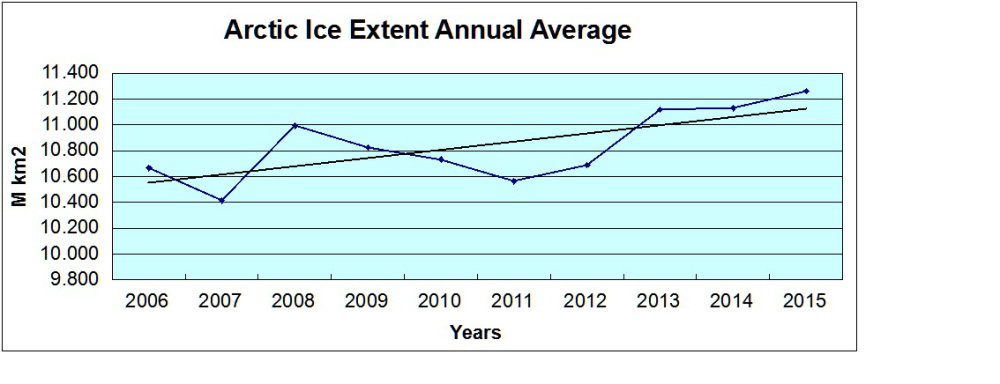
MASIE has very helpfully provided their records for the last ten years. Since stormy weather can affect both maximum and minimum ice extents, emphasis on March and September averages can be misleading. From a climate change perspective, a better metric is the average ice extent over the entire year. By that measure we gain a realistic perspective on the last ten years of Arctic ice fluctuation.
Actually we don’t Ron, for a number of reasons. For example Chris Reynolds summarises your “better metric” as follows:
Claims that there is no ongoing deterioration in Arctic sea ice are totally unfounded, and it is safe to ignore those making such claims as being unreliable due to their lack of grasp of the subject.
whilst “Tamino” points out that:
The data used, from MASIE, doesn’t start until 2006. Which makes it downright bizarre to use this for studying climate, for two reasons. First, we have data (passive microwave from satellites) covering quite a bit more time — starting in late 1978. Second, the MASIE people themselves tell you that their product isn’t the best for climate studies, instead you should use that passive microwave data from satellites.
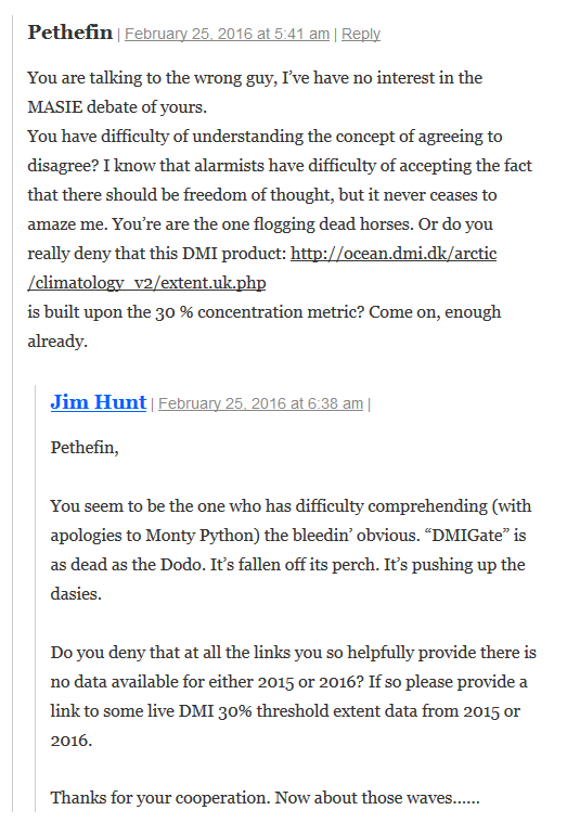
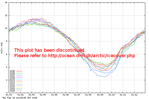
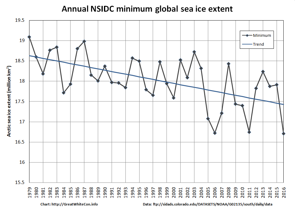
If you download the data that “MASIE has very helpfully provided” and plot the self same graph so proudly displayed by the GWPF you will see something that looks a lot like this:
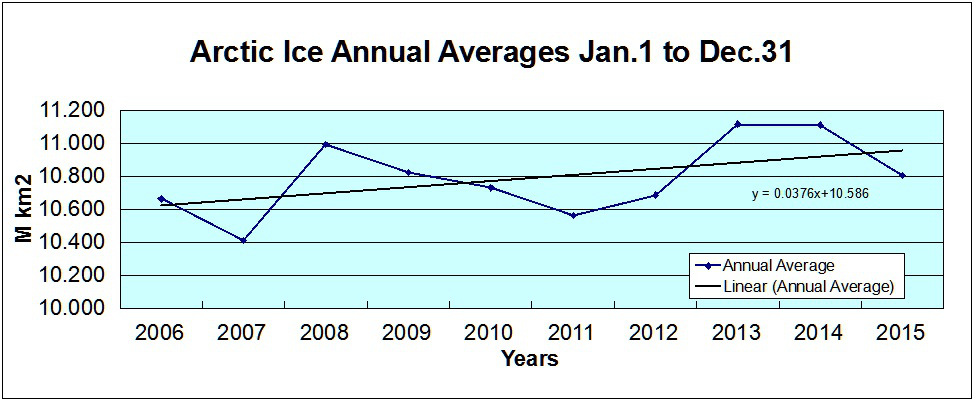
Amazingly enough this graph is taken from a more recent article by Ron Clutz, also reproduced in part on the Global Warming Policy Forum’s web site. This one is dated 2nd January 2016 and entitled “Happy Arctic Ice Year!“. Ron claims that:
Arctic ice declined in the decade prior to 2007, but has not declined since. What we have seen in the last decade is a plateau in Arctic ice extent, analogous to the plateau in surface temperatures. This year end report shows there is no reason to worry about Arctic ice melting.
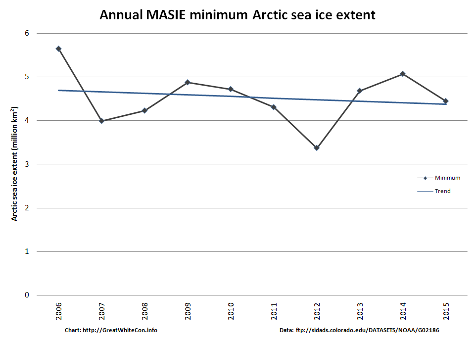
For some strange reason the GWPF have thus far not corrected the extract from Ron’s earlier article on their web site, and neither has Mr. Clutz. For some other strange reason he hasn’t gotten around to publishing my comment to his article pointing him and his loyal readers to this graph which is also derived from the MASIE data, and neither have the GWPF:
It’s not as though I haven’t tried! See for example:
I’m not the only one to have my constructive criticism censored by Ron Clutz recently. Neven, proprietor of the Arctic Sea Ice Blog, reports over there that:
He’s deleting my comments again (and his own comments to wipe out traces of the fact, which is a cowardly act), so I’m just posting the comments here for reference.
I’ll conclude for the moment with some more words from Chris Reynolds. Someone who, unlike Ron Clutz and the other GWPF Arctic article authors (GWPFAAA for short), has a grasp of physics:
Ice state in the Peripheral Seas region is a critical metric in determining whether the Arctic Ocean’s ice pack is indeed stabilising or recovering.
Here is a plot of compactness for late summer in the Peripheral Seas from 1979 to 2015, where late summer is the seven day average centred on 31 August.
Here’s the accompanying graph:
Nullius in verba, as the GWPF don’t put it.
[Edit – February 18th 2016]
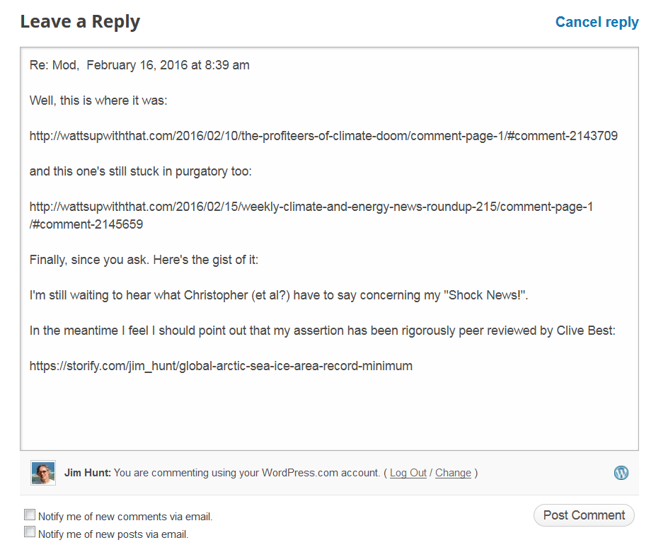
I have recently exchanged a few emails about this issue with Dr. Benny Peiser, who is Director of the Global Warming Policy Forum. However Benny has suddenly gone strangely silent, so here is a transcript of the “debate” thus far:
Us:
Hello Benny,
Thanks for your time in our telephone conversation just now.
In brief, here are my alter ego’s initial quibbles about the GWPForum’s recent Arctic coverage:
and
Please do not hesitate to ask if you require any additional information!
Them:
Dear Mr Hunt
I wonder whether you have any comments regarding the latest PIOMAS data which appear to show a pause in the Arctic sea ice melt in recent years?
With best regards
Us:
Hello Benny,
All in the fullness of time. First of all though, I am waiting to hear your comment(s) on the points I raised in my original email. Here’s where those “Tweets” finish up:
https://greatWhiteCon.info/2016/02/the-great-global-warming-policy-forum-con/
To reiterate, as numerous people pointed out to Mr. Clutz following his first article, MASIE is not fit for the purpose to which he (and hence the GWPF) put it.
To add insult to injury the first MASIE based graph he (and hence the GWPF) published is wildly inaccurate and misleading, and has still not been corrected.
I still eagerly await your comment(s) on this matter,
Them:
Dear Mr Hunt
If I understand you correctly you claim that
1. MASIE is not fit for the purpose to assess Artic sea ice extent, and
2. Arctic sea ice has actually decreased since 2007 — contrary to claims that Arctic ice has not declined in the last 8 years.
I have looked into your first claim and cannot find any information that undermines the reliability of MASIE data for Arctic sea ice analysis.
Regarding your second criticism, the latest PIOMAS data appear to confirm Mr Clutz’s main point, i.e. Arctic ice has remained fairly stable since 2007.
Yours sincerely
Us:
Hello again Benny,
Thank you for your swift response to my most recent email. I fear that you totally misunderstand me. Regarding your numbered points:
1) Did your due diligence include reading this section of the NSIDC web site concerning MASIE?
https://nsidc.org/data/docs/noaa/g02186_masie/index.html
Can you see the parts where it says?
MASIE may look like several other sea ice products distributed at NSIDC and elsewhere, but its source data and intended uses are different.
Operational ice charts meet the needs of those going into the ice and provide general situational awareness, such as the extent of fast ice or of ice of any concentration greater than zero percent.
If one is interested in long-term trends in sea ice or how it responds to changing climate forcing, generally, it is best not to use an operational product, but rather one that is consistently produced and retroactively quality controlled.
Do you understand what that means? If not please do not hesitate to ask!
2) Where on Earth did you get that idea from? Here’s what I said once again:
The first MASIE based graph [Ron Clutz] (and hence the GWPF) published is wildly inaccurate and misleading, and has still not been corrected.
To see what I mean all you have to do is compare it to the second MASIE based graph [Ron Clutz] (and hence the GWPF) published.
Them:
Dear Mr Hunt
I’m afraid you have not addressed my points.
There is nothing wrong with the MASIE data, in particular not when it comes to short-term data sets (although I agree that it should not be used for any trend analysis).
You did not answer the key question: where is the evidence (as suggested in your graph) that Artic sea ice has declined since 2007?
Yours sincerely
Us:
Hello Benny,
I’m afraid that in actual fact it is you who have not addressed my points. Let me take you through them slowly once again. Once you’ve understood the first two rest assured there are more.
1 a) According to the NSIDC, MASIE is not a “short-term data set”, it is an “operational ice chart”.
1 b) In addition, please feel free to search the NSIDC web site for any graph based on the Arctic Ice Annual Average of any metric whatsoever, and let me know what you discover
2) Let’s play “Spot the difference” shall we? Please let me know what differences (if any) you can find between this graph:
and this one:
Thanks in anticipation,
[Edit – February 19th 2016]
Us again:
Not having heard from Benny for a while we thought it polite to enquire after his health this morning:
Dear Benny,
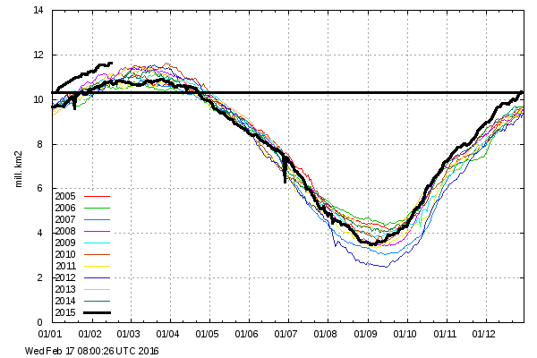
I’ve received nothing back from you since your email of 15:22 on the 16th. Are you OK? If there’s anything we can do to help please do get in touch.
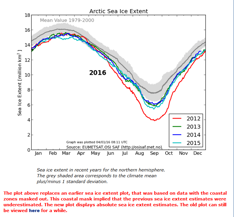
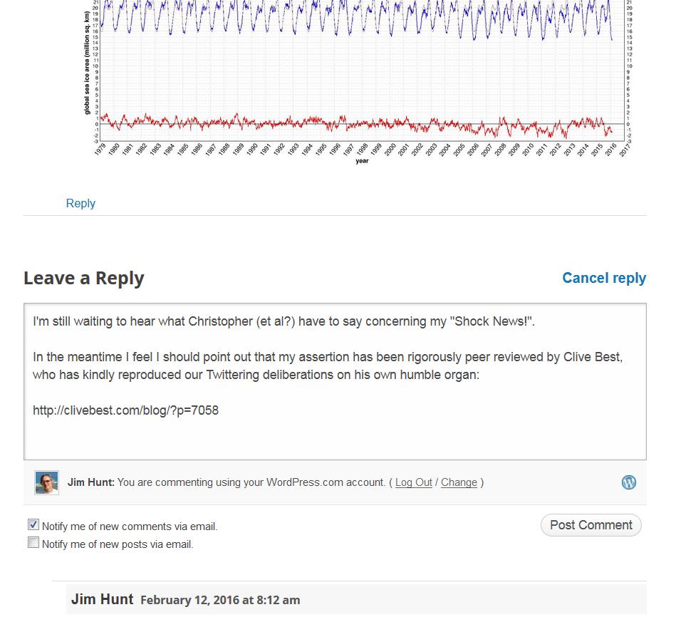
We have some interesting news about which we’d love to know your opinion, as soon as you feel up to it of course. First of all, the NSIDC’s global sea ice extent metric fell to the lowest level *ever yesterday:
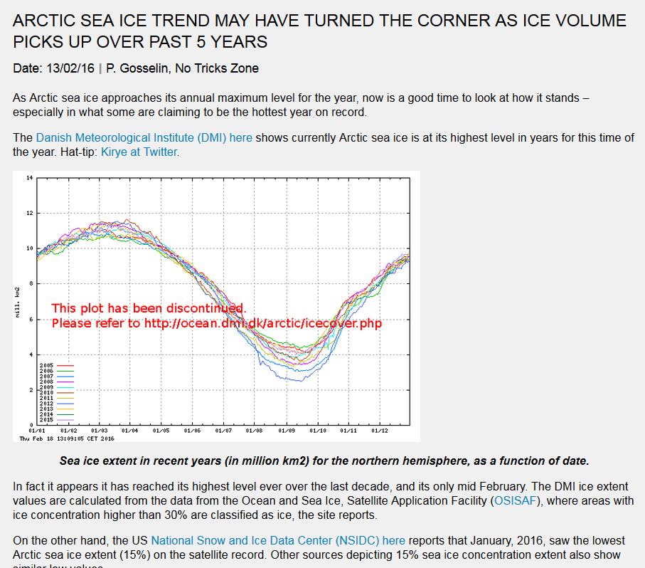
Secondly, are you aware that the February 13th article on the GWPF web site by Pierre Gosselin entitled “Arctic Sea Ice Trend May Have Turned The Corner As Ice Volume Picks Up Over Past 5 Years” currently looks like this?
Get well soon,
Them:
Dear Mr Hunt
Thank you for your latest concern about global sea ice extent
I suggest to monitor global sea ice extent in the next 12 months to see whether the usual recovery fails to materialise (see graph below).
Us:
Dear Dr. Peiser,
I’m delighted to discover that you are evidently in fine fetttle!
I am however afraid that your image is invisible at this end, although it appears to emanate from somewhere on the WUWT sea ice page.
First of all can you possibly resend it?
Secondly I highly recommend that you peruse the GWC sea ice resources instead of Mr. Watts’ in future.
Thirdly will you please fix the wide variety of gross inaccuracies concerning Arctic sea ice that still exist on the Global Warming Policy Forum web site, even after they have been brought to your attention on numerous occasions. For your further information please see also:
https://greatWhiteCon.info/2016/02/global-sea-ice-extent-at-lowest-ever-level/#comment-213484
Best wishes,
[Edit – February 23rd 2016]
Us:
Good day Benny,
I trust that you had a pleasant weekend?
I note that the GWPF webmaster has still not corrected even the most egregious of Ron Clutz’s errors republished on the GWPF web site in the following article:
http://www.thegwpf.com/arctic-ice-recovering/
I further note that you have also now republished this article authored by Paul Homewood:
http://www.thegwpf.com/maisie-confirms-arctic-sea-ice-remaining-stable-in-february/
which amongst other errors contains the following insinuation:
“MAISIE, of course, only goes back to 2006, whereas the sea ice index dates to 1979. It is, however, easy to see why NSIDC are keen to use the latter as a starting point!”
This is of course inaccurate, as I have personally pointed out to Paul on several occasions in the past. The NSIDC themselves have this to say on the matter:
“The Sea Ice Index provides a quick look at Arctic- and Antarctic-wide changes in sea ice. It is a source for consistent, up-to-date sea ice extent and concentration images, in PNG format, and data values, in ASCII text files, from November 1978 to the present.
The images and data are produced in a consistent way that makes the Index time-series appropriate for use when looking at long-term trends in sea ice cover.”
When do you suppose the GWPF webmaster will be able to get around to correcting the latest piece of Arctic misinformation to be published on your web site?
Best wishes,
Us again:
Good morning Benny,
I note that the GWPF webmaster has still not taken on board any of the helpful advice I have proffered over the last few weeks, and has now posted some inaccurate information about “global warming”. Will he or she never learn?
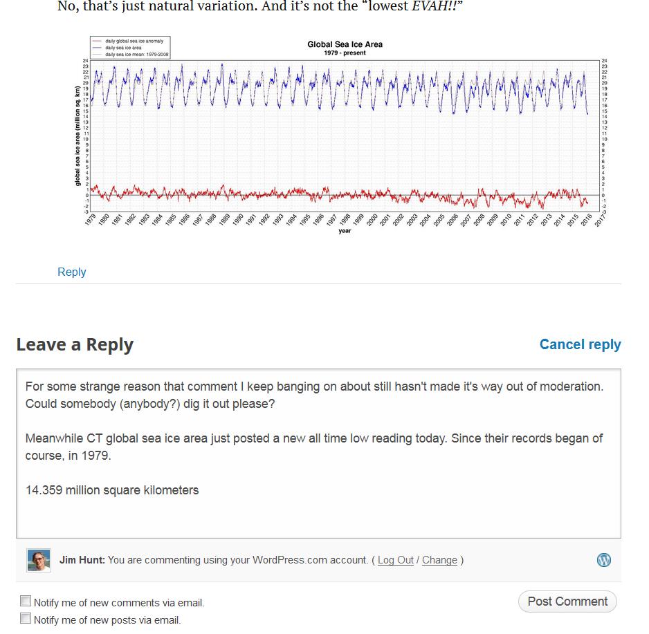
Sticking with our own speciality, please feel free to “print” Snow White’s prediction that CT global sea ice area will post yet another new record of around 14.22 million square kilometers over the next 2 to 3 days.
I followed Ron Clutz’s recent suggestion on Paul Homewood’s blog to “Take it up with Walt Meier”. I interviewed Dr. Meier yesterday and this is what he told me:
https://greatWhiteCon.info/2016/02/dmi-masie-and-the-sea-ice-index-an-interview-with-walt-meier/
Perhaps it is now time to hand your current webmaster their cards and hire a new one?
Best wishes,
[Edit – March 4th 2016]
Us once again:
Hello again Benny,
It seems that your new webmaster has yet to republish the latest product of the Clutz/Homewood porky pie production line! Please pass on our congratulations on their perspicacity. However the latest article on The GWPF web site by David Whitehouse has this to say:
“Is the global warming pause over for good — or will it continue once the current El Nino dies down?”
Does Dr. Whitehouse not realise that there was no “pause”?
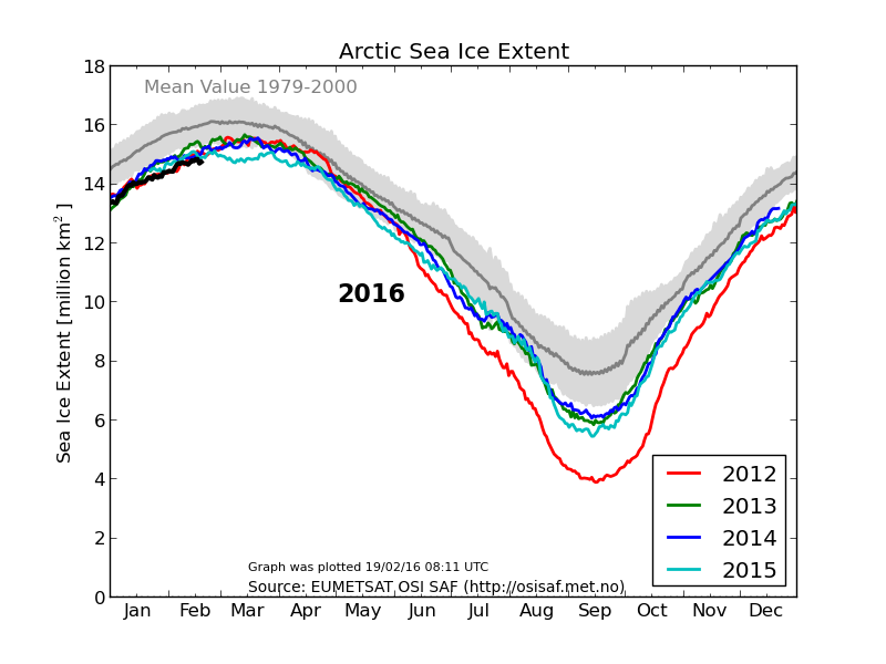
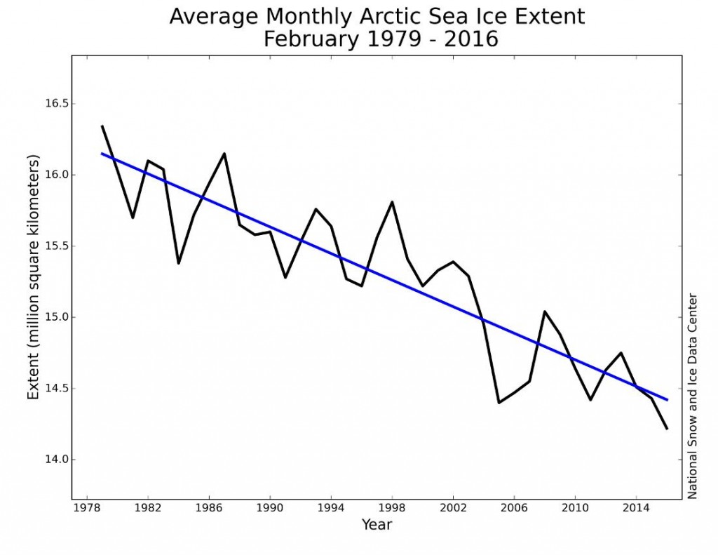
For your, and Dr. Whitehouse’s, information here is the latest report from the NSIDC on Arctic sea ice extent:
With a new webmaster in charge at The GWPF can we now anticipate an accurate Arctic article appearing on your web site? Please do not hesitate to ask if you would like to republish one of mine.
Best wishes,
[Edit – April 4th 2016]
Us once again:
Hello again Benny,
I hope this finds you well? I have been doing as you suggested! Consequently I could not help but notice that you have not been doing what I suggested, and have instead recently republished a large extract from yet another article by Paul Homewood on the topic of Arctic sea ice:
http://www.thegwpf.com/more-of-the-usual-hype-about-arctic-ice/
Needless to say this one is also downright misleading. For your information, here are the actual facts:
Claim – Arctic Sea Ice Holds Firm?
and
More Of The Usual Hype About Arctic Sea Ice
It looks like you’ll have to let another webmaster go, does it not? Don’t forget to tell the new one that my offer of an authoritative Arctic article still stands.
Best wishes,
Them:
We’ll keep you posted!