The self proclaimed “world’s most viewed site on global warming and climate change”, otherwise known as the “Watts Up With That?” blog, recently published an article entitled “Arctic Sea Ice Appears to Have Reached Maximum And Other Ice Observations”. Since I’ve been speculating about the date of the 2014 maximum Arctic sea ice extent myself I avidly read the article but found myself ultimately somewhat perplexed. There were lots of graphs and charts displayed, but there was no sight or mention of what seems to me the most relevant one of all. The long term trend. Here is an expurgated version of my attempts to bring this oversight to the attention of the Watts Up With Thatters:
Us:
Them:
Re: Michael Jennings says:
March 26, 2014 at 7:07 am[snip . . this is dull. Put some content into your contributions or you are just trolling . . mod]
Us:
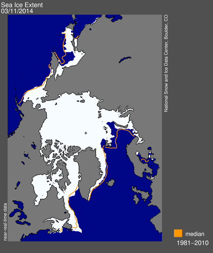
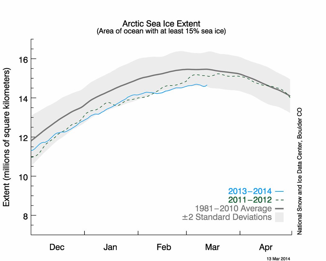
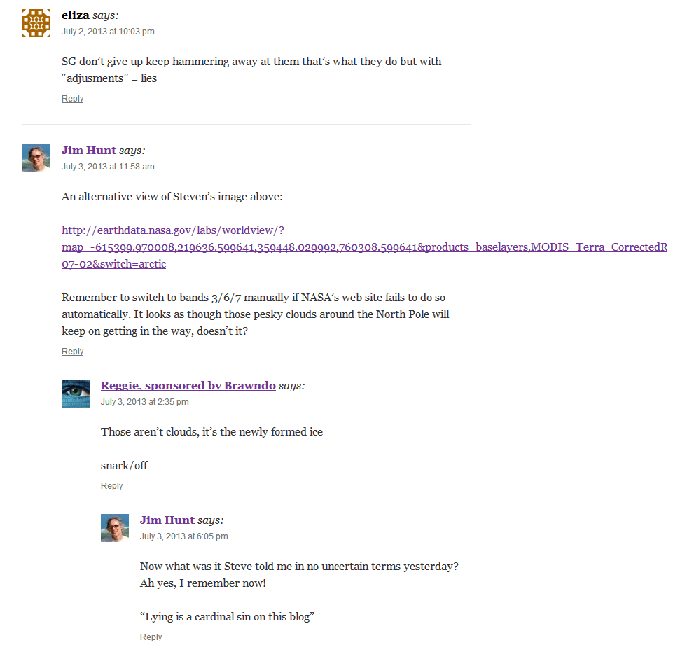
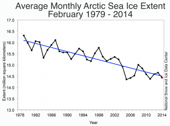
At the risk of repeating myself, here’s the latest dull content out of NSIDC:
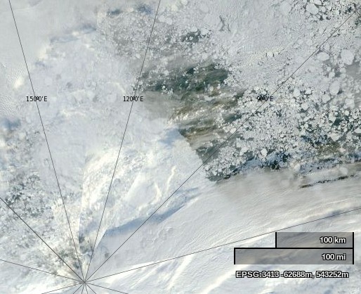
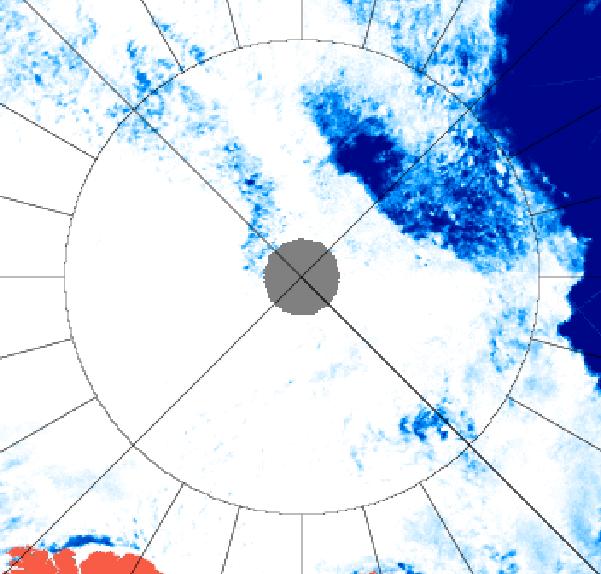
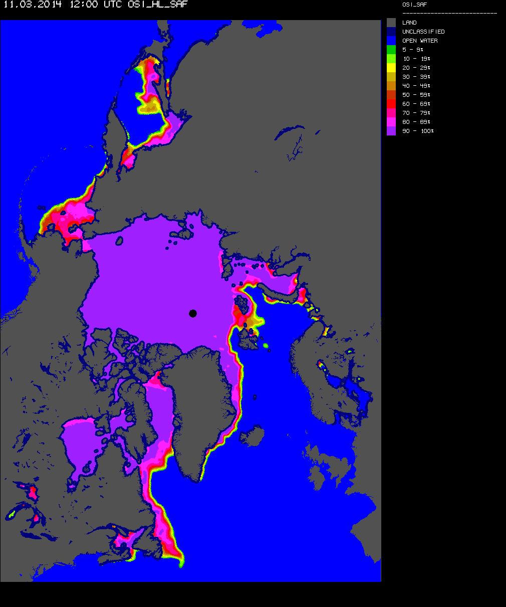
Do you see the blue line heading for the bottom right?
[snip.. lots of dull references to Antarctic sea ice and “Real Science” removed.. mod]
Them:
Snow White needs to get up to speed on the Scientific Method: skeptics have nothing to prove.
Rather, the onus is on the alarmist crowd to provide scientific evidence showing that their CO2/cAGW conjecture is true. They have failed miserably.
But there is no scientific evidence supporting their belief in manmade global warming. None at all. Every last climate model has failed. They were all wrong.
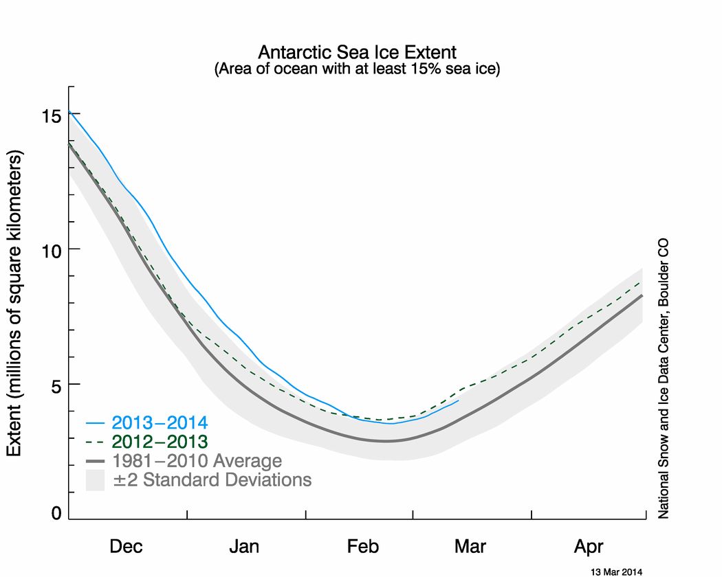
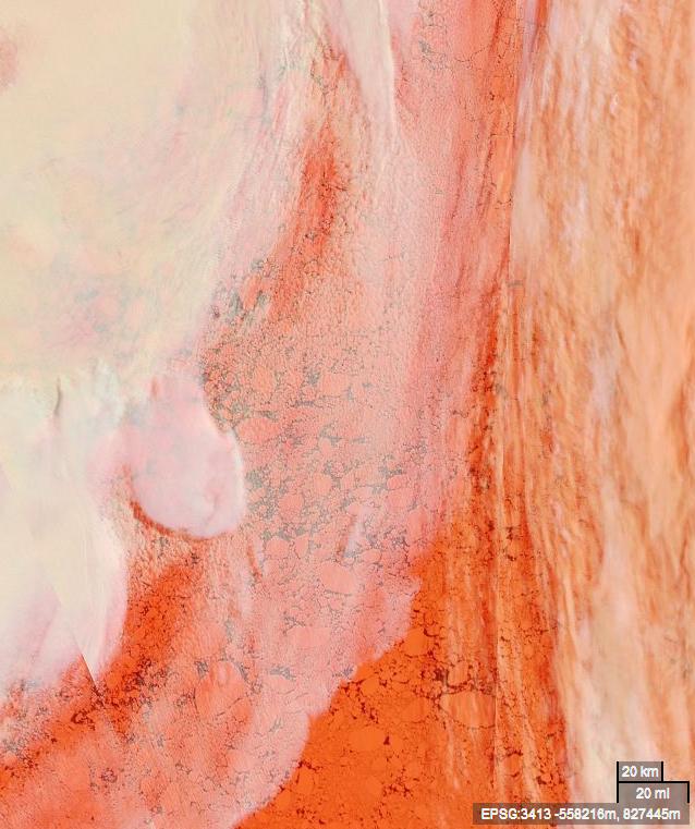
The alarmist crowd is fixated on Arctic ice, instead of on global ice cover. Why? Because that is their last forlorn hope; every other climate scare has been debunked. Well, it’s time to debunk the ‘disappearing Arctic ice’ scare, too:
Global sea ice is at it’s 30-year average [the red graph – click in chart to embiggen]. We already know about the polar see-saw, in which the NH and SH poles balance each other out. That effect can be clearly seen in the global ice chart above.
There is nothing either unusual or unprecedented happening. What we observe now has happened before, repeatedly, and to a much greater degree. Rational folks understand that. It is called the climate Null Hypothesis, and it has never been falsified. The Null Hypothesis is a corollary of the Scientific Method. So is the fact that the onus is on those who produce the catastrophic CO2/AGW conjecture, to suport their belief with scientific evidence.
But there is no evidence proving that Arctic ice is in unprecedented decline. None at all. There is no evidence to prove that the current Arctic ice fluctuation is anything other than natural climate variability. Occam’s Razor says that natural variability is by far the most likely explanation.
The Arctic ice scare is just the same as all the other climate scares. It is promoted by religious True Believers, who expect everyone to share in their Chicken Little panic.
But that only works on those who are ruled by emotion, and fright is an emotion. Scientific skeptics, OTOH, are logical, and therefore they are unaffected by the silly ‘Arctic ice’ scare.
So to summarise, you cannot muster a single chart to refute my assertion about Arctic sea ice decline, let alone “hundreds”.
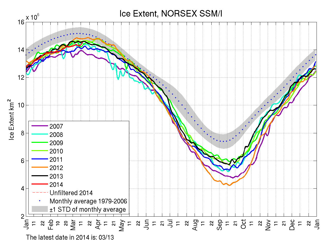
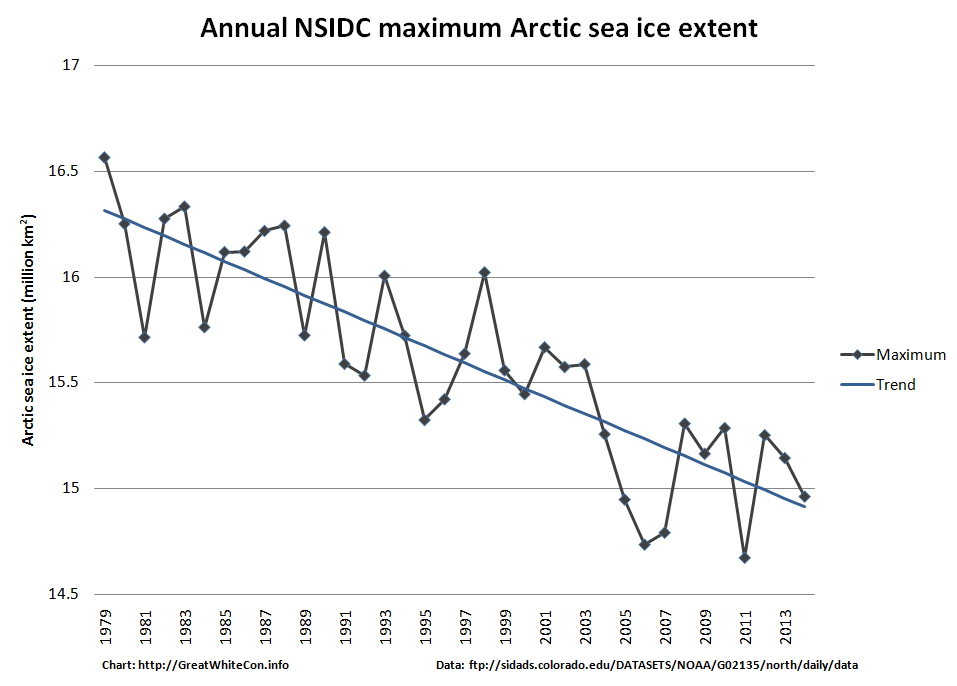
For your edification, and for that of the writer of the original article who for some strange reason neglected to include a graph showing the long term trend in Arctic sea ice maximum extent, here is one I prepared earlier:
From a comment on a different thread on WUWT, on April 10, 2014 at 3:33 am (WUWT time)
I’m sorry Snow White (or Mr Hunt, if you prefer), but I think that a little courtesy would be in order. I’ve read every word on the link you’ve provided, and the central theme of your original post was that “there was no sight or mention of what seems to me the most relevant one of all. The long term trend [of Arctic sea ice]“. You described more than one attempt to bring this deficit to the attention of WUWT.
Given that Michael D posted on your page at April 9, 2014 at 4:01 pm, politely pointing out that the WUWT sea ice page has just such data presented, it would seem a basic courtesy to either acknowledge his assistance (in this blog or yours) and either thank him, or explain why graph does not answer your criticisms.
I acknowledge that your arguments seem to have moved on to volume now, but they have been addressed by others, and better than I could have done. As an aside, I suppose I could run a blog with limited data about Antarctic sea ice coverage and volumes. I’m sure that I would be criticised, with comments explaining that I was looking at the mural through a microscope, and that the Antarctic buildup cannot be considered in isolation. I think that such criticism would be valid – your thoughts?
Us:
As you can see from the historical record, I asked on more than one occasion for someone to supply a link to “A long term (let’s say 30 years or more) graph for any measure of Arctic sea ice “quantity” showing anything other than a trend in the direction of the bottom right hand corner.” Nobody did. Nobody suggested looking at the WUWT sea ice page either, presumably because no graphs fitting my description can be found on there.
Q.E.D. ?
Them:
We’ll keep you posted!