Much like yesterday I was idly browsing my Twitter feed this morning whilst simultaneously consuming my habitual Sunday coffee + BLT when news reached me that David Rose had published yet another article in the Mail on Sunday that purports to investigate “climate science”:
Perhaps due to all our sterling work here at the Great White Con extracting the Michael, it doesn’t seem to fall under the Mail’s “Great Green Con” banner anymore. The general drift is the same though, apart from that lurid title of course!
I think current ‘renewable’ sources such as wind and ‘biomass’ are ruinously expensive and totally futile. They will never be able to achieve their stated goal of slowing the rate of warming and are not worth the billions being paid by UK consumers to subsidise them.
Skipping over all the (merely rhetorical?) self-pity, let’s move on to the climate science, such as it is!
Last Monday… a Met Office press release stated: ‘2014 one of the warmest years on record globally’.
The previous week, almost every broadcaster and newspaper in the world had screamed that 2014 was emphatically The Hottest Year Ever. They did so because NASA told them so. Its Goddard Institute for Space Studies (GISS), the custodian of one of the main American temperature datasets, had announced: ‘The year 2014 ranks as Earth’s warmest since 1880.’ If you’d bothered to click on the sixth of a series of internet links listed at the end of the press release, you could have found deep within it the startling fact that GISS was only ’38 per confident’ that 2014 really did set a record.
In other words, it was 62 per cent confident that it wasn’t. Another detail was that the ‘record’ was set by just two hundredths of a degree. The margin of error was five times bigger. These boring details were ignored. The ‘2014 was a record’ claim went to the very top. President Obama cited it in his State of the Union address. Like the news outlets, it’s unlikely he will issue a correction or clarification any time soon.
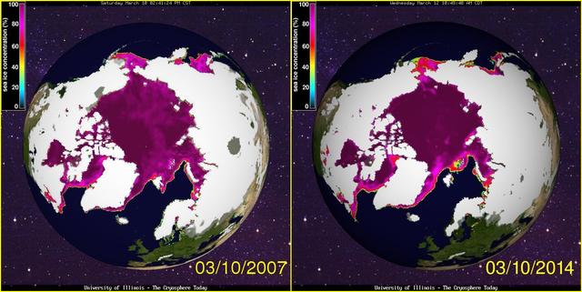
Al Gore repeatedly suggested that the Arctic would likely be ice-free in summer by 2014. In fact Arctic ice has recovered in the past two years, and while the long term trend is down, it looks likely to last several more decades.
Unfortunately that is misleading and/or inaccurate, apart from the bit about the long term trend in Arctic sea ice. Hence I’ve just popped yet another Dear John (and Poppy) virtual letter to Mr. Rose’s managing editor (+PA) at the Mail on Sunday, and I’ll have yet another long chat with IPSO tomorrow:
Us:
Dear John/Poppy,
Would you believe that David Rose is at it again? Not only is he “interviewing” himself in your esteemed organ today, he is misrepresenting the underlying science yet again.
I really must insist that whoever owns the desk on which the buck currently stops for the following article starts communicating with me yesterday if not sooner:
I am away from the office until Tuesday, February 10. I will be checking emails occasionally but if your message is urgent, please contact my assistant Poppy Swann.
Ultimately followed by:
Dear Jim
If you have a complaint about last Sunday’s article, you should set out exactly what it is. If you disagree with any opinions expressed you are welcome to write a letter that we will consider for publication.
You mention that you have sent us a number of inquiries recently. The only other, to my knowledge is that you wanted to know the source of some data that David Rose mentioned in an article some months ago. David Rose told me it came from the official website. Perhaps my colleague Poppy Hall can find it for you since David is probably unwilling to help after your insult.
Best regards
John
Us:
Dear Poppy (and John)
Please would you ask David to let me know where exactly, and on which “official website”, he obtained the DMI extent numbers he quoted in his article last Summer?
FYI John, at Poppy’s suggestion I have also emailed the editorial team @MailOnline. They have yet to even acknowledge receipt of my email of January 26th.
I was idly scrolling through my Twitter feed this morning when I couldn’t help but notice that Gavin Schmidt, Director of NASA’s Goddard Institute for Space Studies, was calling for volunteers to research possible trends in The Economist’s attitude to “climate change” over recent decades:
Interesting media analysis topic for someone with more time than me! (4/4) @TheEconomist
— Gavin Schmidt (@ClimateOfGavin) January 30, 2015
Unable to resist temptation I immediately popped on over to The Economist online and searched for the term “Arctic”, as is my wont. Lo and behold I discovered much to my amazement that they had published an article on that very topic earlier on this very day. However after reading it I have to say I was less than impressed, and reported my findings back to @ClimateOfGavin. I also called The Economist’s “Editorial” number, and spoke to a nice lady with an American accent who told me that she was an “answering service” and assured me that she would pass on my message to an Economist editor, but they almost certainly wouldn’t look at it until Monday. Here’s how the conversation is going:
Them:
The Northern Sea Route is not living up to the hype, either. In 2013 71 ships traversed Russia’s Arctic, according to the Northern Sea Route Information Office: a large increase since 2010, when the number was just four. But 16,000 ships passed through the Suez Canal in 2013, so the northern route is not starting to compete. In 2014 traffic fell to 53 ships, only four of which sailed from Asia and docked in Europe (the rest went from one Russian port to another). The route does not yet link Europe and East Asia.
The decline in 2014 was partly caused by the weather: less sea ice melted last summer than in 2013, so the route was more dangerous.
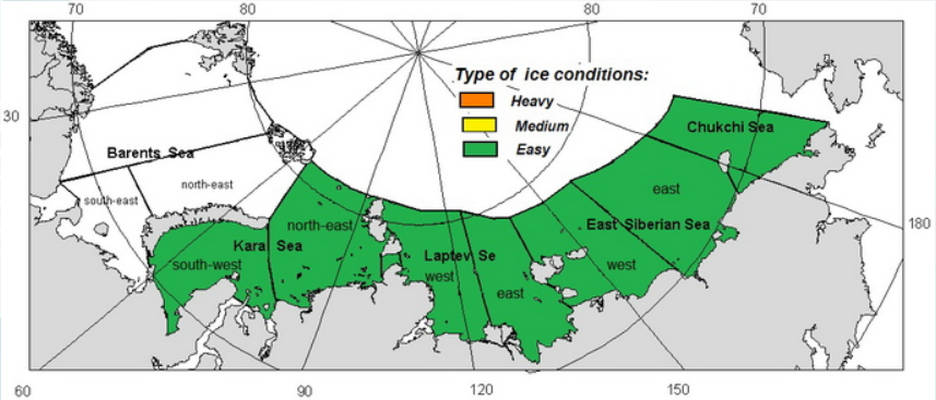
Now I distinctly recall posting this image:
on the Arctic Sea Ice Forum on August 23rd last year. Over and above that, here’s a couple of freshly minted videos to illustrate the point more vividly. The AMSR2 Arctic sea ice concentration data displayed is courtesy of the University of Hamburg:
[Edit 02/02/15] The Economist’s “man in Tromso” asked to see 2012 as well, so here it is. AMSR2 data wasn’t available in 2012, so this one uses the SSMIS passive microwave radiometer instead:
Set the top two running in sync and then if the difference between 2013 and 2014 isn’t as plain as day to you, my name is Snow White!
[Edit 05/02/15]
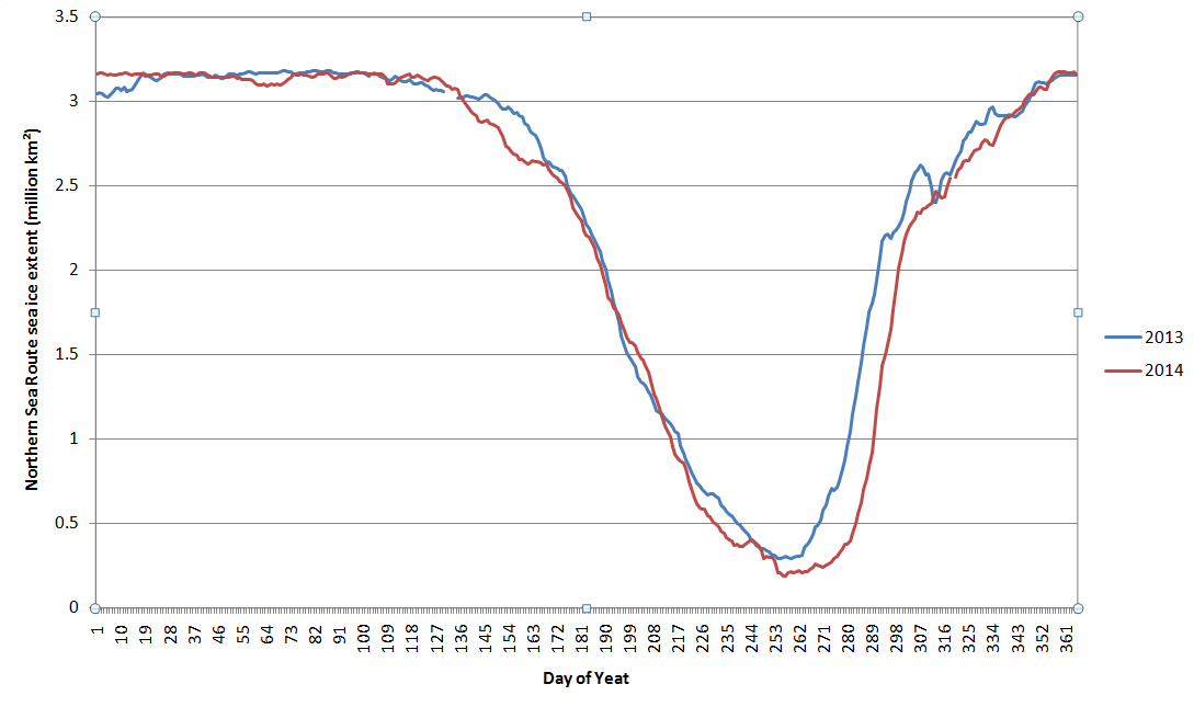
In an endeavour to quantify the reduction in ice coverage in 2014 compared to 2013 that’s evident in the animations we’ve combined the regional extents for the Chukchi, East Siberian, Laptev and Kara Seas to produce this chart:
[/Edit]
Hence:
Us:
Please forgive my rather brusque manner, but I arrive fresh from hauling the Mail on Sunday in front of IPSO.
Can The Economist provide some evidence for their rather vague assertion that “less [Arctic] sea ice melted last summer than in 2013”. Can you for example provide a link to an authoritative source?
The latest print edition of The Economist landed on my doormat this morning. I eagerly turned to the “Letters” section, but was disappointed to discover that my virtual “Letter to the editor” sent on Thursday morning must have missed their deadline. Here it is:
CC: Your “Tromso correspondent”
Sir(s),
I read with much interest the “Not so cool” article in your January 31st edition, which suggested “The hype over the Arctic recedes, along with the summer ice”.
I take the point your Tromso correspondent makes that “The Northern Sea Route is not living up to the hype, either”, but I must take issue with the hype that currently reads, in both your print and online editions:
“The decline in 2014 was partly caused by the weather: less sea ice melted last summer than in 2013, so the route was more dangerous.”
All the evidence I have seen (collected together for your edification, including maps, graphs and animations, at https://greatWhiteCon.info/2015/01/is-the-economist-being-economical-with-the-truth-about-arctic-sea-ice/) refutes that statement. The minimum Arctic sea ice area and extent in summer 2014 were both below 2013. According to assorted satellites there was significantly less sea ice bobbing about along the Northern Sea Route in 2014 than in 2013. The official August 2014 forecast published by the Northern Sea Route Information Office maintained that ice conditions would be “Easy” over the entire NSR.
I look forward to seeing this particular piece of “hype” receding in both physical and virtual print in the very near future.
From the University of Colorado at Boulder, where they are apparently attempting to explain away why Arctic sea ice isn’t living up to previous wild claims such as those made by Dr. Mark Serreze of the National Snow and Ice Data Center, who famously said that the Arctic is in a ‘Death Spiral’ in response to my writing on WUWT:
Hence we are proud to be able to bring you this exclusive report on the “breathtaking ignorance” of the WattsUpWithThat blog! I’ve recently been publicly castigated on Twitter for our tongue in cheek “Us and Them” exposes:
I remain unrepentant, but just for once I’ll maintain a more conventional narrative. Anthony Watts continues his argument as follows:
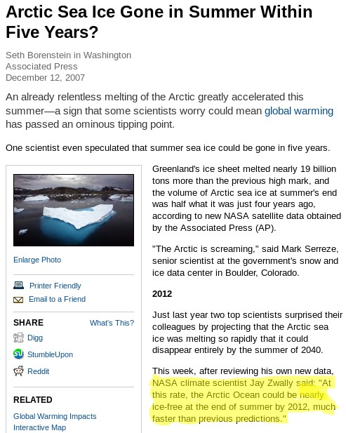
Serreze also famously said two years earlier that “The Arctic is screaming,” and that summer sea ice may be gone in five years, in an interview with the unquestioning and compliant Seth Borenstein at the Associated Press:
He helpfully highlights in yellow what Seth Borenstein said Mark Serreze said way back when in 2007. Note that no “predictions” or even “projections” are mentioned. So where do you suppose Tony’s “summer sea ice may be gone in five years” came from?
Here we provide our own screenshot of the National Geographic article in question, grabbing a slightly larger area of the screen, and highlighting a section slightly further down the page:
For those who have difficulty reading small print, such as Anthony Watts and his merry band of unquestioning and compliant followers over at WUWT, here is the unexpurgated transcript of our highlight in large letters:
NASA climate scientist Jay Zwally said: “At this rate, the Arctic Ocean could be nearly ice-free at the end of summer by 2012, much faster than previous predictions.”
Note firstly that this is a projection rather than a prediction, and secondly that it was reportedly uttered by Jay Zwally of NASA, not Mark Serreze of NSIDC!
Quod erat demonstrandum, and if so one cannot help but wonder how many similar blunders Mr. Watts has made over the course of his illustrious publishing career?
As luck would have it I interviewed Mark Serreze, who is currently director of the NSIDC, not so very long ago. I enquired whether the “Death spiral” story was apocryphal or not. Mark told me he did recall saying something along those lines to a journalist, but that he couldn’t recall the exact circumstances. I also asked if he was willing to make any “predictions” about the decline of sea ice in the Arctic. Mark told me that he still stood by his 2030 estimate for the onset of a seasonally ice free Arctic, although:
Most models say more like 2050
Doing my own due diligence (unlike the readers of Watts Up With That!) the earliest reference I could find to such a “prediction” involved a telephone interview much like the one I had just conducted. In an article dated August 27th 2008 the Reuters environment correspondent reported that:
This year’s Arctic ice melt could surpass the extraordinary 2007 record low in the coming weeks. Last year’s minimum ice level was reached on September 16, according to the National Snow and Ice Data Center.
Even if no records are broken this year, the downward trend in summer sea ice in the Arctic continues, the Colorado-based center said. Last year’s record was blamed squarely on human-spurred climate change.
“No matter where we stand at the end of the melt season it’s just reinforcing this notion that Arctic ice is in its death spiral,” said Mark Serreze, a scientist at the center. The Arctic could be free of summer ice by 2030, Serreze said by telephone.
So there you have it. Unless someone can come up with some evidence to the contrary (unlike Watts and the Watties), it looks to me like Mark Serreze has been consistently saying for many years:
The Arctic could be free of summer ice by 2030
or words to that effect. Expect more from me on my interview with Mark Serreze in due course.
[Edit – February 1st]
Without a word of thanks to yours truly Anthony Watts has now published an “Update” to his original article. The salient bits read as follows:
The original article implied that NISDC’s Mark Serreze made the statement about sea ice being gone in 5 years, ending in 2012, when it was actually NASA’s Jay Zwally that made the claim in the National Geographic article. The language has been clarified in the paragraph to reflect this.
Serreze also famously said two years earlier that “The Arctic is screaming,” and a Arctic research associate, Jay Zwally of NASA, said in the same article that summer sea ice may be gone in five years, in an interview with the unquestioning and compliant Seth Borenstein at the Associated Press.
Anthony obviously hasn’t taken on board my helpful remarks about the difference between a prediction and a projection, and hence he waxes lyrical about how the sea ice in the Arctic didn’t vanish in the summer of 2012. He signs off by saying:
To my knowledge, Dr. Serreze has never publicly corrected the National Geographic article claim of 2012 being the ice-free year that wasn’t, suggesting he endorsed the idea at the time.
Have I got news for you Anthony. It doesn’t suggest anything of the kind! In addition to suggesting strange things to the suggestible Mr. Watts has so far neglected to answer this question posed by a commenter on the article in question:
I look forward to seeing any substantive replies to Jim Hunt’s clarifying post.
and so far he has also neglected to publish my response to that question. It included this video of my namesake, James Hunt, conversing with a couple of clueless mechanics:
Anthony Watts has also thus far neglected to explain how he inexplicably (in all the circumstances) successfully attributed the supposed 2012 “prediction” to Jay Zwally in this 2012 article, that also included a highlighted screenshot much like mine above:
In four months, just 132 days from now at the end of summer on the Autumnal Equinox September 22nd 2012, the Arctic will be “nearly ice free” according to a prominent NASA scientist in a National Geographic article on December 12, 2007.
Regular readers of our so far somewhat surreal reporting from up here in the penthouse suite at the summit of the Great White Con ivory towers will no doubt have noticed that we like to concentrate on the facts about the Arctic, whilst occasionally naively exploring assorted psychological aspects of journeying through the “denialosphere”.
Today, however, we’re branching out in a different direction with the aid of our first ever guest post. It has been carefully crafted by Sou Bundanga of the HotWhopper blog, on the topic of the “journalistic tricks that professional disinformers use”. It covers some of the same ground as a recent post of our own, albeit from a rather different angle. If you would like view the original version on Sou’s blog please click here. Alternatively, please continue below the fold:
This is just a short article to show the journalistic tricks that professional disinformers use. It consists of excerpts from an article by David Rose, who is paid to write rubbish for the Mail on Sunday, a UK tabloid of the sensationalist kind. He’d probably claim that he’s just “doing his job”. His job being to create sensationalist headlines and not bother too much about accuracy, but to try to do it in such a way as to stop the paper ending up in court on the wrong end of a lawsuit. Just. (The paper probably doesn’t mind so much getting taken to the Press Complaints Commission. )
The Nasa climate scientists who claimed 2014 set a new record for global warmth last night admitted they were only 38 per cent sure this was true.
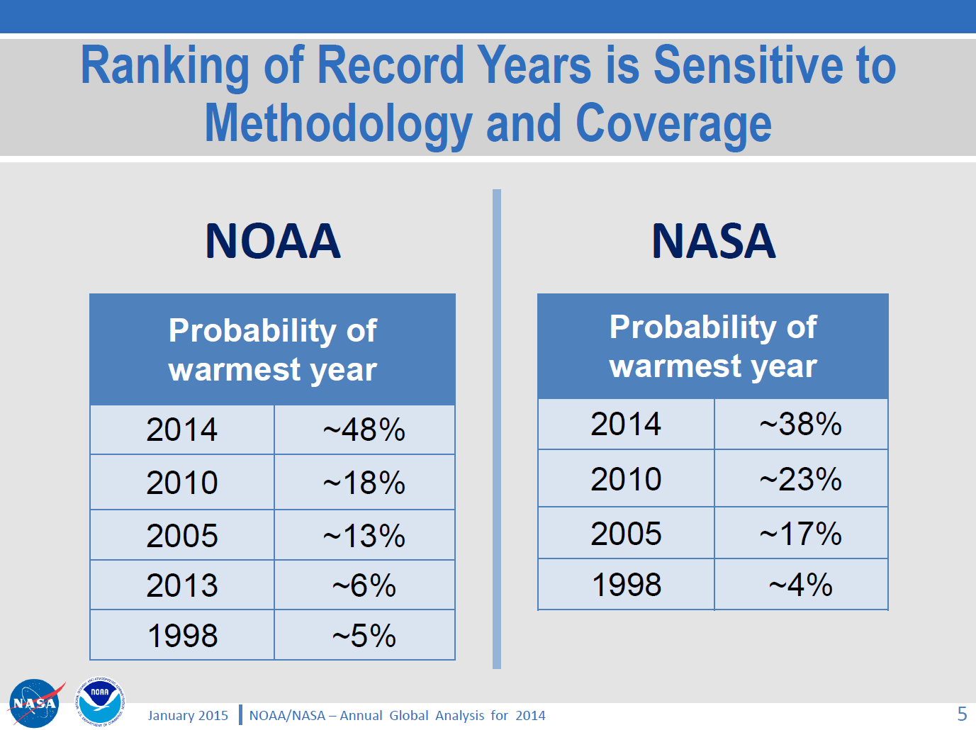
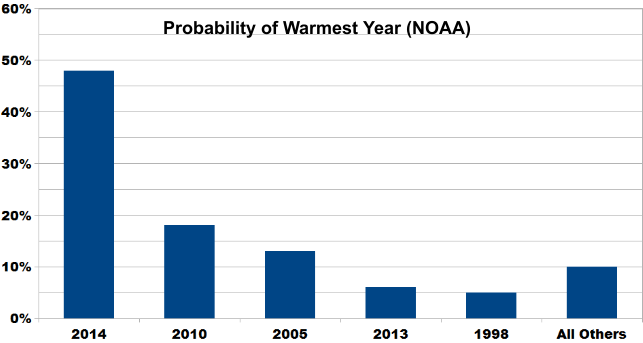
First of all notice the use of the word “admitted” – as if it was something that the scientists were forced into, whereas in fact they provided all the information in their press briefing. Notice also that David has taken one number and used it out of context. The 38% number is the probability that 2014 is the hottest year compared to the probability that 2010 and other hot years are the hottest. 2010, the next hottest year, only got a 23% probability by comparison. Here is the table showing out of 100%, what the different probabilities are:
You can see how David misused the 38% number. In fact the odds of it being the hottest year on record are the highest of the lot.
In a press release on Friday, Nasa’s Goddard Institute for Space Studies (GISS) claimed its analysis of world temperatures showed ‘2014 was the warmest year on record’.
The claim made headlines around the world, but yesterday it emerged that GISS’s analysis – based on readings from more than 3,000 measuring stations worldwide – is subject to a margin of error. Nasa admits this means it is far from certain that 2014 set a record at all.
See how David Rose distorts things. How he uses rhetoric, abusing words like “emerged” and “claim” and “admits”. He is also being “economical with the truth” about the “far from certain”. He just made that one up. It may not be “certain”, but it is much more certain than “far from”. And it is more “certain” that 2014 was the hottest year than that any other year was the hottest year.
If David Rose were arguing that you beat your wife, even though you don’t, he’d probably write it up as:
The so-called scientist claims that he doesn’t beat his wife. He admits that he cannot prove he doesn’t beat his wife. However this journalist can show that it has emerged that his claim is subject to a margin of error. 95% of wife-beaters deny beating their wives.
And I doubt he’d add the confidence limits to the 95% number!
David Rose continues his deception writing:
Yet the Nasa press release failed to mention this, as well as the fact that the alleged ‘record’ amounted to an increase over 2010, the previous ‘warmest year’, of just two-hundredths of a degree – or 0.02C. The margin of error is said by scientists to be approximately 0.1C – several times as much.
That section by David Rose contains the same journalistic tricks of rhetoric, as well as an error of fact. The margin of error of the annual averaged global surface temperature is described in the GISS FAQ as ±0.05°C:
Assuming that the other inaccuracies might about double that estimate yielded the error bars for global annual means drawn in this graph, i.e., for recent years the error bar for global annual means is about ±0.05°C, for years around 1900 it is about ±0.1°C. The error bars are about twice as big for seasonal means and three times as big for monthly means. Error bars for regional means vary wildly depending on the station density in that region. Error estimates related to homogenization or other factors have been assessed by CRU and the Hadley Centre (among others).
If the press release didn’t include any confidence limits, then where did David Rose get his numbers from you may ask? That’s a very good question. It turns out that NOAA and NASA held a press conference, during which they showed some slides and explained the confidence limits, among other things. So David Rose was being very deceitful, wasn’t he. Which isn’t a surprise.
What bit of deception does he swing to next? Well here it is. You be the judge:
As a result, GISS’s director Gavin Schmidt has now admitted Nasa thinks the likelihood that 2014 was the warmest year since 1880 is just 38 per cent. However, when asked by this newspaper whether he regretted that the news release did not mention this, he did not respond. Another analysis, from the Berkeley Earth Surface Temperature (BEST) project, drawn from ten times as many measuring stations as GISS, concluded that if 2014 was a record year, it was by an even tinier amount.
More rhetorical tricks using words like “admitted”. More deception by David Rose. When and how and where did David Rose ask Gavin Schmidt the question? I don’t know. It looks as if it was via an accusatory tweet of the type “have you stopped beating your wife”, like this one on January 17th:
@ClimateOfGavin why didn’t you mention the size of the 2014 “record” and the uncertainty in the GISS press release? Do you regret this?
That’s about it. I’ll leave it to you to decide who is the grand deceiver.
I’d not trust David Rose, denier journo, with a single fact. It is alleged that he is a master of deception. He’d probably try to claim he is just doing his job.
Thanks very much for that article Sou, and by way of conclusion here’s yet another tweet from Gavin Schmidt, this time from January 24th:
I don’t usually get involved in debates about “the global warming pause”, but as you will eventually see there is an Arctic connection, so please bear with me. Personally I reckon “global heat” is more relevant than “global surface temperature”, but nevertheless NASA and NOAA issued a “news release” a couple of days ago stating that:
The year 2014 ranks as Earth’s warmest since 1880, according to two separate analyses by NASA and National Oceanic and Atmospheric Administration (NOAA) scientists.
The 10 warmest years in the instrumental record, with the exception of 1998, have now occurred since 2000. This trend continues a long-term warming of the planet, according to an analysis of surface temperature measurements by scientists at NASA’s Goddard Institute of Space Studies (GISS) in New York.
In an independent analysis of the raw data, also released Friday, NOAA scientists also found 2014 to be the warmest on record.
The announcement was accompanied by this video:
I figured our old friend David Rose would have something to say about all that in the Mail on Sunday, and I was not disappointed. Yesterday David reported, in bold headlines:
Nasa climate scientists: We said 2014 was the warmest year on record… but we’re only 38% sure we were right
Nasa’s Goddard Institute for Space Studies claimed its analysis of world temperatures showed ‘2014 was the warmest year on record’
But it emerged that GISS’s analysis is subject to a margin of error
Nasa admits this means it is far from certain that 2014 set a record at all
David Rose includes this NASA video in the online version of his article:
which finishes up showing the Arctic blanketed in red for the period 2010-14. In the body of the article David suggests that:
GISS’s director Gavin Schmidt has now admitted Nasa thinks the likelihood that 2014 was the warmest year since 1880 is just 38 per cent.
but for some strange reason David neglects to mention this NASA/NOAA “press briefing“, which includes the following figure:
As you can see and hear, Gavin Schmidt’s “admission” was pretty public, and available for anyone doing their due diligence on this thorny topic to see well before the Mail on Sunday published David Rose’s article. For still more from Gavin see also the second half of yet another video from NASA, which we’ve hastily made embeddable from YouTube since NASA’s Goddard Space Flight Center don’t seem to have done so themselves as yet:
[Edit – 23/01/2015]
By way of further elucidation of the NASA/NOAA table of probabilities above, here’s a new graphic courtesy of Skeptical Science:
The probability of 2014 being the warmest year (due to margin of uncertainty and the small differences between years) is almost ten times that of 1998. And the contrarians were very certain that year was warm!
Does that help make things clearer, for those who evidently have difficulty understanding statistics?
[/Edit]
I also figured that the likes of “Steve Goddard” and Anthony Watts would be jumping on the same bandwagon, so you can imagine my disappointment when I discovered that they have both, unlike Gavin, blocked me from their Twitter feeds! Venturing over to the so called “Real Science” blog instead I discovered that Steve/Tony does at least read Gavin’s Twitter feed, although apparently not NASA/NOAA press briefings:
Them:
Implausible Deniability
Gavin is playing his usual game, trying to cover his ass with “uncertainty” that wasn’t mentioned in the NASA press release.
They get the propaganda out there for the White House and major news outlets, then try to generate implausible deniability through back channels like twitter. None of this was mentioned in the NASA press release.
Us:
I take it you weren’t on the call either Tony? Have you by any chance seen this press briefing?
THE DATA ON WEATHER AND CLIMATE (NASA AND NOAA) CAN BE COMPARED TO THE STOCK MARKET ON WALL STREET, MUCH CORRUPTION AND ALTERING. WE ARE NOT GUARANTEED A CERTAIN TEMPERATURE EVERYDAY; ALTHOUGH, THAT IS WHAT THEY WOULD HAVE US THINK, JUST BECAUSE OF SEASONS IN GENERAL.
Further to previous correspondence on similar matters, on January 27th 2015 I received the following email from the Personal Assistant to John Wellington, David Rose’s managing editor at the Mail on Sunday:
Dear Jim,
Thank you for your email.
I am afraid the best person to deal with your question is John Wellington who will reply on his return at the beginning of March.
Thank you for your patience.
Kind regards
Poppy Hall
Us:
CC: IPSO.co.uk
Dear Poppy,
Thanks for that information, but I am afraid my almost infinite patience in this matter is exhausted.
In John’s absence perhaps I might reiterate a question posed by Bob Ward of The Grantham Institute on Twitter yesterday:
Predictable that Mail on Sunday censored all letters pointing out errors in last week's article by @DavidRoseUK about @NASAGISS
Please would you ask whoever owns the desk on which the buck currently stops for the article entitled “Nasa climate scientists: We said 2014 was the warmest year on record… but we’re only 38% sure we were right” by David Rose to communicate with me as soon as possible. FYI – Here it is:
As I’m sure you must realise by now, unfortunately it includes some inaccurate and/or misleading statements which as far as I can ascertain have still not been publicly corrected.
Best wishes,
Jim Hunt
Post Script:
Bob Ward lodged a formal complaint with the Independent Press Standards Organisation about the Mail on Sunday article. Their conclusion?
The complaint was not upheld.
Remedial Action Required – N/A
Date complaint received: 13/02/2015
Date decision issued: 22/06/2015
Their “reasoning”?
The Committee noted that information about the margin of error had been made available by GISS, but that it was not in dispute that these details had been omitted from the press release. The article had made clear that this specifically was the basis for its criticism of Nasa, and the newspaper was entitled to present its view that this omission represented a failure on the part of the organisation. While the information had been released by Nasa, it had been released to a limited selection of people, in comparison to those who would have had access to the press release, and had not been publicised to the same level as the information in the release. The press briefing images referred to by the complainant were available on Nasa’s website, but were not signposted by the press release. In this context, it was not misleading to report that the information relating to the margin of error had emerged in circumstances where the position was not made clear in the press release. While these details of the margin of error may have been noted in a press briefing two days previously, rather than “yesterday”, as reported, this discrepancy did not represent a significant inaccuracy requiring correction under the terms of the Code.
The most widely used measurements of Arctic ice extent are the daily satellite readings issued by the US National Snow and Ice Data Center, which is co-funded by NASA.
He also stated that:
For years, many have been claiming that the Arctic is in an ‘irrevocable death spiral’, with imminent ice-free summers bound to trigger further disasters. These include gigantic releases of methane into the atmosphere from frozen Arctic deposits, and accelerated global warming caused by the fact that heat from the sun will no longer be reflected back by the ice into space.
Judith Curry, professor of earth and atmospheric sciences at Georgia Institute of Technology in Atlanta, said last night: ‘The Arctic sea ice spiral of death seems to have reversed.’
All of which got me thinking. Why did David Rose speak to a professor of earth and atmospheric sciences when researching his article, rather than an expert on Arctic sea ice? Why, indeed, did he not speak to the man who originally coined the “Death spiral” metaphor? Seeking answers to these troubling questions amongst others, I called the National Snow and Ice Data Center in Boulder, Colorado. I enquired whether I might be able to speak with Mark Serreze, who is currently director of the NSIDC. Shortly after that Mark called me back and I was able to ask him a number of questions.
My first question was whether David Rose or anyone from the Mail on Sunday had been in touch with the NSIDC recently. The answer was “No”. Next I enquired whether the “Death spiral” story was apocryphal or not. Mark told me he did recall saying something along those lines, but that he couldn’t recall the exact circumstances. Doing my own due diligence (unlike the Mail!) the earliest reference I could find suggested that “the circumstances” involved a telephone interview much like the one I was in the middle of. In an article dated August 27th 2008 the Reuters environment correspondent reported that:
This year’s Arctic ice melt could surpass the extraordinary 2007 record low in the coming weeks. Last year’s minimum ice level was reached on September 16, according to the National Snow and Ice Data Center.
Even if no records are broken this year, the downward trend in summer sea ice in the Arctic continues, the Colorado-based center said. Last year’s record was blamed squarely on human-spurred climate change.
“No matter where we stand at the end of the melt season it’s just reinforcing this notion that Arctic ice is in its death spiral,” said Mark Serreze, a scientist at the center. The Arctic could be free of summer ice by 2030, Serreze said by telephone.
Mark confirmed to me that he still stood by his 2030 estimate for the onset of a seasonally ice free Arctic, although “most models say more like 2050”.
Next I asked him whether he agreed that “The Arctic sea ice spiral of death has reversed.” He said that he agreed with the statement attributed to Dr. Ed Hawkins near the end of the Mail article, that “There is undoubtedly some natural variability on top of the long-term downwards trend caused by the overall warming“. However 2 years worth of data certainly didn’t constitute “a recovery”. It was more like “a one week retracement in the US stock market. The long term trend in extent is definitely downwards”.
In conclusion I asked Mark to offer his best estimate for Arctic sea ice extent at this summer’s minimum. He told me that even at this late stage some of that “natural variability” could affect the outcome, but that the NSIDC extent “will probably end up on a par with 2013”.
I have also had an email conversation with Andrew Shepherd, the British “expert in climate satellite monitoring” whose views about Arctic sea ice were reported in the Mail on Sunday’s article. He told me that:
Arctic sea ice cover is expected to continue to decline, with the possibility of ice-free summers in the next 20-30 years. Climate model predictions tend to be at the upper end of this range, whereas projections of past observations tend to be at the lower end. Once we are able to include direct measurements of thickness from CryoSat-2, I expect the accuracy of predictions will improve.
If nothing else changes, then the recovery in Arctic sea ice thickness will wind the clock backwards a few years, but there is no reason to believe this is anything other than a temporary reprieve due to one cool summer.
Finally, for the moment at least, I also called the Danish Meteorological Institute. Along with the NSIDC their Arctic sea ice extent figures were quoted by David Rose. Along with the NSIDC they told me that they had received no enquiries recently from Mr. Rose or anyone else at the Mail on Sunday.
Now seems like an entirely appropriate time to bring the latest “Shock News!” from the Arctic to the attention of the “mass media” here in once Great Britain. Here’s a copy of an email I sent to John Wellington over at The Mail earlier today:
Us:
Re: PCC – Global cooling in an ideal world
Hello again John,
Further to our previous correspondence on this controversial topic here is the latest “shock news” from the Arctic, hot off the presses down here at Ivory Towers:
In view of the recent inclement weather in this neck of the woods, perhaps you could forward it on to one of your finest investigative reporters for me?
Best wishes,
Jim Hunt
Them:
It’s now March 15th 2014, and this morning I received a “Dear Jim” note from John:
Dear Jim,
Nice to hear from you and I trust you were not hit by the West Country floods, climate-influenced or not.
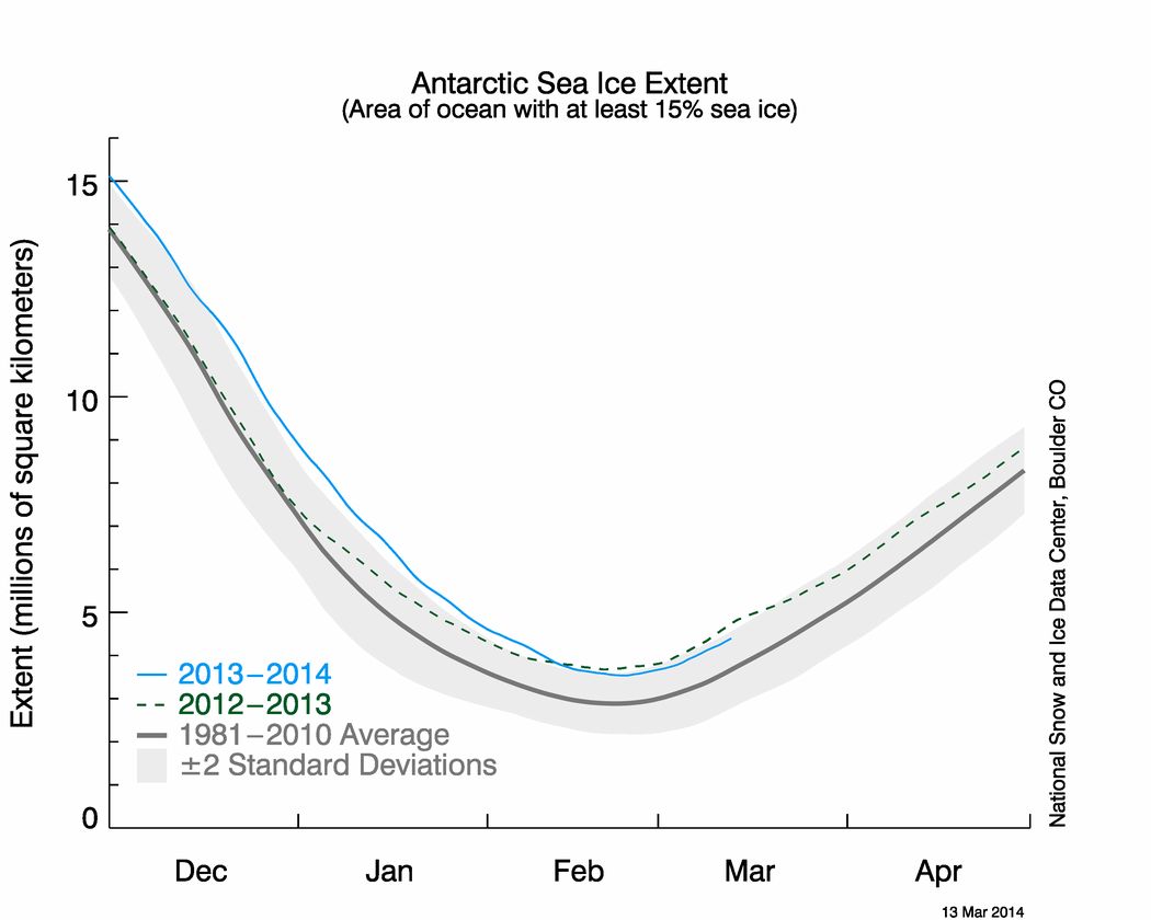
I have discussed your message with a colleague who is interested in these things and we conclude that March is a little early in the year to be drawing significant conclusions. I have been shown some different graphs that appear to show 2014 is not dissimilar to the last few years. I am attaching these for your information.
Best regards
John
Us:
Dear John,
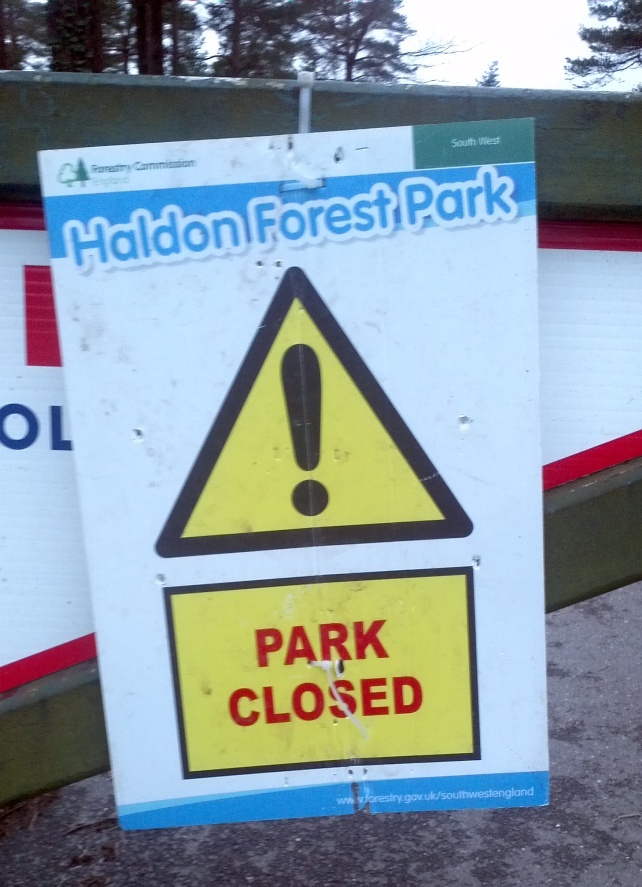
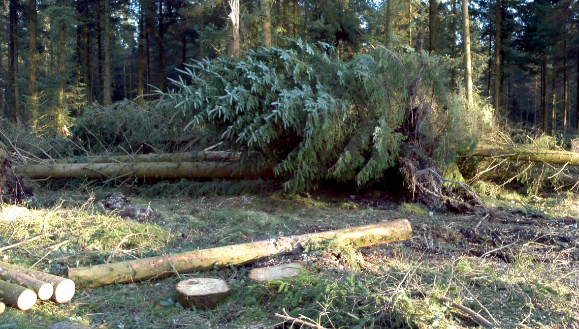
Thank you for your kind words. We’re situated halfway up Haldon, so we avoided the worst of the inclement weather. The top of the hill took a bit of a battering however.
The entrance to Haldon Forest Park on February 24th 2014Haldon Forest Park on March 8th 2014
Our garden suffered a bit too, but thankfully the house was OK.
A new spring gushes from the side of Haldon Hill on Valentine’s Day 2014
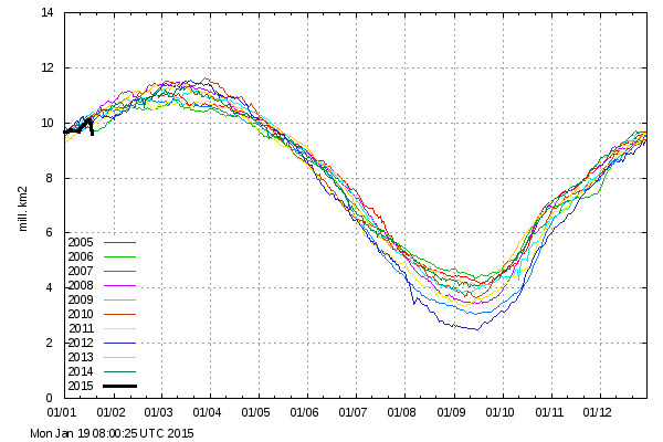
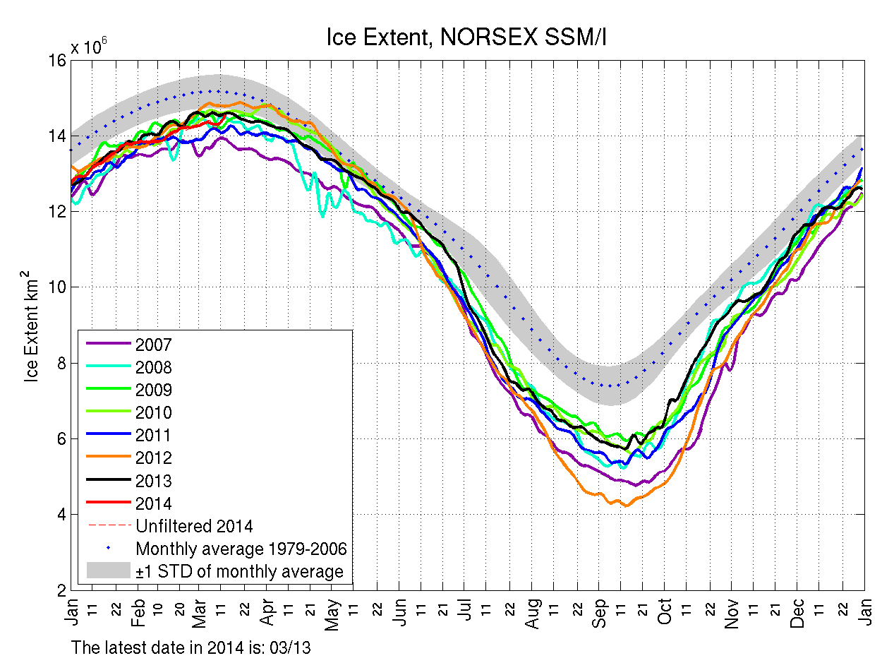
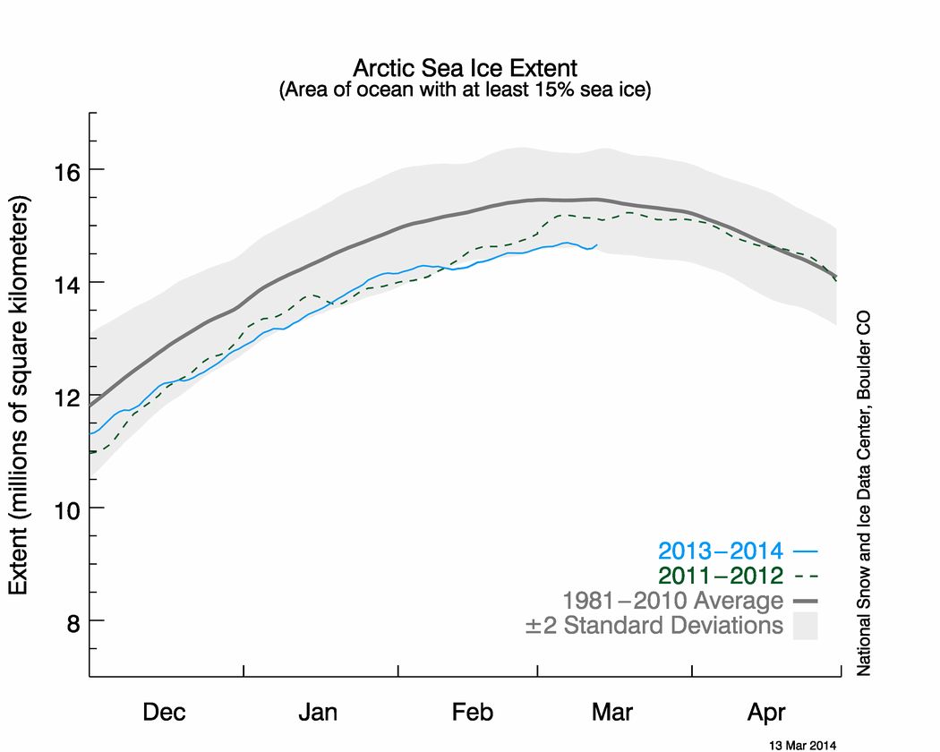
Regarding your own attachments, perhaps in the first instance you might ask your colleague to explain why he or she chooses to send you a NORSEX Arctic sea ice extent graph rather than one from the NSIDC, which I believe we established last summer is The Mail’s oracle on such matters? Please take a good look at the latest NSIDC equivalent to the Antarctic extent graph you sent me, which I attach for your convenience.
NSIDC Arctic sea ice extent graph for March 13th 2014
Whilst you’re at it perhaps you could also ask your colleague to answer at least the first three of these simple questions:
You may also wish to pass on to your colleague the shock news that earlier this week the daily atmospheric carbon dioxide readings from Mauna Loa rose above 400 ppm almost 2 months earlier than last year?
We deny that the article was significantly inaccurate apart from the original headline figure which we have already corrected.
and:
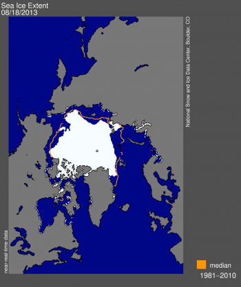
In August, ice did stretch from part of the Siberian shore to the Canadian islands. The image published in the newspaper and online supports this statement as does the enclosed image from the NSIDC site which shows the ice extent on August 18.
Here’s that image, which comes from the August 19th 2013 edition of the National Snow and Ice Data Center’s “Arctic Sea Ice News” entitled “The balding Arctic“:
NSIDC graphic showing Arctic sea ice extent on August 18th 2013
Us:
I’m currently writing a reply to John’s letter. Amongst many other things it directs his attention to this very article and says:
Images showing sea ice “extent” reveal remarkably little about whether an “ice sheet” is “unbroken” or not. If that is what you want to illustrate then an image showing “concentration” is much more helpful. In their report of September 4th upon which David Rose’s article is supposedly based, at least in part, the NSIDC helpfully provided such an image. The Mail on Sunday didn’t publish that image, or a similar image from 2012. In order to correct this inaccuracy they should do so.
Since they’ve evidently read the NSIDC’s news that the Arctic was “Balding” towards the end of August and there was “A real hole near the pole” by early September John and David should be aware of this already, but it seems a refresher course is necessary. On August 19th the NSIDC pointed out that:
Satellite data from the AMSR-2 instrument and MODIS show an unusually large expanse of low-concentration sea ice (20 to 80% cover) within our extent outline (15% or greater, using the SSM/I sensor) spanning much of the Russian side of the Arctic and extending to within a few degrees of the North Pole.
While some of the low concentrations recorded by AMSR-2 may be due to surface melt on sea ice, the MODIS image confirms that a large region is covered by isolated floes.
On September 4th the NSIDC also helpfully pointed out that:
A large hole (roughly 150 square kilometers or 58 square miles) of near-zero ice concentration appears to have opened up at about 87 degrees North latitude.
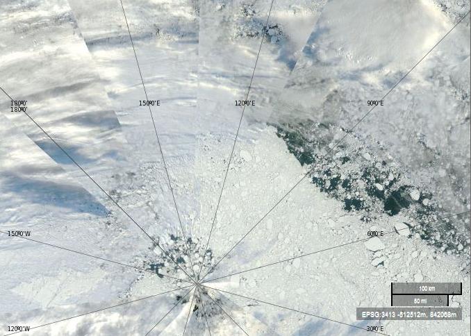
Here is a “true-color” image from September 4th 2013 using MODIS bands 1, 4 and 3, helpfully made available by NASA to anyone who might be interested via the EOSDIS Worldview web site:
NASA Worldview “true-color” image of the North Pole area on September 4th 2013 derived from bands 1, 4 and 3 of the MODIS sensor on the Terra satellite
The lines in this image converge on the North Pole, the same location as the little cross in the NSIDC extent image near the top of this article. Let’s play “Spot the Difference” yet again shall we. Would you say that the sea ice underneath the clouds looks “broken” in this Worldview “true-color” image? How about in the the University of Bremen concentration images often shown by the NSIDC, or in the NSIDC “extent” image above, or in the NASA “extent” videos so beloved by David Rose and the Mail on Sunday?
Regular readers will have realised by now that we’ve been pestering the Mail and The Telegraph with telephone calls and emails for weeks now. That’s because, as The Economist put it last weekend:
There are climate facts—and facts are stubborn things.
Both The Mail and The Telegraph have now corrected a couple of the gross inaccuracies they printed (virtually and/or physically) on September 8th, but many more remain. One of those is the identical phrase in both articles saying:
An unbroken ice sheet more than half the size of Europe already stretches from the Canadian islands to Russia’s northern shores.
The fact of the matter is that this statement is untrue. I’ve recently received a couple of letters about this from “The Daily Telegraph” signed by “Robert Winnett, Head of News”. Here’s an extract from the first one:
Them:
Reputable evidence exists to show an unbroken ice sheet more than half the size of Europe already stretches from the Canadian islands to Russia’s northern shore. This can be seen on the National Snow and Ice Data Center’s website [in the article] “A Real Hole Near the North Pole“. The site states that the average ice extent for August 2013 was 6.09 million square kilometres, which is more than half the size of Europe.
Us:
Have I got news for you Robert! If you’d read any of the articles on here, or watched any of the videos I linked to in my emails, that wasn’t the “fact” I was quibbling about. The fact is that the Arctic “ice sheet” was not “unbroken” and did not “stretch… to Russia’s northern shore” on September 8th 2013 and for considerable periods of time both before and after that date. Here’s an extract from The Telegraph’s second letter:
Them:
In reply to your enquiry, the Telegraph’s policy is to correct clear inaccuracies once we are alerted to them – and in appropriate cases update articles on our website.
Us:
I thought I’d already made this perfectly plain, but evidently not, so here’s yet another alert about clear inaccuracies in the “reporting” of climate science in The Telegraph:
David Rose has now had another article published in the Mail on Sunday. The new one refers back to his previous words of wisdom about the Arctic, imparting this piece of information:
The Mail on Sunday’s report last week that Arctic ice has had a massive rebound this year from its 2012 record low was followed up around the world – and recorded 174,200 Facebook ‘shares’, by some distance a record for an article on the MailOnline website.
That’s a lot of people repeating a load of old nonsense! Here at GreatWhiteCon.info we also have a Facebook presence, so if you would like to share our alternative interpretation of what’s really going on in the Arctic please take a good look at:
and share that information with your friends, as long as it makes more sense to you than David Rose’s record breaking article. Meanwhile here in at Great Ivory Towers we’ve still only progressed as far as the third sentence in David’s article the weekend before last, which reads as follows:
Them:
Days before the annual autumn re-freeze is due to begin, an unbroken ice sheet more than half the size of Europe already stretches from the Canadian islands to Russia’s northern shores.
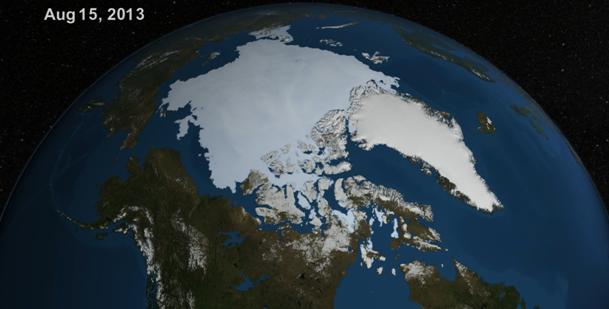
As you’ll discover below we’ve been experimenting with YouTube recently, where we stumbled upon a NASA video which led us to a page on NASA’s Goddard Space Flight Center web site where you can download a high resolution version of the same video. We did that, and then much like the Mail, we took a screenshot from the video to reveal an image remarkably like the one they published just over a week ago. Here it is:
NASA visualization of the Arctic on August 15th 2013
Us:
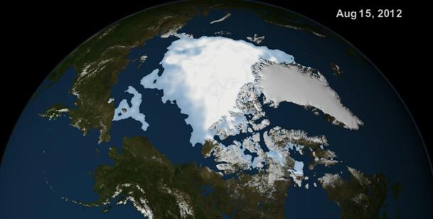
We also found that NASA’s Scientific Visualization Center had another similar video available for download, covering the period from August 1st to September 13th 2012. Here’s a screenshot we took from that video, for August 15th 2012:
NASA visualization of the Arctic on August 15th 2012
For some reason a similar image cannot however be found in David Rose’s Mail on Sunday article of September 8th 2013. Instead that contains an image labelled “August 27th 2012”. Whilst you ponder why the Mail was avoiding comparing like with like visually 9 days ago, here’s a little animation we’ve put together using alternative visualizations of Arctic sea ice, this time of ice concentration and generated by the University of Bremen. It shows how the sea ice cover has been changing from August 15th through to September 13th 2013, which may ultimately prove to be day of the minimum extent in 2013, using the NSIDC’s methodology at least. Note that it lingers for a while on August 27th, and we hope you like the sound track!
Verdict:
For reasons known only to themselves the Mail certainly weren’t comparing like with like visually on September 8th 2013. They evidently weren’t comparing like with like numerically either, since however hard we try comparing numbers from “the same time last year” we can’t come up with the Mail’s magic “60% increase”. Comparing NSIDC extent for August 15th 2013 with August 27th 2012 did however lead us to perform this bit of elementary arithmetic:
6.16 / 3.94 = 1.56 – A 56% increase.
However hard we try we still can’t get close to the Mail’s “nearly a million more square miles of ocean covered with ice than at the same time last year – an increase of 60 per cent”. We also challenge all and sundry to watch our video and then loudly proclaim, with a straight face, that “an unbroken ice sheet more than half the size of Europe already stretches from the Canadian islands to Russia’s northern shores”.
This website uses cookies to improve your experience. We'll assume you're ok with this, but you can opt-out if you wish. Cookie settingsACCEPT
Privacy & Cookies Policy
Privacy Overview
This website uses cookies to improve your experience while you navigate through the website. Out of these, the cookies that are categorized as necessary are stored on your browser as they are essential for the working of basic functionalities of the website. We also use third-party cookies that help us analyze and understand how you use this website. These cookies will be stored in your browser only with your consent. You also have the option to opt-out of these cookies. But opting out of some of these cookies may affect your browsing experience.
Necessary cookies are absolutely essential for the website to function properly. This category only includes cookies that ensures basic functionalities and security features of the website. These cookies do not store any personal information.
Any cookies that may not be particularly necessary for the website to function and is used specifically to collect user personal data via analytics, ads, other embedded contents are termed as non-necessary cookies. It is mandatory to procure user consent prior to running these cookies on your website.