Tag Archives: NALOPKT

The 2024 Arctic Sea Ice Minimum Extent in the Cryodenialosphere

Earlier today the National Snow and Ice Data Center announced that:

On September 11, Arctic sea ice likely reached its annual minimum extent of 4.28 million square kilometers (1.65 million square miles). The 2024 minimum is the seventh lowest in the nearly 46-year satellite record. The last 18 years, from 2007 to 2024, are the lowest 18 sea ice extents in the satellite record…

Note that this is a preliminary announcement. Changing winds or late-season melt could still reduce the Arctic ice extent, as happened in 2005 and 2010. NSIDC scientists will release a full analysis of the Arctic melt season, and discuss the Antarctic winter sea ice growth, in early October.

Consequently several of the usual cryodenialospheric suspects have been frantically spinning their webs of deceit around the announcement.

First up was Javier Vinós, who beat the NSIDC’s starting gun by firing a broadside on X (formerly Twitter) on Sunday. If you’re unfamiliar with the name, Javier frequently pontificates about Arctic sea ice, amongst other things, on Judith Curry’s “Climate Etc.” blog. He confidently announced that:

Arctic sea ice reaches its annual minimum with an extent greater than in 2007, 2012, 2016, 2019, 2020 and 2023.

The two warmest years in a row at > +1.5°C have ZERO IMPACT on the 17-year resilience of Arctic sea ice.

Needless to say, “Snow White” felt compelled to quibble:

Continue reading The 2024 Arctic Sea Ice Minimum Extent in the Cryodenialosphere

Rewriting The Arctic

Peter, a welcome new denizen here at the Great White Con Ivory Towers, appears to have parachuted into our far north summer hideaway on the shores of Santa’s Secret Summer Swimming Pool straight from Tony Heller‘s Unreal Climate Science blog.

Prompted by Peter I wandered over to Tony’s place where I found to my surprise that he has recently been busy warming up an old chestnut of his that has been debunked numerous times over the past decade. Allegedly:

Between 1990 and 2001, the IPCC rewrote the Arctic sea ice satellite record, and changed a trend of ice increasing to ice decreasing.

Here’s a previous chestnut rewarming event preserved for posterity:

Sadly Tony’s side of the “debate” has been deleted by the powers that be at Twitter, so here are the two graphs in question, combined by Mr. Heller into one illuminating animation:

I posted this comment on Tony’s blog last night (UTC), but he hasn’t got back to me yet:

Neither has anybody else. That’s probably because this morning my words of wisdom are still only visible to Tony and I?

[Edit – October 5th]

Progress at long last! Vegieman directs the attention of Tony’s band of merry (mostly) men to:

However for some strange reason he neglects to mention that Tony’s link labelled “2001 IPCC Report” doesn’t lead to that graph!

[Edit – October 9th]

Not a lot of people know that since things have gone quiet at Tony’s place I popped into Paul Homewood’s echo chamber, where rewriting the Arctic continues apace:

Needless to say my helpful comment is currently invisible.

Watch this space!

Sea Ice Data Tampering At DMI?

Not a lot of people know that our headline for today (apart from the terminating question mark) has been shamelessly plagiarised from Paul Homewood’s latest Arctic article. This will give you a flavour of Paul’s purple prose:

Electroverse have uncovered some blatant data tampering by DMI:

“It would appear that the Danish Meteorological Institute (DMI) may have taken a leaf out of NASA’s ‘data-fudging 101‘.

Sometime between late-Nov and early-Dec this year, the DMI’s Arctic Sea Ice Volume chart experienced a mysterious ‘vanishing’ of ice — this is revealed by a direct comparison of the Nov 18th and the Dec 8th charts below.”

I am able to corroborate their findings. In September I took this screenshot of DMI sea ice thickness. Note that the black line for this year was close to the 2018 line, and above 2017 for Sep 20th:

But the new version shows this year well below those two years:

There is no other way to describe this than blatant fraud. The changes do not appear to have been even documented, and the old data is not archived, being simply “replaced”. These should surely be very basic scientific requirements.

Neither does there appear to have been any public announcement by DMI about the fact or the justifications for what amounts to a significant change.

What this episode means is that DMI can no longer be trusted to produce honest, reliable data. It also raises the question of whether similar tampering has been carried out in previous years, without anybody being aware. After all, it is only by pure accident that it has been spotted this time.

Even fewer people know that my helpful explanatory comment is currently invisible to Paul’s band of merry (mostly) men:

Should anyone contrive to click on the invisible link this what they would see just below the DMI’s recent Tweet:

Quite predictably Tony Heller has also jumped on the self same bandwagon, claiming in an article entitled “Rapidly Disappearing Arctic Ice” that:

On December 4, DMI showed Arctic sea ice volume above the 2004-2013 average:

Quite predictably, the data disappeared for three days, and now that it has returned, DMI has massively reduced the amount of sea ice in the Arctic. Much of the thick ice off the coast of Siberia has disappeared:

Presumably their data tampering has freed the Russian ships trapped in the ice.

In normal circumstances I would of course point out the error of his ways to Tony via Twitter. However:

Here is the DMI’s explanation for the recent change in their Arctic sea ice thickness/volume visualisations, as shown on their “Polar Portal” web site:

New graphics December 7, 2021

We have improved the DMI operational ocean and sea-ice model HYCOM-CICE with higher horizontal resolution and updated HYCOM and CICE code. In particular, the sea ice code has been greatly improved with meltponds, sea-ice salinity, improved thermodynamics and much more. The freshwater discharge from Greenland has also been greatly improved using freshwater product from GEUS, which especially improves the coastal ocean currents and thus the ice transport nearshore Greenland. The model has been running continuously since September 1990. Therefore, we have by December 07, 2021 updated the graphics of sea-ice thickness and volume using the new and improved data on Polarportal and ocean.dmi.dk.

The improved model setup has led to higher variability as well as less abrupt melting during the melt season, which gives a shift of approximately half a month for the time of minimum ice volume. The trend between the years is almost unchanged. Thereby, a year with a large sea-ice volume in the old setup also has a large volume in the new setup, and similar for years with low sea-ice volume.

I always thought that “skeptical” folk didn’t much care for the output of “climate models” but I guess I must have been mistaken?

[Edit – December 13th]

Needless to say my comment at NALOPKT is still invisible this evening. However credit where credit is due. Tony Heller has at least not censored my comments on his blog. Earlier today Watts Up With That referred to both the Heller and Homewood DMIGate2 articles. Do you suppose the following helpful comment of mine will ever see the light of day at WUWT?

Watch this space for more #DMIGate2 news as and when we receive it!

What’s Up With That Arctic Sea Ice Disinformation

A few days ago we posted an article about the recent surge in the amount of disinformation being published about Arctic sea ice. Eventually one of our long list of usual suspects, Anthony Watts, published a copy of an erroneous Arctic article by Paul Homewood.

Now the Watts Up With That Arctic porky pie production line is going into overdrive, so here’s an already long list of its output in the run up to the COP26 conference in Glasgow in a month or so. First up is the aforementioned clone from NALOPKT. Allegedly:

It is very easy to show that Arctic sea ice has stabilised. As their graph itself shows, there have only been three years since 2007 with lower ice extent than that year, and eleven have had higher extents. Also the average of the last ten years is higher than 2007’s extent.

In itself, this is too short a period to make any meaningful judgements. But that is no excuse for the Met Office to publish such a manifest falsehood.

This comment of mine on that article remains invisible at WUWT:

This morning (UTC) I added another comment to Anthony’s moderation queue:

Continue reading What’s Up With That Arctic Sea Ice Disinformation

Not A Lot Of People Know How Paul Homewood Propagates Fake News About the Arctic!!

A couple of days ago we explained how Christopher Booker explained that blogger Paul Homewood:

Has drawn on official sources.. to uncover what is actually happening [in the Arctic]

Have we got news for you Christopher? That’s not how it works in the cryodenialosphere! Mr. Homewood’s article about Mr. Booker’s article about Mr. Homewood’s previous article(s) is littered with factual errors. This is what happens should you be foolish enough to attempt to correct such errors.

Here is what we typed into the comment section of Mr. Homewood’s blog:

Of course if Mr. Booker were to have considered Arctic sea ice volume he might have thought twice about his “there is even more of it today than in February 2006, and it is also significantly thicker.” remark?

PIOMAS-IceVolumeAnomalyCurrentV2.1_20170227

Followed by:

NALOPKT-AliceIsModerated

When that failed to make an appearance:

NALOPKT-Alice-Moderated-20170228

When Ron Clutz sang the praises of MASIE yet again:

NALOPKT-Jim-AutoSnipped-20170227

Here is what Paul Homewood cherry picked to publish to his loyal readership:

NALOPKT-Alice-Snipped-20170228

Can you spot the difference? Our juiciest cherries all ended up on Paul’s cutting room floor!

Shock News! The Telegraph is Propagating Fake News About the Arctic!!

David Rose is mercifully quiet this weekend, but there’s no rest for the wicked! Christopher Booker in the Sunday Telegraph leads a bunch of the usual Alt-facts suspects in a barrage of fake news about our dearly beloved Arctic sea ice. According to Mr. Booker in the “Arctic Myths” section of his column today:

As the fake science of global warming continues to crumble, one scare story the zealots are determined to hold on to at all costs is their claim that ice in the Arctic is dangerously vanishing. Yet again lately we have been treated to a barrage of such headlines as “Hottest Arctic on record triggers massive ice melt”.

The nearest we got to such a headline here at the Great White Con was “Arctic Sea Ice News from AGU” in which article we showed images which said things like:

arctictemp_map_graph_2015-16_620

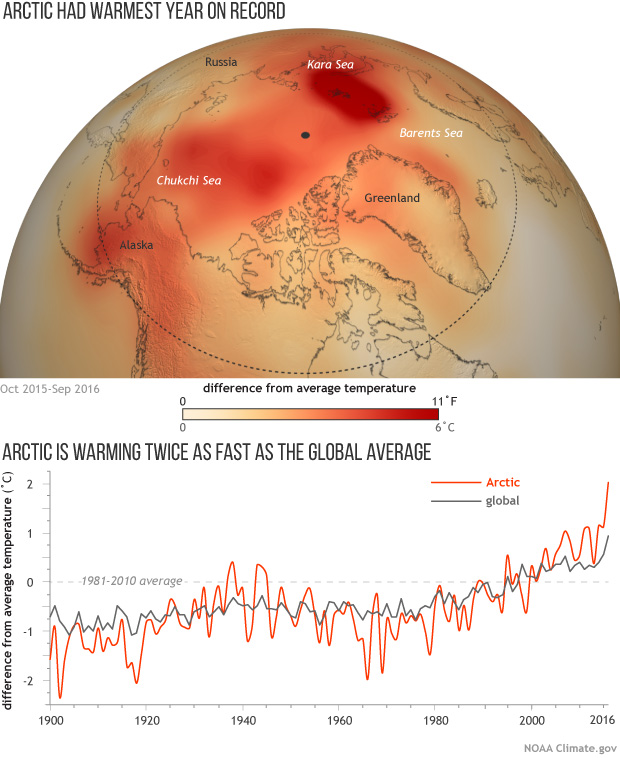
That’s because last year was the *hottest year on record in the Arctic! Undeterred by mere facts Mr. Booker continues:

Booker-NSIDC-20170226

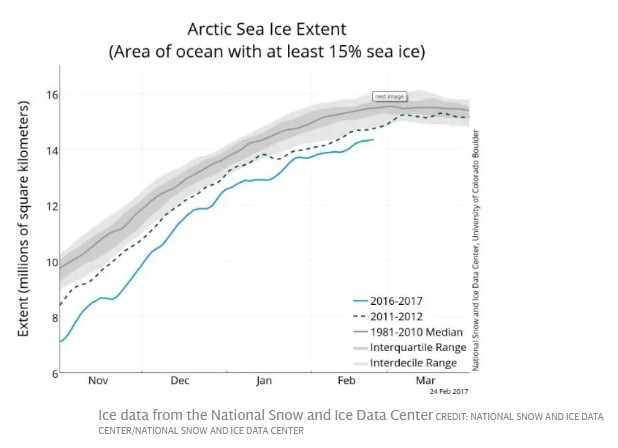
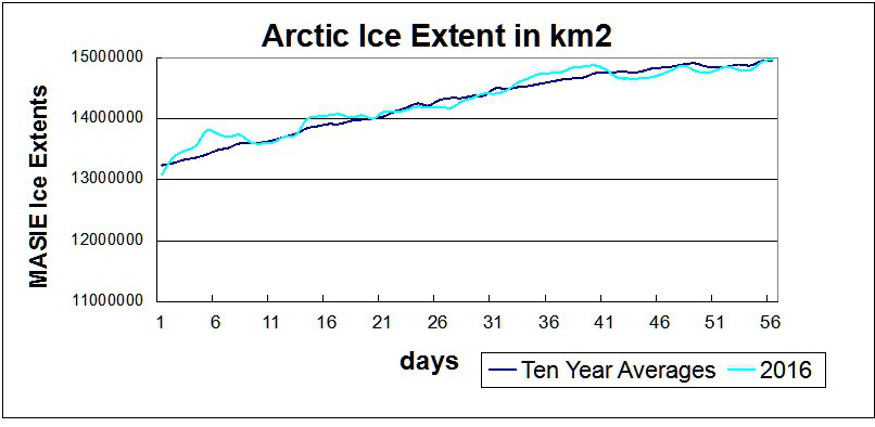
But that ever-diligent blogger Paul Homewood has drawn on official sources such as the US National Snow and Ice Data Center to uncover what is actually happening. Under “Arctic Fake News”, on NotALotOfPeopleKnowThat, he posted a graph showing that last week the extent of sea ice was much the same as it has been at this date ever since 2001. Indeed, according to the Danish Meteorological Institute, there is even more of it today than in February 2006, and it is also significantly thicker. Back in 2008 much of the ice was only a metre thick. Today that has risen to two metres, and in some places four.

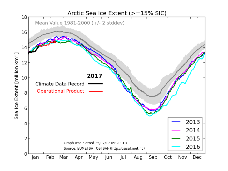
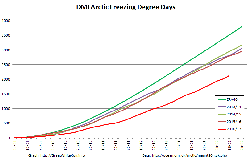
Mr. Booker appears to be more than somewhat confused, since this is what the DMI Arctic sea ice extent graph he links to reveals:

DMI_nh_iceextent_daily_5years_20170225

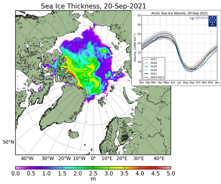
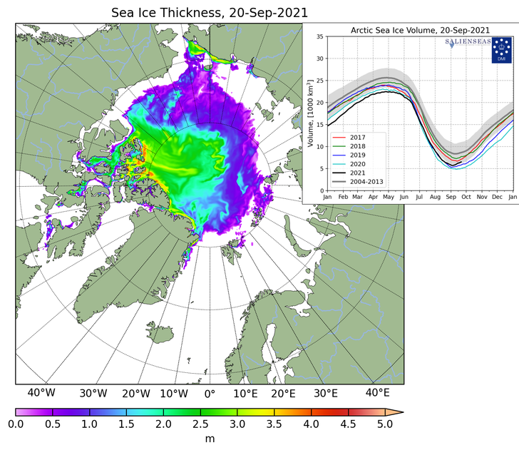
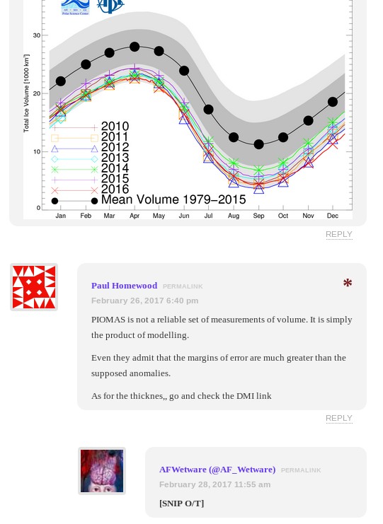
In addition the DMI thickness maps he refers to aren’t available at any of the places he mentions! Not a lot of people know that he was probably thinking of another recent article by Paul Homewood entitled “Arctic Ice Fake News“, which includes these two DMI thickness maps:

cice_combine_thick_sm_en_20080218

cice_combine_thick_sm_en_20170218

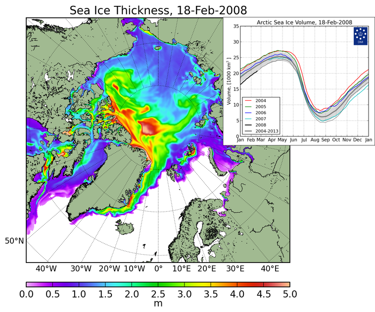
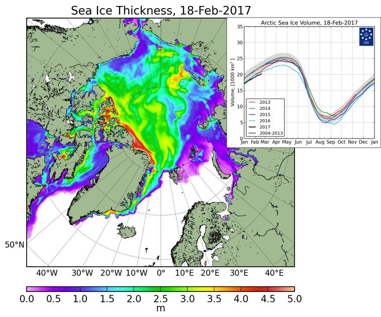
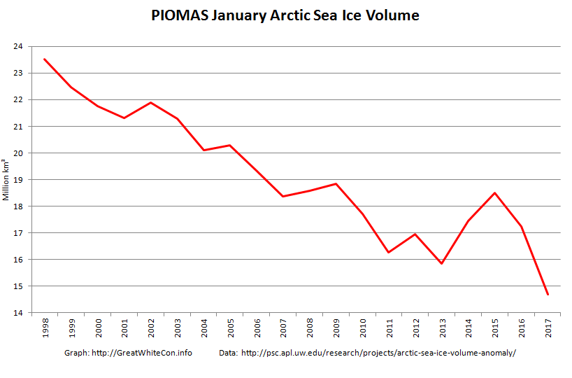
Even without considering other sources of Arctic thickness and/or volume data it is quite clear from the two volume graphs that according to the Danish Meteorological Institue Arctic sea ice volume is significantly lower this year than it was in 2008. If Arctic sea ice extent is greater this year and the volume is lower then the laws of physics (which not even the combined talents of Messrs Homewood and Booker can change) dictate that its average thickness must be LESS this year than in 2008!

Mr Booker blunders on:

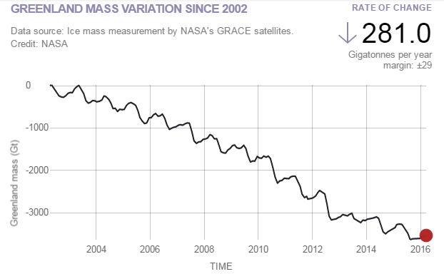
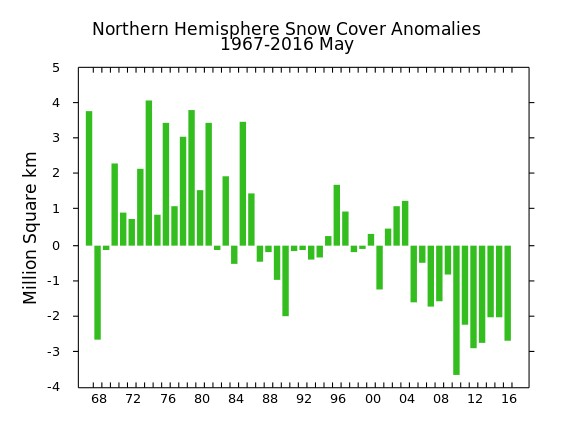
The DMI data also show that the Greenland ice sheet, which we are told is melting at horrendous speed, is actually growing this year at a record rate, to a size way above its average for the past 26 years. And the most authoritative record of Northern Hemisphere snow cover shows this year’s ranking as one of the six highest since 1967.

He seems blissfully unaware that the “DMI data” to which he refers is the output of a DMI climate model that attempts to determine the “surface mass balance” of the Greenland ice sheet. He seems to think it’s a measurement of the mass of the Greenland ice sheet, which it isn’t. However this is, courtesy of NASA:

GreenlandGrace-20170213

In his bubble of astounding Arctic ignorance Mr. Booker continues:

The Deplorable Climate Science blog, run by US expert Tony Heller, gleefully reproduces a 2007 headline: “Scientists: ‘Arctic is screaming’, global warming may have passed tipping point”. As Heller comments: “The Arctic is indeed screaming at climate scientists – to shut up.”

Now as luck would have it I have been (vainly!) attempting to persuade Mr. Heller “to shut up” on the very article Mr. Booker references! Let’s take a quick look at a couple of highlights shall we?

February 22, 2017 at 12:01 am

At the risk of repeating myself, need I say more?

PIOMAS-Jan-19Years

It seems safe to assume that Mr. Booker wasn’t reading Mr Heller’s blog on or after February 22nd does it not? Otherwise he would surely have had second thoughts about writing such a ludicrous phrase as “there is even more of it today than in February 2006”?

Then of course there’s the burning question of the “Hottest Arctic on record”

February 22, 2017 at 5:59 pm

At the risk of (repeating myself)² AZ, here’s some “higher atmospheric air temperatures” for you:

DMI-FDD-20170218

If Mr. Booker had browsed Mr. Heller’s blog slightly more diligently he might even have seen this from the much maligned NOAA:

February 20, 2017 at 11:06 am

You seem to have forgotten about spring Gail? Here’s April:

NOAA-NH-Snow-April

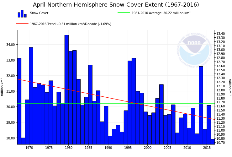
Here’s the May graph from “the most authoritative record of Northern Hemisphere snow cover” for good measure:

Rutgers-NH-Snow-May

To summarise, Messrs Booker and Homewood could have confined their due diligence on their assorted Arctic articles to reading my comments on Mr. Heller’s blog. Having done so it would quickly have become apparent to them that every single point they made was in actual fact a “fake fact”.

The inevitable conclusion is that they have no interest whatsoever in establishing the actual facts about the Arctic. All they are interested in is propagating “fake news” about the Arctic as far and as wide as possible in pursuit of a common “agenda”. As is David Rose.

* Since satellite records began.

Gross Deception About MASIE and the Sea Ice Index

Our title for today is a reference back to a 2015 article by Paul Homewood on his “Not A Lot Of People Know That” blog, in which he told a load of old porky pies about the National Snow and Ice Data Center’s graphs of Arctic sea ice extent. Only last week Mr. Homewood cooked up another pile of porky pies concerning the Danish Meteorolical Institute’s Arctic sea ice extent metric. Now he has turned his pie baking skills to the Multisensor Analyzed Sea Ice Extent (MASIE for short), which is “a prototype collaborative product of the National Ice Center and NSIDC”.

Mr. Homewood obviously hadn’t done a whole lot of homework on MASIE before firing up his porky pie production line, since he used the self same recipe posted on the so called “Science Matters” blog of Ron Clutz shortly before. In fact he just reprinted the first part of Ron’s article and added a handy link to Ron’s even bigger pile of porky pies beneath it. Hence both Paul and Ron’s web sites currently proudly proclaim that:

Something strange is happening in the reporting of sea ice extents in the Arctic. I am not suggesting that “Something is rotten in the state of Denmark.” That issue about a Danish graph seems to be subsiding, though there are unresolved questions. What if the 30% DMI graph is overestimating and the 15% DMI graph is underestimating?

The MASIE record from NIC shows an average year in progress, with new highs occurring well above the 2015 maximum:

Clutz-masie-2016-to-day-56r

While I am compelled to agree with Ron and Paul that “something strange is happening in the reporting of sea ice extents in the Arctic” we disagree about everything else! One reason for that is because only a few days ago I interviewed NASA scientist Walt Meier following a suggestion by Ron Clutz that I do precisely that. Please read the edited highlights of that interview, and note in addition that Walt assured me that he had not previously been contacted by either of Messrs. Clutz and Homewood. Having never previously contacted Mr. Meier, here’s what Ron Clutz would have his loyal readership believe this weekend:

NOAA Is Losing Arctic Ice

Why the Discrepancy between SII and MASIE?

The issue also concerns Walter Meier who is in charge of SII, and as a true scientist, he is looking to get the best measurements possible. He and several colleagues compared SII and MASIE and published their findings last October. The purpose of the analysis was stated thus:

Our comparison is not meant to be an extensive validation of either product, but to illustrate as guidance for future use how the two products behave in different regimes.

Here is what Dr. Meier’s peer reviewed paper from October last year concluded on the matter:

Operational modelers require timely data that are as accurate as possible to initialize forecast models. In particular, an accurate ice edge is important because of the influence of the interaction of sea ice and water with the overlying atmosphere on the model fluxes. Consistency of data is also desirable for operational models, but is a secondary concern because the models are regularly reinitialized for their synoptic forecasts. Operational observations like MASIE make the most sense for these applications. However, the quality and amount of information used to produce the operational analyses vary.

Climate modelers desire consistent long-term data to minimize model biases and better understand and potentially improve model physics. The passive microwave record is useful, but has limitations. Regions of thin ice are underestimated and if the ice cover is diffuse with low concentration, ice-covered regions may be detected as open water. Even thin ice modifies heat and moisture transfer and thus may affect atmospheric and oceanic coupling. Surface melt results in an underestimation of concentration. This should be considered when evaluating model concentrations with passive microwave data.

and here once again is what he told me a few short days ago:

Since the quantity and quality of [MASIE] data varies the time series will not be consistent over time.

For some strange reasom Mr. Clutz’s article mentions none of this. Needless to say I have attempted to bring this unfortunate oversight to the attention of Ron & Paul:

2016-02-28_1007-RonClutz

Even more unfortunately it seems that their joint acute snow blindness has got even worse over the last few days, since they still haven’t noticed my link to Walt Meier’s words waiting patiently in their WordPress.com “moderation queues”.

Whilst we wish them on their recovery from their painful ailment, here’s an alternative interpretation of the MASIE data:

MASIE-Min

Operational modellers for the use of! Here’s what the NSIDC’s Sea Ice Index currently reveals to climate scientists:

Charctic-20160226

NSIDC Arctic sea ice extent is evidently still currently lowest *ever for the date.

DMI, MASIE and the Sea Ice Index – An Interview With Walt Meier

For some reason best known to himself Anthony Watts has jumped on the “DMIGate” bandwagon started by Paul Homewood over on this side of the Atlantic a few days ago. In his latest article Mr. Watts quotes with approval the “Not A Lot Of People Know That” article which we have already covered in some depth.

Here yet again is one of my comments that recently ended up on the NALOPKT cutting room floor:

2016-02-21_1811-NALOPKT

You will note that I was suggesting that Ron Clutz’s extremely selectively interpretation of some of Walt Meier’s academic papers left a lot to be desired. Particularly given the additional fuel added to the “skulduggery” fire by the Watts Up With That article it seemed sensible to phone up NASA and ask Walt for his views on the second hottest Arctic sea ice topic on the planet at the moment, according to Messrs. Clutz and Homewood at least. That is the relative merits of Multisensor Analyzed Sea Ice Extent (MASIE for short) versus the National Snow and Ice Data Center’s Sea Ice Index (SII for short) for determining Arctic sea ice trends.

According to the NSIDC:

MASIE sea ice products are developed from National Ice Center (NIC for short) data with support from the U.S. Navy and from NOAA. MASIE is hosted by NOAA@NSIDC.

whereas:

The Sea Ice Index provides a quick look at Arctic- and Antarctic-wide changes in sea ice. It is a source for consistent, up-to-date sea ice extent and concentration images and data values from November 1978 to the present.

As luck would have I managed to get through to Walt on my second attempt, and he graciously agreed to be interviewed at extremely short notice. He told me that whilst he now worked at NASA he used to be at the NSIDC, and still collaborated with them. Here are the edited highlights of his thoughts on “MASIE v SII”:

MASIE repackages data from the NIC, and incorporates an ice edge hand drawn by analysts working with whatever satellite data they have available at the time. It is an “operational” product designed to produce a “best effort” ice edge each day, based on whatever data may be available at the time.

Visual data is obviously not available in winter, and the ice edge is often obscured by clouds in summer. Synthetic Aperture Radar can “see in the dark” and through clouds, but suffers from different limitations. The whole of the Arctic isn’t covered every day for example. In addition, and unlike the SII, data from different satellite sensors is incorporated which means there are inevitably inconsistencies from day to day and from year to year. There is also an element of “human subjectivity” because different analysts are working with different sources of data from one day to the next. Since the quantity and quality of data varies the time series will not be consistent over time.

On the other hand the SII was designed to use a consistent methodology over a long period of time using a single type of sensor. 100% automatically processed passive microwave data is the “gold standard” when it comes to determining sea ice trends. It is subject to some biases and thus is not necessarily as accurate on a given day as MASIE. However, the biases are consistent over time, so the time series will be consistent over time. This means that year-to-year comparisons and trend estimates will be more accurate in the passive microwave data than in MASIE.

So there you have it. If you’re on the bridge of a vessel sailing in Arctic waters then MASIE is the right tool for the job. If on the other hand you’re sat in front of a computer trying to get the best estimate of trends in Arctic sea ice extent then the Sea Ice Index is what you’ll grab from your toolkit.

Having had a chance to examine the “evidence” of DMI “skulduggery” presented by Messrs. Watts and Homewood, Walt sent me a follow up email. Here is what it says:

Regarding DMI, the issue seems quite simple. The 30% plot is an older version that they stopped supporting as they transitioned to the 15% plot. I don’t know specifically why the 30% plot went awry, but there is generally automatic quality control done to make sure the final results are accurate and consistent. If such QC is not done, a lot of incorrect values can occur. I suspect that since the older version was no longer supported, the QC wasn’t being watched and something went wrong that they didn’t bother to fix (or maybe didn’t even notice) because the new 15% version is the official DMI output.

Not a lot of people know that, because Watts, Homewood et al. have developed the nasty habit of “snipping” comments to that effect as and when the mood takes them, which based on my own experience seems to be remarkably often in this day and age.