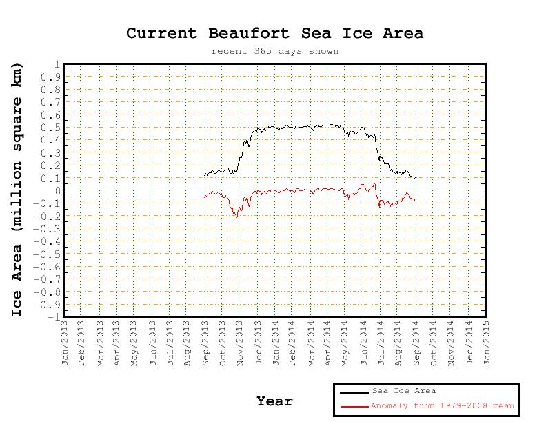
We’ve recently been speculating about the effect on the sea ice in the Arctic of varying amounts of weather borne heat, wind and waves. The cumulative effect of all the assorted storms is that today a variety of sea ice metrics are all at their lowest ever level for the date, since their respective records began.
The JAXA/ADS extent was the first to fall below all previous years, and here’s how it looks today:
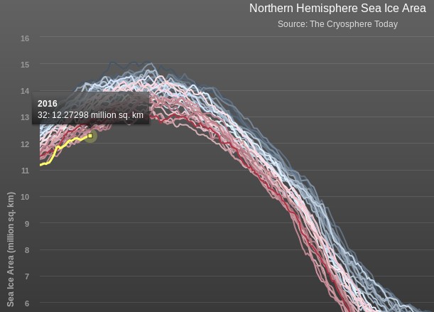
Note that it shows extent currently decreasing. Next came the Cryosphere Today area, which has also just decreased from the day before:
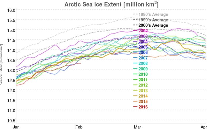
The latest metric to join the club is the 5 day averaged version of the NSIDC Arctic sea ice extent, which currently reveals:
Would any brave reader care to hazard a guess where and when the assorted Arctic sea ice metrics will eventually reach their maximum values for 2016?
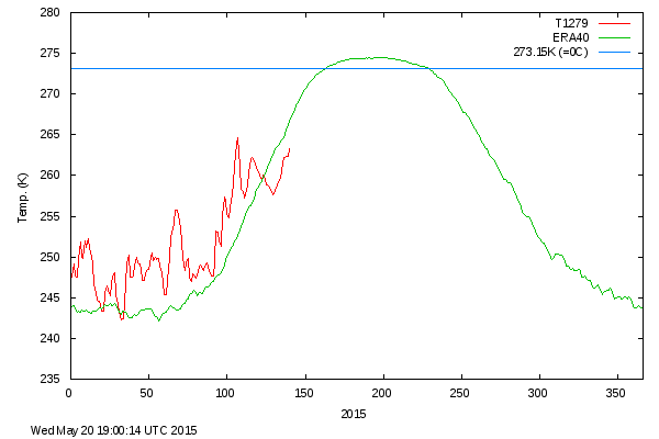
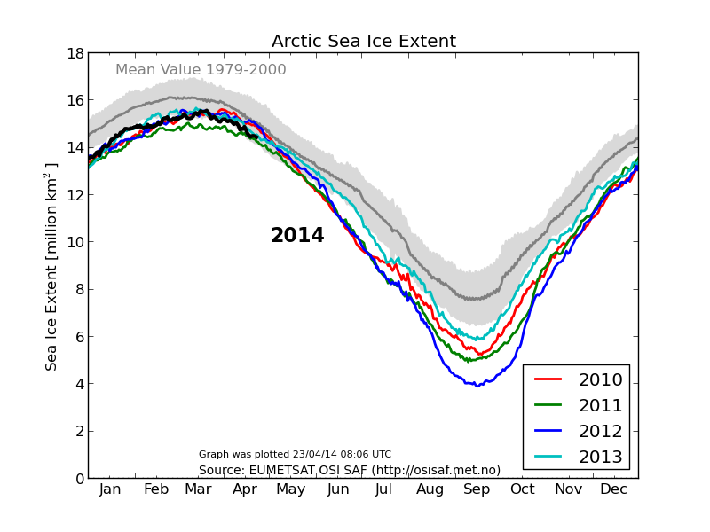
We’ve now entered the month of September, the month in which Arctic sea ice extent and area reach their annual minimum levels, historically at least. To set the scene, here’s the extent graph from the Japan Aerospace Exploration Agency (JAXA) for September 1st, based on data from the AMSR2 sensor on board their SHIZUKU satellite.:
As you can see, the 2015 curve has just dropped below 2007 and is now at the second lowest level for the date in JAXA’s records. As the month progresses we’ll be taking a look at a variety of other metrics as they start to report their numbers for September.
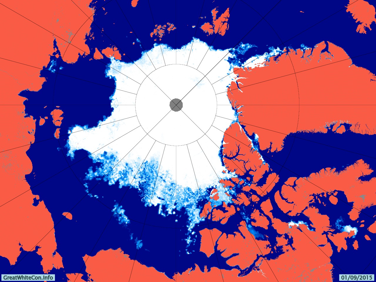
To set the scene, here’s the University of Hamburg’s map of Arctic sea ice concentration for September 1st, again based on AMSR2 data:
Here’s a video showing how that map has changed over the last two months:
Notice in particular the effect of the recent Arctic cyclone on the sea ice in the lower left quadrant. Note also our comment that:
[There is] a large potential fetch across the East Siberian, Chukchi and Beaufort Seas should any further cyclones occur in the area over the next few weeks. The conditions now exist for an even more damaging swell to be generated before the 2015 minimum Arctic sea ice extent is reached.
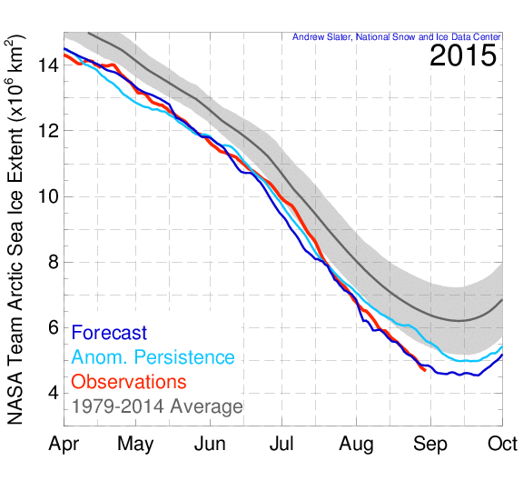
By now you may be wondering if we have a prediction to make? Well, we predict it still all depends on the weather! However here’s how the “probabilistic” 50 day ahead prediction from Andrew Slater of the NSIDC looks at the moment:
If I were a betting man I’d say that the red line will ultimately put in a lower low than the dark blue one.
Finally, for the moment at least, take a look at the GFS surface level pressure forecast for later today, courtesy of MeteoCiel:
Can you see the 1000 hPa central pressure low spinning over the Laptev Sea? It’s currently not very deep, and it’s not over the East Siberian Sea either, but watch that space along with us as we wait to discover where and when the assorted Arctic sea ice metrics reach their minima for 2015.
[Edit – September 3rd 2015]
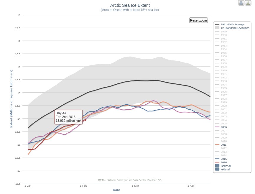
The latest edition of the US National Snow and Ice Data Center’s Arctic Sea Ice News has just been published. In the section on the imminent minimum they show this graph:
and say that:
Starting with the ice extent observed on August 31 and then applying 2006 loss rates, the slowest rate in recent years, results in the highest extrapolated minimum for 2015 of 4.50 million square kilometers (1.74 million square miles), and a September monthly average extent of 4.59 million square kilometers (1.77 million square miles). The lowest daily minimum comes from using the 2010 pace, yielding an estimated 4.12 million square kilometers (1.67 million square miles) for the daily minimum, and a September monthly average extent of 4.33 million square kilometers (1.67 million square miles).
Using an average rate of ice loss from the most recent ten years gives a one-day minimum extent of 4.38 ± 0.11 million square kilometers (1.79 million square miles), and a September monthly average of 4.49 ± 0.09. As of August 31, the 5-day running daily average extent is 4.72 million square kilometers. If no further retreat occurred, 2015 would already be the sixth lowest daily ice extent in the satellite record.
The forecast places the upcoming daily sea ice minimum between third and fourth lowest, with fourth more likely. There is still a possibility that 2015 extent will be lower than 4.3 million square kilometers, the third lowest sea ice extent, surpassing the 2011 sea ice extent minimum, and a small chance of surpassing 2007, resulting in the second-lowest daily minimum. This assumes that we continue to have sea ice loss rates at least as fast as those of 2010. This was indeed the case for the final ten days of August 2015.
Somewhere between 2nd and 6th then! We felt compelled to enquire on Twitter:
Experts say that the Arctic is in a “death spiral” – but for the past two years it has been tracking 2005/2006 – the years with the two highest summer extents of the past decade.
For the past four years, summer melt season temperatures in the Arctic have been well below normal.
No matter how many times experts lie about it, the Arctic is not melting down.
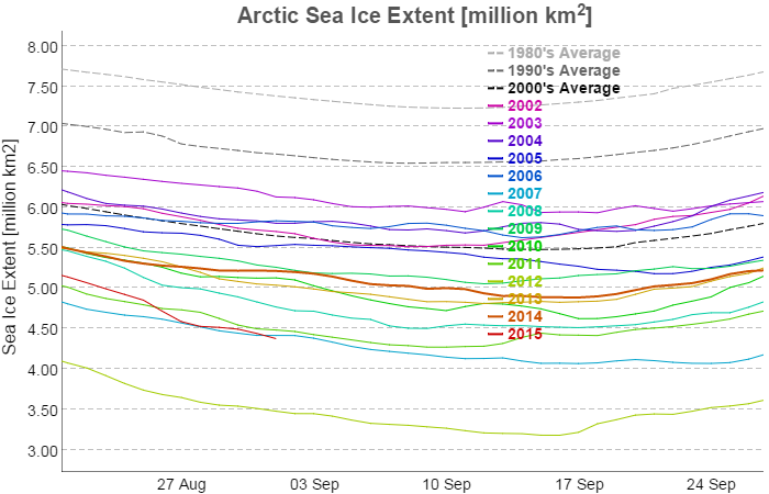
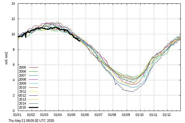
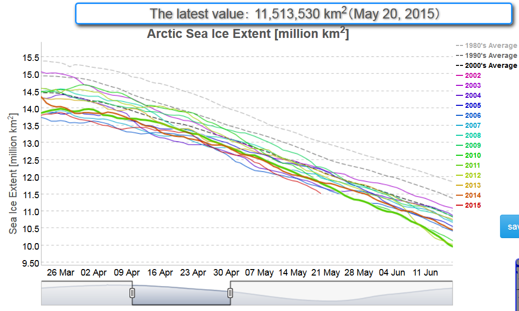
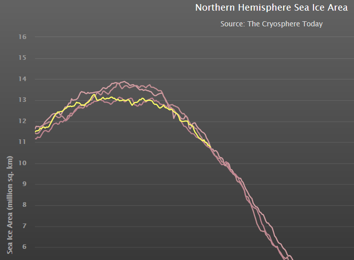
The Arctic, of course, has other ideas and continues to fail to conform to the narrative over at (un)Real Science. Today the NSIDC 5 day average extent Arctic sea ice extent is in actual fact at the lowest level for the time of year since their records began:
In view of “Steve”/Tony’s headline you may find it surprising that so is his much beloved DMI 30% threshold extent extent metric (displayed in full):
and so is the JAXA 15% extent extent:
Holding out by the merest whisker (for the moment) is the Cryosphere Today area metric, which is nonetheless lower than on the same day in both 2005 and 2006:
Quod Erat Demonstrandum?
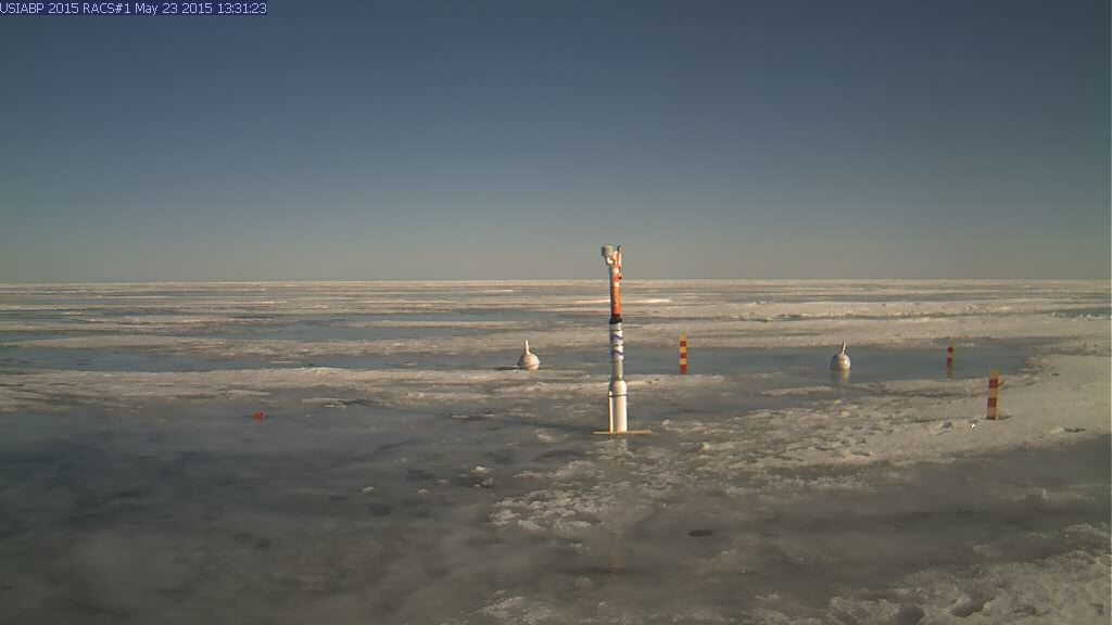
[Edit – May 23rd 2015]
After being used by a polar bear to inspect its feet, the webcam trained on ice mass balance buoy 2015A is now pointing in the right direction again. It reveals that the Arctic is in fact “melting down” even as “Steve”/Tony maintains that it isn’t:
As if further proof were needed, the DMI 15% threshold extent graph extent is also now clearly lower than previous years at this time:
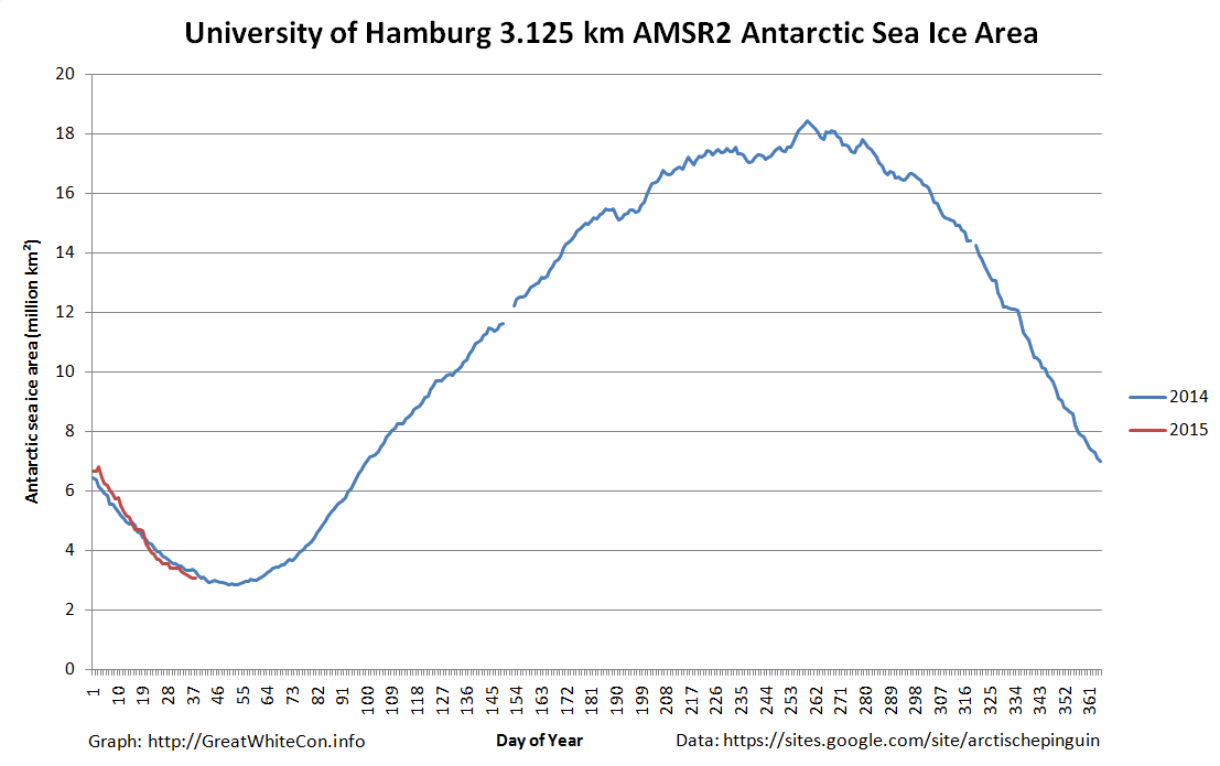
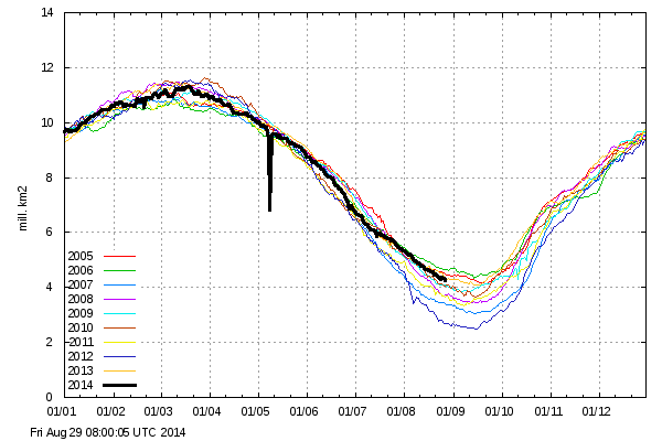
In the Arctic the refreeze is slowing down as the March maximum extent approaches. Meanwhile in the southern hemisphere Antarctic sea ice extent has taken a tumble as the annual minimum extent approaches.
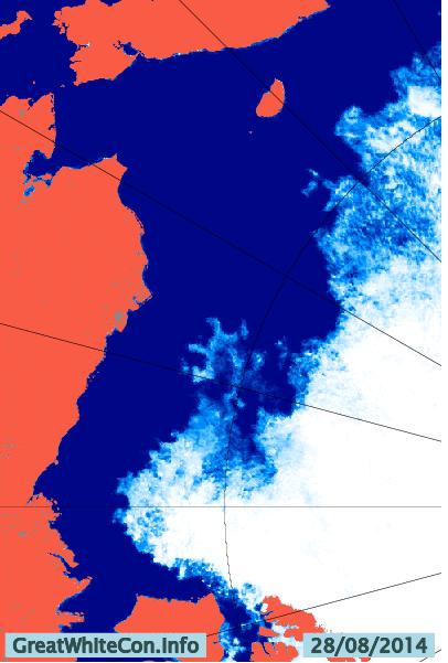
Over the long cold Arctic winter “Wipneus” of ArctischePinguin fame has been porting his northern hemisphere regional sea ice area/extent methodology to cover the South Pole as well. We are pleased to be able to reveal the fruits of his labours on our new regional Antarctic Sea Ice Graphs page. The ultimate source of the information is the University of Hamburg’s sea ice concentration data based on a 3.125 km grid that uses data from the from the AMSR2 instrument on board the Japan Aerospace Exploration Agency’s SHIZUKU satellite. Here’s an overview of Antarctic sea ice area:
and here’s a close up on the sea ice extent in the Bellingshausen and Amundsen Seas region, where what sea ice there is helps buttress the West Antarctic Ice Sheet:
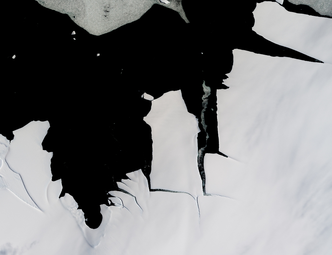
In future we will also be bringing you satellite images from Antarctica. By way of example, here’s the latest “Shock News!!!” from the Antarctic, courtesy of LandSat 8:
NASA report that:
While large icebergs calve regularly from fast-flowing ice shelves in West Antarctica, the coast of cooler, drier East Antarctica tends to be less active. That made it a mild surprise when a 70-square-kilometer chunk of ice broke off from the King Baudouin Ice Shelf in January 2015. The last time that part of King Baudouin calved such a large iceberg was in the 1960s.
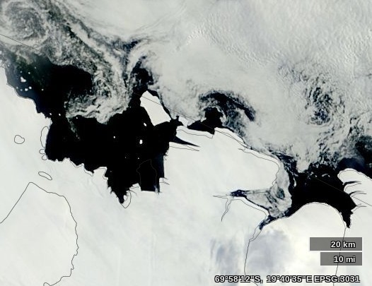
and you can track the current position of the latest large chunk of ex ice shelf on their WorldView web site:
The recently calved King Baudouin Ice Shelf on February 3rd 2015
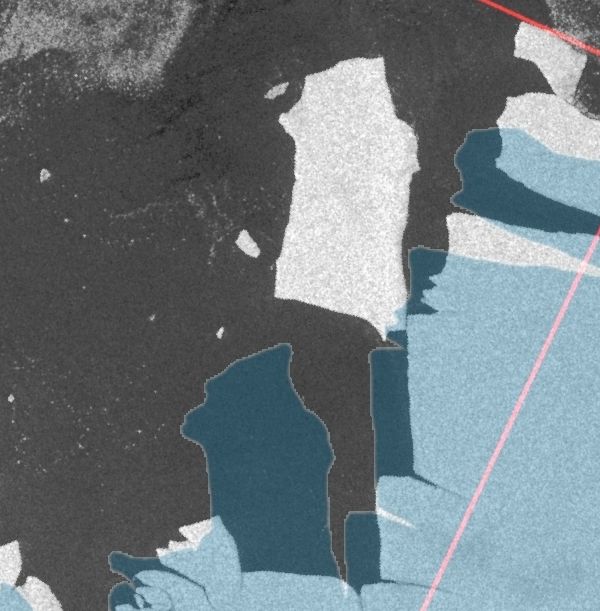
Thanks also to “Arcticio” from the Arctic Sea Ice Blog who pointed me in the direction of PolarView, where it was remarkably easy to locate this Sentinel-1A synthetic aperture radar image of the large iceberg in question on January 30th 2015:
Needless to say we are unimpressed by the following explanation:
Them:
The Danish Meteorological Institute shows a 63% increase in Arctic sea ice extent since the same date in 2012, and an increase of 76% since the 2012 summer minimum. Current extent is 4.4 million km², up from 2.7 million km² on August 28, 2012.
My methodology is similar numerically to DMI’s, I used maps from the Japan Aerospace Exploration Agency to generate the map below. Green shows ice gain since the same date in 2012, and red shows ice loss. My calculation shows a 64% increase in ice, almost identical to the calculations from DMI.
A favorite comment from alarmists is “the increase in ice extent is meaningless, because the ice is getting thinner“
They have it exactly backwards. The reason why ice extent is up, is because the ice is thicker.
Mind you I’m not the one proudly proclaiming “ice extent is up, because the ice is thicker.”. Steve/Tony is, but for some strange reason he provides visualisations of extent and age but not thickness!
Them:
Lets put it another way. Age of the ice is a proxy for ice thickness. But, if you don’t believe in proxies, just tell us.
Us:
Les – If you believe in proxies then PIOMAS Arctic sea ice volume for April 2014 was less than April 2012.
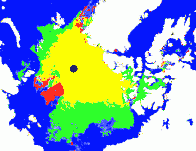
If instead you prefer the evidence of your own eyes then perhaps you can explain where all that red stuff in the Beaufort Sea in Steve/Tony’s animation has gone?
If “older, thicker ice is moving towards Alaska” then it looks like it’s melting there, not “accumulating”.
Them:
Mr. Hunt’s evidence…..
“NRL does not warrant or represent this INFORMATION is fit for any particular purpose,”
Us:
Anything/Gail/Sophie – Do you have any idea what this is?
Them:
Here’s a quick summary for people who aren’t following.
SG makes a post comparing 2012 and 2014. Jim argues with SG’s claim of thicker ice by comparing 2013 extent to 2014. When that gets called out, he shows the same silly 2014 plot that has no 2012 plot to compare to…still no valid comparison. After some back-and-forths and tangents, he brings up PIOMAS. When asked to compare thickness in PIOMAS 2012/2014, he avoids the question (twice).
Is there a single metric out there showing 2014 to be worse than 2012?
– Scott
Us:
Here’s a quick summary for you Scott:
Where’s all the “older, thicker ice in the western Arctic” that SG keeps referring to hiding?
Them:
Nice image, Jim. You have chosen a metric. So that’s half the story. Where’s the 2012 equivalent of that image so we can see if SG is wrong about 2014 vs 2012?
-Scott
Us:
Thank you for your kind words Scott.
I haven’t “chosen a metric”. I have nonetheless already shown you one comparison with 2013, using TH’s very own “metric”. To complete the story, and at the risk of repeating myself once again, perhaps you can explain where all the “older, thicker ice accumulating on the Pacific side” that TH keeps referring to is hiding?
The “Shock News” about Arctic sea ice is coming thick and fast as the 2014 melting season reaches its peak. I’ve been debating the meaning all of the various metrics with none other than my old sparring partner “Steve Goddard” AKA Tony Heller. The theory which is mine (in brief!) is that the ice is actually getting thinner and hence travelling faster. As regular Great White Con readers may well suspect by now, Steve/Tony has other ideas. Here are the edited highlights:
Them:
Steve/Tony’s latest Arctic sea ice prophecy is entitled “My Arctic Forecast“, although it’s actually his fourth of the season. Here’s his take:
Arctic ice extent will continue to decline for a couple of days, then a cyclone near the North Pole will begin spreading the ice, and the extent curve will turn back towards the median.
The minimum this summer will likely be close to the 2006 minimum, which was the highest minimum of the past decade.
Us:
My latest Arctic forecast is more short term than yours Tony, and rather more precise too.
“CT area decline of around 180 k over the next two days”. I guess that equates to “CT Arctic sea ice area will reverse and then decline for a couple of days”?
Them:
Gutsy to go with a forecast, but then the great ones risk it to gain the glory.
Us:
Many thanks for your kind words Phil.
Time passes……
CT Area has just come in at 44,288 square kilometers below yesterday. The “turn on the proverbial dime” has come to pass, and there is only another 135,712 to go!
Them:
CT doesn’t measure extent. This post is about extent. Stop being a moron and wasting my time.
Time passes……
I do appreciate you demonstrating so graphically the dissonance and dishonesty of climate alarmists.
Us:
The pleasure is all mine Tony.
I’ve asked this before without receiving an answer, but is there any way for commenters on here to include an image?
Failing that is there any way you might be willing and able to display the graph at my JAXA link here?
You do have a working knowledge of English. Congratulation!
Us:
Thanks for your kind words DedaEda, once again.
A new month means some masks have changed, so the GWC patent pending crystal ball is cloudier than usual. Undaunted the CT oracle hoarsely whispers “Expect a couple more 100 k declines next. Around 225 k in total”
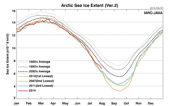
With the able assistance of some of the regular readers of Steve Goddard’s so called “Real Science” blog I have drawn up a checklist of questions to answer should you (or any “sceptics” you may be aware of) be suffering from the delusion that the sea ice in the Arctic is “recovering” or “rebounding”:
Us:
1. Is the NSIDC daily Arctic sea ice extent number for March 8th 2014 the lowest on record for that day of the year? Yes or No?
2. Is the Cryosphere Today Arctic sea ice area number for March 8th 2014 the lowest on record for that day of the year? Yes or No?
3. Is the IJIS Arctic sea ice extent number for March 9th 2014 the lowest on record for that day of the year? Yes or No?
4. What credible evidence can you provide to show that “The Arctic is getting colder”?
5. In what way has the NSIDC’s data been “contaminated by Mann”?
6. Where might one find “empirical data that hasn’t been contaminated” if not from the likes of NOAA/NASA/JAXA et. al.
8. How much sea ice do you suppose will be left in the Gulf of St. Lawrence by September? [2014-3-12 20:26]
9. Which version of “the [thickness/volume] truth” do you choose to believe? [2014-3-14 09:30]
10. When was it that the DMI “changed the way they read/interrupt coastal features [which] they incorporated into their extent/area numbers”? [2014-3-15 15:08]
11. Why have we been accused of “a lie” and “put on ignore”? [2014-3-16 15:12]
12. Please be so good as to provide us with a link that describes “the modeling used by NSIDC to ‘create’ these numbers” [2014-3-20 13:00]
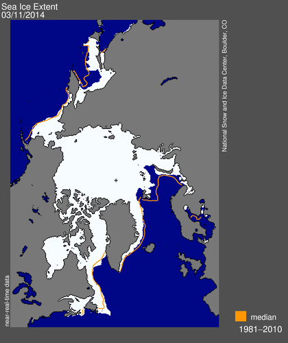
NSIDC visualisation of Arctic sea ice daily extent for March 10th 2014
Then a “Real Scientist” asks a sensible question:
Do NSIDC and DMI define the Arctic differently? If so, by how much?
Us:
We say:
1. Yes Dave.
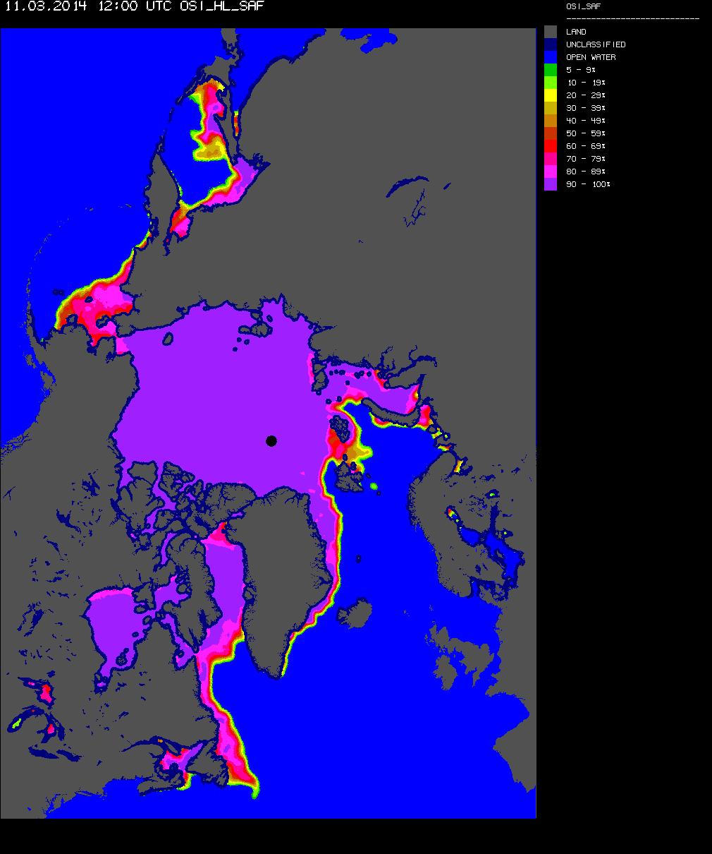
2. Here’s a clue:
OSI-SAF Arctic sea ice concentration for March 11th 2014
We’ll keep you posted!
This website uses cookies to improve your experience. We'll assume you're ok with this, but you can opt-out if you wish. Cookie settingsACCEPT
Privacy & Cookies Policy
Privacy Overview
This website uses cookies to improve your experience while you navigate through the website. Out of these, the cookies that are categorized as necessary are stored on your browser as they are essential for the working of basic functionalities of the website. We also use third-party cookies that help us analyze and understand how you use this website. These cookies will be stored in your browser only with your consent. You also have the option to opt-out of these cookies. But opting out of some of these cookies may affect your browsing experience.
Necessary cookies are absolutely essential for the website to function properly. This category only includes cookies that ensures basic functionalities and security features of the website. These cookies do not store any personal information.
Any cookies that may not be particularly necessary for the website to function and is used specifically to collect user personal data via analytics, ads, other embedded contents are termed as non-necessary cookies. It is mandatory to procure user consent prior to running these cookies on your website.