Tag Archives: IPCC

The Intergovernmental Panel on Climate Change

Alaska May Snow Cover At Record Low Levels

“Steven Goddard” is evidently magically turning into “Snow White’s” muse. His latest fairy tale addresses her second favourite subject after Arctic sea ice, which is of course northern hemisphere snow cover. The article is entitled “October-March Snow Cover At Record High Levels“, and proudly proclaims that:

Fifteen years ago, climate experts said that snow is a thing of the past. Since then, Northern Hemisphere snow cover has soared to record levels.

unRealSnow-20150607

Rutgers University Climate Lab :: Global Snow Lab

What this tells us is that cold air is intruding further south during the snow season. It also tells us that Tom Karl at NOAA is lying about global temperatures.

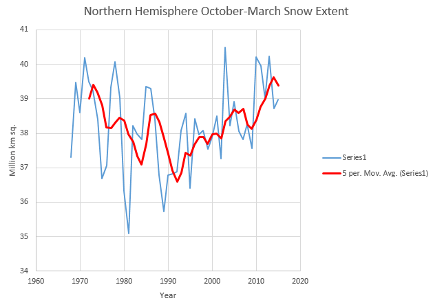
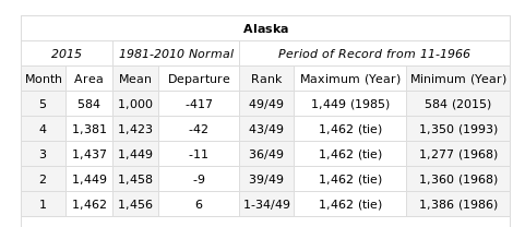
Snow White and I innocently followed Steve’s link, then clicked on the “Rankings” link on the left hand side, where we discovered this:

Selection_474

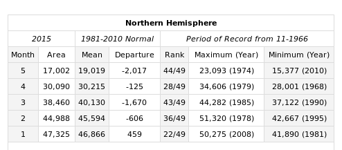
not to mention this:

Selection_473

Feeling confident that all the Real Scientists would be interested in the latest data hot off the presses from the Snow Lab we showed them this picture:
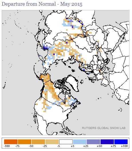
maysnowmap2015

and enquired?

What does that tell us?

The initial response from “gator69”?

The fact that you refer to “normal” in climate or weather tells us that you have zero understanding of either.

When will you work to help the starving millions by confronting alarmists, and assist in diverting money to where it is desperately needed right now?

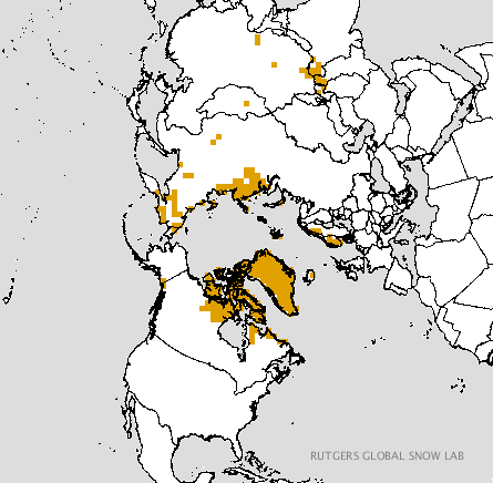
Since “Real Scientists” are apparently aghast at anomaly maps, here are the current absolute values from Rutgers:

RutgersSnow-20150607

Just in case you are wondering what all this has to do with Snow White’s favourite subject of all, here’s the current Topaz 4 map of Arctic sea ice snow cover:

Topaz4Snow-20150607

and here is the current northern hemisphere temperature forecast for Tuesday morning from the “Climate Reanalyzer

CCIT2-20150607+51

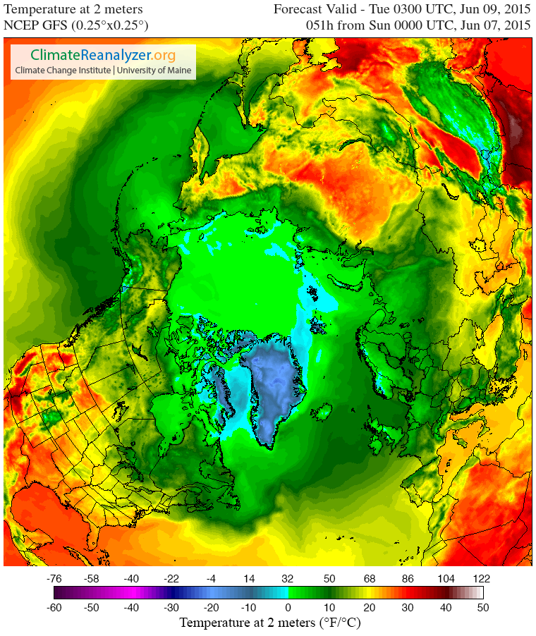
Snow White and I cannot help but wonder what effect temperatures above zero across virtually the entire Arctic Ocean will have on the snow cover that currently remains. We also cannot help but wonder whether 2015 Arctic sea ice extent will suddenly start tracking 1995 or 2006 as a consequence.

We also wondered what Tom Karl et al. of NOAA have been saying about the Arctic, and discovered this:

Since the IPCC report, new analyses have revealed that incomplete coverage over the Arctic has led to an underestimate of recent (since 1997) warming in the Hadley Centre/Climate Research Unit data used in the IPCC report. These analyses have surmised that incomplete Arctic coverage also affects the trends from our analysis as reported by IPCC.

Finally, for the moment at least, here’s the Topaz 4 snow depth forecast for June 16th 2015:

Topaz4Snow-20150616

Thanks to “Nightvid Cole” and “Vergent” at the Arctic Sea Ice Forum for bringing that view of things to our attention.

Gross Deception Measuring Arctic Sea Ice Trends

Our title today is inspired by Paul Homewood, who published an article earlier this week entitled “Why Measuring Arctic Ice Trends From 1979 Is Gross Deception” and which begins as follows:

Officially, we only started monitoring Arctic sea ice extents by satellite from 1979. We know however that this is not the whole story. For instance, HH Lamb tells us:

Kukla & Kukla (1974) report that the area of snow and ice, integrated over the year across the Northern Hemisphere, was 12% more in 1973 than in 1967, when the first satellite surveys were made.

I’ve added that link, since Paul neglected to include it. He concludes:

To draw any conclusions about Arctic ice or temperatures, using data that begins at the coldest point of the cycle is utterly worthless and grossly misleading. But this is climate “science” we are talking about.

Since this is Paul Homewood we are talking about I felt compelled to quibble about his grossly misleading assertion:
 

Us:

Here’s the NSIDC’s chart of Arctic sea ice extent anomalies since 1953:

You will no doubt note that it reveals an overall peak in the late 60s, not the late 70s


Them:

I note they don’t show the 1940’s


Us:

Whereas I note that 1969 is a much juicier looking cherry than 1979. Is 1949 better still?


Them:

They did not have satellite monitoring in 1969.


Even though I had already pointed out the error of his ways to him Paul Homewood decided at this juncture to publish another article, this time entitled “Satellite Monitoring Of Arctic Sea Ice Pre 1979“. It began:

IPCC90-SeaIce IPCC90-Captionhttp://www.ipcc.ch/ipccreports/far/wg_I/ipcc_far_wg_I_full_report.pdf

I was pointing out yesterday why it was so inappropriate to deduce trends in Arctic sea ice, using 1979 as the start point. NSIDC, of course, do this supposedly because that is when satellite monitoring began.

Mr Biscuits, however, reminds me that the 1990 IPCC report showed the above graph, with Arctic sea ice extent back to 1972.


Us:

At the risk of repeating myself, what about this remarkable recent narrative?

https://archive.today/ADq4O#selection-1535.0-1547.25


Them:

They did not have satellites in 1953.


Us:

What the NSIDC actually say regarding their dataset that starts in 1978 is:

“This product is designed to provide a consistent time series of sea ice concentrations (the fraction, or percentage, of ocean area covered by sea ice) spanning the coverage of several passive microwave instruments.”

http://nsidc.org/data/nsidc-0051

Note that there is no mention of “when satellite monitoring began”. See also their Nimbus Data Rescue project, which has data going back to 1964:

http://nsidc.org/data/nimbus/data-sets.html

“Consistent time series” are the operative words


Them:

We’ll keep you posted!

Shock News! Murdoch Plagiarises David Rose Errors

Regular readers may recall that on September 8th 2013 the Mail on Sunday published an article by David Rose claiming that the Arctic “Ice Sheet Grew 920,000 Square Miles in a Year“. That was not true, and after we complained to the UK Press Complaints Commission The Mail eventually published a “correction” of sorts.

On September 15th 2013 the Mail on Sunday published another article by David Rose entitled “Global warming is just HALF what we thought: World’s top climate scientists admit computers got the effects of greenhouse gases wrong”, which proudly displayed their erroneous headline from the previous week. The article contained many more errors,  some of which the United Kingdom’s Met Office highlighted on their official blog later the same day:

The article states that the Met Office’s ‘flagship’ model (referring to our Earth System Model known as HadGEM2-ES) is too sensitive to greenhouse gases and therefore overestimates the possible temperature changes we may see by 2100.

There is no scientific evidence to support this claim.

The Mail eventually “corrected” the article in their usual half hearted fashion, whilst simultaneously updating the title to read “Global warming is just QUARTER what we thought“, which doesn’t strike me as being an accurate use of the English language let alone scientifically accurate.

Meanwhile on September 16th 2013 on the other side of the planet Rupert Murdoch’s The Australian published an article written by Graham Lloyd entitled “We got it wrong on warming, says IPCC“, saying things like:

The Intergovernmental Panel on Climate Change’s latest assessment reportedly admits its computer drastically overestimated rising temperatures, and over the past 60 years the world has in fact been warming at half the rate claimed in the previous IPCC report in 2007. More importantly, according to reports in British and US media, the draft report appears to suggest global temperatures were less sensitive to rising levels of atmospheric carbon dioxide than was previously thought. The 2007 assessment report said the planet was warming at a rate of 0.2C every decade, but according to Britain’s The Daily Mail the draft update report says the true figure since 1951 has been 0.12C.

After a long drawn out enquiry the Australian Press Council has finally announced that in its view The Australian cannot justify publishing inaccurate scientific information by blaming David Rose and The Mail on Sunday. They state that:

The Press Council has considered a complaint about a number of items published in The Australian in September 2013, a week before the release of the Fifth Assessment Report of the Intergovernmental Panel on Climate Change (IPCC).

The Council has considered the complaint by reference to the following parts of its General Principles: “Publications should take reasonable steps to ensure reports are accurate, fair and balanced”; “relevant facts should not be misrepresented or suppressed”; and “Where it is established that a serious inaccuracy has been published, a publication should promptly correct the error, giving the correction due prominence.”

The Council has concluded that the erroneous claim about the revised warming rate was very serious, given the importance of the issue and of the need for accuracy (both of which were emphasised in the editorial that repeated the claim without qualification). Although based on another publication’s report, the claim was unequivocally asserted in The Australian headline, “We got it wrong on warming, says IPCC”, which also implied the IPCC had acknowledged the alleged error. The impression that the claim was correct was reinforced by The Australian saying the IPCC had been “forced to deny” that it was in crisis talks.

The Council considers rigorous steps should have been taken before giving such forceful and prominent credence to The Mail on Sunday’s claim. Accordingly, the complaint on that ground is upheld.

The Council welcomes the acknowledgements of error and expressions of regret which the publication eventually made to it. But they should have been made very much earlier, and made directly to the publication’s readers in a frank and specific manner. It is a matter of considerable concern that this approach was not adopted.

To summarise, don’t believe everything you read in The Daily Mail or The Australian, particularly if the words in question are written by or plagiarised from David Rose:


Has Arctic Sea Ice Already Started to Recover?

In a word, NO!! Here we go again.

Them:

According to David Rose’s headline in yesterday’s Mail on Sunday:

Global warming ‘pause’ may last for 20 more years and Arctic sea ice has already started to recover.

There is of course plenty more where that came from, such as:

The 17-year pause in global warming is likely to last into the 2030s and the Arctic sea ice has already started to recover, according to new research.

A paper in the peer-reviewed journal Climate Dynamics – by Professor Judith Curry of the Georgia Institute of Technology and Dr Marcia Wyatt – amounts to a stunning challenge to climate science orthodoxy.

Not only does it explain the unexpected pause, it suggests that the scientific majority – whose views are represented by the UN Intergovernmental Panel on Climate Change (IPCC) – have underestimated the role of natural cycles and exaggerated that of greenhouse gases.

along with a:

Graph that makes a mockery of warming

Us:

If you take a look at the evidence from the NSIDC the Mail on Sunday recently provided us with in support of their previous inaccurate headlines you will discover it says:

Monthly August ice extent for 1979 to 2013 shows a decline of 10.6% per decade.

QED? Apparently not as far as the Mail on Sunday’s concerned. If further evidence is needed please read our previously published “stunning challenge” to Judith Curry’s Arctic sea ice expertise. In brief:

Judith Curry republishes the same nonsense [as The Mail], but then neglects to publish even a similarly mealy mouthed “correction”, let alone anything remotely resembling the information originally published by the NSIDC upon which this collective fantasy is allegedly based. Therefore Judith should be taken seriously, and as a climate scientist rather than a tabloid journalist or a fantasy fiction writer?

We think not.

Them:

David Rose goes on to say (amongst other things) that:

The graph shown above, based on a version published by Dr Ed Hawkins of Reading University on his blog, Climate Lab Book, reveals that actual temperatures are now below the predictions made by almost all the 138 models on which the IPCC relies.

The pause means there has been no statistically significant increase in world average surface temperatures since the beginning of 1997, despite the models’ projection of a steeply rising trend.

Us:

On Dr. Hawkins’ blog, commenting on a previous David Rose article in the Mail on Sunday, he says this:

David Rose has written an article in the Mail on Sunday which, by eye, seems to use the top left panel from the figure below, but without mention of its original source. In the article David Rose suggests that this figure proves that the forecasts are wrong. This is incorrect.

Here’s the figure Dr. Hawkins is referring to:

Ed Hawkins original graphs comparing CMIP5 simulations with observations
Ed Hawkins’ original graphs comparing CMIP5 simulations with observations

Finally, for the moment at least, here’s the text of an email we sent to the Managing Editor of the Mail on Sunday this morning:

Hello John,

Thanks for your additional comments. Unfortunately you still fail to address the primary question I’ve been asking for almost 2 months now, so I will be formally pursuing matters concerning the September 8th article via the PCC from now on.

Moving on I note that you have published another article by David Rose this weekend entitled “Global warming ‘pause’ may last for 20 more years and Arctic sea ice has already started to recover”, which mentions both Judith Curry and Arctic sea ice once again. I already have a few bones to pick with you about this one as well.

1. I posted an online comment on the article yesterday evening. It remains invisible this morning. Your web site says “The comments below have not been moderated.”. My comment included no links, although it did mention the “Great White Con”. Perhaps you could look into that for me, and provide me with an explanation?

2. Do you suppose it would be possible to persuade David to reveal his sources any more swiftly this time around? Where does his misleading graphic entitled “Graph that makes a mockery of warming” and the underlying data come from? At first sight it doesn’t seem to be from Judith Curry’s “Stadium wave” paper for example.

We have yet to receive a reply.