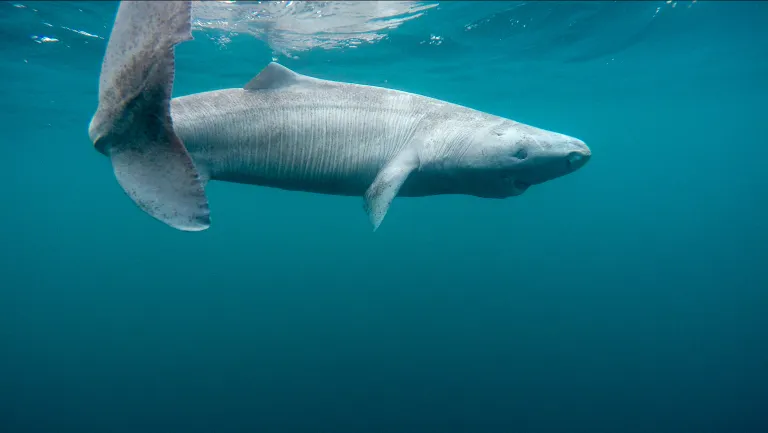
You will no doubt be astonished to learn that shark jumping supremo Tony Heller has just jumped over the entire East Greenland population of this long lived but officially vulnerable species. Without harming a single one!
Over on XTwitter “Steve”/Tony was recently shown this video which graphically reveals the declining age of the sea ice in the Arctic Ocean:
As the New Year rapidly approaches Tony Heller is up to his old Arctic tricks yet again. No doubt we’ll get on to many of his hoary old chestnuts in due course, but although I may easily have blinked and missed it he appears to have a new trick up his voluminous sleeve. Providing empirical evidence that the Intergovernmental Panel on Climate Change’s global warming “predictions” are correct!
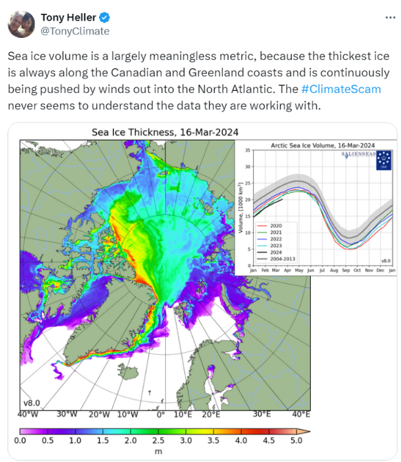
Here is a recent extract from “Snow White’s” XTwitter feed:
Here's @TonyClimate demonstrating yet again that either:
1) He has no understanding of all things #Arctic, or
2) He understands well enough, but he pulls the wool over the eyes of his flock of faithful followers:https://t.co/U3tbp2qrOU
Peter, a welcome new denizen here at the Great White Con Ivory Towers, appears to have parachuted into our far north summer hideaway on the shores of Santa’s Secret Summer Swimming Pool straight from Tony Heller‘s Unreal Climate Science blog.
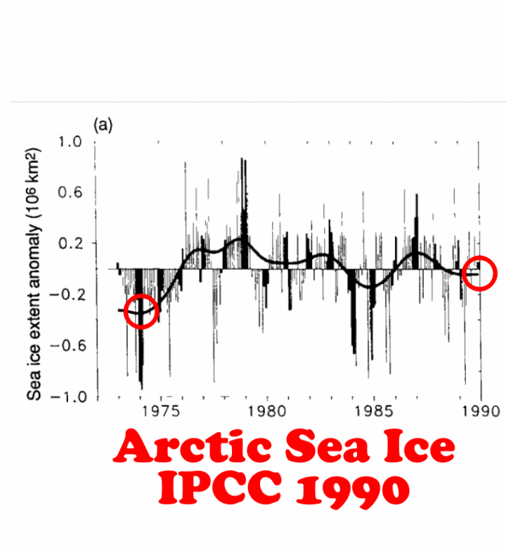
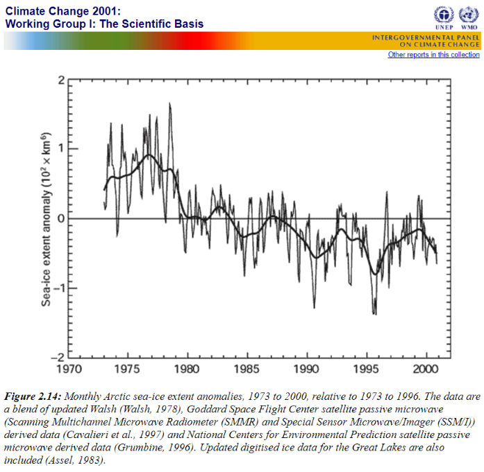
Prompted by Peter I wandered over to Tony’s place where I found to my surprise that he has recently been busy warming up an old chestnut of his that has been debunked numerous times over the past decade. Allegedly:
Between 1990 and 2001, the IPCC rewrote the Arctic sea ice satellite record, and changed a trend of ice increasing to ice decreasing.
Here’s a previous chestnut rewarming event preserved for posterity:
You really have no idea what you're talking about, do you Tony?
Sadly Tony’s side of the “debate” has been deleted by the powers that be at Twitter, so here are the two graphs in question, combined by Mr. Heller into one illuminating animation:
I posted this comment on Tony’s blog last night (UTC), but he hasn’t got back to me yet:
Neither has anybody else. That’s probably because this morning my words of wisdom are still only visible to Tony and I?
[Edit – October 5th]
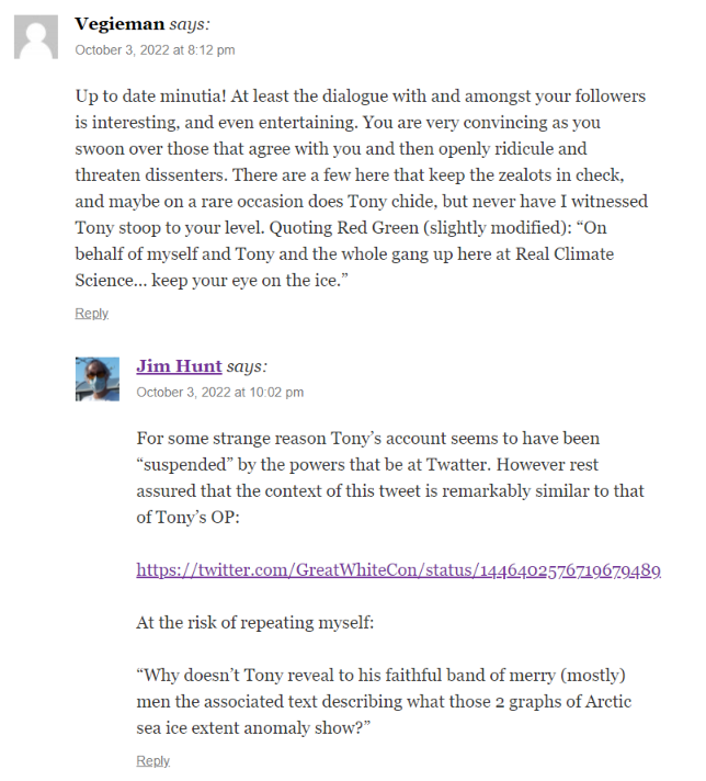
Progress at long last! Vegieman directs the attention of Tony’s band of merry (mostly) men to:
However for some strange reason he neglects to mention that Tony’s link labelled “2001 IPCC Report” doesn’t lead to that graph!
[Edit – October 9th]
Not a lot of people know that since things have gone quiet at Tony’s place I popped into Paul Homewood’s echo chamber, where rewriting the Arctic continues apace:
A few days ago we posted an article about the recent surge in the amount of disinformation being published about Arctic sea ice. Eventually one of our long list of usual suspects, Anthony Watts, published a copy of an erroneous Arctic article by Paul Homewood.
Now the Watts Up With That Arctic porky pie production line is going into overdrive, so here’s an already long list of its output in the run up to the COP26 conference in Glasgow in a month or so. First up is the aforementioned clone from NALOPKT. Allegedly:
It is very easy to show that Arctic sea ice has stabilised. As their graph itself shows, there have only been three years since 2007 with lower ice extent than that year, and eleven have had higher extents. Also the average of the last ten years is higher than 2007’s extent.
In itself, this is too short a period to make any meaningful judgements. But that is no excuse for the Met Office to publish such a manifest falsehood.
This comment of mine on that article remains invisible at WUWT:
Who would have thunk it?
Not a lot of people know that @wattsupwiththat has just repeated Paul Homewood's allegations that @MetOffice has been economical with the truth about #Arctic#SeaIce.
Neither Paul nor Anthony have seen fit to publish my response yet:
The Polar Amplification Model Intercomparison Project (PAMIP for short) is one of several Community Earth System Model (CESM for short) based climate modelling projects.
Polar amplification, the phenomenon that external radiative forcing produces a larger change in surface temperature at high latitudes than the global average, is a key aspect of anthropogenic climate change but its causes and consequences are not fully understood.
PAMIP, co-led by Dr. Doug Smith, Dr. James Screen, and Dr. Clara Deser seeks to improve our understanding of this phenomenon through a coordinated set of numerical model experiments. As one of the Coupled Model Intercomparison Project Phase 6 (CMIP6) endorsed MIPs, PAMIP will address the following primary questions:
1. What are the relative roles of local sea ice and remote sea surface temperature changes in driving polar amplification?
2. How does the global climate system respond to changes in Arctic and Antarctic sea ice?
The PAMIP project is thus part of the global climate modelling effort leading up to the long anticipated publication of the Intergovernmental Panel on Climate Change’s next series of assessment reports, conveniently abbreviated as simply “AR6”. The project has been in the news recently. According to an article in Science magazine:
Every time severe winter weather strikes the United States or Europe, reporters are fond of saying that global warming may be to blame. The paradox goes like this: As Arctic sea ice melts and the polar atmosphere warms, the swirling winds that confine cold Arctic air weaken, letting it spill farther south. But this idea, popularized a decade ago, has long faced skepticism from many atmospheric scientists, who found the proposed linkage unconvincing and saw little evidence of it in simulations of the climate.
Now, the most comprehensive modeling investigation into this link has delivered the heaviest blow yet: Even after the massive sea ice loss expected by midcentury, the polar jet stream will only weaken by tiny amounts—at most only 10% of its natural swings. And in today’s world, the influence of ice loss on winter weather is negligible, says James Screen, a climate scientist at the University of Exeter and co-leader of the investigation, which presented its results last month at the annual meeting of the European Geosciences Union (EGU for short). “To say the loss of sea ice has an effect over a particular extreme event, or even over the last 20 years, is a stretch.”
The idea that Arctic sea ice loss could influence midlatitude winter weather first gained traction in 2012, in a paper by two climate scientists, Jennifer Francis, now at the Woodwell Climate Research Center, and Stephen Vavrus at the University of Wisconsin, Madison. It started with a simple observation: The Arctic is warming nearly three times faster than the rest of the world. At the time, sea ice loss was thought to be the primary accelerant for this amplification: As bright, reflective ice is replaced by dark, sunlight-absorbing water, the Arctic heats up, causing more ice loss, and more warming in turn.
The warming, Francis and Vavrus proposed, would inflate the height of the polar troposphere—the lowest layer of the atmosphere and home to its weather. That would decrease the pressure differences between polar and midlatitude air that drive the polar jet stream, which separates the air masses and keeps cold air collared around the pole. The jet would grow weaker and wavier, allowing cold air to intrude farther south. In their paper, Francis and Vavrus argued such a trend was visible in weather records and worsening with Arctic warming and ice loss.
The results of the project presented at the EGU haven’t been published in an academic journal yet, but according to Science once again:
In the years long PAMIP investigation researchers ran more than a dozen climate models 100 times each. One set of model runs simulated the Arctic atmosphere without pronounced sea ice loss, using ocean temperatures and sea ice extent from 2000. The other kept the ocean temperatures the same, but reduced the ice coverage to the extent expected decades from now, after 2°C of global warming, when the Arctic could be ice free in the summer. Keeping the oceans the same should highlight the influence—if any—of sea ice loss.
In addition to finding only a tiny effect of sea ice loss on the polar jet stream, the models also found no coherent sign of a second proposed effect of reduced sea ice: more frequent disruptions of the stratospheric polar vortex—a second set of swirling winds, much higher up. Such disruptions, which occur every 2 years on average, ultimately allow cold air lower in the atmosphere to spill southward, causing extreme winter storms, including the cold that gripped Texas this past winter.
However not everyone is convinced by the modelling results:
Judah Cohen, director of seasonal forecasting at Atmospheric and Environmental Research, has long argued that increased snow cover and diminished sea ice in Siberia favor weather patterns that propagate energy into the stratosphere, making the high-altitude disruptions more frequent. He notes that the models also forecast unrealistically warm winter weather in the midlatitudes, making other predictions suspect. “There’s clearly something missing.” And Francis says the PAMIP experiment may be too simplistic, now that “we know there’s a lot more to Arctic amplification than sea ice loss.”
Whilst we wait to discover precisely what was revealed to the EGU audience, here is a list of current PAMIP publications:
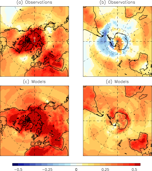
In conclusion, for the moment at least, here’s an illustration of one of the issues PAMIP is endeavouring to address. The difference between the outputs of previous generation of CMIP5 global climate models and observations taken from Smith et al. (2019):
Recent Arctic and Antarctic temperature trends (∘C decade−1) in (a, b) observations and (c, d) model simulations. Linear trends are shown for the 30-year period (1988 to 2017). Observations are taken as the average of HadCRUT4 (Morice et al., 2012), NASA-GISS (Hansen et al., 2010) and NCDC (Karl et al., 2015). Model trends are computed as the average from 25 CMIP5 model simulations driven by historical and RCP4.5 radiative forcings.
It will be extremely interesting to discover what the working group 1 section of the IPCC’s 6th Assessment Report ultimately has to say on the topic of Arctic amplification. The current AR6 timeline states that:
The Working Group I contribution is expected to be considered at the 54th Session of the IPCC which is scheduled to take place in the 14 days from 26 July 2021. The report will be released, subject to approval and acceptance by the Panel, on or around 9 August.
Earlier today Scientific American published an article entitled “That ‘Obama Scientist’ Climate Skeptic You’ve Been Hearing About“. The climate skeptic in question being of course Steven E. Koonin. If you click that last link it will be immediately obvious that I’ve recently been critical of Professor Koonin’s new book “Unsettled” in several more ways than one! The article in Scientific American is authored by several more people than one. Twelve to be precise, including the famous names of Naomi Oreskes, Michael E. Mann and Andrew Dessler. That team takes a largely different approach to my own criticism, making no mention of the cryosphere for example, although sea level rise does get a mention. Rather than going into the science in detail, Oreskes et al. take a different approach. Here’s the introduction to the article:
If you’d heard only that a scientist who served in the Trump administration and now regularly appears on Fox News and other conservative media thinks climate change is a hoax, you’d roll your eyes and move on. But if you heard that someone associated with former President Barack Obama’s Democratic administration was calling the climate science consensus a conspiracy, the novelty of the messenger might make you take it a little more seriously.
The latter is what Steve Koonin is using to sell his new book, which is being billed as the revelation of an “Obama scientist” who wants you to think that climate change isn’t a big deal. But unfortunately, climate change is real, is caused primarily by burning fossil fuels, and is already hurting people all over the world, including here in the United States.
For example, a study published recently found that because climate change has caused sea levels to rise, Superstorm Sandy flooded an additional 36,000 homes, impacting 71,000 people who would’ve been safe otherwise, and caused $8 billion in additional damage.
A little later the article suggests that:
Steve Koonin is hoping you’ll see Obama’s name and trust him when he tells you that he’s better equipped to summarize major climate reports than the authors of the U.N.’s IPCC report and the U.S. government’sNational Climate Assessment, who wrote at length about the already sizable and growing costs of climate change. He’s hoping you won’t recall that each president appoints thousands of people, and Koonin, it turns out, was hired at the Energy Department specifically for his contrarianism. His boss at the time, Stephen Chu, said he “didn’t want to have a department where everybody believed exactly as everybody else” and added that Koonin “loves to be the curmudgeon type.”
Curmudgeon or not, Steve’s science certainly leaves a lot to be desired, as has been proved here! Oreskes et al. put it this way:
When it comes to the science, Koonin cherry-picks and misrepresents outdated material to downplay the seriousness of the climate crisis…
He wants you to believe that, as an Obama hire, he knows better about what you should take away from these reports than the scientists who wrote them.
That sums things up quite nicely, although the article doesn’t actually contain a whole lot of evidence for the first assertion, what Steve refers to as “The Science”. Instead it prefers to link to the Climate Feedback article mentioned here at the Great White Con back at the beginning of May and two articles by Marianne Lavelle in Inside Climate News.
However towards the end of the article, in true “Merchants of Doubt” style, following the money trail behind the promotion of “Unsettled” is mentioned:
The misrepresentations cited as appearing in Koonin’s book are being amplified in right-wing media and beyond. A recent Washington Post column by conservative contributor Marc Thiessen repeats several points Koonin makes…
Thiessen is a fellow at the American Enterprise Institute. For those unfamiliar with the tangled world of organized climate denial, a recent study paints a pretty clear picture: of all the conservative, climate-denying think tanks that get Koch and other industry funding, AEI has gotten the most. It received some $380 million to peddle industry-friendly denial like Koonin’s, much of it through dark money pass-throughs to conceal that it’s coming from conservative and dirty-energy donors.
Be all that as it may, in conclusion let’s get back to the cryospheric science. Here’s how I first found out about the Scientific American article, and Steve Koonin and/or Judith Curry still haven’t answered my pertinent questions about the unsettling lack of Arctic scientific expertise evident in “Unsettled”:
I rather doubt that Judith! Although @michaelemann and @NaomiOreskes are a bit behind the curve in their critique of the "recent Washington Post column by conservative contributor @marcthiessen" which I covered on May 16th.
Regular readers will no doubt have noticed by now that here at the Great White Con we are publishing a series of reviews of Steven E. Koonin‘s new book “Unsettled”? Today we move on to the topic of Land-Surface Air Temperature (LSAT for short). Here is an extract from the very first page of the book:
Yes, it’s true that the globe is warming, and that humans are exerting a warming influence upon it. But beyond that—to paraphrase the classic movie The Princess Bride: “I do not think ‘The Science’ says what you think it says.”
For example, both the research literature and government reports that summarize and assess the state of climate science say clearly that heat waves in the US are now no more common than they were in 1900, and that the warmest temperatures in the US have not risen in the past fifty years. When I tell people this, most are incredulous. Some gasp. And some get downright hostile.
Here once again is an extract from page 23 of the Kindle edition of Steve’s book:
The [IPCC] assessment reports literally define The Science for non-experts. Given the intensive authoring and review processes, any reader would naturally expect that their assessments and summaries of the research literature are complete, objective, and transparent—the “gold standard.” In my experience, the reports largely do meet that expectation, and so much of the detail in the first part of this book, the science story, is drawn from them.
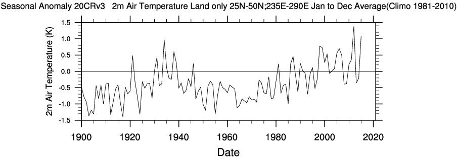
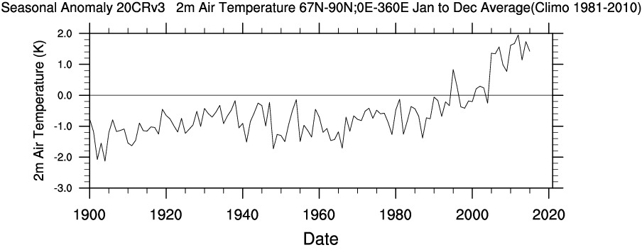
First of all let me remind Steve that the United States does not constitute the entirety of our planet. In particular the Arctic is warming a lot faster than mid latitudes in general and the US in particular. Using WRIT once again to produce our own time series, we can compare and contrast longer term temperature records between the Continental United States and the Arctic (including both land and ocean above the Arctic circle):
Also note that for some reason Steve makes no mention of US “coolest temperatures” and/or “cold waves” since 1900. I don’t know about you, but the top graph certainly suggest to me that “the warmest temperatures in the US have risen in the past fifty years”.
Let’s see how Steve explains himself. For that we have to wait until Chapter 5, catchily entitled “Hyping the Heat”. Therein no mention is made of recent temperature increases across the Arctic, but we are able to read in the introductory paragraphs that:
We can all agree the globe has gotten warmer over the past several decades. Here’s another summary statement from the IPCC’s AR5:
[S]ince about 1950 it is very likely that the numbers of cold days and nights have decreased and the numbers of warm days and nights have increased . . . there is medium confidence that globally the length and frequency of warm spells, including heat waves, has increased since the middle of the 20th century. (IPCC. AR5 WGI Section 2.6.1.)
Then there is a long discussion about what Steve apparently perceives to be shortcomings in the “The US government’s most recent assessment report, the 2017 Climate Science Special Report (CSSR)”. Steve is apparently well qualified in physics, so presumably he is able to comprehend these equations?
US ≠ Global
CSSR ≠ AR5
For those of you less familiar with the arcane language of mathematics and physics that translates to “the climate of the continental United States is not identical to Arctic climate or typical of the climate of Planet Earth as a whole” and hence “US Governmental climate reports are not necessarily typical of ‘Intergovernmental’ climate assessments”.
Next let’s check what Steve’s “gold standard for The Science” has to say on this topic. According to section 2.6.1 of the Intergovernmental Panel on Climate Change’s fifth Assessment Report, as cited by Steve:
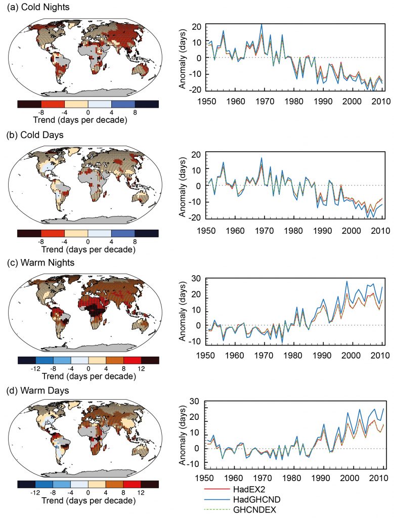
A large amount of evidence continues to support the conclusion that most global land areas analysed have experienced significant warming of both maximum and minimum temperature extremes since about 1950 (Donat et al., 2013c). Changes in the occurrence of cold and warm days (based on daily maximum temperatures) are generally less marked (Figure 2.32):
Figure 2.32 | Trends in annual frequency of extreme temperatures over the period 1951–2010, for (a) cold nights (TN10p), (b) cold days (TX10p), (c) warm nights (TN90p) and (d) warm days (TX90p) (Box 2.4, Table 1). Trends were calculated only for grid boxes that had at least 40 years of data during this period and where data ended no earlier than 2003. Grey areas indicate incomplete or missing data. Black plus signs (+) indicate grid boxes where trends are significant (i.e., a trend of zero lies outside the 90% confidence interval). The data source for trend maps is HadEX2 (Donat et al., 2013c) updated to include the latest version of the European Climate Assessment data set (Klok and Tank, 2009). Beside each map are the near-global time series of annual anomalies of these indices with respect to 1961–1990 for three global indices data sets: HadEX2 (red); HadGHCND (Caesar et al., 2006; blue) and updated to 2010 and GHCNDEX (Donat et al., 2013a; green). Global averages are only calculated using grid boxes where all three data sets have at least 90% of data over the time period. Trends are significant (i.e., a trend of zero lies outside the 90% confidence interval) for all the global indices shown.
To paraphrase The Princess Bride once again: “I do not think ‘The Science’ says what Steven E. Koonin says it says in ‘Unsettled’”.
For our latest review of Steven E. Koonin’s new book, “Unsettled”, we’re moving from the ice covering the Arctic seas on to land. Greenland to be specific. Unlike Arctic sea ice the Greenland Ice Sheet does merit a mention in the book. In fact it’s one of the bullet points Steve leads with on page 2:
Here are three more [climate facts] that might surprise you, drawn directly from recent published research or the latest assessments of climate science published by the US government and the UN:
Humans have had no detectable impact on hurricanes over the past century.
Greenland’s ice sheet isn’t shrinking any more rapidly today than it was eighty years ago.
The net economic impact of human-induced climate change will be minimal through at least the end of this century.
So what gives?
A very good question Steve, because if we stick with the Arctic land ice referred to in the middle bullet, Professor Koonin makes no reference at this juncture to any “recent published research or latest assessment of climate science” to justify his assertion.
Which is a bit of a shame since in the Climate Feedback critique of Professor Koonin’s statement which was mentioned in our introductory article, Twila Moon from the United States’ National Snow and Ice Data Center points out that:
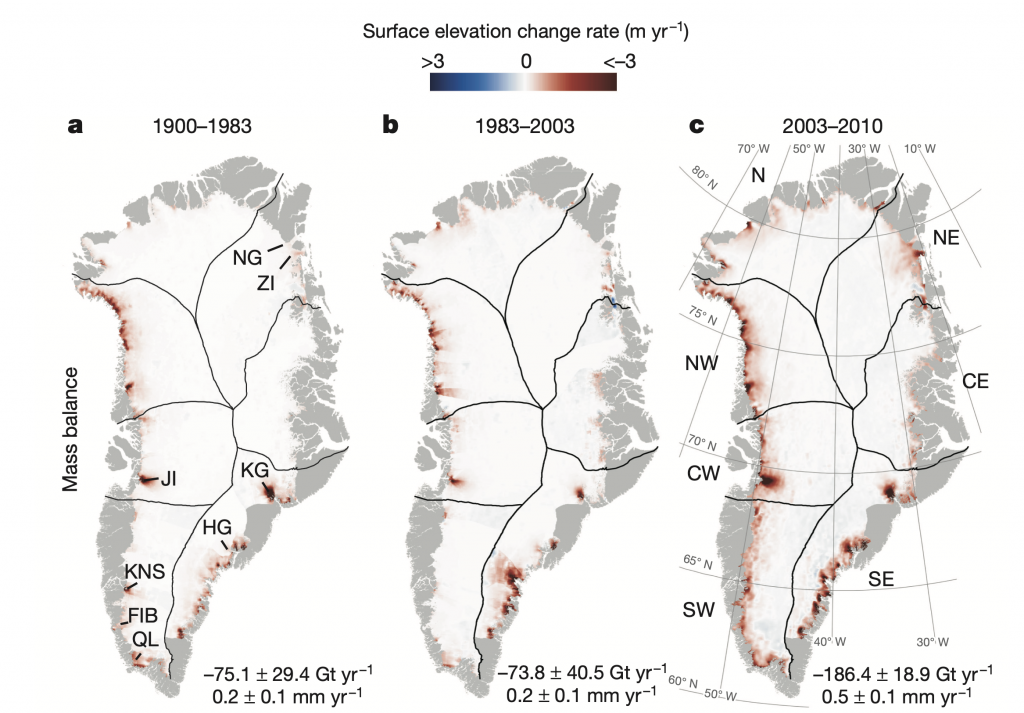
This statement is untrue. In fact, the Greenland Ice Sheet lost more mass during 2003-2010 than during all of 1900-2003 combined. This is evident in the following figure from Kjeldsen et al. (2015)
Surface elevation change rates in Greenland during 1900-1983 (a), 1983-2003 (b), and 2003-2010 (c). The numbers listed below each panel are the integrated Greenland-wide mass balance estimates expressed as gigatonnes per year and as millimetre per year GMSL (global mean sea level) equivalents.
If we look in more detail at changes over 1972-2018, we can further see that the ice sheet was mostly in balance (gain about the same amount of snow/ice in winter as is lost in summer) during the 1970s and 1980s [Mouginot and Rignot et al. (2019)]. It was only in the mid-1990s that Greenland ice loss began to increase more substantially.
Over the last 20 years, ice loss has been rapid and large, creating measurable sea level rise, which we experience as increases in coastal erosion, flooding, problems with water and sewer systems at the coasts, and saltwater inundation of freshwater sources.
So how is it possible for Steve Koonin to have got his facts so wrong? For his attempt at justification we have to wait until chapter 8 of “Unsettled” on the subject of “Sea Level Scares”. On page 160 of my Kindle edition Steve writes:
So future global sea level rise is uncertain not only because of all of the model uncertainties in the global temperature rise discussed in Chapter 4, but also because the dynamics of the Greenland and Antarctic ice sheets are quite uncertain. The IPCC summarizes the situation (SMB is the Surface Mass Balance, measuring the net change in ice due to atmospheric processes): . . .
“For periods prior to 1970, significant discrepancies between climate models and observations arise from the inability of climate models to reproduce some observed regional changes in glacier and GIS [Greenland Ice Sheet] SMB around the southern tip of Greenland. It is not clear whether this bias in climate models is due to the internal variability of the climate system or deficiencies in climate models. For this reason, there is still medium confidence in the ability of climate models to simulate past and future changes in glaciers mass loss and Greenland SMB.”
The reference for this quotation is given as “IPCC SROCC Section 4.2.2.2.6“, which on inspection is entitled “Budget of global mean sea level change”. The immediate question that springs to my mind is “Why didn’t Steve refer to SROCC Section 1.4.2?”. That section is entitled “Observed and Projected Changes in the Cryosphere”, and skipping over the Arctic sea ice section for the moment it states:
AR5 assessed that the annual mean loss from the Greenland ice sheet very likely substantially increased from 34 (-6–74) Gt yr–1 (billion tonnes yr–1) over the period 1992–2001, to 215 (157–274) Gt yr–1 over the period 2002–2011.
Or Steve might have quoted from Section 4.2.2.2.4 “Greenland and Antarctic ice sheets”, but for some reason he didn’t:
Frequent observations of ice sheet mass changes have only been available since the advent of space observations (see Section 3.3.1). In the pre-satellite era, mass balance was geodetically reconstructed only for the GIS (Kjeldsen et al., 2015)
op. cit., or as suggested there he could even have quoted from Section 3.3.1 “Ice Sheet Changes”, but once again he didn’t:
The GIS was close to balance in the early years of the 1990s (Hanna et al., 2013; Khan et al., 2015), the interior above 2000 m altitude gained mass from 1961 to 1990 (Colgan et al., 2015) and both coastal and ice sheet sites experienced an increasing precipitation trend from 1890 to 2012 and 1890 to 2000 respectively (Mernild et al., 2015), but since the early 1990s multiple observations and modelling studies show strong warming and an increase in runoff (very high confidence).
Personally I have very high confidence that Professor Koonin had great difficulty cherry picking a Greenland Ice Sheet quote from the IPCC that could be “spun” into supporting his case. Frankly his “southern tip of Greenland” effort smacks of desperation.
Unsettling, is it not?
[Edit – June 12th]
Here’s a long thread on Twitter from Helen Fricker, explaining the genesis of the IPCC’s Special Report on the Ocean and Cryosphere in a Changing Climate. Essential reading for Steve Koonin, since he is apparently unaware of any of this!
In 2018, things were changing so quickly that the update couldn’t wait, prompting an intermediate report — the Special Report on the Ocean and Cryosphere in a Changing Climate. The projected sea level rise in 2100 from Antarctica and Greenland ranged from 3.5" to 1.8'. 13/24
— Helen Amanda Fricker ❄️❄️ ❄️ (@helenafricker) June 10, 2021
Helen refers to her recent op-ed for The Hill which goes into slightly more detail:
The upcoming sixth IPCC report in 2022 will contain updated projections of future sea level rise based on tens of different simulations provided by research groups around the world. These groups all worked together in a community-led effort, involving ice sheet, ocean and atmosphere modeling and observational teams.
We have come a long way, but even after all this we are still playing “catch-up,” and there are still gaps in our understanding. We do know, however, that the ocean is warming and that both Antarctica and Greenland are vulnerable to this warming. The same goes for the atmosphere. We worry that the biggest portion of Antarctica, East Antarctica — which we still think of as a sleepy giant since it is so thick and vast, making it harder for warming ocean waters and increasing air temperatures to reach it — is starting to show signs of change. We also worry that there may be mechanisms, that we have not been able to witness in the modern record and hence that are not in the models, that may amplify the ice loss. Scientists are using paleo-reconstructions to figure out whether these may be important.
Still, we can say with confidence that sea level will continue to rise (faster) in the future and that our projections are conservative estimates. Indeed, satellite observations that measure the changing height (altimetry) and changing mass (gravimetry) of ice sheets are tracking the worst-case predictions from IPCC’s fifth report.
As we gather more data, both on and around the ice sheets using all available tools, including satellites, our observational record gets longer and our understanding improves. As our understanding improves, our models get better. Long-term measurements, sometimes acquired by launching new satellites (such as NASA’s ICESat-2 and other follow-on missions), coordinated modeling and international collaboration are key to delivering more accurate predictions, so that coastal communities can make informed decisions to protect infrastructure and citizens and manage resources.
Our regular reader(s) will no doubt recall the good old days when several times each month an opportunity would present itself to debunk some “skeptical” nonsense from one or more of the usual suspects?
That all changed when Donald Trump was elected President of the United States. He was of course much more amenable to lobbying from fossil fuel interests than Barack Obama, and everything went (comparatively!) quiet.
Now that The Don has sailed off into the proverbial sunset and Joe Biden is top dog all that has changed. A return to the (not so) good old days comes as no surprise, and the porky pies have started coming off the denialospheric production line once again.
There have already been a few contrarian ripples on the surface of the climate science seas, which we may well come to in due course. However a set of substantial waves are now visible on the horizon. The proximate cause is the forthcoming summit of the G7 nations, which as luck would have it is taking place just down the road from the Great White Con winter holiday residence in North Cornwall. Then in November the COP26 conference is being held in Glasgow.
In June, Prime Minister Boris Johnson will welcome fellow G7 leaders to one of the most beautiful parts of the UK: Carbis Bay in Cornwall.
Other parts of the region will also play a key role in the Summit, including neighbouring St Ives, Falmouth and Newquay airport.
With over 400 miles of coastline, Cornwall’s stunning landscape provides a perfect setting for world leaders to come together and discuss how to respond to global challenges like coronavirus and climate change.
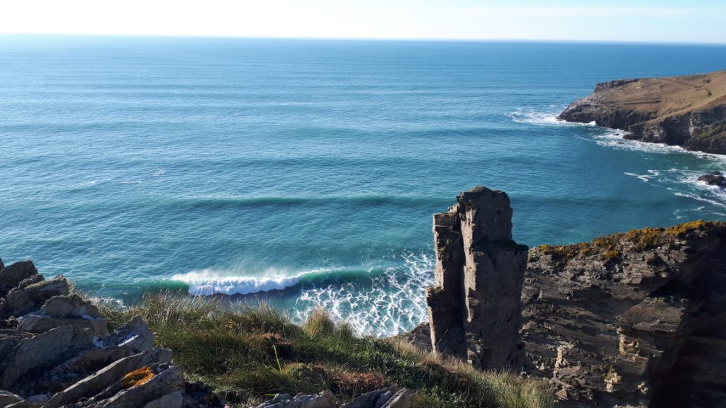
Here’s one of my recent pictures of some of that coastline, including part of Cornwall’s industrial heritage and some large waves!
Climate change is top of the G7 agenda along with Covid-19, and you can rest assured that vested interests will not miss any opportunity to promote those interests over the next two months and beyond. By way of example, one of our long standing “usual suspects”, Judith Curry, “tweeted” the following message to her followers on April 17th:
Not only does Dana kindly link to our recent efforts to educate the Daily Mail’s leader writer about the Arctic facts of life. He also does a much better job of explaining the issues than a previous Guardian article about Arctic sea ice volume which we were recently somewhat critical of. This therefore seems like the perfect time to provide an “Arctic Sea Ice Volume 101” lesson for Daily Mail leader writers and their wholly independent “legal eagles”.
Let’s take things one small step at a time shall we. The Daily Mail leader last week starts by saying:
In a major report last year, the Intergovernmental Panel on Climate Change gave a grave assessment of how man-made global warming was rapidly destroying the Arctic ice cap.
Steadily increasing temperatures had made the pack ice contract by up to 12 per cent between 1979 and 2012, leading to rising sea levels which threatened to swamp coastal regions – not to mention endangering stranded polar bears.
By the middle of the century ‘a nearly ice-free Arctic Ocean’ was likely for a large part of the year, the report predicted.
The Mail’s leader writer isn’t very specific about which of the numerous IPCC reports they are referring to , but the Mail’s legal eagle tells us that:
This item was written on the basis of… the 2014 synthesis report by the Intergovernmental Panel on Climate Change – arguably the definitive authority on the subject.
This is a quote from that IPCC report (p4 notes). ‘The annual mean Arctic sea-ice extent decreased over the period 1979 to 2012, with a rate that was very likely in the range 3.5 to 4.1% per decade.’
Given that there are over three decades between 1979 and 2012, the shrinkage of the ice-cap couldn’t have been more than 12 per cent.
This is the first of many “misunderstandings” in the Daily Mail’s leader and their legal eagles response. Here is an extract from Section B.3 “Cryosphere” on page 9 of the IPCC AR5 Working Group 1 Summary for Policy Makers:
The annual mean Arctic sea ice extent decreased over the period 1979 to 2012 with a rate that was very likely in the range 3.5 to 4.1% per decade (range of 0.45 to 0.51 million km2 per decade), and very likely in the range 9.4 to 13.6% per decade (range of 0.73 to 1.07 million km2 per decade) for the summer sea ice minimum (perennial sea ice).
As you can see, the Mail’s “definitive authority on the subject” subject says that “for the summer sea ice minimum” Arctic sea ice extent in fact decreased by more like 12% per DECADE.
Moving on the next paragraph in the Daily Mail’s leader, we are told that:
How interesting then, that the latest analysis of 88million measurements from the European Space Agency’s Cryosat satellite show the northern ice-cap INCREASED by a staggering 41 per cent in 2013 and, despite a modest shortage last year, is bigger than at any time for decades.
whilst the Mail’s legal eagle explains to us that:
Researchers used 88 million measurements of sea ice thickness recorded by the European Space Agency’s CryoSat-2 mission between 2010 and 2014.
The results showed that there was a 14 per cent reduction in the volume of summertime Arctic sea ice between 2010 and 2012 – but the volume of ice jumped by 41 per cent in 2013, relative to the previous year, when the summer was five per cent cooler than the previous year.
Notice that in this article the author is talking about “summertime Arctic sea ice volume” and not “mean Arctic sea ice extent”. Let’s see if instead of trying to compare apples with oranges like the Mail’s leader writer we can in fact compare like with like shall we?
Firstly let us recall (if we can) from our school days that Volume = Area x Thickness. Next returning to the IPCC AR5 WG1 report we need to turn to the technical summary of their full report where in the TS.2.5.3 “Sea Ice” section on page 40 we can read that:
There is high confidence that the average winter sea ice thickness within the Arctic Basin decreased between 1980 and 2008. The average decrease was likely between 1.3 m and 2.3 m. High confidence in this assessment is based on observations from multiple sources: submarine, electromagnetic probes and satellite altimetry; and is consistent
with the decline in multi-year and perennial ice extent.
Now unfortunately for our purposes this decline in thickness is not expressed as a percentage and is in winter rather than summer. Nevertheless it should be readily apparent to all and sundry by now that the thickness of Arctic sea ice has been declining at the same time as its extensiveness. Moving on to page 136 in section 1.3.4.3 “Ice” of the full IPCC WG1 report we find:
There has been a trend of decreasing Northern Hemisphere sea ice extent since 1978, with the summer of 2012 being the lowest in recorded history (see Section 4.2 for details). The 2012 minimum sea ice extent was 49% below the 1979 to 2000 average and 18% below the previous record from 2007. The amount of multi-year sea ice has been reduced, i.e., the sea ice has been thinning and thus the ice volume is reduced.
Following the IPCC’s instructions let’s now move on to page of section 4.2.2.4 “Arctic Sea Ice Thickness and Volume”, where we read that:
For the Arctic, there are several techniques available for estimating the thickness distribution of sea ice. Combined data sets of draft and thickness from submarine sonars, satellite altimetry and airborne electromagnetic sensing provide broadly consistent and strong evidence of decrease in Arctic sea ice thickness in recent years.
That’s followed by many paragraphs of learned discussion, but still no statement of Arctic wide volume decline in percentage terms to keep the Mail’s legal eagle happy.
This website uses cookies to improve your experience. We'll assume you're ok with this, but you can opt-out if you wish. Cookie settingsACCEPT
Privacy & Cookies Policy
Privacy Overview
This website uses cookies to improve your experience while you navigate through the website. Out of these, the cookies that are categorized as necessary are stored on your browser as they are essential for the working of basic functionalities of the website. We also use third-party cookies that help us analyze and understand how you use this website. These cookies will be stored in your browser only with your consent. You also have the option to opt-out of these cookies. But opting out of some of these cookies may affect your browsing experience.
Necessary cookies are absolutely essential for the website to function properly. This category only includes cookies that ensures basic functionalities and security features of the website. These cookies do not store any personal information.
Any cookies that may not be particularly necessary for the website to function and is used specifically to collect user personal data via analytics, ads, other embedded contents are termed as non-necessary cookies. It is mandatory to procure user consent prior to running these cookies on your website.