“A lie told often enough becomes the truth”
– Vladimir Lenin
“The most brilliant propagandist technique will yield no success unless one fundamental principle is borne in mind constantly and with unflagging attention. It must confine itself to a few points and repeat them over and over. Here, as so often in this world, persistence is the first and most important requirement for success”
– Adolf Hitler
The few points about the Arctic that Tony Heller repeats over and over look like this today:
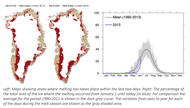
The Guardian reports that Arctic ice is melting “faster and earlier”
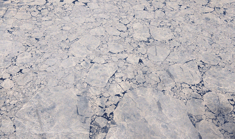
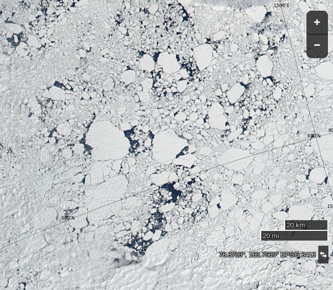
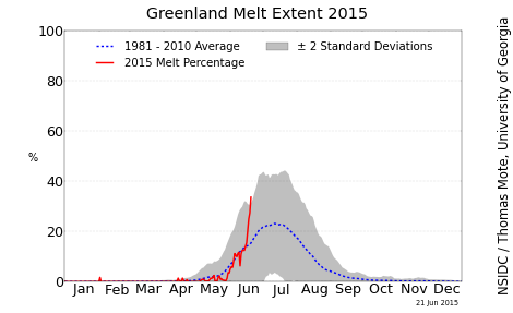
NASA Worldview “true-color” image of broken ice north of the East Siberian Sea on June 22nd 2015, derived from bands 1, 4 and 3 of the MODIS sensor on the Aqua satelliteNSIDC Greenland melt area graph on June 21st 2015
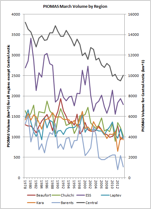
Stung by some unusually constructive criticism from Anthony Watts we have (somewhat hurriedly) added several new pages to the Great White Con “Resources” section of this web site. They contain the sort of information that is rather tricky to update automatically on a daily basis, and concentrate on resources that help the interested searcher after truth get a handle on the thickness and hence volume of the sea ice in the Arctic, on a regional as well as pan Arctic scale.
The first section is entitled “Arctic Sea Ice Graphs“, and here’s an example of one graph which reveals the ice volume in various regions of the Arctic, based on the output of the PIOMAS model:
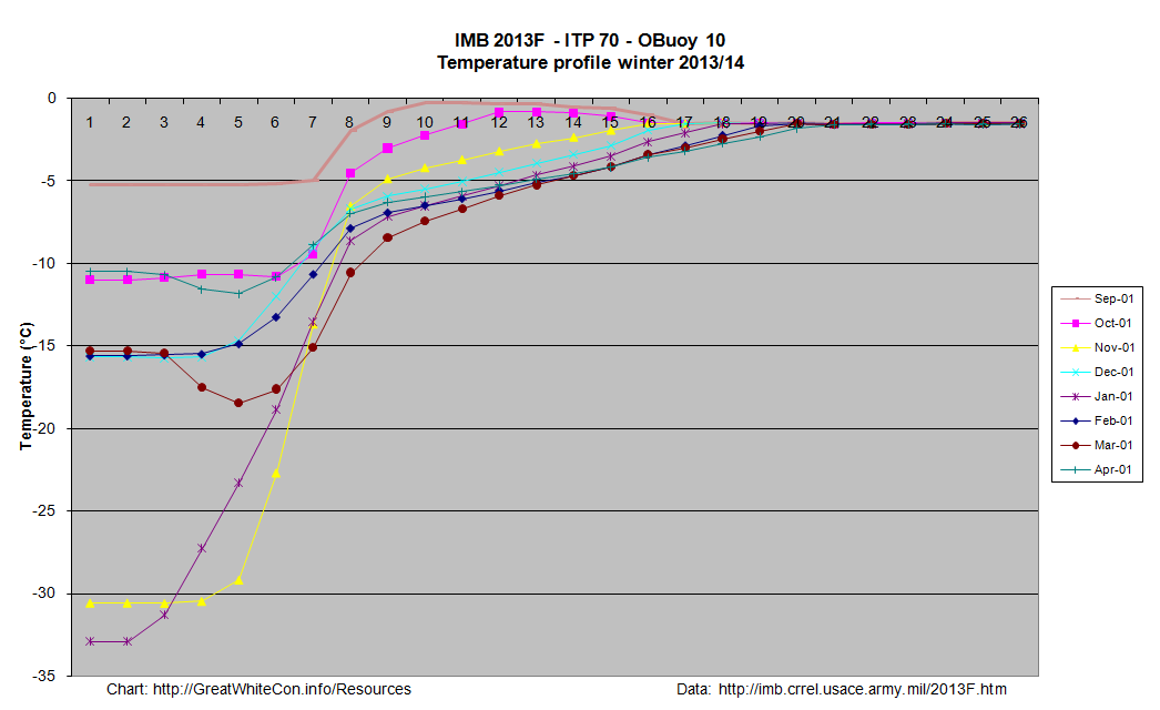
The second section is entitled “Ice Mass Balance Buoys“. As the name hopefully suggests, this section displays data reported by the Cold Regions Research and Engineering Laboratory’s currently active ice mass balance buoys in a variety of novel formats. These buoys are deployed on a regular basis at selected locations across the Arctic, and report on a number of different parameters including snow depth, ice thickness and temperature. By way of example here’s a couple of reports from IMB 2013F, which was originally deployed last August on what was then classified as “first year” ice in the Beaufort Sea. First of all here’s the Google Maps/Earth view that reveals how the buoy has moved around the Arctic since then, and shows how clicking on one of the “pushpins” reveals the values of a variety of interesting metrics on a daily basis:
Google map of the movement of IMB 2013F
As you can see, last August the thickness of the ice floe that the buoy is located upon was 1.4 metres thick. If you click through to the live map and experiment you will discover, amongst a variety of other things, that the ice under the buoy is now 1.68 meters thick, with an additional 49 cm of snow on top of that.
A second set of images shows graphs revealing the temperature above, below and within the ice, currently on a monthly basis:
Click on the graph to view a larger version. This one requires a certain amount of interpretation, but the first thing to note is that the numbers across the top represent the position of thermistors spaced 10 cm apart on a pole that is mounted vertically through the ice floe. Number 1 is in the air above the floe, the rightmost side of the graph (number 26 in this case) is in the water below the ice floe, and somewhere in between those extremes the temperature sensors can also be in the midst of either ice or snow.
At the end of March the interface between ice and snow in this case was somewhere between sensors 8 and 9, and hence at a temperature of around – 7 degrees Celsius, by which time the buoy had moved from the Canadian waters where it started into the area of the Beaufort Sea north of Alaska.
For further discussion about the interpretation of our new resources please use the comment section on the “About Our Arctic Sea Ice Resources” page. For technical observations and suggestions for improvements feel free to comment below!
Whilst a variety of climate change “skeptics” have been pointing out recently that the April 2014 edition of the National Snow and Ice Data Center’s Arctic Sea Ice News mentioned that:
A large area of the multiyear ice has drifted to the southern Beaufort Sea and East Siberian Sea
There is a lot of thick ice in the western Arctic, which will be difficult to melt this summer.
they glossed over the bit where the NSIDC added:
Where warm conditions are likely to exist later in the year.
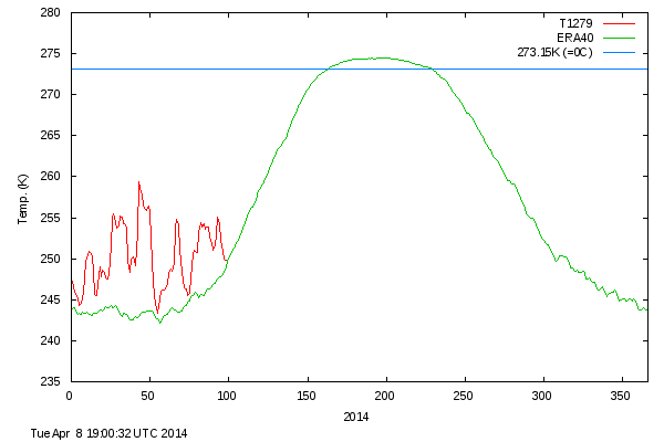
In fact conditions have been very warm (relatively speaking!) in the Arctic for all of 2014 so far. The DMI daily mean temperature of the Arctic area north of the 80th northern parallel has never dropped below the long term average all winter:
DMI mean temperature north of the 80th northern parallel, on April 8th 2014
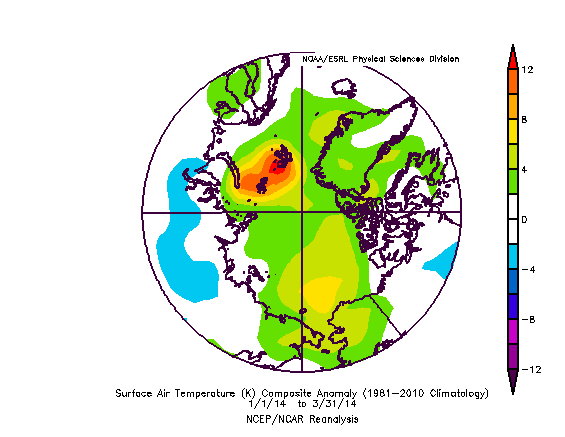
and the surface air temperature anomaly chart for the Arctic for the first three months of 2014 looks like this:
Arctic surface air temperature anomaly plot for January to March 2014
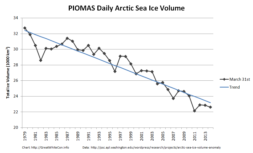
Those anomalously warm temperatures may well have something to do with the fact that the latest PIOMAS Arctic sea ice volume estimates which have just been released reveal this:
PIOMAS arctic sea ice volume on March 31st from 1979-2014
As you can see, according to the PIOMAS model at least, Arctic sea ice volume has now reached the second lowest level for the date since the satellite record began.
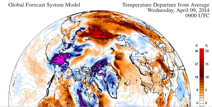
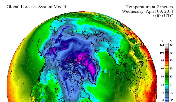
Whilst the skeptics have been complaining about the amount of ice on the Great Lakes of North America they seem to have somehow failed to notice the anomalously low coverage of snow over Siberia. Here’s the surface air temperature anomaly forecast for the northern hemisphere tomorrow:
GFS 2m temperature anomaly forecast for 09:00 UTC on April 9th 2014
Do you see the bright red patch over the coast of the Laptev Sea, indicating temperatures 20 degrees Celsius above normal? Now take a look at a similar chart, but of the surface air temperatures themselves:
GFS 2m temperature forecast for 09:00 UTC on April 9th 2014
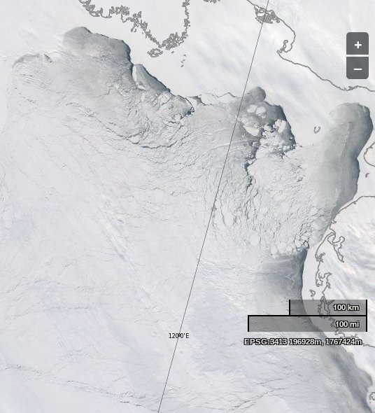
That reveals that the temperatures over the edge of the Laptev Sea are forecast to be above the freezing point of fresh water tomorrow. Just in case you’re wondering what the shores of the Laptev Sea look like at the moment, here’s a picture we recorded earlier today, courtesy of NASA Worldview and the MODIS sensor on the Aqua satellite:
The Laptev Sea as seen by the Aqua satellite on April 8th 2014
What do you suppose the same area will look like in a day or two’s time, or in a month or two’s time for that matter?
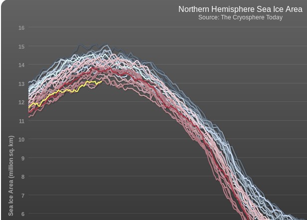
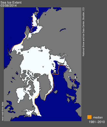
It’s highly probable that whatever metric you choose to use the 2014 Arctic sea ice maximum area and extent will occur this month. Consequently the volume of nonsense propagated by the “skeptics” amongst the “mass media” is increasing also. Earlier today yesterday’s sea ice metrics were published and currently both the Cryosphere Today Arctic sea ice area and NSIDC daily extent are at all time lows for the date. Needless to say that hasn’t stopped the denialosphere prattling on about an “Arctic Ice Recovery” yet again.
First of all, here’s our evidence:
Cryosphere Today Arctic sea ice area graph, as at March 8th 2014
Now I couldn’t help but notice that yet another reproduction of the Mail on Sunday’s erroneous graphic first printed at the time of the 2013 minimum appeared on Steven Goddard’s “Real Climate” blog last week. Steve has been using a variety of other graphics in his assorted attempts to persuade his readers that there is in fact an “Arctic Ice Recovery”. Needless to say, we beg to differ!
Them:
Shocking Increase In Arctic Ice Dooms The Planet – How Ice Sheet Grew 533,000 Square Miles in a Year
Us:
Whilst we’re on the subject of cherry picking, it looks a lot like the left hand part of the image dates from August 27th 2012 whereas the right hand part dates from August 15th 2013. If you’re interested in seeing a similar image dating from September 8th 2013, when the original version of the image above was originally published in the Mail on Sunday over here in once Great Britain then please feel free to take a long hard look at:
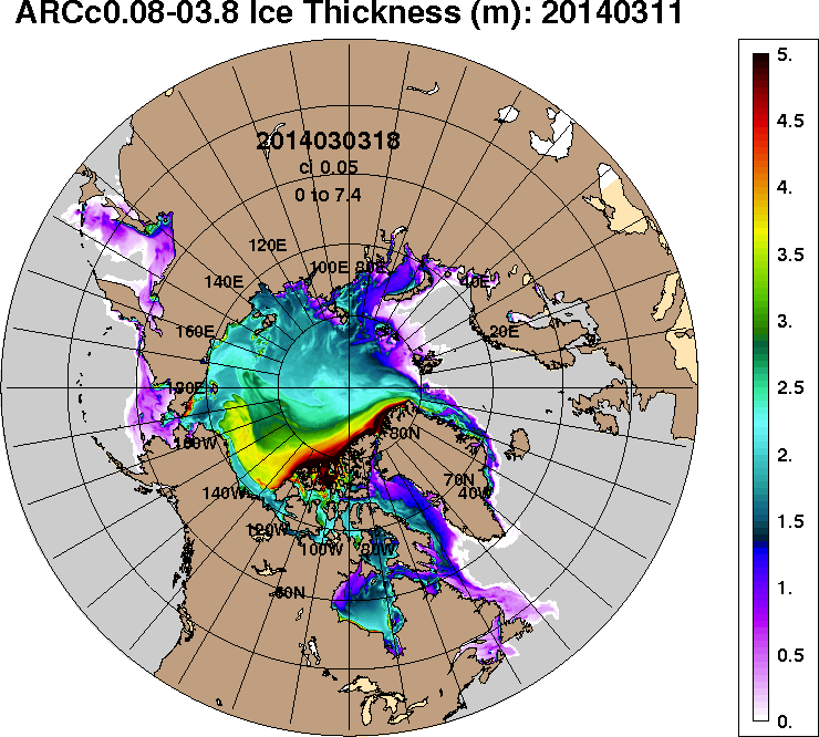
The dirty little secret of Arctic sea ice, is that it is controlled by winter winds – not temperature. Over the last few years, the older thicker ice has pushed into the Beaufort Sea where it survives the winter and slows summer melt. Thus the Arctic continues to “recover.”
ACNFS forecast for Arctic sea ice thickness on March 11th 2014
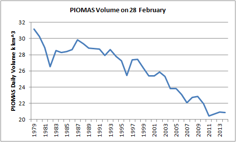
Actually the Arctic doesn’t “continue to recover”. Whilst a bit hard to see on their rather cluttered chart the latest PIOMAS Arctic sea ice volume estimates show that the so called “recovery” had almost completely “melted away” by the end of February:
PIOMAS Arctic sea ice volume on February 28th from 1979-2014
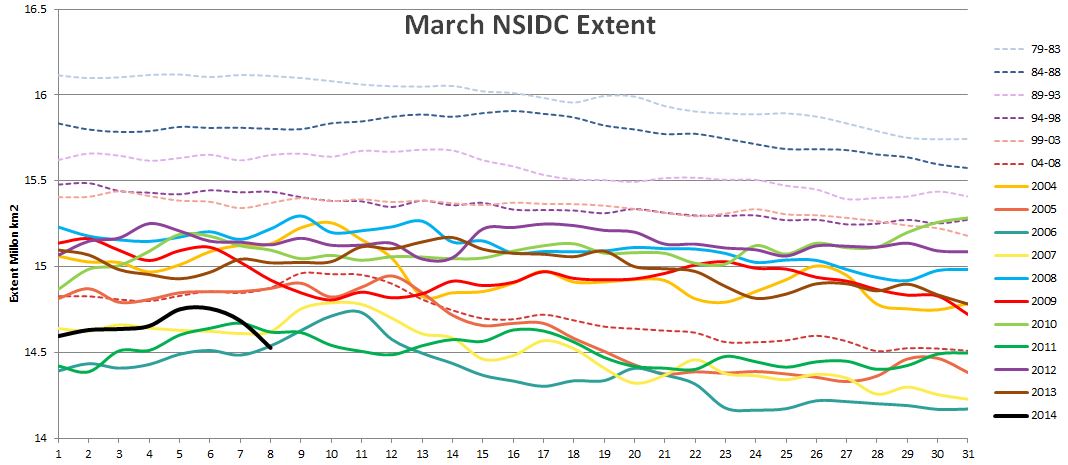
NSIDC visualisation of Arctic sea ice daily extent for March 6th 2014
Us:
Here’s the thing (well, 2 things actually)
1. Steve’s “map” shows the NSIDC Arctic sea ice extent, but you make no mention of it. Perhaps that’s because that particular metric is currently at the lowest it has ever been on this day of any year since the satellites started attempting to measure it? How on Earth can he possibly characterize that as any sort of “recovery”?
2. Surely the very title of this thread (“ice cube”) implies a volume, does it not? I believe Steve’s an engineer, and so he is presumably well aware that a square and a cube are completely different kettles of fish (metaphorically speaking)? All that being the case, why on Earth would Steve choose to illustrate his point with a “map” of ice extent instead of a “graph” of ice volume?
For the moment we rest our case, but rest assured that there is plenty more where this lot came from!
Today we move on to the second sentence in David Rose’s article “this time last week”.
Them:
The rebound from 2012’s record low comes six years after the BBC reported that global warming would leave the Arctic ice-free in summer by 2013.
Us:
As you can see, the Mail article includes no references. Surely in this day and age an online article about such a controversial subject should at the very least include a few links? Hayley Dixon’s article for The Telegraph did at least manage to do that! I’ve asked David Rose via a number of different avenues where he got his information, and how he did his sums. I know he got at least one of the messages because he was browsing my profile on LinkedIn last week, but I have yet to receive any answer from him.
Groping in the dark I’ve tried to speculate about which BBC report in 2007 David is referring to. Perhaps it’s this one by Jonathan Amos entitled “Arctic summers ice-free ‘by 2013′”. Please note the quotation marks around the date. According to this article:
Professor Wieslaw Maslowski told an American Geophysical Union meeting that previous projections had underestimated the processes now driving ice loss.
[His] latest modelling studies indicate northern polar waters could be ice-free in summers within just 5-6 years.
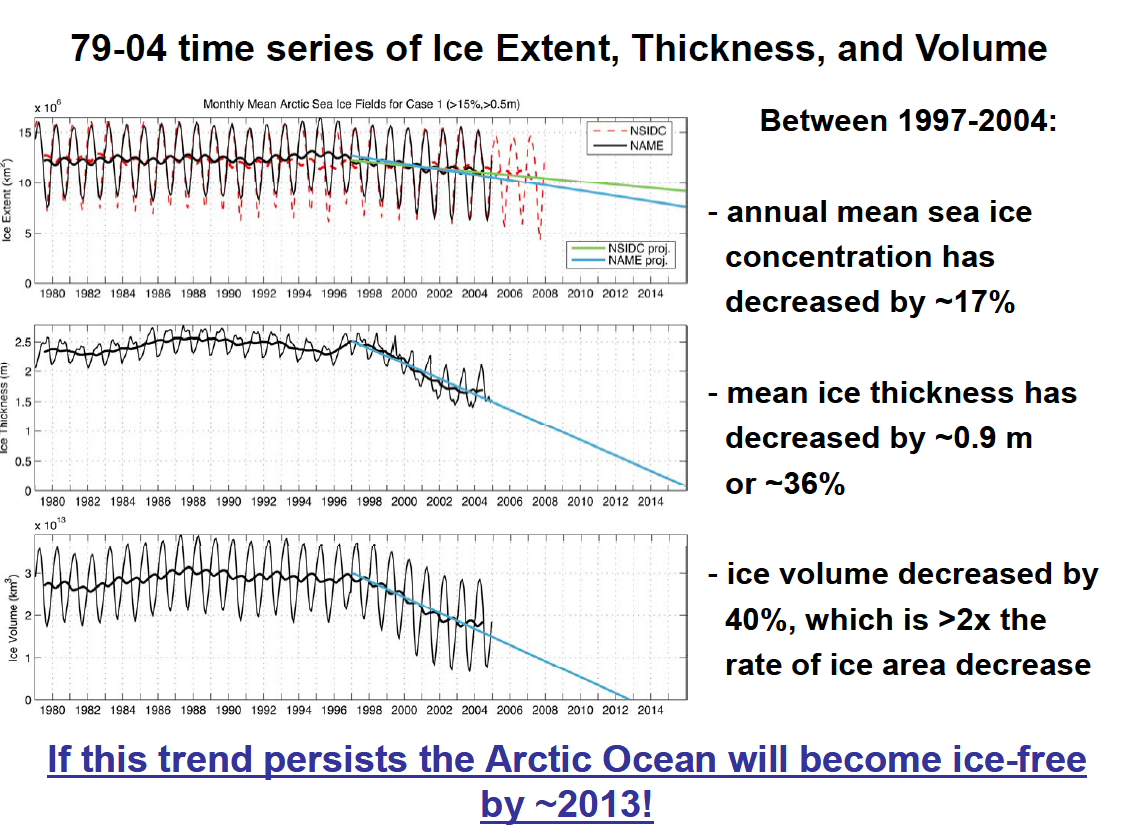
Instead of relying on what David Rose says Jonathan Amos says Wieslaw Maslowski said, why don’t we instead take a look at what Prof. Maslowski actually said. Here’s an extract from the slides he used when giving a presentation in Japan in the summer of 2008, when he’d had plenty of time to learn the lessons of the astonishing Arctic sea ice melt in the summer of 2007:
Wieslaw Maslowski says “if” and “around” in 2008
Note that he didn’t say words to the effect that “The Arctic will be ice-free in summer by 2013” as claimed by David Rose. What he actually said, and converting the mathematical symbol into plain English, was:
IF this trend persists the Arctic Ocean will become ice-free by AROUND 2013!
which is a very different thing. For those of you that would prefer to actually hear Prof. Maslowski convey that message himself, here’s a podcast from December 2007:
The interview lasts for about half an hour, and a full transcript is also available courtesy of Beyond Zero Emissions. You will note that what Wieslaw actually said was:
If we project this trend ongoing for the last 10 – 15 years, we probably will reach zero in summer some time mid next decade.
Verdict:
The evidence suggests that David Rose doesn’t research his sources properly, doesn’t understand English and doesn’t understand common mathematical symbols. Alternatively he understands all of that perfectly well, but chooses to misrepresent all of that to his loyal readership instead of educating them about the facts of the matter.
This website uses cookies to improve your experience. We'll assume you're ok with this, but you can opt-out if you wish. Cookie settingsACCEPT
Privacy & Cookies Policy
Privacy Overview
This website uses cookies to improve your experience while you navigate through the website. Out of these, the cookies that are categorized as necessary are stored on your browser as they are essential for the working of basic functionalities of the website. We also use third-party cookies that help us analyze and understand how you use this website. These cookies will be stored in your browser only with your consent. You also have the option to opt-out of these cookies. But opting out of some of these cookies may affect your browsing experience.
Necessary cookies are absolutely essential for the website to function properly. This category only includes cookies that ensures basic functionalities and security features of the website. These cookies do not store any personal information.
Any cookies that may not be particularly necessary for the website to function and is used specifically to collect user personal data via analytics, ads, other embedded contents are termed as non-necessary cookies. It is mandatory to procure user consent prior to running these cookies on your website.