Category Archives: Concentration

Santa’s Secret Summer Swimming Pool Revisited

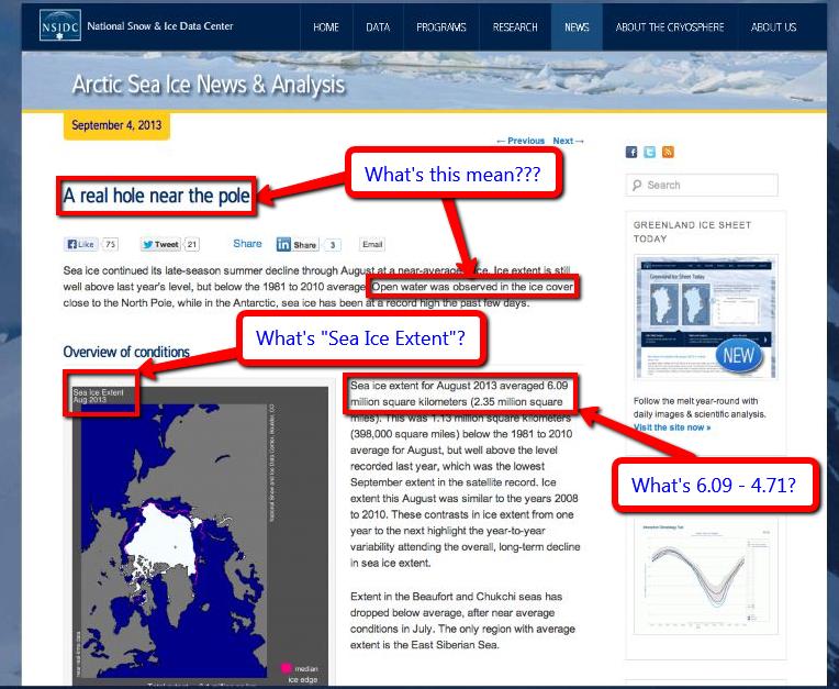
Regular readers may recall that way back when in September 2013 we wondered why David Rose hadn’t seen fit to reproduce any visualisations of Arctic sea ice concentration in a previous article about Arctic sea ice, particularly when his source materials from the NSIDC contained some very nice examples.

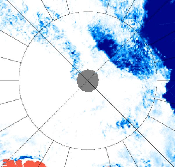
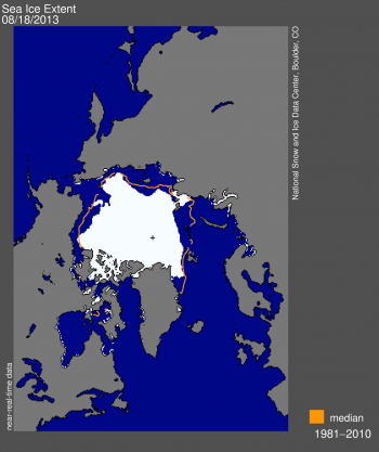
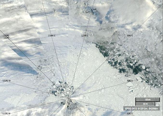
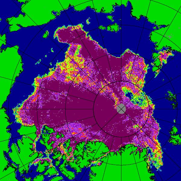
Today we are pleased to be able to inform you that David has now followed our long standing advice, and his article in the Mail on Sunday  yesterday included two such “stunning satellite images”. Of course they are not really “photographic” images, any more than the visualisations of Arctic sea ice extent that David was so keen to show his loyal readers last time around were. Unfortunately David neglected to include a “stunning satellite concentration visualisation” for August 25th 2013 in yesterday’s article. We are pleased to be able to help correct that no doubt inadvertent oversight, albeit somewhat belatedly, with the able assistance of the Department of Atmospheric Sciences at the University of Illinois and their Cryosphere Today web site:

Cryosphere Today Arctic sea ice concentration on August 25th 2013

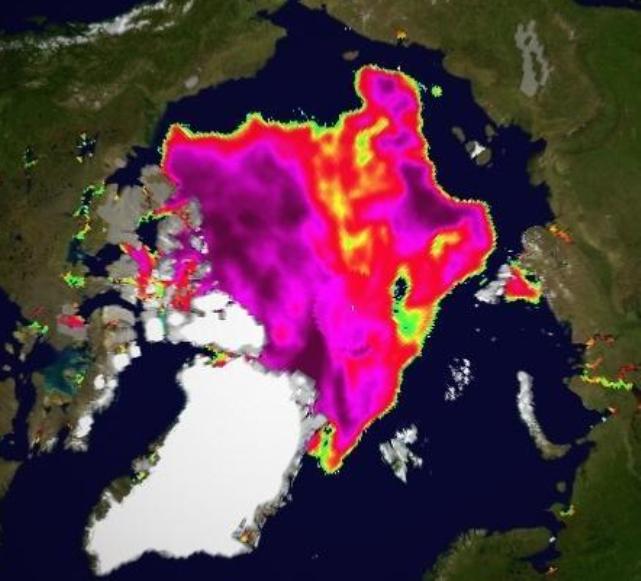
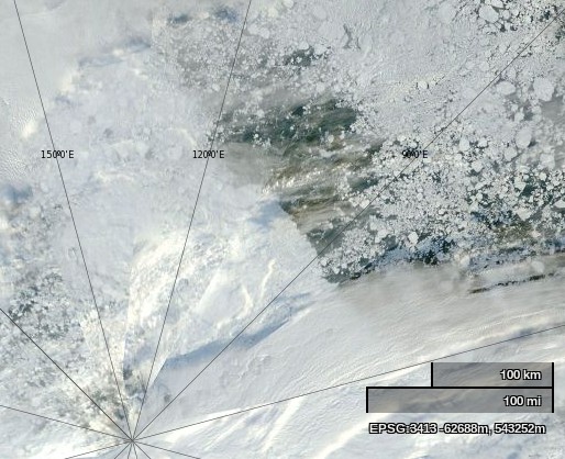
Paraphrasing David Rose’s article yesterday, can you see all the yellow and green areas denoting regions where the ice pack is least dense?

Can you see “an unbroken ice sheet more than half the size of Europe stretch[ing] from the Canadian islands to Russia’s northern shores”?

Can you see Santa’s secret summer swimming pool, just a short sleigh ride away from his natty North Pole residence?

Answers on a virtual post card please, to the address below.

How Many Subs In Santa’s Swimming Pool?

An extract from a  discussion about submarines surfacing at the North Pole, courtesy of Steven Goddard’s “Real Science” blog. One of us must be blind!

Them:

Hey spambot, what is this picture of?

USS Skate (SSN-578) made submarine history on 11 August 1958 when it became the first submarine to surface at the North Pole

Us:

It would seem to be the USS Skate on 11 August 1958 when it became the first submarine to surface at the North Pole. What is this picture of?

NASA Worldview “true-color” image of the North Pole area on September 2nd 2013

NASA Worldview “true-color” image of the North Pole area on September 2nd 2013, derived from bands 1, 4 and 3 of the MODIS sensor on the Terra satellite

Them:

Frozen ice. What is my prize?

And basically yours is just a snipe hunt. Mine disproves your hysteria.

Us:

No prize I’m afraid. The correct answer is vast areas of open ocean. Plenty of room for every submarine on the planet.

Them:

Sorry, there is no open water. Check your picture again. So you are reneging? Typical.

Us:

I have checked again, and I still see lots of open water underneath a thin veil of cloud. Perhaps you should arrange a hasty visit to an optician? Luckily microwaves can see through clouds, even if you cannot. Here’s another satellite image of the North Pole area from September 2nd 2013, this time a University of Hamburg visualisation of data from the AMSR2 sensor on board the Japanese SHIZUKU satellite.

AMSR2 image of the North Pole area on September 2nd 2013

AMSR2 image of the North Pole area on September 2nd 2013

The circle is 85 degrees North. How many subs do you suppose will fit into Santa’s secret summer swimming pool?

Them:

You have X-ray vision? I am sorry! I did not realize you were stuper girl! Want to try again? This time with normal vision.

BTW. for the SLOOOOOW learners. 85 North +/= North pole. The North Pole is WITHIN 85 North. But it is NOT 85 North.

The Skate is at 90 North. The NORTH POLE.

You may have x-ray vision, but you still cannot read a map. neither picture shows open water AT the north pole.

How many submarines are on the planet Snowy? better recheck your figures. They are not tinker toys.

Us:

You’re a hard man to please Phil! Feast your eyes on this picture instead then:

NASA Worldview “true-color” image of the North Pole area on August 28th 2013, derived from bands 1, 4 and 3 of the MODIS sensor on the Aqua satellite

NASA Worldview “true-color” image of the North Pole area on August 28th 2013, derived from bands 1, 4 and 3 of the MODIS sensor on the Aqua satellite

Them:

We’ll keep you posted!

The Mail’s Concentration on Sea Ice Extent

Further to our previous communications about what we refer to here as “The Great White Con” I have now received another email from John Wellington, Managing Editor of the Mail on Sunday.

Them:

Amongst other things it says that:

The incorrect figure published by the NSIDC was taken in good faith. Our writer [AKA David Rose] did not expect an institution of its stature to make such an error, so it is not reasonable to expect him to contact NSIDC to check it, specially as the general idea of an increase in the icepack was consistent with more anecdotal information such as the shipping information. You say we did not produce evidence of the NSIDC mistake. I am attaching a screen grab of their web site before they corrected it.

Mail on Sunday screen grab of NSIDC article entitled "A real hole near the pole"
Mail on Sunday screen grab of NSIDC article entitled “A real hole near the pole”

John’s latest email also included the following statement:

The August NSIDC report begins with a diagram (see  attachment). This shows the Arctic ice sheet stretching from Siberia to the Canadian islands:

Another Mail on Sunday screen grab of NSIDC "Arctic Sea Ice News" article of September 4th 2013
Another Mail on Sunday screen grab of NSIDC “Arctic Sea Ice News” article of September 4th 2013

Us:

You will note I have taken the liberty of annotating The Mail’s screen grabs with what seem to me to be reasonable questions for any vaguely competent investigative journalist to ask themselves when reading the NSIDC’s early September update. At this juncture I can only repeat this question from my most recent missive to The Mail:

This raises any number of questions about the Mail on Sunday misleading its readers, such as “Why didn’t The Mail ask the NSIDC about the apparently conflicting information, much like Bob Ward did, before publishing an article relying on that information?” not to mention “Why can’t David Rose perform accurate arithmetic?”

and provide my own screenshot from the “terminology” page of the NSIDC web site in a no doubt vain attempt to provide John and David with an answer to just one of those questions:

NSIDC explanation of the terms "concentration" and "extent"
NSIDC explanation of the terms “concentration” and “extent”

In brief:

Extent defines a region as either “ice-covered” or “not ice-covered.” For each data cell, it is a binary term; either the cell has ice (usually a value of “1”) or the cell has no ice (usually a value of “0”).

 Do you suppose that given their apparent difficulties in performing elementary arithmetic John and David are able to appreciate the difference between “1 or 0” and “low-concentration sea ice (20 to 80% cover) within our extent outline” or even “near-zero ice concentration“?

How about the readers of The Mail on Sunday, or the Press Complaints Commission for that matter?

The Balding Arctic Exposed

I’ve recently received a letter signed by John Wellington who is the Managing Editor of The Mail on Sunday.

Them:

Referring to David Rose’s Mail on Sunday article of September 8th 2013 John says amongst many other things that:

We deny that the article was significantly inaccurate apart from the original headline figure which we have already corrected.

and:

In August, ice did stretch from part of the Siberian shore to the Canadian islands. The image published in the newspaper and online supports this statement as does the enclosed image from the NSIDC site which shows the ice extent on August 18.

Here’s that image, which comes from the August 19th 2013 edition of the National Snow and Ice Data Center’s “Arctic Sea Ice News” entitled “The balding Arctic“:

National Snow and Ice Data Center graphic showing Arctic sea ice extent on August 18th 2013
NSIDC graphic showing Arctic sea ice extent on August 18th 2013

Us:

I’m currently writing a reply to John’s letter. Amongst many other things it directs his attention to this very article and says:

Images showing sea ice “extent” reveal remarkably little about whether an “ice sheet” is “unbroken” or not. If that is what you want to illustrate then an image showing “concentration” is much more helpful. In their report of September 4th upon which David Rose’s article is supposedly based, at least in part, the NSIDC helpfully provided such an image. The Mail on Sunday didn’t publish that image, or a similar image from 2012. In order to correct this inaccuracy they should do so.

Since they’ve evidently read the NSIDC’s news that the Arctic was “Balding” towards the end of August and there was “A real hole near the pole” by early September John and David should be aware of this already, but it seems a refresher course is necessary. On August 19th the NSIDC pointed out that:

Satellite data from the AMSR-2 instrument and MODIS show an unusually large expanse of low-concentration sea ice (20 to 80% cover) within our extent outline (15% or greater, using the SSM/I sensor) spanning much of the Russian side of the Arctic and extending to within a few degrees of the North Pole.

While some of the low concentrations recorded by AMSR-2 may be due to surface melt on sea ice, the MODIS image confirms that a large region is covered by isolated floes.

On September 4th the NSIDC also helpfully pointed out that:

A large hole (roughly 150 square kilometers or 58 square miles) of near-zero ice concentration appears to have opened up at about 87 degrees North latitude.

Here is a “true-color” image from September 4th 2013 using MODIS bands 1, 4 and 3, helpfully made available by NASA to anyone who might be interested via the EOSDIS Worldview web site:

NASA Worldview “true-color” image of the North Pole area on September 4th 2013 derived from bands 1,4 and 3 of the MODIS sensor on the Terra satellite
NASA Worldview “true-color” image of the North Pole area on September 4th 2013 derived from bands 1, 4 and 3 of the MODIS sensor on the Terra satellite

The lines in this image converge on the North Pole, the same location as the little cross in the NSIDC extent image near the top of this article. Let’s play “Spot the Difference” yet again shall we. Would you say that the sea ice underneath the clouds looks “broken” in this Worldview “true-color” image? How about in the the University of Bremen concentration images often shown by the NSIDC, or in the NSIDC “extent” image above, or in the NASA “extent” videos so beloved by David Rose and the Mail on Sunday?

Russia’s Northern Shores

Regular readers will have realised by now that we’ve been pestering the Mail and The Telegraph with telephone calls and emails for weeks now. That’s because, as The Economist put it last weekend:

There are climate facts—and facts are stubborn things.

Both The Mail and The Telegraph have now corrected a couple of the gross inaccuracies they printed (virtually and/or physically) on September 8th, but many more remain. One of those is the identical phrase in both articles saying:

An unbroken ice sheet more than half the size of Europe already stretches from the Canadian islands to Russia’s northern shores.

The fact of the matter is that this statement is untrue. I’ve recently received a couple of letters about this from “The Daily Telegraph” signed by “Robert Winnett, Head of News”. Here’s an extract from the first one:

Them:

Reputable evidence exists to show an unbroken ice sheet more than half the size of Europe already stretches from the Canadian islands to Russia’s northern shore.  This can be seen on the National Snow and Ice Data Center’s website [in the article] “A Real Hole Near the North Pole“.  The site states that the average ice extent for August 2013 was 6.09 million square kilometres, which is more than half the size of Europe.

Us:

Have I got news for you Robert!  If you’d read any of the articles on here, or watched any of the videos I linked to in my emails, that wasn’t the “fact” I was quibbling about. The fact is that the Arctic “ice sheet” was not “unbroken” and did not “stretch… to Russia’s northern shore” on September 8th 2013 and for considerable periods of time both before and after that date. Here’s an extract from The Telegraph’s second letter:

Them:

In reply to your enquiry, the Telegraph’s policy is to correct clear inaccuracies once we are alerted to them – and in appropriate cases update articles on our website.

Us:

I thought I’d already made this perfectly plain, but evidently not, so here’s yet another alert about clear inaccuracies in the “reporting” of climate science in The Telegraph:

Santa’s Secret Summer Swim

This weekend the Mail on Sunday admitted that the headline numbers in David Rose’s  “And now it’s global COOLING!” article published on September 8th were inflated by a factor of approximately two. This is how they explained that discrepancy to their faithful readers:

Scan of the bottom of page 31 in the September 29th 2013 edition of the Mail on Sunday
The bottom of page 31 in the September 29th 2013 edition of the Mail on Sunday

Can you spot the MILLION square km blunder by the Mail on Sunday? For the benefit of the scientifically illiterate amongst you I’ll explain, as I did yesterday in an email to the Mail on Sunday’s Managing Editor:

It appears that whoever writes your headlines is unaware of the difference between “A MILLION km” and “a million square km”. The former is a distance, and hence has no area. The latter IS an area.

Them:

As you can clearly see, the Mail reported yesterday that:

On September 4, NSIDC, based at the University of Colorado, stated on its website that in August 2013 the Arctic ice cover recovered by a record 2.38 million sq km – 919,000 sq miles – from its 2012 low.

News of this figure was widely reported – including by MailOnline – on September 8.

Us:

The headline of the report published on the NSIDC website on September 4th reads as follows:

A real hole near the pole

The related text reads as follows:

A large hole (roughly 150 square kilometers or 58 square miles) of near-zero ice concentration appears to have opened up at about 87 degrees North latitude. Small areas of open water are common within the ice pack, even at the North Pole, as the ice pack shifts in response to winds and currents, resulting in cracks (called leads) in the ice. The current opening seen in our satellite imagery is much larger.

and the relevant area of the accompanying satellite imagery looks like this:

University of Bremen colour visualisation of Arctic sea ice concentration for September 2nd 2013
University of Bremen AMSR2 colour visualisation of Arctic sea ice concentration for September 2nd 2013

Them:

Since the Mail’s intrepid reporter evidently read those words and looked at that picture, why on Earth do you suppose that the Mail on Sunday printed these words four days later?

Days before the annual autumn re-freeze is due to begin, an unbroken ice sheet more than half the size of Europe already stretches from the Canadian islands to Russia’s northern shores.

Even more to the point, why on Earth do you suppose that the Mail on Sunday left those words unaltered following their September 28th edit of the online version of that article?

Us:

Here’s our latest video update on the 2013 Arctic sea ice refreeze. The “Polar Polynya” is prominent by its presence, as is the broad band of open water between the “broken ice sheet” and “Russia’s northern shores”:

The “Polar Polynya” Reappears!

Whatever David Rose may say in the Mail on Sunday, satellite images from high above the Arctic make it abundantly clear that there is in fact no “unbroken ice sheet [that] already stretches from the Canadian islands to Russia’s northern shores.”

Should further confirmation of that fact be needed, here’s our latest video analysis of the Arctic “refreeze” thus far:

The Great White Con – Update 1 from Jim L. Hunt on Vimeo.

As our video update points out, if you look carefully at the Arctic sea ice concentration maps derived from AMSR2 data, the large “Polar Polynya” visible is the region of the North Pole earlier this month seemed to be shrinking to nothing following the (provisional) NSIDC 2013 extent minimum on September 13th. However it now seems to have been given a new lease of life, as has the nearby “Barents Bite” of open water north of 85 degrees latitude.

That area of the Arctic is currently obscured by cloud, but here’s an image captured by the Aqua satellite earlier today of the “broken ice sheet” off “Russia’s northern shores”:

The Arctic sea ice edge off "Russia’s northern shores" from the Aqua satellite
The Arctic sea ice edge off “Russia’s northern shores” (Click for larger version)

Image courtesy of NASA Worldview from from the Aqua satellite.

Can you by any chance spot any cracks and/or holes in the supposedly “unbroken ice sheet”? Can you spot “Russia’s northern shores” for that matter?

In conclusion, for the moment at least, please note that we are now collecting all these periodical updates together in one handy location.