Here’s a few minutes old Xweet from my now ex Member of the European Parliament, Molly Scott Cato:
Those of us who care about the climate are in an information war with the fossil fuel industry
— Green💚🌻Molly (@GreenPartyMolly) August 2, 2023
This is a forensic analysis of the weapons they’re using
Since this is an existential struggle it would be good to familiarise yourself with them https://t.co/m7tOKvU9gB
Here’s a template for Arctic sea ice trolls, helpfully provided by my very good friend “Snow White”:
Look dumbass. Al Gore says the Arctic is warming at 4 times the speed of the rest of planet, but the data says it’s GETTING COLDER!
By way of a change, which is of course as good as a rest, today let’s take a look at some academic psychology. According to the recently published “The illusory truth effect leads to the spread of misinformation” in the journal “Cognition”:
[Edit – August 4th]Misinformation can negatively impact people’s lives in domains ranging from health to politics. An important research goal is to understand how misinformation spreads in order to curb it. Here, we test whether and how a single repetition of misinformation fuels its spread. Over two experiments (N = 260) participants indicated which statements they would like to share with other participants on social media. Half of the statements were repeated and half were new. The results reveal that participants were more likely to share statements they had previously been exposed to. Importantly, the relationship between repetition and sharing was mediated by perceived accuracy. That is, repetition of misinformation biased people’s judgment of accuracy and as a result fuelled the spread of misinformation.
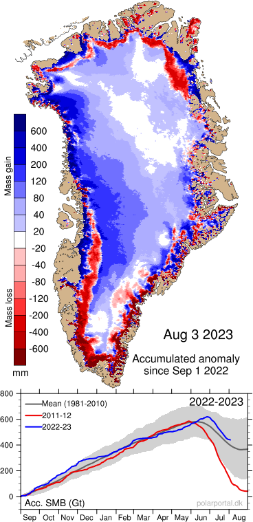
Here’s another helpful template for Arctic sea ice trolls. Simply crop the right hand side off this page of Danish Meteorological Institute information about Greenland’s surface mass balance:
This example of junk science was found on the floor of the XTwitter ClimateBall™ arena this very morning (UTC):
[Edit – August 5th]Evidently doing @JunkScience involves cropping this warning from the @dmidk image he shows his flock of faithful followers 👇https://t.co/tci1iaIDAD
— Snow White (@GreatWhiteCon) August 4, 2023
Steve Milloy is a jo-jo-joke! #ClimateScam #ClimateBrawl #FoFF https://t.co/LPvfwoD7Et pic.twitter.com/bx0Q0P8x94
“Steve”/Tony has gone very quiet on the Arctic sea ice extent front recently. His August 1st missive on that topic looked like this:
After a couple of days of welcome silence, this rather gave his game away:
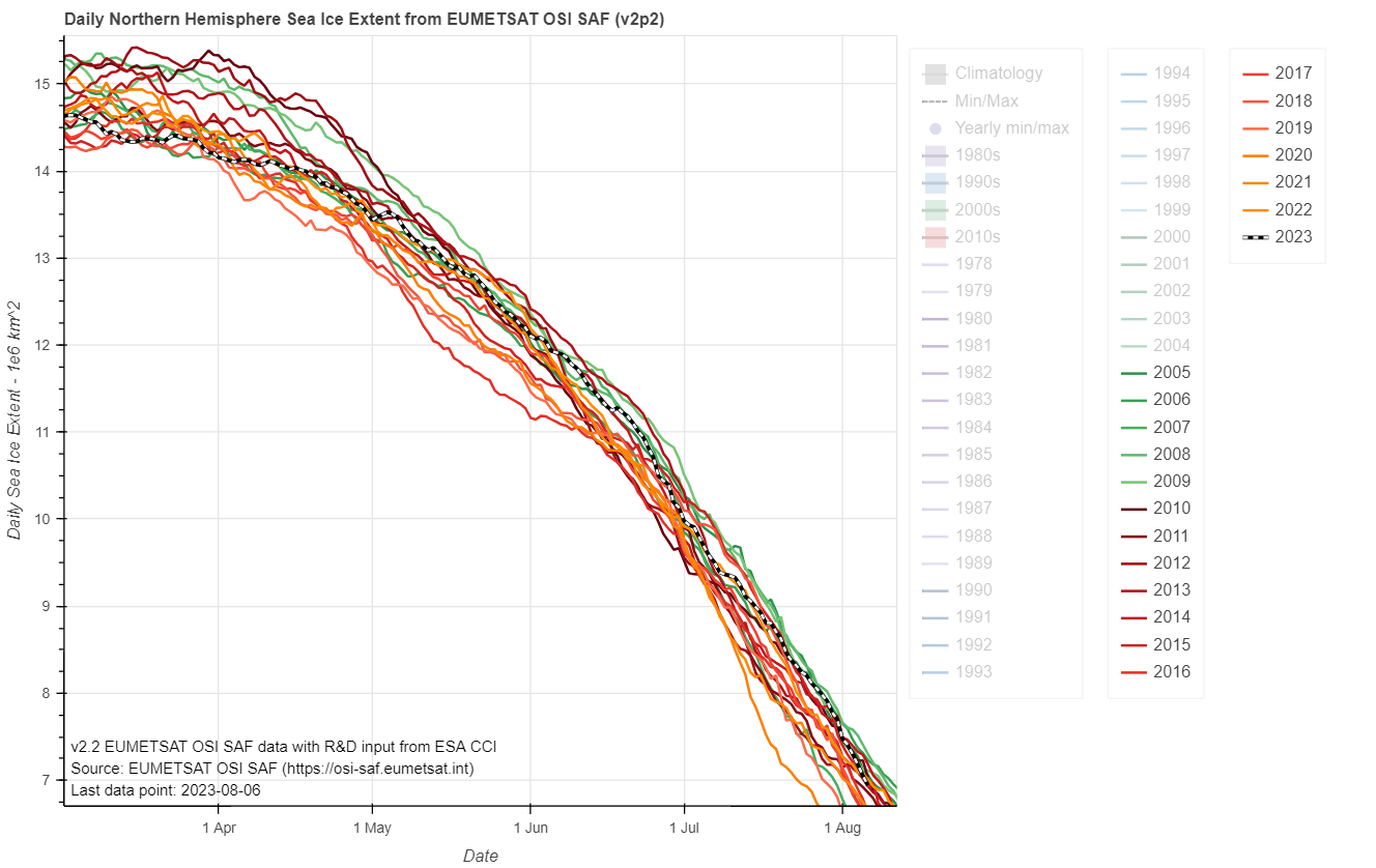
What Tony has consistently neglected to point out is that another graph at his linked data source du jour looks like this:
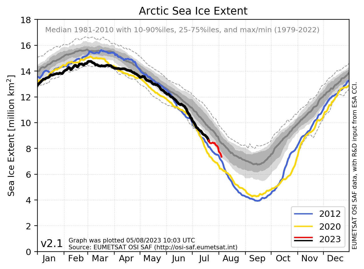
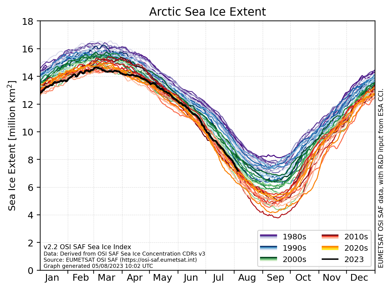
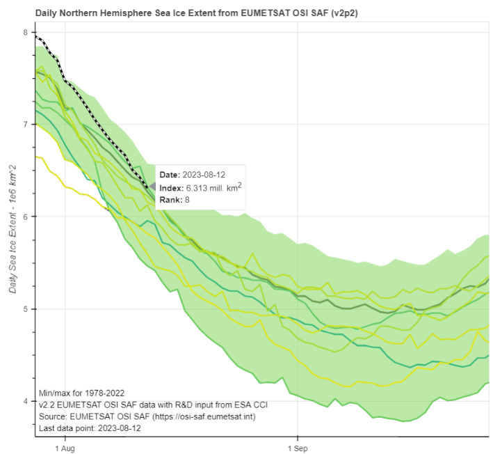
The thing is, the equivalent graphs from the latest version of OSI SAF data look like this instead:
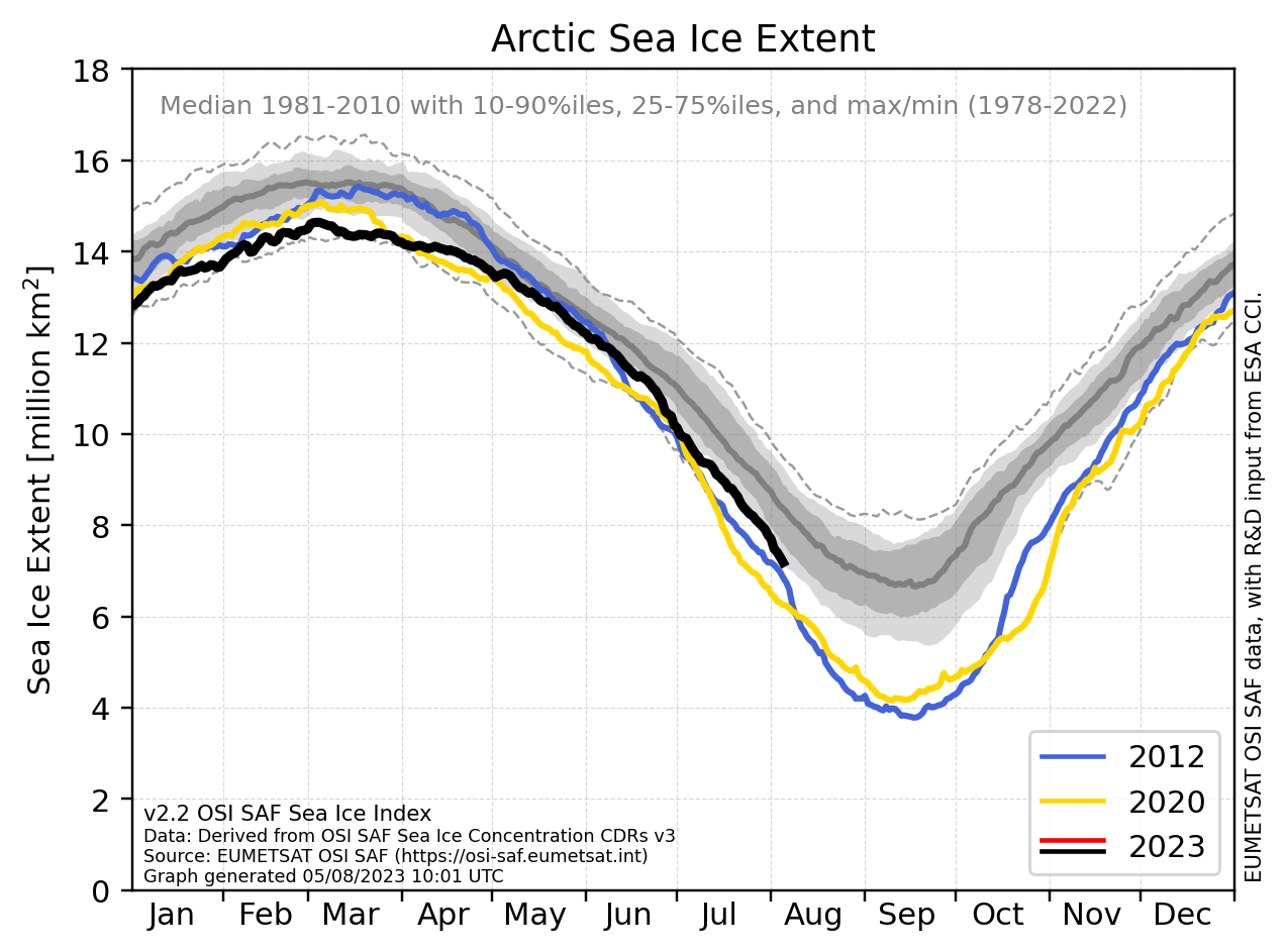
What possible reason could Mr. Heller have for not showing his band of merry (mostly) men the most recent data. If one were inclined to be charitable, perhaps one might conclude that he simply does not know of its existence?
The alternative explanation, however, doesn’t bear thinking about!
Signe Aaboe from MET Norway made a very interesting announcement on XTwitter earlier today, especially given all the circumstances!
Signe also mentioned “A new interactive plotting tool“, which I did of course experiment with at the earliest opportunity. Here’s the result of my very first test:
If anybody can ascertain the period during which the alleged “Arctic sea ice extent is the highest in seventeen years” event occurred please let me know as soon as humanly possible in the space provided for that purpose below.
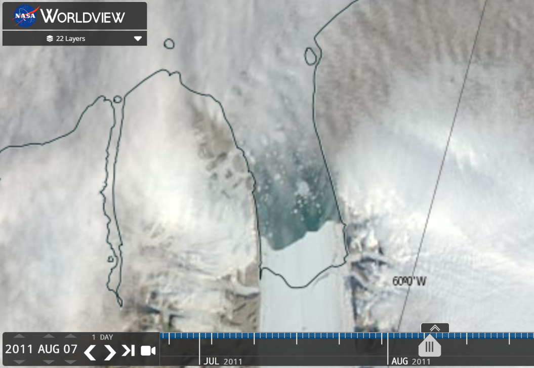
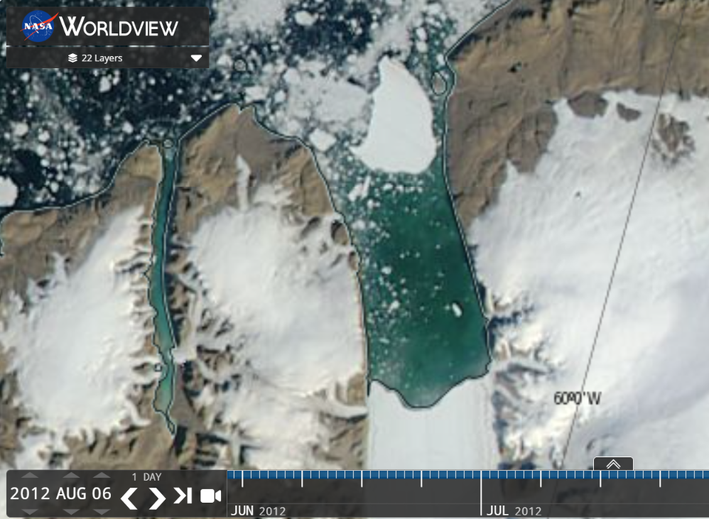
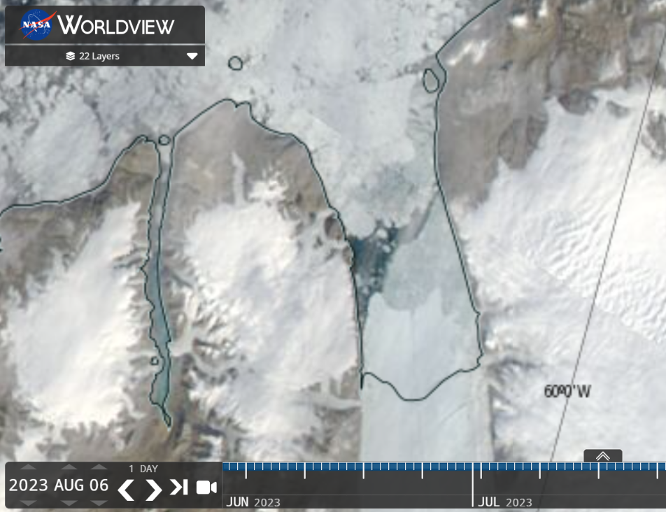
[Edit – August 9th]Since Tony Heller’s cherry picked sea ice extent (mis)information no longer “supports” his agenda he’s rolling out another old favourite. Would you care to guess which of these 3 MODIS images of Petermann Glacier he neglected to include in his recent Xweet about glacier tongues?
“Steve”/Tony is taking a different Arctic tack over on XTwitter today. Hence:
Here’s @TonyClimate demonstrating yet again that either
— Snow White (@GreatWhiteCon) August 14, 2023
1) He has no understanding of all things #Arctic, or
2) He understands well enough, but he pulls the wool over the eyes of his flock of faithful followers:https://t.co/T2WRVu842F
Which is it Tony? #ClimateBrawl #BoMMM https://t.co/MCDmHCNXXt
Here’s the subsequent evidence of Tony’s ineptitude/venality (delete as appropriate).
First of all here is Tony’s Arctic sea ice extent metric du jour, which is now down to 8th lowest for the date in the satellite era:
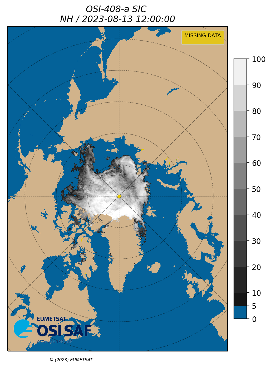
Today’s OSI SAF and AWI Arctic sea ice concentration maps show that the remaining sea ice in the East Siberian Sea does not in fact “extend all the way to the Siberian coast”. It’s concentration is also a lot less than 100% throughout almost the entire ESS:
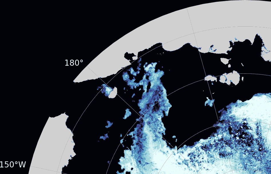
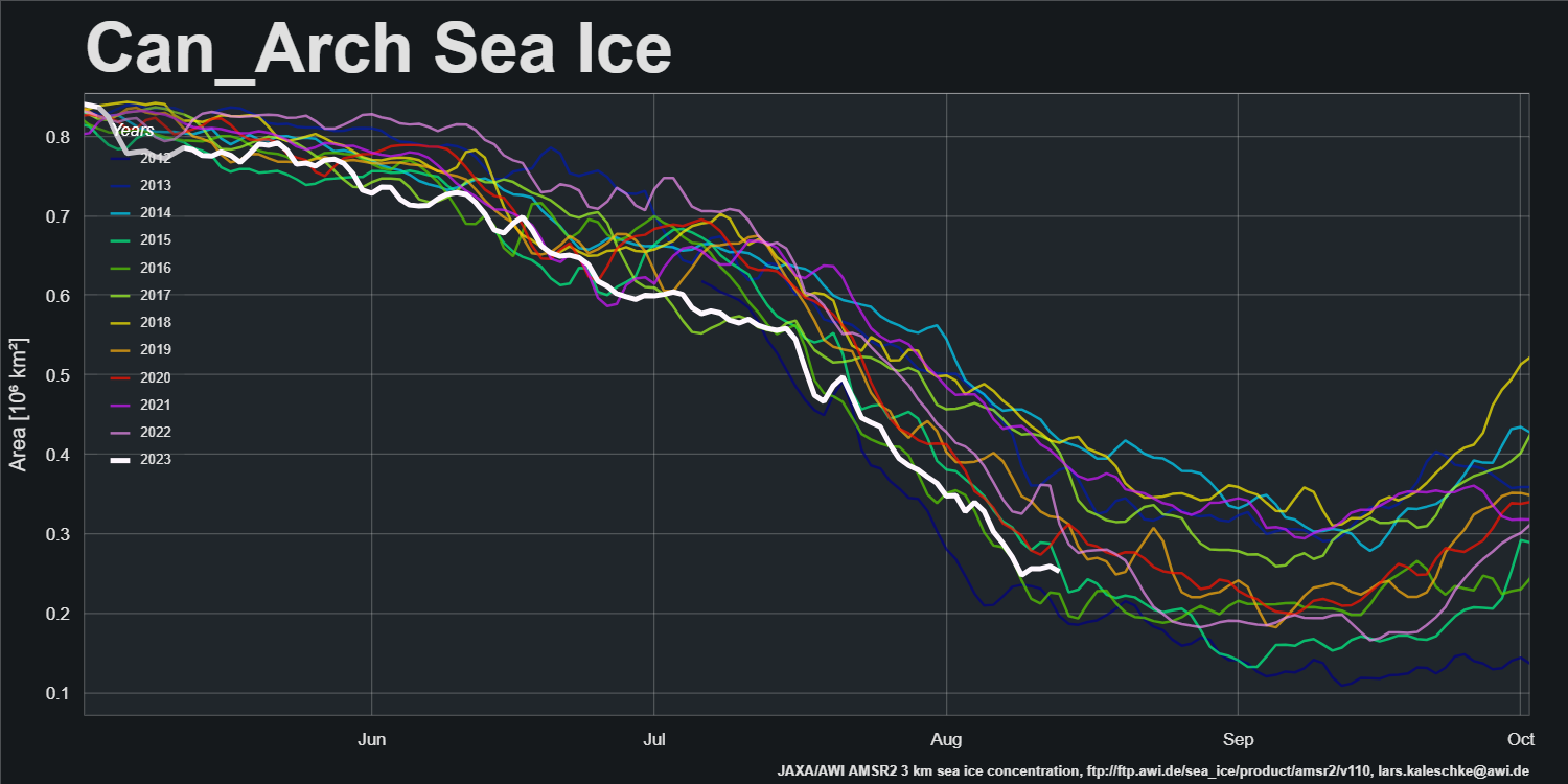
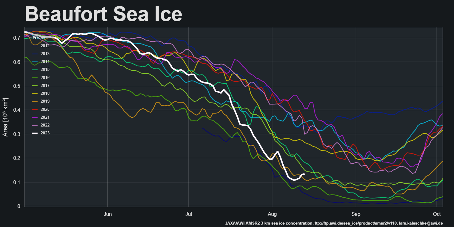
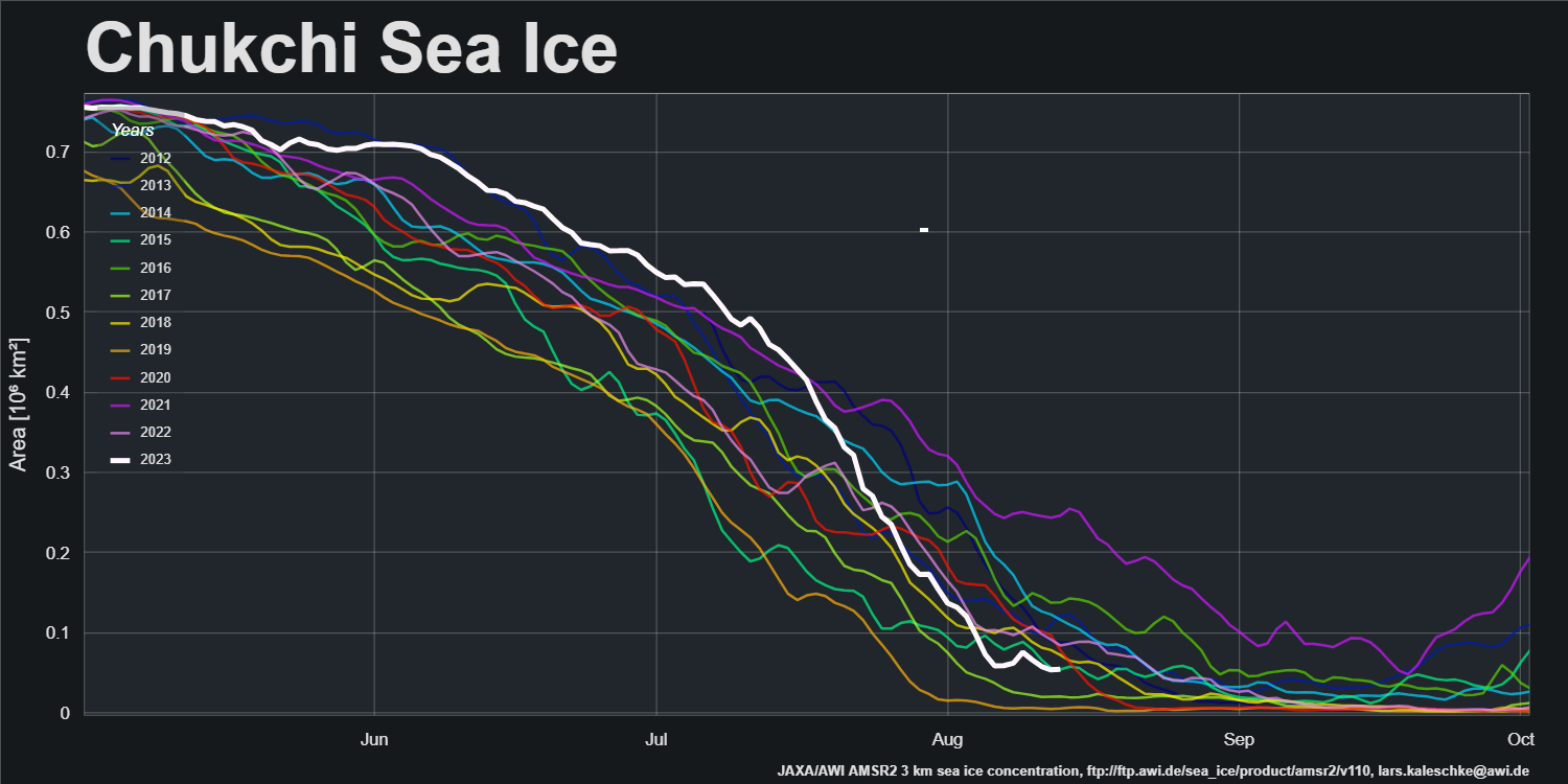
Sea ice area in the Chukchi and Beaufort Seas, plus the Canadian Arctic Archipelago, are near satellite era lows for the date:
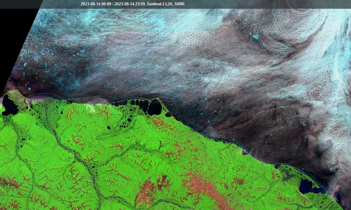
Here’s a rather hazy close up look at all the sea ice that “extends all the way to the Siberian coast” on August 14th, courtesy of Sentinel 2:
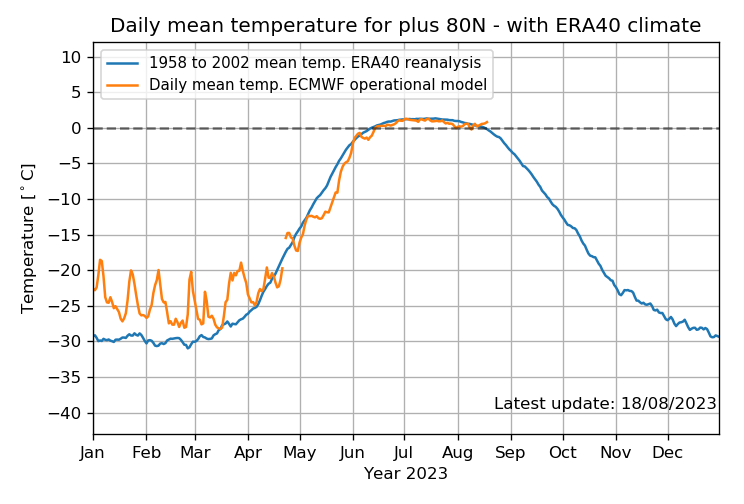
It also seems as though summer isn’t over at the North Pole yet:
Now Malcolm Roberts is “quoting” “Steve”/Tony’s Petermann poppycock with approval, hence:
Meanwhile Santa continues to enjoy the Indian summer at the “North Pole”:
Watch this space!
Who’d’ve thunk it?
“Steve Goddard” is evidently a faithful follower of “Snow White”!
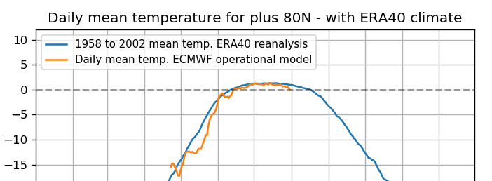
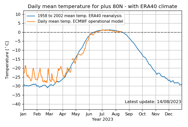
On the idiots using May 2023 Temperature Data to say AGW is not happening.
Have a look at Zack Labes tabulation on Arctic Temperatures North of 80.
Like one month’s very low temperature matters against 500?
Tony Heller keeps doubling down,
“Snow White” finally “persuaded” him to use “her” as one of his “useful idiots”:
“Snow” has fallen head over heels in love with “Steve”:
https://twitter.com/GreatWhiteCon/status/1687068843502379008
Meanwhile Malcolm is cut’n’pasting “Steve’s” implementation of “Snow’s” Arctic sea ice disinformation template #1:
This is a ‘Strawman’ argument, Jim. Milloy was careful to say ‘snow accumulation’, which is exactly what the SMB figures show, so the DMI disclaimer is irrelevant. As for TMB, perhaps you could point me to that graph. Other than some measures of stream flow, I’ve never seen a full measurement of the net annual addition or subtraction of Greenland ice.
Sorry, but IMHO, Snow White us manufacturing a controversy here…
Evenin’ Taylor (UTC),
Did you blink and miss the bit where Mr. Milloy mentioned:
Where was he hiding the “Arctic” and “North Atlantic” temperature data? Perhaps you could pop over to XTwitter and deliver those numbers to Steve and his flock of faithful followers?
Sorry for the delay in responding, Jim (traveling), but your response was off topic of my post. The question was about SMB vs. TMB. I don’t know where he’s getting North Atlantic SST, although there is gridded data from RSS and UAH, as well as random coverage from Argo. However, that’s hardly relevant to Greenland’s ice cap. As you point out, DMI shows a big melt spike in July, but that comes after an above average SMB growth, so I’m not sure how that affects overall Greenland ice volume. That’s why I asked about TMB. If you have a reference to that metric, it would be appreciated.
The obvious place to look for DMI fans (like Mr. Heller, currently at least) is:
http://polarportal.dk/en/greenland/mass-and-height-change/
However the most recent graph appears to date from August 2021:
If you don’t mind additional work, (unlike Mr. Heller!) “Greenland ice sheet mass balance from 1840 through next week” is available via:
https://doi.org/10.22008/FK2/OHI23Z
Jim can you explain how that “mean temperature” graph is being misused? He’s arguing it is “colder” than the mean and that’s what the graph shows…. I guess I am missing what the big deal is. haha.
Hi Drew,
The DMI one you mean?
If so, in my first example above Mr. Heller asserts that “The melt season at both the North Pole and Greenland started late and are wrapping up very early.”
Re the North Pole, what has that DMI graph got to do with “the melt season at… the North Pole”:
Re Greenland, see “Snow White’s” response to the other Steve:
Does that help at all?
that helps a ton! thanks Jim!
The numbers are off the hook…