2021 has been and gone, so first of all may I wish all our readers a very Happy New Year.
Sadly it’s not been a happy start to 2022 for the inhabitants of Boulder, Colorado, home of the National Snow and Ice Data Center. According to the Denver Post:
The Marshall fire destroyed an estimated 991 homes in Boulder County, damaged 127 more and may have killed three people, Sheriff Joe Pelle said Saturday afternoon.
Pelle added that the cause of the fire — the most damaging in Colorado history — remains under investigation, and confirmed that sheriff’s officials have served a search warrant on at least one property based on a tip.
Currently, two people are missing in Superior and another is missing in the Marshall area, Pelle said. All three are feared dead as each of their homes was lost to the fire, the sheriff said…
So far, officials say Thursday’s wildfire — exacerbated by 100-mph winds — burned more than 6,000 acres across Boulder County.
The fire destroyed 553 homes in Louisville, damaging 45, Pelle said Saturday. It also destroyed 332 homes in Superior, damaging 60 in that town, and destroyed 106 homes in unincorporated Boulder County, damaging 22…
Officials first thought downed power lines sparked the fire, but have been unable to confirm its origin. The abnormally dry conditions led to what is now the most destructive wildfire in Colorado history.
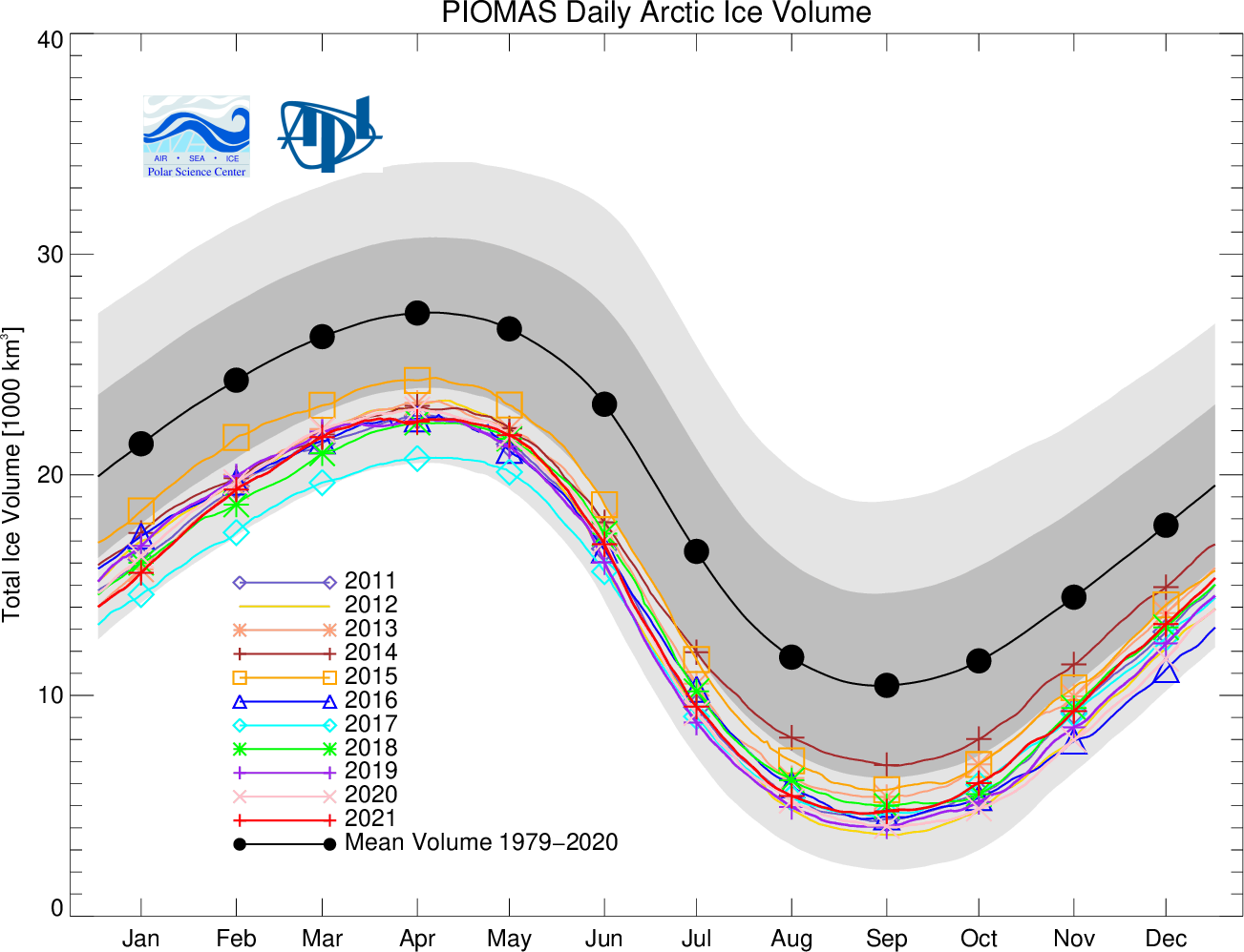
Moving north to examine snow and ice data from the Arctic, let’s start 2022 in traditional fashion with a look at high resolution AMSR2 area and extent:
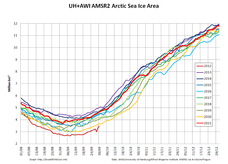
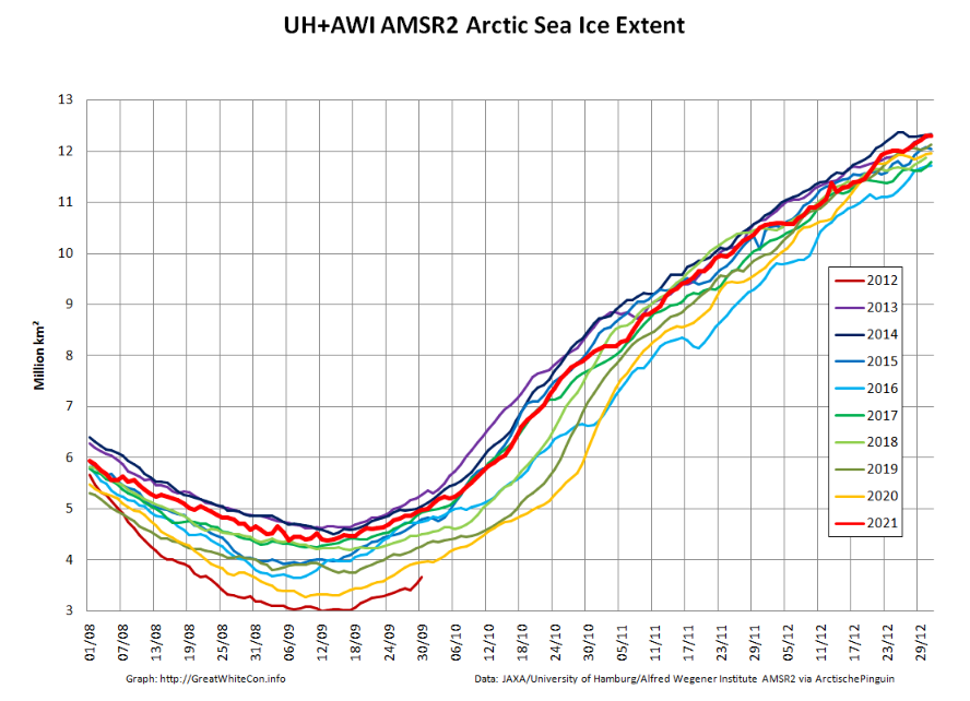
Both metrics are now near the upper boundary of the last 10 years’ range. The AMSR2 instrument wasn’t launched into orbit until summer 2012, but according to both JAXA and NSIDC data extent on January 1st 2022 is almost identical to the same date in 2012. Regular readers will recall that year went on to produce the lowest annual minimum extent in the satellite era despite recording the highest annual maximum in the decade of the 2010s:
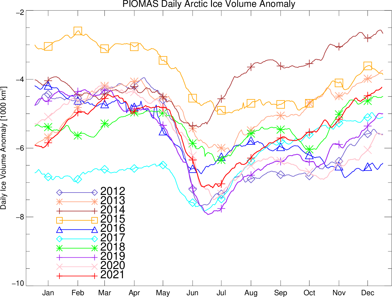
Note that sea ice volume tells a rather different story. Here’s the latest AWI CryoSat-2/SMOS volume graph:

The current near real time data is likely to be revised upwards slightly when the final reanalysis is complete, but even so volume seems likely to remain in the lower half of the recent range at the end of 2021.
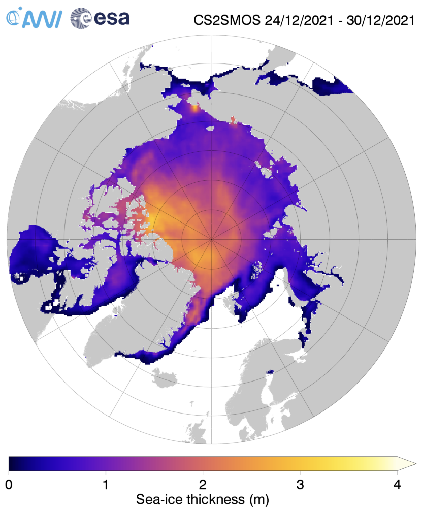
Here too is the AWI Arctic sea ice thickness map:
together with the thickness anomaly map from the Finnish Meteorological Institute:
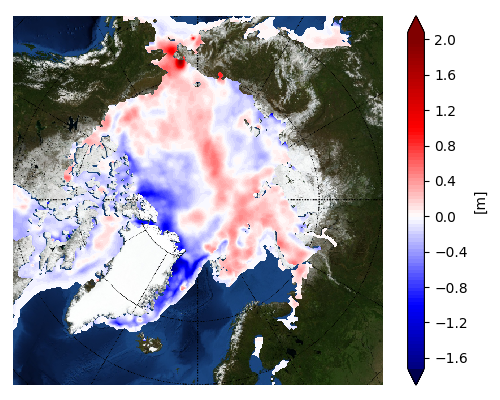
Once again the ice in the so called “last ice area” north of Greenland and Ellesmere Island is thinner than usual, as is the ice in the Fram Strait and East Greenland Sea.
[Edit – January 11th]As has been pointed out below, the Polar Science Center has now released the PIOMAS volume data for December 2021:
Average Arctic sea ice volume in December 2021 was 13,300 km3. This value is the 9th lowest on record for December, about 2100 km3 above the record set in 2016. Monthly ice volume was 51% below the maximum in 1979 and 37% below the mean value for 1979-2020. Average December 2021 ice volume was 1.2 standard deviations above the 1979-2020 trend line.
November and December of 2021 saw relative rapid ice growth for recent years, bringing the mean ice thickness (above 15 cm thickness) towards the thicker end of the recent values.
The ice thickness anomaly map for December 2021 relative to 2011-2020 continues to show anomalies divided into positive and a negative halves with areas of positive anomalies increasing since the two prior months and stretching from the Beaufort, over the pole and into the Barents. Negative anomalies stretching from Fram Strait, North of Greenland and along the Canadian Archipelago. Areas North of Greenland again feature low ice thickness as in prior years.

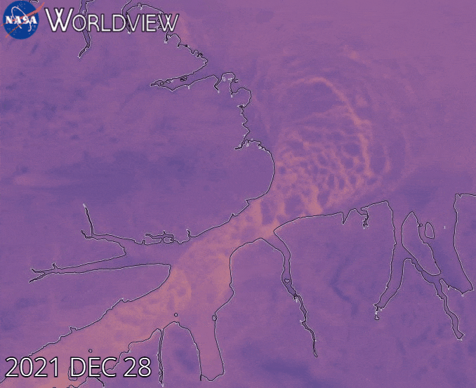
Note that as revealed by this animation from NASA Worldview the sea ice in the Lincoln Sea is currently still breaking up and being exported from the Central Arctic via the Nares Strait:
The Atlantic side of the Arctic Ocean has been taking a bit of a battering from what I shall henceforth refer to as the Great Arctic Winter Cyclone of 2022, or GAWC 2022 for short. Unless there’s an even deeper one later in the year of course!
According to the Canadian Meteorological Centre the storm achieved a minimum Mean Sea Level Pressure of 937 hPa at 12 noon UTC yesterday:
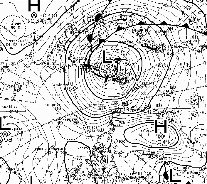
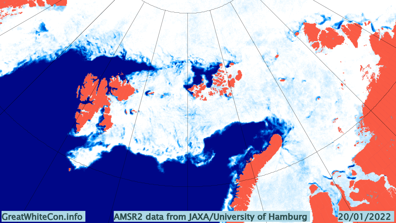
Here are the visible effects of the storm on the sea ice in the area so far, now updated to January 25th:
Watch this space!
Maybe I’m reading your comment about NSIDC data incorrectly, Jim, but today’s chart shows Jan 1 sea ice well into the interdecile range vs. 2012-13 well outside that range. Are we looking at different graphs?
Also, are you projecting/predicting extent similar to 2012 this year? I might want to wager a ‘wee dram’ on that…
[Image replaced with a “static” version – Mod]
The NSIDC’s “Charctic” graph (which I linked to!) currently shows this:
Your graph shows a comparison with January 1st 2013.
I am pointing out that:
1) There is low correlation between the March maximum and the subsequent September minimum, hence:
2) A new satellite era record minimum in September 2022 cannot be ruled out.
Your “wee dram” will have to wait!
Jim, agree completely about lack of correlation about min and max extents. However, some would say that more heat lost by open water in the fall seems to lead to faster freeze-up in the winter, although I haven’t personally done the analysis.
On a different note, I see that NSIDC’s latest commentary has extent at the ‘thirteenth lowest’, not a particularly dramatic number, and if ice growth stays within the interdecile range, then my 15M k^2 prediction is looking stronger. Care to wager another ‘dram’?
Yamal and Pugnax have successfully negotiated the Vilkitsky Strait heading west:
Jim,
You seem to think sea ice volume is telling a different story
I would be interested in your comments on the PIOMAS November review
Figure 1 shows a clear movement from lower quartile to upper quartile terrirtory since 2010.
Figure 8 is even referred to in the text. “The November time series (Fig 8) for both data sets have no apparent trend over the past 11 years.”
This chart looks very similar to the no trend chart provided by Ray in your previous post. I too am awaiting 2022 with interest. Will the “no apparent trend” continue OR will we see 2012 once again?
Happy New Year Neil,
PIOMAS sea ice volume, and particularly their thickness map, does tell a different story. As indeed does the AWI “measured” thickness data. I quoted the article you refer to in my December review. Just above your quote is this:
Since you mention Ray Bates see also:
https://GreatWhiteCon.info/2021/12/the-gwpf-boldly-go-where-steve-koonin-feared-to-tread/#SlowTransition
and regarding anomalously thin ice also:
https://GreatWhiteCon.info/2021/10/the-last-ice-area-in-the-arctic/
Thanks for your comments, Jim.
The difference of opinion lies in whether we think the glass is half full or half empty.
Yes, the sea ice extent and thickness is at a very low ebb. It does however seem to have stabalized at this low level over the past 10 years.
I watch and wait with interest to see what will happen over the next 10 years.
In particular when the AMO starts to fall.
Volume has stabilized over the past 11 years as well, Neil, per the recent update from PIOMAS (December summary). Same was true for November volume (no apparent trend for 11 years). From a climatological standpoint, it will take a few more years of these pauses to be significant, but the current situation is not as alarming as some would have it. Time will tell.
I am a simple person not a scientist. I have noted all this talk of ice melting in the north and south poles. But don’t forget ice expansion in the South Pole around the Ross sea. As a simple person I understand that ice melts faster than it freezes. So if the top of the planet tilts on its rotating axis even a degree. Say the top of the planet tilts towards the sun. The bottom of the planet tilts away. So the top starts to melt fast. Some of the South Pole would move into a warmer belt and also melt. But say the Ross sea moved into the colder more shadowed area it would freeze more. Over time it would expand (as it is). Other parts of the planet would have increased temperature and more extreme climates. But the planet overtime would settle and these extremes will become less severe. The ice mass of the North and South will return to previous levels. Albeit the extremities will have shifted due to this earth tilt. This is just my simple non scientific analysis of the current climate crisis. I’m sure some people will laugh but others will probably try a computerised simulation to test the theory and see that this simple person is correct.
Darryl idea is not too far from the truth. Indeed to think Earth movement behaves in such intricate way consumes such imagination that lacks in more sophisticated people (in the bad, philosophical sense) such as Michael Mann.
The fact i am a moleular biologist who worked for some time with genetics and evolution amounts to about the same thing as nothing, which rhymes more with the notion of earth being but a grain of sand in an enormous beach alike our universe, or human being but a small cog in Gaia (which is not obviously a living entity itself).
Schrödinger would say there sits by the side of the judges a non jurisprudent assessor, namely our little self which finds it distasteful to pass for an automaton (and being unable to change environment).
Had I a different body and were an alien scientist scrutinising earth, i would not be able to see much of a difference between a colony of ants and human kind in many aspects of ecology.. European colonisation has happened and there is no single place on earth europeans have not reached in the so wrongly called Anthropocene, we are essentially looking back at the damage or disturbance already done by them and Recovery or stabilisation phase of the environment, not the other way about.
How could we call these automatons bad or good? They are just a function of and respond to their necessity or need, that is all.
If your need is to understand environment and climate better, that is what will get you moving and studying new things. You can choose how to go and get some water to drink, but you cannot choose not to drink water…
Darryl, you know what happened to Whitney Houston right?!!?
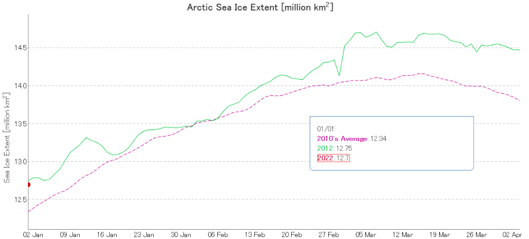
The Arctic Sea Ice Extent seems to have recovered through 2021 into 2022
The position of the sea ice extent above the minimum has risen from 7th lowest in January 2021 to 16th lowest in January 2022.
Last 6 months since August 2021 all exceeded the average for the decade of 2010’s
The January data shown includes current situation for Jan.10th 2022. Will the trend continue through 2022?
It is worth noting that the sea ice extent in January 2012 was 89.111 Sq.Km GREATER than January 2022, yet it still resulted in the lowest ever September minimum
Jan 31st.2021 Postition 7th.lowest +79,452 Sq.Km. above 2010’s average.
Jan.10th.2022 Position 16th.lowest +372,063 Sq.Km. above 2010’s average
Yeh: i got parents that got free education aswell mate! Cheers lol…
“The current situation is not as alarming as some would have it.”
Not strictly about the Arctic in January 2022 of course, but here is the latest “Keeling Curve”:
Here is an introduction to the physics of the so called “Greenhouse Effect”:
https://GreatWhiteCon.info/resources/greenhouse-effect-explanations/
A 11 AM Eastern time today NASA & NOAA are due to announce “2021 Global Temperatures”. What do you suppose they will say, bearing in mind that 2021 has been a La Niña year?
https://www.climate.gov/news-features/blogs/enso/december-2021-la-niña-update-visual-aids
Some of the slides:
Interesting that the rapid rise in anomalies between 1910s and 1940s is almost the same as from 1980’s to 2010s, even though CO2 rose less. If you have a reference paper explaining that rise, I might be able to understand the current rise better.
We also know, based on contemporaneous reports, that the rise was much more dramatic in the continental US.
Again, as the COVID wary and our Eastern Bloc friends were wont to say ‘papers, please’.
Here’s a summary of “the current rise” for you, even though I presume you are not a “policymaker”?
There’s a very long list of “papers” here:
https://www.ipcc.ch/report/sixth-assessment-report-working-group-i/
Jim, while I appreciate the compendium of papers, what I specifically asked for was any papers which explained the global temperature rise during the period 1910-1940, which I pointed out is similar in duration and magnitude to the current period 1990-2020. Since the latter interval is apparently attributed to the rise in CO2, I remain curious about the attribution of the former warming interval. Those are the papers for which I was looking. If you don’t know of any, that’s fine, but I didn’t want to dig through your compendium if it’s not to be found there.
I am always interested in depictions of the Keeling Curve, but perhaps not for the reason you might think. If the boys with the ice core measurements are correct and CO2 lags temperature increases by 800-900 years, the Keeling Curve is exactly what we would expect as a consequence of the Medieval Warming Period roughly that time ago.
There are some recent papers (measuring carbon isotope ratios) that lend some support to that conjecture. And of course, we’re due for another warming period anyway, although the speculation is that this one we’re in will be less extreme than the MWP, given the trend of those events over the last 6,000 years or so.
I just checked the date, and it’s not April 1st yet. Hence I am forced to assume that you have scraped the bottom out of the “skeptical” barrel.
You are claiming that the shape of the Keeling Curve is “a consequence of the Medieval Warming Period”?
And that the warming period we’re in “will be less extreme than the MWP”?
Have I got that straight?
Papers please.
Jim,
Here are a few papers on the CO2 “lag”. Most are concerning the lag noticed at major intervals (start of interglacials, etc.). How that sorts out during cycles in interglacials is less clear, but the timing of the current CO2 increase is pretty close to the observed lags. Unfortunately, it’s much more difficult to prove that with ice core data about recent intervals.
There are many examples of studies finding lags, those include:
1. Indermühle et al. (GRL, vol. 27, p. 735, 2000), who find that CO2 lags behind the temperature by 1200±700 years, using Antarctic ice-cores between 60 and 20 kyr before present (see figure).
2. Fischer et al. (Science, vol 283, p. 1712, 1999) reported a time lag 600±400 yr during early de-glacial changes in the last 3 glacial–interglacial transitions.
3. Siegenthaler et al. (Science, vol. 310, p. 1313, 2005) find a best lag of 1900 years in the Antarctic data.
4. Monnin et al. (Science vol 291, 112, 2001) find that the start of the CO2 increase in the beginning of the last interglacial lagged the start of the temperature increase by 800 years.
As for whether this warming period (un-named to my knowledge yet) is going to be warmer than the MWP, the jury is out. Some claim that it is already warmer, but they use temp measurements that are very discrete (one year increments) vs. the smoothed measurements (guesses really) we have for the MWP. What we do have is hard evidence of extreme warming in some areas (e.g. the Vikings in Greenland), where clearly it was warmer. We also have the famous photos of tree stumps emerging from melting glaciers. So, while I can’t prove it was very much warmer globally during the MWP (or Roman or Minoan for that matter), there seems to be plenty of evidence that it wasn’t colder…
It seems my somewhat surreal visualisation of carbon dioxide bubbling out of expanding oceans escaped you?
What do your assorted references have to say about the magnitude of the CO₂ increases inferred from ice cores? Here’s a clue for you: “Tiny Bubbles Tell All”
Can you spot the difference between then and now?
Further to this, I note with some interest this NOAA graph of CO2 rise over the last one and a half centuries. Note that CDO2 continues to rise in the 30s, despite the 30% global drop in CO2 emissions due to the Great Depression, a world-wide phenomenon. Clearly there are some leads and lags that have little to do with man-made emissions.
http://a.abcnews.go.com/images/Technology/co2_concentration_graf_wmain.jpg
Perhaps you and/or Matt could look through my “compendium of papers” op cit. and come up with one or more that offers a physical (or chemical) explanation for the alleged dependence of 20th century levels of atmospheric carbon dioxide on temperatures during the so called “Medieval Warming Period”?
See also Neukom et al. (2019): “No evidence for globally coherent warm and cold periods over the preindustrial Common Era”
The last graph is intriguing because it would look like lots of recovery years since 2012, which is a good thing.
They’ve been talking about the Yenisei River and permafrost melt and it would seem we’ve seen this over the years on sattelite breaking up the Kara Sea.
So I suppose that ESS/Laptev/Kara side of the Arctic is the so called canary in the coal mine!
Jim’s gone quiet
Hello Matt,
Surely you must have noticed that this isn’t Twitter? “Random images” require links and explanations here.
How did your recent global surface temperature predictions work out BTW?
Regular readers may recall that the liquified natural gas tanker Vladimir Vize successfully negotiated the Northern Sea Route to the Far East last month.
Vladimir is currently making the return journey to Sabetta, and has now reached the East Siberian Sea:
Jim, I have been following the NSIDC website for about 10 years or so. I notice when the ice starts to grow at a very high rate, we always see a dramatic downward turn at some point that decreases the monthly totals. This usually happens in conjunction with numerous missing data points all over the map. But when the NSIDC gives their monthly summary, they conveniently leave out the missing data information and add up the loss data as though the information is entirely accurate. It is deceiving because these massive downward turns during the middle of winter have a negative outcome to the bottom line. You can see the current downward turn in February of 2022 during a very cold arctic winter. I want to (trust the data) but the collection of data gives the impression that data is being manipulated and the monthly summaries or the verbiage they use in monthly summaries definitely indicates a bias.
Hi Gerald,
My apologies for the delay in getting back to you, but I find myself a few hours into a projected 2 day “blackout” thanks to the recent passage of Storm Eunice across South West England.
If you’re somewhat dubious why don’t you try what I first did many moons ago. Generate your own metrics from the raw(ish) satellite data?
Or do you think NASA, ESA, JAXA et al. all generate many terabytes of synthetic or “manipulated” data every day?
Jim, this is a good recommendation.
I thought you’d like it!
See also a recently published academic journal article on GAWC 2022:
https://GreatWhiteCon.info/2022/12/facts-about-the-arctic-in-december-2022/#Dec-04