Tag Archives: WRIT

Steve Koonin’s Unsettled History of US Temperature

Regular readers will no doubt have noticed by now that here at the Great White Con we are publishing a series of reviews of Steven E. Koonin‘s new book “Unsettled”? Today we move on to the topic of Land-Surface Air Temperature (LSAT for short). Here is an extract from the very first page of the book:

Yes, it’s true that the globe is warming, and that humans are exerting a warming influence upon it. But beyond that—to paraphrase the classic movie The Princess Bride: “I do not think ‘The Science’ says what you think it says.”

For example, both the research literature and government reports that summarize and assess the state of climate science say clearly that heat waves in the US are now no more common than they were in 1900, and that the warmest temperatures in the US have not risen in the past fifty years. When I tell people this, most are incredulous. Some gasp. And some get downright hostile.

Here once again is an extract from page 23 of the Kindle edition of Steve’s book:

The [IPCC] assessment reports literally define The Science for non-experts. Given the intensive authoring and review processes, any reader would naturally expect that their assessments and summaries of the research literature are complete, objective, and transparent—the “gold standard.” In my experience, the reports largely do meet that expectation, and so much of the detail in the first part of this book, the science story, is drawn from them.

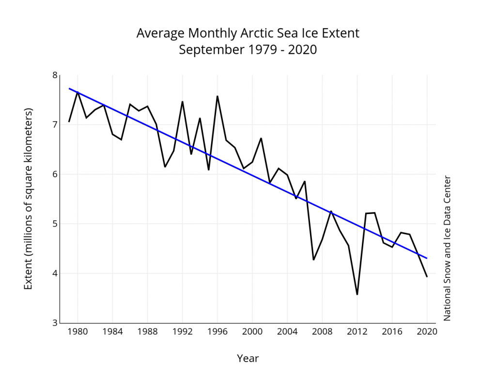
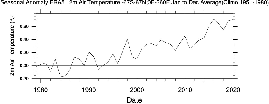
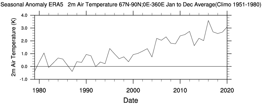
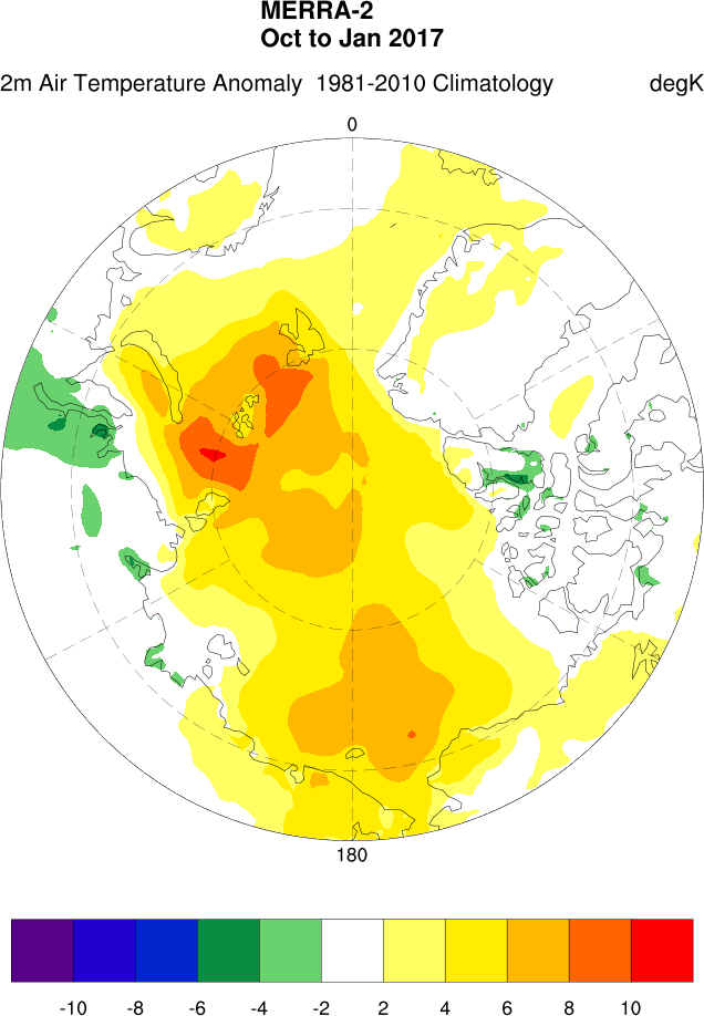
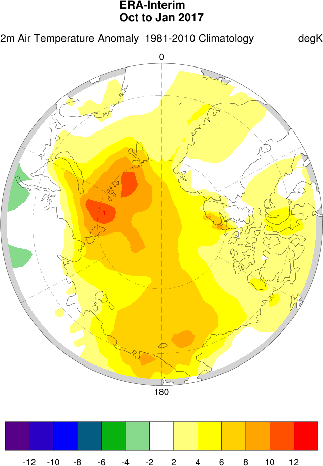
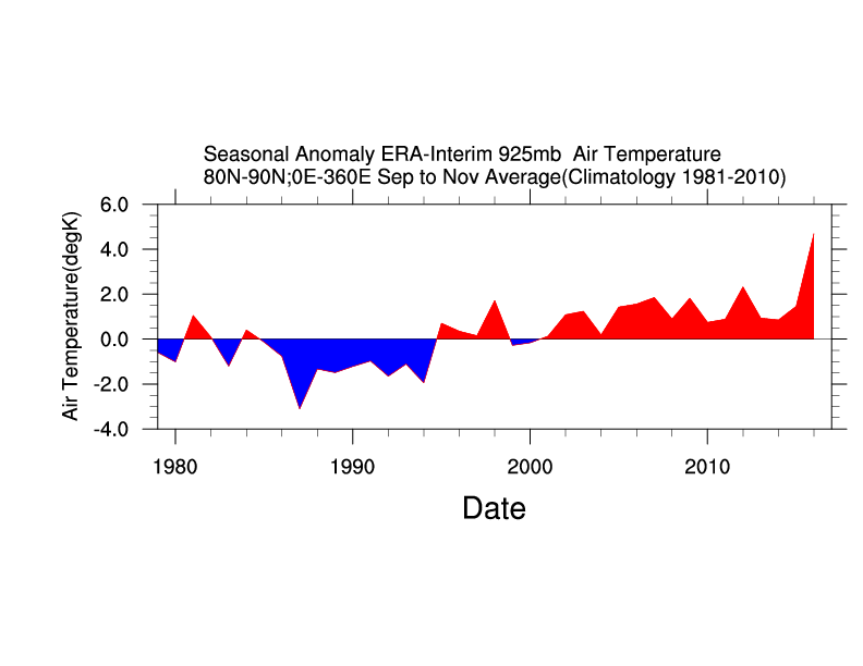
First of all let me remind Steve that the United States does not constitute the entirety of our planet. In particular the Arctic is warming a lot faster than mid latitudes in general and the US in particular. Using WRIT once again to produce our own time series, we can compare and contrast longer term temperature records between the Continental United States and the Arctic (including both land and ocean above the Arctic circle):

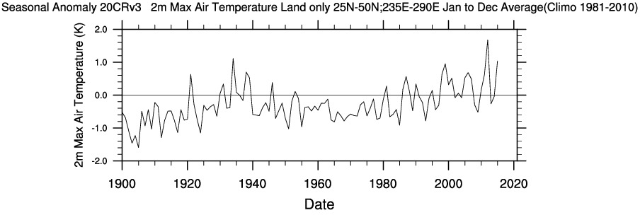
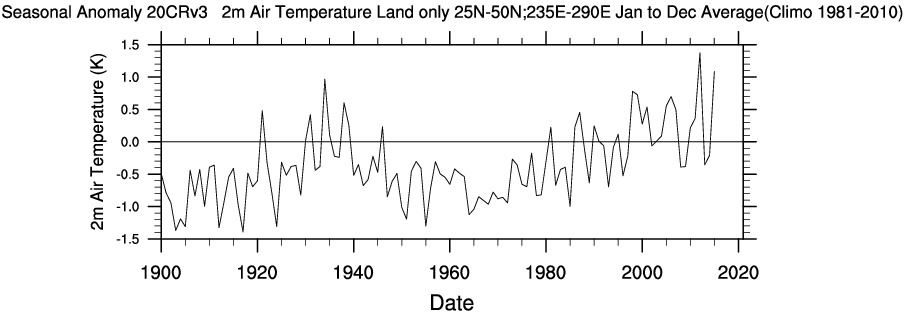
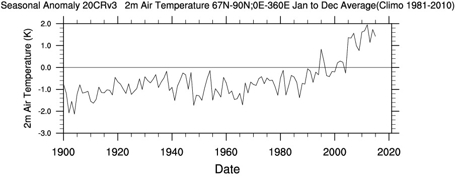
Also note that for some reason Steve makes no mention of US “coolest temperatures” and/or “cold waves” since 1900. I don’t know about you, but the top graph certainly suggest to me that “the warmest temperatures in the US have risen in the past fifty years”.

Let’s see how Steve explains himself. For that we have to wait until Chapter 5, catchily entitled “Hyping the Heat”. Therein no mention is made of recent temperature increases across the Arctic, but we are able to read in the introductory paragraphs that:

We can all agree the globe has gotten warmer over the past several decades. Here’s another summary statement from the IPCC’s AR5:

[S]ince about 1950 it is very likely that the numbers of cold days and nights have decreased and the numbers of warm days and nights have increased . . . there is medium confidence that globally the length and frequency of warm spells, including heat waves, has increased since the middle of the 20th century. (IPCC. AR5 WGI Section 2.6.1.)

Then there is a long discussion about what Steve apparently perceives to be shortcomings in the “The US government’s most recent assessment report, the 2017 Climate Science Special Report (CSSR)”. Steve is apparently well qualified in physics, so presumably he is able to comprehend these equations?

  • US ≠ Global
  • CSSR AR5

For those of you less familiar with the arcane language of mathematics and physics that translates to “the climate of the continental United States is not identical to Arctic climate or typical of the climate of Planet Earth as a whole” and hence “US Governmental climate reports are not necessarily typical of ‘Intergovernmental’ climate assessments”.

Next let’s check what Steve’s “gold standard for The Science” has to say on this topic. According to section 2.6.1 of the Intergovernmental Panel on Climate Change’s fifth Assessment Report, as cited by Steve:

A large amount of evidence continues to support the conclusion that most global land areas analysed have experienced significant warming of both maximum and minimum temperature extremes since about 1950 (Donat et al., 2013c). Changes in the occurrence of cold and warm days (based on daily maximum temperatures) are generally less marked (Figure 2.32):

Figure 2.32 | Trends in annual frequency of extreme temperatures over the period 1951–2010, for (a) cold nights (TN10p), (b) cold days (TX10p), (c) warm nights (TN90p) and (d)
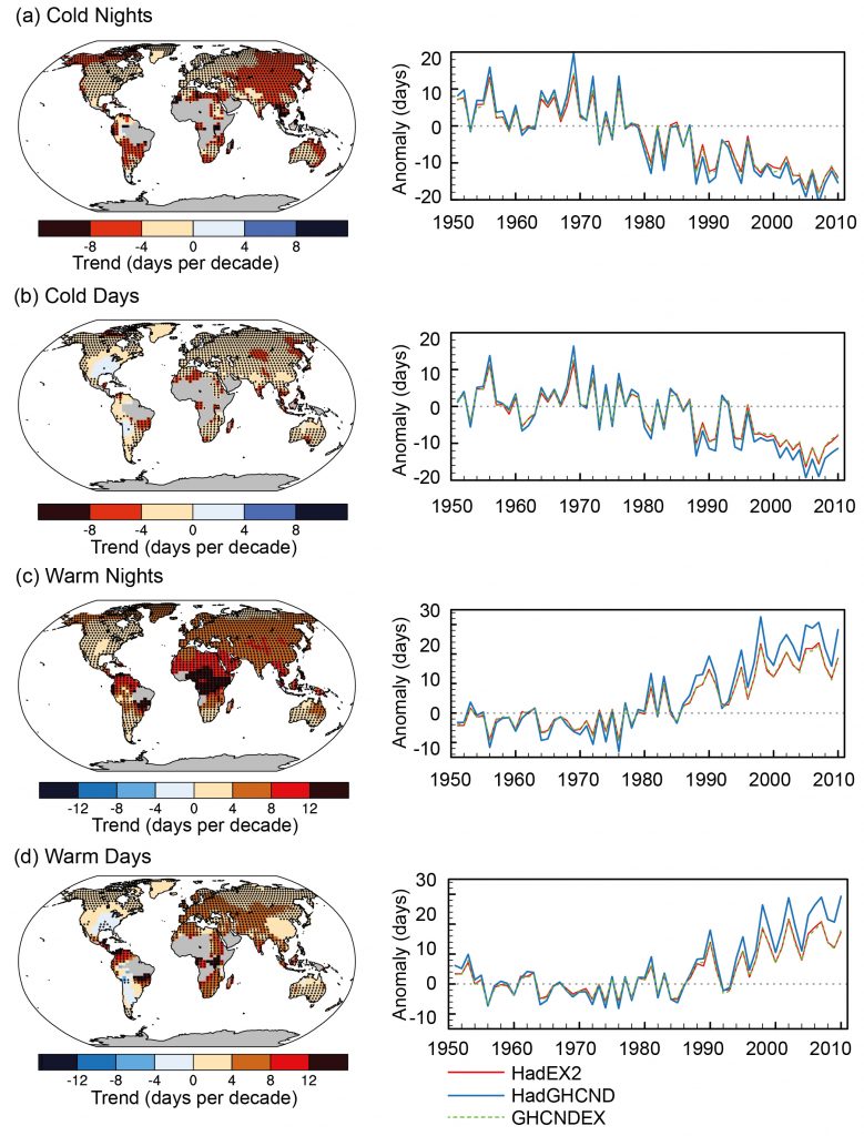
warm days (TX90p) (Box 2.4, Table 1). Trends were calculated only for grid boxes that had at least 40 years of data during this period and where data ended no earlier than 2003.
Grey areas indicate incomplete or missing data. Black plus signs (+) indicate grid boxes where trends are significant (i.e., a trend of zero lies outside the 90% confidence interval).
The data source for trend maps is HadEX2 (Donat et al., 2013c) updated to include the latest version of the European Climate Assessment data set (Klok and Tank, 2009). Beside
each map are the near-global time series of annual anomalies of these indices with respect to 1961–1990 for three global indices data sets: HadEX2 (red); HadGHCND (Caesar et al., 2006; blue) and updated to 2010 and GHCNDEX (Donat et al., 2013a; green). Global averages are only calculated using grid boxes where all three data sets have at least 90%
of data over the time period. Trends are significant (i.e., a trend of zero lies outside the 90% confidence interval) for all the global indices shown.

To paraphrase The Princess Bride once again: “I do not think ‘The Science’ says what Steven E. Koonin says it says in ‘Unsettled’”.

Unsettling, is it not?

Steve Koonin’s Unsettled Arctic Science

Regular readers of this blog will no doubt have realised that way up here in the Great White Con Ivory Towers we concluded many moons ago that Arctic sea ice is the “canary in the climate coal mine”.

Unlike some others we have already mentioned we were not the beneficiaries of a review copy of Steven E. Koonin’s new book, catchily entitled “Unsettled: What Climate Science Tells Us, What It Doesn’t, and Why It Matters”. Hence I was compelled to acquire my own review copy, and have just purchased the electronic version. I eagerly searched the virtual weighty tome for the term “Arctic sea ice”, and you may well be wondering what I discovered?

Nothing. Nada. Zilch. ничего такого. Nic.

I broadened my thus far vain search by removing the “Arctic” specifier, which revealed:

No mention of “sea ice” in the body of the book, merely a reference to the data underlying this graph of northern hemisphere snow cover:

I am forced to an unsettling conclusion. Evidently there are some areas of climate science that Dr. Koonin tells his eager readers nothing whatsoever about. It seems likely that he is also well aware that Arctic sea ice is the canary in the climate coal mine, which is why he has chosen to make no mention of it in his magnum opus.

Here is an informative video which will no doubt not appear in “Unsettled – The Movie”:

[Edit – May 8th]

Having now had time to read some of Steve Koonin’s “Unsettled Climate Science” at greater length I have discovered that it does contain one reference to Arctic sea ice, albeit using non-standard terminology. On page 40 of the Kindle version of the book I read:

Rising temperatures at the surface and in the ocean are not the only indicators of recent warming. The ice on the Arctic Ocean and in mountain glaciers has been in decline, and growing seasons have been lengthening slightly. Satellite observations show that the lower atmosphere is warming as well.

A paragraph I can broadly agree with, but I am compelled to ask why Dr. Koonin does not quantify the “decline of the ice on the Arctic Ocean” anywhere in the book? There are a wide variety of metrics used to quantify the “amount” of sea ice in the Arctic, but here is one readily available for download from the NASA web site. It is hard to believe that a scientist of Dr. Koonin’s experience, particularly one writing about climate change, has never previously come across a similar graph of Arctic sea ice extent:

Arctic sea ice reaches its minimum each September. September Arctic sea ice is now declining at a rate of 13.1 percent per decade, relative to the 1981 to 2010 average. This graph shows the average monthly Arctic sea ice extent each September since 1979, derived from satellite observations.

It seems safe to assume that Dr. Koonin has heard of NASA, since the organisation is mentioned several times in his list of references and once in the body of the book. However it seems that the United States’ National Snow and Ice Data Center (NSIDC for short) is not very visible on his personal radar screen, meriting only a single reference which is to snow rather than ice data.

Here is the NSIDC’s version of the NASA graph above, which includes a handy trend line:

Monthly September ice extent for 1979 to 2020 shows a decline of 13.1 percent per decade.

Nearby Steve has penned another paragraph I can broadly agree with. On page 36 he states:

The warming of the past forty years on large scales hasn’t been uniform over the globe. That’s evident in Figure 1.5, reproduced from the US government’s 2017 CSSR (Climate Science Special Report, described earlier). As you can see, the land is warming more rapidly than the ocean surface, and the high latitudes near the poles are warming faster than the lower latitudes near the equator.

Here is the figure 1.5 referred to above:

Surface temperature change (in °F) for the period 1986–2015 relative to 1901–1960. Changes are generally significant over most land and ocean areas. Changes are not significant in parts of the North Atlantic Ocean, the South Pacific Ocean, and the southeastern United States. There is insufficient data in the Arctic Ocean and Antarctica to compute long-term changes there.

Once again I am compelled to ask some questions. Why not include a map that uses more recent data than 2015? And why not quantify how much faster the “high latitudes near the poles are warming than the lower latitudes near the equator”?

NASA helpfully provide an interface to their data which allows anybody who can click a mouse to produce their own global surface temperature maps. Here is the up to date answer to the first question:

NASA have also produced another informative video, which I suspect will also never make it into “Unsettled – The Movie”:

Another US scientific agency that provides publicly accessible climate data is the National Oceanic and Atmospheric Administration (NOAA for short). The abbreviation is referred to several times in Steve Koonin’s book, but for some reason he never expands the acronym in full. Like NASA they also provide a means to produce your own maps and time series. Albeit with a somewhat more complex user interface, the Web-based Reanalysis Intercomparison Tool (WRIT for short) allows the user to differentiate between different regions of Planet Earth, and hence answer the second question above.

Please compare and contrast the “non polar” temperature time series with the “Arctic” one. Note the change of scale of the X axis, and also the units. Degrees Kelvin rather than degrees Fahrenheit which are seemingly preferred by Dr. Koonin:

To summarise, you don’t need to wait for Steve Koonin to write another book or for the US government to produce another CSSR. Vast amounts of data and a plethora of visualisation tools are freely available to allow you to do your own research regarding a wide variety of climate metrics. Steve neglects to impart that information to his readers as well.

[Edit – May 9th]

As has been alluded to above, in the soon to be shipped hardcover edition of his new book Steve Koonin makes much mention of “snow cover” whilst ignoring “sea ice” entirely. There are also a grand total of 48 reference to the perhaps overly esoteric term “albedo“. On page 84 of the Kindle edition of “Unsettled” we are reliably informed that:

Among the most important things that a model has to get right are “feedbacks.”

Despite that the entire electronic volume makes no mention whatsoever of the phrase “ice-albedo feedback” or any synonym thereof. A brief course teaching the topic has recently been developed as part of the outreach activities of the MOSAiC Arctic drift expedition. Perhaps Dr. Koonin would be well advised to read it at his earliest convenience?

The ice-albedo feedback is an example of a positive feedback loop. A feedback loop is a cycle within a system that increases (positive) or decreases (negative) the effects on that system. In the Arctic, melting sea ice exposes more dark ocean (lower albedo), which in turn absorbs more heat and causes more ice to melt…the cycle continues.

Here’s another explanatory video which will also no doubt never make it into “Unsettled – The Movie”:

Watch this space for further revelations about the gigantic Arctic canary in the room!