A new paper has just been published by the CryoSat-2 team at University College London. The lead author is Rachel Tilling, a PhD student in the Centre for Polar Observation & Modelling at UCL. We’ll get on to the science in due course, but first let’s take a look at how Rachel’s paper has been reported in the Great British mainstream media. In a headline redolent of our old friends at the Mail on Sunday The [headline writer for the] Guardian’s Damian Carrington proclaims that:
Arctic sea ice volume showed strong recovery in 2013
Cooler temperatures revived sea ice levels suggesting a rapid recovery was possible if global warming was curbed, scientists say
Yesterday wasn’t a Sunday, so David Rose was writing in The Spectator instead of The Mail, asking rhetorically:
Of course it was David! We explained that to you back in January!
The Daily Mail Group couldn’t let a juicy headline go begging just because it’s midweek, so an anonymous leader writer came up with this one:
The “Daily Mail Comment” continues:
In a major report last year, the Intergovernmental Panel on Climate Change gave a grave assessment of how man-made global warming was rapidly destroying the Arctic ice cap.
Steadily increasing temperatures had made the pack ice contract by up to 12 per cent between 1979 and 2012, leading to rising sea levels which threatened to swamp coastal regions – not to mention endangering stranded polar bears.
By the middle of the century ‘a nearly ice-free Arctic Ocean’ was likely for a large part of the year, the report predicted.
How interesting then, that the latest analysis of 88million measurements from the European Space Agency’s Cryosat satellite show the northern ice-cap INCREASED by a staggering 41 per cent in 2013 and, despite a modest shortage last year, is bigger than at any time for decades.
After that it prattles on about the “pause”, so for now let’s take a look at the paper that’s got the papers so excited. For some strange reason it’s title makes no mention of a “strong recovery in 2013”, instead describing:
Increased Arctic sea ice volume after anomalously low melting in 2013
Searching the paper for the word “recovery” returns zero results, so you may well be wondering what it actually does say? Here’s a pertinent, albeit brief, extract from the abstract:
Between autumn 2010 and 2012, there was a 14% reduction in Arctic sea ice volume, in keeping with the long-term decline in extent. However, we observe 33% and 25% more ice in autumn 2013 and 2014, respectively, relative to the 2010–2012 seasonal mean, which offset earlier losses. This increase was caused by the retention of thick sea ice northwest of Greenland during 2013 which, in turn, was associated with a 5% drop in the number of days on which melting occurred—conditions more typical of the late 1990s. In contrast, springtime Arctic sea ice volume has remained stable.
Let’s compare that with the Mail’s version shall we? Whilst searching the paper for the word “ice” returns lots of results a search for the word “cap” returns zero results, just like “recovery”. Any investigative journalist (or leader writer) who had investigated Wikipedia would have discovered this:
An ice cap is an ice mass that covers less than 50,000 km² of land area (usually covering a highland area). Masses of ice covering more than 50,000 km² are termed an ice sheet.
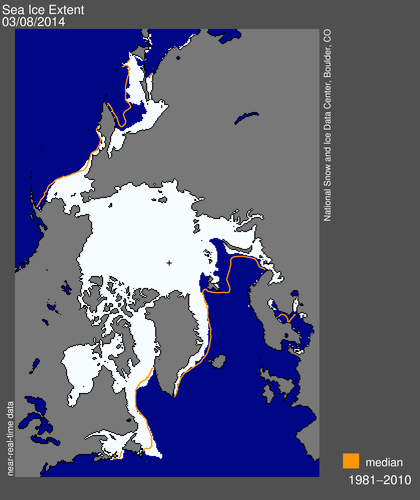
Thus the Arctic Ocean is not covered by an “ice-cap [that] INCREASED by a staggering 41 per cent in 2013” because, as it’s name suggests, it’s an ocean and not a land area. Assuming for the moment that the Mail leader writer is in actual fact referring to sea ice cover in the Arctic, then according to Rachel Tilling’s paper CryoSat-2 “observed 33% more ice in autumn 2013”. Where did the Mail’s “41%” come from then? Their patent pending hot air generator in reverse gear?
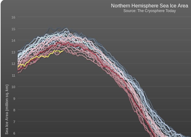
Moving on, the Mail must also have a top secret time machine hidden in the basement of Northcliffe House that will enable their leader writer to travel back and change history, because here once again is Andy Lee Robinson’s graphic visualisation of what’s really been happening to the volume of sea ice in the Arctic over the past few decades, albeit using PIOMAS sized ice cubes rather than the CryoSat-2 flavour:
Needless to say I have already lodged an official complaint about the antics of The Daily Mail’s imaginary time machine. If you would like to do as well then here is the appropriate form to fill in:
http://dailymail.co.uk/readerseditor
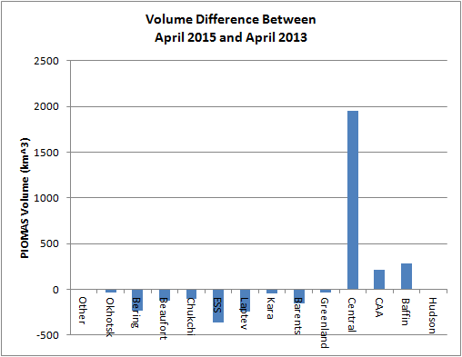
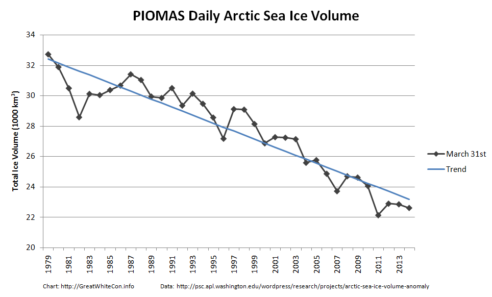
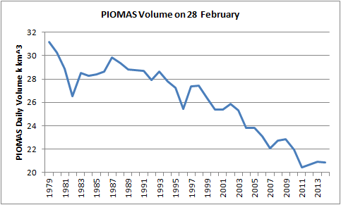
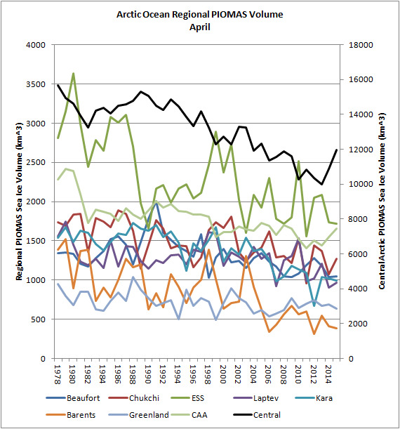
For any IPSO case officers (or Guardian writers) that might be watching please feel free to read all about 41% of nothing, and if you prefer graphs to moving pictures here’s one that shows Arctic sea ice volume in Spring from our PIOMAS regional volume page:
Meanwhile, over on Twitter: