Our title today is inspired by Paul Homewood, who published an article earlier this week entitled “Why Measuring Arctic Ice Trends From 1979 Is Gross Deception” and which begins as follows:
Officially, we only started monitoring Arctic sea ice extents by satellite from 1979. We know however that this is not the whole story. For instance, HH Lamb tells us:
Kukla & Kukla (1974) report that the area of snow and ice, integrated over the year across the Northern Hemisphere, was 12% more in 1973 than in 1967, when the first satellite surveys were made.
I’ve added that link, since Paul neglected to include it. He concludes:
To draw any conclusions about Arctic ice or temperatures, using data that begins at the coldest point of the cycle is utterly worthless and grossly misleading. But this is climate “science” we are talking about.
Since this is Paul Homewood we are talking about I felt compelled to quibble about his grossly misleading assertion:
Here’s the NSIDC’s chart of Arctic sea ice extent anomalies since 1953:
You will no doubt note that it reveals an overall peak in the late 60s, not the late 70s
Them:
I note they don’t show the 1940’s
Us:
Whereas I note that 1969 is a much juicier looking cherry than 1979. Is 1949 better still?
Them:
They did not have satellite monitoring in 1969.
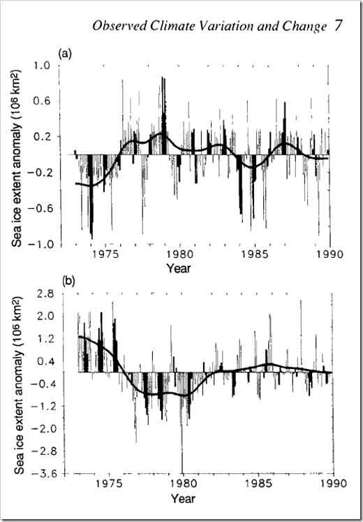
Even though I had already pointed out the error of his ways to him Paul Homewood decided at this juncture to publish another article, this time entitled “Satellite Monitoring Of Arctic Sea Ice Pre 1979“. It began:

 http://www.ipcc.ch/ipccreports/far/wg_I/ipcc_far_wg_I_full_report.pdf
I was pointing out yesterday why it was so inappropriate to deduce trends in Arctic sea ice, using 1979 as the start point. NSIDC, of course, do this supposedly because that is when satellite monitoring began.
Mr Biscuits, however, reminds me that the 1990 IPCC report showed the above graph, with Arctic sea ice extent back to 1972.
Us:
At the risk of repeating myself, what about this remarkable recent narrative?
https://archive.today/ADq4O#selection-1535.0-1547.25
Them:
They did not have satellites in 1953.
Us:
What the NSIDC actually say regarding their dataset that starts in 1978 is:
“This product is designed to provide a consistent time series of sea ice concentrations (the fraction, or percentage, of ocean area covered by sea ice) spanning the coverage of several passive microwave instruments.”
http://nsidc.org/data/nsidc-0051
Note that there is no mention of “when satellite monitoring began”. See also their Nimbus Data Rescue project, which has data going back to 1964:
http://nsidc.org/data/nimbus/data-sets.html
“Consistent time series” are the operative words
Them:
We’ll keep you posted!

Hope this is on topic.
I had a look around Mr Homewood’s blog. He posted this on 18th April:
https://notalotofpeopleknowthat.wordpress.com/2015/04/18/the-rhone-glacier-then-and-now/
The posting compares a photo of the Rhone Glacier from 1950 to one from 2009. He says “They actually look pretty similar.”
A quick search took me to the Swiss glacier monitoring network:
http://glaciology.ethz.ch/messnetz/glaciers/rhone.html
I posted a comment on the Homewode board linking this page and pointed out that the Swiss page included a graph that showed a shortening of the glacier of roughly 400 meters since 1950.
For some reason my post did not get past moderation.
No problem AK. Glaciers and sea ice are undoubtedly related.
I took the liberty of archiving the blog post you refer to, and here’s the graph you refer to:
Getting past
censorship“moderation” on pseudo-skeptical blogs with an on topic message that they don’t want to hear is undoubtedly difficult, unless your name is Barry Woods?!Well, we know the Russians were going to offer up the Arctic in 1969 to world shipping so guessing the ice was at a low.
Hi Richard,
How do we know that? No guessing please. Evidence instead!