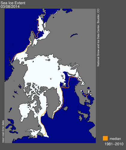
It’s highly probable that whatever metric you choose to use the 2014 Arctic sea ice maximum area and extent will occur this month. Consequently the volume of nonsense propagated by the “skeptics” amongst the “mass media” is increasing also. Earlier today yesterday’s sea ice metrics were published and currently both the Cryosphere Today Arctic sea ice area and NSIDC daily extent are at all time lows for the date. Needless to say that hasn’t stopped the denialosphere prattling on about an “Arctic Ice Recovery” yet again.
First of all, here’s our evidence:
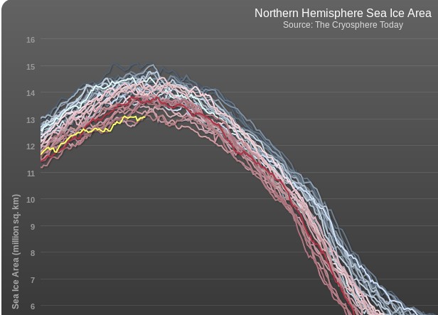
[Graph from Cryosphere Today interactive Arctic sea ice chart]
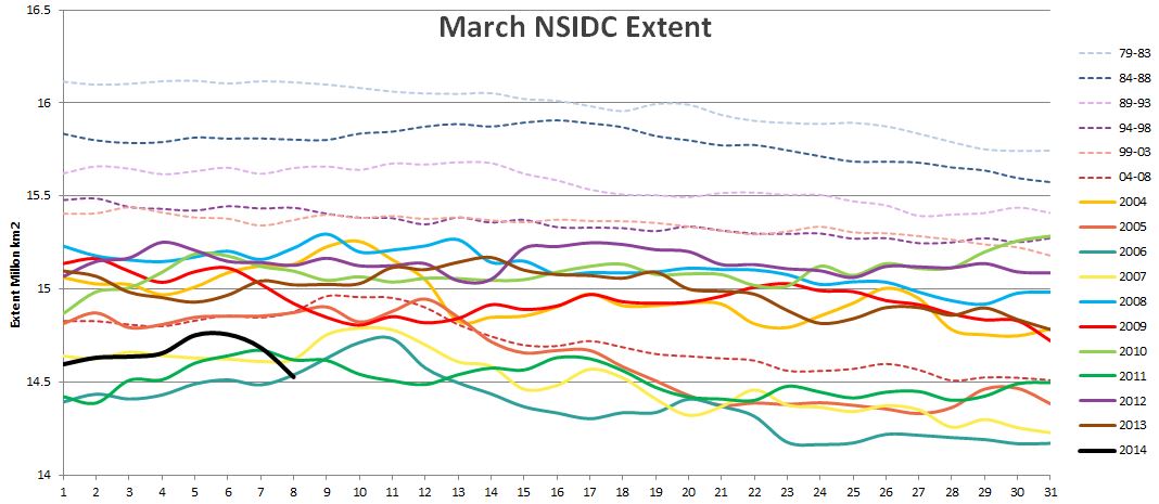
[Graph courtesy of BornFromTheVoid at the Arctic Sea Ice Forum]
Now I couldn’t help but notice that yet another reproduction of the Mail on Sunday’s erroneous graphic first printed at the time of the 2013 minimum appeared on Steven Goddard’s “Real Climate” blog last week. Steve has been using a variety of other graphics in his assorted attempts to persuade his readers that there is in fact an “Arctic Ice Recovery”. Needless to say, we beg to differ!
Them:
Shocking Increase In Arctic Ice Dooms The Planet – How Ice Sheet Grew 533,000 Square Miles in a Year
Us:
Whilst we’re on the subject of cherry picking, it looks a lot like the left hand part of the image dates from August 27th 2012 whereas the right hand part dates from August 15th 2013. If you’re interested in seeing a similar image dating from September 8th 2013, when the original version of the image above was originally published in the Mail on Sunday over here in once Great Britain then please feel free to take a long hard look at:
https://GreatWhiteCon.info/2013/09/santas-secret-summer-swim/
Credible evidence, or not?
Arctic Ice Recovery
The dirty little secret of Arctic sea ice, is that it is controlled by winter winds – not temperature. Over the last few years, the older thicker ice has pushed into the Beaufort Sea where it survives the winter and slows summer melt. Thus the Arctic continues to “recover.”
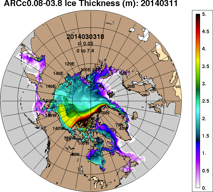
[Image from the 1/12° Arctic Cap HYCOM/CICE/NCODA archive]
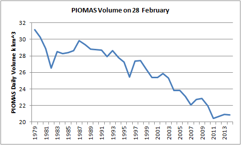
Actually the Arctic doesn’t “continue to recover”. Whilst a bit hard to see on their rather cluttered chart the latest PIOMAS Arctic sea ice volume estimates show that the so called “recovery” had almost completely “melted away” by the end of February:
[Image by Chris Reynolds on the Arctic Sea Ice Blog]
Planet Doomed By Missing Ice Cube In The Barents Sea
Us:
Here’s the thing (well, 2 things actually)
1. Steve’s “map” shows the NSIDC Arctic sea ice extent, but you make no mention of it. Perhaps that’s because that particular metric is currently at the lowest it has ever been on this day of any year since the satellites started attempting to measure it? How on Earth can he possibly characterize that as any sort of “recovery”?
2. Surely the very title of this thread (“ice cube”) implies a volume, does it not? I believe Steve’s an engineer, and so he is presumably well aware that a square and a cube are completely different kettles of fish (metaphorically speaking)? All that being the case, why on Earth would Steve choose to illustrate his point with a “map” of ice extent instead of a “graph” of ice volume?
For the moment we rest our case, but rest assured that there is plenty more where this lot came from!
Shock News! The IJIS IARC-JAXA extent numbers for March 9th have now been published, and they reveal a record low Arctic sea ice extent for the date as well:
So, assuming that Arctic ice extent does recover back to normal within the next couple of years, would that cause you to recant your AGWing faith? If not, what would it take?
Hi Anto,
Thanks for the heads up over at Steve’s place, and thanks for all your comments!
What counts as “normal” when it comes to Arctic sea ice extent? Reversion to the mean?
What “AGWing faith” would that be? This site is all about “facts”, not “faith”. “Putting the Arctic sea ice record straight”, as it says at the top.
Oh, and as of the 15th of March, the Danes don’t agree with you:
http://ocean.dmi.dk/arctic/plots/icecover/icecover_current_new.png
Nor do the Japanese:
http://www.ijis.iarc.uaf.edu/seaice/extent/Sea_Ice_Extent_v2_L.png
Nor the Norwegians:
http://arctic-roos.org/observations/satellite-data/sea-ice/observation_images/ssmi1_ice_ext.png
Steve’s been conspicuous only by his absence, so what are your own answers to the first three questions posed over here?
https://greatWhiteCon.info/2014/03/some-sceptical-questions/
PIOMAS Arctic sea ice volume estimates show that the so called “recovery” had almost completely “melted away” by the end of February
Actually, no – it doesn’t:
http://psc.apl.washington.edu/wordpress/wp-content/uploads/schweiger/ice_volume/BPIOMASIceVolumeAnomalyCurrentV2.1.png
You should also know that PIOMASS is actually a model, not a direct observational comparison and that all of its recent revisions (it’s up to V2.1 now) have shown that the prior versions overestimated ice loss.
http://psc.apl.washington.edu/wordpress/wp-content/uploads/schweiger/ice_volume/version_diff.png
To use one of Steve’s favourite phrases “can’t you read a graph”? See the one above labelled “PIOMAS Arctic sea ice volume on February 28th from 1979-2014”. Follow the links and DYOR if you don’t believe it.
I am well aware that PIOMAS is a model, as is the US Navy’s ACNFS shown above. That’s why I used the word “estimate” and not “measurement”.
To use one of Steve’s favourite phrases “can’t you read a graph”?
Yes, I can. As noted above, far from the recovery “melting away”, as you put it, the maximum Arctic ice extent anomaly per the PIOMASS graph which I linked above (and which shows higher resolution data than they one you have presented) quite clearly indicates that the maximum sea ice extent anomaly for 2014 was higher than 2011, 2012 and 2013.
http://psc.apl.washington.edu/wordpress/wp-content/uploads/schweiger/ice_volume/BPIOMASIceVolumeAnomalyCurrentV2.1.png
While actual ice extent won’t peak until the end of this month, even PIOMASS’s current graph shows extent for 2014 tracking above 2011, 2012 and 2013.
http://psc.apl.washington.edu/wordpress/wp-content/uploads/schweiger/ice_volume/BPIOMASIceVolumeAnomalyCurrentV2.1_CY.png
Anto – There’s really no need to repeat yourself. Your graph doesn’t make it easy to compare PIOMAS volume on February 28th across a range of years. Mine does.
Precisely where the maxima of all the various metrics will ultimately end up remains to be seen. In the meantime your second link is similarly hard to decipher. Take a look at my graph again, where you can clearly see that VOLUME on February 28th 2014 was below 2013 and slightly above 2011 and 2012.
You might be interested to compare February’s history with the history of summer minima. As you can no doubt clearly see, the 2013 PIOMAS volume estimate for last September was well above 2010, 2011 and 2012. That is no longer the case:
[Image courtesy of Wipneus on the Arctic Sea Ice Forum]