In a word, NO!! Here we go again.
Them:
According to David Rose’s headline in yesterday’s Mail on Sunday:
Global warming ‘pause’ may last for 20 more years and Arctic sea ice has already started to recover.
There is of course plenty more where that came from, such as:
The 17-year pause in global warming is likely to last into the 2030s and the Arctic sea ice has already started to recover, according to new research.
A paper in the peer-reviewed journal Climate Dynamics – by Professor Judith Curry of the Georgia Institute of Technology and Dr Marcia Wyatt – amounts to a stunning challenge to climate science orthodoxy.
Not only does it explain the unexpected pause, it suggests that the scientific majority – whose views are represented by the UN Intergovernmental Panel on Climate Change (IPCC) – have underestimated the role of natural cycles and exaggerated that of greenhouse gases.
along with a:
Graph that makes a mockery of warming
Us:
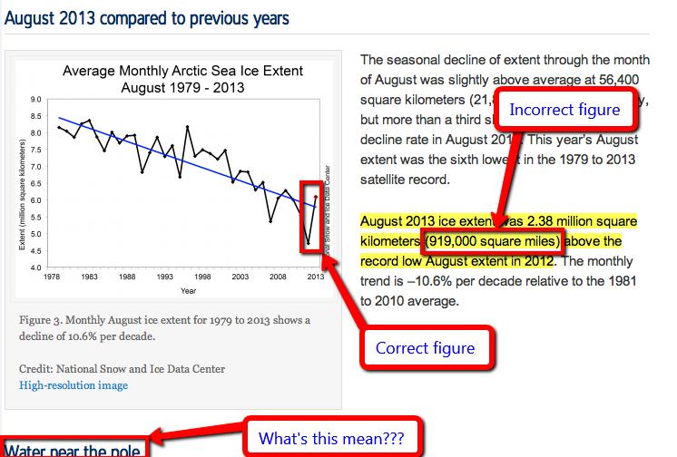
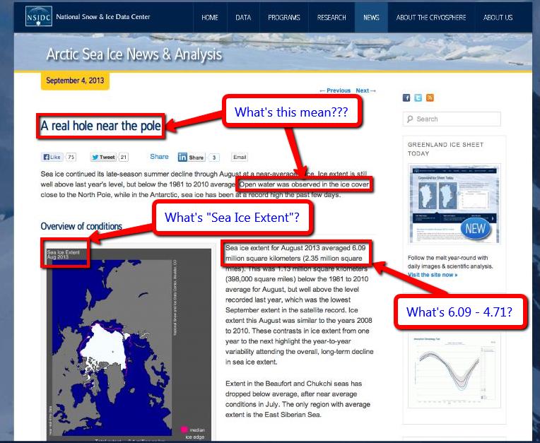
If you take a look at the evidence from the NSIDC the Mail on Sunday recently provided us with in support of their previous inaccurate headlines you will discover it says:
Monthly August ice extent for 1979 to 2013 shows a decline of 10.6% per decade.
QED? Apparently not as far as the Mail on Sunday’s concerned. If further evidence is needed please read our previously published “stunning challenge” to Judith Curry’s Arctic sea ice expertise. In brief:
Judith Curry republishes the same nonsense [as The Mail], but then neglects to publish even a similarly mealy mouthed “correction”, let alone anything remotely resembling the information originally published by the NSIDC upon which this collective fantasy is allegedly based. Therefore Judith should be taken seriously, and as a climate scientist rather than a tabloid journalist or a fantasy fiction writer?
We think not.
Them:
David Rose goes on to say (amongst other things) that:
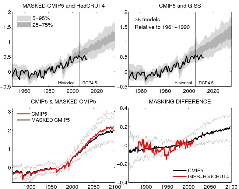
The graph shown above, based on a version published by Dr Ed Hawkins of Reading University on his blog, Climate Lab Book, reveals that actual temperatures are now below the predictions made by almost all the 138 models on which the IPCC relies.
The pause means there has been no statistically significant increase in world average surface temperatures since the beginning of 1997, despite the models’ projection of a steeply rising trend.
Us:
On Dr. Hawkins’ blog, commenting on a previous David Rose article in the Mail on Sunday, he says this:
David Rose has written an article in the Mail on Sunday which, by eye, seems to use the top left panel from the figure below, but without mention of its original source. In the article David Rose suggests that this figure proves that the forecasts are wrong. This is incorrect.
Here’s the figure Dr. Hawkins is referring to:
Finally, for the moment at least, here’s the text of an email we sent to the Managing Editor of the Mail on Sunday this morning:
Hello John,
Thanks for your additional comments. Unfortunately you still fail to address the primary question I’ve been asking for almost 2 months now, so I will be formally pursuing matters concerning the September 8th article via the PCC from now on.
Moving on I note that you have published another article by David Rose this weekend entitled “Global warming ‘pause’ may last for 20 more years and Arctic sea ice has already started to recover”, which mentions both Judith Curry and Arctic sea ice once again. I already have a few bones to pick with you about this one as well.
1. I posted an online comment on the article yesterday evening. It remains invisible this morning. Your web site says “The comments below have not been moderated.”. My comment included no links, although it did mention the “Great White Con”. Perhaps you could look into that for me, and provide me with an explanation?
2. Do you suppose it would be possible to persuade David to reveal his sources any more swiftly this time around? Where does his misleading graphic entitled “Graph that makes a mockery of warming” and the underlying data come from? At first sight it doesn’t seem to be from Judith Curry’s “Stadium wave” paper for example.
We have yet to receive a reply.