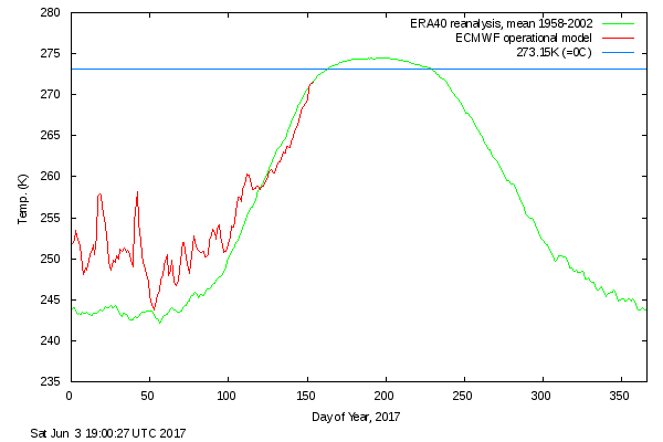
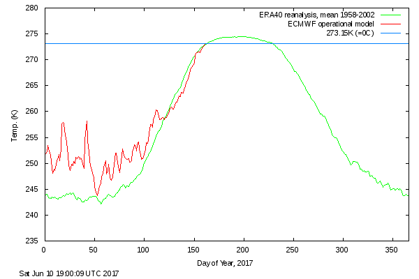
After a comparatively cool May, surface air temperatures in the high Arctic are back up to “normal”:
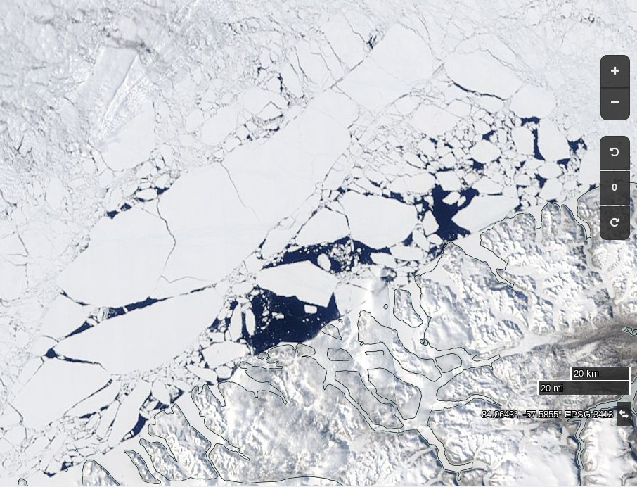
The condition of the sea ice north of 80 degrees is far from normal however. Here’s what’s been happening to the (normally) land fast ice north west of Greenland:
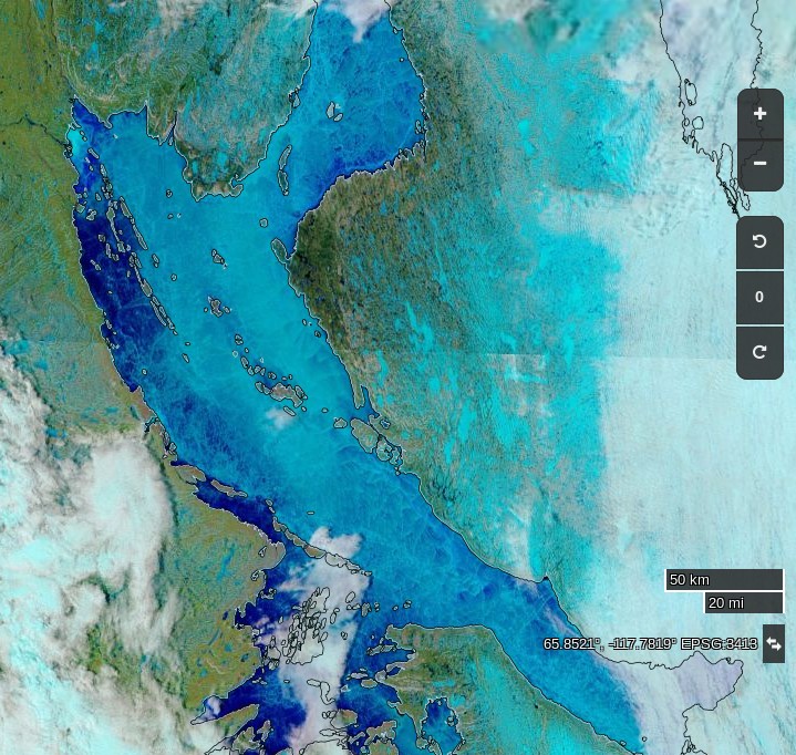
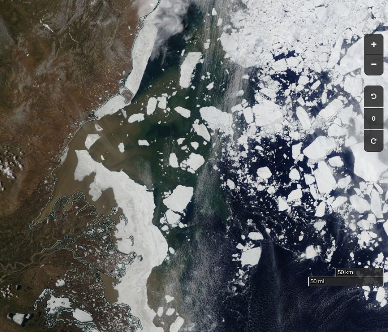
Further south surface melt has set in across the southern route through the Northwest Passage:
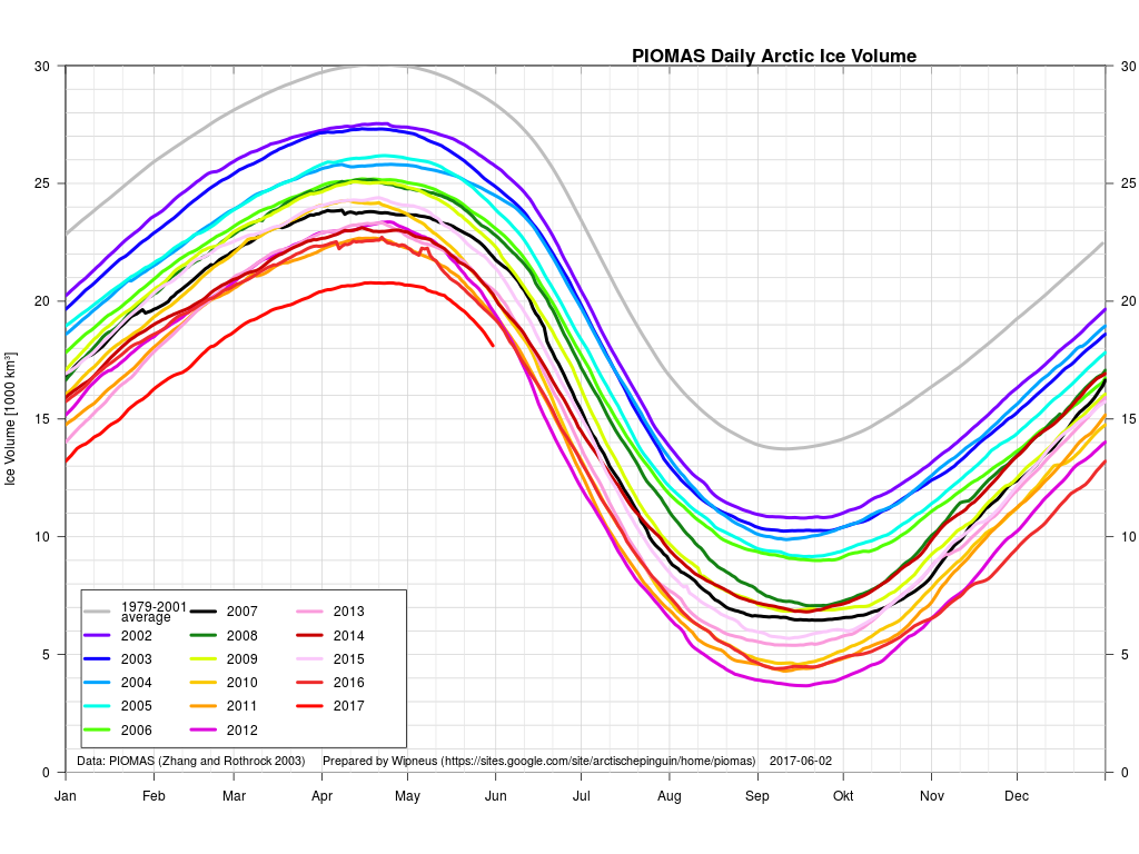
Whilst the gap with previous years has narrowed during May, PIOMAS Arctic sea ice volume is still well below all previous years in their records:
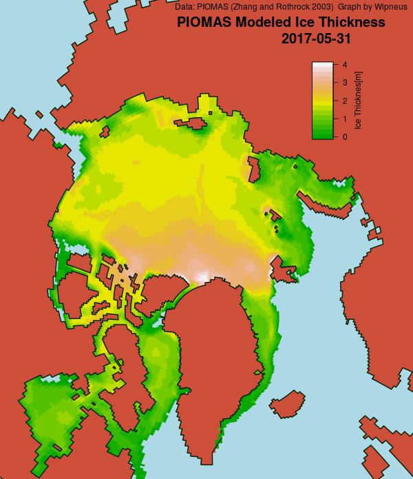
The PIOMAS gridded thickness graph suggests that a large area of thick ice is currently sailing through the Fram Strait to ultimate oblivion:
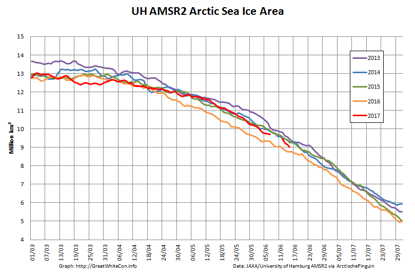
Here’s the latest AMSR2 Arctic sea ice area graph:
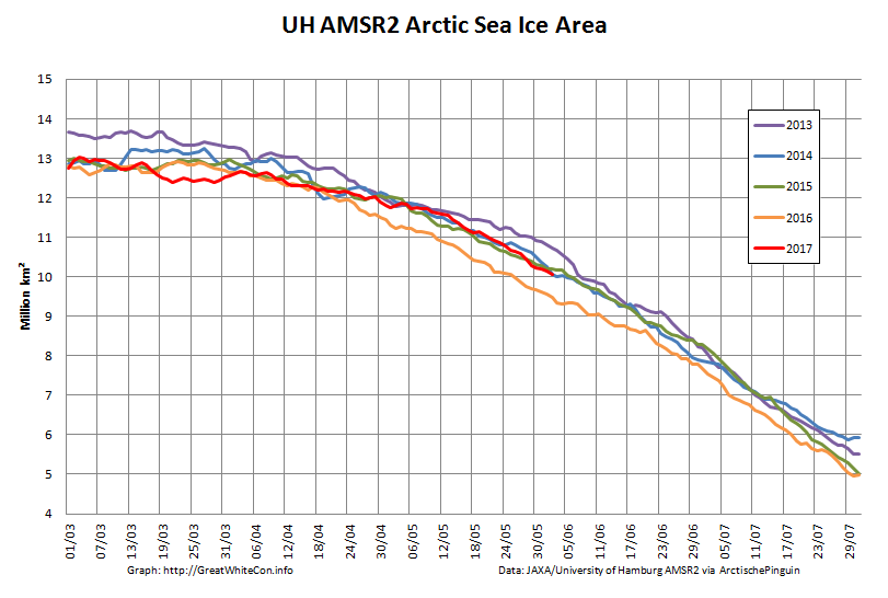
and just in case melt ponds are now affecting those numbers here is extent as well:
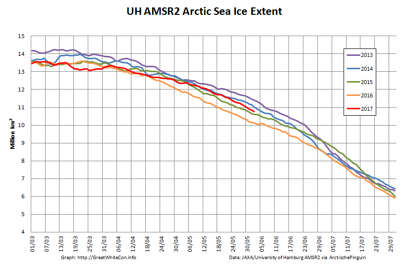
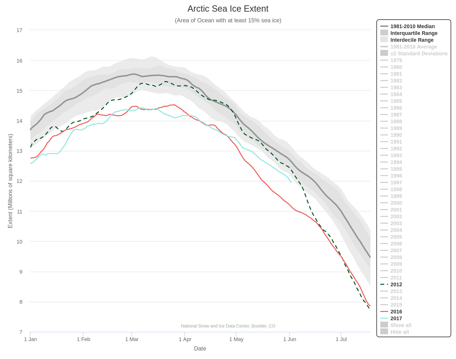
The rate of decrease is inexorably increasing! 2012 extent is currently still well above that of 2017, but those positions may well be reversed by the end of June? Here’s NSIDC’s view on the matter:
As requested by Tommy, here’s the current Arctic Basin sea ice area: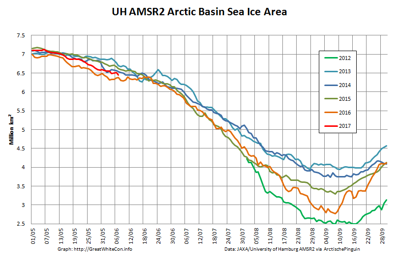
This includes the Beaufort, Chukchi, East Siberian and Laptev Seas along with the Central Arctic. It excludes the Atlantic periphery, which currently looks like this: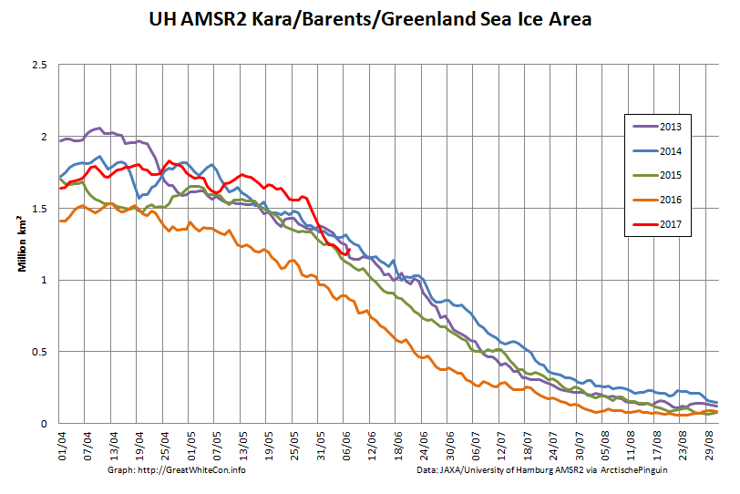
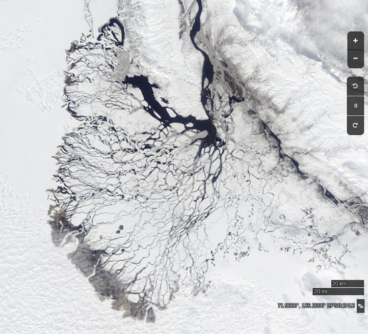
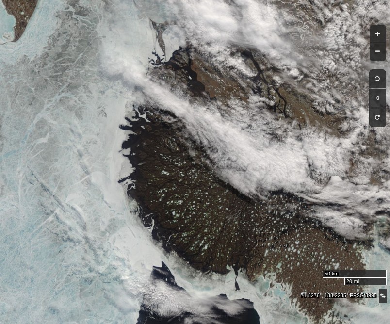
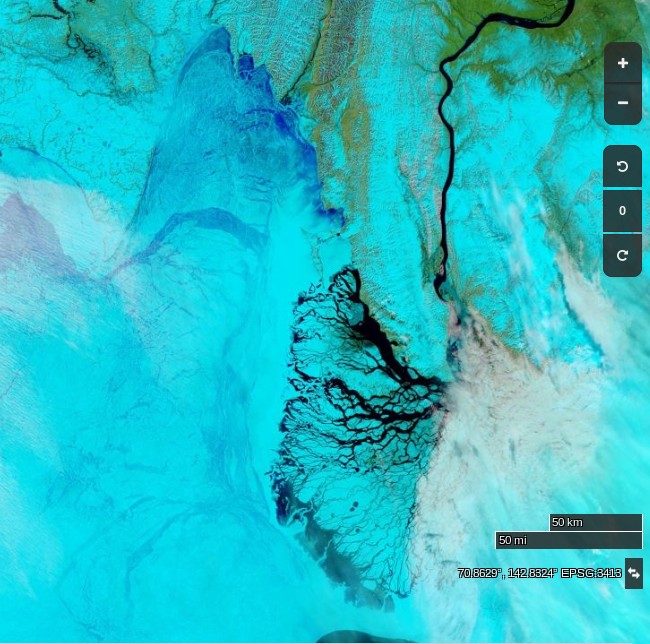
At long last a clear(ish) image of water from the Lena Delta spreading out across the fast ice in the Laptev Sea:
Compare and contrast with June 1st last year:
and June 10th 2012:
DMI’s daily mean temperature for the Arctic area north of the 80th northern parallel has reached zero degrees Celsius almost exactly on the climatological schedule:
We calculate our freezing degree days on the basis of the freezing point of Arctic sea water at -1.8 degrees Celsius. On that basis this winter’s grand total of 3740 was reached on June 1st:
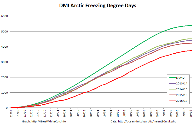
Despite the “coolish” recent weather total FDDs are way below the climatology and other recent years. Consequently there’s a lot less sea ice in the Arctic left to melt at the start of this Central Arctic melting season than in any previous year in the satellite record. However whilst there are some melt ponds visible in the Arctic Basin on MODIS, in that respect 2017 is lagging behind both last year and 2012.
Here’s the latest JAXA surface melt map: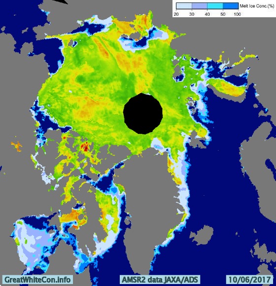
JAXA/IJIS/ADS Arctic sea ice extent for 2017 is now above 2012:

Meanwhile there are finally signs of some surface melt on the fast ice in the Laptev Sea:
An animation of the latest Arctic sea ice age data from Mark Tschudi:
Further confirmation that in 2017 the older, thicker ice is gathered together on the Atlantic side of the Arctic Ocean.
The Mackenzie River melt waters have now breached the fast ice off the delta:
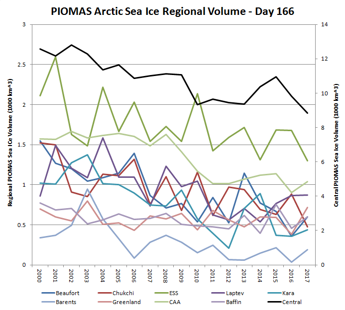
Thanks to the sterling work of Wipneus on the Arctic Sea Ice Forum, here’s a regional breakdown of PIOMAS Arctic Sea Ice volume for the month of May:
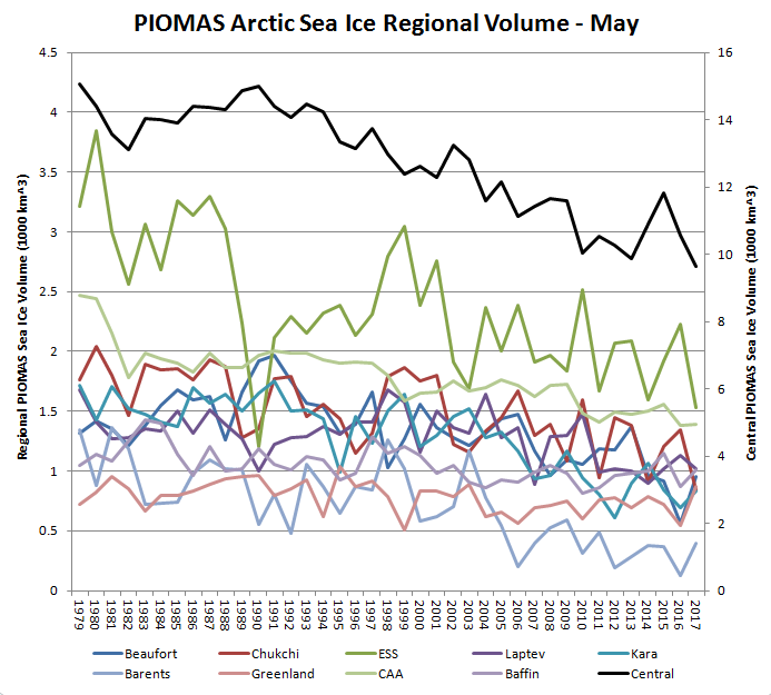
Note the caveat – “No checks, but the data looks plausible”.
The AMSR2 data feed from the University of Hamburg suffered from a “brief hiatus” a few days ago, but is now back in action:

Yesterday’s data still hasn’t arrived, but it certainly looks as though 2017 extent will soon drop below 2016.
The PIOMAS mid month volume update has arrived. The gap between 2012 and 2017 is closing fast:

Here’s the regional breakdown:
Here is the ECMWF MSLP forecast for 96 hours time:
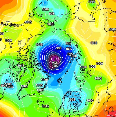
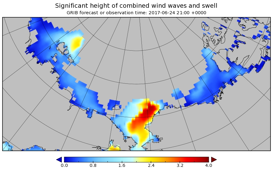
A sub 970 hPa cyclone is starting to enter the realms of realistic possibility, and also forecast are some significant waves in the Chukchi Sea and the expanding 2017 “Laptev Bite”:
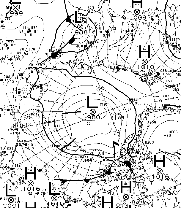
The forecast cyclone was nowhere near as deep as predicted. According to the analysis by Environment Canada it bottomed out at 980 hPa yesterday:
O-Buoy 14 is currently firmly embedded in the fast ice of Viscount Melville Sound, deep in the heart of the Northwest Passage. Here’s the view from the buoy’s camera:
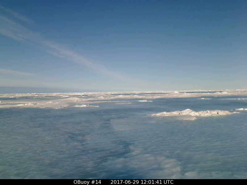
and here’s the view from space:
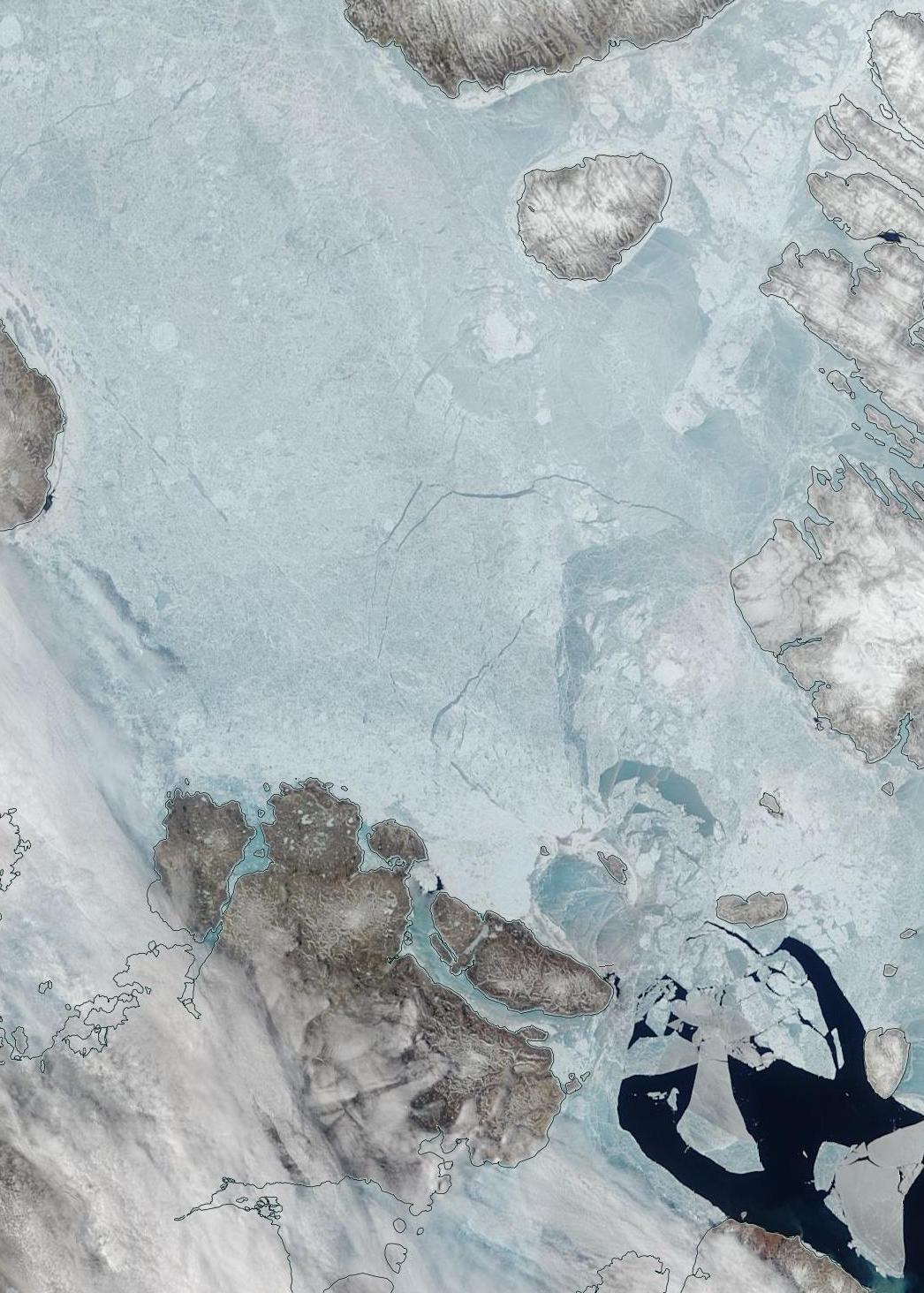
Watch this space!
Well 2016 was certainly a big departure from previous years;
The trend overal each year is in one direction …
Even if 2017 does not turn out as bad as 2016 the trend of less ice would still be in place overal
Great information!
The ‘ice-extent’ graph always seems deceptive as it includes the Greenland Sea, the Nares, CAA, and even Hudson Bay? Those are all irrelevant, and toast. What counts is the Arctic Ocean only in terms of measuring its stability to previous years. Do you have the chart for the main ocean only (includes all the peripheral oceans in the Arctic Basin, but not the N. Atlantic export and Ontario coast !) ?
Thanks !
I do Tommy.
See above.
That’s great, thanks !
2nd lowest area.
What about volume for the same region?
Second lowest area since AMSR2 first took to the skies in 2012, which is not quite the same thing. Here’s NSIDC extent once again, with a few extra years added:
Chris Reynolds used to work out PIOMAS regional volumes, but no longer does so. I’m not aware of anybody else who has picked up that baton I’m afraid.
Thanks. Thanks, I’ll give it a go.
Is there an easy place to pick out the data?
Well, it’s not a trivial problem to solve. The raw gridded PIOMAS thickness data is available from:
http://psc.apl.uw.edu/research/projects/arctic-sea-ice-volume-anomaly/data/model_grid
However you also need masks for the relevant regions and the area of each PIOMAS grid cell to replicate Chris Reynolds’ work. More on that problem (re area/extent rather than volume) on the ASIF at:
“Calculating area and extent from gridded concentration data”
Chris’s own hints on how to go about things can be viewed at:
http://dosbat.blogspot.co.uk/2013/12/regional-piomas-volume-data.html
No ‘reply’ button shows up for you latest replies, but thanks for the links to the data. It’ll take me a while 🙂
Comments don’t nest infinitely deep!
The wondrous Wipneus has generated the data you seek. See:
http://forum.arctic-sea-ice.net/index.php/topic,119.msg117013.html#msg117013
et seq.
Oh great !
I’ll see what I can figure out.
Thanks!
See above also.
Interesting, thanks.
Overall, Arctic Ocean volume looks low or borderline. It’s going to take me a while to get to trying the overall.
Thanks !
I assume my “Arctic Basin” is much the same as your “Arctic Ocean”? In this case the CAB plus Beaufort, Chukchi, East Siberian and Laptev Seas:
By that definition 2017 “Basin volume” is still significantly below 2012. However the reverse is the case for the Atlantic periphery (Kara, Barents and Greenland Seas).
Sorry, I may not have the right terms.
When you say ‘Central’ in the graph, that is different than ‘Basin’, that makes sense. I have been calling it Arctic Ocean to try to exclude Greenland Sea, Baffin, Hudson, etc.
So in the graph you just posted is what I was looking for. Thanks!
It will take me a while to figure out how to have a year to year volume comparison for just the ocean ( CAB plus Beaufort, Chukchi, East Siberian and Laptev Seas, as you said), or maybe you posted that and I missed it? (Barents included or not, won’t make much difference, as it is near empty most years now)
And as you said: “By that definition 2017 “Basin volume” is still significantly below 2012.”
And that to me is the most important information out there right now.
METOP-A Advanced Scatterometer (ASCAT)
If I were to look at the above resource in your Arctic Sea Ice Graphs page would I be able to say that the ‘Wrangel Arm’ feature often mentioned in previous years as of some importance seems to be weakened and therefore the strength of the Arctic ice looks quite divided?
The Arctic and Antarctic Research Institute overview makes it clearer I think:
There’s lots of old ice queuing to escape on the Atlantic side, whereas the Pacific side shows no old ice to speak of, and is wide open for melting this summer.
Also, this graph from NSIDC showing the ‘Cumulative temperature departure from average (for) Barros, Alaska’ seems too strange to ignore.
I know people keep mentioning Barrow over and over for some strange reason but now I know why…. that does not look like sinusoidal behaviour!!!
How relevant to the subject of Arctic sea ice decline is this exact graph?
The rate-of-change is of course what fascinates but knowing that exponential growth can never occur shouldn’t we perhaps be expecting this Barrow graphs behaviour to show up elsewhere so as to spread the load so to speak? (It’s like a Sherlock Holmes mystery ….!)
[Roughly guessing of course the slowdown seems to be because of ‘the excesses of the 80s’ and the near exponential rise due to ‘the rising dragon called China’ let alone India.]
[Embedded the graph – Mod]
For the Barrow graph, if you turn the graph 45 degrees anticlockwise, it then shows no temperature anomaly until about 1980 and then it shows a hockey stick positive temperature anomaly. Given the length of time it shows the value going down (i.e. negative anomaly accumulating) 1921-1980 it’s hard for me to believe that the axes are correct.
Well, that graph is from the latest edition of the NSIDC’s Arctic Sea Ice News:
http://nsidc.org/arcticseaicenews/2017/06/sluggish-ice-retreat/
I assume that they know what they’re talking about?
Good enough.
The overall picture isn’t changed – a hockey stick – goodbye sea ice – hello tipping points and the endocene.
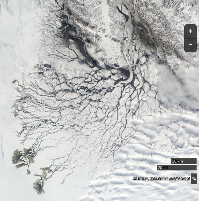
A clearer view of the Lena Delta this morning:
I’m still waiting for a nice clear image of the Mackenzie Delta, but in the meantime here’s a slightly hazy one:
The remaining fast ice in the vicinity isn’t going to hold out for much longer.
Susceptible to warming
According to the study, permafrost appears to be more susceptible to global warming than previously thought, as stabilising the climate at 2ºC above pre-industrial levels would lead to the thawing of more than 40% of today’s permafrost areas.
source: http://www.alternet.org/environment/permafrost-thaw-threatens-dangerous-flood-emissions
If the above were anywhere near correct, and we are already close to 1.5 degrees C above pre-industrial levels already, shouldn’t we be looking at numbers and time-series plots on the subject of ‘Permafrost’ in a very very serious sense about now?
(To compare and contrast such things with sea ice levels would in my mind be of the utmost importance…)
The fast ice off the Mackenzie Delta has disintegrated. However there are now numerous wildfires in the area:
“Mork calling Jim,… Mork calling Jim:…”
How’s that http://nsidc.org/arcticseaicenews/files/2017/07/Figure5x.png for an expediently cognisant report? (No, but seriously,.. is this an/the iconic graphic portending THE TIPPY TIP?)
http://cires1.colorado.edu/~aslater/SEAICE/this_year_timeseries.png
As a failed engineering student I also really dig this update…. Call me “keen ‘s mustard” : I don’t mind as long as it saves a few kids!
Wouldn’t say tipping point yet. Cumulative numbers affected by big early high (for winter) temps. Temps for last 60 days at least have been at or below normal, longest streak of that for a while. Look at recent slope of cumulative curve to see what I mean. Unusual positive temps in winter allows heat to drain from planet- not necessarily evidence of ‘tipping’.
(..the only slight improvement to the nsidc graph would be the inclusion of the 2015-2016 line!)
For 2015-16 see:
https://greatWhiteCon.info/resources/arctic-sea-ice-graphs/#SlaterFDD
However if memory serves that graph includes the wider Arctic, not just north of 80 degrees.
To cut a long story short, Jim,
Do you believe what Thawing Thunder says in the home brew thread about being in “daiquiri times”?