For some relevant background to this weekend’s dose of “Alternative Facts” from David Rose in the Mail on Sunday you may wish to peruse this article in our sister journal “Alternative Facts Wetware™“:
From the conclusions to that article on Donald Trump’s rise to power:
Reflecting on the implications of this analysis for the specifics of this election, we can see that many Trump voters knew full well that their man was a reprobate, that they deplored his crudities and that they saw him as a risky choice. And yet in a world where the system is seen to be against “us” and where things appear to be driven in the wrong direction by “them,” the really irrational thing to do is to vote for the conventional candidate who represents sticking with that system.
Getting back to this morning’s batch of post truth alternative facts from the poison pen of David Rose, the latest porky pie fresh off the Mail’s production line is entitled:
“How can we trust global warming scientists if they keep twisting the truth”
It is of course Mr. Rose who is “twisting the truth” yet again. His opening salvo:
They were duped – and so were we. That was the conclusion of last week’s damning revelation that world leaders signed the Paris Agreement on climate change under the sway of unverified and questionable data.
A landmark scientific paper –the one that caused a sensation by claiming there has been NO slowdown in global warming since 2000 – was critically flawed. And thanks to the bravery of a whistleblower, we now know that for a fact.
Mr. Rose wouldn’t recognise “a fact” if it hit him in the back of the head at a million miles an hour. The “landmark scientific paper” in question isn’t “critically flawed” anywhere but in the fertile imagination of David Rose and the other “Merchants of Doubt”. Take a look at the facts:
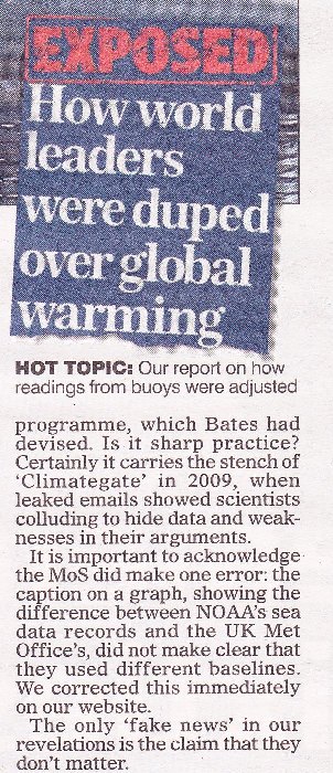
As predicted yesterday, I’m off down to the local paper shop. I wonder if there’s an associated editorial this week too? I’ll be back in a bit with more. As David Rose so eloquently put it this morning:
We cannot allow such a vital issue for our future to be mired in half truths and deceptions.
My pocket is now £1.70 lighter in exchange for the following information:
It seems that is what passes for “due prominence, and — where appropriate — an apology” in MailSpeak? Here’s the actual facts once again:
I don’t see an accurate graph in Mr. Rose’s profuse apology. I see no mention of “World leaders not duped, Mail readers conned again”. Do you?
This will come as no shock to seasoned Lamar Smith watchers. The U.S. House Science, Space, and Technology Committee have issued another news release:
“Committee Probes Allegations of Politicization of NOAA Study”
By now you can probably guess what it says:
Lamar Smith (R-Texas) today sent a letter to National Oceanic and Atmospheric Administration (NOAA) Acting Administrator Benjamin Friedman requesting information on the Karl study following reports the study ignored NOAA standards, was rushed to publication, and was not free from political bias.
“Allegations of politicization of government funded scientific research cannot be ignored. The Committee has a constitutional responsibility to conduct oversight in instances of alleged fraud, abuse, and misconduct especially where the government’s scientific integrity is called into question. Dr. Bates’ revelations raise additional questions as to whether the science at NOAA is objective and free from political interference. In light of this new information, the Committee requests the below information to better understand the depth and scope of internal debate at NOAA related to the Karl study,” the letter states.
Today’s letter requests documents and communications related to the release of the Karl study, the datasets used in the Karl study, concerns raised about datasets used in the Karl study, and the scientific integrity of the study. The committee also requested a briefing on the independent experts NOAA is engaging with to review this matter.
The letter can be found here.
The news release continues to describe the alleged “background”, but I think we’re all pretty familiar with that by now? The letter itself is addressed to Benjamin Friedman, NOAA’s acting administrator. It demands to see a big pile of documents “related to the Karl study”. It will come a no surprise whatsoever to our regular readers that it references the leading actors in the David & Judy show!
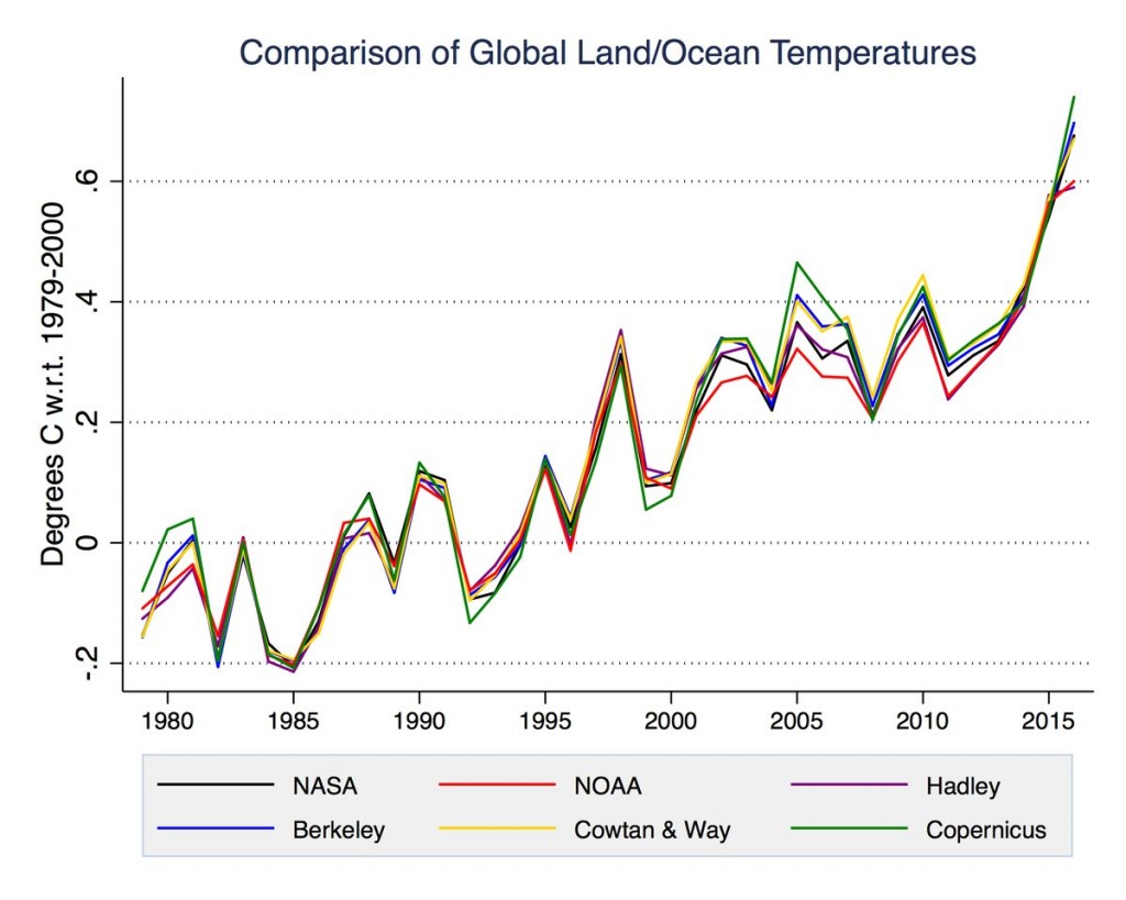
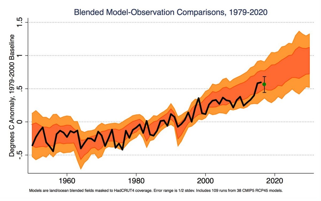
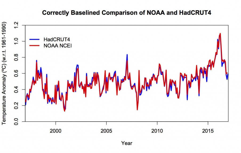
We should at least be encouraged by the development which confirms that the DM is not a reliable newspaper; it took long enough.
Not sure when the last time they actually accidentally published a fact. 1980?
Paul Dacre is utterly unapologetic about feeding the neuroses of his readers, however often the staff at the nursing home complain.
Just applying my ‘O’ Level mathematics to the graph above, and drawing a ‘line of best fit’, it is pretty much flat apart from 2016 which is unusually high and may be an outlier in climate change terms. Could it actually be that global temperature has not really changed in the last 20 years?
What do you make of this longer term graph Adam?
Around 50% of the period 1970-1990 was below the 0degC which gives a false ‘appearance’ to the longer term graph. I don’t know why the baseline was done between 1979-2000….. do you?
I was at school during the 1970’s and i recall that the climate discussions of the time centred around an imminent mini ice age.
It seems that the two divergent lines, if the SD is taken into account are not that far apart until very recently which to my mind means that the last year was an anomaly. Also, just how significant is an increase over baseline of around 0.3degC? Not enough to melt Glaciers or to burn Australia – so, to me, it seems that something else is going on that is perhaps related, or perhaps not, to the micro-change in global temps.
Is it Sun-spots, El Nino, God messing about? Who knows, but i don’t think it is anything to do with the graph.
The good thing about Climate Change as a Political dogma is that it is forcing the change of behaviour from polluting oil based fuels to cleaner (hopefully more reliable Nuclear) energy. This can only be a good thing for our planet.
Adam, you are repeating a well-known canard that discussions “centred around an imminent ice age”. Science in the 1970s primarily predicted warming.
And if you think 0.3 degrees (over about 20 years, please remember that because I get back to it) does not mean much, remember that the difference between a full-blown ice age, with much of Europe and North America covered in massive ice sheets, and the temperature at the beginning of the 20th century with most of Europe and North America completely free of ice sheets, is around 4 degrees (according to Marcott et al). In other words, in the last 20 years *alone* the temperature has changed already 8% of the temperature change that caused essential complete loss of mainland glaciers.
You will think that I am stupid, but how big a deal for humanity has the loss of mainland glaciers been?
Surely a much bigger problem for us all is the rise in population? I see more column inches spent on the argument about is Climate Change man made or not than ever I do about how to stop humans reproducing.
BTW – I don’t think that science in the 1970’s predicted warming at all. I was there, studying science, it predicted cooling.
Specifically for you, Adam:
http://journals.ametsoc.org/doi/pdf/10.1175/2008BAMS2370.1
I’ll copy the abstract:
“There was no scientific consensus in the 1970s that the Earth was headed into an imminent ice age. Indeed, the possibility of anthropogenic warming dominated the peer-reviewed literature even then”.
and from Figure 1:
“during the period from 1965 through 1979, our literature survey found 7 cooling, 20 neutral, and 44 warming papers”.
Myth busted. You might want to consider that you are “remembering” something, because you have heard the myth a wee bit too many times.
Regarding the glaciers, you are moving the goalposts. You stated that 0.3 degrees would not melt glaciers. I then put that number into perspective, showing that 4 degrees was enough to completely melt essentially all mainland glaciers that covered large parts of Europe and Northern America. That is, do not underestimate the impact of a ‘mere’ 0.3 degrees on glaciers. And now you want us to argue that we shouldn’t care about those melting glaciers??? I guess I should be happy that you implicitly acknowledge that 0.3 degrees over 20 years actually is quite a big deal to how our world looks.
Adam, the graph of NOAA anomalies is pretty “noisy”, as it based on monthly values. It is therefore quite easy for the eye to be deceived.
As Jim indicated, all one has to do is look at a slightly longer time period for the overall trend to become it bit more obvious. You are correct to be concerned about outliers, but you also need to be concerned about outright liars.
You may or may not be aware that 1997 and 1998 were pretty outstanding outliers at the time. Displaying data with a starting point a little before 1997/98 is a bog standard example of the cherry-picking technique known as “end-point selection”.
If one bunches the NOAA data into 5 year periods, things can become a little clearer…
5yr Period Anomaly (in degrees Celsius)
1970-74 0.016
1975-79 0.092
1980-84 0.246
1985-89 0.282
1990-94 0.346
1995-99 0.474
2000-04 0.554
2005-09 0.612
2010-14 0.662
2015-16 0.92
Even if one ignores 2015 & 2016, the upward trend should be obvious to anyone.
In case you think I am just making those numbers up, you can get them directly from NOAA using this link…
https://www.ncdc.noaa.gov/cag/time-series/global/globe/land_ocean/12/12/1970-2016?trend=true&trend_base=10&firsttrendyear=1880&lasttrendyear=2016
Try out your ‘O’ Level maths skills on that.
OK, thank you. That does makes it appear more like an increase, however tiny.
Adam, you are incorrect about cooling being predicted in the 1970s. But don’t believe me (really, you shouldn’t, I’m just commenting on a blog.) Better to read actual peer reviewed scientific papers. Links to those papers are handily summarized on an SkS blog post, but please don’t trust that blog either. Instead click on that blog post’s links to the actual papers and read those. After you read the Basic tabbed pane there, read the Intermediate one: https://skepticalscience.com/ice-age-predictions-in-1970s.htm
Adam, when you say … “That does makes it appear more like an increase, however tiny”, that, plus your “cooling predicted in the 1970’s” and “population growth is a bigger problem” all contribute to making you sound like a denier troll.
However, let’s give the benefit of the doubt, shall we?
Addressing these points in some vague order…
1) “TINY TEMPERATURE GROWTH”: Still using NOAA NCEI numbers, the average global temperature anomaly across the 1970’s (when you were at school) was ~ 0.054 deg C. The anomaly over the 10 year period 2005-20014 (deliberately missing out 2015 & 2016, as you consider these to be distorting outliers) was ~ 0.637 deg C.
That’s a rise of approaching 0.6 deg C over a period of 35 years. The change in global temperature between the pre-industrial period and the depths of the Last Glacial Maximum (~ 20,000 years ago) was somewhere in the 4 to 5 degree C range.
I’ll let you work out the difference in these trends for yourself.
2) “CHOICE OF BASELINE”: You may have some trouble with this if you are not particularly numerate. (That’s not meant in any way as an insult. Numeracy is a skill, and people can be exceeding clever, without being numerate. Two days ago, I was talking to an extremely well-educated lady, but she could not do Fahrenheit to Celsius conversion for sub-zero temperatures.)
The baseline period selected ONLY has an effect on the absolute values of the resultant anomalies. This makes precisely ZERO impact upon the trend line.
If you can’t accept this – and you shouldn’t, unless you are convinced of the logic – here is a simple thought experiment.
a) write down the numbers 1 to 15.
b) calculate the average of the numbers 1 to 10
c) express the numbers 1 to 15 as anomalies from the average (1 – 10) you have just calculated
d) calculate the trend
e, f, g) repeat steps (b, c and d) but taking the average of 6 to 10, instead of 1 to 10
What happens? The scale of the anomalies has altered, BUT THE TREND IS STILL IDENTICAL.
3) “COOLING WAS PREDICTED IN THE 1970’s”: No it bloody well wasn’t. As Tom Dayton said, look up the scientific literature.
You could do worse than having a long hard look at Spencer Weart’s incredibly informative “Discovery of Global Warming”, on the website of the American Institute of Physics.
http://history.aip.org/climate/index.htm
4) “POPULATION GROWTH IS A BIGGER PROBLEM”: If the global population stabilised today, there would still be a massive problem with Carbon emissions.
If we could have kept the population down below 3 billion, the CO2 level in the atmosphere would still have risen far above 280 ppm(v), although by not quite as much as it has done.
This is one of the obnoxious “holier than thou” strawman arguments regularly spouted by deniers.
Bill
Thank you for taking the time to write your replies, and thank you too for giving me the benefit of the doubt. I’m neither a denier, nor am i a troll – but i am demonstrably innumerate.
Much of my information about Climate change comes from comparing the widely differing views of the Guardian and then the Daily Telegraph (or… yikes… the Daily Mail). When read in isolation, one can get whipped-up by either view – comparing them is difficult because they both take such (in my opinion) extreme views.
I am a countryman, and with my own eyes i can see that the seasons have moved forward, that Campion flowers in my woods in January when it shouldn’t until March – local examples of a change in climate.
I may be innumerate (witness my O level in Maths – a First in Biology though) but i am not stupid. There is never any explanation in the daily press about why this is not caused by external factors relating to the sun’s activity, and why it believed to be caused by CO2. My understanding of CO2 volume is that all the fossil fuels burnt are but naught versus a good volcanic explosion – Krakatoa for example. You will no doubt explain to me that this is wrong, but if you cannot, then what relevance is stopping using fossil fuels if they will make only a marginal difference?
BTW, i am wholeheartedly in favour of reducing FF use because of the pollution/smog/ health aspect.
Welcome Adam,
I see others have already covered the basics!
Going back to the question I posed you previously, you can indulge your ‘O’ level maths skills and draw trend lines to your heart’s content over at WoodForTrees. Here’s one I prepared earlier:
http://www.woodfortrees.org/plot/hadcrut4gl/from:1970/to:2017/plot/hadcrut4gl/from:1970/to:2017/trend/plot/hadcrut4gl/from:1970/to:2017/trend/offset:0.4/plot/hadcrut4gl/from:1970/to:2017/trend/offset:-0.4
The big change since that article was written is that for some strange reason the term “Alternative Facts” is now preferred to “Post Truth”!
This charting tool is fantastic!
So, much of what is reported in the “Denier Troll” press (i believe that is what it is called) centres around the fact that for the last 20 years there has been no change in the global temperature.
I am afraid that i don’t know the difference between a HADCRUT and a CRUTEM – and the differences may well be crucial, but i’ve just plotted a graph over the last 20 years using unadjusted(?) HADCRUT data and, priming it out and using a ruler as i was taught when i was 14 to create a line of best fit, it looks as flat as a pancake.
This is the dataset i used:http://www.woodfortrees.org/plot/hadcrut3vgl/from:1995/to:2017/plot/hadcrut4gl/from:1970/to:2017/trend/offset:0.4/plot/hadcrut4gl/from:1970/to:2017/trend/offset:-0.4
Now, one of the other things that the loony right wing papers say is that there is a big difference between satellite and land based temperature monitors because over many decades, urbanisation has changed the micro-climate around the monitoring centres – i have no idea (again) if this is true, but if i were to want to see the satellite temperature data, what is its acronym on the list provided by wood for trees?
Many Thanks
ADAM
Just so’s you know Adam, you’re still doing a remarkably good impersonation of one of Bill’s “denier trolls“!
Why don’t you try using up to date data?
http://www.woodfortrees.org/plot/hadcrut4gl/from:1995/to:2017/plot/hadcrut4gl/from:1995/to:2017/trend/offset:0.4/plot/hadcrut4gl/from:1995/to:2017/trend/offset:-0.4/plot/hadcrut4gl/from:1995/to:2017/trend
In fact, i’ve now spent a bit more time fiddling with these graphs and over the past 20 years, almost all of the data sets show virtually no change. There is a huge anomaly (or is it) in the last year or so, but taking out that spike, most data sets apart from the Wood for trees own version show hardly any change.
On another subject that recently made me cry – Arctic and Antarctic sea ice, it seems that there has been some diminution of Arctic ice and a concurrent increase in Antarctic ice – does anyone know why this is, and would Polar Bears thrive in the Antarctic if we were to “Re-Wild” it should they not have adequate ice to survive?
Your sources are behind the times. There are large decreases in Antarctic ice for nearly 2 years now. drop in extent of well over 5 standard deviations.
Whether this is a trend or a blip is as unclear as whether the rise of some years ago was a trend or a blip.
Your method of learning science by comparing various newspaper sources is flawed. Try scientific sources if you wnt to learn about science. Here are some links to get you started:
General evidence: http://climate.nasa.gov/evidence/
History of science: http://history.aip.org/climate/index.htm
More detailed evidence but still nonmath: http://www.ipcc.ch/pdf/assessment-report/ar5/wg1/WG1AR5_SPM_FINAL.pdf
Or to prevent yourself talking nonsense about sea ice, why not have a good look around Great White Con Ivory Towers first?
Arctic Sea Ice Graphs
Antarctic Sea Ice Graphs
Whilst Bill is our local resident expert on the satellite data, here’s a graph I produced quickly especially for Andy:
http://www.woodfortrees.org/plot/rss/from:1970/to:2017/plot/rss/from:1970/to:2017/trend/plot/rss/from:1970/to:2017/trend/offset:0.4/plot/rss/from:1970/to:2017/trend/offset:-0.4
Note that although I asked for more the RSS data only goes back to 1979.
Thank you Gentlemen,
1. I appreciate that i may be spouting verbiage about sea ice (Jim), but i used the data that was recommended to me – Wood for trees. Antarctic Ice has grown a bit over 20 years and Arctic ice has receded.
2. My point is that the graph of global temperature using HADCRUT data from 1996 – 2016, 20 years, excepting a single spike, is flat. You’ve just whopped up a satellite graph which confirms my point. Do it again, but from 1996-2016 and take out the massive spike at 2015(ish) THEN tell me it is not flat.
If a Denier Troll is someone who is either ill informed and trying to get better informed (but not by just accepting one or other sides argument) or somebody that asks questions of seemingly obvious data (20 years flat except one recent spike) then count me in. If a ‘normal’ non-expert like me is struggling to make sense of it all then what hope for the argument?
So, my vastly more intelligent and well informed correspondents, please can you explain why i see the data you have given me via Wood For Trees as no problem in Antarctica and no problem for the last 20 years? Please try to resist the use of the work Stupid, thick, knowingly contrary, Denier to Troll.
Many Thanks
ADAM
Adam,
CRUTEM is a land-only global dataset produced by the Climactic Research Unit at the University of East Anglia.
HadSST is a sea surface temp dataset produced by the UK Met Office Hadley Centre.
HadCRUT is an area-weighted merger of these two datasets.
DEBUNKING TIME AGAIN…
1) VOLCANOES EMIT MORE CO2 THAN HUMANS: The short and sweet answer is “bollocks”.
The biggest (by far) eruption in modern times was the corker at Mount Pinatubo in the Philippines (June 15, 1991). If volcanic CO2 emissions dwarfed (or even came close to rivalling human emissions), then we would have seen a great big spike in the Mauna Loa CO2 record immediately following that eruption.
Have a look, and let us know what you see…
https://www.esrl.noaa.gov/gmd/ccgg/trends/full.html
But there’s another way we know the claim is utterly bogus. As you have a First in Biology, you are probably quite aware that plants carry out a form of mass fractionation, in the way that they tend to preferentially take up the lighter isotope of Carbon – C12.
This isotopic fingerprint is preserved throughout the long drawn out millions of years during which fossil fuels have been produced naturally in the Earth’s crust. As a consequence, when fossil fuels are burned, their emission signature is lighter than the C12/C13 ratio one would get by the non-biological recycling of sequestered carbon via volcanoes or via seltzer springs. The atmospheric C12/C13 ratio is altering exactly as one would expect as somewhere in the order of 10 gigatonnes of isotopically light Carbon gets dumped into the atmosphere each year.
But, hey, don’t take my word for it. Here’s an article written by the US Geological Society dealing with that very same bogus claim…
https://www.esrl.noaa.gov/gmd/ccgg/trends/full.html
The relevant text reads as follows… “All studies to date of global volcanic carbon dioxide emissions indicate that present-day subaerial and submarine volcanoes release less than a percent of the carbon dioxide released currently by human activities.”
Is that quite clear enough?
2) THE HADCRUT DATA IS FLAT OVER THE 1996-2016 PERIOD:
Short answer – no it isn’t. The annual global data is available here…
http://www.metoffice.gov.uk/hadobs/hadcrut4/data/current/time_series/HadCRUT.4.5.0.0.annual_ns_avg.txt
If you plot this, and set up a linear trend line (using least squares method) the results are as follows…
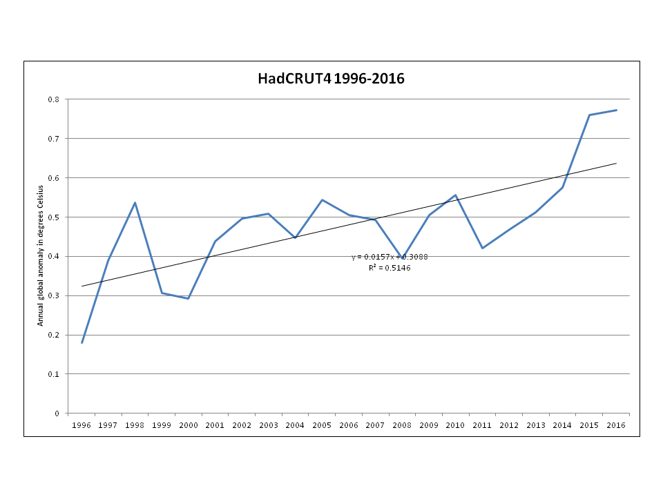
1996-2016 trend = 0.157 degrees Celsius/decade
However, since you are convinced this is all due to the 2016 spike, let’s take that out the equation. Tell you what, since 2015 was a bit on the warm side, let’s kick that into touch instead…
1996-2014 trend = 0.106 degrees Celsius/decade
Now, if it is reasonable to ignore the 2016 (and 2015) spike, it is also surely reasonable to do the same to the 1998 spike? n’est-ce pas?
1996-2014 trend (with 1998 omitted) = 0.129 degrees Celsius/decade
(N.B. It took longer to type those preceding paragraphs relating to the HadCRUT data, than it did to set up the graphs with the parameters as described, and consequently read off the gradients of the trend lines.)
3) ANTARCTIC SEA ICE GROWTH JUST ABOUT MATCHES LOSSES IN THE ARCTIC:
Oh for f***’s sake. Look at the bloody numbers …
ftp://sidads.colorado.edu/DATASETS/NOAA/G02135
or …
https://ads.nipr.ac.jp/vishop/#/extent
Why do you just keep regurgitating this drivel? This is getting boring.
[Graphs added as requested – Mod]
Dear patient gentlemen
Many thanks for your (at times frustrating for you) efforts as you have guided me through the minefield of FAKE NEWS that i so effortlessly regurgitate.
I have looked at all of the various papers, graphs and comments that you have made and even to my innumerate mind, your data and interpretation seems to make perfect sense.
Thank you for your perseverance.
All Best
ADAM
You’re welcome Adam.
Sorry for the fat finger problem!
Adam,
1) Actually I recommended that you check out this very web site for sea ice related information!
2) Most of the heat from “Global Warming” goes into the oceans. From time to time some of that comes out into to the atmosphere in an “El Niño” event. What possible justification is there for arbitrarily removing 2015 from the data without removing 1998 as well?
3) My words were “doing a remarkably good impersonation” of such a creature. If you are really interested in finding the answers to these questions I suggest you modify your behaviour before making similar enquiries at any other data driven community.
Perhaps somewhat off topic, but since Adam expressed an interest in the Arctic here’s the up to date graph of University of Hamburg AMSR2 Arctic sea ice area:
Off topic or not, If Andy cared to look at the “bloody numbers” to which Bill refers he would no doubt note that at 2.246 million square kilometres the NSIDC daily Antarctic sea ice extent metric is at the lowest level EVER in their records going back to 1979.
JAXA concur:
@Jim
I’ve just dropped you an email with the three variants of the HadCRUT trend graph.
Feel free to use as you wish.
I got your emails Bill. Graphs duly added to your original comment.
Only one big problem with your discussion of temp trends. Note that your HADCRUT data shows 2014 as higher or same as 1998, while GSS shows it around .4C less. Makes huge difference in trend, and when you add back in the 2015-2016 data, it makes the discrepancies worse ( GSS 2016 only .2C higher than 1998, HADCRUT much larger). Differences like this are the sort of thing that affects credibility. I’ll make a bet that once the 2017 and 2018 data are in, that GSS (and UAH for that matter) will make the 2016 spike resemble the 1998 one, vs. the restart of a strong upward trend. Any takers?
Taylor,
HadCRUT uses 1961-90 as the baseline.
NASA Gistemp uses 1951-80 as the baseline.
However, as long as one is talking about trends, the selected baseline makes precisely ZERO difference. If you’re not sure about why that should be the case, please have a look at my comment dated Feb 13 Time 10:03
It is only when comparing the magnitude of an anomaly from one source with that from a different source that one requires to employ a consistent baseline.
Anyway, here are the annual numbers taken directly from the relevant sites, with the anomaly values given in degrees Celsius …
HadCRUT: 1998(+0.536); 2014(+0.575); 2016(+0.773)
Gistemp: 1998 (+0.63); 2014(0.75); 2016(+0.98)
Although such short-term trends are not the same, these numbers do NOT bear out your assertion.
The difference in behaviour between these two datasets can be largely explained by the different way the two organisations treat the Arctic region. The number of actual recording stations is very limited in the Arctic, and it is important to understand the differing methodologies. NASA deals with this by using an interpolative technique to in-fill gaps in station coverage, whereas HadCRUT simply leaves the same areas as “unknown”. As the Arctic is warming much faster than the global average, this means that Gistemp tends to show a greater rate of warming than HadCRUT over the last decade or so.
Think about at least one of the reasons for that. Loss of sea ice means that a greater amount of non-frozen ocean is in contact with the atmosphere at high latitudes. This prevents the air temperatures in that vicinity from straying much below zero. In the past, where the sea ice acted as an insulating medium, air temps could (and did) plummet.