As our regular reader(s) will be aware, Anthony Watts has been plagiarising our content and republishing it on his “Watts Up With That” blog. In a perplexing perversity he has also been refusing to publish content that we have happily contributed to the self same blog. Hence we have taken the liberty of basing our title for today on a recent WUWT guest post by Willis Eschenbach entitled:
Here’s what Willis had to say at the end of his article:
My Usual Request: Misunderstandings are the curse of the internet. If you disagree with me or anyone, please quote the exact words you disagree with, so we can all understand the exact nature of your objections. I can defend my own words. I cannot defend someone else’s interpretation of some unidentified words of mine.
My Other Request: If you believe that e.g. I’m using a method wrong or using the wrong dataset, please educate me and others by demonstrating the proper use of the method or the right dataset. Simply claiming I’m wrong about methods doesn’t advance the discussion unless you can point us to the right way to do it.
Data: The Hadley HadISST ice (and sea surface temperature) data is available here. I used the NetCDF file HadISST_ice.nc.gz (~15Mb) at the bottom of the page.
and here’s a copy of our still invisible comment:
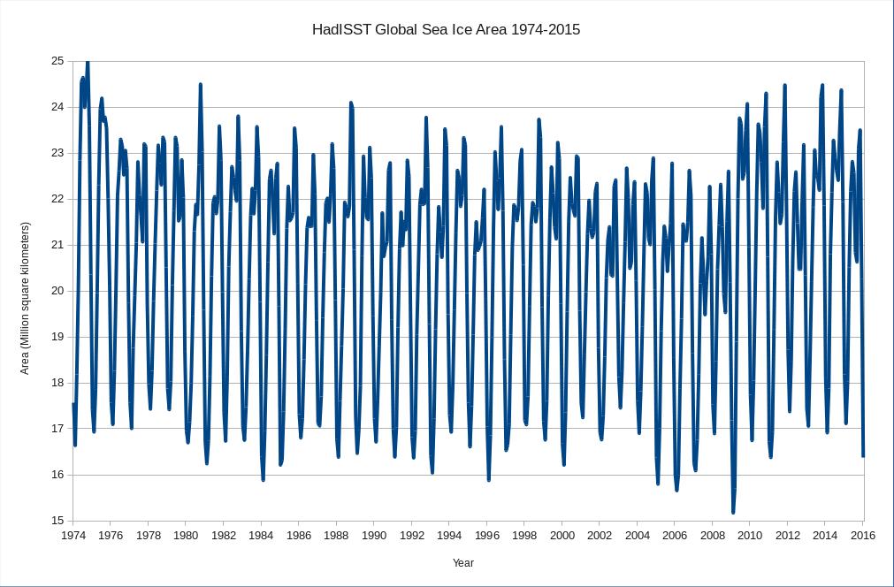
Epitomising the indomitable spirit of scientific skepticism we set out to duplicate the results obtained by Mr. Eschenbach and answer our own question as well as his. Here is what we’ve discovered. Firstly global sea ice area since 1974:
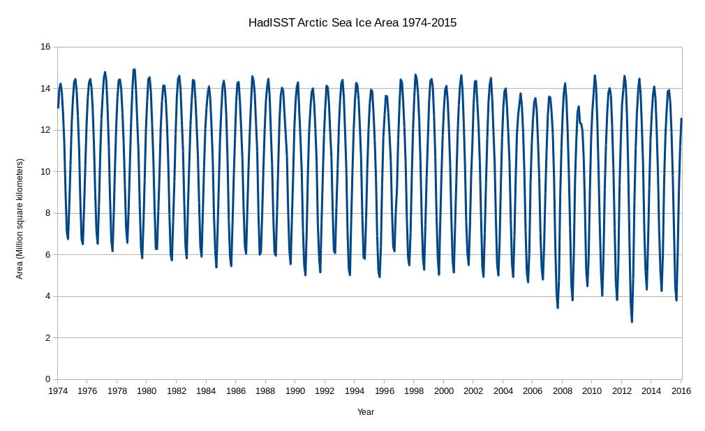
and then Arctic sea ice area since 1974:
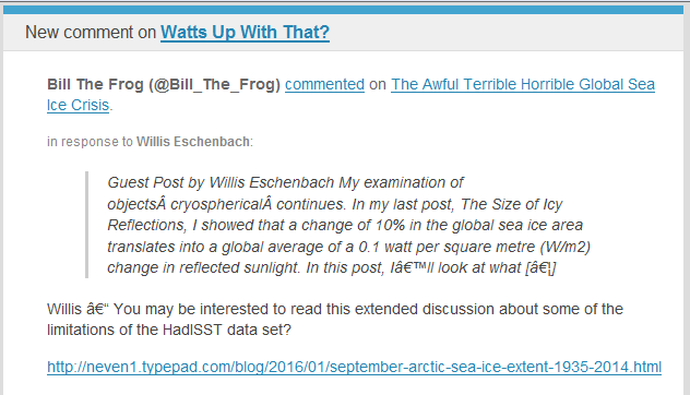
Now as our very own learned guest poster Bill The Frog all too briefly pointed out to Willis Eschenbach on April 7th:
Ignoring Bill’s helpful hint Willis concluded that:
We’re pretty sure that the global average surface temperature increased from the mid-1970s to about 1998. However, we see no sign of this in the global sea ice area data. Instead, ice area remained stable throughout the 1980s and the 1990s, while temperatures climbed:
Next, we’re also pretty sure that there was no significant change in the global average temperature from about 1998 to 2015, the end of the ice data. Despite that, starting in 2000 the ice area first dipped to a low in about 2007, and since then has been climbing rapidly.
This supports a curious conclusion, which is that in modern times at least, the global sea ice area is not particularly a function of the global average surface temperature. Go figure…
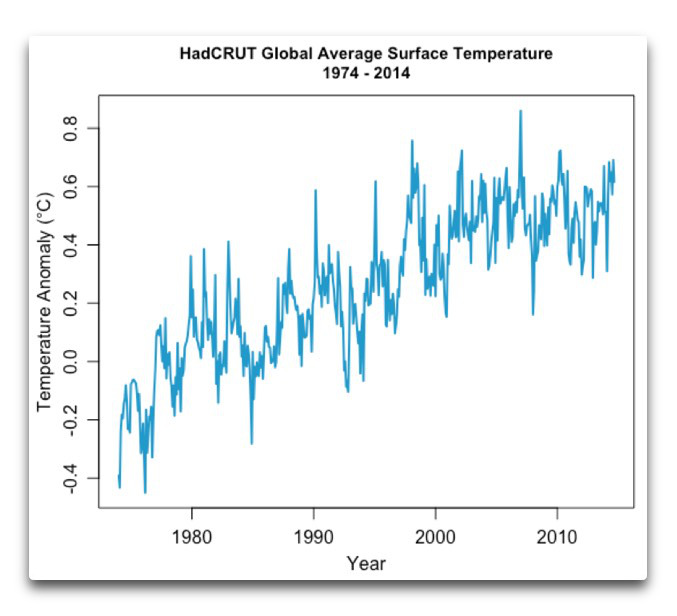
Now that we’re in possession of all this newly revealed data about historical sea ice area and censorship in the cryospheric blogosphere what should we “go figure”? Firstly one feels compelled to ask why Willis’s global average temperature graph neglects to mention 2015 when he implies that it does?
Should you figure anything else please free to answer our query on a virtual postcard, in the space provided for that purpose below. You may additionally like to vent your feelings concerning this controversial cover-up of our changing climate over on Twitter using the #SnipGate hashtag.
To me, what Willis’s commentary highlights almost more than anything else is his lack of fundamental understanding of how global heat circulation works, and the behavior of the system overall as it redistributes the vast reservoirs of heat which have been built over the last century.
I don’t think he understand either its buffers, the latency in distribution, or how the cyclical changes around physical thresholds – in particular the freezing point of sea water and moisture content of the atmosphere – play out mechanically.
I hope he becomes better familiar with them.
At times such as this one is forced to wonder. Are Willis n Willard really so lacking in a fundamental understanding of the “mechanics” of the Arctic?
Which is worse? That they mislead their loyal readership through mere ignorance, or that they do so deliberately?
The fact that they suppress alternative interpretations of the data they so selectively display rather suggests the latter, does it not?
Jim, are you saying the second graphic is wrong?
(I thought Aussies were supposed to be sarcastic but we’ve got nothing on the internet it would seem, ..I just dunno anymore!)
Slowly answering my own question those numbers seem about right.
No, no… the maximums should be going down… but then it’s area so they look about right by my guesstimation…
(How am I doing?)
Hi AiG,
No I’m not saying it’s wrong. I am saying that the first graph is our first attempt to answer Willis’s question about whether its possible to reproduce his results. “Peer review” if you like. Skeptical science at its finest!
The second, Arctic only, graph is what it is. Now it too is available for peer review. Maybe we made a coding error and it’s not in actual fact an accurate visualisation of the underlying HadISST data set?
Assuming for the moment that it is accurate, since our coding skills are evidently at least the equal of Willis’s and we have a different agenda to Willis n Willard, it’s now a Rorschach test of sorts.
Thanks very much for attempting it! Does anybody else in here fancy doing so too?
Meanwhile do you have any thoughts about why Willis chose to start his sea ice area graphs in 1974, and end his temperature graph in 2014?
OK, I am going to do it as a visual artist; but probably more important as a layperson.
The first graph ‘global sea ice area since 1974’: the frequency of hopping icy frogs. It has decreased between 2000 and 2009; In 2009 almost no hops. From 2010 a slow increase again but never as high as in 1974, now it has the tendency of decreasing again.
The second graph ‘Arctic sea ice area since 1974’: less and less hops-ice area in some time of every year (the summer obviously) ; it seems to me that we are going to the point that the Arctic will be ice free in the summer time. (maybe I shouldn’t come to a conclusion at all?)
There looks to be a lag between the two. A spike down in the top has a corresponding spike down a few data points later on the lower graph.