A new paper has just been published by the CryoSat-2 team at University College London. The lead author is Rachel Tilling, a PhD student in the Centre for Polar Observation & Modelling at UCL. We’ll get on to the science in due course, but first let’s take a look at how Rachel’s paper has been reported in the Great British mainstream media. In a headline redolent of our old friends at the Mail on Sunday The [headline writer for the] Guardian’s Damian Carrington proclaims that:
Arctic sea ice volume showed strong recovery in 2013
Cooler temperatures revived sea ice levels suggesting a rapid recovery was possible if global warming was curbed, scientists say
Yesterday wasn’t a Sunday, so David Rose was writing in The Spectator instead of The Mail, asking rhetorically:
Of course it was David! We explained that to you back in January!
The Daily Mail Group couldn’t let a juicy headline go begging just because it’s midweek, so an anonymous leader writer came up with this one:
The “Daily Mail Comment” continues:
In a major report last year, the Intergovernmental Panel on Climate Change gave a grave assessment of how man-made global warming was rapidly destroying the Arctic ice cap.
Steadily increasing temperatures had made the pack ice contract by up to 12 per cent between 1979 and 2012, leading to rising sea levels which threatened to swamp coastal regions – not to mention endangering stranded polar bears.
By the middle of the century ‘a nearly ice-free Arctic Ocean’ was likely for a large part of the year, the report predicted.
How interesting then, that the latest analysis of 88million measurements from the European Space Agency’s Cryosat satellite show the northern ice-cap INCREASED by a staggering 41 per cent in 2013 and, despite a modest shortage last year, is bigger than at any time for decades.
After that it prattles on about the “pause”, so for now let’s take a look at the paper that’s got the papers so excited. For some strange reason it’s title makes no mention of a “strong recovery in 2013”, instead describing:
Increased Arctic sea ice volume after anomalously low melting in 2013
Searching the paper for the word “recovery” returns zero results, so you may well be wondering what it actually does say? Here’s a pertinent, albeit brief, extract from the abstract:
Between autumn 2010 and 2012, there was a 14% reduction in Arctic sea ice volume, in keeping with the long-term decline in extent. However, we observe 33% and 25% more ice in autumn 2013 and 2014, respectively, relative to the 2010–2012 seasonal mean, which offset earlier losses. This increase was caused by the retention of thick sea ice northwest of Greenland during 2013 which, in turn, was associated with a 5% drop in the number of days on which melting occurred—conditions more typical of the late 1990s. In contrast, springtime Arctic sea ice volume has remained stable.
Let’s compare that with the Mail’s version shall we? Whilst searching the paper for the word “ice” returns lots of results a search for the word “cap” returns zero results, just like “recovery”. Any investigative journalist (or leader writer) who had investigated Wikipedia would have discovered this:
An ice cap is an ice mass that covers less than 50,000 km² of land area (usually covering a highland area). Masses of ice covering more than 50,000 km² are termed an ice sheet.
Thus the Arctic Ocean is not covered by an “ice-cap [that] INCREASED by a staggering 41 per cent in 2013” because, as it’s name suggests, it’s an ocean and not a land area. Assuming for the moment that the Mail leader writer is in actual fact referring to sea ice cover in the Arctic, then according to Rachel Tilling’s paper CryoSat-2 “observed 33% more ice in autumn 2013”. Where did the Mail’s “41%” come from then? Their patent pending hot air generator in reverse gear?
Moving on, the Mail must also have a top secret time machine hidden in the basement of Northcliffe House that will enable their leader writer to travel back and change history, because here once again is Andy Lee Robinson’s graphic visualisation of what’s really been happening to the volume of sea ice in the Arctic over the past few decades, albeit using PIOMAS sized ice cubes rather than the CryoSat-2 flavour:
Needless to say I have already lodged an official complaint about the antics of The Daily Mail’s imaginary time machine. If you would like to do as well then here is the appropriate form to fill in:
http://dailymail.co.uk/readerseditor
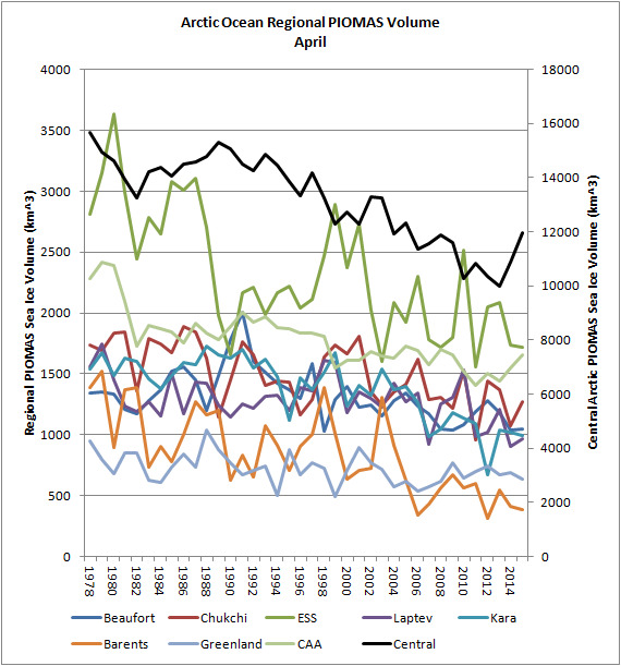
For any IPSO case officers (or Guardian writers) that might be watching please feel free to read all about 41% of nothing, and if you prefer graphs to moving pictures here’s one that shows Arctic sea ice volume in Spring from our PIOMAS regional volume page:
Meanwhile, over on Twitter:
why do you waste your time with the daily wail jim ? it is only good for wrapping fish and chips.
meanwhile if you want a more detailed view of the canadian ice regions may i suggest the canadian ice service linked , a far more up to date and accurate product than the modeled output of the likes of nsidc.
the real picture for a region like hudson bay is a bit of an eye opener http://iceweb1.cis.ec.gc.ca/Prod/page3.xhtml
Modeled output? What are you talking about? What is the Canadian Ice Service using for a more detailed view that the ‘modeled output of the likes of nsidc’ aren’t using?
Oh, and your link doesn’t seem to work.
apologies for the broken link. i am surprised you ask that neven. direct observations from aircraft and hudson bay boat traffic paint a very different picture from that presented by the nsidc.
please try this link , third box from the bottom numbered 36, departure from normal concentration – hudson bay. http://iceweb1.cis.ec.gc.ca/Prod/page2.xhtml?CanID=11092
my interpretation of that chart may be incorrect. if so ,please feel free to correct my mistake.
Thanks for the link, I’m familiar with these maps.
There are a few problems with what you said:
– Concentration maps, of the NSIDC and other organisations, are based on satellite observations, and are not ‘modeled output’.
– The CIS maps aren’t more up-to-date. The map you refer to is for July 20th. It’s July 24th today, which means the latest concentration maps are for July 23rd. But EC has daily regional maps as well.
– Here’s the thing: Those CIS maps are meant for shipping, and so they’re taking zero risks, rather mapping too much ice than too little. Read the explanation by Dr. Walt Meier in this blog post on why IMS has higher extent numbers than NSIDC, the same applies here.
In the end this isn’t about comparing different sea ice concentration maps with each other, and saying this one’s better, more accurate, more up-to-date (and implying that the people making the other maps are incompetent or fudging the numbers). It’s about comparing sea ice concentration maps of different years. This tells us something about what’s happening, regionally and/or overall.
Of course, all of this is off-topic, but maybe that was the idea.
there was no implication of anything other than two different methods giving two different results neven.
i know you will have read the papers in relation to what cryosat 2 actually does neven http://onlinelibrary.wiley.com/doi/10.1002/grl.50193/pdf and from what i can gather the output is indeed modeled . yes ,it has improved techniques for estimating volume , but at the end of the day they are still estimates.
i am not implying anything of the sort, so do not attempt to put words in my mouth. indeed the scientists involved in the various ice measuring programs are well aware of the issues involved and are constantly working to improve accuracy, so i do not see why you have a problem with this.
i am only interested in as accurate a physical picture in the arctic as possible. this requires taking information from all sources that provide it.
hudson bay in itself will likely have no or very little impact on any minimum figures for the sea ice this year as it will probably melt out eventually,so this years situation is nothing more than an indicator that methods of measuring ice in any form are not always accurate .
Lots of people read the Wail Chilly. Some of them even repeat what they read in there.
My eyes are open, but your link doesn’t work for me. Your point is? Haven’t we already covered it?
https://greatWhiteCon.info/2015/07/is-time-running-out-for-arctic-sea-ice/#comment-210600
link working now jim.
It seems that the Daily Mail under IPSO work faster than the Mail on Sunday used to in the good old days of the Press Complaints Commission! Here’s their initial response to my complaint:
Does it sound to you as though whoever wrote that hadn’t got around to clicking on my “41% of nothing” link above?
like i said jim, waste of time. no point arguing with them and the readers of the paper are just as bad.
Even Daily Mail readers get one vote each.
First, yes, extent decreased since 1979, but the paper is about volume (which is extent x thickness). Second, the 41% increase is with regards to the 2012 mega-record low, which was 80% lower than 1979, off the top of my head. Third, this is a pure lie: “the northern ice-cap INCREASED by a staggering 41 per cent in 2013 and, despite a modest shortage last year, is bigger than at any time for decades.” It’s not an ice cap, and the Arctic sea ice pack isn’t bigger than at any time for decades.
David Rose has written so often about Arctic sea ice now that he should be able to explain to his readers the difference between extent and volume, without mixing them (and their percentages) up so blatantly. Or isn’t he a journalist who checks and tries to understand facts? Such as it is, this is pure misinformation, and given Rose’s ties to the GWPF, I’m tempted to call it disinformation, ie on purpose.
This should be totally unacceptable to an editor-in-chief and Rose should be reprimanded.
Hi Neven,
Just for a change Mr. Rose’s byline isn’t attached to these Daily Mail articles. I believe he only writes for the Mail on Sunday. Oh, and the Spectator (see above). Plus fiction books of course.
The editorial was anonymous. Now that it’s been kindly brought to my attention I may try and pick a few holes in the article by a certain “Mia de Graaf” as well!
I apologize to David Rose for thinking he wrote this particular misleading article.
It has just been brought to my attention that the headline at the top of Damian Carrington’s article was in fact written by somebody else. Hence the edit in my first paragraph above.
Good coverage, Jim. Reciprocating links, here’s my piece on the same matter:
http://www.skepticalscience.com/arctic-ice-volume-2015.html
Likewise John!
IIRC you also hail from the UK? Have you considered sending your “weary responses” to The Daily Mail’s howlers on to IPSO and/or direct to DMG?
hi john 🙂
Great post.
It is amazing how ignorant some deniers are.
Also, remember that Cryosat-2 measures volume of ice. Sea ice extent is an expression of coverage (square miles) rather than volume (cubic miles).
An increase or decrease in volume does not correlate to an increase or decreas in ice cover extent.
That is a fifth grade subject (How Fifth Graders Calculate Ice Volume, 2, 3, 4, 5).
PS. Floating Arctic ice that melts into sea water does not displace any more than it did as ice entering the sea originally (no sea level rise when floating ice melts to become sea water).
Thanks Dredd,
Would you mind if I brought your “Sea ice volume 101” series to the attention of The Daily Mail in amongst my formal correspondence?
P.S. I think SkS might quibble with you ever so slightly on your final point. If you follow John Mason’s link above you will eventually get to:
http://www.skepticalscience.com/Sea-level-rise-due-to-floating-ice.html
cryosat 2 does not measure volume of ice.
Would you care to elaborate Chilly?
Presumably your gnomic remark is intended to convey that in actual fact CryoSat-2 attempts to measure “freeboard”?
http://onlinelibrary.wiley.com/doi/10.1002/grl.50193/pdf
http://www.the-cryosphere.net/8/705/2014/tc-8-705-2014.pdf
[Mod – This nearly got flushed out along with the rest of the spam bucket Chilly. Your point is?]
Jim I was going to comment on the Mail article (there is one in The Register too but my comment was blocked along with a lot of other comments you can see when you post but are not released), but my experience there is that they succeeded with their re-design and the noise of the masses drowns out all rational debate. It’s simply not worth the time.
It’s going to be a moot point anyway, area is vanishing so fast in the supposed second thickest region of the Arctic that this year’s figures are certainly going to be closer to 2012 than to the long term trend. Unless there is a sudden slow down of course like 2006 which is always possible but not looking like it.
The NSR moved a step closer to being open yesterday and the NWP is also moving that way at a reasonable pace. It looks like the NSR may be fully open by Sunday/Monday.
I don’t check the NSIDC so often as I used to due to Neven’s excellent graphs and plots, but I just checked and even their 5 day running Extent chart is dropping back towards 2012 levels. CT is now in the top 5 range of melt and we still have not melted out the remainder of the Hudson Bay.
Come September these articles are going to be shown for what they are. Namely a desperate attempt to trumpet ANY report which shows a chart looking like it is going up rather than down.
Notably the Arctic and the Climate are not co-operating. Not surprising given the heat budget growing every year….
Good morning Neil.
I tried commenting on The Mail’s “editorial” yesterday too. This was my first attempt:
After it had remained invisible for quite some time I called the Mail Online. Kate informed me that my link violated the Mail’s “No links” policy. I enquired whether a comment suggesting that the reader might like to try a Google search would violate any Mail policy and was assured that it would not. Here is my second attempt:
After it had remained invisible for quite some time I called the Mail Online again and asked to speak to Kate. She explained to me that Mail Moderators are very busy people. They have to quickly scan large volumes of comments and make hasty decisions. Kate assured me my comment was acceptable and personally approved it. Here it is in the archives. Please feel free to pop over to the Mail Online and give it the thumbs up if you approve of it too.
Ed Hawkins got the joke!
However it seems as though David Rose was not amused by this one:
I followed Jim’s example and complained to the Mail. After receiving their “stock” reply, I sent the following
And I received the following response
So a victory of some sort, but not a published correction.
Thanks for the info Phil,
However there are so many areas of apparent misunderstanding on the Mail’s part it’s hard to know where to begin when demanding a correction.
Merely changing “decades” into “years” online most certainly doesn’t cut the mustard! Perhaps a set of graphs in print plus Andy’s video online might go some way towards setting the bitterly twisted record straight?
Here’s the current online version showing the single changed word:
but what about the print version?
and what about drawing the attention of unsuspecting viewers of the Mail Online to the correction?
I’d just pull the pin, and throw this at them.
Arctic Sea Ice Minimum Volumes 1979-2014
Anyone can see in an instant that the “41% growth” from 2012 is pathetic compared to the trend, which is the real news.
I did pursue this further, pointing out to the Mail that if they had done their “back of an envelope” calculation correctly then (with a couple of assumptions favourable to the denier ) it gave you a ballpark figure of 2060 for an ice free arctic September, which was hardly inconsistent with the IPCC projection of “mid 21st century”. I suggested that this should be enough to ask the UCL team whether they thought their results were consistent with IPCC projections.
Sadly the UCL group were unable to make a statement on this. The Lawyer at the Mail states
So it seems the Mail can get away with interpreting a trend from 5 years of data when the UCL team can’t. However, unless the UCL team feel their responses today have been misrepresented to me, I think I have exhausted my options.
My very approximate comparison of Tilling et al.’s cryosat results and PIOMAS are;
2010 – 2012 : cryosat = -14%, PIOMAS = -19%
Av(2010-12) – 2013: cryosat = +33%, PIOMAS = +25%
Av(2010-12) – 2014: cryosat = +25%, PIOMAS = +59%
Suggests reasonable agreement between the two, although 2014 is obviously odd with cryosat suggesting a decline and PIOMAS an increase.
We’re still pursuing the Mail Phil, albeit taking a rather different tack. For more details see:
and