According to Michael Mann he coined the name “Atlantic Multi-decadal Oscillation”:
Two decades ago, in an interview with science journalist Richard Kerr for the journal Science, I coined the term the “Atlantic Multidecadal Oscillation” (the “AMO” for short) to describe an internal oscillation in the climate system resulting from interactions between North Atlantic ocean currents and wind patterns. These interactions were thought to lead to alternating decades-long intervals of warming and cooling centered in the extratropical North Atlantic that play out on 40-60 year timescales (hence the name). Think of the purported AMO as a much slower relative of the El Nino/Southern Oscillation (ENSO), with a longer timescale of oscillation (multidecadal rather than interannual) and centered in a different region (the North Atlantic rather than the tropical Pacific).
More recently Mann et al. claimed that in actual fact the AMO does not exist.
For several decades the existence of interdecadal and multidecadal internal climate oscillations has been asserted by numerous studies based on analyses of historical observations, paleoclimatic data and climate model simulations. Here we use a combination of observational data and state-of-the-art forced and control climate model simulations to demonstrate the absence of consistent evidence for decadal or longer-term internal oscillatory signals that are distinguishable from climatic noise. Only variability in the interannual range associated with the El Niño/Southern Oscillation is found to be distinguishable from the noise background.
More recently still I discovered the source of Matt’s optimistic, AMO based prediction of Arctic sea ice recovery. Here is the latest edition, courtesy of Roger “Tallbloke” Tattersall:
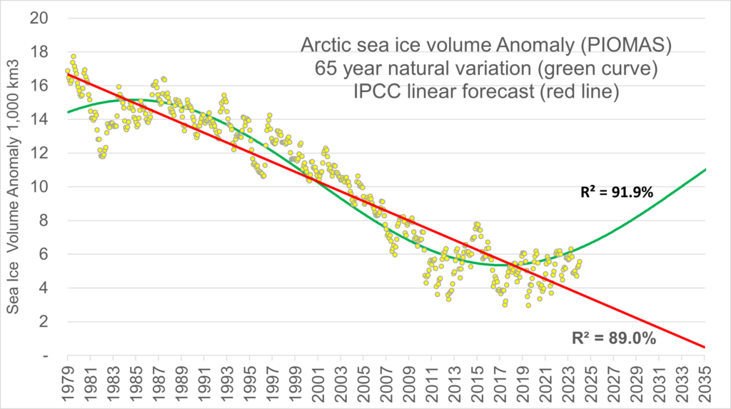
During my conversation with Roger on his blog yesterday he made an at least vaguely testable prediction:
Well at least we don’t need you to cease prevaricating to see what the correlation coefficients for the two trendlines says about it. We’ll see how the differential changes in the coming months. AMO sine wave approximation wins by 2.9% at the moment.
“Now answer mine. In what way is your green line related to ‘the physics of the sea ice annual melt/freeze cycle?’?
In the same way the IPCC’s linear projection is. They are both hypotheses, supported by theory and observations. (one of which will be proved incorrect by 2028).
When I enquired further, Rog helpfully elucidated:
“It may be similarly obvious to you, but where does your green line come from in the second image?“
It’s just a 65yr sine wave in phase with the AMO, scaled to best fit the PIOMAS data.
I don’t yet know if these things come in threes, but “Eli the Pit Bull” made a similar “prediction” on XTwitter:
Your wish is my command Eli!
P.S. In partial answer to the question posed by Tom below, I’ve hurriedly created these two graphs from the PIOMAS gridded data numbers as crunched into regions by Steven at the ASIF:
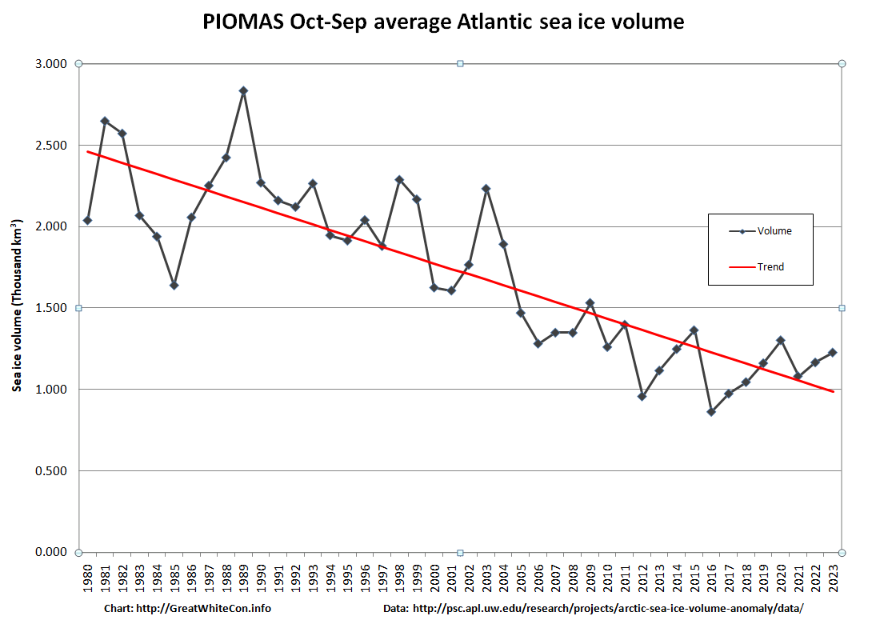
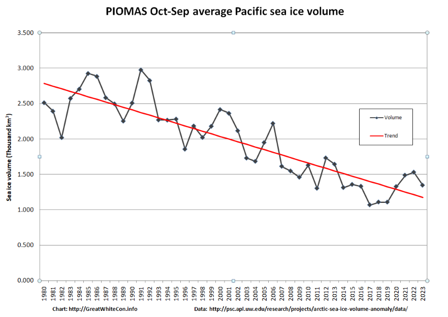
In this case “Atlantic” = Barents + East Greenland Seas, and “Pacific” = Okhotsk + Bering + Chukchi +Beaufort. E&OE!
They look broadly similar to my ageing eyeballs.
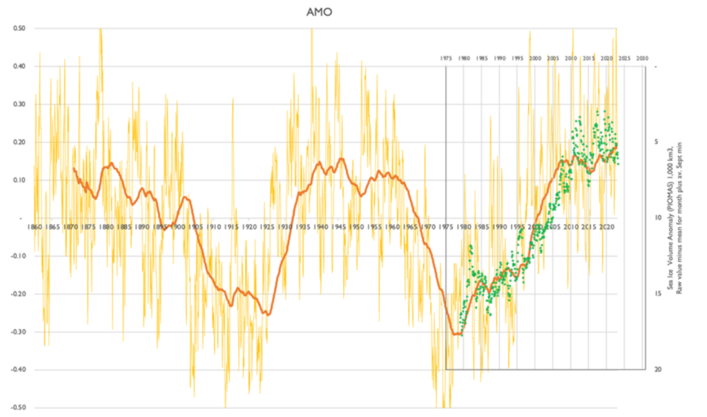
[Update – February 20th]In response to Neil’s comment below, here is Roger’s alternative view of PIOMAS volume versus the AMO, which he added below his repost of Ron Clutz’s Arctic article on the “Science (Doesn’t) Matters” blog :
Whilst Neil is here, I’ll add my record of the comments that Ron Clutz has now deleted from his “moderation queue” and which will henceforth be invisible to his flock of faithful followers until hell freezes over:
Do you have any comment Neil?
Watch this space! (For 4 more years at least)

Well we’ll know by the end of the decade at least! Though, am I wrong in saying that the greatest ice loss has been in the Beaufort to East Siberian Sea side of the Arctic, not the Atlantic?
Hi Jim,
You didn’t include Tallblokes chart comparing sea ice extent and AMO.
By the way I note the AMO data is still not available for 2023/24.
Have you any idea when this data will appear on-line
Hi Neil,
An alternative and more up to date version of AMO data is available from:
https://www1.ncdc.noaa.gov/pub/data/cmb/ersst/v5/index/ersst.v5.amo.dat
I only included the latest edition of the graph Matt posted in a comment a few months ago. I assume the graph you’re referring to is the one I’ve added above? However that one also plots PIOMAS volume rather than extent.