According to “Steve Goddard” it is! Hot off the presses over at “Real Science” we are told that:
DMI hasn’t updated their 30% concentration map for 10 days, but their 15% concentration map is just about at the 1979-2000 mean.
Ocean and Ice Services | Danmarks Meteorologiske Institut
The melt season has essentially stopped, with very cold air across the Beaufort Sea
[Image redacted – It shows Canada and one corner of the Beaufort Sea]
The usual criminals in the press (Guardian, New York Times, etc.) and government agencies will of course not mention this, because reality and science wrecks their agenda.
I have to admit Steve’s confusing language confused me briefly. The Arctic sea ice concentration and ice type maps from the OSISAF on which the Danish Meteorological Institute base their extent graphs have been updating normally, but I eventually discovered what “Steve”/Tony was on about. On close inspection although the date at the bottom has been updating the 2015 curve on DMI’s 30% threshold Arctic sea ice extent graph currently seems to be stuck on August 2nd:
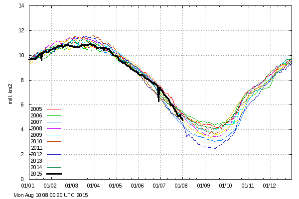
I’ve informed DMI of the problem, but when it might be fixed remains to be seen, since as the DMI web site puts it:
The old plot can still be viewed here for a while.
and as I was just informed they don’t have any resources allocated to keep the “deprecated” 30% service running.
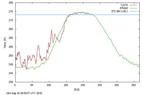
Meanwhile back in real world in the Arctic, DMI temperatures north of 80 degrees are above “normal”:
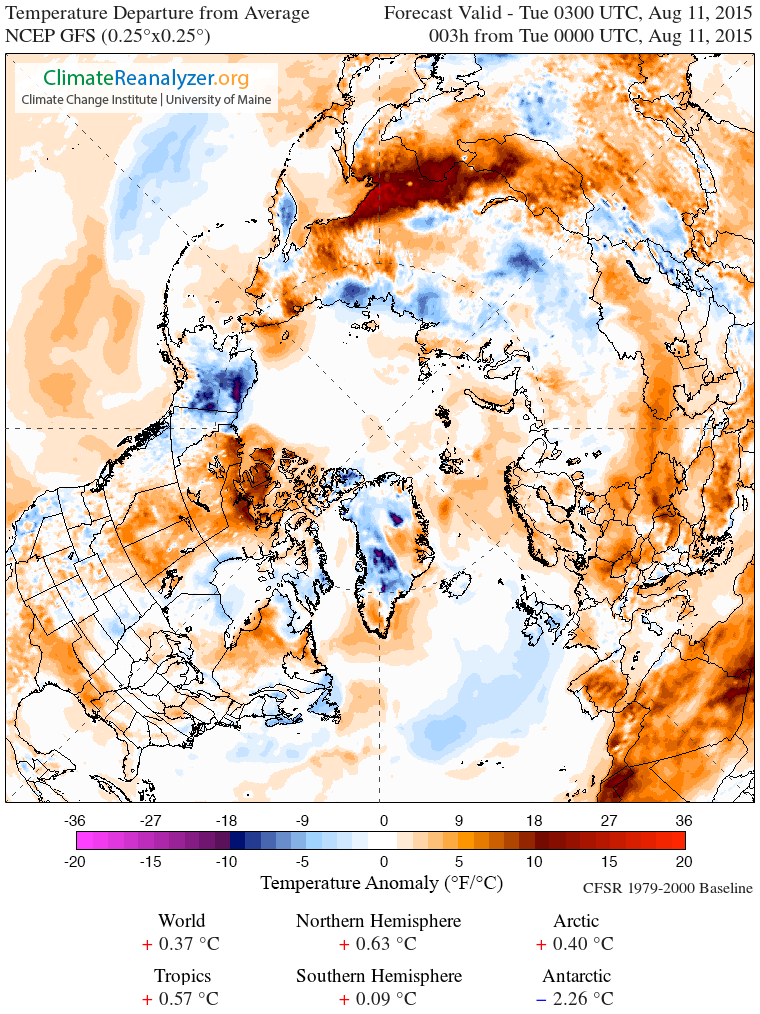
GFS temperature anomalies look like this:
and JAXA 15% threshold Arctic sea ice extent has been dropping at nearly 100,000 km² per day for the last few days: